 Dev Design Library
Separator Components
Dev Design Library indexes 64 separator components from 43 open-source UI libraries, with the most coming from Shadcn Space, ReUI, sv-efferd, pdfcn and Cojeev UI. Each one links to its page with the source code, a live preview where available, the library license and the install command. Separator components belong to the Layout group.
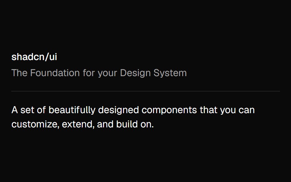 Separatorshadcn/ui · ReactVisually or semantically separates content.
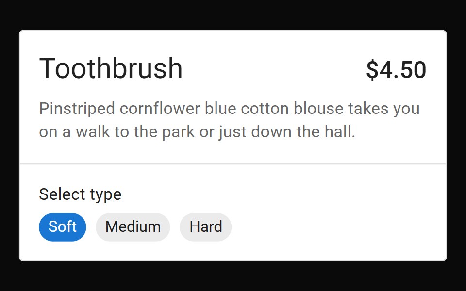 DividerMUI / Material UI · React
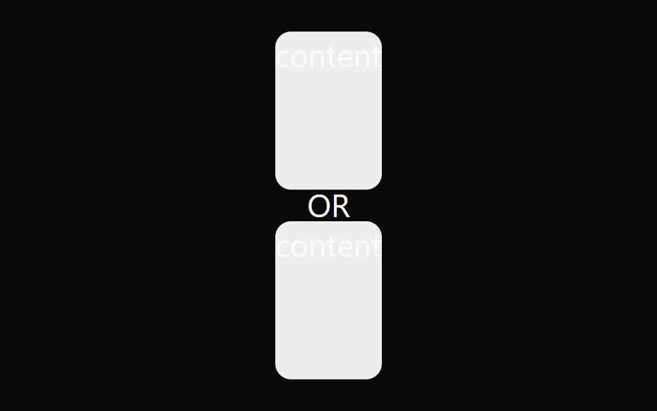 DividerdaisyUI · CSS (Tailwind)
 SeparatorChakra UI · ReactUsed to visually separate content
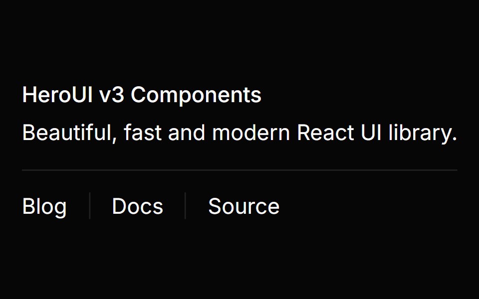 SeparatorHeroUI · ReactA simple line to separate content visually.
 DividerReact Spectrum · ReactDividers bring clarity to a layout by grouping and dividing content in close proximity. They can also be used to…
 Separatorcoss ui · ReactA separator element accessible to screen readers.
 SeparatorRadix Themes · React
 DividerTremor · React
 Horizontal separator for content sections.ReUI · ReactHorizontal separator for content sections.
 Dividerpdfcn · ReactDivider PDF component (forme)
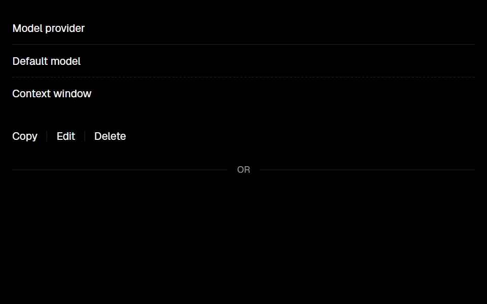 DividerLobe UI · React
 separatorIntent UI · Reactseparator
 Section DividerUntitled UI React · React
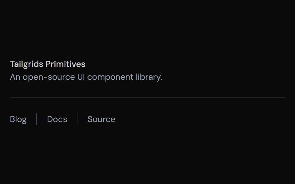 SeparatorTailGrids · ReactA separator component to separate content.
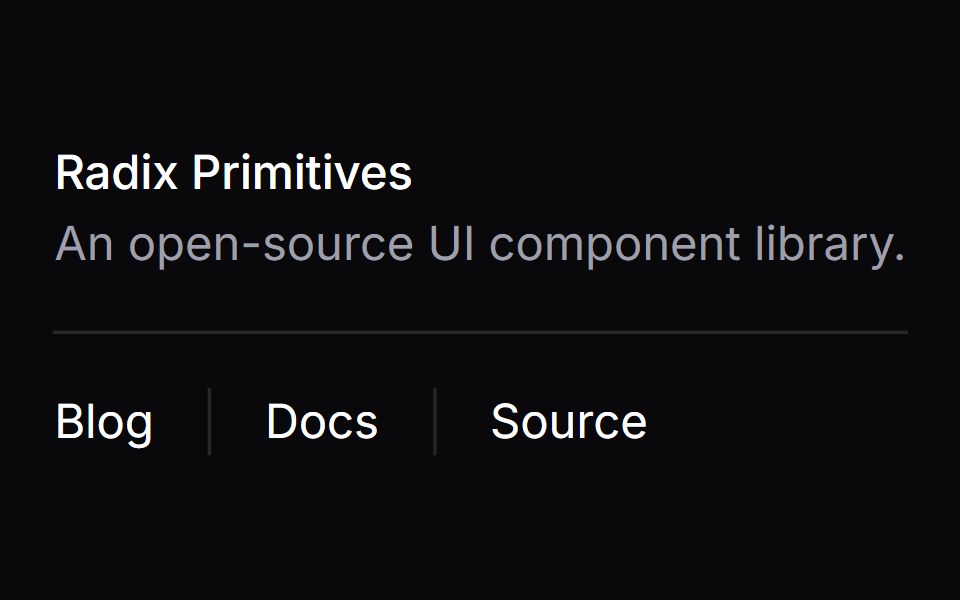 SeparatorVengeance UI · React
 SeparatorToolcraft · React
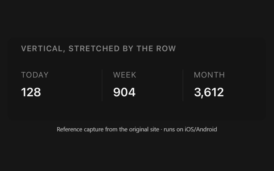 SeparatorPanel UI · React NativeHorizontal or vertical rule between content, optionally labelled.
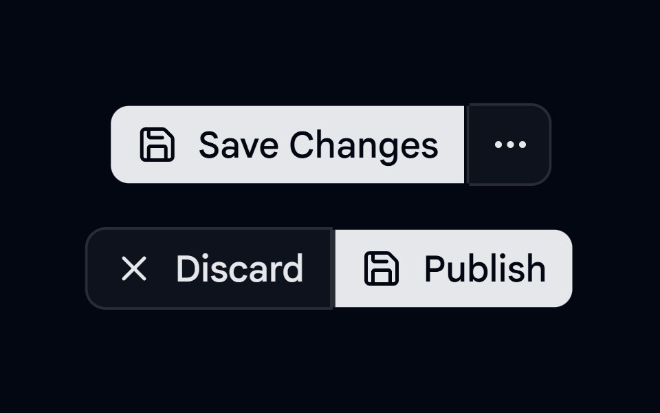 Button Group-04 - SeparatorShadcn Space · ReactButton group with separators
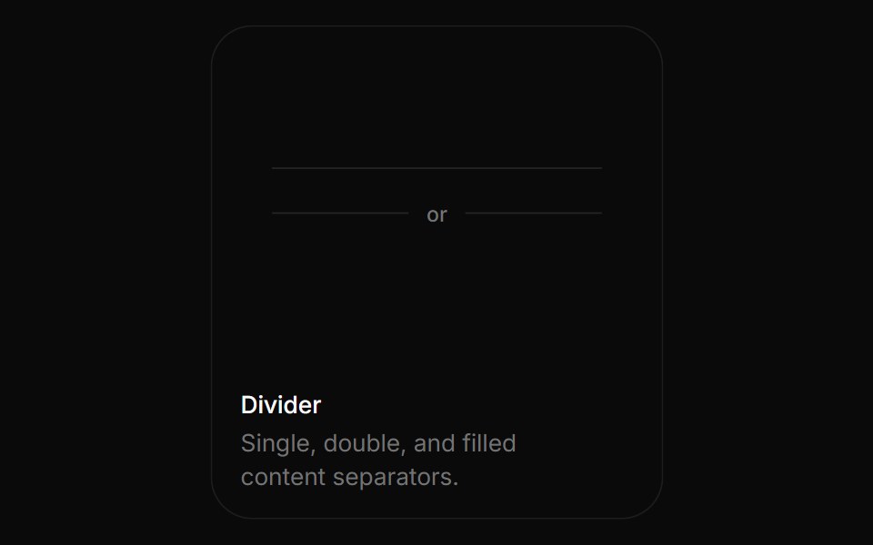 DividerBoardUI · ReactSingle, double, and filled content separators.
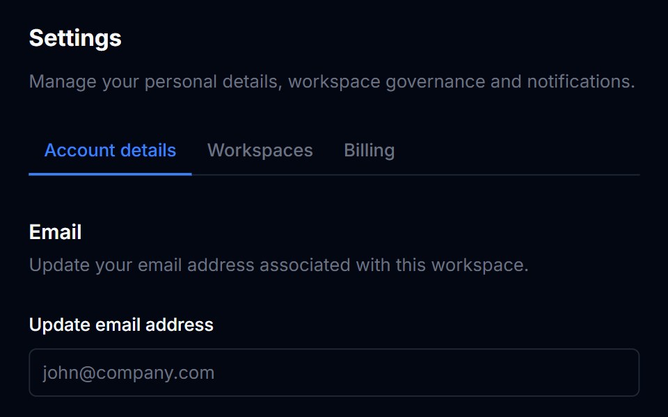 DividerTremor Blocks · React
 SeparatorShadcn Dashboard · React
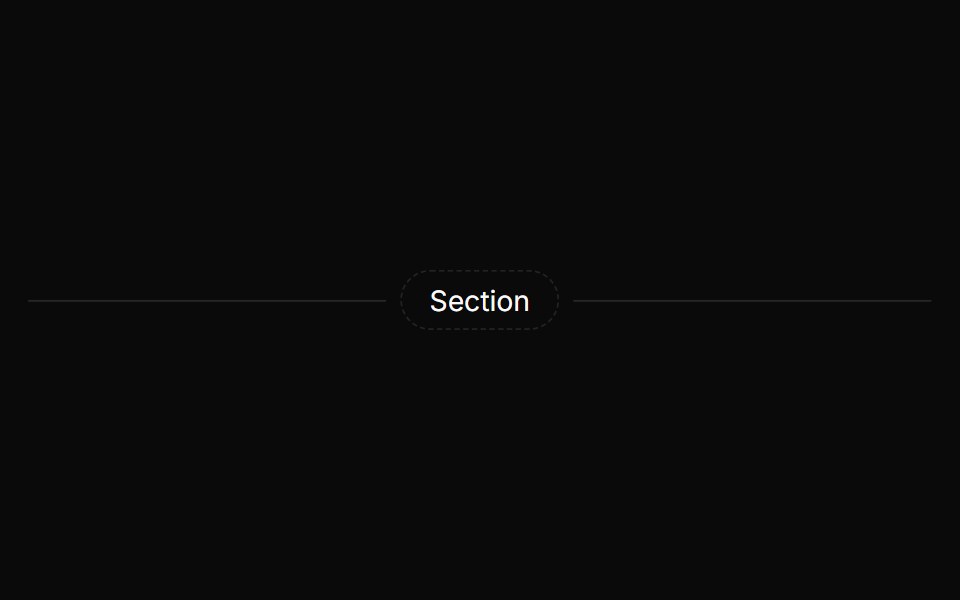 SeparatorAnimations (Svelte) · SvelteA flexible horizontal separator for dividing content with solid or gradient lines and optional centered labels.
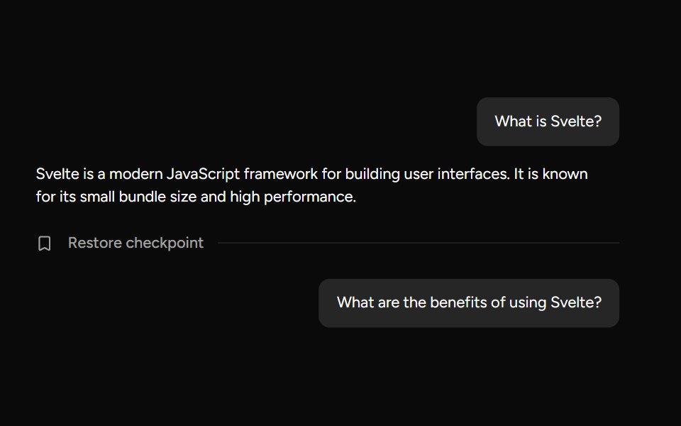 CheckpointAI Elements (Svelte) · SvelteA compact checkpoint component that pairs a separator with icon and trigger helpers for workflow checkpoints.
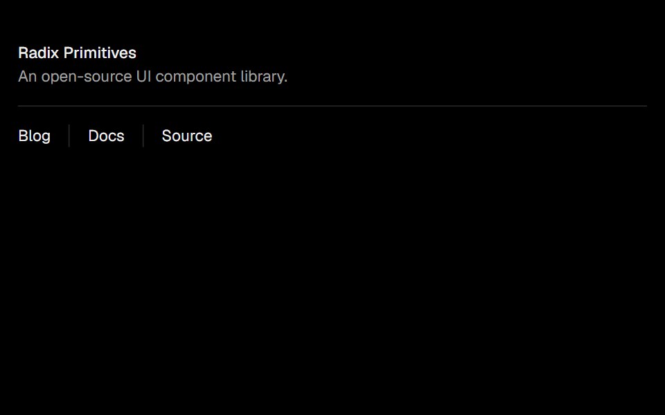 SeparatorObsidianUI · React
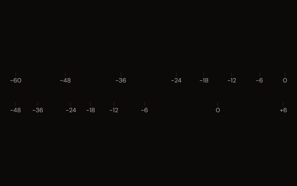 dB Scaleaudiocn · ReactTick marks and labels for a decibel range, shared by meters and faders.
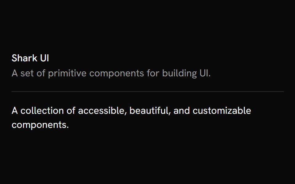 SeparatorShark UI · ReactVisually separate content with a line.
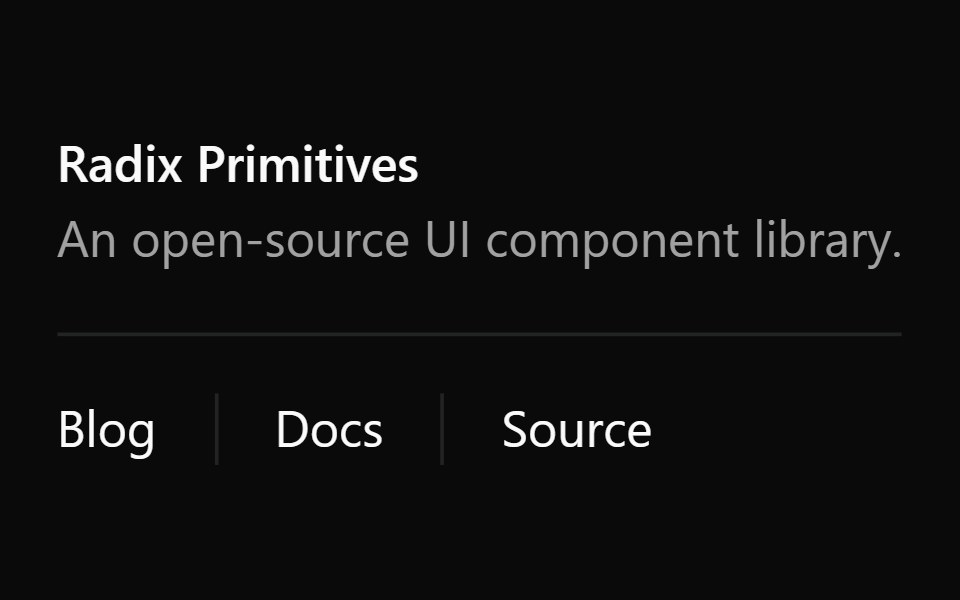 SeparatorWatermelon UI · React
 Auth dividersv-efferd · Svelte
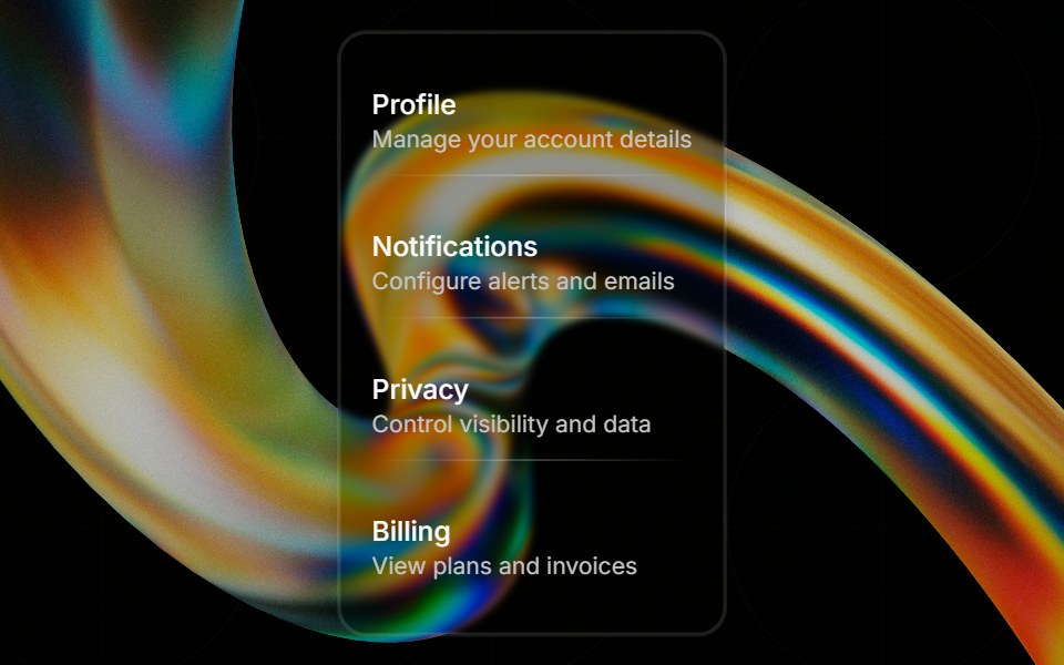 Glass Separatorglasscn · ReactGlass Separator with five variants: clear, frosted, subtle, liquid, and liquid-refract
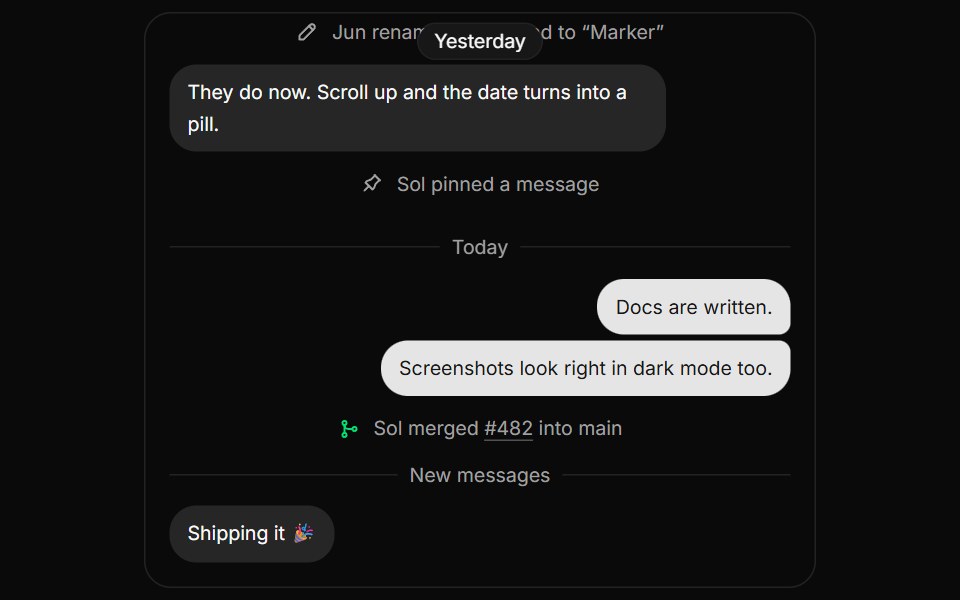 MarkerHextaUI · ReactQuiet notes between content, like date dividers and system events, with sticky dates and times that read as Today or…
 MarkerCojeev UI · ReactSeparates or annotates a sequence with a short event, status, or time label.
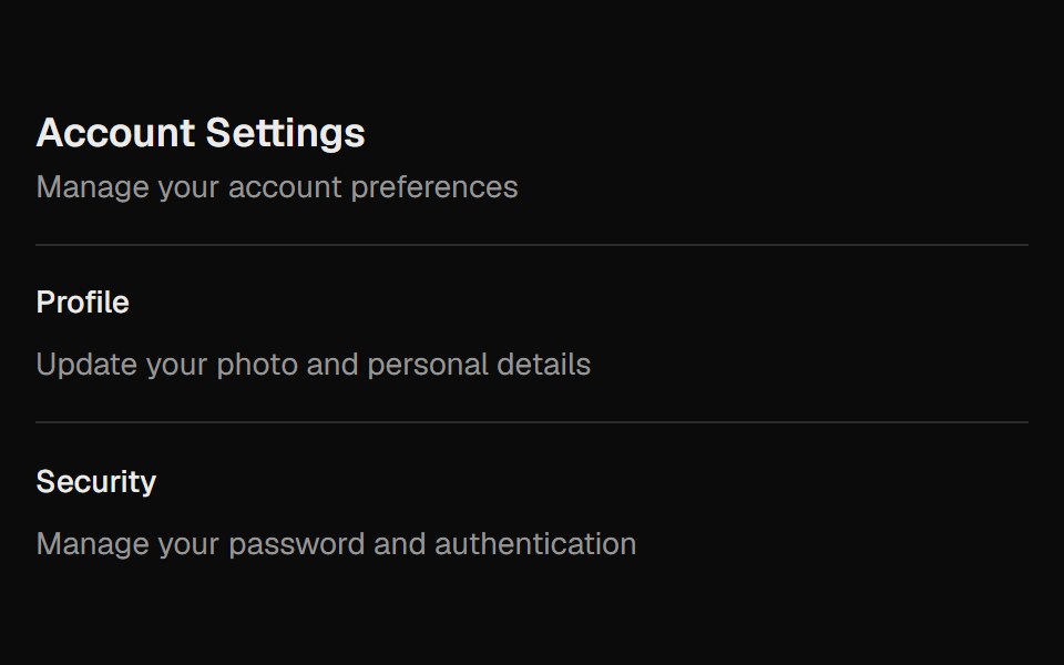 SeparatorROI UI · ReactA separator element accessible to screen readers.
 DividerHalaska UI · React
 RuleMetal UI · React + SwiftUIAn engraved groove between groups; graphite on dark chrome.
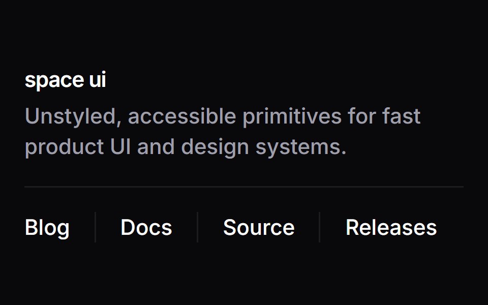 SeparatorSpaceUI · ReactDraws clean horizontal or vertical dividing lines between content blocks or tools to create clear visual separation.
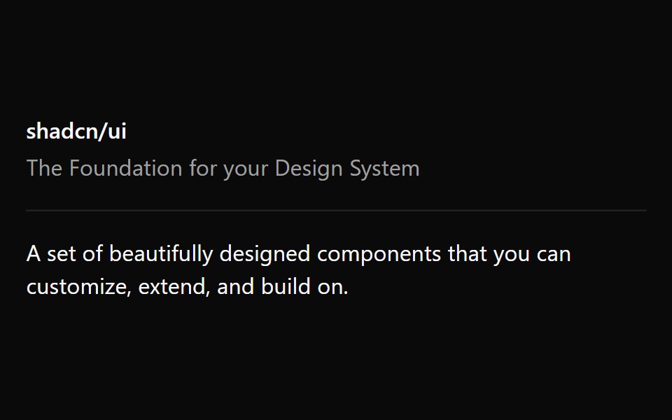 Aria SeparatorReScript shadcn · ReScript
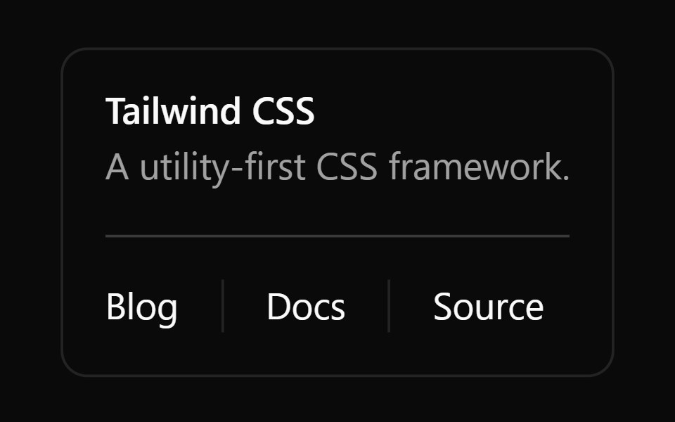 SeparatorOUI · ReactReact aria components Separator with shadcn characteristics.
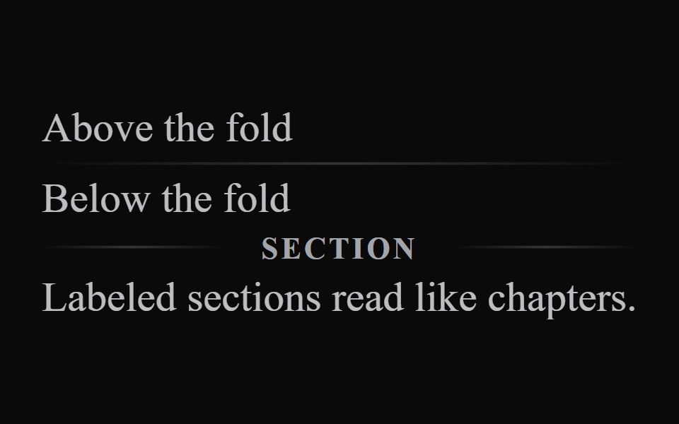 Liquid DividerLiquefy UI · ReactDivider line in liquid glass style. Linha divisória em estilo vidro líquido.
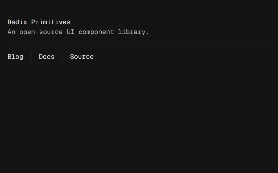 SeparatorD2Studio UI · ReactVisually or semantically separates content.
 SeparatorFibo · ReactA thin rule between groups of content, across or down, with an optional label.
 DividerReactFrame · ReactA horizontal or vertical divider with solid, dashed, dotted and gradient styles, an optional label with start, center…
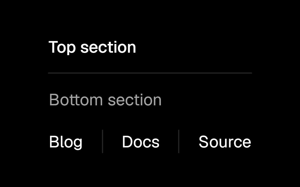 Separatorark-cn · ReactA shadcn-style separator component built with Ark UI primitives.
 Vertical separator for inline elements.ReUI · ReactVertical separator for inline elements.
 Dividerpdfcn · ReactDivider PDF component (takumi)
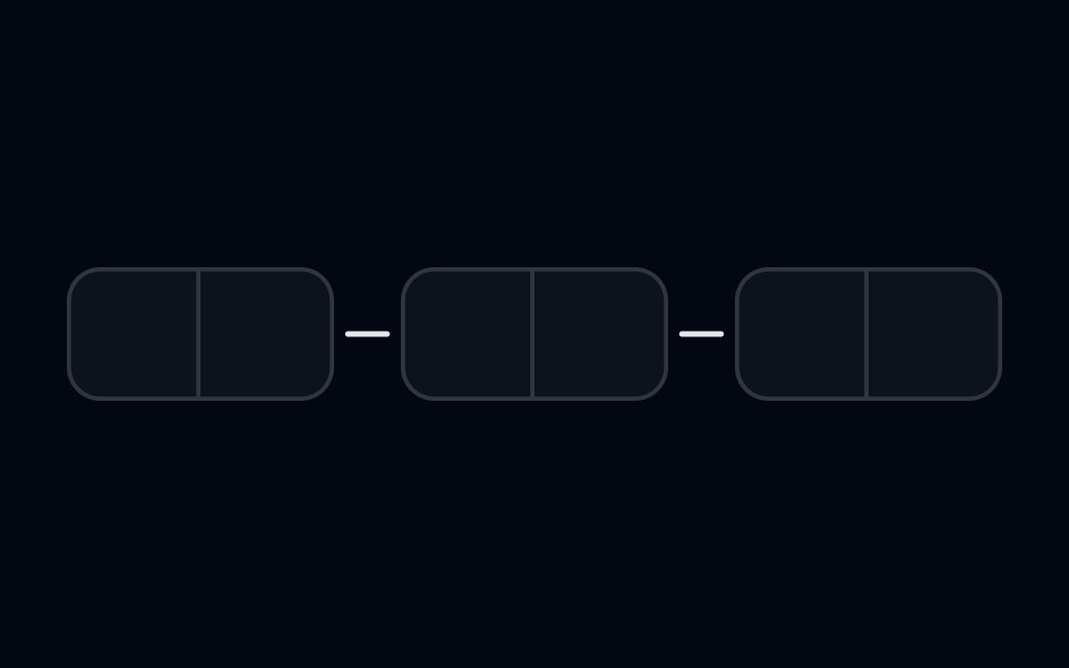 Input OTP-03 - With SeparatorShadcn Space · ReactInput OTP component with separator between segments
 Dashed linesv-efferd · Svelte
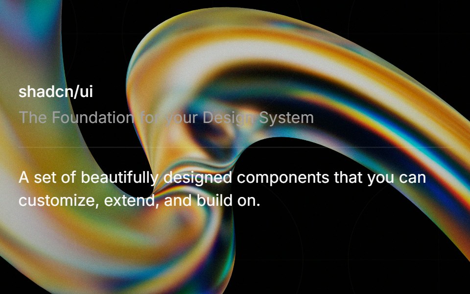 Separatorglasscn · React
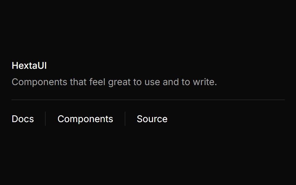 SeparatorHextaUI · ReactA hairline that divides content horizontally or vertically, with an optional label and a decorative mode for purely…
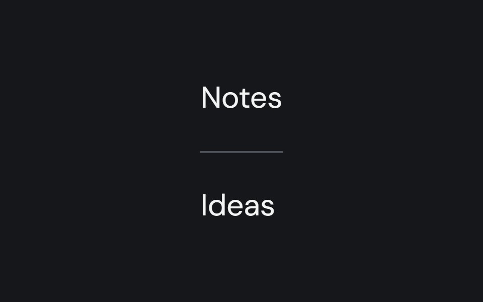 SeparatorCojeev UI · ReactDivides adjacent content with a horizontal or vertical rule.
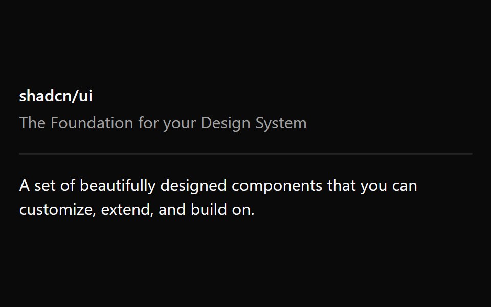 Base SeparatorReScript shadcn · ReScript
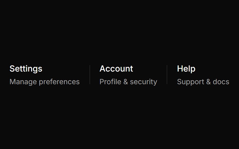 Vertical separator groups related menu items.ReUI · ReactVertical separator groups related menu items.
 Select-09 - Select with separatorShadcn Space · ReactSelect component
 Full width dividersv-efferd · Svelte
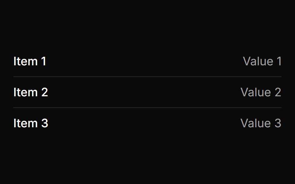 Horizontal separator between items in a list.ReUI · ReactHorizontal separator between items in a list.
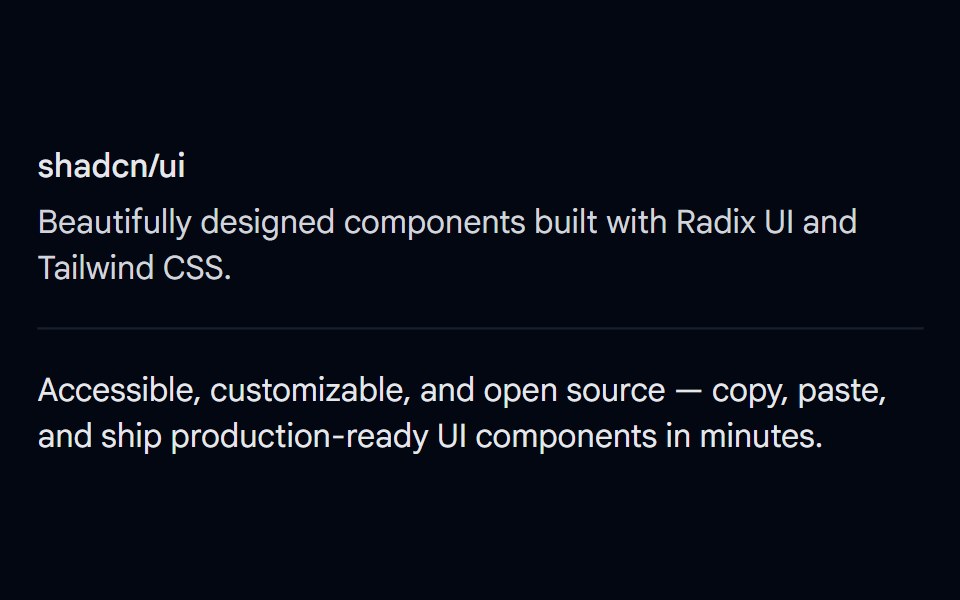 Separator 01 - DefaultShadcn Space · ReactBasic horizontal separator dividing content sections
 Mask linesv-efferd · Svelte
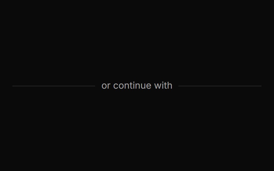 Separator with centered text labelReUI · ReactSeparator with centered text label
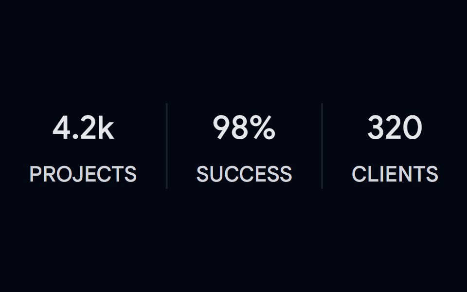 Separator 02 - VerticalShadcn Space · ReactVertical separators between stat columns with label and value
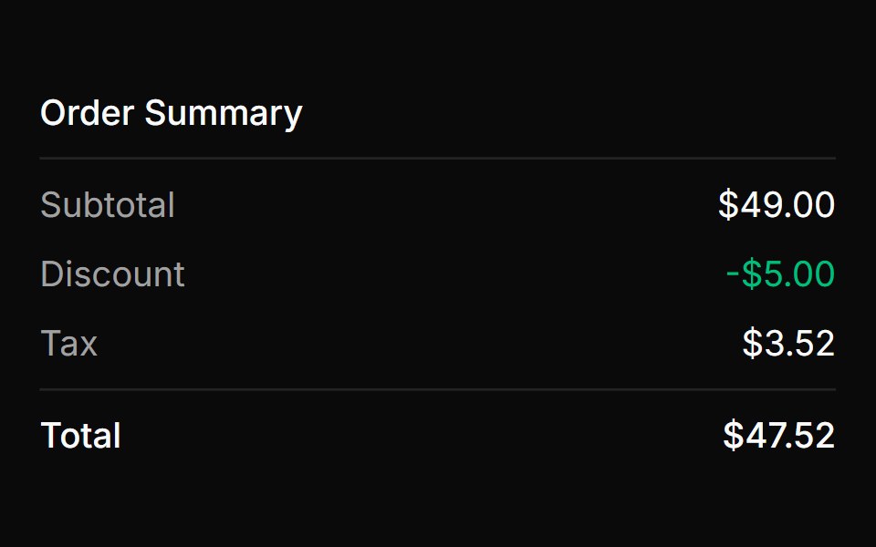 Order summary with separatorsReUI · ReactOrder summary with separators
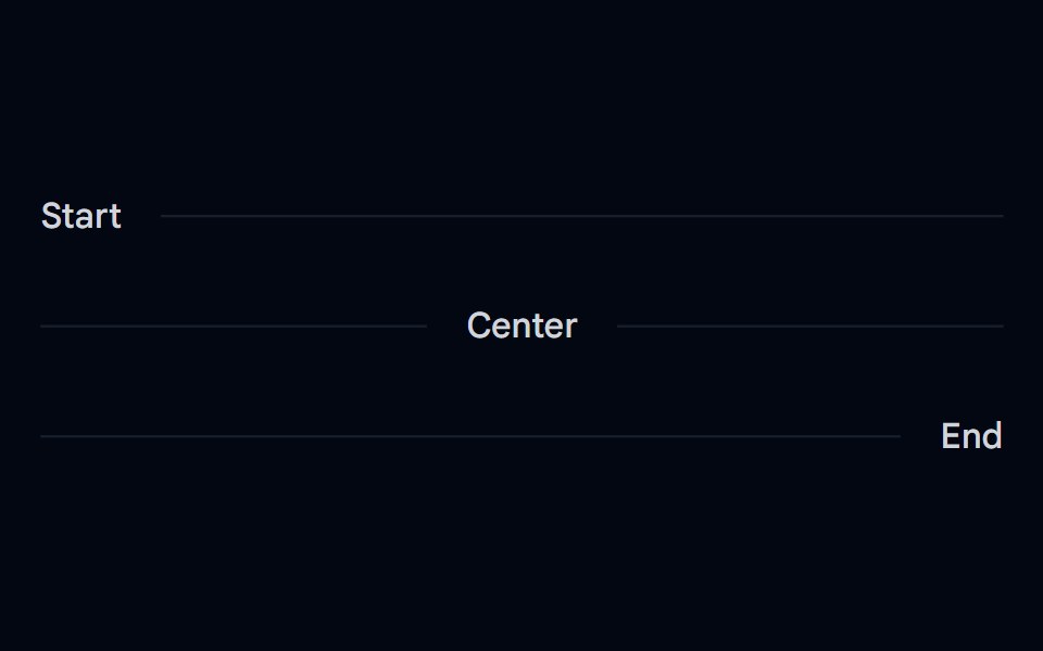 Separator 03 - Horizontal Label PlacementShadcn Space · ReactHorizontal separators with inline start, center, and end text labels
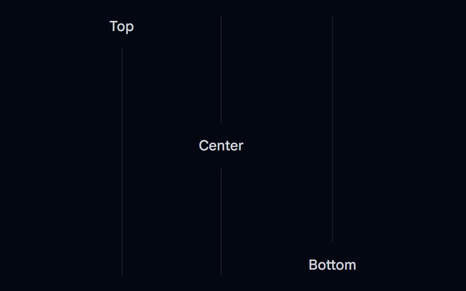 Separator 04 - Vertical Label PlacementShadcn Space · ReactVertical separators with top, center, and bottom text labels
 Separator 05 - DashedShadcn Space · ReactDashed horizontal separator
 Separator 06 - Gradient FadedShadcn Space · ReactGradient faded horizontal separator that fades from transparent to border color
Libraries with separator components
Related categories
- React Separator Components
- Tailwind CSS Separator Components
- Svelte Separator Components
- shadcn/ui Separator Components
- Layout Components
- Grid Components
- Bento Grid Components
- Stack Components
- App Shell Components
- Container Components
- Scroll Area Components
- Split Pane Components
- Window Frame Components
- Aspect Ratio Components
- Sticky Scroll Components
- Masonry Components
- Dashboard Grid Components