 Dev Design Library
shadcn/ui Grid Components
Dev Design Library indexes 42 shadcn/ui grid components from 9 open-source UI libraries, with the most coming from Watermelon UI, FLX UI, Shadcn Space, audiocn and Magic UI. Each one links to its page with the source code, a live preview where available, the library license and the install command. They follow the shadcn/ui conventions, so most install with the shadcn CLI and drop into a Tailwind project. Grid components belong to the Layout group.
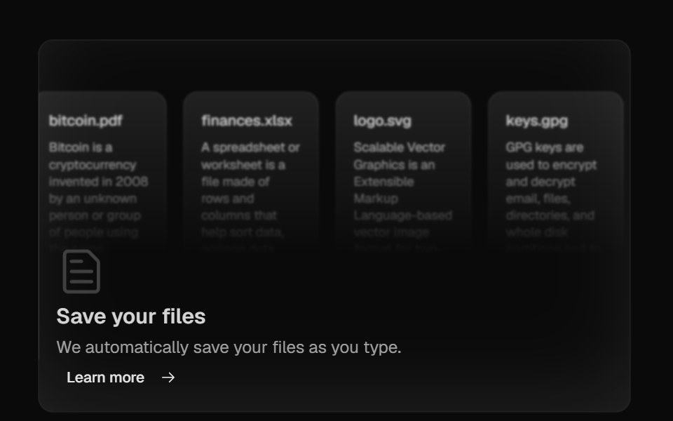 Bento GridMagic UI · ReactBento grid is a layout used to showcase the features of a product in a simple and elegant way.
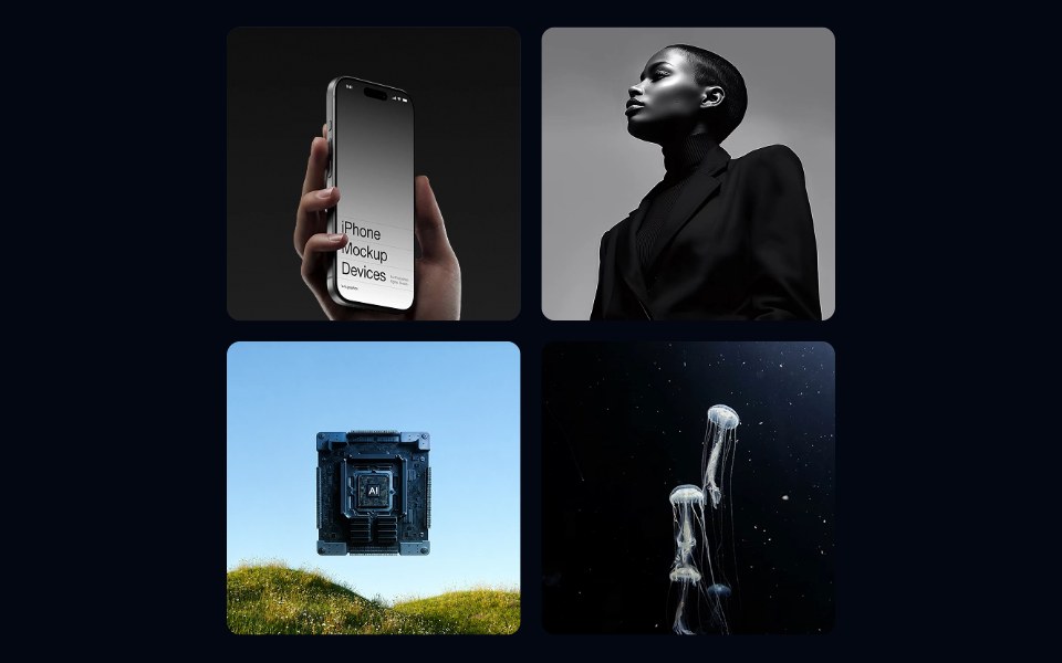 Aspect Ratio 02 - Square GridShadcn Space · ReactA responsive photo gallery grid using square aspect ratio tiles with a hover zoom effect.
 Bento GridAnimations (Svelte) · SvelteA flexible grid layout with interchangeable BentoCard items for showcasing content in a responsive masonry style.
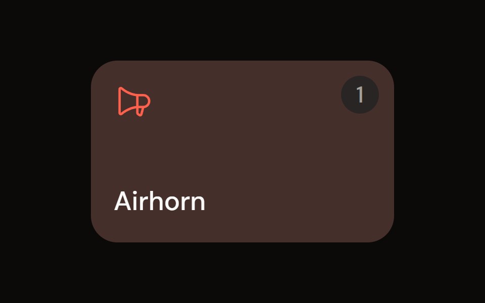 Sound Padaudiocn · ReactA trigger pad with one-shot, toggle, hold and loop modes, a hotkey, playback progress and an accent colour, plus a…
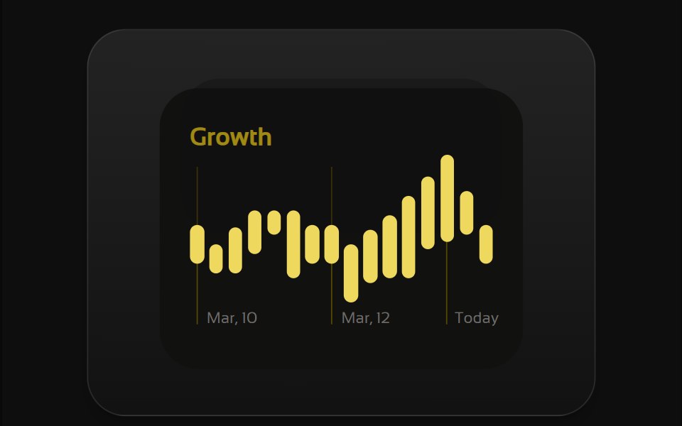 Bento 1Watermelon UI · React
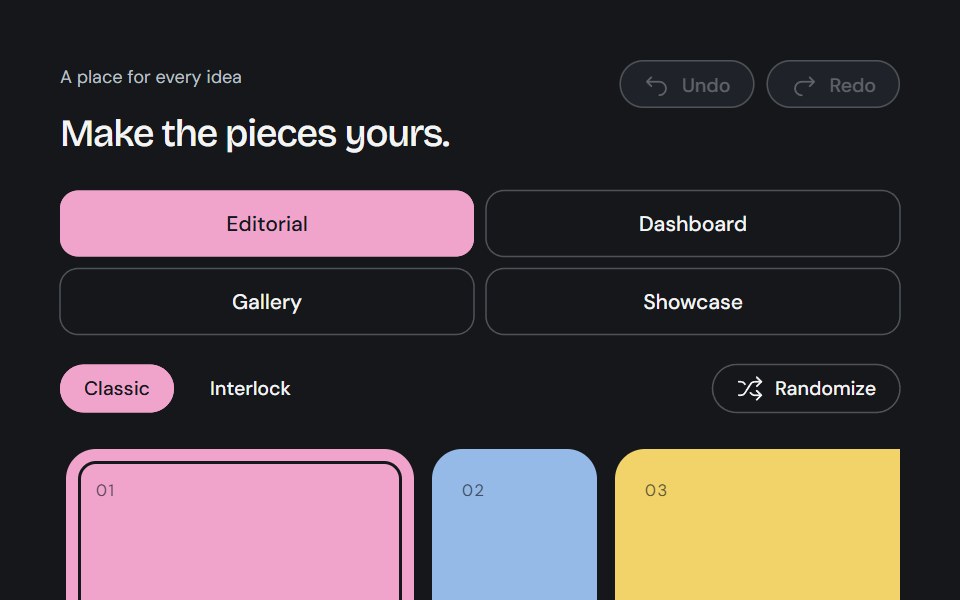 Bento GridCojeev UI · ReactA complete canvas of rounded cards or organically interlocking pieces. Compose a layout, then install just the…
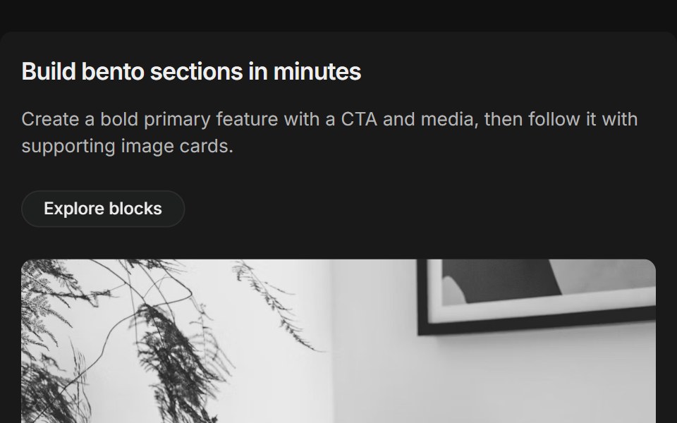 Bento grids 01FLX UI · ReactThree-column bento: primary tile (two-thirds) with title, description, CTA and media, plus supporting image cards.
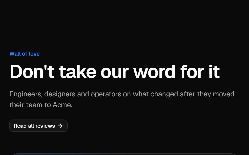 Testimonial gridVelora UI · ReactMasonry wall of social posts and quote cards, led by a wide case-study quote with a headline metric.
 Bento 01D2Studio UI · ReactBento grid for an education program platform with admin overview, faculty view and a program form.
 Blog 01 - Latest Blog & News GridShadcn Space · ReactA modern blog section with featured posts, large thumbnails, publish dates, and headlines, ideal for sharing agency…
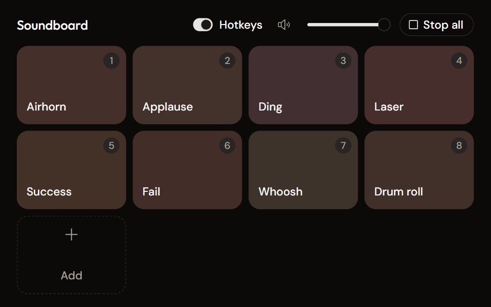 Soundboardaudiocn · ReactA grid of sound pads with global hotkeys, per-pad mode and volume in a context menu, master volume, stop all, and…
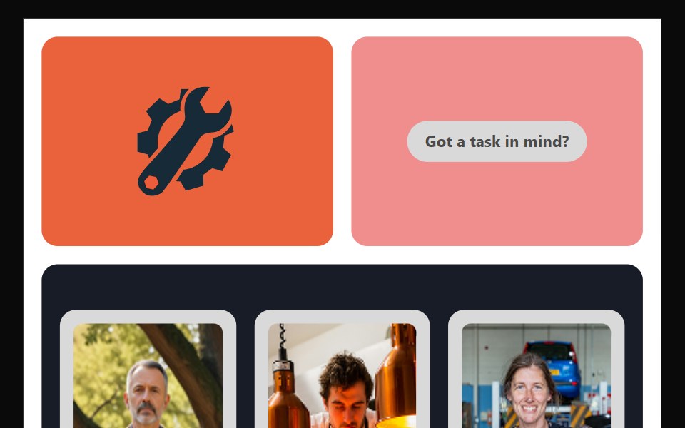 Bento 10Watermelon UI · React
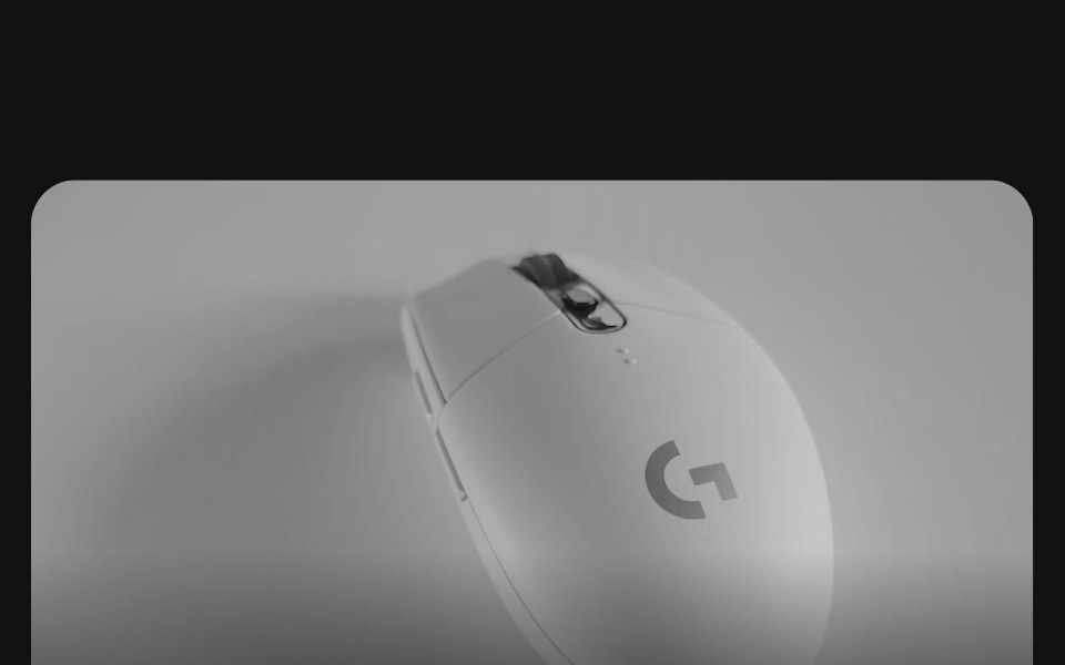 Bento grids 02FLX UI · ReactA row of collection cards, one twice as wide, each with a product photo bleeding off the top, a title, a short…
 Portfolio 01 - Clean Portfolio GridShadcn Space · ReactA modern portfolio section displaying featured projects with tags, visuals, and categories, ideal for agencies or…
 Bento 11Watermelon UI · React
 Bento grids 03FLX UI · ReactA product grid with a tall featured item in the center, four smaller items around it, category badges, prices and names.
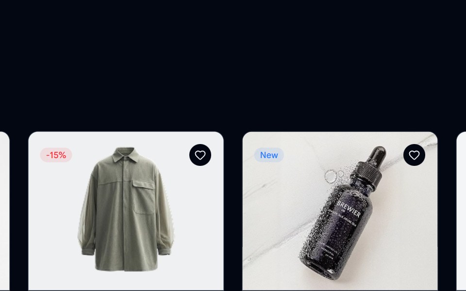 Product Listing 01 - Multi Column GridShadcn Space · ReactA multi-column layout featuring product cards with images, reviews, and pricing details, helping users scan, compare…
 Bento 12Watermelon UI · React
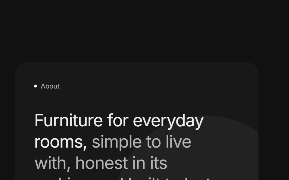 Bento grids 04FLX UI · ReactTwo stacked cards with a two-tone title, a paragraph and a pill button beside a product photo surrounded by short…
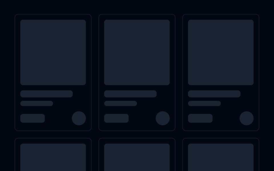 Skeleton 04 - Product Card GridShadcn Space · ReactResponsive product grid skeleton with square image, title, subtitle, price, and add to cart button placeholders.
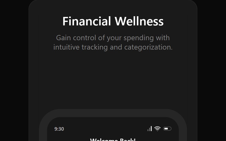 Bento 13Watermelon UI · React
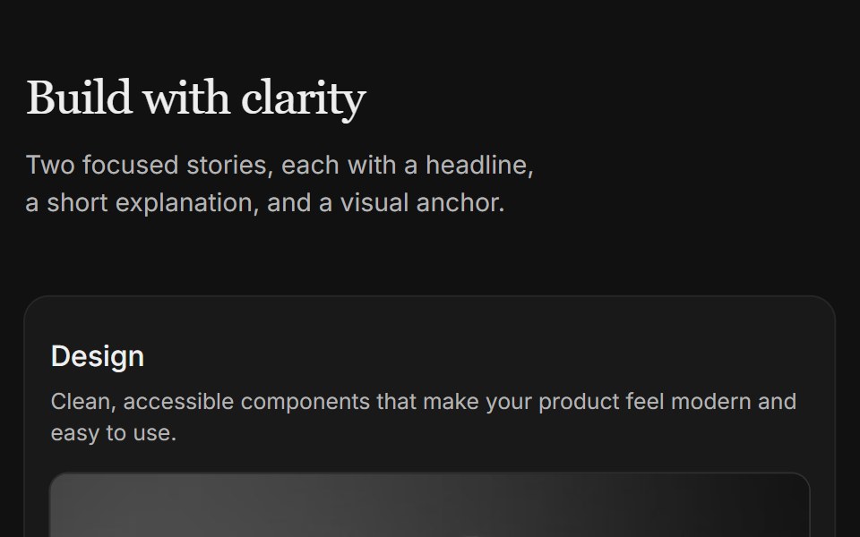 Content 04FLX UI · ReactTwo-column card grid with a serif section header and copy above each image.
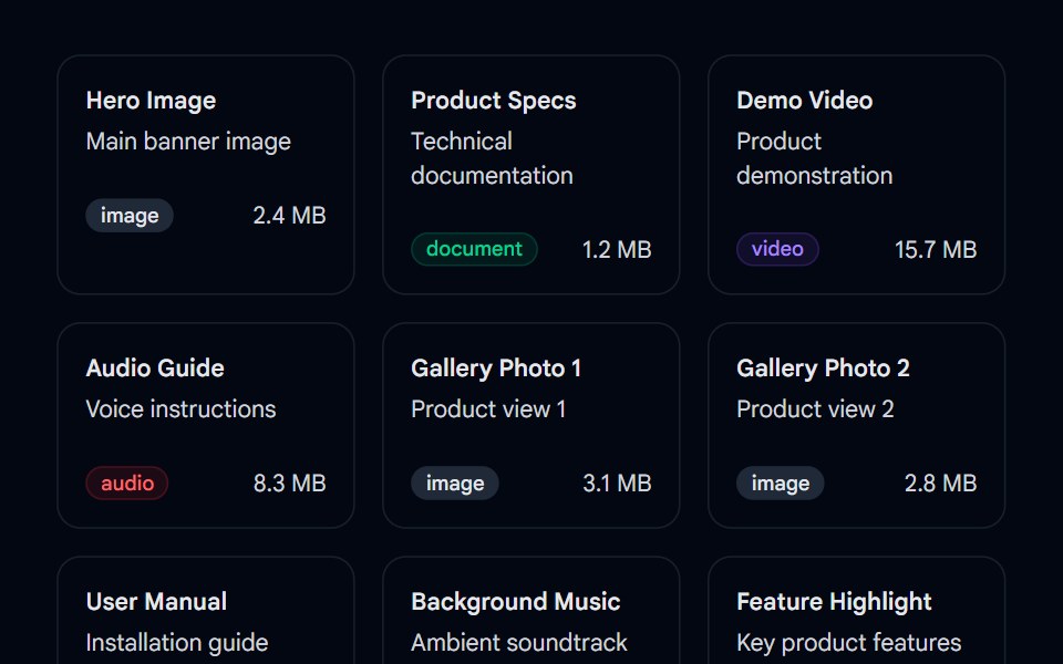 Sortable 02 - Sortable Asset GridShadcn Space · ReactA drag-and-drop sortable asset grid component using @dnd-kit with type badges, file sizes, and smooth reordering…
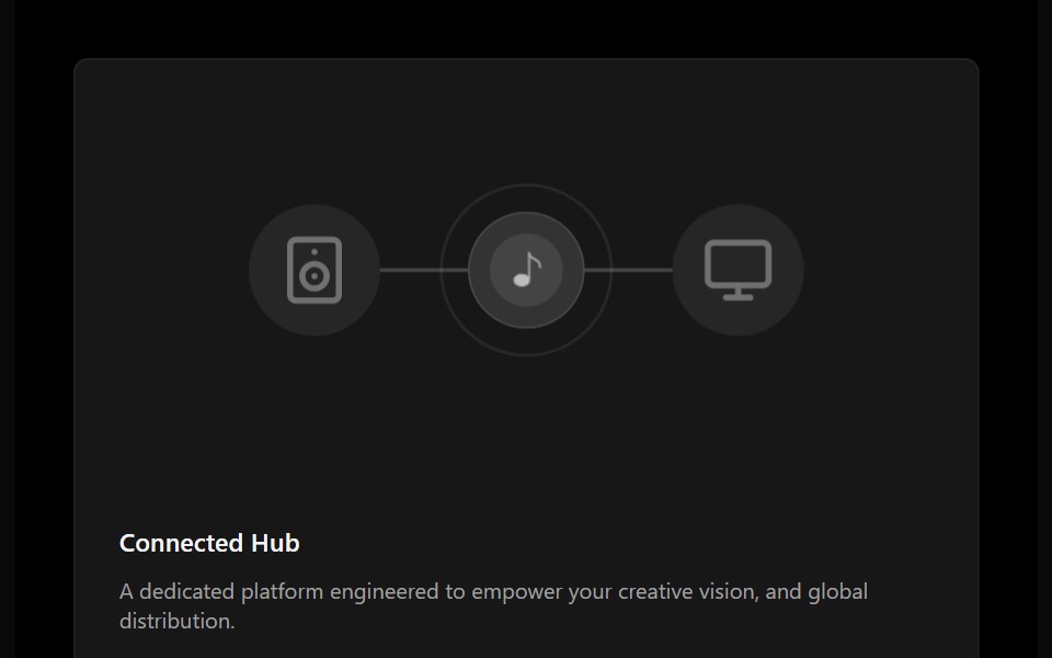 Bento 14Watermelon UI · React
 Content 06FLX UI · ReactTwo-column split with serif headline, supporting copy, optional CTA, and a media panel.
 Team 02 - Modern Team GridShadcn Space · ReactA clean team grid with large profile cards, roles, and social icons, ideal for agencies or SaaS companies to introduce…
 Bento 15Watermelon UI · React
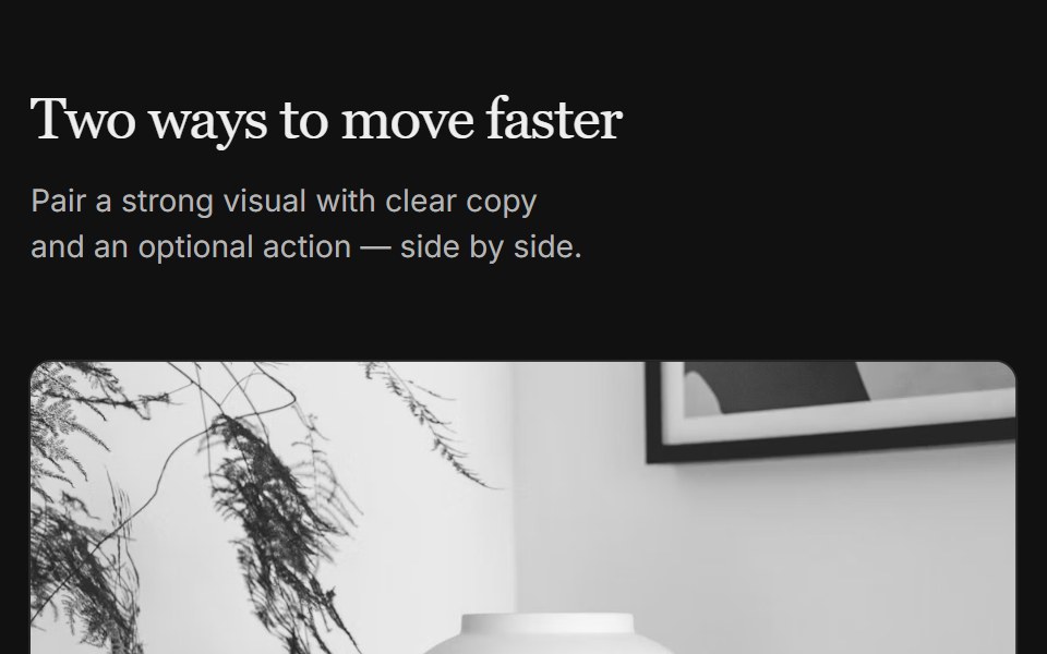 Content 07FLX UI · ReactTwo-column grid with serif header, media on top, copy, and optional CTA per column.
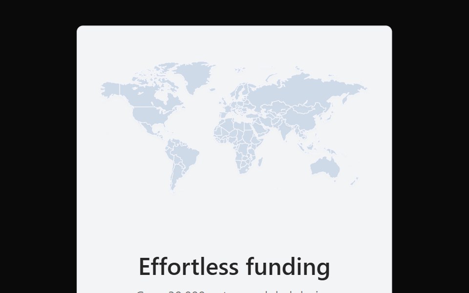 Bento 16Watermelon UI · React
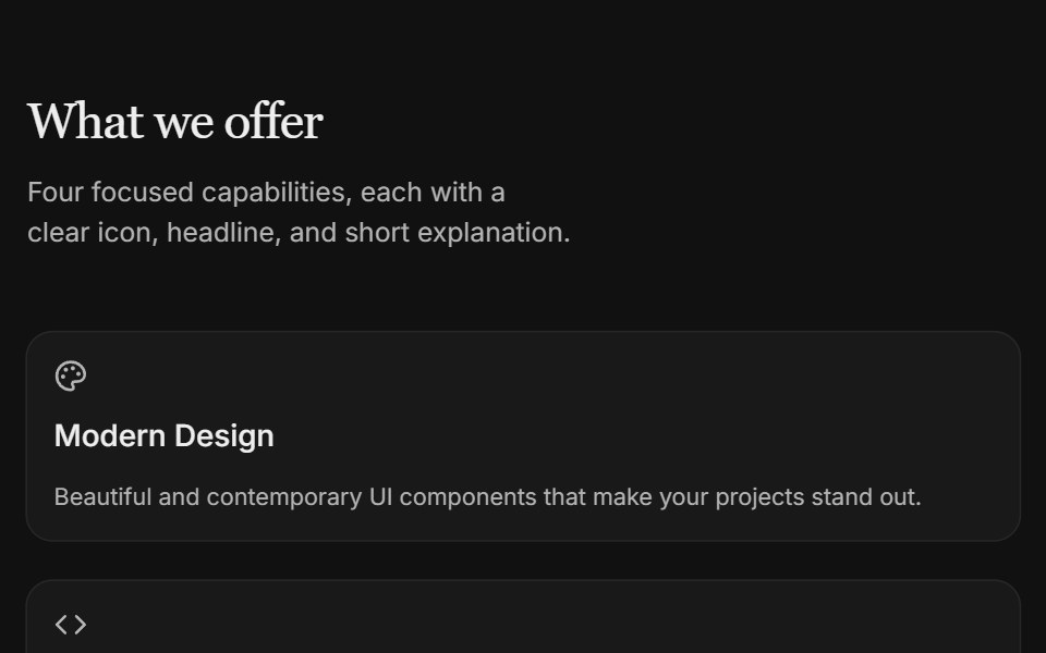 Content 09FLX UI · ReactTwo-column icon card grid with serif section header and subtle entrance motion.
 Bento 17Watermelon UI · React
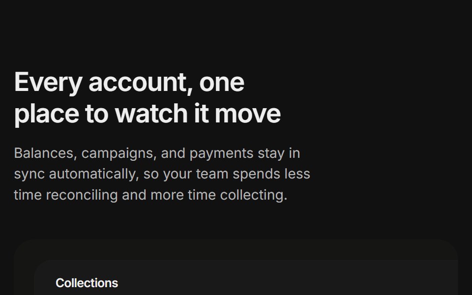 Content 11FLX UI · ReactA billing overview split with a dashboard preview card and two feature highlights, built for the app-shell preset.
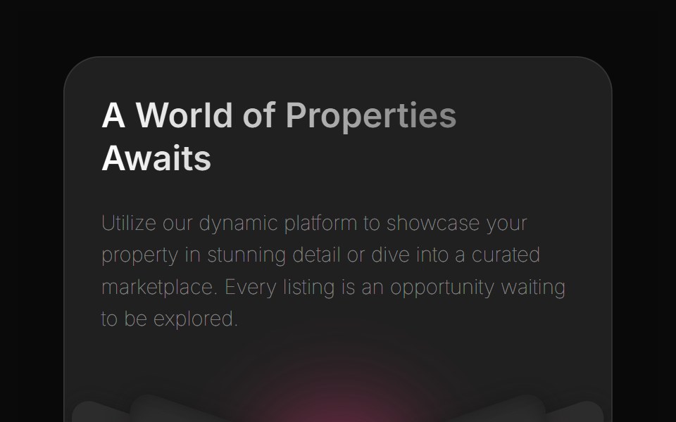 Bento 2Watermelon UI · React
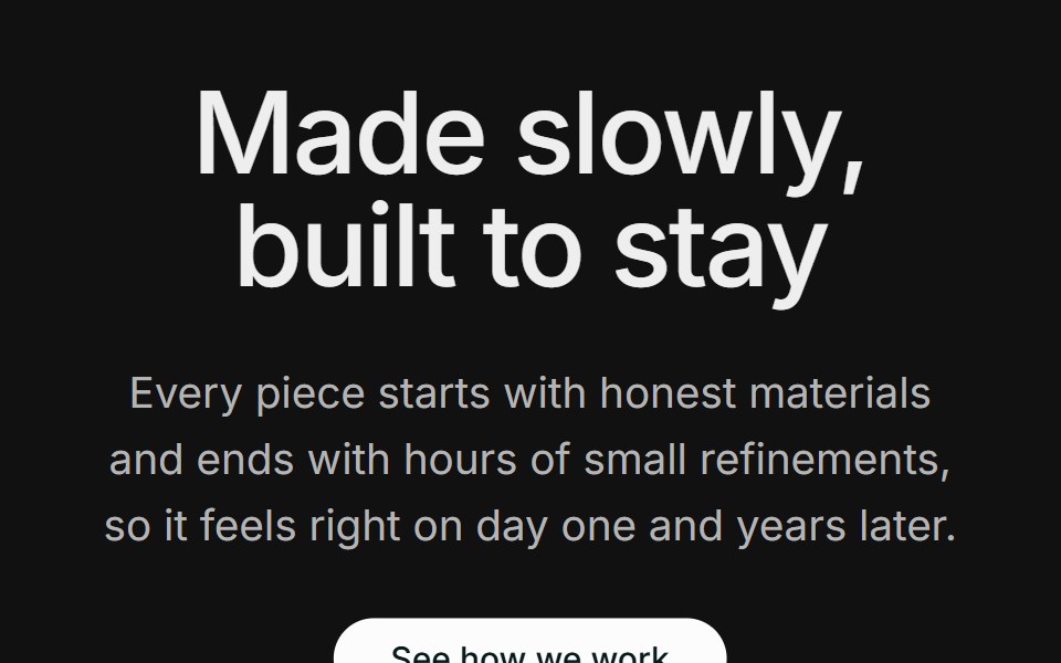 Content 12FLX UI · ReactA centered section header with supporting copy and a CTA, followed by two large side-by-side photos.
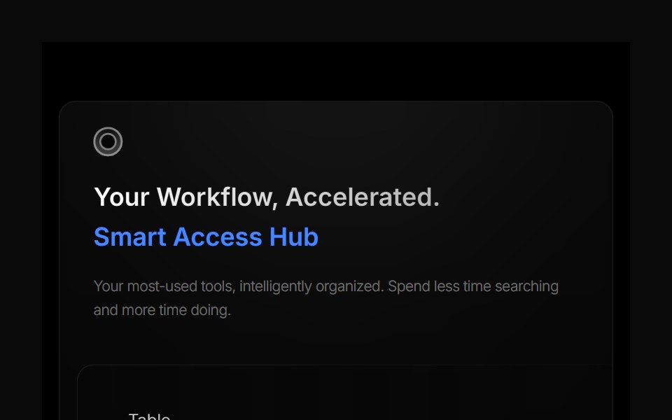 Bento 3Watermelon UI · React
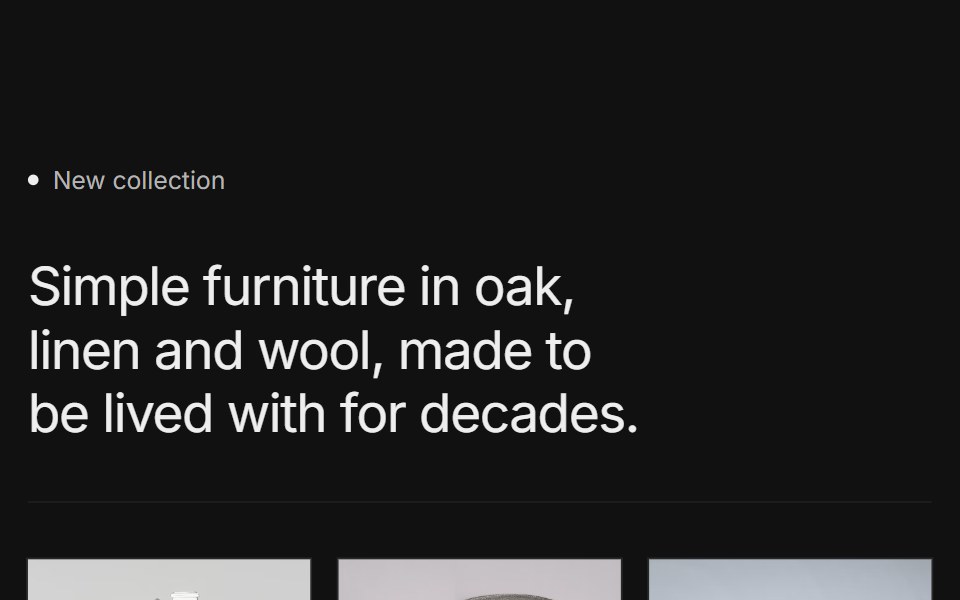 Content 15FLX UI · ReactA labeled collection intro with a short headline, a row of three product photos with names, and a CTA, framed by thin…
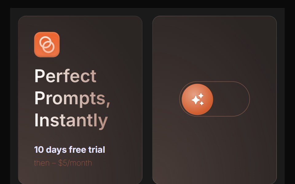 Bento 4Watermelon UI · React
 Bento 5Watermelon UI · React
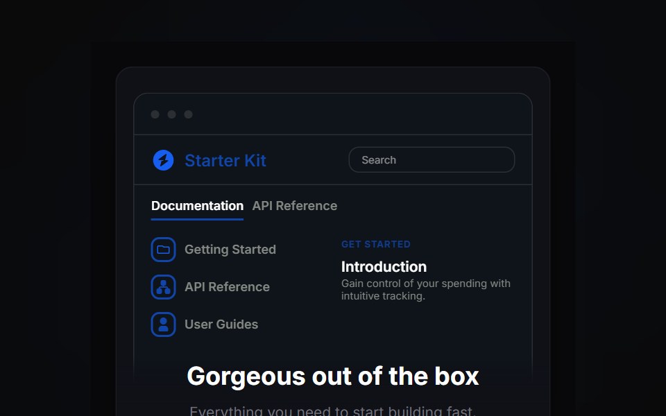 Bento 6Watermelon UI · React
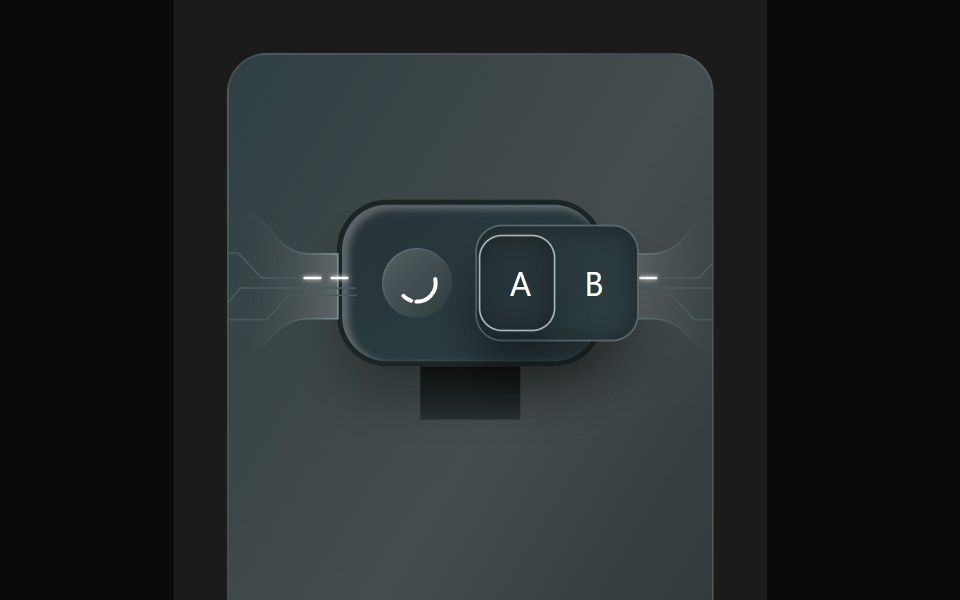 Bento 7Watermelon UI · React
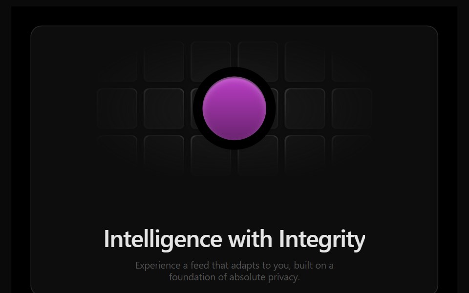 Bento 8Watermelon UI · React
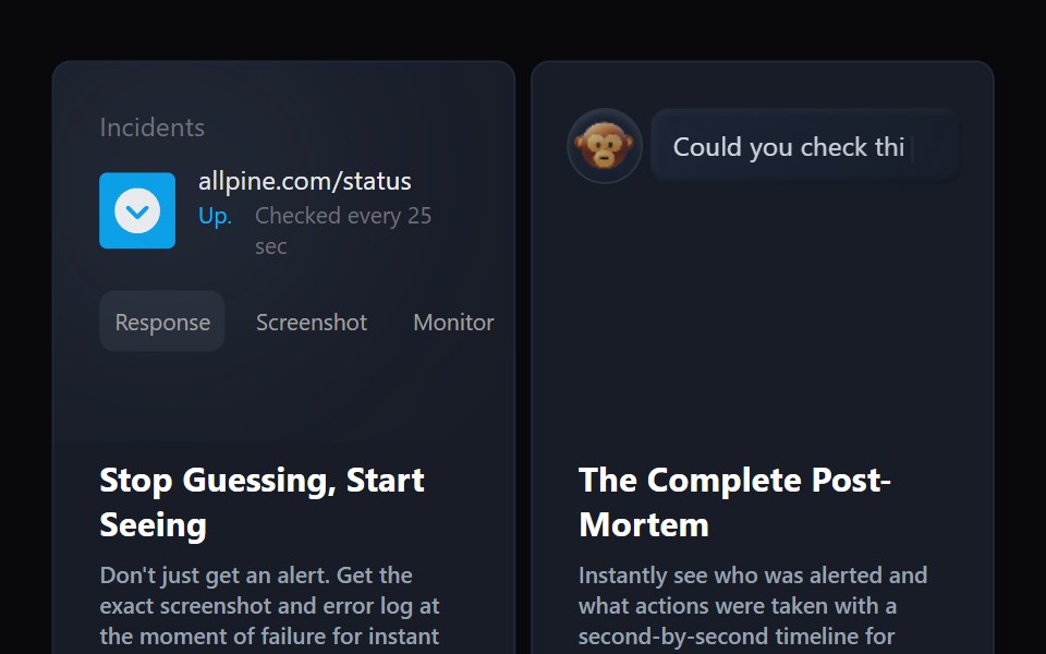 Bento 9Watermelon UI · React