 Dev Design Library
React Grid Components
Dev Design Library indexes 131 React grid components from 33 open-source UI libraries, with the most coming from FLX UI, Watermelon UI, Tremor Blocks, D2Studio UI and Shadcn Space. Each one links to its page with the source code, a live preview where available, the library license and the install command. Every library in this list targets React. Grid components belong to the Layout group.
Showing 120 of 131, a mix from every library. Open a library to see all of its components.
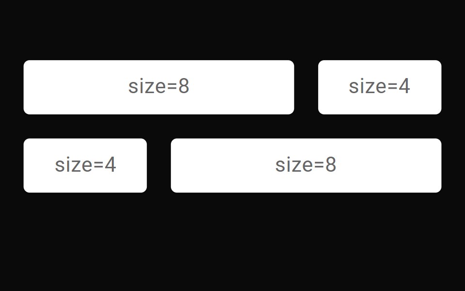 GridMUI / Material UI · React
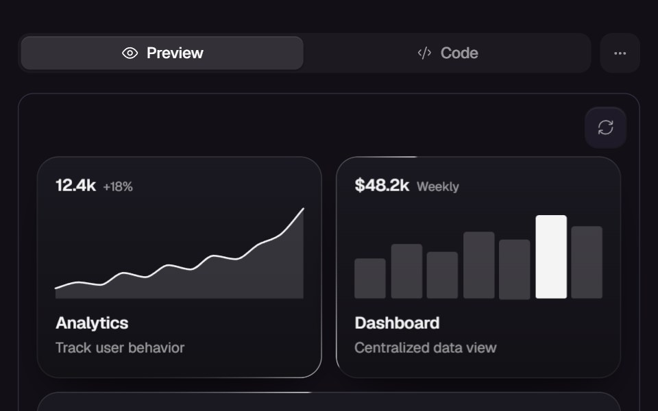 Magic BentoReact Bits · ReactInteractive bento grid tiles expand + animate with various options.
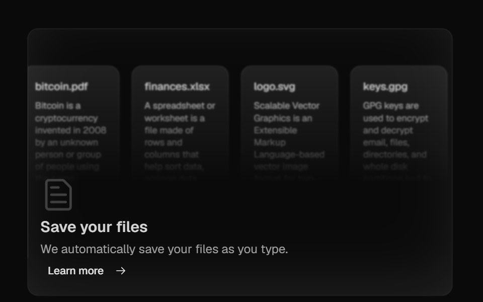 Bento GridMagic UI · ReactBento grid is a layout used to showcase the features of a product in a simple and elegant way.
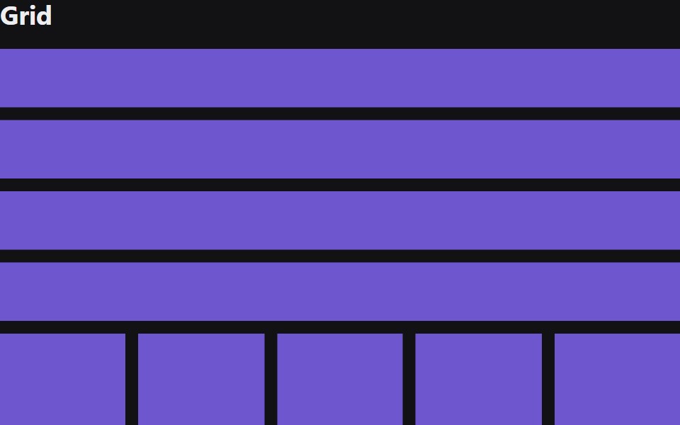 GridRadix Themes · React
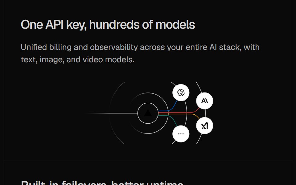 Illustration Card GridCult UI · ReactGrid of cards with gateway illustrations
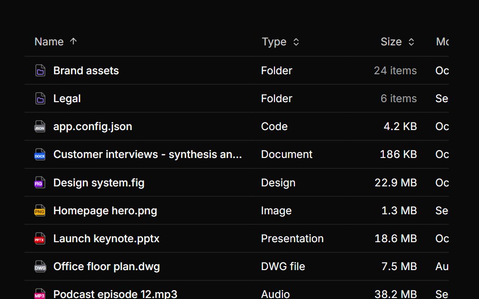 Data grid file browserReUI · ReactMini icons resolved from each file name in the rows of a sortable data grid.
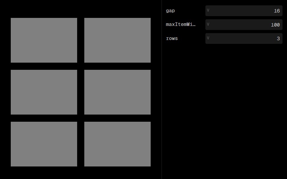 GridLobe UI · ReactGrid is a responsive layout component that arranges child elements in a grid pattern. It automatically adjusts the…
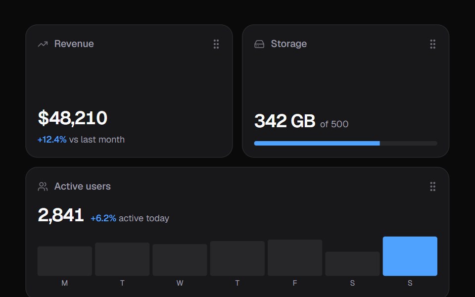 Widget GridKokonut UI · ReactDashboard widgets you lift, drag and resize on a 6-column grid, with spring physics and full keyboard support.
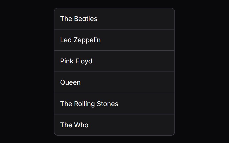 grid-listIntent UI · Reactgrid-list
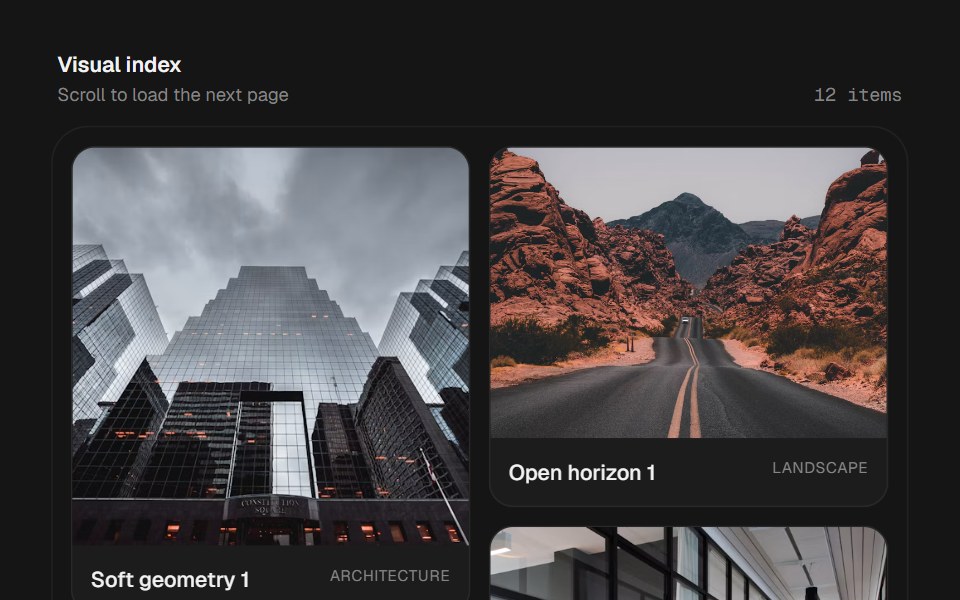 Infinite MasonrybeUI · ReactResponsive virtualized masonry that measures variable-height cards and loads more data as the user nears the end.
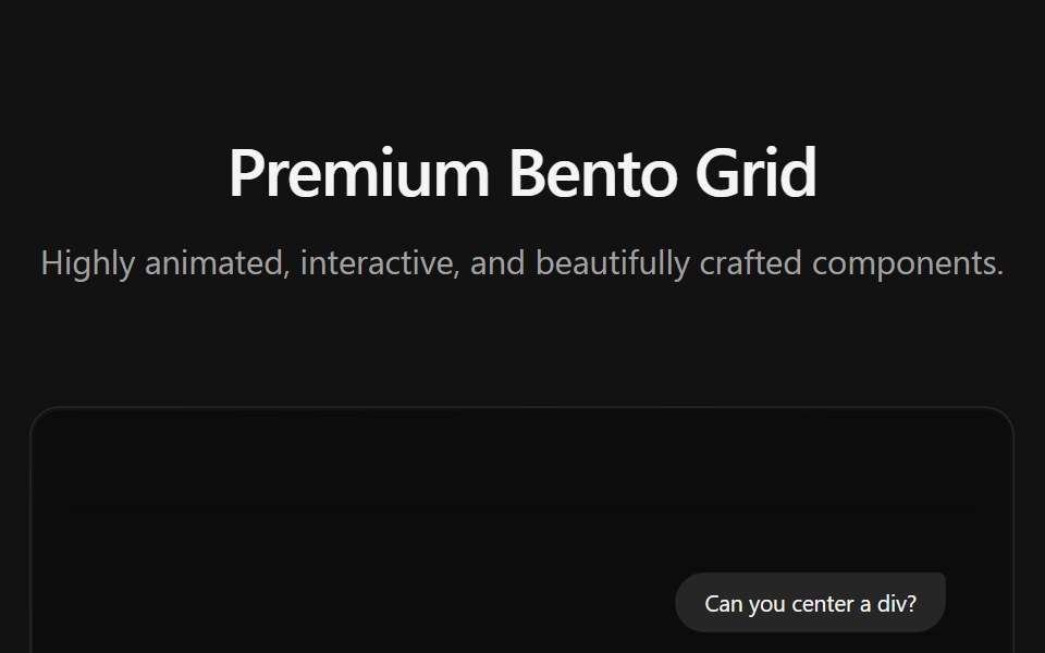 Bento GridSpectrum UI · ReactA premium interactive Bento Grid component
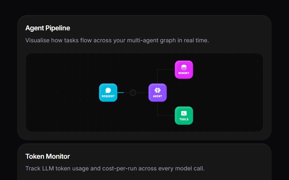 Agent Bento GridVengeance UI · ReactMulti-agent workspace grid layout
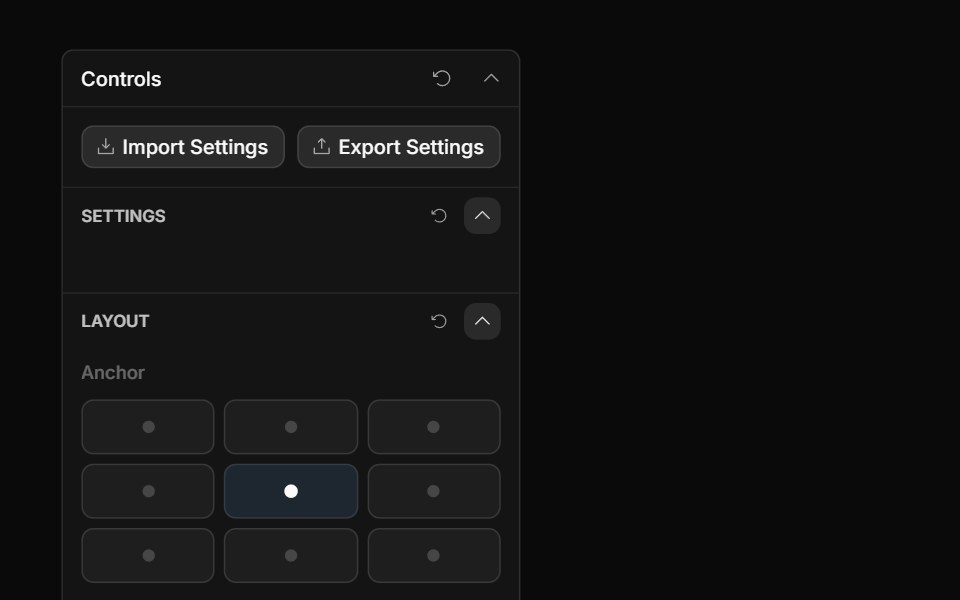 Anchor Grid ControlToolcraft · React
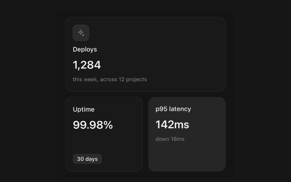 Grid ItemPanel UI · React NativeBento tiles, and the grid that places them.
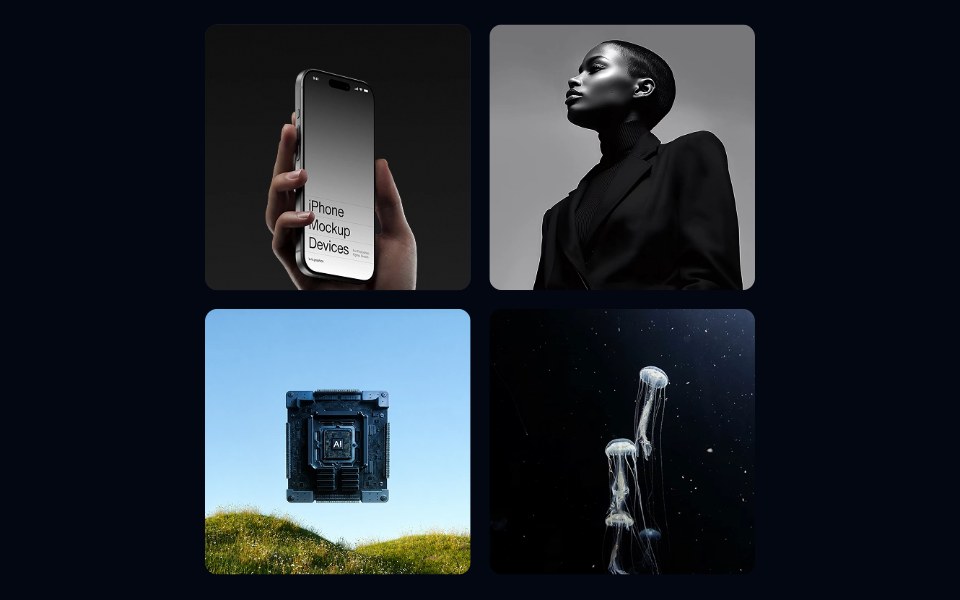 Aspect Ratio 02 - Square GridShadcn Space · ReactA responsive photo gallery grid using square aspect ratio tiles with a hover zoom effect.
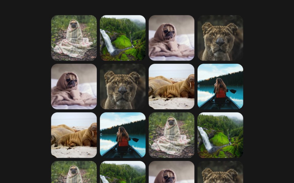 Photo Magnet GridPixel Perfect · ReactA tidy grid of photos that scatters away from the cursor like same-pole magnets, each tile leaning away in 3D as it…
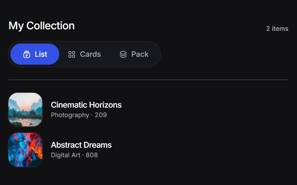 Animated Collectionuselayouts · ReactA collection of items with smooth layout transitions and animations.
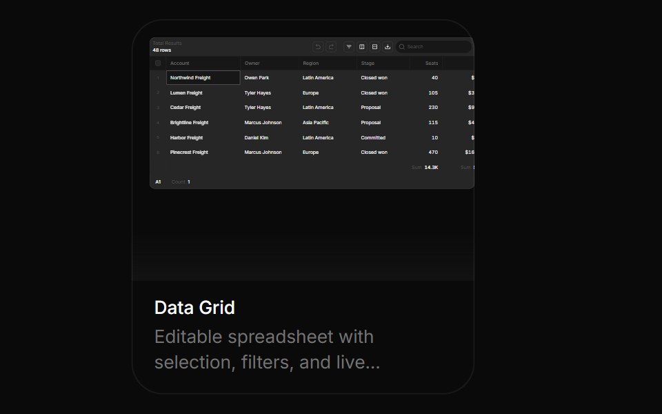 Data GridBoardUI · React
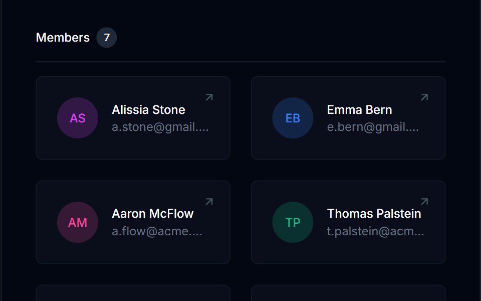 Grid List 01Tremor Blocks · React
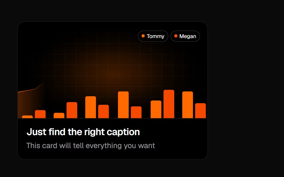 Animated Card 1Badtz UI · React
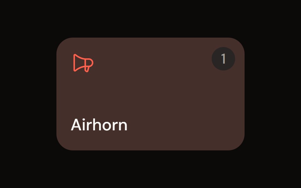 Sound Padaudiocn · ReactA trigger pad with one-shot, toggle, hold and loop modes, a hotkey, playback progress and an accent colour, plus a…
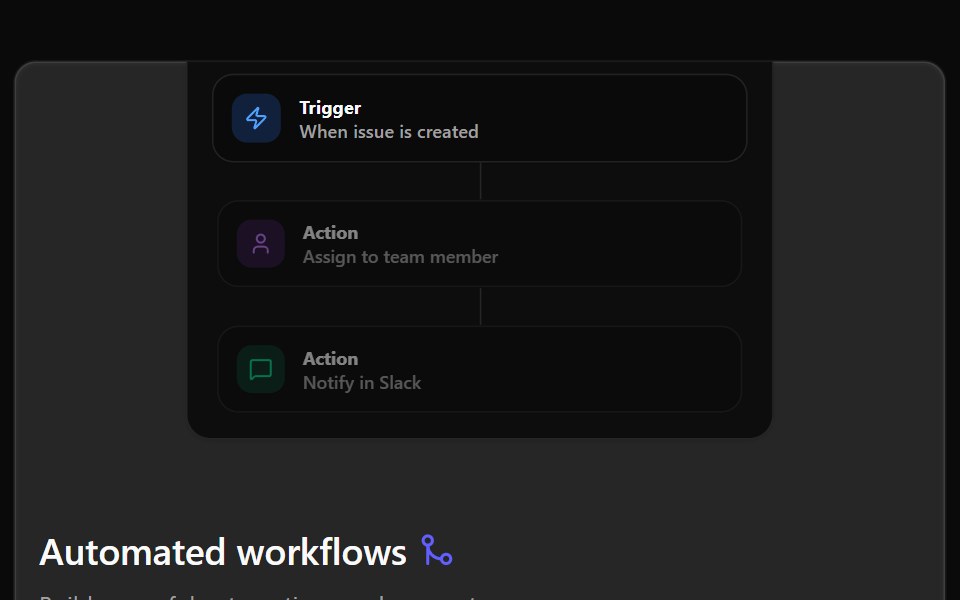 Bento 01Watermelon UI · React
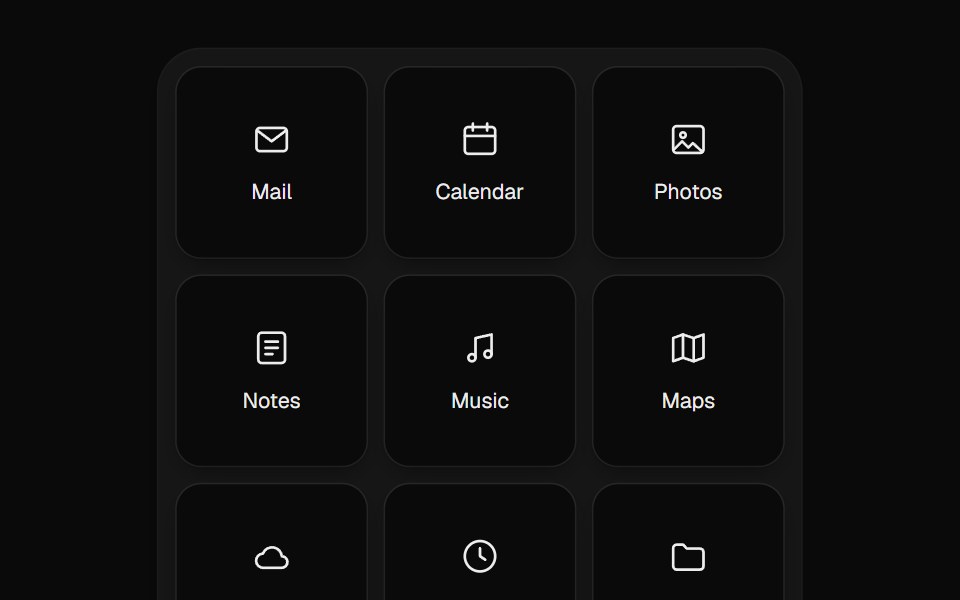 Sortable GridUI Lab · ReactDrag an app tile and the others slide out of its way.
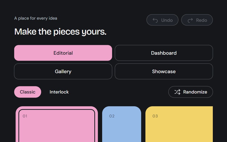 Bento BuilderCojeev UI · ReactAn editable Bento canvas with complete partitions, content swapping, snapped neighbor resizing, history and usable…
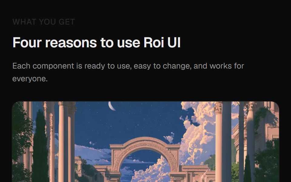 Card Image SectionROI UI · ReactA section with 4 image cards in a masonry layout.
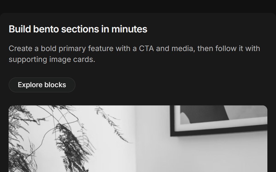 Bento grids 01FLX UI · ReactThree-column bento: primary tile (two-thirds) with title, description, CTA and media, plus supporting image cards.
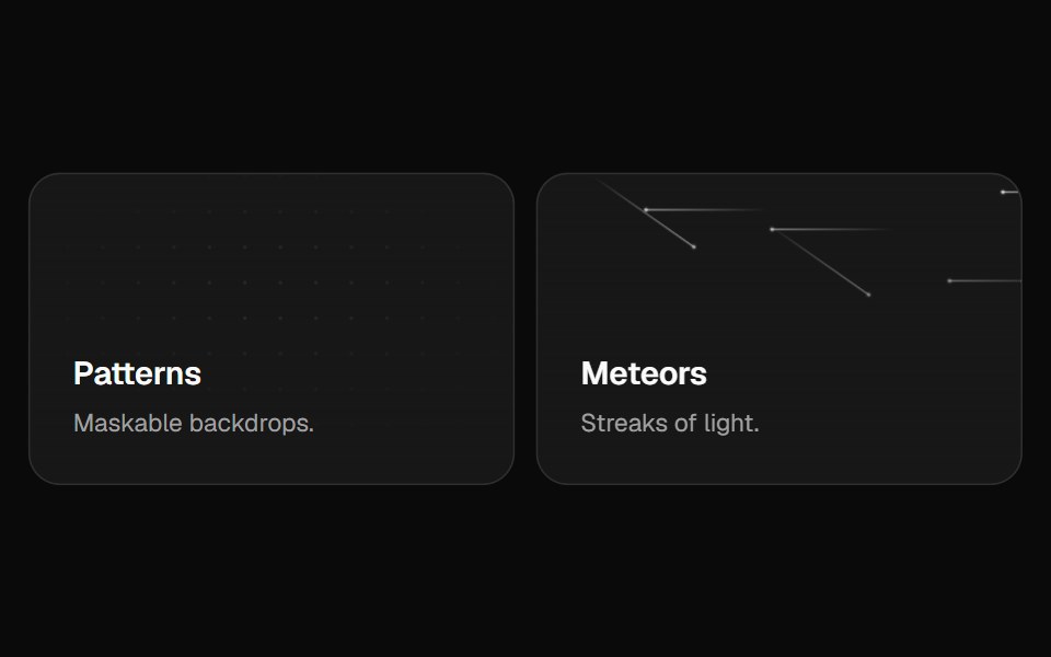 Bento GridVelora UI · ReactFeature bento with hover-reveal CTAs and rich backgrounds.
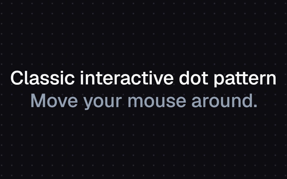 Magnetic Dot GridAtelier UI · React
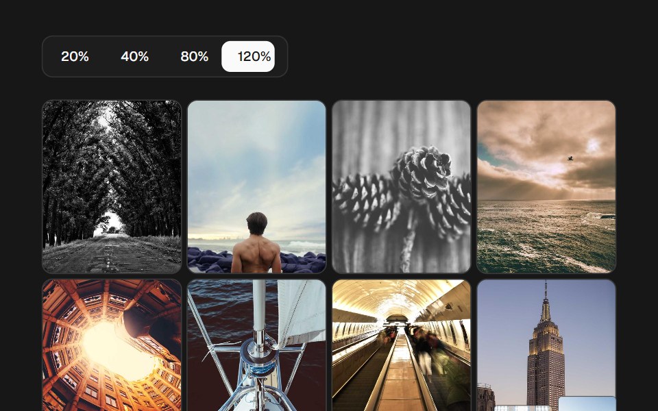 Image Density GridSkecher UI · ReactA percentage-controlled image grid with animated density changes, soft focus, and optional controls.
 Fisheye Chromatic Card GridCue Foundations · React
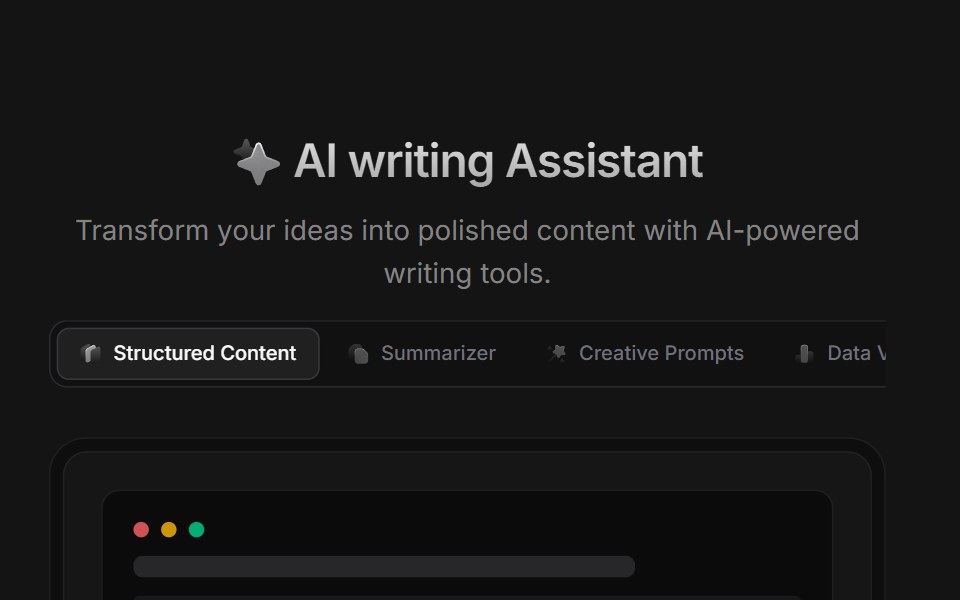 AI BlockD2Studio UI · ReactAI prompt template grid with creative prompts, summarizer, story, poetry and study presets.
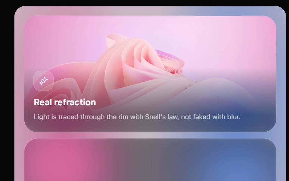 Glass Bento GridOpaline · ReactFeature tiles on glass in a bento layout, with a pointer light and a call to action that slides in.
 Features Section Demo 1Aceternity UI · ReactSimple with card gradient
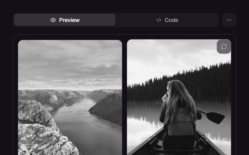 MasonryReact Bits · ReactResponsive masonry layout with animated reflow + gaps optimization.
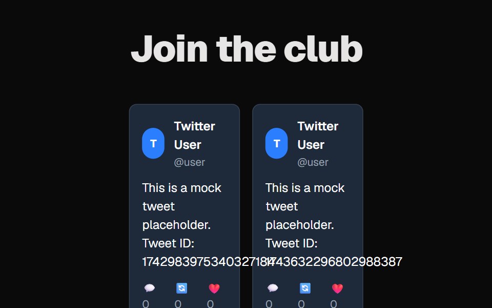 Tweet GridCult UI · ReactGrid layout component for displaying tweet-like content cards
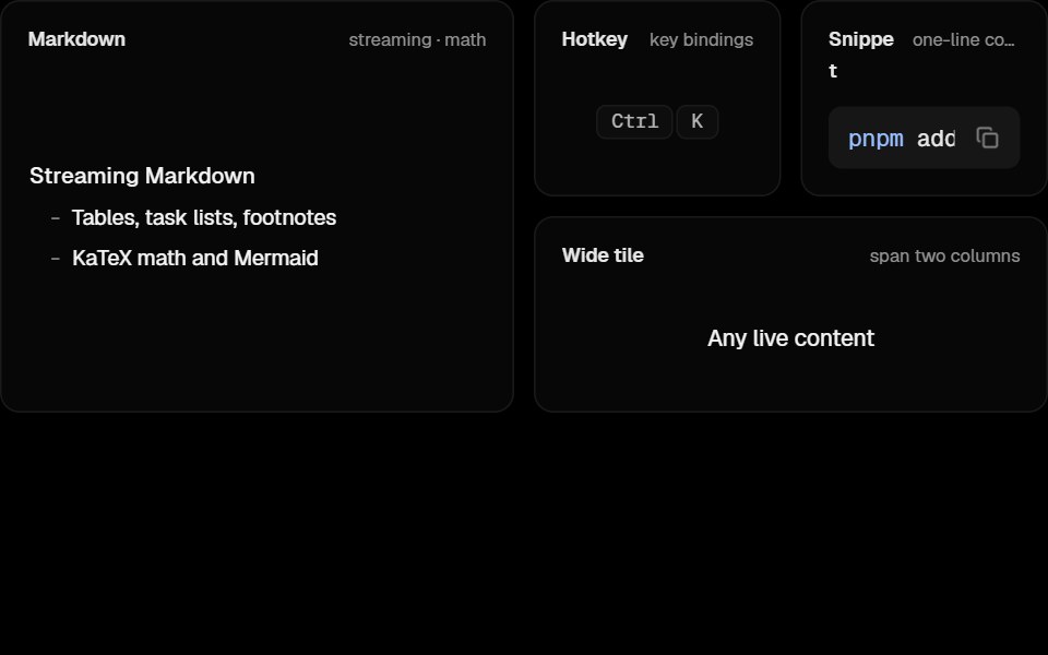 Awesome Bento GridLobe UI · React
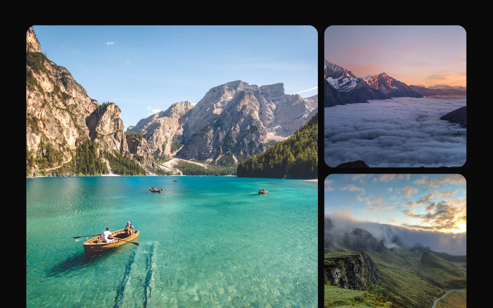 Lightbox GridKokonut UI · ReactA photo grid whose thumbnails grow into a full view and fly back to their slot when you drag them down.
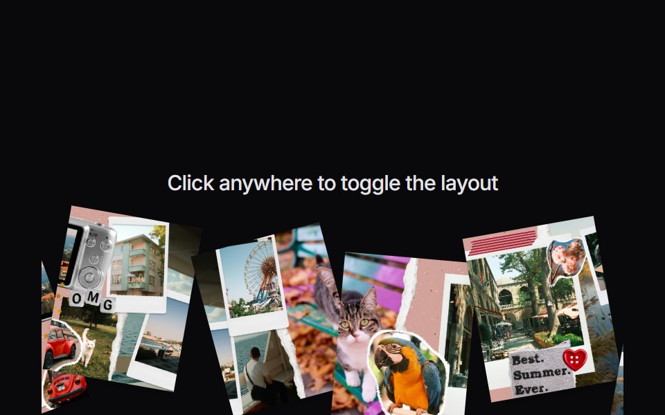 Image CollageVengeance UI · ReactInteractive scattered image collage toggle
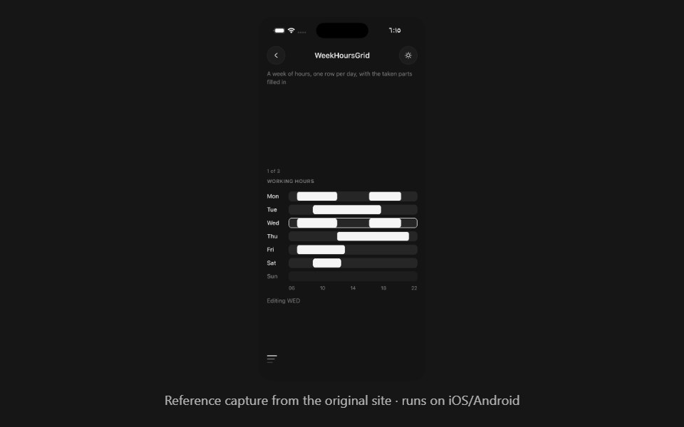 Week Hours GridPanel UI · React NativeA week of hours, one row per day, with the taken parts filled in.
 Blog 01 - Latest Blog & News GridShadcn Space · ReactA modern blog section with featured posts, large thumbnails, publish dates, and headlines, ideal for sharing agency…
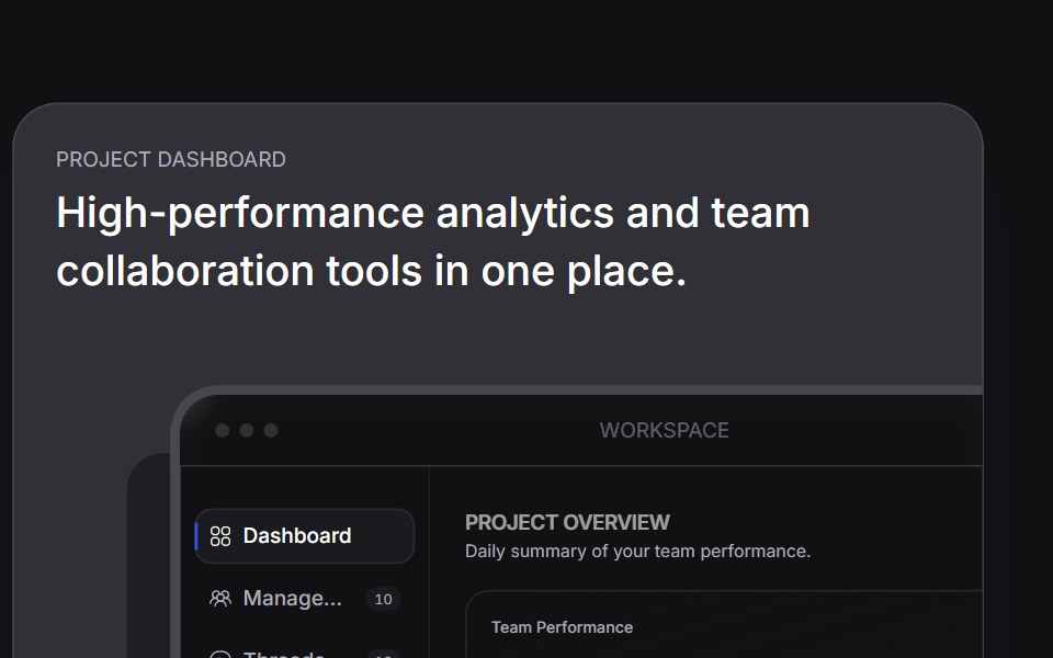 Bento Carduselayouts · ReactAn interactive bento card with animated tabs and workspace preview.
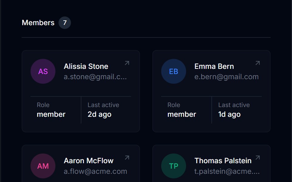 Grid List 02Tremor Blocks · React
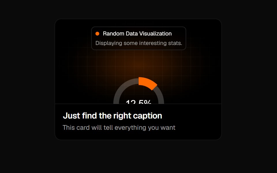 Animated Card 2Badtz UI · React
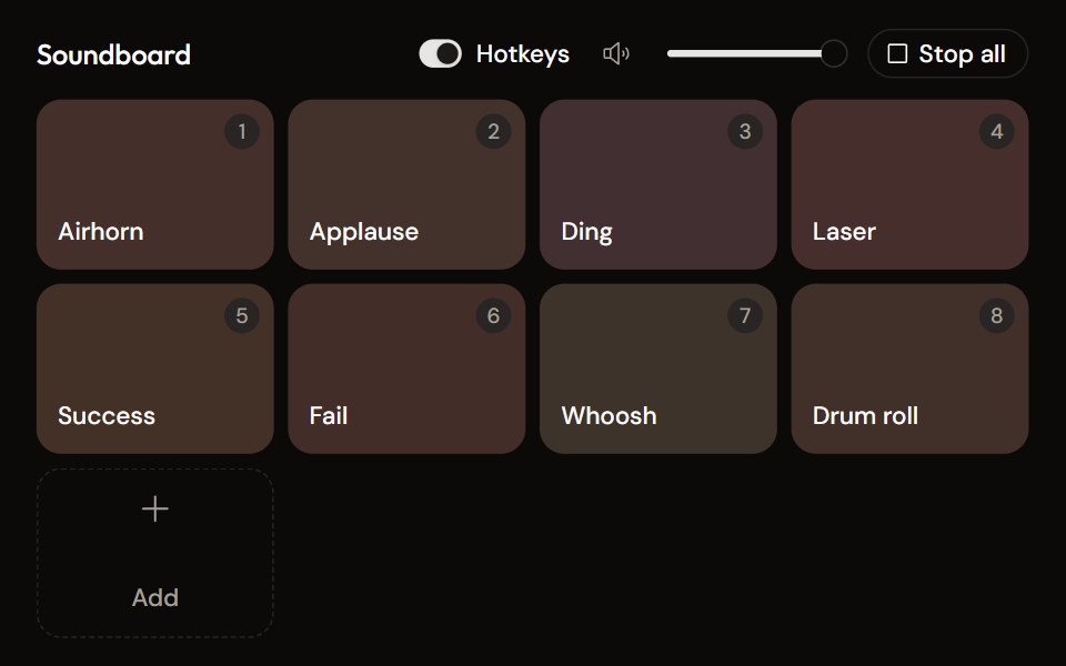 Soundboardaudiocn · ReactA grid of sound pads with global hotkeys, per-pad mode and volume in a context menu, master volume, stop all, and…
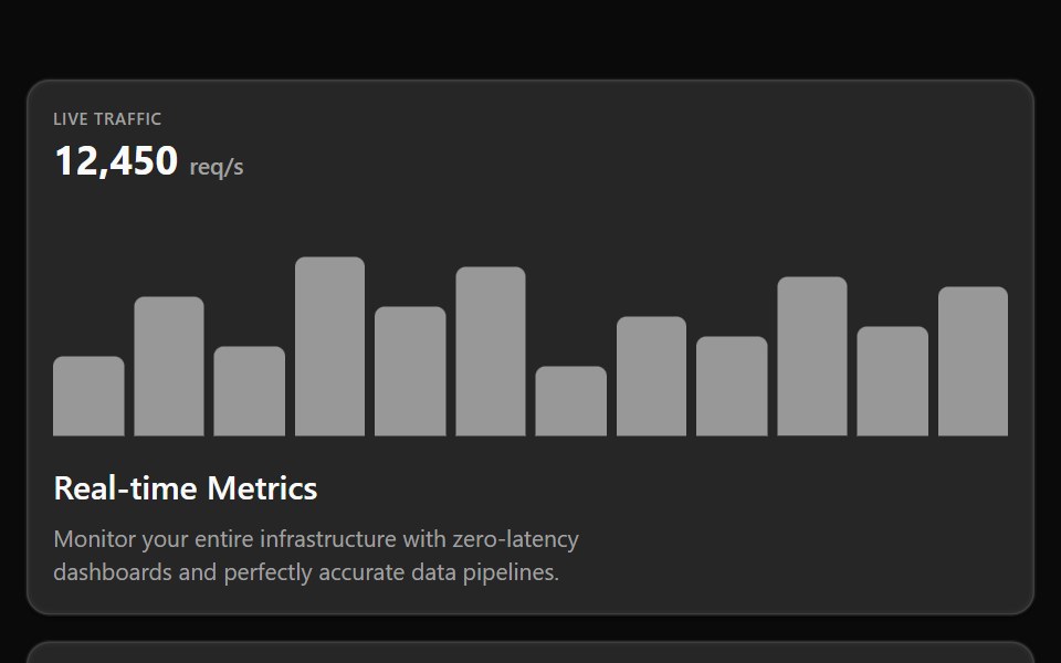 Bento 02Watermelon UI · React
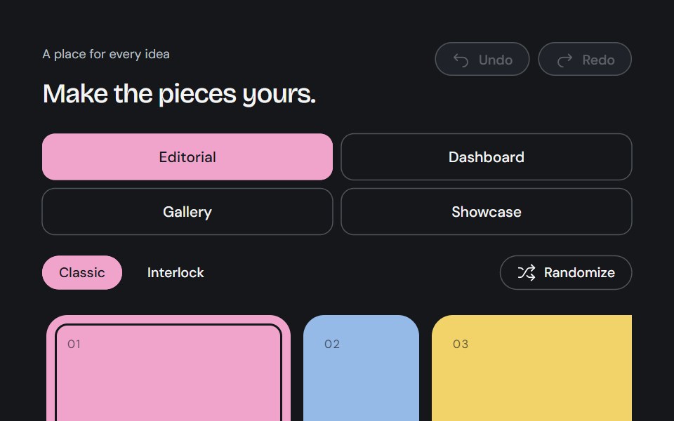 Bento GridCojeev UI · ReactA complete canvas of rounded cards or organically interlocking pieces. Compose a layout, then install just the…
 Bento grids 02FLX UI · ReactA row of collection cards, one twice as wide, each with a product photo bleeding off the top, a title, a short…
 Bento feature gridVelora UI · ReactFive-card bento grid with live visuals: integration beams, orbiting icons, a chart, a tag marquee and a globe.
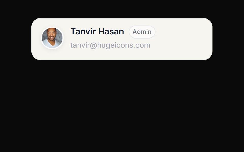 Grid Row Profile ExpanderCue Foundations · React
 Bento 01D2Studio UI · ReactBento grid for an education program platform with admin overview, faculty view and a program form.
 Features Section Demo 2Aceternity UI · ReactSimple with hover effects
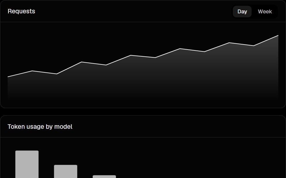 Dashboard Chart GridLobe UI · React
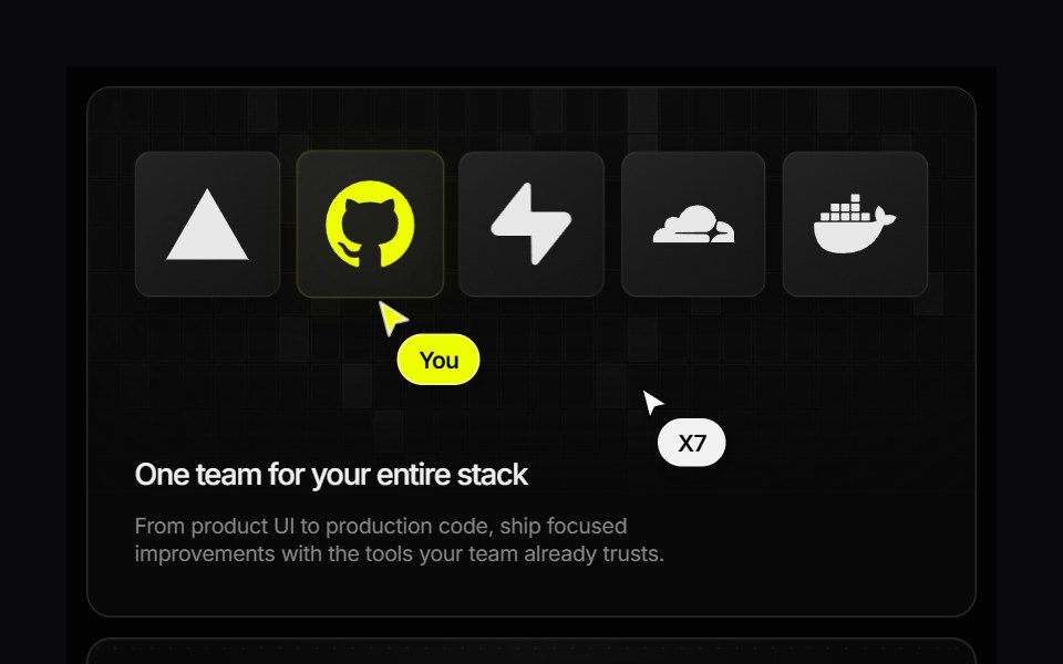 Research Bento GridVengeance UI · ReactAnimated developer-service showcase with interactive pricing and pause states
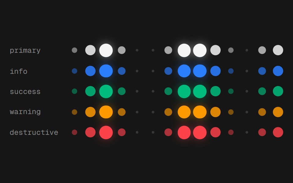 Web Day GridPanel UI · React Native
 Portfolio 01 - Clean Portfolio GridShadcn Space · ReactA modern portfolio section displaying featured projects with tags, visuals, and categories, ideal for agencies or…
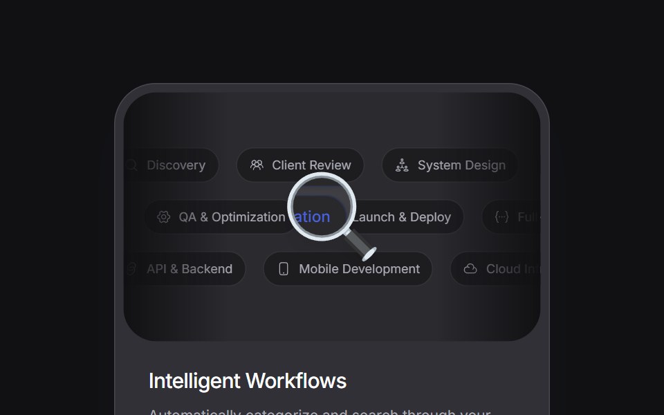 Magnified Bentouselayouts · ReactA bento card component with a draggable magnifying lens effect over scrolling chips.
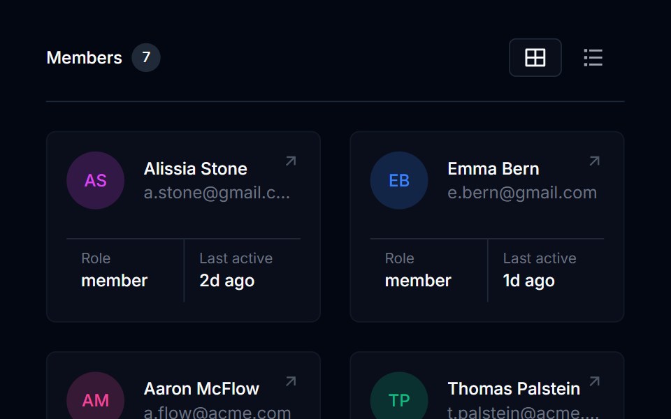 Grid List 03Tremor Blocks · React
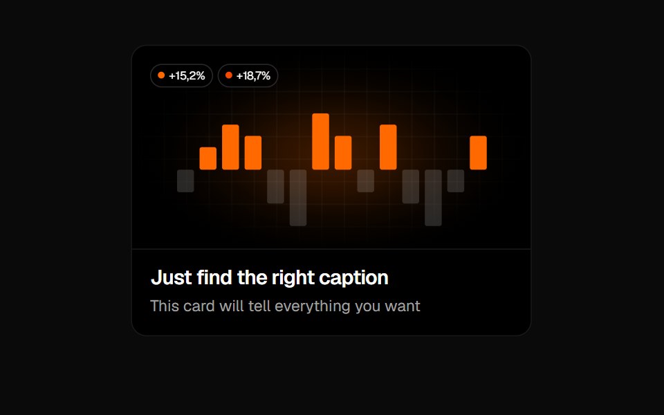 Animated Card 3Badtz UI · React
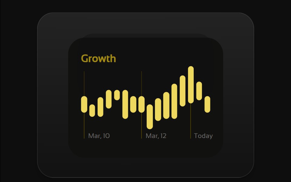 Bento 1Watermelon UI · React
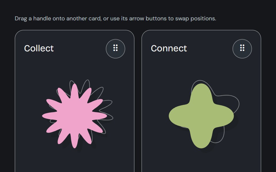 SwapyCojeev UI · ReactCards swap positions through a drag handle or keyboard controls and retain their order in React state.
 Bento grids 03FLX UI · ReactA product grid with a tall featured item in the center, four smaller items around it, category badges, prices and names.
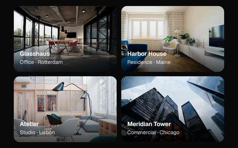 Layout GridVelora UI · ReactBento grid of image tiles that expand in place to reveal rich content.
 Stacker Style Bento GridCue Foundations · React
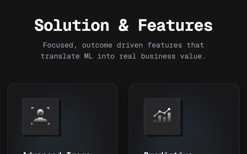 Bento 02D2Studio UI · ReactA five-card feature bento with metallic-gradient glyphs on lifting icon tiles, a dot-matrix texture and color-dodged…
 Bento GridAceternity UI · React
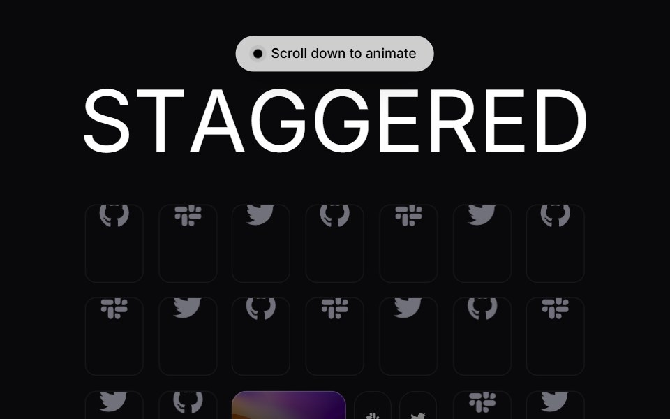 Staggered GridVengeance UI · ReactOffset card grid composition
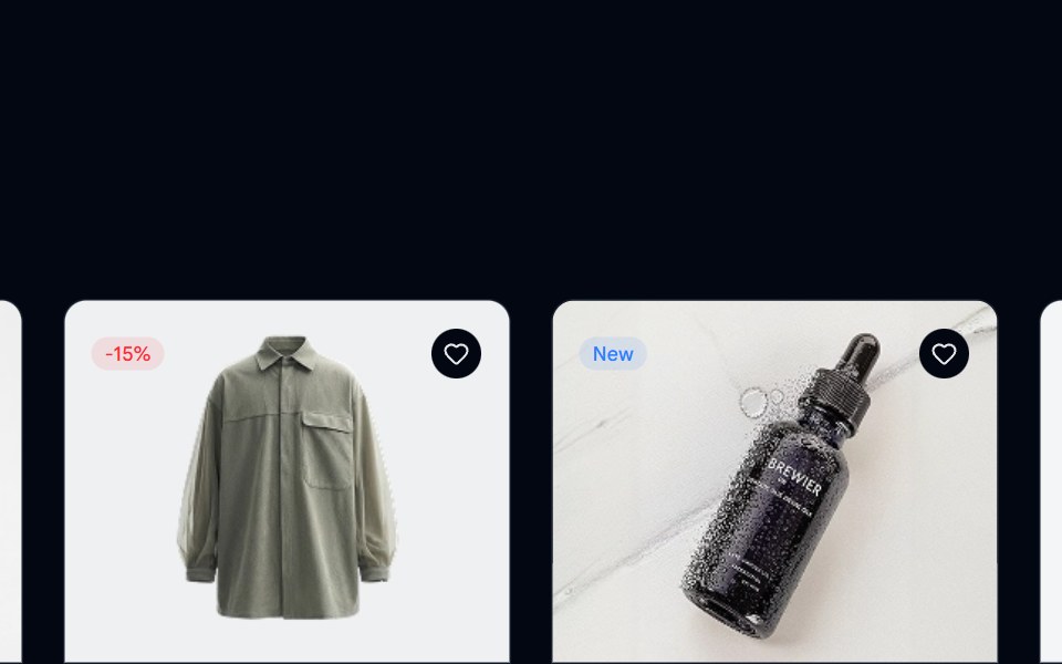 Product Listing 01 - Multi Column GridShadcn Space · ReactA multi-column layout featuring product cards with images, reviews, and pricing details, helping users scan, compare…
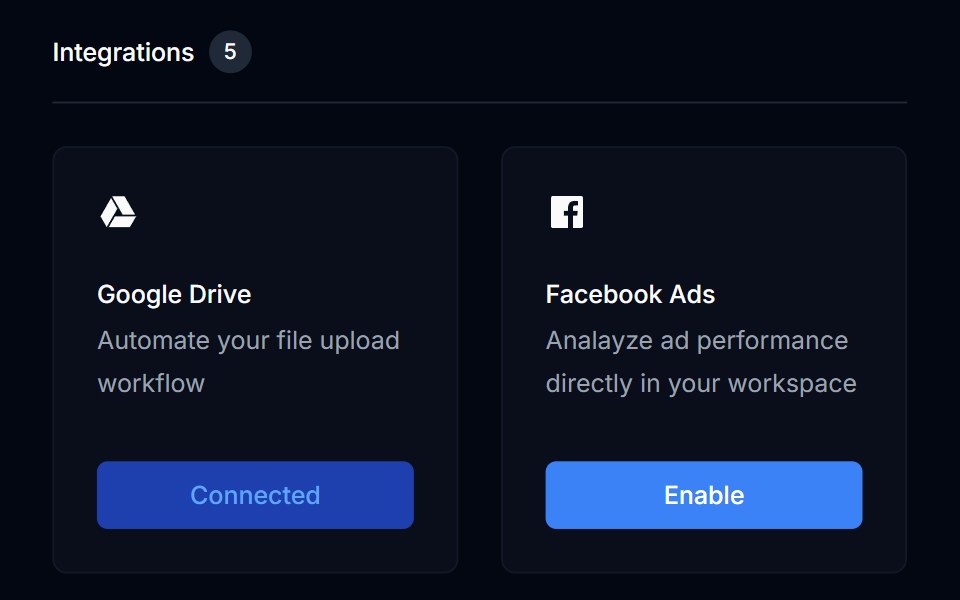 Grid List 04Tremor Blocks · React
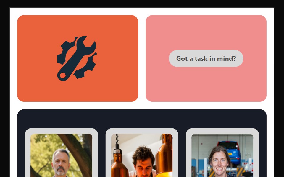 Bento 10Watermelon UI · React
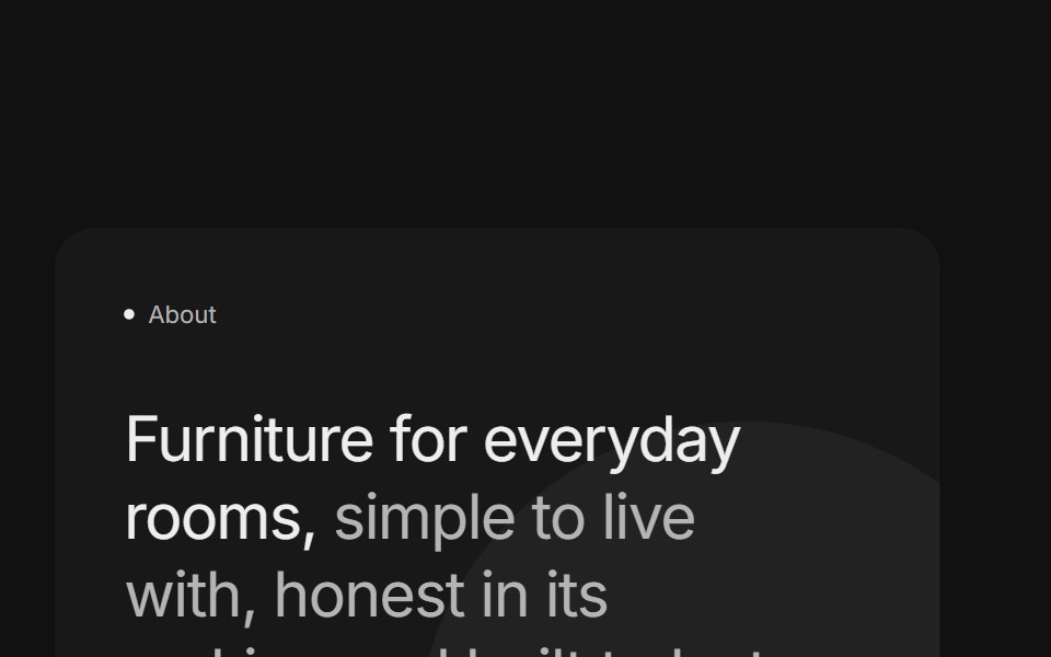 Bento grids 04FLX UI · ReactTwo stacked cards with a two-tone title, a paragraph and a pill button beside a product photo surrounded by short…
 Parallax GridVelora UI · ReactGallery columns drifting at different rates for depth.
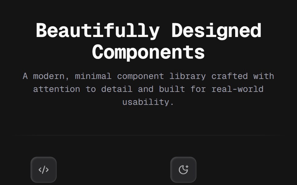 Bento 03D2Studio UI · ReactA flat 3×2 feature grid on thin edge-masked rules — no cards, no fills. Each cell pairs a recessed keycap icon tile…
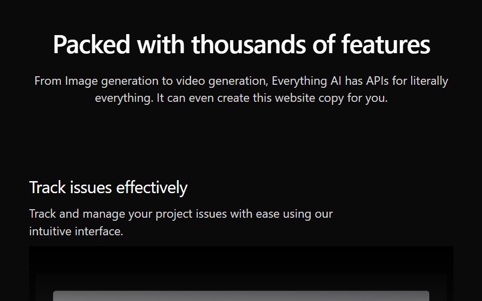 Features Section Demo 3Aceternity UI · React
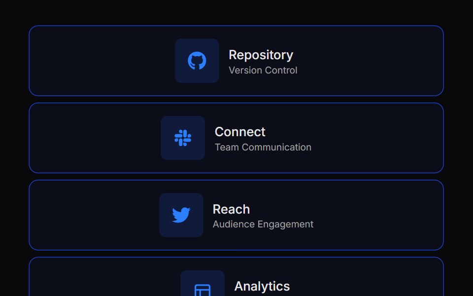 Expandable Bento GridVengeance UI · React
 Skeleton 04 - Product Card GridShadcn Space · ReactResponsive product grid skeleton with square image, title, subtitle, price, and add to cart button placeholders.
 Grid List 05Tremor Blocks · React
 Bento 11Watermelon UI · React
 Bento grids 05FLX UI · ReactA mosaic of rounded tiles that mixes photos with two short text tiles, one with a detail photo at its base and one…
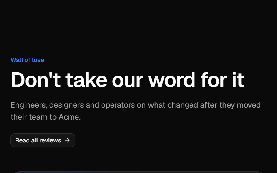 Testimonial gridVelora UI · ReactMasonry wall of social posts and quote cards, led by a wide case-study quote with a headline metric.
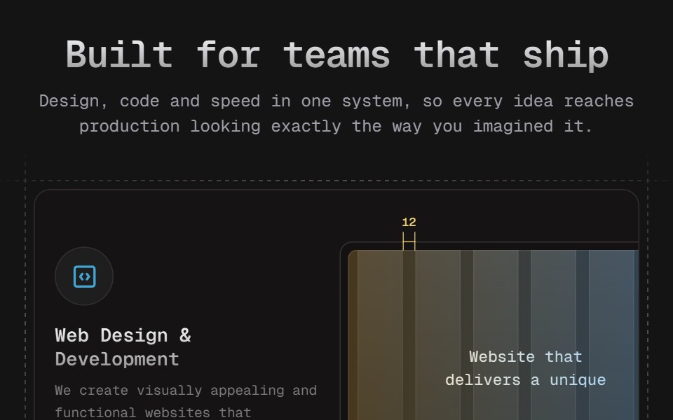 Bento 04D2Studio UI · ReactA four-card services bento on marching dashed blueprint frames. Hover blooms each card's icon from blue to the D2…
 Layout GridAceternity UI · React
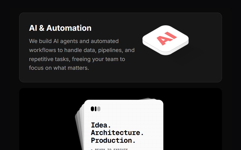 Why Us BentoVengeance UI · React
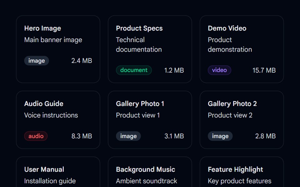 Sortable 02 - Sortable Asset GridShadcn Space · ReactA drag-and-drop sortable asset grid component using @dnd-kit with type badges, file sizes, and smooth reordering…
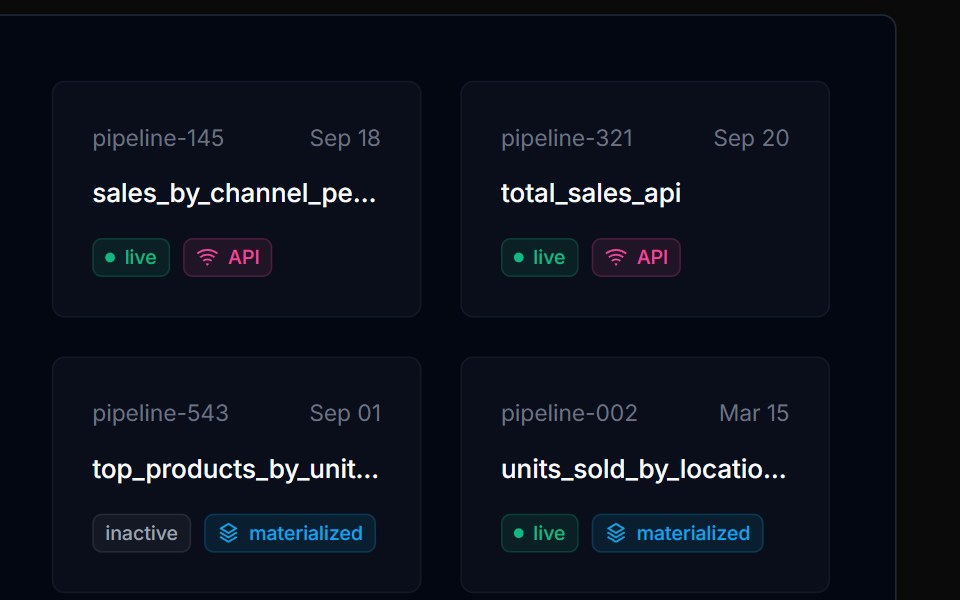 Grid List 06Tremor Blocks · React
 Bento 12Watermelon UI · React
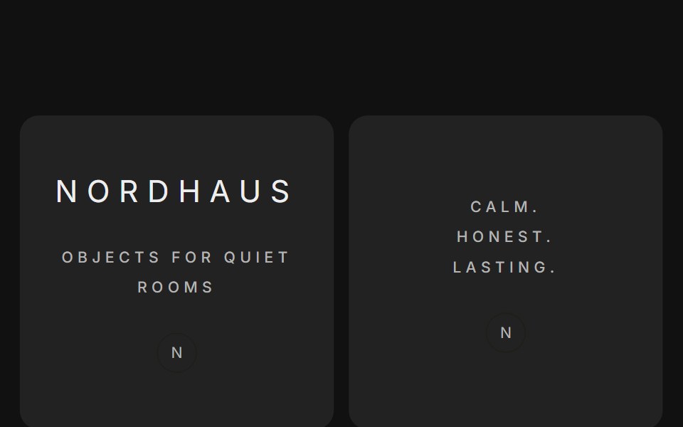 Bento grids 06FLX UI · ReactA brand mosaic of square tiles around one large central photo, mixing photographs with spaced-out taglines and a small…
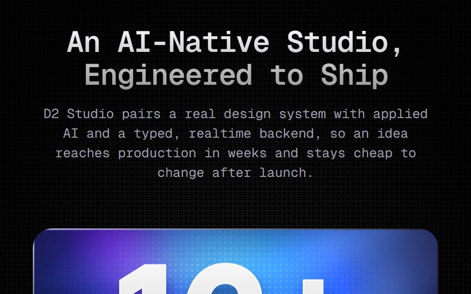 Bento 05D2Studio UI · ReactA four-card studio bento on a masked dot field. Each card is a Figma gradient export carrying its own glass fill and…
 Parallax ScrollAceternity UI · React
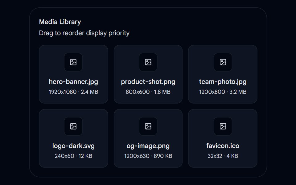 Sortable 04 - Sortable Media Library GridShadcn Space · ReactA drag-and-drop sortable media library component using @dnd-kit for reordering image assets by display priority within…
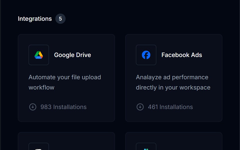 Grid List 07Tremor Blocks · React
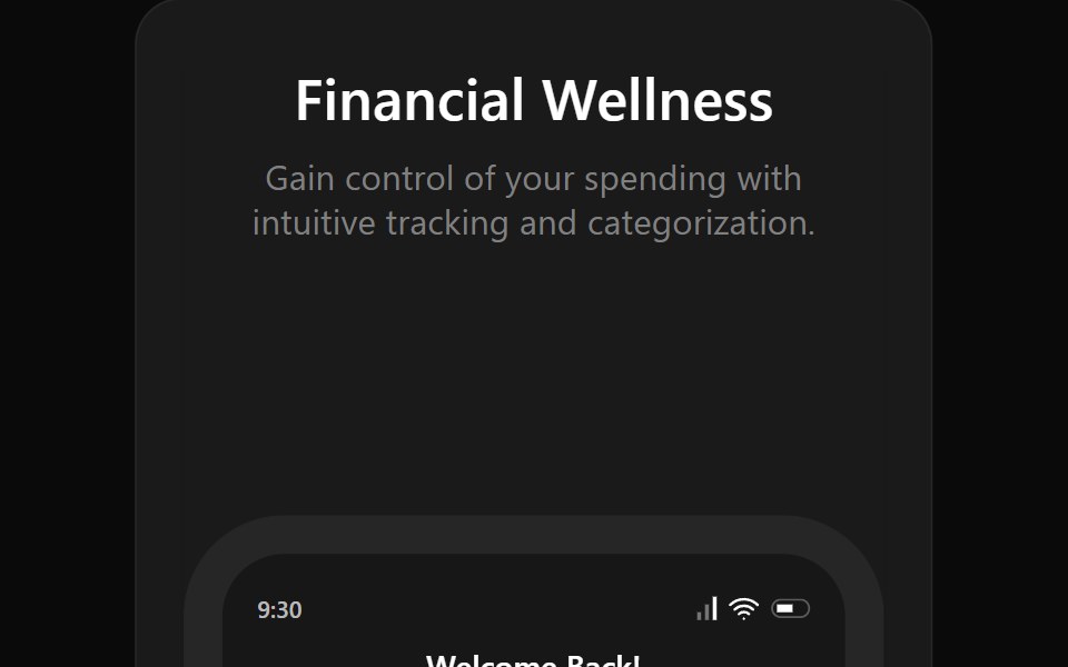 Bento 13Watermelon UI · React
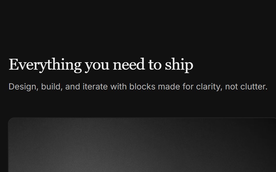 Content 02FLX UI · ReactA grid of media cards with a section header and item details below each image.
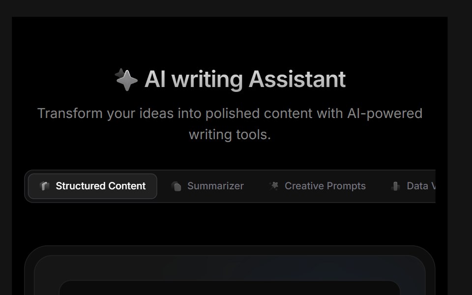 Block 01D2Studio UI · ReactAI feature showcase with smart summarizer, creative prompts, document analysis and engagement metrics cards.
 Parallax Scroll 2Aceternity UI · React
 Team 02 - Modern Team GridShadcn Space · ReactA clean team grid with large profile cards, roles, and social icons, ideal for agencies or SaaS companies to introduce…
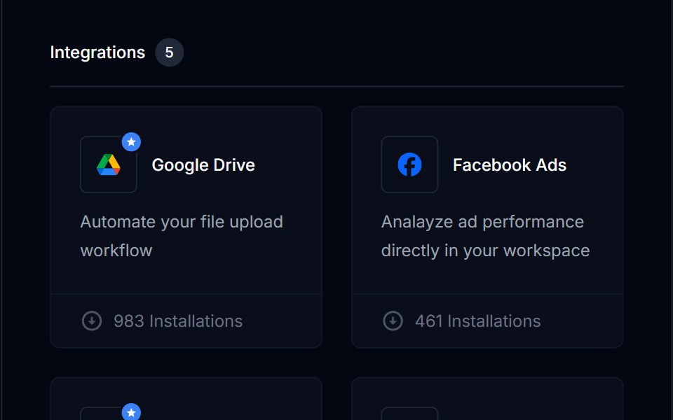 Grid List 08Tremor Blocks · React
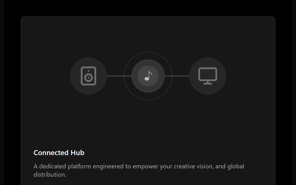 Bento 14Watermelon UI · React
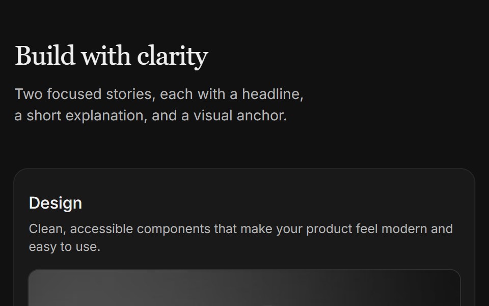 Content 04FLX UI · ReactTwo-column card grid with a serif section header and copy above each image.
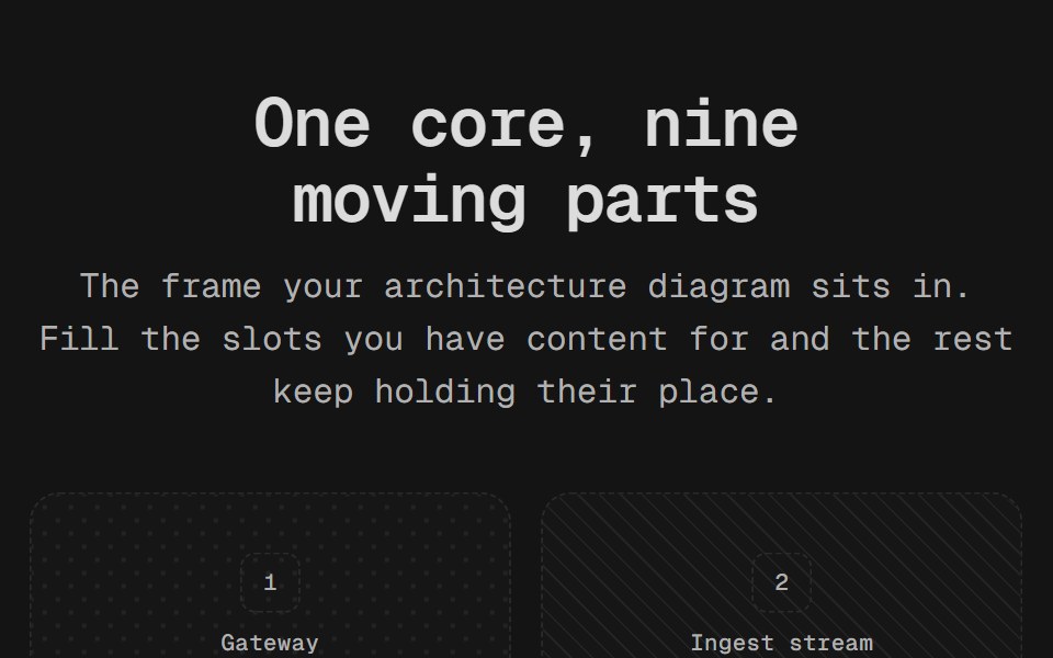 Diagram GridD2Studio UI · ReactA bento scaffold rather than a finished bento: nine slots in the scattered arrangement an integration diagram wants…
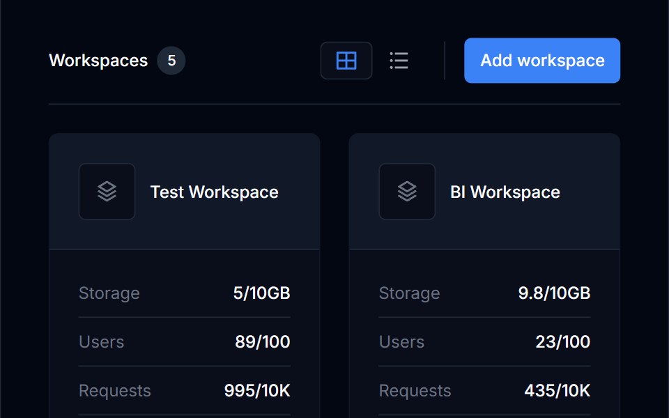 Grid List 09Tremor Blocks · React
 Bento 15Watermelon UI · React
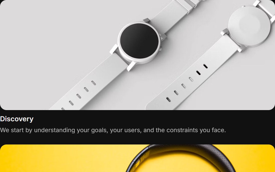 Content 05FLX UI · ReactA focus grid with items that can be focused and dimmed.
 Notification BentoD2Studio UI · ReactA four-panel notification bento: a pure-CSS metallic bell on a lit dot-matrix field, recent activity feed, unread…
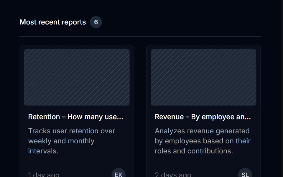 Grid List 10Tremor Blocks · React
 Bento 16Watermelon UI · React
 Content 06FLX UI · ReactTwo-column split with serif headline, supporting copy, optional CTA, and a media panel.
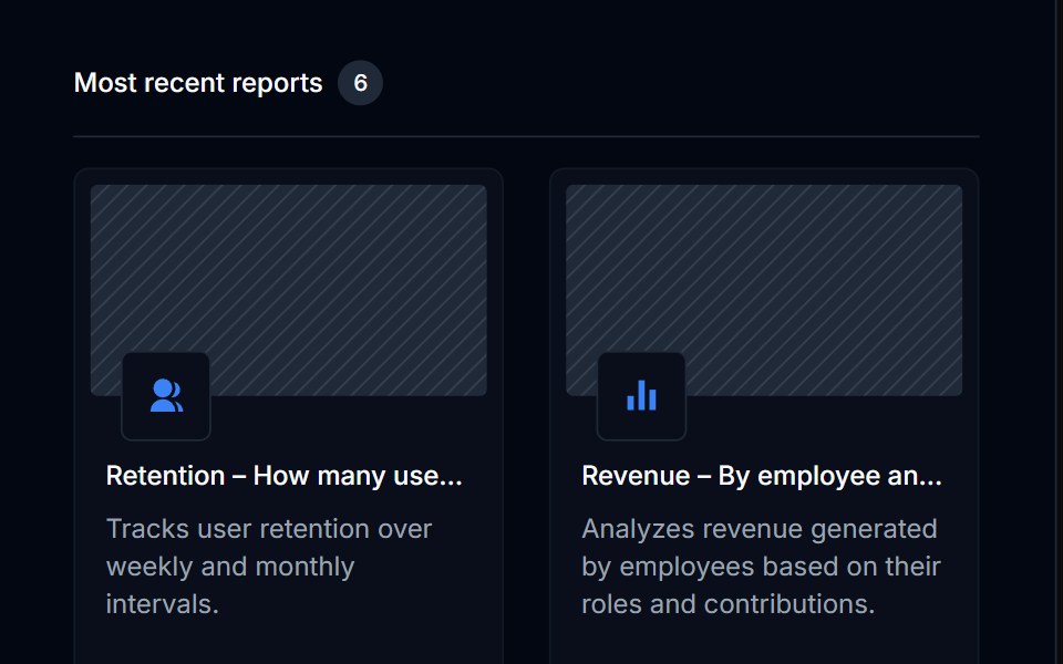 Grid List 11Tremor Blocks · React
 Bento 17Watermelon UI · React
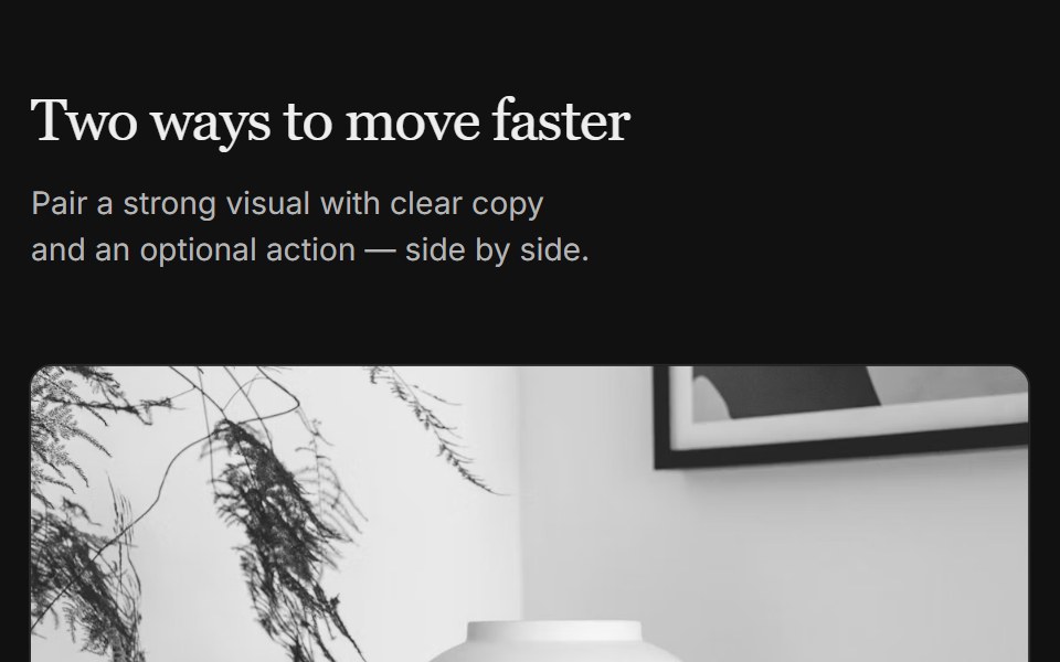 Content 07FLX UI · ReactTwo-column grid with serif header, media on top, copy, and optional CTA per column.
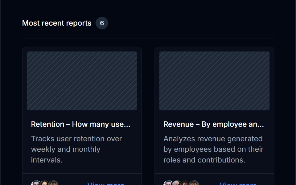 Grid List 12Tremor Blocks · React
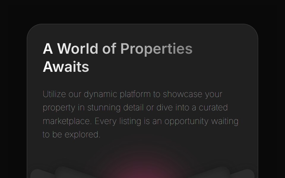 Bento 2Watermelon UI · React
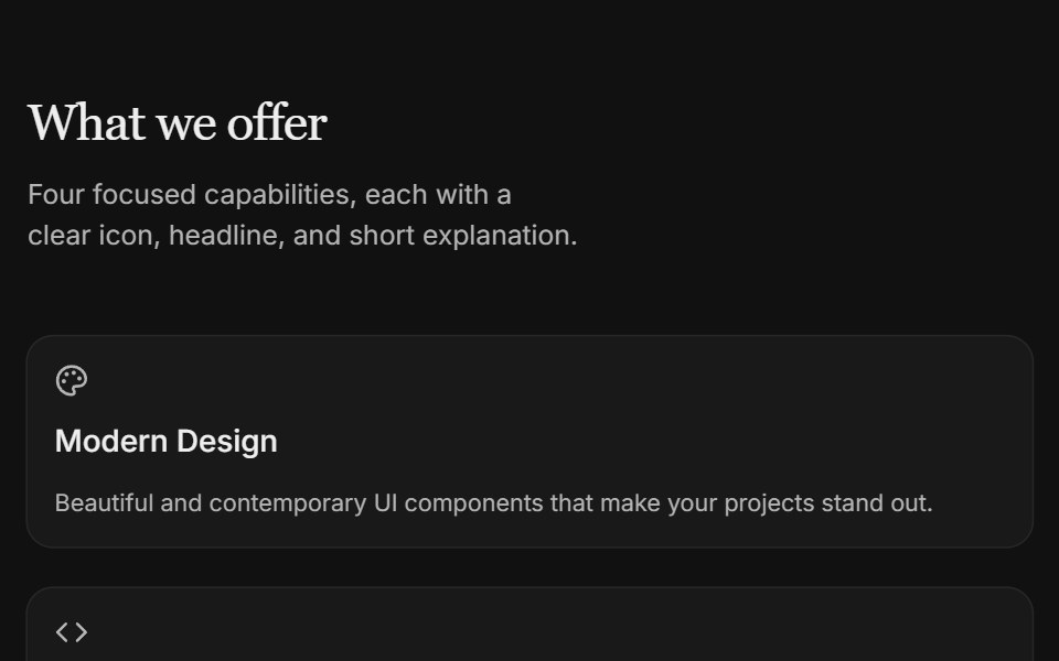 Content 09FLX UI · ReactTwo-column icon card grid with serif section header and subtle entrance motion.
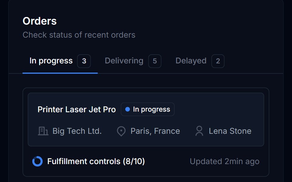 Grid List 13Tremor Blocks · React
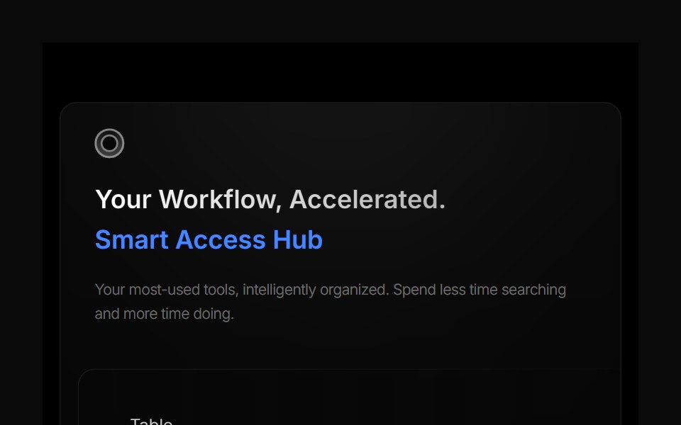 Bento 3Watermelon UI · React
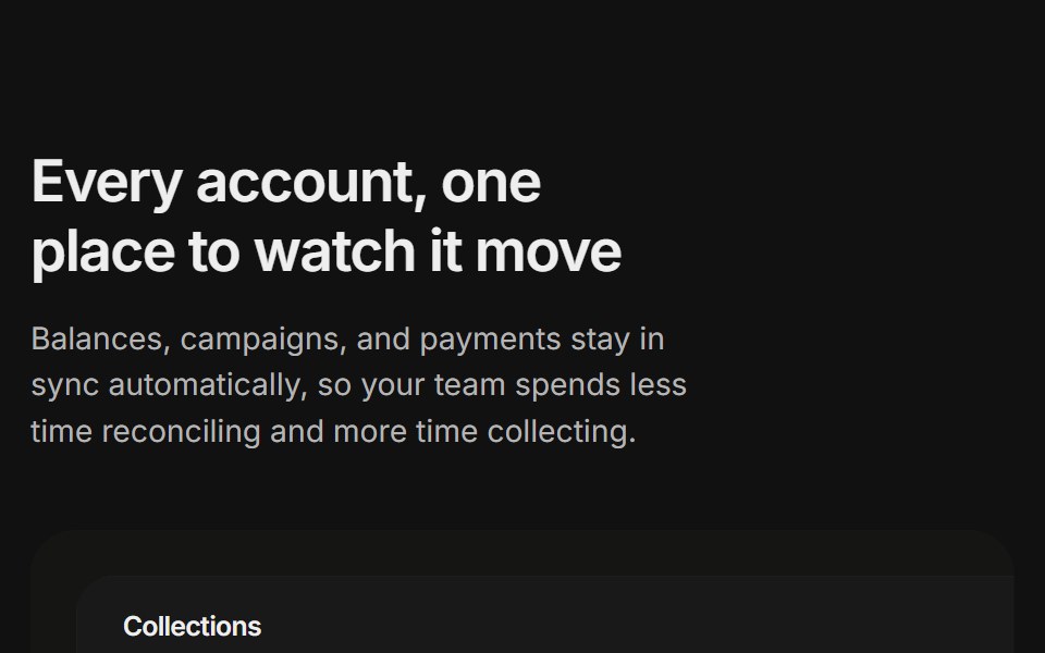 Content 11FLX UI · ReactA billing overview split with a dashboard preview card and two feature highlights, built for the app-shell preset.
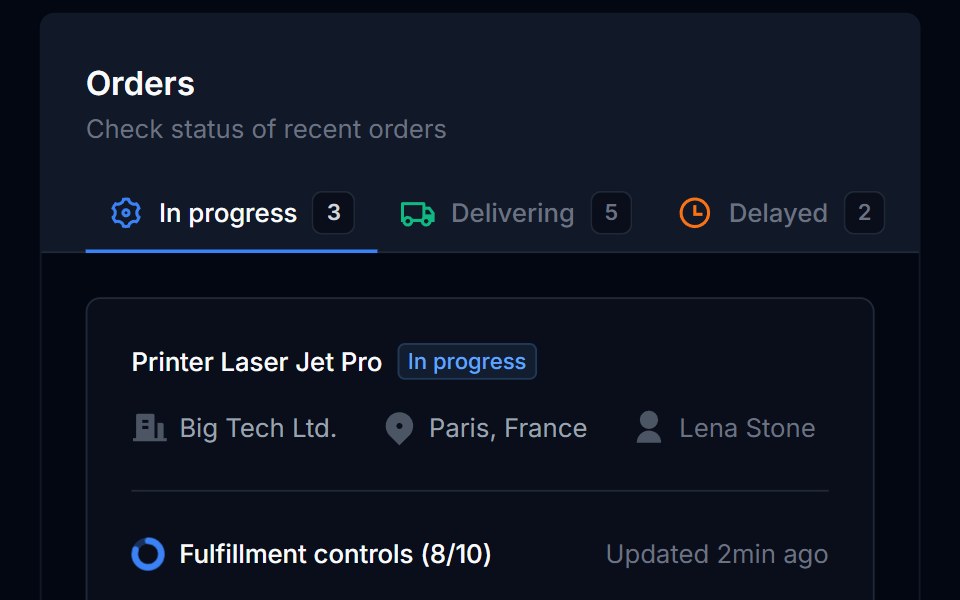 Grid List 14Tremor Blocks · React
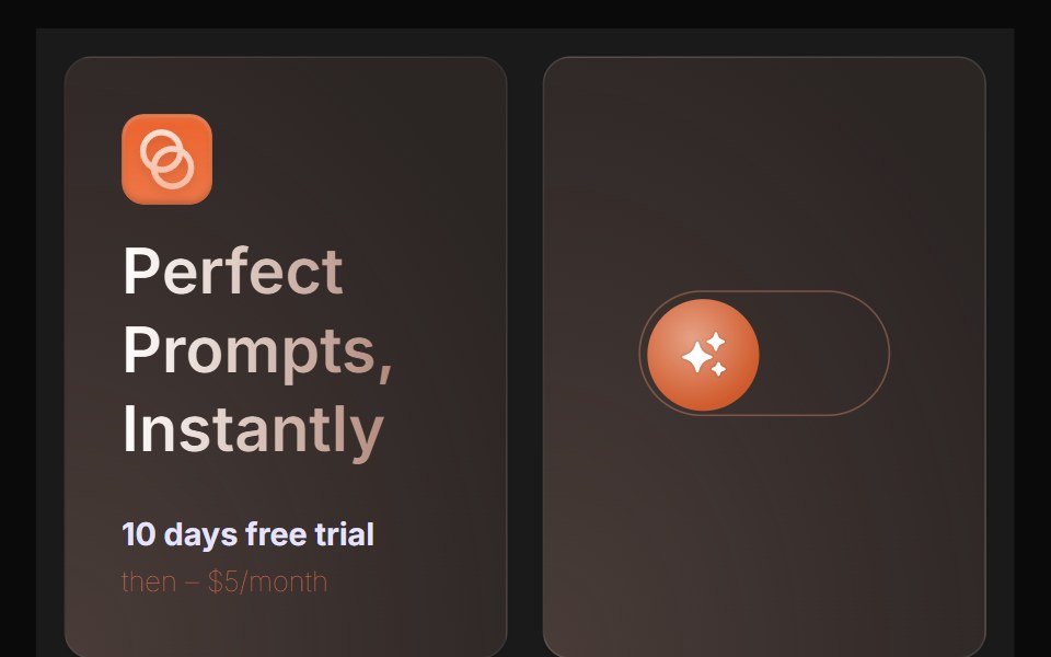 Bento 4Watermelon UI · React
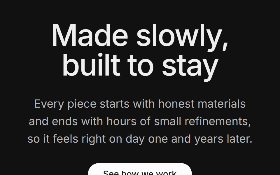 Content 12FLX UI · ReactA centered section header with supporting copy and a CTA, followed by two large side-by-side photos.
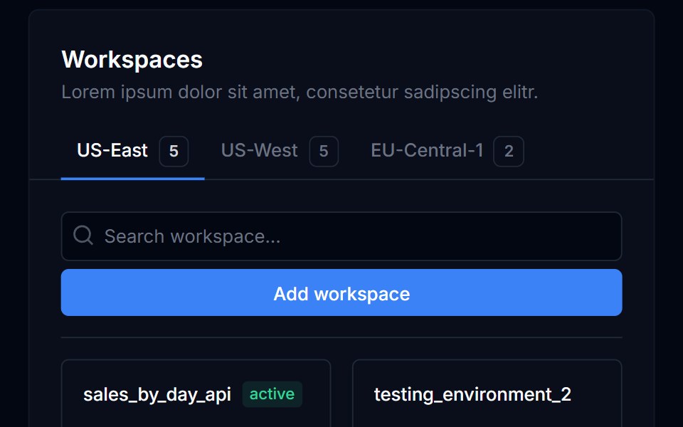 Grid List 15Tremor Blocks · React
 Bento 5Watermelon UI · React