 Dev Design Library
Tree View Components
Dev Design Library indexes 101 tree view components from 32 open-source UI libraries, with the most coming from ReUI, Origin UI, Shadcn Space, React Spectrum and beUI. Each one links to its page with the source code, a live preview where available, the library license and the install command. Tree view components belong to the Data display group.
 Sidebar 11shadcn/ui · ReactA sidebar with a collapsible file tree.
 Tree ViewChakra UI · ReactUsed to display hierarchical data structures in an expandable tree format
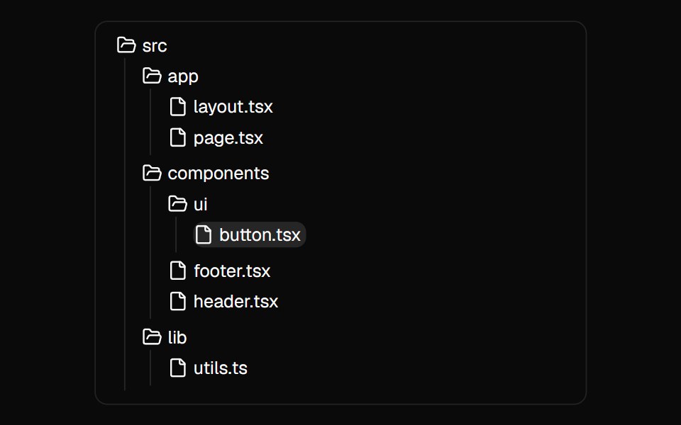 File TreeMagic UI · ReactA component used to showcase the folder and file structure of a directory.
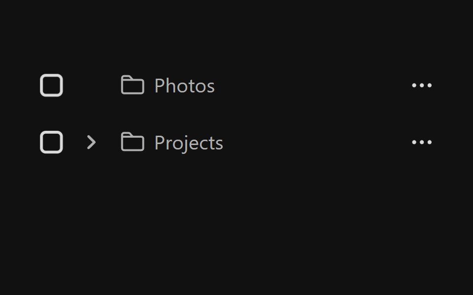 Tree ViewReact Spectrum · ReactA tree view provides users with a way to navigate nested hierarchical information.
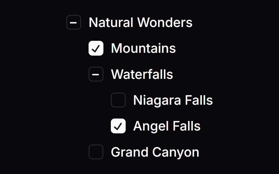 Checkbox TreeOrigin UI · React
 Tree ViewPreline UI · JavaScript (HTML + Tailwind)
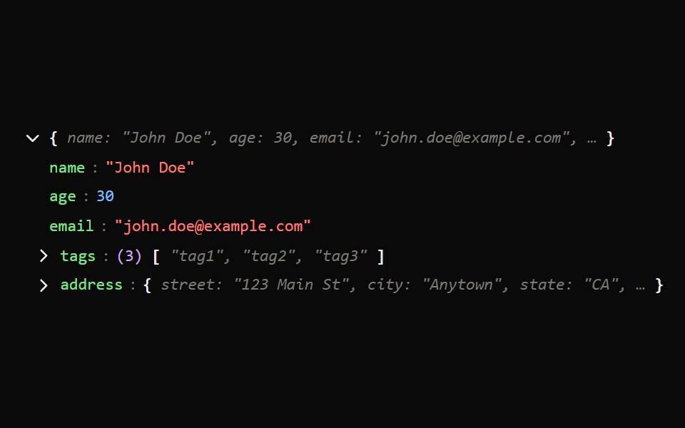 Json Tree ViewArk UI · ReactA component that displays JSON data in an interactive, collapsible tree structure.
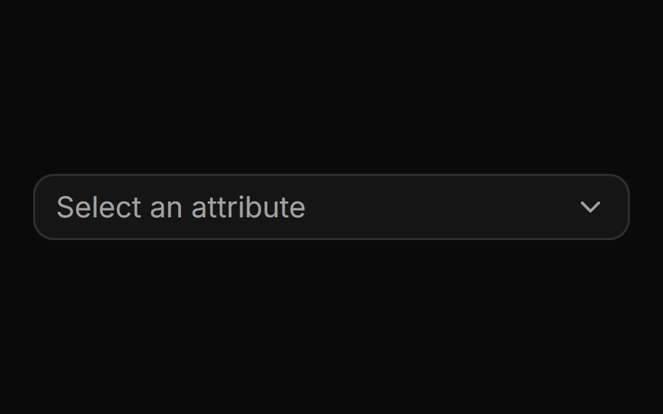 Nested attribute picker with drill-down navigation.ReUI · ReactNested attribute picker with drill-down navigation.
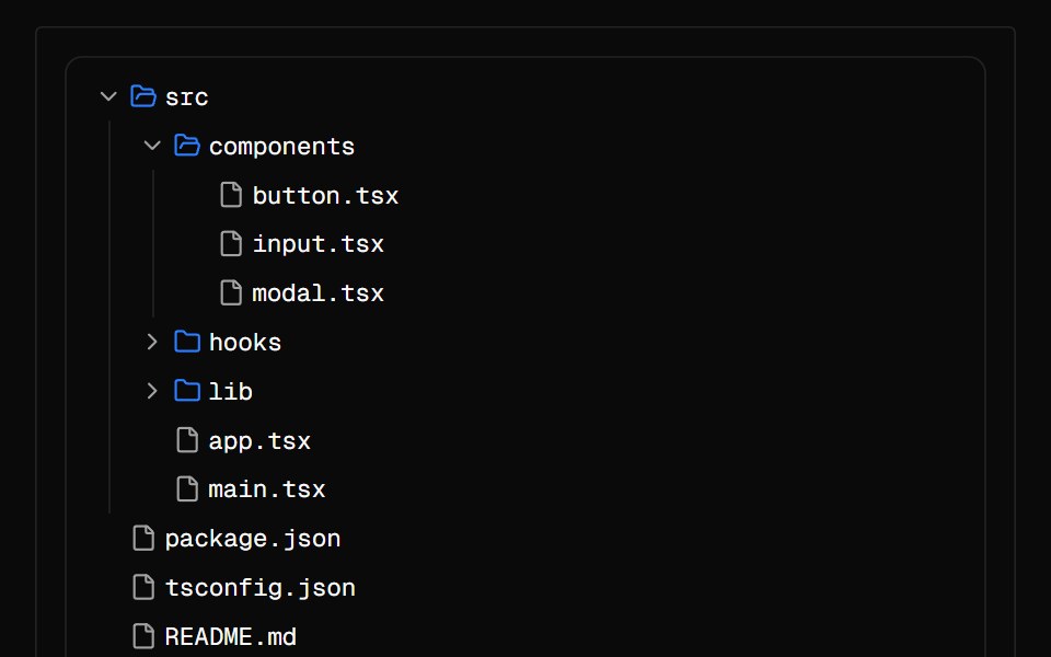 File TreeAI Elements · ReactDisplay hierarchical file and folder structure with expand/collapse functionality.
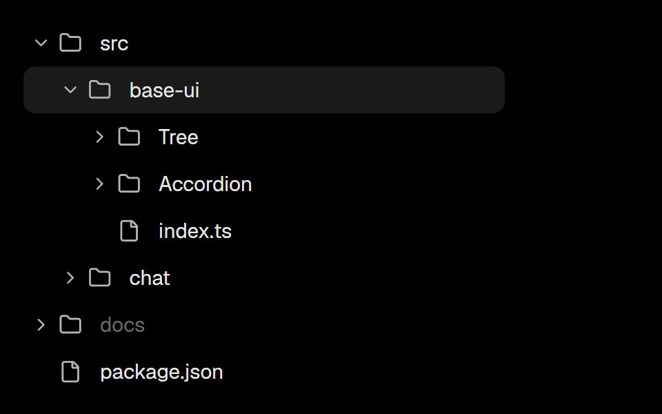 TreeLobe UI · React
 treeIntent UI · Reacttree
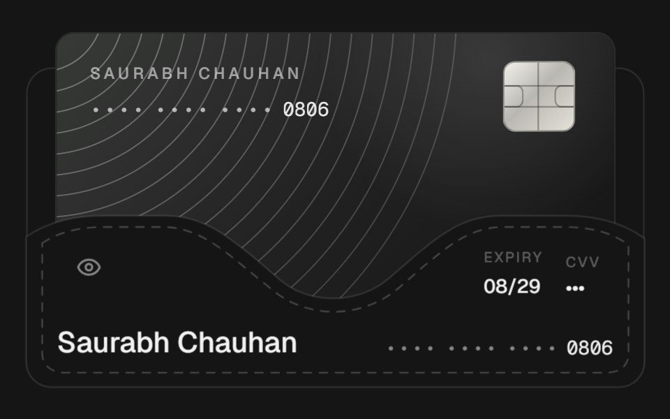 Card FolderbeUI · ReactA landscape card tucked into a stitched purse pocket that lifts forward as the purse compresses into its bottom seam…
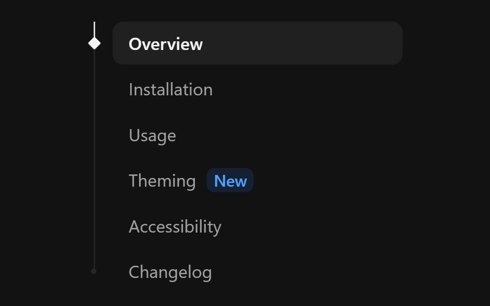 Tree NavSpectrum UI · ReactA nav list with a tree rail and a spring marker that follows hover and settles on the active link.
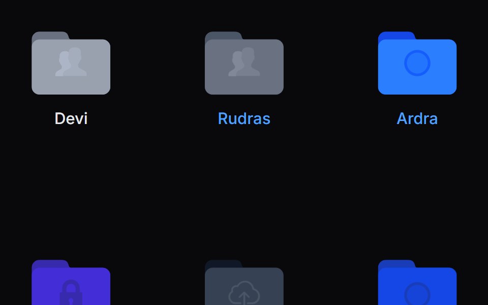 Folder PreviewVengeance UI · ReactFolder stack visual preview
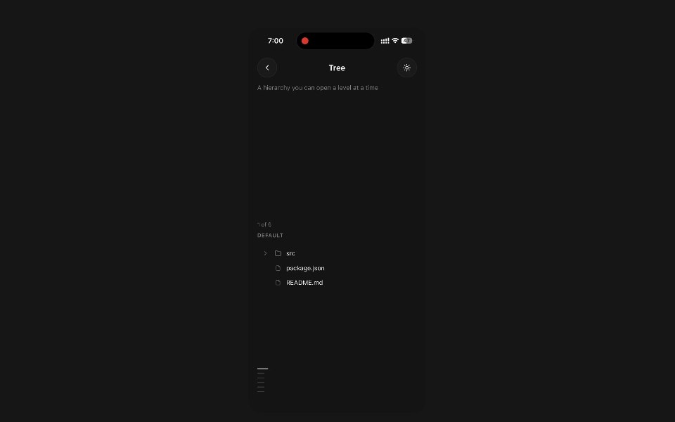 TreePanel UI · React NativeA hierarchy you can open a level at a time.
 Checkbox-09 - Checkbox with treeShadcn Space · ReactCheckbox component
 Folder Interactionuselayouts · ReactA folder management system with drag-and-drop-like feel.
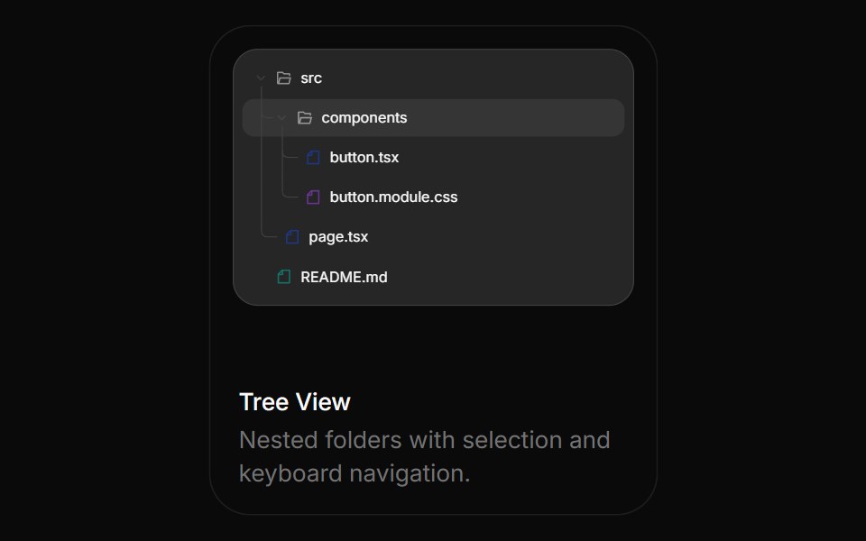 Tree ViewBoardUI · React
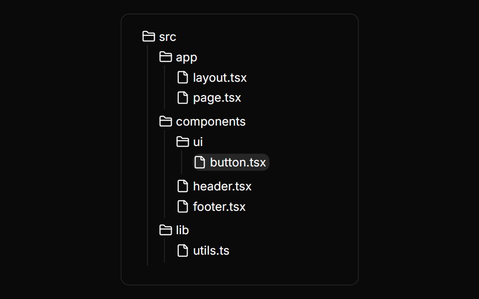 File TreeAnimations (Svelte) · SvelteAn interactive file tree component with expandable folders, selectable files, and smooth animations.
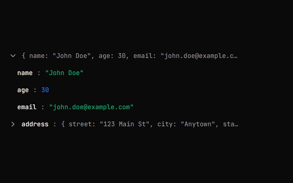 Json Tree ViewShark UI · ReactDisplay JSON data in an interactive, expandable tree.
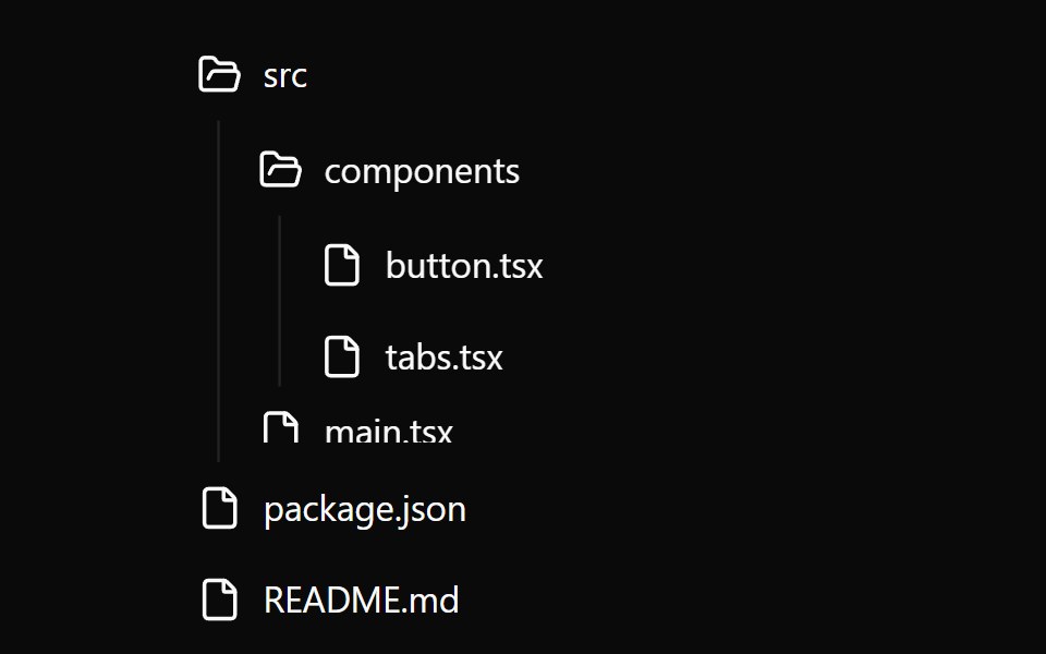 FilesWatermelon UI · React
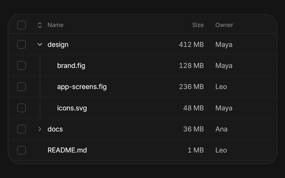 Tree tableArc Library · ReactA table with nested rows, tri-state selection, hierarchy-preserving sort, and lazy-loaded children.
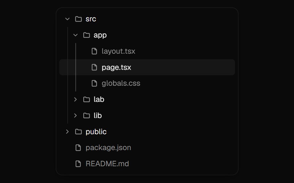 Tree ViewUI Lab · ReactFolders unfold in place while the selection glides to the file you pick.
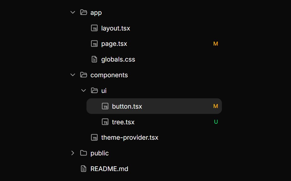 TreeHextaUI · ReactNested, expandable rows for files and hierarchies, with indent guides, connector lines, cascading checkboxes…
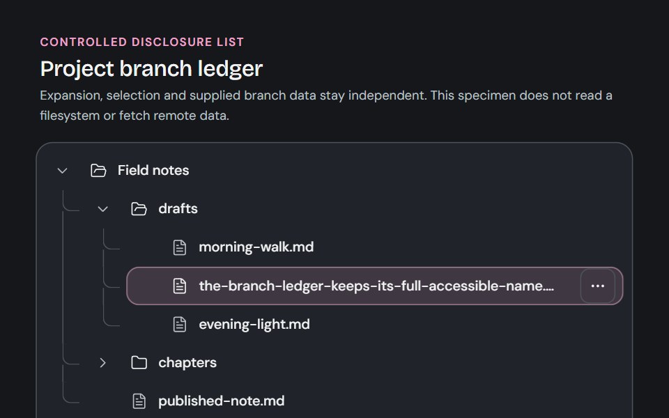 TreeCojeev UI · ReactA controlled branch ledger for supplied hierarchical data, with separate disclosure, selection and trailing actions.
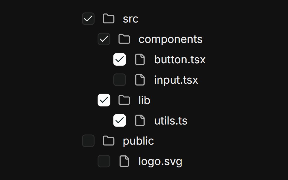 Nested treeFLX UI · ReactMulti-level file tree; parents derive checked / indeterminate from children.
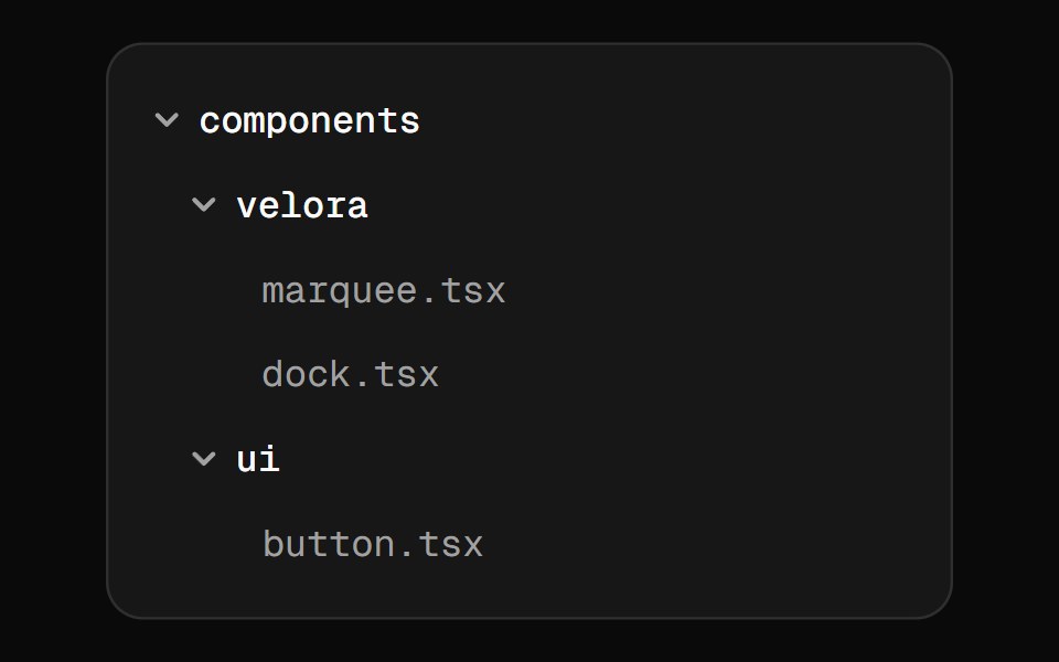 File TreeVelora UI · ReactCollapsible tree for documenting project structure.
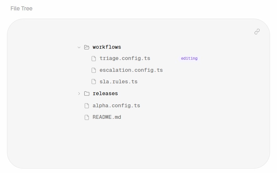 File TreeHalaska UI · React
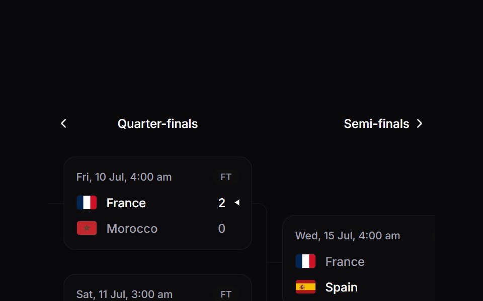 Tournament BracketSpaceUI · ReactAnimated knockout bracket with round navigation, live and finished matches, and elbow connectors.
 SidebarOUI · ReactSidebar Trigger, Sidebar Tree, and Sidebar Button for shadcn Sidebar.
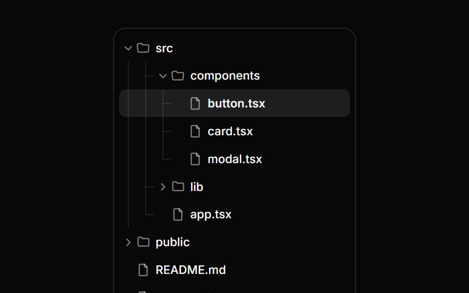 Tree ViewReactFrame · ReactA hierarchical tree with expand/collapse, tri-state checkboxes for multi-select, single-row selection, guide lines and…
 Tree Viewark-cn · ReactA shadcn-style tree view component built with Ark UI primitives.
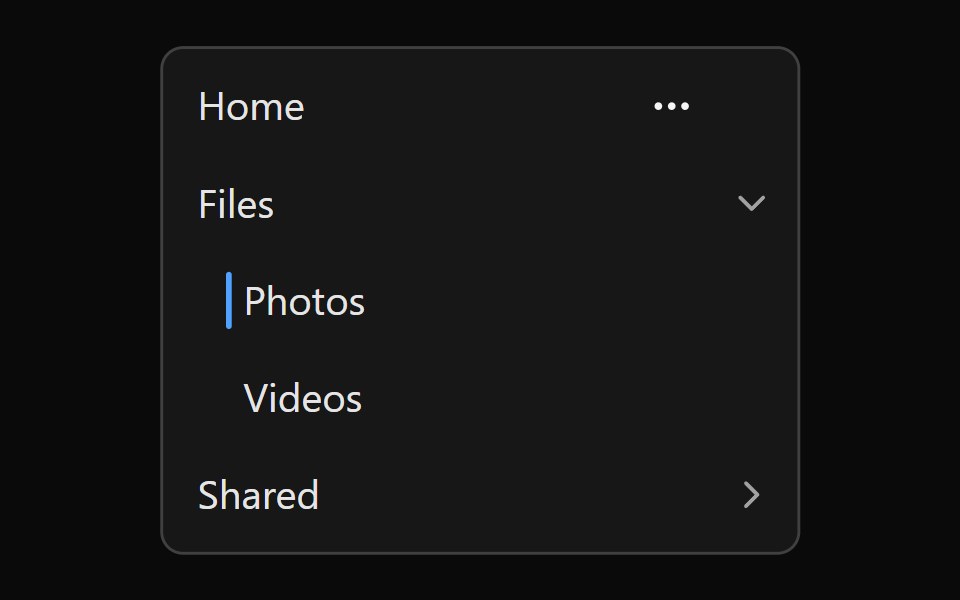 Tailwind Navigation TreeReact Spectrum · React
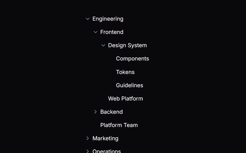 Comp 565Origin UI · React
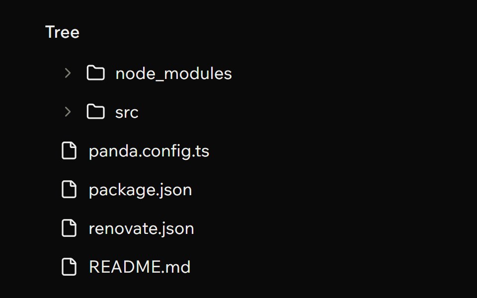 Tree ViewArk UI · ReactA component that is used to show a tree hierarchy.
 Translated labels across a country picker.ReUI · ReactA German country picker where every string the primitive renders comes from labels, including the live-region…
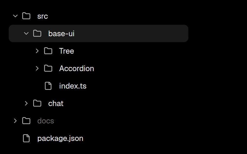 Base Ui TreeLobe UI · React
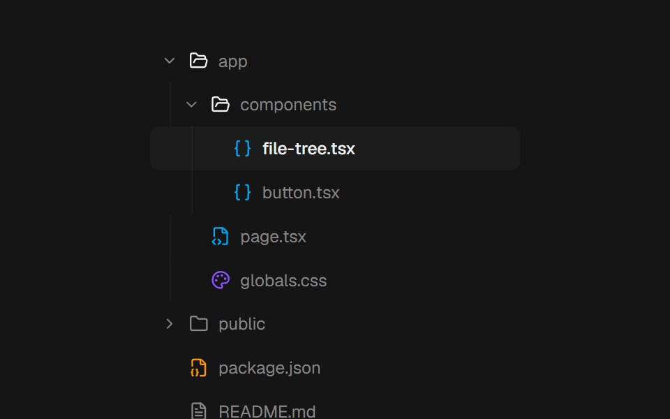 File TreebeUI · ReactComposable file and folder primitives with springing branches, a gliding selection, and complete keyboard navigation.
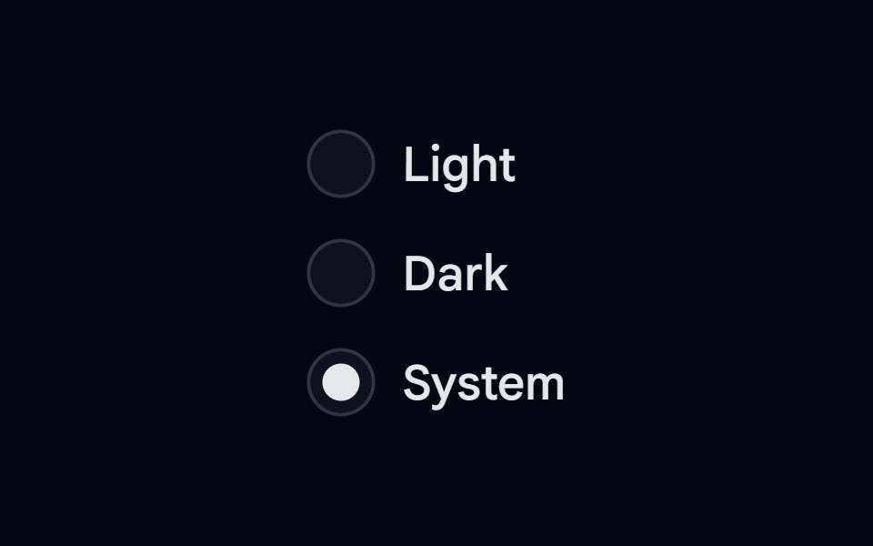 Radio Group-01 - Radio Group with treeShadcn Space · ReactRadio Group component
 Tree ViewShark UI · ReactHierarchical data in a tree structure.
 Tree MenuWatermelon UI · React
 Tree viewArc Library · ReactNavigate nested folders and structured content.
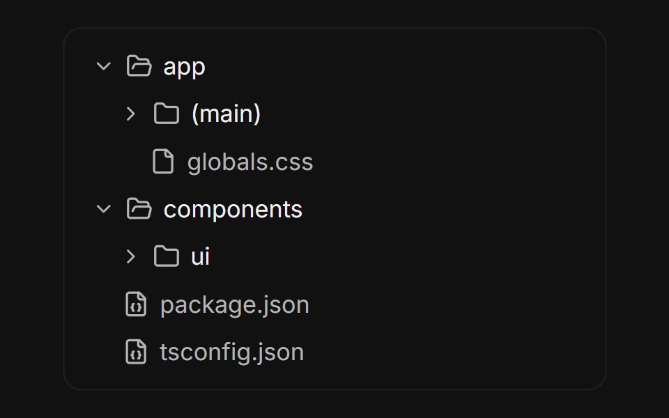 File treeFLX UI · ReactNested folders built from collapsible rows, with folder icons that swap on open.
 Tailwind TreeReact Spectrum · React
 Comp 566Origin UI · React
 Two-line rows with descriptions and a disabled option.ReUI · ReactTwo-line rows with descriptions and a disabled option.
 Mdx File TreeLobe UI · React
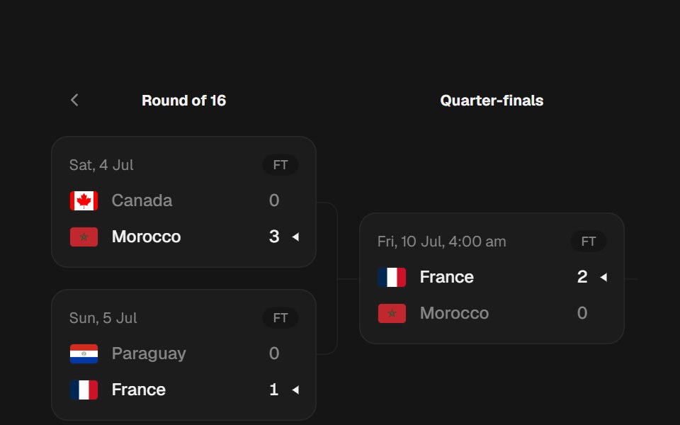 Knockout BracketbeUI · ReactPages one round at a time. The leftmost round stacks at a fixed rhythm, each later round centers between its two…
 Radio Group-02 - Radio Group with treeShadcn Space · ReactRadio Group component
 Tree Menu BaseWatermelon UI · React
 File listFLX UI · ReactFile icon, name, size metadata, and a trailing overflow menu with actions per row.
 Vanilla Navigation TreeReact Spectrum · React
 Comp 567Origin UI · React
 Form field that submits like a native input.ReUI · ReactForm field that submits like a native input.
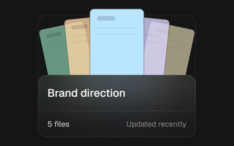 Project FolderbeUI · ReactAn interactive project folder that opens its file fan on hover or focus, expands into a focus-managed overlay, then…
 Radio Group-03 - Radio Group with treeShadcn Space · ReactRadio Group component
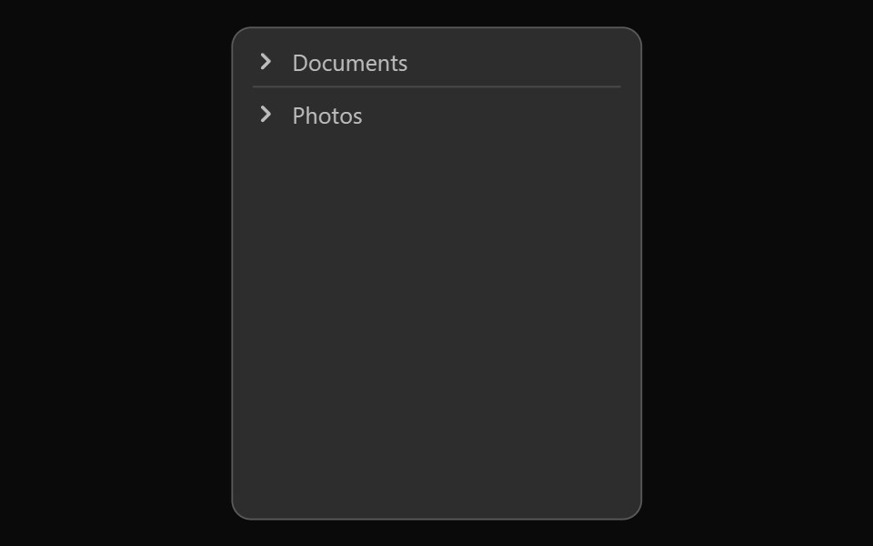 Vanilla TreeReact Spectrum · React
 Comp 568Origin UI · React
 Columns mode with independently scrolling panels.ReUI · ReactA media library in Miller columns where all three panes overflow and each scrolls on its own.
 Radio Group-04 - Radio Group with treeShadcn Space · ReactRadio Group component
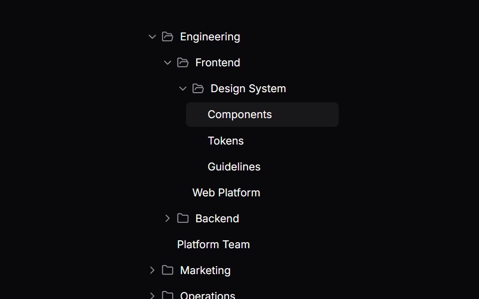 Comp 569Origin UI · React
 Tree mode with inline expand and multi-select scopes.ReUI · ReactTree mode with inline expand and multi-select scopes.
 Radio Group-05 - Radio Group with treeShadcn Space · ReactRadio Group component
 Comp 570Origin UI · React
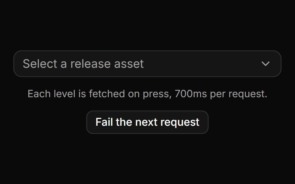 Async drill-down that loads before it navigates.ReUI · ReactAsync drill-down that loads before it navigates.
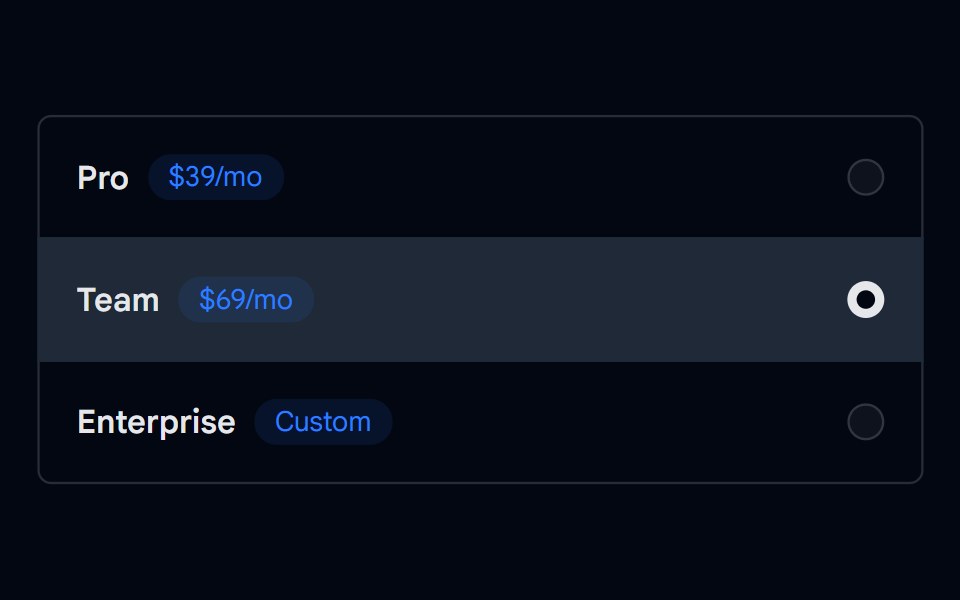 Radio Group-06 - Radio Group with treeShadcn Space · ReactRadio Group component
 Comp 571Origin UI · React
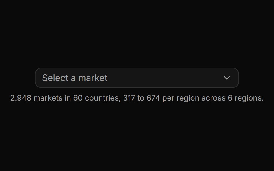 Virtualized level with thousands of rows.ReUI · ReactSix unevenly sized regions of country markets, windowed so only the visible rows ever mount.
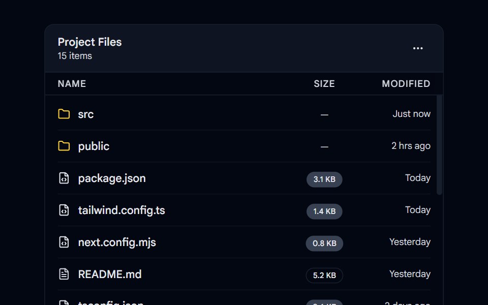 Scroll Area 01 - Custom File ExplorerShadcn Space · ReactA scrollable file explorer list with custom icons, badges, and smooth scroll area performance.
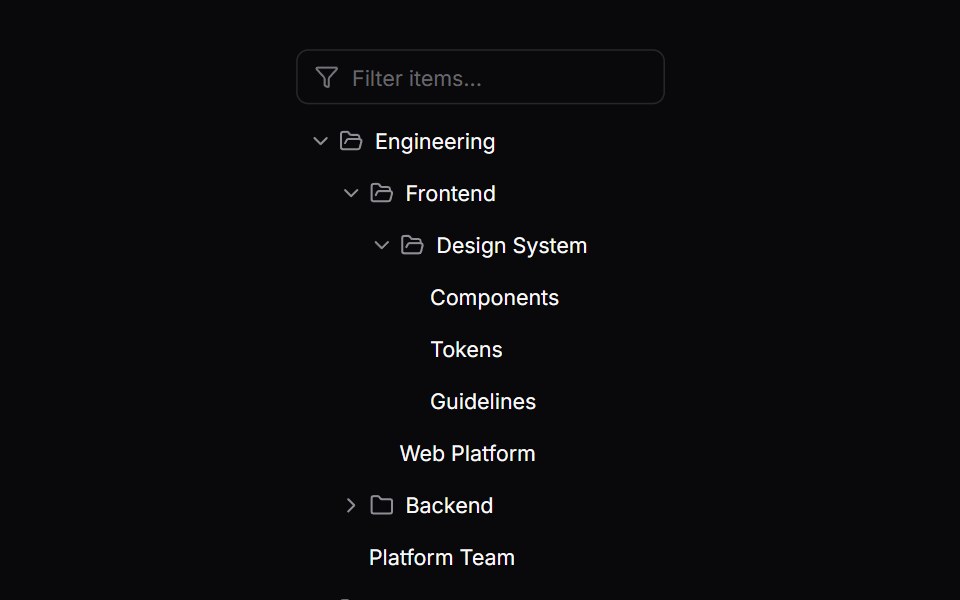 Comp 572Origin UI · React
 Consumer-rendered removable chips with path-aware labels.ReUI · ReactChips rendered outside the primitive from useCascaderSelection, each carrying its full path so repeated column names…
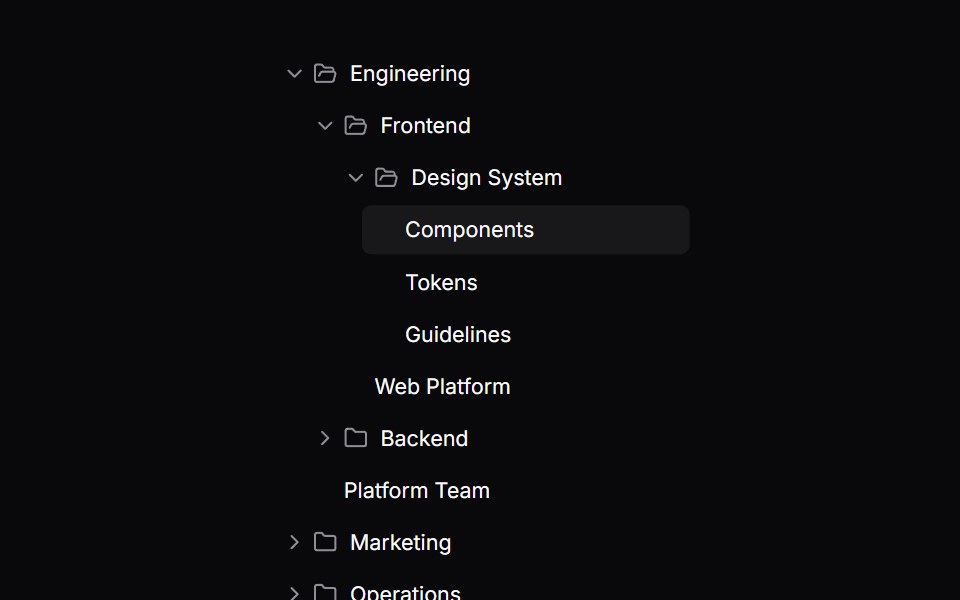 Comp 573Origin UI · React
 Cascading tree multi-select inside a popover.ReUI · ReactA cascading tree with indeterminate branches in a popover, bounded by the positioner's available height.
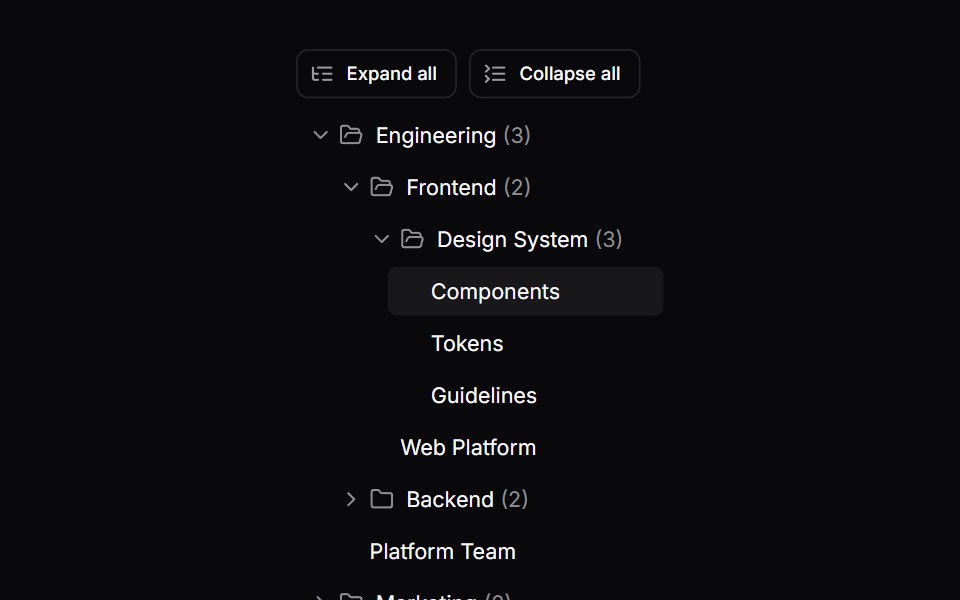 Comp 574Origin UI · React
 Status and priority colour dots via renderLabel.ReUI · ReactStatus and priority colour dots via renderLabel.
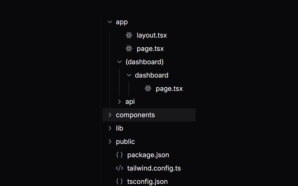 Comp 575Origin UI · React
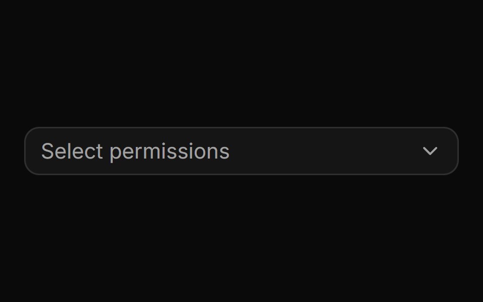 Multi-select permissions with checkboxes and a selection cap.ReUI · ReactMulti-select permissions with checkboxes and a selection cap.
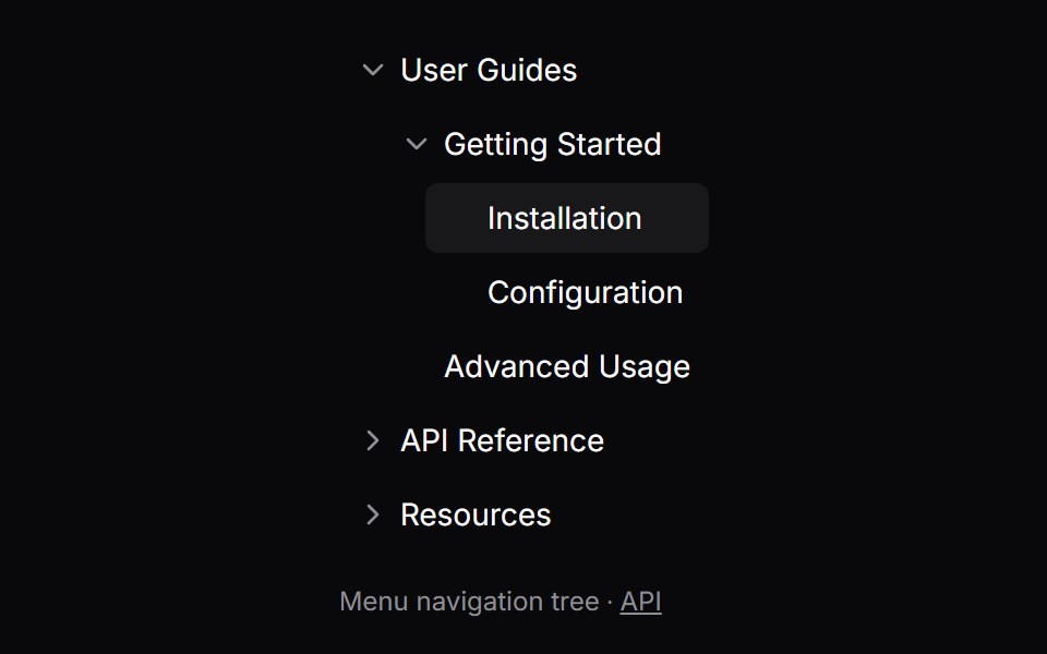 Comp 576Origin UI · React
 Expense accounts with a colour inherited down each branch.ReUI · ReactExpense accounts with a colour inherited down each branch.
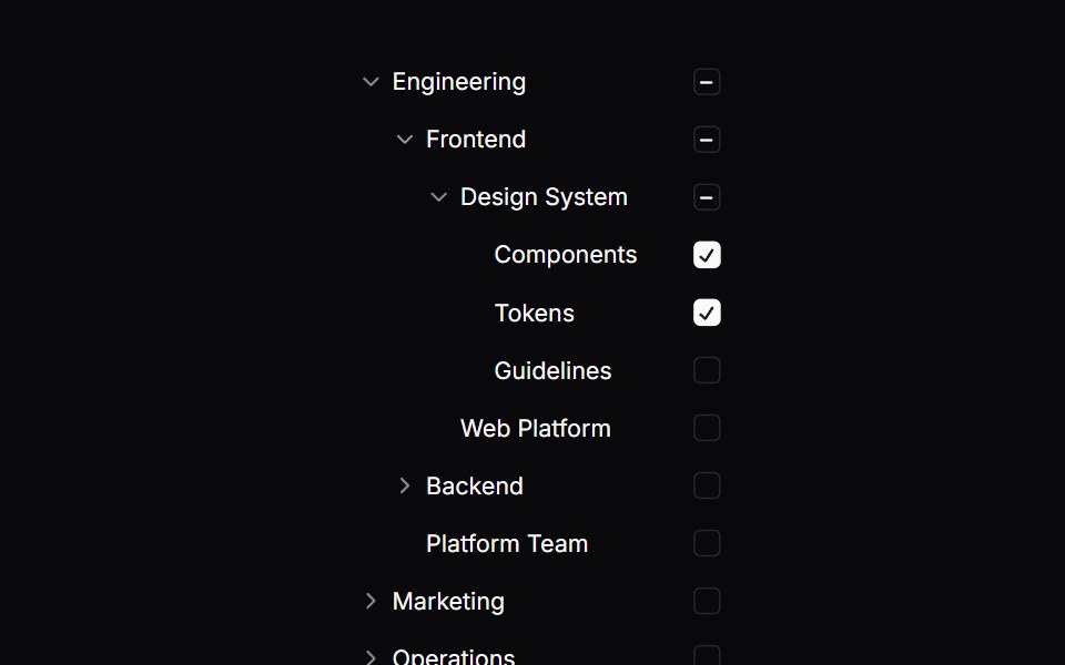 Comp 597Origin UI · React
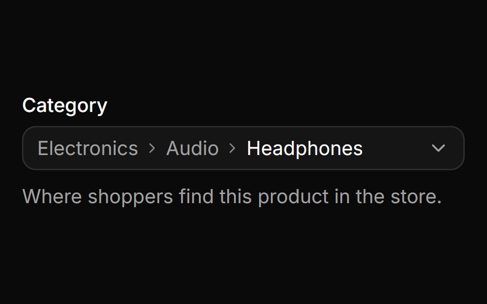 Global search across the whole tree from a nested level.ReUI · ReactA product category field that reopens on its current level, where typing still searches the whole catalog and each hit…
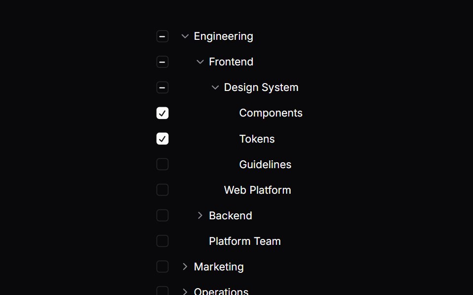 Comp 598Origin UI · React
 Deep search across every level with path-annotated results.ReUI · ReactDeep search across every level with path-annotated results.
 Comp 599Origin UI · React
 Pinned footer with a side-anchored import flyout.ReUI · ReactPinned footer with a side-anchored import flyout.
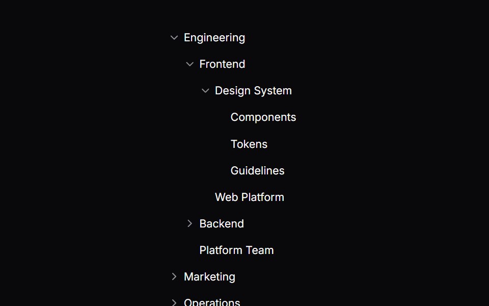 TreeOrigin UI · React
 Custom rows with avatars and role badges.ReUI · ReactCustom rows pairing avatars with outline role badges that color-code seniority.
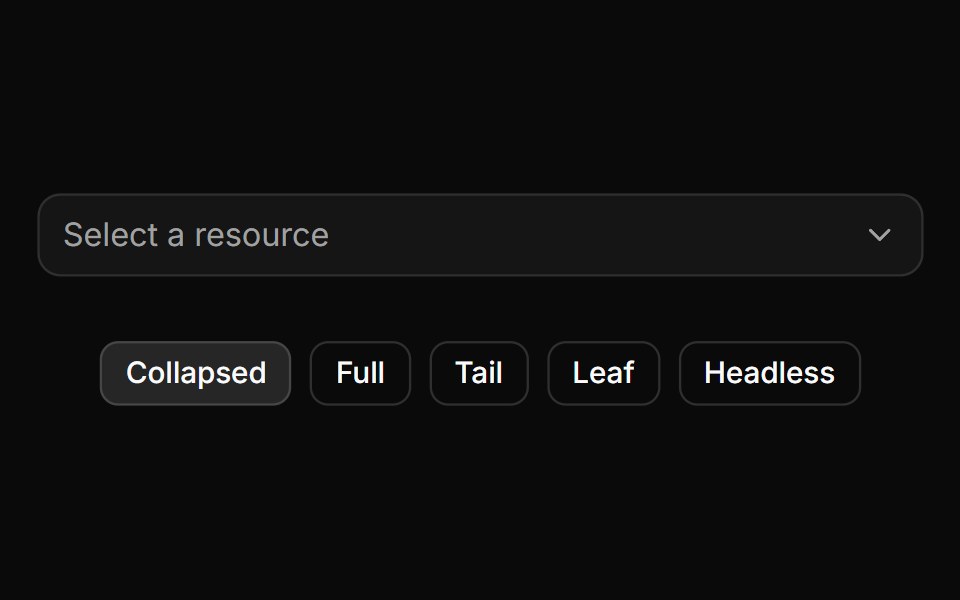 Trigger path formatting and collapsing.ReUI · ReactTrigger path formatting and collapsing.
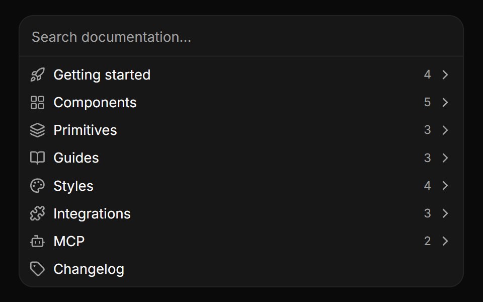 Embedded panel without a popover.ReUI · ReactEmbedded panel without a popover.
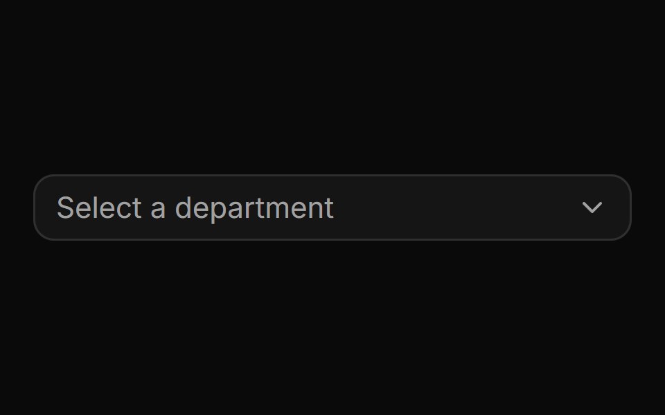 Flat adjacency data with a parent pointer.ReUI · ReactFlat adjacency data with a parent pointer.
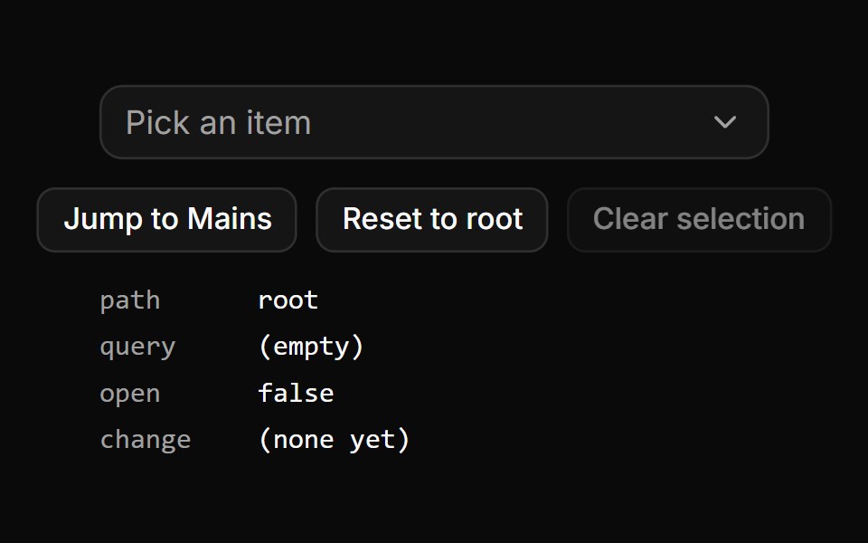 Controlled path, value, query and open state.ReUI · ReactExternal buttons jump the panel to a level, reset it to the root and clear the selection, with all four controlled…
 Data grid with tree rowsReUI · ReactData grid with tree rows
 Basic tree.ReUI · ReactBasic tree.
 Tree with indented lines.ReUI · ReactTree with indented lines.
 Tree with custom indent.ReUI · ReactTree with custom indent.
 Tree with custom indent.ReUI · ReactTree with custom indent.
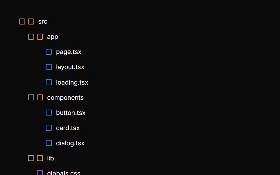 File explorer tree with type iconsReUI · ReactFile explorer tree with type icons
 Organization chart tree with avatarsReUI · ReactOrganization chart tree with avatars
 Permissions tree with checkboxesReUI · ReactPermissions tree with checkboxes
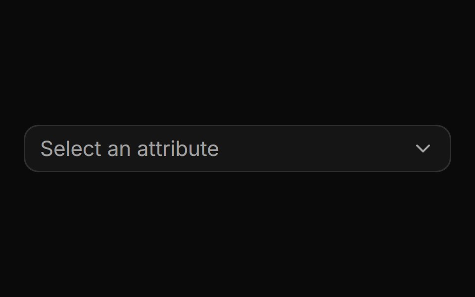 CascaderReUI · ReactA nested multi-level combobox with drill-down navigation, breadcrumbs, search and custom rows.
 TreeReUI · ReactA customizable tree component for React.
Libraries with tree view components
Related categories
- React Tree View Components
- Tailwind CSS Tree View Components
- Animated Tree View Components
- shadcn/ui Tree View Components
- Data Display Components
- Card Components
- Chart Components
- Table Components
- Avatar Components
- List Components
- Stat Components
- Calendar Components
- Accordion Components
- Data Table Components
- Carousel Components
- Collapsible Components
- Avatar Group Components
- Stat Card Components
- Bar Chart Components
- Card Stack Components