 Dev Design Library
Svelte Avatar Components
Dev Design Library indexes 17 Svelte avatar components from 2 open-source UI libraries, with the most coming from sv-particles and Animations (Svelte). Each one links to its page with the source code, a live preview where available, the library license and the install command. Every library in this list targets Svelte. Avatar components belong to the Data display group.
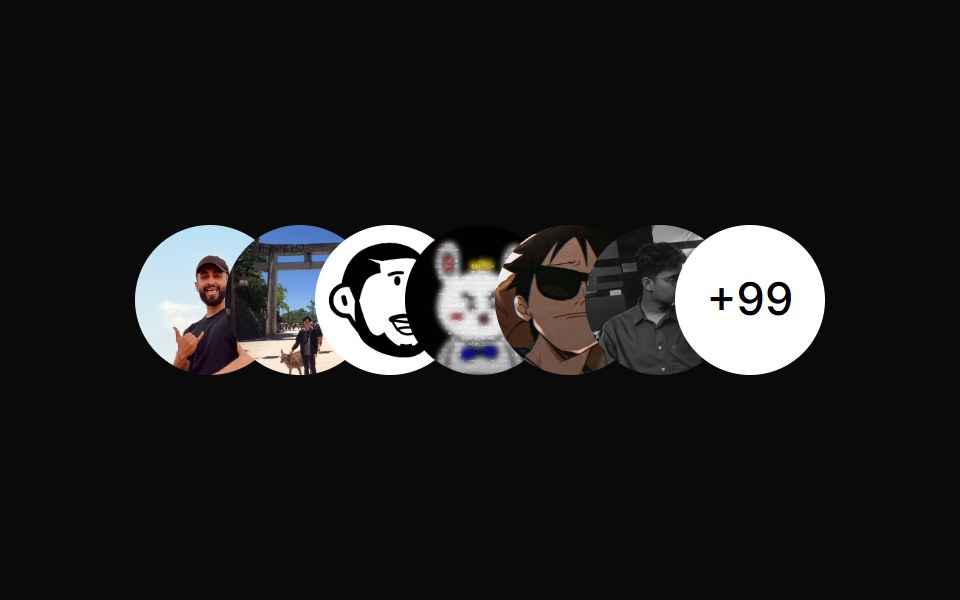 Avatar CirclesAnimations (Svelte) · SvelteA component that displays overlapping avatar circles with optional count indicator for showing team members or…
 Basic Avatarsv-particles · Svelte
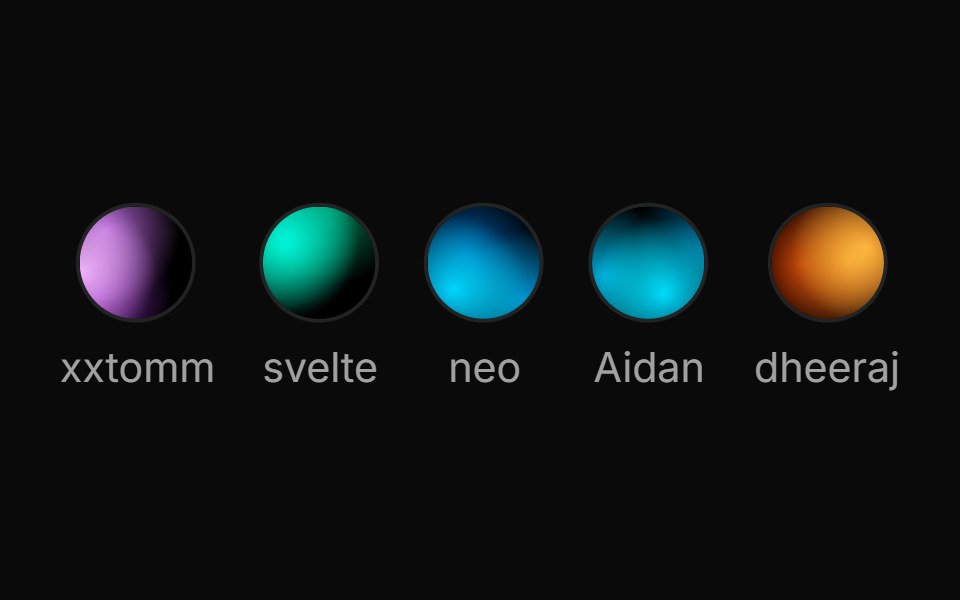 Spell Fallback AvatarAnimations (Svelte) · Svelte
 Fallback Onlysv-particles · Svelte
 Large Overlapping Avatar Groupsv-particles · Svelte
 Overlapping Avatar Groupsv-particles · Svelte
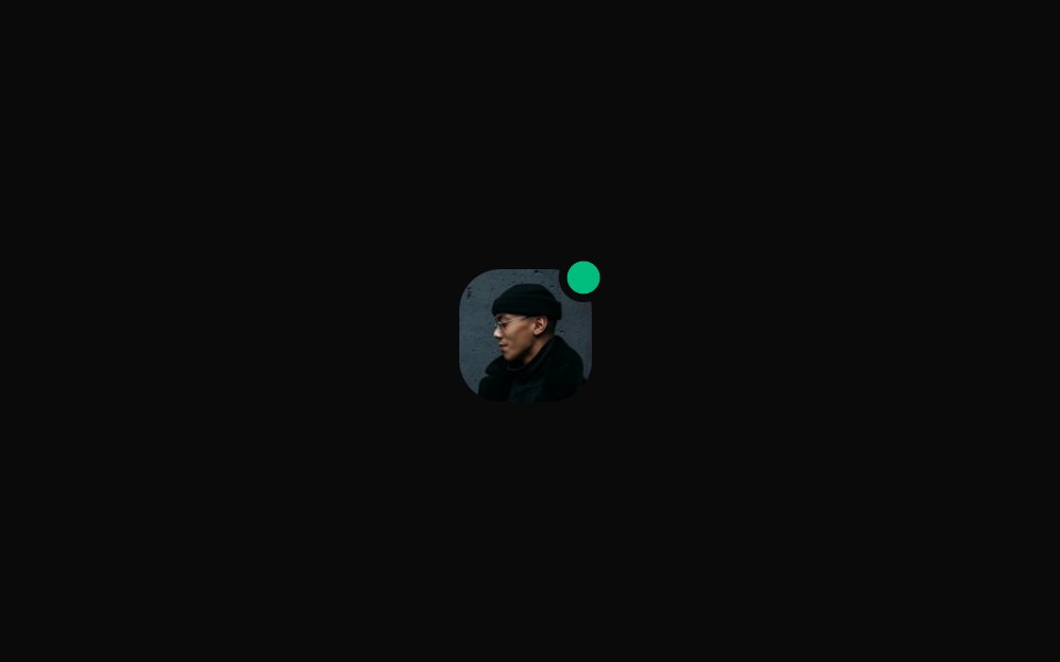 Rounded With Emerald Status Dotsv-particles · Svelte
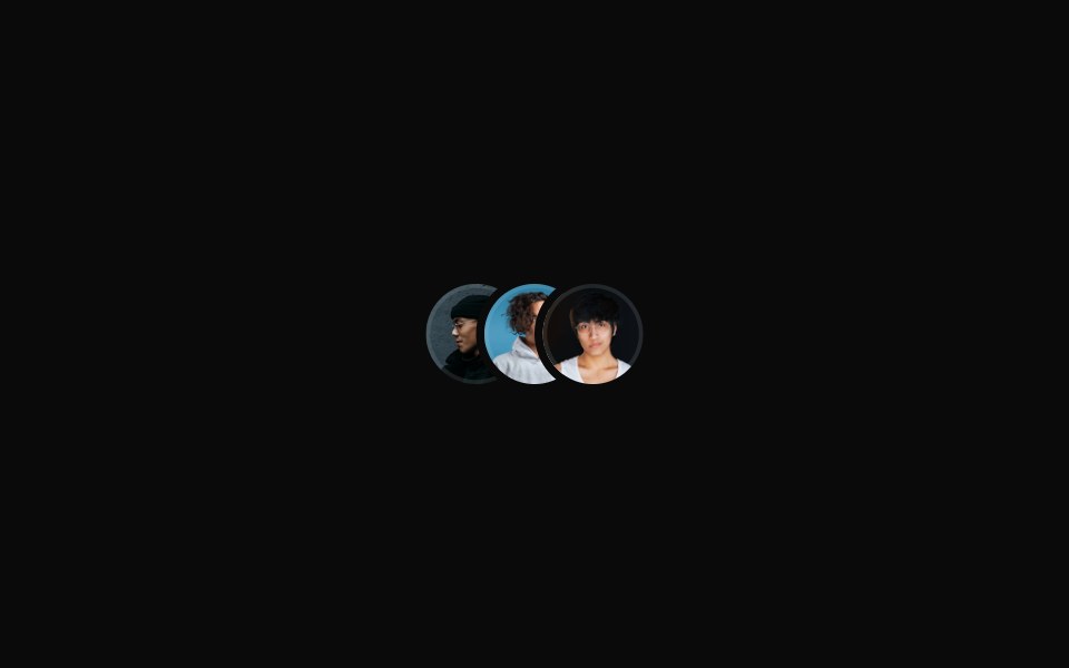 Small Overlapping Avatar Groupsv-particles · Svelte
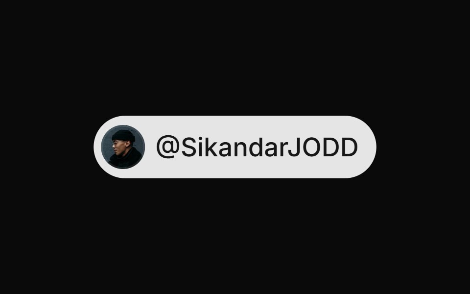 With Avatarsv-particles · Svelte
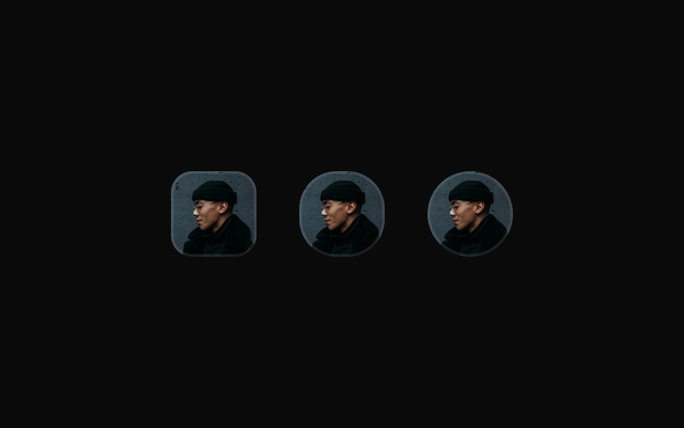 With Different Radiisv-particles · Svelte
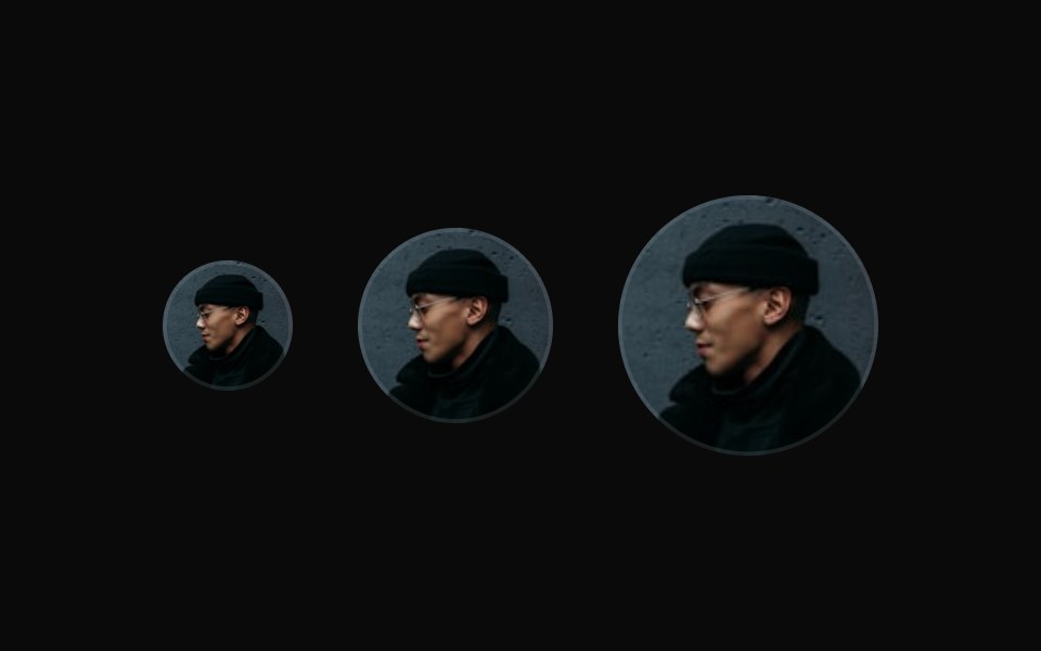 With Different Sizessv-particles · Svelte
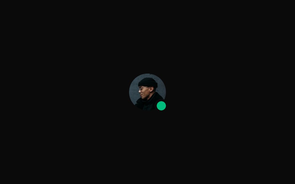 With Emerald Status Dotsv-particles · Svelte
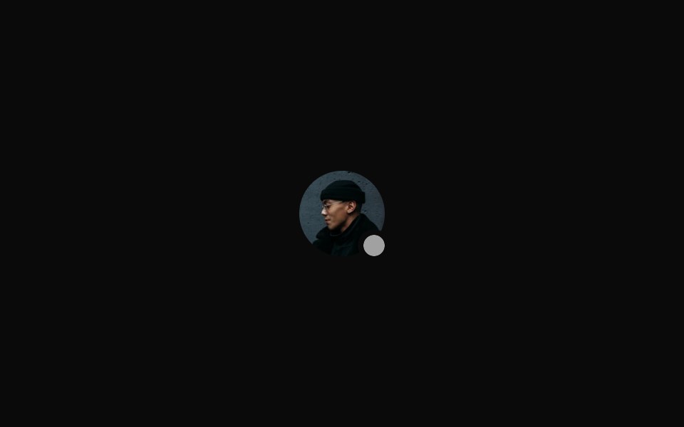 With Muted Status Dotsv-particles · Svelte
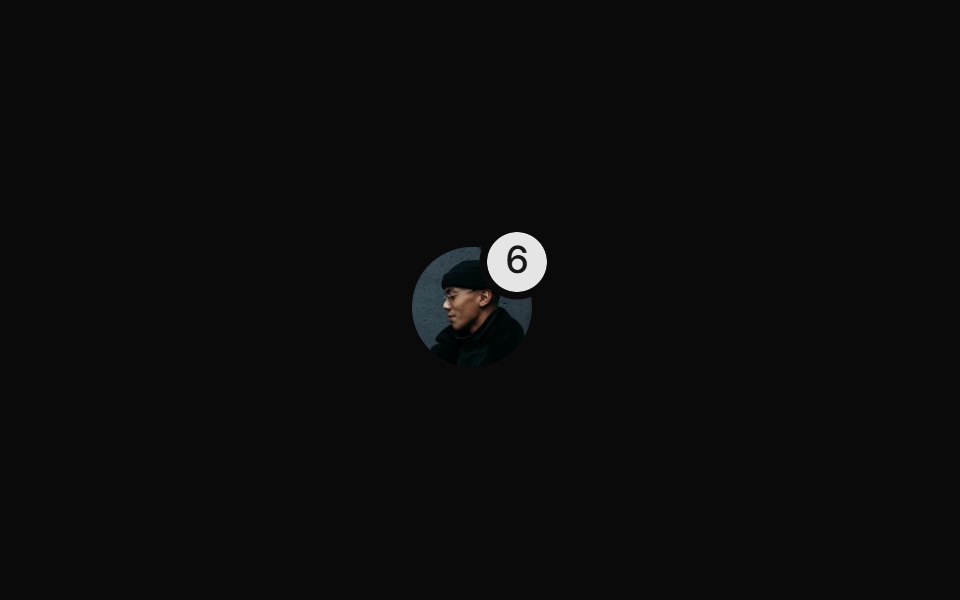 With Notification Badgesv-particles · Svelte
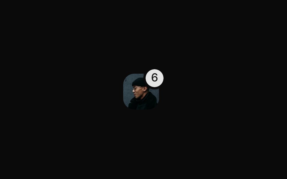 With Rounded Notification Badgesv-particles · Svelte
 With User Icon Fallbacksv-particles · Svelte
 With Verify Badgesv-particles · Svelte
Libraries with Svelte avatar components
Related categories
- Avatar Components
- React Avatar Components
- Tailwind CSS Avatar Components
- Animated Avatar Components
- shadcn/ui Avatar Components
- Svelte Data Display Components
- Svelte Table Components
- Svelte Card Components
- Svelte Data Table Components
- Svelte Accordion Components
- Svelte Stat Components
- Svelte Filter Bar Components