 Dev Design Library
Tailwind CSS Skeleton Components
Dev Design Library indexes 69 Tailwind CSS skeleton components from 36 open-source UI libraries, with the most coming from FLX UI, ReUI, Amicro Micro Transitions, Spectrum UI and SpaceUI. Each one links to its page with the source code, a live preview where available, the library license and the install command. Every library in this list styles its components with Tailwind CSS utility classes. Skeleton components belong to the Feedback group.
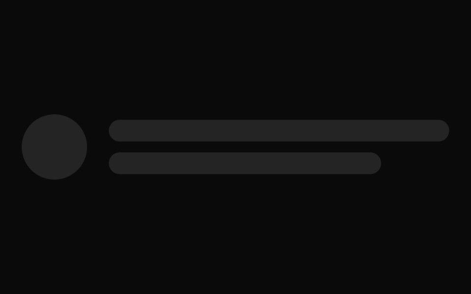 Skeletonshadcn/ui · ReactUse to show a placeholder while content is loading.
 SkeletondaisyUI · CSS (Tailwind)
 SkeletonHeroUI · ReactDisplays a loading placeholder with shimmer or pulse animation effects.
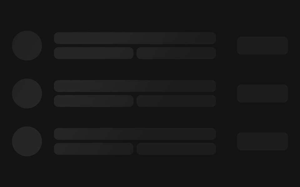 Skeletoncoss ui · ReactA loading state skeleton for your components.
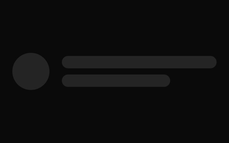 Skeleton loader for avatars and user info.ReUI · ReactSkeleton loader for avatars and user info.
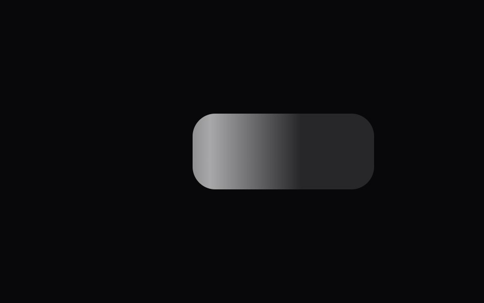 Fluid SkeletonAmicro Micro Transitions · ReactFluid Skeleton loading animation.
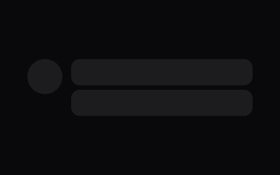 skeletonIntent UI · Reactskeleton
 Loading StatesbeUI · ReactCovers work before a durable plan is available.
 SkeletonTailGrids · ReactA component to indicate a loading state.
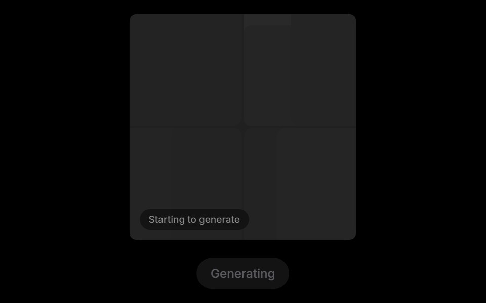 Grid RevealRare UI · ReactA loading state for AI images that turns into the real picture when it arrives.
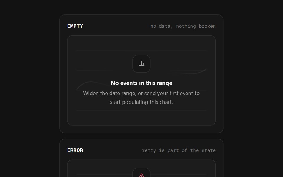 Chart StatesSpectrum UI · ReactLoading skeletons, empty states and error states for every chart — one wrapper, six skeleton shapes, and a frame…
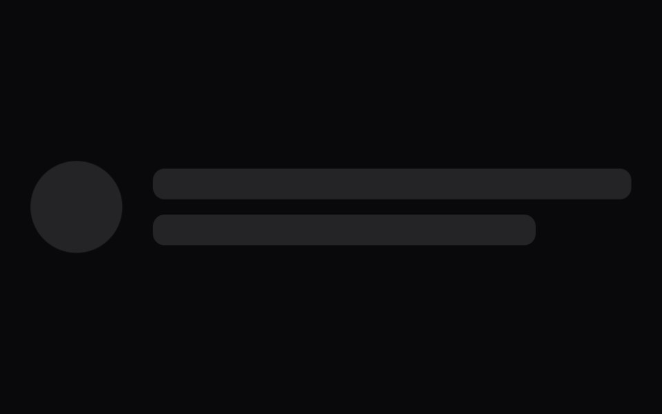 SkeletonVengeance UI · React
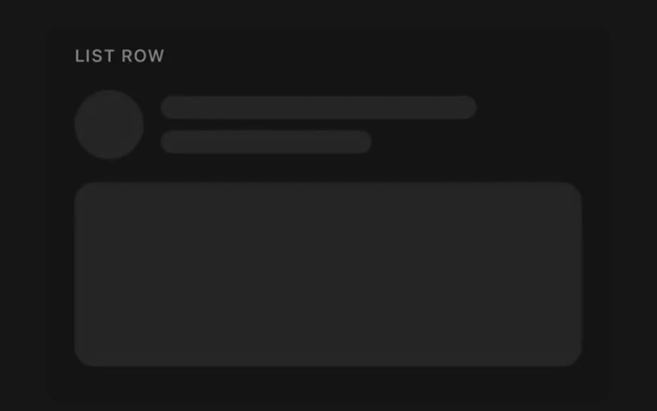 SkeletonPanel UI · React NativeShimmer placeholder for loading content.
 Skeleton 05 - Loading to ContentShadcn Space · ReactBlog card that shows a matching skeleton while loading, fades in the real content, and can be reloaded to replay the…
 Animatedinput PlaceholderShadcn Dashboard · React
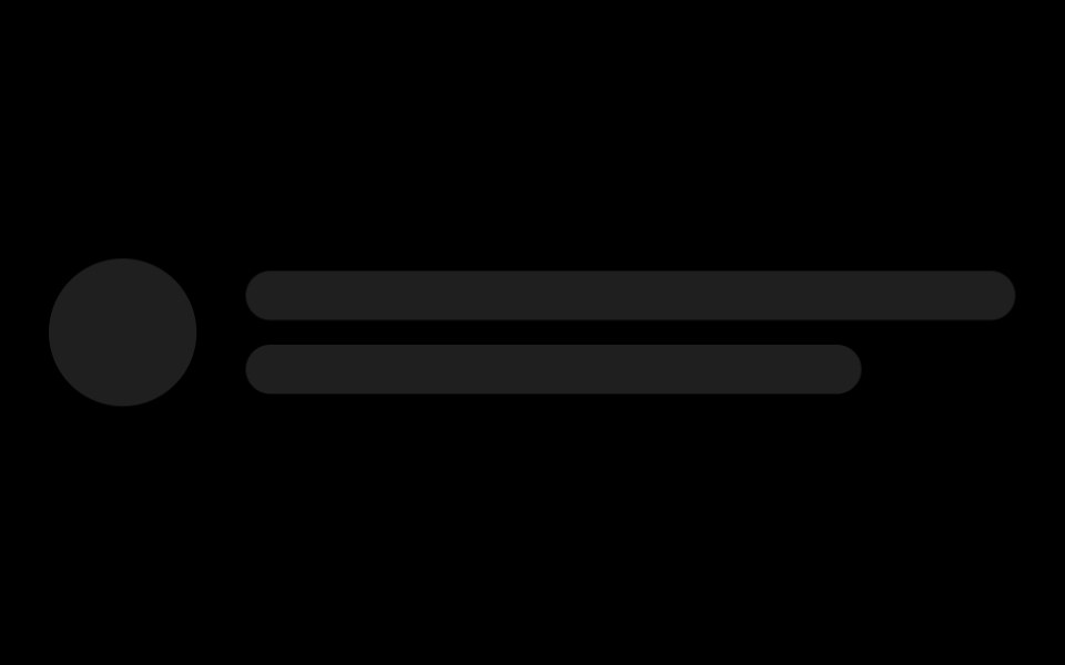 SkeletonObsidianUI · React
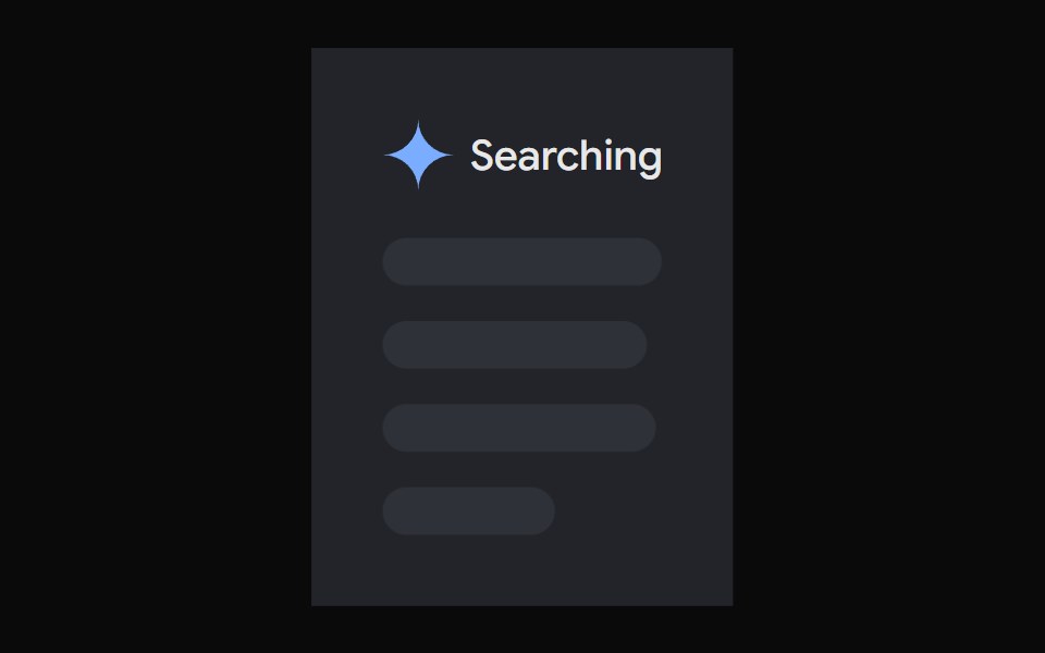 AI Overview SkeletonNotra · ReactA loading state built on shadcn Skeleton.
 SkeletonShark UI · ReactDisplays a loading state.
 SkeletonRewamp UI · ReactShared Skeleton primitive Pulsing block styled with brand tokens and subtle lilac shimmer sweep…
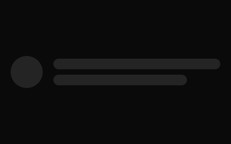 SkeletonWatermelon UI · React
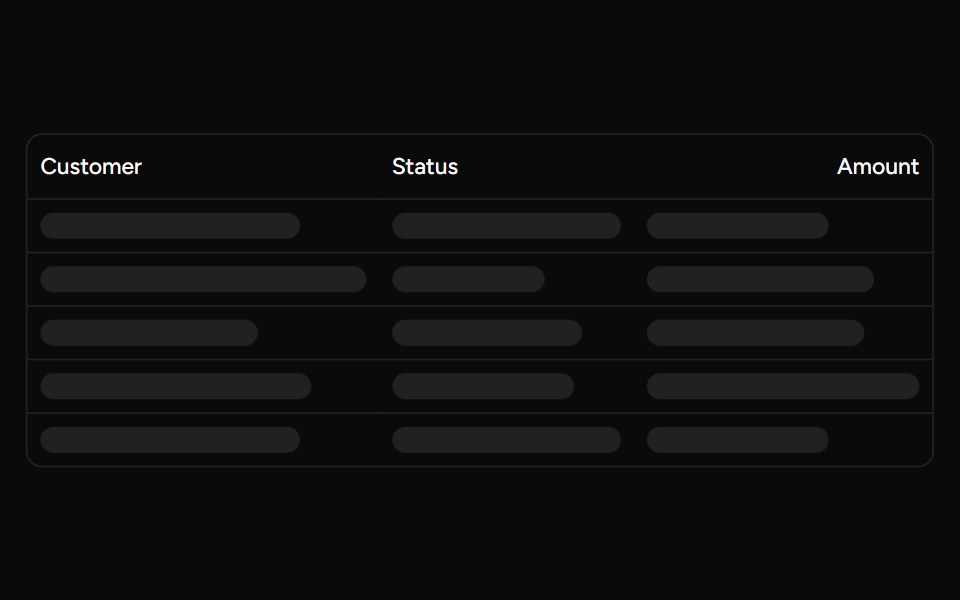 Data Table Loadingsv-table · SvelteSkeleton rows that preserve a table layout while its data is loading.
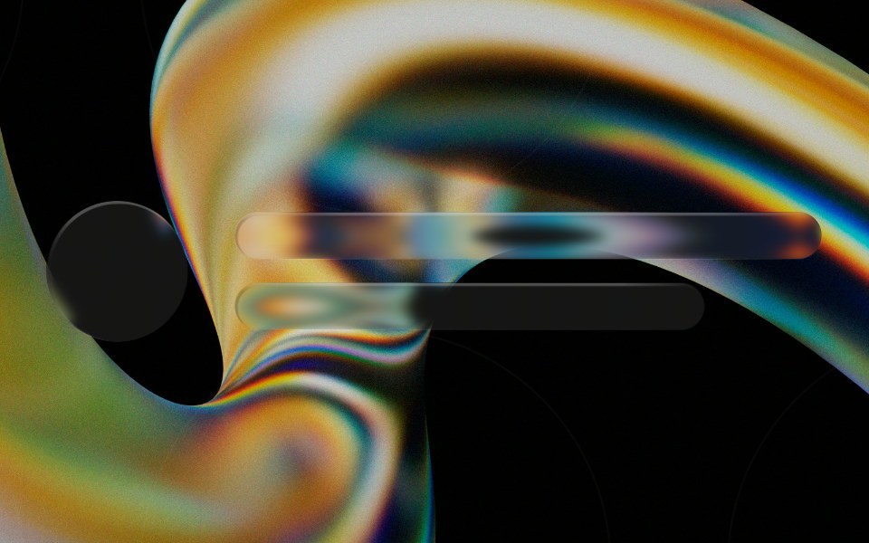 Glass Skeletonglasscn · ReactGlass Skeleton with five variants: clear, frosted, subtle, liquid, and liquid-refract
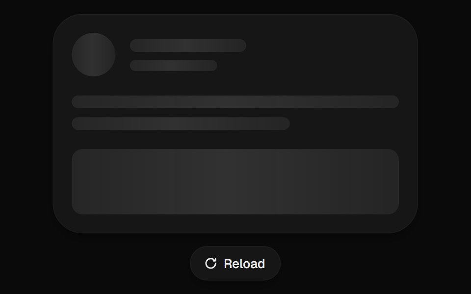 Skeleton LoaderUI Lab · ReactHolds the exact shape of what is coming, so nothing jumps.
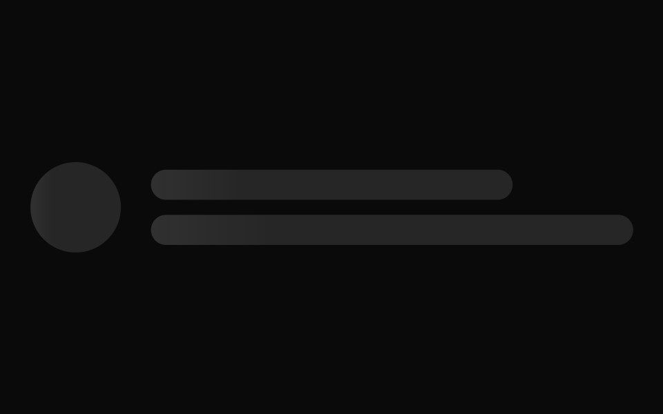 SkeletonHextaUI · ReactPlaceholders that wait 150ms before showing, take the exact size of the content they wrap, and fade it in without…
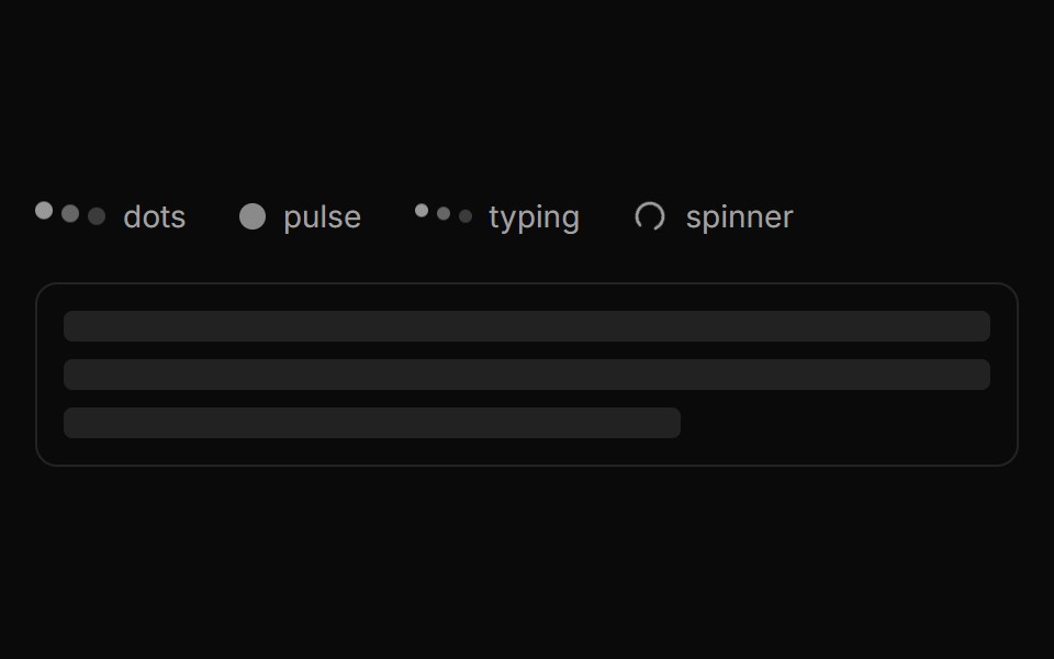 LoaderLocalMode · ReactA small family of busy indicators (dots / pulse / typing / spinner) plus a Shimmer skeleton-text variant, shown while…
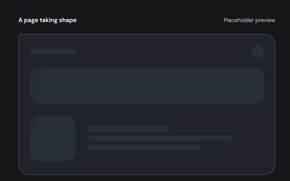 SkeletonCojeev UI · ReactGive unavailable content a useful outline: a reading page, a person or a board of ideas, with three quiet-safe paint…
 Loading skeletonFLX UI · ReactSkeleton placeholder while the avatar loads.
 SkeletonMetal UI · React + SwiftUIWhere content will be before it arrives: blocks, lines and circles in the well's sunk look, shown after a beat with a…
 LoadingSpaceUI · ReactMatrix pixel grid loader with Tailwind color support, spring motion presets, and assistant status cards.
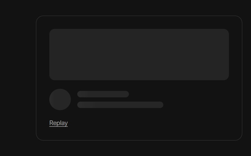 SkeletonSora UI · ReactA loading placeholder with shimmer or fade variants, plus a transition that crossfades into real content once loading…
- SkeletonD2Studio UI · ReactUse to show a placeholder while content is loading.
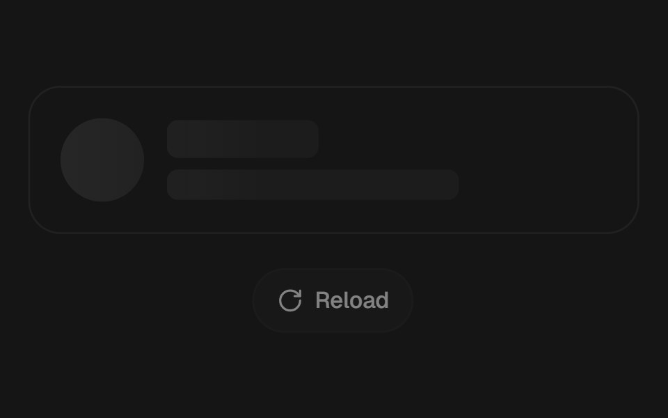 SkeletonEaseUI · ReactLoading placeholder with one shimmer shared across the page. Wrap real content and it takes the same shape, then…
 SkeletonFibo · ReactA placeholder in the shape of content that's still loading.
 SkeletonReactFrame · ReactA loading placeholder with rect, text, circle and card presets, a shimmer or pulse animation, reduced-motion support…
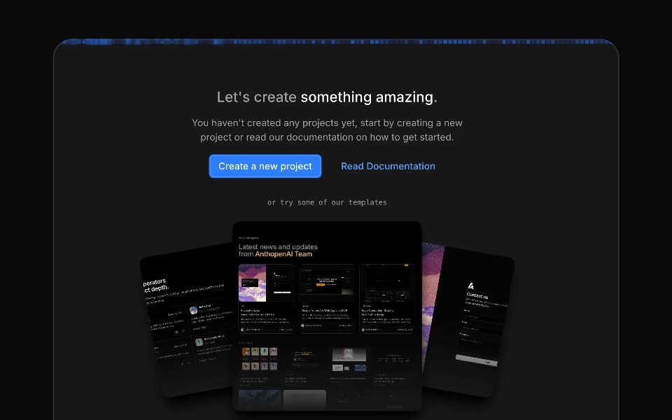 Image Generation LoaderAceternity UI · React
 Skeletonark-cn · ReactPlaceholder to show a loading state before content loads.
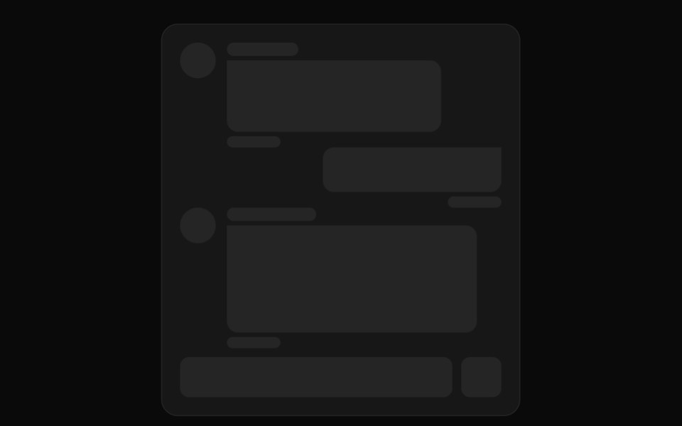 Skeleton loader for chat messagesReUI · ReactSkeleton loader for chat messages
 Shimmer LineAmicro Micro Transitions · ReactShimmer Line loading animation.
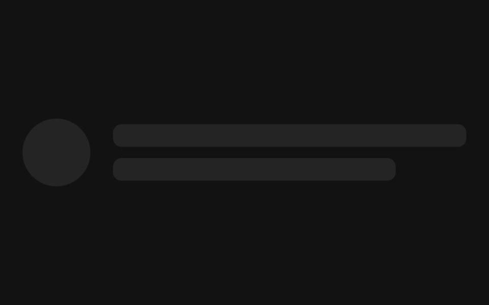 SkeletonSpectrum UI · Reactcomponent for the Skeleton
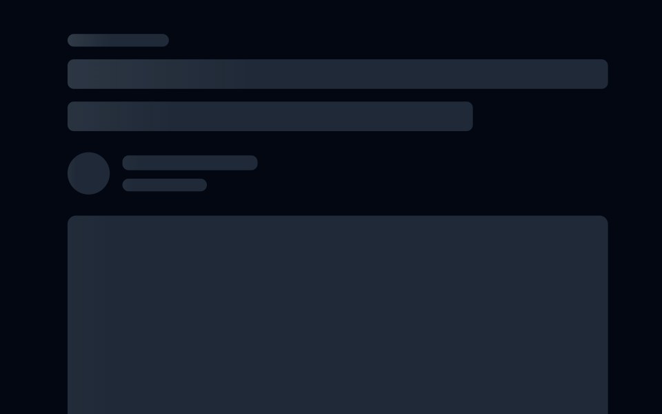 Skeleton 08 - Shimmer ArticleShadcn Space · ReactArticle skeleton with a staggered shimmer sweep instead of a pulse, covering title, author, cover image, and paragraph…
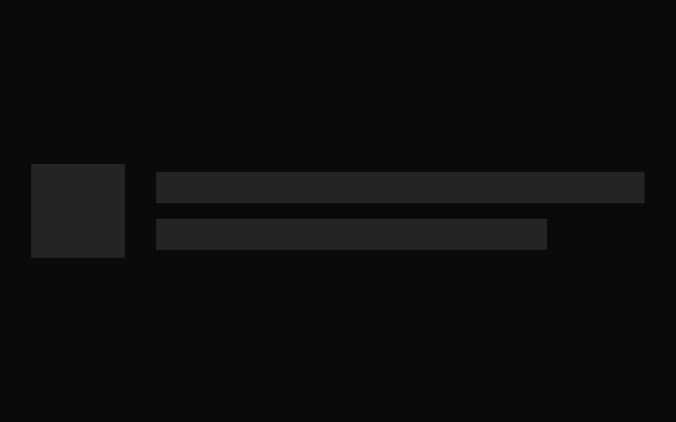 SkeletonShadcn Dashboard · React
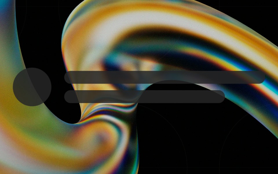 Skeletonglasscn · React
 BasicFLX UI · ReactA stack of placeholder lines for a text block.
 SkeletonSpaceUI · ReactDisplays animated placeholder shapes while content is loading, giving users immediate visual feedback and making apps…
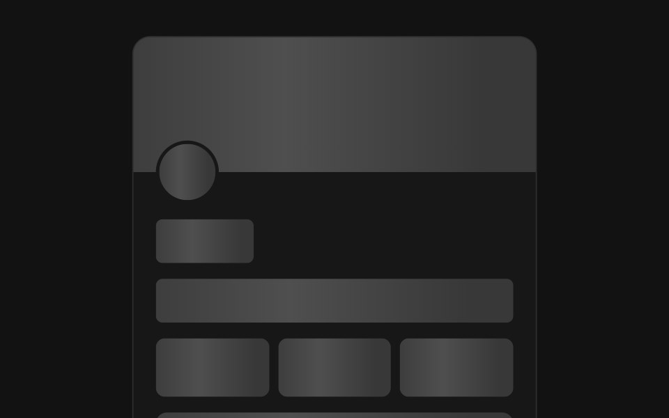 Skeleton ShimmerSora UI · ReactSkeleton loading placeholders with a shimmer effect that transitions to revealed content via a CSS view-transition…
 Skeleton loader for a card component.ReUI · ReactSkeleton loader for a card component.
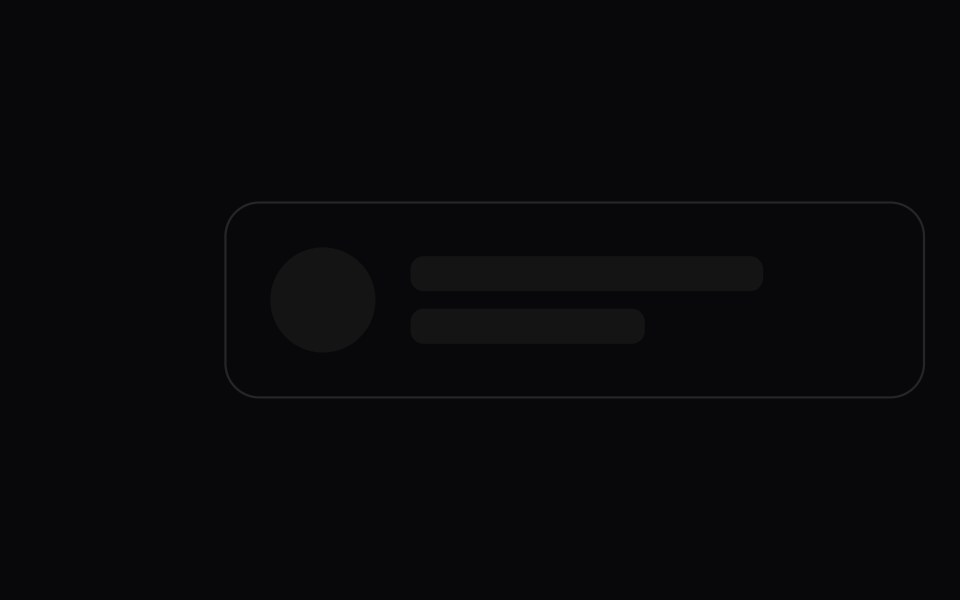 SkeletonAmicro Micro Transitions · ReactLoading skeleton with smooth shimmer sweep.
 Skeleton RevealSpectrum UI · ReactA skeleton that pulses while loading, then cross-fades and un-blurs into the real content.
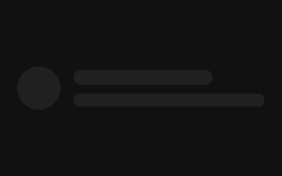 Avatar with textFLX UI · ReactA circle beside two lines, mimicking a loading user row.
 Skeleton loader for text and paragraphs.ReUI · ReactSkeleton loader for text and paragraphs.
 Skeleton LoaderAmicro Micro Transitions · ReactSkeleton Loader loading animation.
 CardFLX UI · ReactMedia banner above a title, body lines, and a footer.
 Skeleton loader for a form.ReUI · ReactSkeleton loader for a form.
 ParagraphFLX UI · ReactA heading followed by full-width body lines.
 Skeleton loader for a data table.ReUI · ReactSkeleton loader for a data table.
 ListFLX UI · ReactRepeated rows, each with a circular avatar and two text lines.
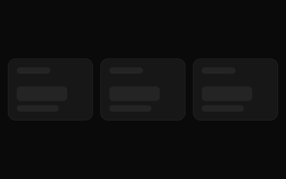 Skeleton loader for a dashboard stats rowReUI · ReactSkeleton loader for a dashboard stats row
 TableFLX UI · ReactA header row above several placeholder data rows.
 Skeleton loader for a list with actionsReUI · ReactSkeleton loader for a list with actions
 FormFLX UI · ReactLabelled fields above a submit button placeholder.
 Skeleton loader for a card gridReUI · ReactSkeleton loader for a card grid
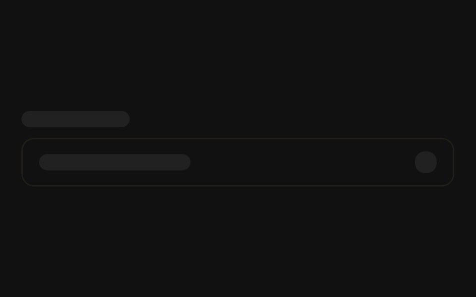 SelectFLX UI · ReactA field label above a trigger with a chevron block.
 Skeleton loader for a full profile pageReUI · ReactSkeleton loader for a full profile page
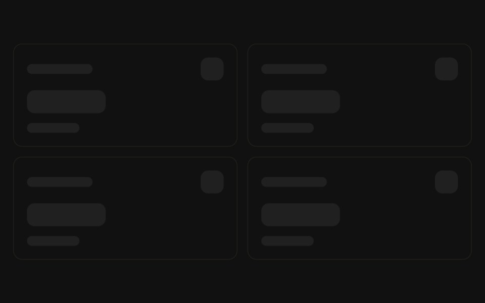 Stat cardsFLX UI · ReactA grid of KPI cards with label, value, and trend lines.
 Chat threadFLX UI · ReactAlternating inbound and outbound message bubbles.
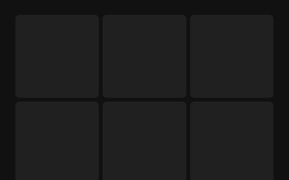 Gallery gridFLX UI · ReactA grid of square image tiles for a loading gallery.
 ArticleFLX UI · ReactA hero image, title, byline, and stacked body lines.
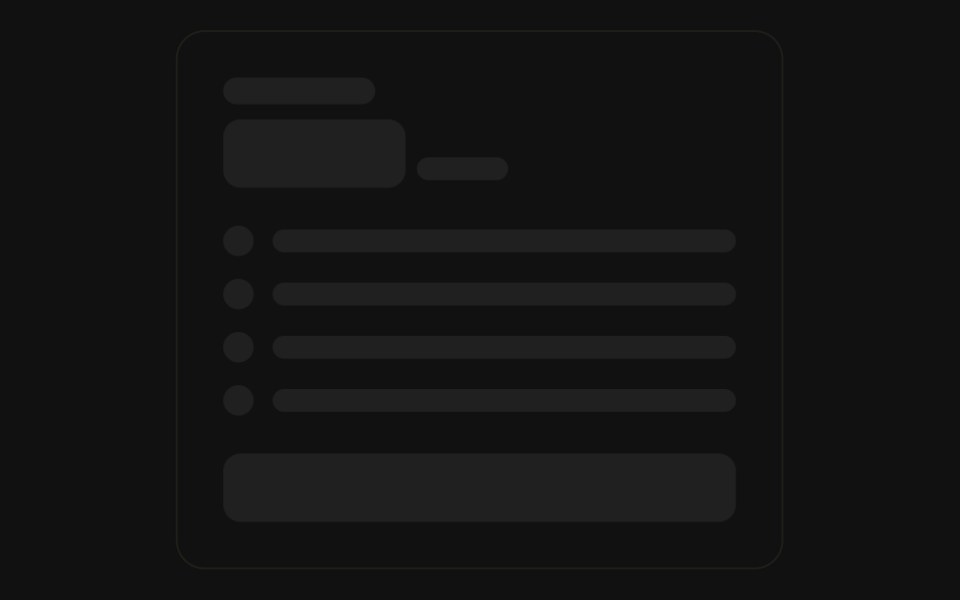 Pricing cardFLX UI · ReactA plan name, price, feature rows, and a CTA button.
 Sidebar navFLX UI · ReactA logo header above a list of icon-and-label nav rows, with a user profile row at the bottom.
Libraries with Tailwind CSS skeleton components
Related categories
- Skeleton Components
- React Skeleton Components
- Animated Skeleton Components
- shadcn/ui Skeleton Components
- Tailwind CSS Feedback Components
- Tailwind CSS Spinner Components
- Tailwind CSS Badge Components
- Tailwind CSS Progress Components
- Tailwind CSS Alert Components
- Tailwind CSS Chip Components
- Tailwind CSS Progress Bar Components
- Tailwind CSS Empty State Components
- Tailwind CSS Notification Components
- Tailwind CSS Banner Components
- Tailwind CSS Status Indicator Components
- Tailwind CSS Typing Indicator Components
- Tailwind CSS Progress Circle Components
- Tailwind CSS Error State Components
- Tailwind CSS Scroll Progress Components
- Tailwind CSS Success Animation Components