Animated Circular Progress Bar
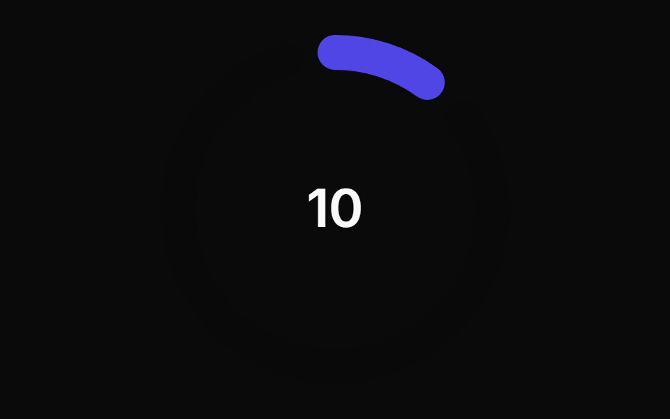
A circular progress bar component with animated transitions between primary and secondary colors.
- Library
- Animations (Svelte)
- Framework
- Svelte
- Type
- block
- License
- MIT
- Install
pnpm dlx shadcn-svelte@latest add https://sv-animations.vercel.app/r/animated-circular-progress-bar.json- Files
src/lib/components/magic/animated-circular-progress-bar/animated-circular-progress-bar.sveltesrc/lib/components/magic/animated-circular-progress-bar/index.tssrc/lib/utils.ts
- Source
- https://github.com/SikandarJODD/animations
Categories
- Feedback Components
- Svelte Feedback Components
- Tailwind CSS Feedback Components
- Progress Components
- Tailwind CSS Progress Components
- Progress Circle Components
- Tailwind CSS Progress Circle Components