Char Limit Indicator
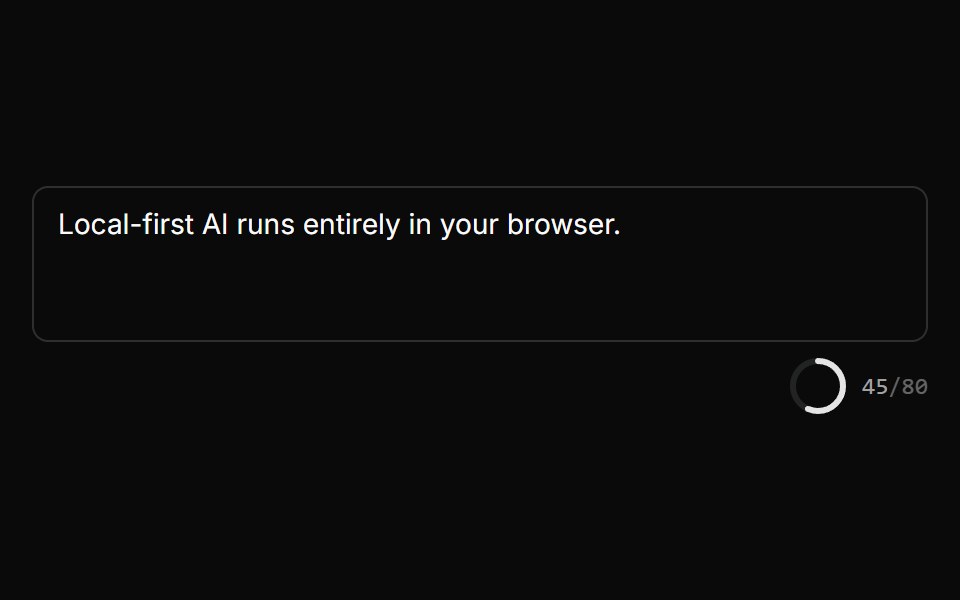
A radial progress ring + n/MAX monospace counter that turns error-colored when over the limit, deriving the percentage internally from charCount + maxLength. Pure SVG, shadcn/CSS-variable themed (not daisyUI). Self-contained — sits beside a.
- Library
- LocalMode
- Framework
- React
- Type
- component
- License
- MIT
- Install
npx shadcn add @localmode/ui/ui/input-controls/char-limit-indicator- Files
apps/ui/registry/localmode/input-controls/char-limit-indicator/char-limit-indicator.tsxapps/ui/src/lib/utils.ts
- Source
- https://github.com/LocalMode-AI/LocalMode
Categories
- Counter Components
- React Counter Components
- Tailwind CSS Counter Components
- Data Display Components
- React Data Display Components
- Tailwind CSS Data Display Components
- Feedback Components
- React Feedback Components
- Tailwind CSS Feedback Components
- Progress Components
- React Progress Components
- Tailwind CSS Progress Components