Progress Bar
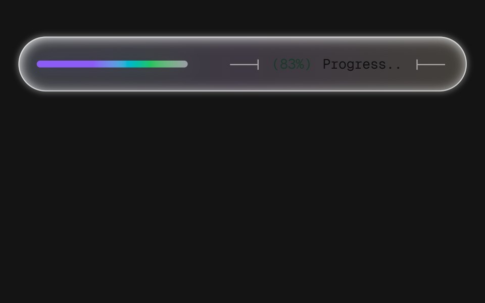
A frosted-glass progress pill with technical-drawing leader lines bracketing a monospace readout. Three levels of chrome — full, bar, plain — and two fill styles: a 6px beam or a three-row dot matrix. Every surface property is themeable — f.
- Library
- D2Studio UI
- Framework
- React
- Type
- component
- License
- MIT
- Install
npx shadcn@latest add https://d2studio.dev/r/progress-bar.json- Files
registry/default/components/progress-bar.tsxlib/utils.ts
- Source
- https://github.com/rajaaltus/d2studio-ui
Categories
- Feedback Components
- React Feedback Components
- Tailwind CSS Feedback Components
- Progress Components
- React Progress Components
- Tailwind CSS Progress Components
- Progress Bar Components
- React Progress Bar Components
- Tailwind CSS Progress Bar Components