 Dev Design Library
Tailwind CSS Text Input Components
Dev Design Library indexes 528 Tailwind CSS text input components from 55 open-source UI libraries, with the most coming from ReUI, Origin UI, sv-particles, Oxbow UI and FLX UI. Each one links to its page with the source code, a live preview where available, the library license and the install command. Every library in this list styles its components with Tailwind CSS utility classes. Text input components belong to the Inputs group.
Showing 120 of 528, a mix from every library. Open a library to see all of its components.
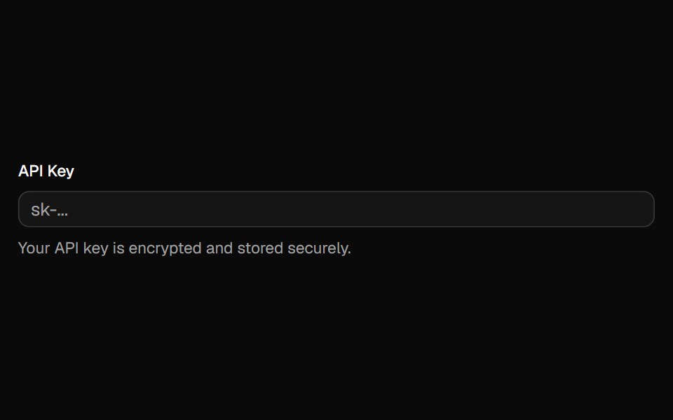 Inputshadcn/ui · ReactA text input component for forms and user data entry with built-in styling and accessibility features.
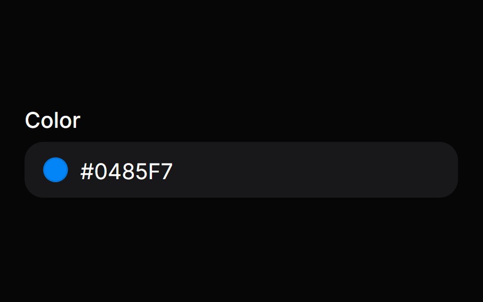 Color FieldHeroUI · ReactColor input field with labels, descriptions, and validation built on React Aria ColorField
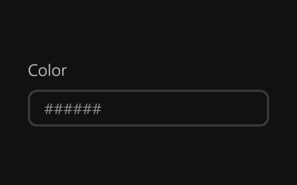 Color FieldReact Spectrum · ReactA color field allows users to edit a hex color or individual color channel value.
 Autocompletecoss ui · ReactAn input that suggests options as you type.
 InputOrigin UI · ReactA native input element.
- Pin InputPreline UI · JavaScript (HTML + Tailwind)
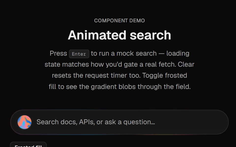 Halo SearchCult UI · ReactSearch input with animated gradient border, staggered placeholder, blur deletion on clear, loading line, and Warp…
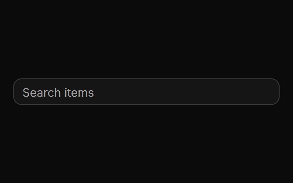 AutocompleteReUI · ReactAn input that suggests options as you type.
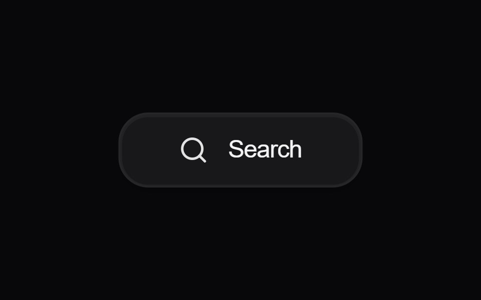 Button SearchAmicro Micro Transitions · React
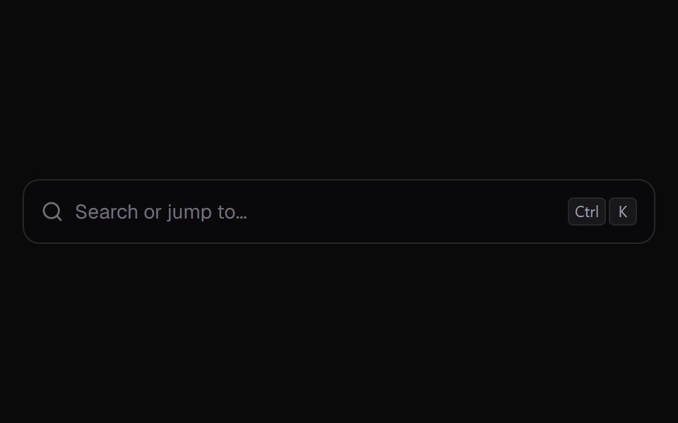 Command PaletteKokonut UI · React⌘K command palette with nested pages, fuzzy matching and in-row progress for running actions.
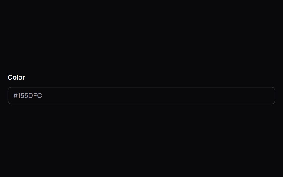 color-fieldIntent UI · Reactcolor-field
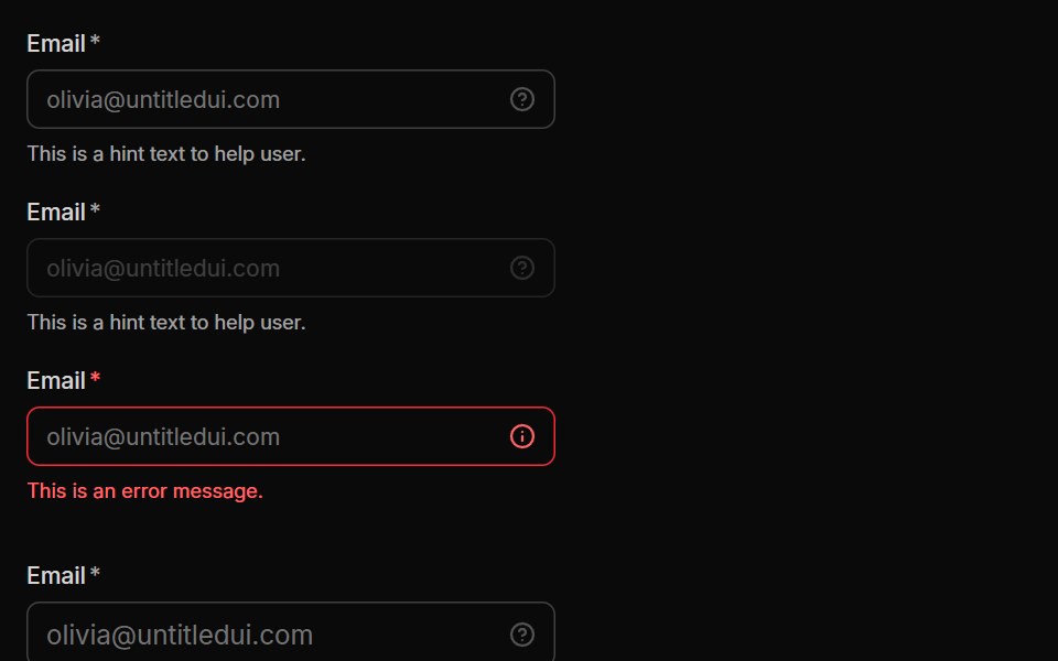 InputUntitled UI React · React
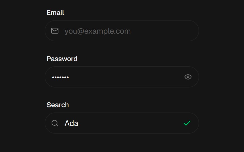 InputbeUI · ReactText input with label, left/right icons, optional stable error row, error shake and success check draw.
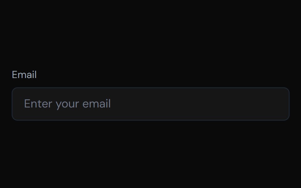 InputTailGrids · ReactAn input component with multiple variants and support for icons.
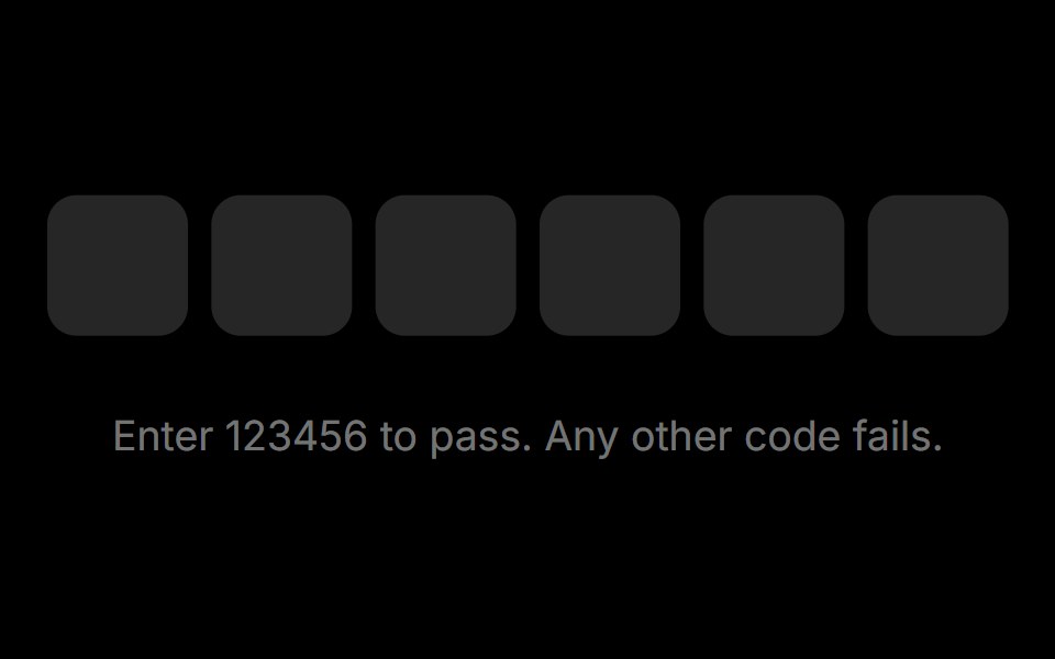 OTP InputRare UI · ReactA one-time-code input whose characters roll into place behind a caret that slides from slot to slot.
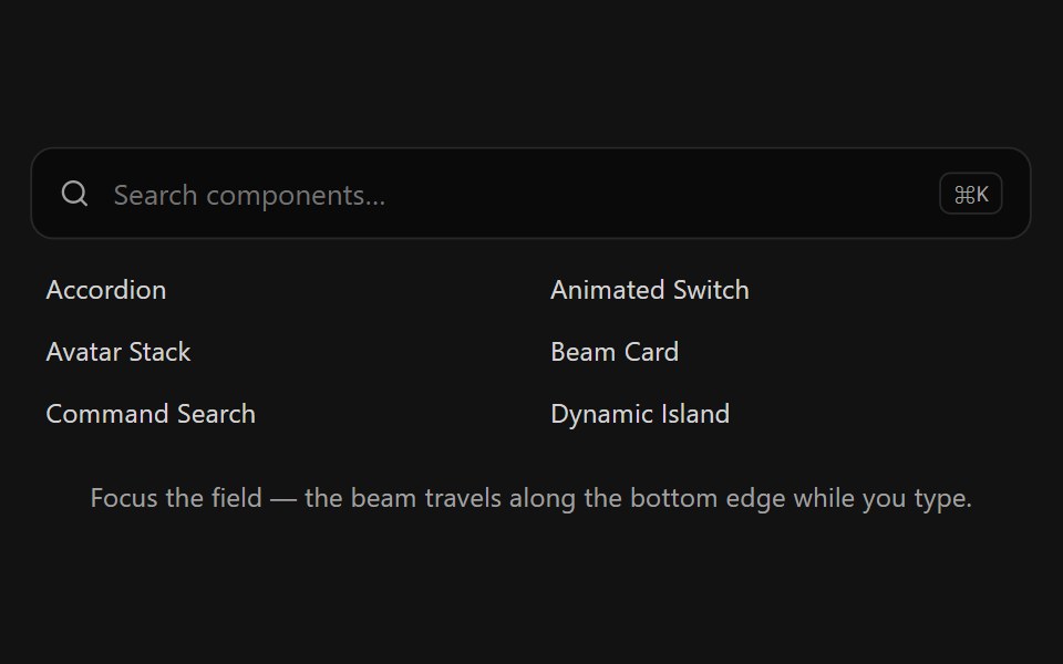 Beam Search BarSpectrum UI · ReactA search bar whose bottom edge lights up with a traveling beam while it has focus.
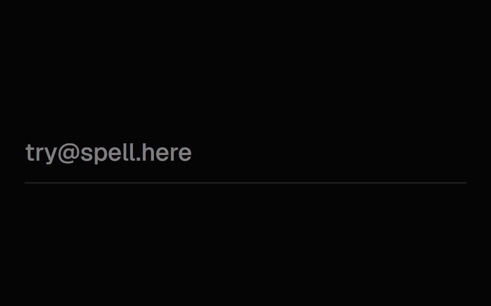 Exploding InputSpell UI · ReactInput component that spawns particle effects when typing.
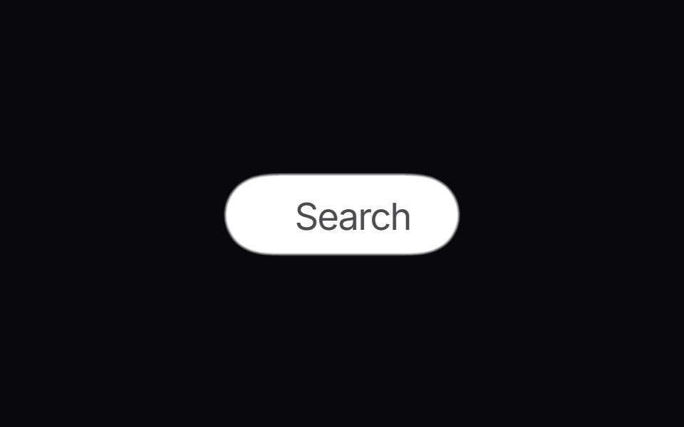 Gooey SearchVengeance UI · ReactMorphing gooey blob search button with animated results
 Input CopyFluid Functionalism · ReactRead-only input with a copy-to-clipboard button and animated check feedback. Supports optional label and shape context.
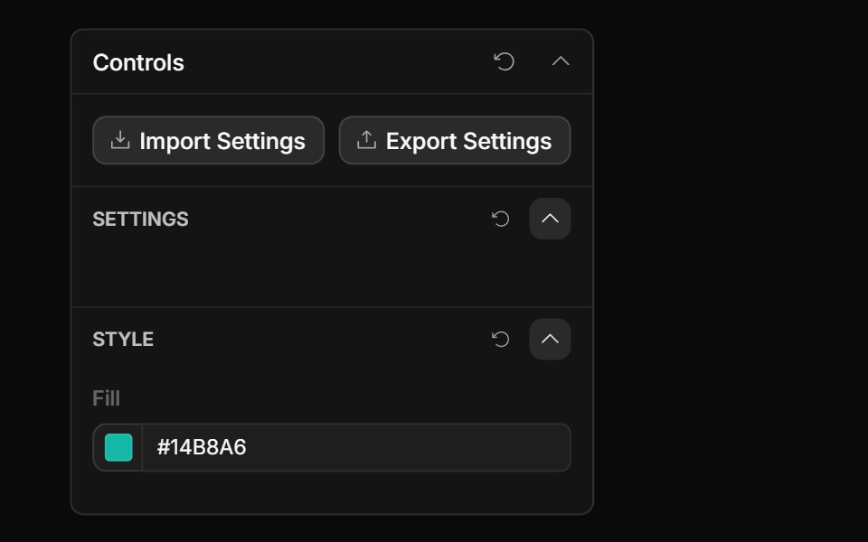 Color ControlToolcraft · React
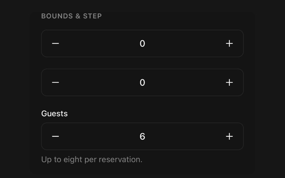 Number InputPanel UI · React NativeNumeric field stepped by buttons or typed by hand.
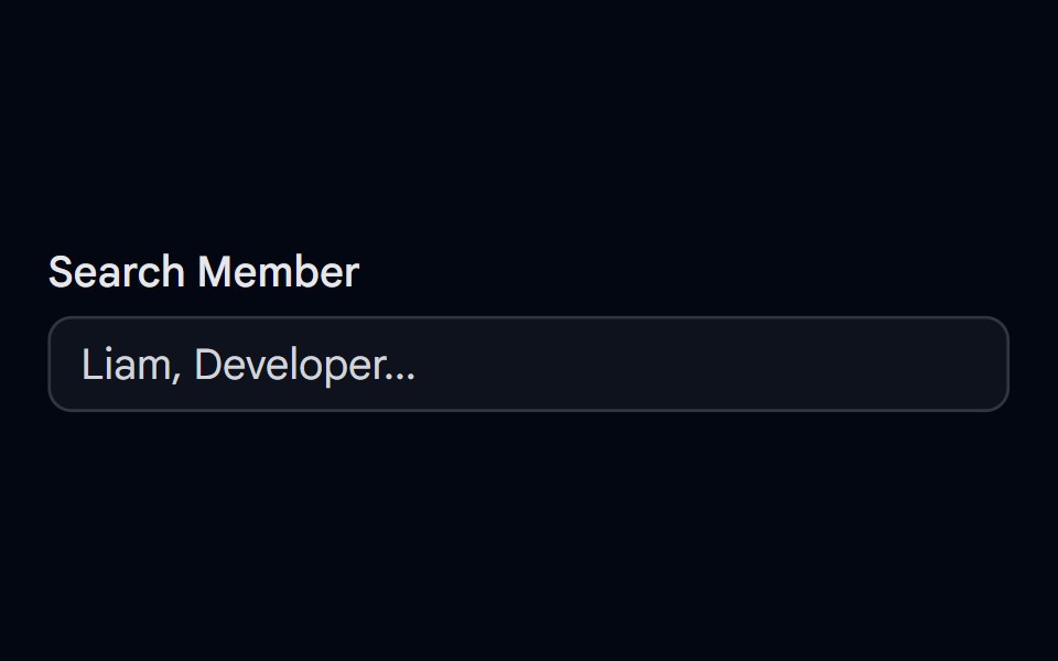 Autocomplete-04 - Team Member SearchShadcn Space · ReactAutocomplete with grouped team members, avatars, status dots, and spring-animated list items
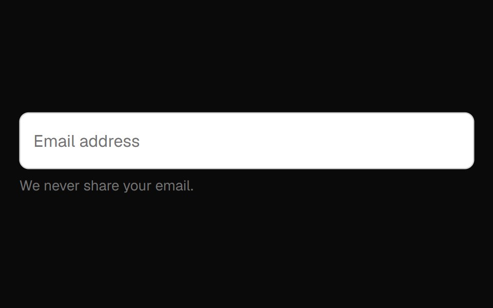 Floating Label Field InputOpenSourceUI · React
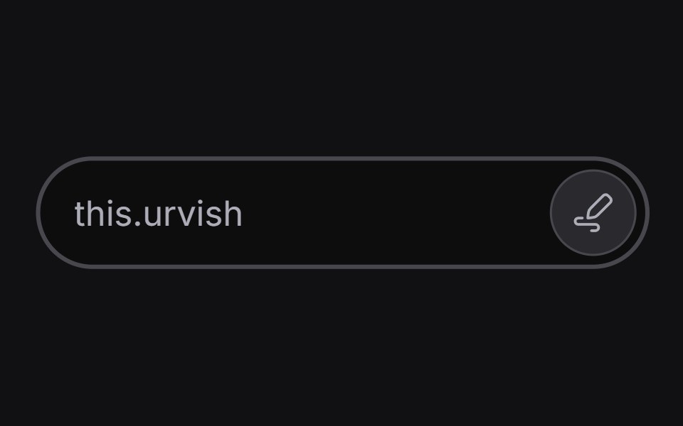 Inline Edituselayouts · ReactAn input that switches between read and edit modes.
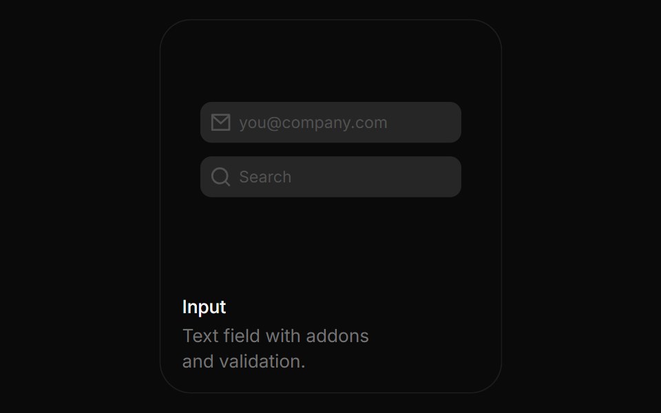 InputBoardUI · ReactText field with addons and validation.
 InputComponentry · React
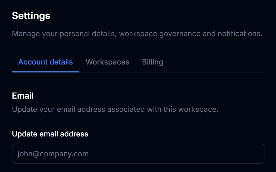 InputTremor Blocks · React
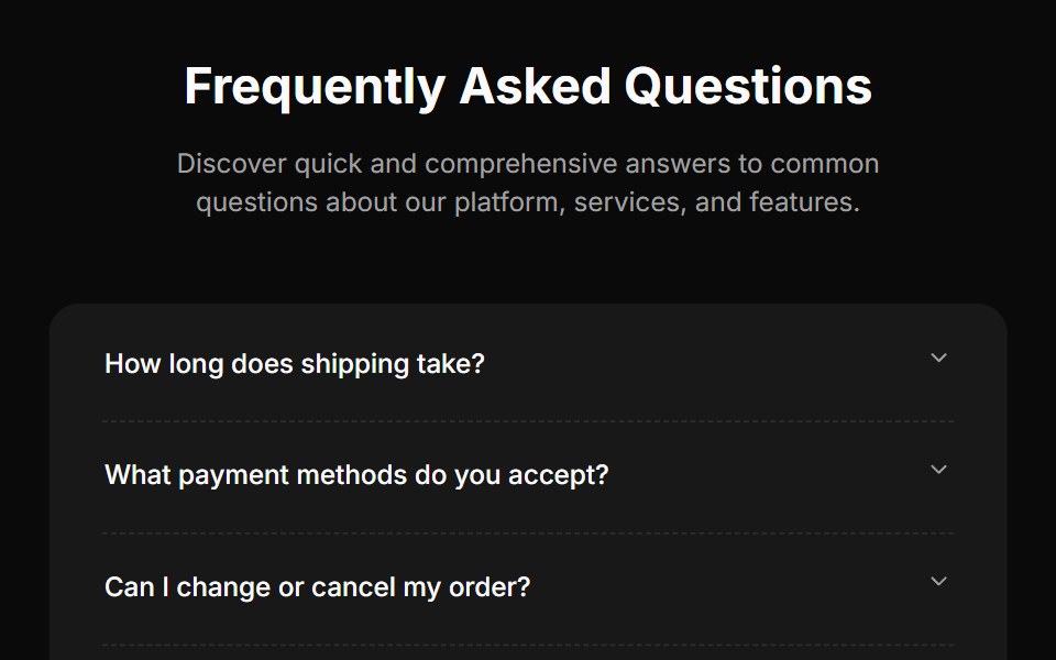 Faq Fourcnblocks · SvelteFAQ section with search and categories
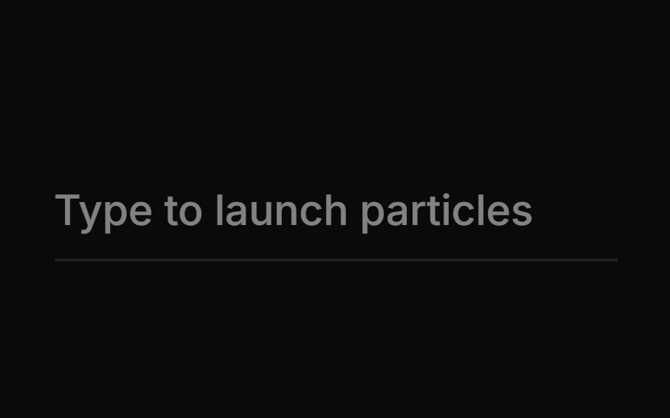 Spell Exploding InputAnimations (Svelte) · Svelte
 InputObsidianUI · React
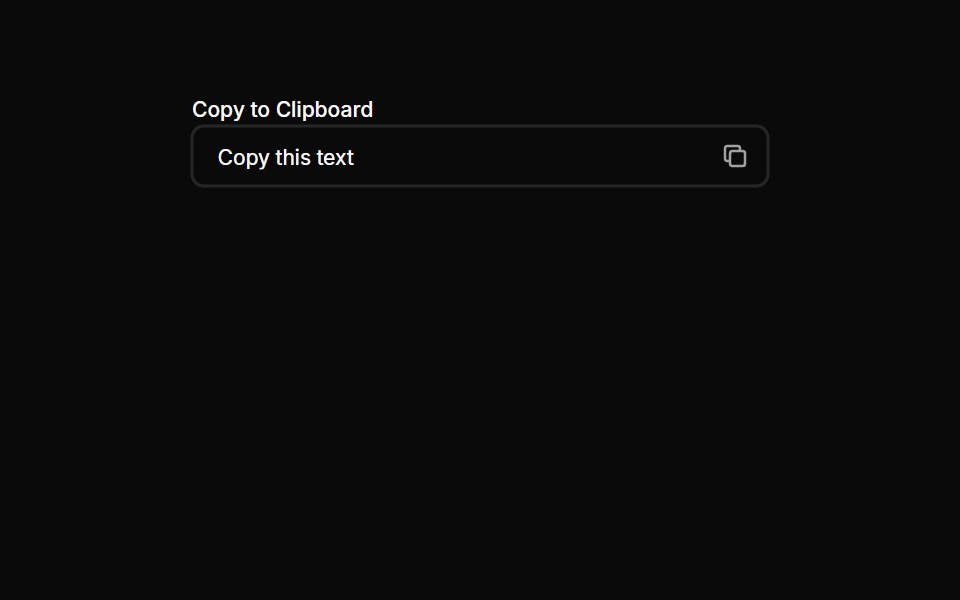 Inputs 20Oxbow UI · AstroCopy to clipboard input
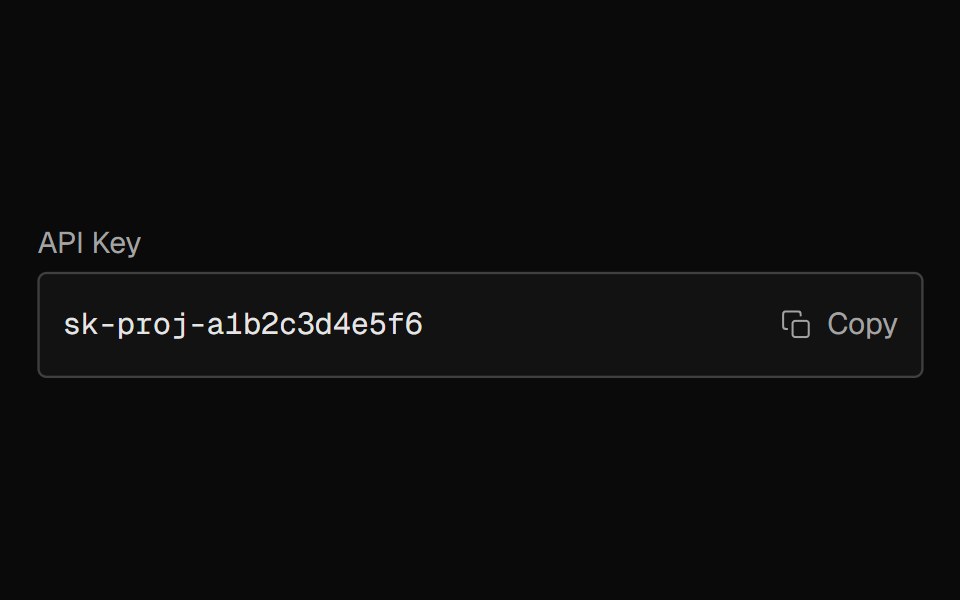 Input CopyNexvyn UI · ReactA copy-to-clipboard field that shows a monospace value with an icon or button trigger, animating a checkmark on copy.
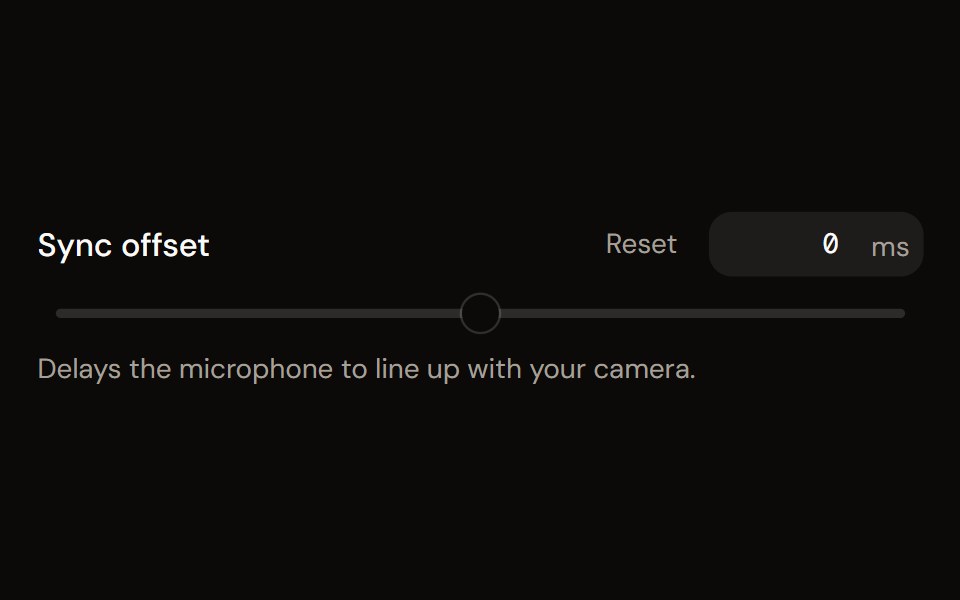 Parameter Slideraudiocn · ReactA labelled slider with a numeric input, unit, marks, reset and a linear or log scale, for gain trims, delays…
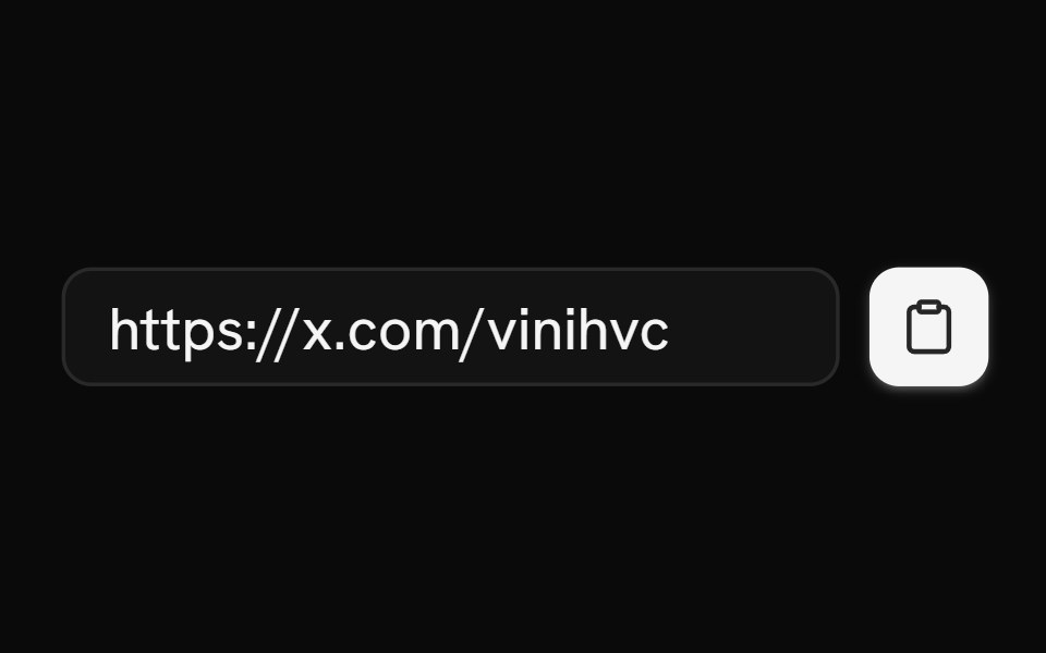 ClipboardShark UI · ReactCopy text to the clipboard.
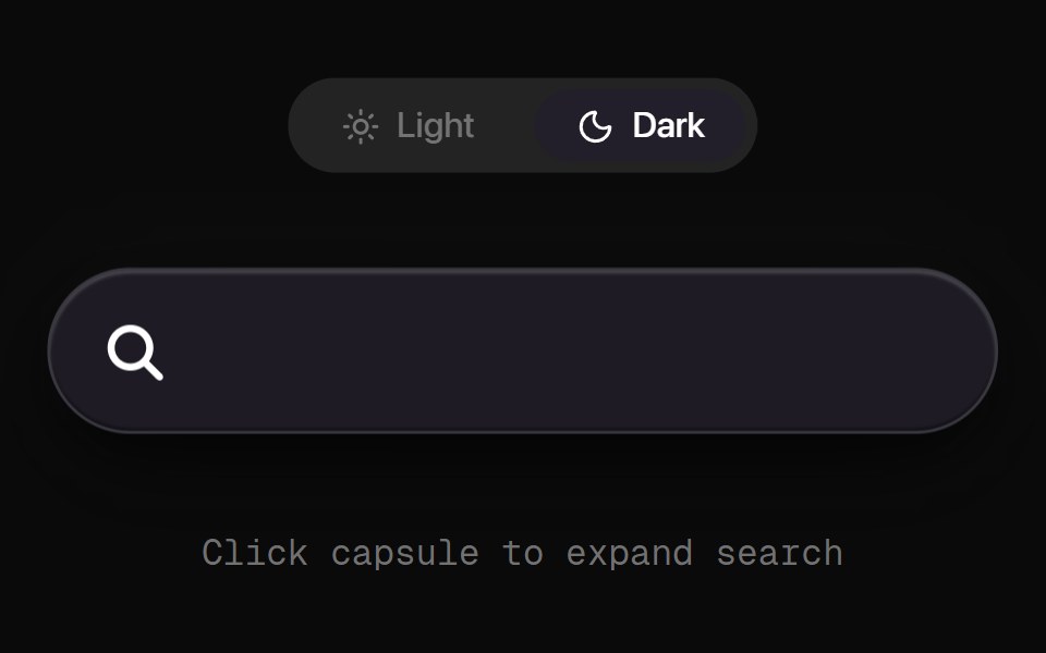 Morph Search CapsuleRewamp UI · ReactSleek, tactile search pill capsule with click ripple physics and a buttery-smooth fluid SVG morph transition between…
 Floating InputWatermelon UI · React
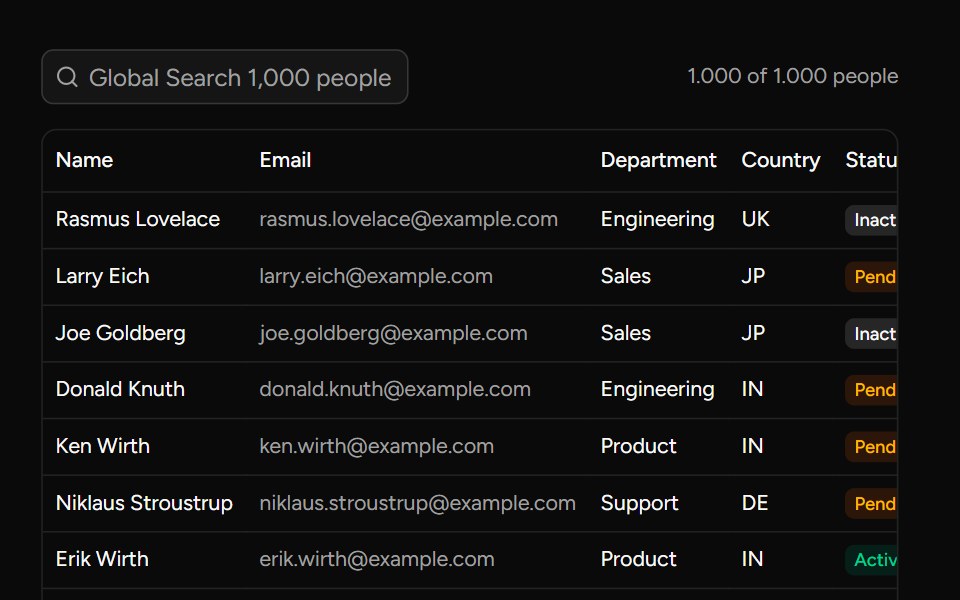 Debounce Inputsv-table · SvelteA search input with an optional delay for value changes.
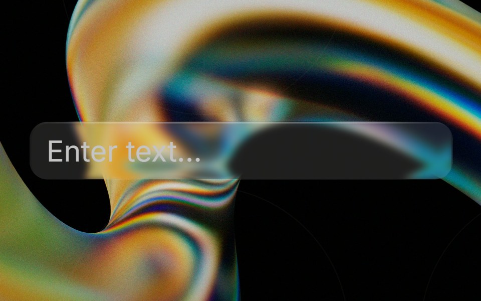 Glass Inputglasscn · ReactGlass Input with five variants: clear, frosted, subtle, liquid, and liquid-refract
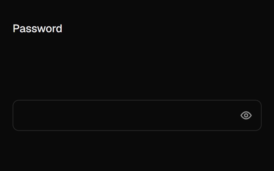 Caps Lock WarningUI Lab · ReactA small caps lock key with its light on slides into the field when caps is on.
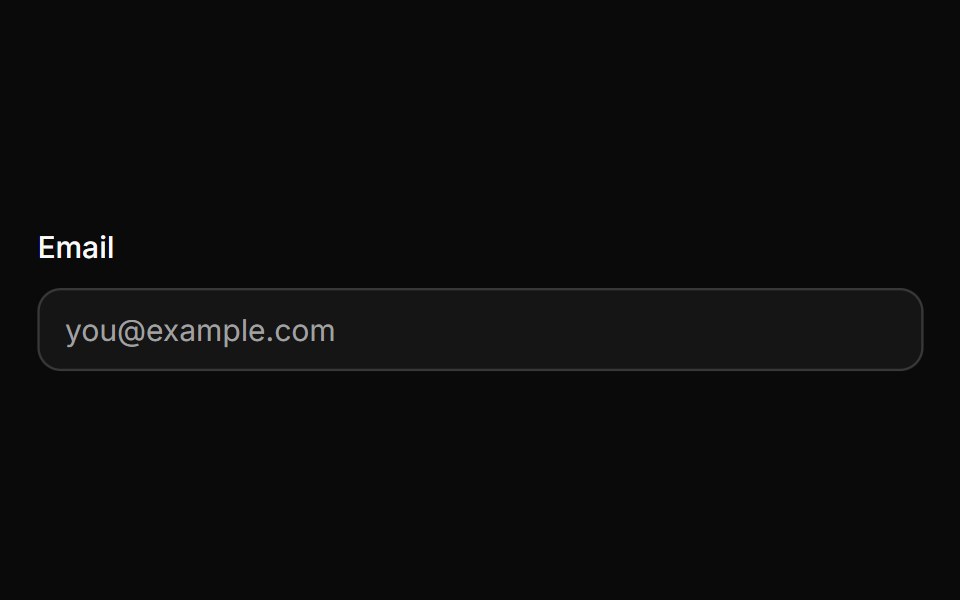 InputHextaUI · ReactA text input with three sizes, invalid and read-only states, native validation styling and a 16px touch font so phones…
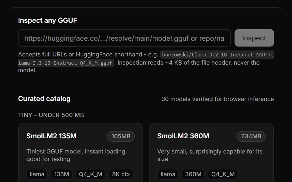 GGUF Explorer BlockLocalMode · ReactBrowse 160,000+ HuggingFace GGUF models and the curated wllama catalog, inspect any file's metadata via a ~4KB HTTP…
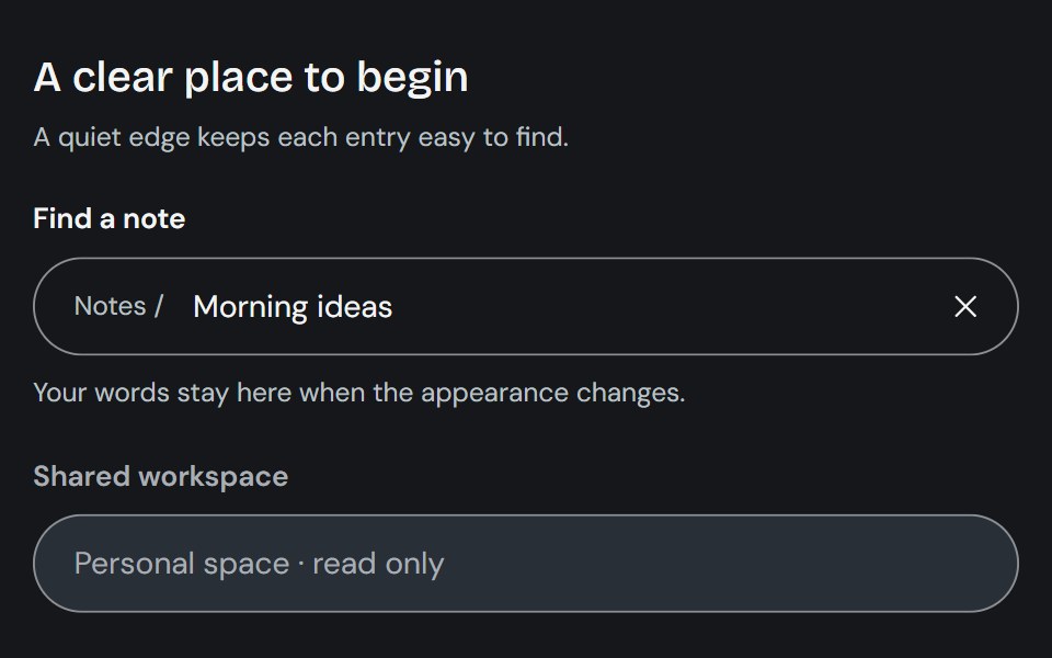 InputCojeev UI · ReactCollects a single-line value through a native input with optional composed affixes and clearing controls.
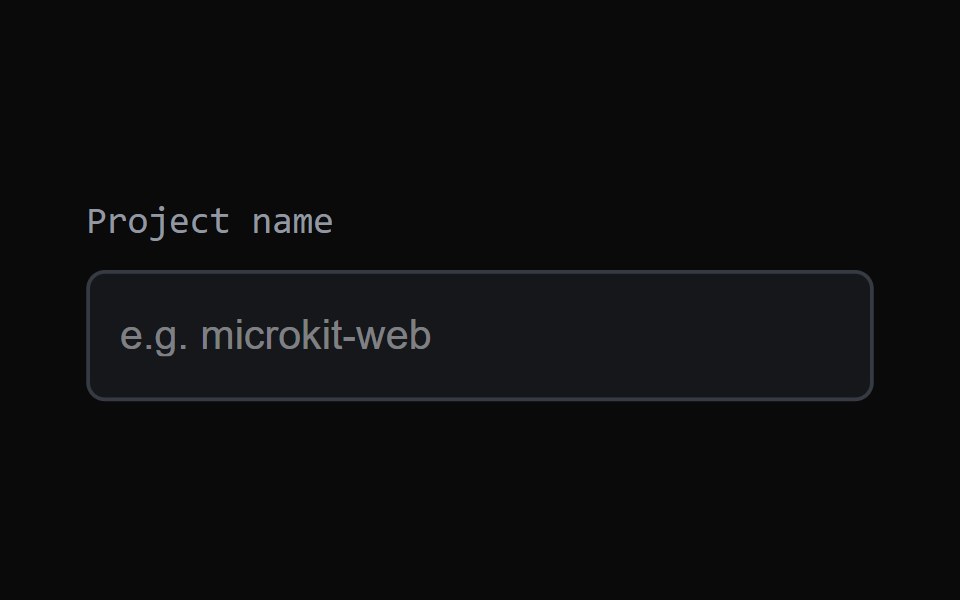 Focus FieldMicroKit · ReactAn input with a clean animated focus treatment.
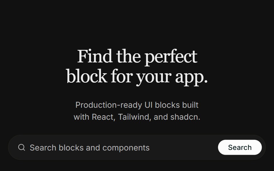 Hero 09FLX UI · ReactA centered real-estate hero with a search bar, a masked architecture image that fades into the page, and a split…
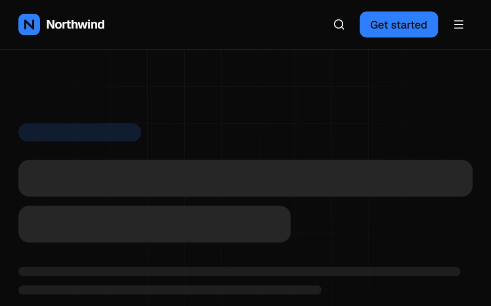 Mega menu navbarVelora UI · ReactTop bar with a keyboard-accessible Product mega menu, search, sign-in and a slide-over mobile menu.
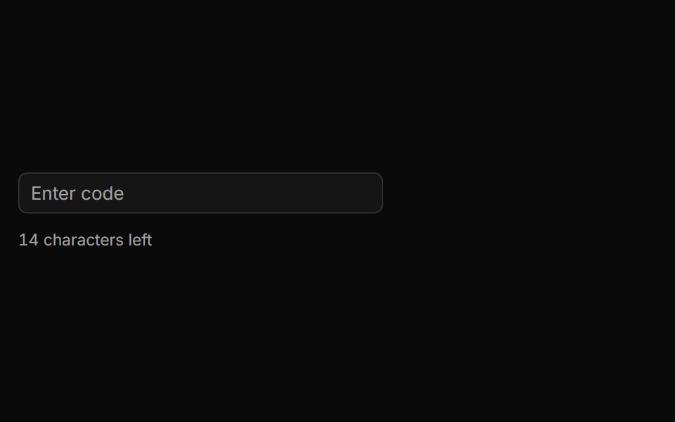 Characters Remaining Countsv-particles · SvelteText input that shows how many characters are still left before the limit.
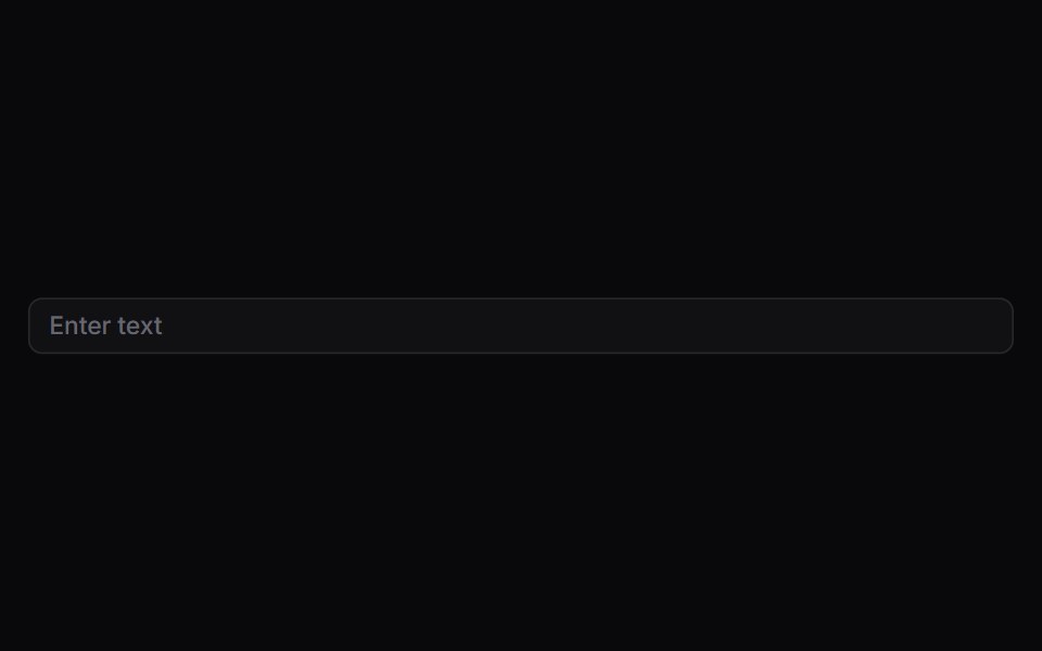 InputSpaceUI · ReactAllows users to type single-line text, emails, passwords, or numbers, with clear focus outlines and validation feedback.
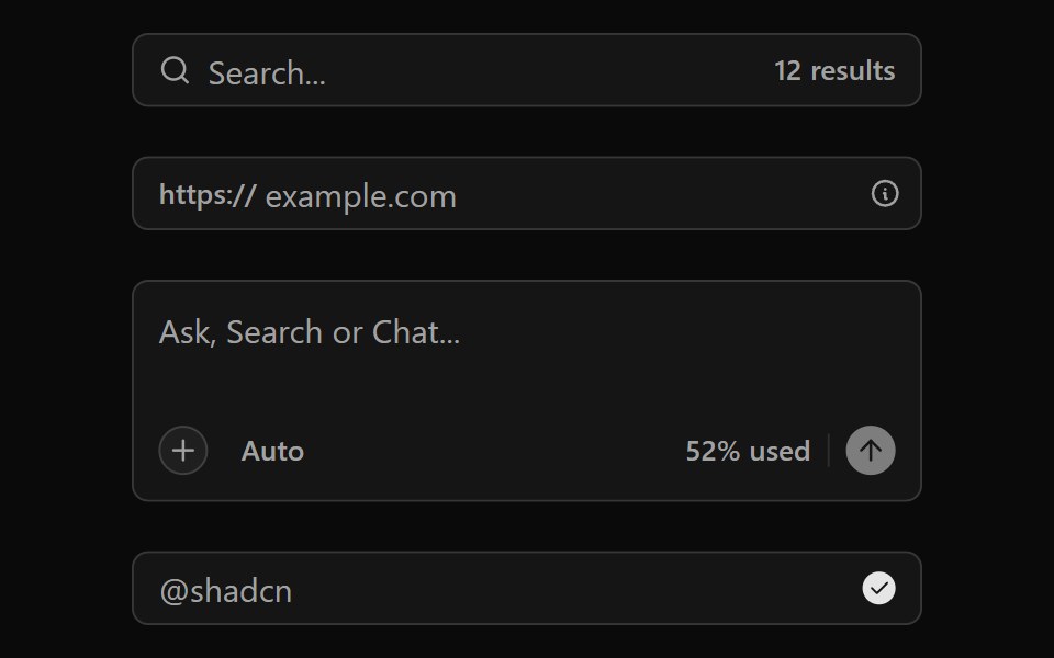 Input GroupOUI · ReactReact aria components Group with shadcn characteristics.
 Dashboard 01D2Studio UI · ReactHotel booking dashboard with guest and vacancy stats, booking search and a check-in and check-out table.
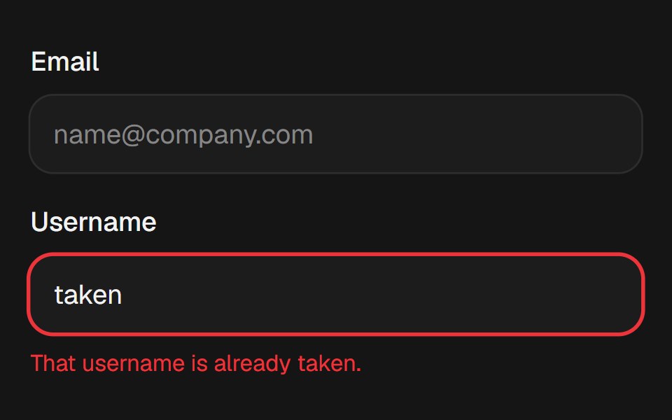 InputEaseUI · ReactText input whose focus ring grows from a hairline to two px, with a destructive ring for aria-invalid.
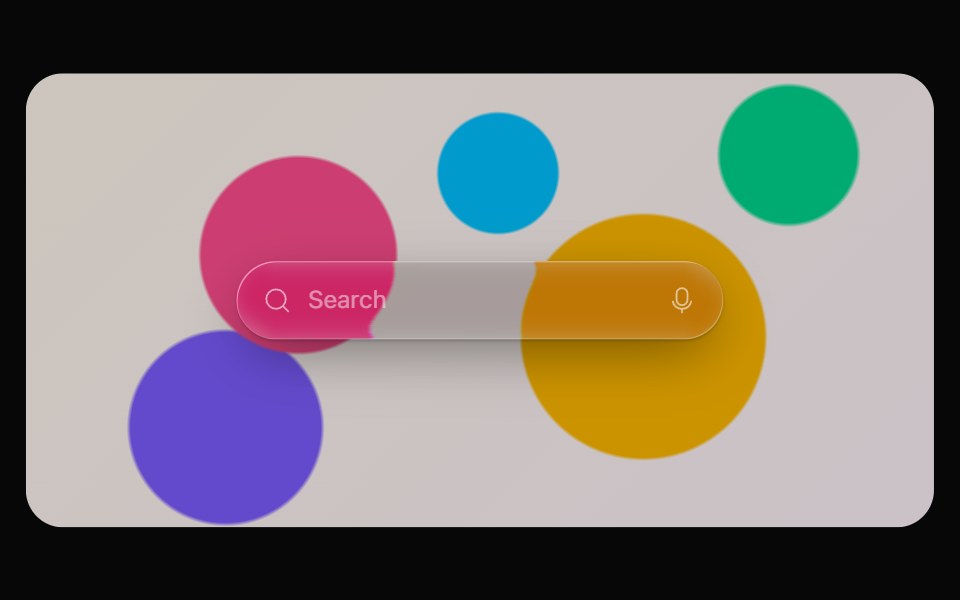 Glass InputOpaline · ReactCapsule text field with icon and adornment slots — made for search.
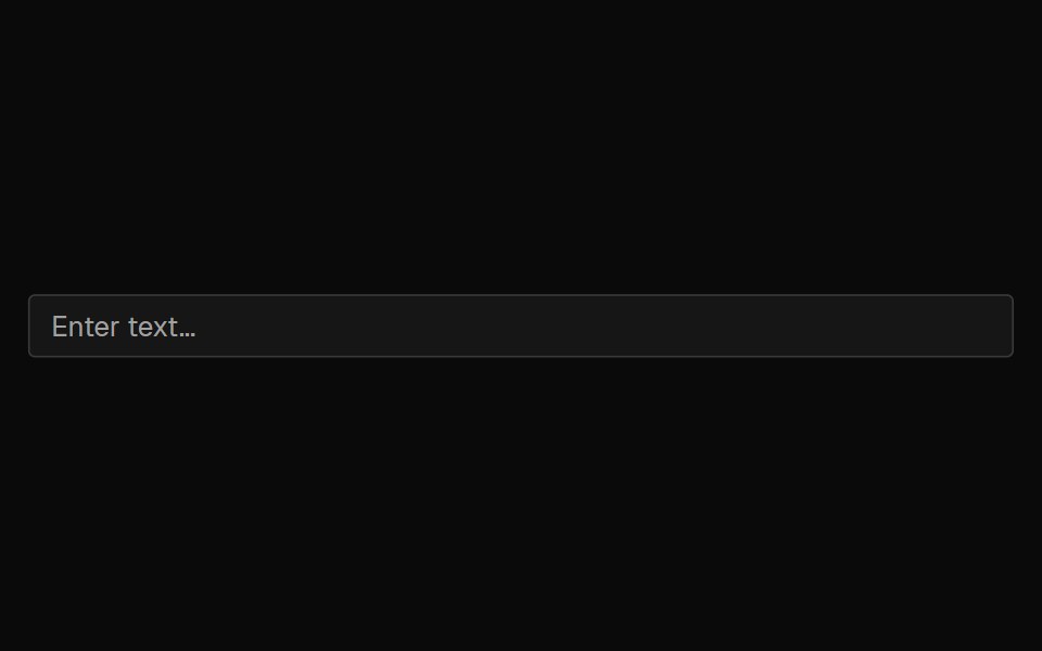 InputFibo · ReactA single line of free text.
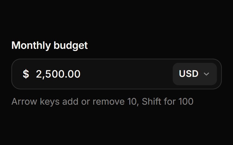 Currency InputReactFrame · ReactA money input with a currency picker: live thousands separators for any locale, the right number of decimals per…
 Gooey InputAceternity UI · React
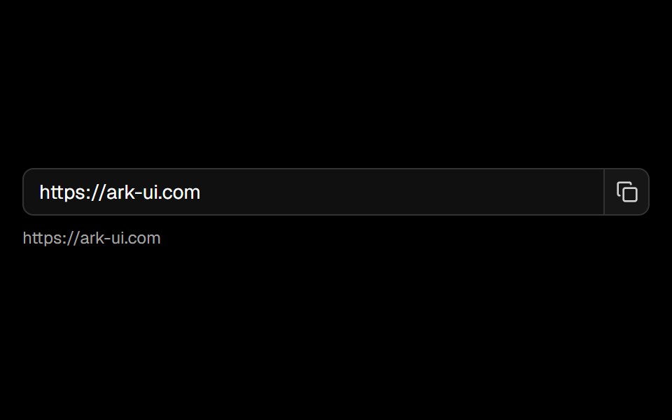 Clipboardark-cn · ReactA shadcn-style clipboard component built with Ark UI primitives.
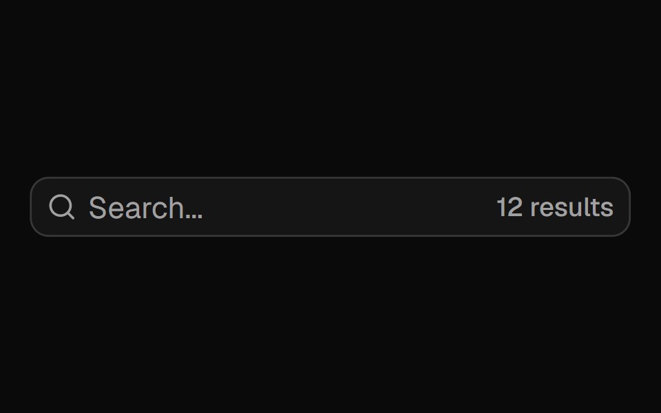 Input Groupshadcn/ui · ReactAdd addons, buttons, and helper content to inputs.
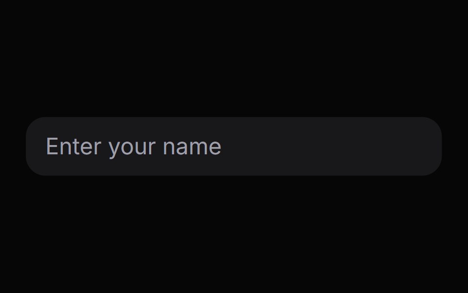 InputHeroUI · ReactA text input component with styled border and background for collecting user input.
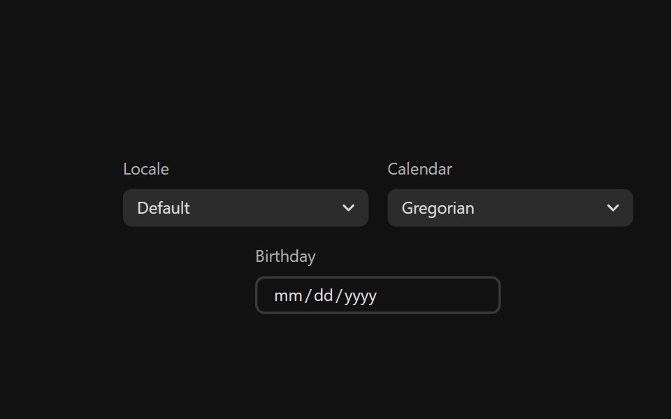 Date FieldReact Spectrum · ReactDateFields allow users to enter and edit date and time values using a keyboard. Each part of a date value is displayed…
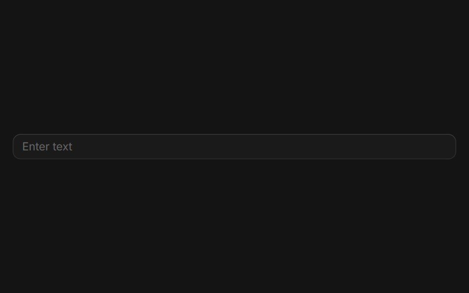 Inputcoss ui · ReactA native input element.
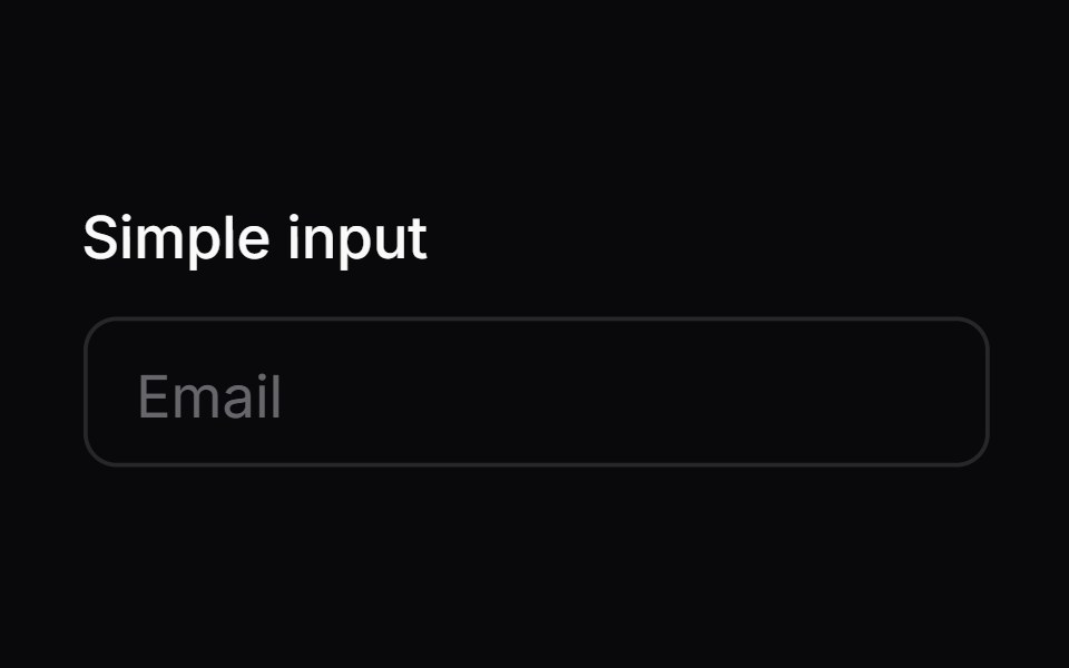 Comp 01Origin UI · React
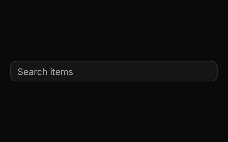 Basic autocomplete controlReUI · ReactBasic autocomplete control
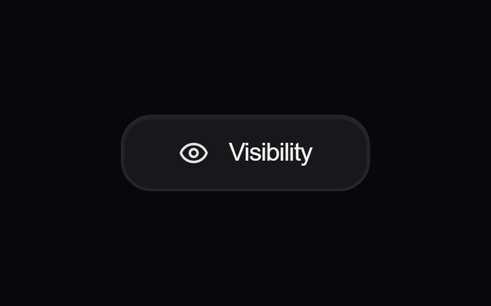 Button VisibilityAmicro Micro Transitions · React
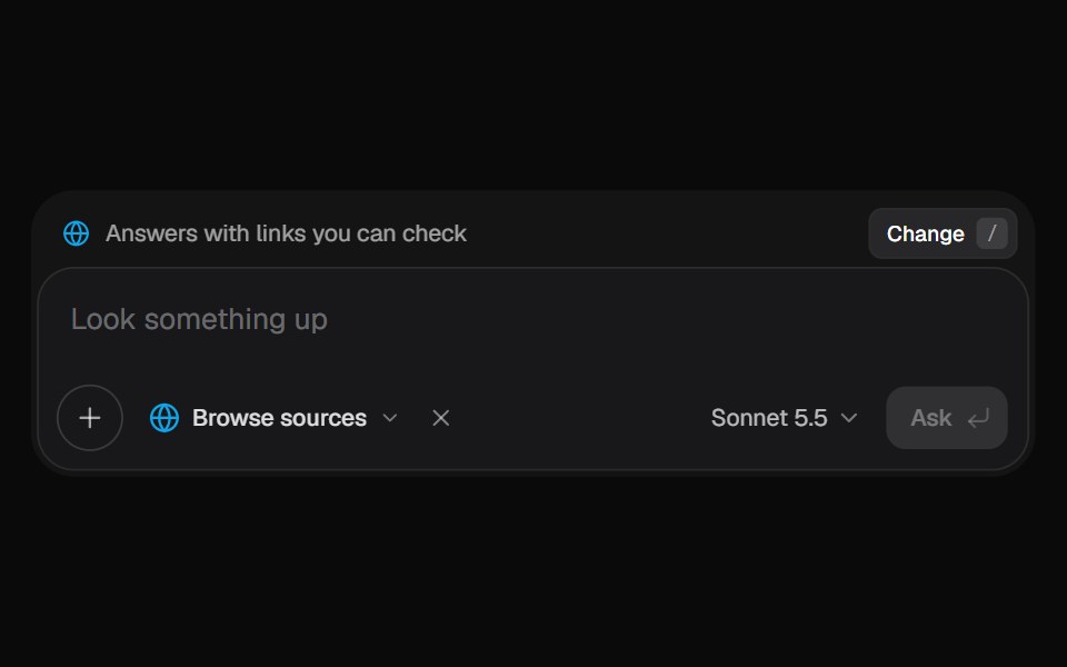 AI Input SearchKokonut UI · ReactAI composer with a Tools menu (browse, investigate, draft, run code, reason), a model picker and a live trace that…
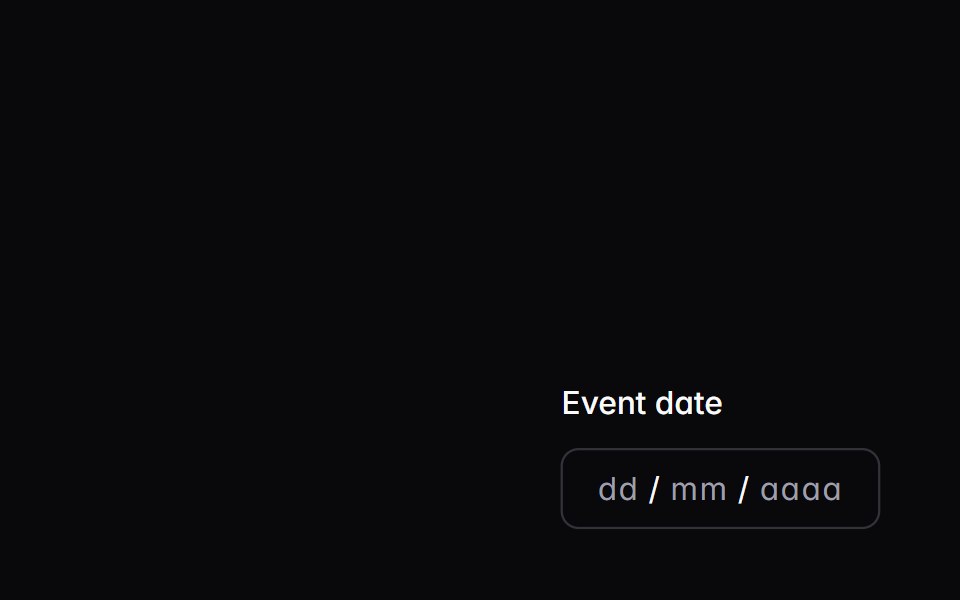 date-fieldIntent UI · Reactdate-field
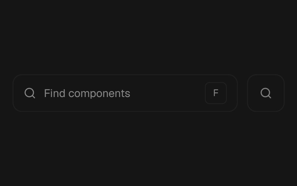 Morphing SearchbeUI · ReactSearch field or compact icon that morphs into a glass results surface, whether opened by click or keyboard shortcut.
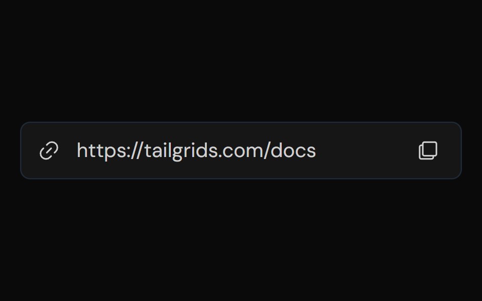 Input GroupTailGrids · ReactA flexible and accessible input group component that allows you to combine multiple input elements, such as text…
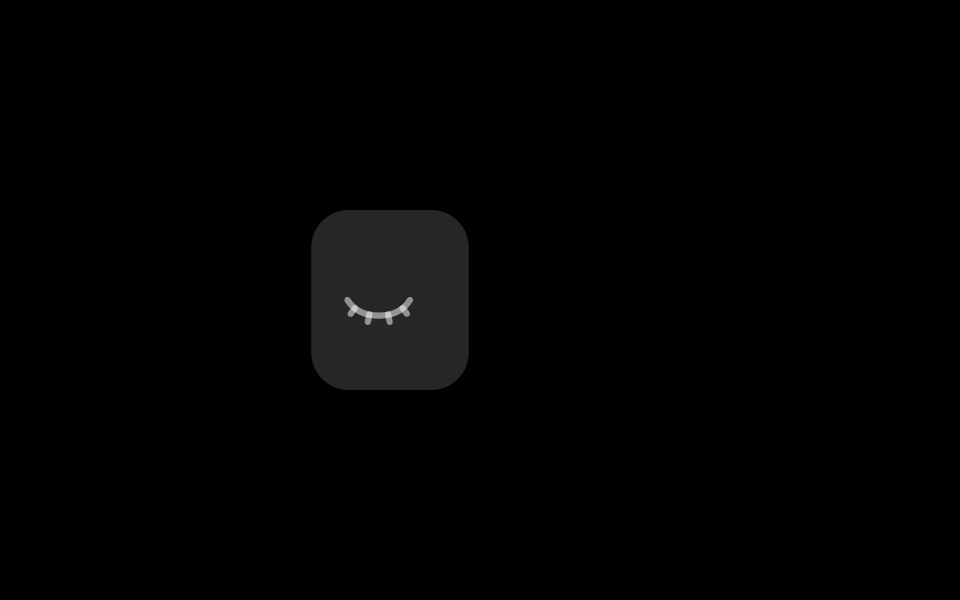 Password InputRare UI · ReactA password field with an eye toggle to show or hide what you type, and a strength meter that shows the password level…
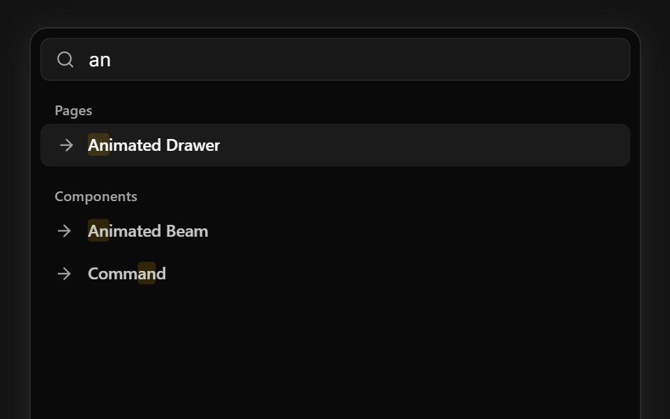 Command SearchSpectrum UI · ReactA command palette that types queries and live-filters grouped results, with keyboard navigation.
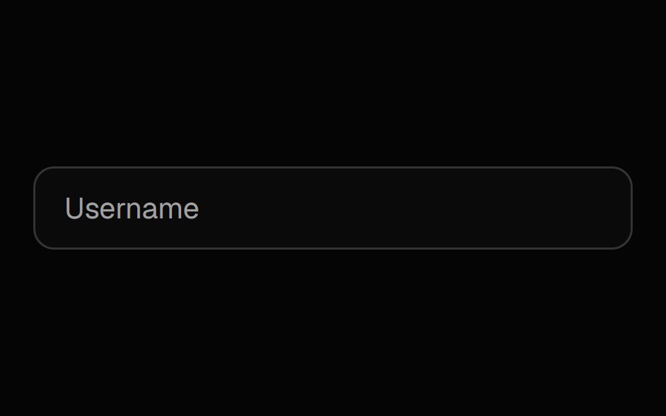 Label InputSpell UI · ReactInput field with floating label and password visibility toggle.
 InputVengeance UI · React
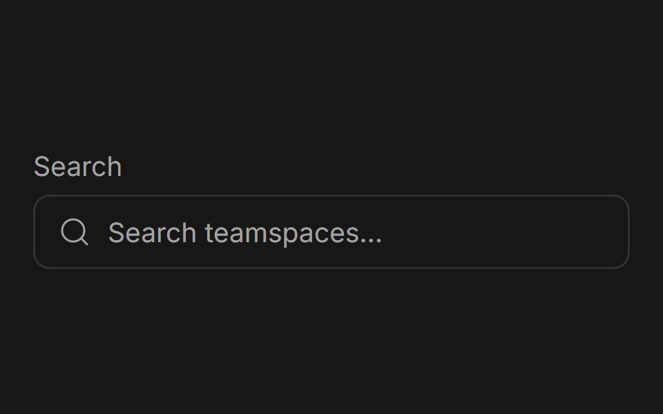 Input GroupFluid Functionalism · ReactGrouped input fields with fluid hover highlighting, animated label transitions, optional icons, and error states.
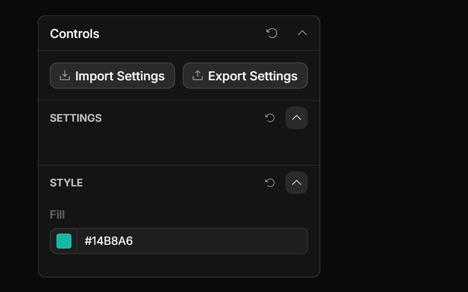 Color Value ControlToolcraft · React
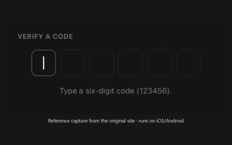 Otp InputPanel UI · React NativeOne-time-code field drawn as a row of separate cells.
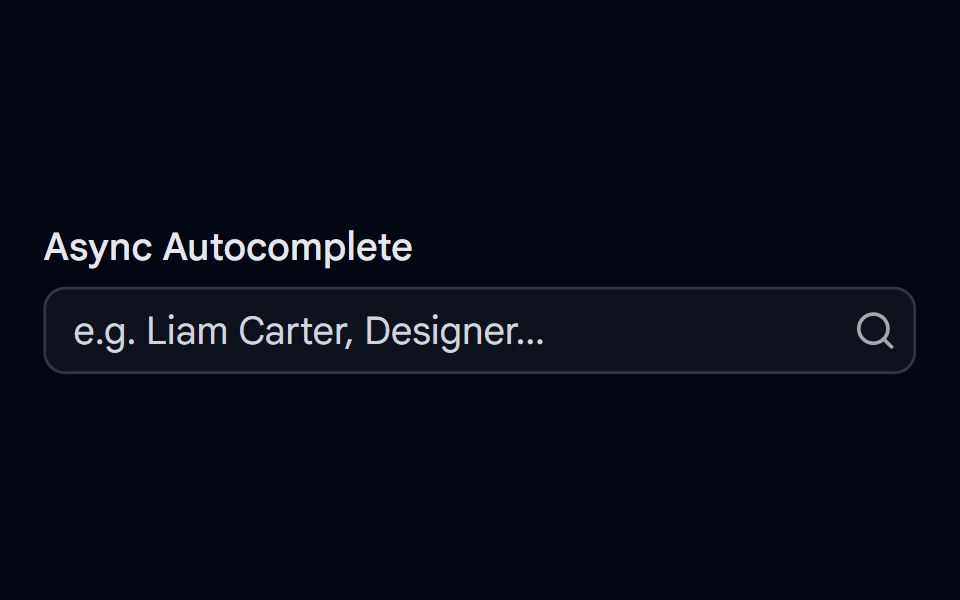 Autocomplete-05 - Async SearchShadcn Space · ReactAutocomplete with debounced async search, loading spinner, error handling, avatars, and spring-animated results
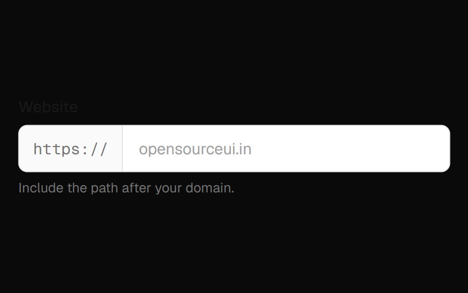 Input Group FieldOpenSourceUI · React
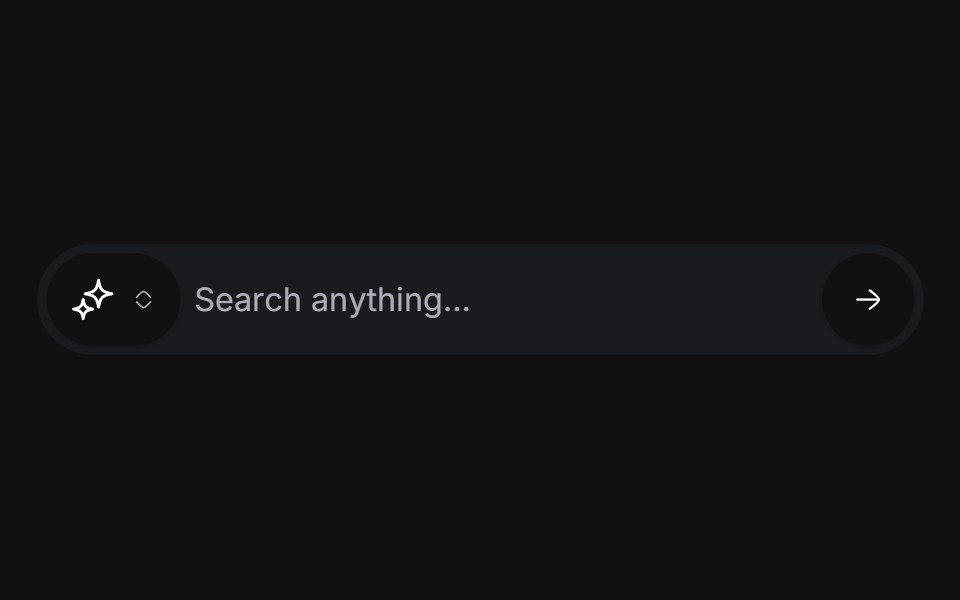 Morphing Inputuselayouts · ReactAn input field that morphs between different states.
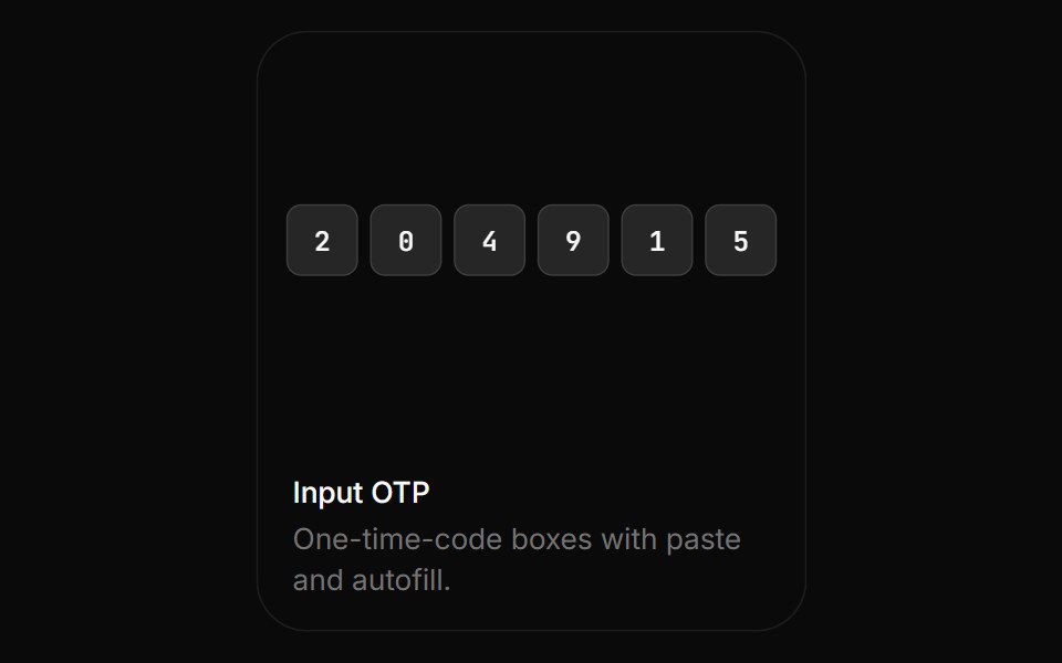 Input OtpBoardUI · ReactOne-time-code boxes with paste and autofill.
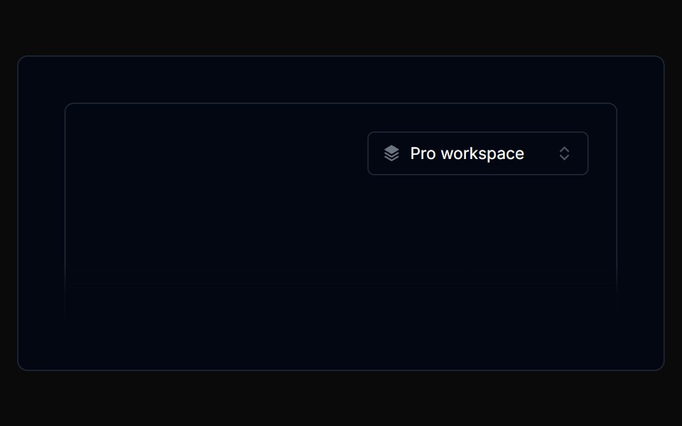 Filterbar 01Tremor Blocks · React
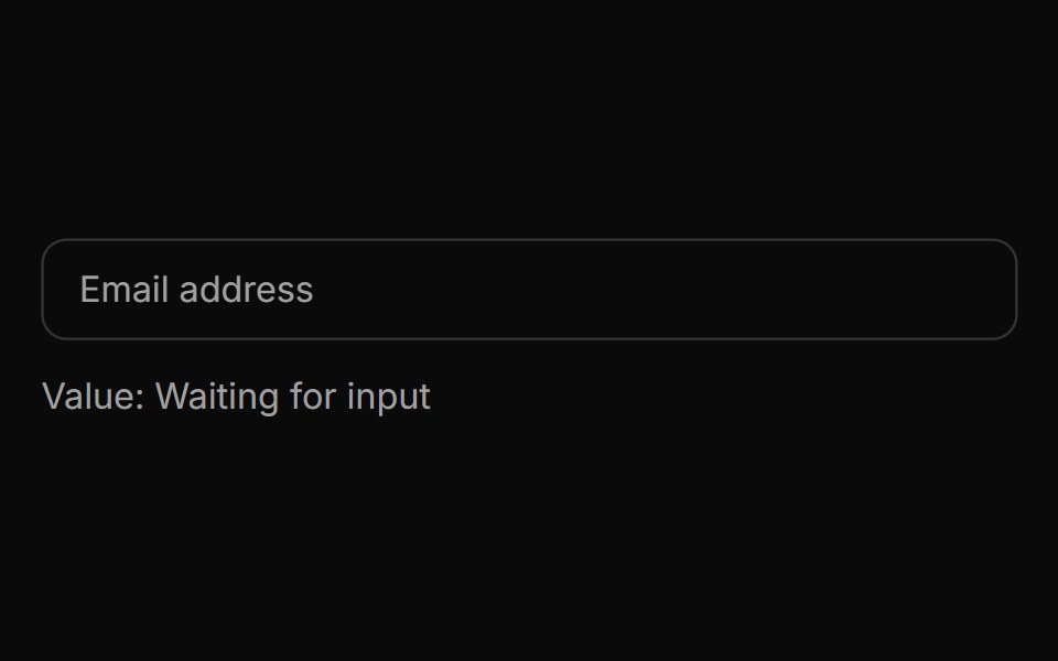 Spell Label InputAnimations (Svelte) · Svelte
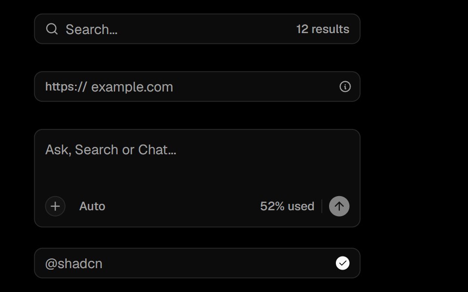 Input GroupObsidianUI · React
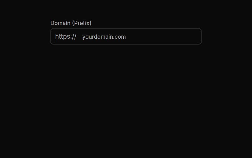 Input Groups 01Oxbow UI · Astro
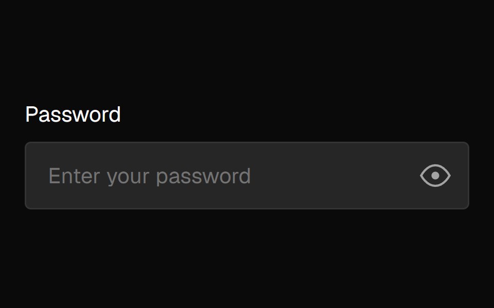 Password InputNexvyn UI · ReactA password input with an animated eye toggle that follows your cursor and blinks periodically.
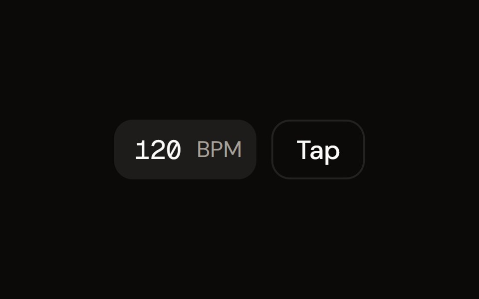 Tempo Controlaudiocn · ReactAn editable BPM input with tap tempo, keyboard stepping and a rolling average.
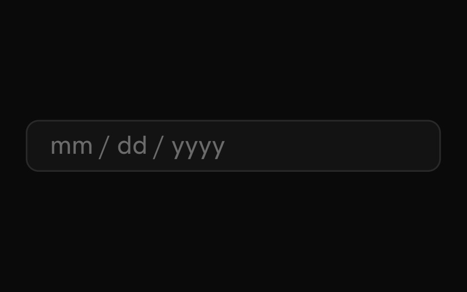 Date InputShark UI · ReactSegmented input for dates and times.
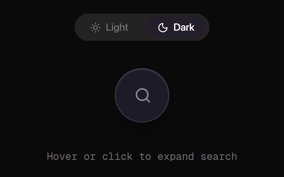 Animated Search DemoRewamp UI · React
 Floating Input BaseWatermelon UI · React
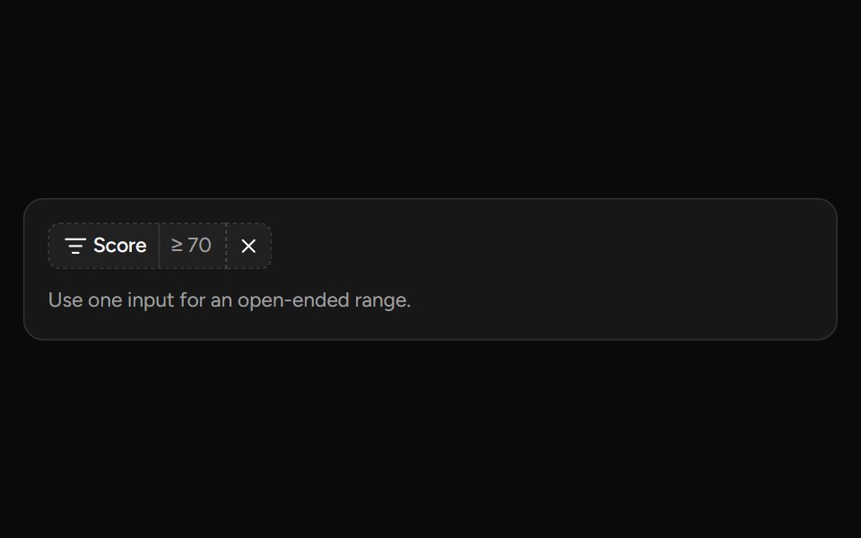 Number Range Filtersv-table · SvelteA number range picker with exact inputs, an optional slider, and explicit apply behavior.
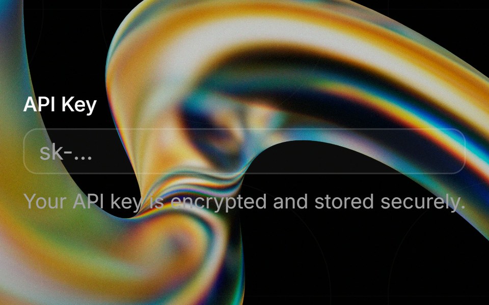 Inputglasscn · React
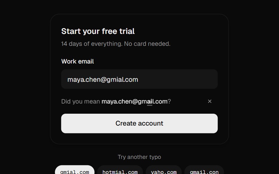 Email Typo FixUI Lab · ReactCatches gmial.com and fixes it by moving only the letters that were wrong.
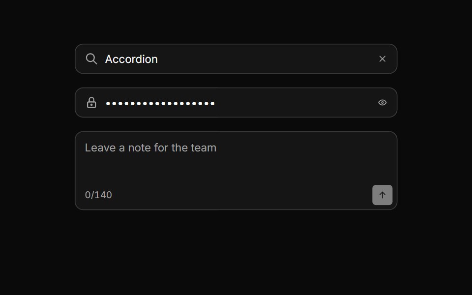 Input groupHextaUI · ReactAn input with icons, text, buttons or a keyboard hint attached, sharing one border and focus ring.
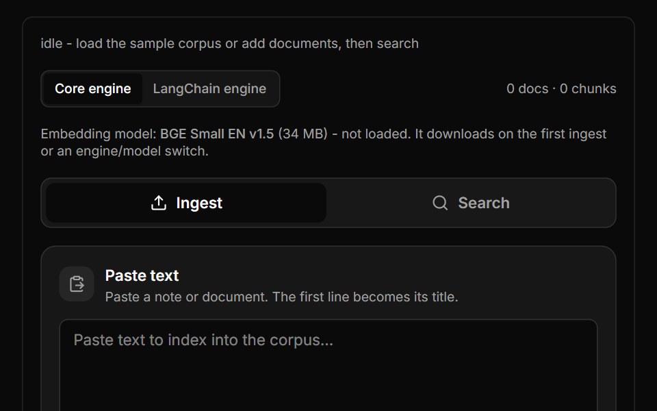 Semantic Search BlockLocalMode · ReactFull text/PDF/OCR ingest into its OWN corpus with off/recursive/semantic chunking and a live chunk-boundary preview…
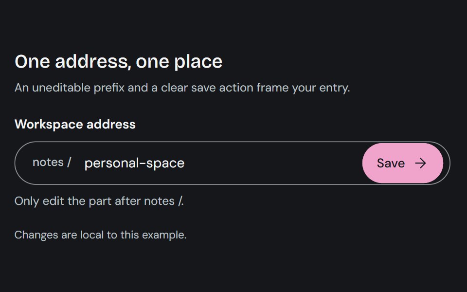 Input GroupCojeev UI · ReactCombines a text control with adjacent prefixes, suffixes, or actions in one input surface.
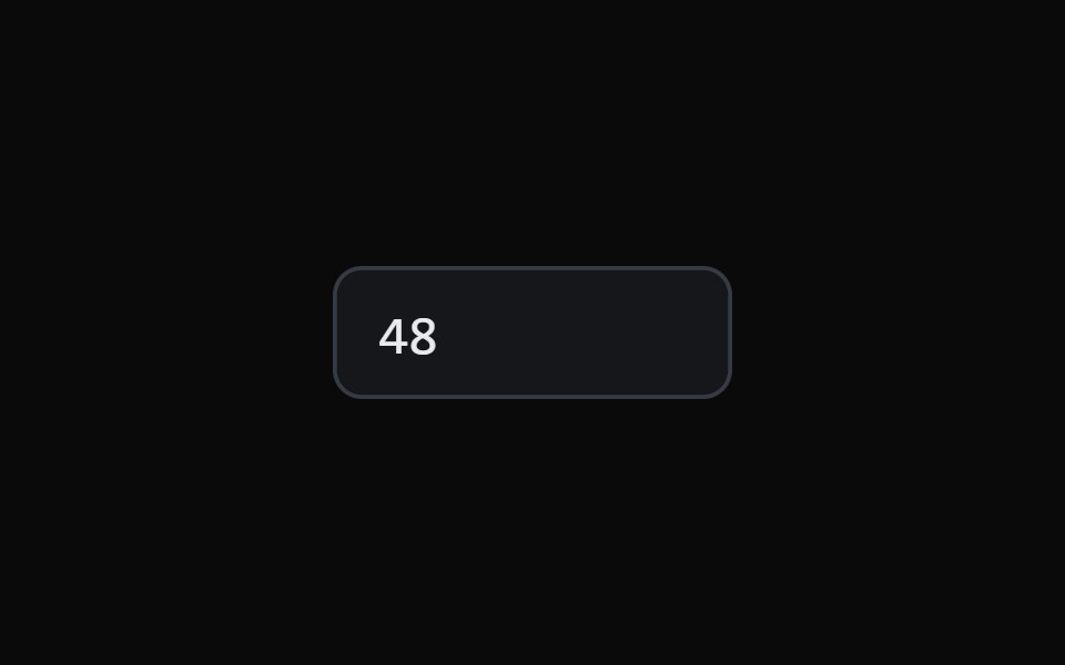 Scrub Number FieldMicroKit · ReactA number field you drag to scrub and click to type, with a ruler that tracks the gesture.
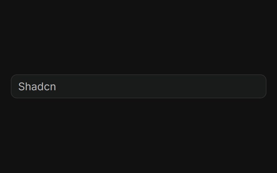 BasicFLX UI · ReactPlain text input with a placeholder, no addons.
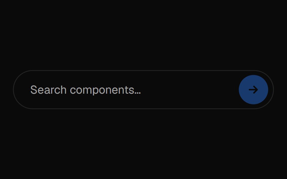 Vanish InputVelora UI · ReactSearch field whose placeholder cycles while empty.
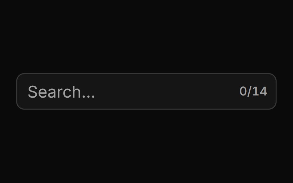 With Character Countsv-particles · SvelteForm field that shows the number of characters typed out of the maximum.
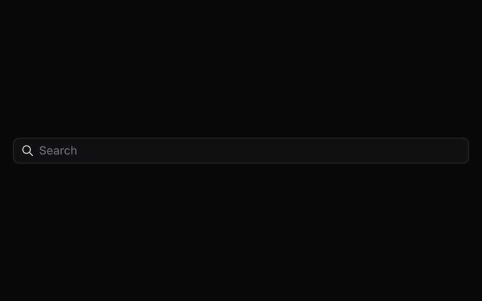 Input GroupSpaceUI · ReactAttaches icons, prefix text, buttons, or dropdowns directly to an input field, creating compact, all-in-one form…
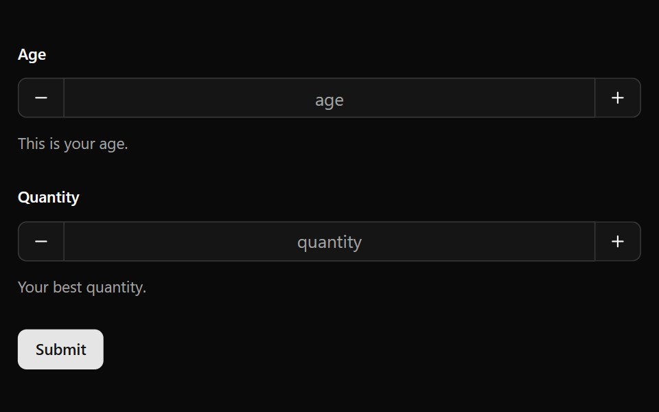 Number FieldOUI · ReactReact aria components Number Field with shadcn characteristics.
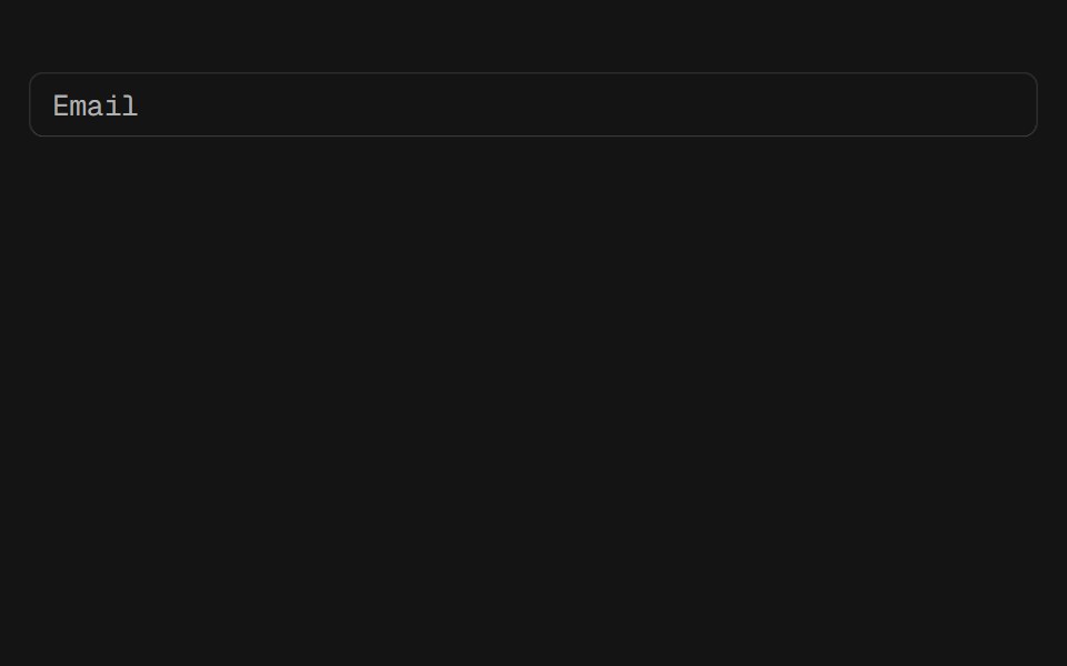 InputD2Studio UI · ReactDisplays a form input field or a component that looks like an input field.
 Morphing SearchEaseUI · ReactA circular search button that morphs into a text field: the same element grows and reshapes via a layout animation…
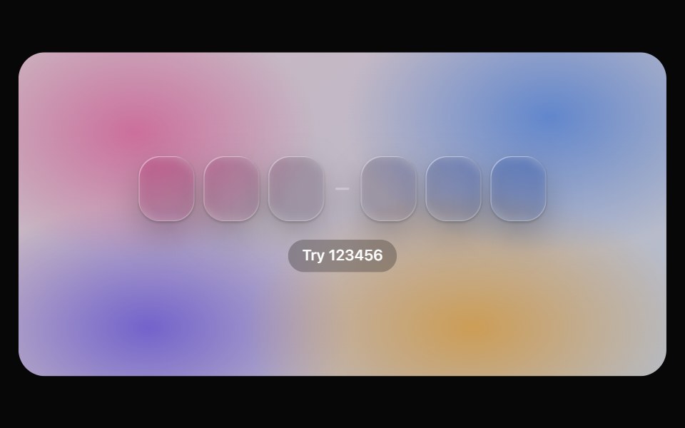 OTP InputOpaline · ReactOne-time code cells on glass with a gliding lens, paste and SMS autofill, and success / error states.
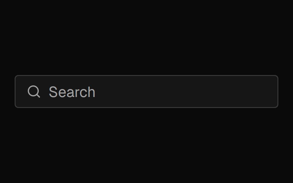 Input GroupFibo · ReactAn input with an icon, text or button beside it, drawn as one field.
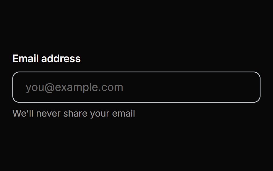 InputReactFrame · ReactAn accessible text input with outline, filled, and underline variants, label/helper/error text, a password show/hide…
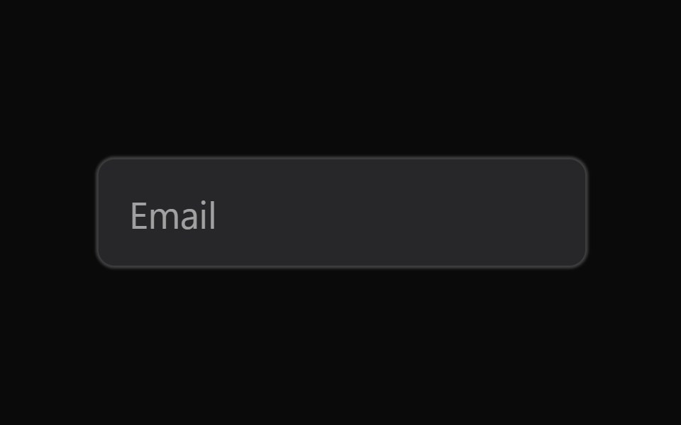 InputAceternity UI · React
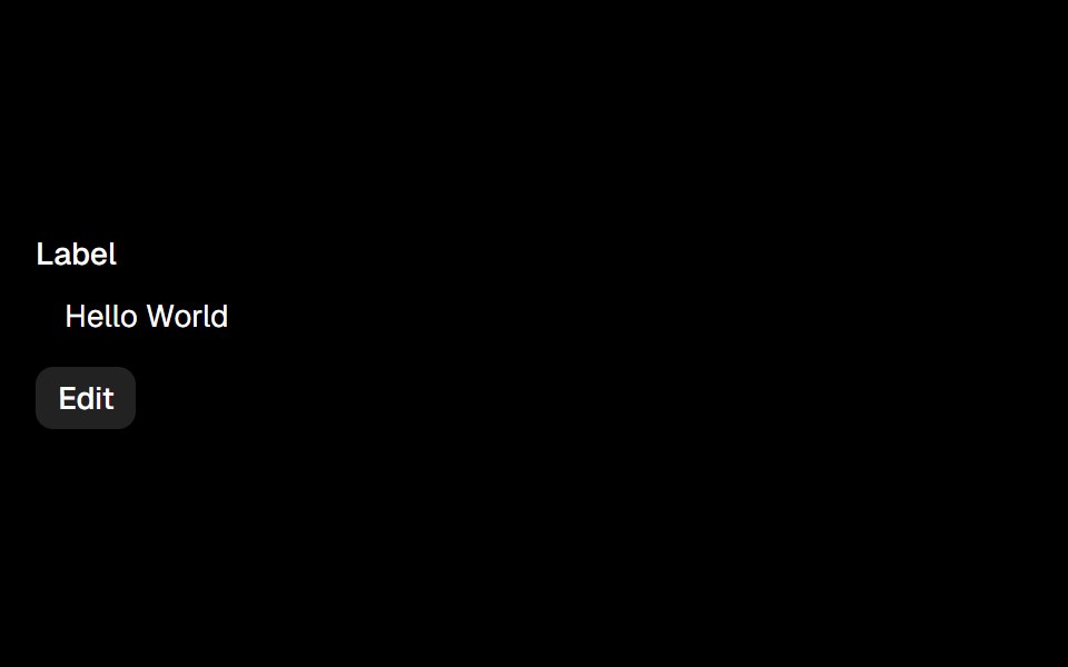 Editableark-cn · ReactA shadcn-style editable component built with Ark UI primitives.
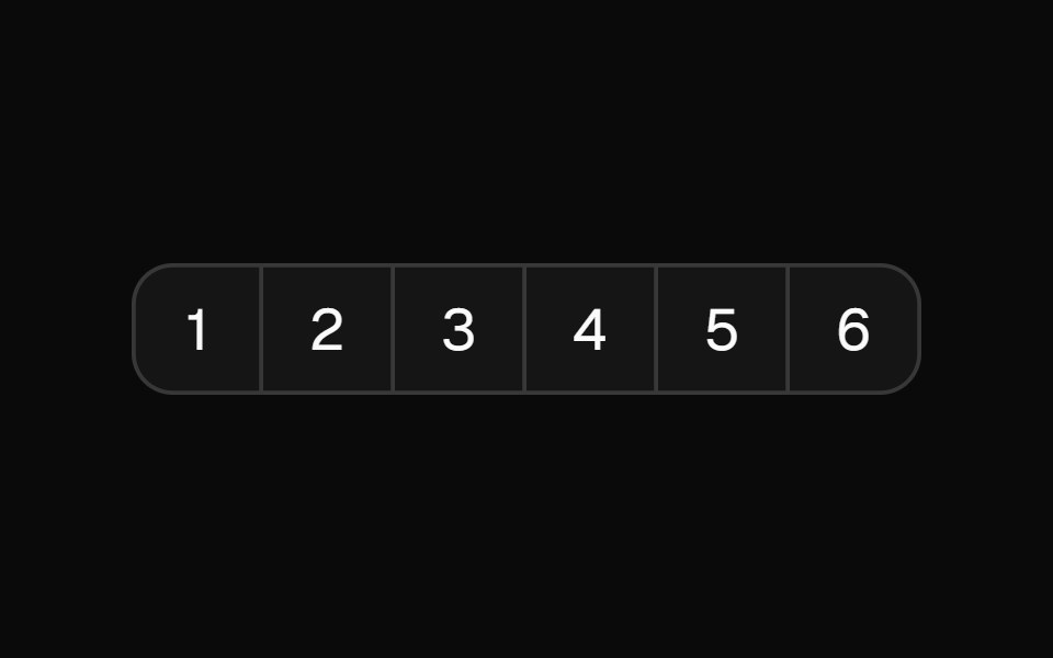 Input Otpshadcn/ui · ReactAccessible one-time password component with copy paste functionality.
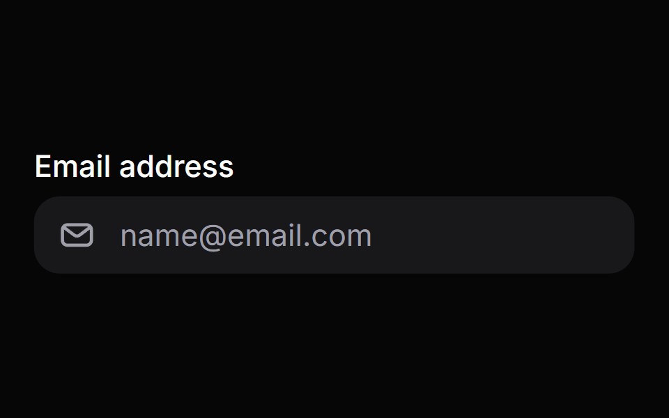 Input GroupHeroUI · ReactA compound layout component that groups an input with optional prefix and suffix decorators.
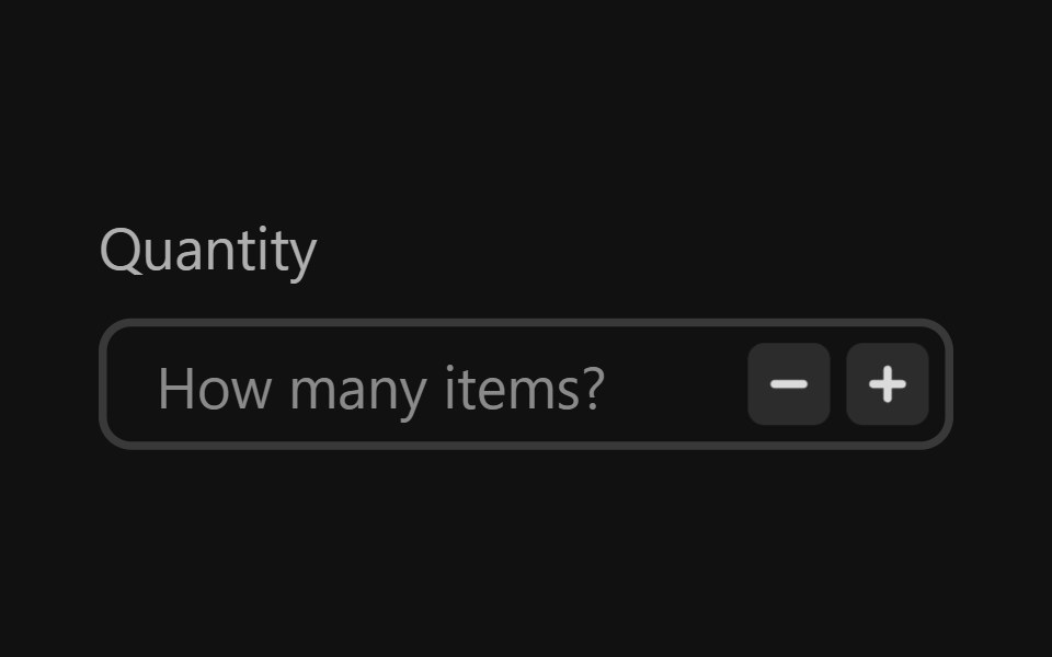 Number FieldReact Spectrum · ReactNumberFields allow users to enter a number, and increment or decrement the value using stepper buttons.
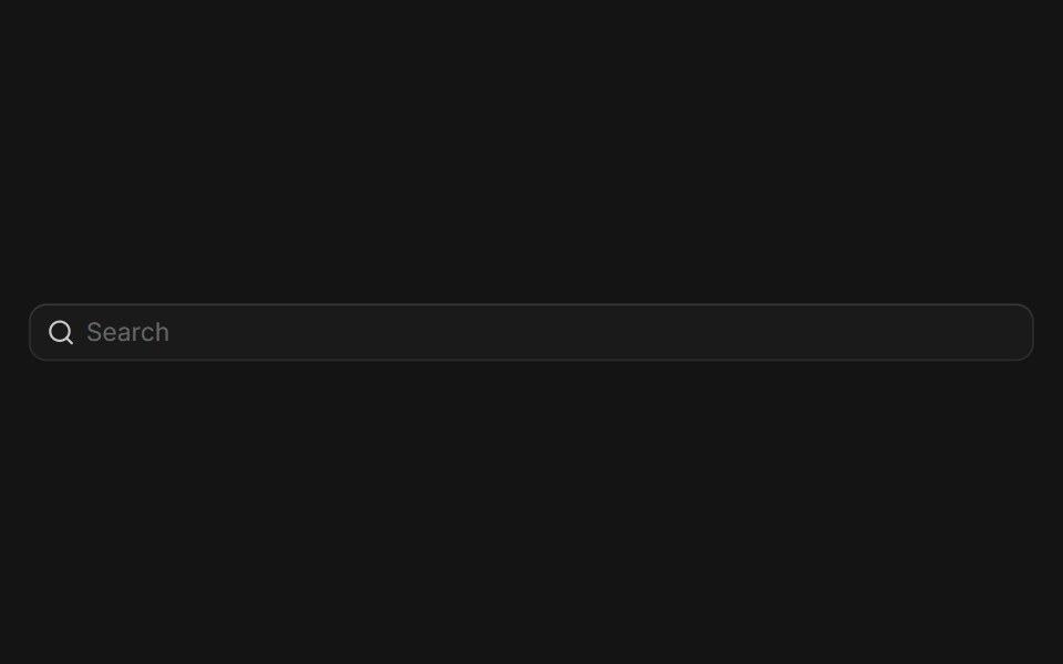 Input Groupcoss ui · ReactA flexible component for grouping inputs with addons, buttons, and other elements.
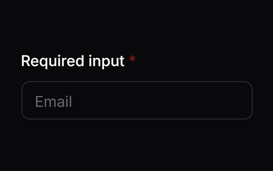 Comp 02Origin UI · React
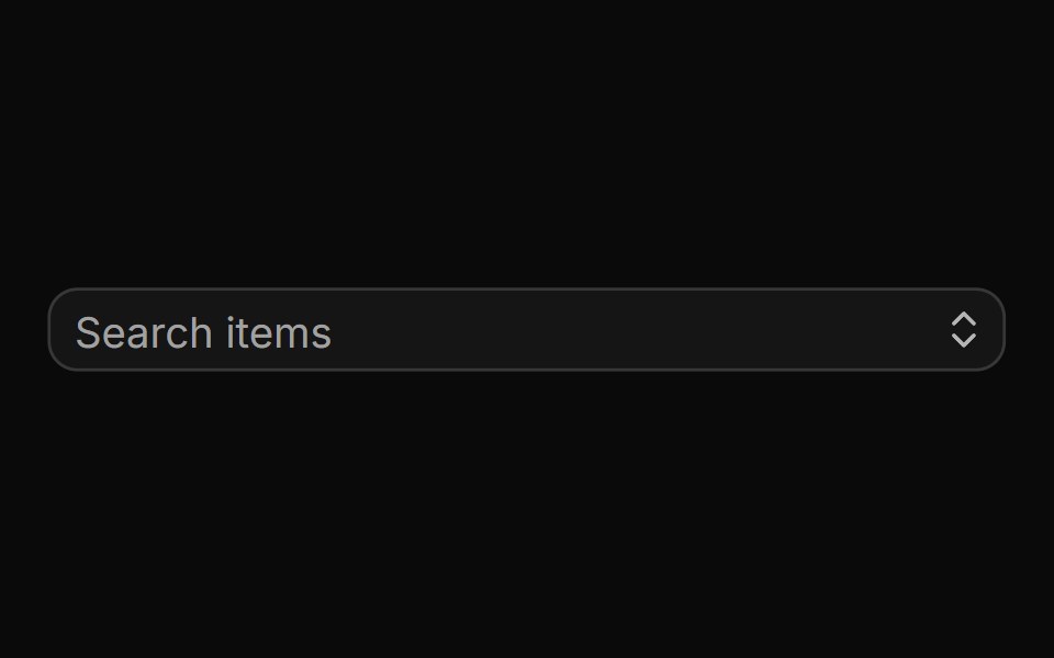 Small autocompleteReUI · ReactSmall autocomplete
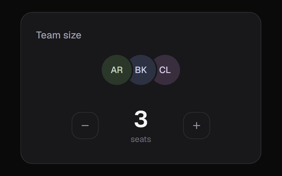 Team SelectorKokonut UI · ReactSeat picker with a scrubbable number, generated avatars and an optional rolling price line.
 inputIntent UI · Reactinput
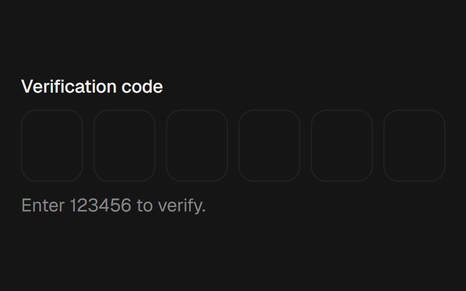 Otp InputbeUI · ReactOne-time-code input with a gliding focus ring, digits that roll in per slot, error shake and a success check draw.
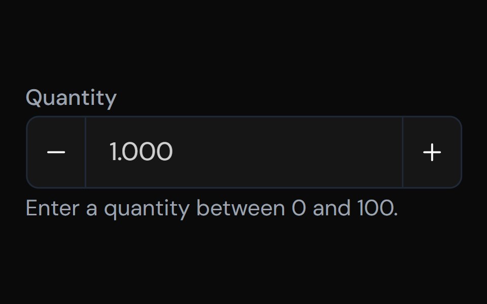 Number FieldTailGrids · ReactA component for entering numeric values with increment and decrement buttons.
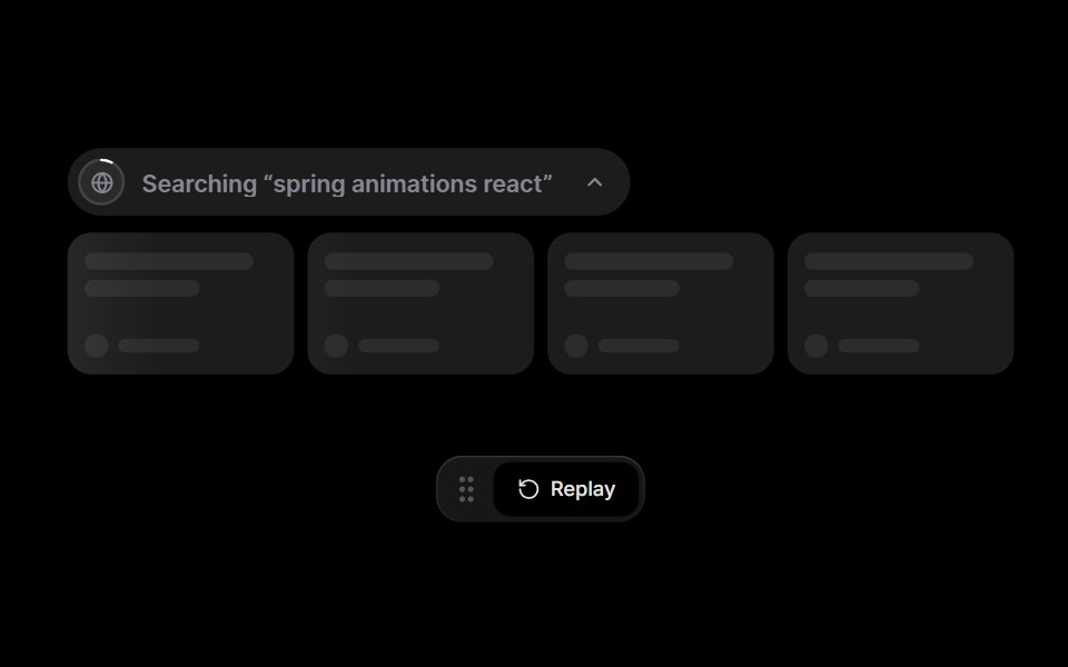 Web SearchRare UI · ReactThe sources behind an AI answer, shown as a search pill, source cards, a streaming answer, and inline citations.
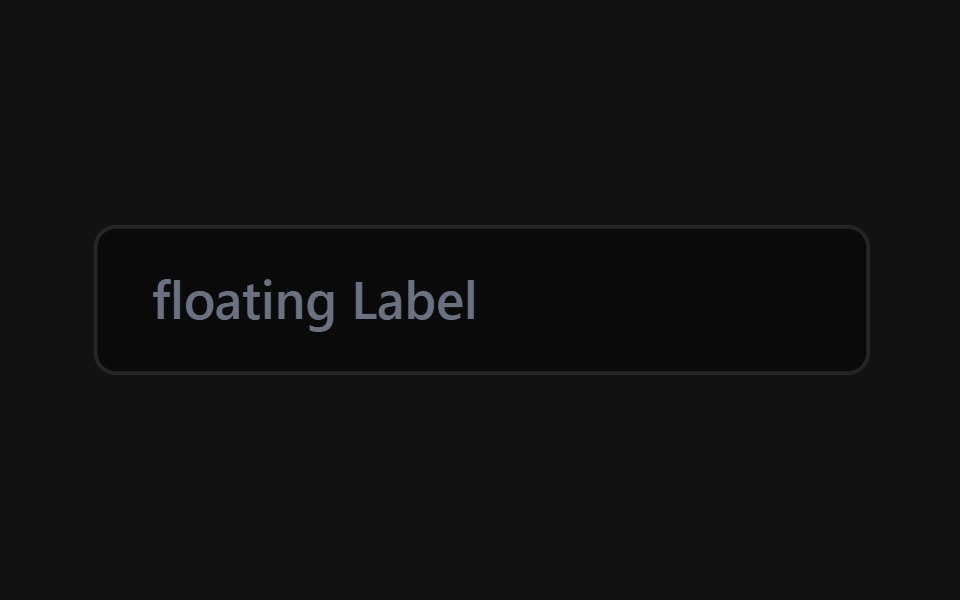 Floating Label InputSpectrum UI · Reactcomponent for the Floating Label Input
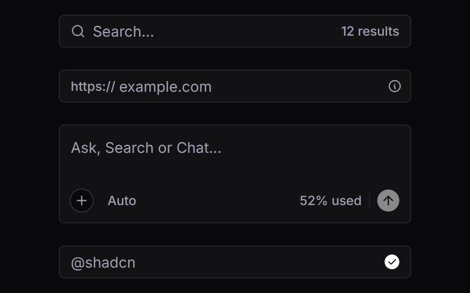 Input GroupVengeance UI · React
 Sidebar Search FieldFluid Functionalism · ReactHeader search on the menu rows' rhythm: leading icon on the rows' 16px axis, text on the 32px axis, and a…
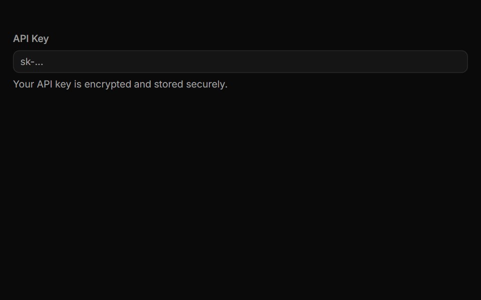 InputToolcraft · React
Libraries with Tailwind CSS text input components
Related categories
- Text Input Components
- React Text Input Components
- Svelte Text Input Components
- Animated Text Input Components
- shadcn/ui Text Input Components
- Tailwind CSS Input Components
- Tailwind CSS Select Components
- Tailwind CSS Form Field Components
- Tailwind CSS Form Components
- Tailwind CSS Textarea Components
- Tailwind CSS Checkbox Components
- Tailwind CSS Switch Components
- Tailwind CSS Slider Components
- Tailwind CSS Radio Components
- Tailwind CSS Combobox Components
- Tailwind CSS File Upload Components
- Tailwind CSS Search Input Components
- Tailwind CSS Date Picker Components
- Tailwind CSS Login Form Components
- Tailwind CSS Color Picker Components
- Tailwind CSS OTP Input Components