Input
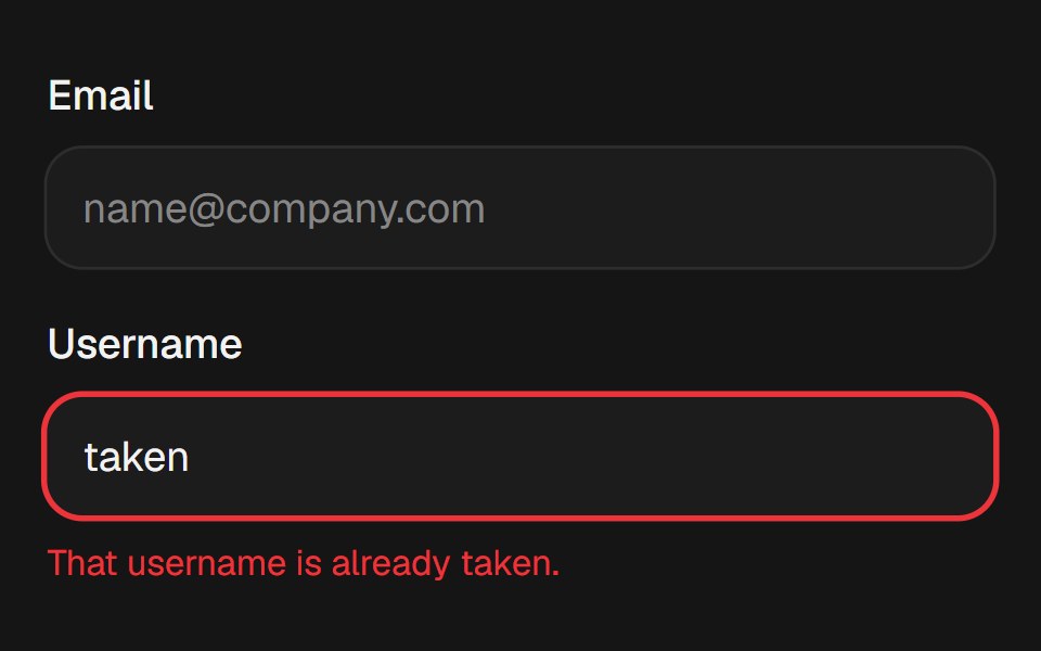
Text input whose focus ring grows from a hairline to two px, with a destructive ring for aria-invalid.
- Library
- EaseUI
- Framework
- React
- Type
- component
- License
- MIT
- Install
npx shadcn@latest add @easeui/input- Files
components/motion/input.tsxlib/utils.ts
- Source
- https://github.com/rjcuff/easeui
Categories
- Input Components
- React Input Components
- Tailwind CSS Input Components
- Text Input Components
- React Text Input Components
- Tailwind CSS Text Input Components