Avatar
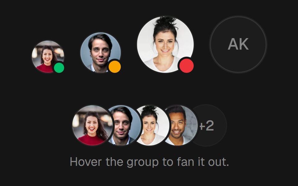
Round avatar in three sizes with an optional status dot. The image fades in on load and falls back to initials, and a group stacks them and fans them out on hover.
- Library
- EaseUI
- Framework
- React
- Type
- component
- License
- MIT
- Install
npx shadcn@latest add @easeui/avatar- Files
components/motion/avatar.tsxlib/utils.ts
- Source
- https://github.com/rjcuff/easeui
Categories
- Avatar Components
- React Avatar Components
- Tailwind CSS Avatar Components
- Data Display Components
- React Data Display Components
- Tailwind CSS Data Display Components