Choice cards
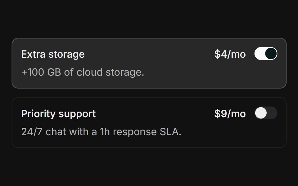
Clickable add-on rows showing a title, description, price, and a switch, each fully tappable via a wrapping label.
- Library
- FLX UI
- Framework
- React
- Type
- block
- License
- AGPL-3.0
- Install
pnpm dlx shadcn@latest add @flx/switch-10- Files
registry/patterns/switch/switch-10.tsxsrc/components/ui/field.tsxsrc/components/ui/switch.tsxsrc/lib/utils.tssrc/components/ui/label.tsxsrc/components/ui/separator.tsx
- Source
- https://github.com/felipemenezes098/ui-flx
Categories
- Card Components
- React Card Components
- Tailwind CSS Card Components
- shadcn/ui Card Components
- Data Display Components
- React Data Display Components
- Tailwind CSS Data Display Components
- shadcn/ui Data Display Components
- Input Components
- React Input Components
- Tailwind CSS Input Components
- shadcn/ui Input Components