 Dev Design Library
React Slider Components
Dev Design Library indexes 168 React slider components from 62 open-source UI libraries, with the most coming from Origin UI, ReUI, audiocn, Toolcraft and Watermelon UI. Each one links to its page with the source code, a live preview where available, the library license and the install command. Every library in this list targets React. Slider components belong to the Inputs group.
Showing 120 of 168, a mix from every library. Open a library to see all of its components.
 Slidershadcn/ui · ReactAn input where the user selects a value from within a given range.
 SliderMUI / Material UI · React
 Comet DialReact Bits · ReactTick-ring dial you flick by angle: the reading launches on a spring and a velocity-driven comet streaks behind the lit…
 SliderChakra UI · ReactUsed to allow users to make selections from a range of values.
 SliderHeroUI · ReactA draggable input for selecting a value or range within a bounded interval.
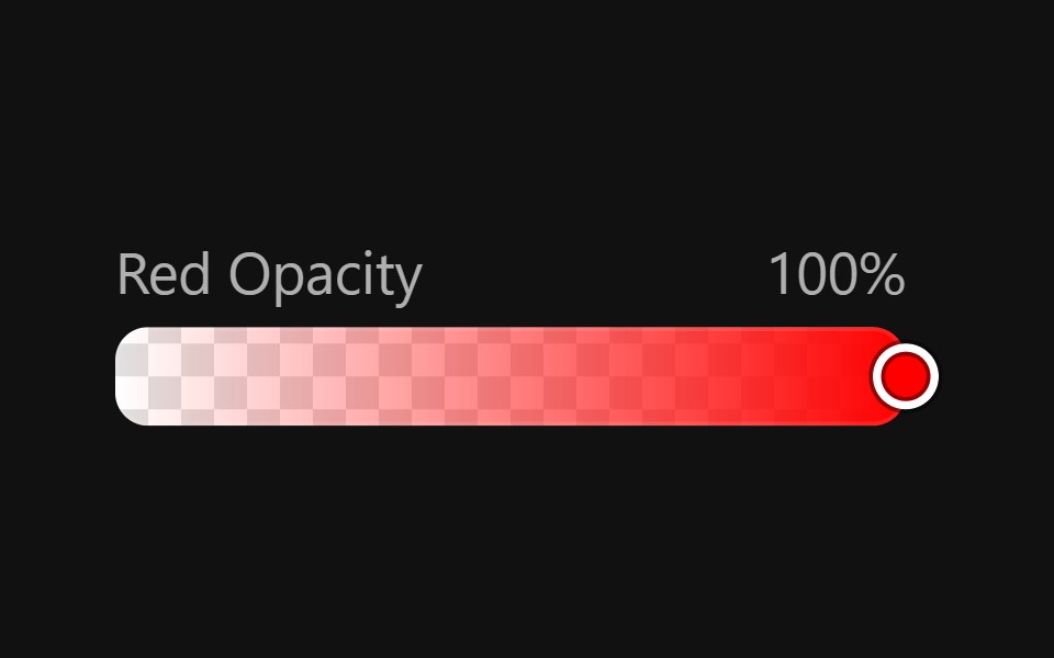 Color SliderReact Spectrum · ReactColorSliders allow users to adjust an individual channel of a color value.
 Slidercoss ui · ReactAn input where the user selects a value from within a given range.
 SliderOrigin UI · ReactAn input where the user selects a value from within a given range.
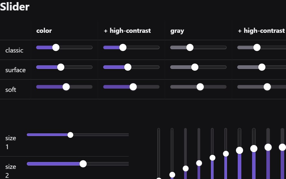 SliderRadix Themes · React
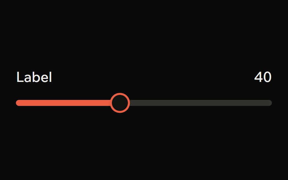 SliderArk UI · ReactA control element that allows for a range of selections.
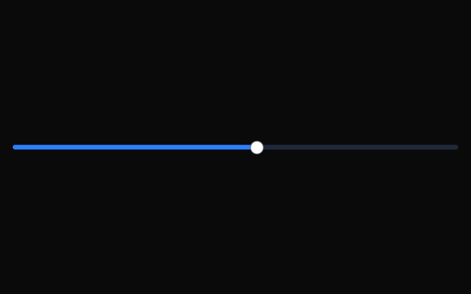 SliderTremor · React
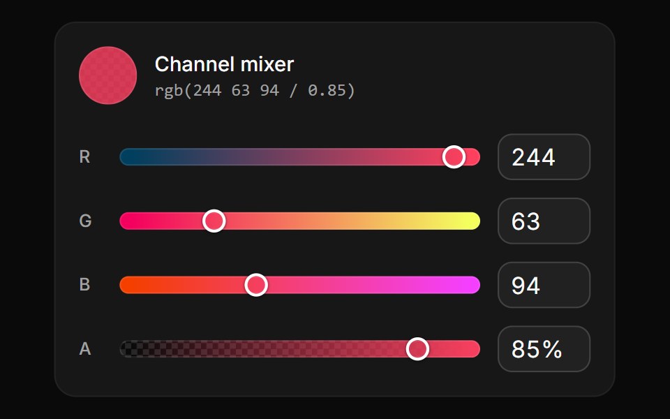 Channel slidersReUI · ReactRed, green, blue and opacity sliders with numeric fields, each track redrawn from the others.
 Button VolumeAmicro Micro Transitions · React
 SliderPark UI · ReactA form input component for selecting values from a continuous range.
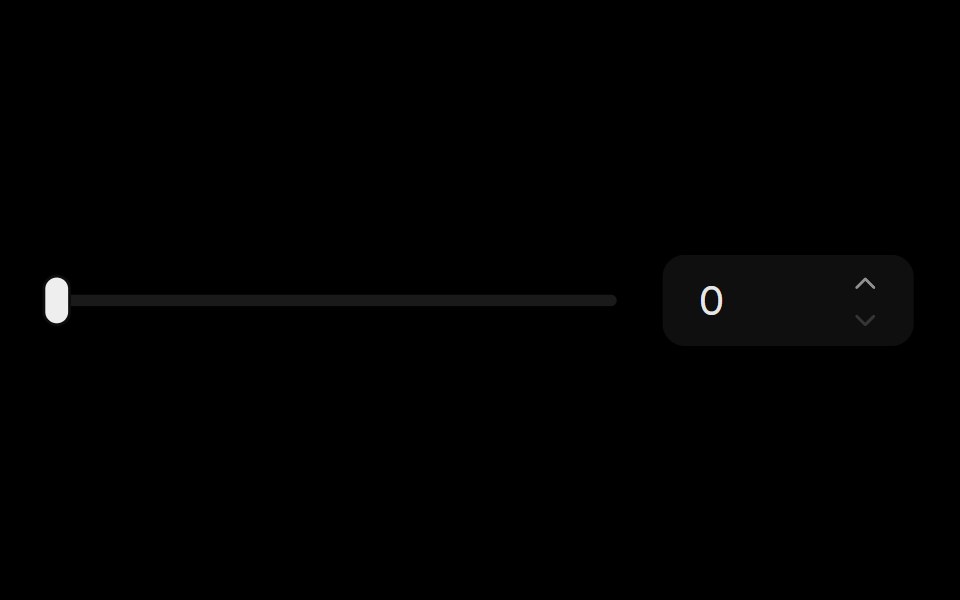 Slider With InputLobe UI · ReactSliderWithInput combines a slider with an input number field, allowing users to adjust values either by dragging the…
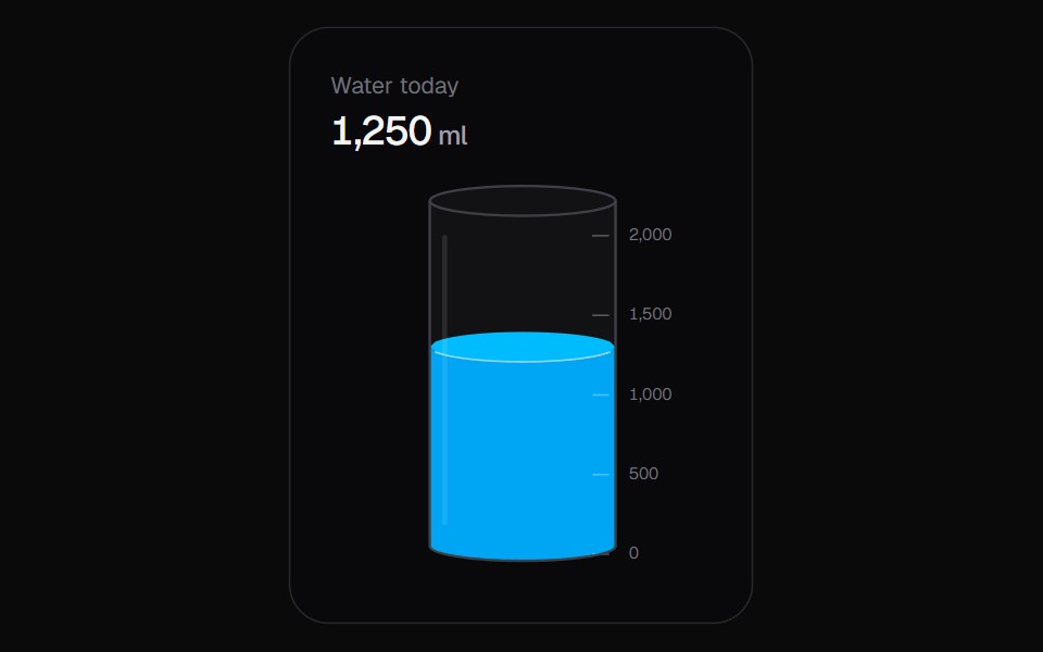 Liquid SliderKokonut UI · ReactA vertical slider you fill like a glass, with a sloshing surface and rising bubbles.
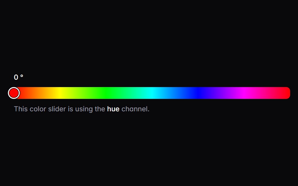 color-sliderIntent UI · Reactcolor-slider
 SliderUntitled UI React · React
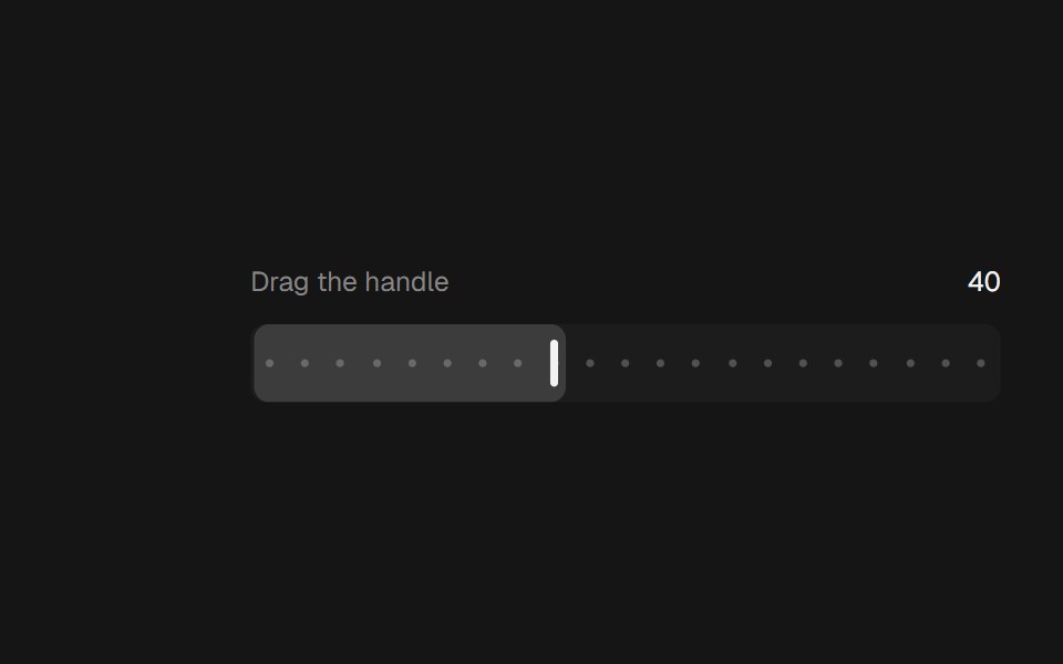 Range SliderbeUI · ReactA bar thumb that glides between steps.
 SliderTailGrids · ReactA slider component to select a value from a range.
 Dual Range Slider DependenciesSpectrum UI · Reactcomponent for the Dual Range Slider Dependencies
 SliderVengeance UI · React
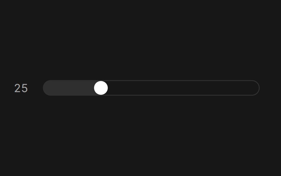 SliderFluid Functionalism · ReactAnimated slider with spring-snapped thumb, step dots, range mode, and click-to-edit value display. Built on Radix UI…
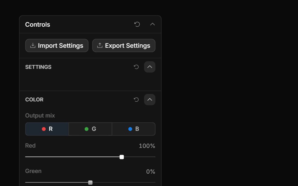 Channel Mixer ControlToolcraft · React
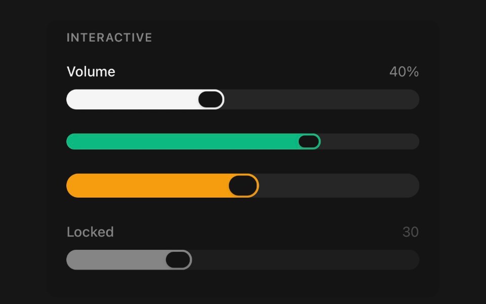 SliderPanel UI · React NativePick a value, or a span, by dragging a thumb along a track.
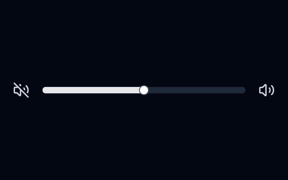 Slider 01 - Volume ControlShadcn Space · ReactVolume control slider with volume icons and smooth fill animation.
 Cards SliderPixel Perfect · ReactCards Slider — an infinite deck of product cards. The active card sits
 Paywalluselayouts · ReactA premium paywall component with a pick your price detent slider, animated numeric price transitions, and a segmented…
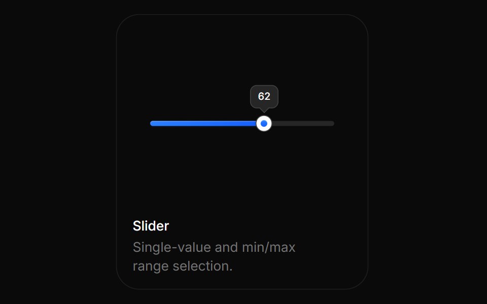 SliderBoardUI · ReactSingle-value and min/max range selection.
 SliderTremor Blocks · React
 SliderShadcn Dashboard · React
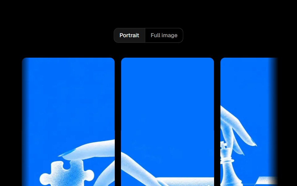 Parallax SliderObsidianUI · ReactA full-width image slider where each slide moves with a parallax offset, driven by drag, arrows or keys.
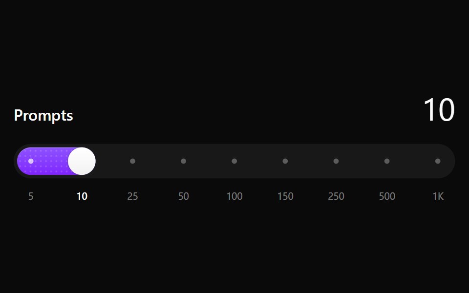 Step SliderNotra · ReactA slider that snaps to a fixed set of values, with a dotted fill that sweeps on every step. Built on the Base UI Slider.
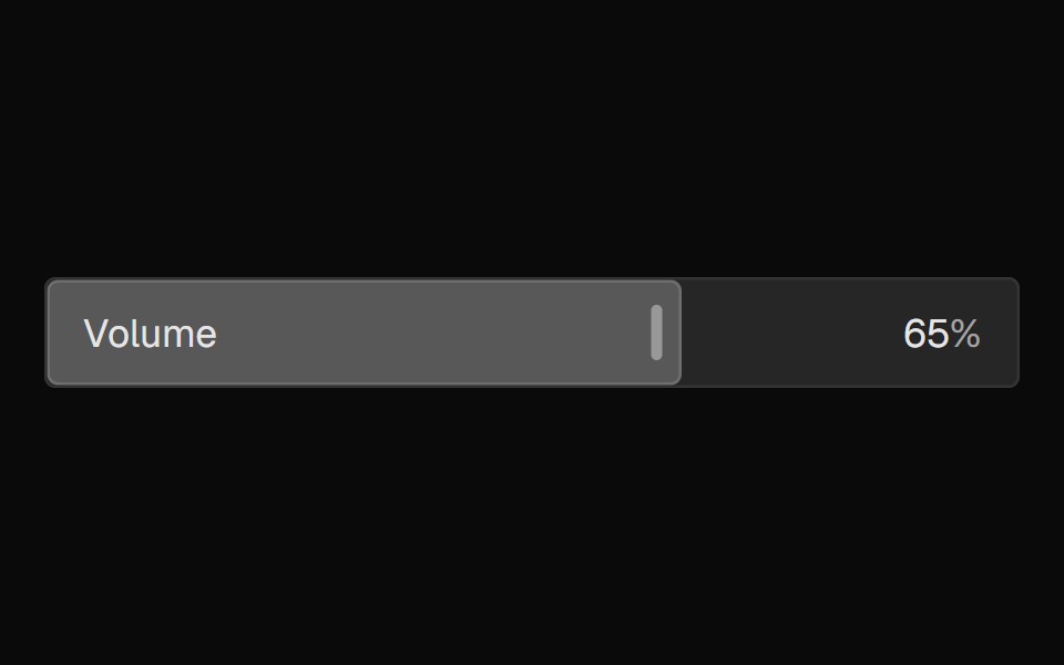 FaderNexvyn UI · ReactA mixing-console-style parameter fader where the control IS the display, with continuous and detent value grammars…
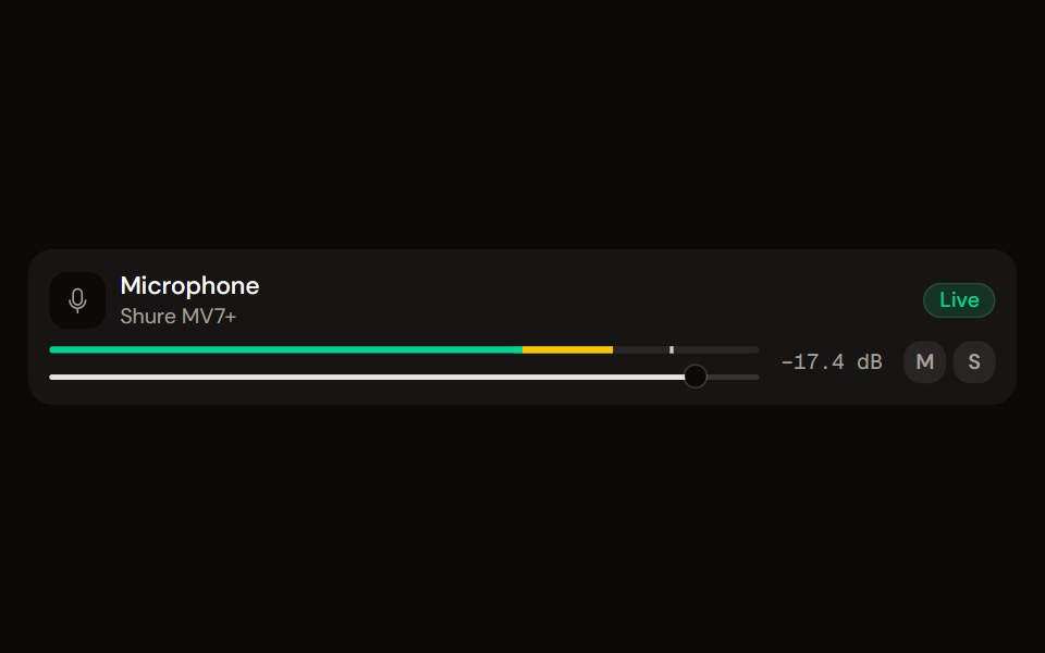 Channel Stripaudiocn · ReactOne channel of a mixer: header, status, meter, fader, value, controls and a notice, as a row or a console strip. The…
 sliderBaseLayer · ReactA slider allows a user to select one or more values within a range.
 Circular SliderShark UI · ReactCircular slider for selecting values.
 Reasoning EffortAI CSS · React
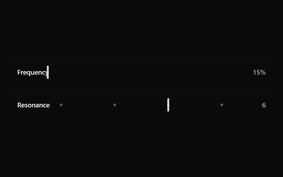 Fluid SliderSona UI · ReactA labeled Base UI range control with direct surface selection, a dedicated draggable indicator, and restrained…
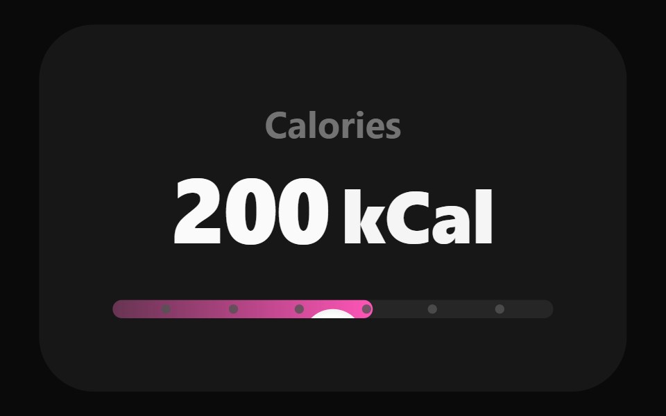 Adaptive SliderWatermelon UI · React
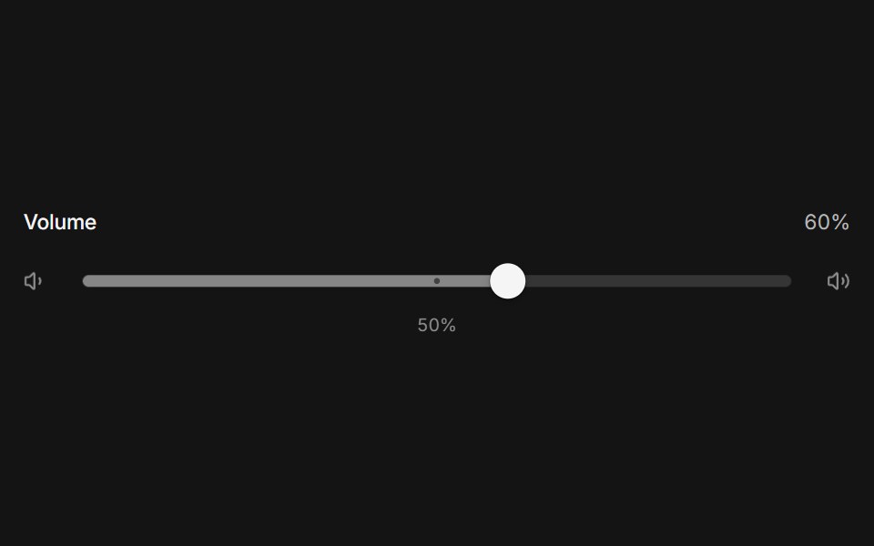 Elastic sliderArc Library · ReactA slider that stretches like rubber past its ends, with a swaying value tag and detents the thumb clicks into.
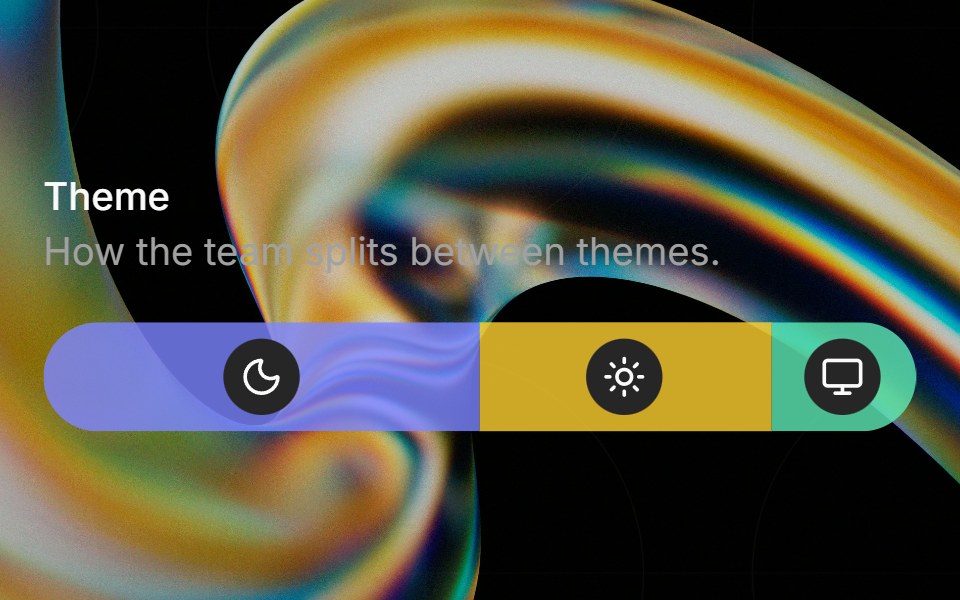 Preferenceglasscn · ReactA weighted preference bar with icon badges, hover tinting, and tooltip descriptions.
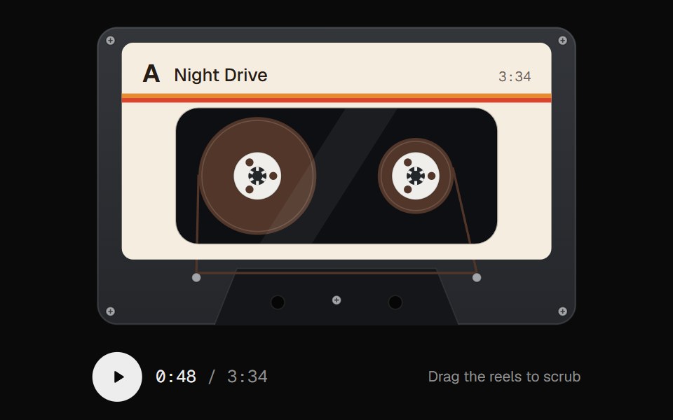 Cassette ScrubberUI Lab · ReactScrub audio by dragging the tape, with reels that spin like the real thing.
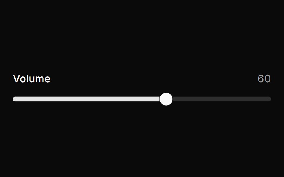 SliderHextaUI · ReactPick a value or a range by dragging, tapping the track or using the keys, with jumps that glide and an optional value…
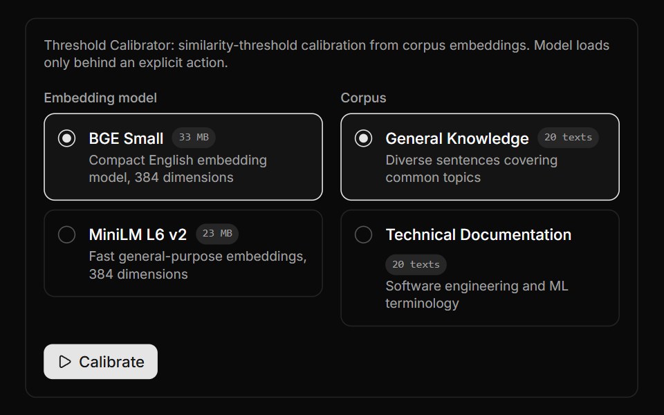 Threshold Calibrator BlockLocalMode · ReactCalibrate a similarity threshold from corpus embeddings via useCalibrateThreshold at percentile 90, over a selected…
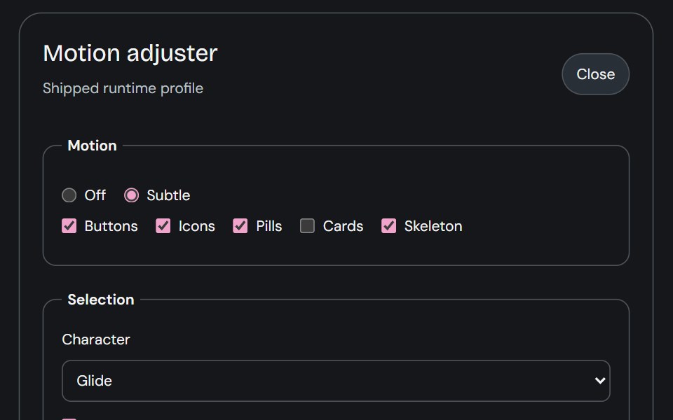 Motion AdjusterCojeev UI · ReactProvides live controls for the shared motion settings and editable body profiles used across the library.
 Scrub Number FieldMicroKit · ReactA number field you drag to scrub and click to type, with a ruler that tracks the gesture.
 SliderROI UI · ReactA slider component for selecting values from a range.
 Usage SliderFLX UI · ReactUsage Slider for Select a Plan.
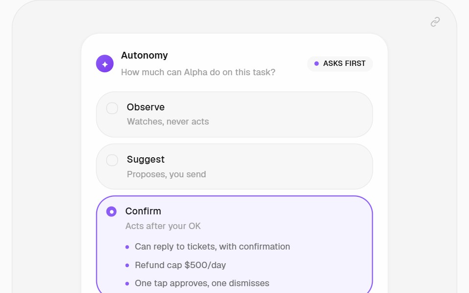 Autonomy PatternHalaska UI · React
 SliderMetal UI · React + SwiftUIScalar or range amounts on a clamped track: horizontal/vertical, centred or neutral fill, named independent knobs…
 SliderSpaceUI · ReactAllows users to choose a numeric value or range smoothly by sliding a handle along a horizontal track with immediate…
 Aria SliderReScript shadcn · ReScript
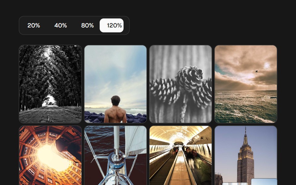 Image Density GridSkecher UI · ReactA percentage-controlled image grid with animated density changes, soft focus, and optional controls.
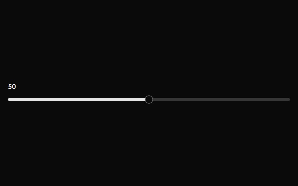 SliderOUI · ReactReact aria components Slider with shadcn characteristics.
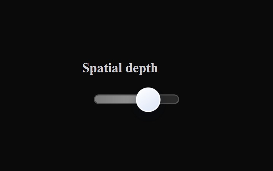 Liquid SliderLiquefy UI · ReactSlider in liquid glass style. Controle deslizante em estilo vidro líquido.
 SliderD2Studio UI · ReactAn input where the user selects a value from within a given range.
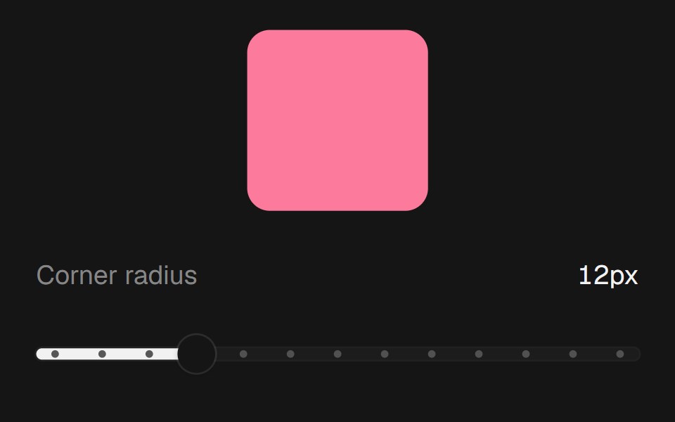 Range SliderEaseUI · ReactNative range input with a filled track and tick dots, so keyboard and screen reader support come built in.
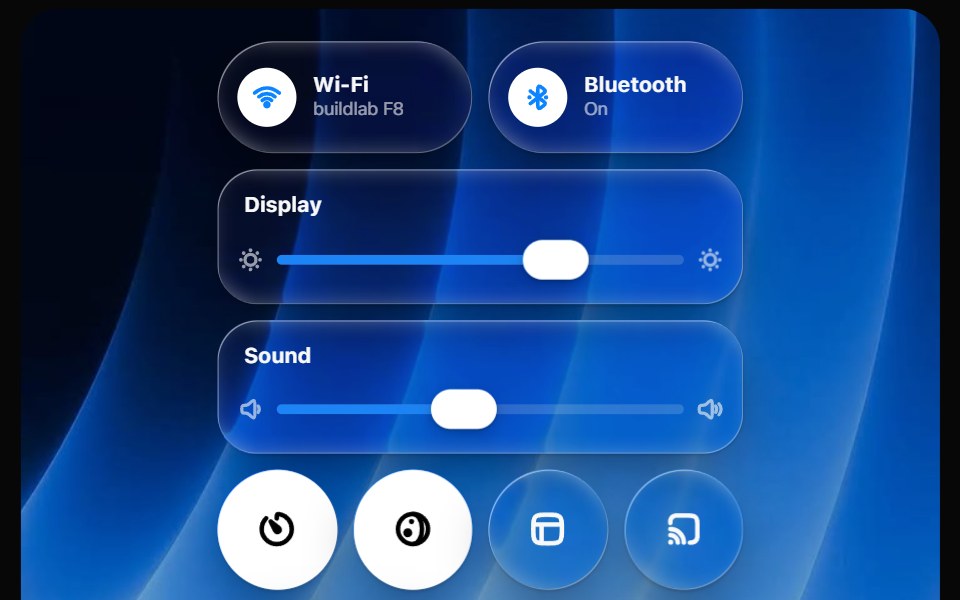 Glass Control CenterOpaline · ReactmacOS-style Control Center kit — glass modules, toggles, light-filled sliders and buttons.
 Chapter ScrubberFibo · ReactA rail of marks that swell under the pointer like the Dock, previewing the chapter at the crest.
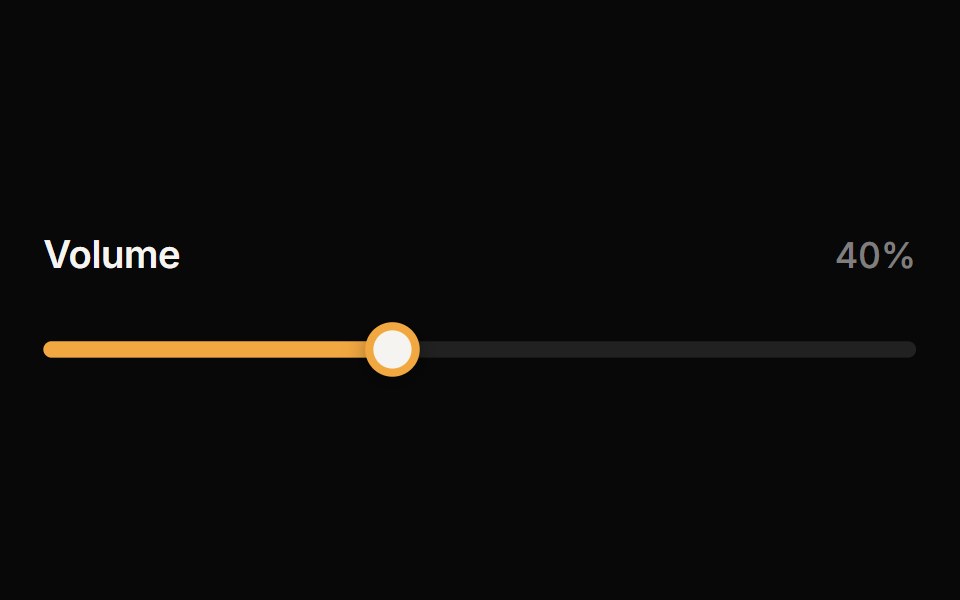 SliderReactFrame · ReactAn accessible single or range slider with a draggable thumb, a value tooltip, optional step marks, keyboard control…
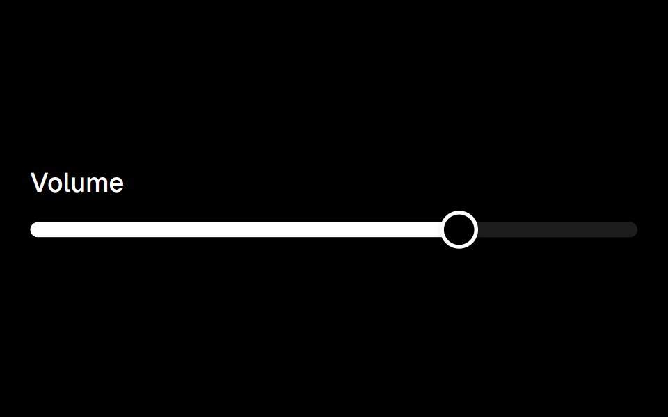 Sliderark-cn · ReactA shadcn-style slider component built with Ark UI primitives.
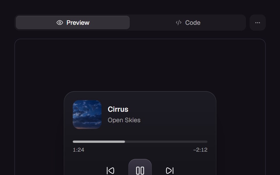 Elastic SliderReact Bits · ReactSlider handle stretches elastically then snaps with spring physics.
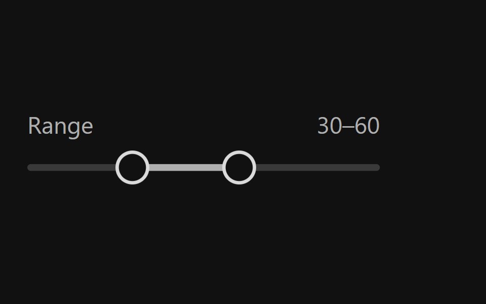 Range SliderReact Spectrum · ReactRangeSliders allow users to quickly select a subset range. They should be used when the upper and lower bounds to the…
 Comp 240Origin UI · React
 Basic slider.ReUI · ReactBasic slider.
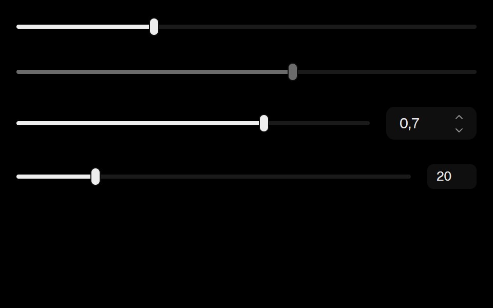 SliderLobe UI · React
 sliderIntent UI · Reactslider
 Range Slider FluidbeUI · ReactRange slider with two thumbs and a fluid, springy fill between them.
 Sales CTA FooterSpectrum UI · ReactA seat slider that prices a tier live, beside the link grid.
 Slider (Base UI)Fluid Functionalism · ReactAnimated slider with spring-snapped thumb, step dots, range mode, and click-to-edit value display. Base UI flavor.
 Color Opacity ControlToolcraft · React
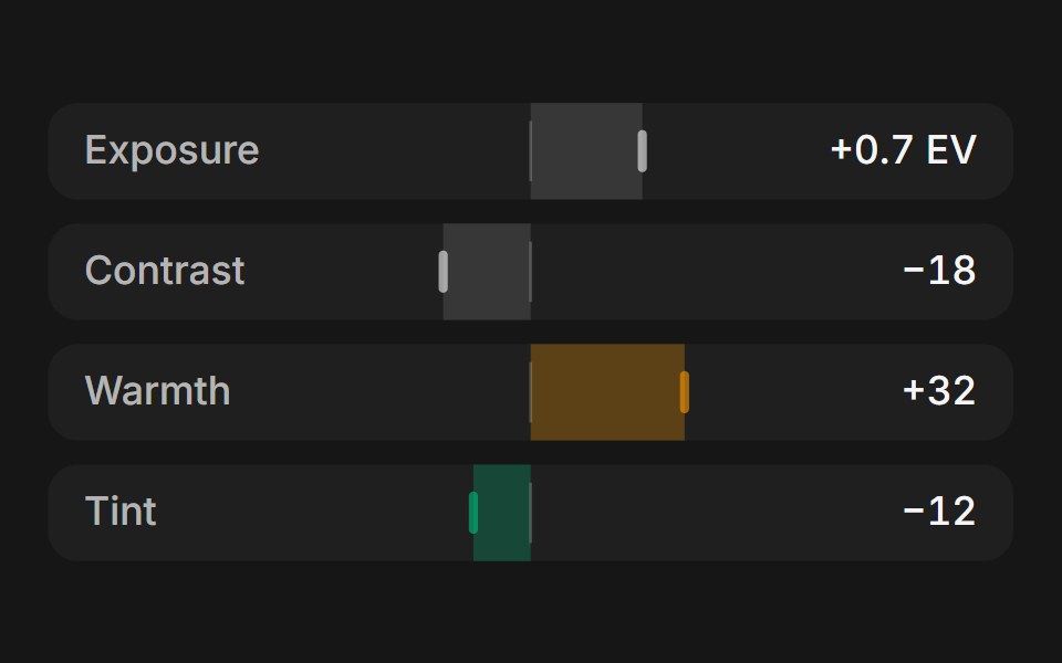 Web SliderPanel UI · React NativeSliders for photo adjustments and zoom, with step buttons.
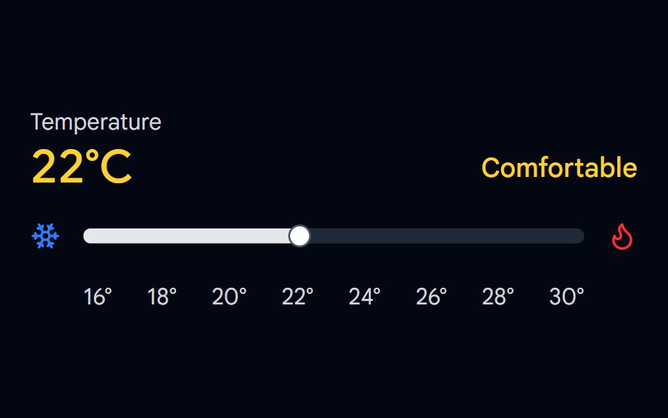 Slider 03 - Temperature ControlShadcn Space · ReactTemperature control slider with cool/comfortable/warm zones, color-coded display, and hover preview.
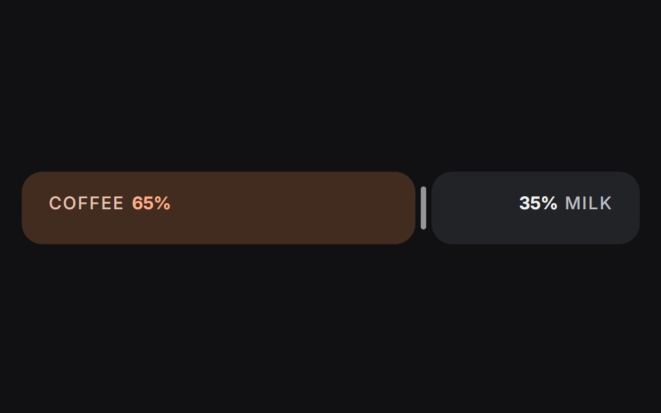 Slideruselayouts · ReactA dual-sided ratio slider animated with spring physics and drag interactions.
 SliderObsidianUI · React
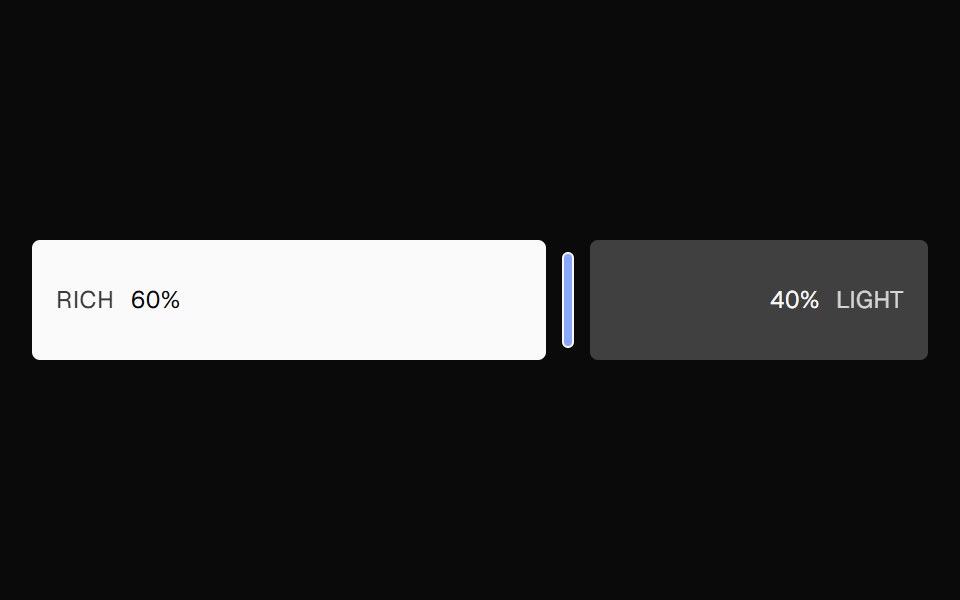 Ratio SliderNexvyn UI · ReactA split ratio slider with two color bars, a draggable divider, and responsive labels that collapse when space is tight.
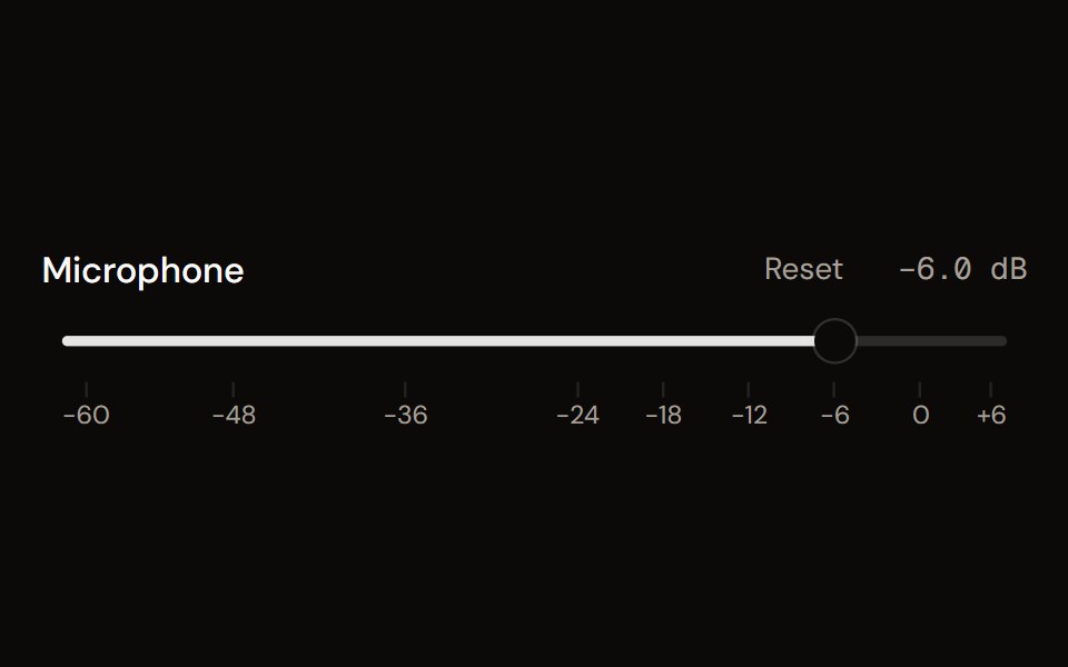 Faderaudiocn · ReactA volume fader in decibels: linear or console taper, detents, a scale, reset, an editable value, silence at the…
 SliderShark UI · ReactA slider for selecting a value from a range.
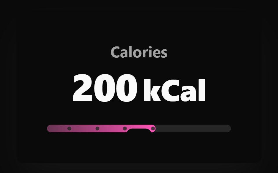 Adaptive Slider BaseWatermelon UI · React
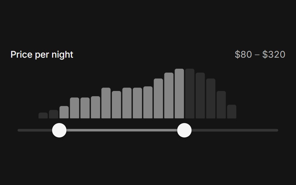 Range histogram sliderArc Library · ReactA price range over a live histogram of the data, lighting the bars inside the range and settling on bar edges.
 Elastic SliderUI Lab · ReactStretches like rubber when you drag past the end, then springs back.
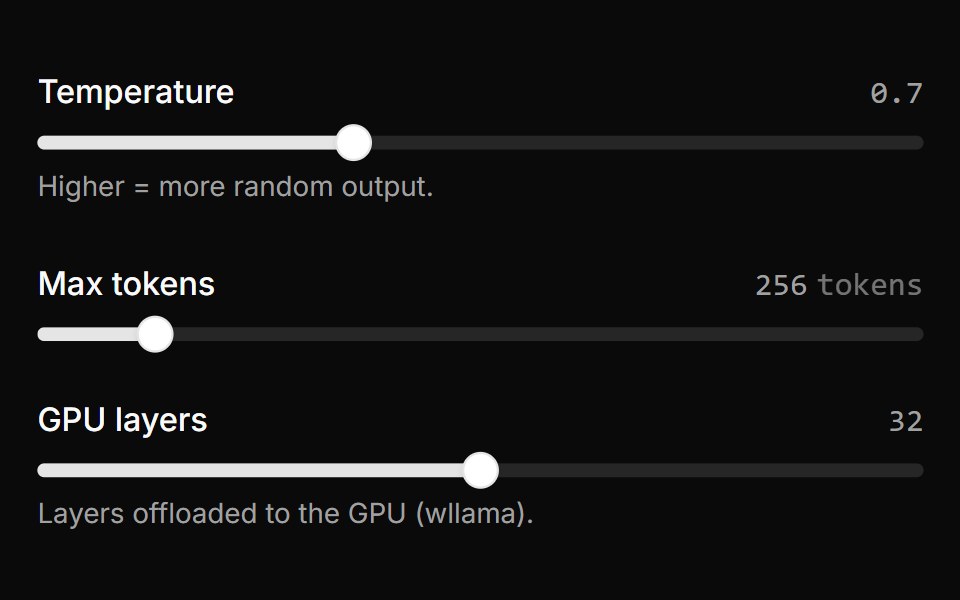 Parameter SliderLocalMode · ReactAn inline range slider with a live value readout for reversible adjustment of a local generation parameter…
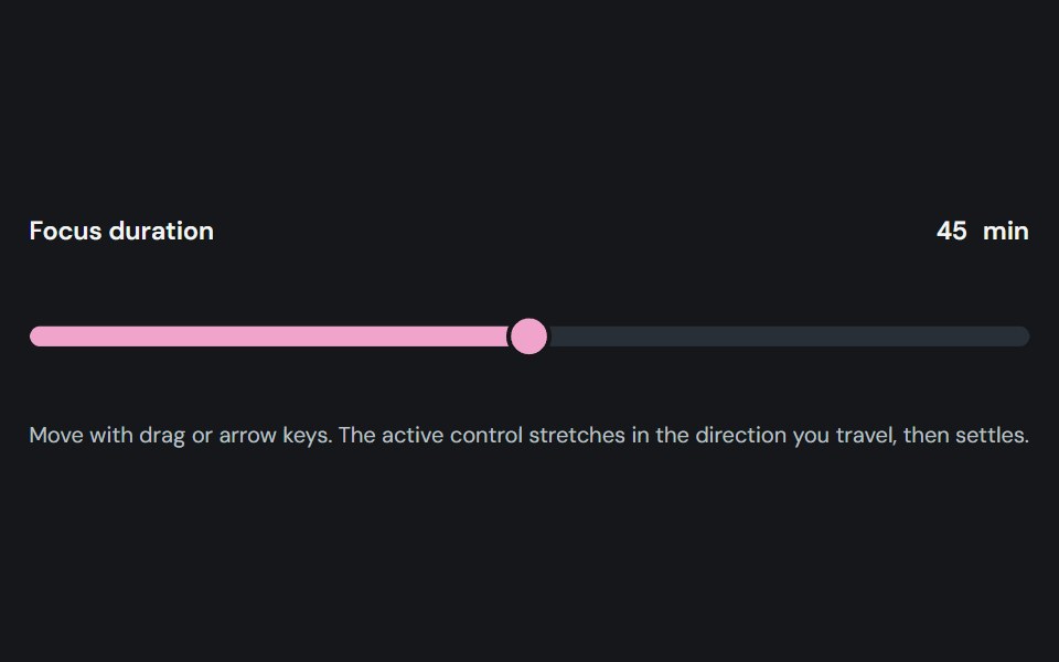 SliderCojeev UI · ReactAdjusts one or more numeric values by moving labeled thumbs along a track.
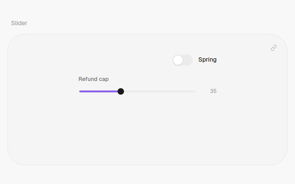 SliderHalaska UI · React
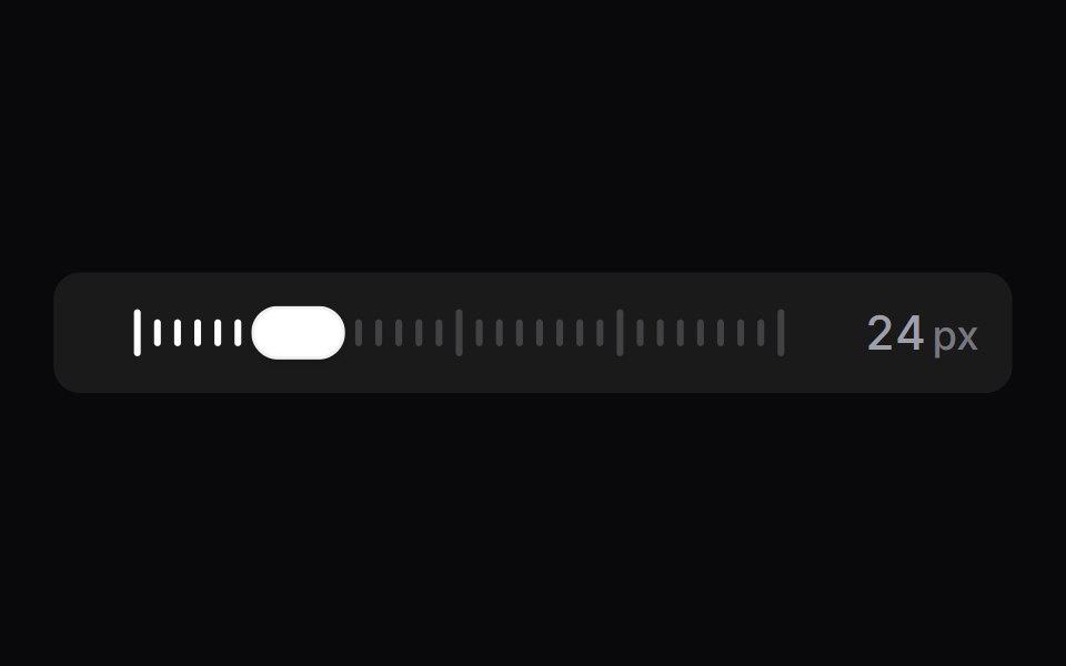 Tick SliderSpaceUI · ReactA scrubber drawn as a row of tick marks, backed by a real range input.
 Base SliderReScript shadcn · ReScript
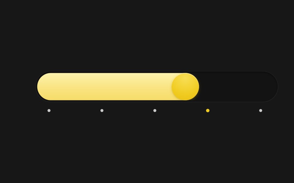 Spring SliderSkecher UI · ReactA pill-track slider with a spring-driven fill and thumb, tick markers, and a tooltip that blurs in and out.
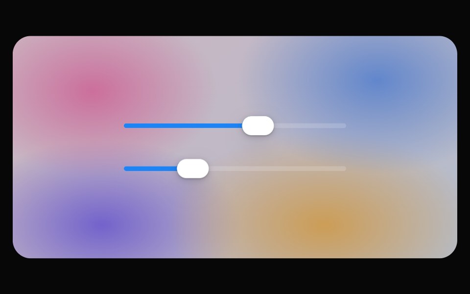 Glass SliderOpaline · ReactSlider whose thumb becomes a refracting lens while dragging.
 SliderFibo · ReactPicks a number, or a range, by dragging along a track.
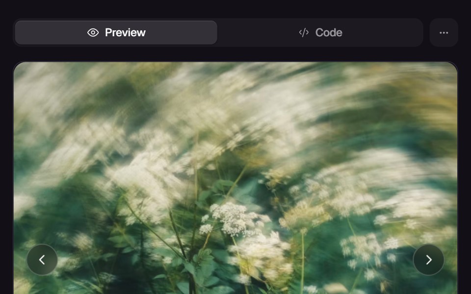 Morph SliderReact Bits · ReactWebGL slider that melts between images with a displacement transition.
 SliderReact Spectrum · ReactSliders allow users to quickly select a value within a range. They should be used when the upper and lower bounds to…
 Comp 241Origin UI · React
 Slider with tick marksReUI · ReactSlider with tick marks
 Base Ui SliderLobe UI · React
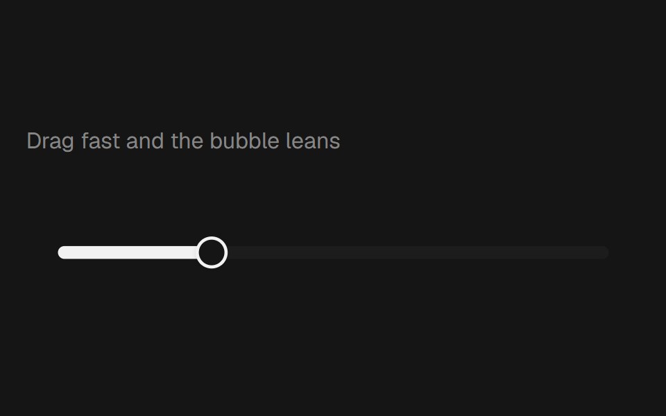 Range Slider BubblebeUI · React
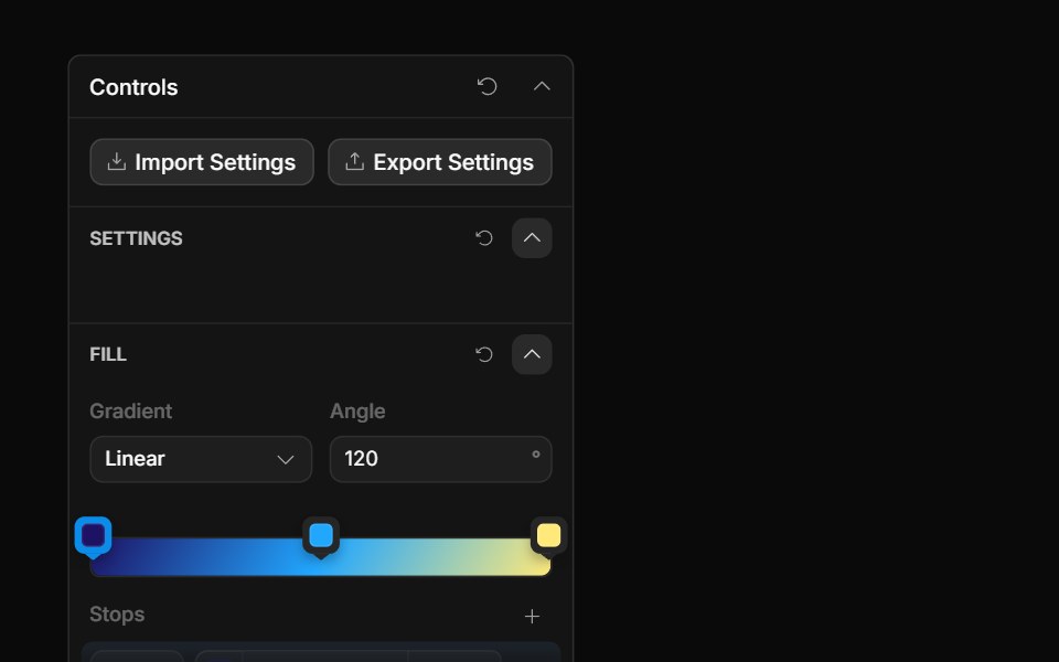 Gradient ControlToolcraft · React
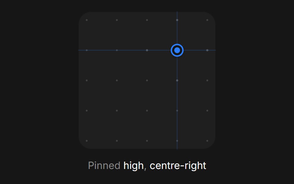 Web Xy PadPanel UI · React NativeA two-axis pad for setting a pair of values at once, such as light position.
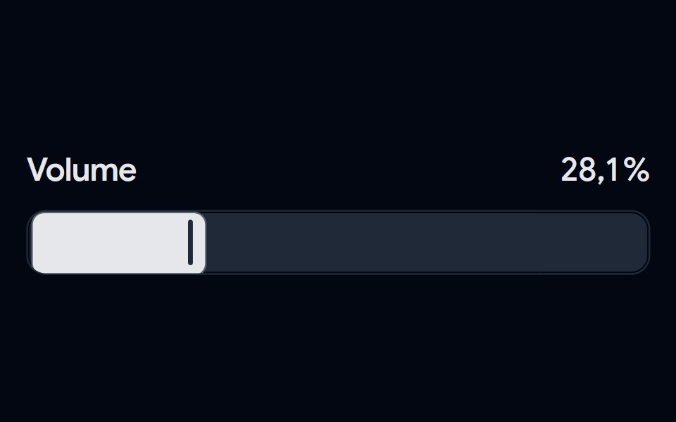 Slider 04 - Modern VolumeShadcn Space · ReactA sleek volume slider featuring a bold track design, custom vertical thumb, and smooth percentage transitions with…
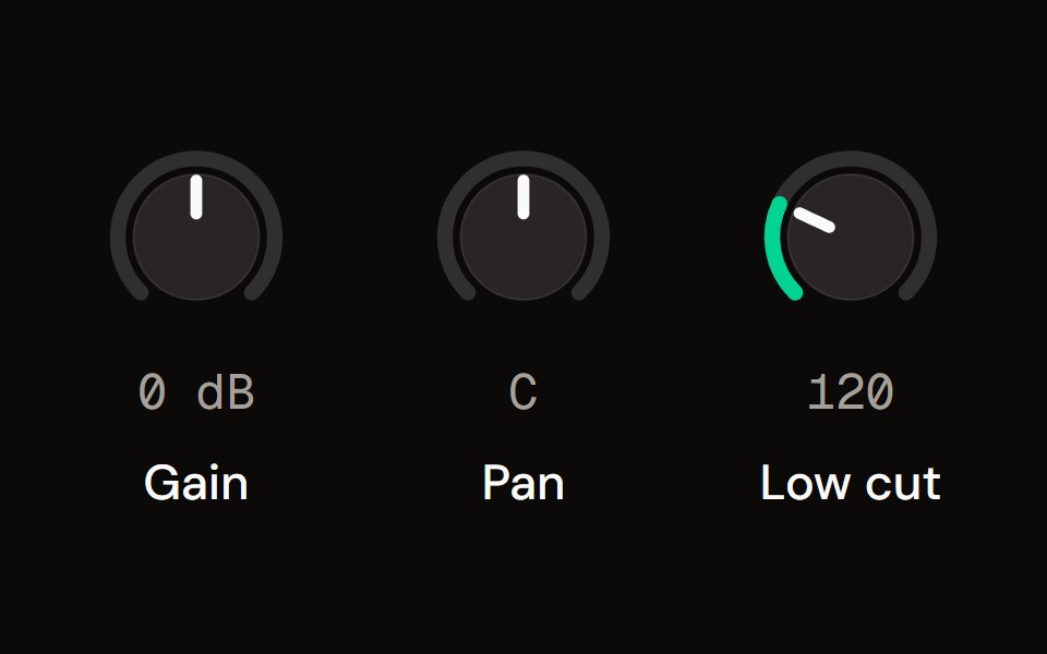 Knobaudiocn · ReactA rotary control drawn in SVG, with vertical, horizontal or circular dragging, fine adjustment, reset, a bipolar…
 Carousel SliderWatermelon UI · React
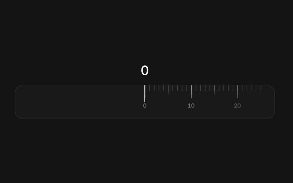 Ruler sliderArc Library · ReactA tape of ticks that slides under a fixed needle, with momentum, snapping, and a rolling readout.
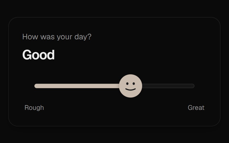 Mood SliderUI Lab · ReactThe thumb is a face that frowns, grins and leans into the drag as you rate your day.
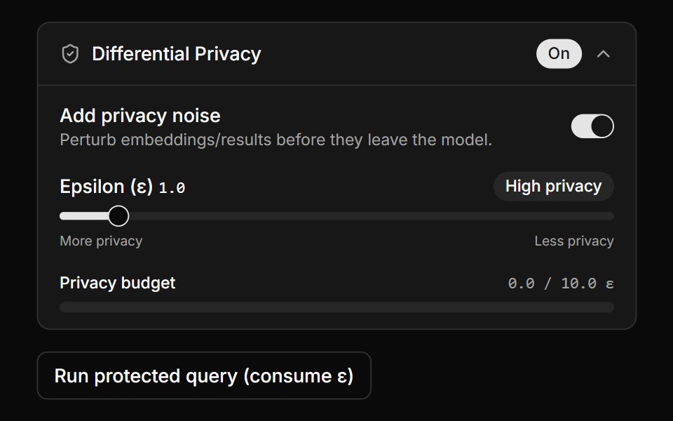 Differential Privacy ControlsLocalMode · ReactA collapsible DP settings panel (enable toggle, epsilon slider with derived High/Balanced/Low label, privacy-budget…
 Spring SliderHalaska UI · React
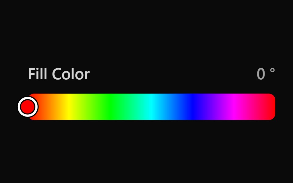 Tailwind Color SliderReact Spectrum · React
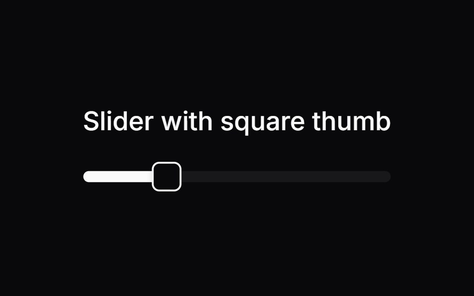 Comp 242Origin UI · React
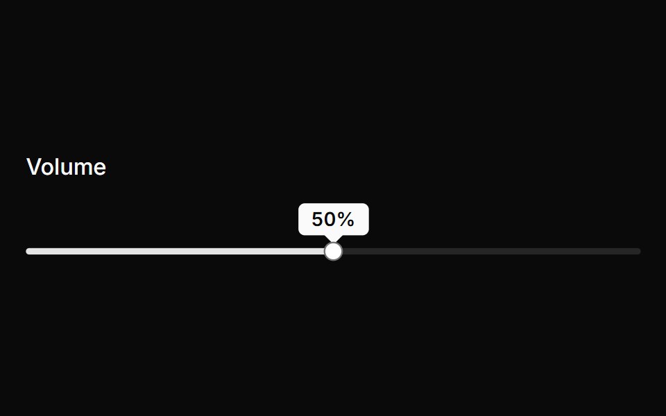 Slider with dynamic tooltip indicatorReUI · ReactSlider with dynamic tooltip indicator
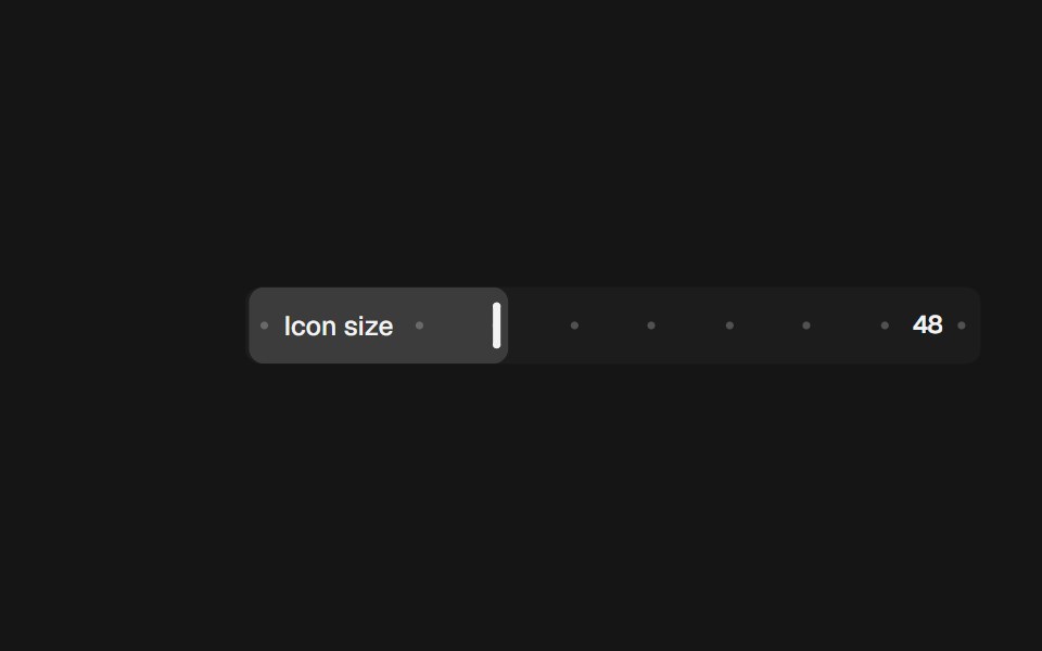 Range Slider InlinebeUI · React
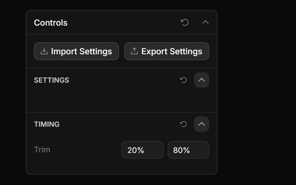 Range Input ControlToolcraft · React
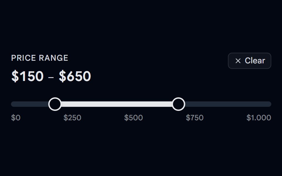 Slider 05 - Price Range FilterShadcn Space · ReactA dual-thumb price range filter slider with a hover ghost preview — hover outside the selected range to see a…
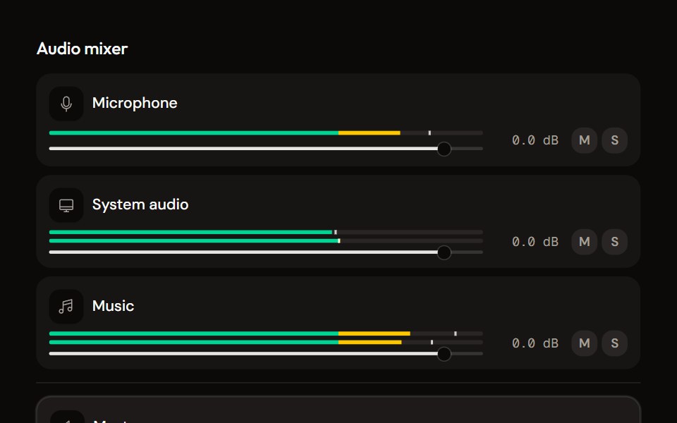 Mixeraudiocn · ReactThe container for channel strips: shared meter settings, keyboard navigation between strips, a master area and an…
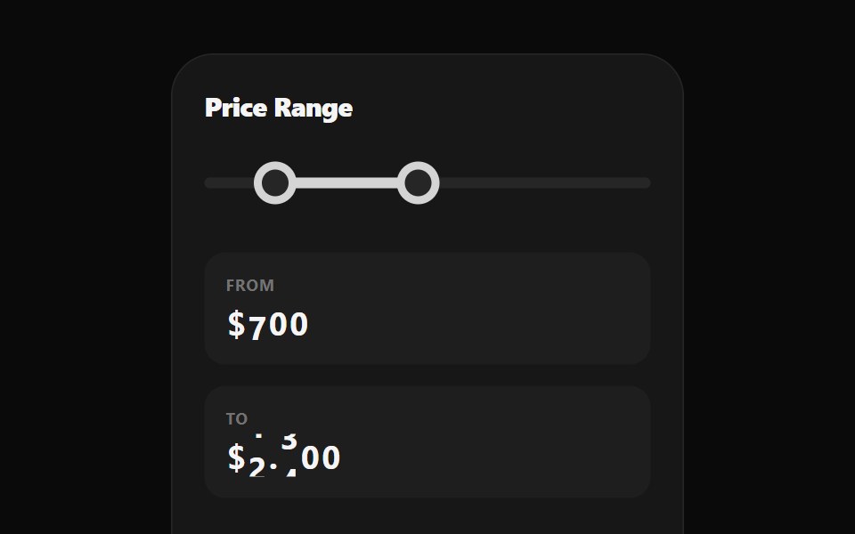 Range Selection SliderWatermelon UI · React
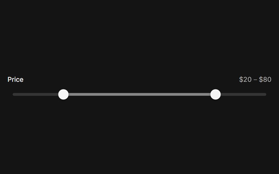 SliderArc Library · ReactPick a value or a range on a track that follows your finger.
 Pricing CalculatorUI Lab · ReactItemizes your bill like an invoice and upgrades the plan the moment your team crosses a seat threshold.
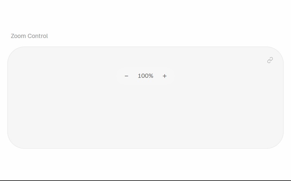 Zoom ControlHalaska UI · React
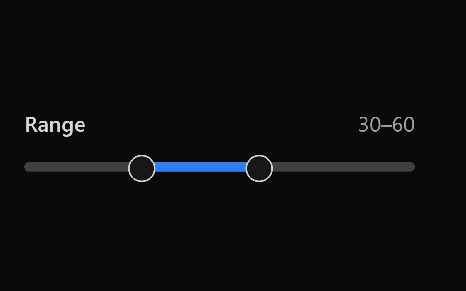 Tailwind SliderReact Spectrum · React
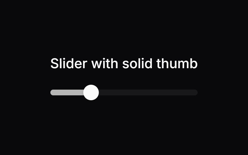 Comp 243Origin UI · React
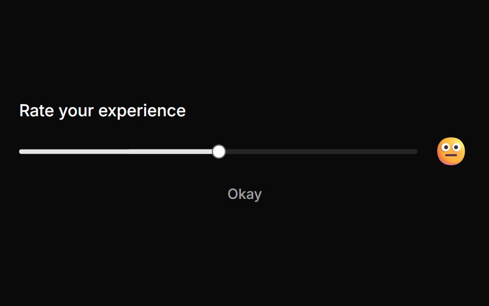 Rating slider with emoji feedbackReUI · ReactRating slider with emoji feedback
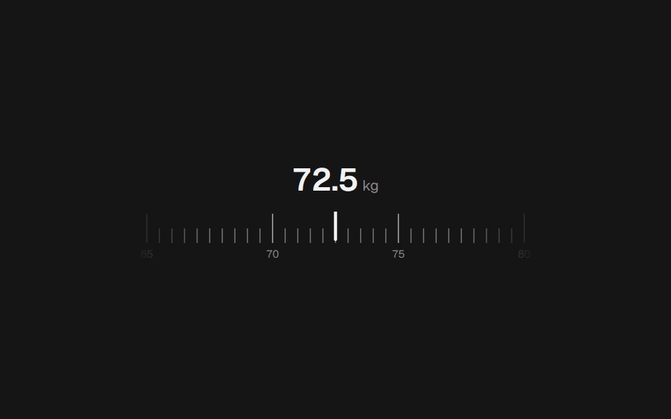 Range Slider RulerbeUI · React
Libraries with React slider components
Related categories
- Slider Components
- Tailwind CSS Slider Components
- Animated Slider Components
- shadcn/ui Slider Components
- React Input Components
- React Select Components
- React Text Input Components
- React Form Field Components
- React Form Components
- React Switch Components
- React Textarea Components
- React Checkbox Components
- React Radio Components
- React Combobox Components
- React File Upload Components
- React Date Picker Components
- React Search Input Components
- React Color Picker Components
- React Login Form Components
- React OTP Input Components