 Dev Design Library
React Select Components
Dev Design Library indexes 503 React select components from 65 open-source UI libraries, with the most coming from ReUI, Watermelon UI, Origin UI, Shadcn Space and FLX UI. Each one links to its page with the source code, a live preview where available, the library license and the install command. Every library in this list targets React. Select components belong to the Inputs group.
Showing 120 of 503, a mix from every library. Open a library to see all of its components.
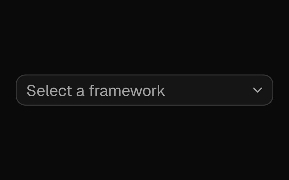 Comboboxshadcn/ui · ReactAutocomplete input with a list of suggestions.
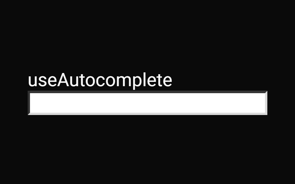 AutocompleteMUI / Material UI · React
 Glide SelectReact Bits · ReactSelect chip whose menu pops out of its own corner and whose single hover highlight glides between rows, remembering…
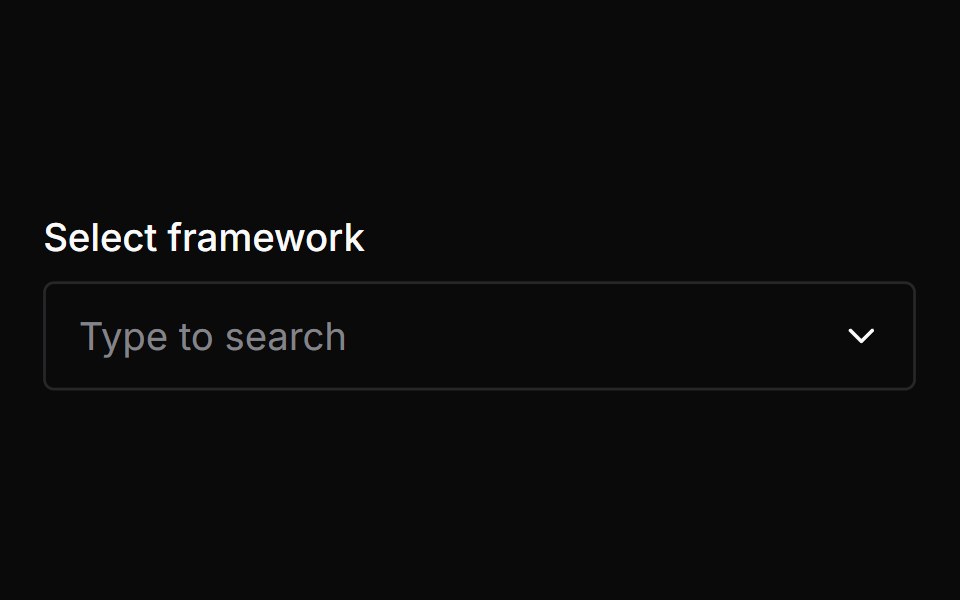 ComboboxChakra UI · ReactA versatile input component that combines a text input with a listbox, allowing users to filter a list of options and…
 AutocompleteHeroUI · ReactAn autocomplete combines a select with filtering, allowing users to search and select from a list of options
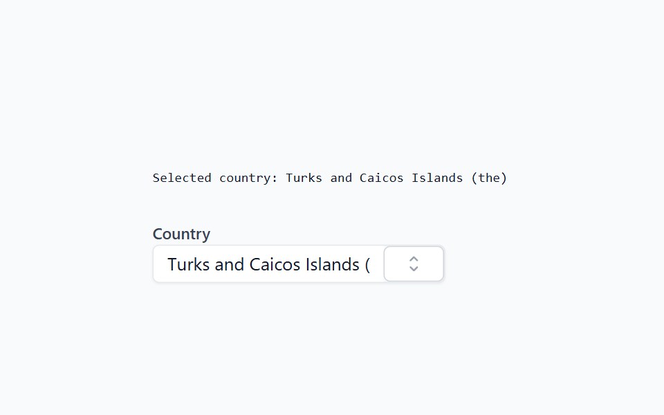 ComboboxHeadless UI · React
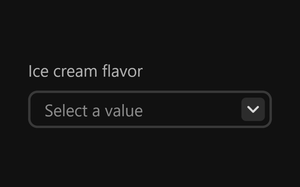 Combo BoxReact Spectrum · ReactComboBoxes combine a text entry with a picker menu, allowing users to filter longer lists to only the selections…
 Autocompletecoss ui · ReactAn input that suggests options as you type.
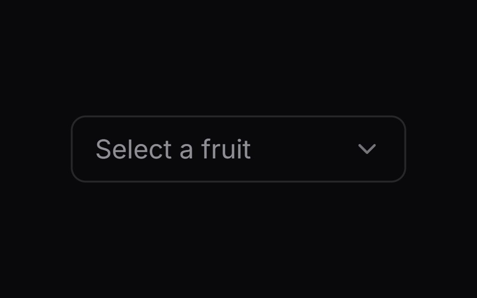 SelectOrigin UI · ReactA common form component for choosing a predefined value in a dropdown menu.
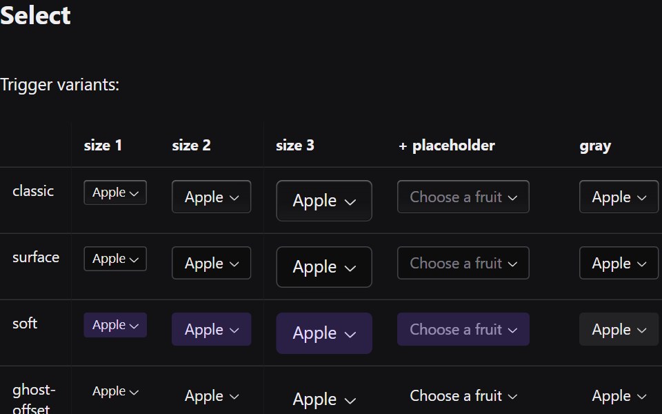 SelectRadix Themes · React
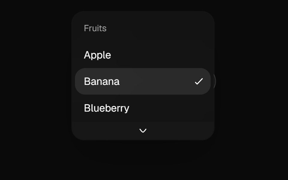 Base SelectCult UI · ReactBase UI select primitives used by Halo Select
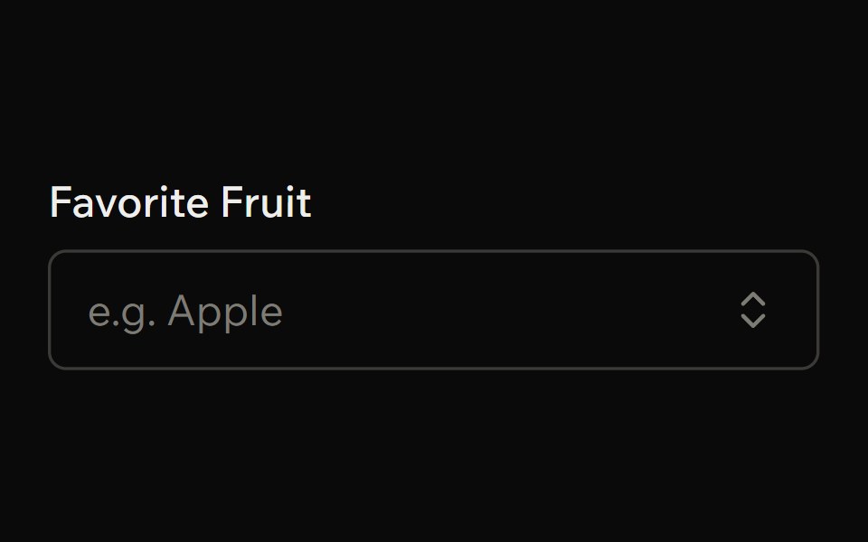 ComboboxArk UI · ReactA single input field that combines the functionality of a select and input.
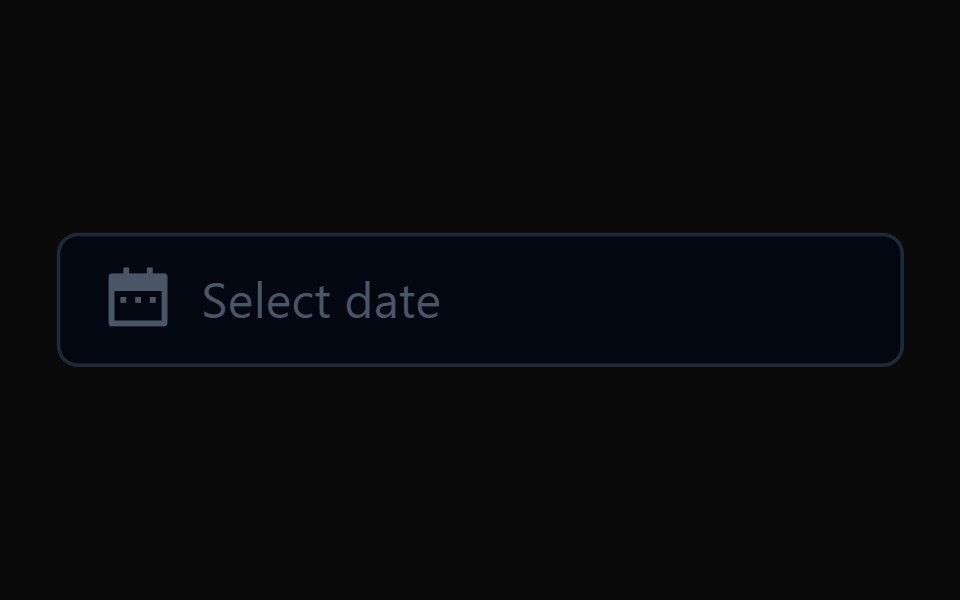 Date PickerTremor · React
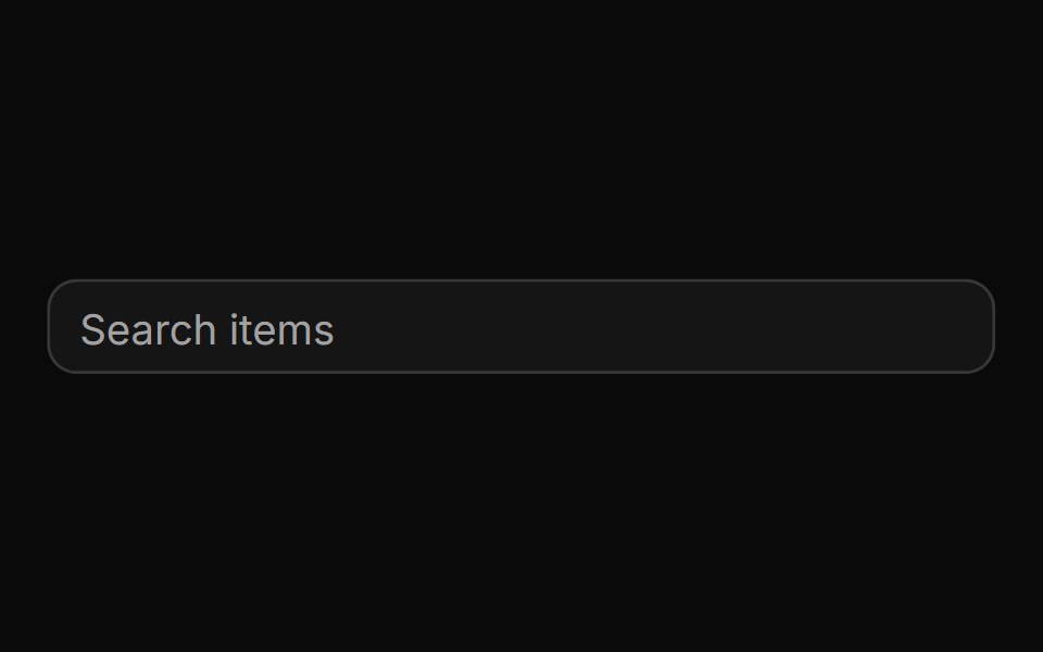 AutocompleteReUI · ReactAn input that suggests options as you type.
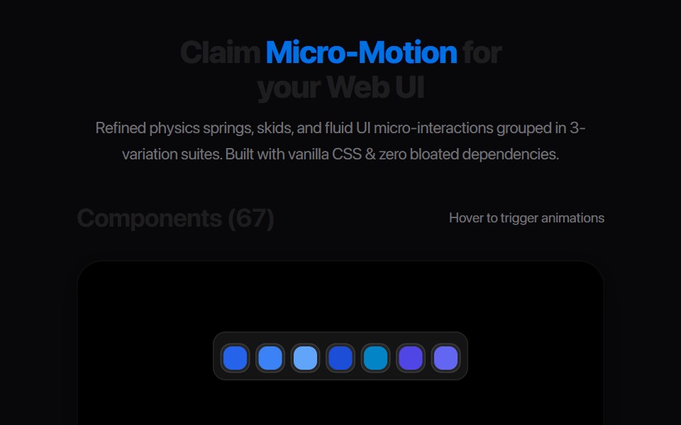 Elastic Tag SnapAmicro Micro Transitions · ReactMinimalist luggage tag with bungee spring snap and vertical recoil.
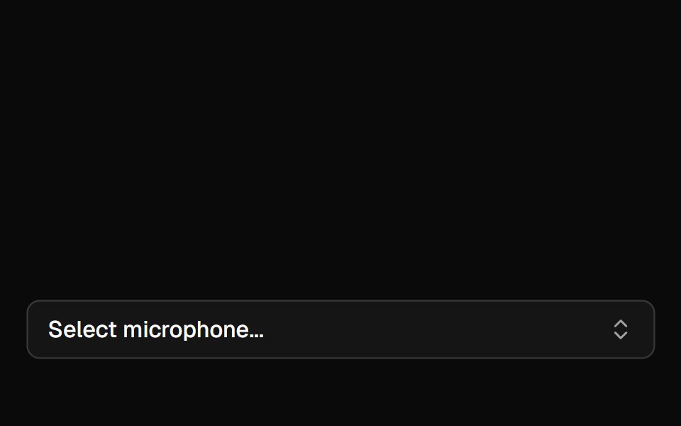 Mic SelectorAI Elements · ReactA composable dropdown component for selecting audio input devices with permission handling and device change detection.
 ComboboxPark UI · ReactA searchable dropdown component combining input and selection features.
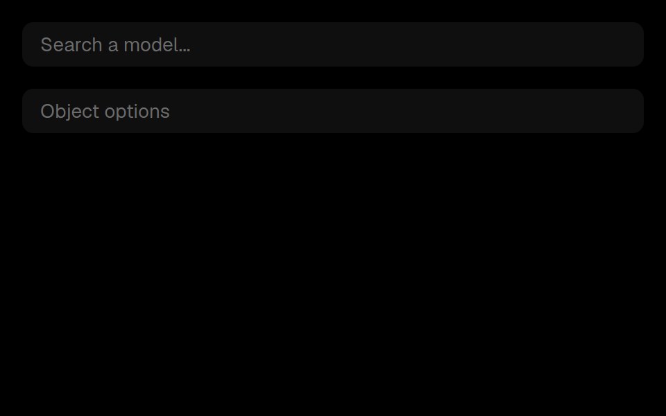 Auto CompleteLobe UI · ReactProvides a dropdown of suggestions as the user types, extending Ant Design AutoComplete with additional styling options.
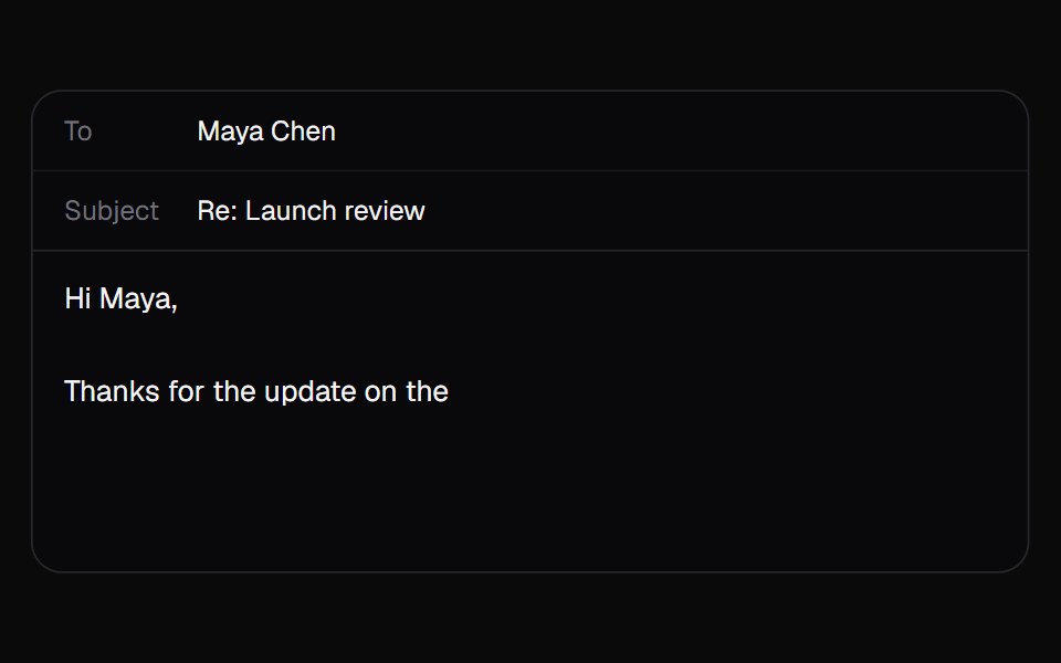 AI AutocompleteKokonut UI · ReactA text box that suggests how your sentence ends in grey after the caret. Tab takes it all, the right arrow takes one…
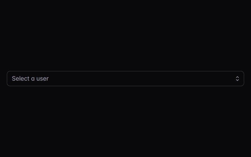 combo-boxIntent UI · Reactcombo-box
 DropdownUntitled UI React · React
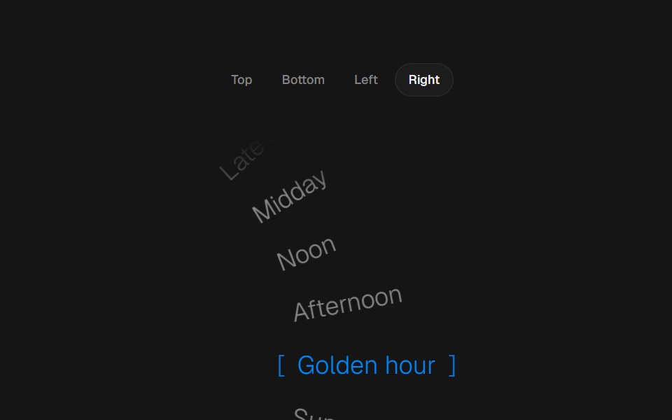 Arc PickerbeUI · ReactRadial text picker with top, bottom, left or right curves, smooth wheel movement and live selection on each scroll…
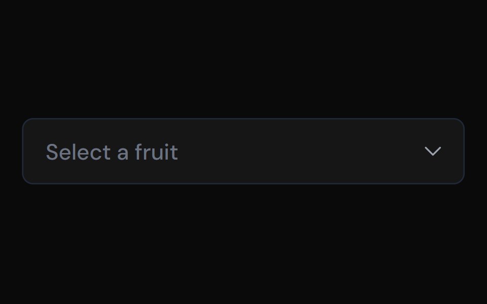 ComboboxTailGrids · ReactA combobox component with multiple variants.
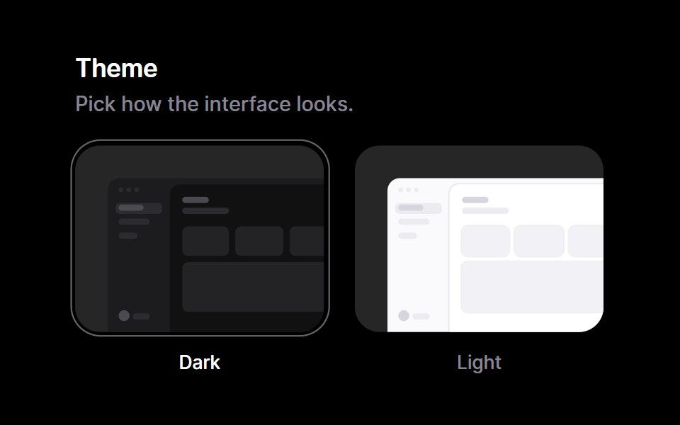 Theme SelectorRare UI · ReactA row of miniature app previews, one per theme, with a ring that marks the one you pick.
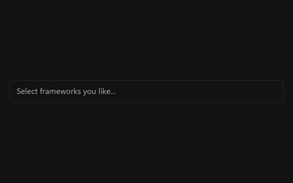 Multiple SelectorSpectrum UI · ReactA multi-select input with async search, grouping, and creatable options.
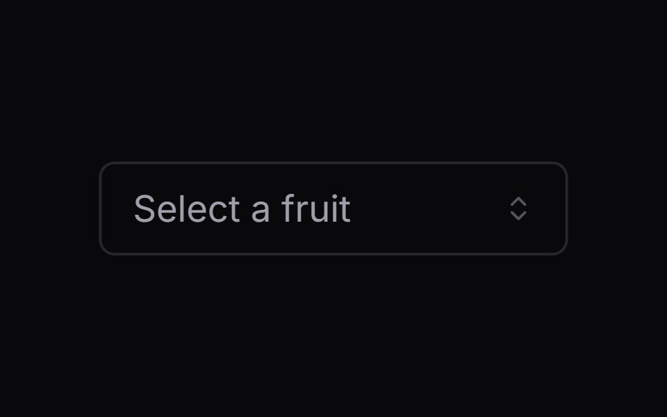 SelectVengeance UI · React
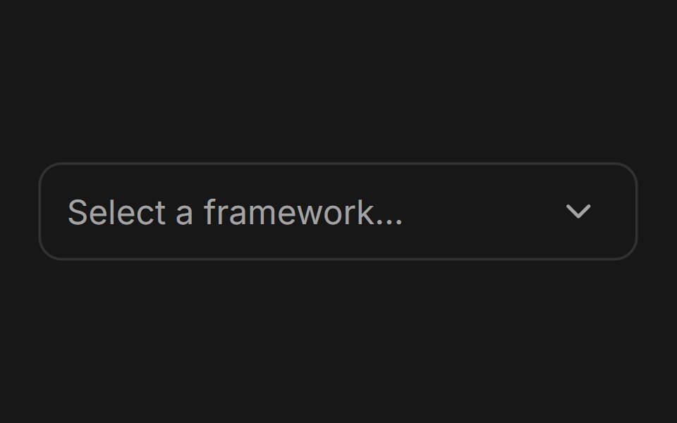 ComboboxFluid Functionalism · ReactType-to-filter combobox with single or multiple (chips, merged selection backgrounds) selection: a text field that…
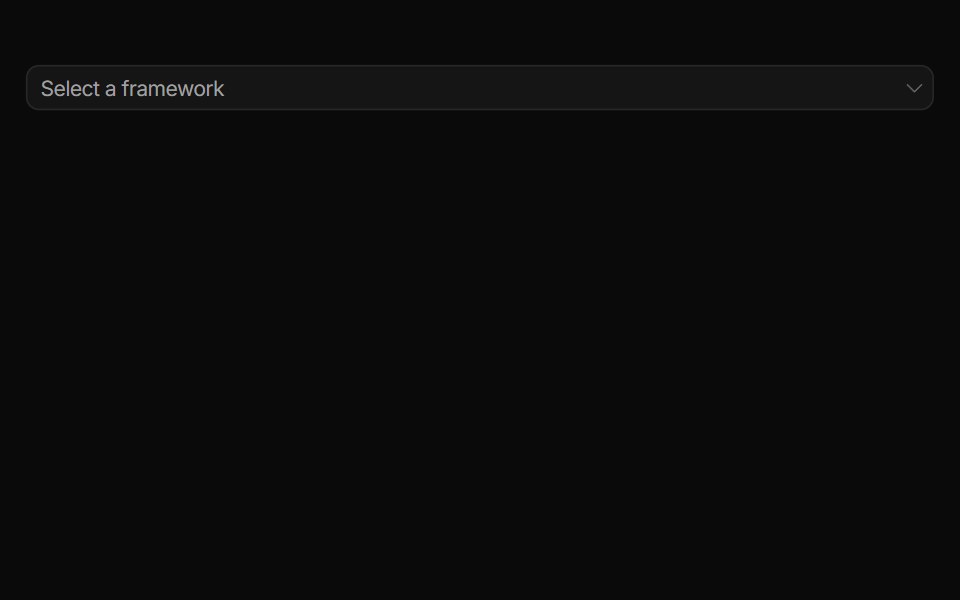 ComboboxToolcraft · React
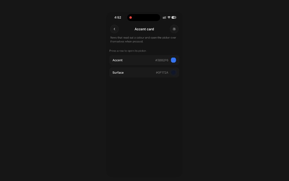 Color PickerPanel UI · React NativeA colour chosen by dragging — a saturation square or a wheel, a hue scale, and opacity.
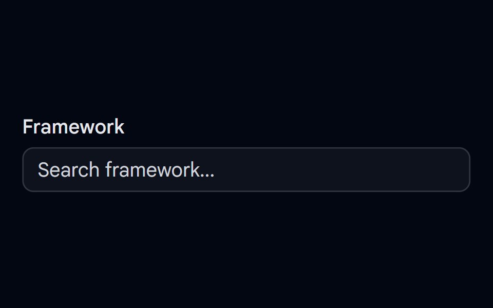 Autocomplete-01 - DefaultShadcn Space · ReactDefault autocomplete component
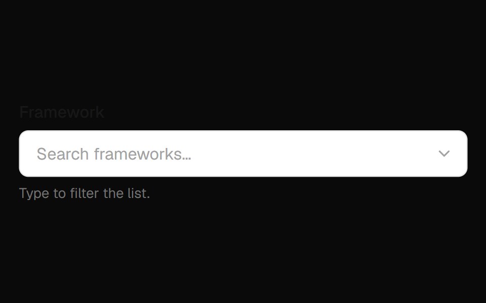 Combobox Field InputOpenSourceUI · React
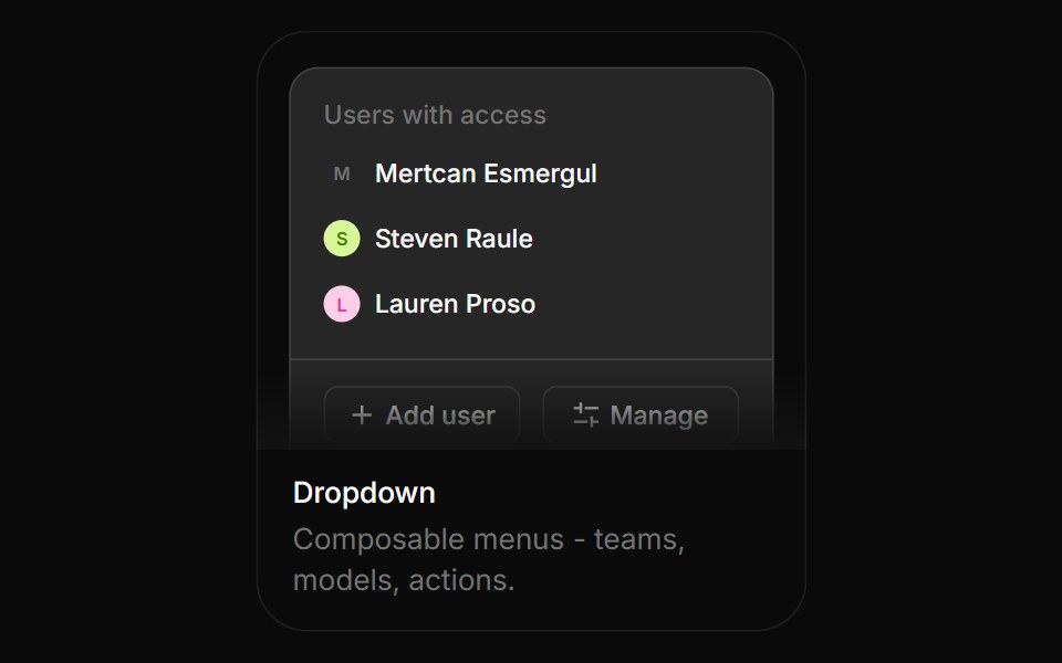 DropdownBoardUI · ReactComposable menus - teams, models, actions.
 AutocompleteComponentry · React
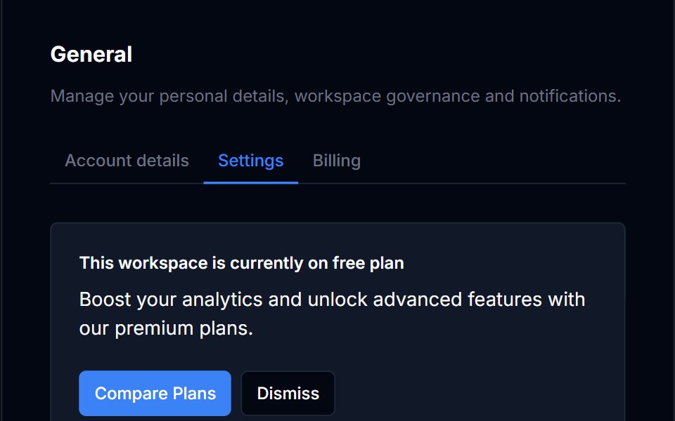 SelectTremor Blocks · React
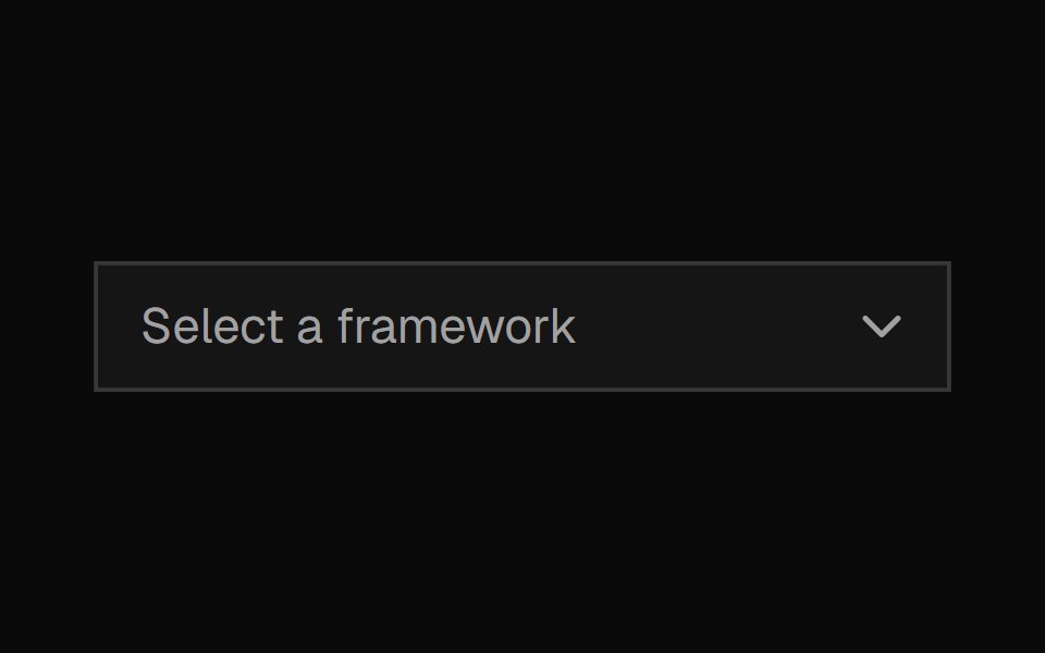 ComboboxShadcn Dashboard · React
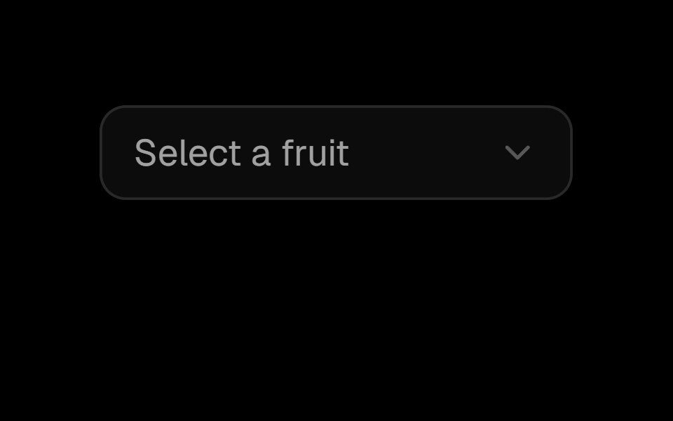 SelectObsidianUI · React
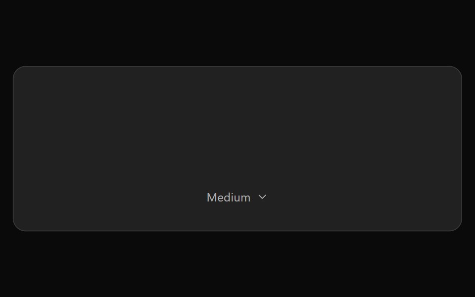 ChatGPT Model SelectorNotra · ReactThe hover-to-open effort chip with Model and Effort submenus, built on shadcn DropdownMenu.
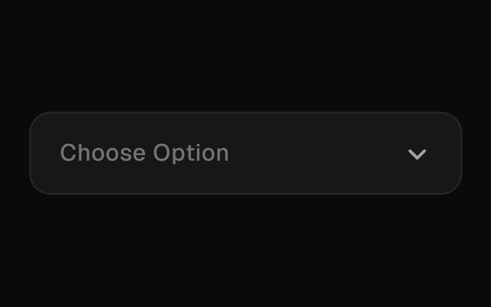 Animated SelectGreatUI · React
 Gooey DropdownNexvyn UI · ReactA dropdown menu with a gooey SVG filter effect that morphs a trigger pill into the panel using spring physics and CSS…
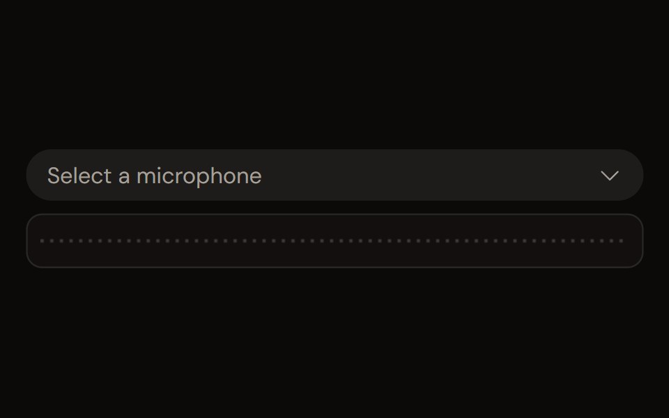 Audio Device Selectaudiocn · ReactA microphone, speaker or source picker with loading, permission, None and disconnected-device states, and a slot for a…
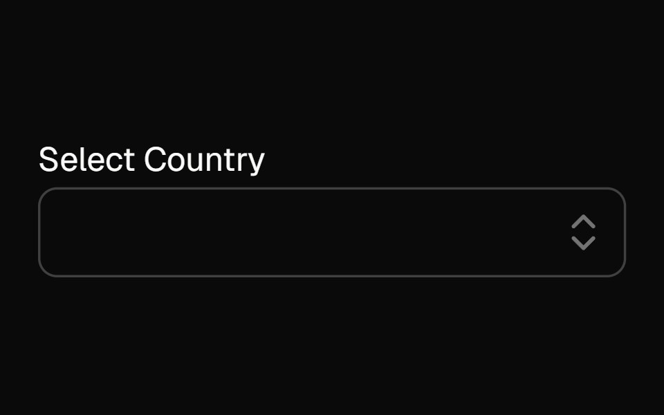 comboboxBaseLayer · ReactA combo box combines a text input with a listbox, allowing users to filter a list of options to items matching a query.
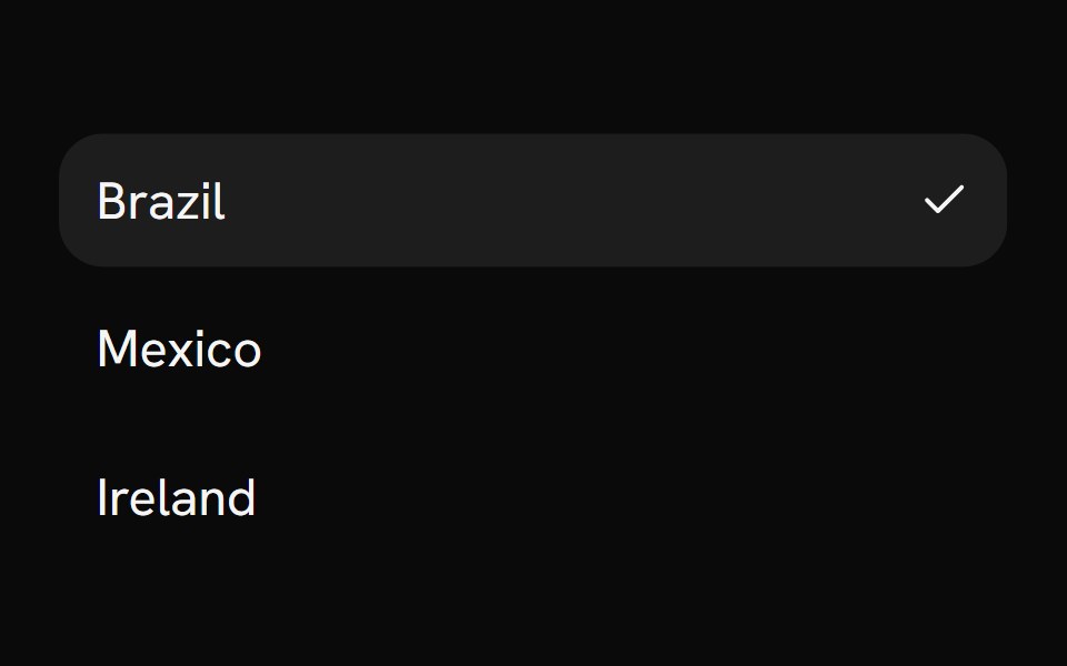 ListboxShark UI · ReactSelect a single or multiple items from a list.
 Assignment ClusterSona UI · React
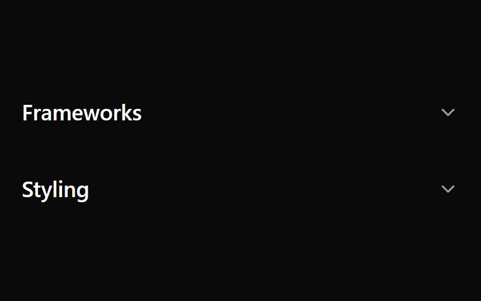 Accordion MultiselectWatermelon UI · React
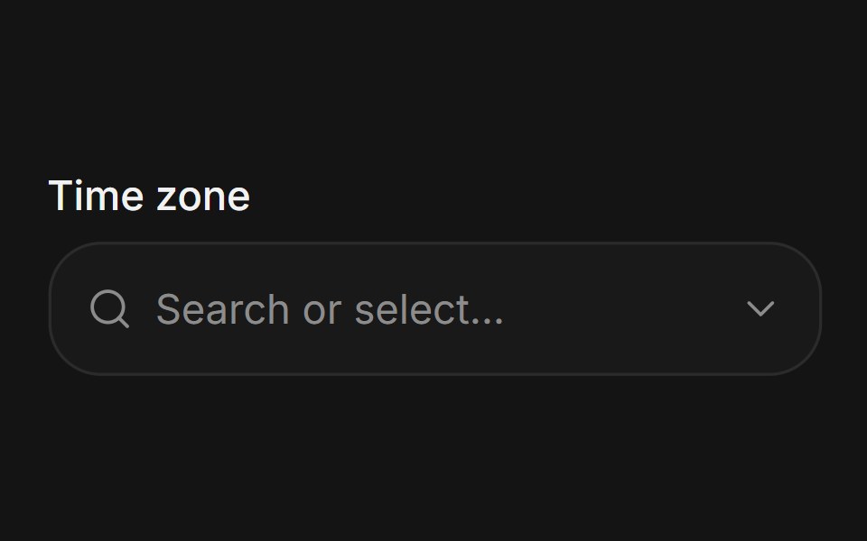 ComboboxArc Library · ReactSearch and select from a list without leaving the field.
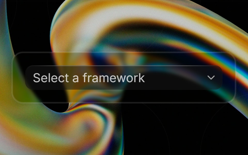 Glass Comboboxglasscn · ReactGlass Combobox with five variants: clear, frosted, subtle, liquid, and liquid-refract
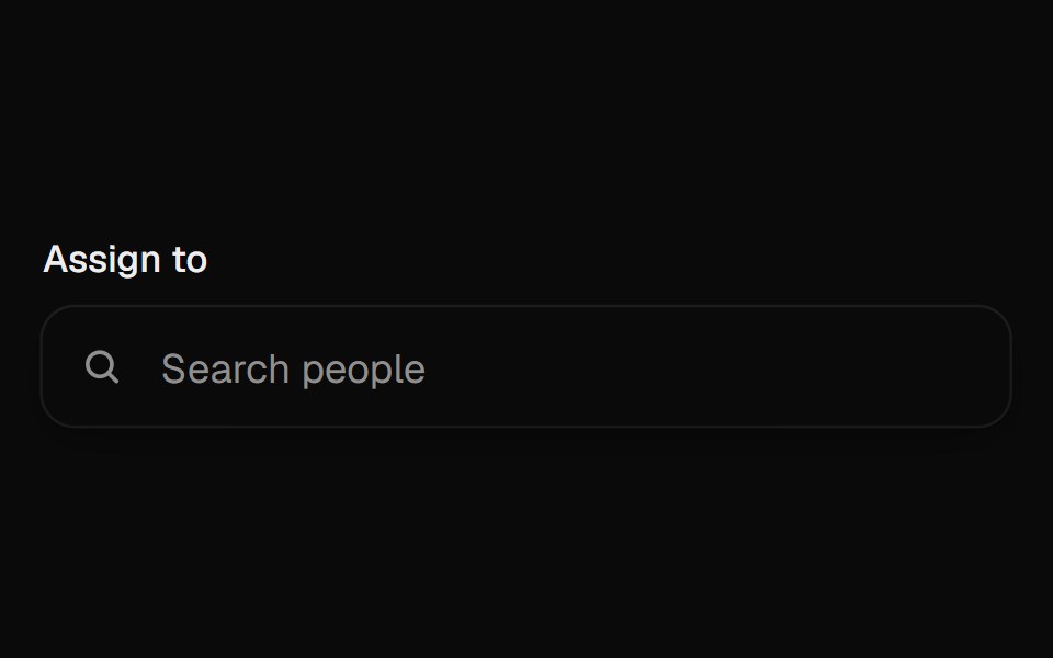 ComboboxUI Lab · ReactThe person you pick flies out of the list and into the field.
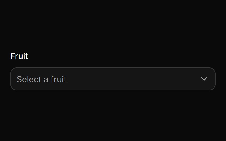 ComboboxHextaUI · ReactA filterable select with chips, groups and async results, in a popup that resizes as you type.
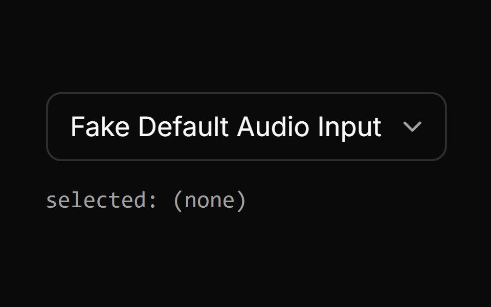 Mic SelectorLocalMode · ReactA microphone input-device picker with permission handling and live device enumeration — fully offline, using only…
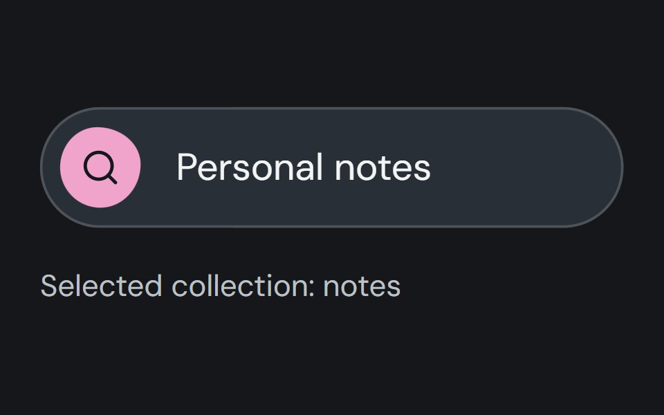 ComboboxCojeev UI · ReactFilters a list of options through text input and stores one selected value.
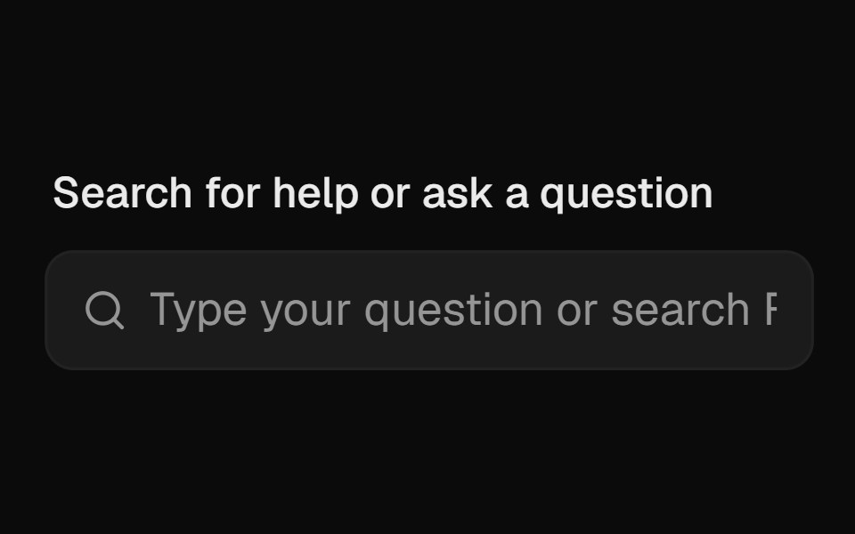 AutocompleteROI UI · ReactAn input that suggests options as you type.
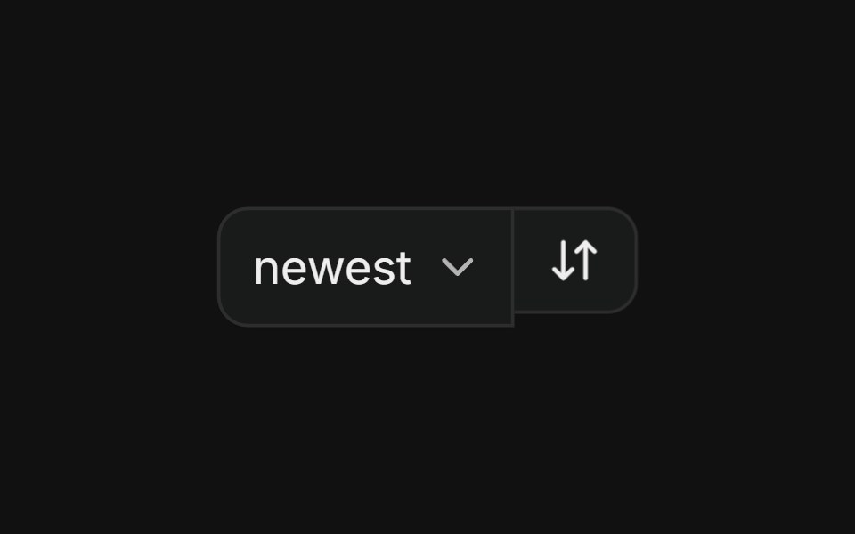 With selectFLX UI · ReactSort dropdown paired with a direction-toggle icon button in a merged-border row.
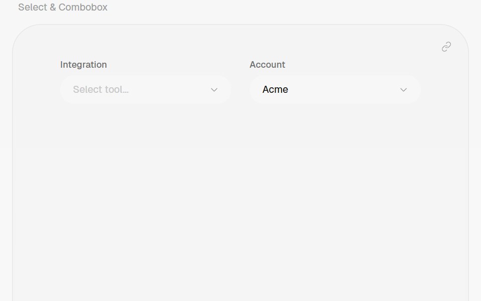 ComboboxHalaska UI · React
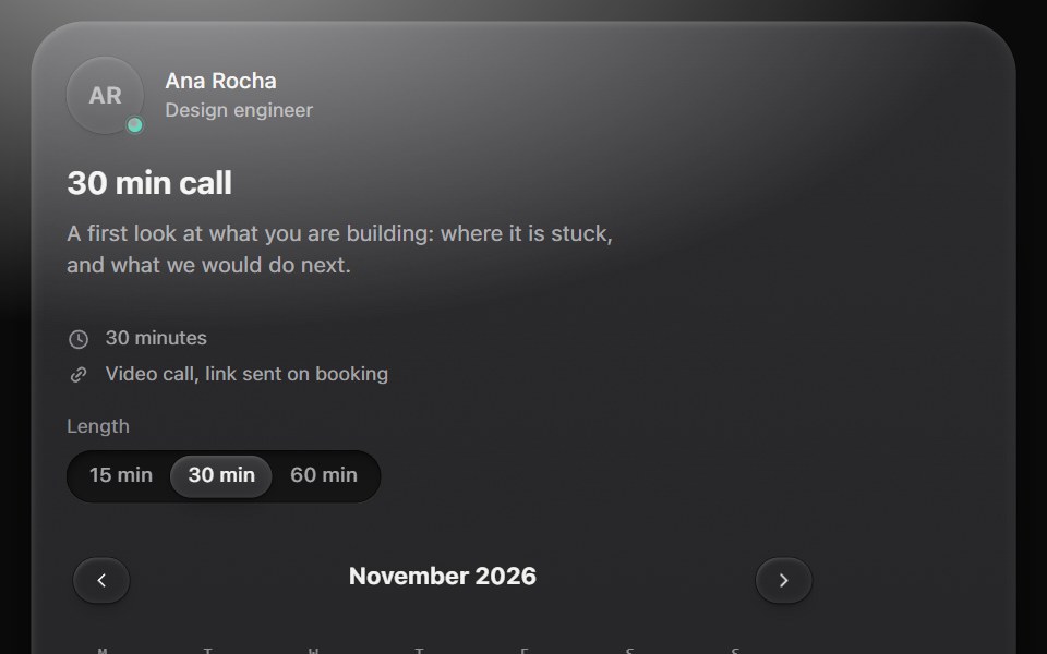 Availability pickerMetal UI · React + SwiftUIA booking block: a host, a call length, a calendar of the next six weeks, the day's free times re-labelled by time…
 AutocompleteSpaceUI · ReactDisplays matching suggestions as users type into an input field, helping them find items quickly and reducing typing…
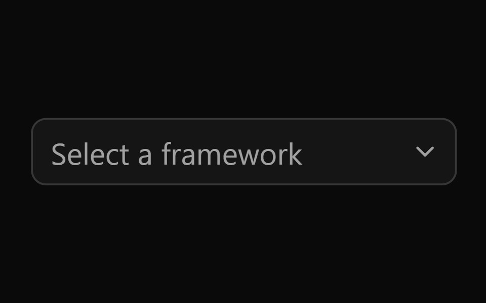 Aria ComboboxReScript shadcn · ReScript
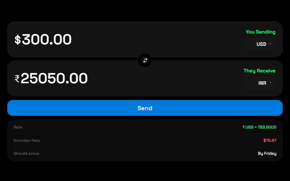 Currency SwitchZAYX · React Native
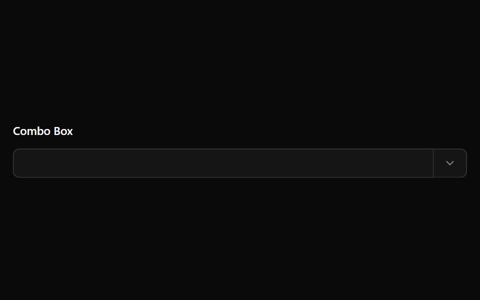 Combo BoxOUI · ReactReact aria components Combo Box with shadcn characteristics.
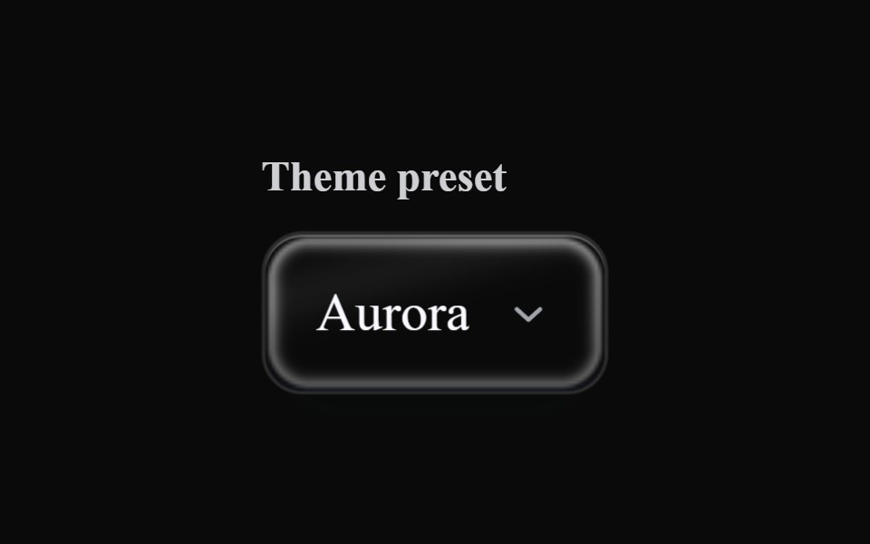 Liquid SelectLiquefy UI · ReactSelect dropdown in liquid glass style. Select em estilo vidro líquido.
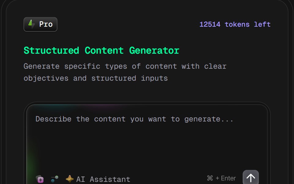 AI Content Creator Card v2D2Studio UI · ReactGlassmorphic AI content generator card with content type and tone pickers and a prompt field.
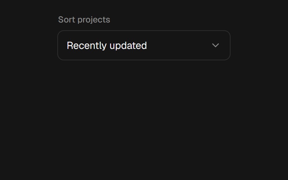 SelectEaseUI · ReactComposable select whose menu fades and scales out of the trigger, and opens upward when there is no room below.
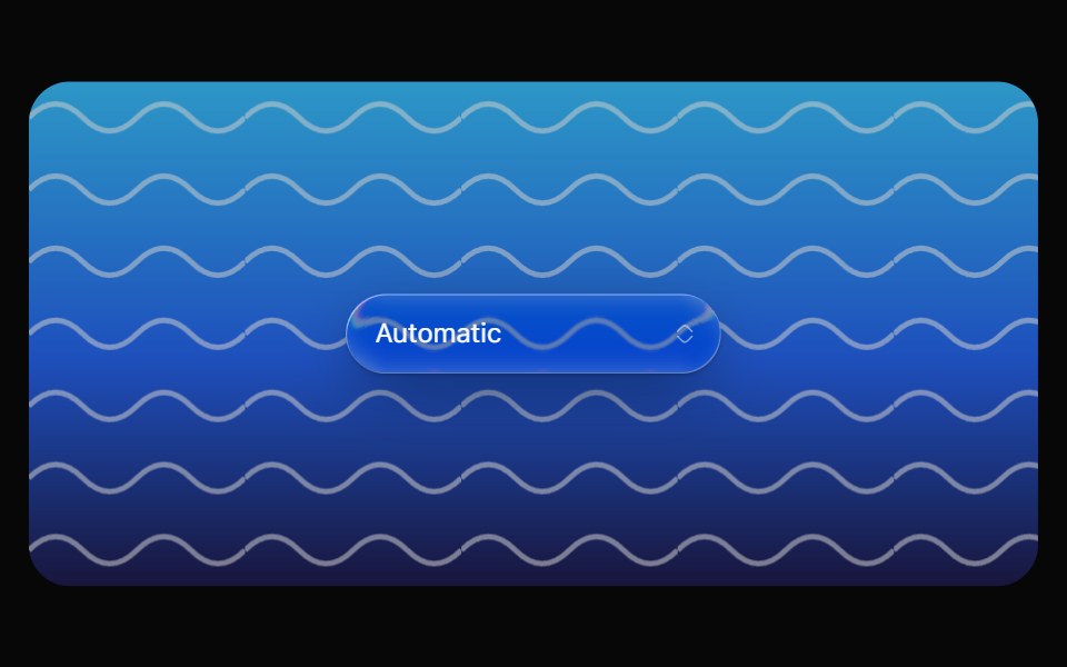 Glass SelectOpaline · ReactCapsule select with a frosted glass option list.
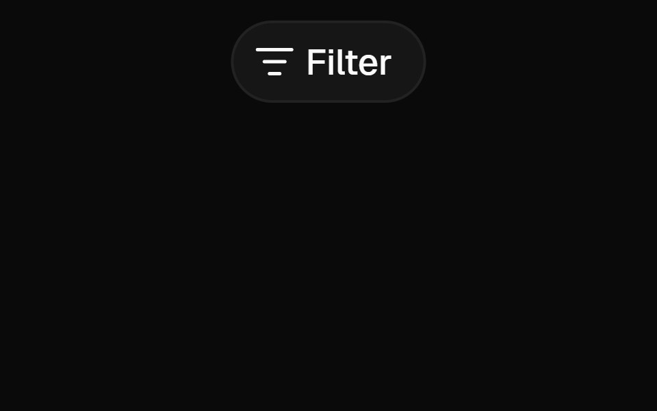 Filter MenuFibo · ReactA filter menu of fields and values that turns into a search as you type.
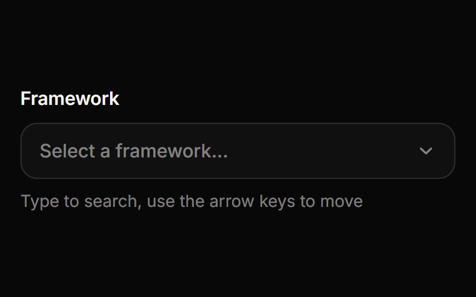 ComboboxReactFrame · ReactA searchable select where you type to filter options, with match highlighting, option descriptions, disabled options…
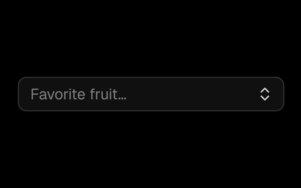 Comboboxark-cn · ReactA shadcn-style combobox component built with Ark UI primitives.
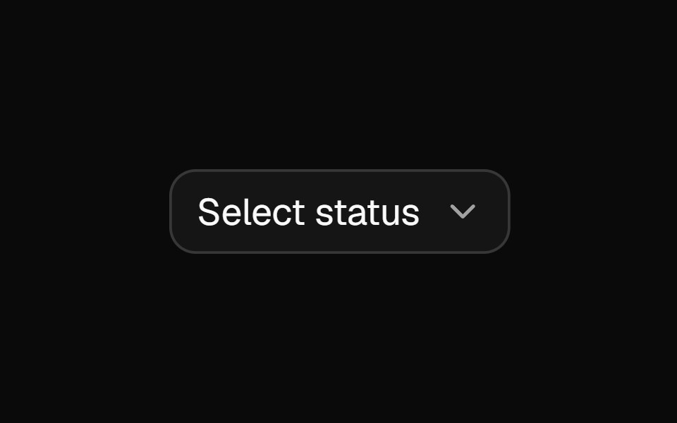 Native Selectshadcn/ui · ReactStyled native HTML select dropdown. Select nativo do HTML estilizado.
 Native SelectMUI / Material UI · React
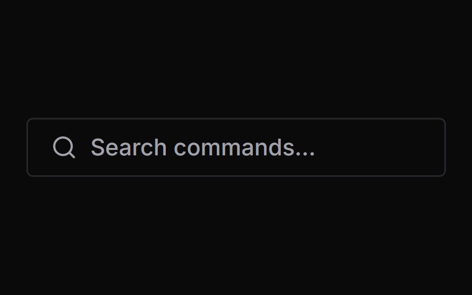 CommandChakra UI · ReactUsed to build searchable command menus, search dialogs, and pickers.
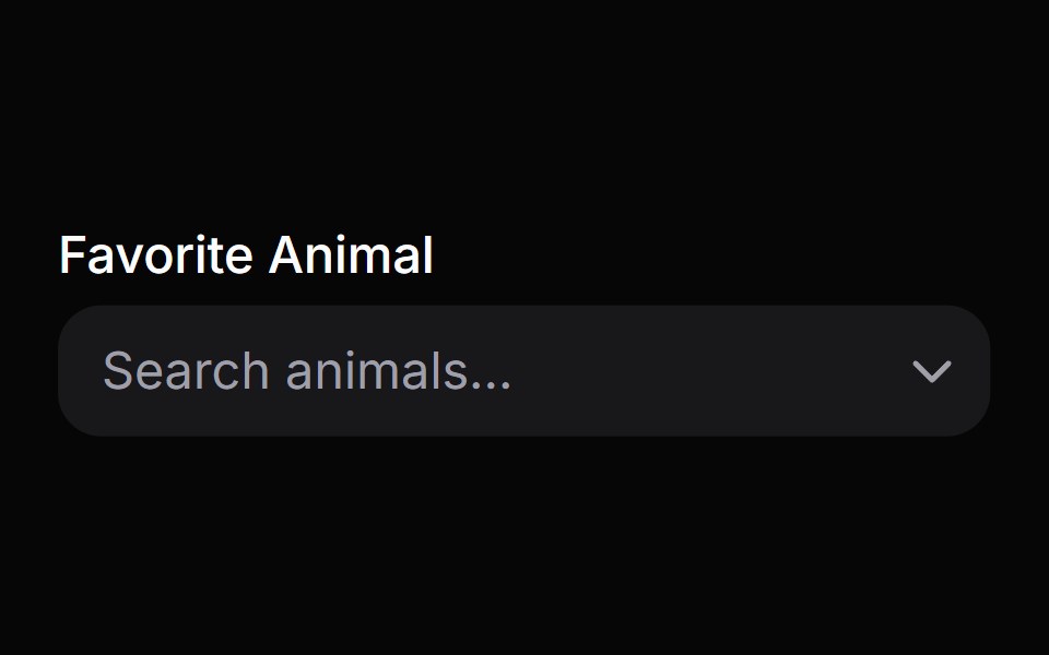 Combo BoxHeroUI · ReactA combo box combines a text input with a listbox, allowing users to filter a list of options to items matching a query
 SelectHeadless UI · React
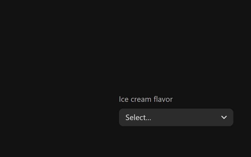 PickerReact Spectrum · ReactPickers allow users to choose a single option from a collapsible list of options when space is limited.
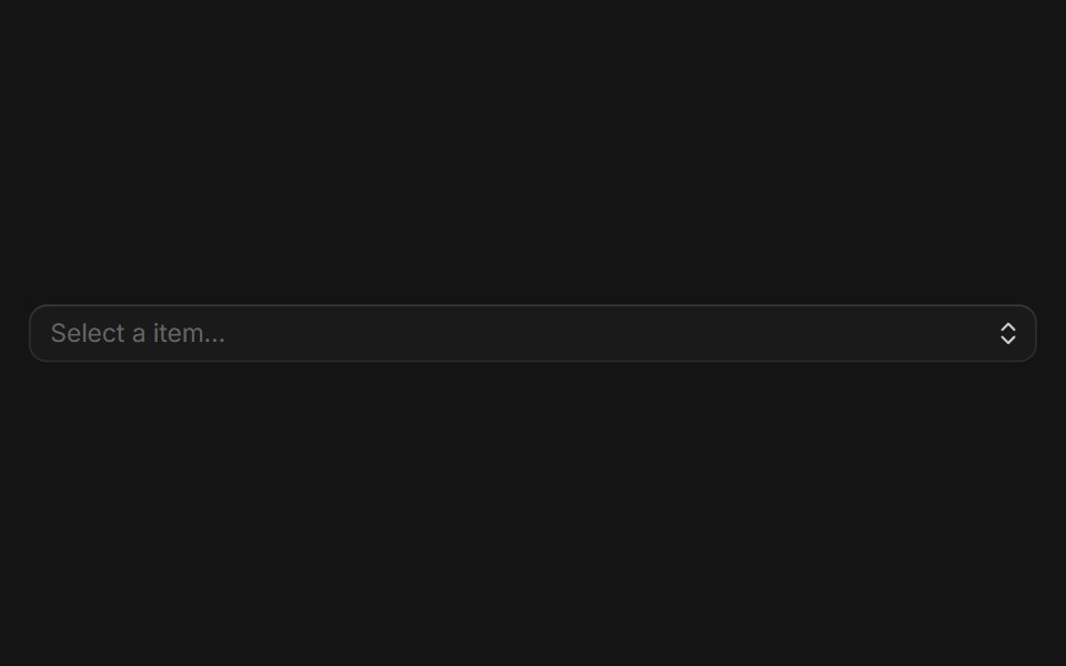 Comboboxcoss ui · ReactAn input combined with a list of predefined items to select.
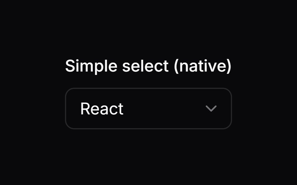 Comp 189Origin UI · React
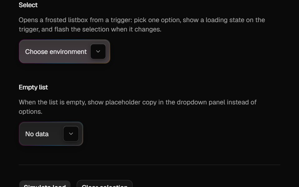 Halo SelectCult UI · ReactComposable animated select with gradient rim, frosted fill, and staggered label
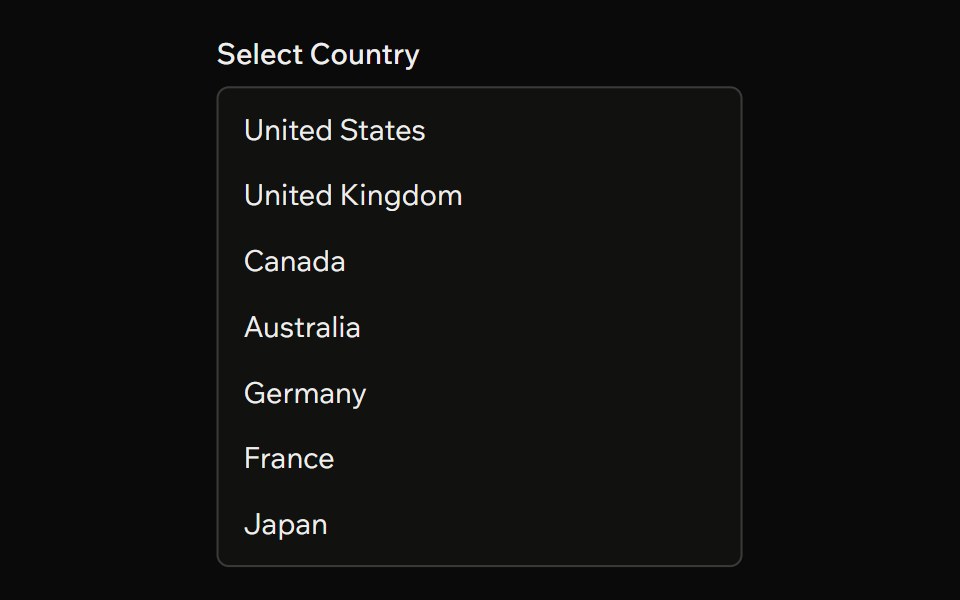 ListboxArk UI · ReactA component for selecting a single or multiple items from a list.
 SelectTremor · React
 Basic autocomplete controlReUI · ReactBasic autocomplete control
 Category SelectAmicro Micro Transitions · React
 Voice SelectorAI Elements · ReactA composable dialog component for selecting AI voices with metadata display and search functionality.
 SelectPark UI · ReactA form input component for choosing one option from a dropdown list.
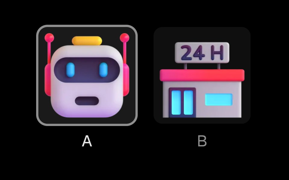 Image SelectLobe UI · ReactImageSelect allows users to choose an option from a list of images. It's ideal for visual selection interfaces where…
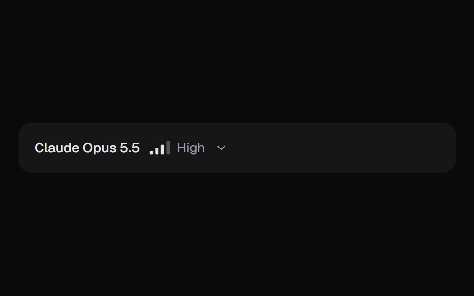 AI Model SelectorKokonut UI · ReactPick a model and how hard it thinks. Effort is a detent track that reshapes for each model and keeps your level when…
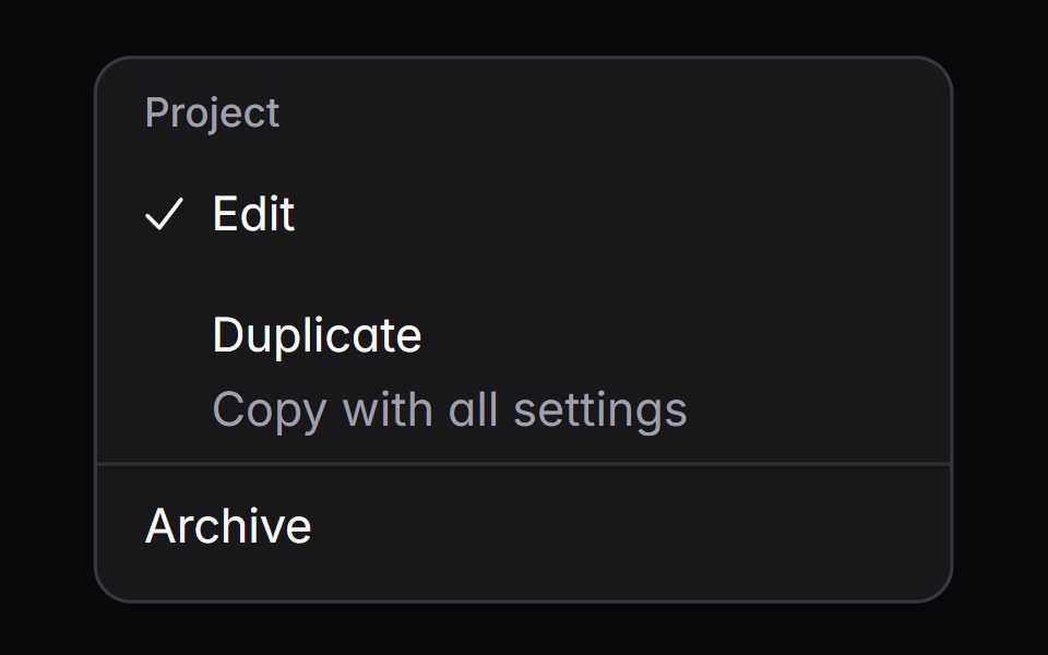 dropdownIntent UI · Reactdropdown
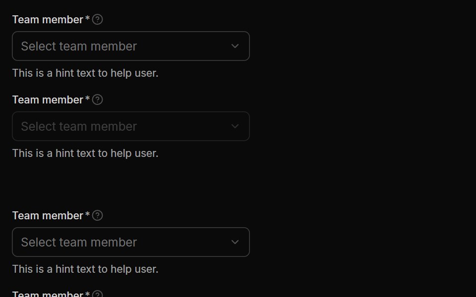 SelectUntitled UI React · React
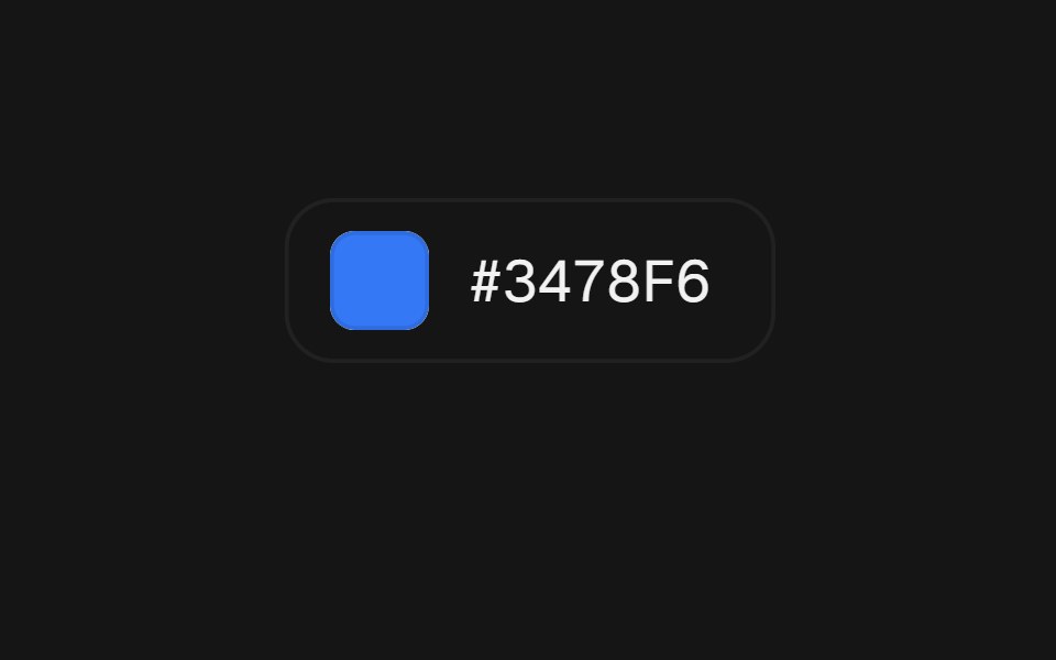 Color PickerbeUI · ReactA popover picker with a loupe under your finger.
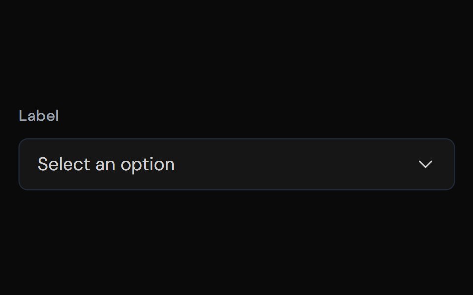 Native SelectTailGrids · ReactA native select component with multiple variants.
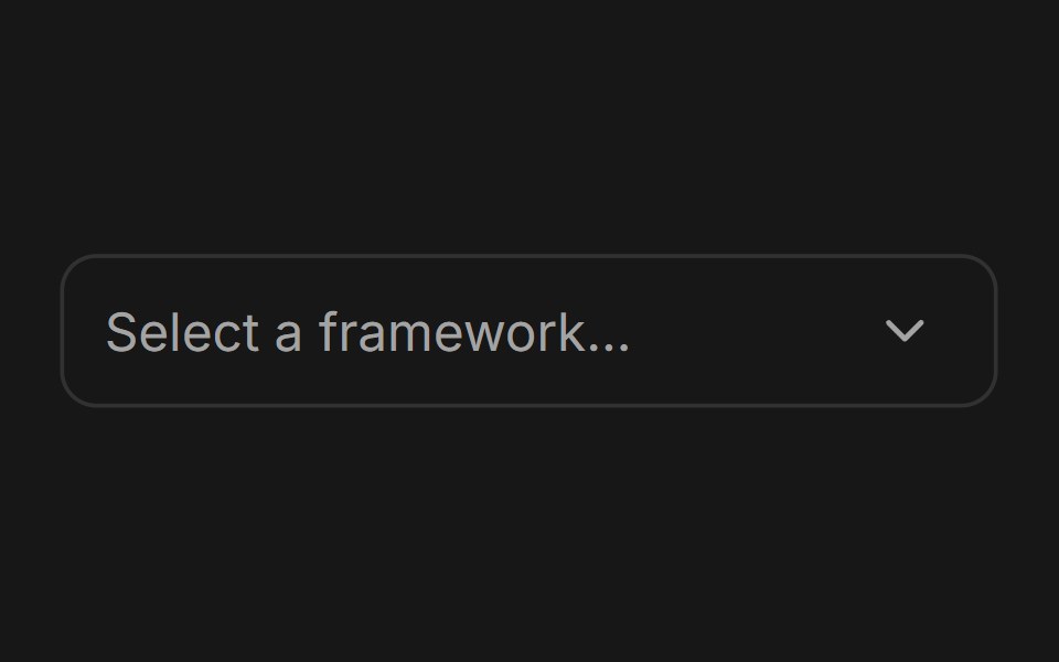 ComboboxFluid Functionalism · ReactType-to-filter combobox with single or multiple (chips, merged selection backgrounds) selection: a text field that…
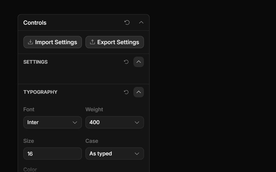 Font Picker ControlToolcraft · React
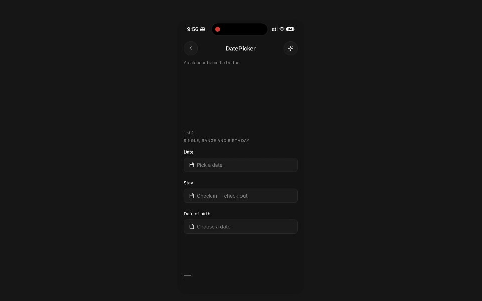 Date PickerPanel UI · React NativeA calendar behind a button.
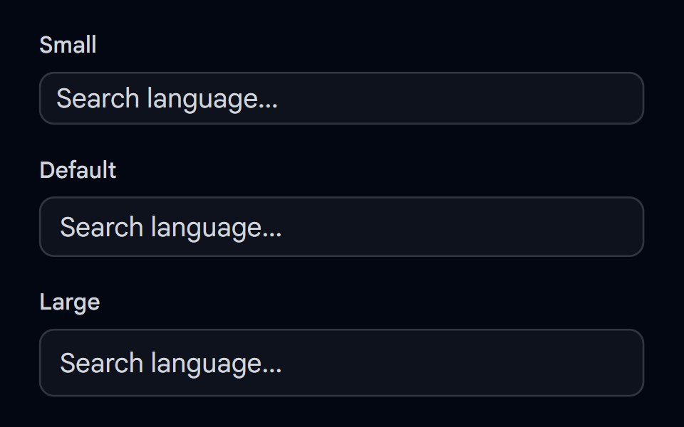 Autocomplete-02 - Size variantsShadcn Space · ReactAutocomplete component with different size variants
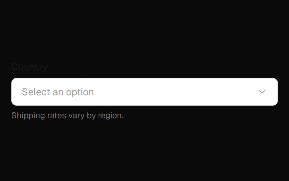 Select Field InputOpenSourceUI · React
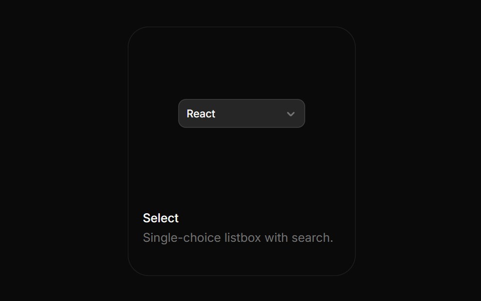 SelectBoardUI · ReactSingle-choice listbox with search.
 Select NativeTremor Blocks · React
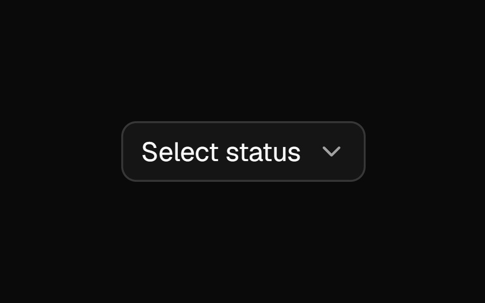 Native SelectShadcn Dashboard · React
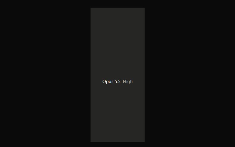 Claude Model SelectorNotra · ReactA hover-open model and effort picker built on shadcn DropdownMenu.
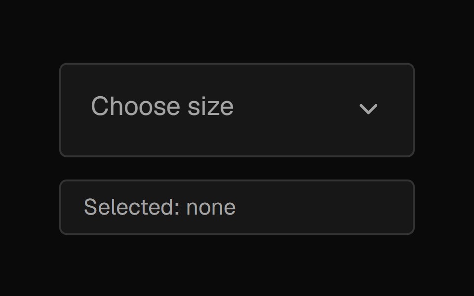 SelectNexvyn UI · ReactA form select with a two-layer proximity highlight (selected accent tint + muted hover), drawn check animation, and a…
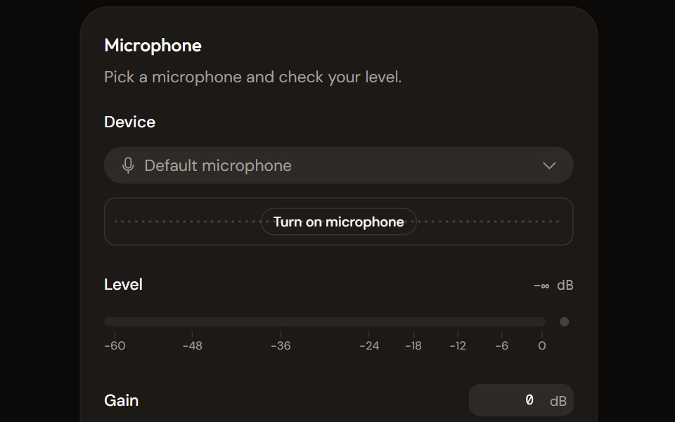 Microphone Setupaudiocn · ReactChoose and check a microphone: device select with a live preview, a level meter, gain, mute and a level check that…
 selectBaseLayer · ReactA select displays a collapsible list of options and allows a user to select one of them.
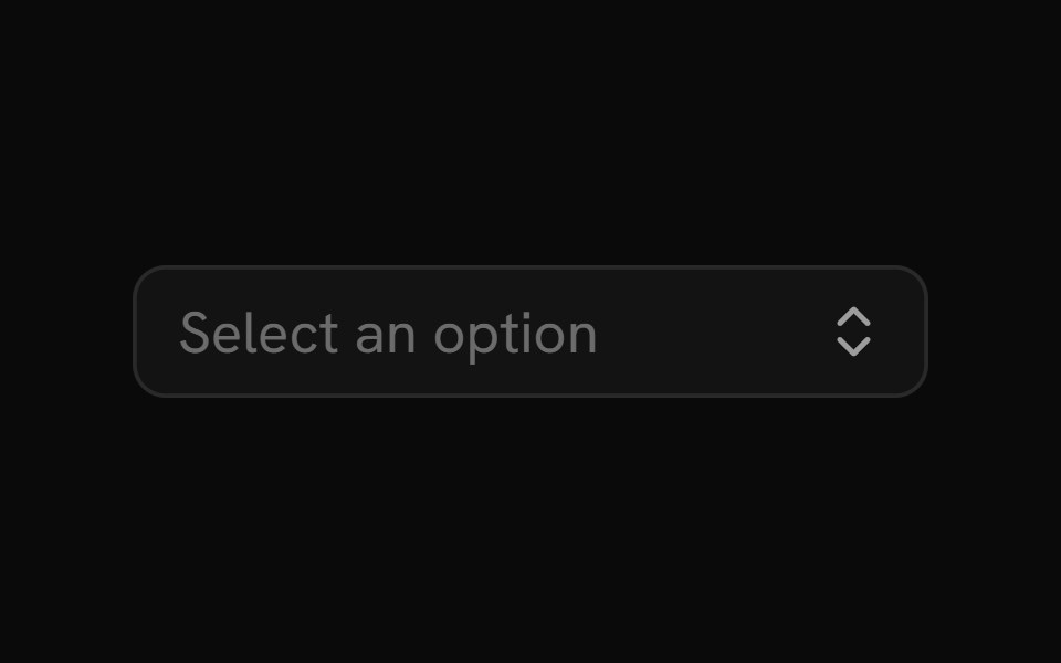 Native SelectShark UI · ReactStyled native HTML select element.
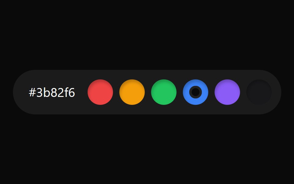 Color Watch SelectorWatermelon UI · React
 Morph selectArc Library · ReactA select whose trigger grows into the list, with a gliding highlight and type-ahead.
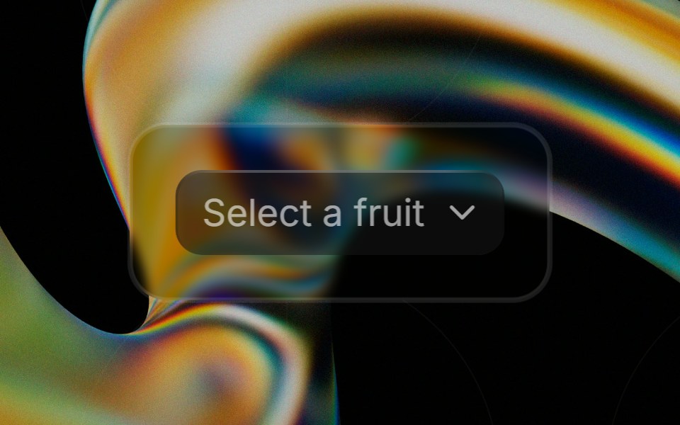 Glass Selectglasscn · ReactGlass Select with five variants: clear, frosted, subtle, liquid, and liquid-refract
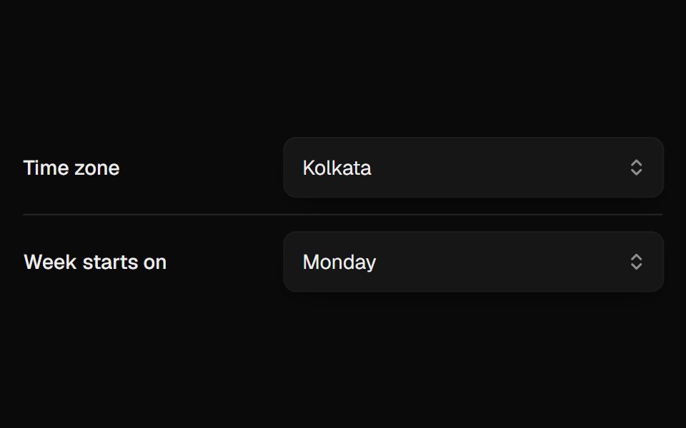 Select MenuUI Lab · ReactOpens with your current choice sitting exactly on the button, macOS style.
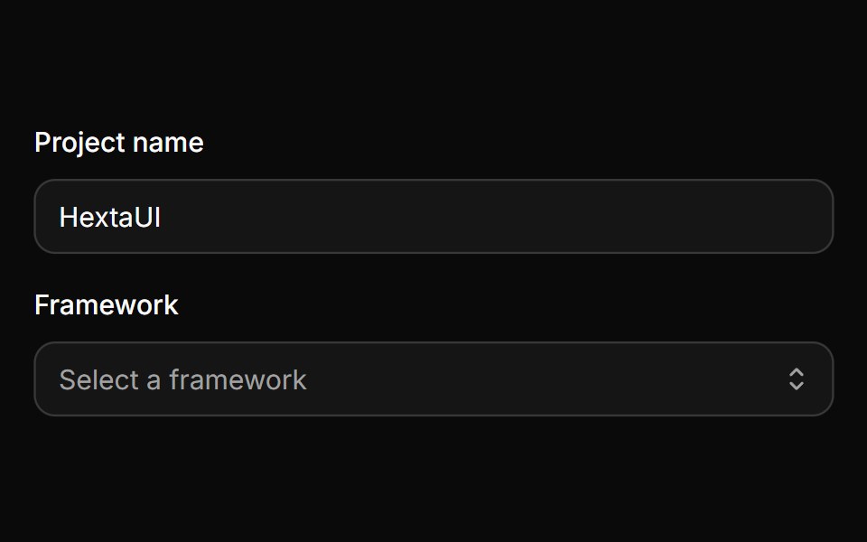 Native selectHextaUI · ReactThe browser's own select, styled to match Input, with a quiet placeholder, Field support and the OS picker on every…
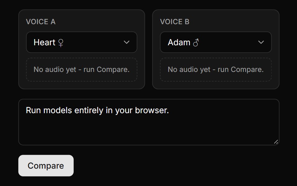 Voice Comparison PanelLocalMode · ReactA/B voice comparison — two labeled columns, each with a language-grouped voice select (VoicePicker) and a native…
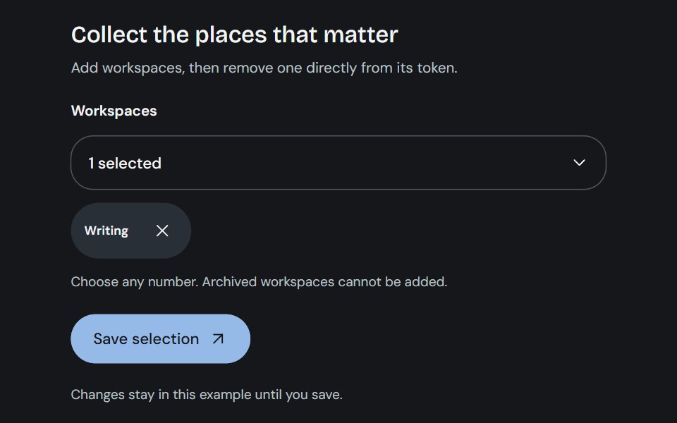 Multi-selectCojeev UI · ReactSearchable multiple choices with removable selections, form values and clear validation.
 ComboboxROI UI · ReactA searchable select component.
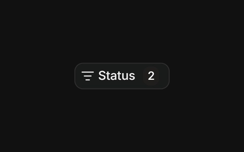 Multi-select filterFLX UI · ReactCheckbox items with a count badge and a clear action.
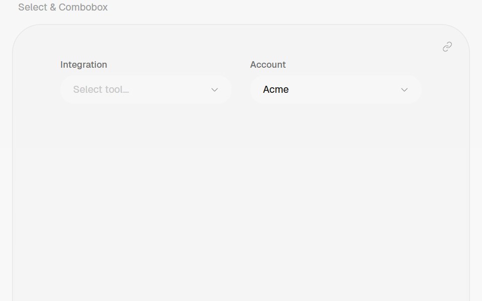 SelectHalaska UI · React
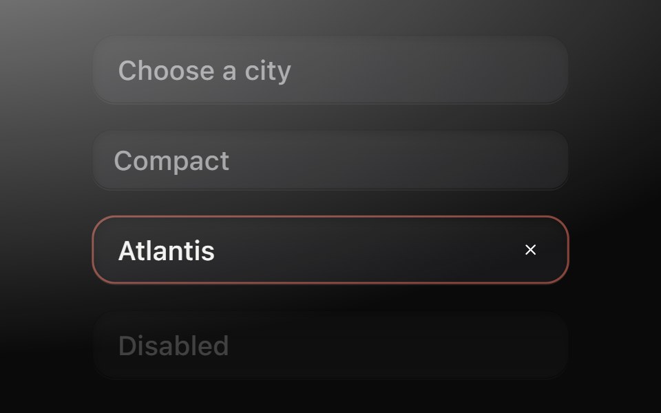 ComboboxMetal UI · React + SwiftUIType to find one of many: a field well that opens the menu's frosted plate; rows filter at once while the plate's…
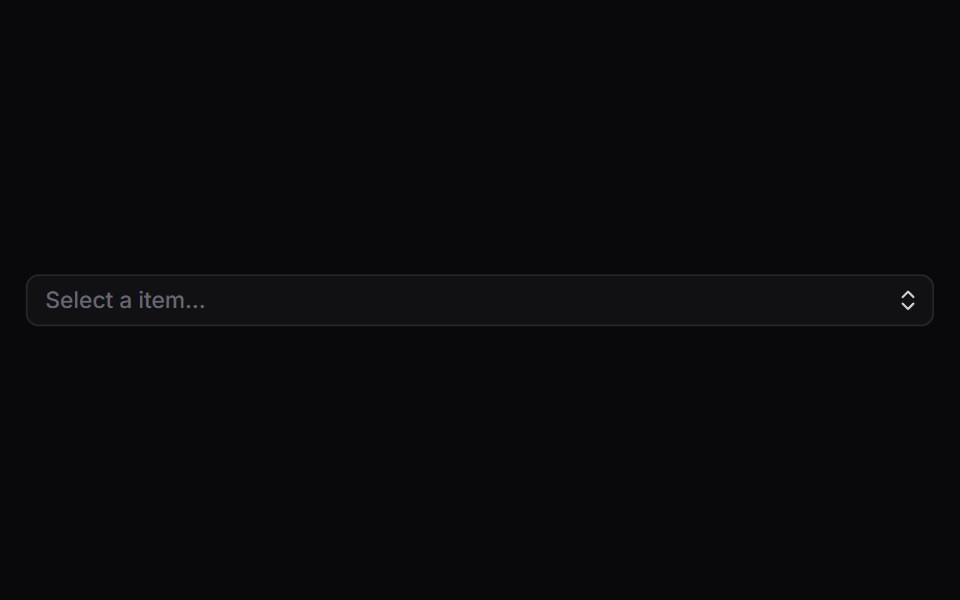 ComboboxSpaceUI · ReactCombines a text search input with a dropdown menu, allowing users to filter and select options from large lists easily.
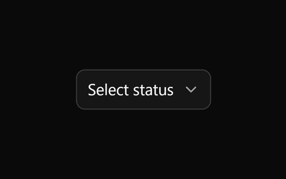 Aria Native SelectReScript shadcn · ReScript
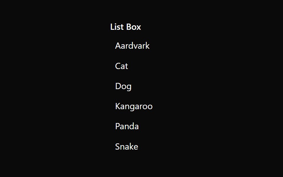 List BoxOUI · ReactReact aria components List Box with shadcn characteristics.
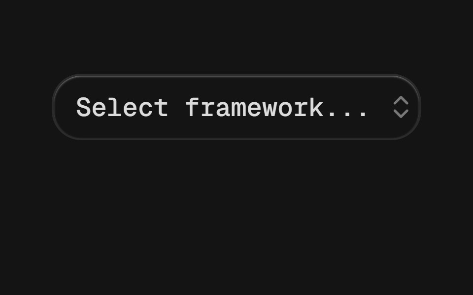 ComboboxD2Studio UI · ReactAutocomplete input and command palette with a list of suggestions.
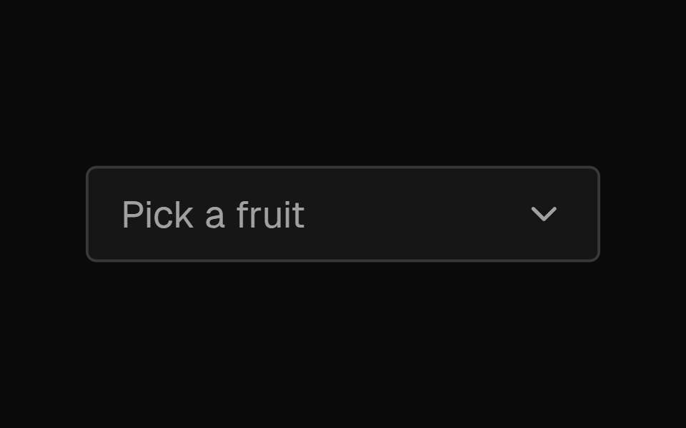 SelectFibo · ReactPicks one option from a list that opens on demand.
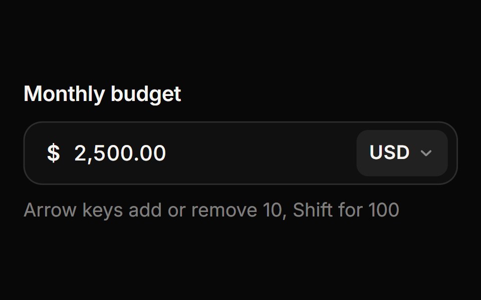 Currency InputReactFrame · ReactA money input with a currency picker: live thousands separators for any locale, the right number of decimals per…
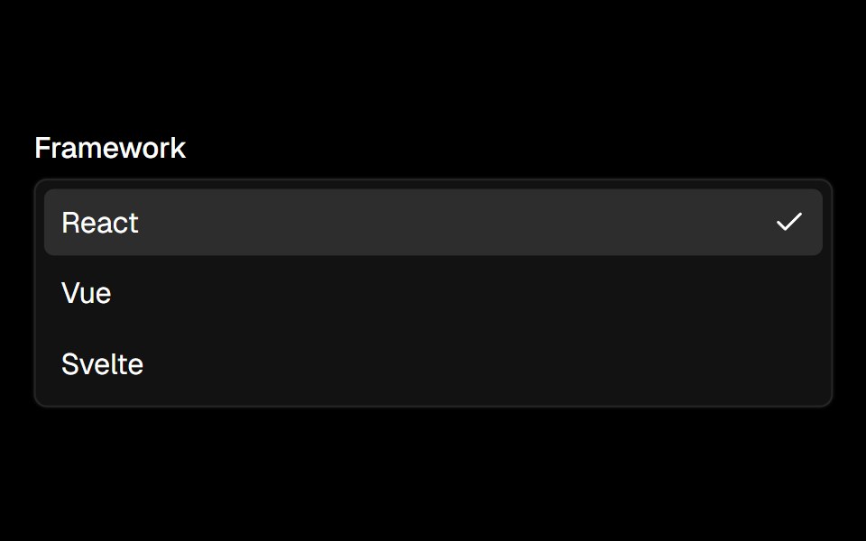 Listboxark-cn · ReactA shadcn-style listbox component built with Ark UI primitives.
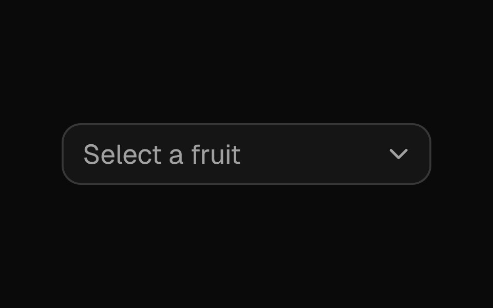 Selectshadcn/ui · ReactDisplays a list of options for the user to pick from—triggered by a button.
 SelectMUI / Material UI · React
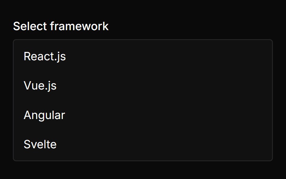 ListboxChakra UI · ReactUsed to display a list of options for selection.
Libraries with React select components
Related categories
- Select Components
- Tailwind CSS Select Components
- React Native Select Components
- Animated Select Components
- shadcn/ui Select Components
- React Input Components
- React Text Input Components
- React Form Field Components
- React Form Components
- React Switch Components
- React Textarea Components
- React Checkbox Components
- React Slider Components
- React Radio Components
- React Combobox Components
- React File Upload Components
- React Date Picker Components
- React Search Input Components
- React Color Picker Components
- React Login Form Components
- React OTP Input Components