 Dev Design Library
Animated Select Components
Dev Design Library indexes 68 Animated select components from 27 open-source UI libraries, with the most coming from Kokonut UI, Shadcn Space, beUI, Fluid Functionalism and ReactFrame. Each one links to its page with the source code, a live preview where available, the library license and the install command. These are the select components tagged as animated: motion on hover, on scroll or on load, usually built with CSS transitions or Framer Motion. Select components belong to the Inputs group.
 Glide SelectReact Bits · ReactSelect chip whose menu pops out of its own corner and whose single hover highlight glides between rows, remembering…
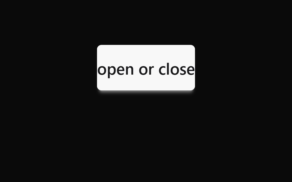 DropdowndaisyUI · CSS (Tailwind)
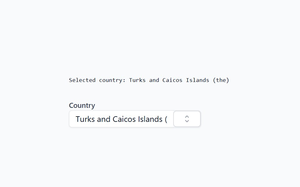 ComboboxHeadless UI · React
- ComboboxPreline UI · JavaScript (HTML + Tailwind)
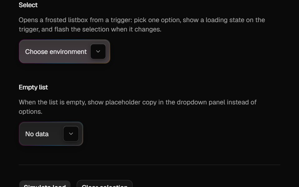 Halo SelectCult UI · ReactComposable animated select with gradient rim, frosted fill, and staggered label
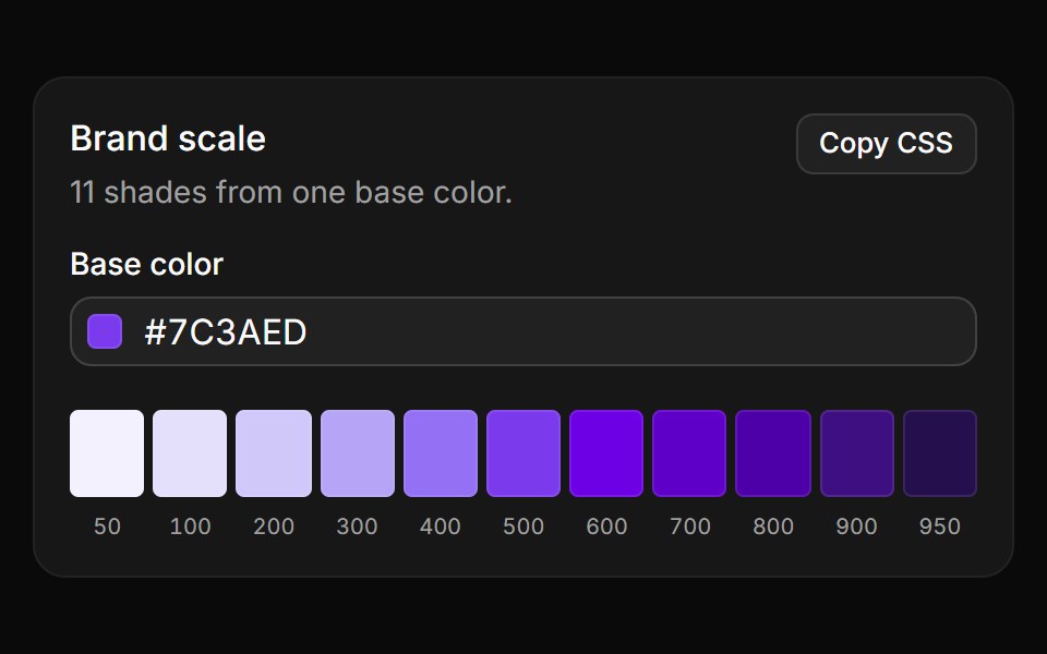 Brand scaleReUI · React11 shades from 50 to 950 generated in OKLCH from one base color, copied as CSS variables.
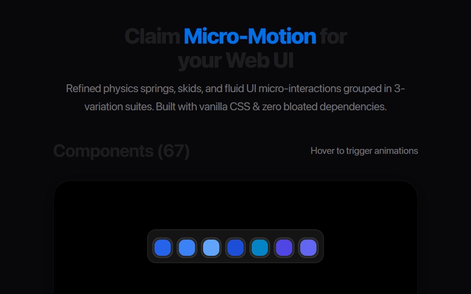 Elastic Tag SnapAmicro Micro Transitions · ReactMinimalist luggage tag with bungee spring snap and vertical recoil.
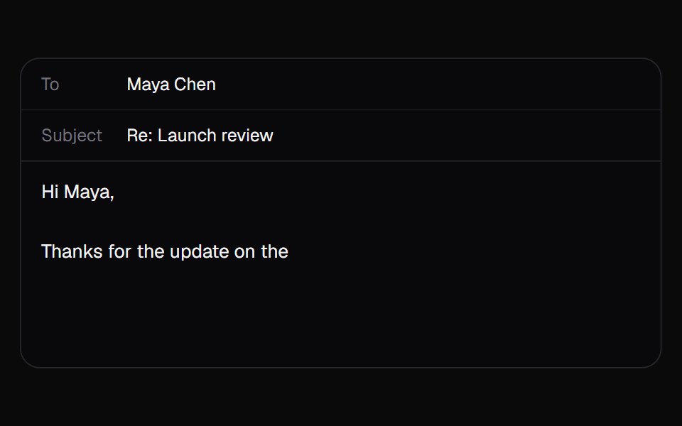 AI AutocompleteKokonut UI · ReactA text box that suggests how your sentence ends in grey after the caret. Tab takes it all, the right arrow takes one…
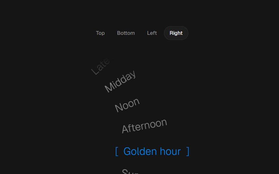 Arc PickerbeUI · ReactRadial text picker with top, bottom, left or right curves, smooth wheel movement and live selection on each scroll…
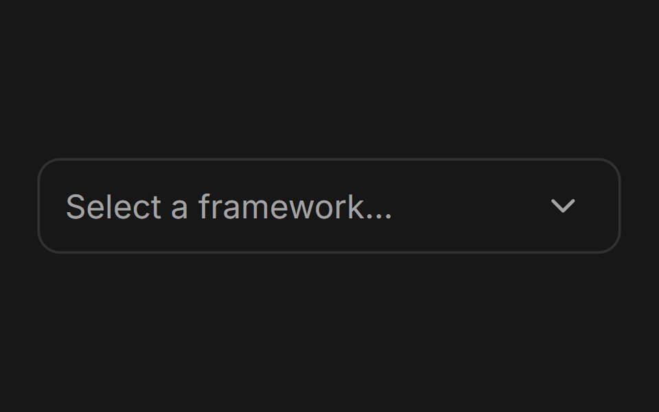 ComboboxFluid Functionalism · ReactType-to-filter combobox with single or multiple (chips, merged selection backgrounds) selection: a text field that…
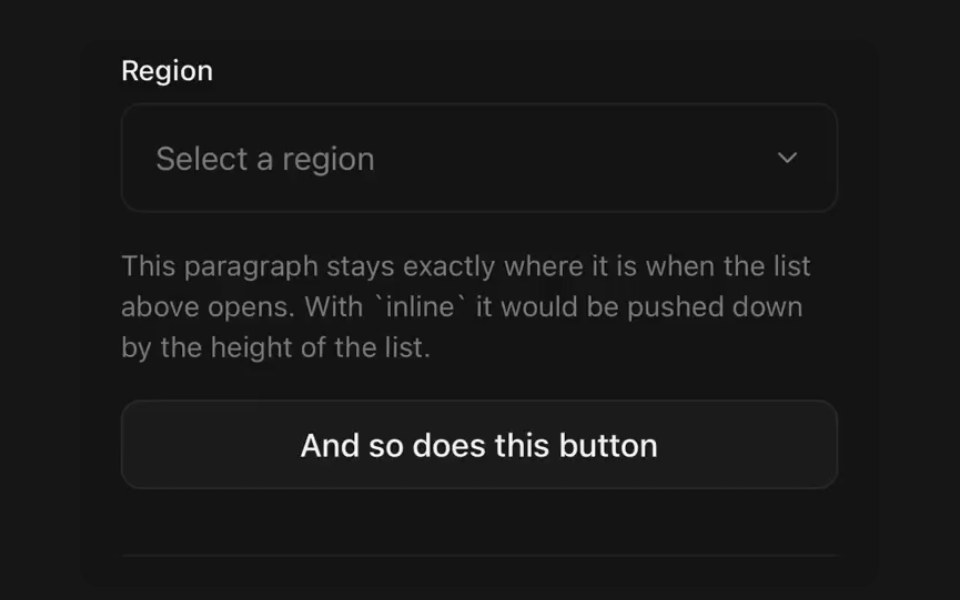 SelectPanel UI · React NativePicker shown in a bottom sheet, expanded in place, or floating over the page.
 Autocomplete-03 - Vanish AnimationShadcn Space · ReactAutocomplete with vanish animation
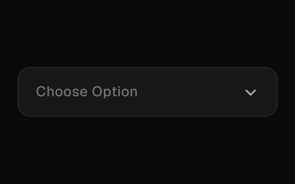 Animated SelectGreatUI · React
 Gooey DropdownNexvyn UI · ReactA dropdown menu with a gooey SVG filter effect that morphs a trigger pill into the panel using spring physics and CSS…
 Assignment ClusterSona UI · React
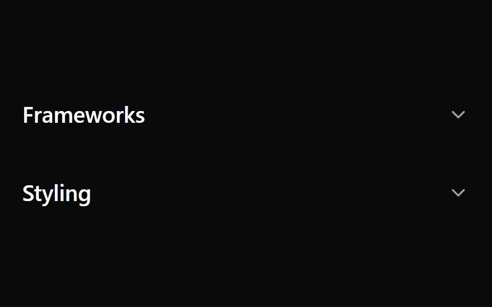 Accordion MultiselectWatermelon UI · React
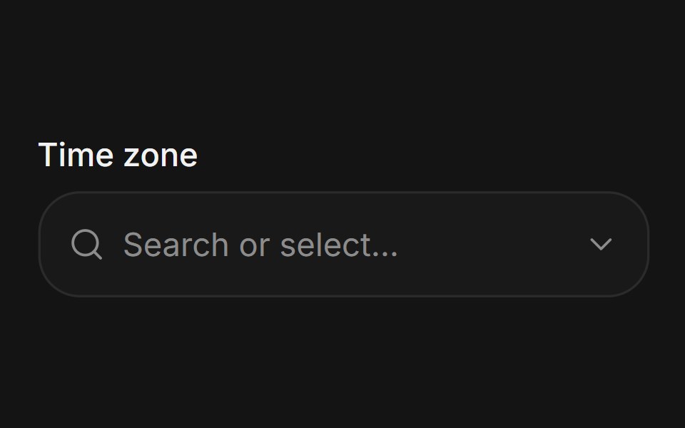 ComboboxArc Library · ReactSearch and select from a list without leaving the field.
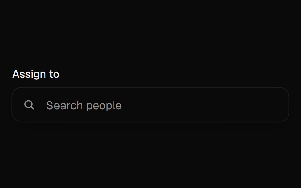 ComboboxUI Lab · ReactThe person you pick flies out of the list and into the field.
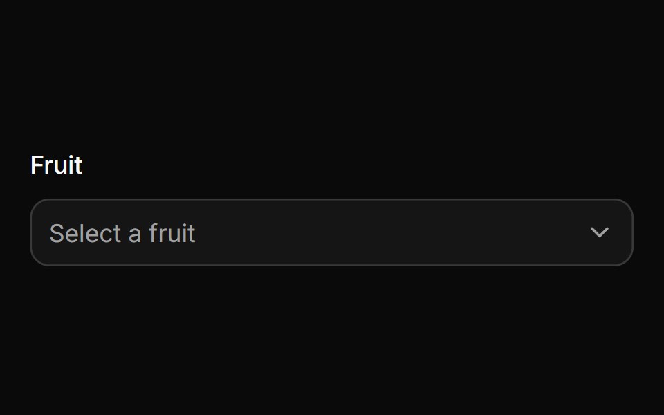 ComboboxHextaUI · ReactA filterable select with chips, groups and async results, in a popup that resizes as you type.
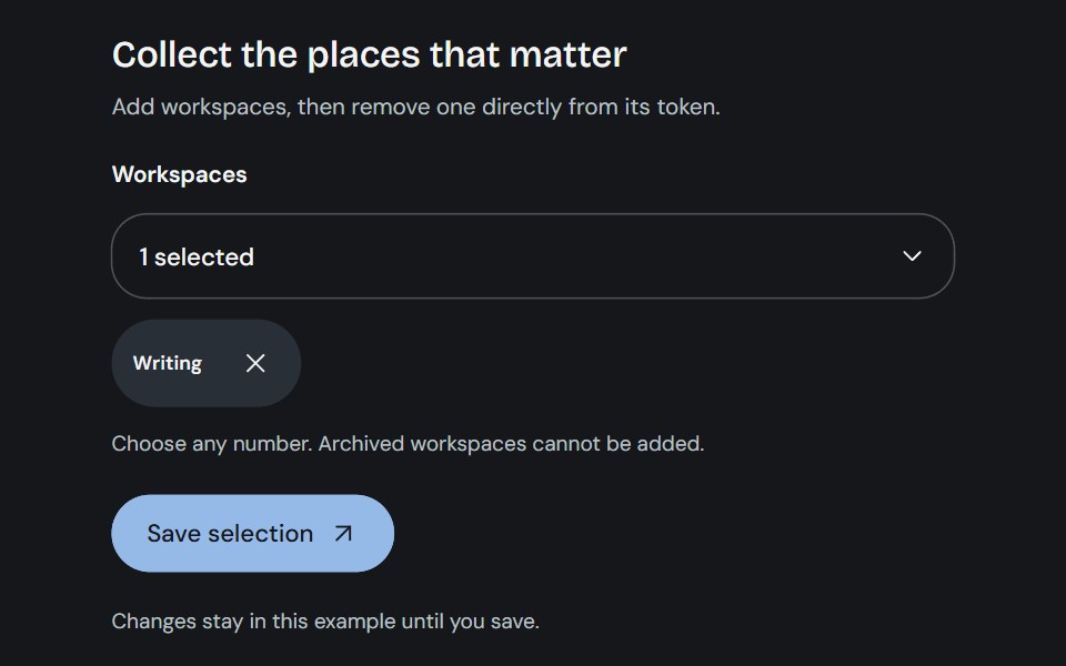 Multi-selectCojeev UI · ReactSearchable multiple choices with removable selections, form values and clear validation.
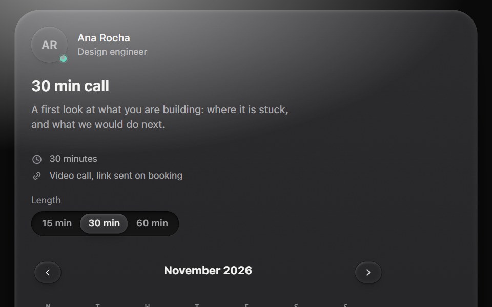 Availability pickerMetal UI · React + SwiftUIA booking block: a host, a call length, a calendar of the next six weeks, the day's free times re-labelled by time…
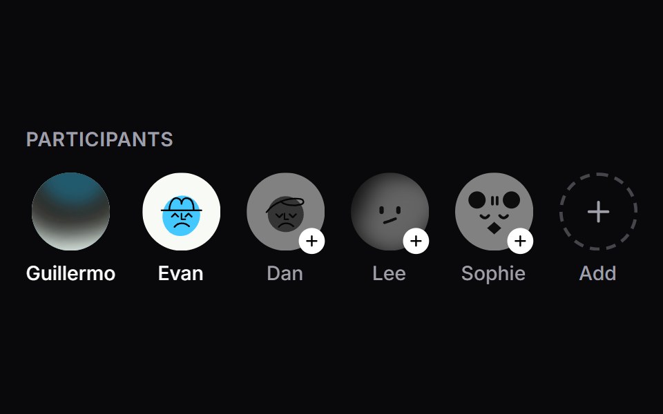 Member SelectorSpaceUI · ReactAn interactive participant and member avatar selector with dynamic row layout, animated selection badges, quick-add…
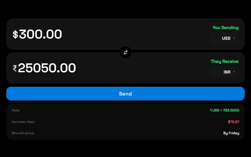 Currency SwitchZAYX · React Native
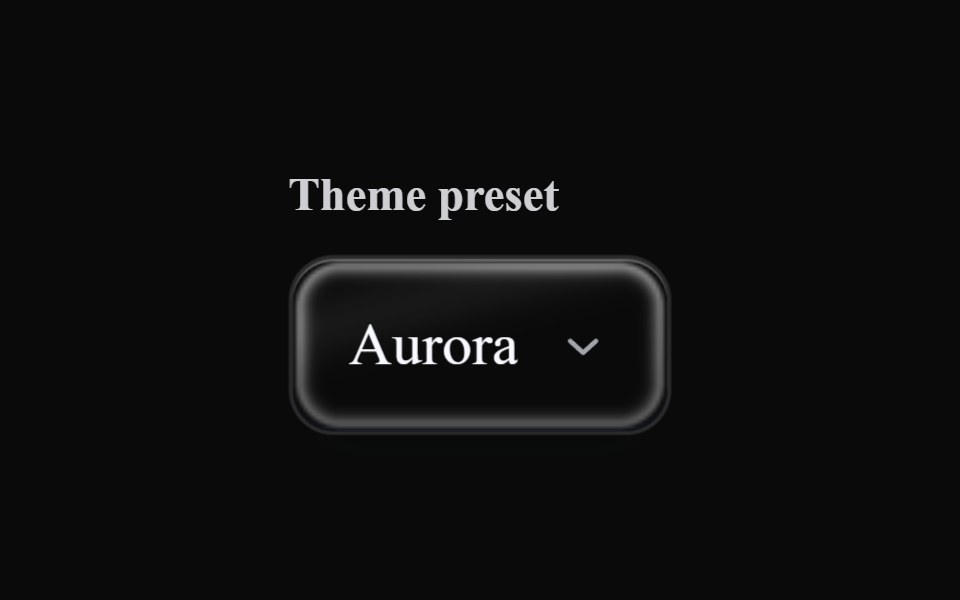 Liquid SelectLiquefy UI · ReactSelect dropdown in liquid glass style. Select em estilo vidro líquido.
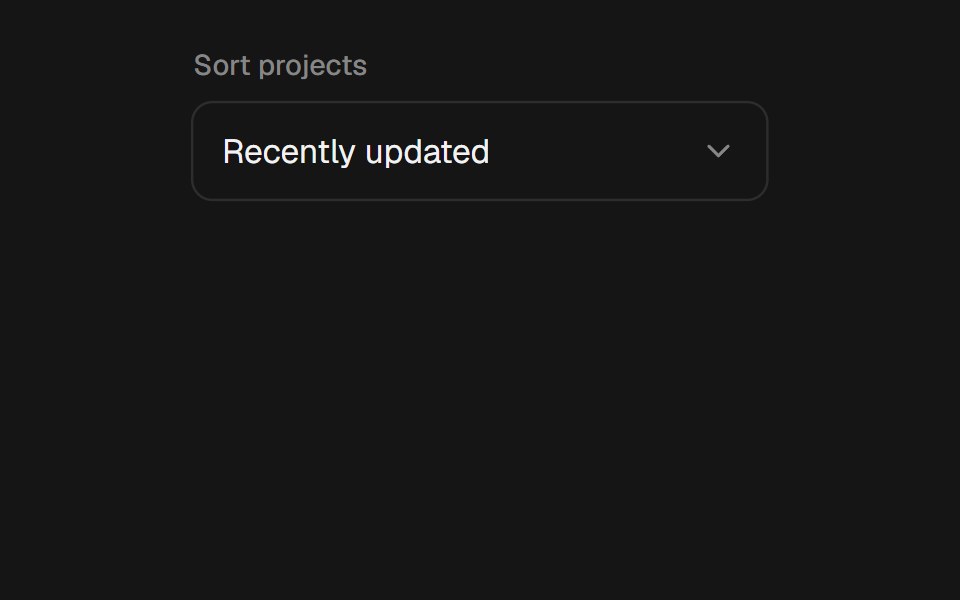 SelectEaseUI · ReactComposable select whose menu fades and scales out of the trigger, and opens upward when there is no room below.
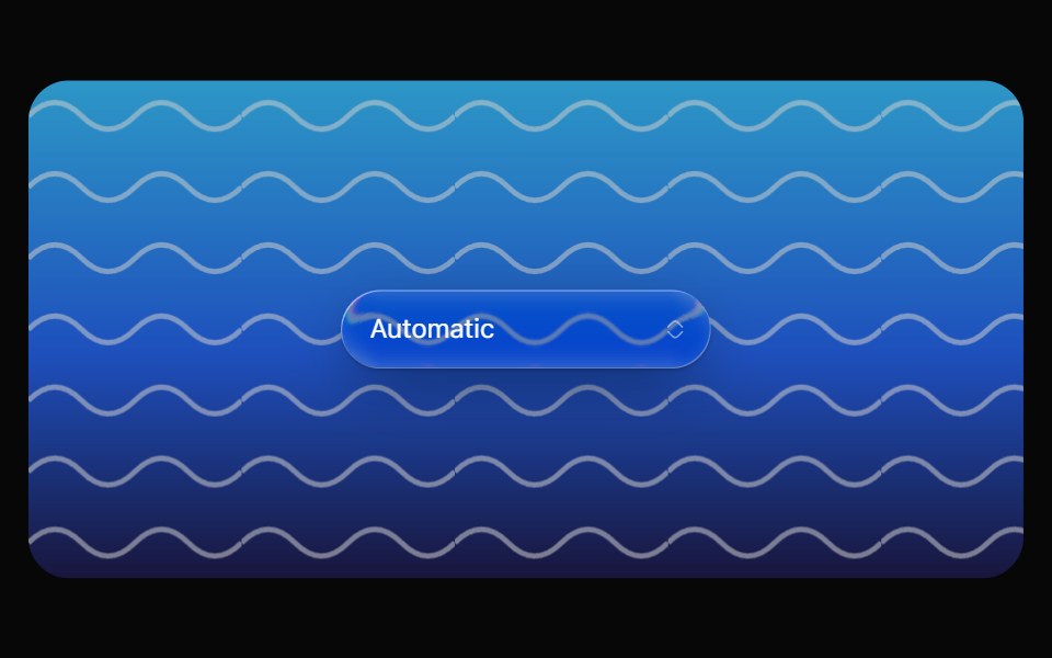 Glass SelectOpaline · ReactCapsule select with a frosted glass option list.
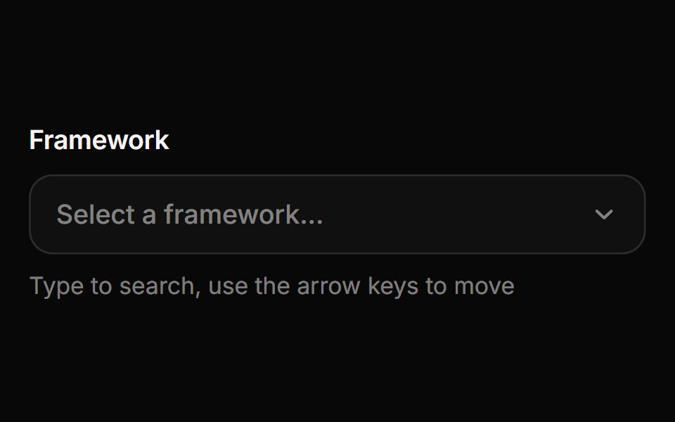 ComboboxReactFrame · ReactA searchable select where you type to filter options, with match highlighting, option descriptions, disabled options…
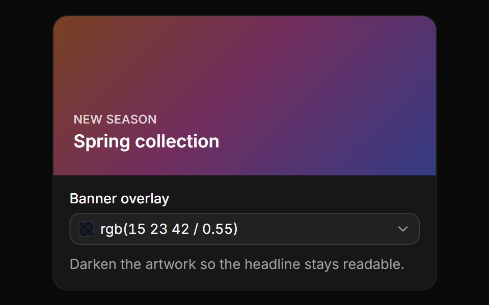 OpacityReUI · ReactA banner overlay with an opacity slider and field, written as rgb() with alpha.
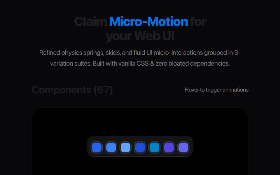 Category SelectAmicro Micro Transitions · React
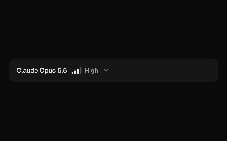 AI Model SelectorKokonut UI · ReactPick a model and how hard it thinks. Effort is a detent track that reshapes for each model and keeps your level when…
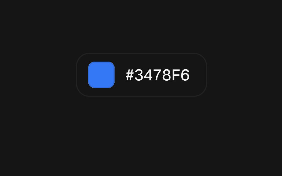 Color PickerbeUI · ReactA popover picker with a loupe under your finger.
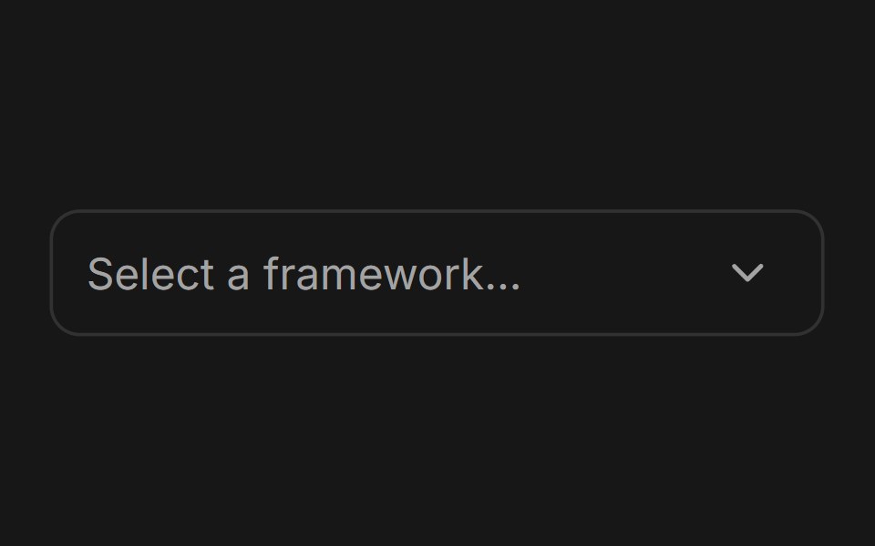 ComboboxFluid Functionalism · ReactType-to-filter combobox with single or multiple (chips, merged selection backgrounds) selection: a text field that…
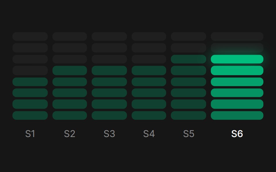 Web Bar PickerPanel UI · React Native
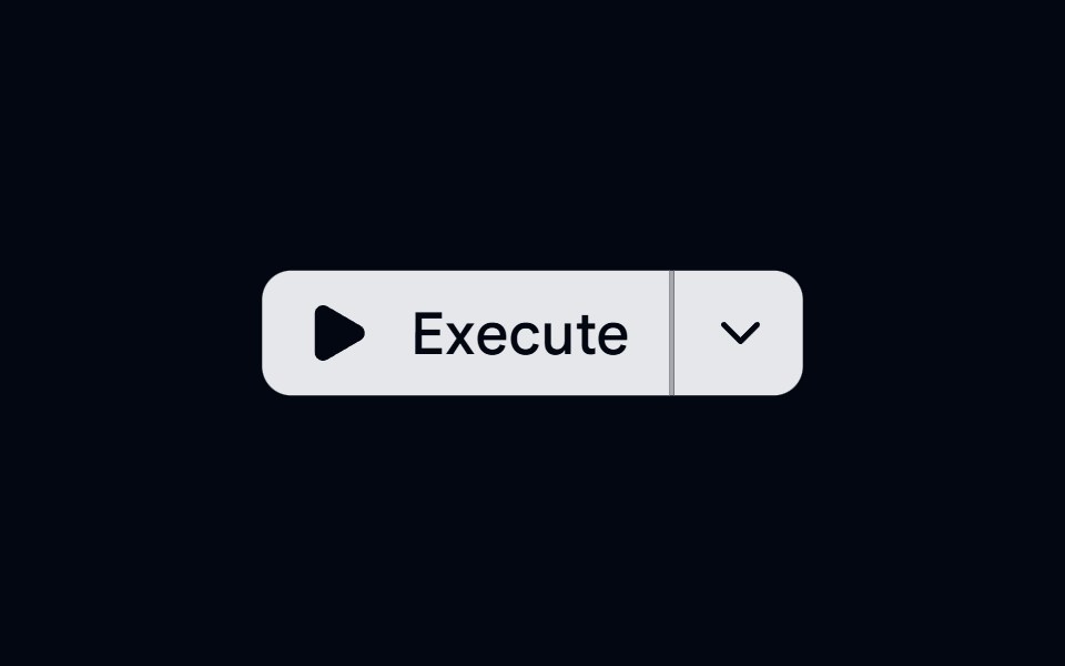 Button Group 12 - Action DropdownShadcn Space · ReactButton group with a split action dropdown menu, featuring micro-animations and smooth open transitions
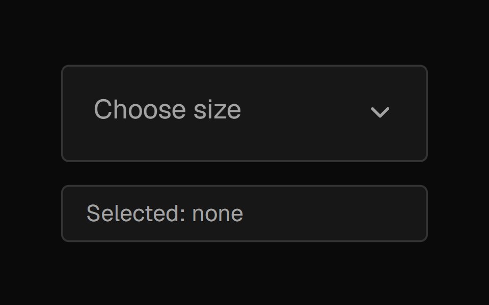 SelectNexvyn UI · ReactA form select with a two-layer proximity highlight (selected accent tint + muted hover), drawn check animation, and a…
 Morph selectArc Library · ReactA select whose trigger grows into the list, with a gliding highlight and type-ahead.
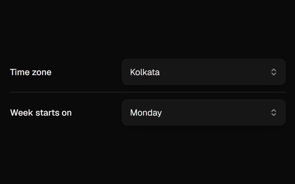 Select MenuUI Lab · ReactOpens with your current choice sitting exactly on the button, macOS style.
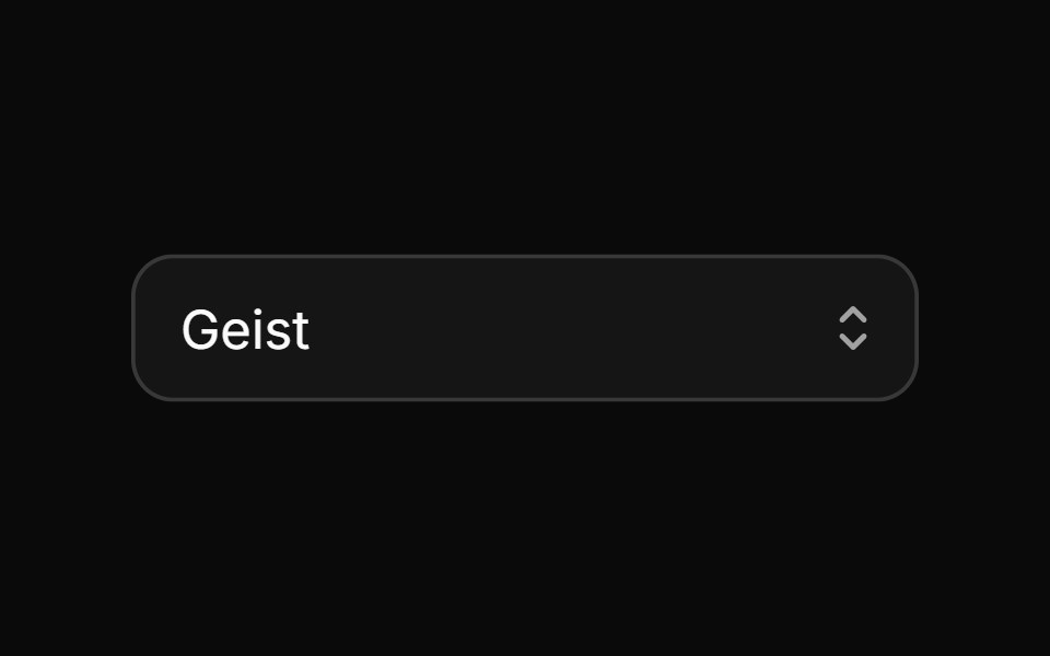 SelectHextaUI · ReactPick one or more options from a list that opens on the current value, with typeahead, groups and form support.
 Team Roster SelectorSpaceUI · React
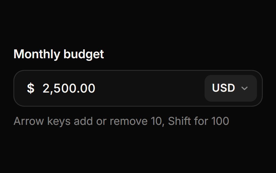 Currency InputReactFrame · ReactA money input with a currency picker: live thousands separators for any locale, the right number of decimals per…
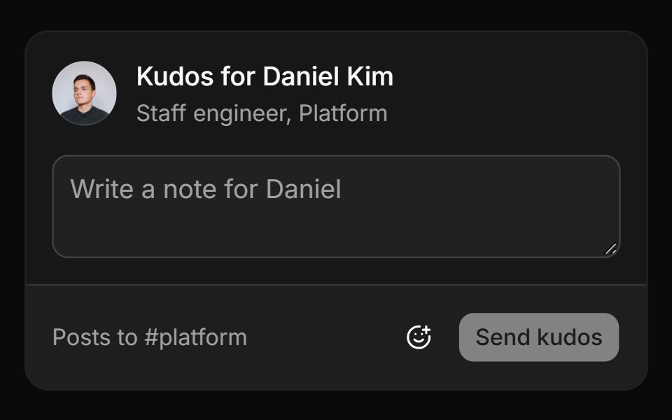 Workplace-safe setReUI · ReactA kudos card whose picker hides a blocklist and newer emoji, then posts the note to #platform.
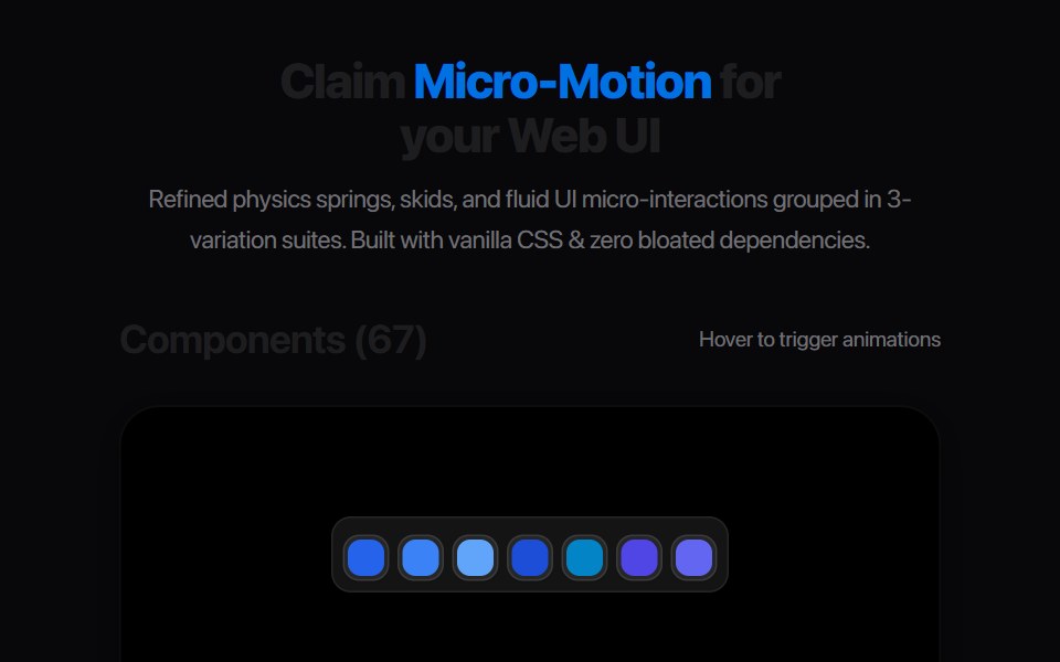 Filter Tag PillAmicro Micro Transitions · React
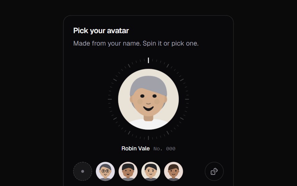 Avatar PickerKokonut UI · ReactGenerated avatars from a name, morphing as you type, on a 3D coin you can flick, tap or shuffle.
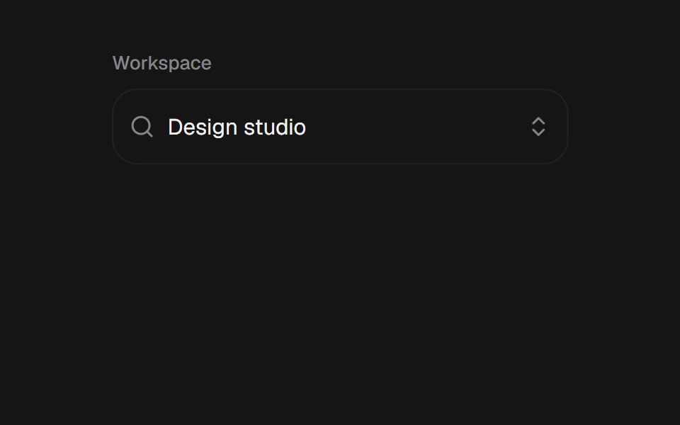 ComboboxbeUI · ReactSearchable combobox with a morphing portal, grouped filtering, keyboard navigation, and controlled or uncontrolled…
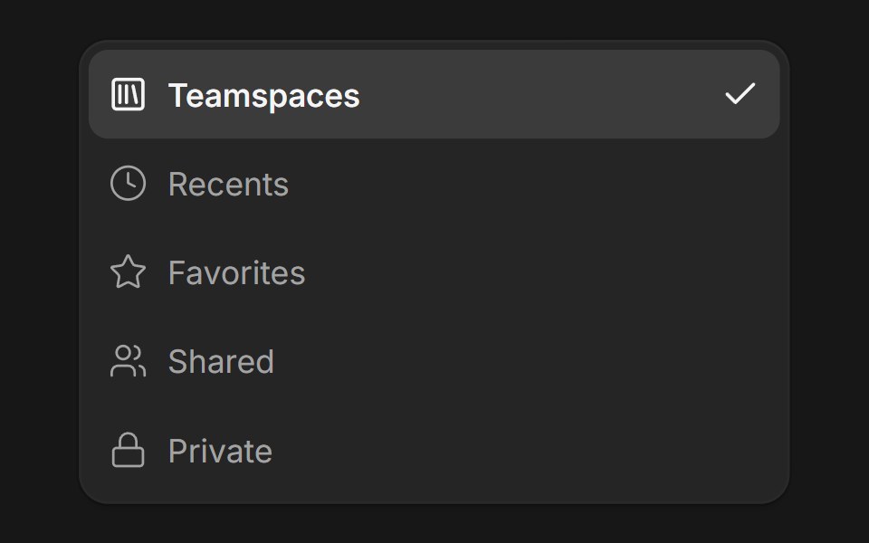 DropdownFluid Functionalism · ReactDropdown menu with fluid hover, animated selection indicator, inline panel or triggered popup with collision-aware…
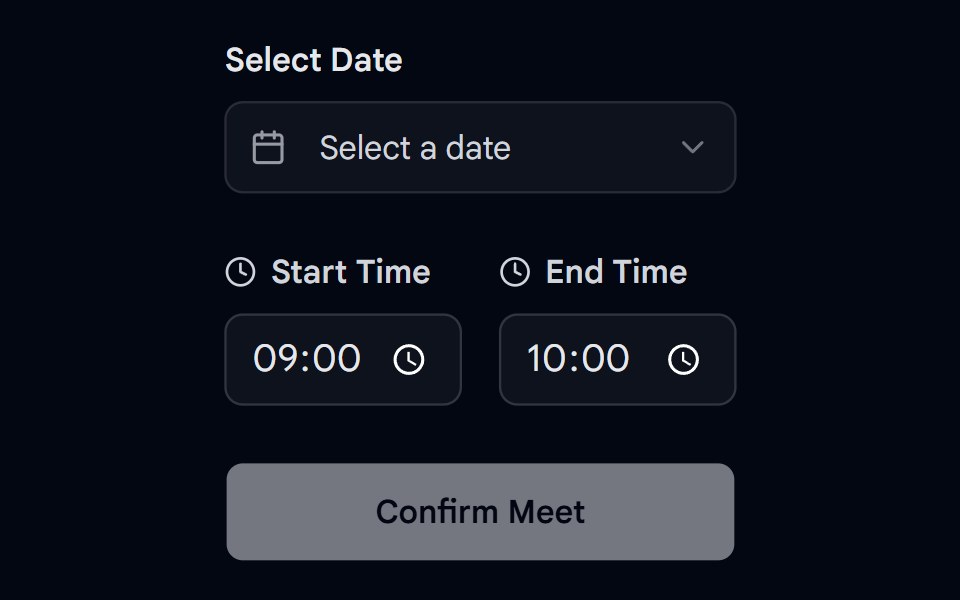 Date Picker 01 - Data & Time PickerShadcn Space · ReactA professional appointment booking card with date and time range selection.
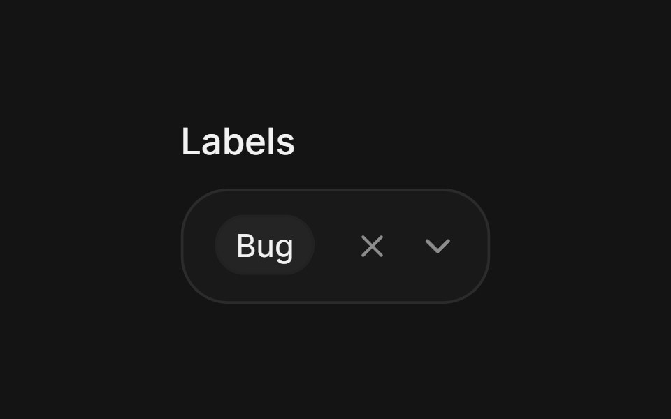 Multi-selectArc Library · ReactSelect several values while keeping the field readable.
 Status PickerUI Lab · ReactPick a status and the badge on your avatar turns into its shape: a dot, a moon, a stop sign or a ring.
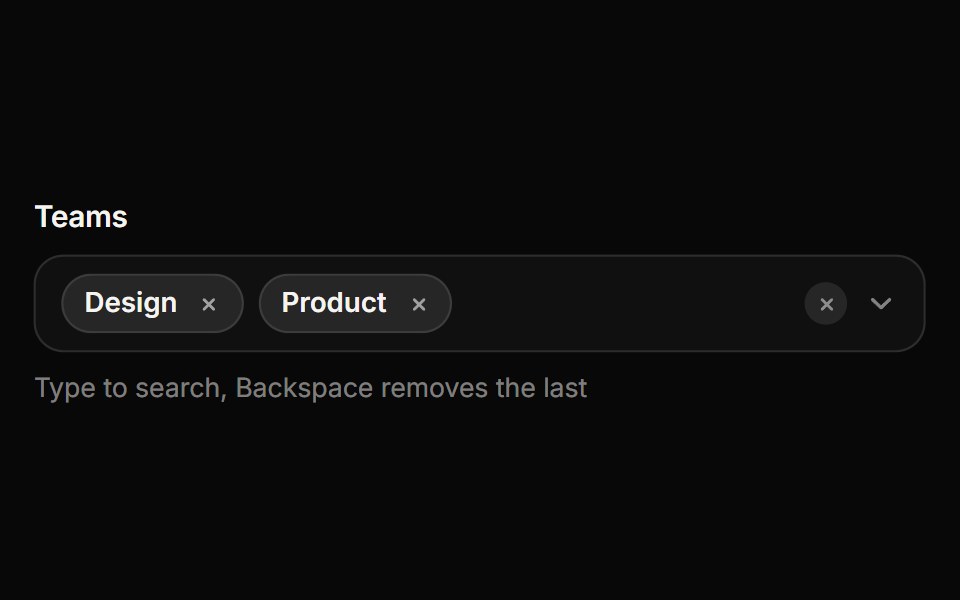 Multi SelectReactFrame · ReactA searchable multi-select that shows the chosen options as removable chips, with checkbox rows, select all, a…
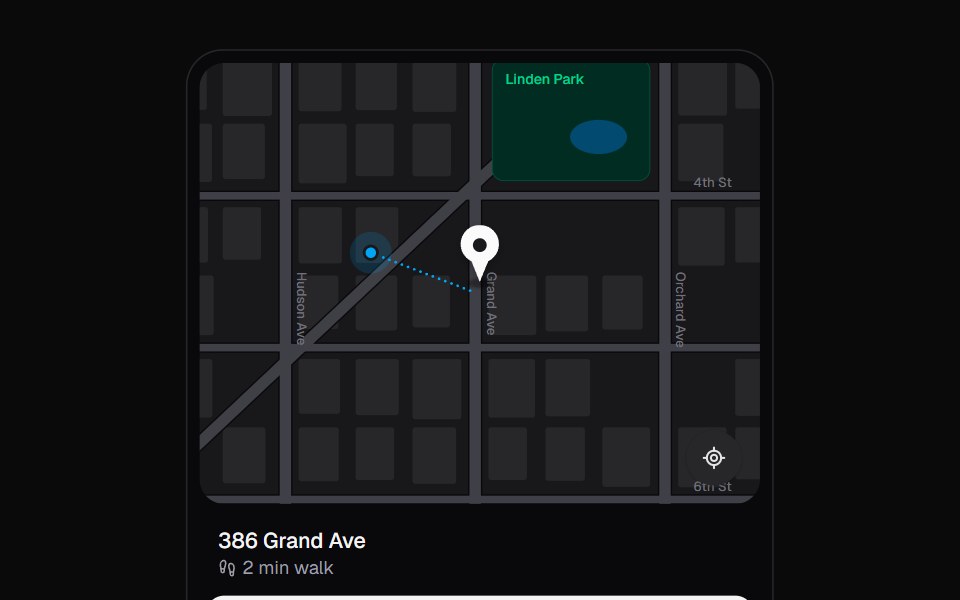 Location PickerKokonut UI · ReactSet a pickup point the way ride apps do. Drag the map under a fixed pin; it lifts off its shadow, glides onto the…
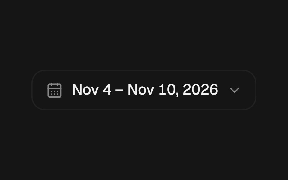 Date Range PickerbeUI · ReactComposable date range picker with root, trigger, popover content, calendar, header, grid, summary, footer, clear and…
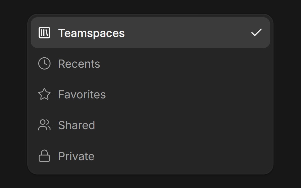 DropdownFluid Functionalism · ReactDropdown menu with fluid hover, animated selection indicator, inline panel or triggered popup with collision-aware…
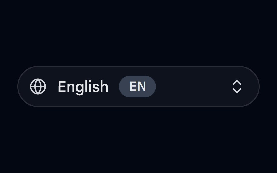 Dropdown Menu 08 - Language SelectorShadcn Space · ReactA language selector dropdown with an animated pill trigger, popular languages, region submenus, native names, RTL…
 SelectArc Library · ReactA compact choice field with a keyboard friendly menu.
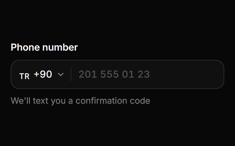 Phone InputReactFrame · ReactA phone number input with a searchable country menu: flags and calling codes, as-you-type formatting per country…
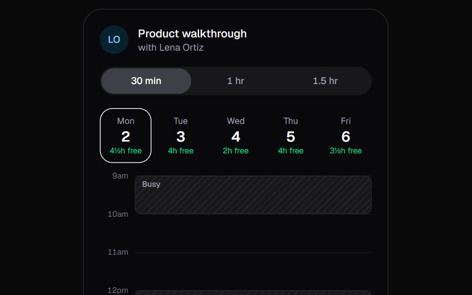 Slot PickerKokonut UI · ReactBook a meeting on a day rail. Drag a meeting into a free gap; it hops over existing bookings, resizes in place and…
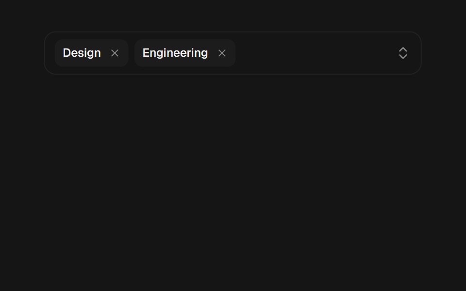 Multi SelectbeUI · ReactComposable multi-select primitives with searchable options, removable animated tokens, and a morphing collision-aware…
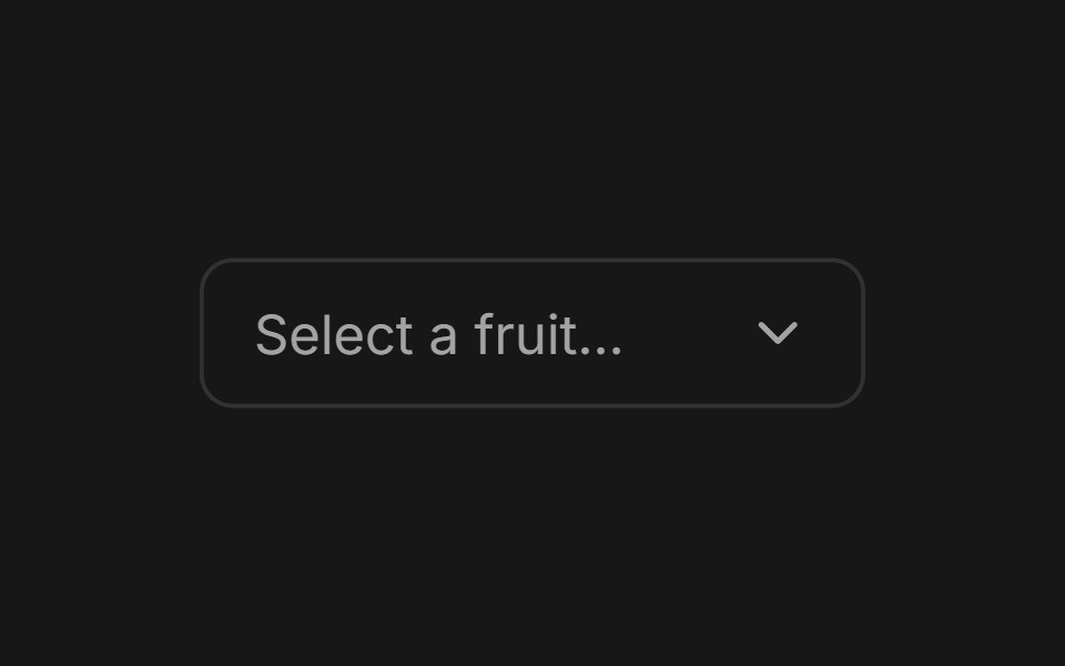 SelectFluid Functionalism · ReactAnimated select menu with collision-aware positioning, typeahead, fluid hover, spring-animated popover, and animated…
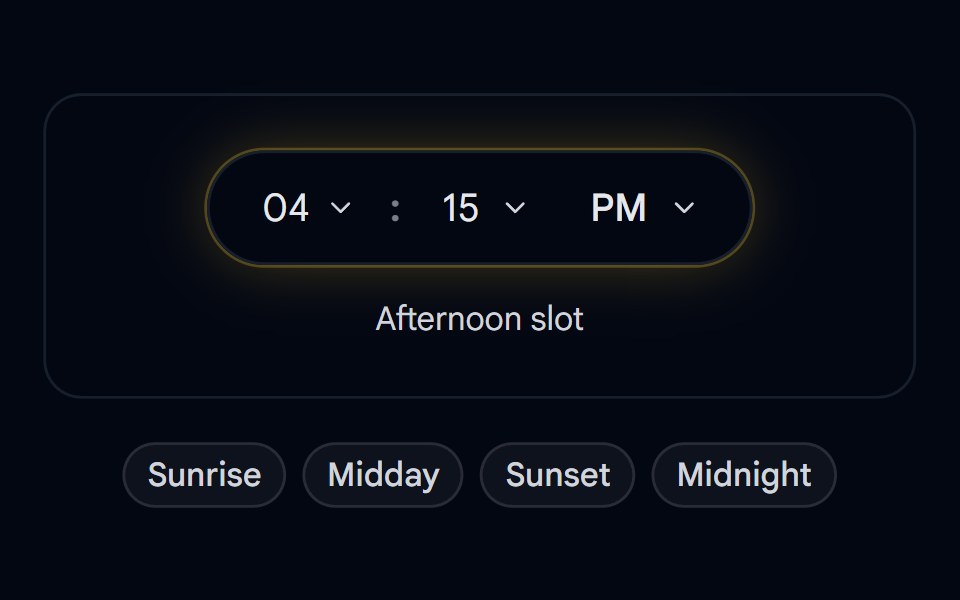 Select 10 - Flip Clock Daypart PickerShadcn Space · ReactPill-shaped hour/minute/period time picker with flip-digit transitions, a day/night glow ring, and quick daypart presets
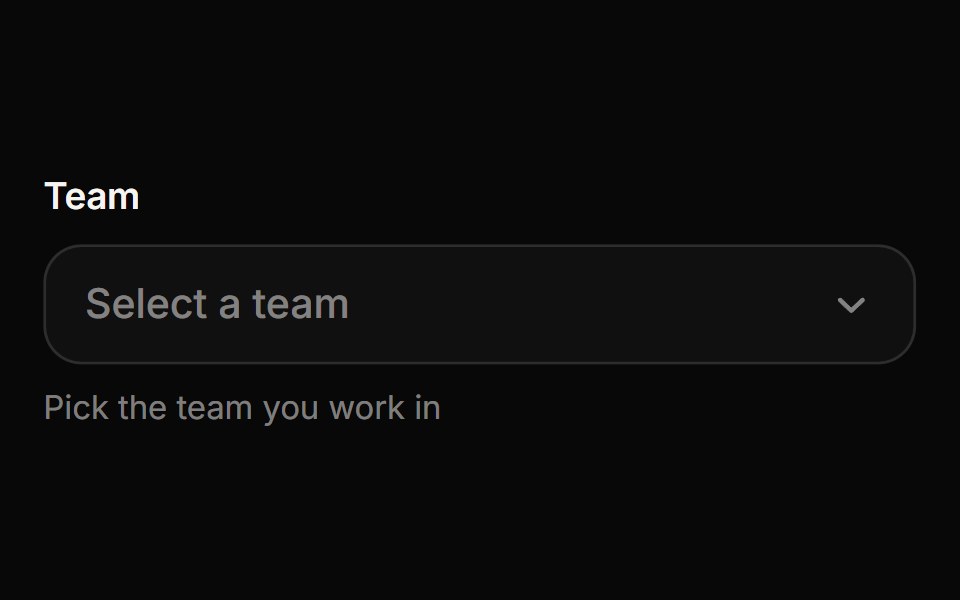 SelectReactFrame · ReactAn accessible, animated custom select with a springy chevron, keyboard navigation, type-ahead, option descriptions…
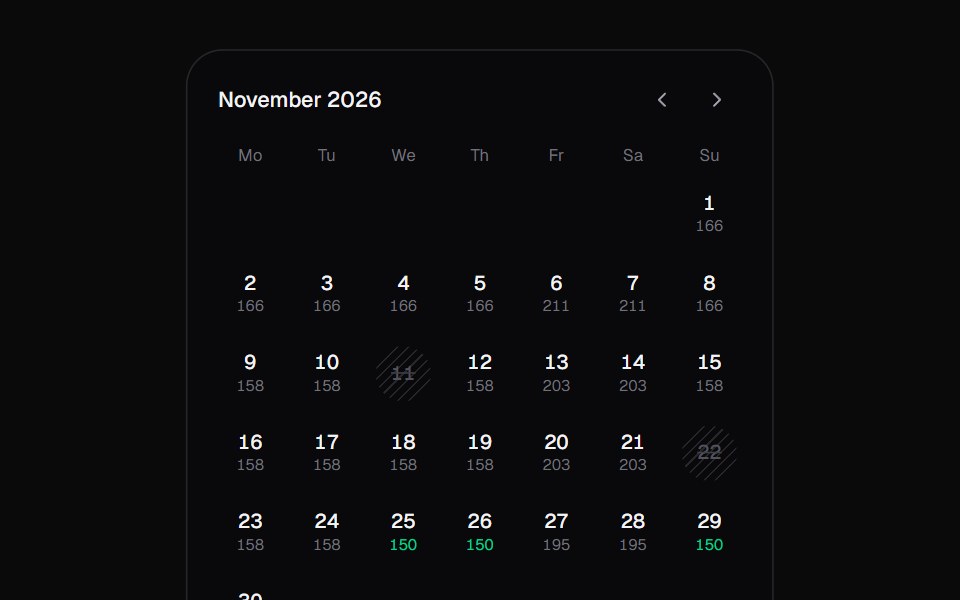 Stay PickerKokonut UI · ReactA date range picker for booking stays. Every night shows its price, sold-out nights are hatched, and your stay is one…
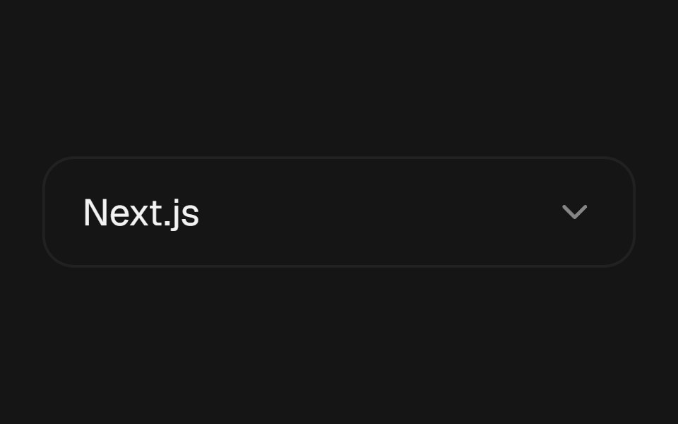 Select MorphbeUI · ReactSelect whose trigger expands and changes shape into the list of options.
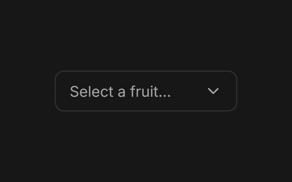 SelectFluid Functionalism · ReactAnimated select menu with collision-aware positioning, typeahead, fluid hover, spring-animated popover, and animated…
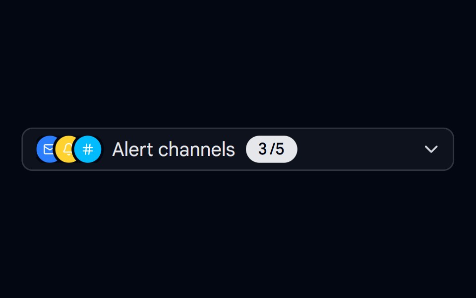 Select 11 - Alert Channels Multi-SelectShadcn Space · ReactMulti-select trigger that summarizes chosen alert channels as an animated overlapping icon stack with a spring-counted…
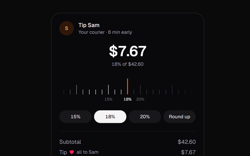 Tip SelectorKokonut UI · ReactA tip picker for checkout, set on a tape you drag and flick. The ticks you pass fill in, the amounts roll, and Round…
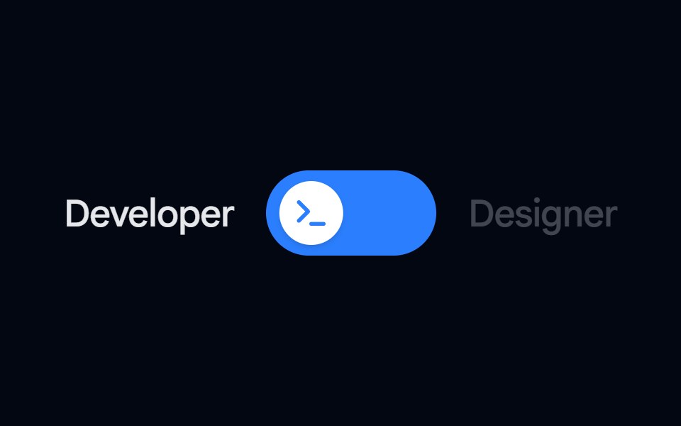 Switch 08 - Role PickerShadcn Space · ReactA colorful role-picker switch that swaps track color and thumb icon per state, with a soft ambient glow and side…
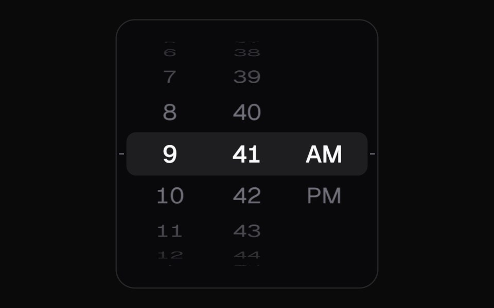 Wheel PickerKokonut UI · ReactiOS-style 3D drum picker with flick momentum, built with React and Motion.
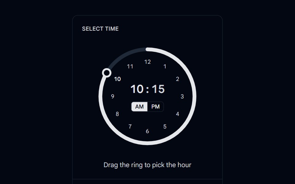 Time Picker 03 - Ring TrackShadcn Space · ReactCircular ring time picker where an arc fills as you drag the knob, with the time and AM or PM toggle in the center and…
Libraries with Animated select components
Related categories
- Select Components
- React Select Components
- Tailwind CSS Select Components
- React Native Select Components
- shadcn/ui Select Components
- Animated Input Components
- Animated Text Input Components
- Animated Slider Components
- Animated Switch Components
- Animated Form Components
- Animated Textarea Components
- Animated Search Input Components
- Animated Checkbox Components
- Animated Segmented Control Components
- Animated Form Field Components
- Animated Rating Components
- Animated File Upload Components
- Animated Range Slider Components
- Animated Wheel Picker Components
- Animated Knob Components
- Animated Color Picker Components