 Dev Design Library
Animated Segmented Control Components
Dev Design Library indexes 23 Animated segmented control components from 16 open-source UI libraries, with the most coming from Amicro Micro Transitions, React Bits, Arc Library, Opaline and Fluid Functionalism. Each one links to its page with the source code, a live preview where available, the library license and the install command. These are the segmented control components tagged as animated: motion on hover, on scroll or on load, usually built with CSS transitions or Framer Motion. Segmented control components belong to the Inputs group.
 Glide SelectReact Bits · ReactSelect chip whose menu pops out of its own corner and whose single hover highlight glides between rows, remembering…
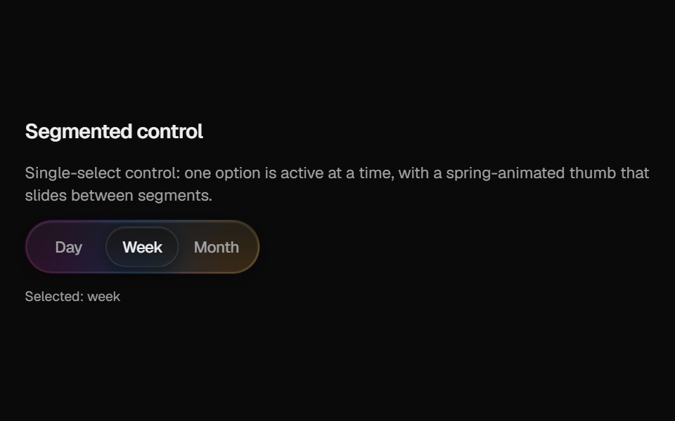 Halo SegmentedCult UI · ReactSegmented control with frosted track, gradient rim, and spring sliding thumb
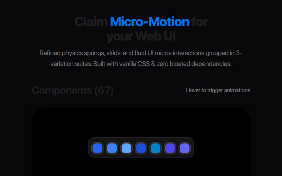 Ab Segmented TabsAmicro Micro Transitions · ReactSegmented control where active letter (A or B) slides into a solid pill.
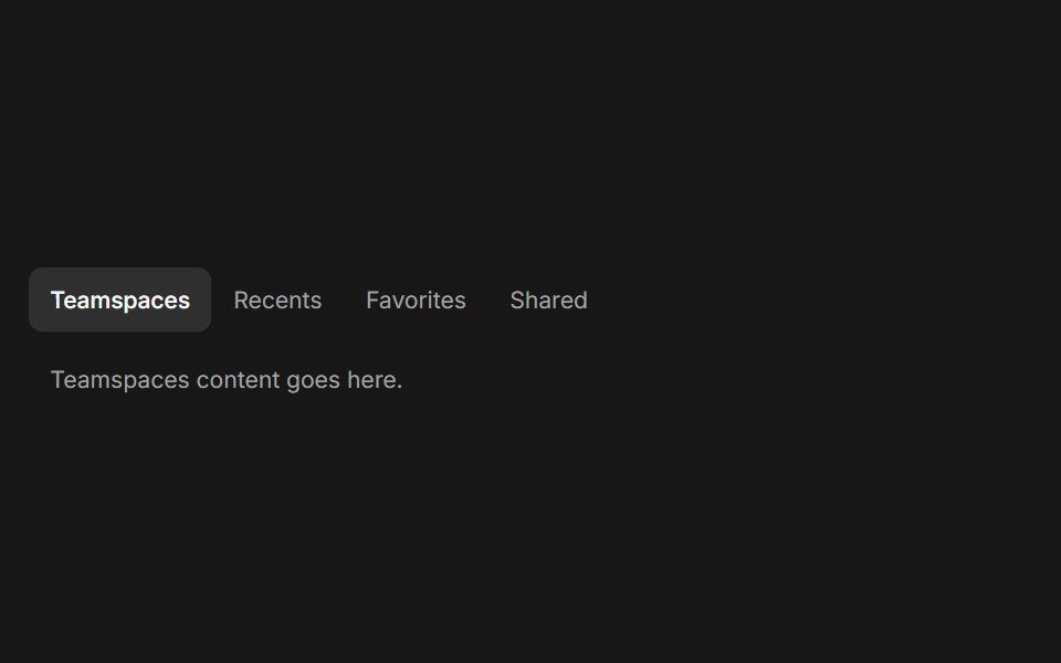 TabsFluid Functionalism · ReactHorizontal tab navigation with fluid hover, animated pill selection indicator, and fluid font-weight transitions…
 Number Ticker 08 - Segmented LCDShadcn Space · ReactA retro seven-segment LCD display that renders digits as illuminated SVG segments, perfect for odometers, counters…
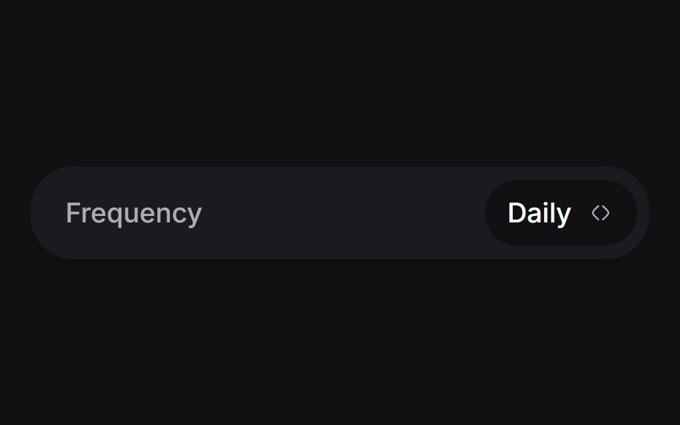 Day Pickeruselayouts · ReactA custom day picker component with smooth animations.
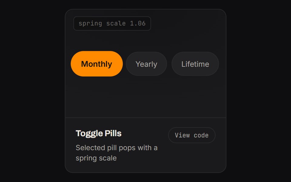 Toggle PillsKinetics · HTML/CSSSelected pill pops with a spring scale
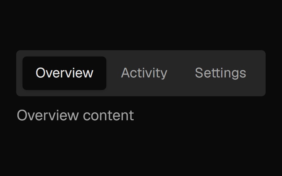 Tabs SubtleNexvyn UI · ReactA pill-style tab list where the selected indicator springs between tabs, built on the WAI-ARIA tabs pattern with full…
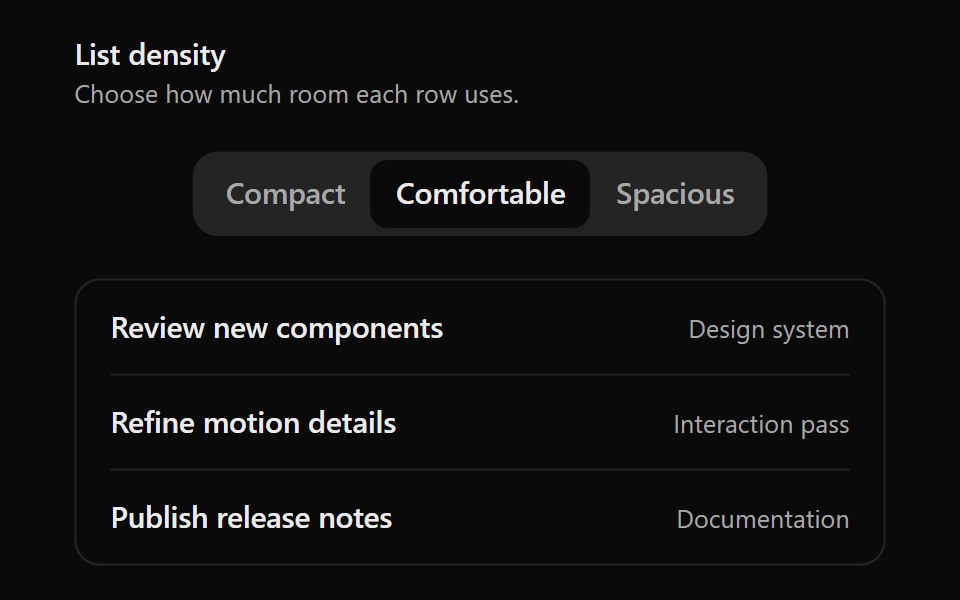 Animated Segmented ControlSona UI · React
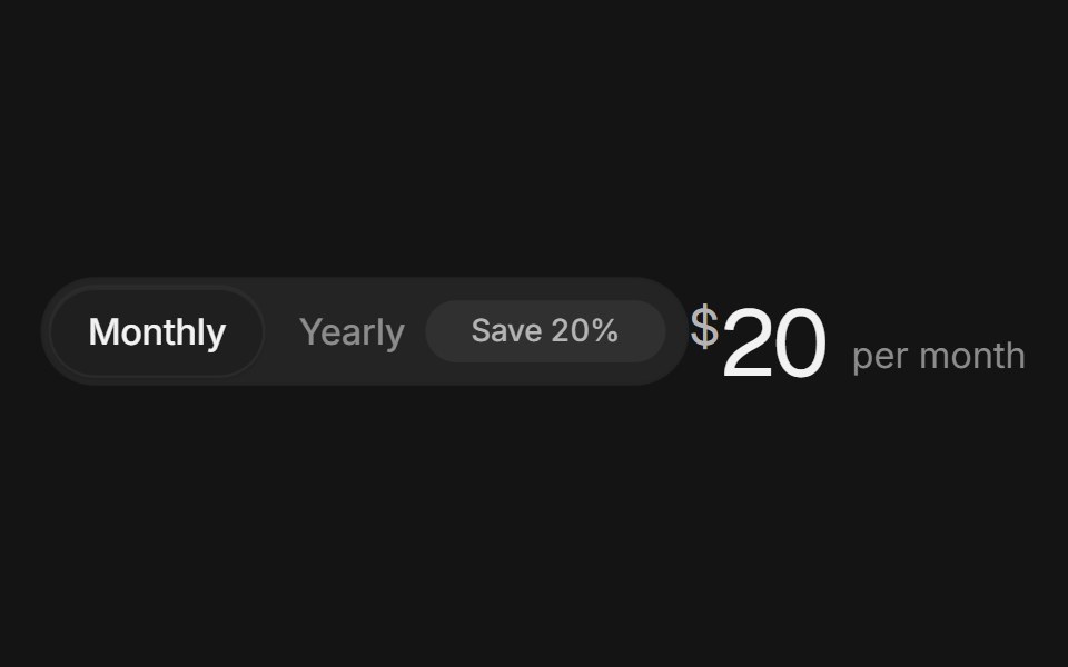 Billing toggleArc Library · ReactA monthly and yearly switch with a savings badge and prices that roll to the new amount.
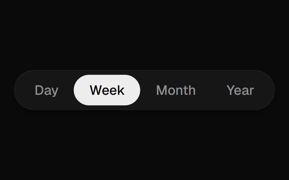 Segmented ControlUI Lab · ReactThe pill stretches toward your pick like an inchworm, recoloring each label as its edge crosses.
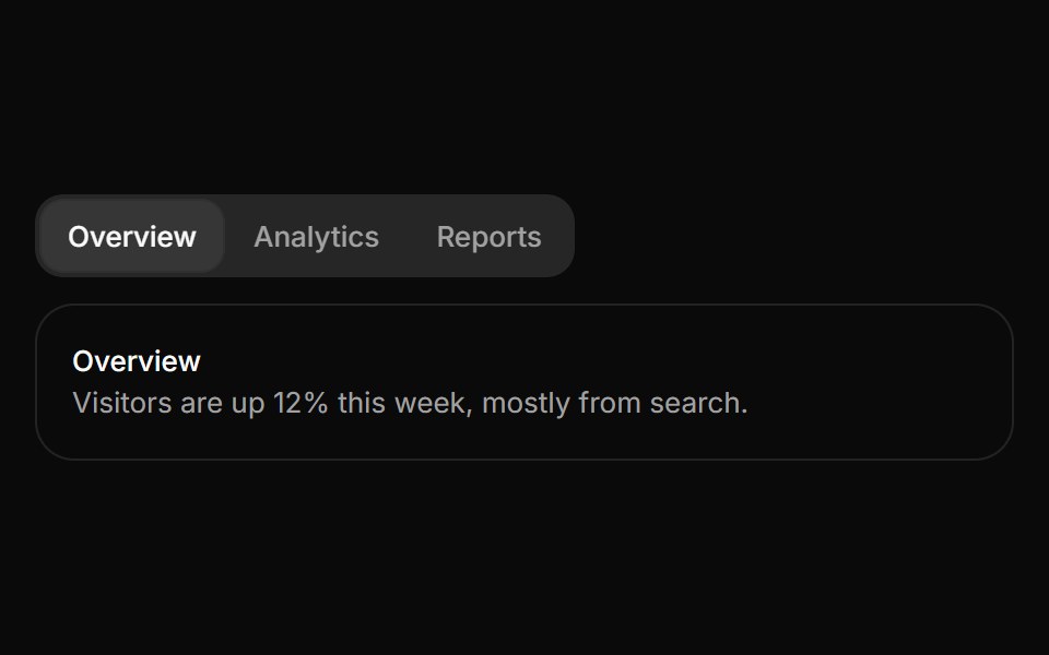 TabsHextaUI · ReactSwitch between views with an indicator that slides to the active tab, as a segmented control or an underline, and…
 Mode SwitcherSpaceUI · React
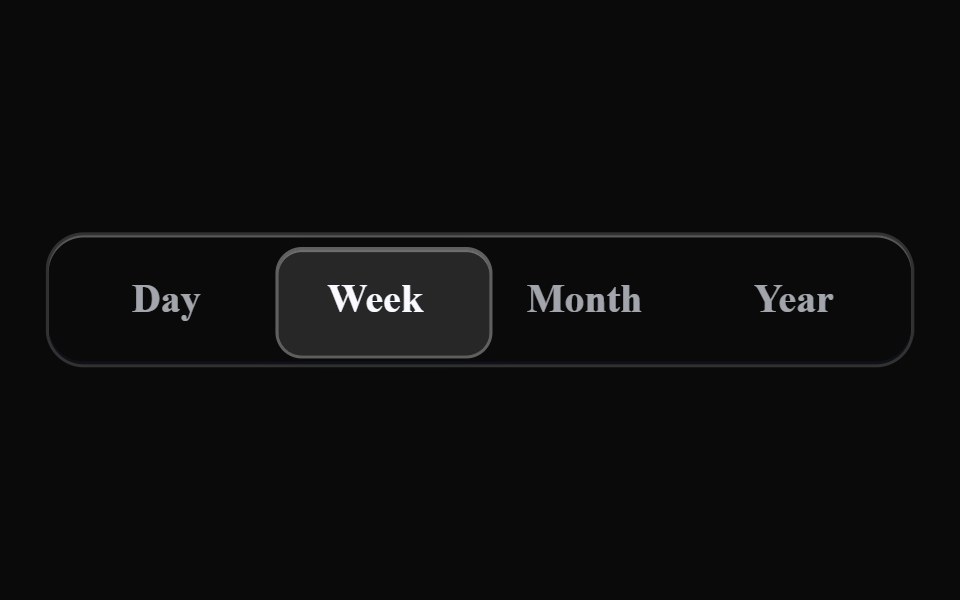 Liquid SegmentedLiquefy UI · ReactSegmented control in liquid glass style. Controle segmentado em estilo vidro líquido.
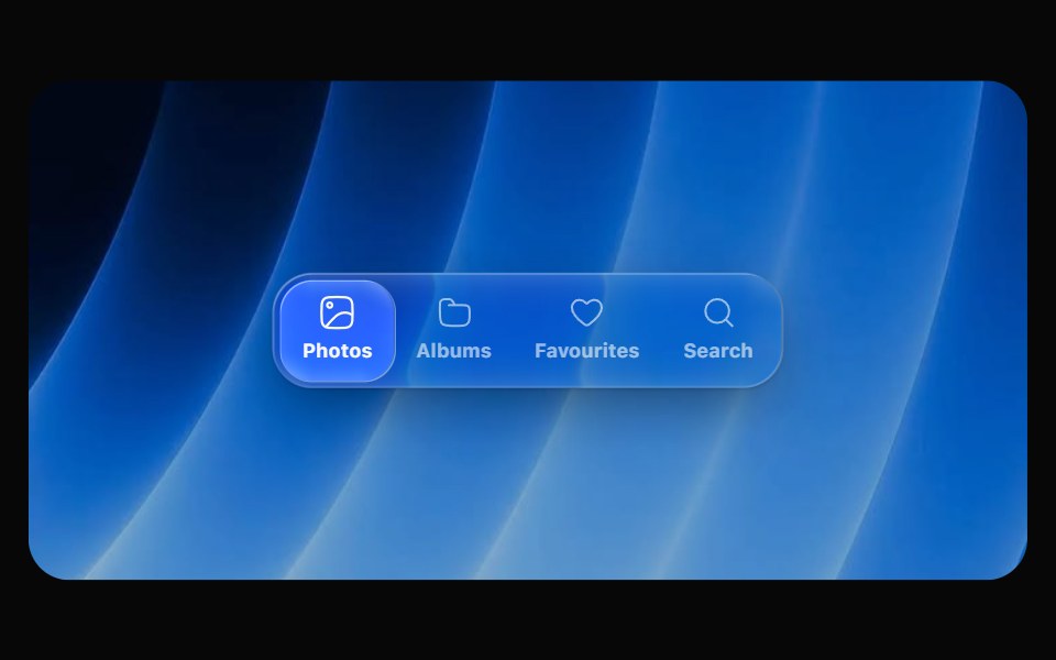 Glass SegmentedOpaline · ReactIcon segmented picker whose glass bubble stretches like liquid as it travels.
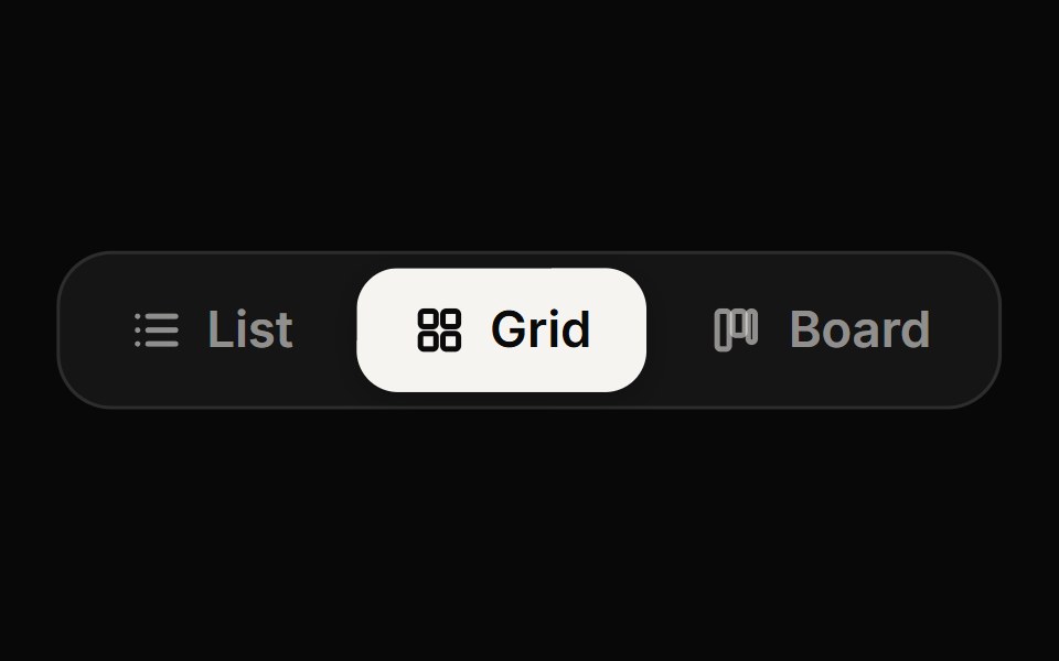 Segmented ControlReactFrame · ReactA compact radio-style switch between a few options with a sliding animated thumb, solid or soft styles, icons…
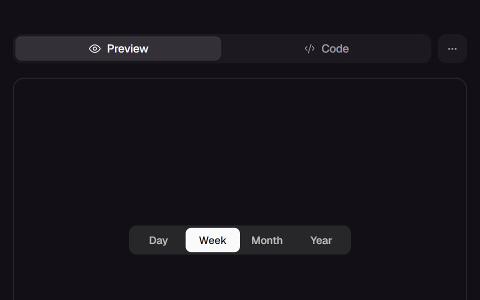 Rubber SegmentReact Bits · ReactSegmented control with a rubber thumb: taps stretch it across the gap and squash it onto the target, and you can grab…
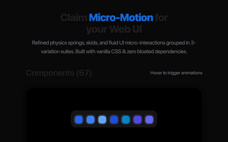 Perspective Layout SwitcherAmicro Micro Transitions · ReactInteractive toggle switching between Grid and 3D Stack layout icons.
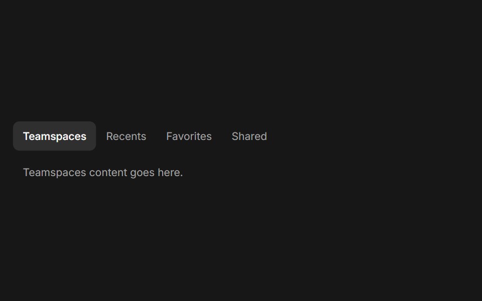 TabsFluid Functionalism · ReactHorizontal tab navigation with fluid hover, animated pill selection indicator, and fluid font-weight transitions. Base…
 Toggle groupArc Library · ReactA row of icon or text toggles, single or multiple: one pressed fill glides between options, or each fades in on its…
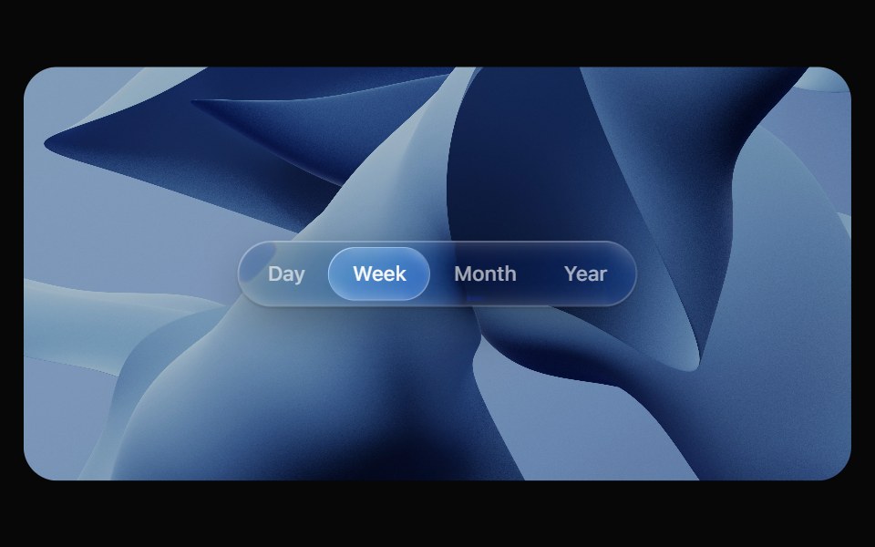 Glass TabsOpaline · ReactSegmented control with a glass bubble that glides between tabs.
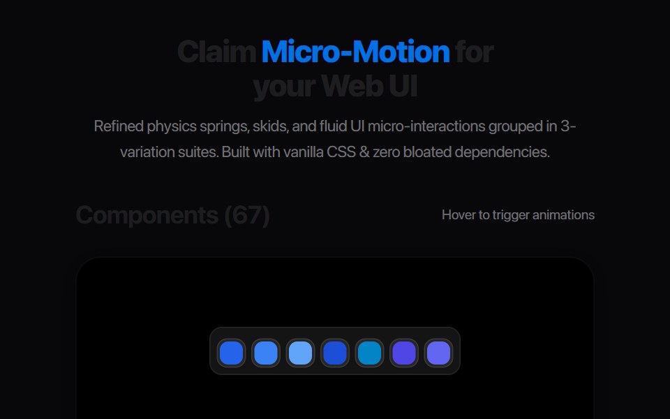 Segmented Link StretchAmicro Micro Transitions · ReactMulti-joint segmented pill chain expanding and snapping together.
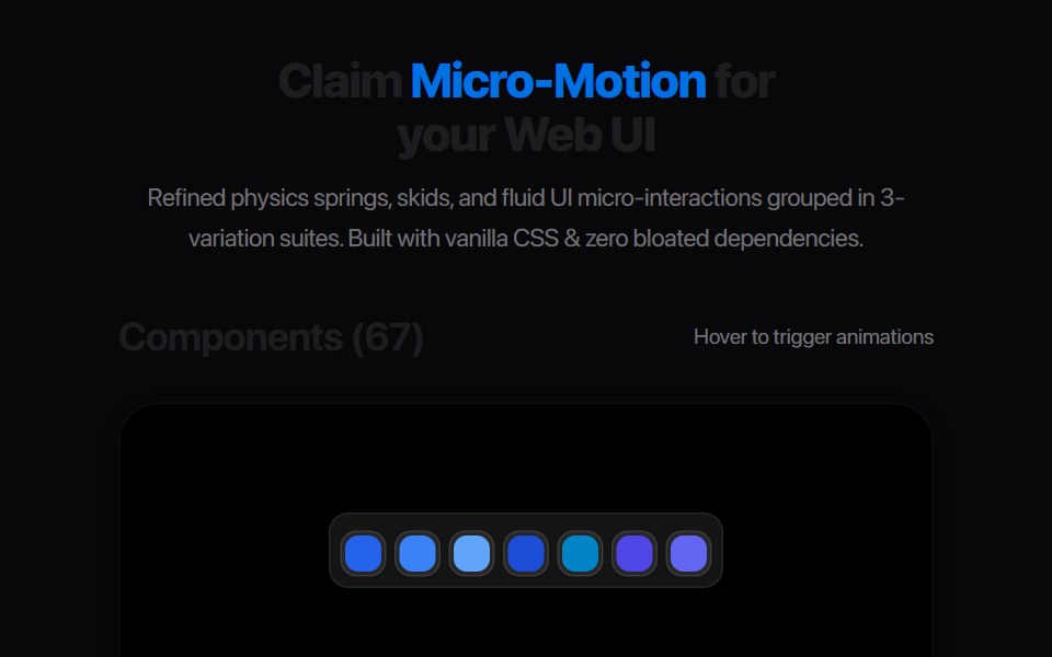 Multi Tab BarAmicro Micro Transitions · React
Libraries with Animated segmented control components
Related categories
- Segmented Control Components
- React Segmented Control Components
- Tailwind CSS Segmented Control Components
- Animated Input Components
- Animated Text Input Components
- Animated Select Components
- Animated Slider Components
- Animated Switch Components
- Animated Form Components
- Animated Textarea Components
- Animated Search Input Components
- Animated Checkbox Components
- Animated Form Field Components
- Animated Rating Components
- Animated File Upload Components
- Animated Range Slider Components
- Animated Wheel Picker Components
- Animated Knob Components
- Animated Color Picker Components