 Dev Design Library
Tailwind CSS Segmented Control Components
Dev Design Library indexes 46 Tailwind CSS segmented control components from 24 open-source UI libraries, with the most coming from Watermelon UI, Amicro Micro Transitions, Toolcraft, LocalMode and Opaline. Each one links to its page with the source code, a live preview where available, the library license and the install command. Every library in this list styles its components with Tailwind CSS utility classes. Segmented control components belong to the Inputs group.
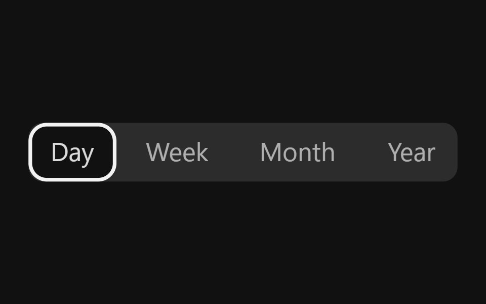 Segmented ControlReact Spectrum · ReactA SegmentedControl is a mutually exclusive group of buttons used for view switching.
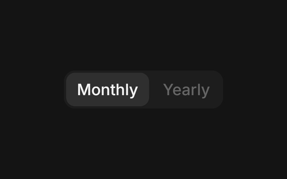 Segmented Controlcoss ui · ReactA visual pattern for presenting related choices, navigation destinations, filters, or content views.
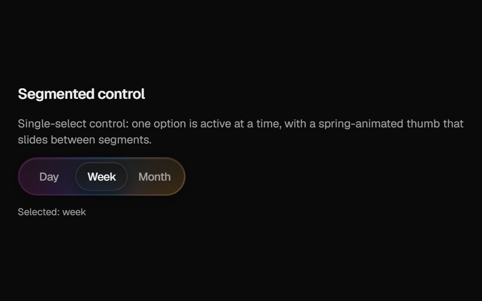 Halo SegmentedCult UI · ReactSegmented control with frosted track, gradient rim, and spring sliding thumb
 Ab Segmented TabsAmicro Micro Transitions · ReactSegmented control where active letter (A or B) slides into a solid pill.
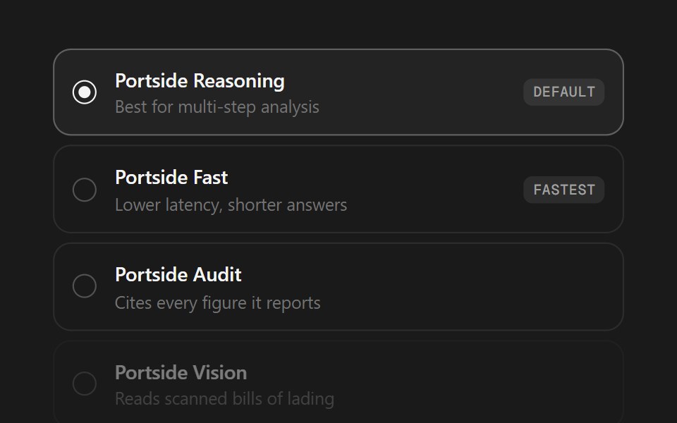 Model SelectorSpectrum UI · ReactA model picker as a radio list or segmented control, with badges and disabled states.
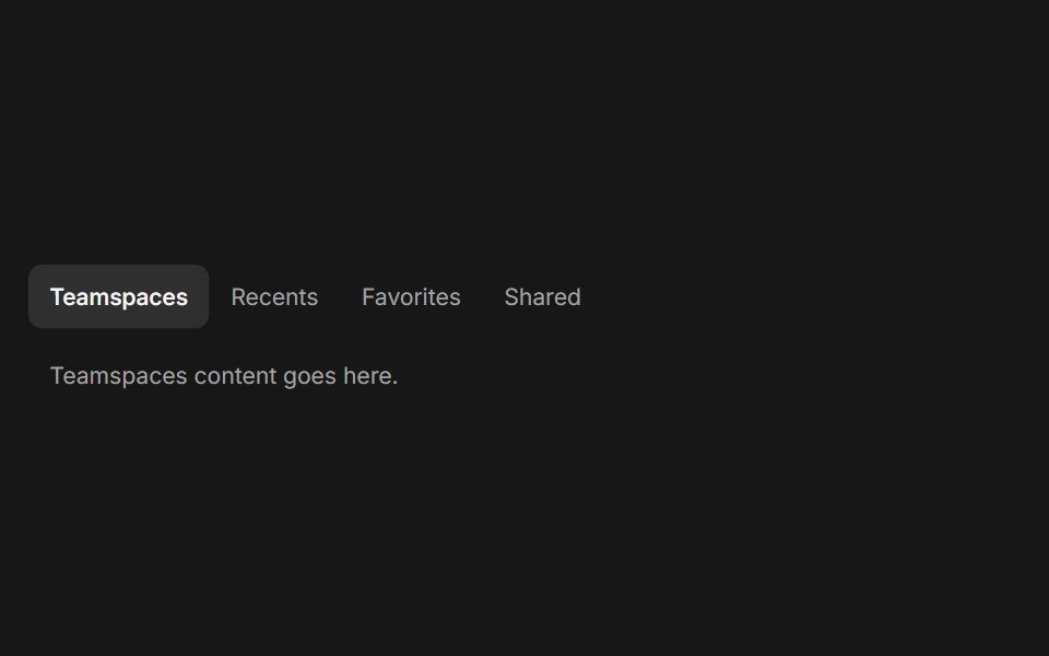 TabsFluid Functionalism · ReactHorizontal tab navigation with fluid hover, animated pill selection indicator, and fluid font-weight transitions…
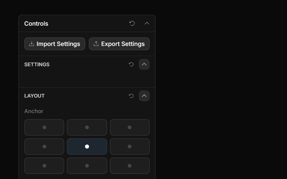 Anchor Grid ControlToolcraft · React
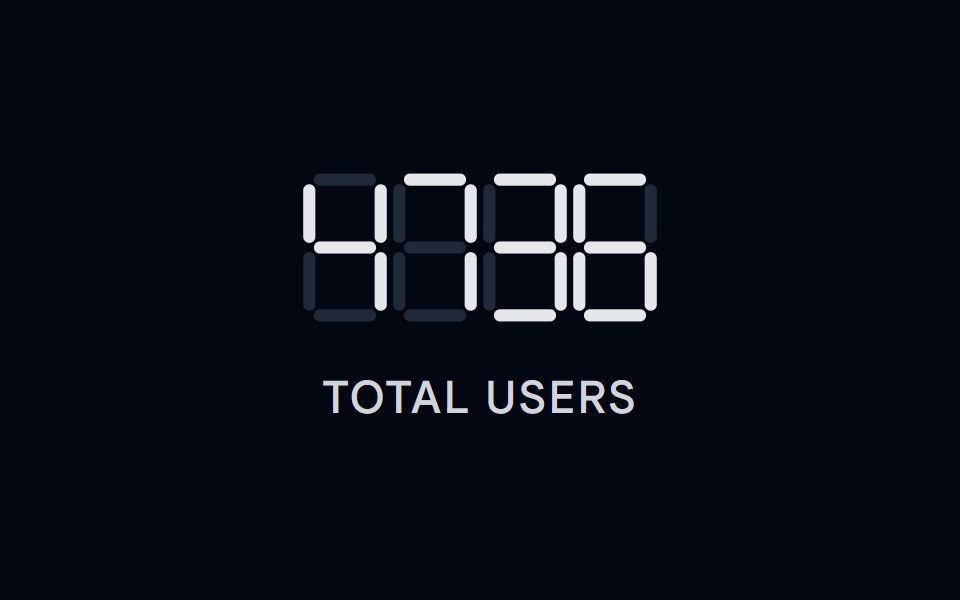 Number Ticker 08 - Segmented LCDShadcn Space · ReactA retro seven-segment LCD display that renders digits as illuminated SVG segments, perfect for odometers, counters…
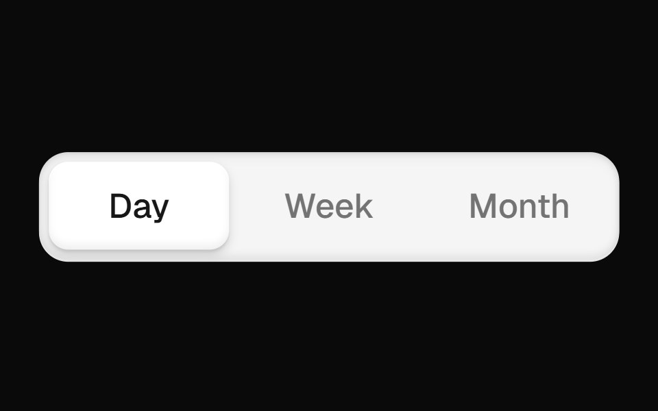 Segmented Toggle ButtonOpenSourceUI · React
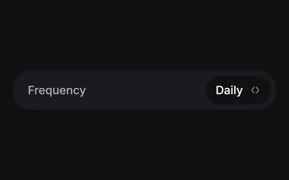 Day Pickeruselayouts · ReactA custom day picker component with smooth animations.
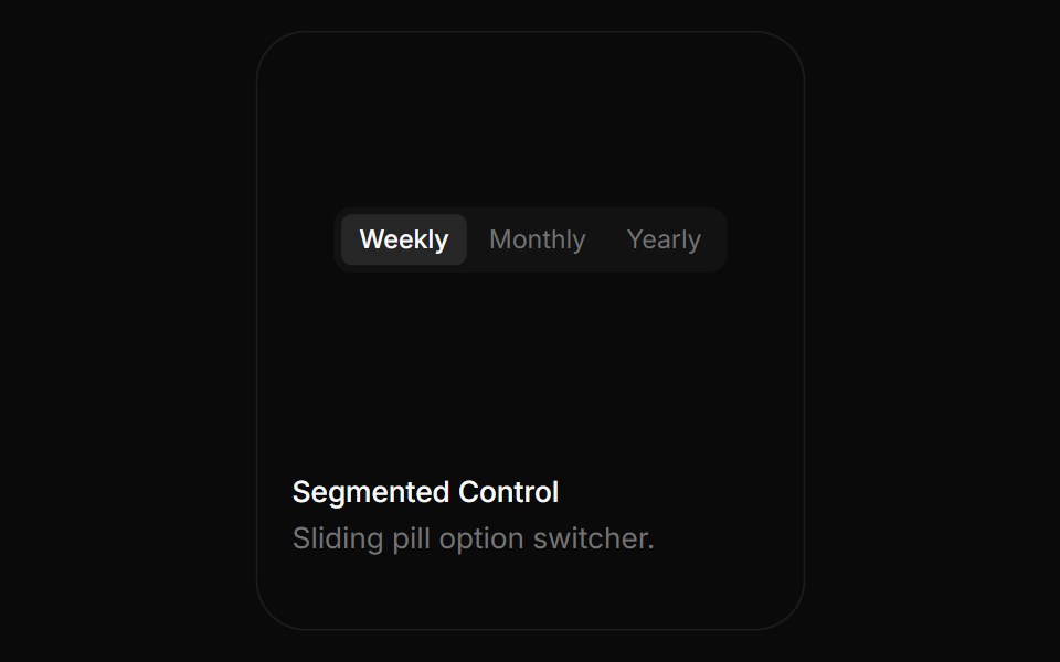 Segmented ControlBoardUI · ReactSliding pill option switcher.
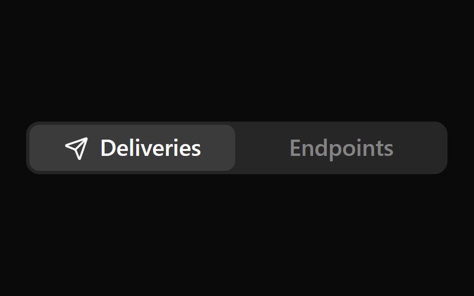 Icon TabsNotra · ReactA segmented tab selector where only the active tab shows its icon, sliding in beside the label. Built on the Base UI…
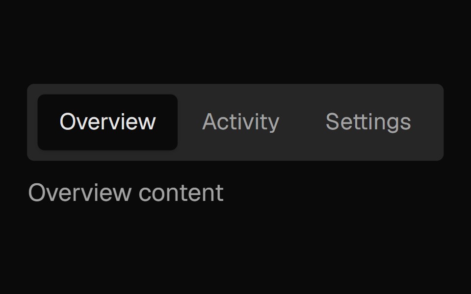 Tabs SubtleNexvyn UI · ReactA pill-style tab list where the selected indicator springs between tabs, built on the WAI-ARIA tabs pattern with full…
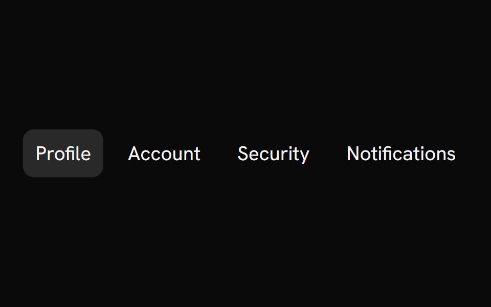 Segment GroupShark UI · ReactFollows the selected item.
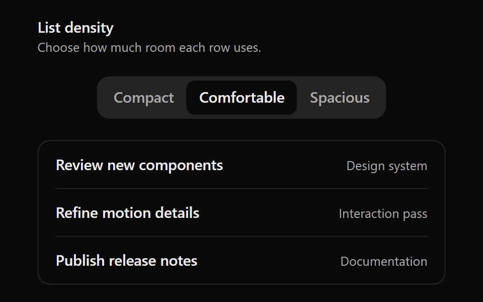 Animated Segmented ControlSona UI · React
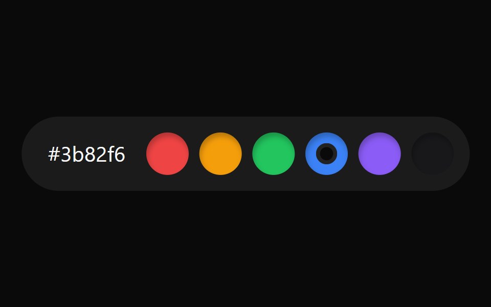 Color Watch SelectorWatermelon UI · React
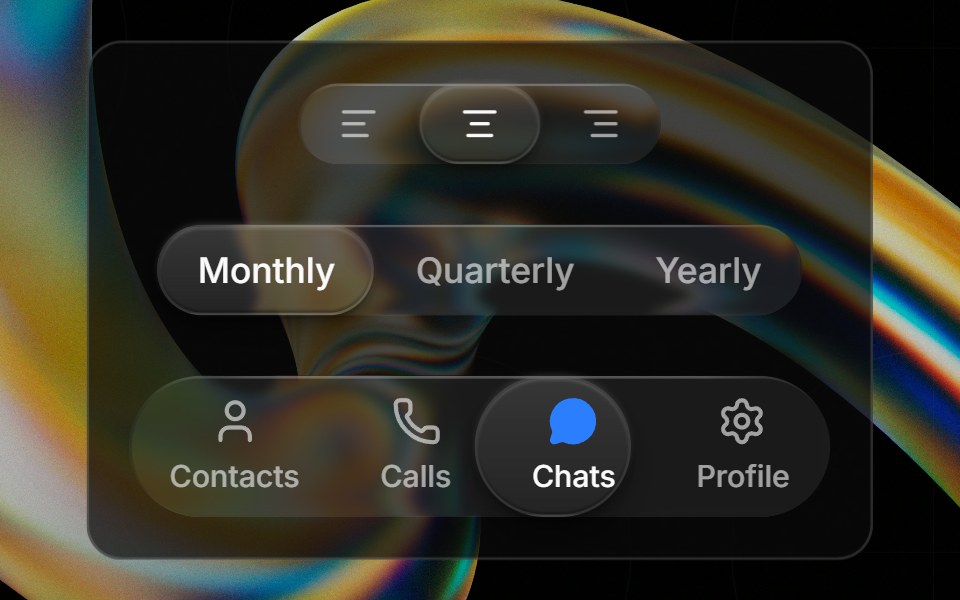 Glass Toggle Groupglasscn · ReactA segmented control with a sliding glass puck indicator supporting icons, text, or any React content.
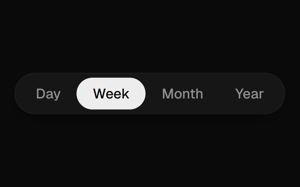 Segmented ControlUI Lab · ReactThe pill stretches toward your pick like an inchworm, recoloring each label as its edge crosses.
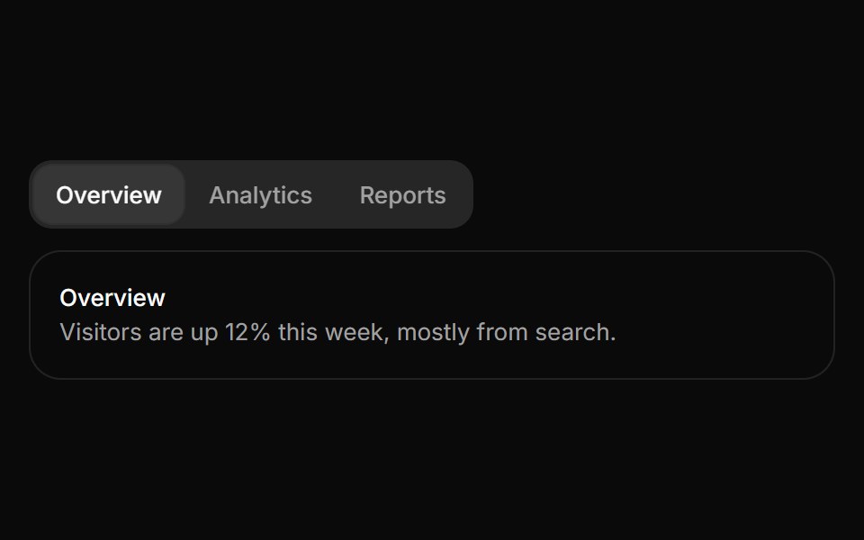 TabsHextaUI · ReactSwitch between views with an indicator that slides to the active tab, as a segmented control or an underline, and…
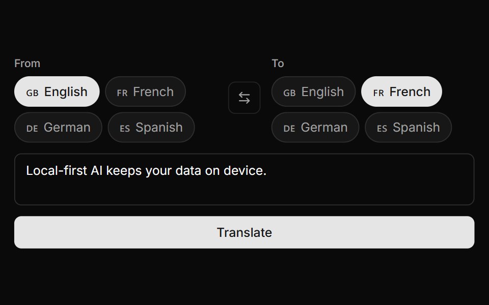 Language Pair SelectorLocalMode · ReactA paired source/target language picker — From/To pill toggles with flag + name + a swap button, or a compact {source}…
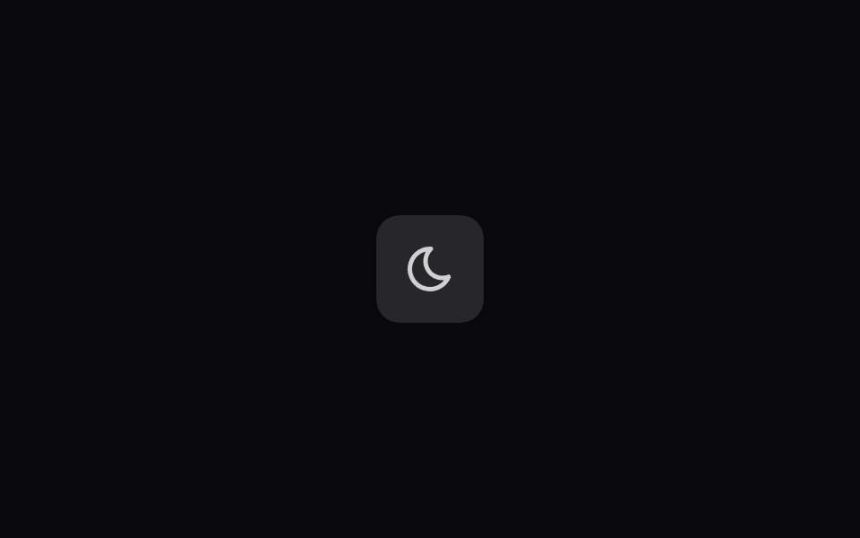 Mode SwitcherSpaceUI · React
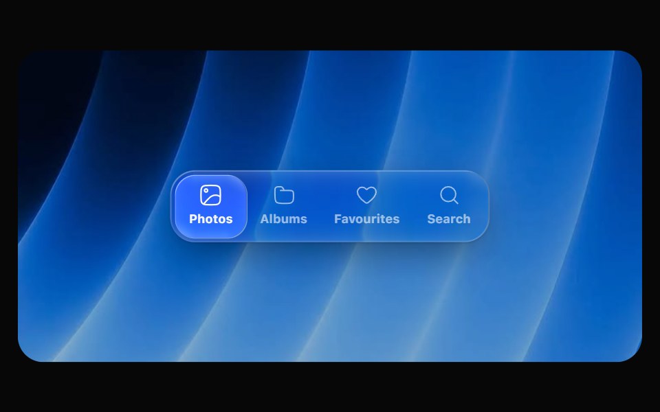 Glass SegmentedOpaline · ReactIcon segmented picker whose glass bubble stretches like liquid as it travels.
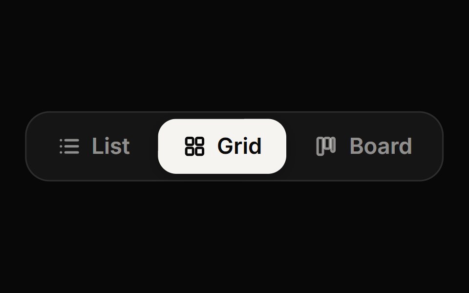 Segmented ControlReactFrame · ReactA compact radio-style switch between a few options with a sliding animated thumb, solid or soft styles, icons…
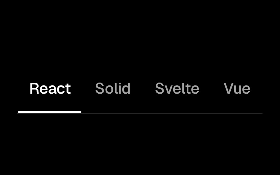 Segment Groupark-cn · ReactA shadcn-style segment group component built with Ark UI primitives.
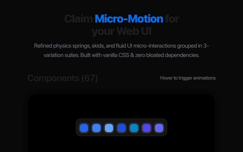 Perspective Layout SwitcherAmicro Micro Transitions · ReactInteractive toggle switching between Grid and 3D Stack layout icons.
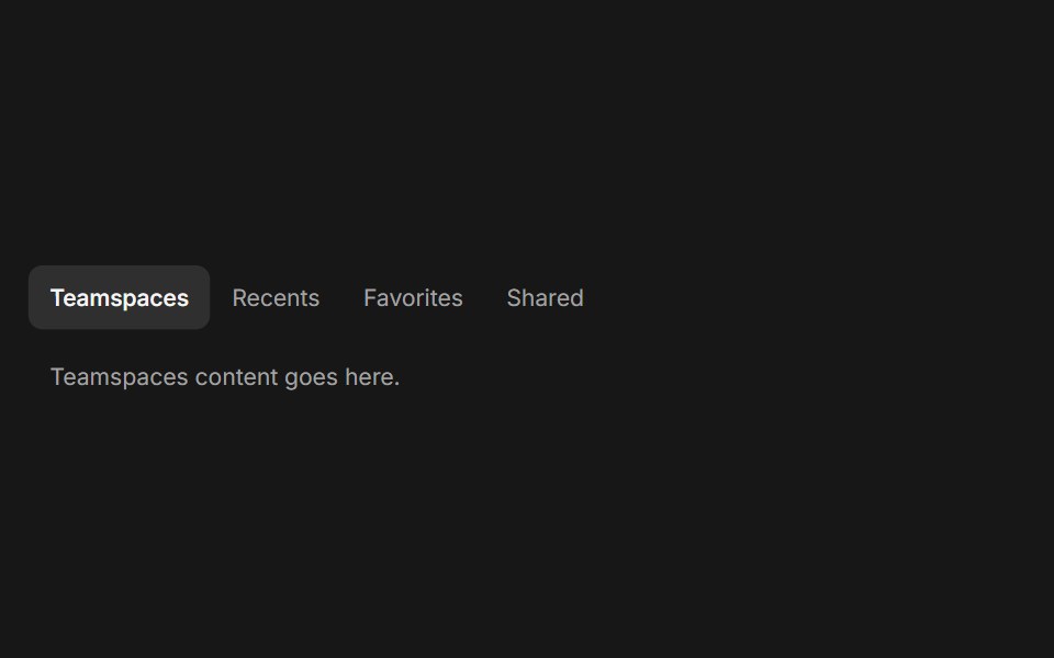 TabsFluid Functionalism · ReactHorizontal tab navigation with fluid hover, animated pill selection indicator, and fluid font-weight transitions. Base…
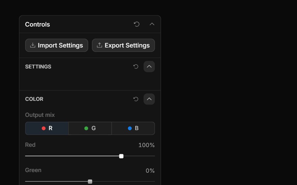 Channel TabsToolcraft · React
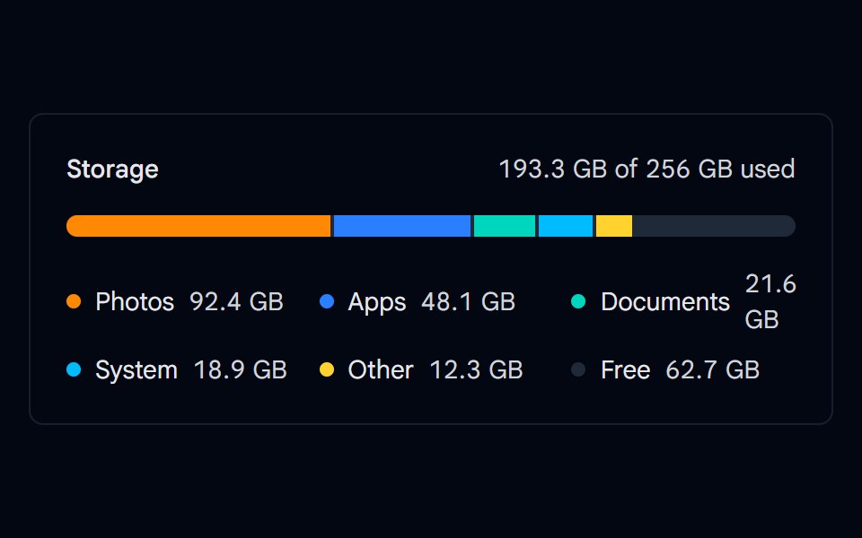 Progress 07 - Segmented StorageShadcn Space · ReactMulti segment storage bar showing photos, apps, documents, system, and other usage with a legend and free space.
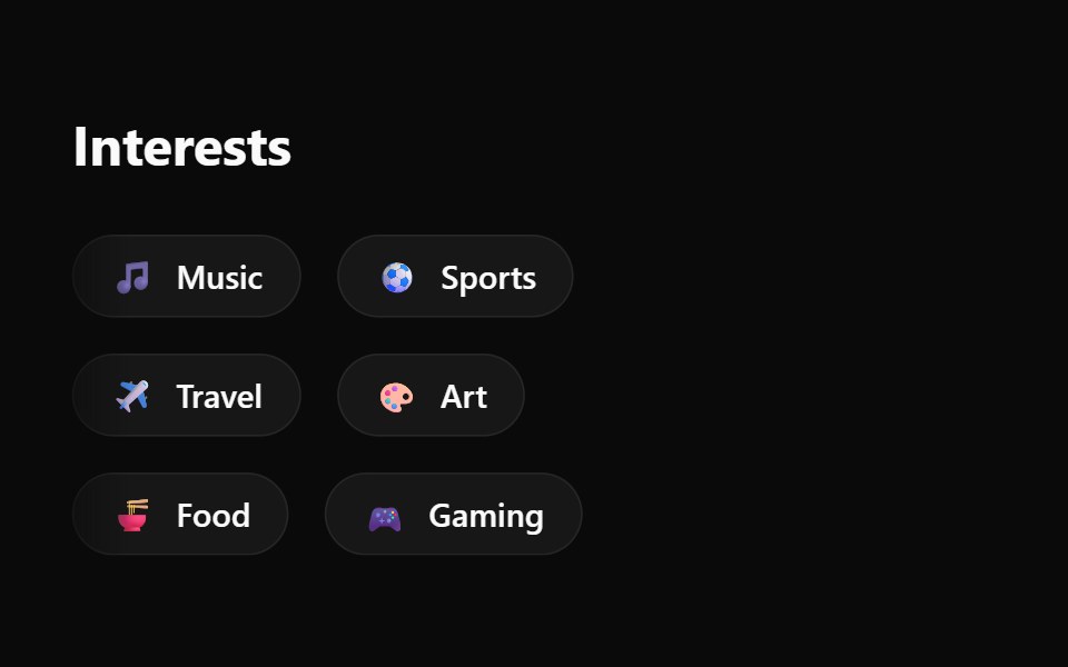 Emoji Spree Choice ChipsWatermelon UI · React
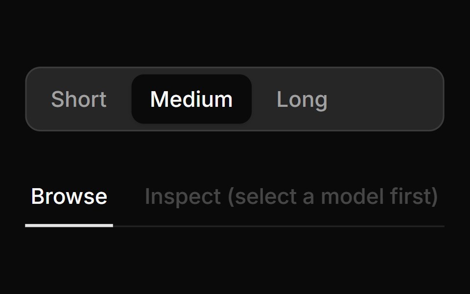 Segmented Mode PickerLocalMode · ReactA pill toggle for 2–4 mutually-exclusive named modes (ring-bordered container, active item tinted + ringed), plus a…
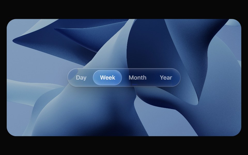 Glass TabsOpaline · ReactSegmented control with a glass bubble that glides between tabs.
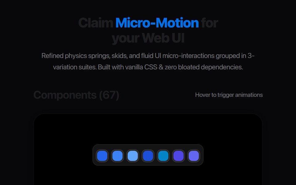 Segmented Link StretchAmicro Micro Transitions · ReactMulti-joint segmented pill chain expanding and snapping together.
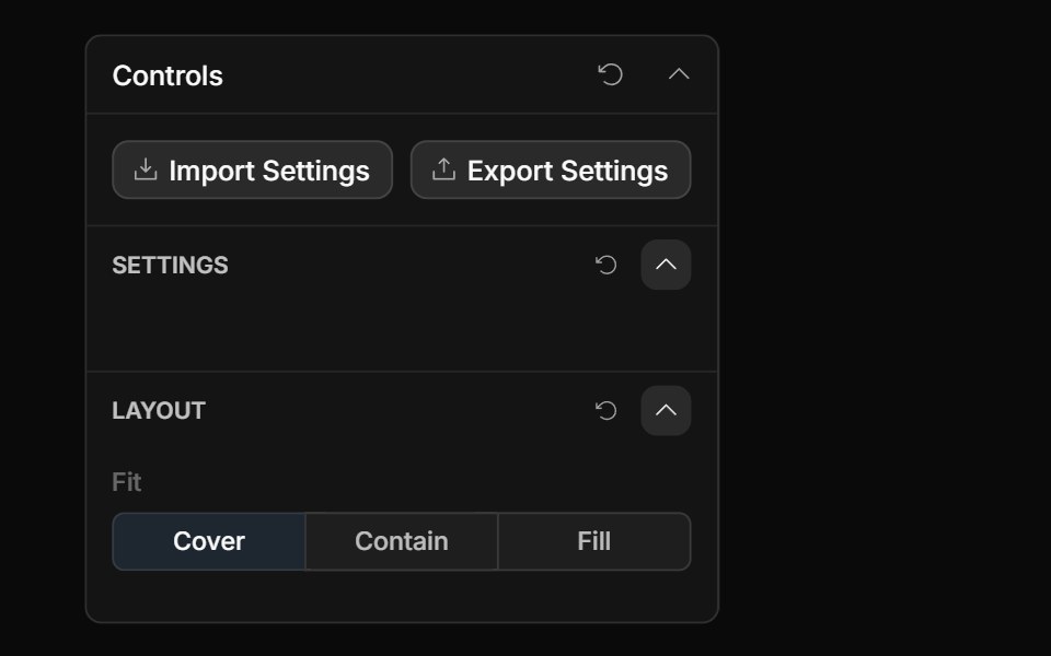 Segmented ControlToolcraft · React
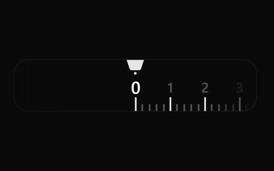 Fractional PickerWatermelon UI · React
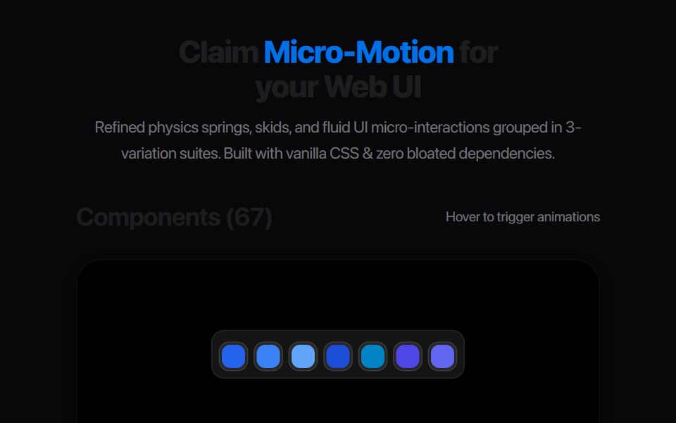 Multi Tab BarAmicro Micro Transitions · React
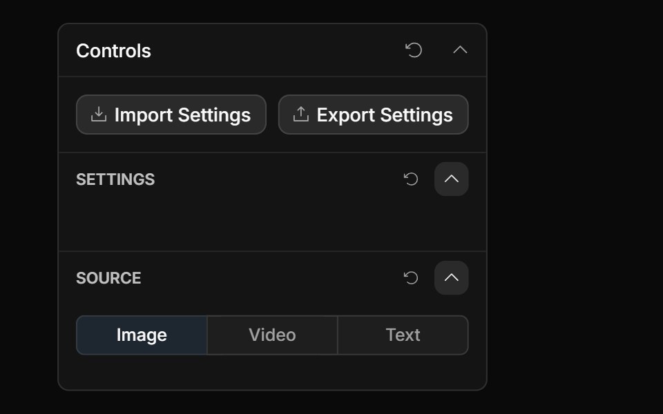 Tabs ControlToolcraft · React
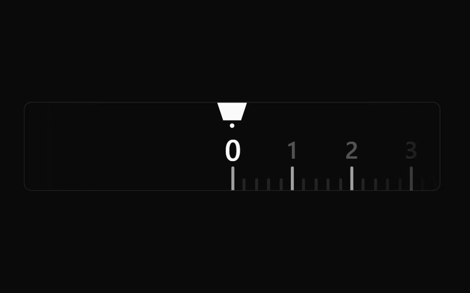 Fractional Picker BaseWatermelon UI · React
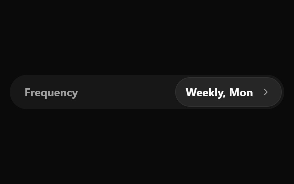 Frequency SelectorWatermelon UI · React
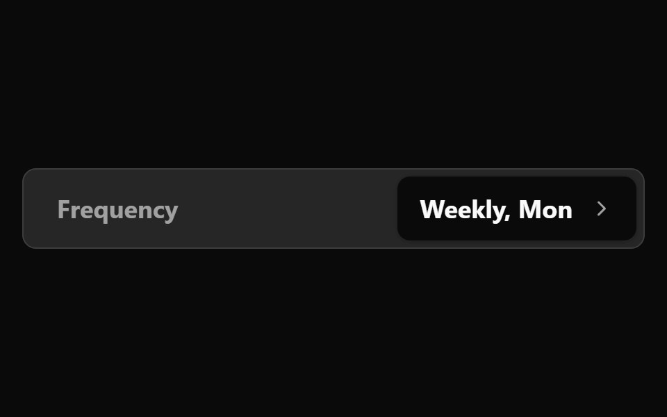 Frequency Selector BaseWatermelon UI · React
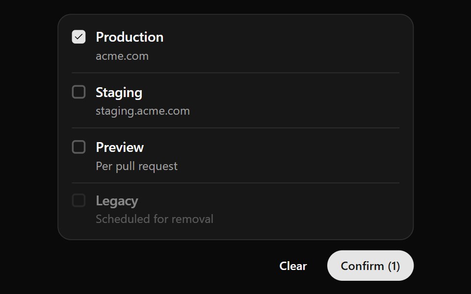 Option ListWatermelon UI · React
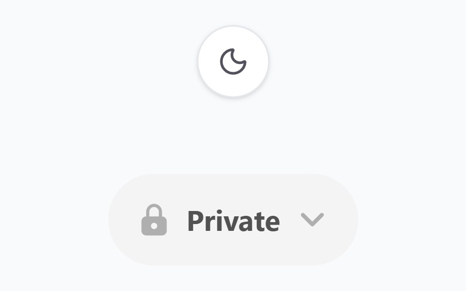 Option PickerWatermelon UI · React
 Quick Option PickerWatermelon UI · React
 Quick Option Picker BaseWatermelon UI · React
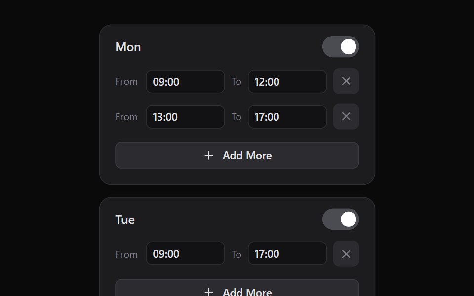 Slot PickerWatermelon UI · React
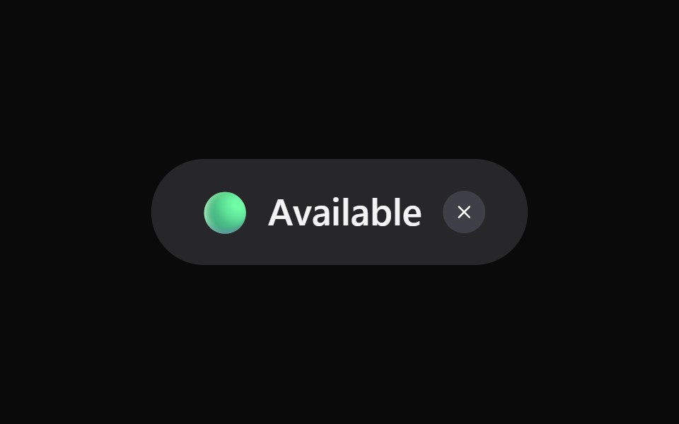 Status PickerWatermelon UI · React
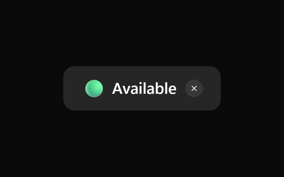 Status Picker BaseWatermelon UI · React
Libraries with Tailwind CSS segmented control components
Related categories
- Segmented Control Components
- React Segmented Control Components
- Animated Segmented Control Components
- Tailwind CSS Input Components
- Tailwind CSS Text Input Components
- Tailwind CSS Select Components
- Tailwind CSS Form Field Components
- Tailwind CSS Form Components
- Tailwind CSS Textarea Components
- Tailwind CSS Checkbox Components
- Tailwind CSS Switch Components
- Tailwind CSS Slider Components
- Tailwind CSS Radio Components
- Tailwind CSS Combobox Components
- Tailwind CSS File Upload Components
- Tailwind CSS Search Input Components
- Tailwind CSS Date Picker Components
- Tailwind CSS Login Form Components
- Tailwind CSS Color Picker Components