Date Range Picker
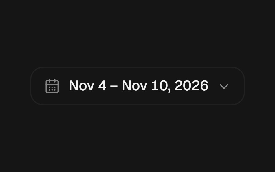
Composable date range picker with root, trigger, popover content, calendar, header, grid, summary, footer, clear and preset parts, plus a shared state hook. Compact inline and dropdown compositions, direct month and year selection, and full keyboard navigation.
- Library
- beUI
- Framework
- React
- Type
- component
- License
- MIT
- Install
npx shadcn@latest add @beui/date-range-picker- Files
components/motion/date-range-picker/context.tscomponents/motion/date-range-picker/date-utils.tscomponents/motion/date-range-picker/messages.tscomponents/motion/date-range-picker/types.tscomponents/motion/date-range-picker/use-date-range-picker.tscomponents/motion/date-range-picker.tsxcomponents/motion/popover-morph.tsxlib/ease.ts
- Source
- https://github.com/starc007/ui-components
Categories
- Date Picker Components
- React Date Picker Components
- Tailwind CSS Date Picker Components
- Animated Date Picker Components
- Date Range Picker Components
- React Date Range Picker Components
- Tailwind CSS Date Range Picker Components
- Input Components
- React Input Components
- Tailwind CSS Input Components
- Animated Input Components
- Select Components