Checkbox
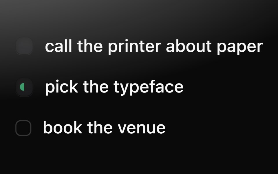
The dimple checkbox: a recessed well that turns into a dark pressed key with a drawn tick; doing (half green) and ghost (an inferred task's hollow ring) states.
- Library
- Metal UI
- Framework
- React + SwiftUI
- Type
- ui
- License
- MIT
- Dependencies
- @base-ui/react@^1.8.0
- Files
packages/metalui/src/components/checkbox/checkbox.tsxpackages/metalui/src/icons/TickGlyph.tsxpackages/metalui/src/icons/tick.generated.tspackages/metalui/src/motion/layout-effect.tspackages/metalui/src/motion/reduced.ts
- Source
- https://github.com/vijayksingh/metalui
Categories
- Checkbox Components
- React Checkbox Components
- Tailwind CSS Checkbox Components
- Input Components
- React Input Components
- Tailwind CSS Input Components