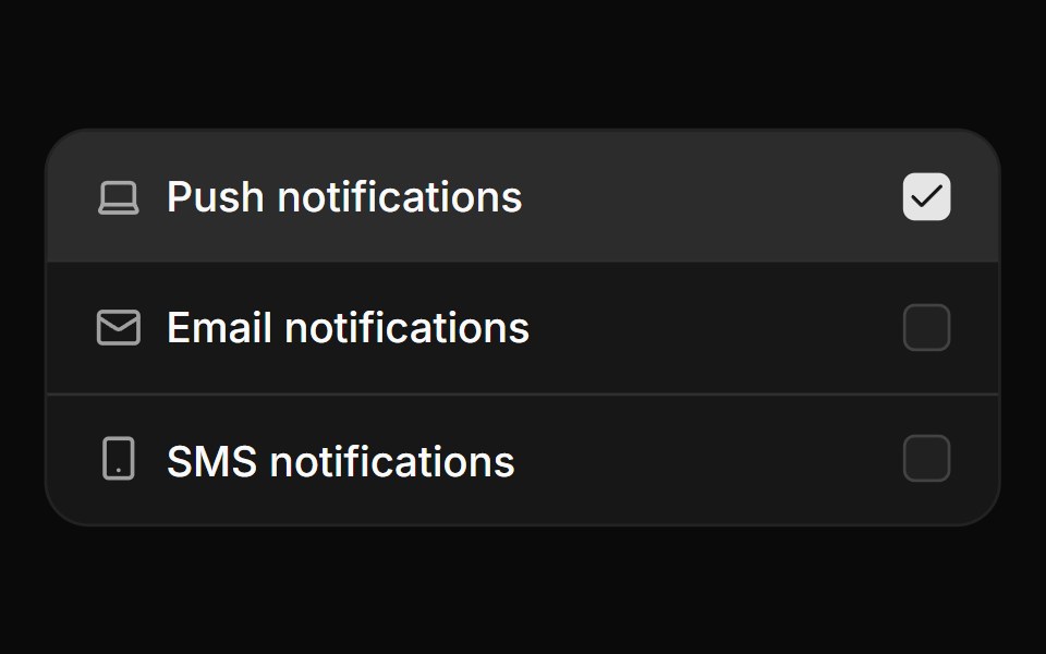
Card checkbox group with icons
Card checkbox group with icons.
- Library
- ReUI
- Framework
- React
- Type
- block
- License
- MIT
- Install
npx shadcn@latest add @reui/c-checkbox-12- Files
registry-reui/bases/radix/components/checkbox/c-checkbox-12.tsxregistry/bases/radix/ui/card.tsxregistry/bases/radix/ui/checkbox.tsxregistry/bases/radix/ui/field.tsxregistry/bases/radix/ui/separator.tsxapp/(create)/components/icon-placeholder.tsxlib/icon-library-store.tsregistry/icons/icon-lucide.tsx
- Source
- https://github.com/keenthemes/reui
Categories
- Checkbox Components
- React Checkbox Components
- Tailwind CSS Checkbox Components
- Input Components
- React Input Components
- Tailwind CSS Input Components
More from ReUI
- Basic checkbox with label
- Checkbox group in a frame
- Card checkbox group with icons
- Custom positioned checkbox
- Custom positioned checkbox
- Avatar based card checkbox
- Nested checkbox group
- Payment method card checkbox
- Checkbox with label and tooltip info
- Checkbox group with badge
- Disabled checkbox
- Checkbox with label and tooltip info