 Dev Design Library
shadcn/ui Color Picker Components
Dev Design Library indexes 6 shadcn/ui color picker components from 5 open-source UI libraries, with the most coming from FLX UI, Cult UI, Fluid Functionalism, Intent UI and Shadcn Space. Each one links to its page with the source code, a live preview where available, the library license and the install command. They follow the shadcn/ui conventions, so most install with the shadcn CLI and drop into a Tailwind project. Color picker components belong to the Inputs group.
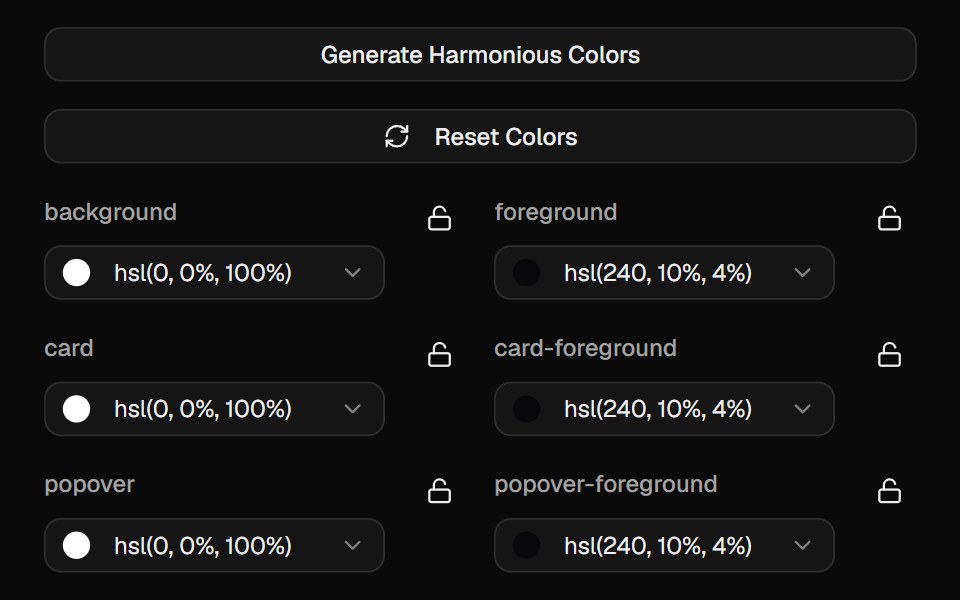 Color PickerCult UI · ReactInteractive color picker component with HSL support and preset colors
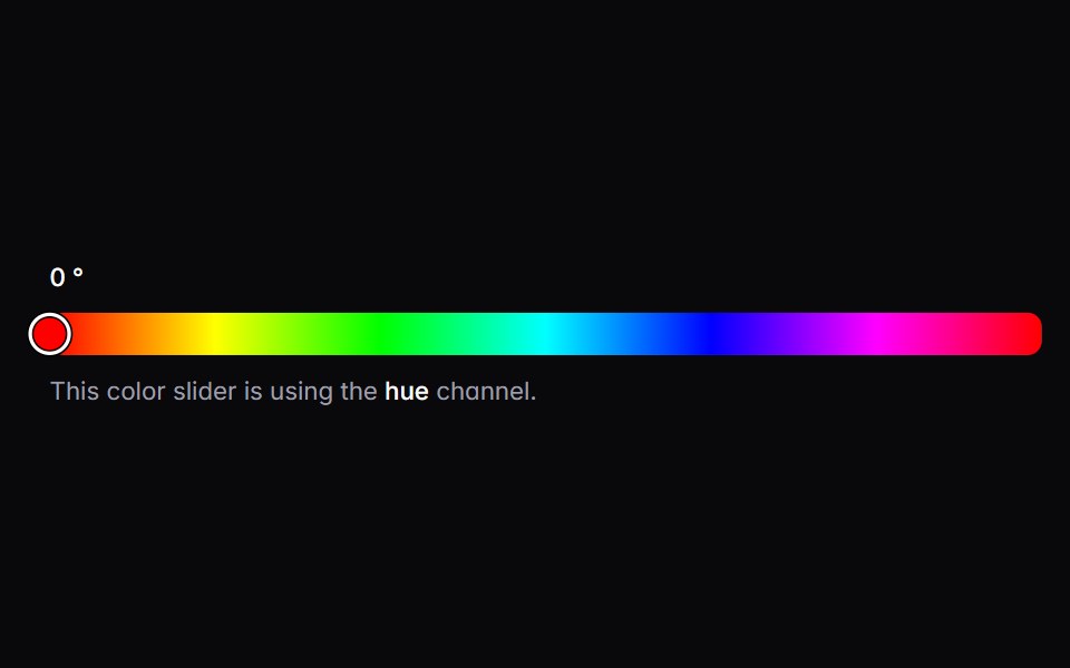 color-sliderIntent UI · Reactcolor-slider
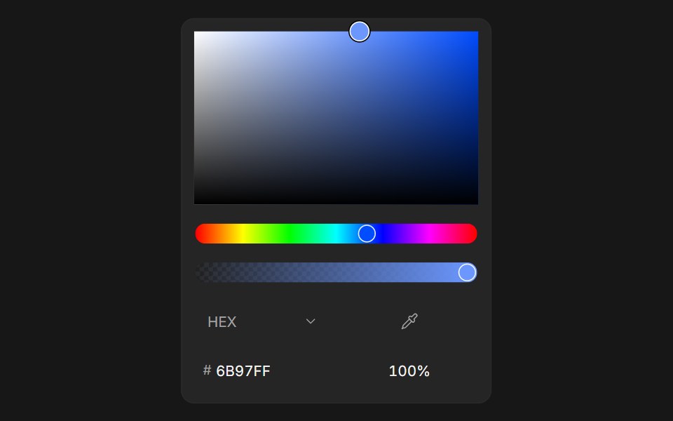 Color PickerFluid Functionalism · ReactColor picker with HEX, RGB, HSL, and OKLCH formats, alpha channel, optional swatches, and a popover trigger. Built on…
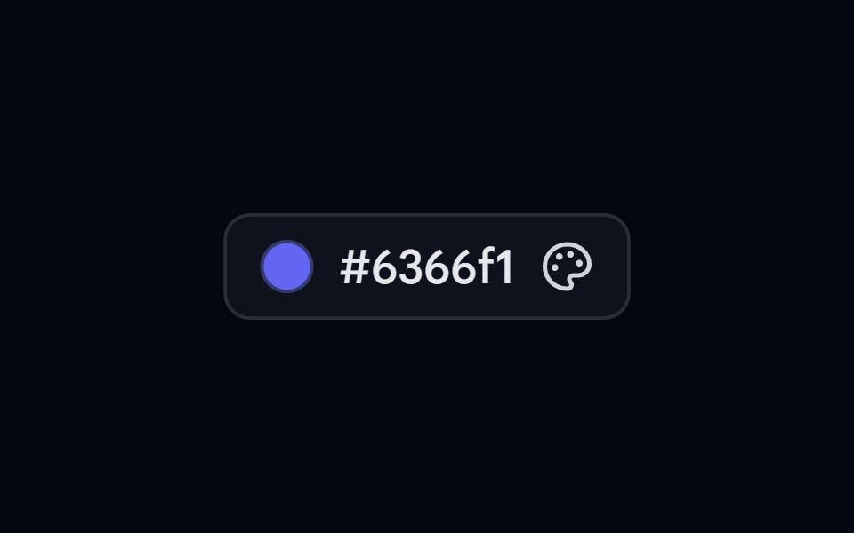 Popover 07 - Color PickerShadcn Space · ReactColor picker popover with preset swatches, a live hex input, and a copy-to-clipboard action.
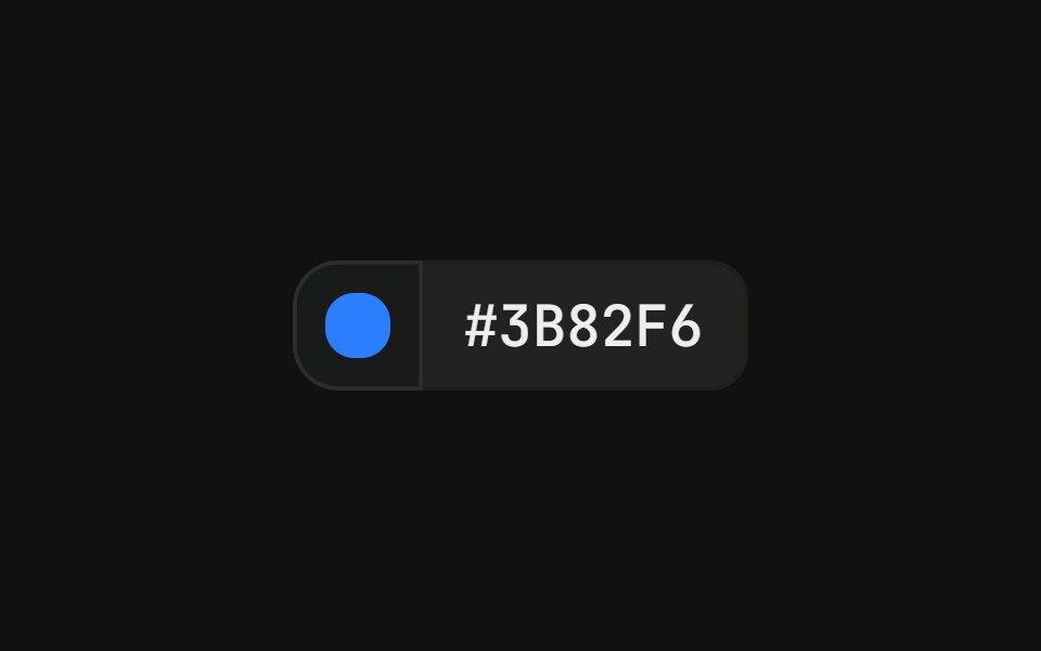 With popover swatchFLX UI · ReactColor swatch button that opens a grid of color swatches, paired with a hex value label in a merged-border row.
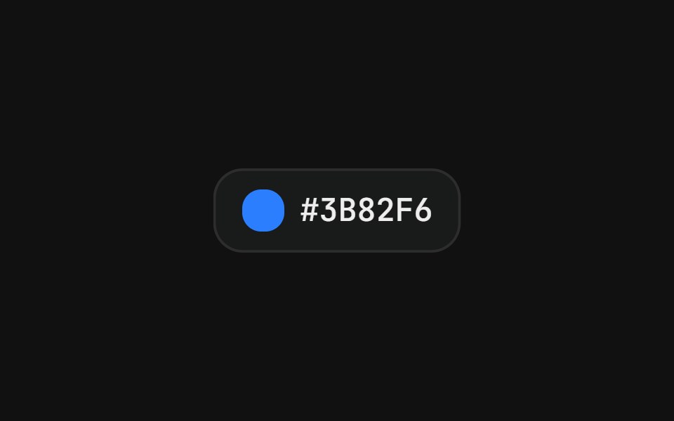 Color pickerFLX UI · ReactSwatch grid with a check icon on the active color.
Libraries with shadcn/ui color picker components
Related categories
- Color Picker Components
- React Color Picker Components
- Tailwind CSS Color Picker Components
- Animated Color Picker Components
- shadcn/ui Input Components
- shadcn/ui Form Components
- shadcn/ui Select Components
- shadcn/ui Text Input Components
- shadcn/ui Form Field Components
- shadcn/ui Switch Components
- shadcn/ui Textarea Components
- shadcn/ui Checkbox Components
- shadcn/ui OTP Input Components
- shadcn/ui Combobox Components
- shadcn/ui Date Picker Components
- shadcn/ui Radio Components
- shadcn/ui Login Form Components
- shadcn/ui Search Input Components
- shadcn/ui File Upload Components
- shadcn/ui Slider Components