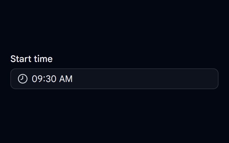
Time Picker 01 - Scroll Columns
Popover time picker with scrollable hour, minute, and AM or PM columns.
- Library
- Shadcn Space
- Framework
- React
- Type
- component
- License
- MIT
- Dependencies
- lucide-react
- Files
src/components/shadcn-space/time-picker/time-picker-01.tsxsrc/components/ui/button.tsxsrc/components/ui/label.tsxsrc/components/ui/popover.tsxsrc/components/ui/scroll-area.tsxsrc/lib/utils.tssrc/config.ts
- Source
- https://github.com/shadcnspace/shadcnspace
Categories
- Input Components
- React Input Components
- Tailwind CSS Input Components
- shadcn/ui Input Components
- Select Components
- React Select Components
- Tailwind CSS Select Components
- shadcn/ui Select Components
- Time Picker Components
- Tailwind CSS Time Picker Components
- shadcn/ui Time Picker Components
More from Shadcn Space
- Autocomplete-01 - Default
- Autocomplete-02 - Size variants
- Autocomplete-03 - Vanish Animation
- Button Group 12 - Action Dropdown
- Calendar 05 - Month and Year Select
- Calendar 09 - Custom Range Select
- Combobox 04 - Timezone
- Combobox 05 - Users
- Combobox 06 - With Flag
- Combobox 07 - Creatable
- Date Picker 01 - Data & Time Picker
- Date Picker 02 - Date Range