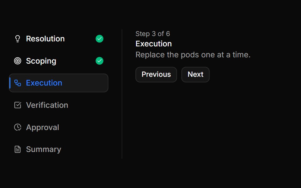
Stepper with side rail and step icons
6 incident response steps as rows with their own icons, a blue bar on the current row, green checks on done rows and the step detail beside them.
- Library
- ReUI
- Framework
- React
- Type
- block
- License
- MIT
- Install
npx shadcn@latest add @reui/c-stepper-40- Files
registry-reui/bases/radix/components/stepper/c-stepper-40.tsxregistry-reui/bases/radix/reui/frame.tsxregistry-reui/bases/radix/reui/stepper.tsxregistry/bases/radix/ui/button.tsxregistry/bases/radix/ui/separator.tsxapp/(create)/components/icon-placeholder.tsxlib/icon-library-store.tsregistry/icons/icon-lucide.tsx
- Source
- https://github.com/keenthemes/reui
Categories
- Navigation Components
- React Navigation Components
- Tailwind CSS Navigation Components
- Stepper Components
- React Stepper Components
- Tailwind CSS Stepper Components
More from ReUI
- Guided workspace setup
- Multi-select answers
- A written answer beside the choices
- Segmented progress with step labels
- An optional question with skip
- A rule that sends you back
- A branch that appears when it applies
- Basic stepper
- Stepper with content for each step
- Stepper with progress bar and titles
- Stepper with segmented progress bar
- Stepper with vertical orientation and descriptions