 Dev Design Library
Tailwind CSS Stepper Components
Dev Design Library indexes 148 Tailwind CSS stepper components from 33 open-source UI libraries, with the most coming from ReUI, Origin UI, Tremor Blocks, Watermelon UI and Shadcn Space. Each one links to its page with the source code, a live preview where available, the library license and the install command. Every library in this list styles its components with Tailwind CSS utility classes. Stepper components belong to the Navigation group.
Showing 120 of 148, a mix from every library. Open a library to see all of its components.
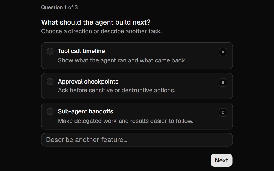 Questionnaireshadcn/ui · ReactA multi-step questionnaire with single-choice, multiple-choice, freeform, and skippable questions.
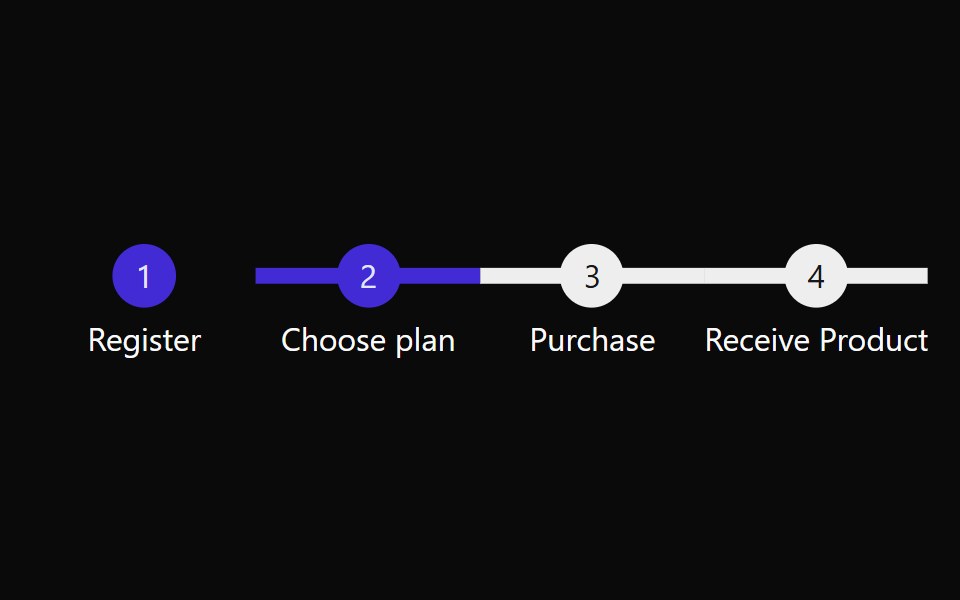 StepsdaisyUI · CSS (Tailwind)
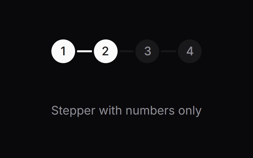 Comp 513Origin UI · React
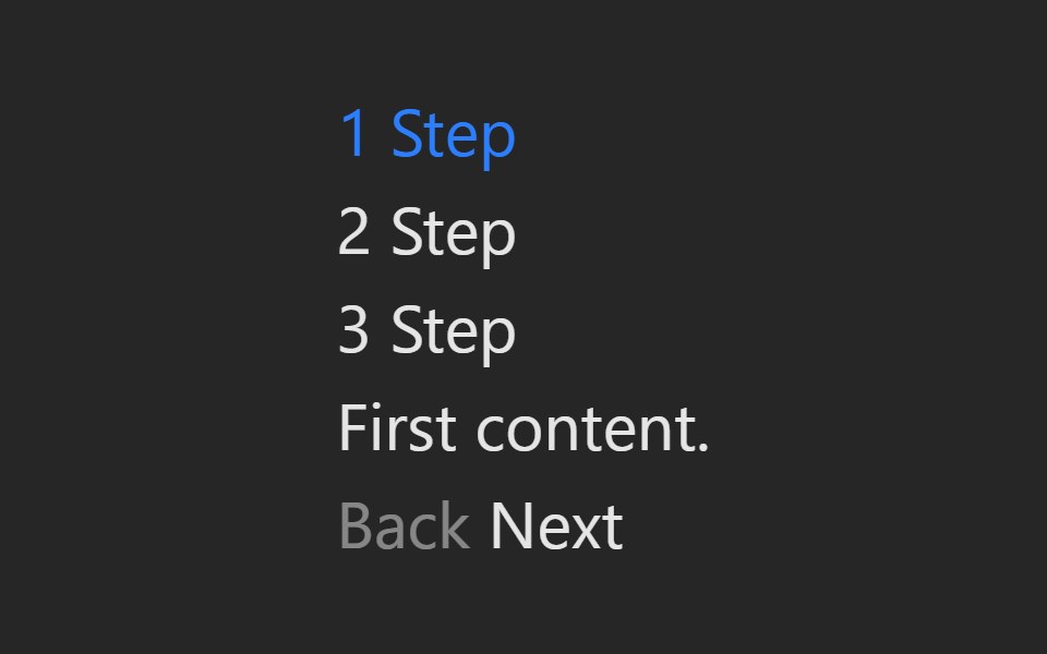 StepperPreline UI · JavaScript (HTML + Tailwind)
 OnboardingCult UI · ReactComposable multi-step onboarding primitives: Onboarding root with step navigation, FeatureCarousel, ChoiceGroup radio…
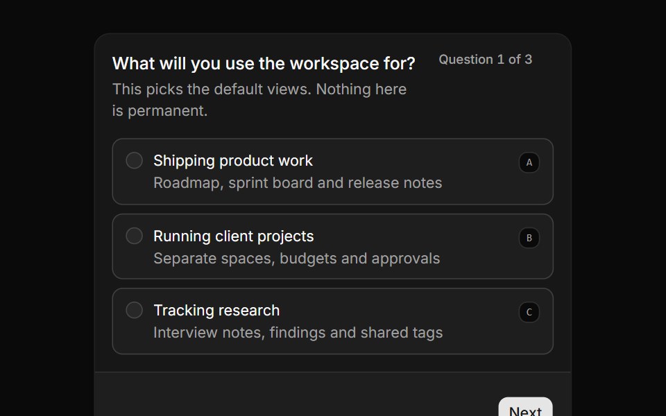 Guided workspace setupReUI · ReactThree required questions in a card, with progress, navigation and a summary on submit.
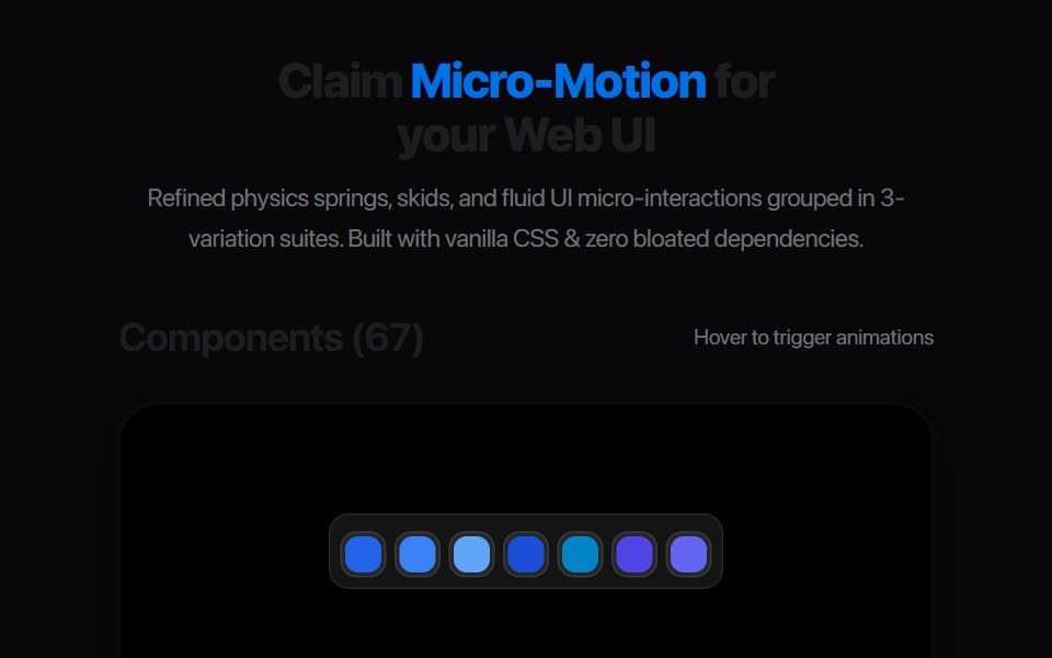 Progress StepperAmicro Micro Transitions · ReactHorizontal step line (STEP 1 → STEP 2 → STEP 3) with animated fill bar.
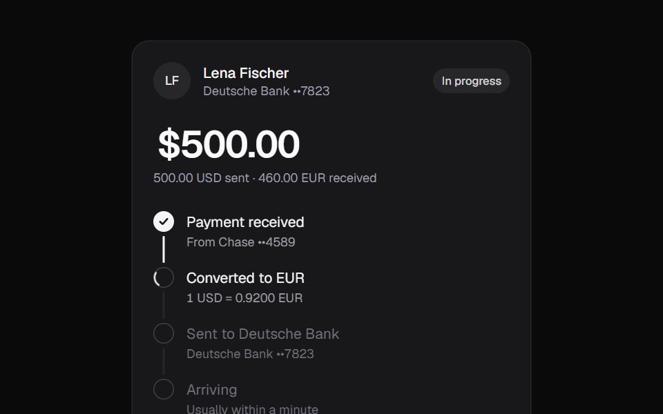 Currency TransferKokonut UI · ReactTransfer tracker that converts the amount in place, walks through each step on a filling rail and ends with a copyable…
 Adaptive StepperbeUI · ReactComposable numeric stepper whose fixed footprint adapts at its minimum and maximum while the value rolls between steps.
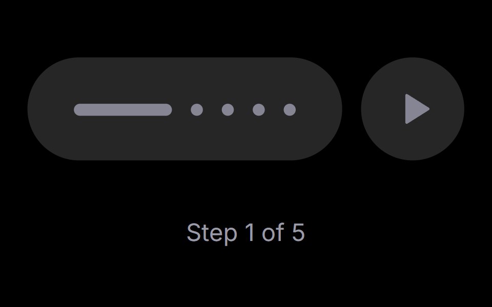 Step PlayerRare UI · ReactAn iOS-style stepped progress track with a play, pause and replay control. The active step stretches into a bar that…
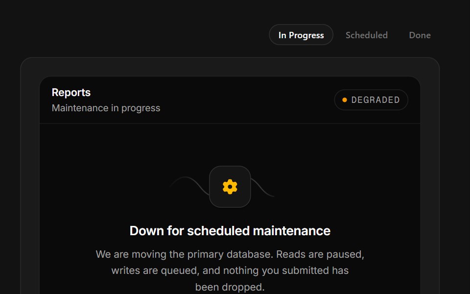 Scheduled MaintenanceSpectrum UI · ReactA maintenance window with a ticking ETA, a stage rail and a notify-me field.
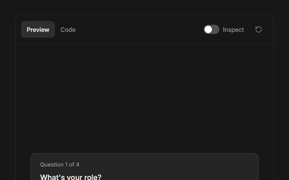 Ask User QuestionsFluid Functionalism · ReactStepped question flow with numbered options, keyboard shortcuts (1–9), single or multi-select, inline 'other' text…
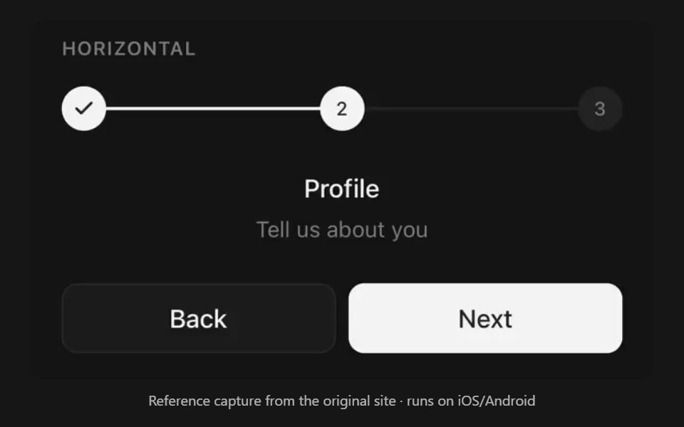 StepsPanel UI · React NativeStepper for multi-step flows.
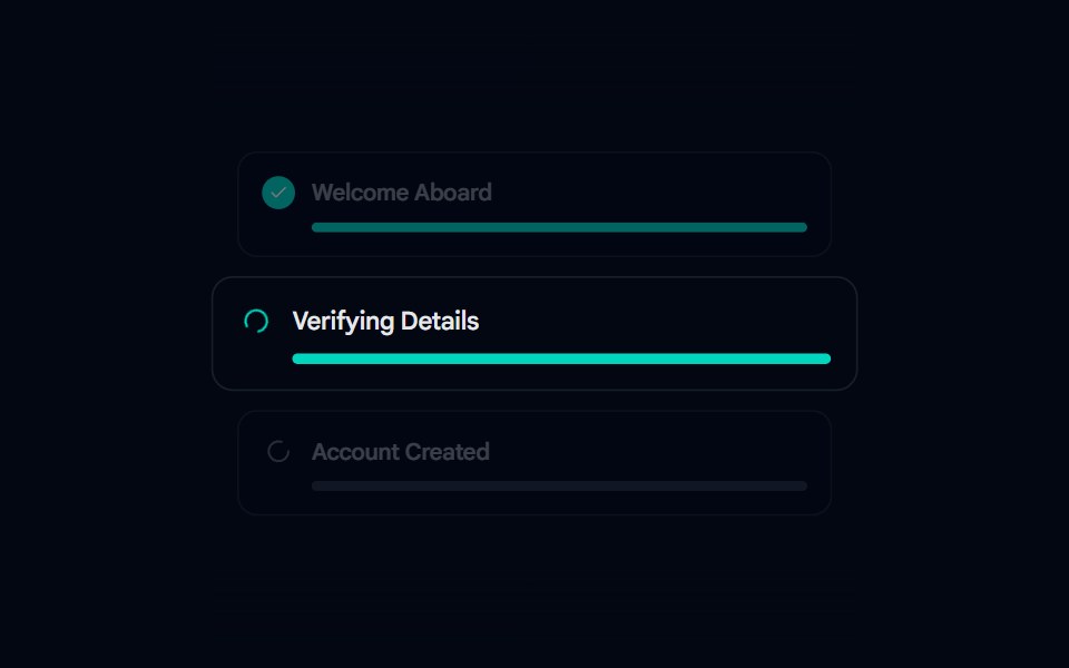 Animated List 02 - Setup StepsShadcn Space · ReactSetup Steps component
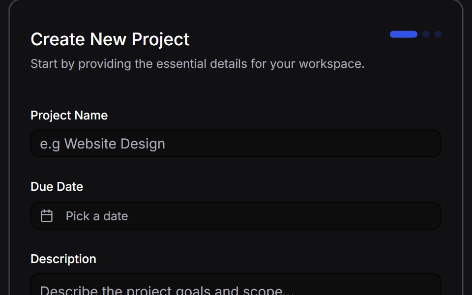 Multi Step Formuselayouts · ReactA dynamic, animated multi-step form with validation.
 Onboarding Feed 01Tremor Blocks · React
 Feature Fourteencnblocks · SvelteFeature section with numbered steps
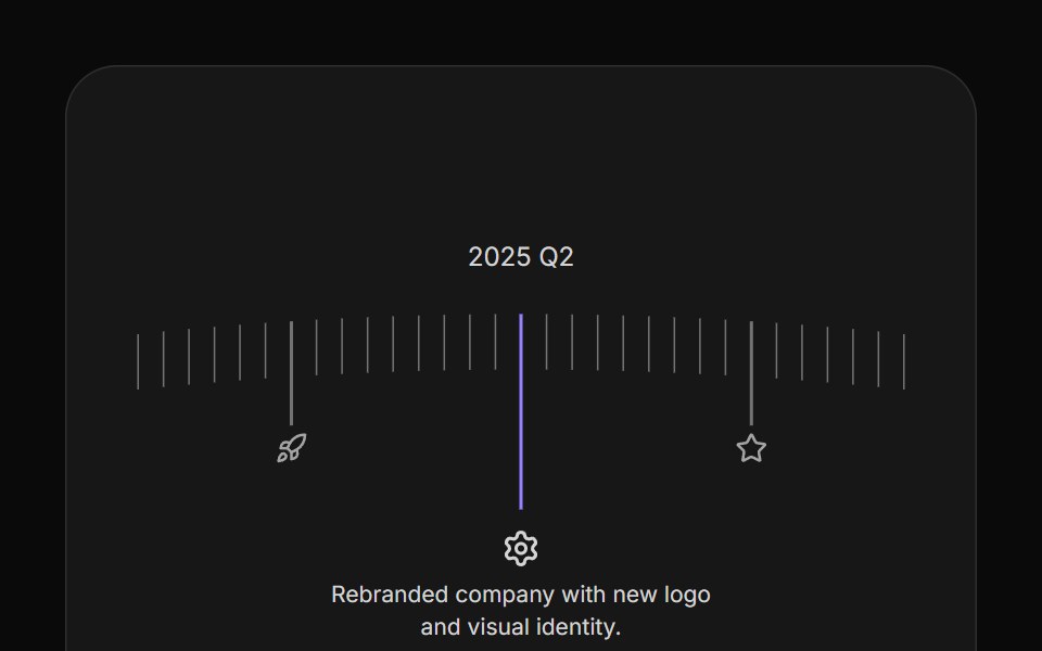 Arc TimelineAnimations (Svelte) · SvelteA curved timeline that rotates through milestone steps with clickable markers, icons, and configurable spacing.
 Steps 01Oxbow UI · Astro
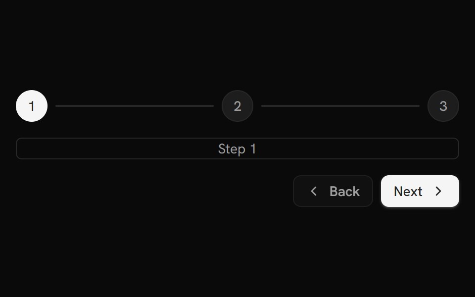 StepsShark UI · ReactSteps in a wizard-like format.
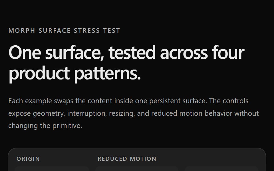 Prototype Morph SurfaceSona UI · ReactStress tests for the Morph Surface primitive. Página de testes de estresse do primitivo Morph Surface.
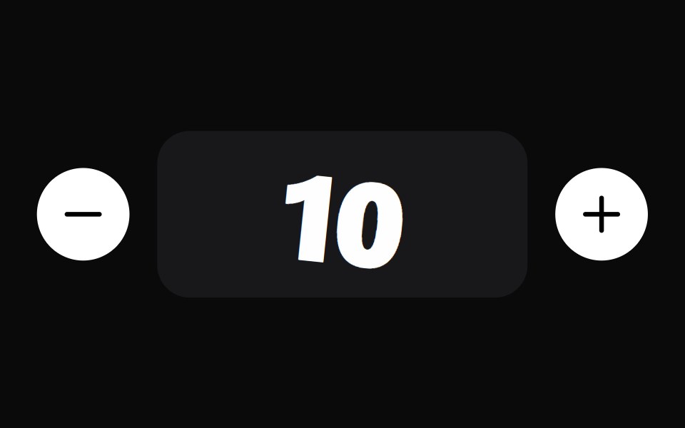 Pop StepperWatermelon UI · ReactStep indicator whose steps pop with a spring as they complete.
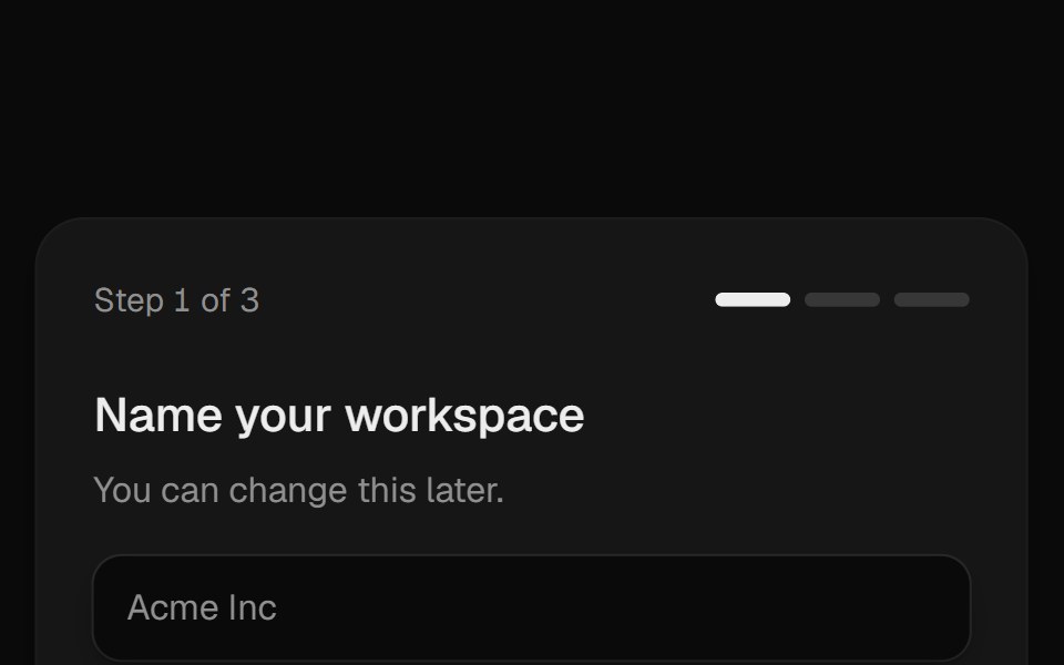 Multi Step FormUI Lab · ReactSlides between steps while the card grows around each one.
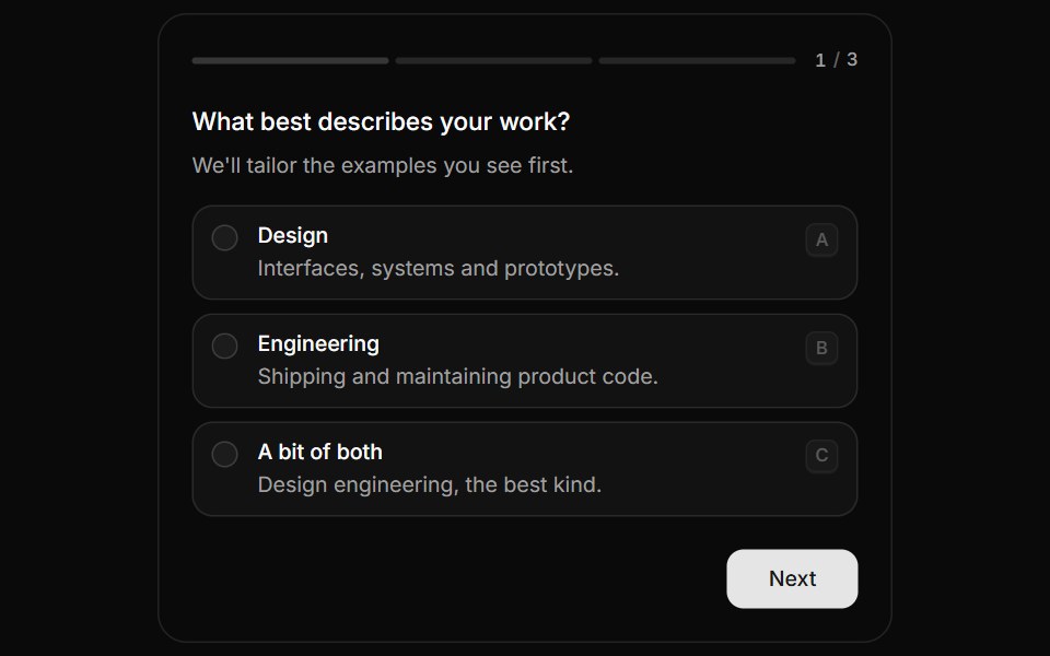 QuestionnaireHextaUI · ReactA step-by-step form that moves between questions with a sense of direction, shows real progress and answers from the…
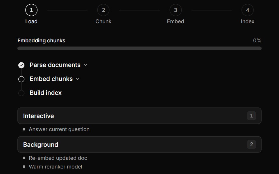 Multi-Step Pipeline TrackerLocalMode · ReactProgress surfaces for local workflows: a horizontal numbered-step indicator (active/completed/pending), a…
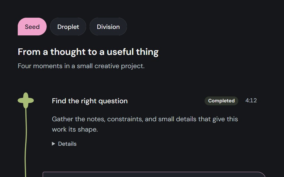 Milestone pathCojeev UI · ReactFollow caller-owned progress or a running workflow as a connected Journey, a scrollable Sequence or a compact…
 Onboarding welcomeFLX UI · ReactCompact hero image, title, and description; dual CTAs.
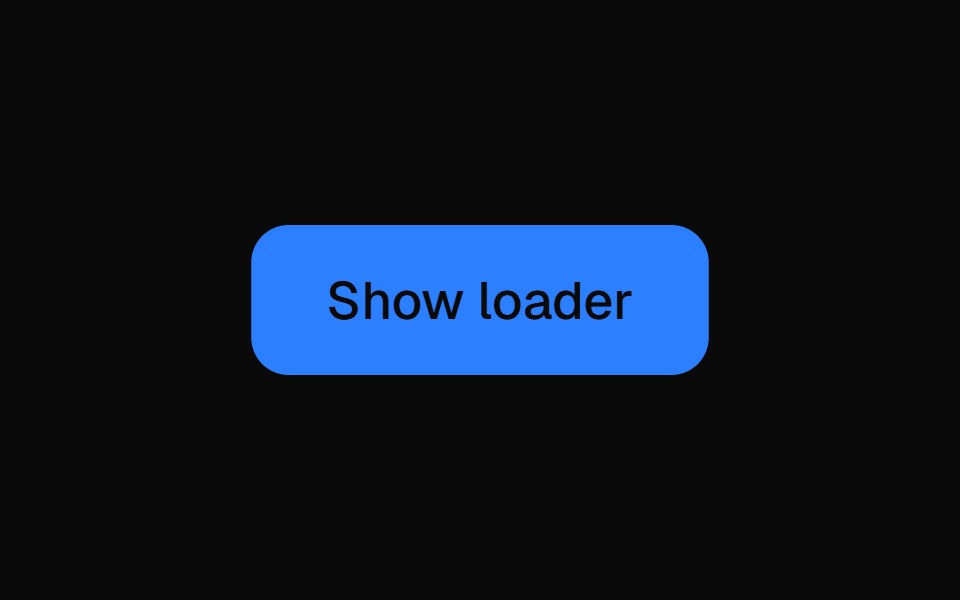 Multi Step LoaderVelora UI · ReactFull-screen overlay that ticks through a list of steps, keeping the active one centred.
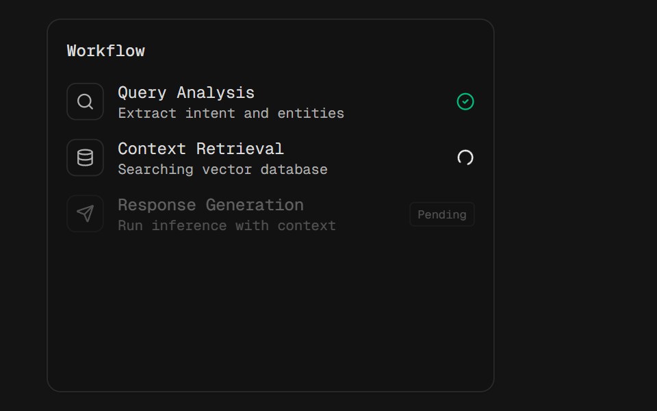 Agent WorkflowD2Studio UI · ReactA three-step agent workflow, caught mid-run: one step done, one spinning, one still pending. Each row dims as a whole…
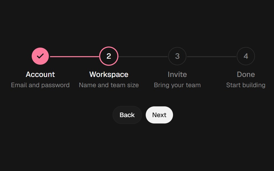 StepperEaseUI · ReactNumbered steps joined by a line that fills as you move forward. Finished steps trade their number for a check and can…
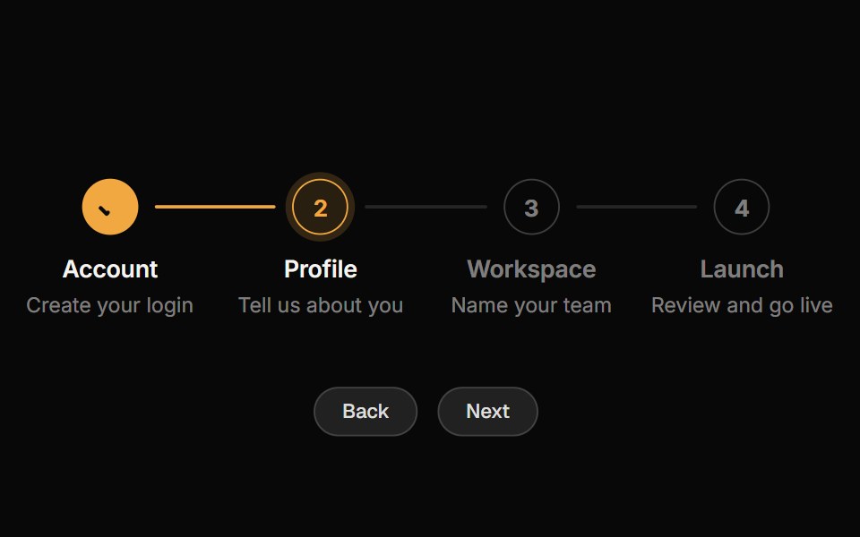 StepperReactFrame · ReactAn accessible step indicator with horizontal and vertical layouts, numbered and minimal variants, animated progress…
 Multi Step LoaderAceternity UI · React
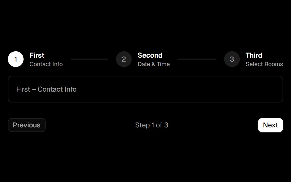 Stepsark-cn · ReactA shadcn-style steps component built with Ark UI primitives.
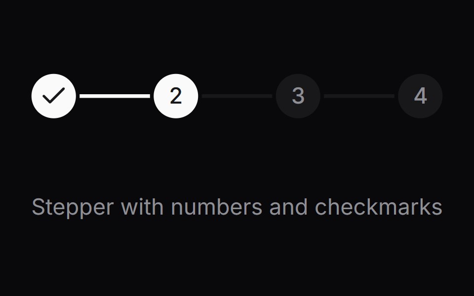 Comp 514Origin UI · React
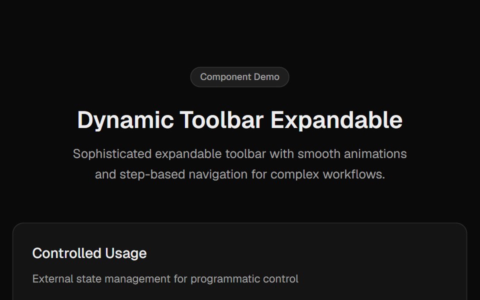 Toolbar ExpandableCult UI · ReactExpandable toolbar component with step-based navigation, smooth animations, and enhanced scrolling
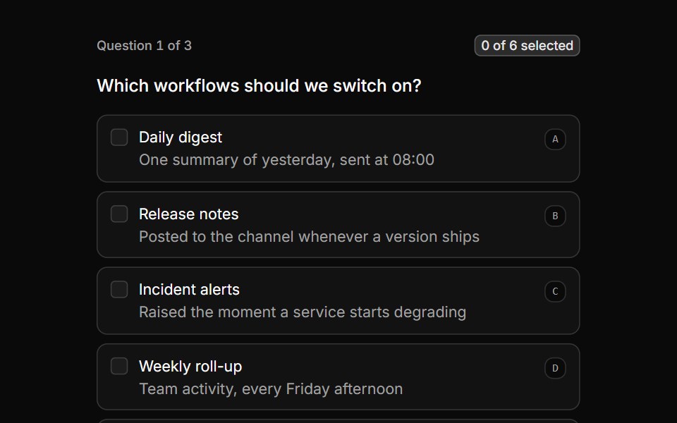 Multi-select answersReUI · ReactA checkbox question that accepts several answers, with a live count and a chip summary.
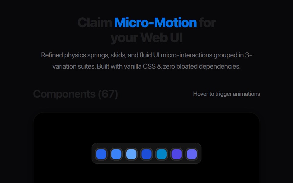 Segmented Step BarAmicro Micro Transitions · ReactBattery-style multi-segment discrete progress bar with stepped fill.
 Multiple Step Form DemoSpectrum UI · Reactcomponent for the Multiple Step Form Demo
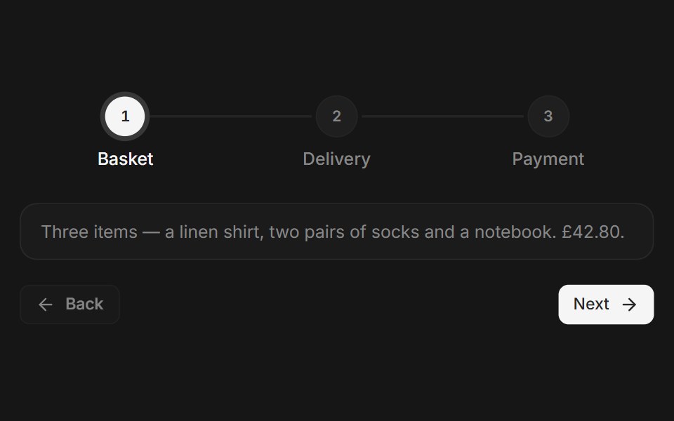 Web StepsPanel UI · React NativeA step indicator for multi-step flows such as checkout, with back and next.
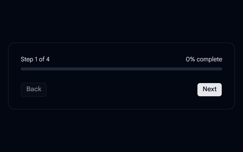 Progress 02 - Onboarding StepperShadcn Space · ReactA clean onboarding progress tracker with step navigation and percentage completion.
 Onboarding Feed 02Tremor Blocks · React
 Steps 02Oxbow UI · Astro
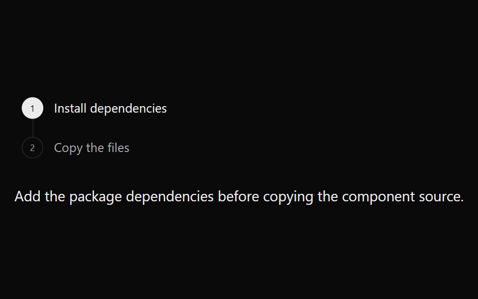 StepperSona UI · ReactA composable step navigation pattern for guiding people through a small, ordered workflow.
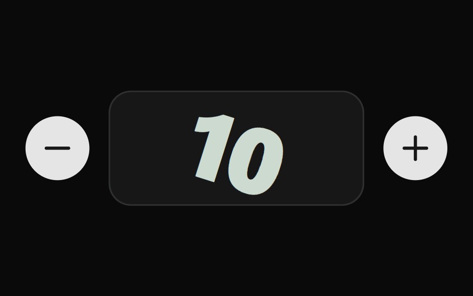 Pop Stepper BaseWatermelon UI · ReactStep indicator whose steps pop with a spring as they complete.
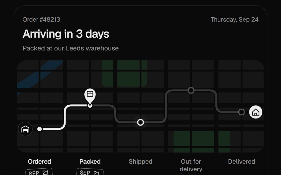 Order TrackerUI Lab · ReactDrives a parcel across a street map to your door and stamps each stop as it arrives.
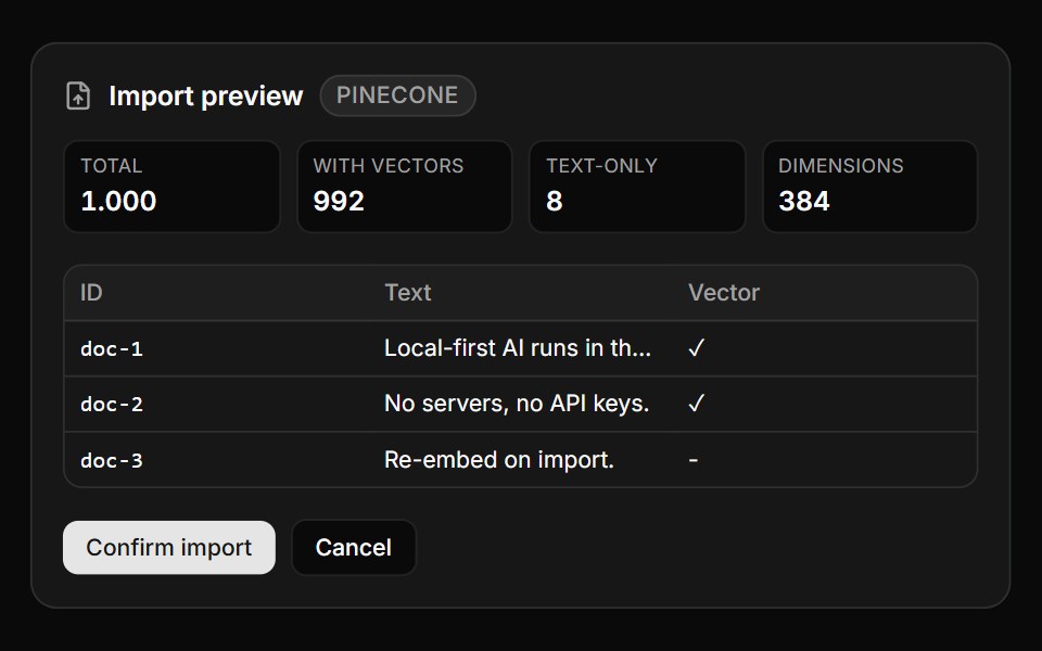 Vector Import FlowLocalMode · ReactA guarded vector-import flow for useImportExport: a preview panel (detected-format badge, total / with-vectors /…
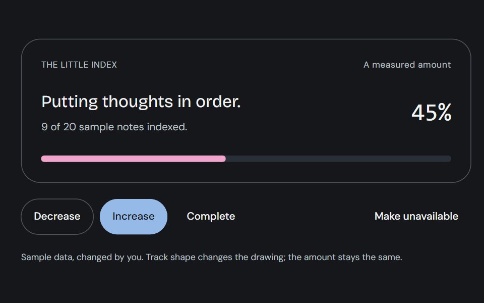 ProgressCojeev UI · ReactOne measured amount, explained as an inline task, a small report or connected milestones—with independent organic…
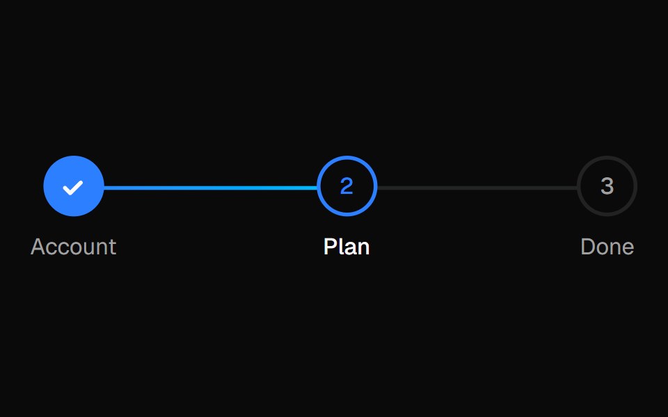 StepperVelora UI · ReactProgress indicator for multi-step forms and checkouts.
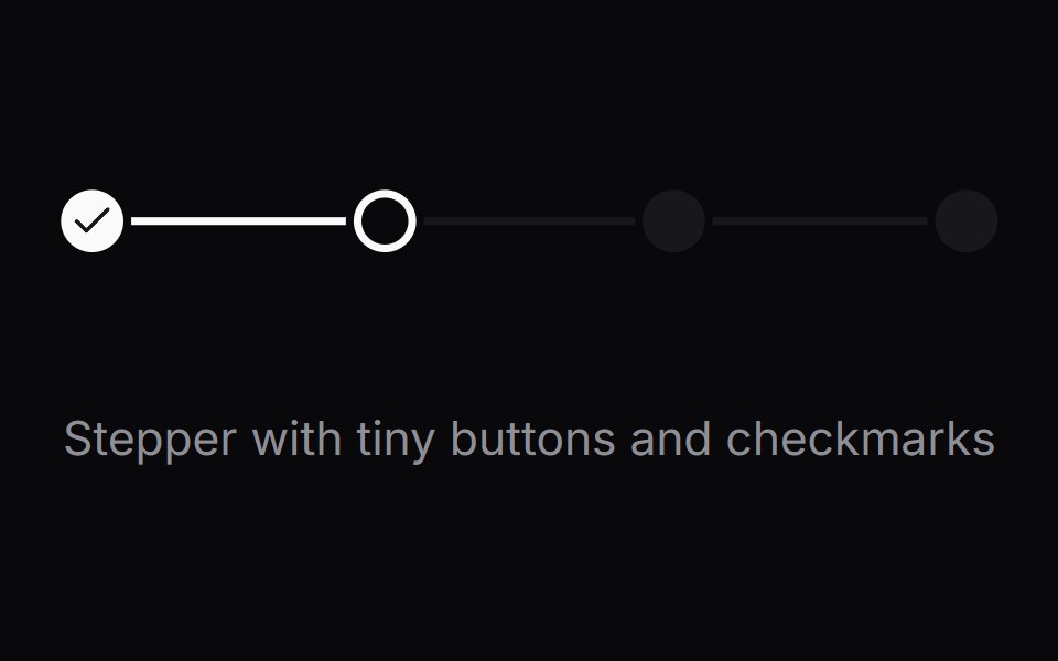 Comp 515Origin UI · React
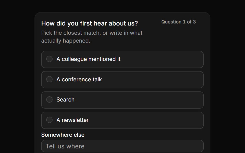 A written answer beside the choicesReUI · ReactA text input sitting with the fixed choices, so an answer can be typed instead of picked.
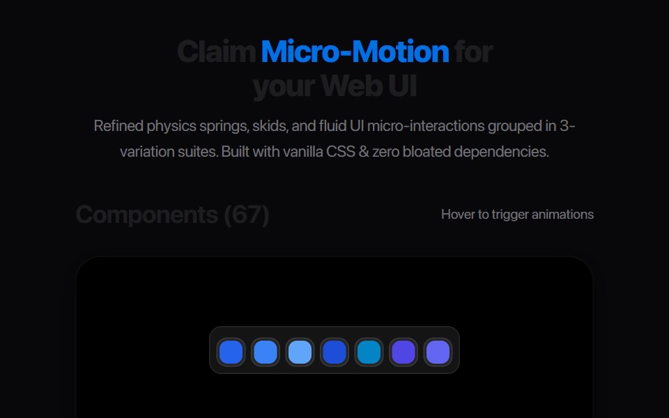 Segmented Stepper DotsAmicro Micro Transitions · ReactPill-morphing connected page dots with spring expansion indicator.
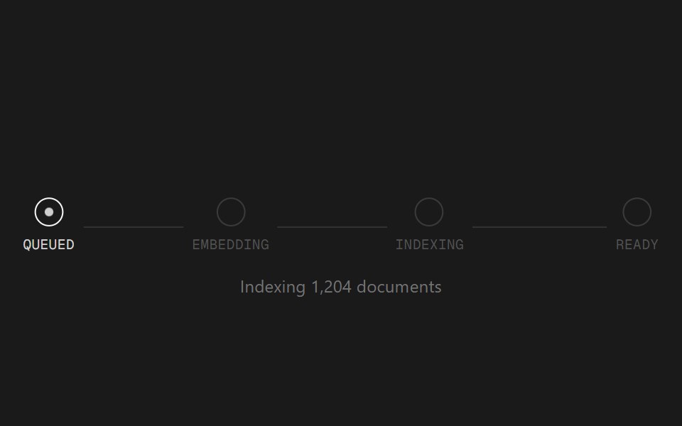 Status TrackerSpectrum UI · ReactA staged progress tracker for long-running AI jobs.
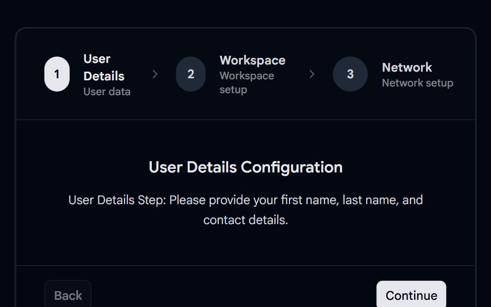 Stepper 02 - Multi-Step WizardsShadcn Space · ReactMulti-step configuration stepper wizard with distinct tabs for user details, workspace set up, and network options.
 Onboarding Feed 03Tremor Blocks · React
 Steps 03Oxbow UI · Astro
 Create CommunityWatermelon UI · React
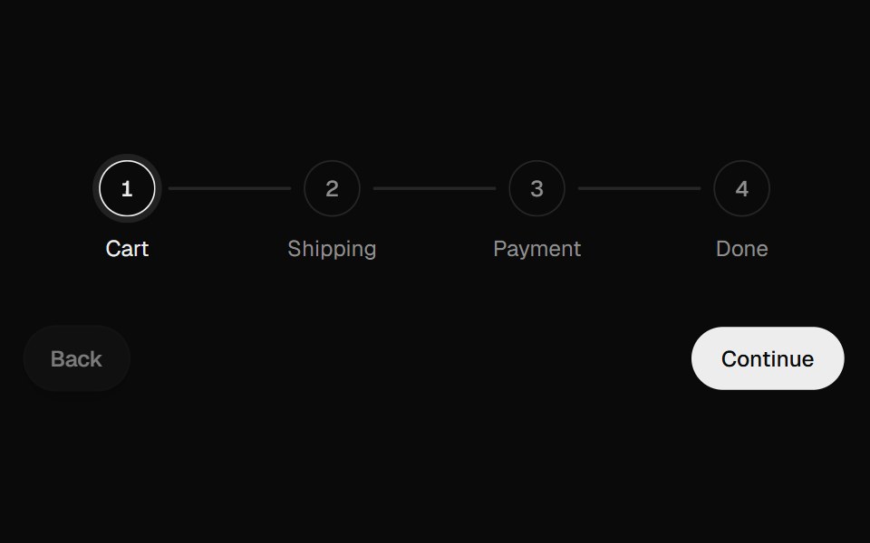 Progress StepperUI Lab · ReactFills the line toward the next step and unfills it in reverse.
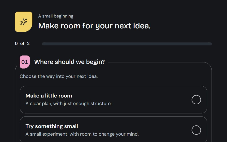 QuestionnaireCojeev UI · ReactA little guided brief: open questions, a focused journey or a two-column worksheet with living choice marks and honest…
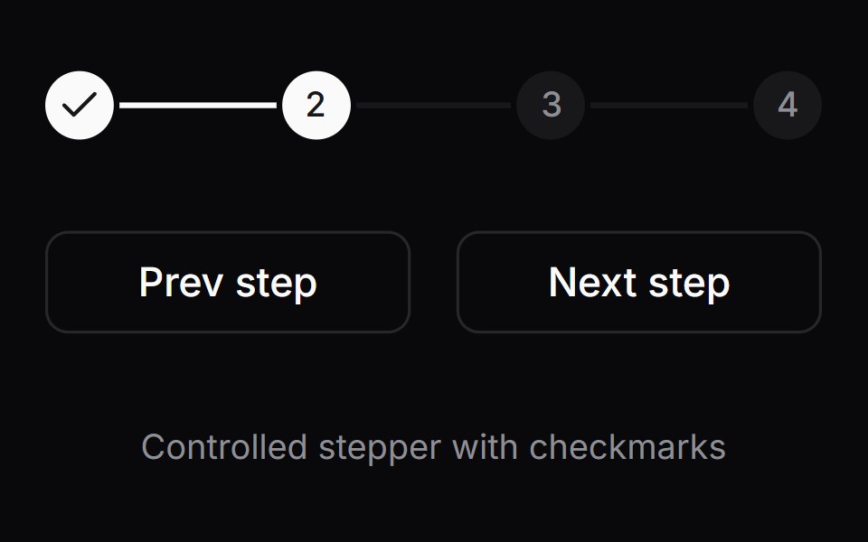 Comp 516Origin UI · React
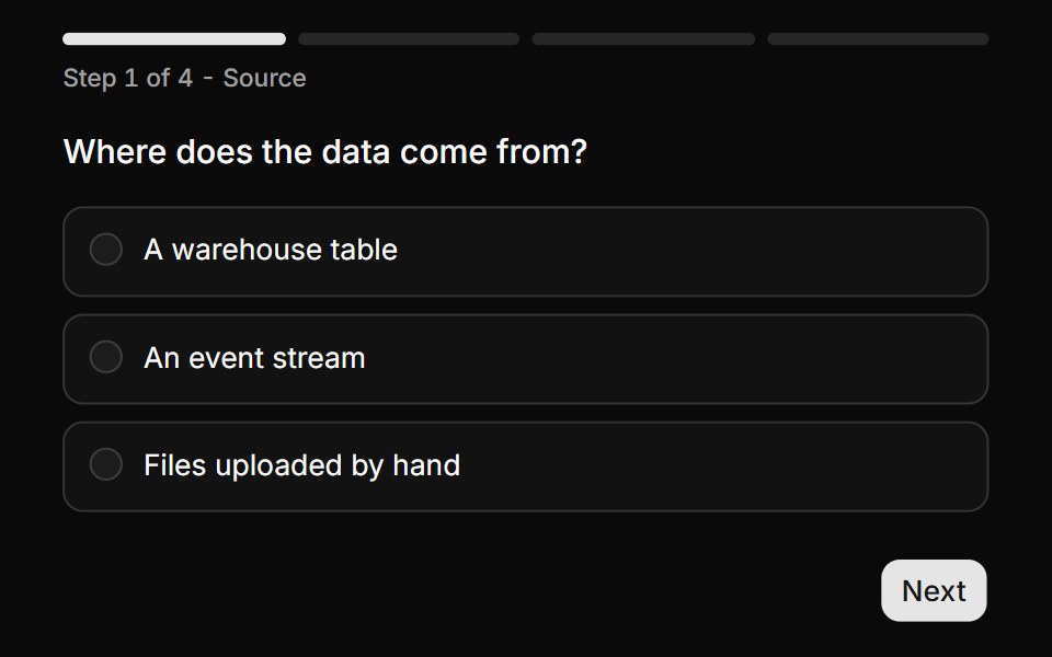 Segmented progress with step labelsReUI · ReactA custom progress bar built from the progress render state, over a four question flow.
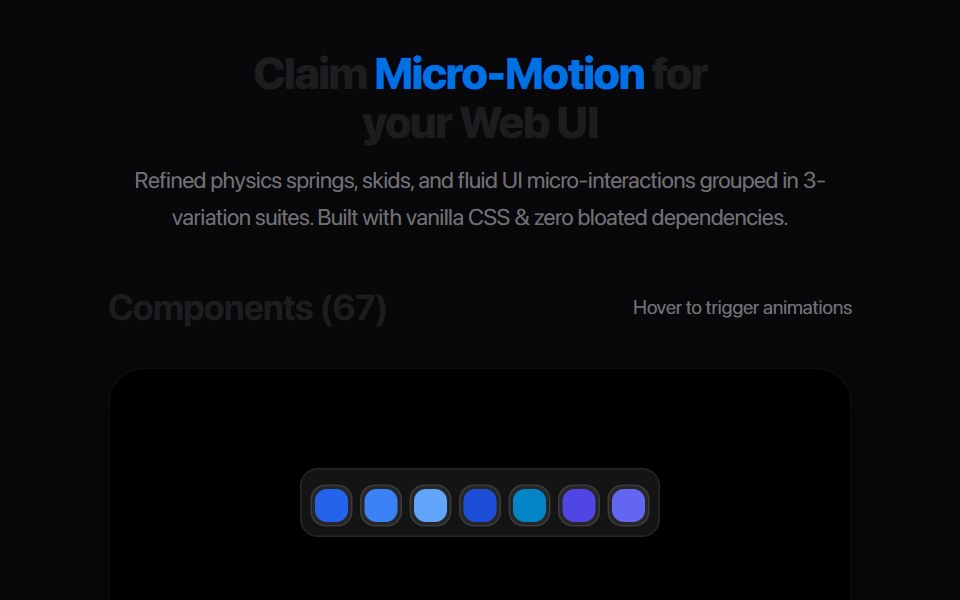 Gear Tooth StepAmicro Micro Transitions · React
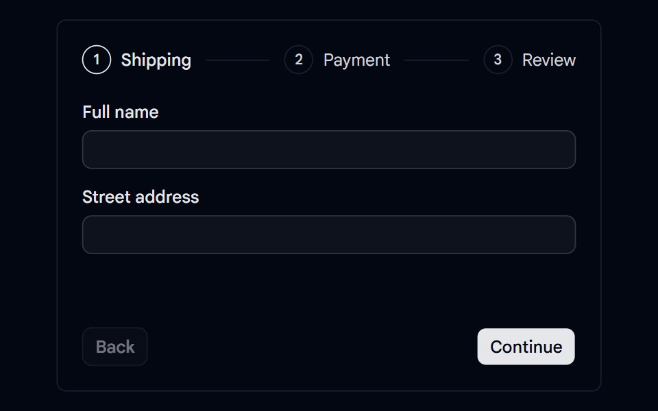 Stepper 05 - Checkout with ValidationShadcn Space · ReactCheckout stepper for shipping, payment, and review with per-step validation, error indicators, card formatting, and an…
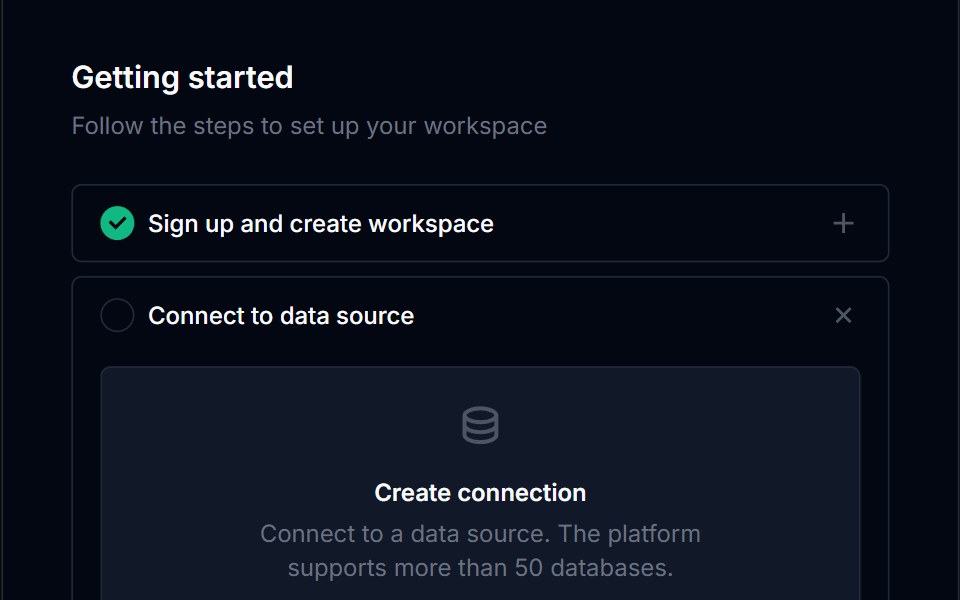 Onboarding Feed 04Tremor Blocks · React
 Create Community BaseWatermelon UI · React
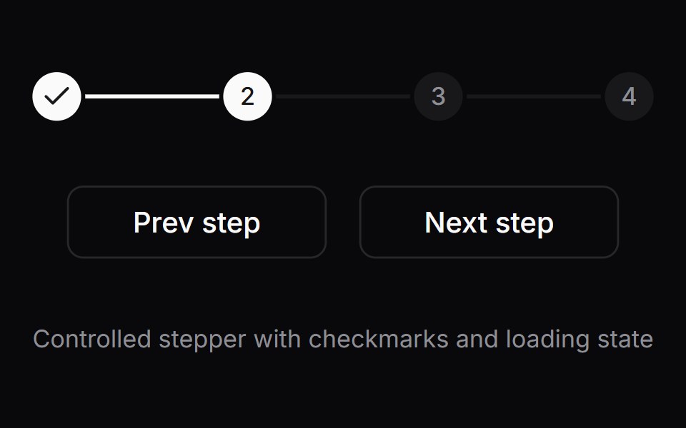 Comp 517Origin UI · React
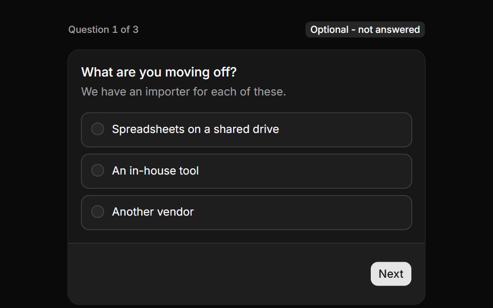 An optional question with skipReUI · ReactA question the visitor may skip on purpose, with the skipped state carried into the summary.
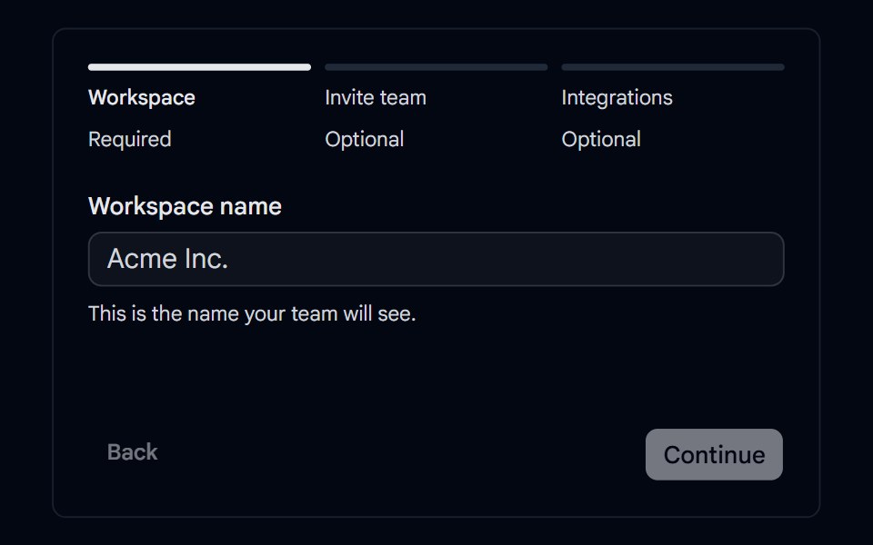 Stepper 07 - Optional & Skipped StepsShadcn Space · ReactWorkspace setup stepper with required and optional steps, a skipped state, and a summary that links back to skipped…
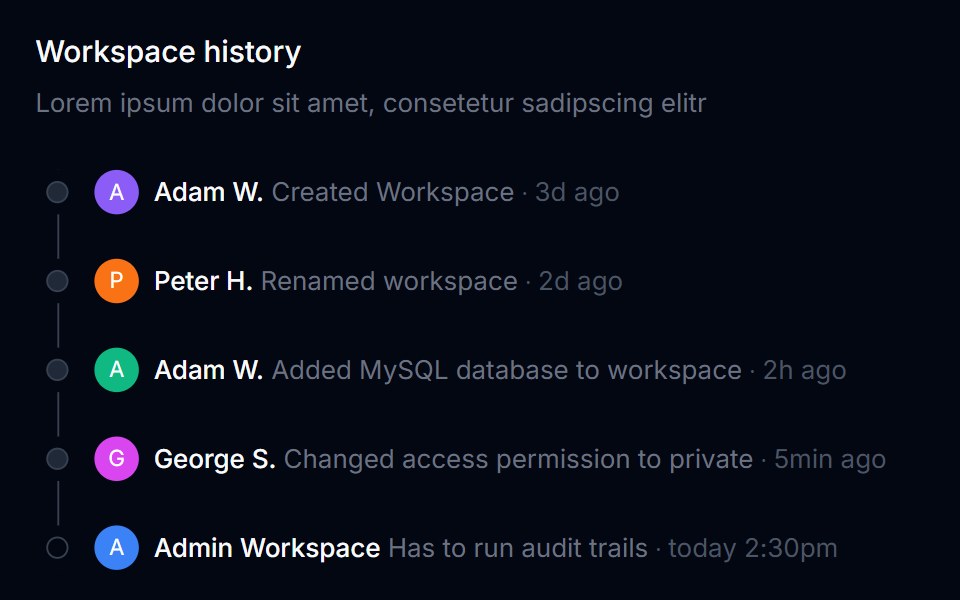 Onboarding Feed 05Tremor Blocks · React
 Step IndicatorWatermelon UI · React
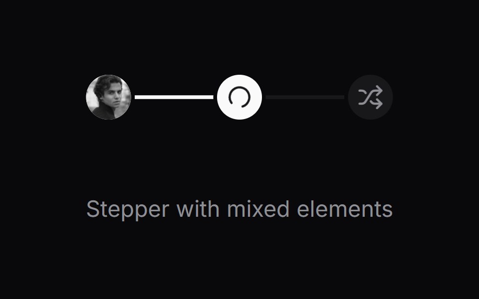 Comp 518Origin UI · React
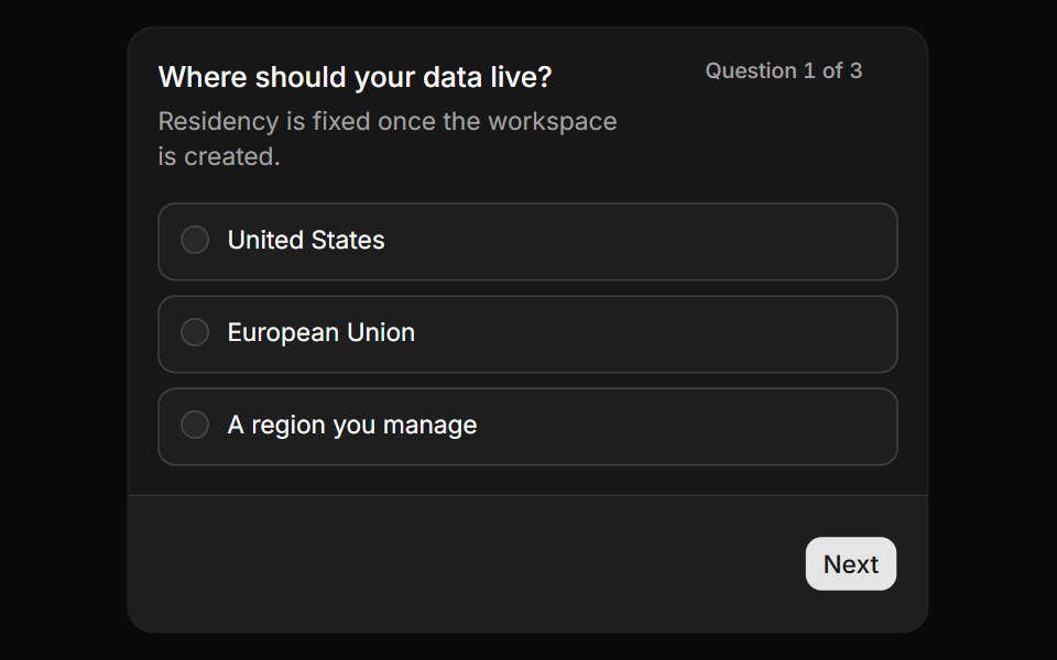 A rule that sends you backReUI · ReactA cross-question rule checked on submit, returning the flow to the question that broke it.
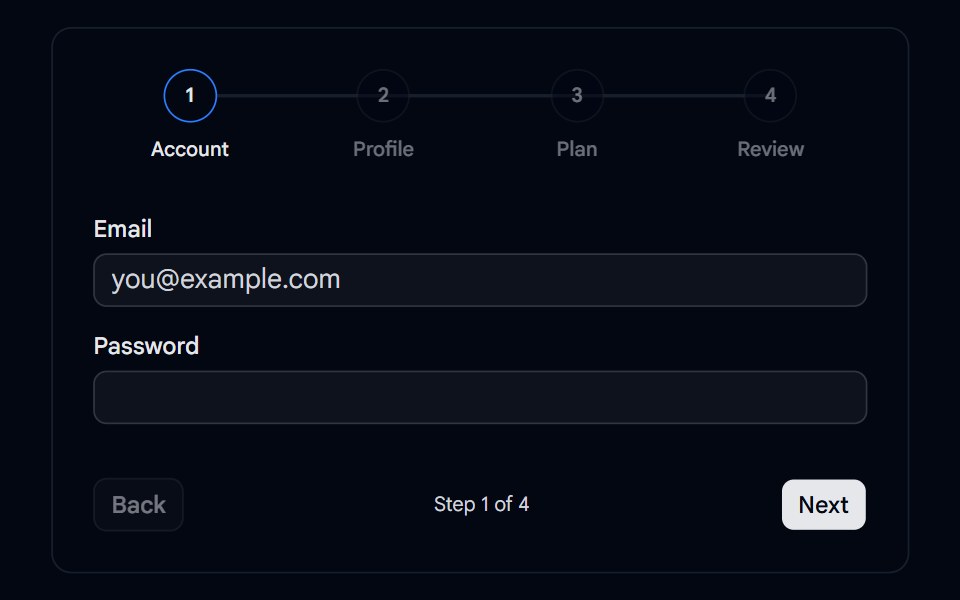 Tabs 15 - Wizard StepsShadcn Space · ReactMulti-step wizard tabs with numbered steps, an animated progress line, and Back and Next navigation.
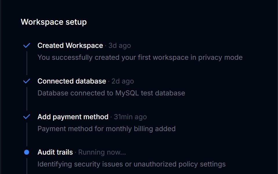 Onboarding Feed 06Tremor Blocks · React
 Step Indicator BaseWatermelon UI · React
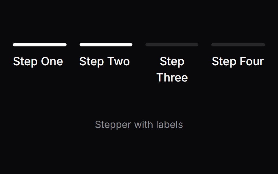 Comp 519Origin UI · React
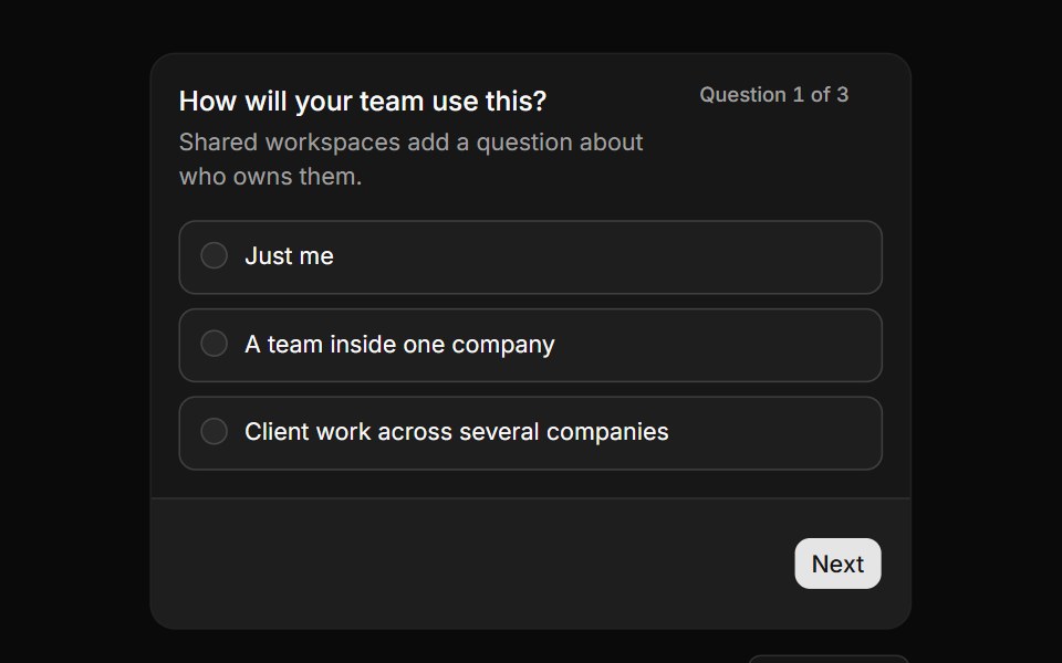 A branch that appears when it appliesReUI · ReactA question that only joins the flow after an earlier answer, with avatars, reset and a summary.
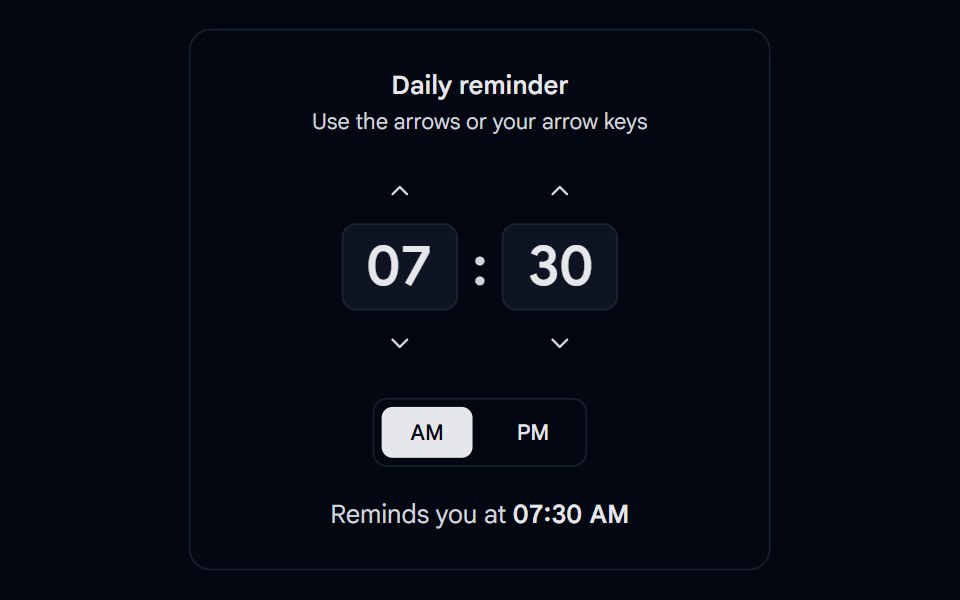 Time Picker 05 - StepperShadcn Space · ReactHour and minute steppers with up and down buttons, arrow key support, 15 minute steps, and an AM or PM toggle
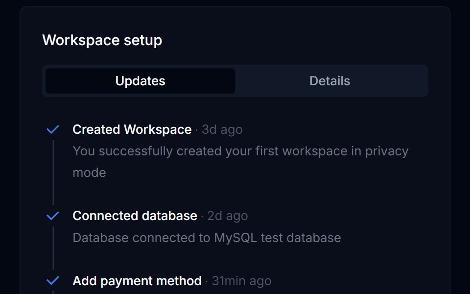 Onboarding Feed 07Tremor Blocks · React
 Step PagerWatermelon UI · React
 Comp 520Origin UI · React
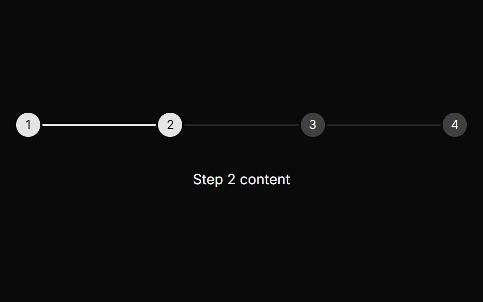 Basic stepperReUI · ReactBasic stepper
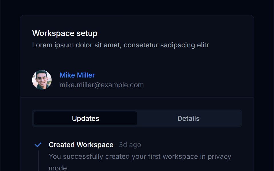 Onboarding Feed 08Tremor Blocks · React
 Step Pager BaseWatermelon UI · React
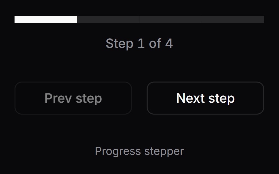 Comp 521Origin UI · React
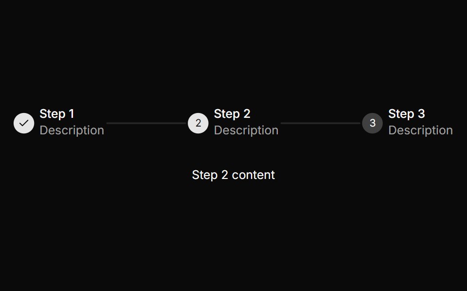 Stepper with content for each stepReUI · ReactStepper with content for each step
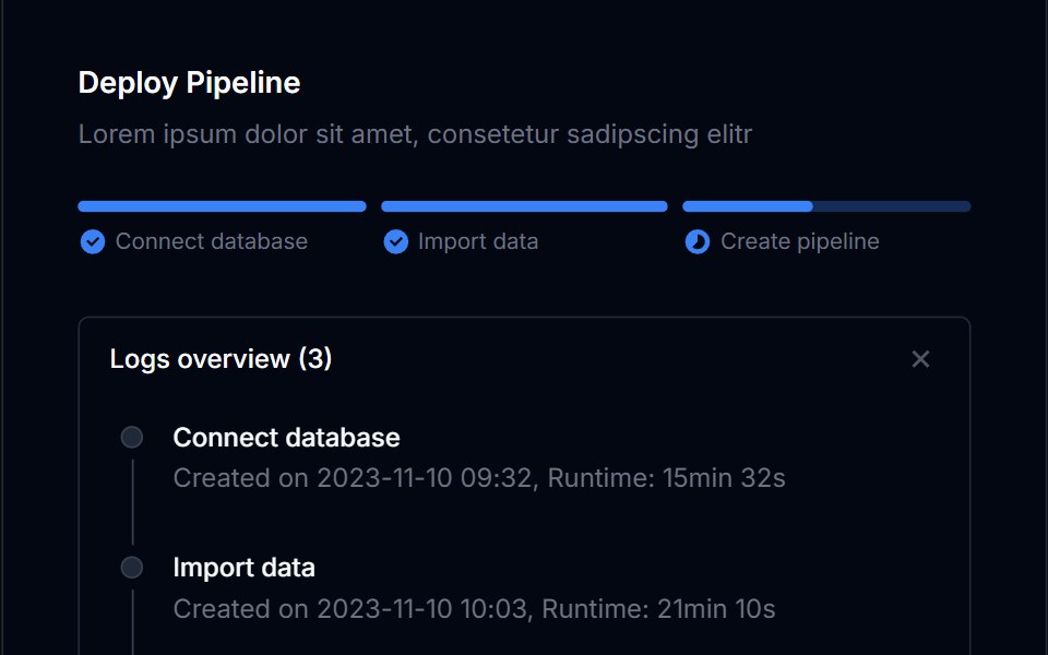 Onboarding Feed 09Tremor Blocks · React
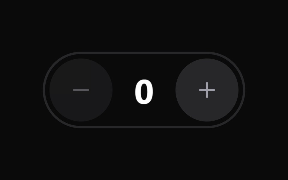 StepperWatermelon UI · React
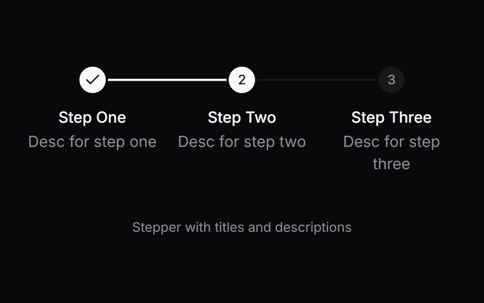 Comp 522Origin UI · React
 Stepper with progress bar and titlesReUI · ReactStepper with progress bar and titles
 Onboarding Feed 10Tremor Blocks · React
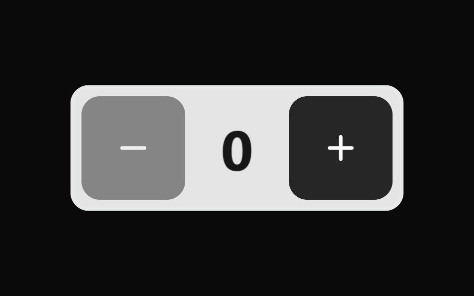 Stepper BaseWatermelon UI · React
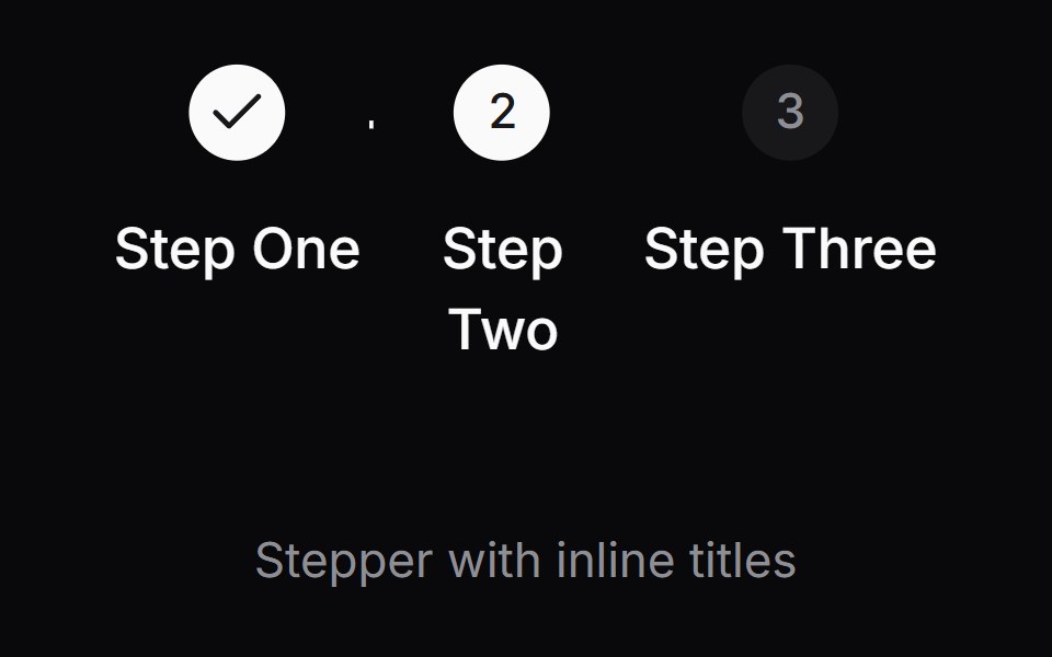 Comp 523Origin UI · React
 Stepper with segmented progress barReUI · ReactStepper with segmented progress bar
 Onboarding Feed 11Tremor Blocks · React
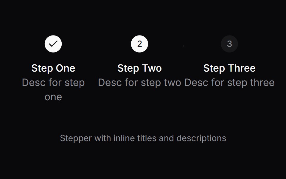 Comp 524Origin UI · React
 Stepper with vertical orientation and descriptionsReUI · ReactStepper with vertical orientation and descriptions
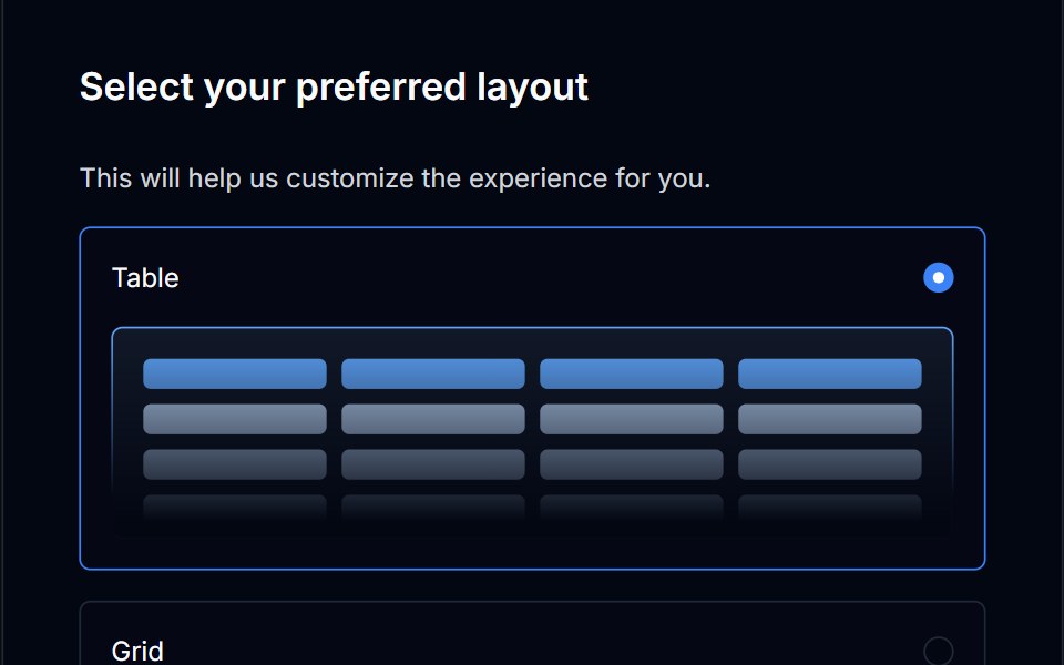 Onboarding Feed 12Tremor Blocks · React
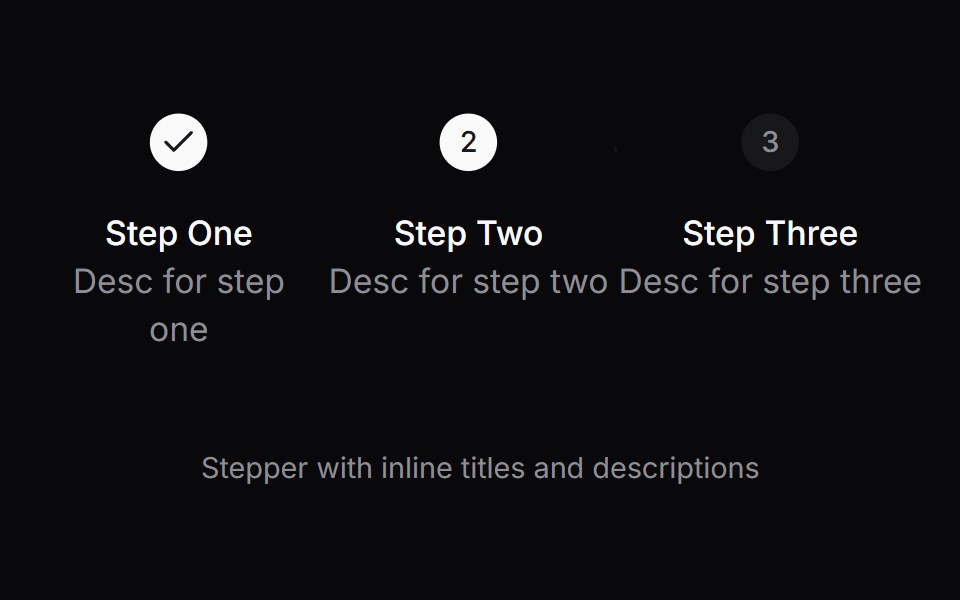 Comp 525Origin UI · React
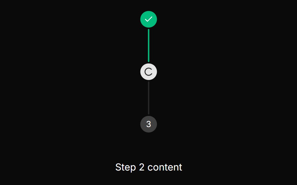 Stepper with vertical orientationReUI · ReactStepper with vertical orientation
 Onboarding Feed 13Tremor Blocks · React
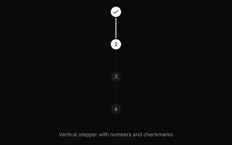 Comp 526Origin UI · React
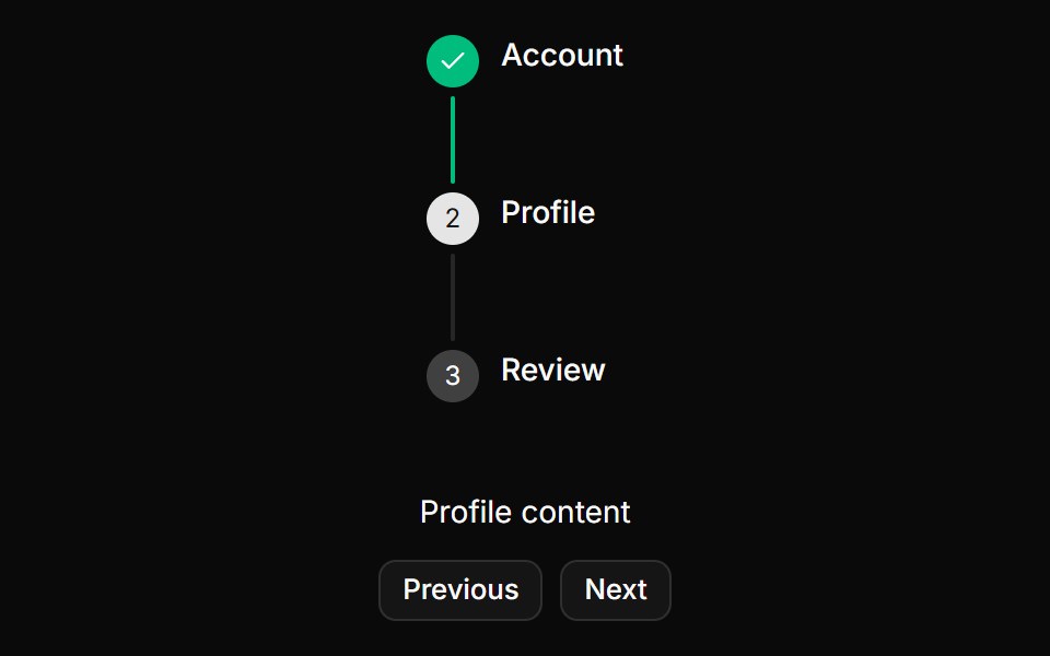 Stepper with vertical orientation and titlesReUI · ReactStepper with vertical orientation and titles
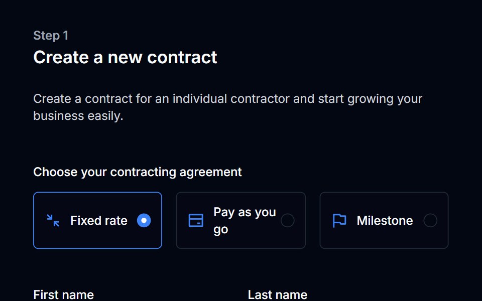 Onboarding Feed 14Tremor Blocks · React
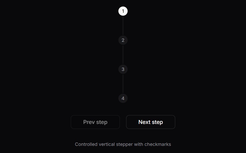 Comp 527Origin UI · React
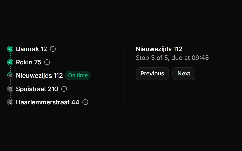 Stepper with delivery stops and ETAsReUI · ReactA vertical rail of 5 delivery addresses joined by dotted connectors, an On time badge on the current stop and arrival…
 Onboarding Feed 15Tremor Blocks · React
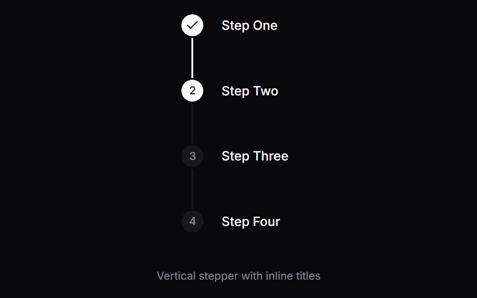 Comp 528Origin UI · React
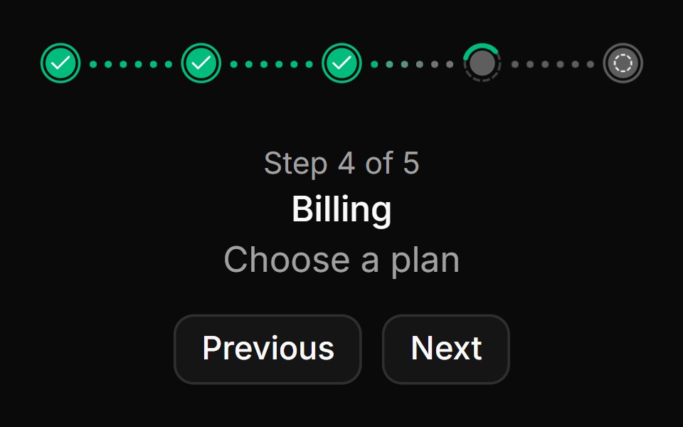 Stepper with dotted progressReUI · React5 label-free dots for a workspace setup flow, with the step count, name and hint of the selected step shown below.
 Onboarding Feed 16Tremor Blocks · React
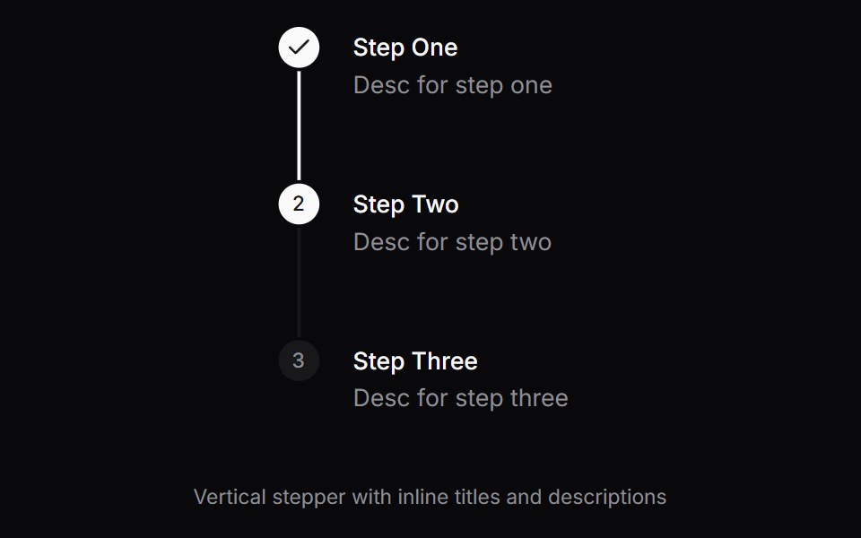 Comp 529Origin UI · React
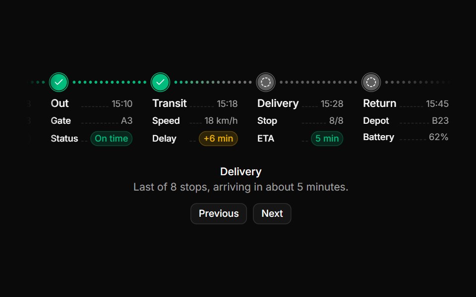 Stepper with key-value stage detailsReUI · React5 delivery run stages from loading to return, each with a time and dashed-leader rows such as gate, delay, ETA and…
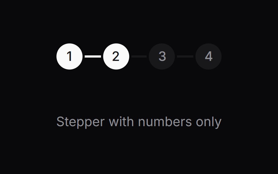 StepperOrigin UI · React
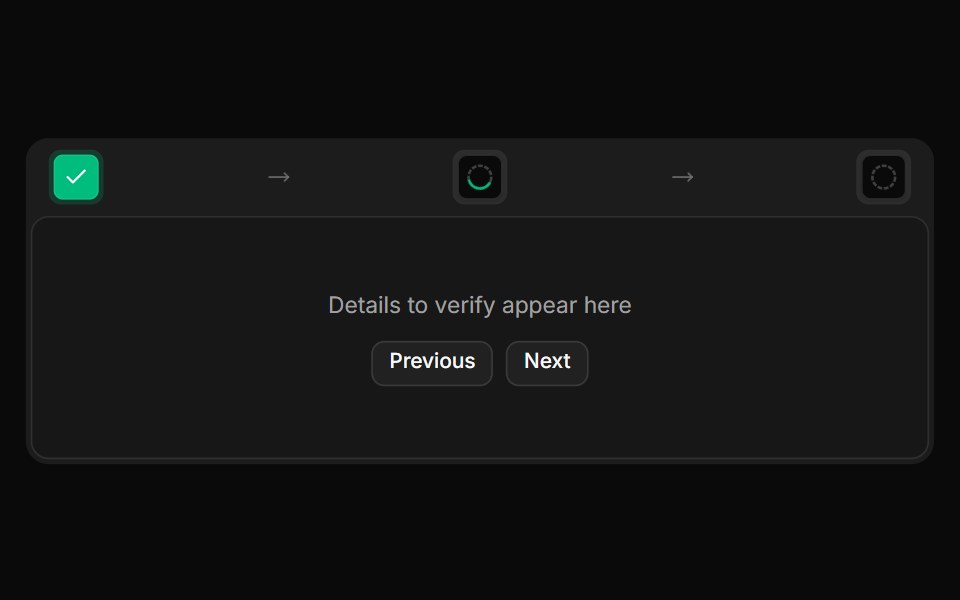 Stepper with icon tiles in a frameReUI · React3 resolution steps in a framed header bar with check or dashed ring tiles and subtitles, collapsing to tiles alone…
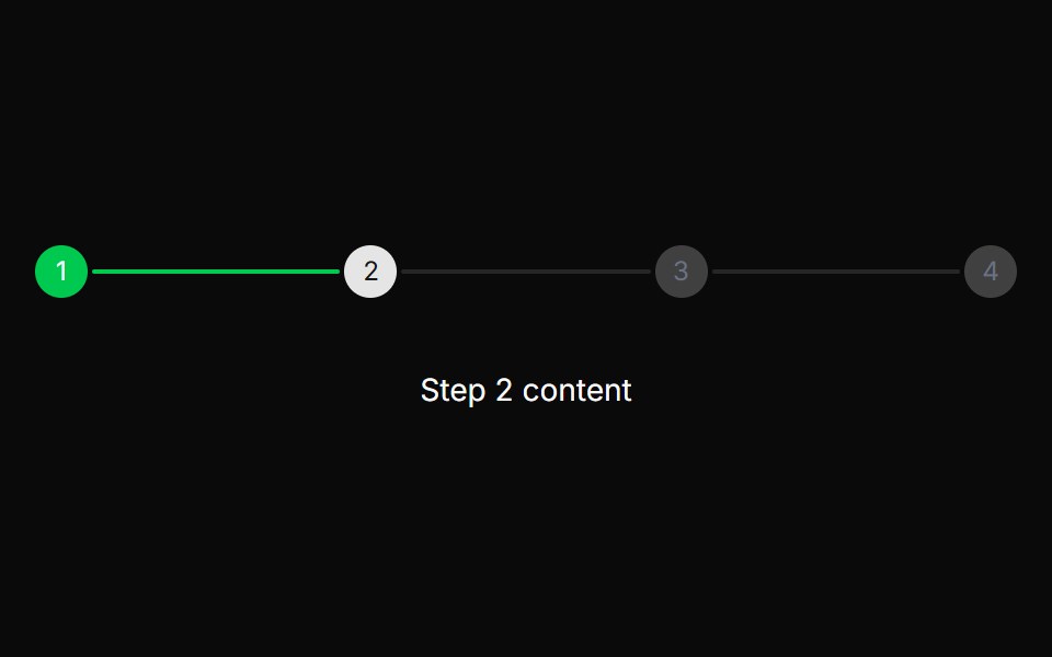 Stepper with completed stateReUI · ReactStepper with completed state
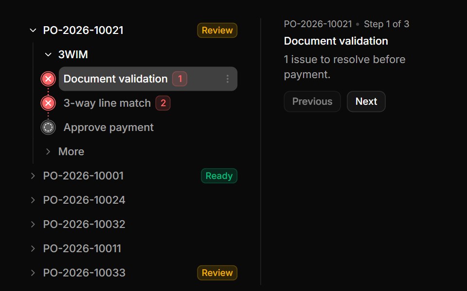 Stepper with purchase order checksReUI · React6 purchase orders that expand into 3-way match checks, each passed, failed with an issue count, or pending, with…
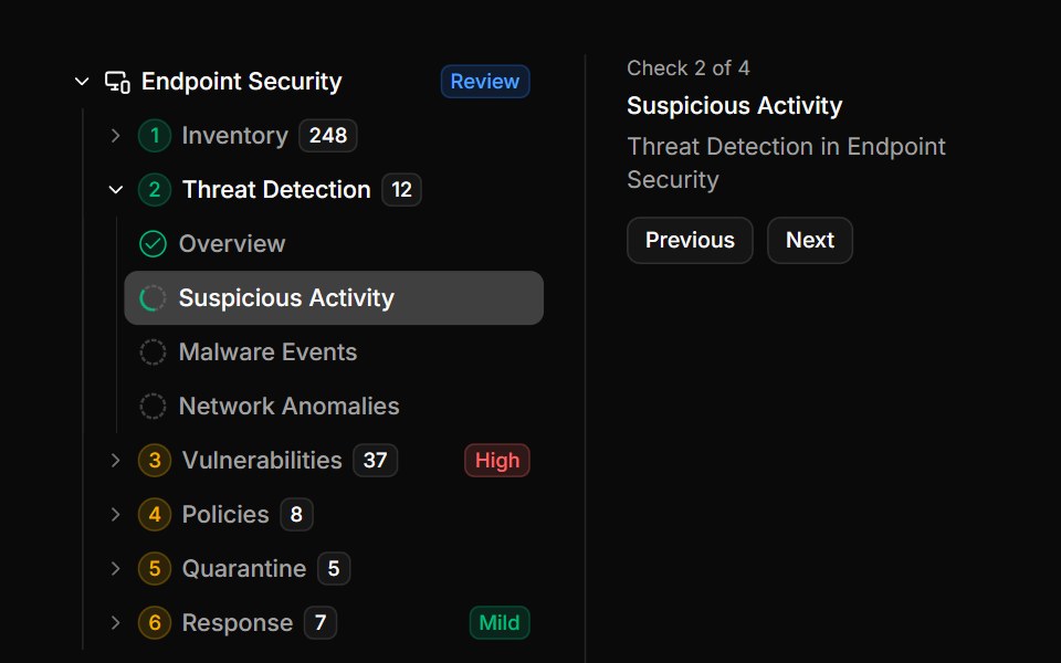 Stepper with grouped security checksReUI · React29 security checks under 12 numbered steps in 4 areas, with finding counts and severity badges, and Previous and Next…
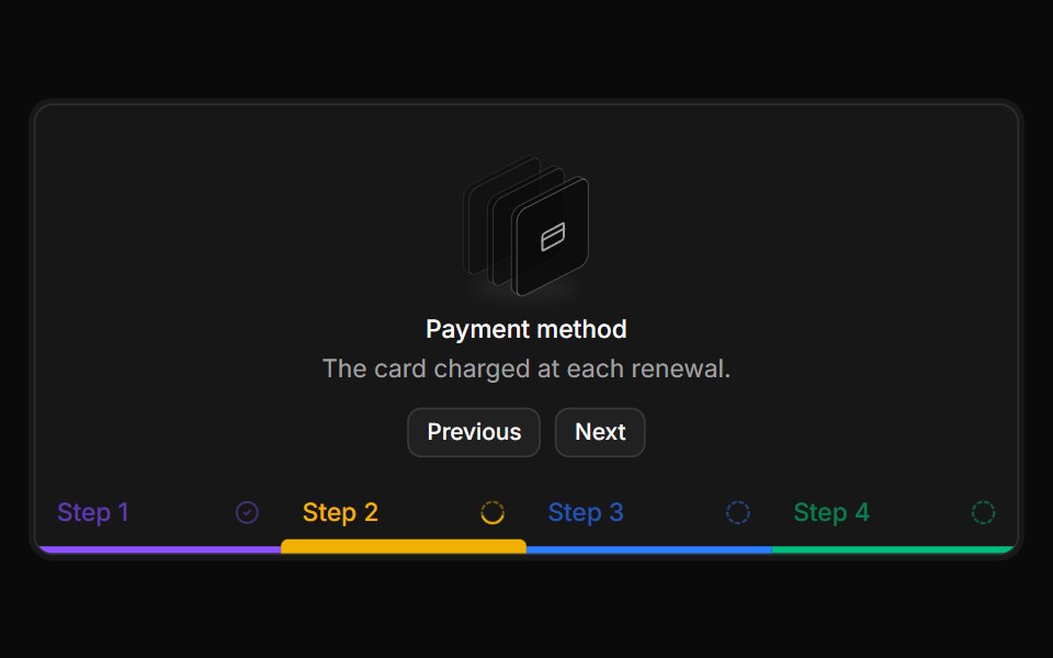 Stepper with color-coded bottom barsReUI · React4 billing setup steps as colored bars along the panel's bottom edge, the active one thicker, under the current step's…
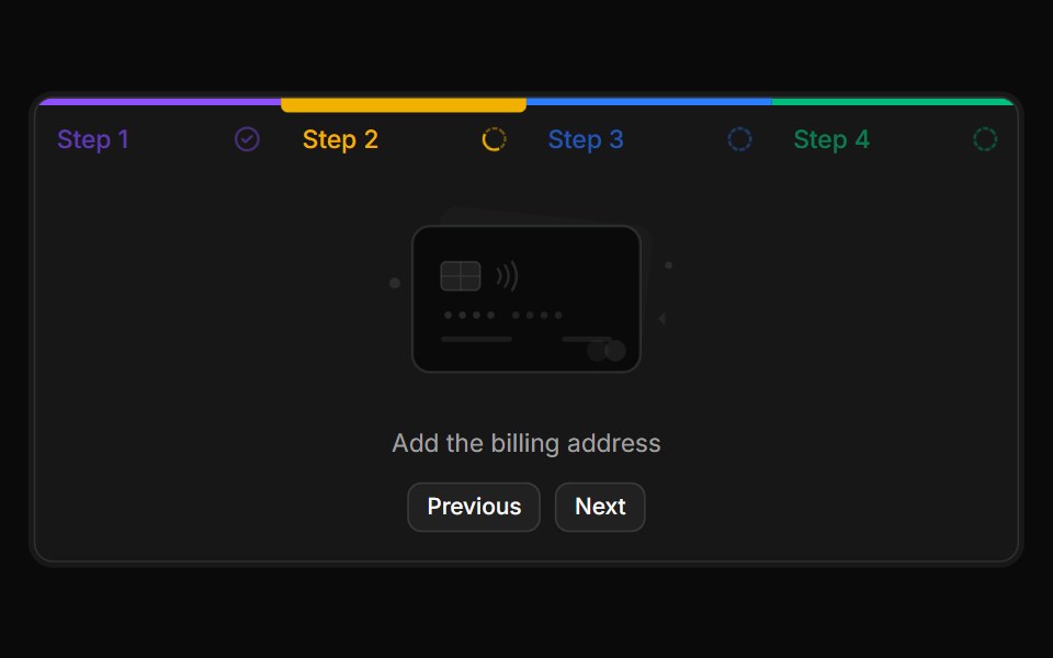 Stepper with top color bars and card artReUI · ReactAdding a payment card in 4 steps, each tab with its own color bar on the top edge that thickens when selected, over a…
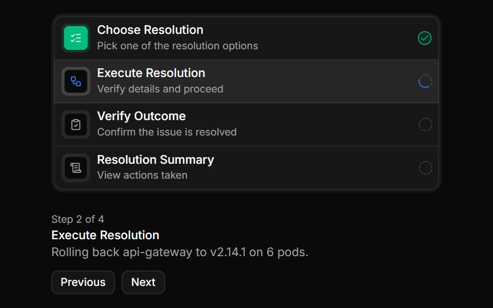 Stepper with icon tile rowsReUI · React4 incident resolution steps in a vertical list, each row showing an icon, a title, a subtitle and its status, above…
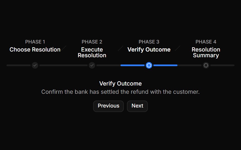 Stepper with phase trackReUI · ReactA refund case in 4 phases labeled Phase 1 to 4, joined by a single track with a dot per phase and slash dividers…
Libraries with Tailwind CSS stepper components
Related categories
- Stepper Components
- React Stepper Components
- Animated Stepper Components
- shadcn/ui Stepper Components
- Tailwind CSS Navigation Components
- Tailwind CSS Menu Components
- Tailwind CSS Tabs Components
- Tailwind CSS Navbar Components
- Tailwind CSS Sidebar Components
- Tailwind CSS Pagination Components
- Tailwind CSS Breadcrumb Components
- Tailwind CSS Command Palette Components
- Tailwind CSS Context Menu Components
- Tailwind CSS Mega Menu Components
- Tailwind CSS Dock Components
- Tailwind CSS Wizard Components
- Tailwind CSS Table Of Contents Components
- Tailwind CSS Tab Bar Components
- Tailwind CSS Hamburger Menu Components