 Dev Design Library
Tailwind CSS Tabs Components
Dev Design Library indexes 193 Tailwind CSS tabs components from 63 open-source UI libraries, with the most coming from Origin UI, sv-particles, FLX UI, Oxbow UI and Shadcn Space. Each one links to its page with the source code, a live preview where available, the library license and the install command. Every library in this list styles its components with Tailwind CSS utility classes. Tabs components belong to the Navigation group.
Showing 120 of 193, a mix from every library. Open a library to see all of its components.
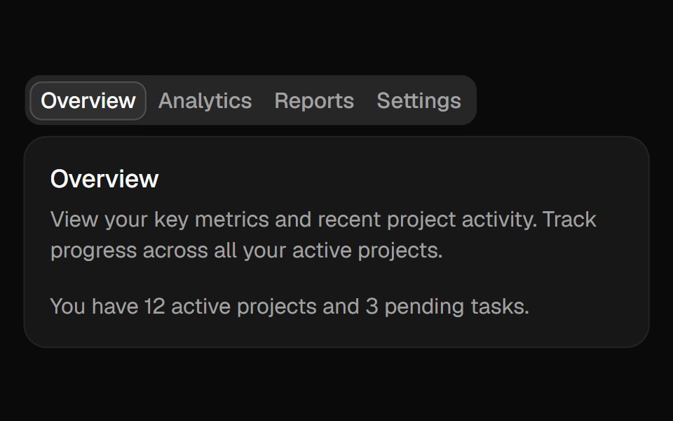 Tabsshadcn/ui · ReactA set of layered sections of content—known as tab panels—that are displayed one at a time.
 TabdaisyUI · CSS (Tailwind)
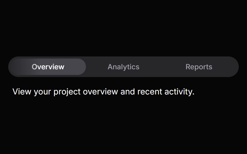 TabsHeroUI · ReactOrganize content into tabbed views with animated transitions and indicators.
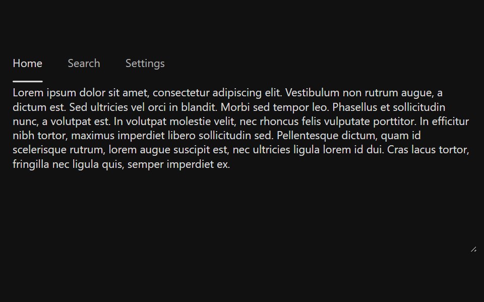 TabsReact Spectrum · ReactTabs organize content into multiple sections and allow users to navigate between them. The content under the set of…
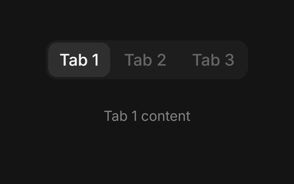 Tabscoss ui · ReactA component for toggling between related panels on the same page.
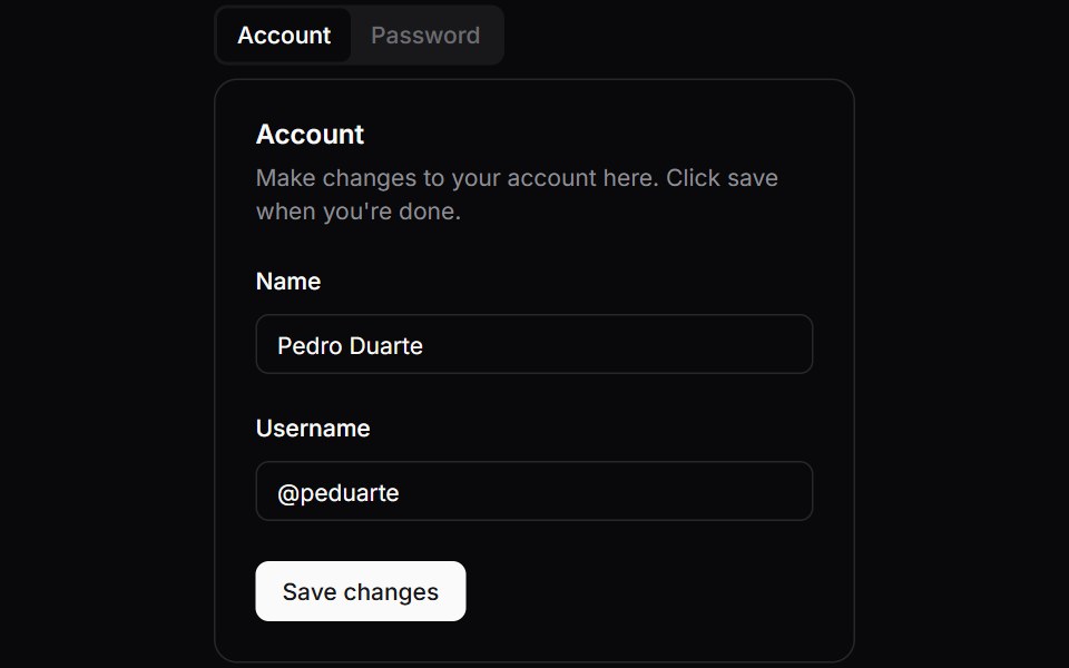 TabsOrigin UI · ReactA component for toggling between related panels on the same page.
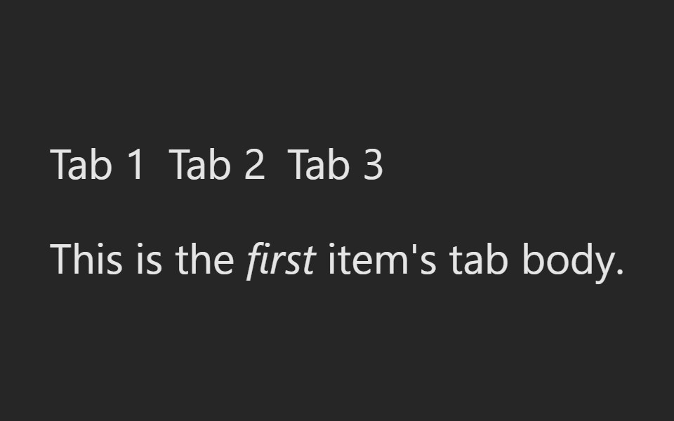 TabsPreline UI · JavaScript (HTML + Tailwind)
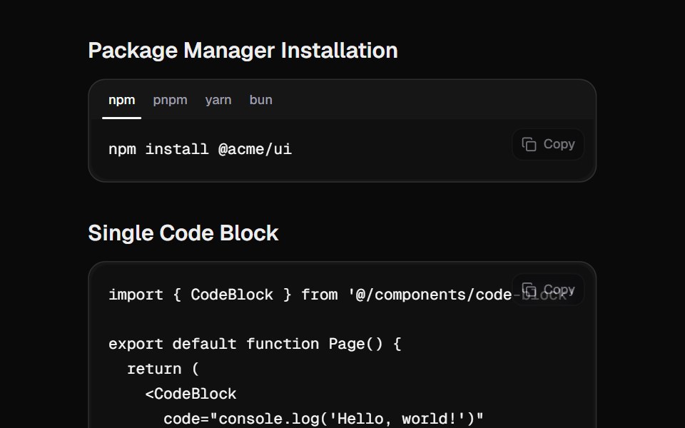 Code BlockCult UI · ReactA beautiful code block component with tabs, copy functionality, and smooth animations
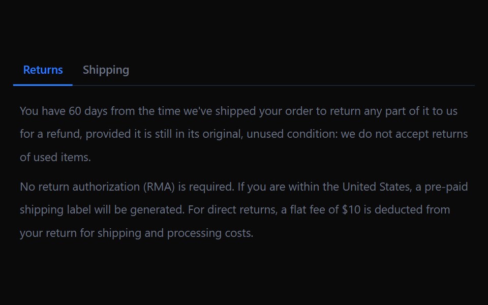 TabsTremor · React
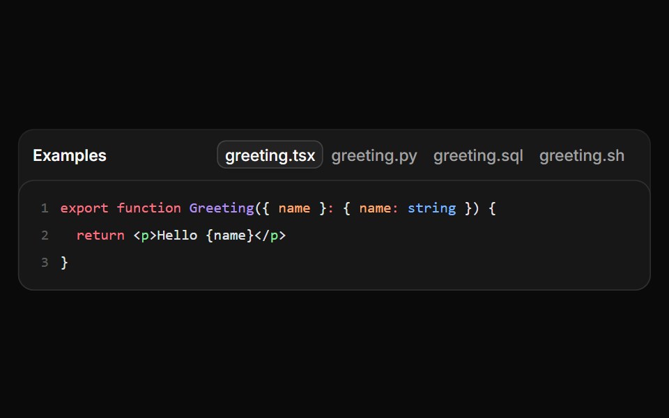 File tabs in a dense frameReUI · ReactA framed file switcher loading one grammar chunk per selected language.
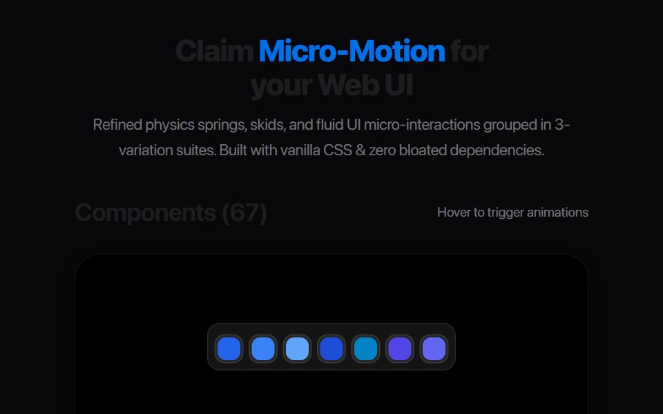 Ab Segmented TabsAmicro Micro Transitions · ReactSegmented control where active letter (A or B) slides into a solid pill.
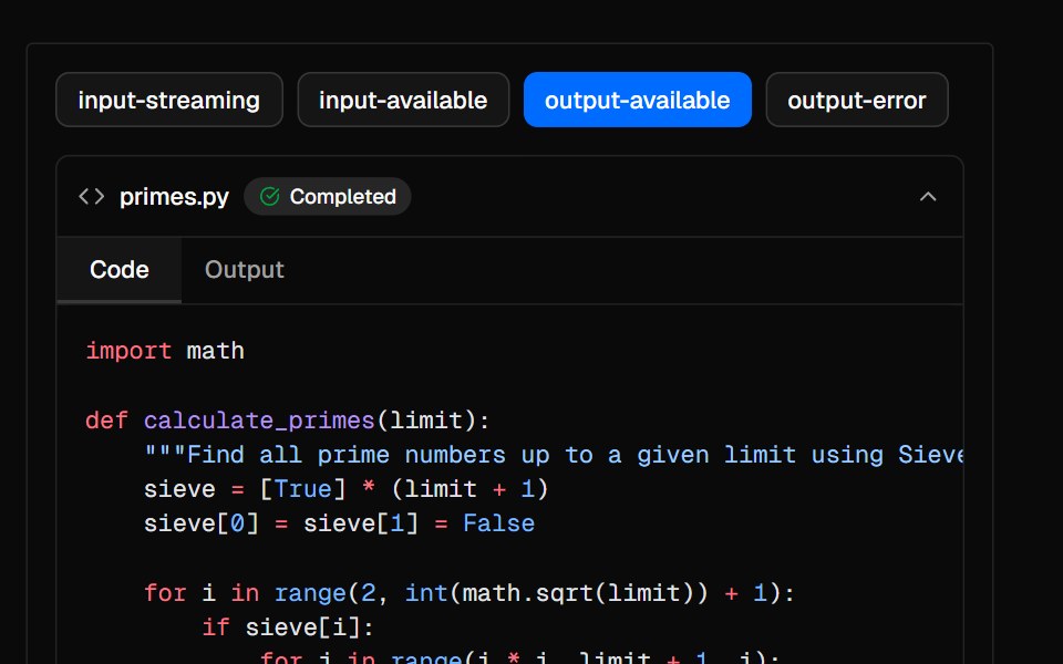 SandboxAI Elements · ReactA collapsible container for displaying AI-generated code and output in chat interfaces.
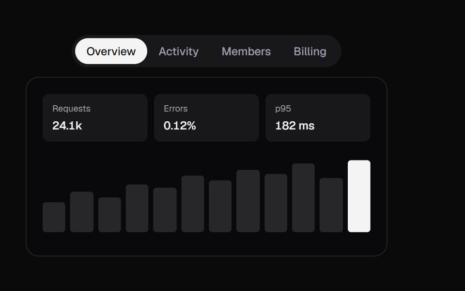 Swipe TabsKokonut UI · ReactTabs with a swipeable panel, a drag-tracked indicator and spring physics.
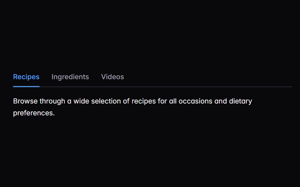 tabsIntent UI · Reacttabs
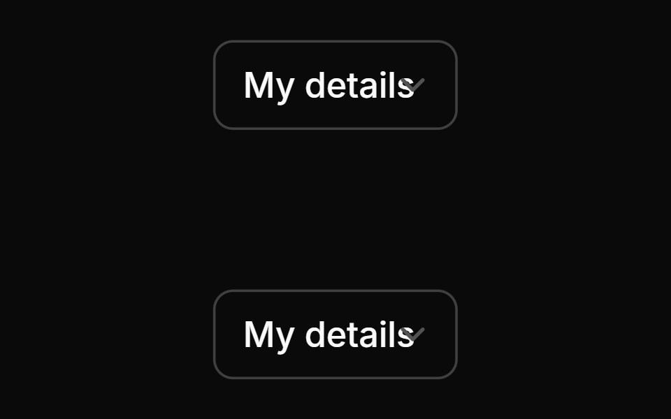 TabsUntitled UI React · React
 Expandable TabsbeUI · ReactIcon tab bar where the active tab expands to a labelled pill, with a panel above that morphs height and slides content…
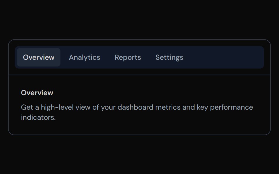 TabsTailGrids · ReactA tabs component with multiple variants.
 FAQ Tabs CardSpectrum UI · ReactA tabbed FAQ card with animated accordion answers and a support footer.
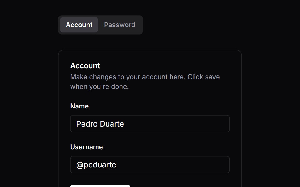 TabsVengeance UI · React
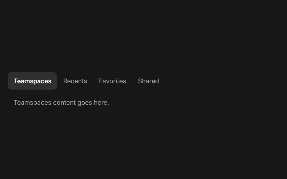 TabsFluid Functionalism · ReactHorizontal tab navigation with fluid hover, animated pill selection indicator, and fluid font-weight transitions…
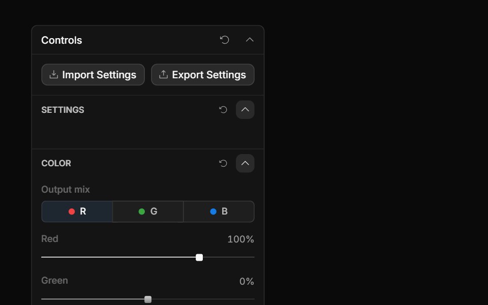 Channel TabsToolcraft · React
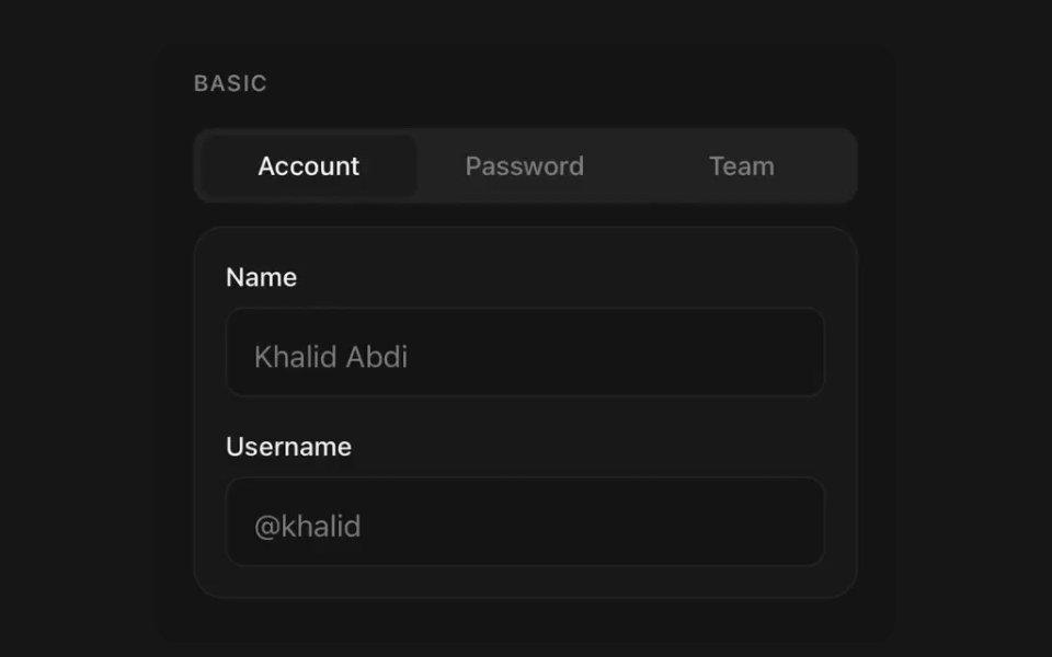 TabsPanel UI · React NativeSegmented navigation with an animated indicator.
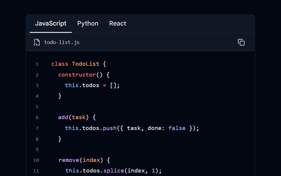 Code Block 06 - Language TabsShadcn Space · ReactCode block with language selector tabs (JavaScript, Python, React) and scrollable content
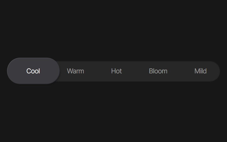 Tab Background AnimationPixel Perfect · ReactA tab background animation using Framer Motion.
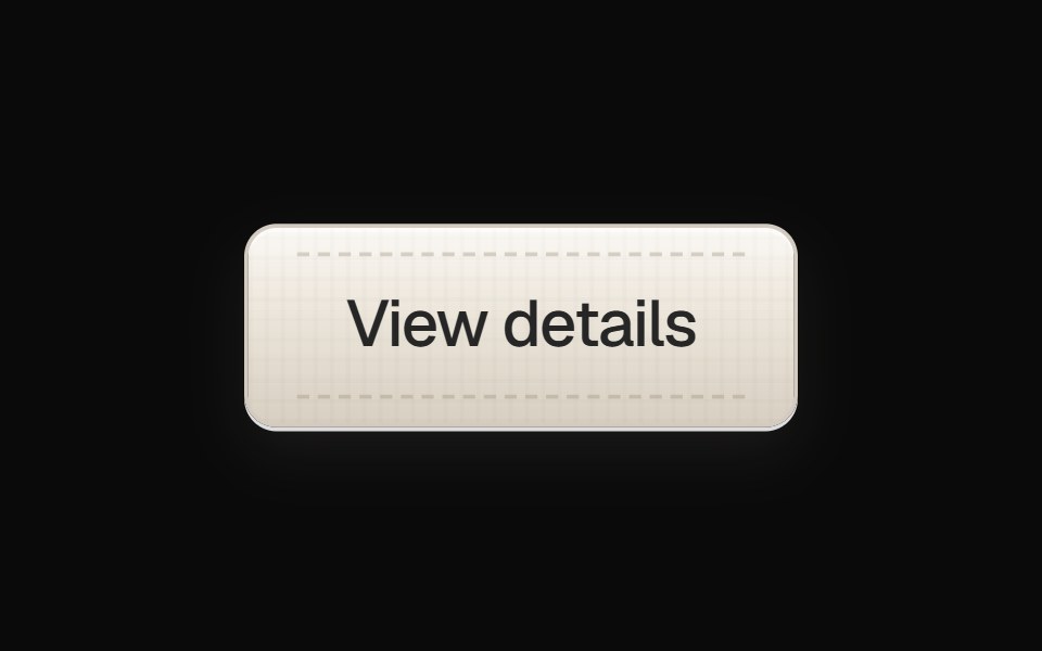 Linen Tab ButtonOpenSourceUI · React
 Bento Carduselayouts · ReactAn interactive bento card with animated tabs and workspace preview.
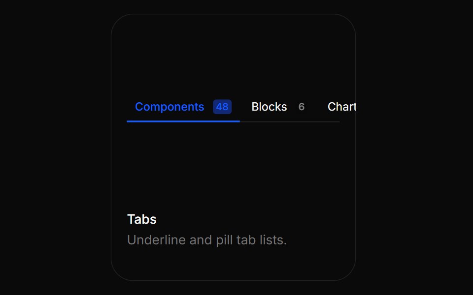 TabsBoardUI · ReactUnderline and pill tab lists.
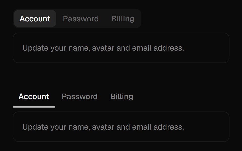 TabsComponentry · React
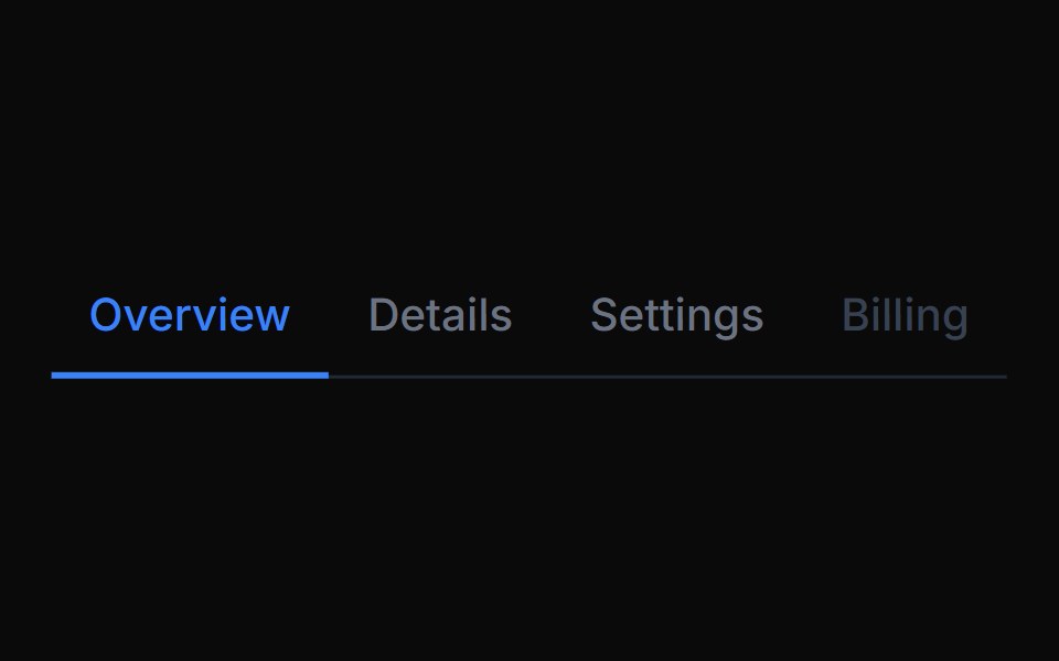 Tab NavigationTremor Blocks · React
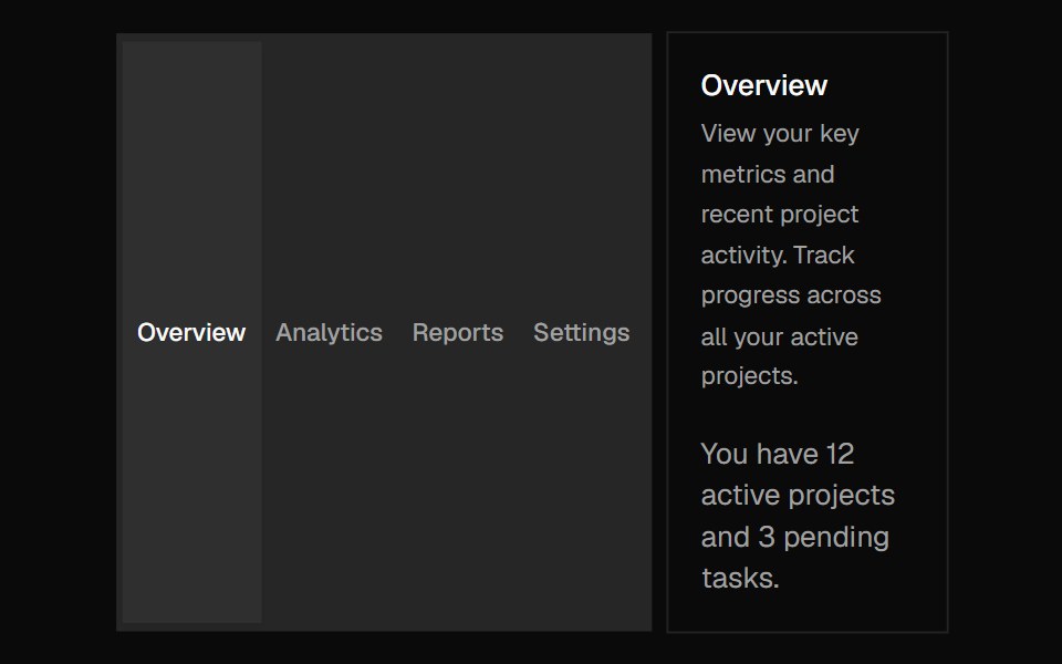 TabsShadcn Dashboard · React
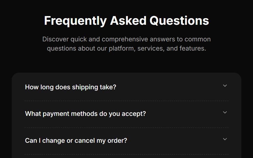 Faq Fourcnblocks · SvelteFAQ section with search and categories
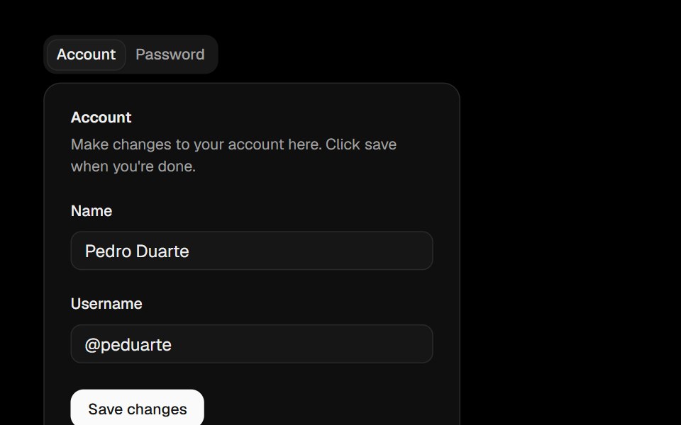 TabsObsidianUI · React
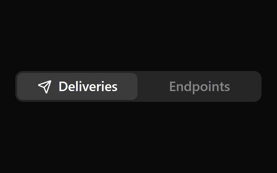 Icon TabsNotra · ReactA segmented tab selector where only the active tab shows its icon, sliding in beside the label. Built on the Base UI…
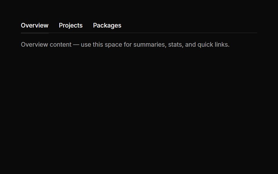 Tabs 01Oxbow UI · Astro
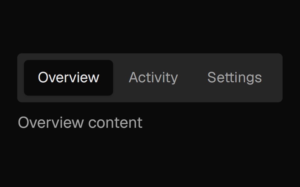 Tabs SubtleNexvyn UI · ReactA pill-style tab list where the selected indicator springs between tabs, built on the WAI-ARIA tabs pattern with full…
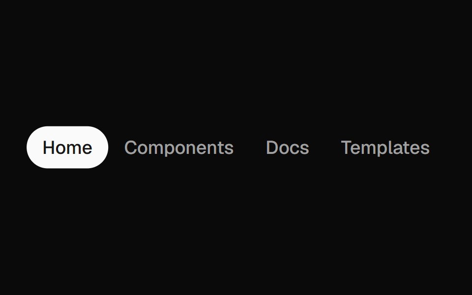 Animated TabsForge UI · Reactwitch tabs smoothly with motion-based underline or highlight effects.
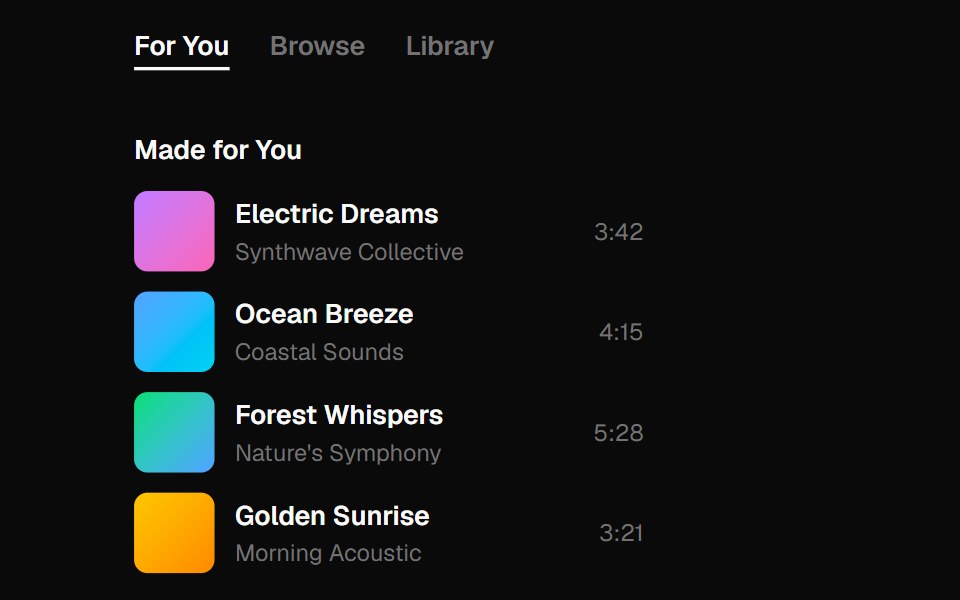 tabsBaseLayer · ReactTabs organize content into multiple sections and allow users to navigate between them.
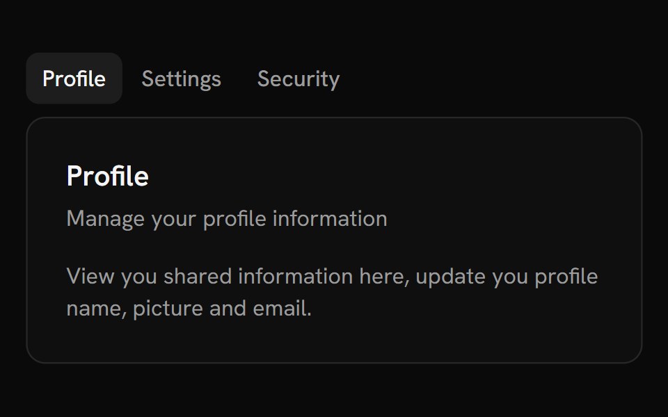 TabsShark UI · ReactA tabs for navigating between content.
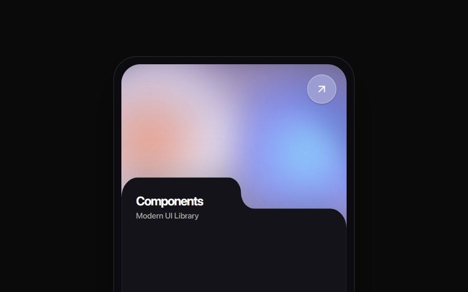 Folder Tab CardRewamp UI · ReactA modern tactile UI card featuring an ethereal animated mesh aurora gradient header, circular diagonal glass arrow…
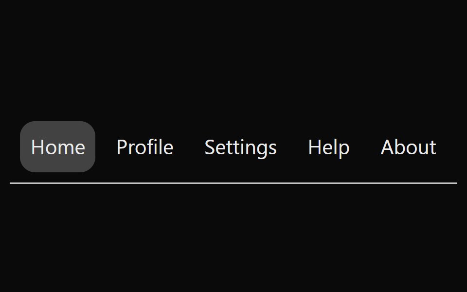 Animated TabsSona UI · ReactAn accessible horizontal tab selector built on Base UI with controlled state, keyboard navigation, disabled items, and…
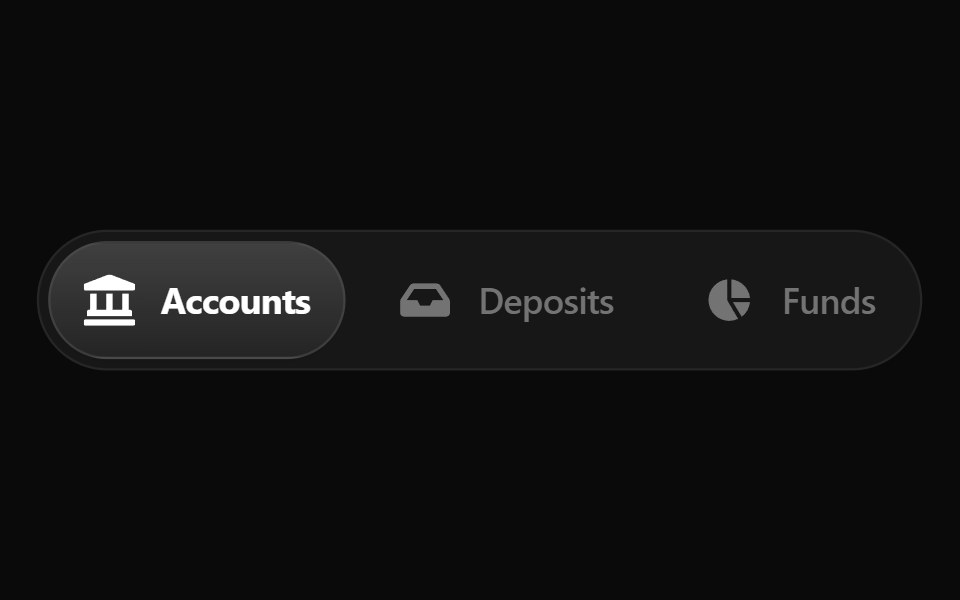 Fluid TabsWatermelon UI · ReactTabs with an indicator that flows smoothly from one tab to the selected one.
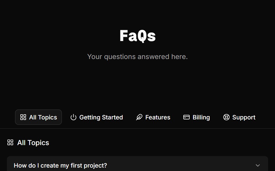 FAQ Foursv-efferd · SvelteA categorized FAQ explorer with topic switching and softly framed accordion rows.
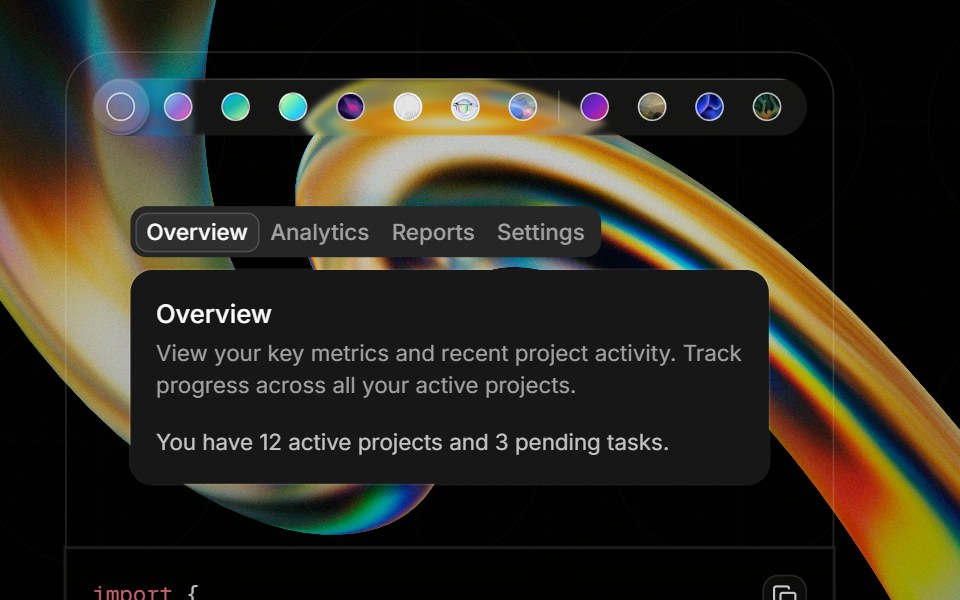 Component Previewglasscn · ReactA preview shell for component demos with switchable default and glass variants.
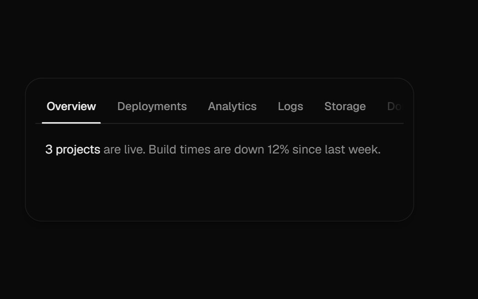 Overflow TabsUI Lab · ReactScrolls a long row of tabs, fading whichever edge still hides more.
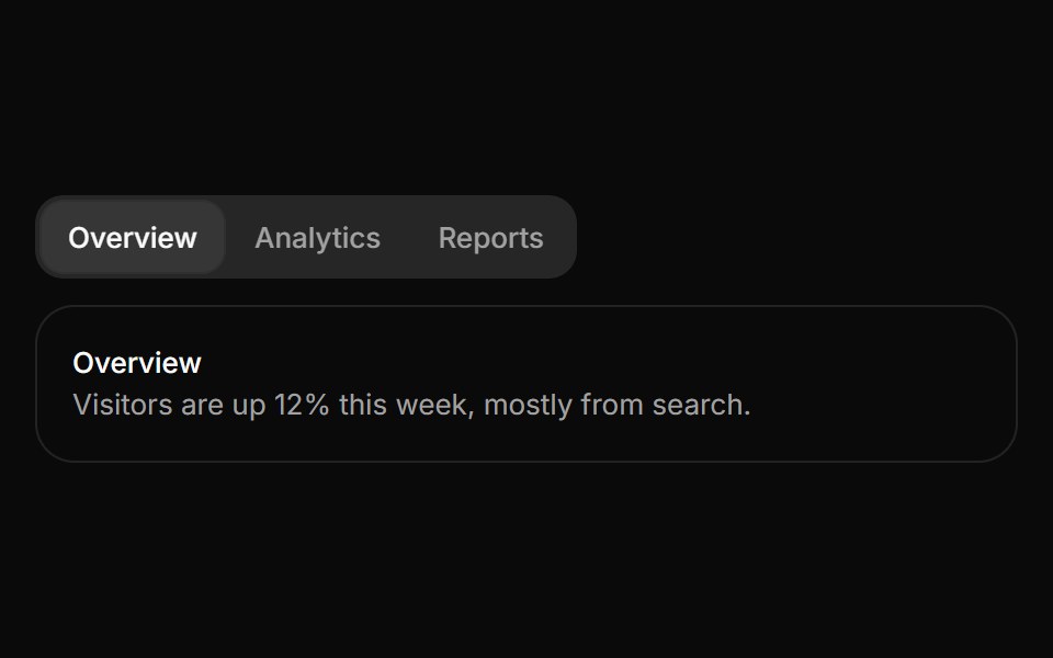 TabsHextaUI · ReactSwitch between views with an indicator that slides to the active tab, as a segmented control or an underline, and…
 DevTools Drawer BlockLocalMode · ReactA global on-device observability drawer: six tabbed surfaces (inference queues, event log, pipeline runs, model cache…
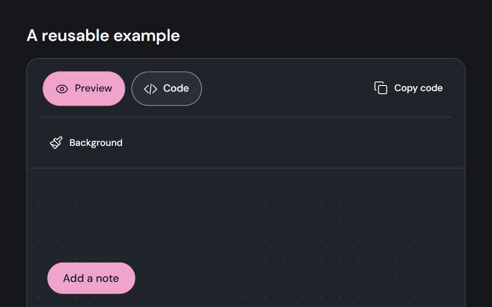 Component previewCojeev UI · ReactPairs a live component example with a code view and a copy action.
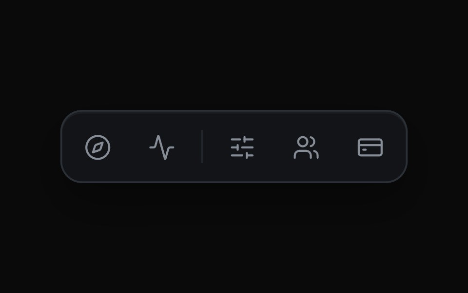 Expanding Icon TabsMicroKit · ReactAn icon bar where the chosen tab widens to reveal its label and the rest of the row slides over to make room.
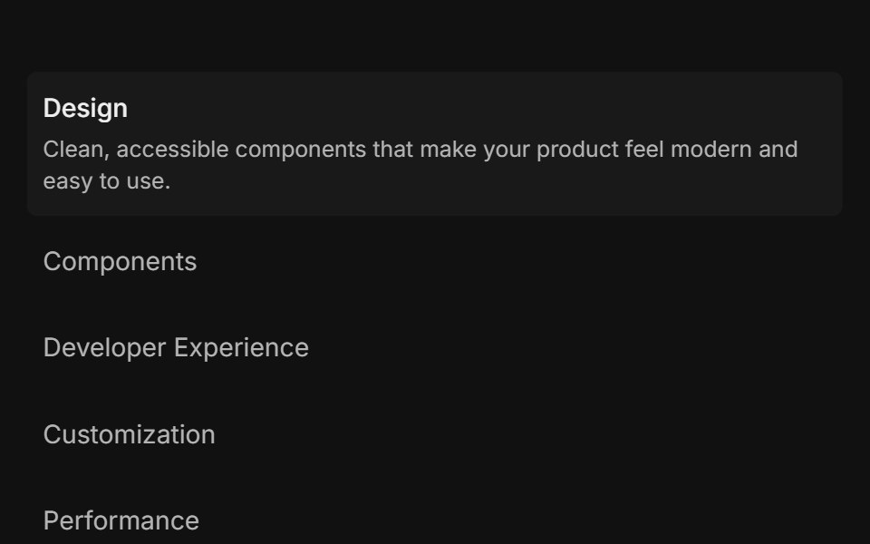 Feature 01FLX UI · ReactList of items: select one to reveal its description and media.
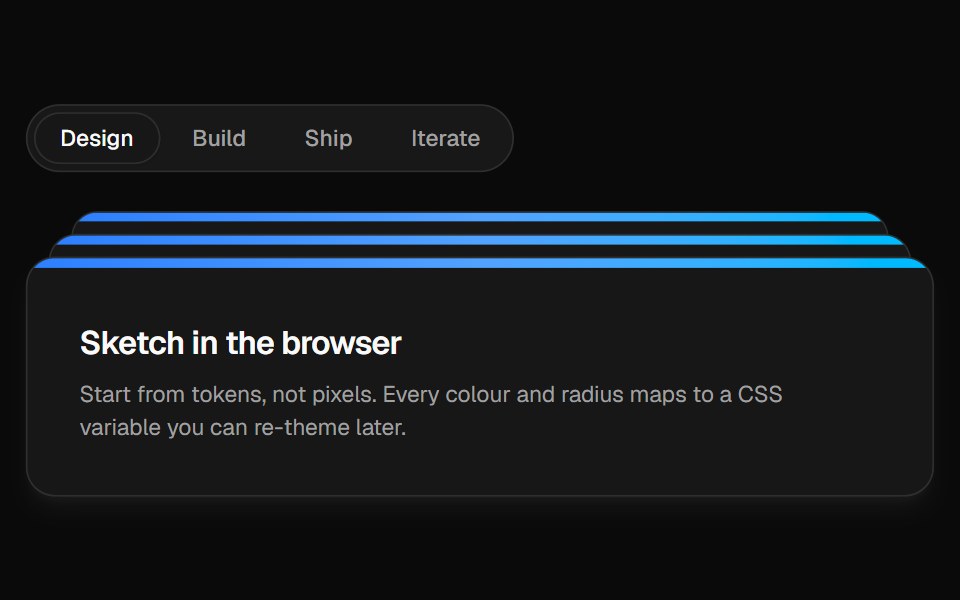 Animated TabsVelora UI · ReactTabs with a gliding pill and panels stacked like cards that peek behind.
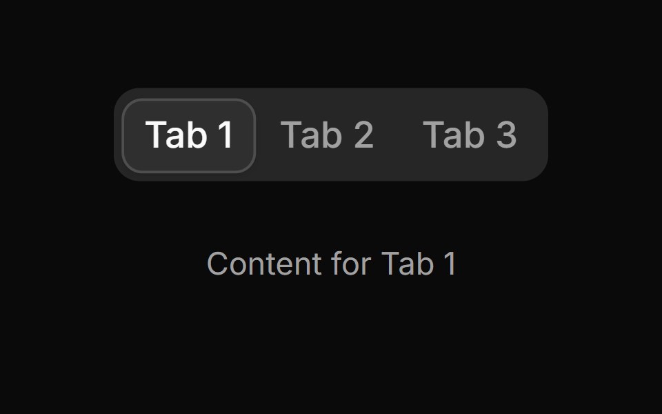 Tab 1sv-particles · Svelte
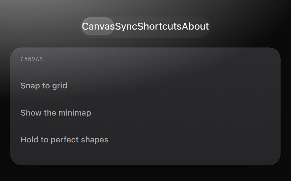 TabsMetal UI · React + SwiftUISwitches which panel is shown: the switcher track and gliding thumb as the tab list, and panels that drift in from the…
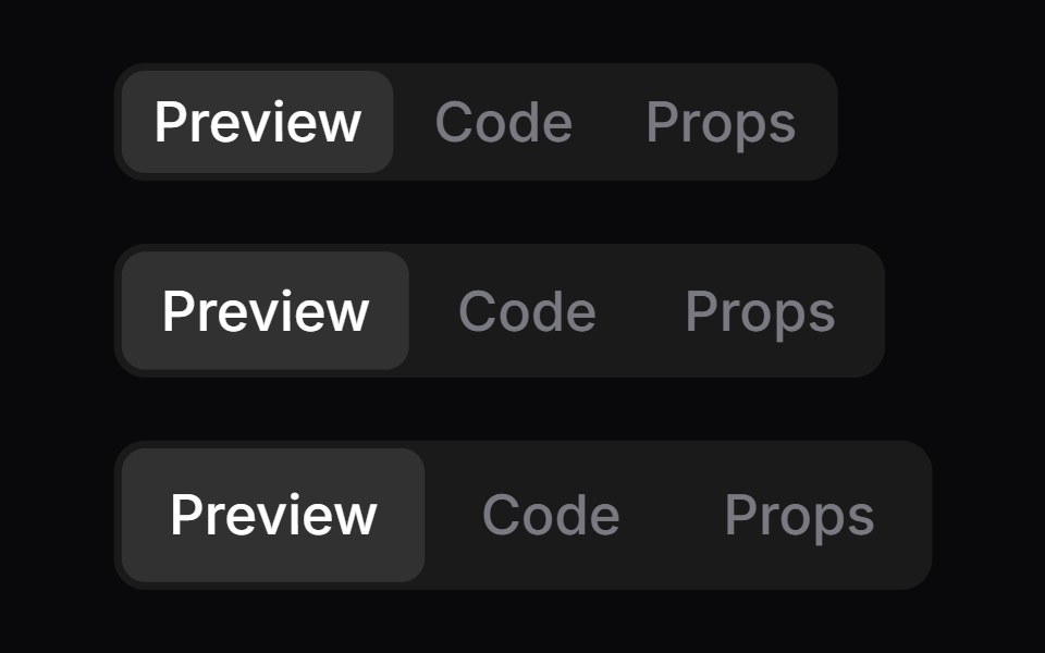 TabsSpaceUI · ReactSplits content into switchable tabs on a single screen, allowing users to view different sections of related…
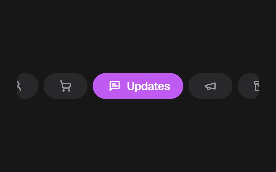 Apple Mail TabsSkecher UI · ReactA colorful, horizontally scrollable mail category selector with compact inactive tabs and an expanded active tab.
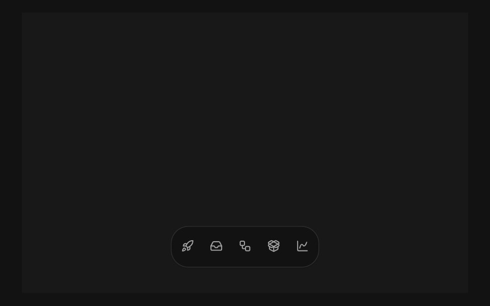 Expandable TabsSora UI · ReactA pill-shaped tab bar that expands into a floating panel, with Motion driving the shell, label, and content transitions.
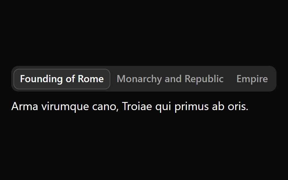 TabsOUI · ReactReact aria components Tabs with shadcn characteristics.
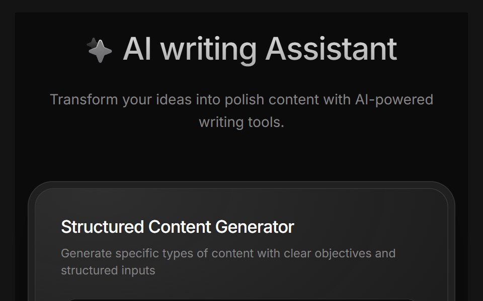 AI Writing AssistantD2Studio UI · ReactAI writing assistant panel with assistant, blog and pro modes and a prompt field.
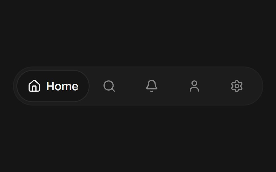 Expandable TabsEaseUI · ReactA row of icon tabs where the selected one expands to reveal its label, sliding a shared background pill to match.
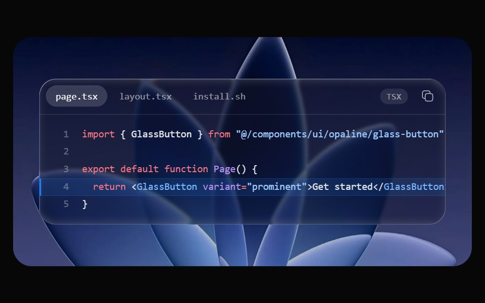 Glass Code BlockOpaline · ReactSyntax-highlighted code in a glass window, with tabs, line numbers, highlighted lines and copy.
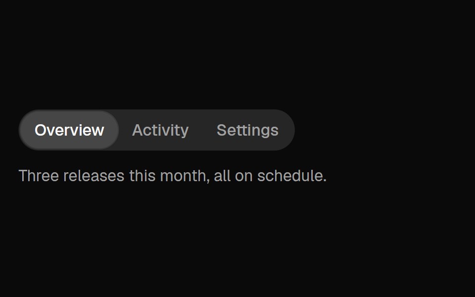 TabsFibo · ReactSwitches between views of one subject in place, as a segmented control or a row of tabs with an underline; scrolls…
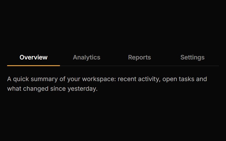 TabsReactFrame · ReactAn accessible tab set with underline, pill and segmented variants, a sliding animated indicator, icons, counts…
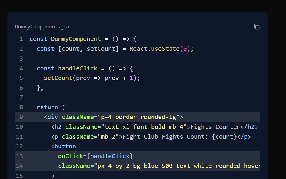 Code BlockAceternity UI · React
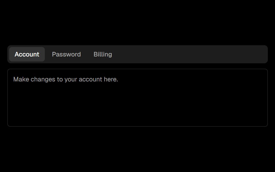 Tabsark-cn · ReactA shadcn-style tabs component built with Ark UI primitives.
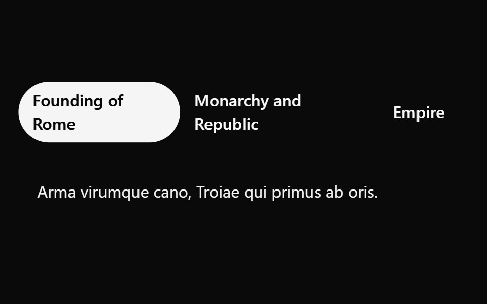 Tailwind TabsReact Spectrum · React
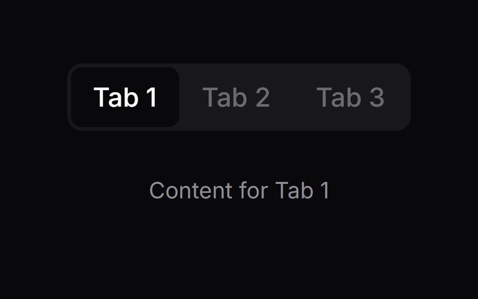 Comp 426Origin UI · React
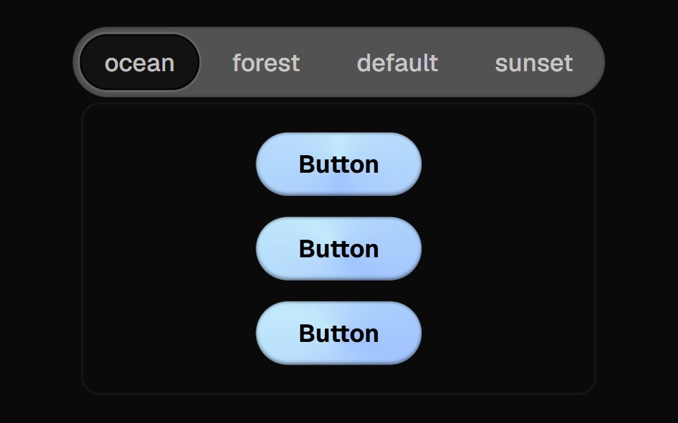 Direction Aware TabsCult UI · ReactTab component with direction-aware animations and smooth transitions
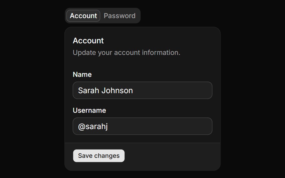 Basic tabs.ReUI · ReactBasic tabs.
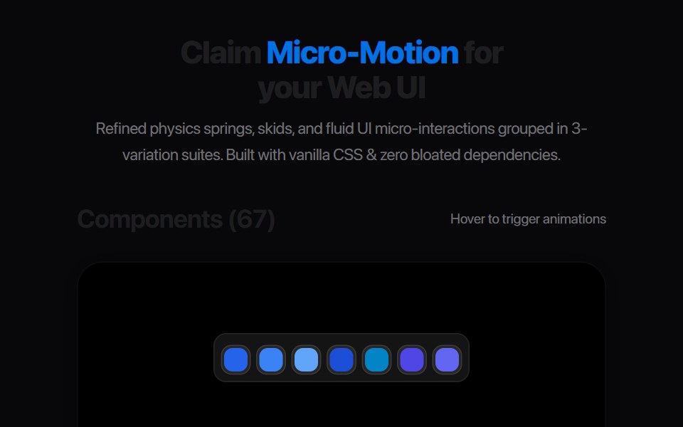 Segmented Link StretchAmicro Micro Transitions · ReactMulti-joint segmented pill chain expanding and snapping together.
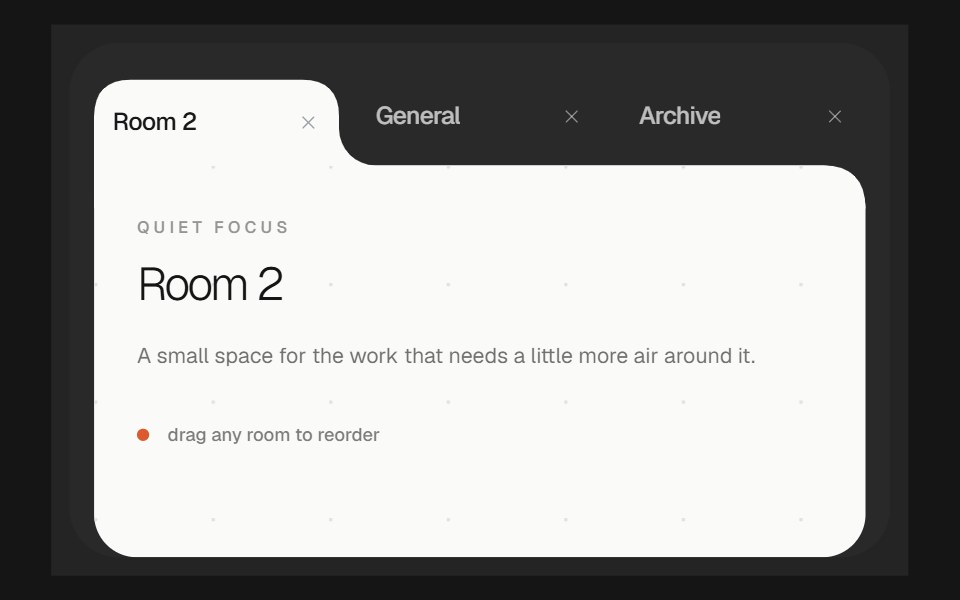 Morphing TabsbeUI · ReactReorderable tabs whose selected item grows into a white content surface, with the active shape gliding as tabs move…
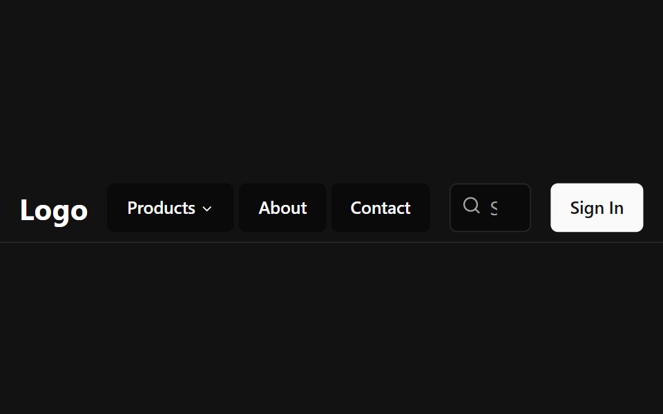 Tab NavbarSpectrum UI · Reactcomponent for the Tab Navbar
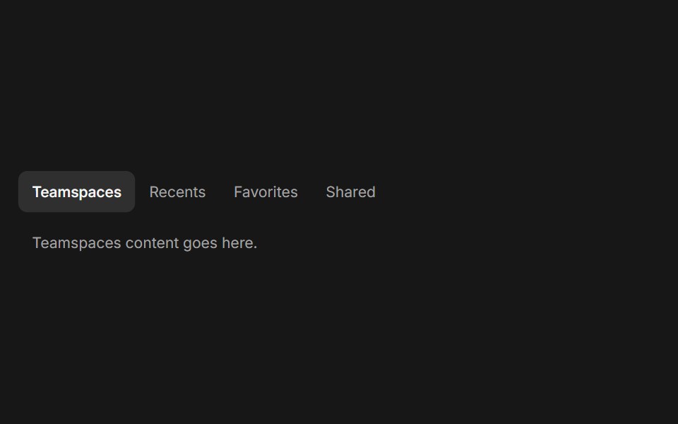 TabsFluid Functionalism · ReactHorizontal tab navigation with fluid hover, animated pill selection indicator, and fluid font-weight transitions. Base…
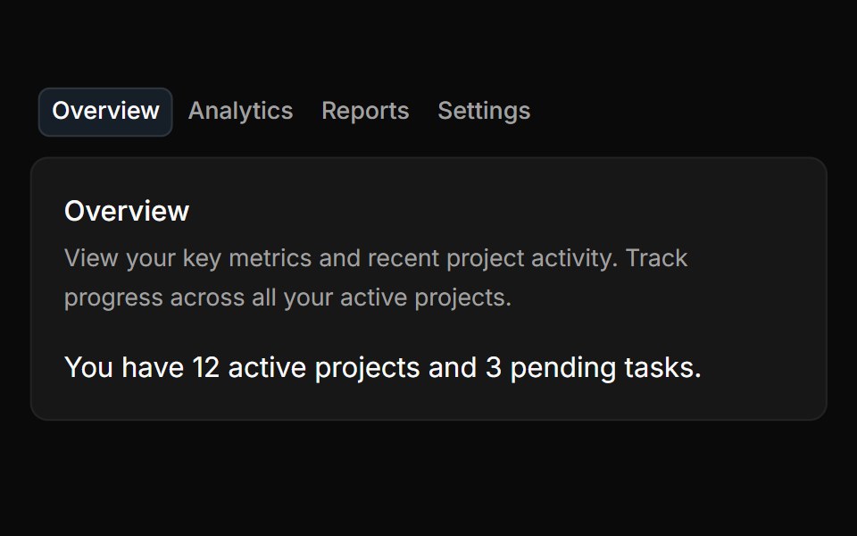 TabsToolcraft · React
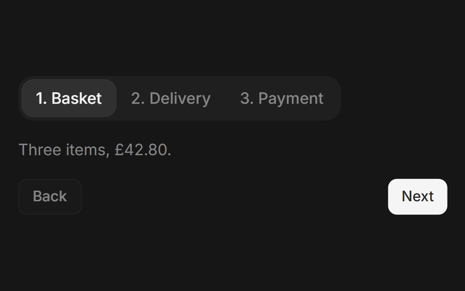 Web TabsPanel UI · React Native
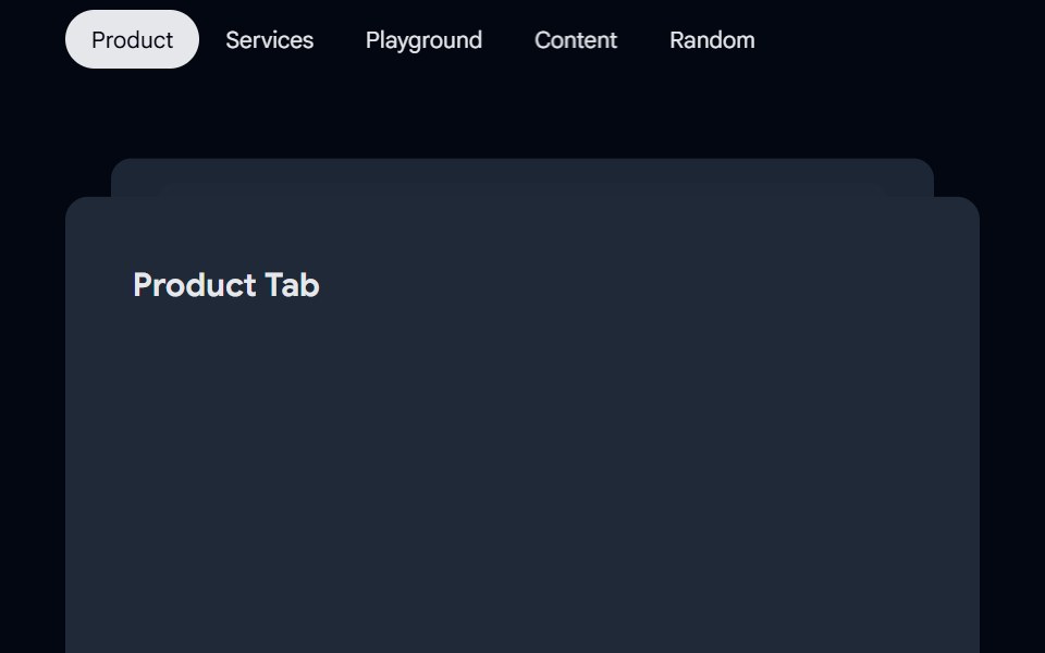 Tabs-01 - AnimatedShadcn Space · ReactTabs component
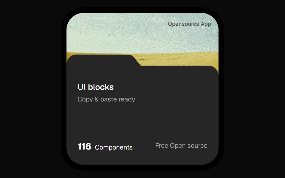 Opensource Folder Tab CardOpenSourceUI · React
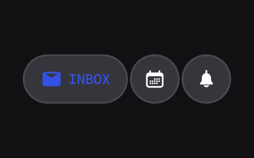 Discrete Tabsuselayouts · ReactA tab component with discrete sliding animations.
 SettingsBoardUI · React
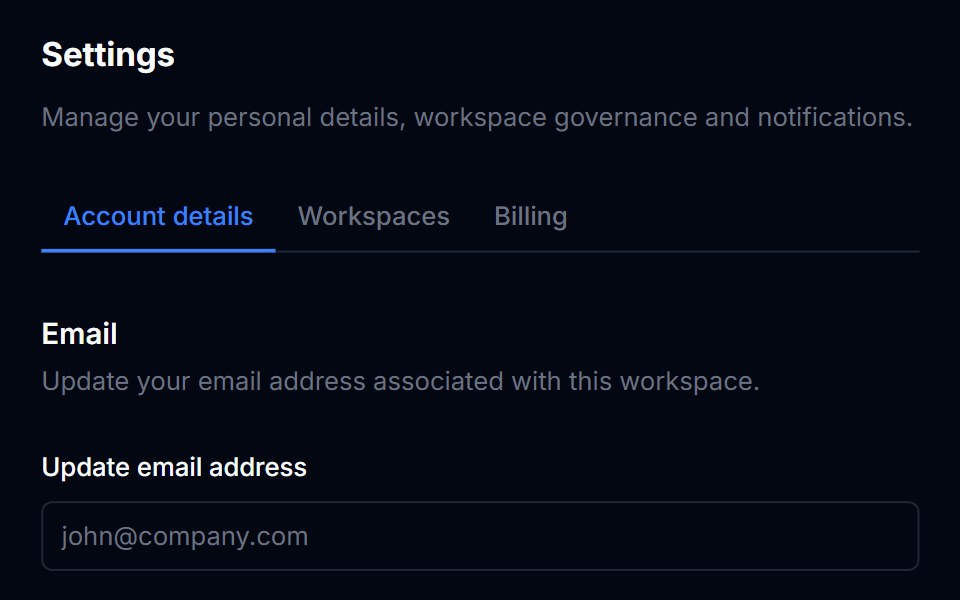 TabsTremor Blocks · React
 Feature Sevencnblocks · SvelteFeature section with tabs and content panels
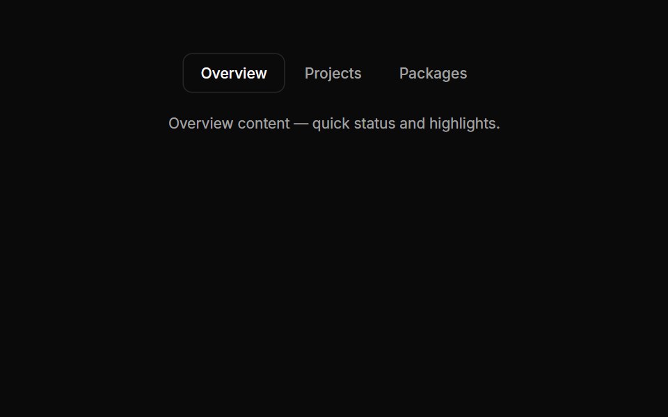 Tabs 02Oxbow UI · Astro
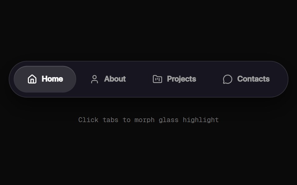 Morphing Tab NavbarRewamp UI · React
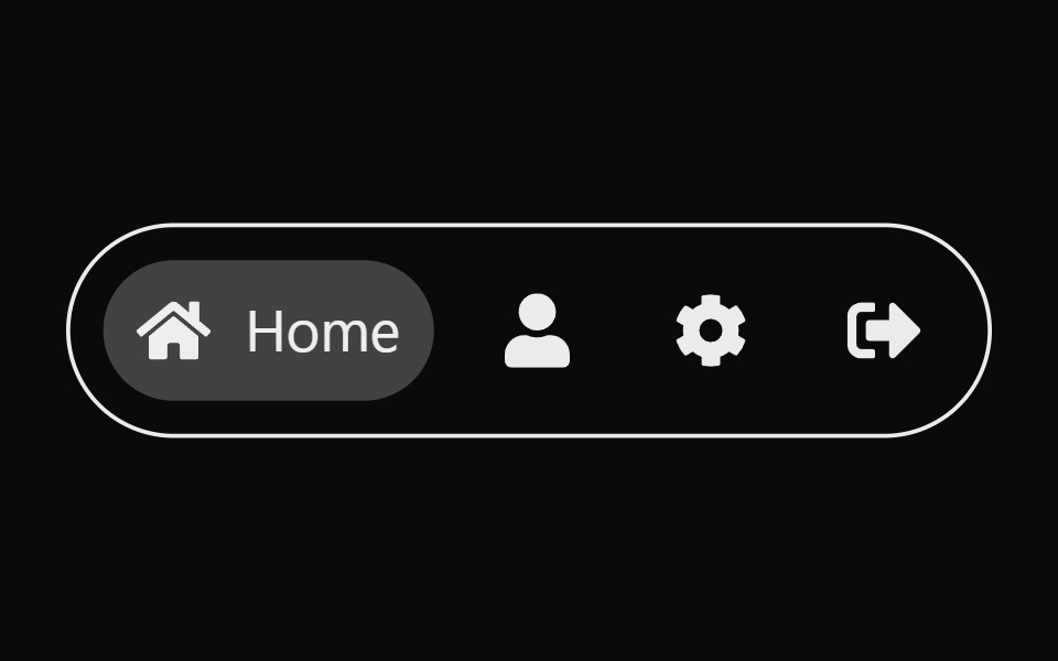 Expandable TabsSona UI · ReactAn accessible Base UI tab selector that expands the active icon into a labeled pill with input-aware layout motion.
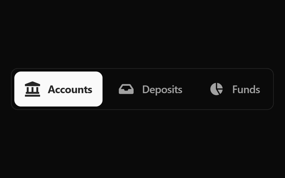 Fluid Tabs BaseWatermelon UI · ReactTabs with an indicator that flows smoothly from one tab to the selected one.
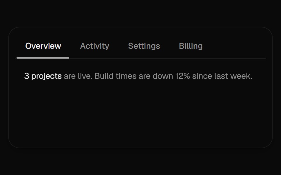 Sliding TabsUI Lab · ReactAn underline stretches toward the tab you pick while a soft pill follows your pointer.
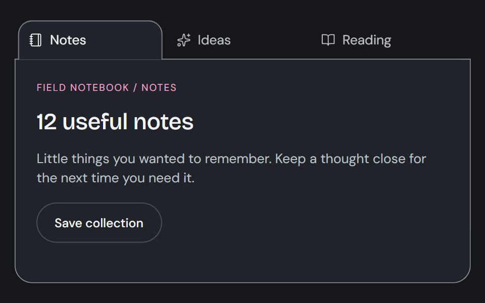 TabsCojeev UI · ReactSwitches between related content panels while keeping the available views visible.
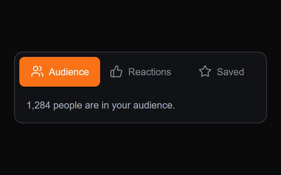 Sliding Content TabsMicroKit · ReactA compact tab switcher with a sliding active surface and content transition.
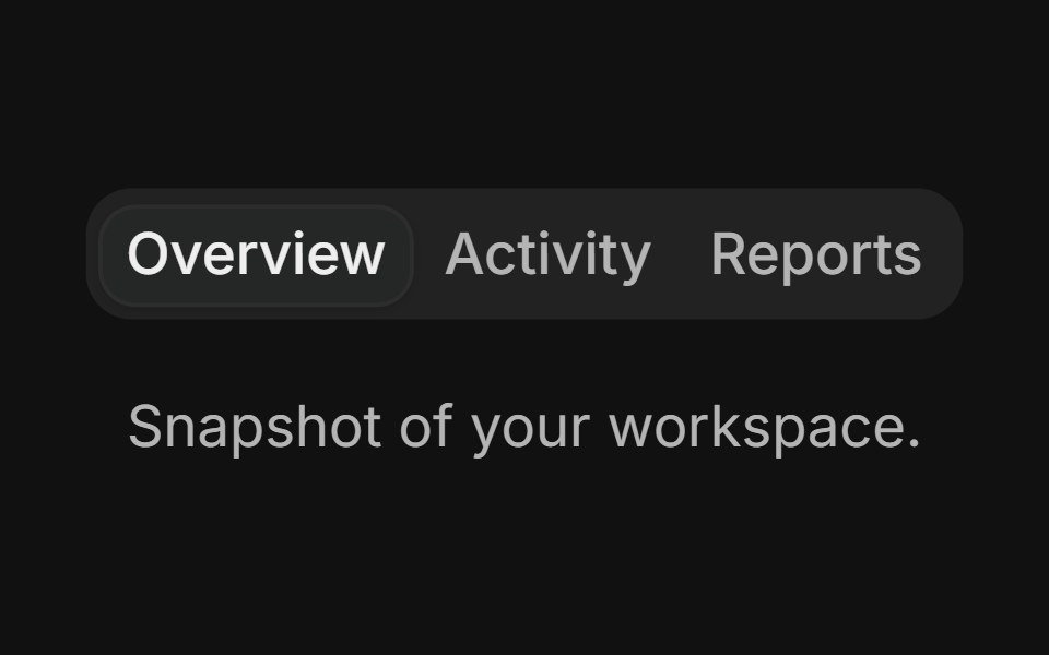 BasicFLX UI · ReactThree tabs with the default filled variant.
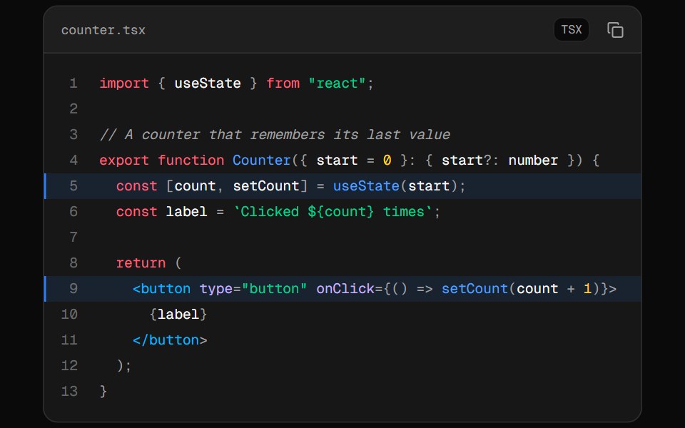 Code BlockVelora UI · ReactCode panel with tabs, line numbers, highlighted lines and a copy button.
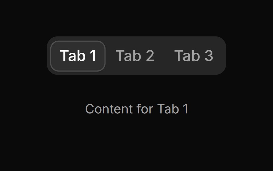 Tab 10sv-particles · Svelte
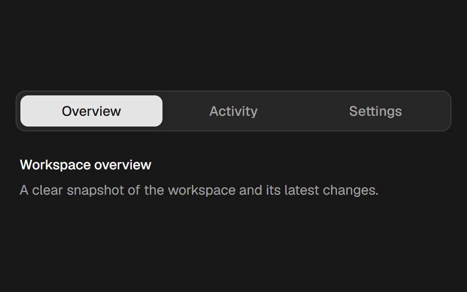 Velocity TabsSkecher UI · ReactAn accessible tab selector with a spring indicator that stretches in response to movement velocity.
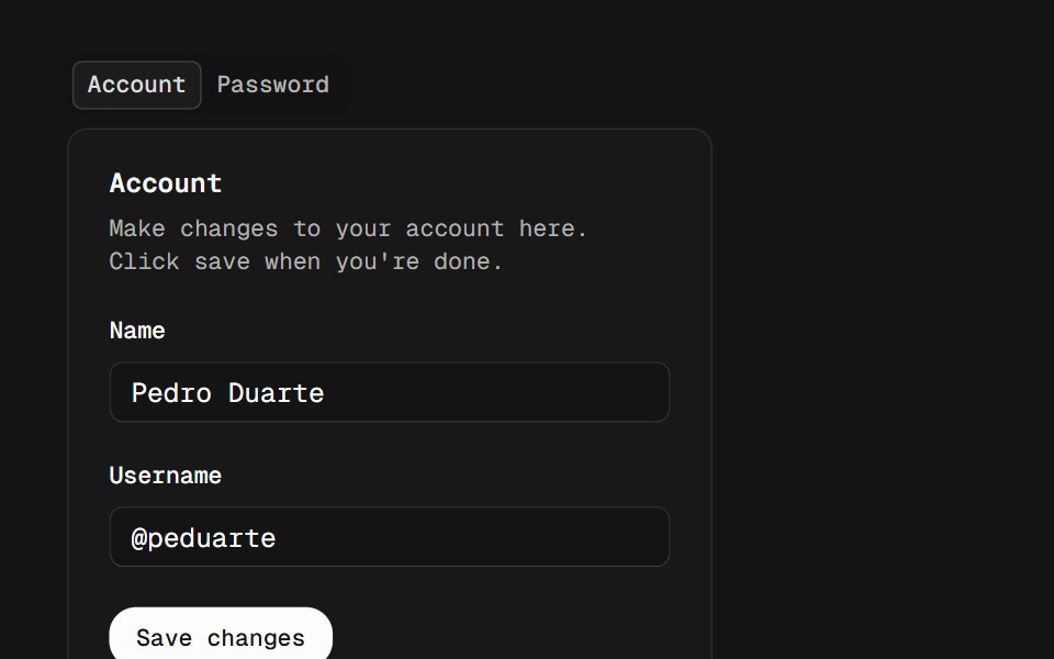 TabsD2Studio UI · ReactA set of layered sections of content, known as tab panels, that are displayed one at a time.
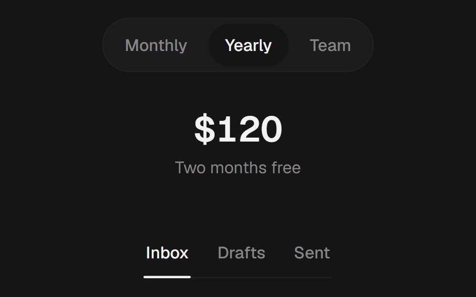 TabsEaseUI · ReactPill, segment, or underline tabs with an indicator that slides to the selected tab.
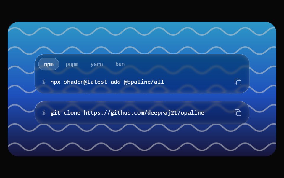 Glass SnippetOpaline · ReactA command on a glass capsule with copy, and tabs for npm, pnpm, yarn and bun.
 TikTok Post MockupReactFrame · ReactA full-bleed 9:16 TikTok feed mockup with a Following/For You tab bar, a side action rail (like/comment/save/share)…
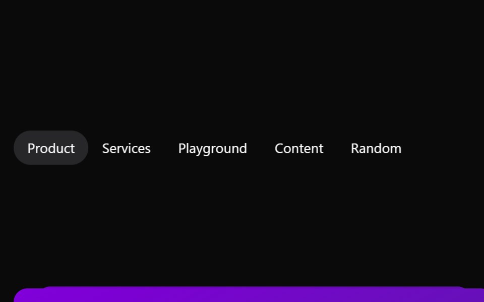 TabsAceternity UI · React
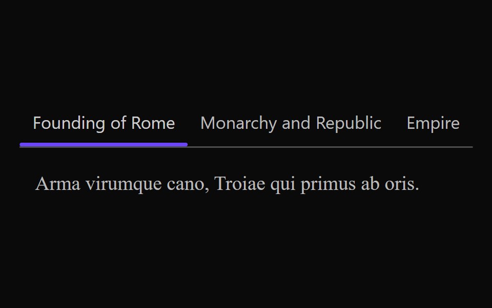 Vanilla TabsReact Spectrum · React
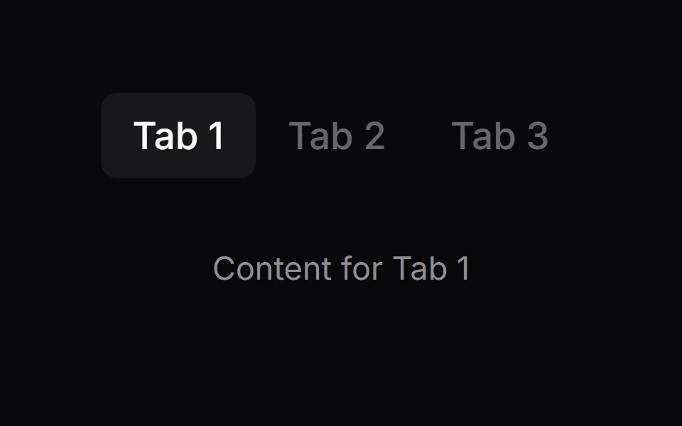 Comp 427Origin UI · React
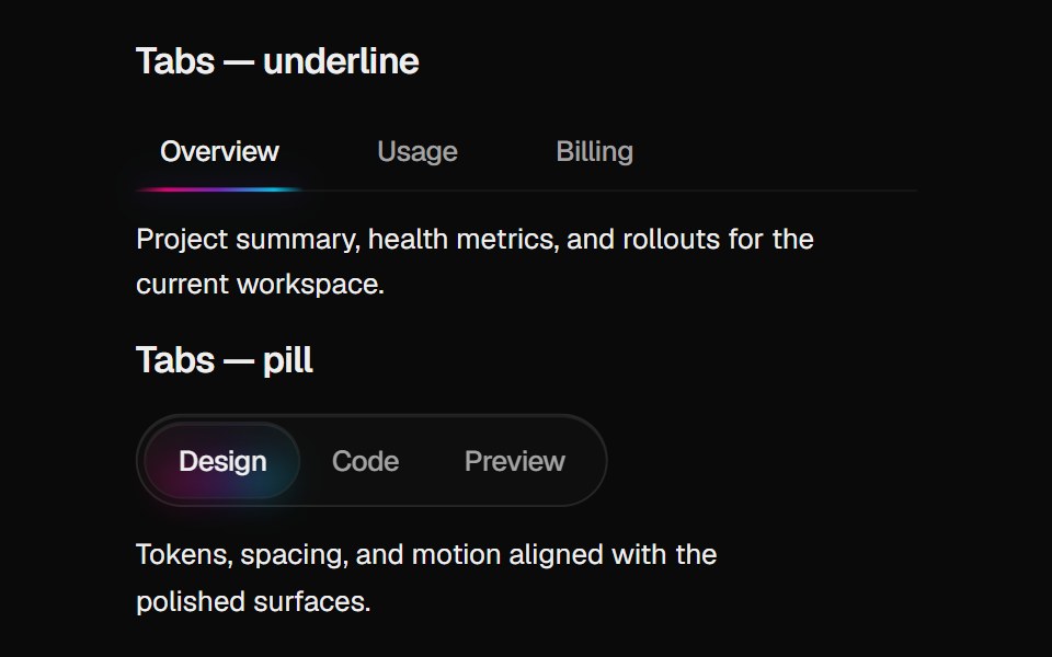 Halo TabsCult UI · ReactBase UI tabs with gradient indicator: underline or pill variant aligned with Halo Card rim colors
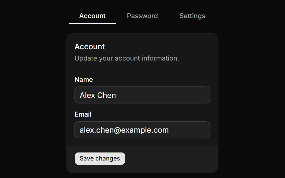 Tabs with line variant.ReUI · ReactTabs with line variant.
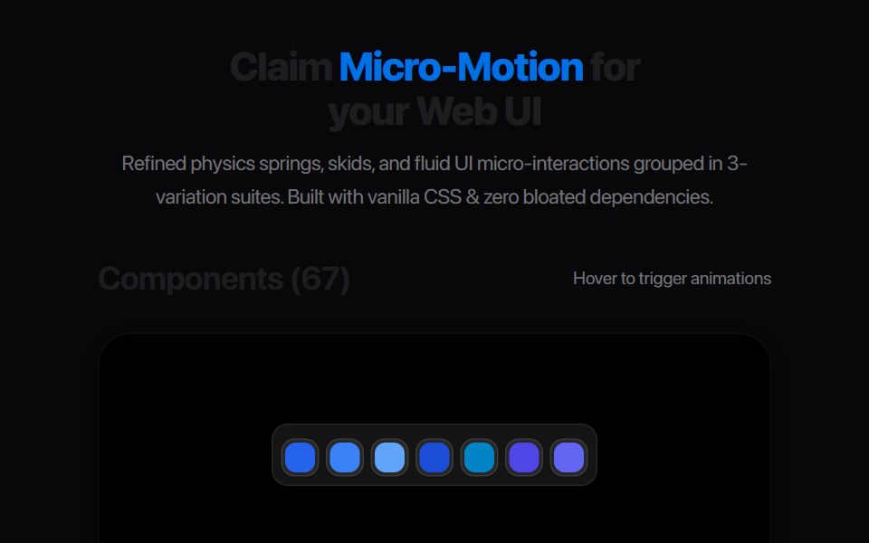 Multi Tab BarAmicro Micro Transitions · React
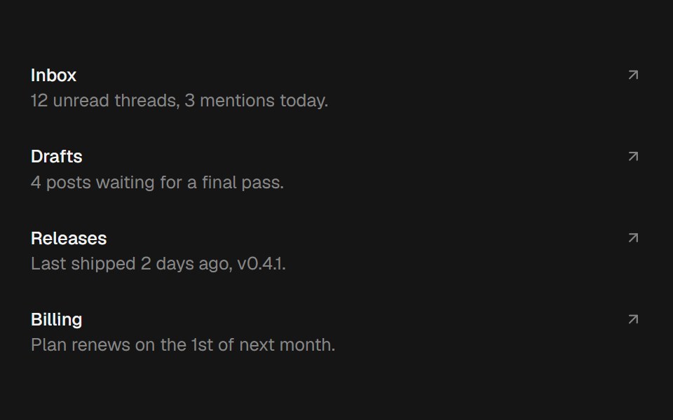 Shared Layout BgbeUI · ReactA pill that glides between hovered items via motion's shared layout, with blur enter/exit.
- Tabs SubtleFluid Functionalism · ReactHorizontal tab navigation with fluid hover, animated pill selection indicator, and fluid font-weight transitions…
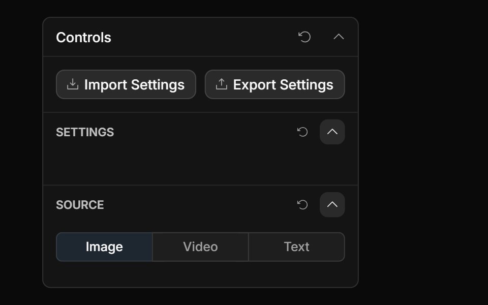 Tabs ControlToolcraft · React
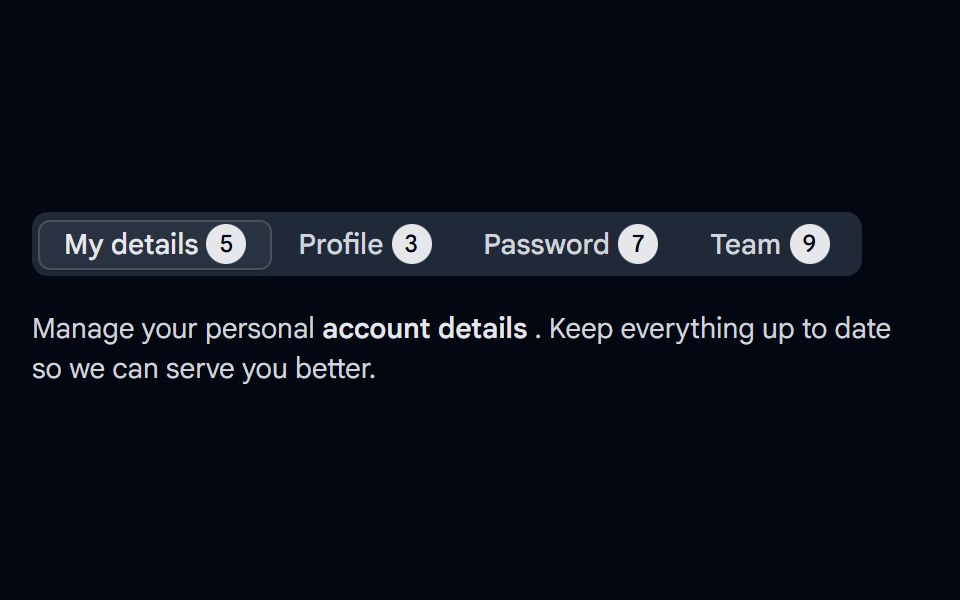 Tabs-04 - With CountShadcn Space · ReactTabs component
 Stacked Folder CardOpenSourceUI · React
 Vertical Tabsuselayouts · ReactA vertical tab interaction with smooth content switching.
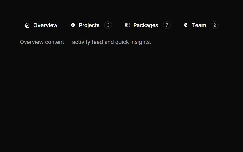 Tabs 03Oxbow UI · Astro
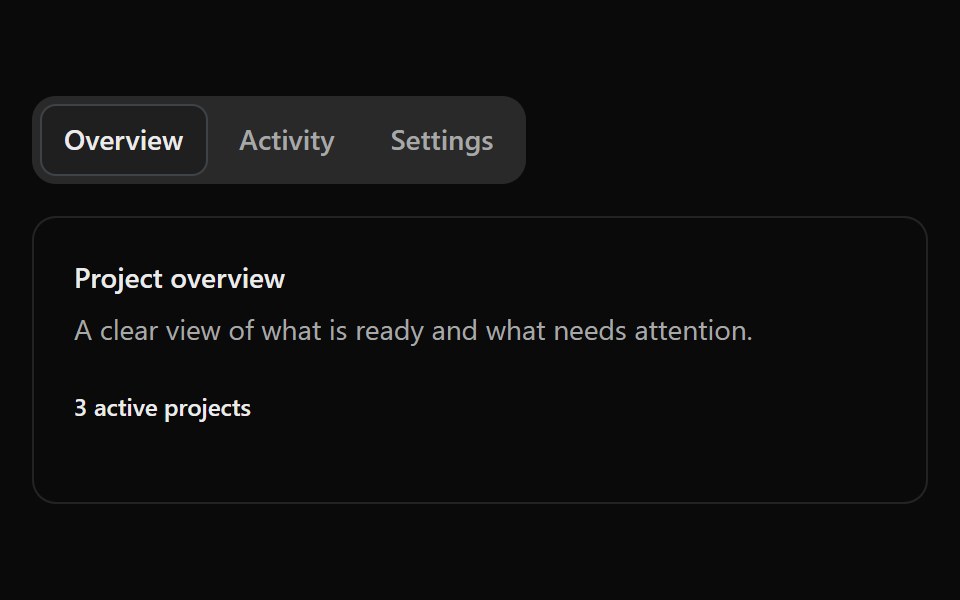 Fluid TabsSona UI · ReactAn accessible Base UI tab selector with a shared active surface that travels fluidly between selections, with capsule…
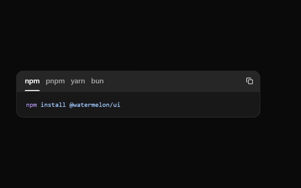 Code TabsWatermelon UI · React
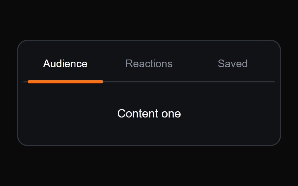 Sliding Underline TabsMicroKit · ReactA compact tab switcher with an orange underline that glides between labels.
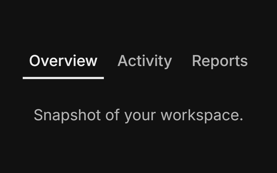 Line variantFLX UI · ReactUnderline indicator instead of filled background.
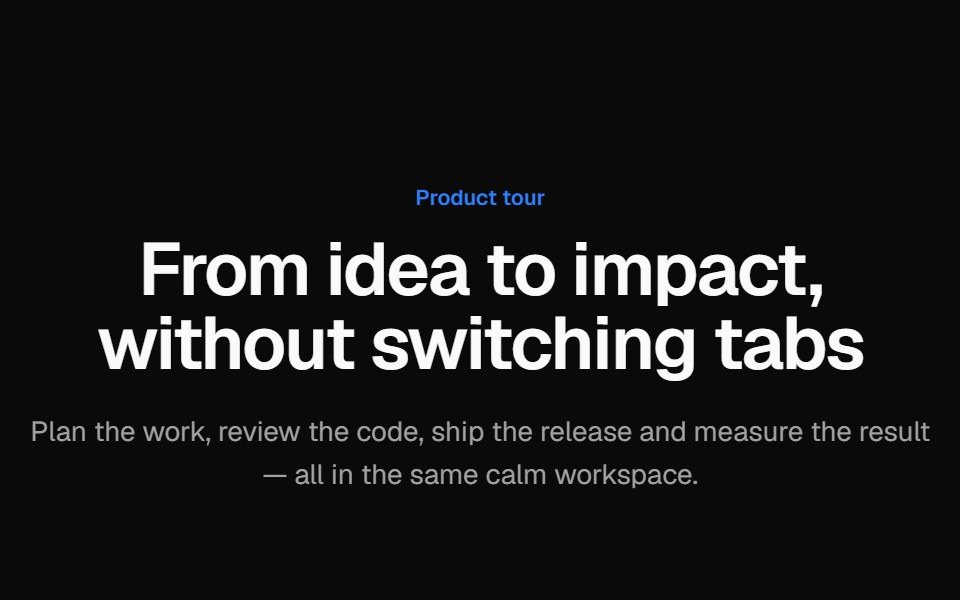 Tabbed product tourVelora UI · ReactProduct tour with animated tabs; each tab pairs short copy and a checklist with a Tailwind-built app mock.
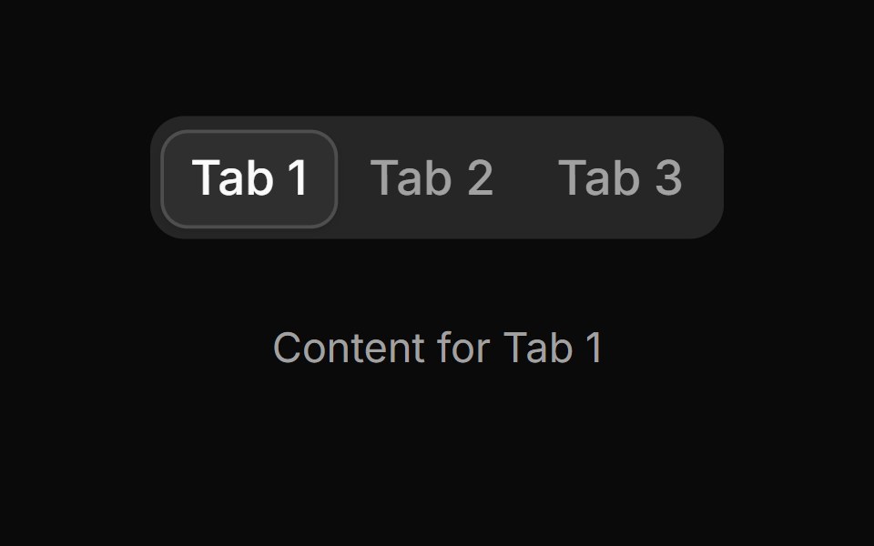 Tab 11sv-particles · Svelte
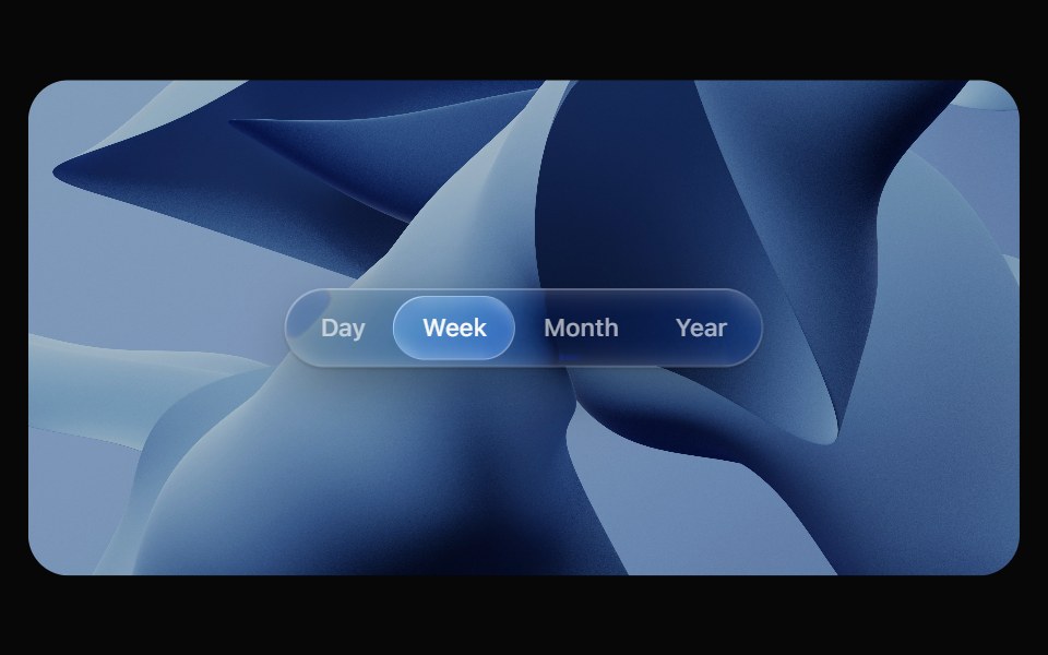 Glass TabsOpaline · ReactSegmented control with a glass bubble that glides between tabs.
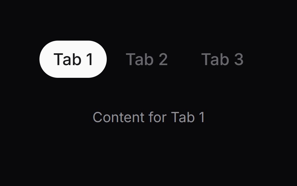 Comp 428Origin UI · React
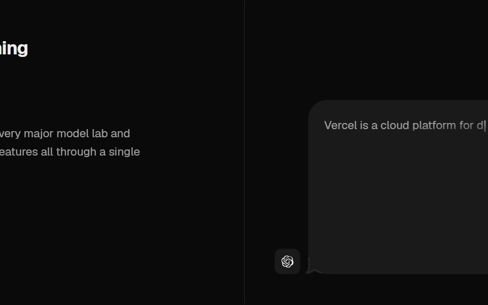 Tabs Illustration VercelCult UI · ReactTabs with Vercel-style illustrations
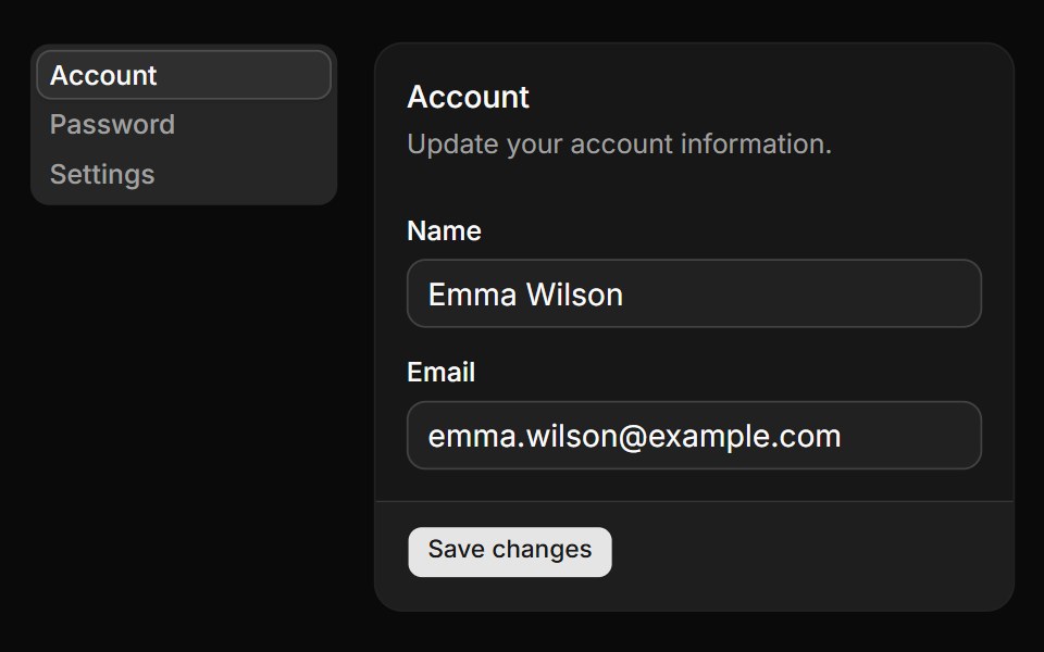 Tabs with vertical orientation.ReUI · ReactTabs with vertical orientation.
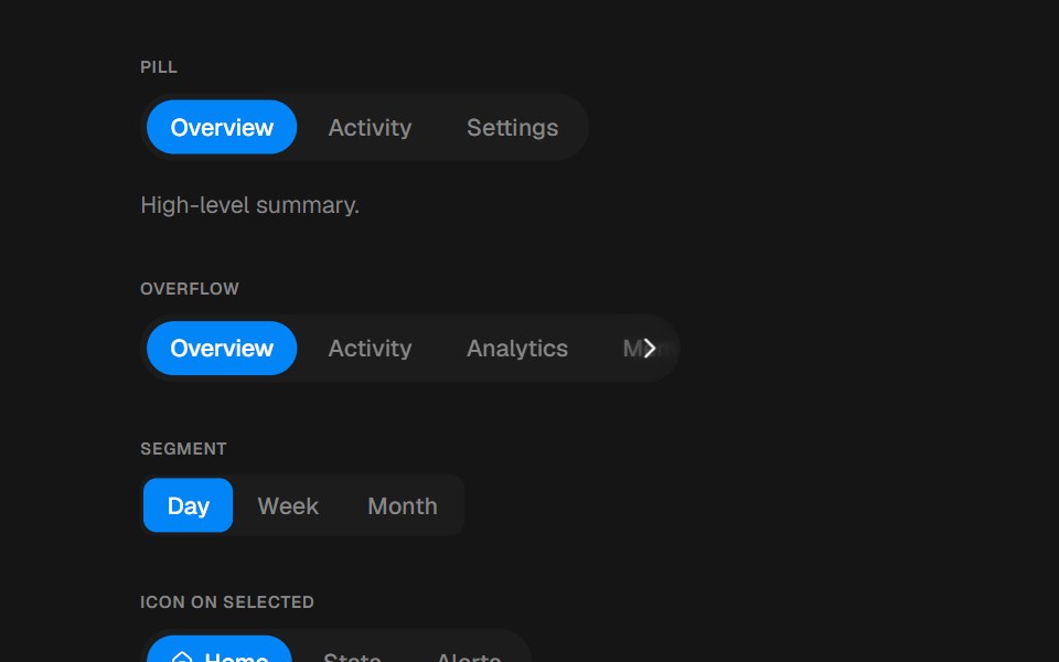 TabsbeUI · ReactPill, segment or underline tabs with a spring layoutId indicator.
- Tabs SubtleFluid Functionalism · ReactHorizontal tab navigation with fluid hover, animated pill selection indicator, and fluid font-weight transitions. Base…
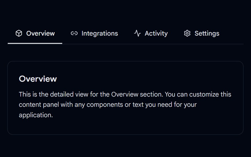 Tabs-05 - UnderlineShadcn Space · ReactAnimated underline tabs component
Libraries with Tailwind CSS tabs components
Related categories
- Tabs Components
- React Tabs Components
- Svelte Tabs Components
- Animated Tabs Components
- shadcn/ui Tabs Components
- Tailwind CSS Navigation Components
- Tailwind CSS Menu Components
- Tailwind CSS Stepper Components
- Tailwind CSS Navbar Components
- Tailwind CSS Sidebar Components
- Tailwind CSS Pagination Components
- Tailwind CSS Breadcrumb Components
- Tailwind CSS Command Palette Components
- Tailwind CSS Context Menu Components
- Tailwind CSS Mega Menu Components
- Tailwind CSS Dock Components
- Tailwind CSS Wizard Components
- Tailwind CSS Table Of Contents Components
- Tailwind CSS Tab Bar Components
- Tailwind CSS Hamburger Menu Components