 Dev Design Library
React Tabs Components
Dev Design Library indexes 177 React tabs components from 71 open-source UI libraries, with the most coming from Origin UI, FLX UI, Shadcn Space, ReUI and Watermelon UI. Each one links to its page with the source code, a live preview where available, the library license and the install command. Every library in this list targets React. Tabs components belong to the Navigation group.
Showing 120 of 177, a mix from every library. Open a library to see all of its components.
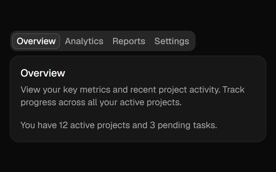 Tabsshadcn/ui · ReactA set of layered sections of content—known as tab panels—that are displayed one at a time.
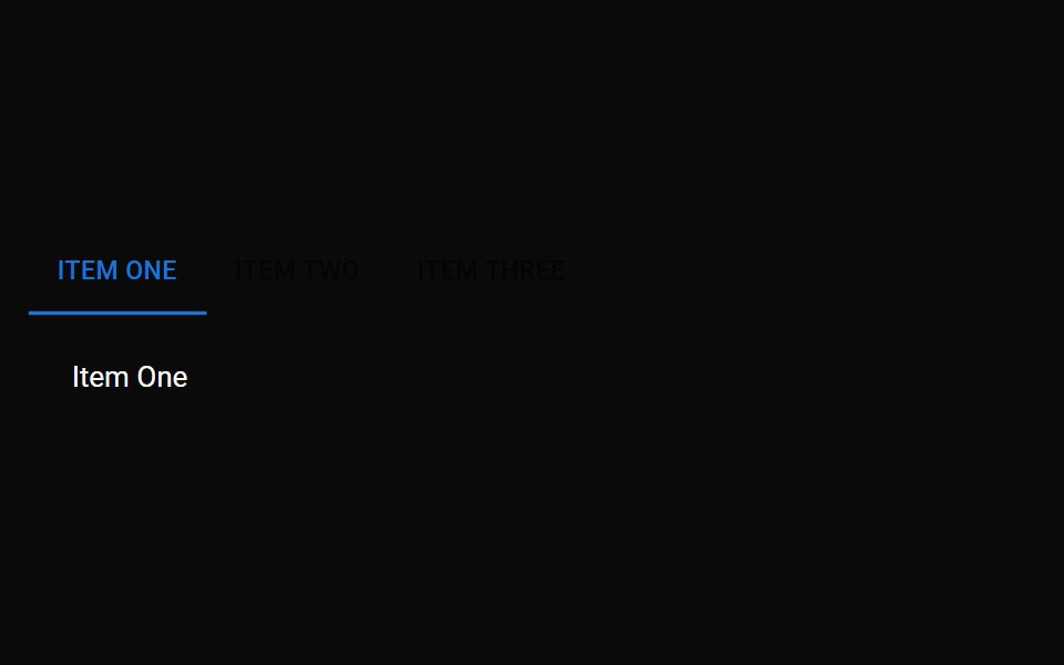 TabMUI / Material UI · React
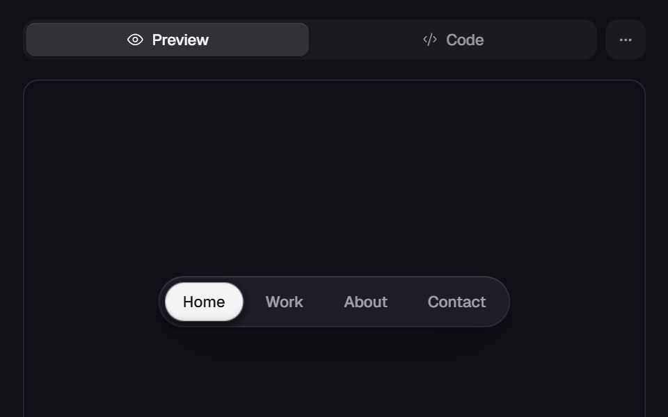 Gooey NavReact Bits · ReactNavigation indicator morphs with gooey blob transitions between items.
 TabsChakra UI · ReactUsed to display content in a tabbed interface
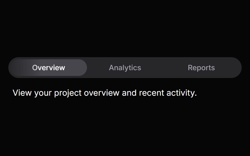 TabsHeroUI · ReactOrganize content into tabbed views with animated transitions and indicators.
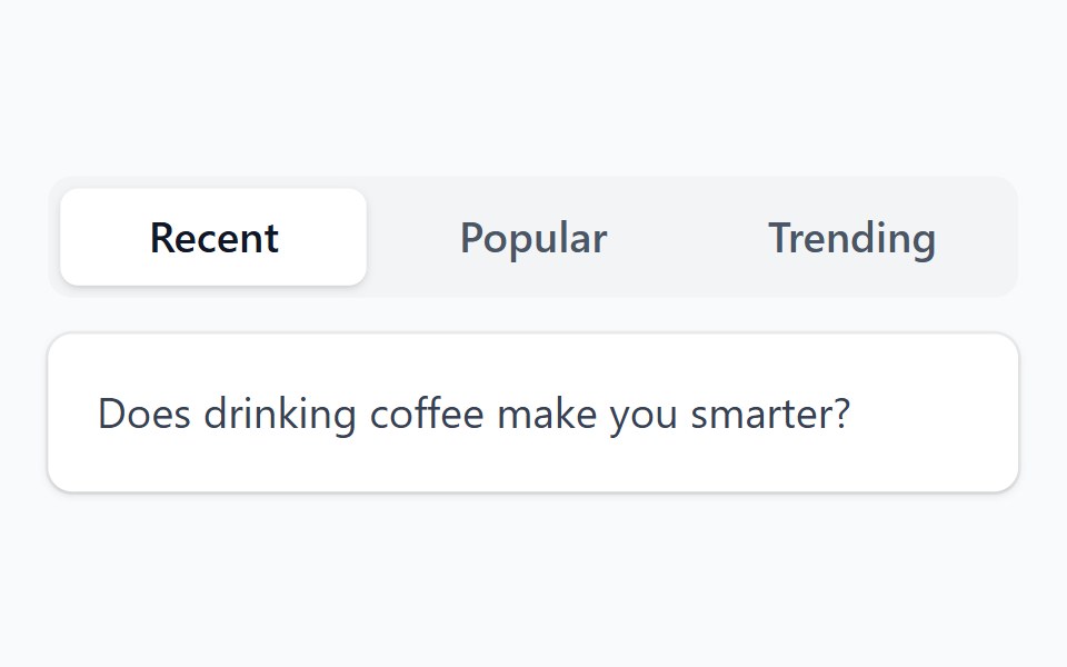 TabHeadless UI · React
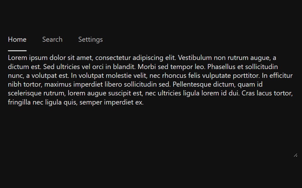 TabsReact Spectrum · ReactTabs organize content into multiple sections and allow users to navigate between them. The content under the set of…
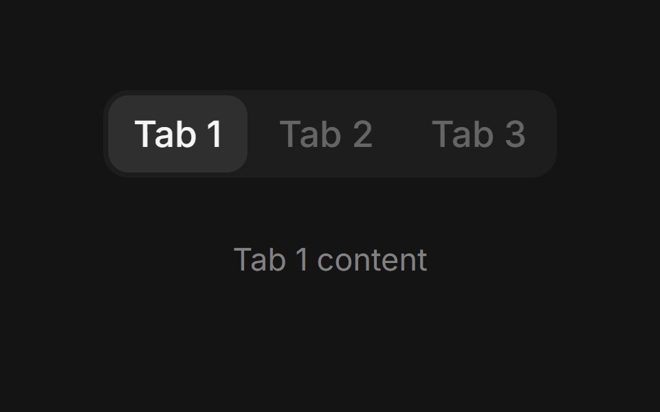 Tabscoss ui · ReactA component for toggling between related panels on the same page.
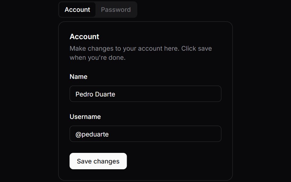 TabsOrigin UI · ReactA component for toggling between related panels on the same page.
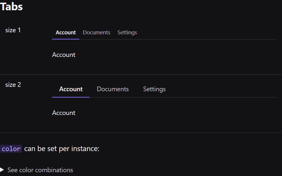 TabsRadix Themes · React
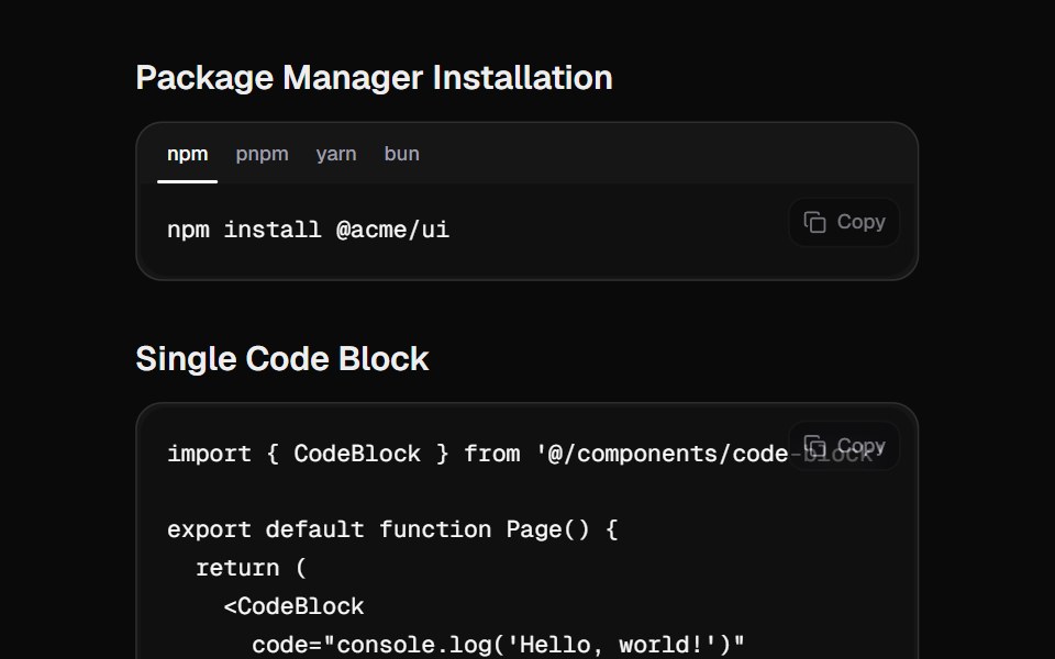 Code BlockCult UI · ReactA beautiful code block component with tabs, copy functionality, and smooth animations
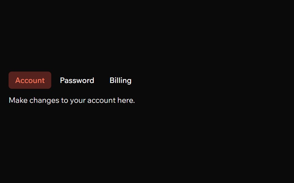 TabsArk UI · ReactFlexible navigation tool with various modes and features.
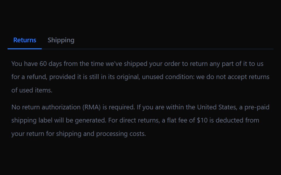 TabsTremor · React
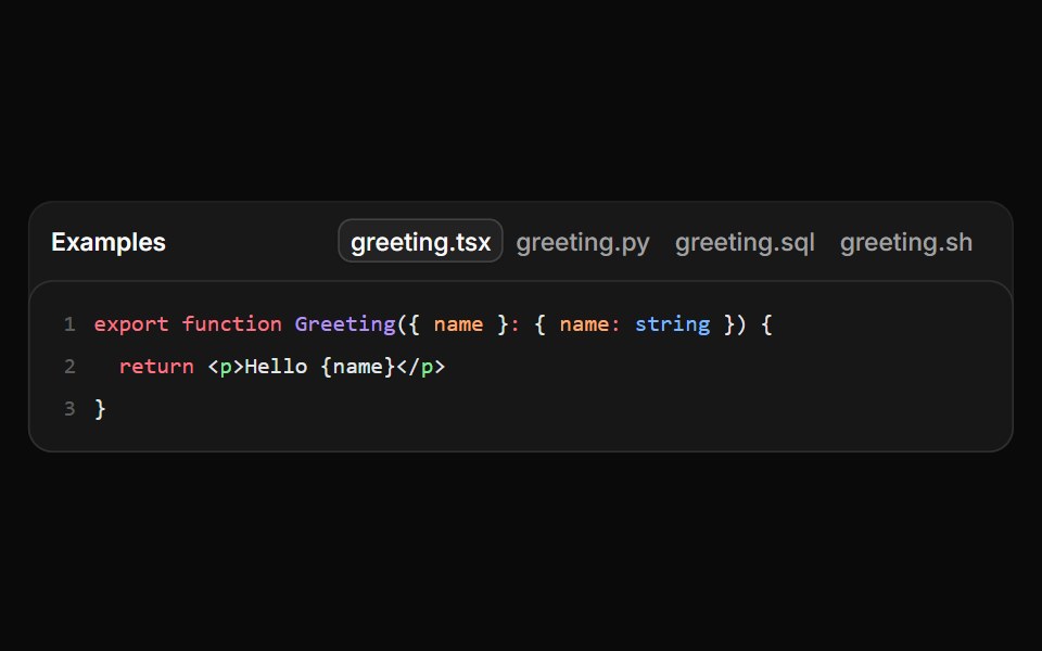 File tabs in a dense frameReUI · ReactA framed file switcher loading one grammar chunk per selected language.
 Ab Segmented TabsAmicro Micro Transitions · ReactSegmented control where active letter (A or B) slides into a solid pill.
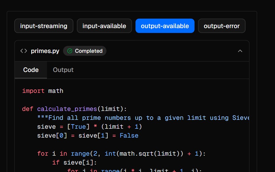 SandboxAI Elements · ReactA collapsible container for displaying AI-generated code and output in chat interfaces.
 TabsPark UI · ReactA component for organizing content into switchable panels.
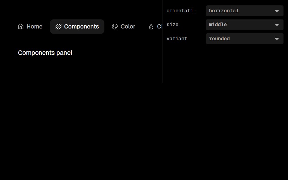 TabsLobe UI · ReactBase UI-powered Tabs with iOS-flavored interactions — no hover background, tap-scale feedback, and a sliding active…
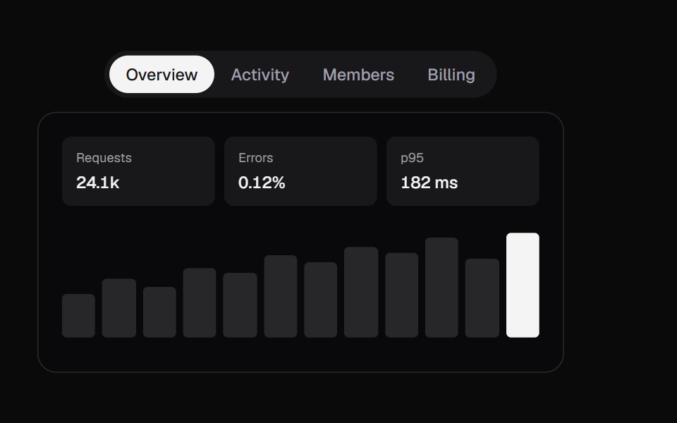 Swipe TabsKokonut UI · ReactTabs with a swipeable panel, a drag-tracked indicator and spring physics.
 tabsIntent UI · Reacttabs
 TabsUntitled UI React · React
 Expandable TabsbeUI · ReactIcon tab bar where the active tab expands to a labelled pill, with a panel above that morphs height and slides content…
 TabsTailGrids · ReactA tabs component with multiple variants.
 FAQ Tabs CardSpectrum UI · ReactA tabbed FAQ card with animated accordion answers and a support footer.
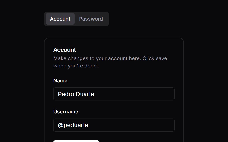 TabsVengeance UI · React
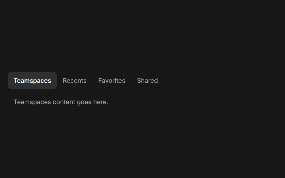 TabsFluid Functionalism · ReactHorizontal tab navigation with fluid hover, animated pill selection indicator, and fluid font-weight transitions…
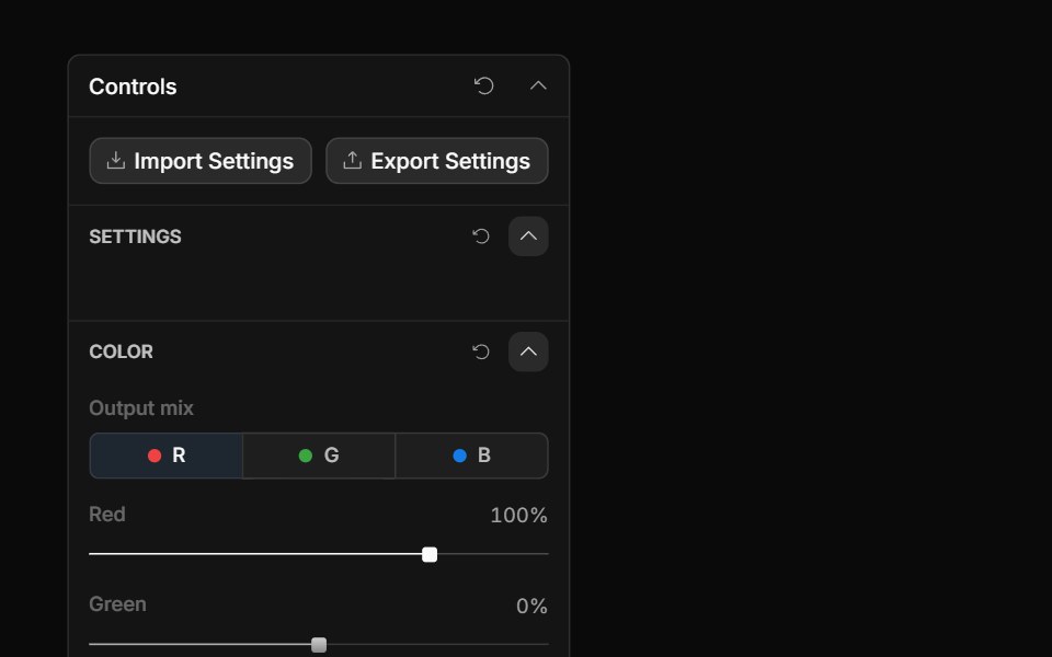 Channel TabsToolcraft · React
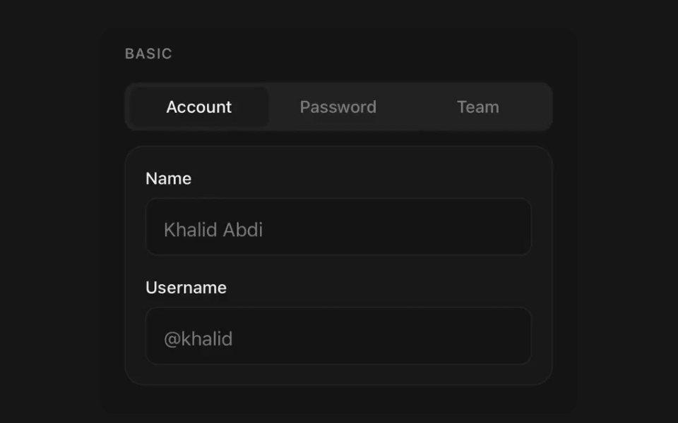 TabsPanel UI · React NativeSegmented navigation with an animated indicator.
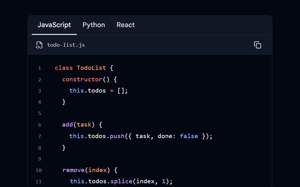 Code Block 06 - Language TabsShadcn Space · ReactCode block with language selector tabs (JavaScript, Python, React) and scrollable content
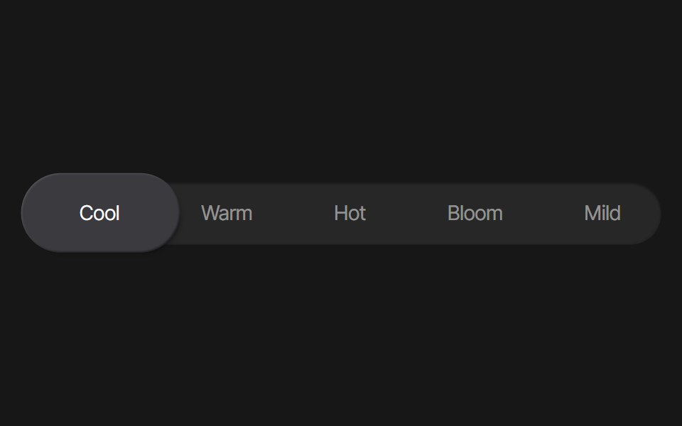 Tab Background AnimationPixel Perfect · ReactA tab background animation using Framer Motion.
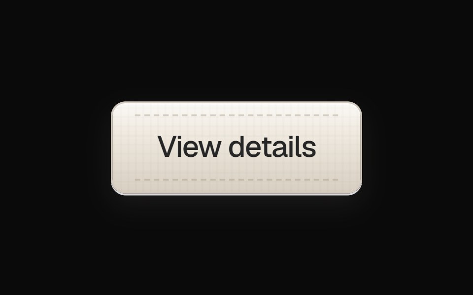 Linen Tab ButtonOpenSourceUI · React
 Bento Carduselayouts · ReactAn interactive bento card with animated tabs and workspace preview.
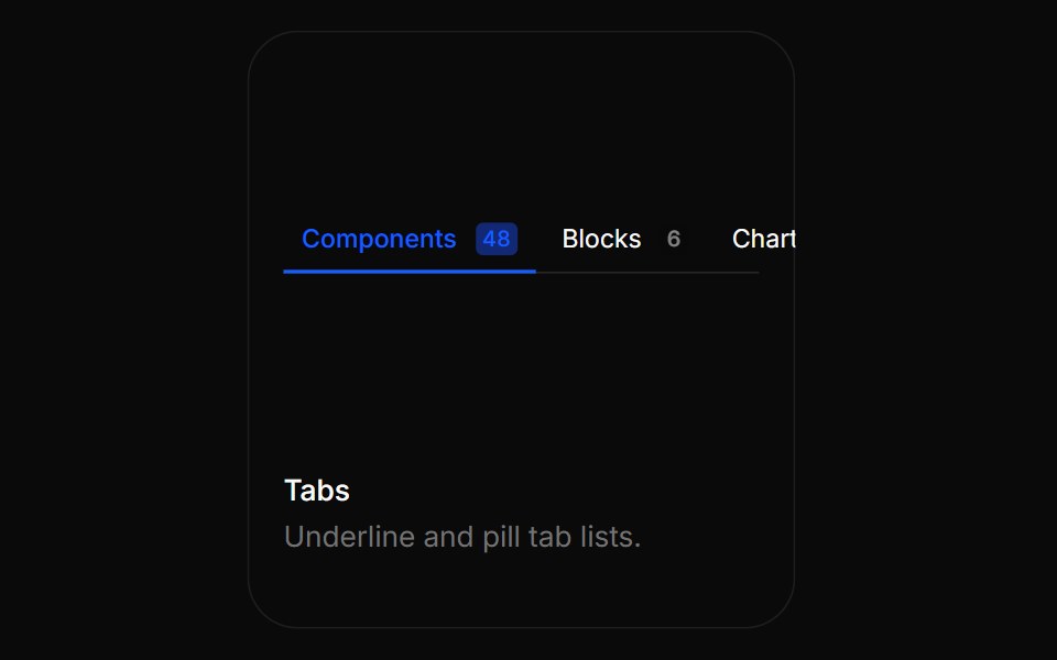 TabsBoardUI · ReactUnderline and pill tab lists.
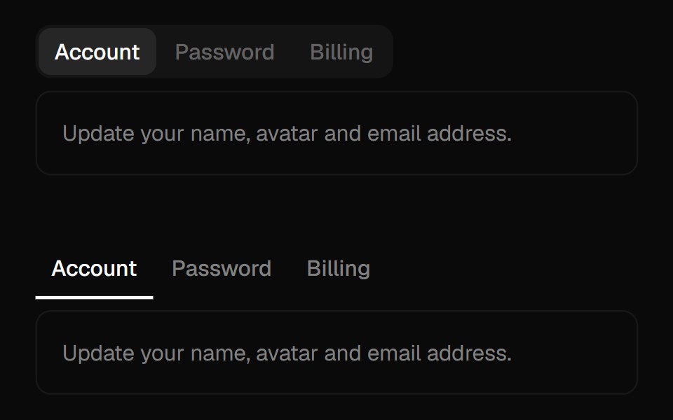 TabsComponentry · React
 Tab NavigationTremor Blocks · React
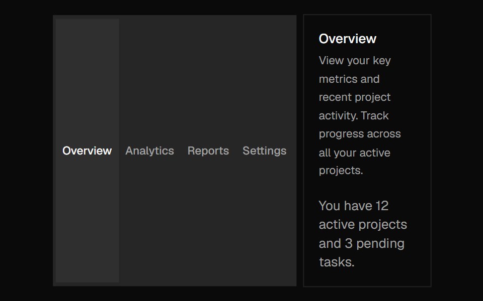 TabsShadcn Dashboard · React
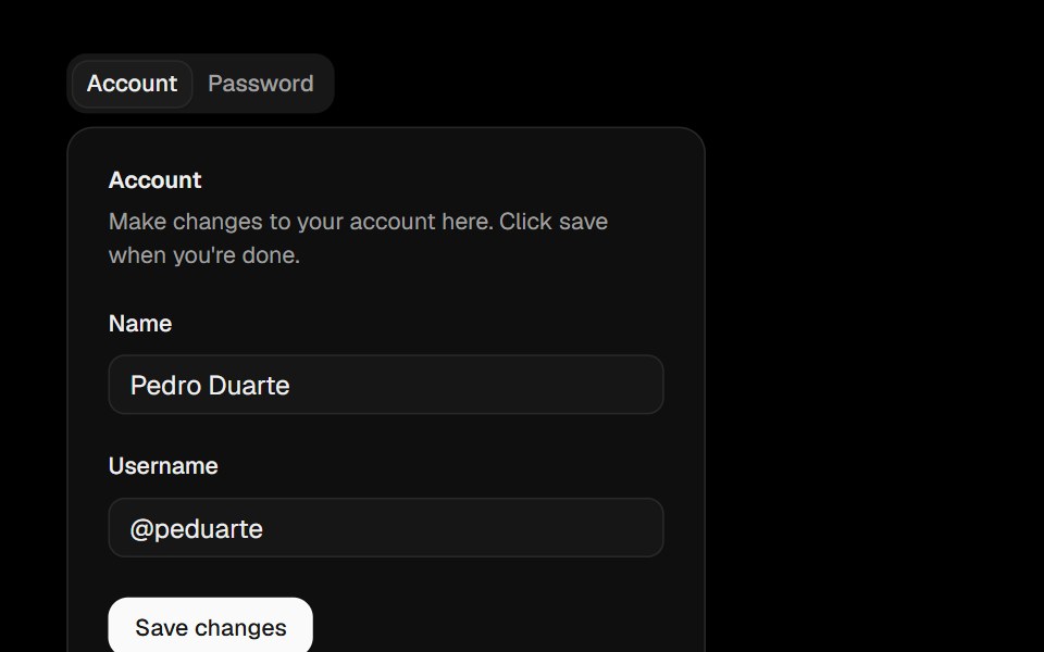 TabsObsidianUI · React
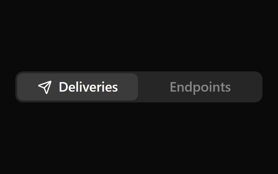 Icon TabsNotra · ReactA segmented tab selector where only the active tab shows its icon, sliding in beside the label. Built on the Base UI…
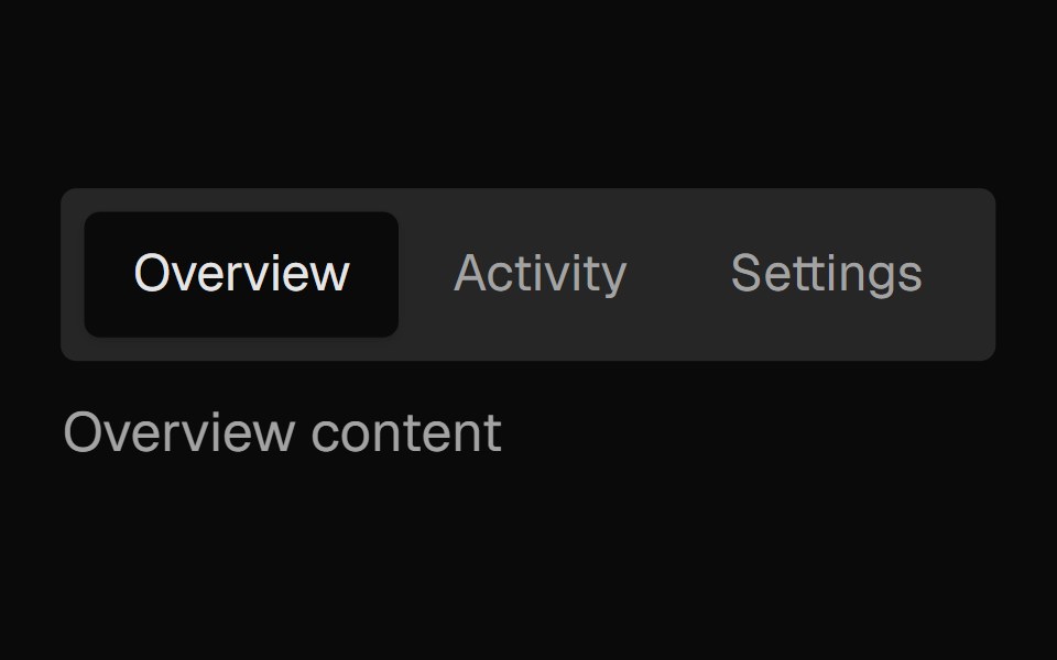 Tabs SubtleNexvyn UI · ReactA pill-style tab list where the selected indicator springs between tabs, built on the WAI-ARIA tabs pattern with full…
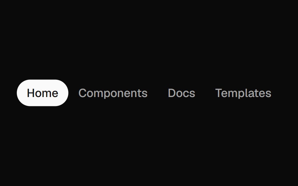 Animated TabsForge UI · Reactwitch tabs smoothly with motion-based underline or highlight effects.
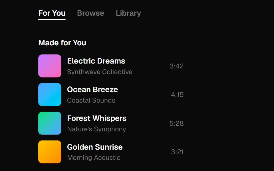 tabsBaseLayer · ReactTabs organize content into multiple sections and allow users to navigate between them.
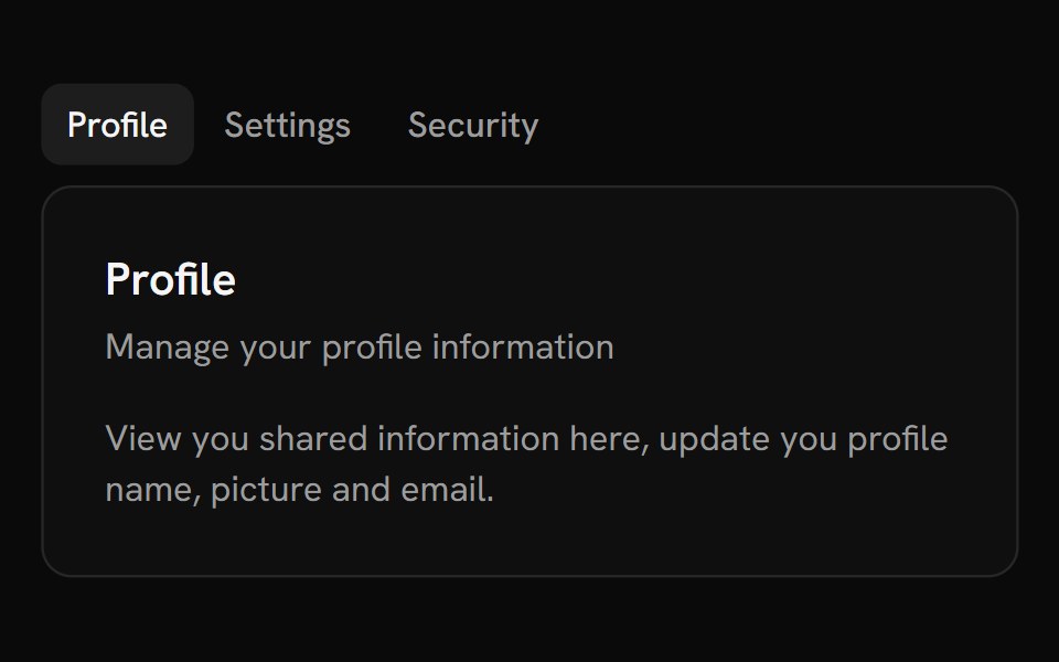 TabsShark UI · ReactA tabs for navigating between content.
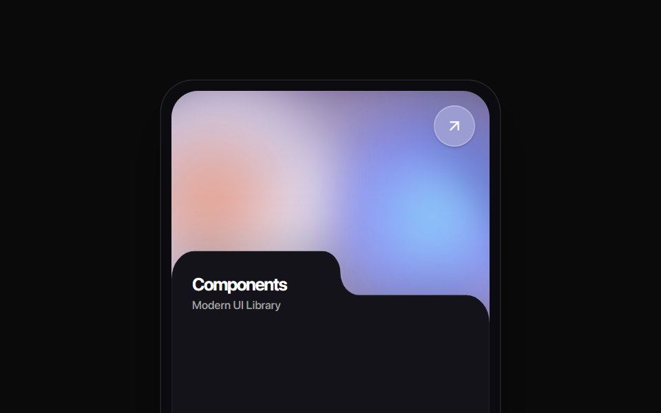 Folder Tab CardRewamp UI · ReactA modern tactile UI card featuring an ethereal animated mesh aurora gradient header, circular diagonal glass arrow…
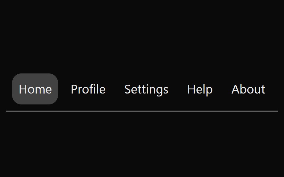 Animated TabsSona UI · ReactAn accessible horizontal tab selector built on Base UI with controlled state, keyboard navigation, disabled items, and…
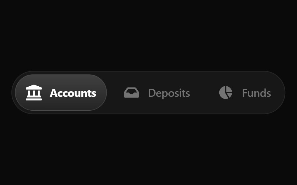 Fluid TabsWatermelon UI · ReactTabs with an indicator that flows smoothly from one tab to the selected one.
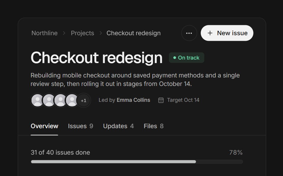 Page headerArc Library · ReactA project page header that folds into a compact bar as you scroll, with tabs whose counts roll.
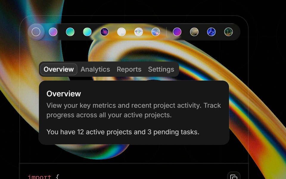 Component Previewglasscn · ReactA preview shell for component demos with switchable default and glass variants.
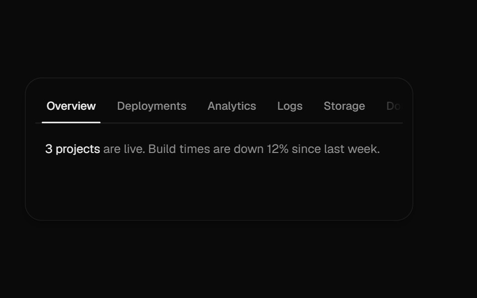 Overflow TabsUI Lab · ReactScrolls a long row of tabs, fading whichever edge still hides more.
 TabsHextaUI · ReactSwitch between views with an indicator that slides to the active tab, as a segmented control or an underline, and…
 DevTools Drawer BlockLocalMode · ReactA global on-device observability drawer: six tabbed surfaces (inference queues, event log, pipeline runs, model cache…
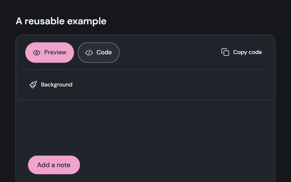 Component previewCojeev UI · ReactPairs a live component example with a code view and a copy action.
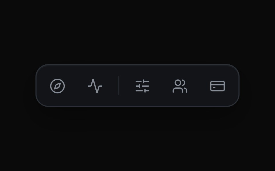 Expanding Icon TabsMicroKit · ReactAn icon bar where the chosen tab widens to reveal its label and the rest of the row slides over to make room.
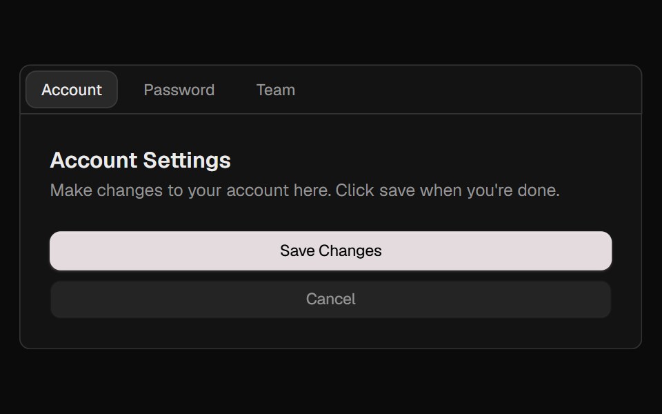 TabsROI UI · ReactA set of layered sections of content.
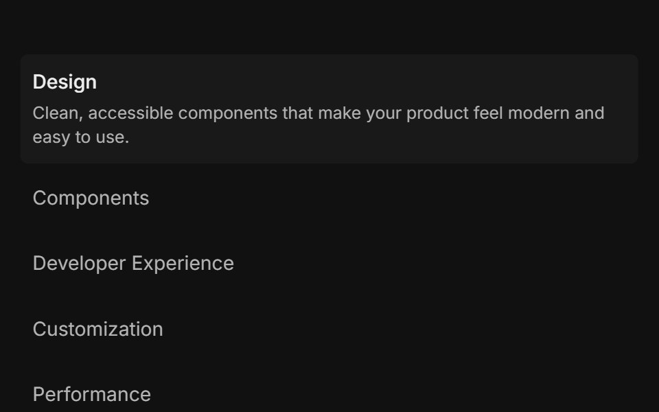 Feature 01FLX UI · ReactList of items: select one to reveal its description and media.
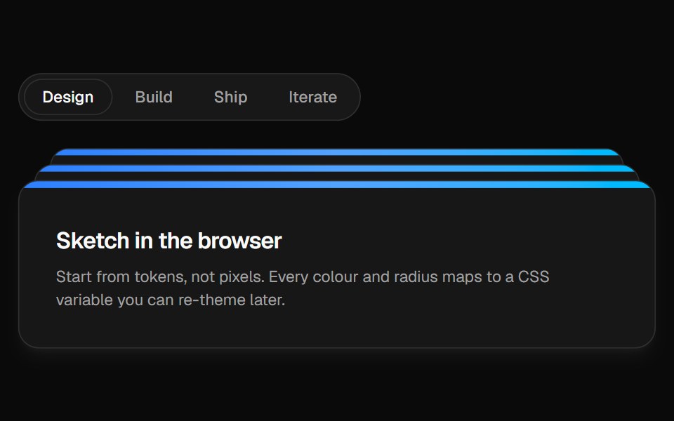 Animated TabsVelora UI · ReactTabs with a gliding pill and panels stacked like cards that peek behind.
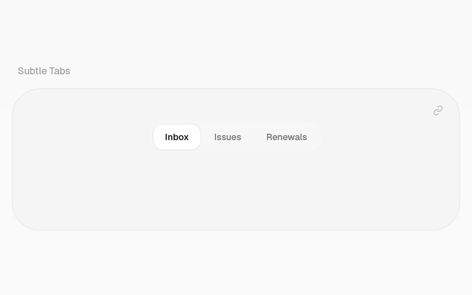 Subtle TabsHalaska UI · ReactTabs with a background pill that springs to the selected tab.
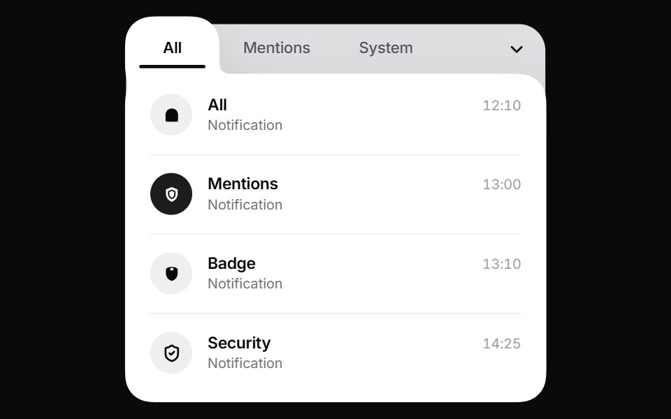 Liquid TabsPin UI · React
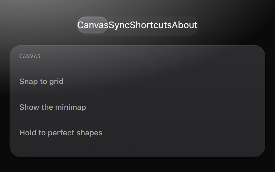 TabsMetal UI · React + SwiftUISwitches which panel is shown: the switcher track and gliding thumb as the tab list, and panels that drift in from the…
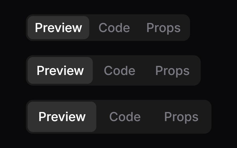 TabsSpaceUI · ReactSplits content into switchable tabs on a single screen, allowing users to view different sections of related…
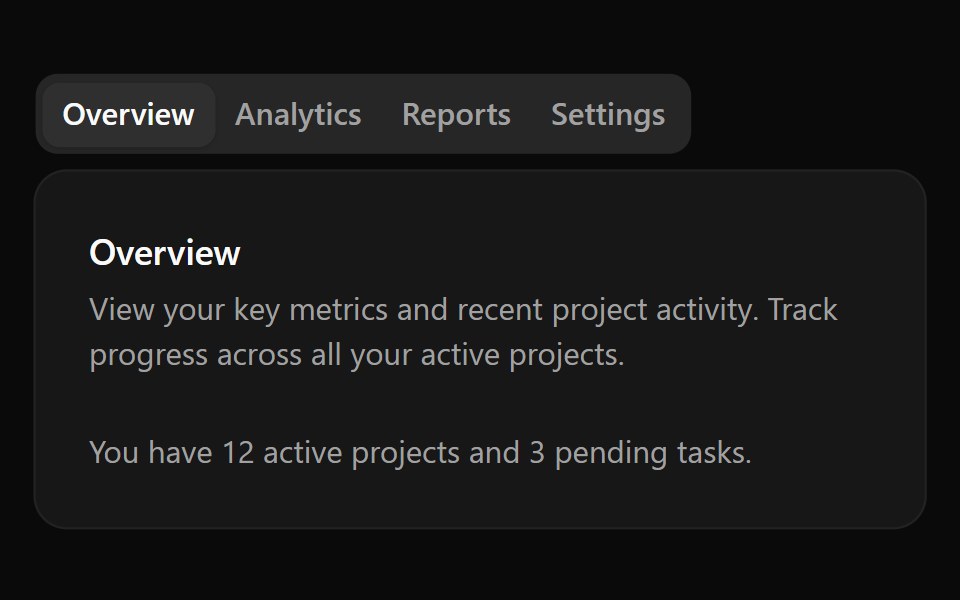 Aria TabsReScript shadcn · ReScript
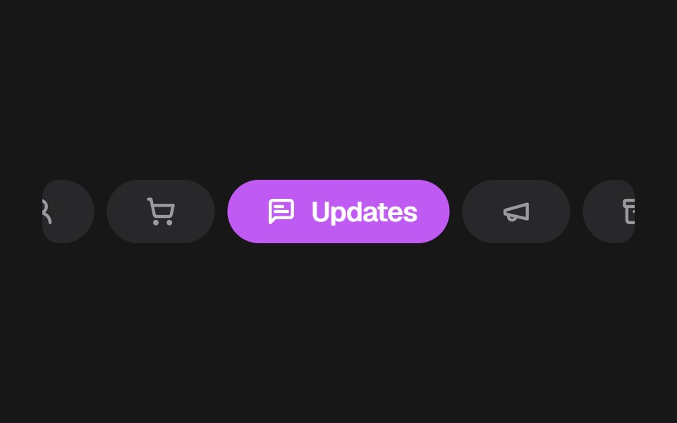 Apple Mail TabsSkecher UI · ReactA colorful, horizontally scrollable mail category selector with compact inactive tabs and an expanded active tab.
 Expandable TabsSora UI · ReactA pill-shaped tab bar that expands into a floating panel, with Motion driving the shell, label, and content transitions.
 TabsOUI · ReactReact aria components Tabs with shadcn characteristics.
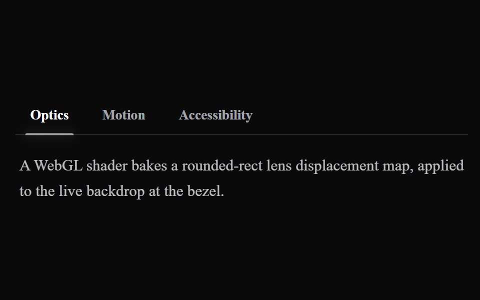 Liquid TabsLiquefy UI · ReactTabs in liquid glass style. Abas em estilo vidro líquido.
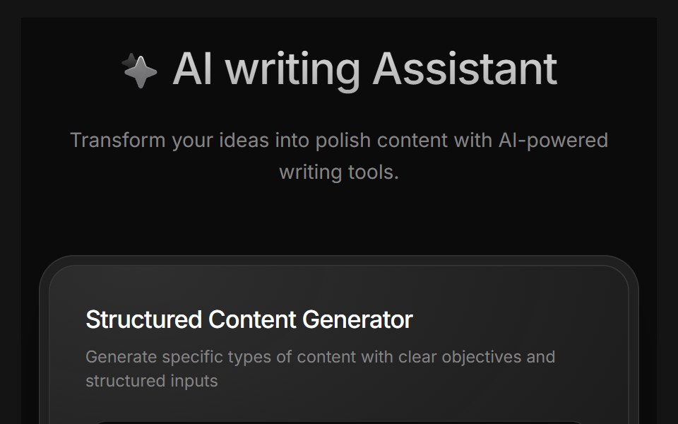 AI Writing AssistantD2Studio UI · ReactAI writing assistant panel with assistant, blog and pro modes and a prompt field.
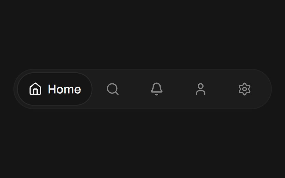 Expandable TabsEaseUI · ReactA row of icon tabs where the selected one expands to reveal its label, sliding a shared background pill to match.
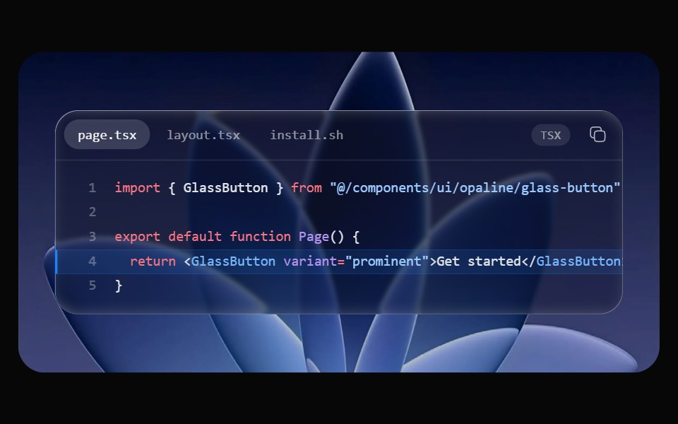 Glass Code BlockOpaline · ReactSyntax-highlighted code in a glass window, with tabs, line numbers, highlighted lines and copy.
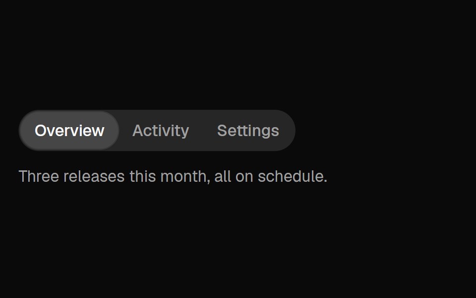 TabsFibo · ReactSwitches between views of one subject in place, as a segmented control or a row of tabs with an underline; scrolls…
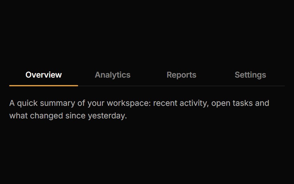 TabsReactFrame · ReactAn accessible tab set with underline, pill and segmented variants, a sliding animated indicator, icons, counts…
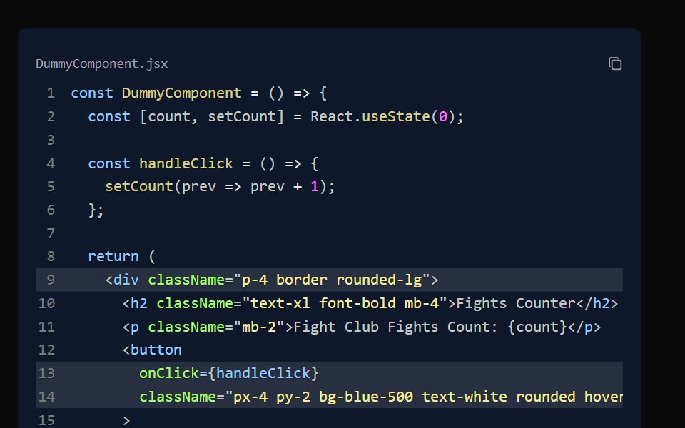 Code BlockAceternity UI · React
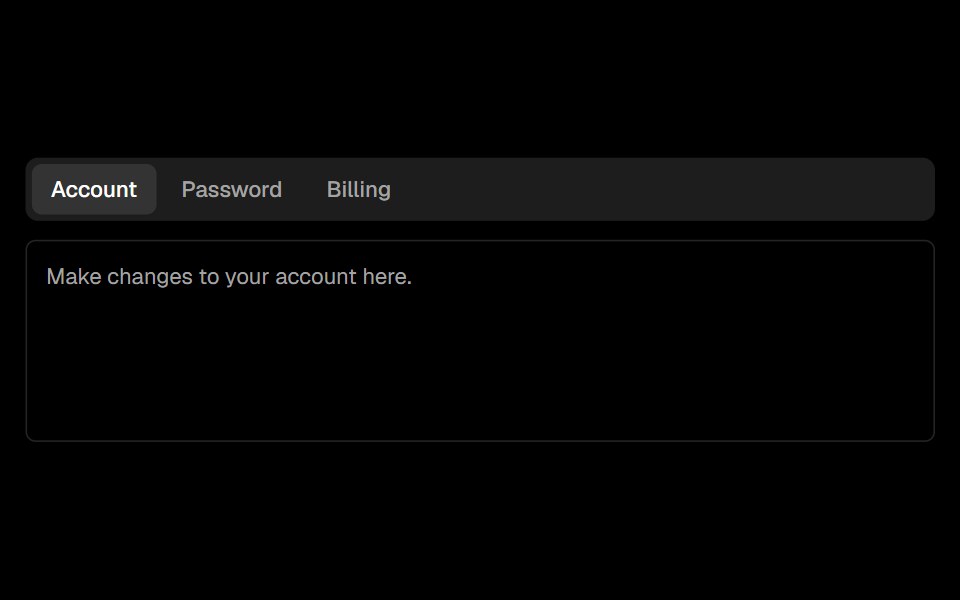 Tabsark-cn · ReactA shadcn-style tabs component built with Ark UI primitives.
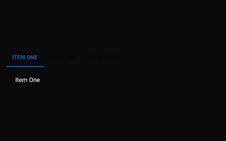 TabsMUI / Material UI · React
 TabsHeadless UI · React
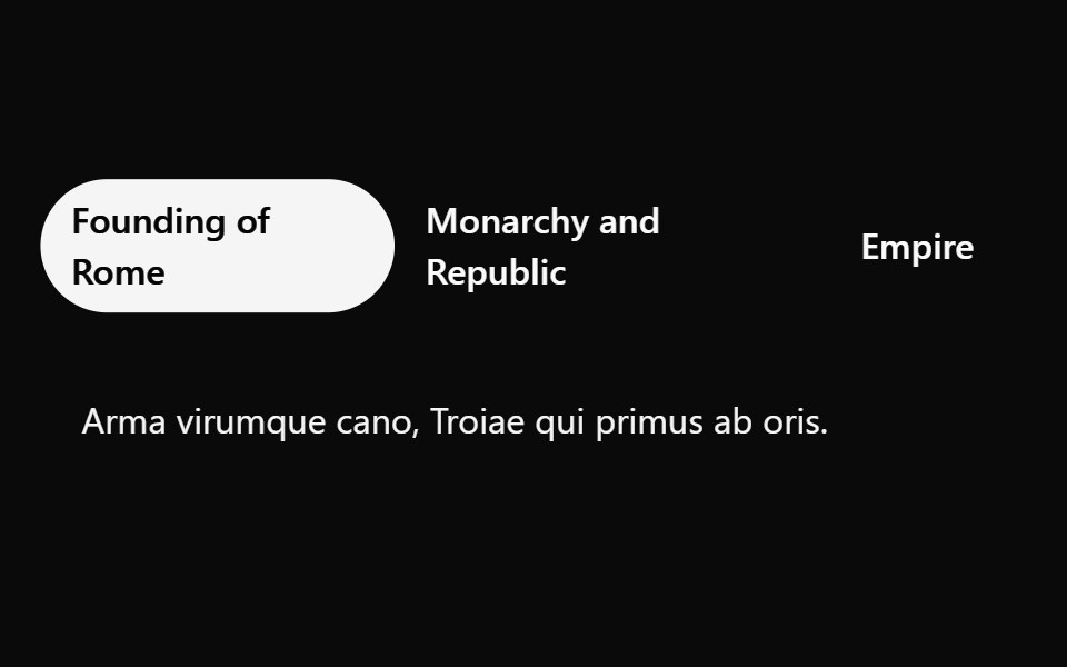 Tailwind TabsReact Spectrum · React
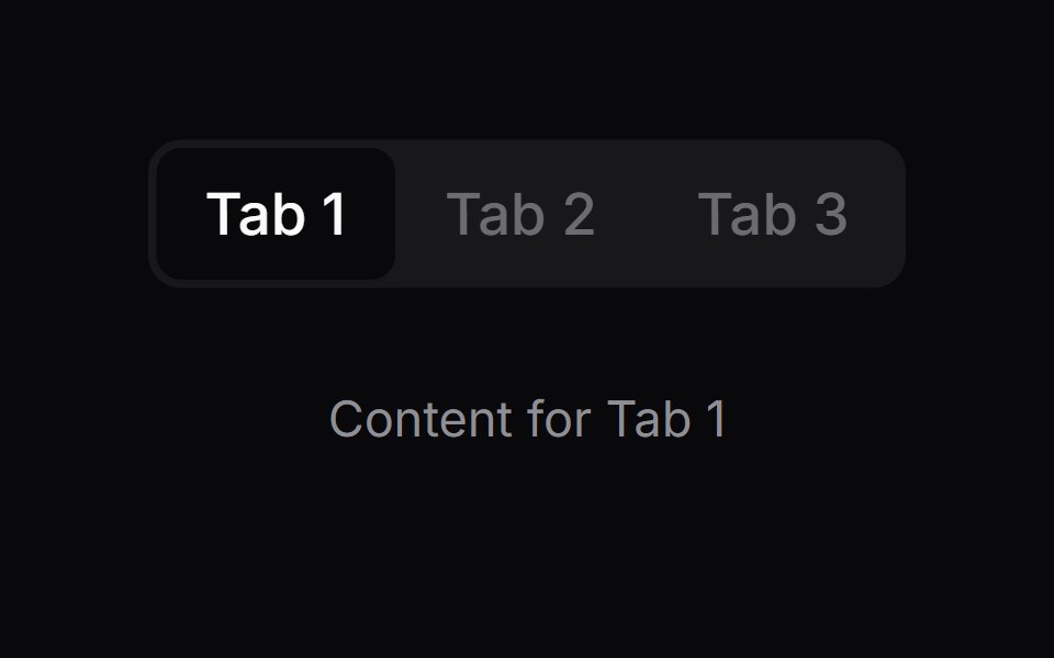 Comp 426Origin UI · React
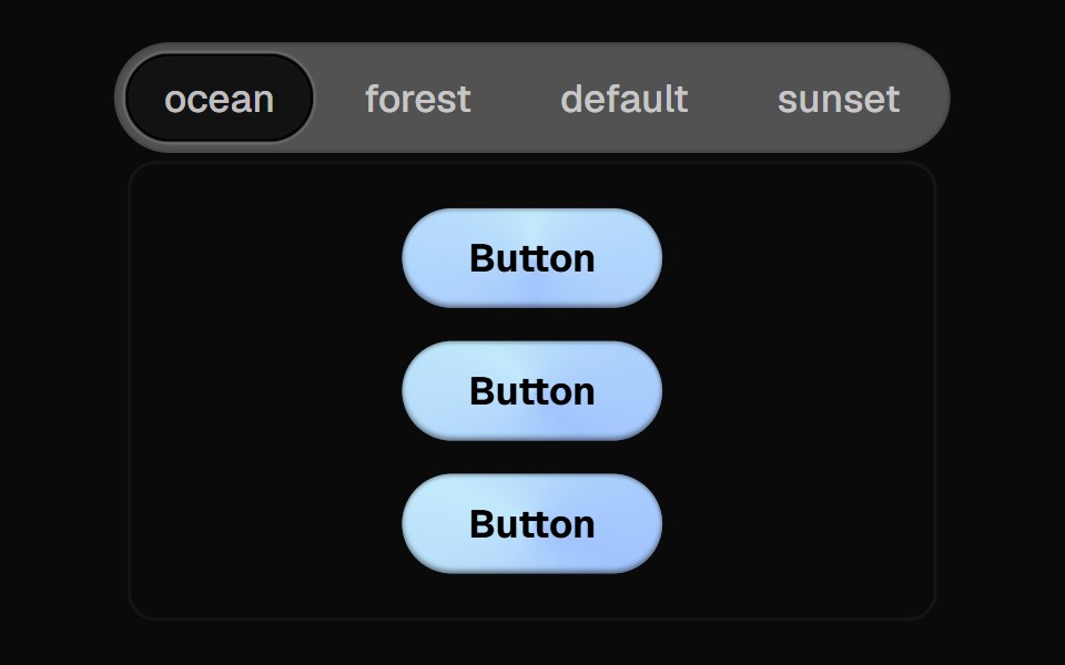 Direction Aware TabsCult UI · ReactTab component with direction-aware animations and smooth transitions
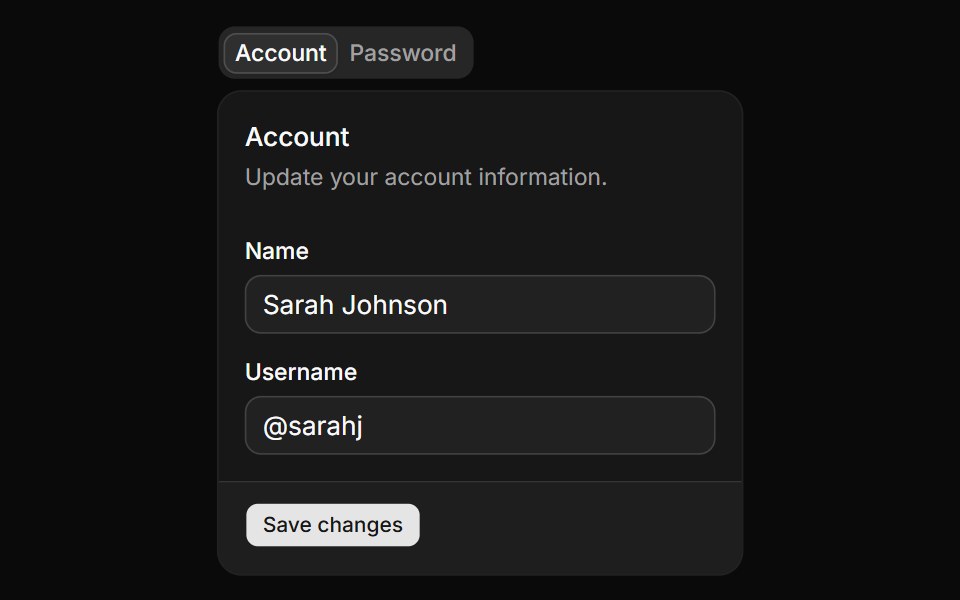 Basic tabs.ReUI · ReactBasic tabs.
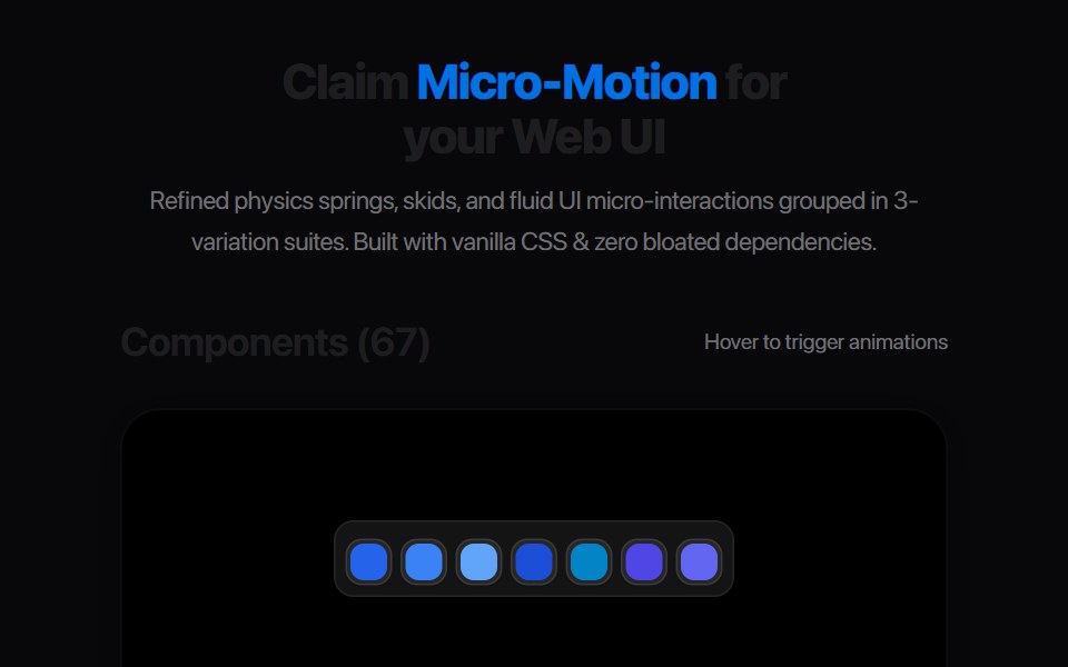 Segmented Link StretchAmicro Micro Transitions · ReactMulti-joint segmented pill chain expanding and snapping together.
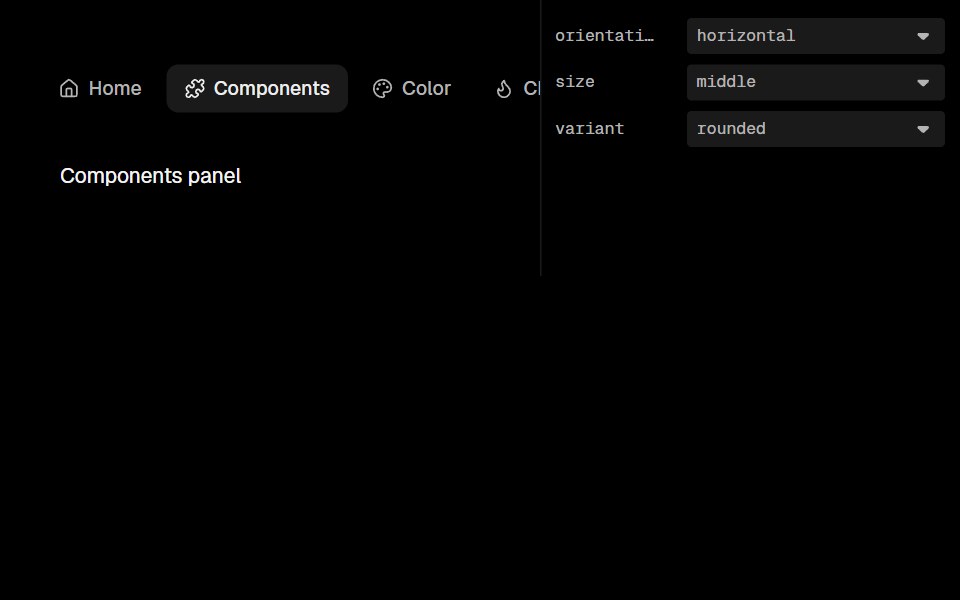 Base Ui TabsLobe UI · React
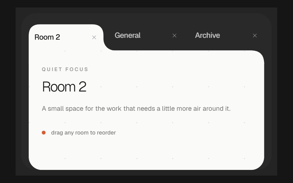 Morphing TabsbeUI · ReactReorderable tabs whose selected item grows into a white content surface, with the active shape gliding as tabs move…
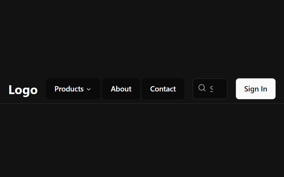 Tab NavbarSpectrum UI · Reactcomponent for the Tab Navbar
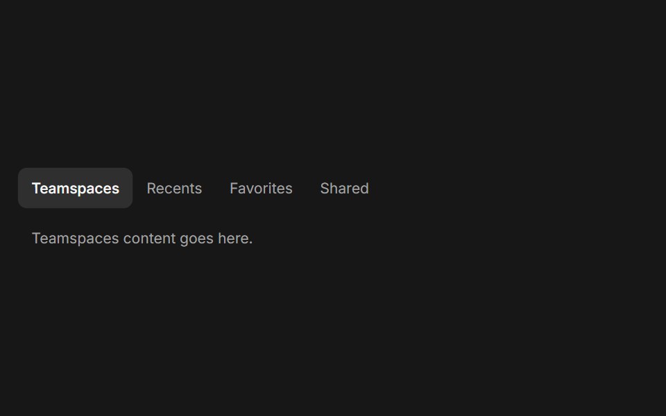 TabsFluid Functionalism · ReactHorizontal tab navigation with fluid hover, animated pill selection indicator, and fluid font-weight transitions. Base…
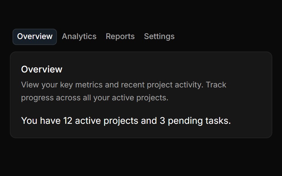 TabsToolcraft · React
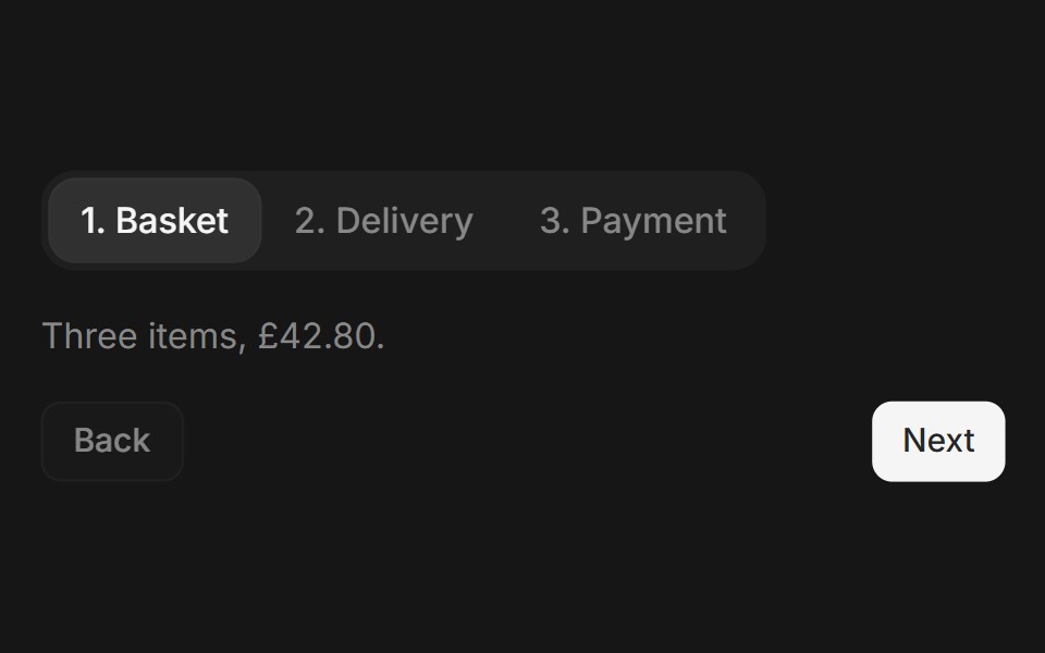 Web TabsPanel UI · React Native
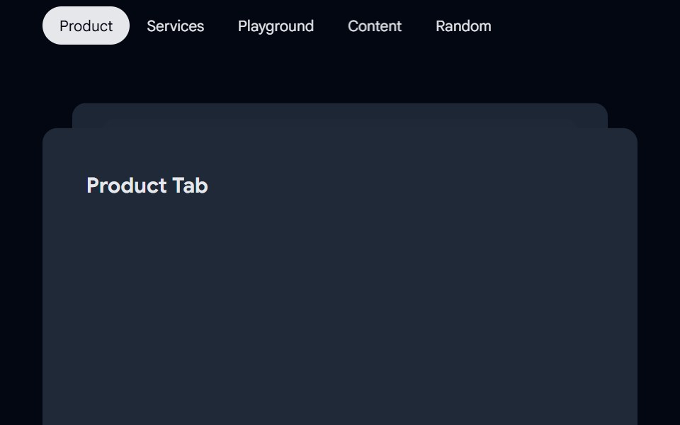 Tabs-01 - AnimatedShadcn Space · ReactTabs component
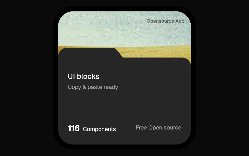 Opensource Folder Tab CardOpenSourceUI · React
 Discrete Tabsuselayouts · ReactA tab component with discrete sliding animations.
 SettingsBoardUI · React
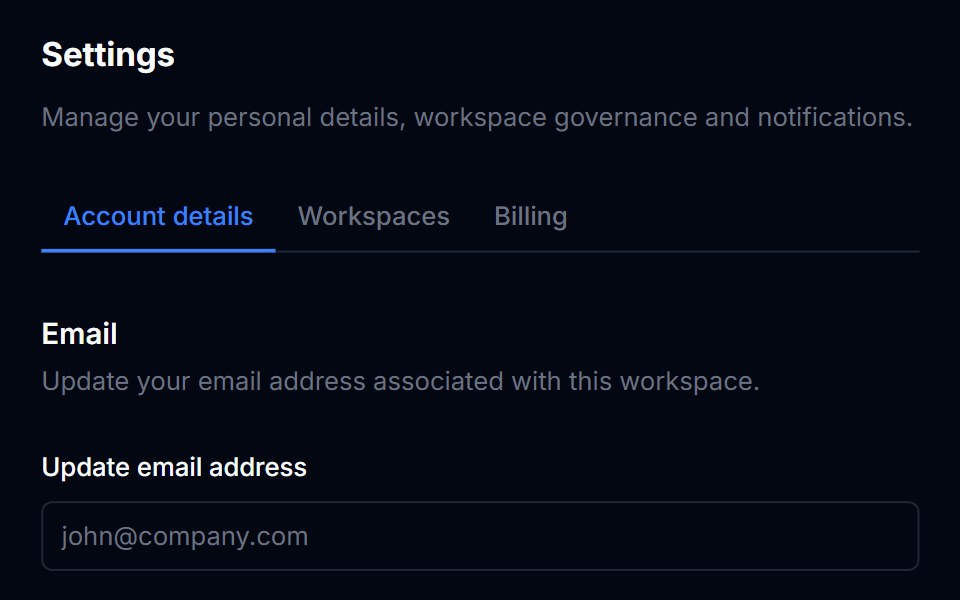 TabsTremor Blocks · React
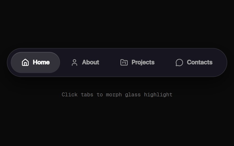 Morphing Tab NavbarRewamp UI · React
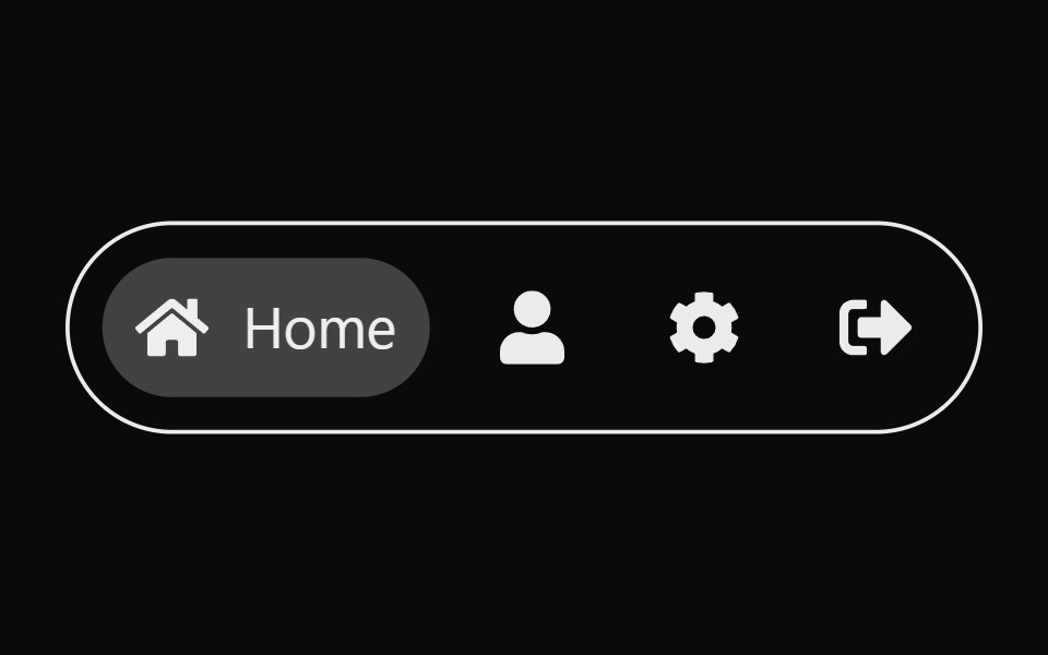 Expandable TabsSona UI · ReactAn accessible Base UI tab selector that expands the active icon into a labeled pill with input-aware layout motion.
 Fluid Tabs BaseWatermelon UI · ReactTabs with an indicator that flows smoothly from one tab to the selected one.
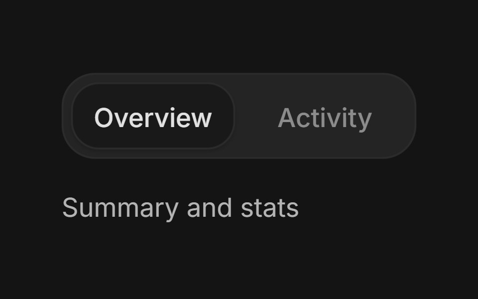 TabsArc Library · ReactSwitch between related content in the same context.
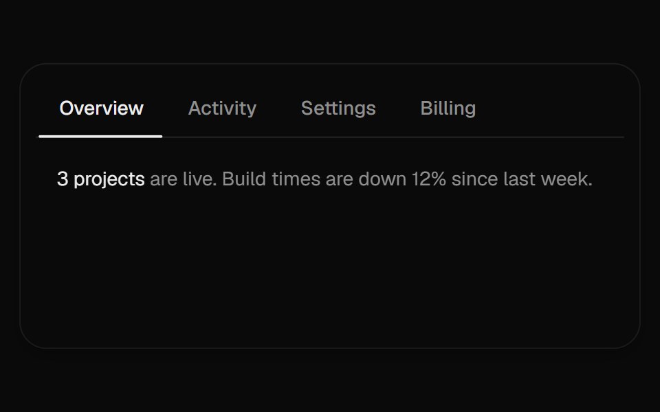 Sliding TabsUI Lab · ReactAn underline stretches toward the tab you pick while a soft pill follows your pointer.
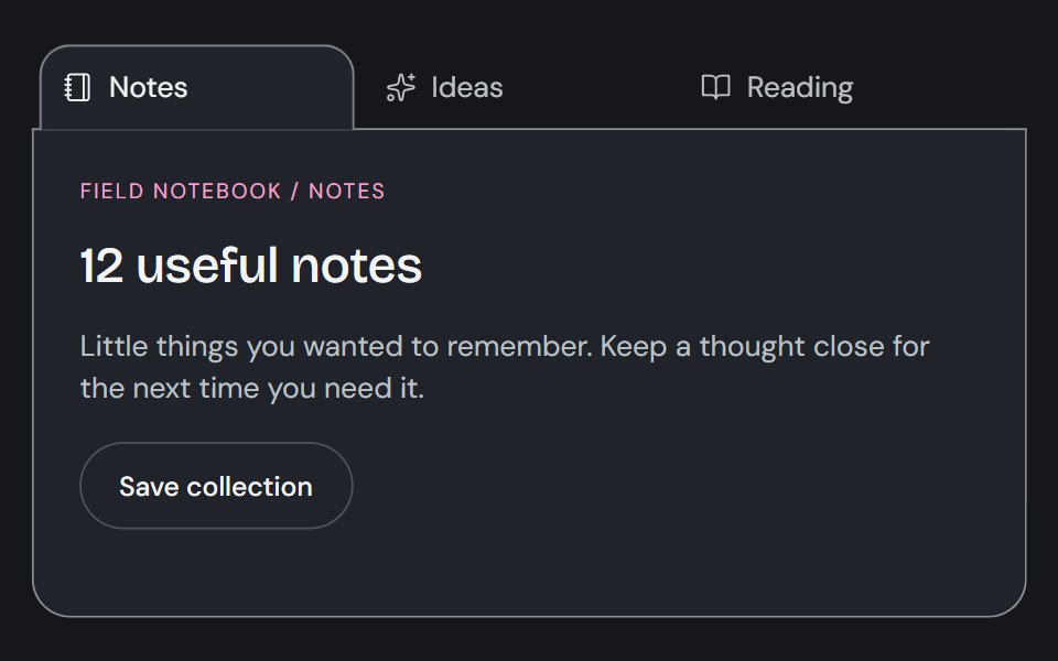 TabsCojeev UI · ReactSwitches between related content panels while keeping the available views visible.
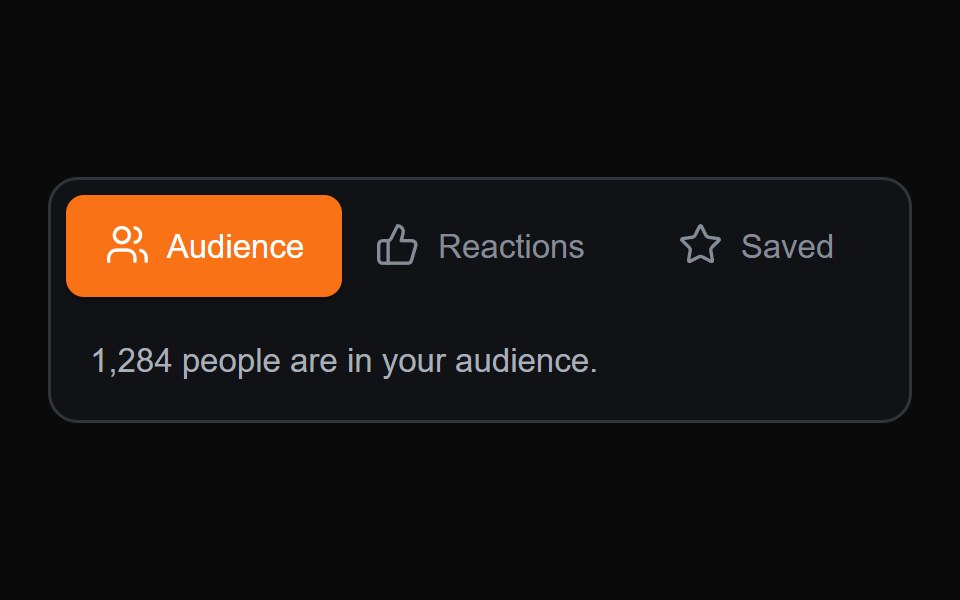 Sliding Content TabsMicroKit · ReactA compact tab switcher with a sliding active surface and content transition.
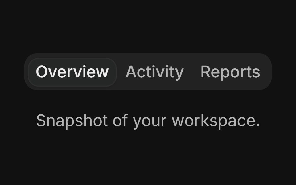 BasicFLX UI · ReactThree tabs with the default filled variant.
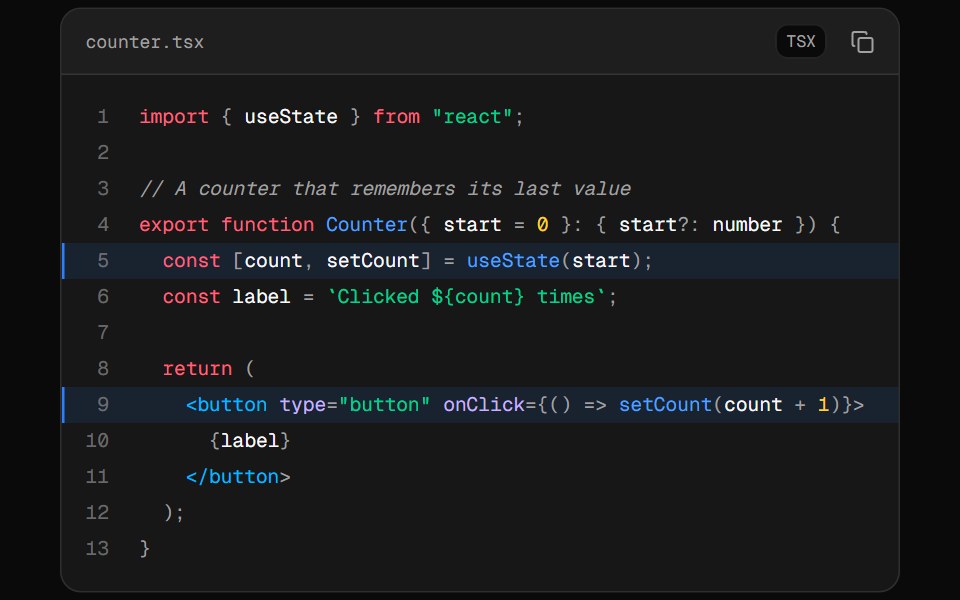 Code BlockVelora UI · ReactCode panel with tabs, line numbers, highlighted lines and a copy button.
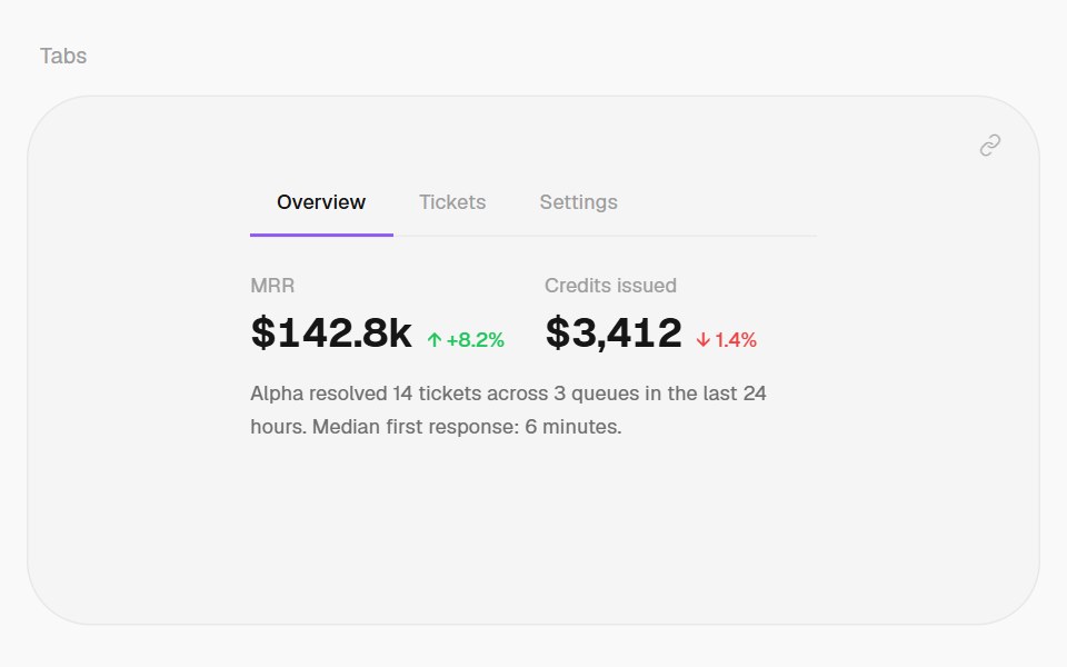 TabsHalaska UI · React
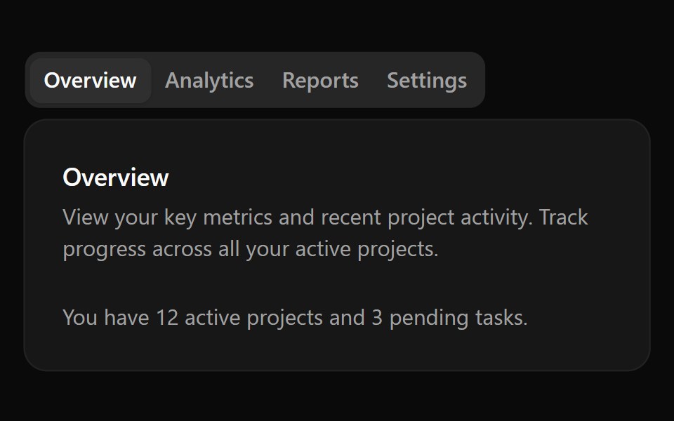 Base TabsReScript shadcn · ReScript
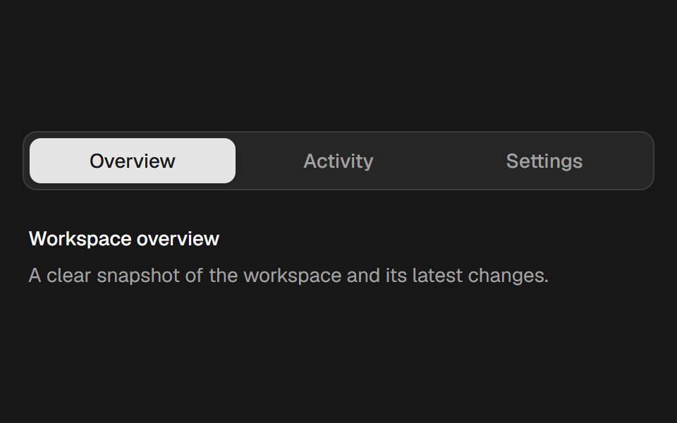 Velocity TabsSkecher UI · ReactAn accessible tab selector with a spring indicator that stretches in response to movement velocity.
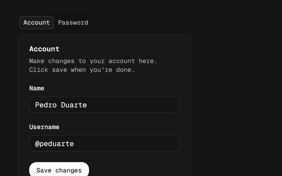 TabsD2Studio UI · ReactA set of layered sections of content, known as tab panels, that are displayed one at a time.
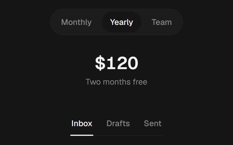 TabsEaseUI · ReactPill, segment, or underline tabs with an indicator that slides to the selected tab.
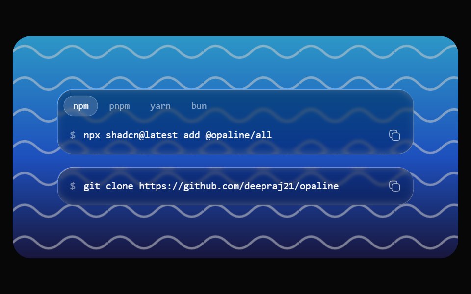 Glass SnippetOpaline · ReactA command on a glass capsule with copy, and tabs for npm, pnpm, yarn and bun.
 TikTok Post MockupReactFrame · ReactA full-bleed 9:16 TikTok feed mockup with a Following/For You tab bar, a side action rail (like/comment/save/share)…
 TabsAceternity UI · React
 Vanilla TabsReact Spectrum · React
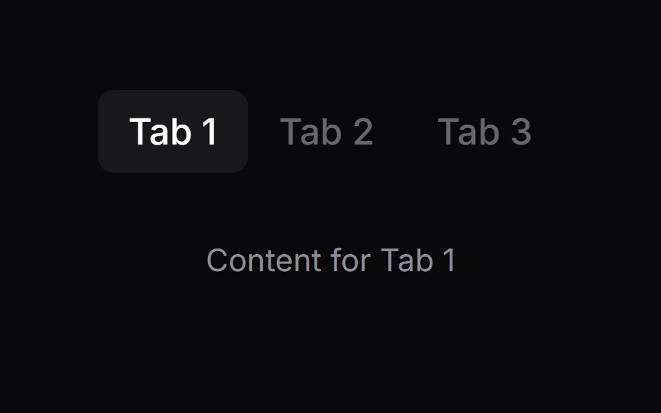 Comp 427Origin UI · React
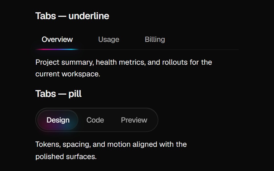 Halo TabsCult UI · ReactBase UI tabs with gradient indicator: underline or pill variant aligned with Halo Card rim colors
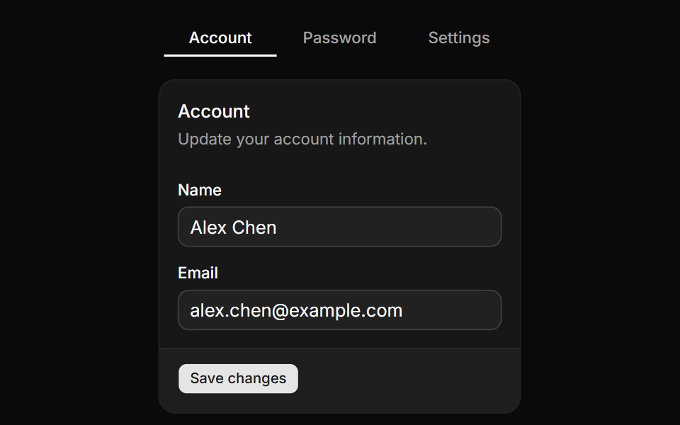 Tabs with line variant.ReUI · ReactTabs with line variant.
 Multi Tab BarAmicro Micro Transitions · React
 Dashboard Page TabsLobe UI · React
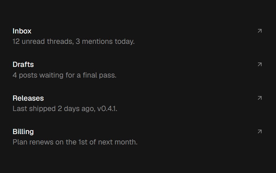 Shared Layout BgbeUI · ReactA pill that glides between hovered items via motion's shared layout, with blur enter/exit.
- Tabs SubtleFluid Functionalism · ReactHorizontal tab navigation with fluid hover, animated pill selection indicator, and fluid font-weight transitions…
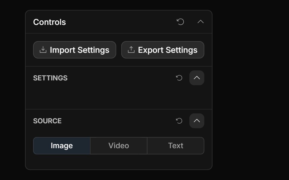 Tabs ControlToolcraft · React
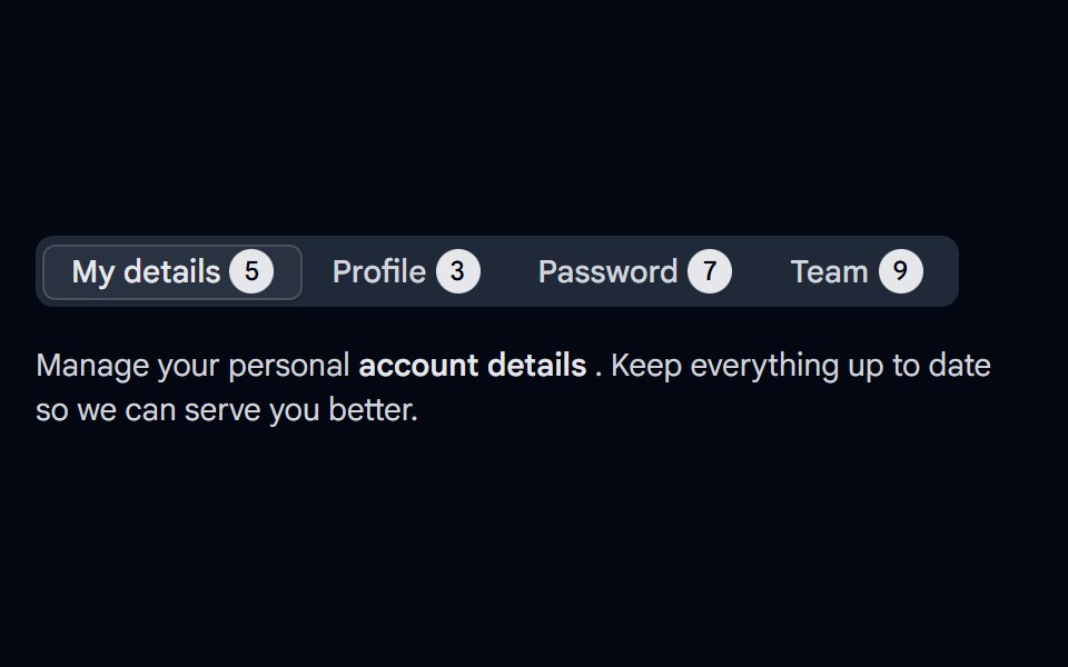 Tabs-04 - With CountShadcn Space · ReactTabs component
 Stacked Folder CardOpenSourceUI · React
 Vertical Tabsuselayouts · ReactA vertical tab interaction with smooth content switching.
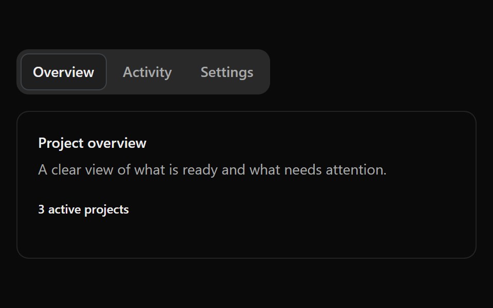 Fluid TabsSona UI · ReactAn accessible Base UI tab selector with a shared active surface that travels fluidly between selections, with capsule…
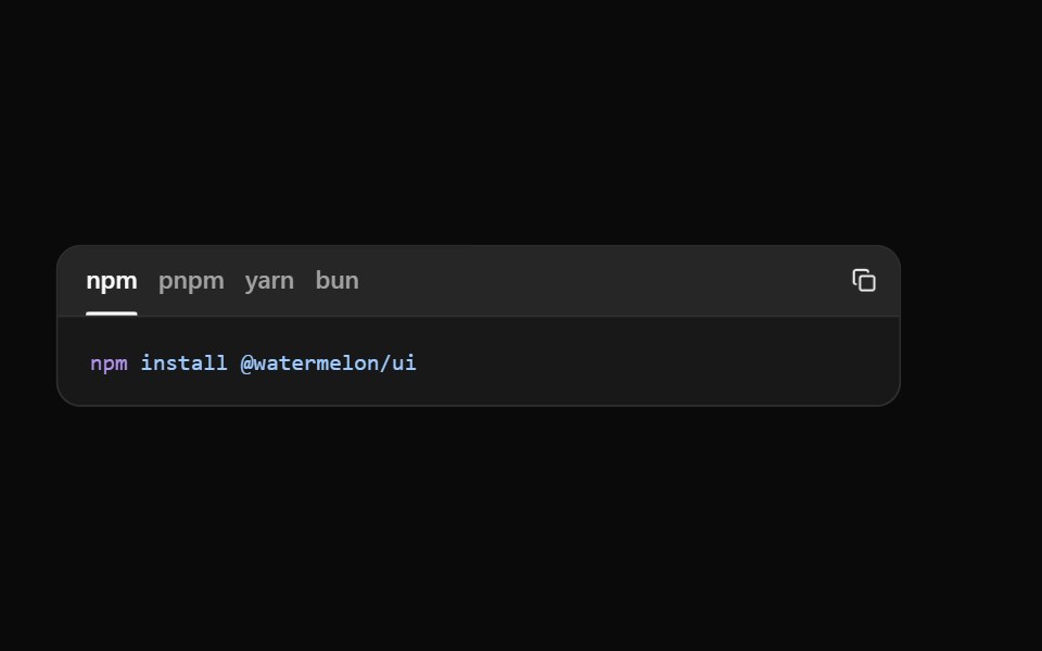 Code TabsWatermelon UI · React
Libraries with React tabs components
Related categories
- Tabs Components
- Tailwind CSS Tabs Components
- Svelte Tabs Components
- Animated Tabs Components
- shadcn/ui Tabs Components
- React Navigation Components
- React Menu Components
- React Stepper Components
- React Navbar Components
- React Sidebar Components
- React Pagination Components
- React Breadcrumb Components
- React Command Palette Components
- React Context Menu Components
- React Dock Components
- React Mega Menu Components
- React Table Of Contents Components
- React Hamburger Menu Components