 Dev Design Library
Animated Tabs Components
Dev Design Library indexes 66 Animated tabs components from 34 open-source UI libraries, with the most coming from Shadcn Space, Watermelon UI, Fluid Functionalism, Cult UI and uselayouts. Each one links to its page with the source code, a live preview where available, the library license and the install command. These are the tabs components tagged as animated: motion on hover, on scroll or on load, usually built with CSS transitions or Framer Motion. Tabs components belong to the Navigation group.
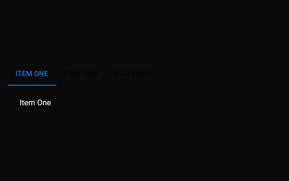 TabsMUI / Material UI · React
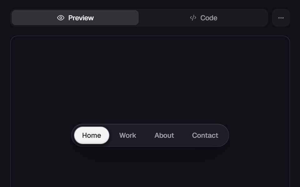 Gooey NavReact Bits · ReactNavigation indicator morphs with gooey blob transitions between items.
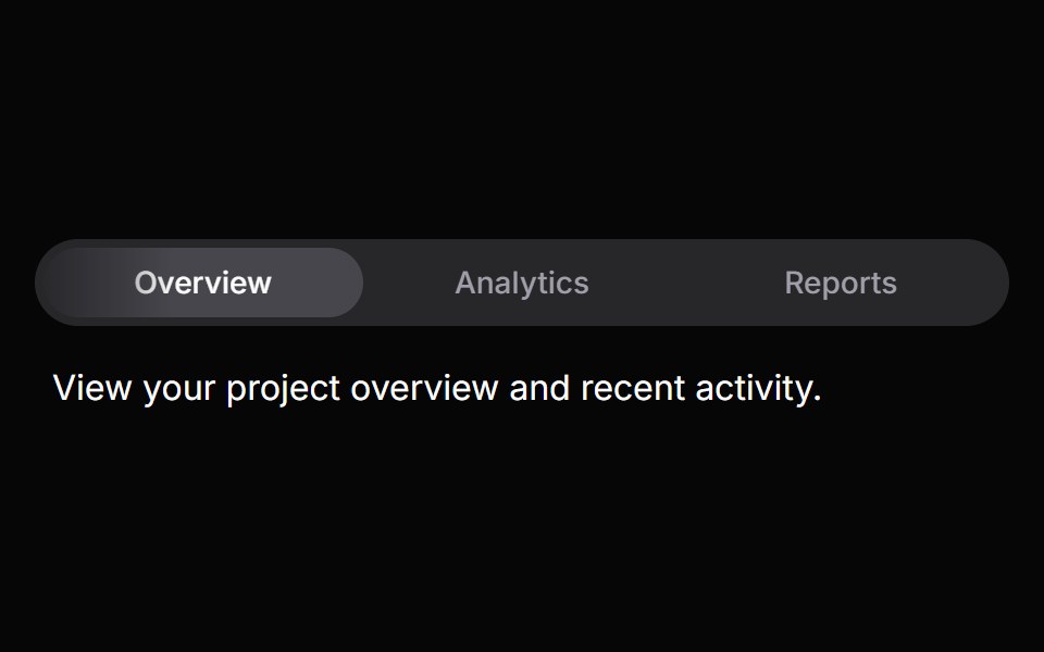 TabsHeroUI · ReactOrganize content into tabbed views with animated transitions and indicators.
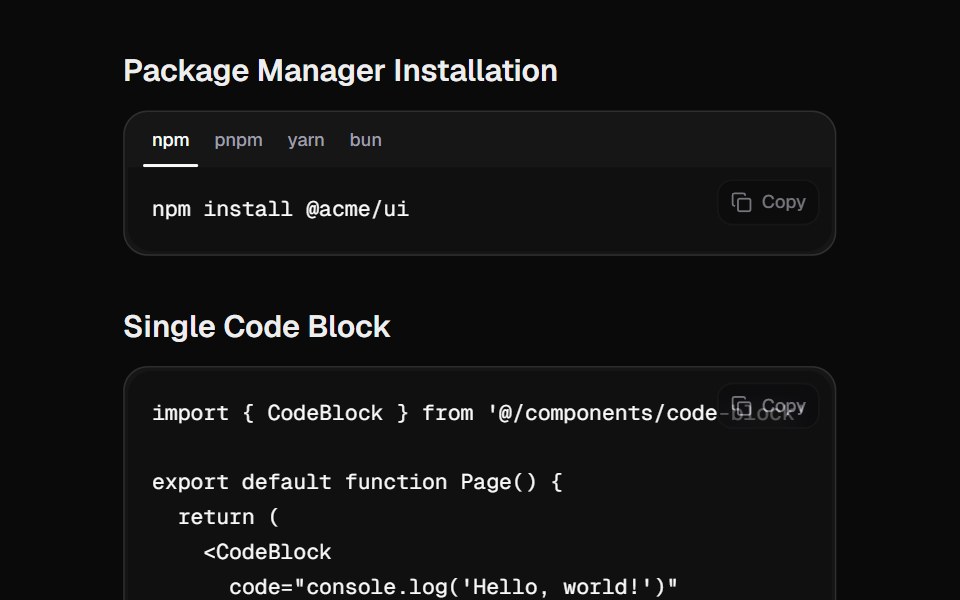 Code BlockCult UI · ReactA beautiful code block component with tabs, copy functionality, and smooth animations
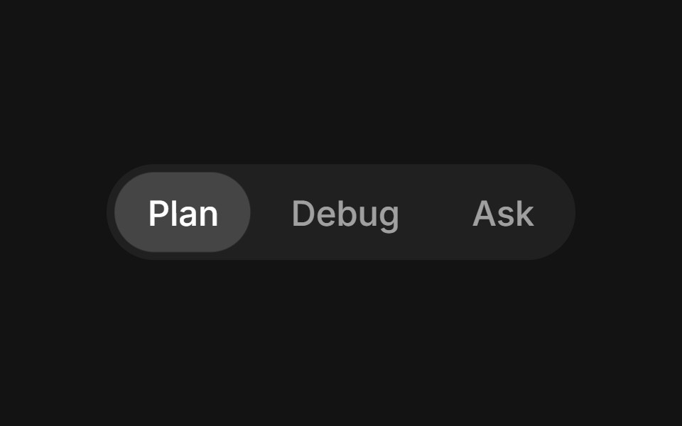 Tabs Slidingtransitions.dev · HTML/CSS
 Ab Segmented TabsAmicro Micro Transitions · ReactSegmented control where active letter (A or B) slides into a solid pill.
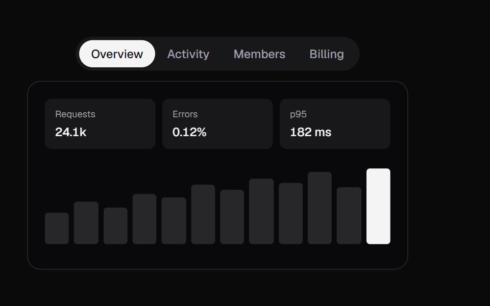 Swipe TabsKokonut UI · ReactTabs with a swipeable panel, a drag-tracked indicator and spring physics.
 Expandable TabsbeUI · ReactIcon tab bar where the active tab expands to a labelled pill, with a panel above that morphs height and slides content…
 FAQ Tabs CardSpectrum UI · ReactA tabbed FAQ card with animated accordion answers and a support footer.
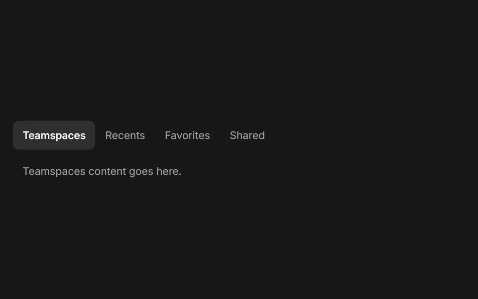 TabsFluid Functionalism · ReactHorizontal tab navigation with fluid hover, animated pill selection indicator, and fluid font-weight transitions…
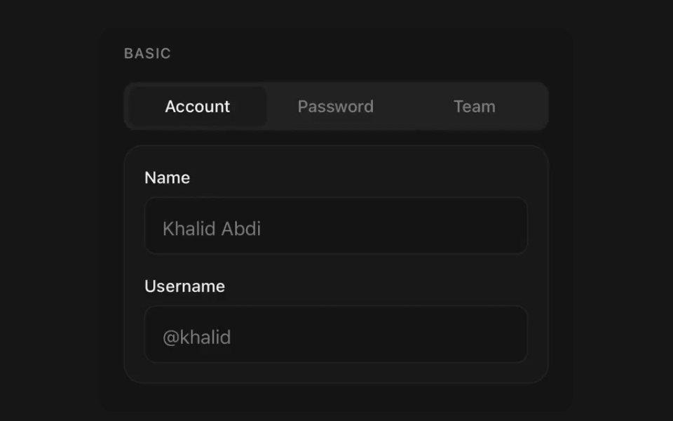 TabsPanel UI · React NativeSegmented navigation with an animated indicator.
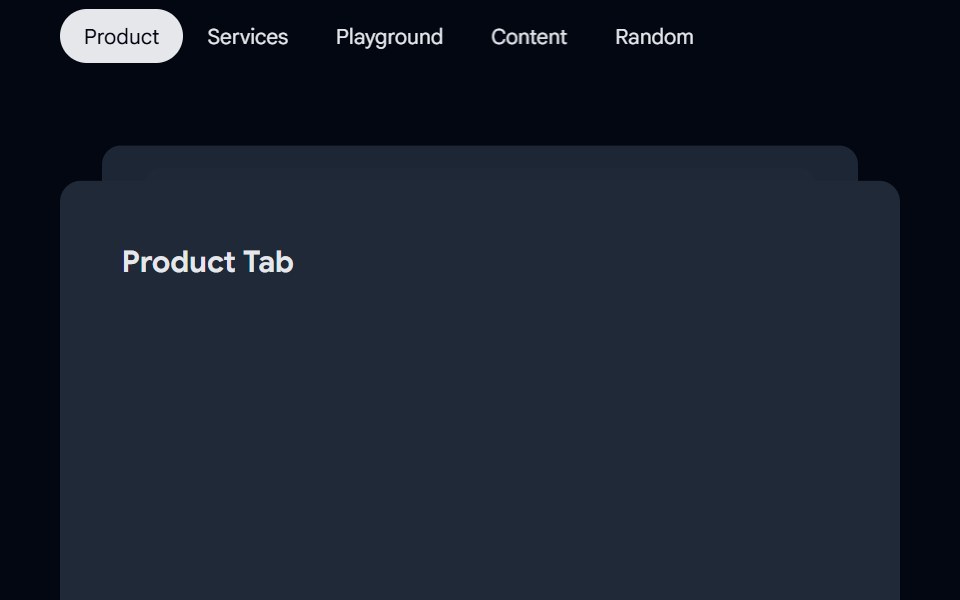 Tabs-01 - AnimatedShadcn Space · ReactTabs component
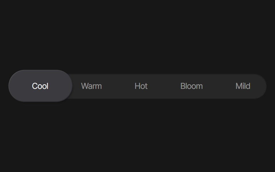 Tab Background AnimationPixel Perfect · ReactA tab background animation using Framer Motion.
 Bento Carduselayouts · ReactAn interactive bento card with animated tabs and workspace preview.
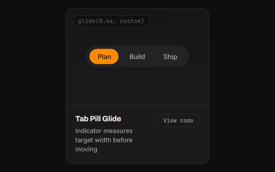 Tab Pill GlideKinetics · HTML/CSSIndicator measures target width before moving
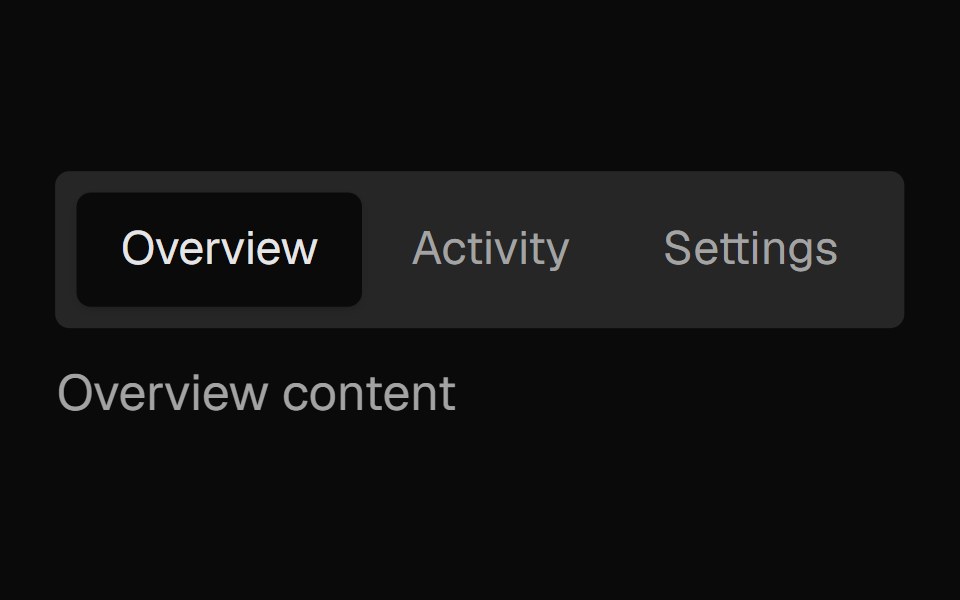 Tabs SubtleNexvyn UI · ReactA pill-style tab list where the selected indicator springs between tabs, built on the WAI-ARIA tabs pattern with full…
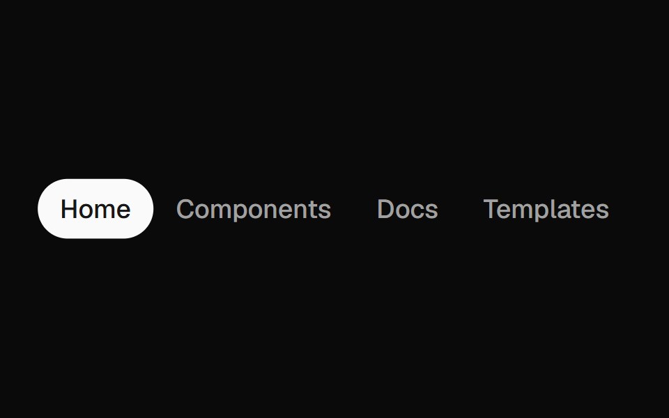 Animated TabsForge UI · Reactwitch tabs smoothly with motion-based underline or highlight effects.
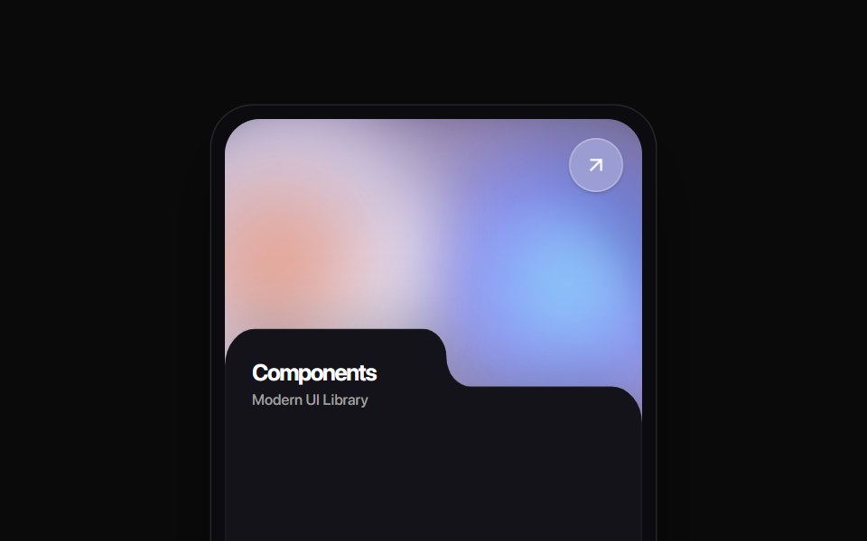 Folder Tab CardRewamp UI · ReactA modern tactile UI card featuring an ethereal animated mesh aurora gradient header, circular diagonal glass arrow…
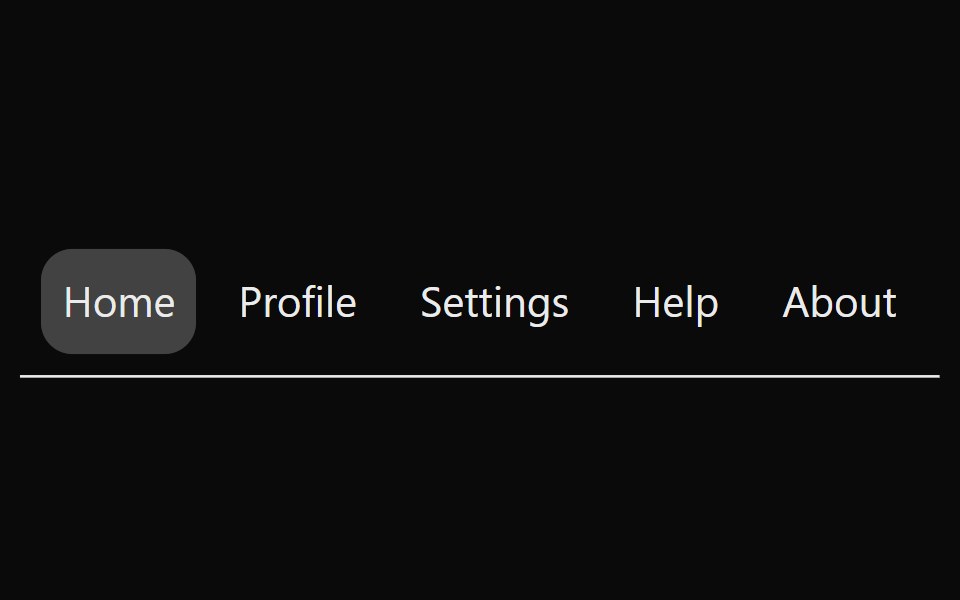 Animated TabsSona UI · ReactAn accessible horizontal tab selector built on Base UI with controlled state, keyboard navigation, disabled items, and…
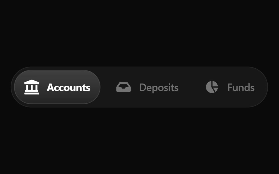 Fluid TabsWatermelon UI · ReactTabs with an indicator that flows smoothly from one tab to the selected one.
 FAQ Foursv-efferd · SvelteA categorized FAQ explorer with topic switching and softly framed accordion rows.
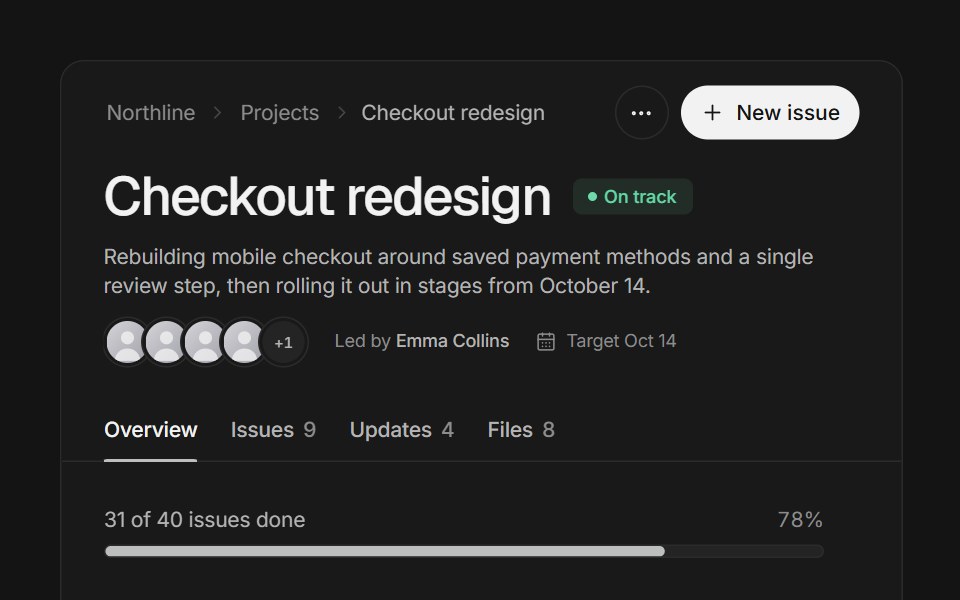 Page headerArc Library · ReactA project page header that folds into a compact bar as you scroll, with tabs whose counts roll.
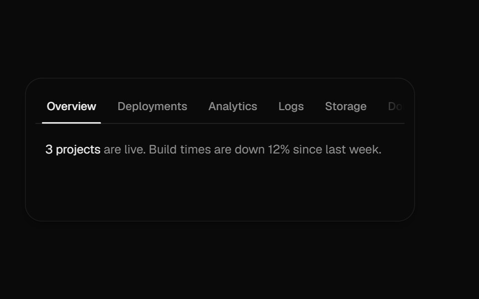 Overflow TabsUI Lab · ReactScrolls a long row of tabs, fading whichever edge still hides more.
 TabsHextaUI · ReactSwitch between views with an indicator that slides to the active tab, as a segmented control or an underline, and…
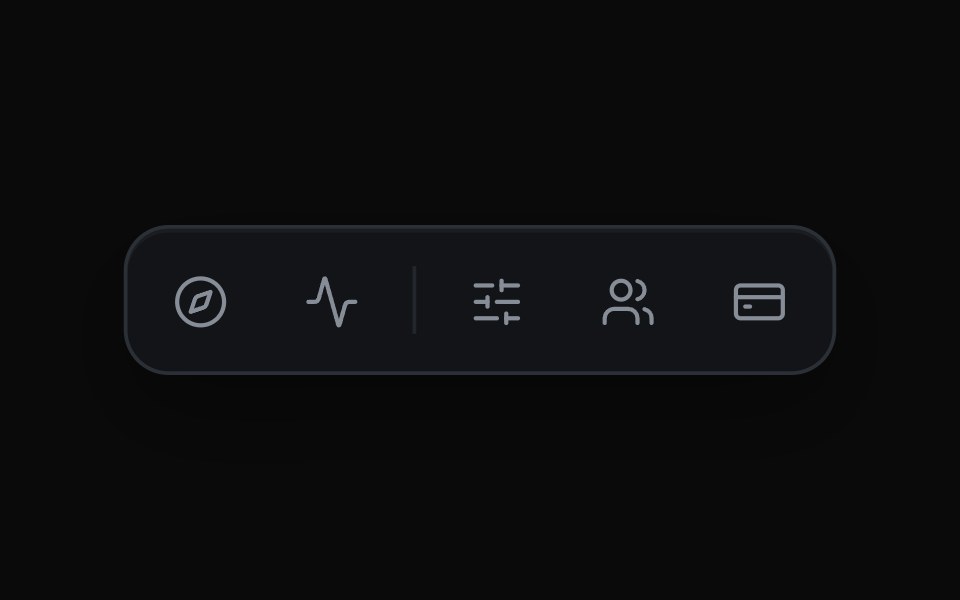 Expanding Icon TabsMicroKit · ReactAn icon bar where the chosen tab widens to reveal its label and the rest of the row slides over to make room.
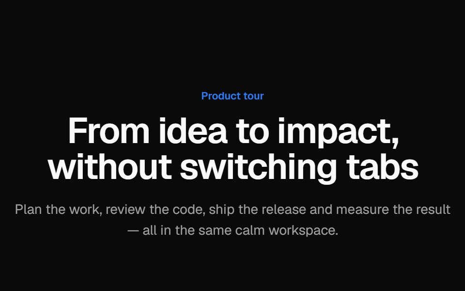 Tabbed product tourVelora UI · ReactProduct tour with animated tabs; each tab pairs short copy and a checklist with a Tailwind-built app mock.
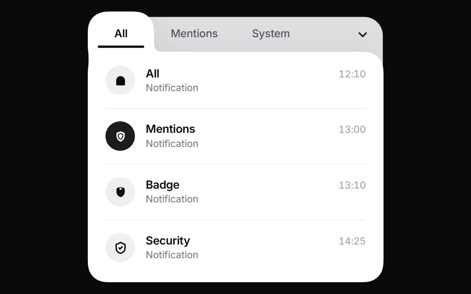 Liquid TabsPin UI · React
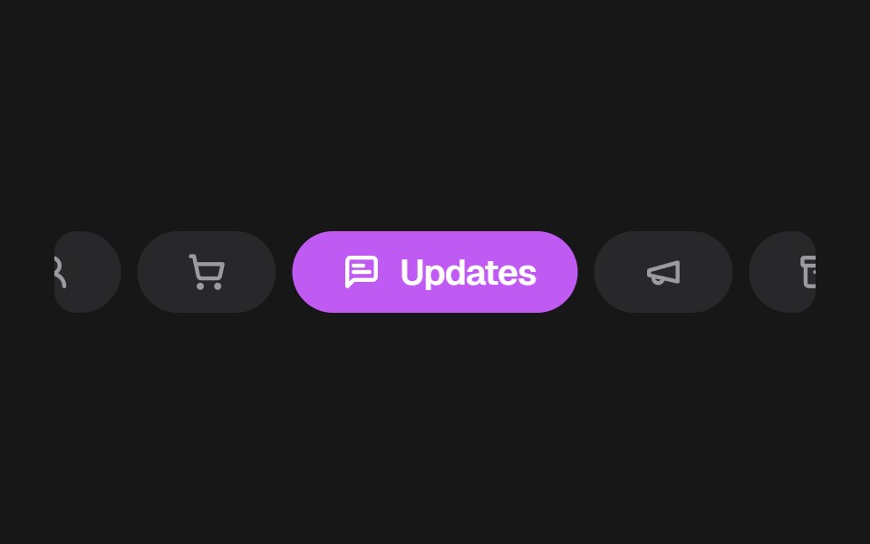 Apple Mail TabsSkecher UI · ReactA colorful, horizontally scrollable mail category selector with compact inactive tabs and an expanded active tab.
 Expandable TabsSora UI · ReactA pill-shaped tab bar that expands into a floating panel, with Motion driving the shell, label, and content transitions.
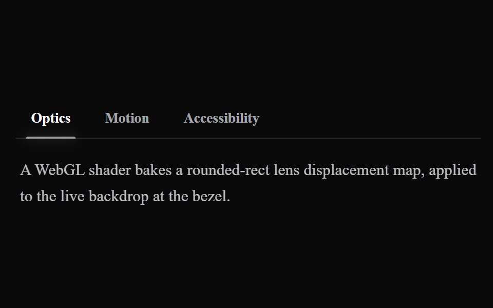 Liquid TabsLiquefy UI · ReactTabs in liquid glass style. Abas em estilo vidro líquido.
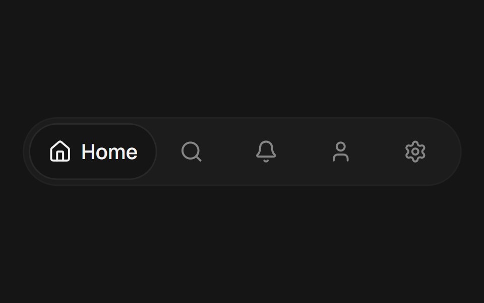 Expandable TabsEaseUI · ReactA row of icon tabs where the selected one expands to reveal its label, sliding a shared background pill to match.
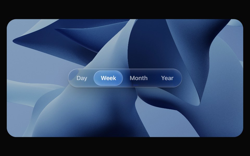 Glass TabsOpaline · ReactSegmented control with a glass bubble that glides between tabs.
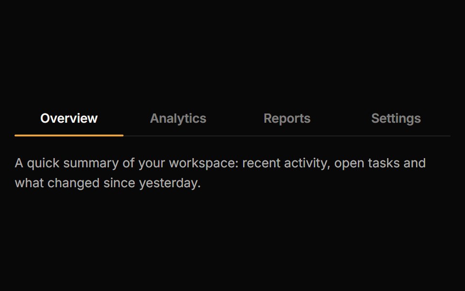 TabsReactFrame · ReactAn accessible tab set with underline, pill and segmented variants, a sliding animated indicator, icons, counts…
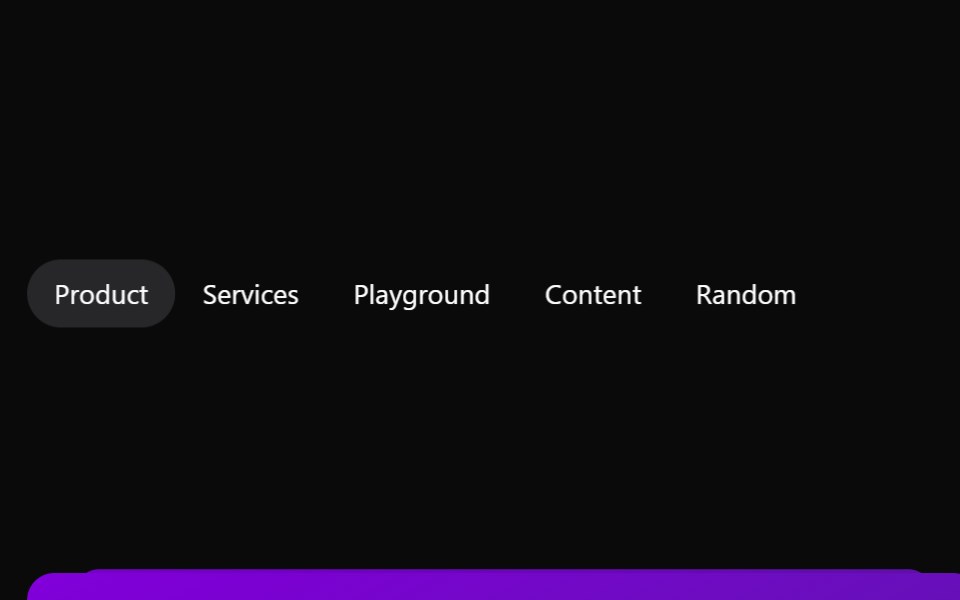 TabsAceternity UI · React
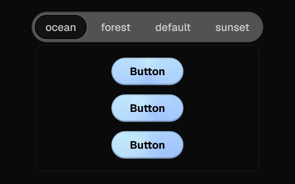 Direction Aware TabsCult UI · ReactTab component with direction-aware animations and smooth transitions
 Segmented Link StretchAmicro Micro Transitions · ReactMulti-joint segmented pill chain expanding and snapping together.
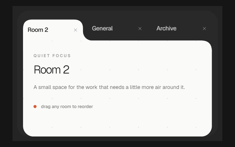 Morphing TabsbeUI · ReactReorderable tabs whose selected item grows into a white content surface, with the active shape gliding as tabs move…
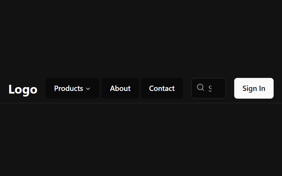 Tab NavbarSpectrum UI · Reactcomponent for the Tab Navbar
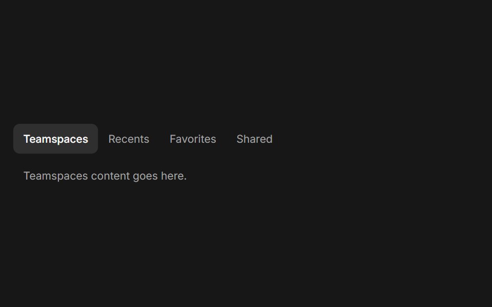 TabsFluid Functionalism · ReactHorizontal tab navigation with fluid hover, animated pill selection indicator, and fluid font-weight transitions. Base…
 Tabs-04 - With CountShadcn Space · ReactTabs component
 Discrete Tabsuselayouts · ReactA tab component with discrete sliding animations.
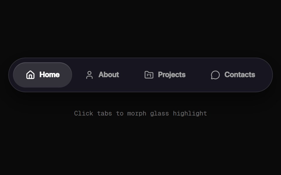 Morphing Tab NavbarRewamp UI · React
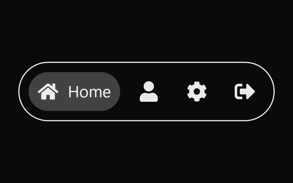 Expandable TabsSona UI · ReactAn accessible Base UI tab selector that expands the active icon into a labeled pill with input-aware layout motion.
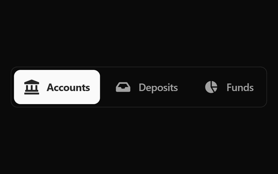 Fluid Tabs BaseWatermelon UI · ReactTabs with an indicator that flows smoothly from one tab to the selected one.
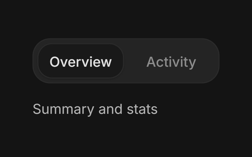 TabsArc Library · ReactSwitch between related content in the same context.
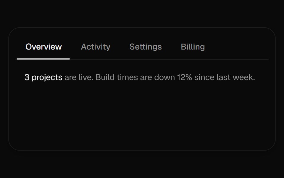 Sliding TabsUI Lab · ReactAn underline stretches toward the tab you pick while a soft pill follows your pointer.
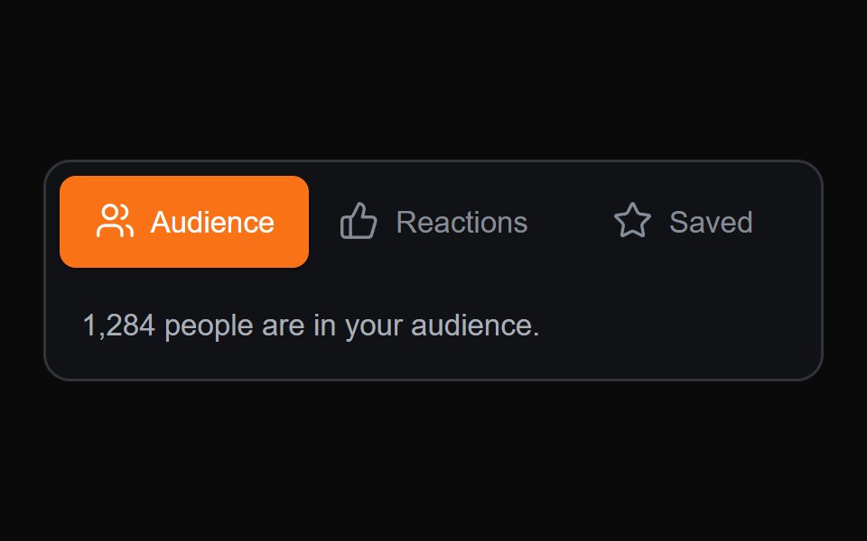 Sliding Content TabsMicroKit · ReactA compact tab switcher with a sliding active surface and content transition.
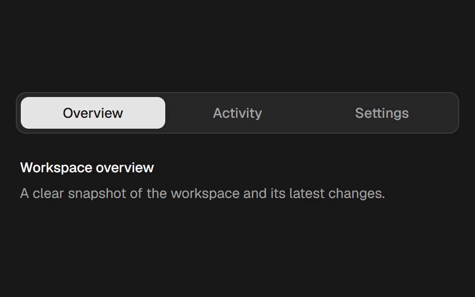 Velocity TabsSkecher UI · ReactAn accessible tab selector with a spring indicator that stretches in response to movement velocity.
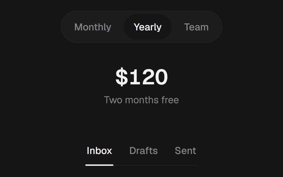 TabsEaseUI · ReactPill, segment, or underline tabs with an indicator that slides to the selected tab.
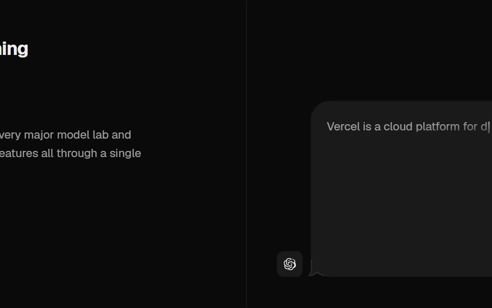 Tabs Illustration VercelCult UI · ReactTabs with Vercel-style illustrations
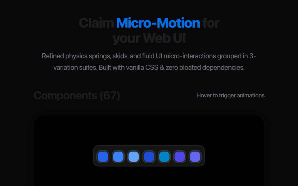 Multi Tab BarAmicro Micro Transitions · React
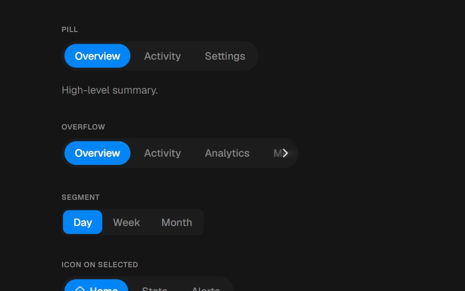 TabsbeUI · ReactPill, segment or underline tabs with a spring layoutId indicator.
- Tabs SubtleFluid Functionalism · ReactHorizontal tab navigation with fluid hover, animated pill selection indicator, and fluid font-weight transitions…
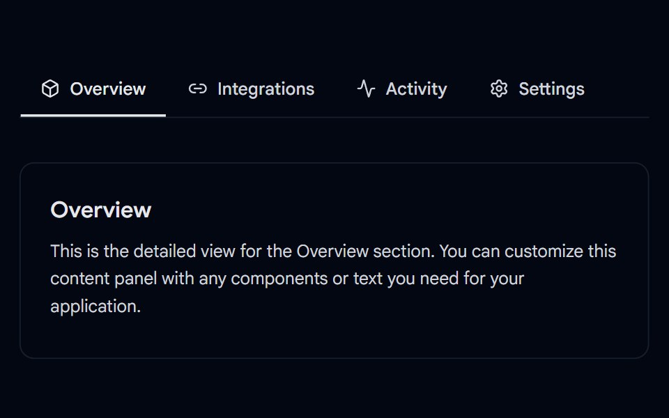 Tabs-05 - UnderlineShadcn Space · ReactAnimated underline tabs component
 Vertical Tabsuselayouts · ReactA vertical tab interaction with smooth content switching.
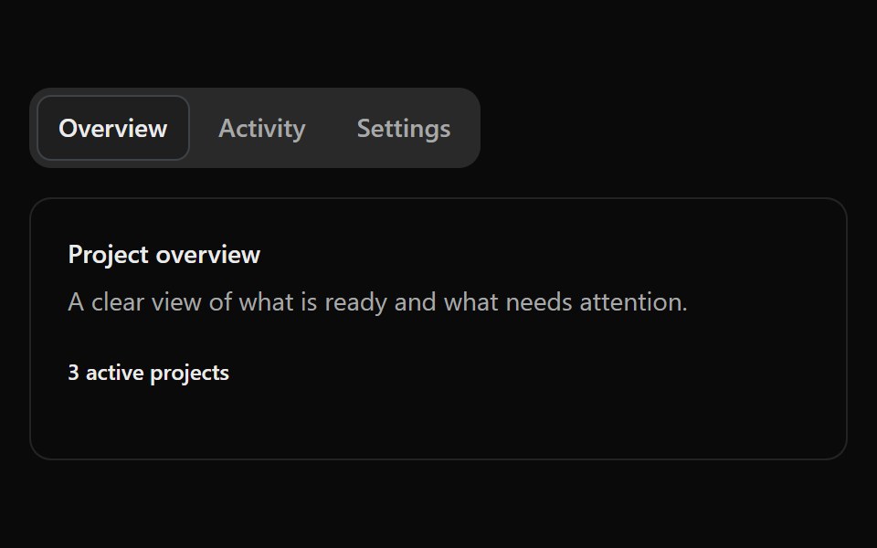 Fluid TabsSona UI · ReactAn accessible Base UI tab selector with a shared active surface that travels fluidly between selections, with capsule…
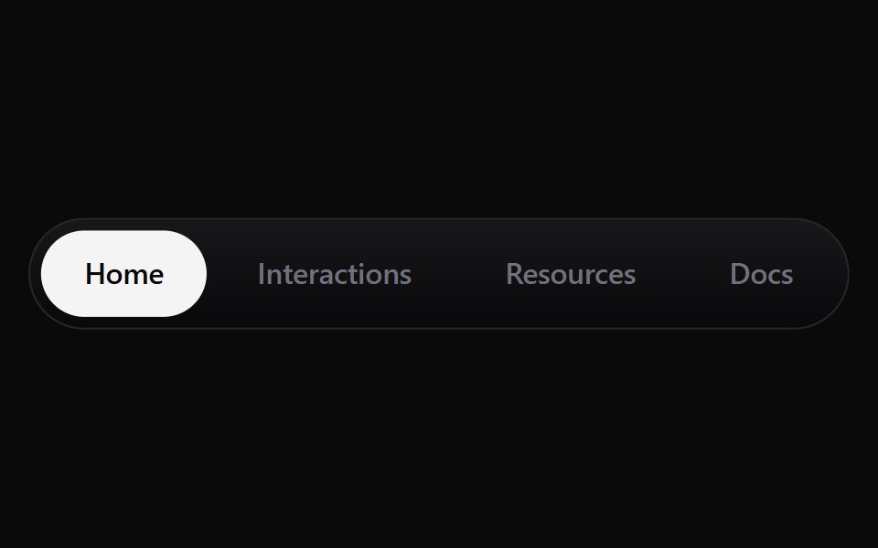 Continuous TabsWatermelon UI · React
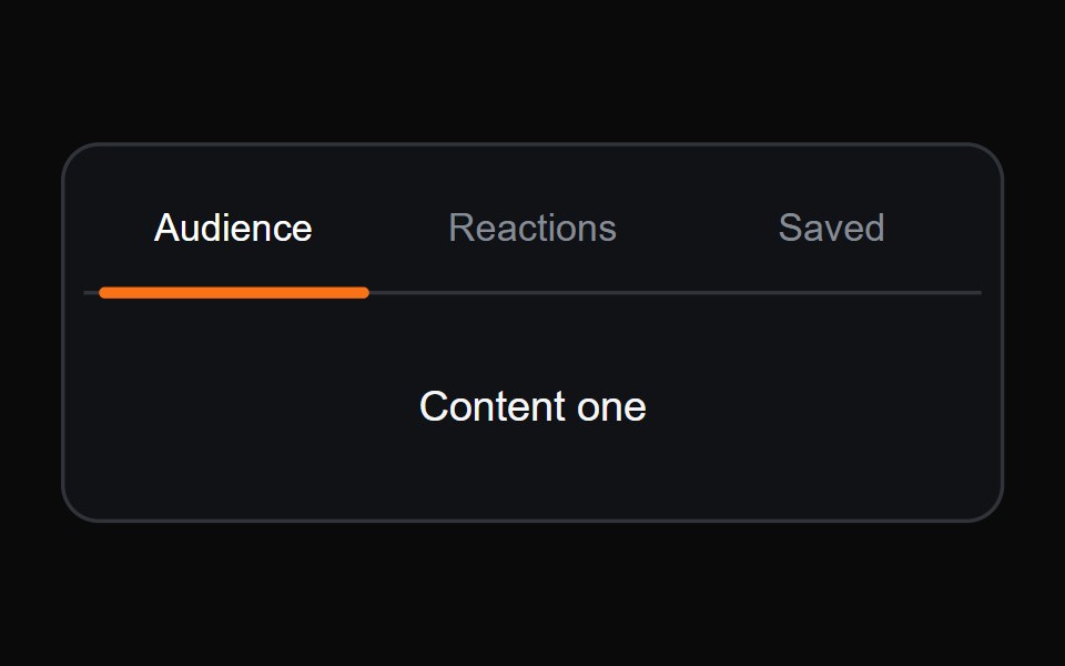 Sliding Underline TabsMicroKit · ReactA compact tab switcher with an orange underline that glides between labels.
- Tabs SubtleFluid Functionalism · ReactHorizontal tab navigation with fluid hover, animated pill selection indicator, and fluid font-weight transitions. Base…
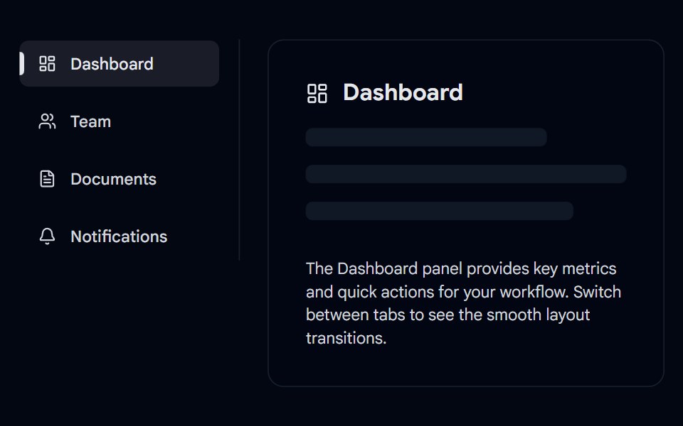 Tabs-06 - VerticalShadcn Space · ReactVertical animated tabs component
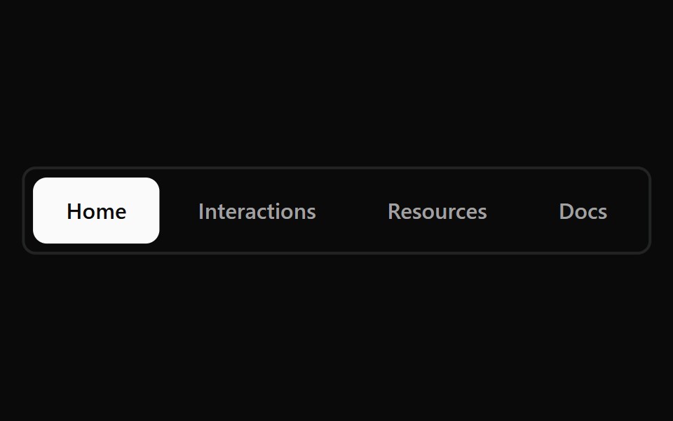 Continuous Tabs BaseWatermelon UI · React
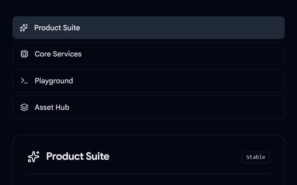 Tabs-07 - Icon & DescriptionShadcn Space · ReactTabs with icon and description component
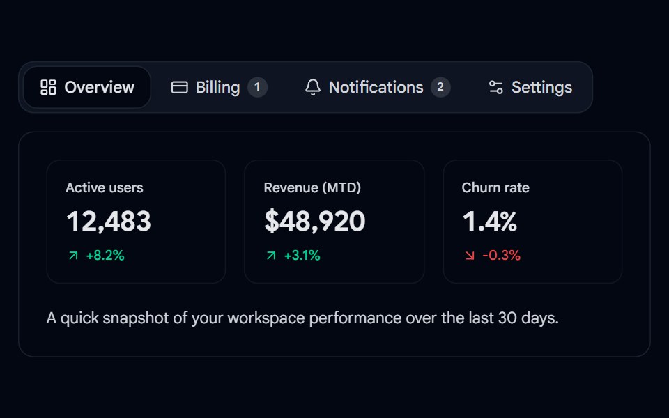 Tabs 08 - Animated Dashboard TabsShadcn Space · ReactA reusable, animated tabs component with a sliding active pill, icons, badges, and direction-aware content…
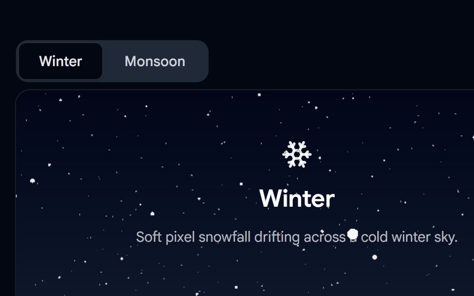 Tabs 09 - Seasonal PixelSnow TabsShadcn Space · ReactA Winter/Monsoon tabs demo where the Winter panel is covered in a live pixel-snow WebGL shader effect and the Monsoon…
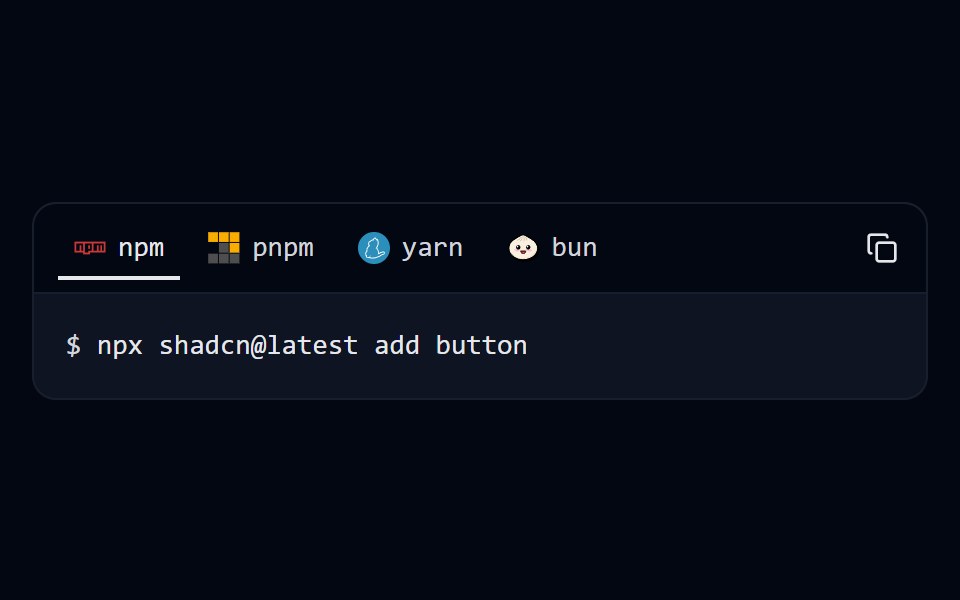 Tabs 10 - Package ManagerShadcn Space · ReactInstall command tabs for npm, pnpm, yarn and bun with a one-click copy button.
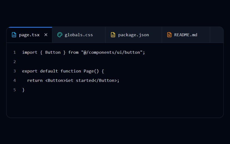 Tabs 11 - Browser TabsShadcn Space · ReactEditor-style closable file tabs with file type icons and line-numbered content.
Libraries with Animated tabs components
Related categories
- Tabs Components
- React Tabs Components
- Tailwind CSS Tabs Components
- Svelte Tabs Components
- shadcn/ui Tabs Components
- Animated Navigation Components
- Animated Menu Components
- Animated Navbar Components
- Animated Sidebar Components
- Animated Dock Components
- Animated Stepper Components
- Animated Command Palette Components
- Animated Context Menu Components
- Animated Tab Bar Components
- Animated Pagination Components
- Animated Table Of Contents Components
- Animated Wizard Components
- Animated Hamburger Menu Components
- Animated Breadcrumb Components
- Animated Floating Navbar Components