 Dev Design Library
Animated Navigation Components
Dev Design Library indexes 349 Animated navigation components from 54 open-source UI libraries, with the most coming from Watermelon UI, UI Lab, Nexvyn UI, Fluid Functionalism and Shadcn Space. Each one links to its page with the source code, a live preview where available, the library license and the install command. These are the navigation components tagged as animated: motion on hover, on scroll or on load, usually built with CSS transitions or Framer Motion.
Showing 120 of 349, a mix from every library. Open a library to see all of its components.
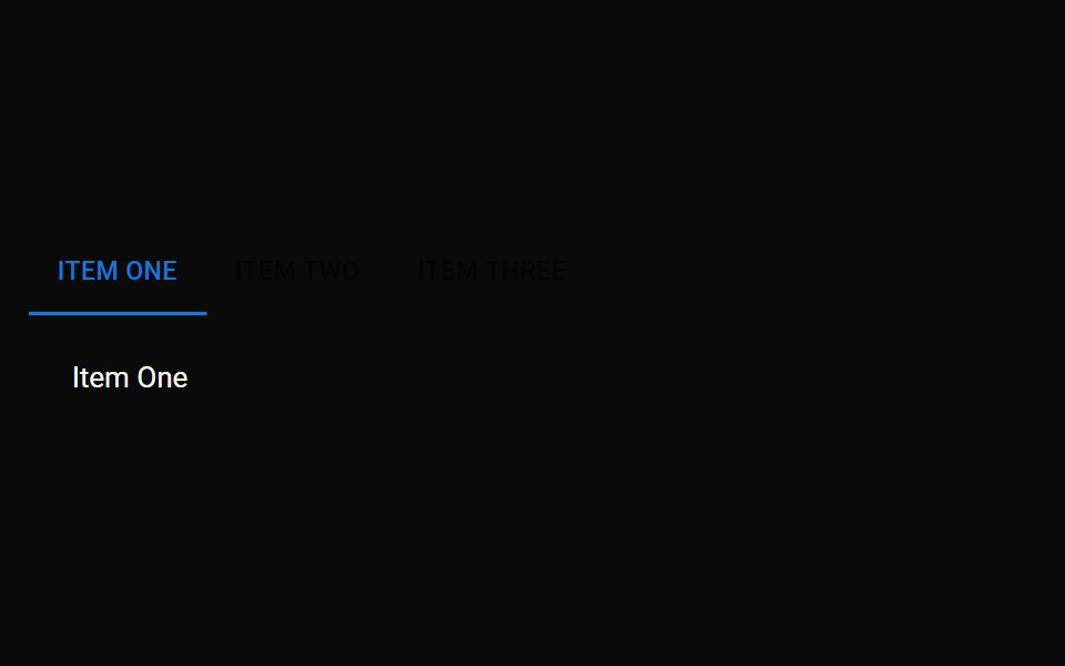 TabsMUI / Material UI · React
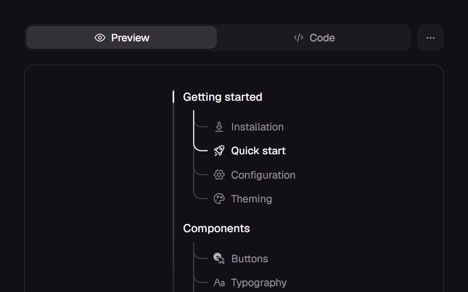 Branched MenuReact Bits · ReactCollapsible menu whose sections unfold into a trunk with a curved branch to each child, and an accent line that…
 MenudaisyUI · CSS (Tailwind)
 DropdownHeroUI · ReactA dropdown displays a list of actions or options that a user can choose
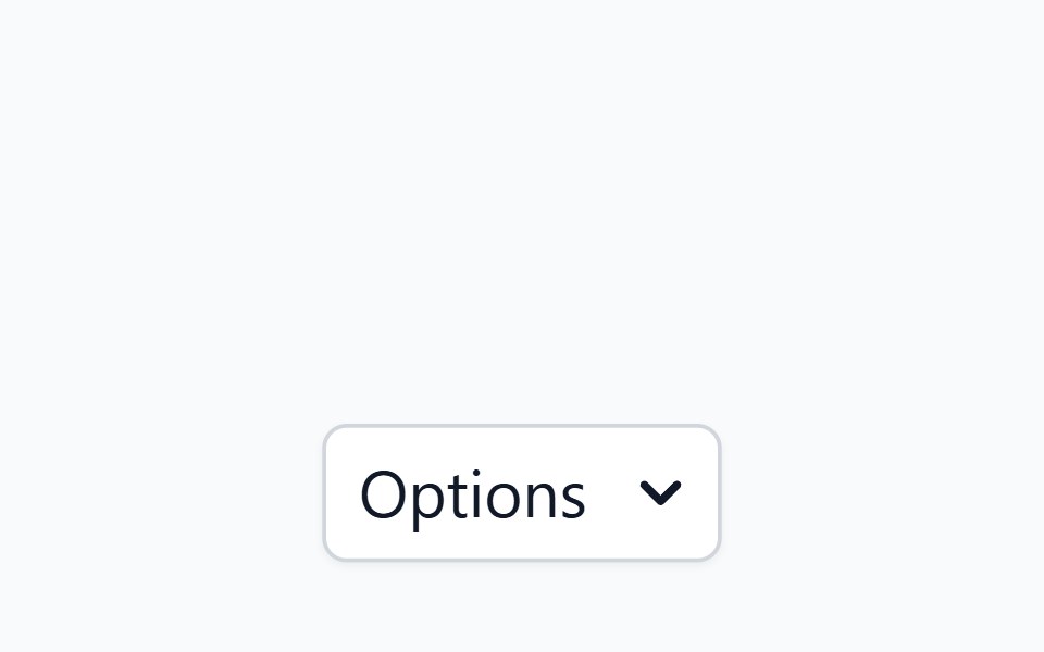 MenuHeadless UI · React
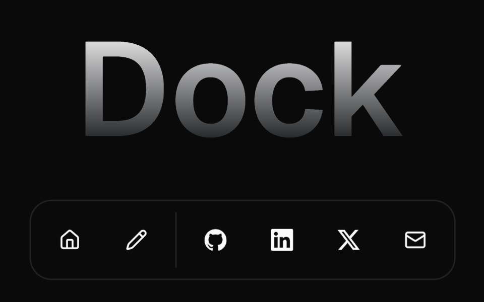 DockMagic UI · ReactAn implementation of the MacOS dock using react + tailwindcss + motion
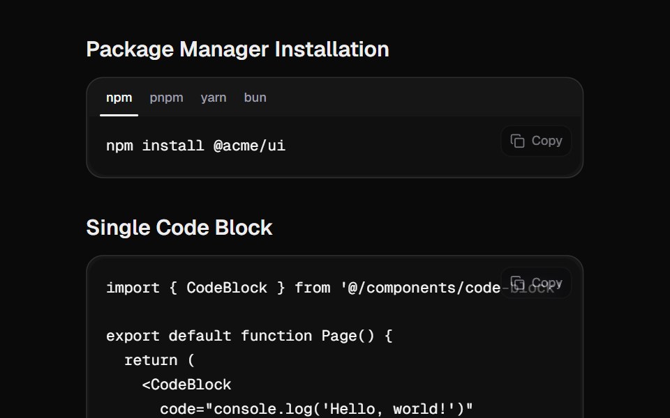 Code BlockCult UI · ReactA beautiful code block component with tabs, copy functionality, and smooth animations
 Dropdown Menu Morphtransitions.dev · HTML/CSSButton that grows and changes shape into its dropdown menu instead of opening a separate panel.
 Animated hamburger / close toggle buttonReUI · ReactAnimated hamburger / close toggle button
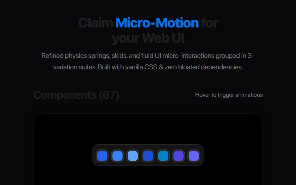 Ab Segmented TabsAmicro Micro Transitions · ReactSegmented control where active letter (A or B) slides into a solid pill.
 BurgerLobe UI · ReactA responsive navigation control that opens a drawer of menu items from a hamburger button.
 Command PaletteKokonut UI · React⌘K command palette with nested pages, fuzzy matching and in-row progress for running actions.
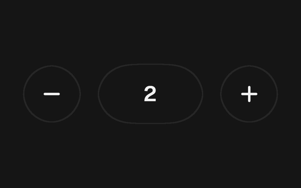 Adaptive StepperbeUI · ReactComposable numeric stepper whose fixed footprint adapts at its minimum and maximum while the value rolls between steps.
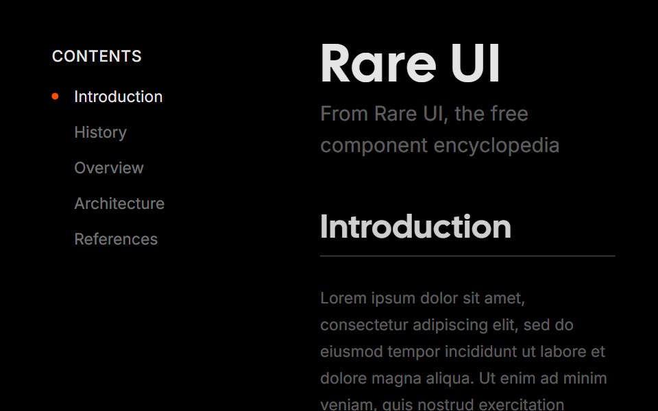 Bounce SidebarRare UI · ReactA vertical navigation list with a bouncy, spring-animated active indicator.
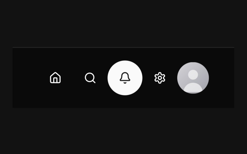 Circular NavbarSpectrum UI · Reactcomponent for the Circular Navbar
 Awwwards NavVengeance UI · ReactGlass bottom nav that expands into a mega-menu
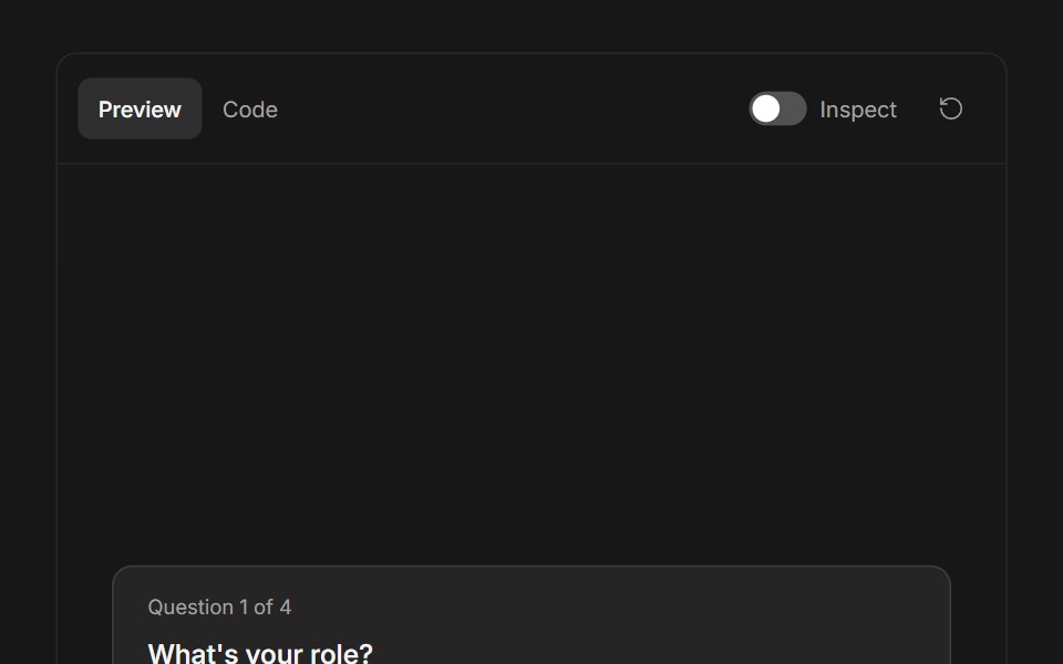 Ask User QuestionsFluid Functionalism · ReactStepped question flow with numbered options, keyboard shortcuts (1–9), single or multi-select, inline 'other' text…
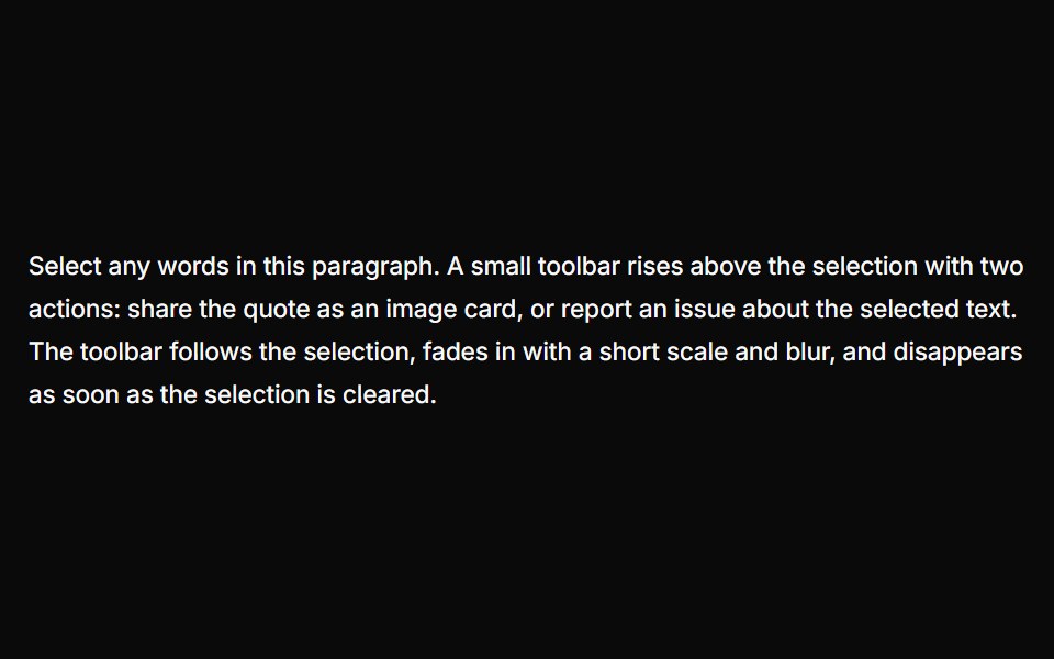 Text Selection PopoverUser Interface Wiki · React
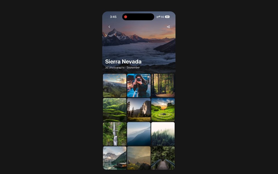 Scroll HeaderPanel UI · React NativeA screen title that hands over to a compact bar as the page scrolls.
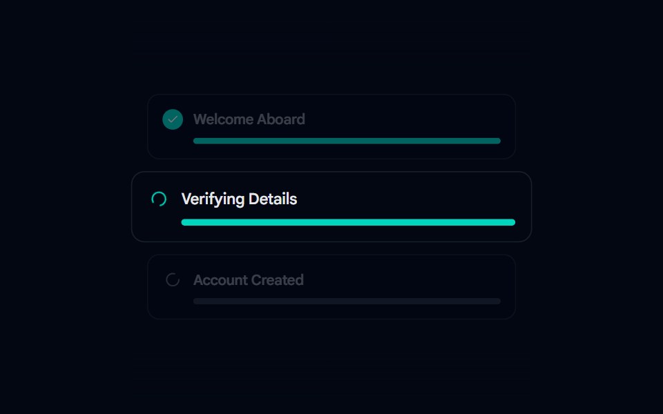 Animated List 02 - Setup StepsShadcn Space · ReactSetup Steps component
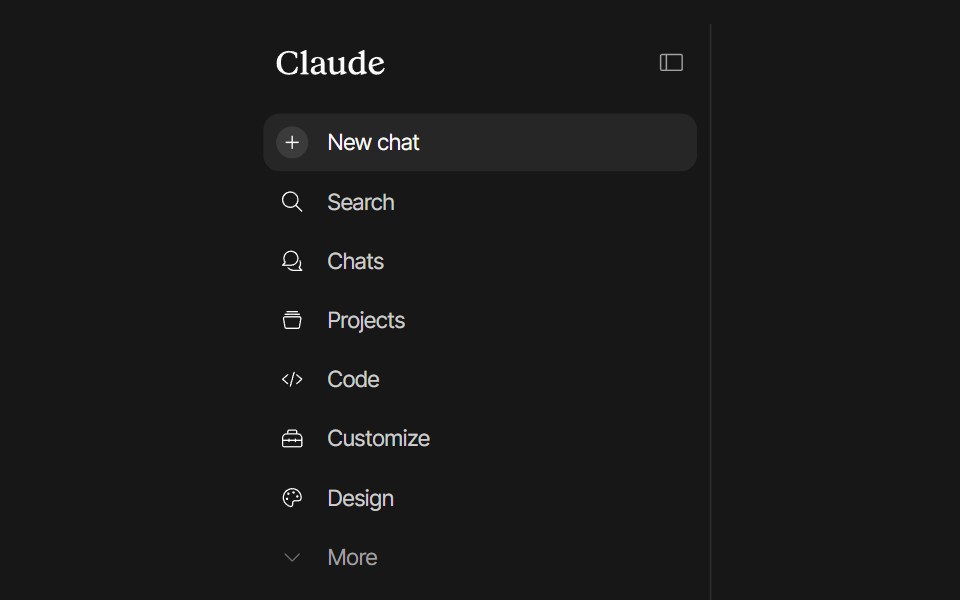 Claude SidebarPixel Perfect · ReactClaude-style sidebar built on shadcn/ui's <Sidebar> primitives. Smooth icon-rail collapse animation, playful icon…
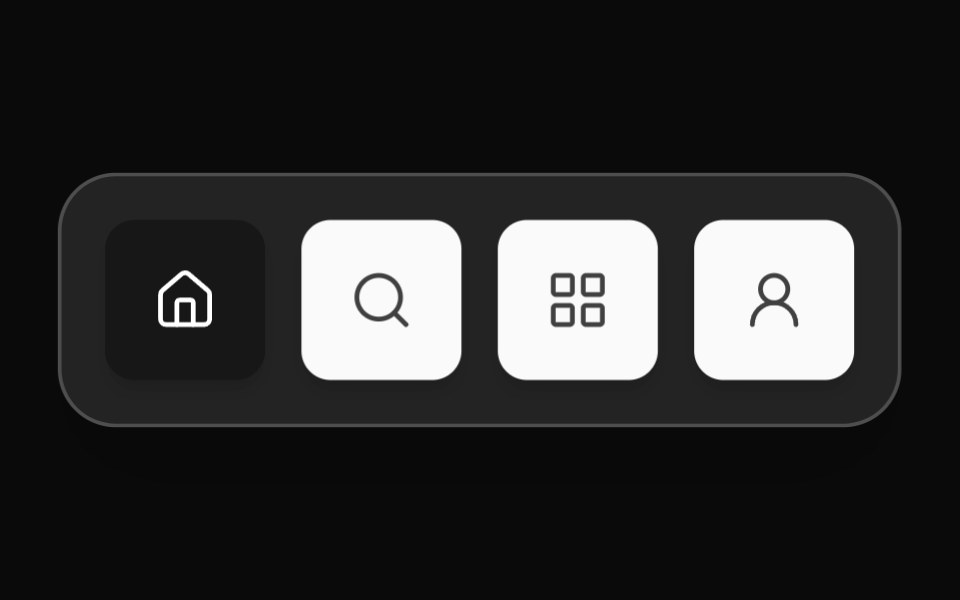 App DockOpenSourceUI · React
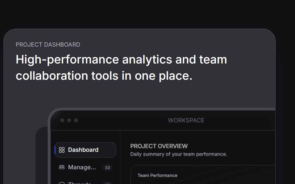 Bento Carduselayouts · ReactAn interactive bento card with animated tabs and workspace preview.
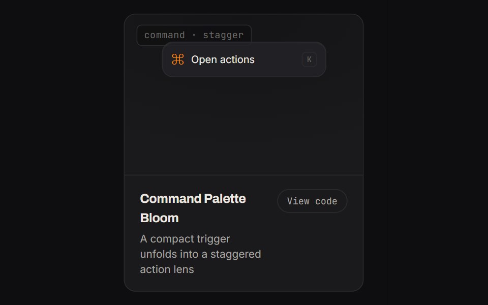 Command Palette BloomKinetics · HTML/CSSA compact trigger unfolds into a staggered action lens
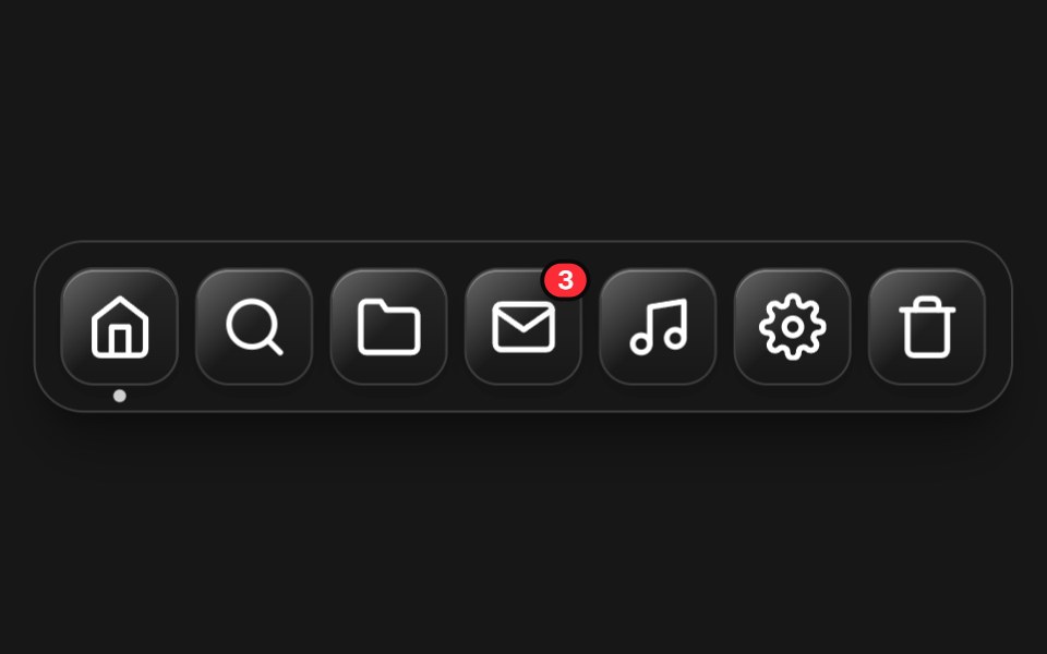 Magnetic DockComponentry · ReactMacOS style dock that scales items based on mouse proximity.
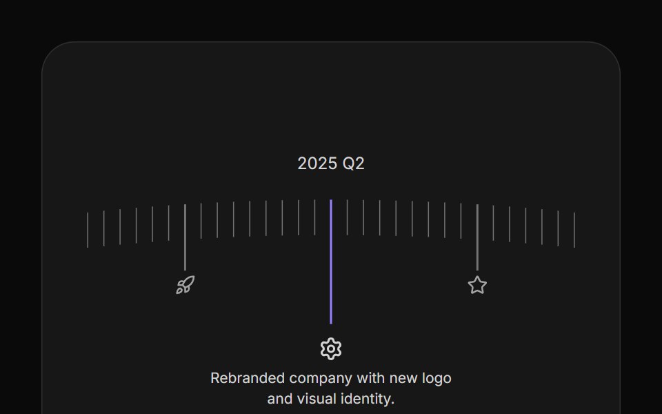 Arc TimelineAnimations (Svelte) · SvelteA curved timeline that rotates through milestone steps with clickable markers, icons, and configurable spacing.
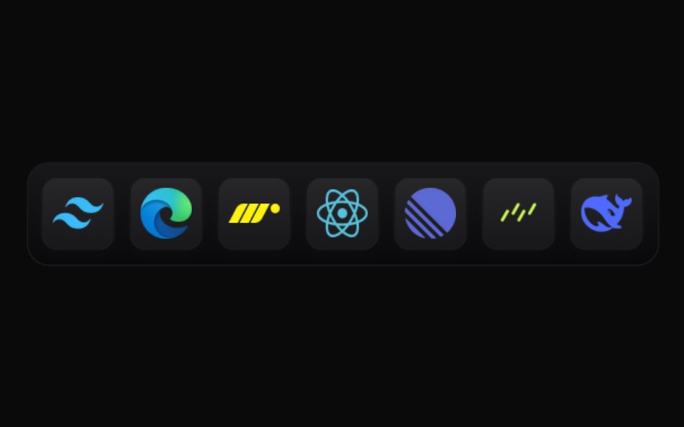 DockBadtz UI · ReactAn interactive icon dock that smoothly scales icons/images on hover, providing a responsive and engaging visual effect.
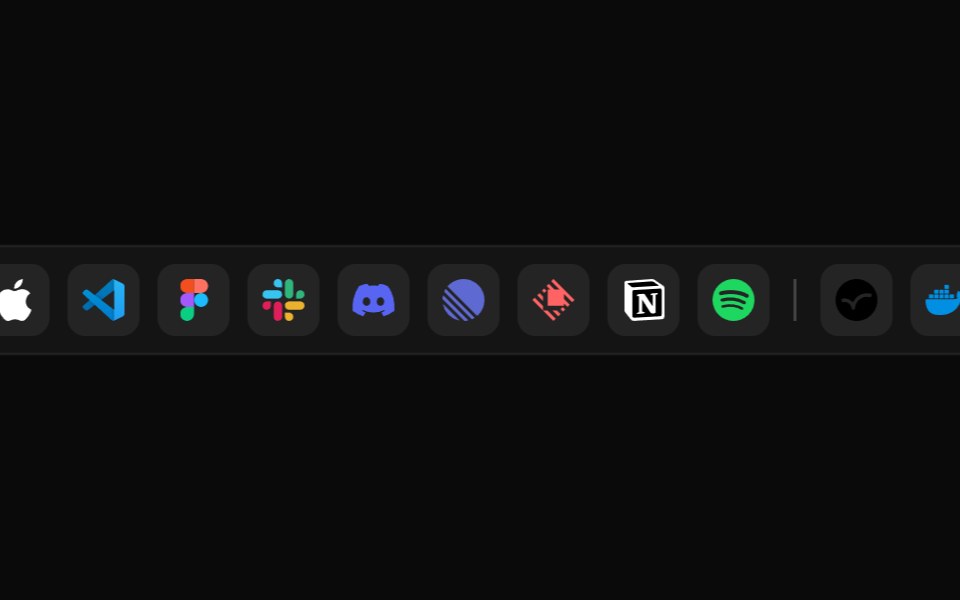 Fluid App DockGreatUI · ReactA glass app dock whose icons magnify and spread under the cursor with spring physics.
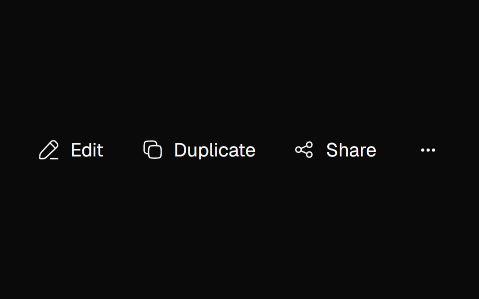 Adaptive ActionsNexvyn UI · ReactA responsive action toolbar that measures its available inline size and moves overflowed items into an accessible…
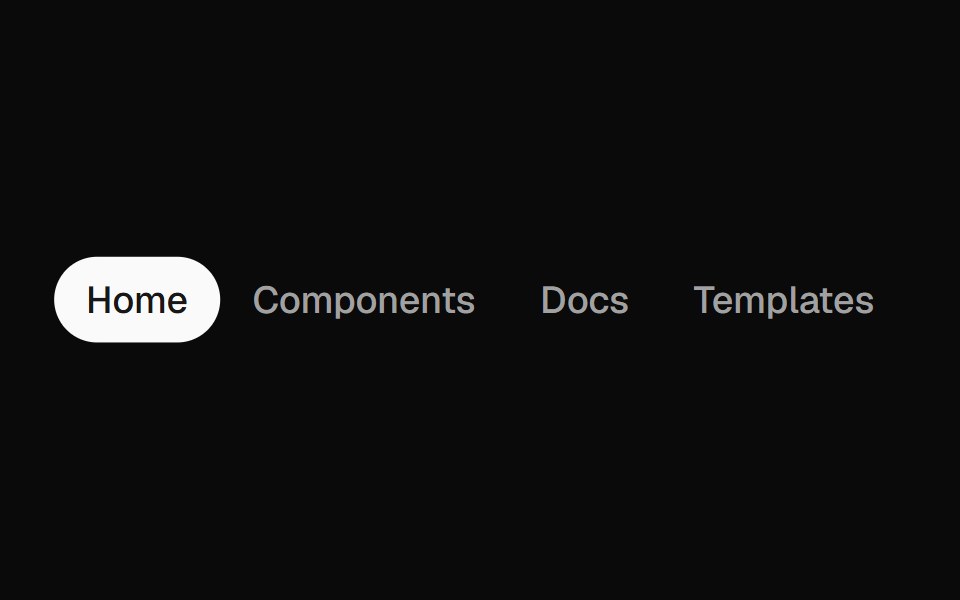 Animated TabsForge UI · Reactwitch tabs smoothly with motion-based underline or highlight effects.
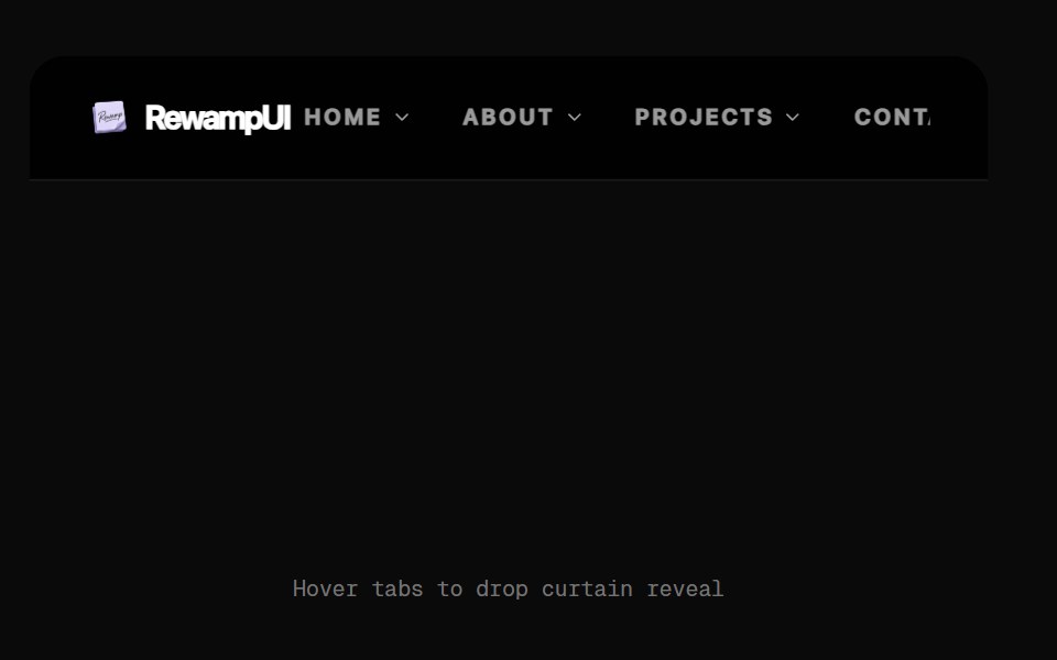 Curtain Reveal NavbarRewamp UI · ReactNavigation bar whose menu opens like a curtain sliding down over the page.
 Animated DropdownSona UI · ReactA composable, accessible dropdown menu built on Base UI with controlled state, interruptible hover highlighting, and…
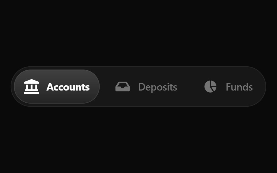 Fluid TabsWatermelon UI · ReactTabs with an indicator that flows smoothly from one tab to the selected one.
 FAQ Foursv-efferd · SvelteA categorized FAQ explorer with topic switching and softly framed accordion rows.
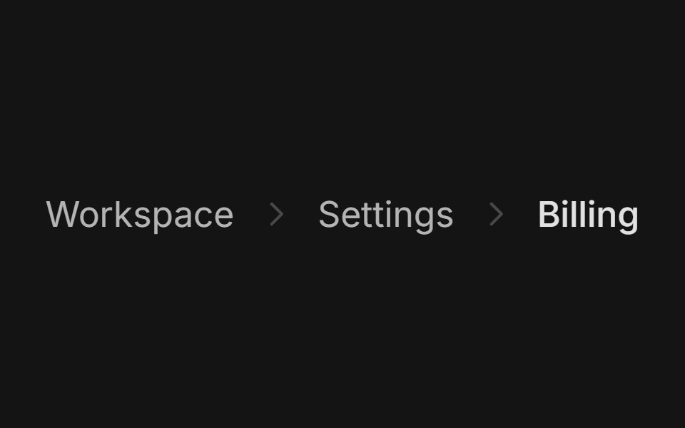 BreadcrumbArc Library · ReactShow where a page sits in a hierarchy.
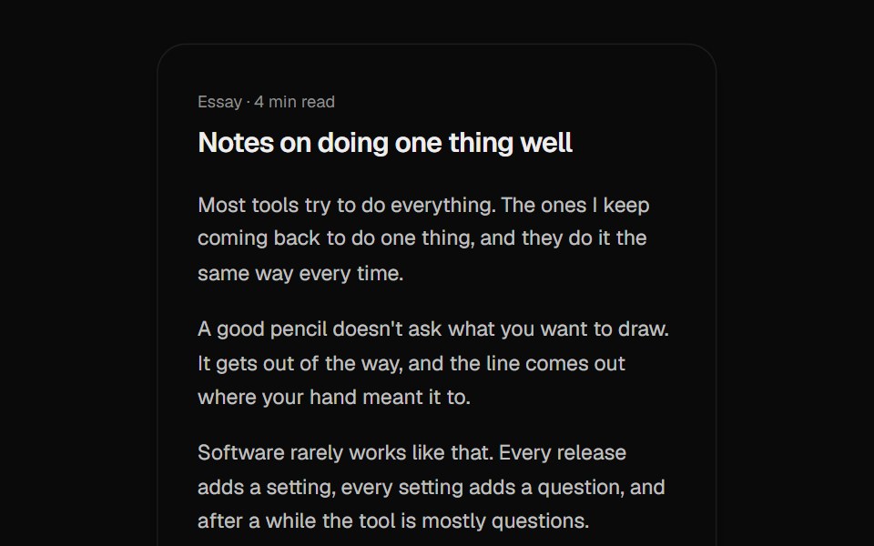 Back To TopUI Lab · ReactFills its ring as you read, and when you press it the arrow lifts off while the page glides back up.
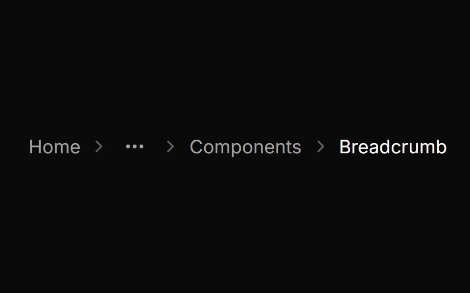 BreadcrumbHextaUI · ReactA trail of links to the current page that wraps safely, mirrors in right-to-left layouts and expands collapsed…
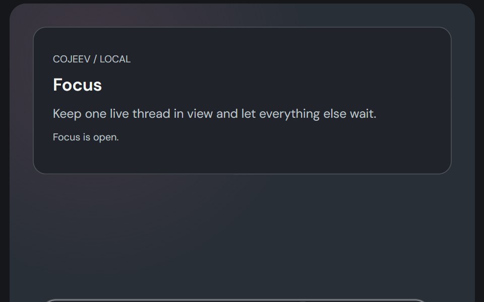 DockCojeev UI · ReactA compact workspace launcher with a magnifying glass bar, raised shelf and labelled vertical rail.
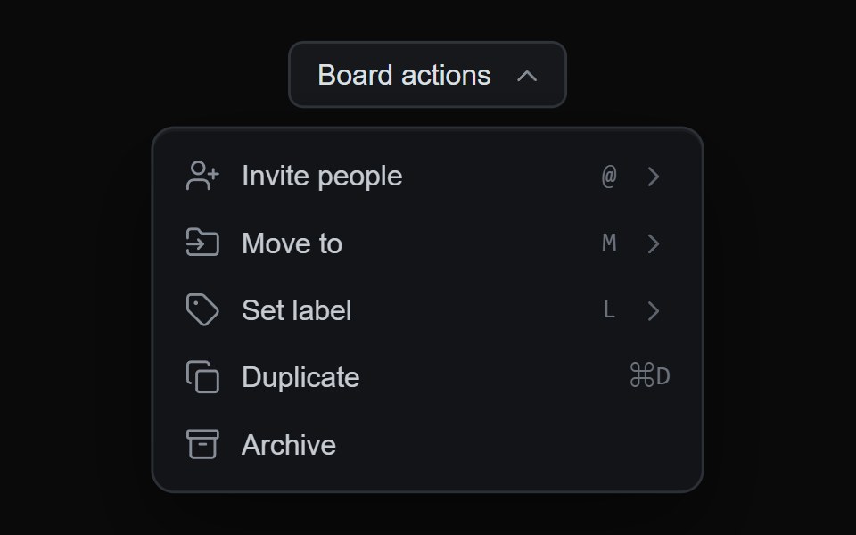 Blur Glide MenuMicroKit · ReactA nested menu whose steps blur before they glide aside, while the surface animates to the height of the step arriving.
 Hamburger toggleFLX UI · ReactThree bars morph into an X on press.
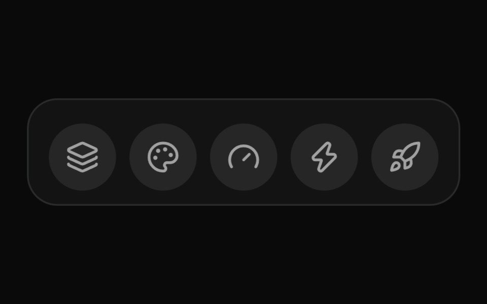 DockVelora UI · ReactmacOS-style dock with cursor magnification.
 Hamburger Menusv-particles · Svelte
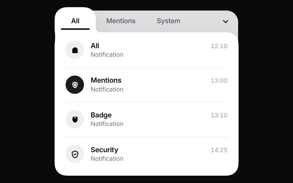 Liquid TabsPin UI · React
 BreadcrumbsMetal UI · React + SwiftUIWhere you are, as a path you can climb: levels above in ink2, the current in ink, engraved chevrons between; a new…
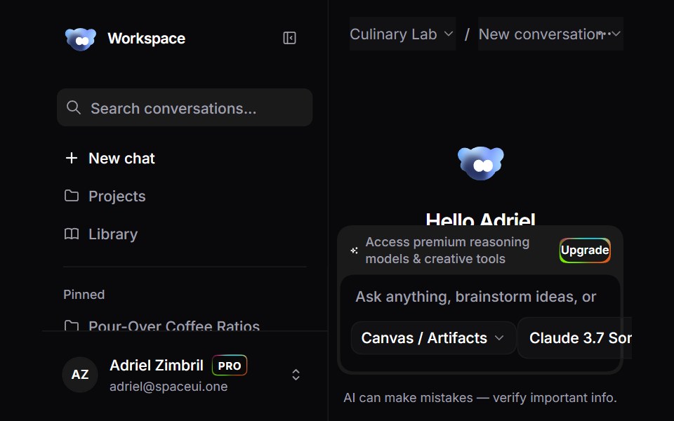 Ai Chat WorkspaceSpaceUI · ReactFull-featured AI Studio chat workspace template featuring conversational threads, multi-model selection, real-time…
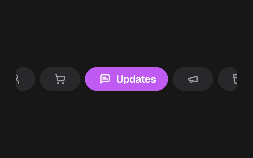 Apple Mail TabsSkecher UI · ReactA colorful, horizontally scrollable mail category selector with compact inactive tabs and an expanded active tab.
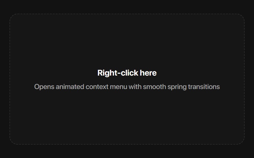 Base Context MenuSora UI · ReactAn accessible context menu built on Base UI with smooth Motion spring scale and submenu slide animations.
 Crypto OrbitZAYX · React Native
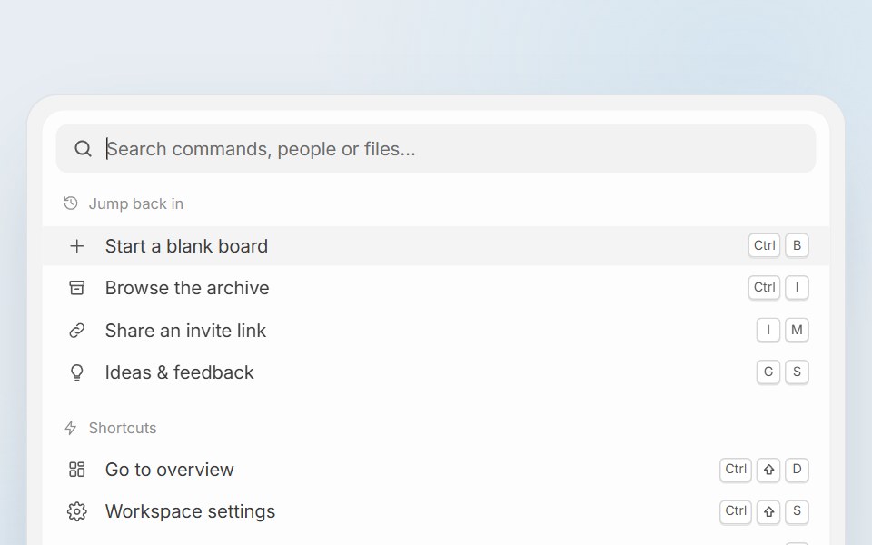 Pixel Perfect Command PaletteCue Foundations · React
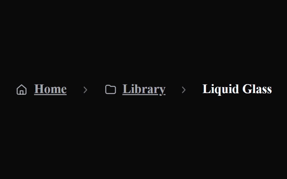 Liquid BreadcrumbsLiquefy UI · ReactBreadcrumb navigation in liquid glass style.
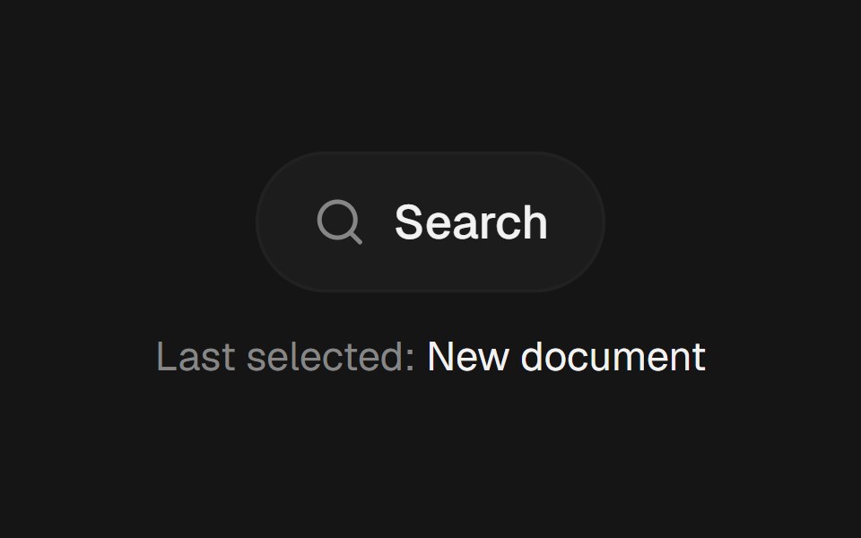 Command PaletteEaseUI · ReactCommand-K style search overlay that filters as you type, with arrow keys to move the highlight and Enter to select.
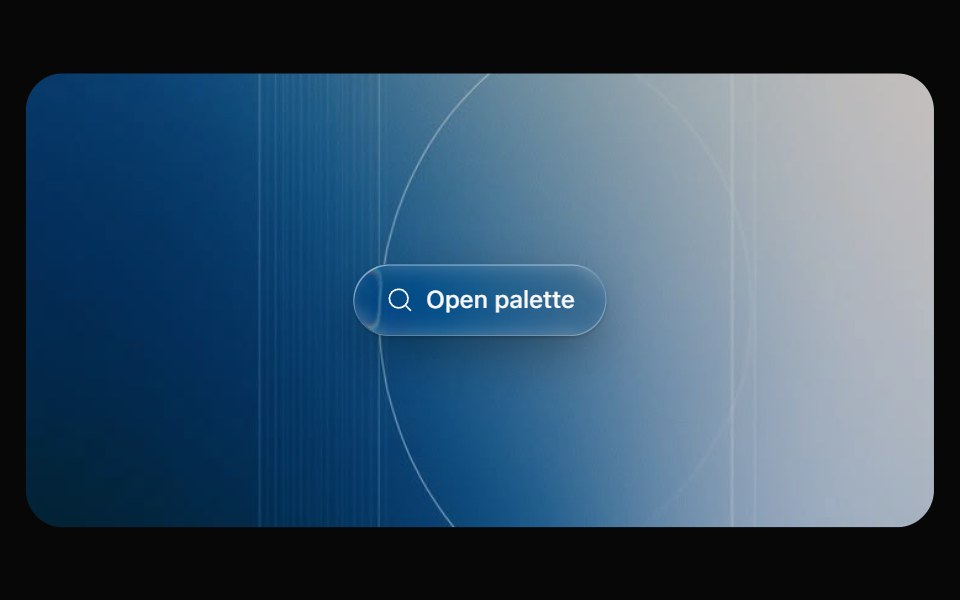 Glass CommandOpaline · React⌘K command palette on a frosted glass sheet, powered by cmdk.
 Back to TopReactFrame · ReactA floating scroll-to-top button that fades in past a threshold, with an optional progress ring showing how far down…
 Floating DockAceternity UI · React
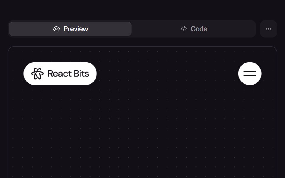 Bubble MenuReact Bits · ReactNavigation bar of round bubbles (logo and toggle) that opens a full-screen overlay of pill-shaped menu links popping in.
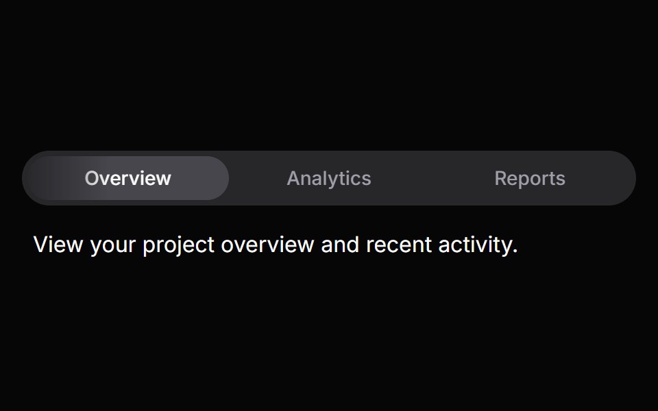 TabsHeroUI · ReactOrganize content into tabbed views with animated transitions and indicators.
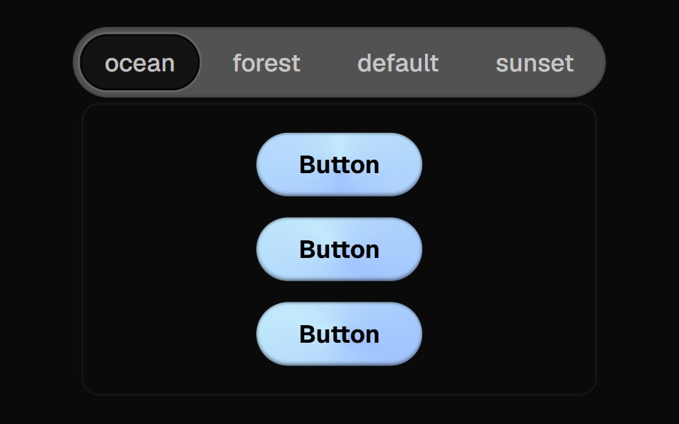 Direction Aware TabsCult UI · ReactTab component with direction-aware animations and smooth transitions
 Gooey Plus Menutransitions.dev · HTML/CSS
 Progress StepperAmicro Micro Transitions · ReactHorizontal step line (STEP 1 → STEP 2 → STEP 3) with animated fill bar.
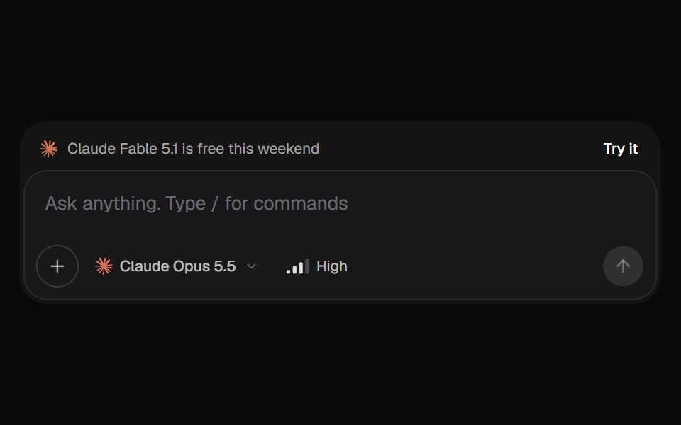 AI Input SelectorKokonut UI · ReactAI chat input with a model menu, a separate Effort control, file chips you can drop or paste, a / command menu, and…
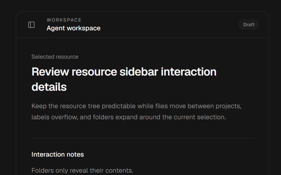 Ai SidebarbeUI · ReactComposes the shell with editable projects, folders, files, and bookmarks.
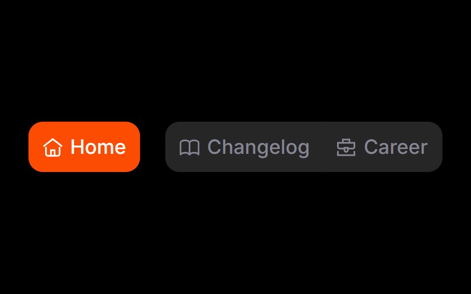 Gooey NavRare UI · ReactA gooey navigation bar that separates the selected item from the group.
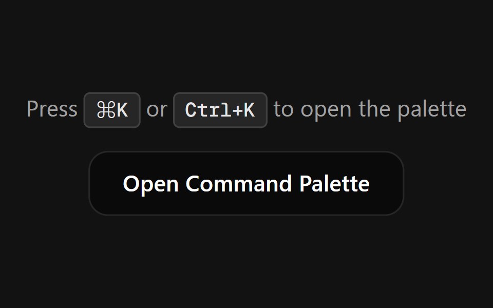 Command PaletteSpectrum UI · ReactA fully customizable, smooth-animated Command Palette (Cmd+K) component
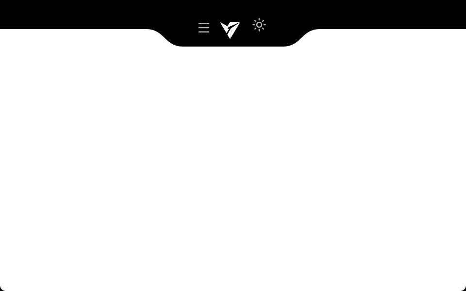 Notch NavbarVengeance UI · ReactResponsive navbar with a sleek cutout notch design
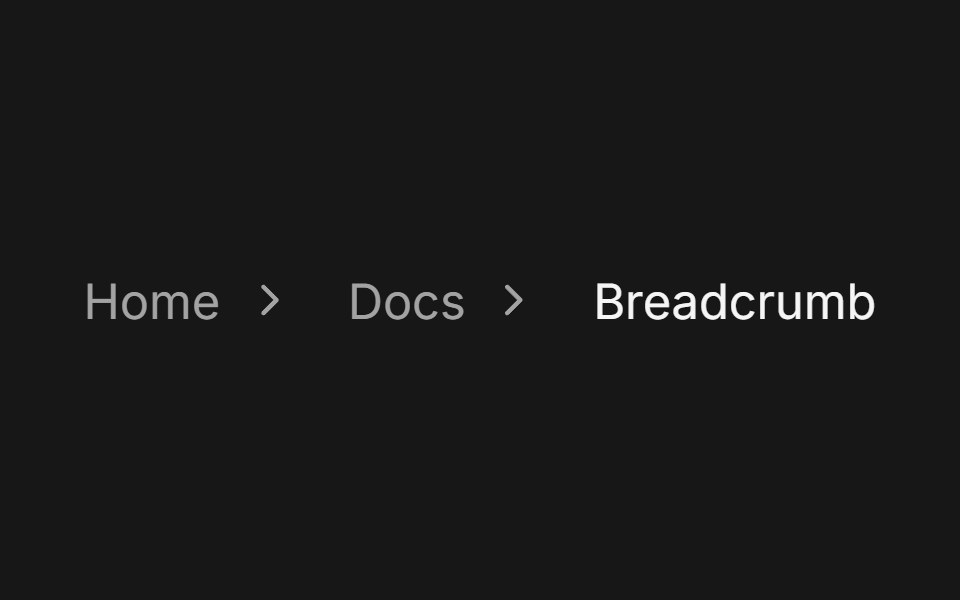 BreadcrumbFluid Functionalism · ReactA trail of links to the current page with one fluid hover across every crumb. Steps can lead with an icon, open a…
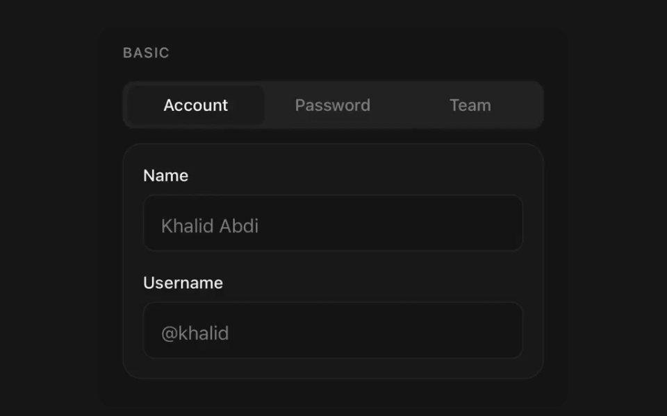 TabsPanel UI · React NativeSegmented navigation with an animated indicator.
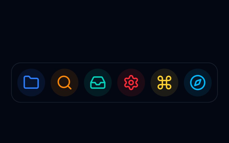 DefaultShadcn Space · ReactApple Dock component
 Glass Scroll NavbarPixel Perfect · ReactA fixed glass navbar refracts scrolling editorial images through a curved lens with spectral color separation.
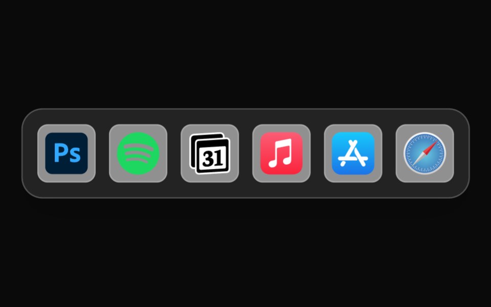 Mac DockOpenSourceUI · React
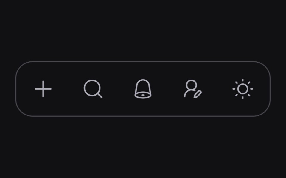 Bottom Menuuselayouts · ReactA floating bottom navigation menu with smooth interactions.
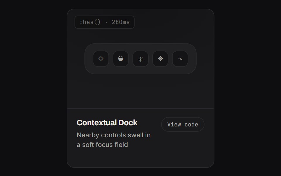 Contextual DockKinetics · HTML/CSSNearby controls swell in a soft focus field
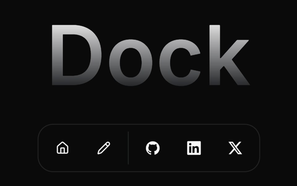 DockAnimations (Svelte) · SvelteA macOS-style dock component with smooth magnification animation on hover, inspired by the macOS dock.
 Fluid Dock CarouselGreatUI · ReactA carousel driven by a fluid dock of thumbnails, with swipe, arrows and keyboard navigation.
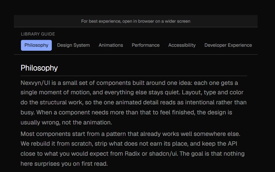 Bounce SidebarNexvyn UI · ReactA sidebar navigation with a bouncing dot indicator that smoothly animates between items using spring physics.
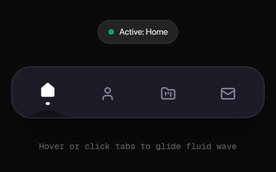 Fluid Wave NavbarRewamp UI · ReactNavigation bar with a fluid wave that follows the hovered or active item.
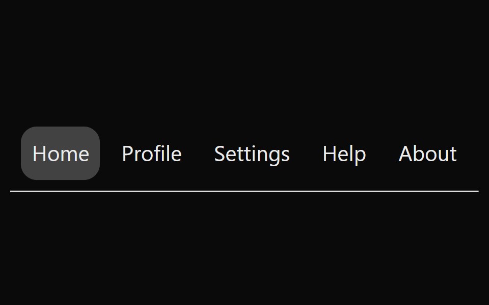 Animated TabsSona UI · ReactAn accessible horizontal tab selector built on Base UI with controlled state, keyboard navigation, disabled items, and…
 Fluid Tabs BaseWatermelon UI · ReactTabs with an indicator that flows smoothly from one tab to the selected one.
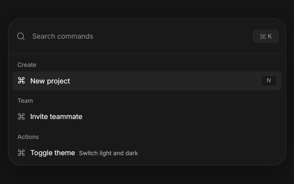 Command paletteArc Library · ReactA complete keyboard driven action surface with search, grouped results, and shortcuts.
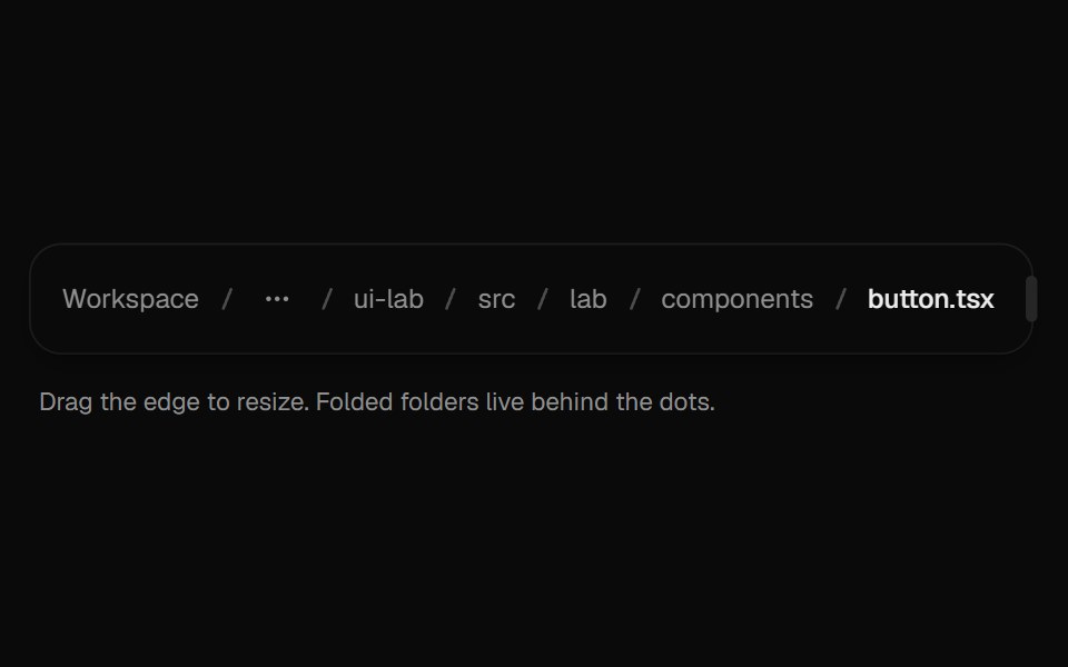 BreadcrumbsUI Lab · ReactFolds the middle of a deep path into a menu when space runs out.
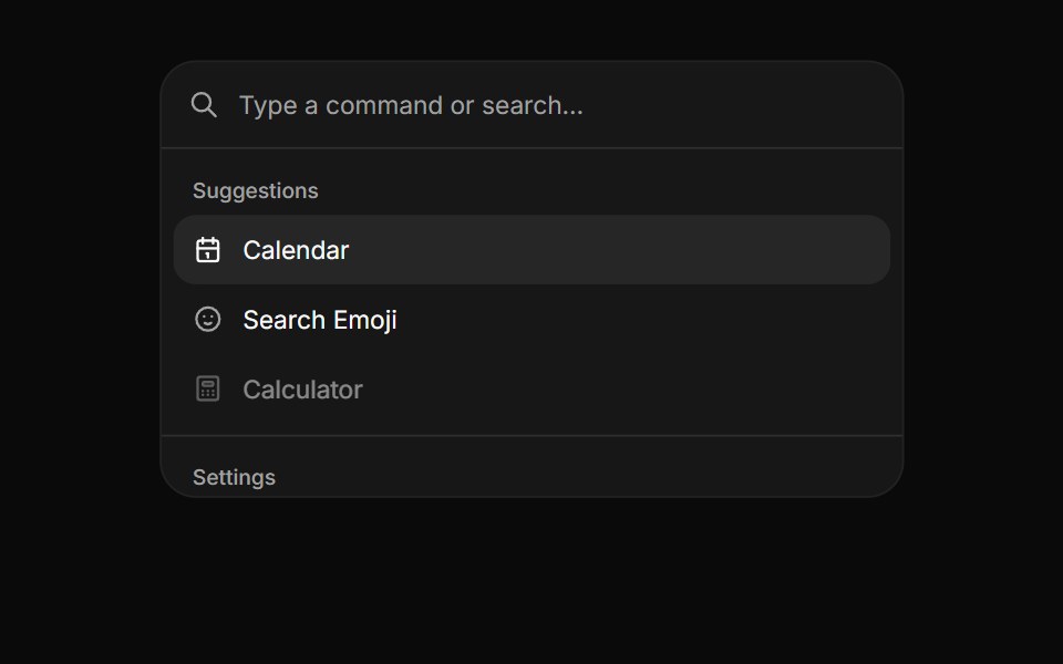 CommandHextaUI · ReactA searchable list of actions, inline or as a ⌘K palette, with pages, shortcuts and highlighted matches.
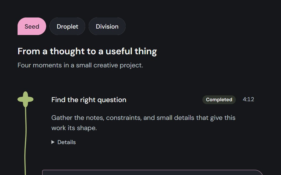 Milestone pathCojeev UI · ReactFollow caller-owned progress or a running workflow as a connected Journey, a scrollable Sequence or a compact…
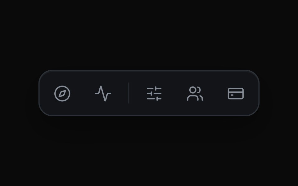 Expanding Icon TabsMicroKit · ReactAn icon bar where the chosen tab widens to reveal its label and the rest of the row slides over to make room.
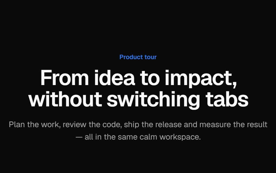 Tabbed product tourVelora UI · ReactProduct tour with animated tabs; each tab pairs short copy and a checklist with a Tailwind-built app mock.
 With Linksv-particles · Svelte
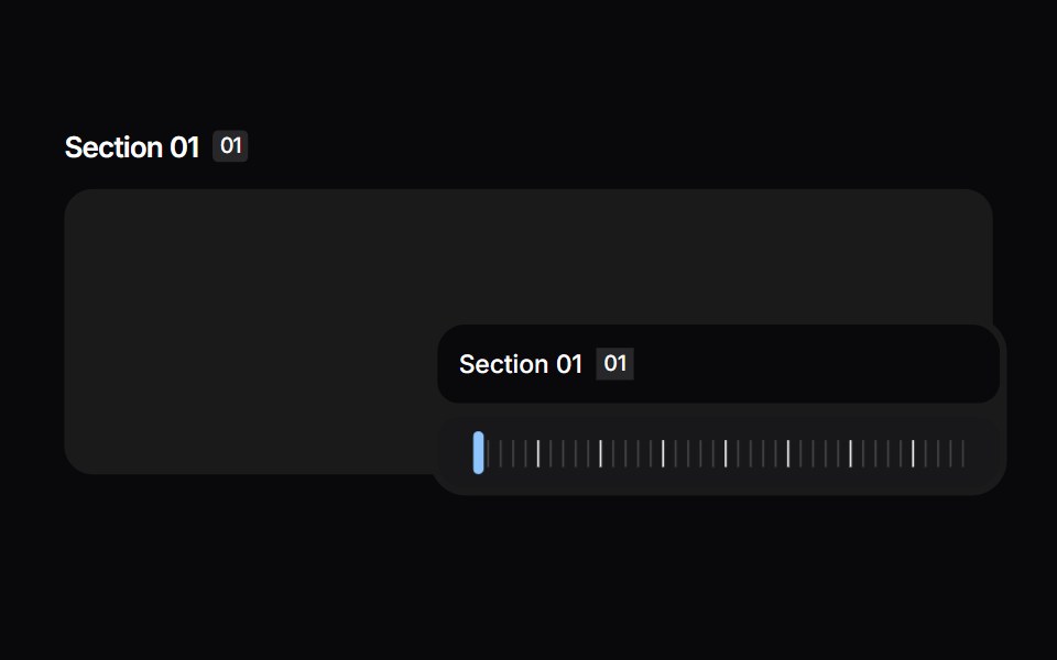 Section ScrollspySpaceUI · ReactFloating section scrollbar that tracks the active heading as you scroll.
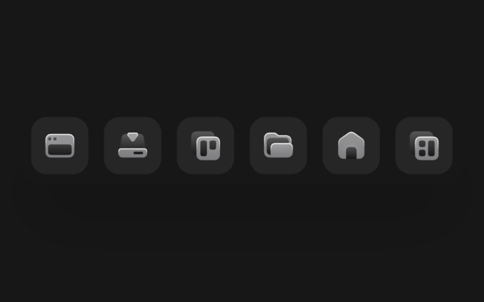 DockSkecher UI · ReactA macOS-style magnifying dock powered by shared motion values and spring-smoothed icon sizing.
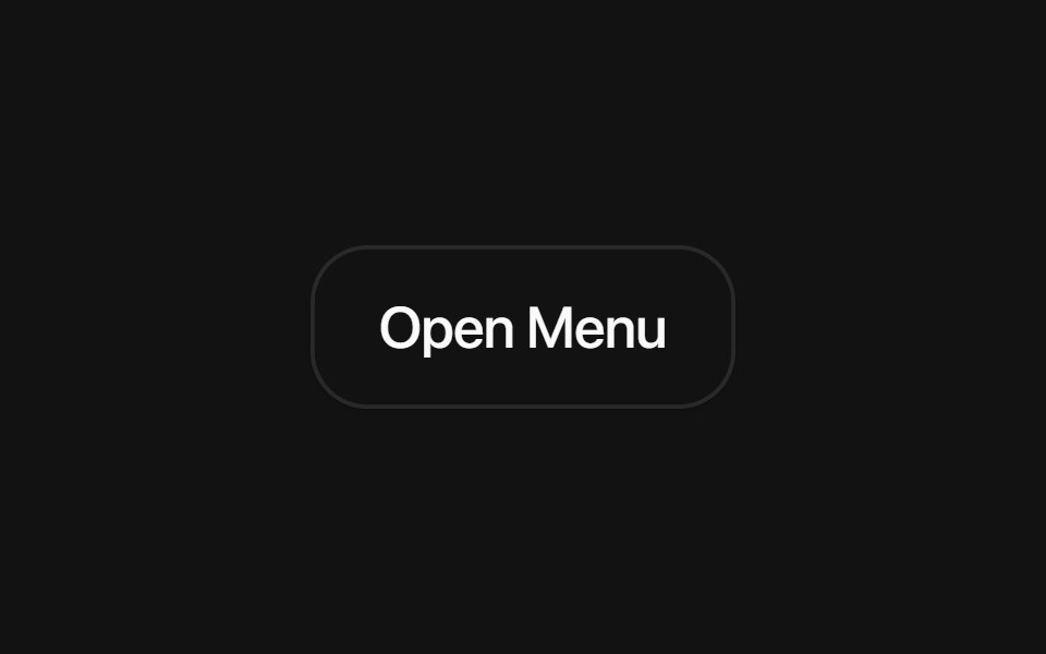 Base Dropdown MenuSora UI · ReactAn accessible dropdown menu built on Base UI with smooth Motion spring scale and submenu slide animations.
 Scrollspy Line NavigationCue Foundations · React
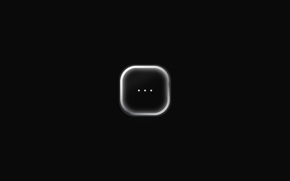 Liquid MenuLiquefy UI · ReactDropdown menu in liquid glass style. Menu suspenso em estilo vidro líquido.
 Dropdown MenuEaseUI · ReactAction menu that opens from a trigger, flips upward when there is no room below, and supports a destructive item.
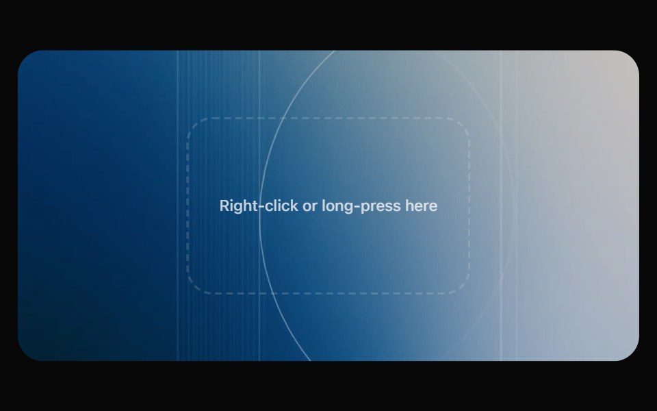 Glass Context MenuOpaline · ReactRight-click menu that springs from the cursor, with a row of round quick actions.
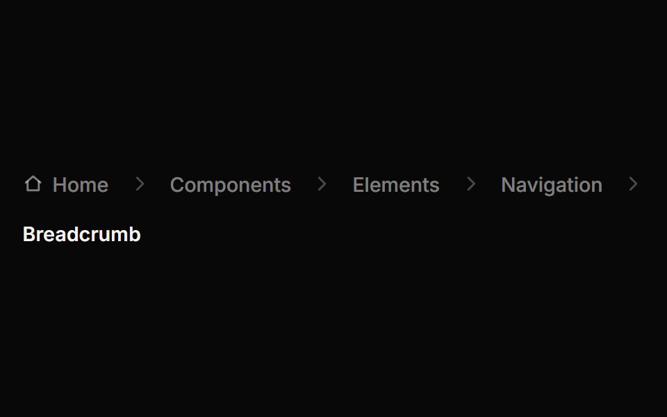 BreadcrumbReactFrame · ReactAn accessible breadcrumb trail with 4 separator styles, an optional home icon, animated collapse of long paths behind…
 Floating NavbarAceternity UI · React
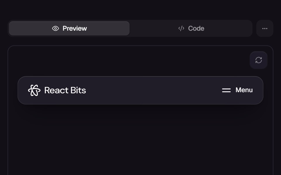 Card NavReact Bits · ReactExpandable navigation bar with card panels revealing nested links.
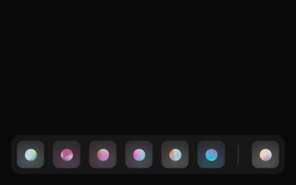 DockCult UI · ReactmacOS-style dock component with hover effects and smooth animations
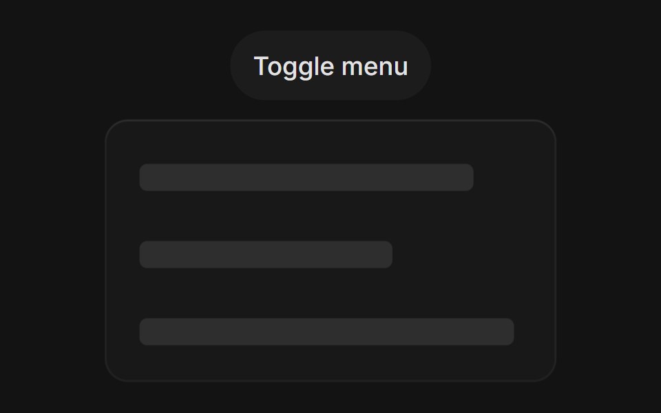 Menu Dropdowntransitions.dev · HTML/CSS
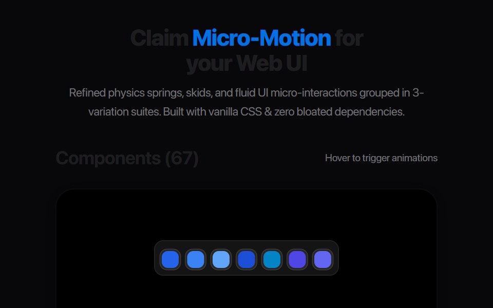 Segmented Link StretchAmicro Micro Transitions · ReactMulti-joint segmented pill chain expanding and snapping together.
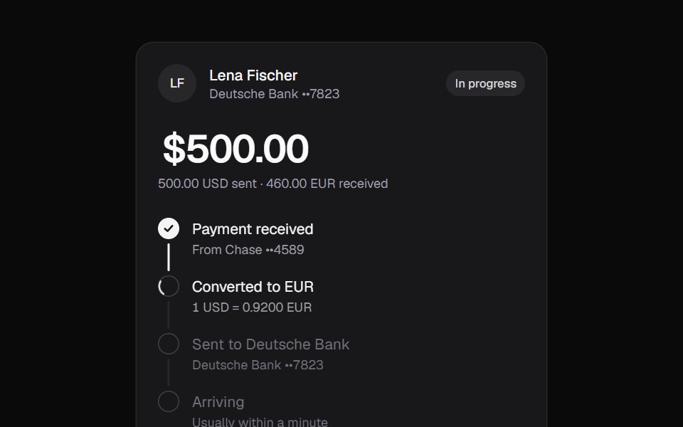 Currency TransferKokonut UI · ReactTransfer tracker that converts the amount in place, walks through each step on a filling rail and ends with a copyable…
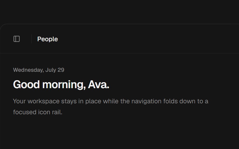 Animated SidebarbeUI · ReactA composable application sidebar with morphing nested navigation that folds into an animated icon rail on desktop and…
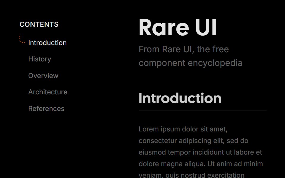 Hook SidebarRare UI · ReactA vertical navigation list with a dashed rail that marks the active item.
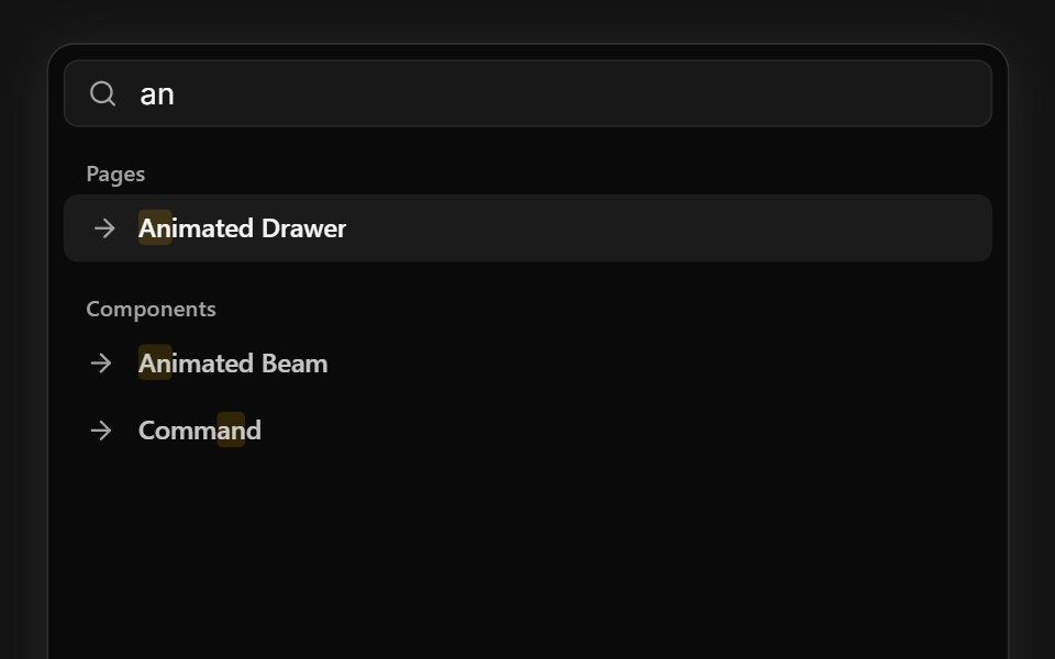 Command SearchSpectrum UI · ReactA command palette that types queries and live-filters grouped results, with keyboard navigation.
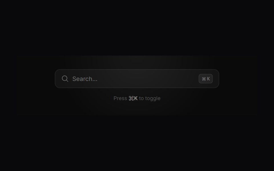 Search ModalVengeance UI · ReactMinimalist command-palette search with live filtering, tags, and actions
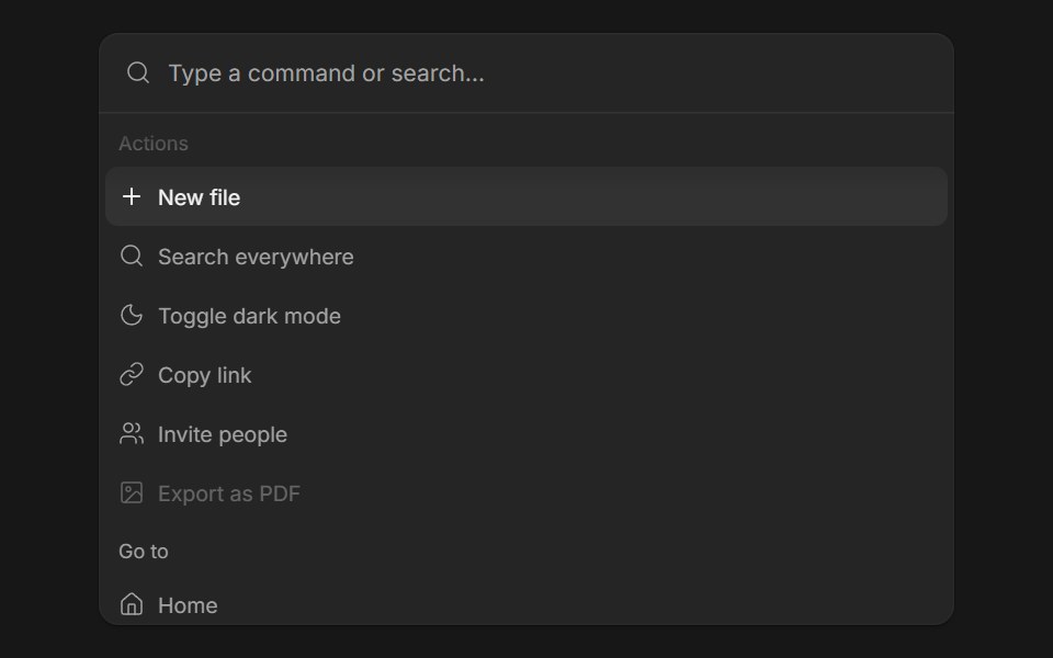 Command MenuFluid Functionalism · ReactSearch field over a list of actions: type to filter, arrows to move the fluid hover highlight, Enter to run. Grouped…
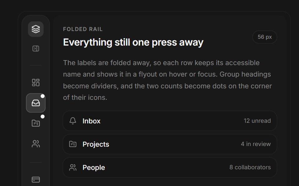 Web Nav RailPanel UI · React NativeA side navigation rail that folds to icons, with sections, badges and keyboard control.
 Dropdown Menu 07 - ExportShadcn Space · ReactAn export dropdown menu opened from a round button with a circular progress ring, with format items, a more-formats…
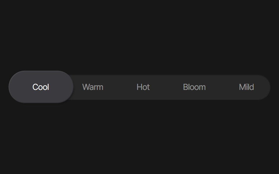 Tab Background AnimationPixel Perfect · ReactA tab background animation using Framer Motion.
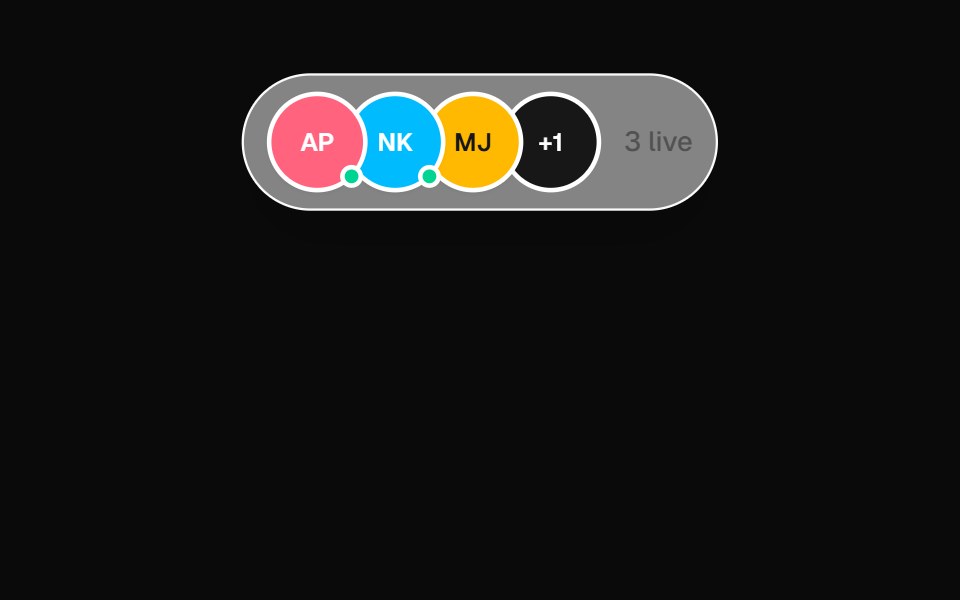 Presence DockOpenSourceUI · React
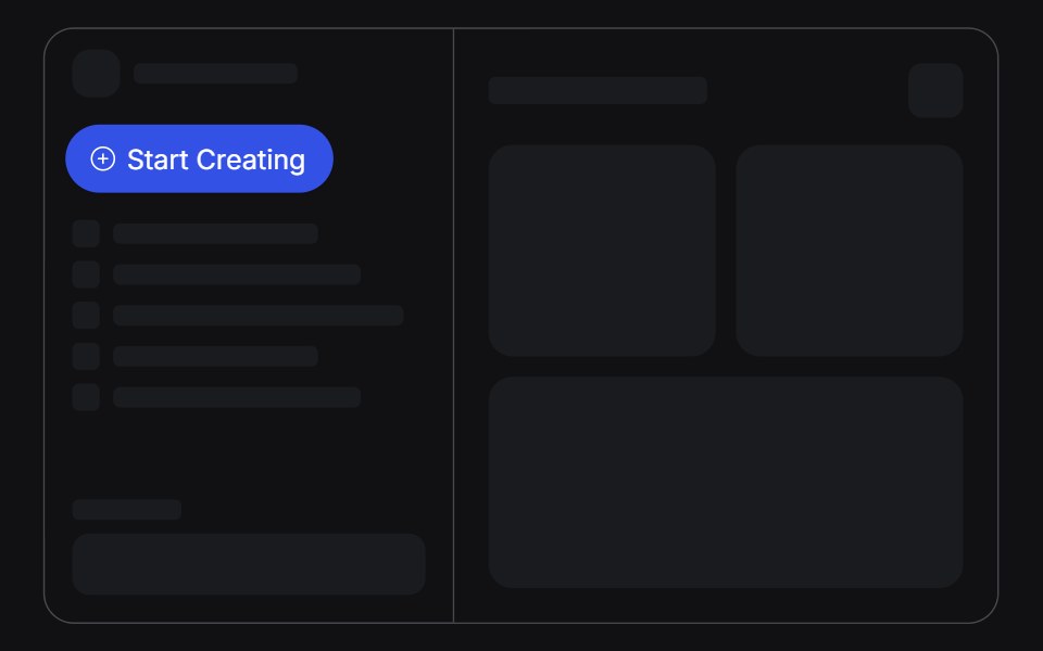 Create Menuuselayouts · ReactA Start Creating pill that springs open into a list of create actions.
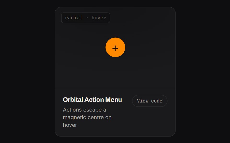 Orbital Action MenuKinetics · HTML/CSSActions escape a magnetic centre on hover
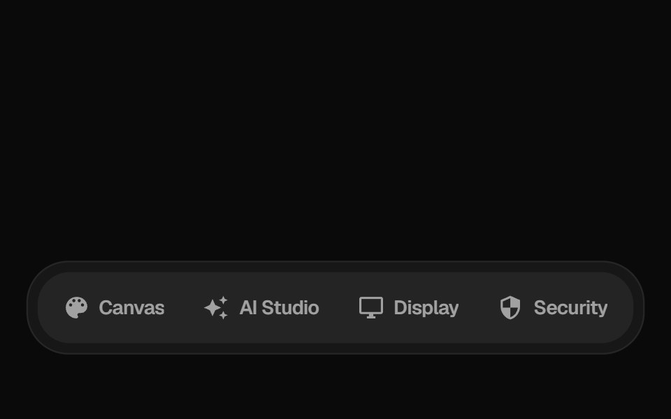 Floating Dock MenuGreatUI · React
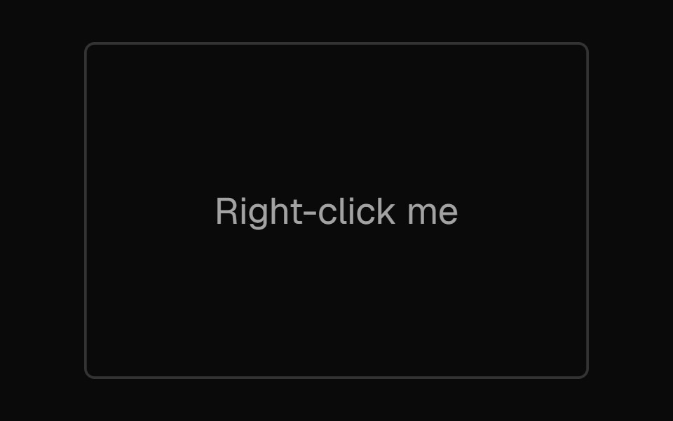 Context MenuNexvyn UI · ReactA right-click menu with proximity highlight and keyboard navigation.
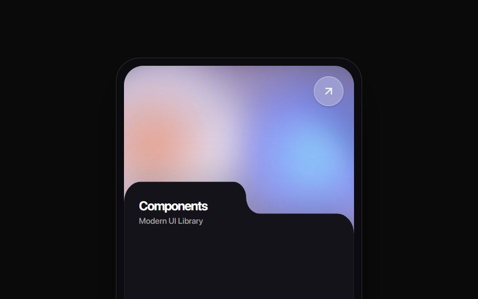 Folder Tab CardRewamp UI · ReactA modern tactile UI card featuring an ethereal animated mesh aurora gradient header, circular diagonal glass arrow…
 Circular Context MenuSona UI · ReactAn edge-aware compound context menu that fans a small set of direct actions away from a selected object.
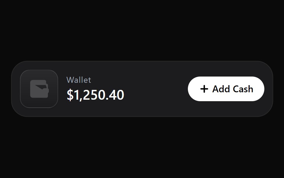 Add Cash DisclosureWatermelon UI · React
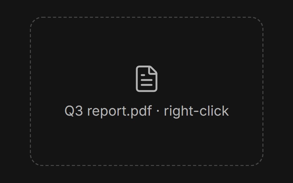 Context menuArc Library · ReactSecondary actions kept close to the selected object.
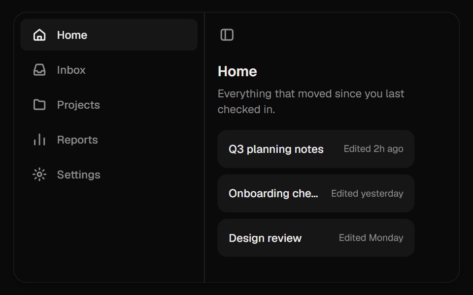 Collapsible SidebarUI Lab · ReactFolds down to an icon rail, with labels that step aside before it closes.
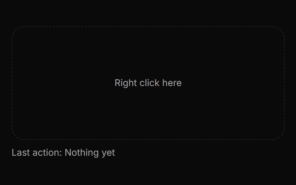 Context menuHextaUI · ReactA menu of actions on right click or long press, with submenus, checkbox and radio items, and hold feedback on touch.
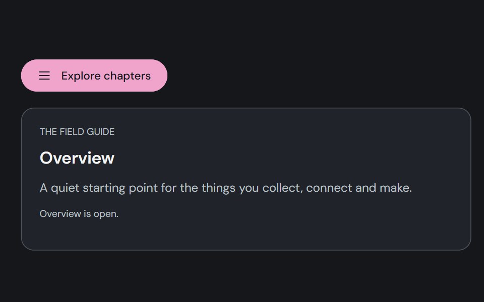 Motion DrawerCojeev UI · ReactA reference-faithful edge drawer, floating quick panel, layered workspace and bottom action tray.
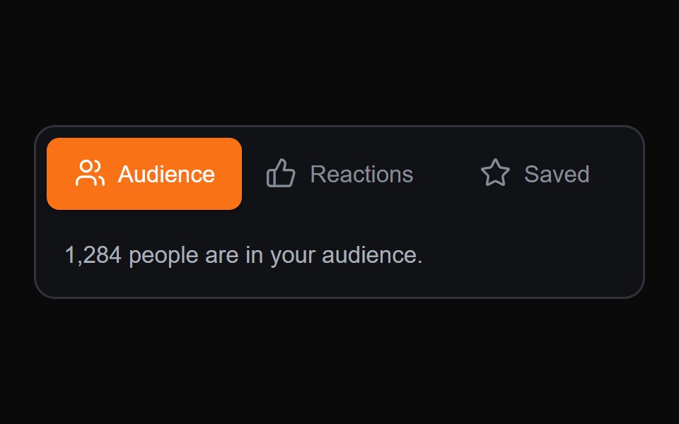 Sliding Content TabsMicroKit · ReactA compact tab switcher with a sliding active surface and content transition.
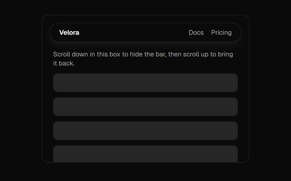 Floating NavbarVelora UI · ReactHides on scroll down, returns the moment you scroll up.
Libraries with Animated navigation components
Related categories
- Navigation Components
- React Navigation Components
- Tailwind CSS Navigation Components
- Svelte Navigation Components
- React Native Navigation Components
- shadcn/ui Navigation Components
- Animated Menu Components
- Animated Tabs Components
- Animated Navbar Components
- Animated Sidebar Components
- Animated Dock Components
- Animated Stepper Components
- Animated Command Palette Components
- Animated Context Menu Components
- Animated Tab Bar Components
- Animated Pagination Components
- Animated Table Of Contents Components
- Animated Wizard Components
- Animated Hamburger Menu Components
- Animated Breadcrumb Components
- Animated Floating Navbar Components