 Dev Design Library
shadcn/ui Navigation Components
Dev Design Library indexes 310 shadcn/ui navigation components from 28 open-source UI libraries, with the most coming from FLX UI, Watermelon UI, Shadcn Space, sv-particles and Intent UI. Each one links to its page with the source code, a live preview where available, the library license and the install command. They follow the shadcn/ui conventions, so most install with the shadcn CLI and drop into a Tailwind project.
Showing 120 of 310, a mix from every library. Open a library to see all of its components.
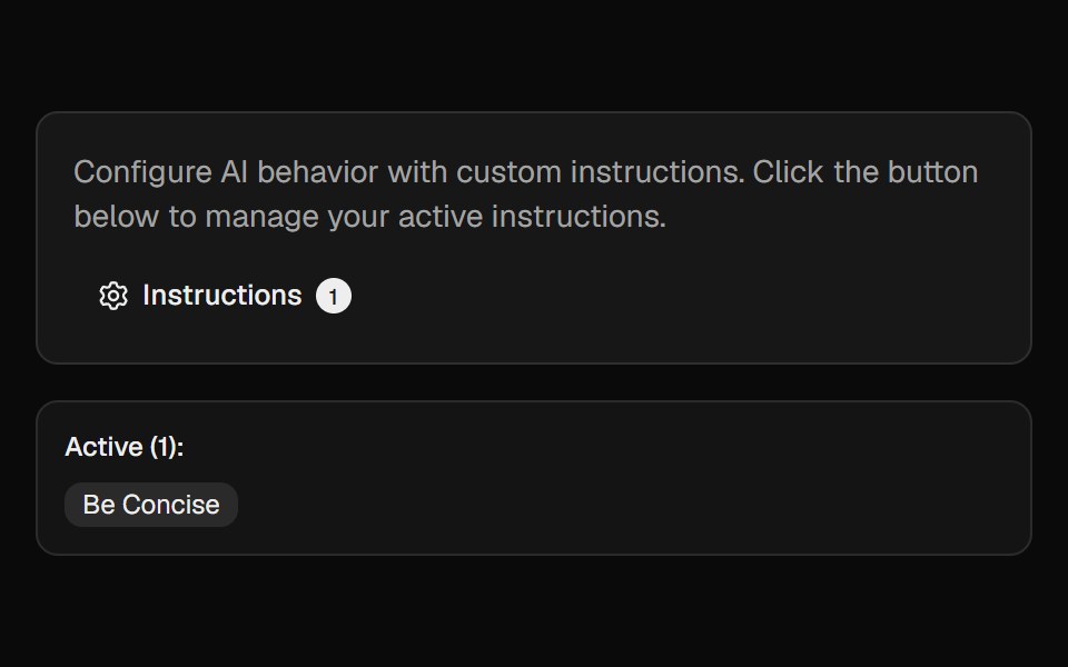 Ai InstructionsCult UI · ReactManage and toggle AI instructions with a popover, search, and create-dialog
 Pinned footer with a side-anchored import flyout.ReUI · ReactPinned footer with a side-anchored import flyout.
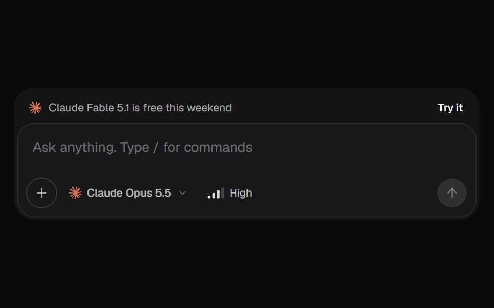 AI Input SelectorKokonut UI · ReactAI chat input with a model menu, a separate Effort control, file chips you can drop or paste, a / command menu, and…
 context-menuIntent UI · Reactcontext-menu
 Circular NavbarSpectrum UI · Reactcomponent for the Circular Navbar
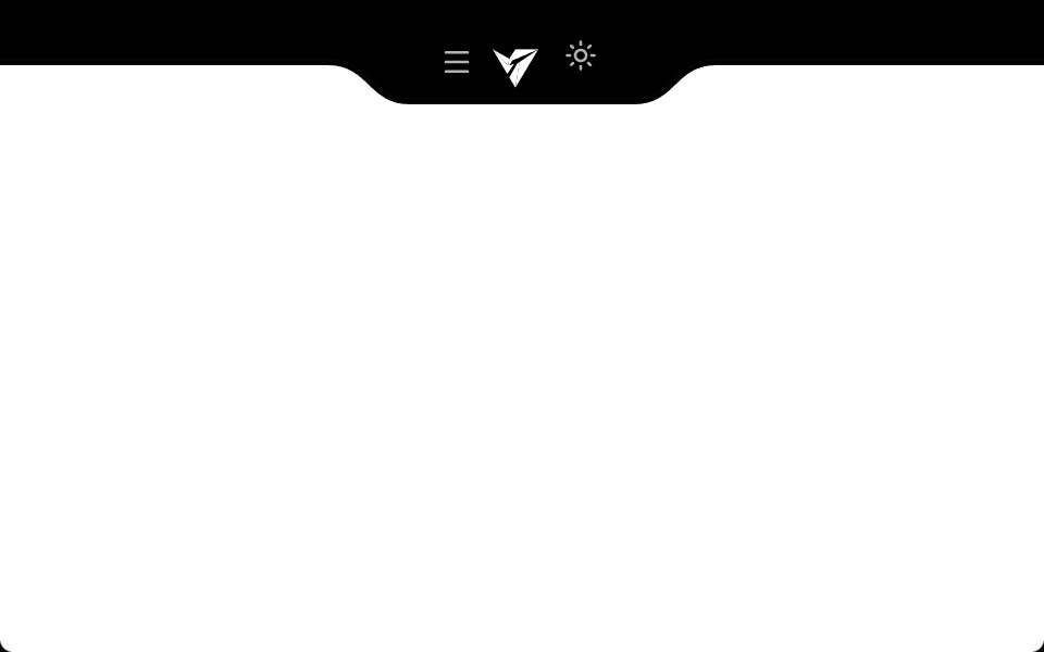 Notch NavbarVengeance UI · ReactResponsive navbar with a sleek cutout notch design
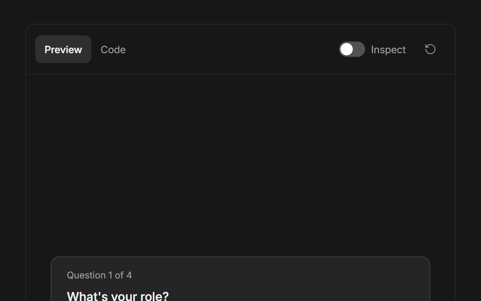 Ask User QuestionsFluid Functionalism · ReactStepped question flow with numbered options, keyboard shortcuts (1–9), single or multi-select, inline 'other' text…
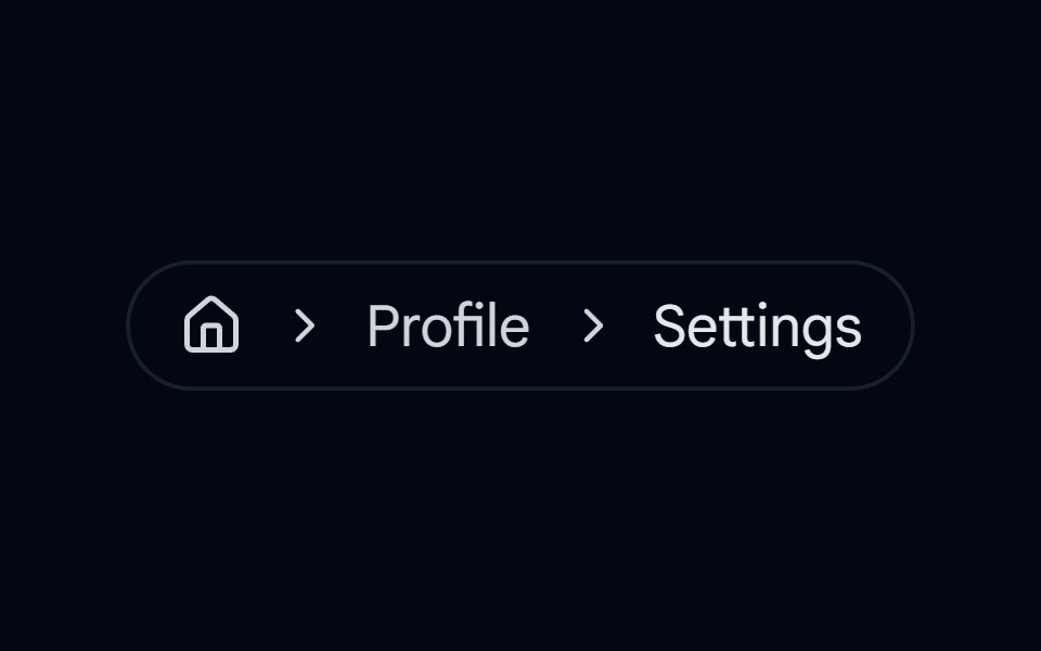 breadcrumb-01 - BreadcrumbShadcn Space · ReactBreadcrumb component
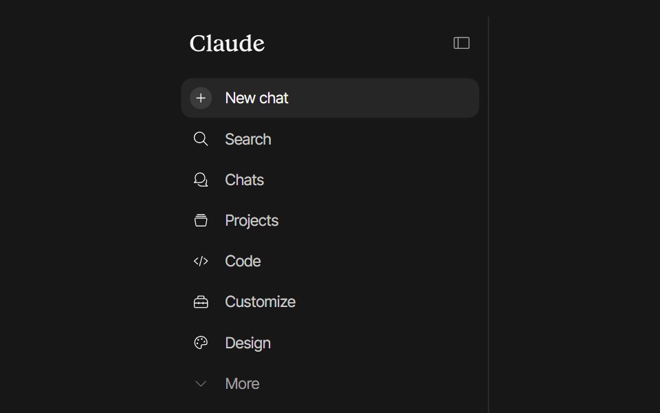 Claude SidebarPixel Perfect · ReactClaude-style sidebar built on shadcn/ui's <Sidebar> primitives. Smooth icon-rail collapse animation, playful icon…
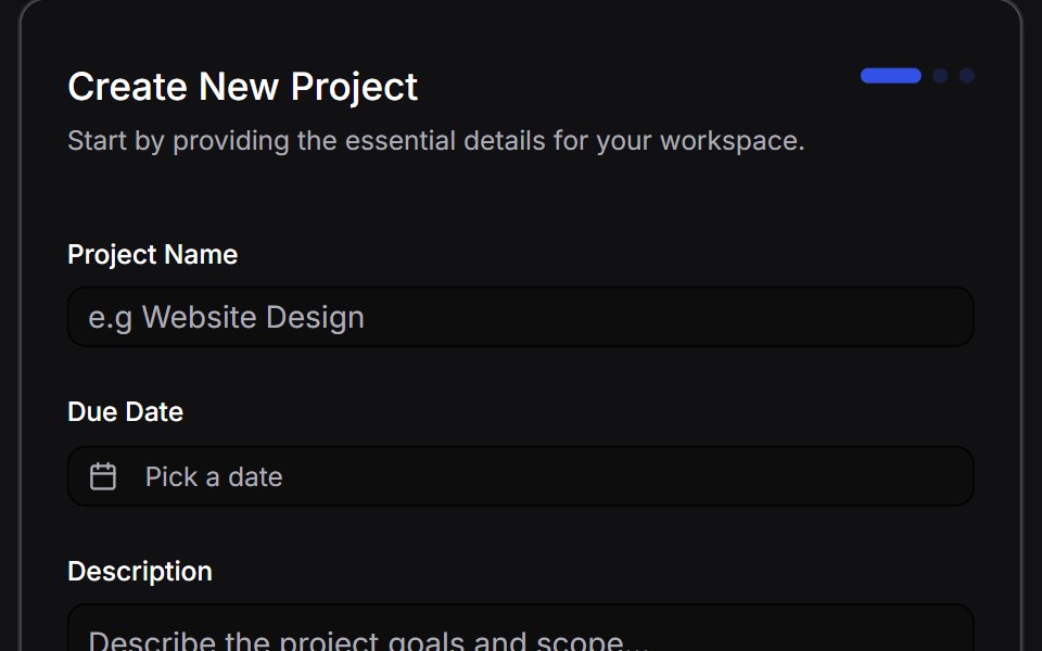 Multi Step Formuselayouts · ReactA dynamic, animated multi-step form with validation.
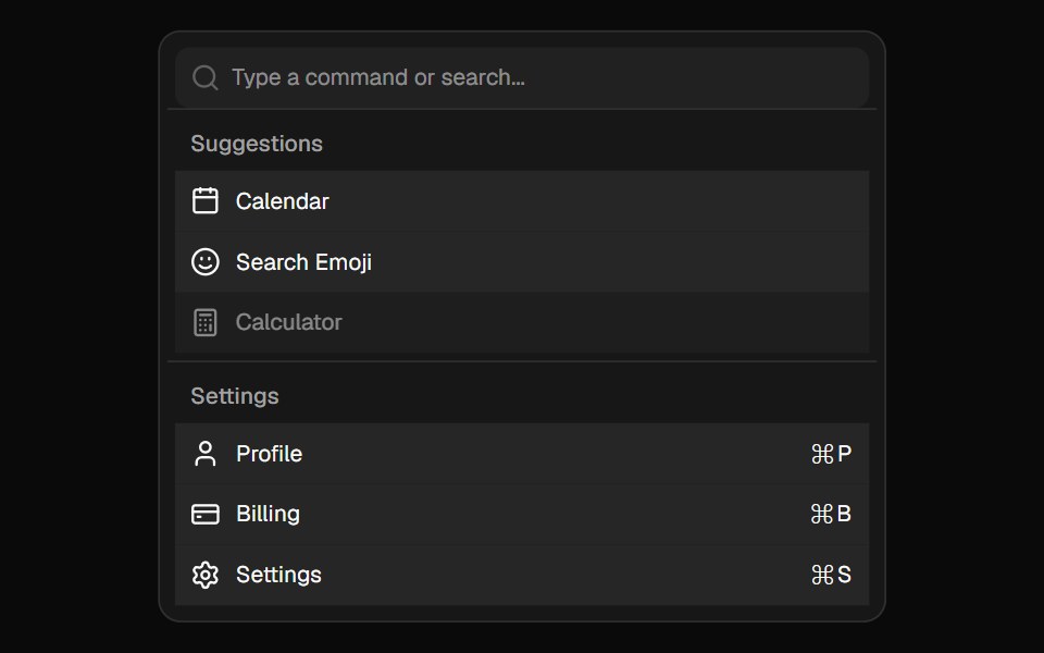 CommandShadcn Dashboard · React
 Hero Headercnblocks · SvelteStandard navigation header with logo and links
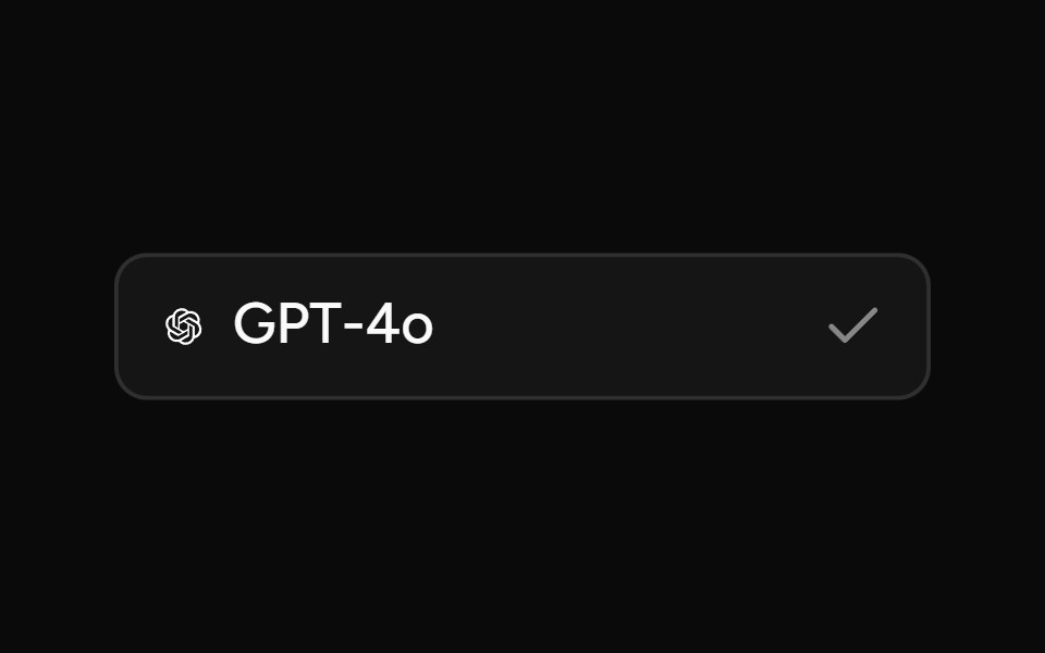 Model SelectorAI Elements (Svelte) · SvelteA searchable model selector dialog built on command and dialog primitives.
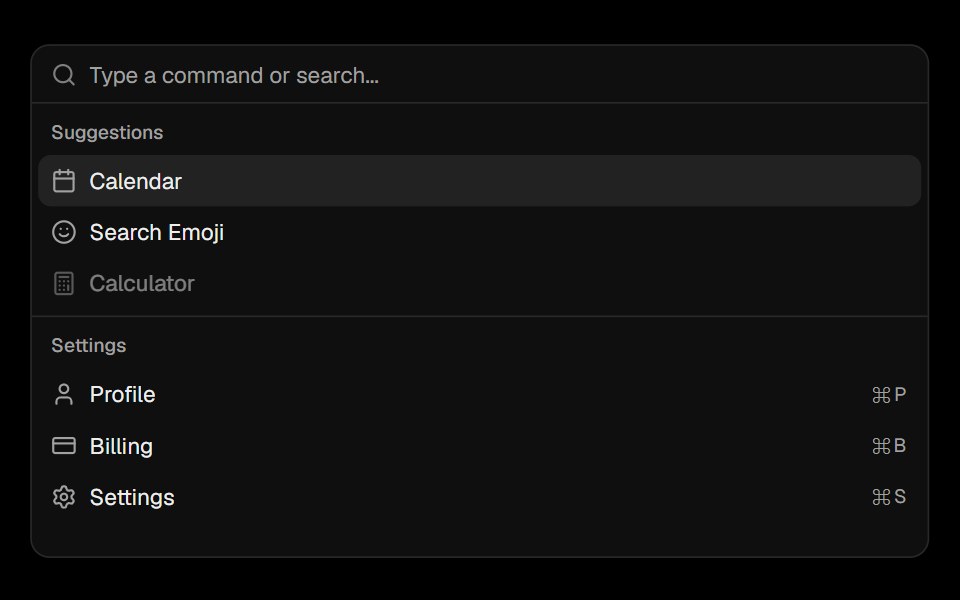 CommandObsidianUI · React
 Chat MinimapNotra · ReactA rail of lines that maps a conversation, built on shadcn Button, Card, HoverCard and Tooltip.
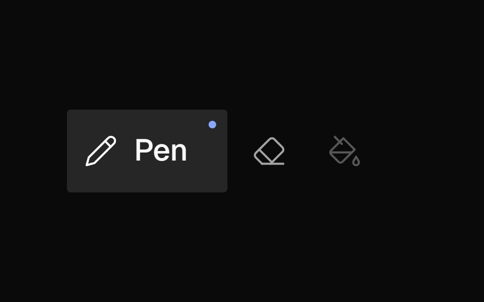 Icon BarNexvyn UI · ReactA horizontal toolbar of icon buttons with bloom-open label reveal on hover/selection, accent dot indicator, and roving…
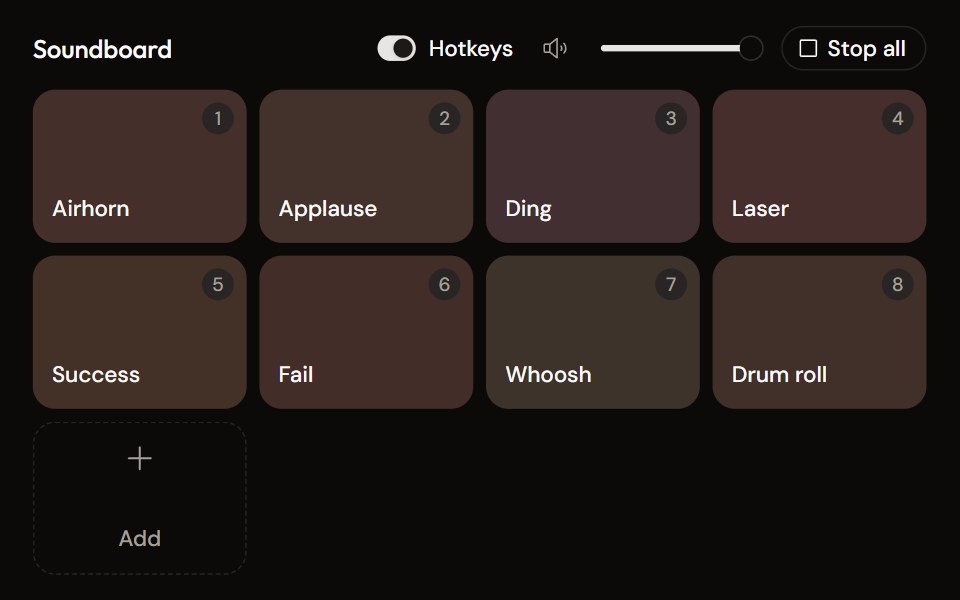 Soundboardaudiocn · ReactA grid of sound pads with global hotkeys, per-pad mode and volume in a context menu, master volume, stop all, and…
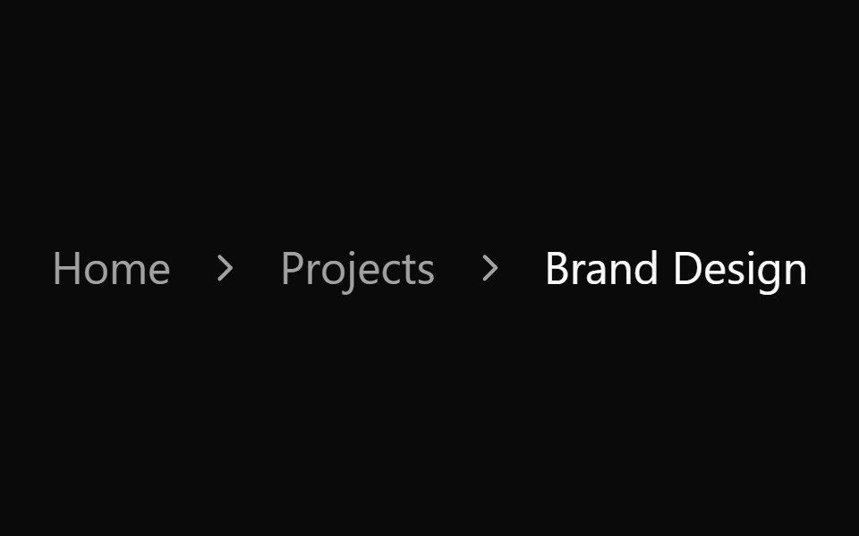 Breadcrumb 01Watermelon UI · React
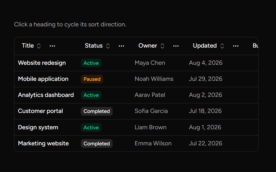 Data Table Column Headersv-table · SvelteA table heading with sorting, pinning, ordering, and visibility actions.
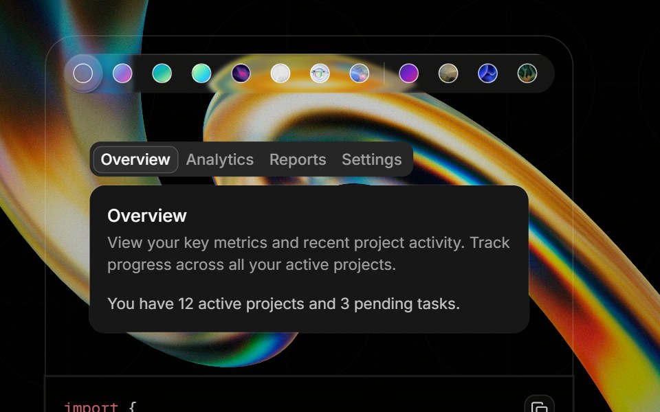 Component Previewglasscn · ReactA preview shell for component demos with switchable default and glass variants.
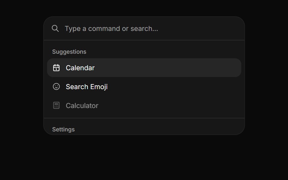 CommandHextaUI · ReactA searchable list of actions, inline or as a ⌘K palette, with pages, shortcuts and highlighted matches.
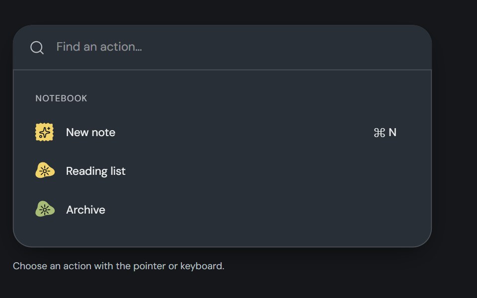 CommandCojeev UI · ReactBuilds a searchable command list that users can navigate and activate from the keyboard.
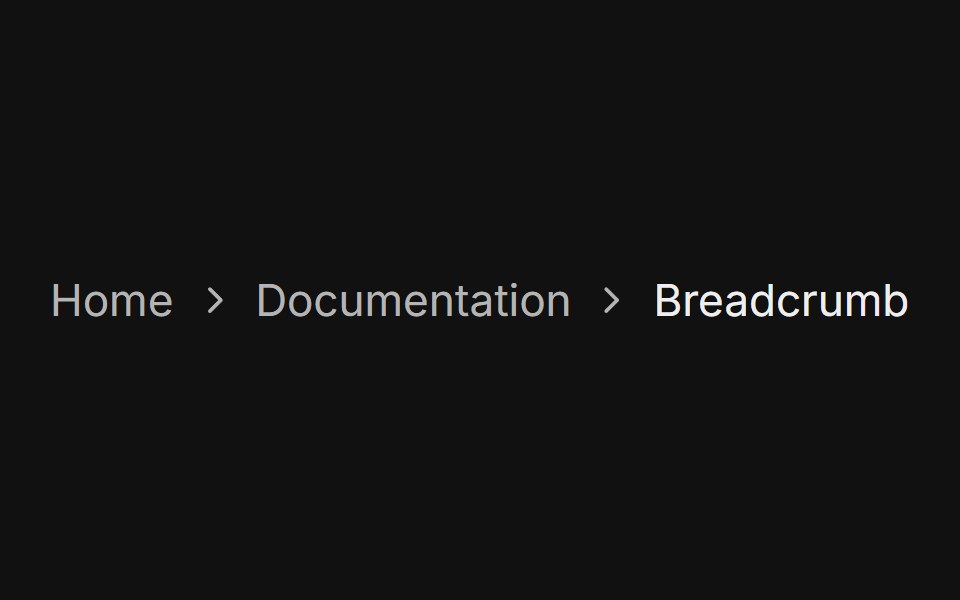 BasicFLX UI · ReactLinks with a current page and chevron separators.
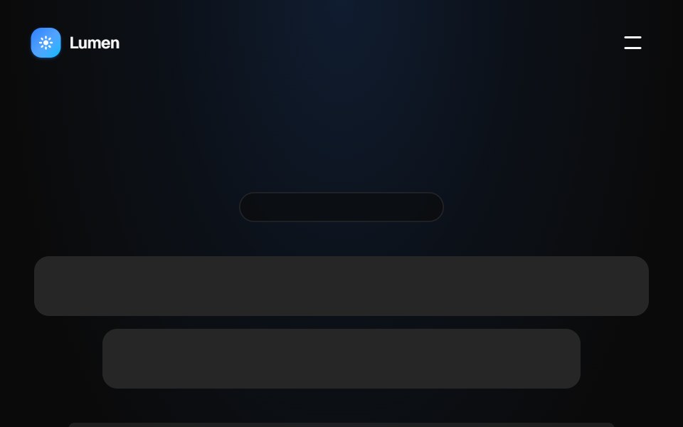 Floating pill navbarVelora UI · ReactFull-width navbar that shrinks into a blurred floating pill on scroll, with a CTA and mobile menu.
 Basic Menusv-particles · Svelte
 SidebarOUI · ReactSidebar Trigger, Sidebar Tree, and Sidebar Button for shadcn Sidebar.
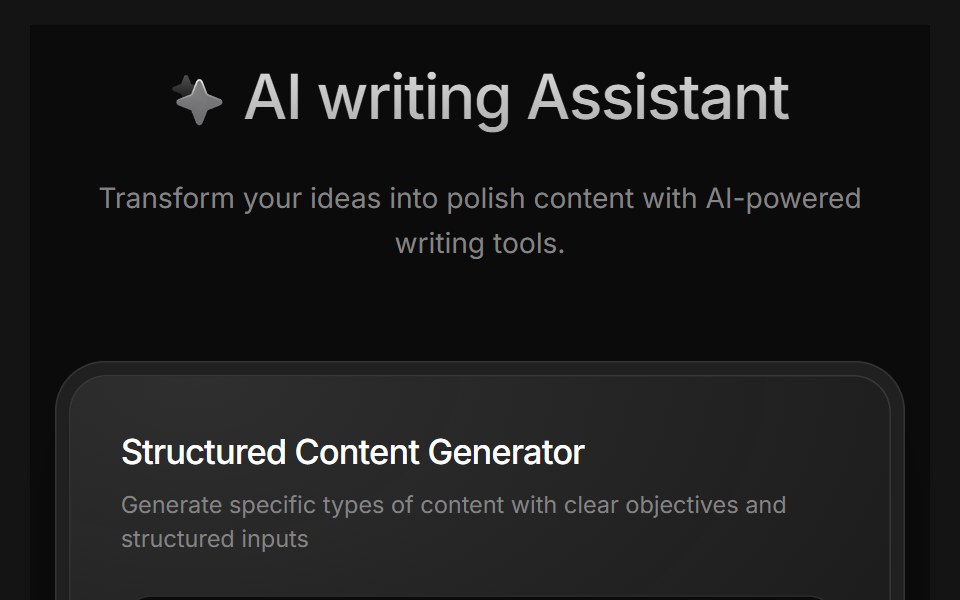 AI Writing AssistantD2Studio UI · ReactAI writing assistant panel with assistant, blog and pro modes and a prompt field.
 Commandark-cn · ReactA shadcn-style command component built with Ark UI primitives.
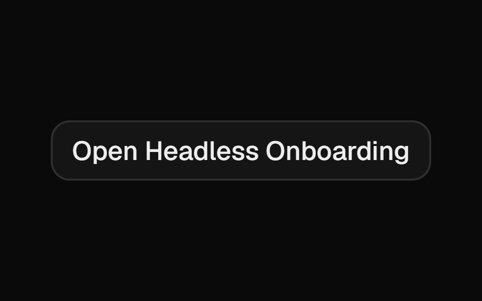 OnboardingCult UI · ReactComposable multi-step onboarding primitives: Onboarding root with step navigation, FeatureCarousel, ChoiceGroup radio…
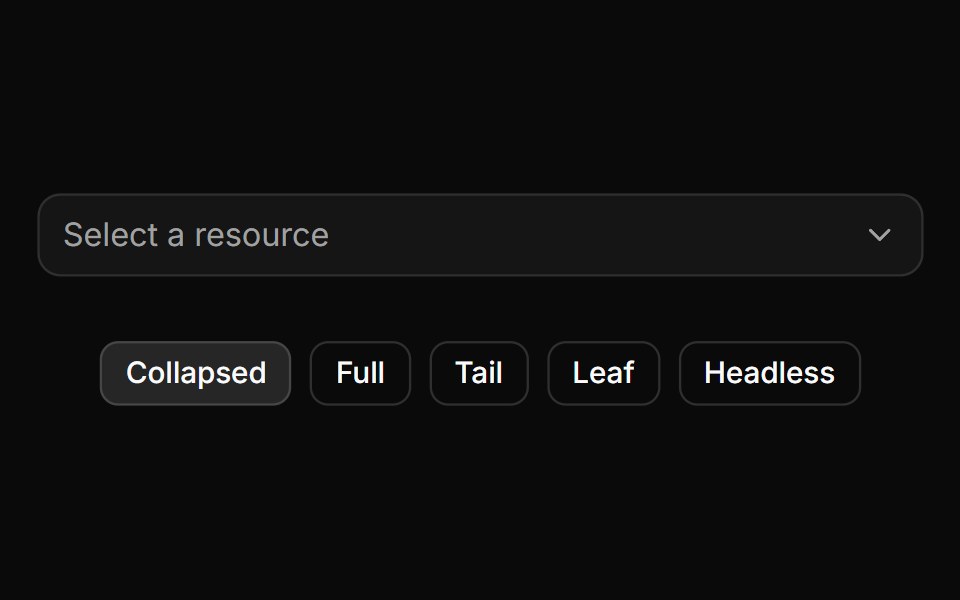 Trigger path formatting and collapsing.ReUI · ReactTrigger path formatting and collapsing.
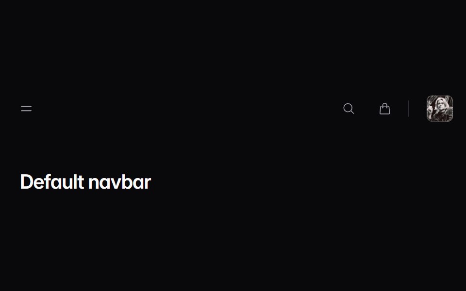 navbarIntent UI · Reactnavbar
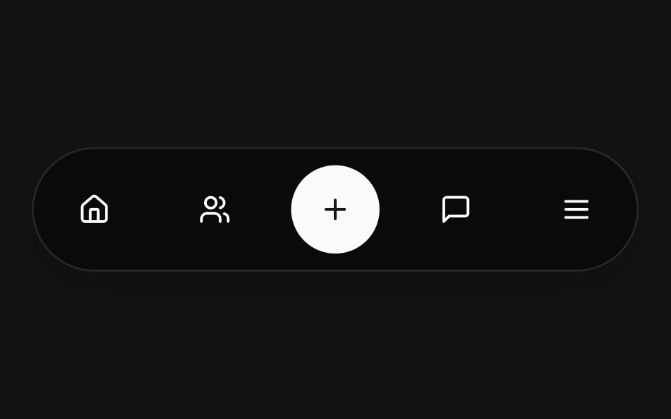 Floating NavbarSpectrum UI · Reactcomponent for the Floating Navbar
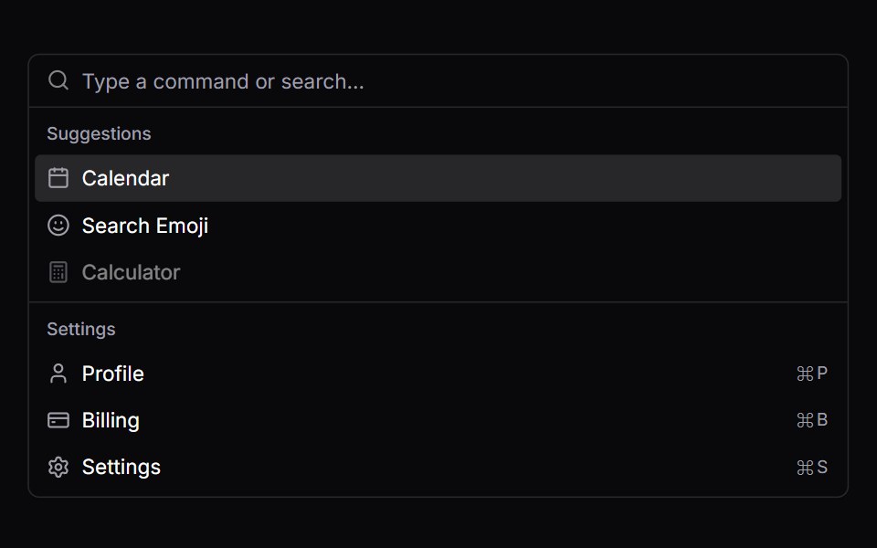 CommandVengeance UI · React
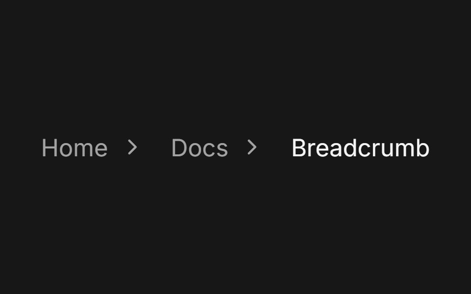 BreadcrumbFluid Functionalism · ReactA trail of links to the current page with one fluid hover across every crumb. Steps can lead with an icon, open a…
 breadcrumb-02 - BreadcrumbShadcn Space · ReactBreadcrumb component
 MenubarShadcn Dashboard · React
 Hero Header Eightcnblocks · SvelteNavigation header with dropdown menus
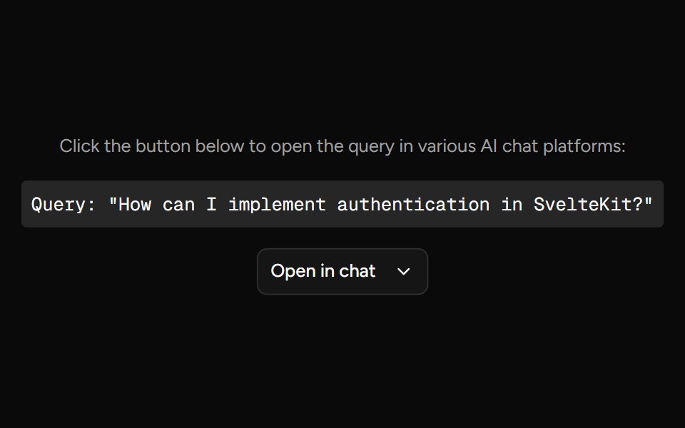 Open In ChatAI Elements (Svelte) · SvelteA provider menu for opening prompts in external chat and AI tools.
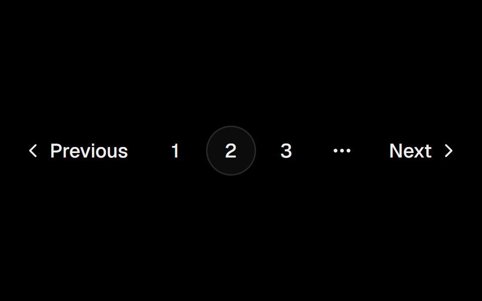 PaginationObsidianUI · React
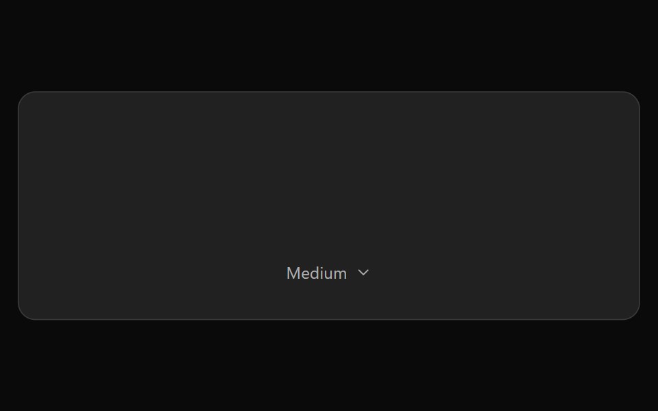 ChatGPT Model SelectorNotra · ReactThe hover-to-open effort chip with Model and Effort submenus, built on shadcn DropdownMenu.
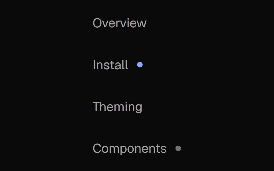 Nav MenuNexvyn UI · ReactA vertical navigation list with two-layer proximity highlight (active route + hover), weight-shift labels, and status…
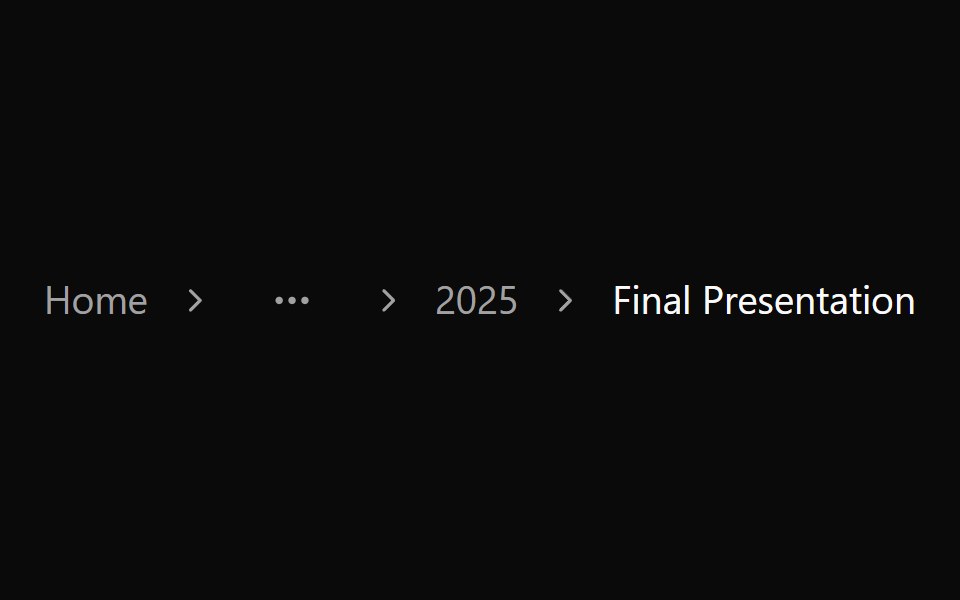 Breadcrumb 02Watermelon UI · React
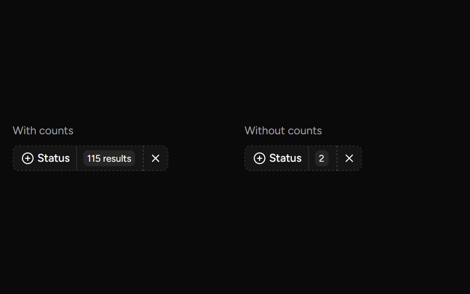 Data Table Faceted Filtersv-table · SvelteA searchable multi-select filter with live counts for categorical table columns.
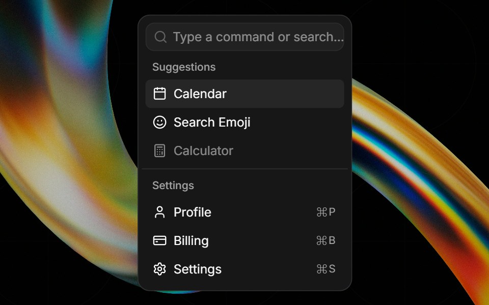 Commandglasscn · React
 Dropdown menuHextaUI · ReactA menu of actions and options behind a button, with groups, submenus, checkbox and radio items, and shortcuts.
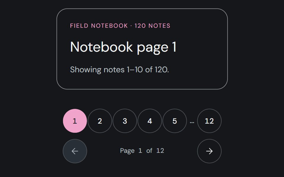 PaginationCojeev UI · ReactLets users move between numbered pages and see their current position.
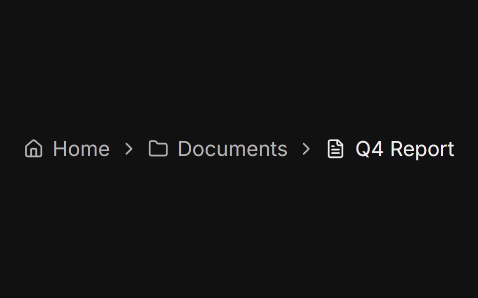 With iconsFLX UI · ReactEach crumb prefixed with a small icon, such as a house, folder, or file.
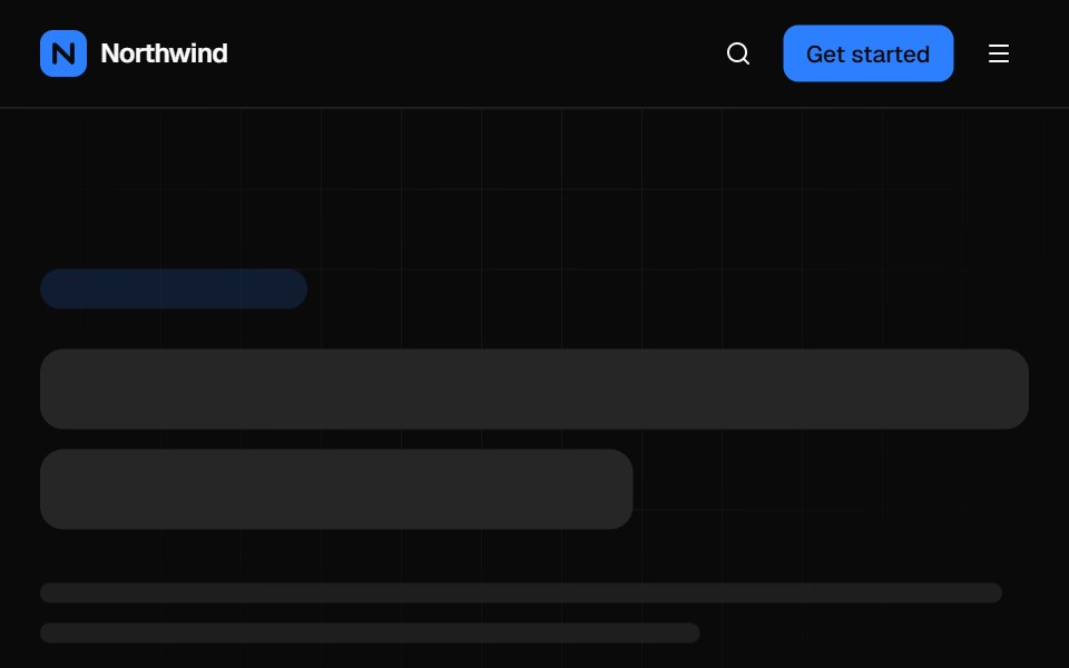 Mega menu navbarVelora UI · ReactTop bar with a keyboard-accessible Product mega menu, search, sign-in and a slide-over mobile menu.
 Close On Clicksv-particles · Svelte
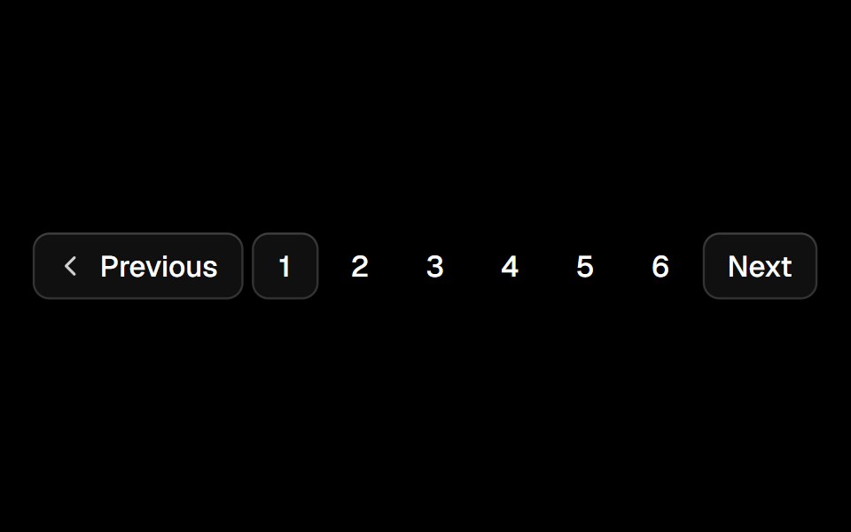 Paginationark-cn · ReactA shadcn-style pagination component built with Ark UI primitives.
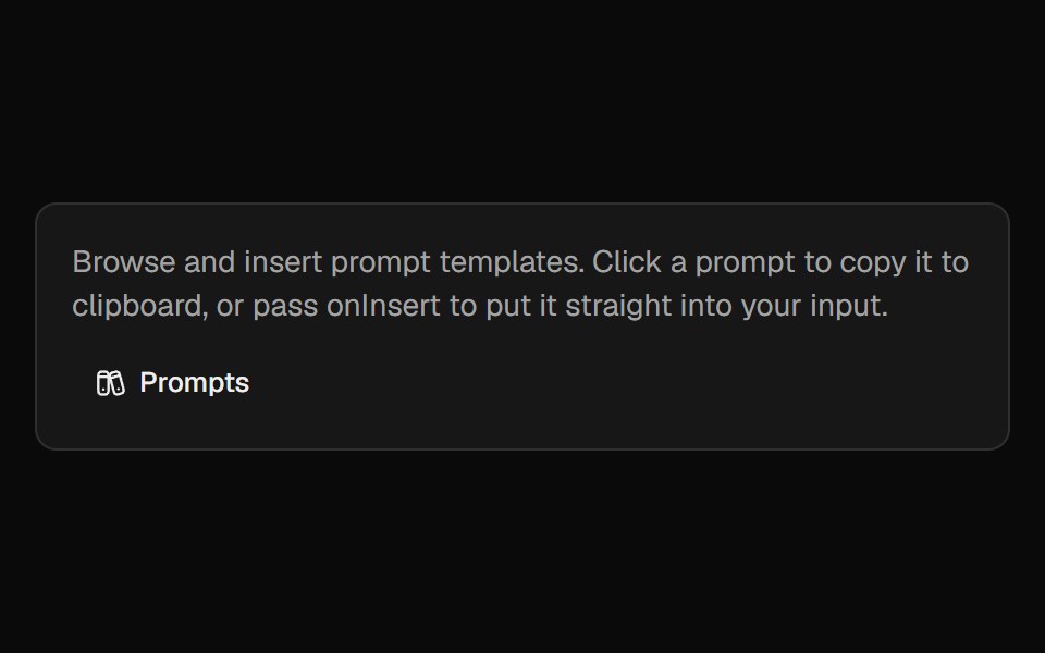 Prompt LibraryCult UI · ReactBrowse, insert, and manage prompt templates with categories and custom prompts
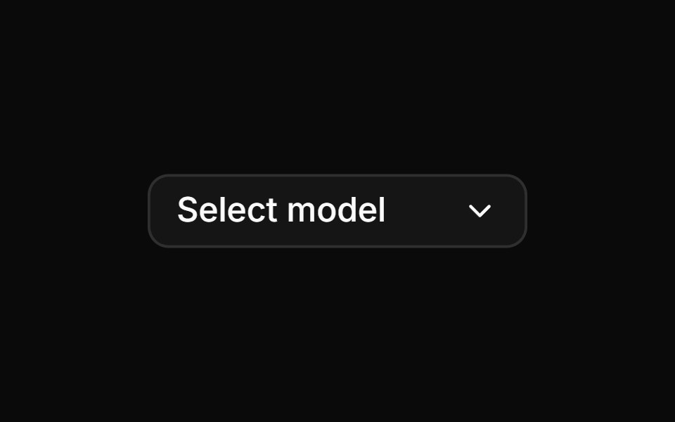 AI model selector with provider iconsReUI · ReactAI model selector with provider icons
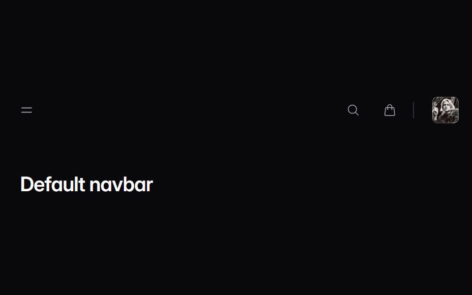 navbar-01Intent UI · Reactnavbar-01
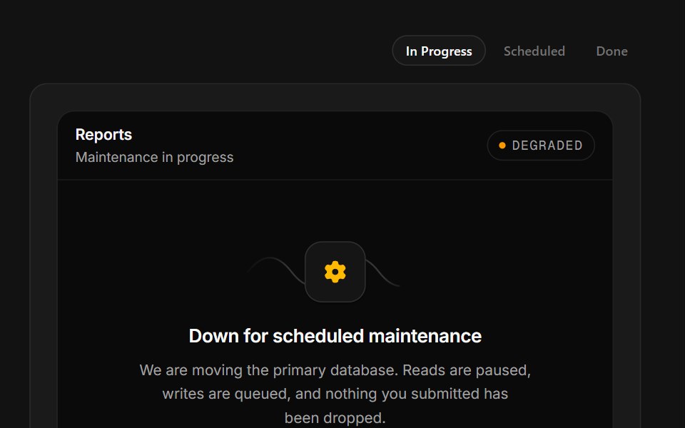 Scheduled MaintenanceSpectrum UI · ReactA maintenance window with a ticking ETA, a stage rail and a notify-me field.
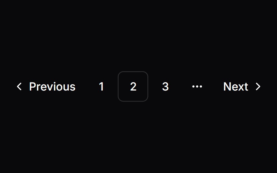 PaginationVengeance UI · React
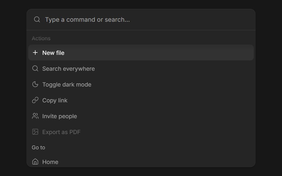 Command MenuFluid Functionalism · ReactSearch field over a list of actions: type to filter, arrows to move the fluid hover highlight, Enter to run. Grouped…
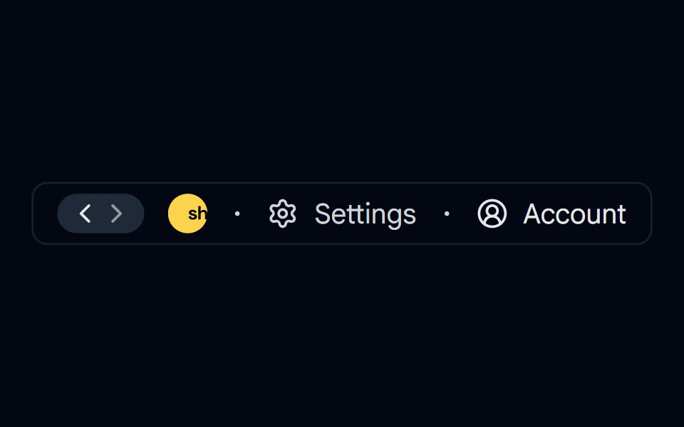 breadcrumb-03 - BreadcrumbShadcn Space · ReactBreadcrumb component
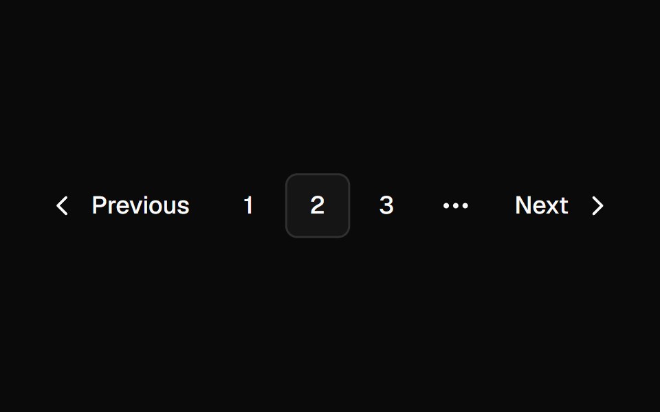 PaginationShadcn Dashboard · React
 Hero Header Ninecnblocks · SvelteHeader with mega menu navigation
 SidebarObsidianUI · React
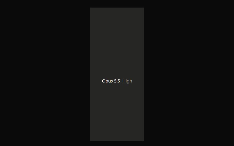 Claude Model SelectorNotra · ReactA hover-open model and effort picker built on shadcn DropdownMenu.
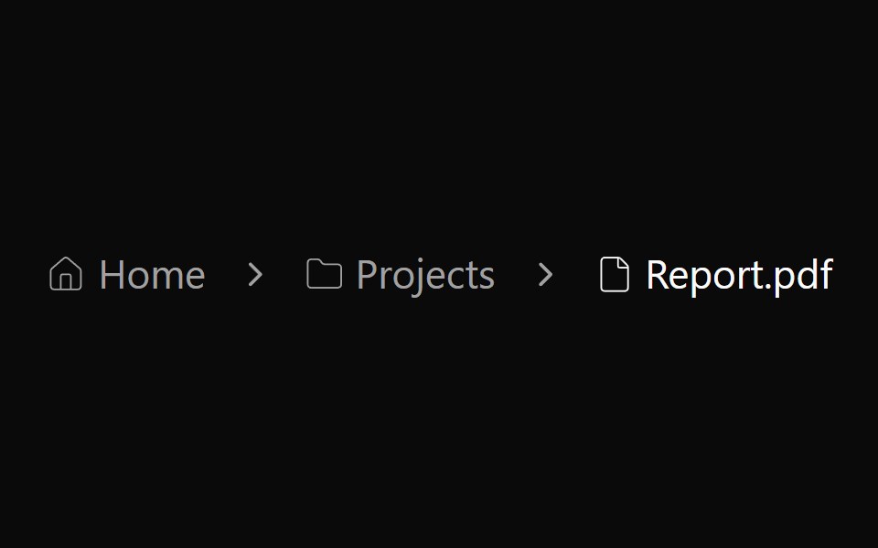 Breadcrumb 03Watermelon UI · React
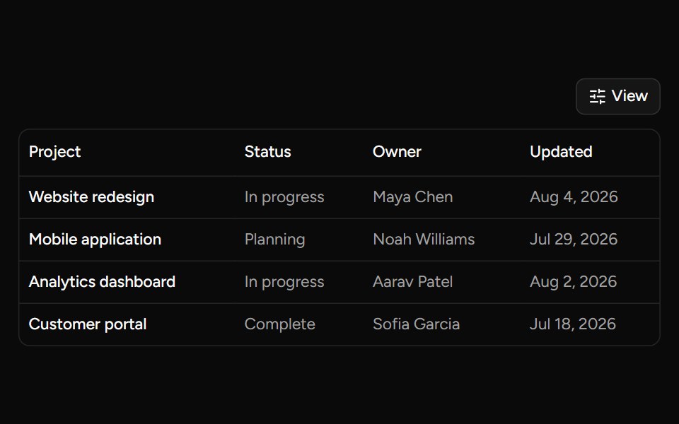 Data Table Viewsv-table · SvelteA checkbox dropdown for toggling table column visibility.
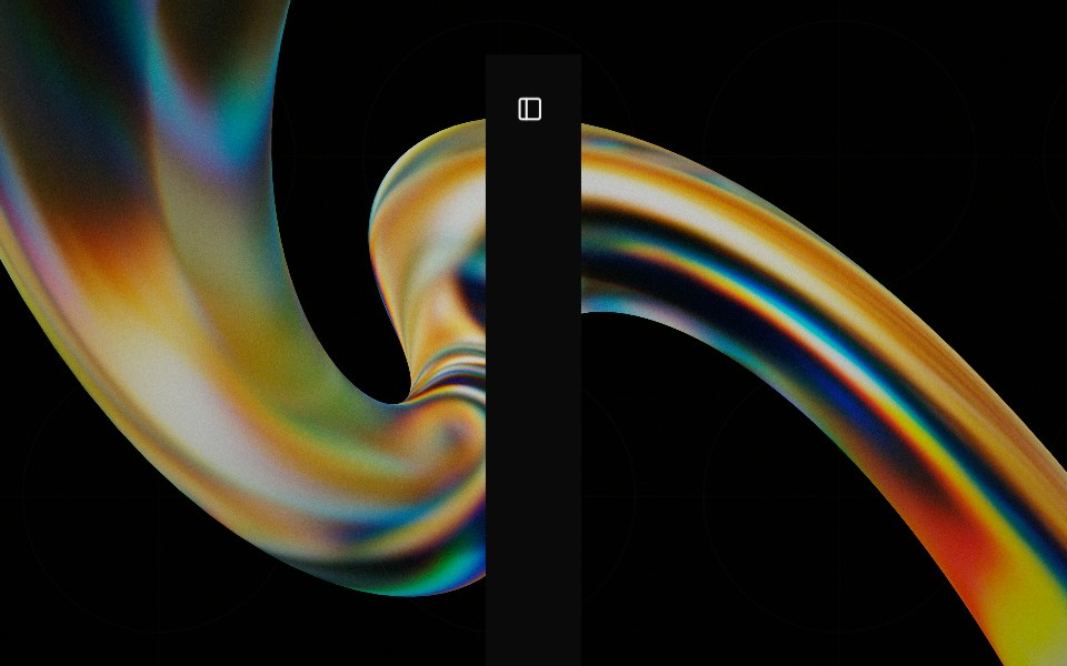 Sidebarglasscn · React
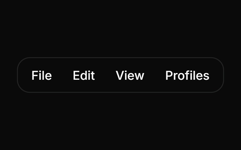 MenubarHextaUI · ReactA desktop-style bar of menus with one highlight that slides between open menus and instant switching as you sweep…
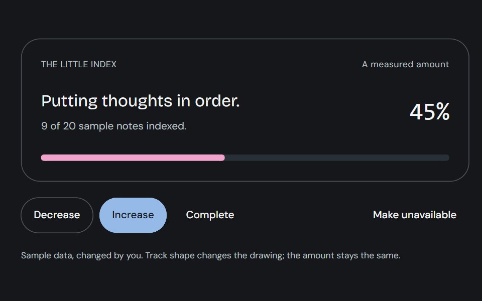 ProgressCojeev UI · ReactOne measured amount, explained as an inline task, a small report or connected milestones—with independent organic…
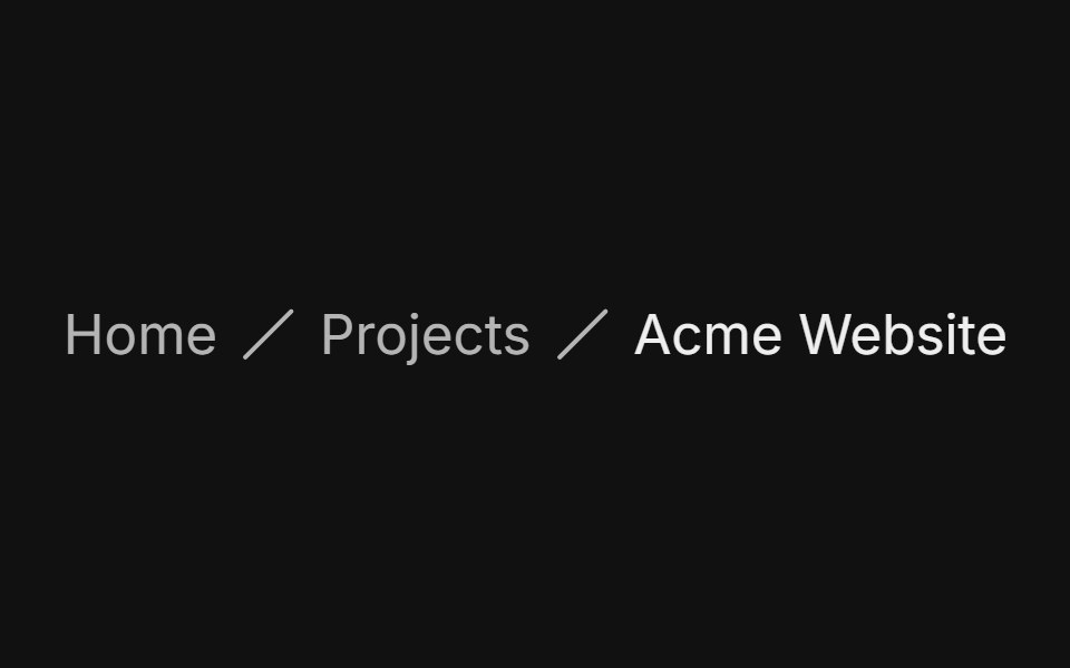 Custom separatorFLX UI · ReactSwap the chevron for a slash via separator children.
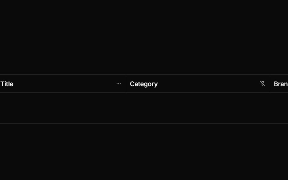 Froze Column Dropdownsv-particles · Svelte
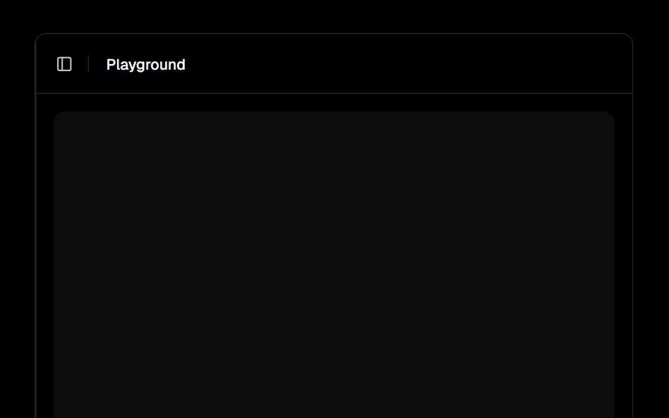 Sidebarark-cn · ReactA shadcn-style sidebar component built with Ark UI primitives.
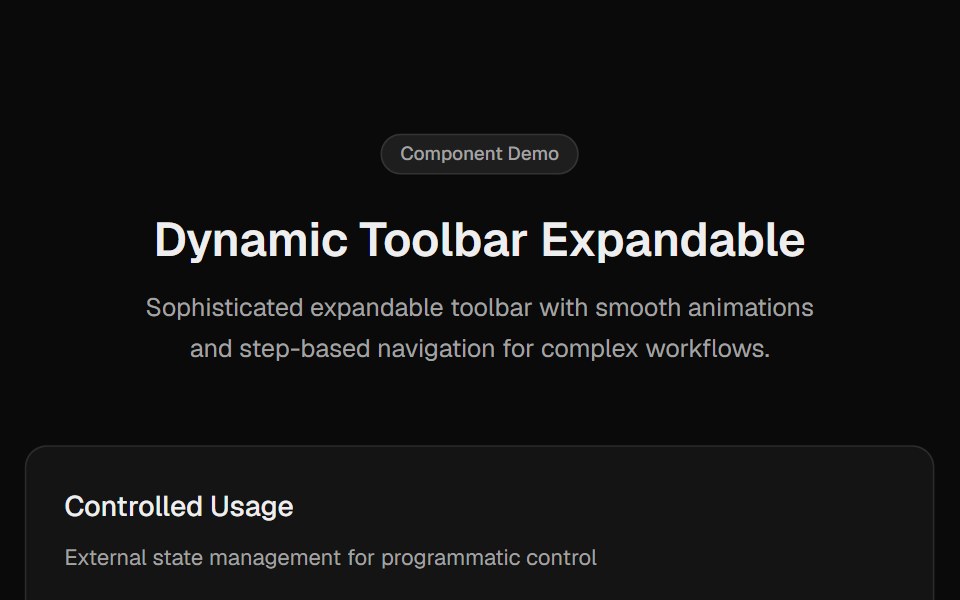 Toolbar ExpandableCult UI · ReactExpandable toolbar component with step-based navigation, smooth animations, and enhanced scrolling
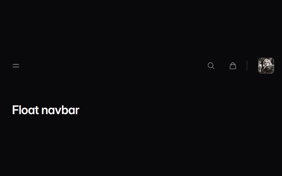 navbar-02Intent UI · Reactnavbar-02
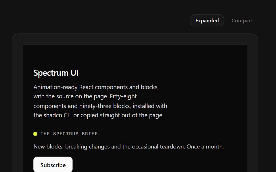 Mega Sitemap FooterSpectrum UI · ReactA five-column sitemap with region and language selectors and mobile accordions.
 SidebarVengeance UI · React
 Settings Dialog (Sidebar in a Dialog)Fluid Functionalism · ReactA settings dialog: the xl Dialog as a canvas, a non-collapsing Sidebar of sections down its left edge, and a scrolling…
 breadcrumb-04 - BreadcrumbShadcn Space · ReactBreadcrumb component
 SidebarShadcn Dashboard · React
 Hero Header Sevencnblocks · SvelteTransparent header with centered logo
 Claude Plus MenuNotra · ReactThe composer's + menu with files, skills, connectors, design system, plugins and research.
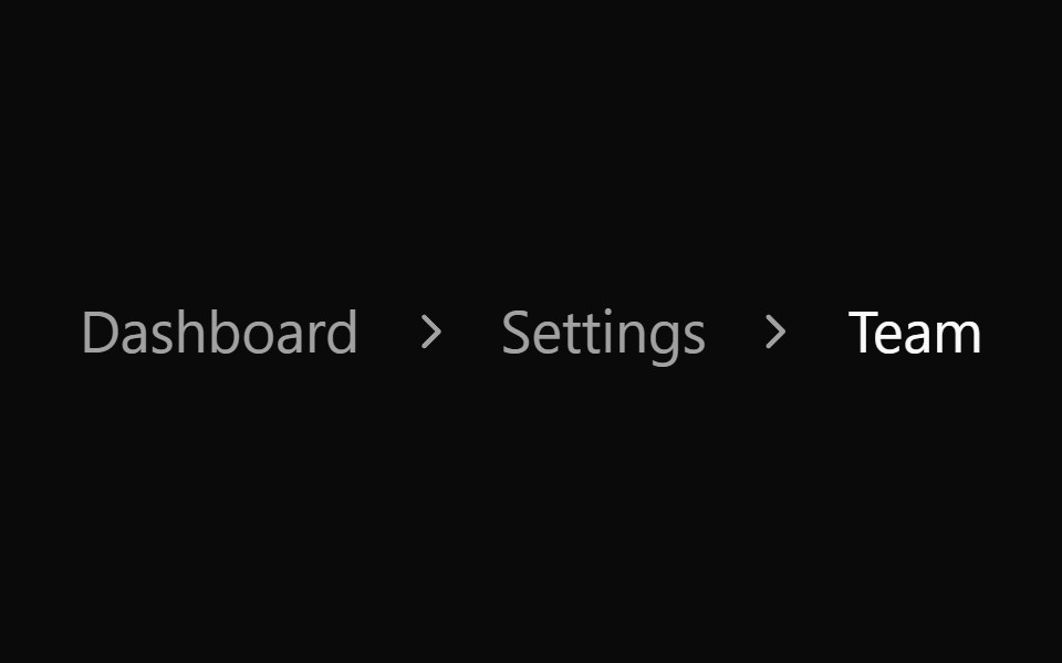 Breadcrumb 04Watermelon UI · React
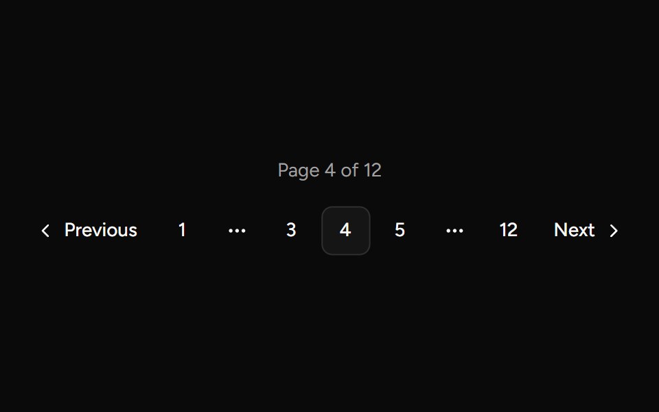 Paginationsv-table · SvelteNumber pagination for table views.
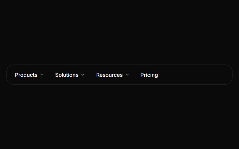 Navigation menuHextaUI · ReactSite navigation with dropdowns, or one full-width panel that stays open while its content slides between menus.
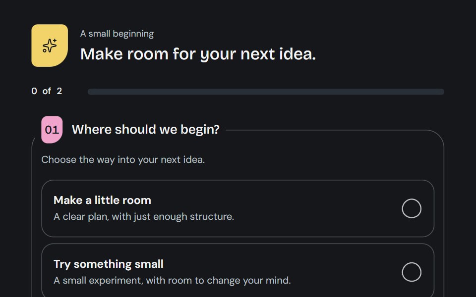 QuestionnaireCojeev UI · ReactA little guided brief: open questions, a focused journey or a two-column worksheet with living choice marks and honest…
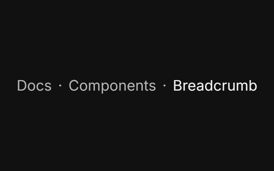 Dot separatorFLX UI · ReactLighter middle dot divider between crumbs.
 Hamburger Menusv-particles · Svelte
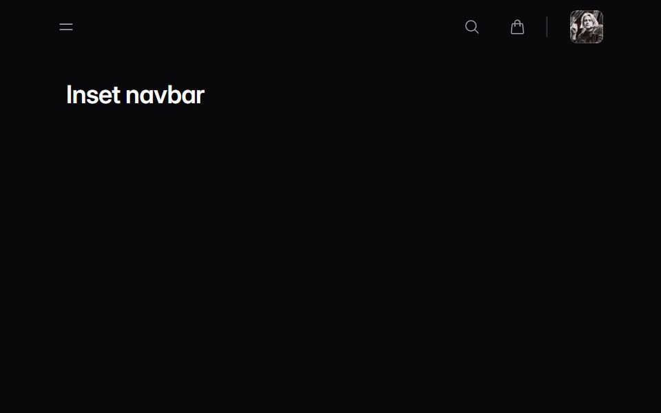 navbar-03Intent UI · Reactnavbar-03
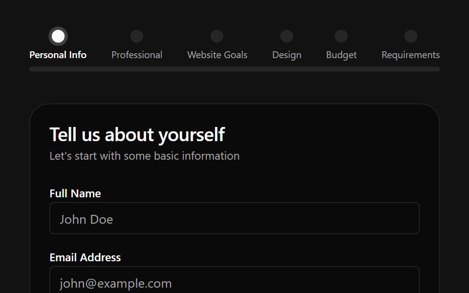 Multiple Step Form DemoSpectrum UI · Reactcomponent for the Multiple Step Form Demo
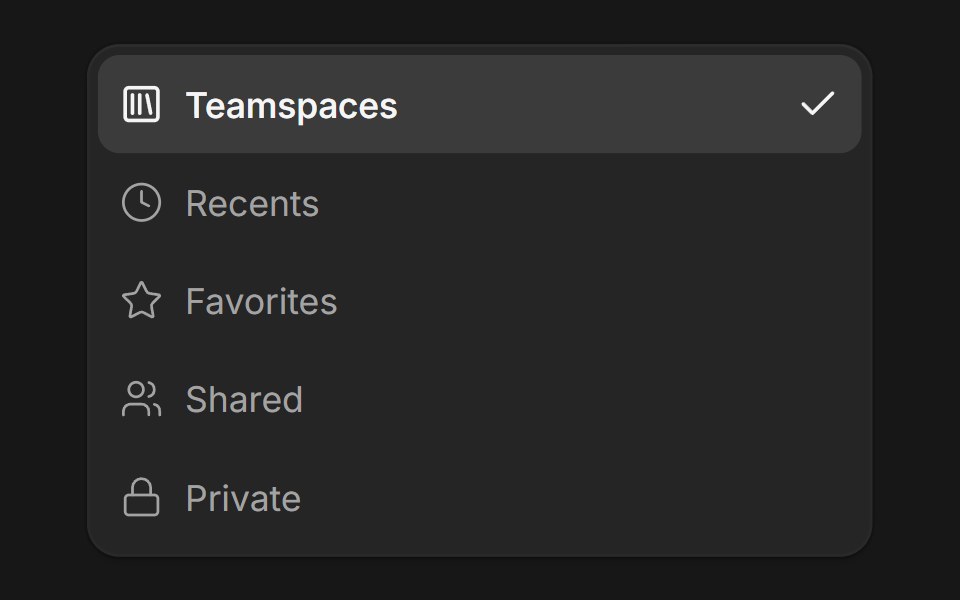 DropdownFluid Functionalism · ReactDropdown menu with fluid hover, animated selection indicator, inline panel or triggered popup with collision-aware…
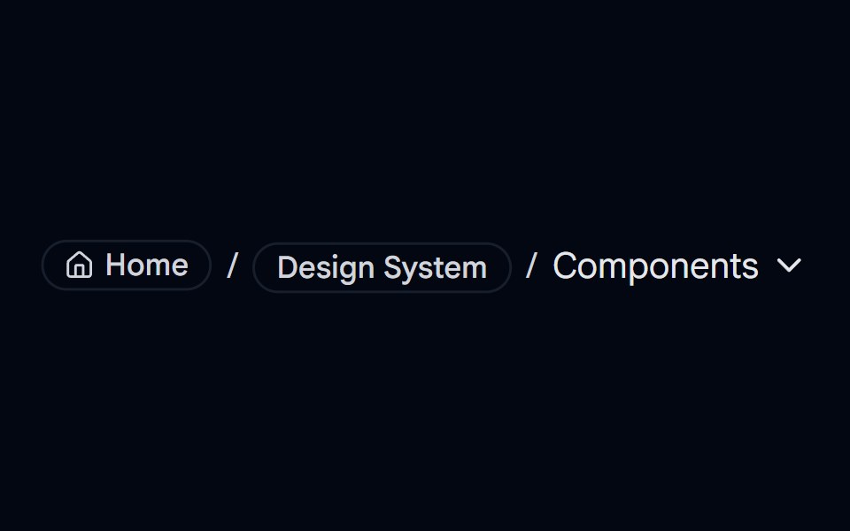 breadcrumb-05 - BreadcrumbShadcn Space · ReactBreadcrumb component
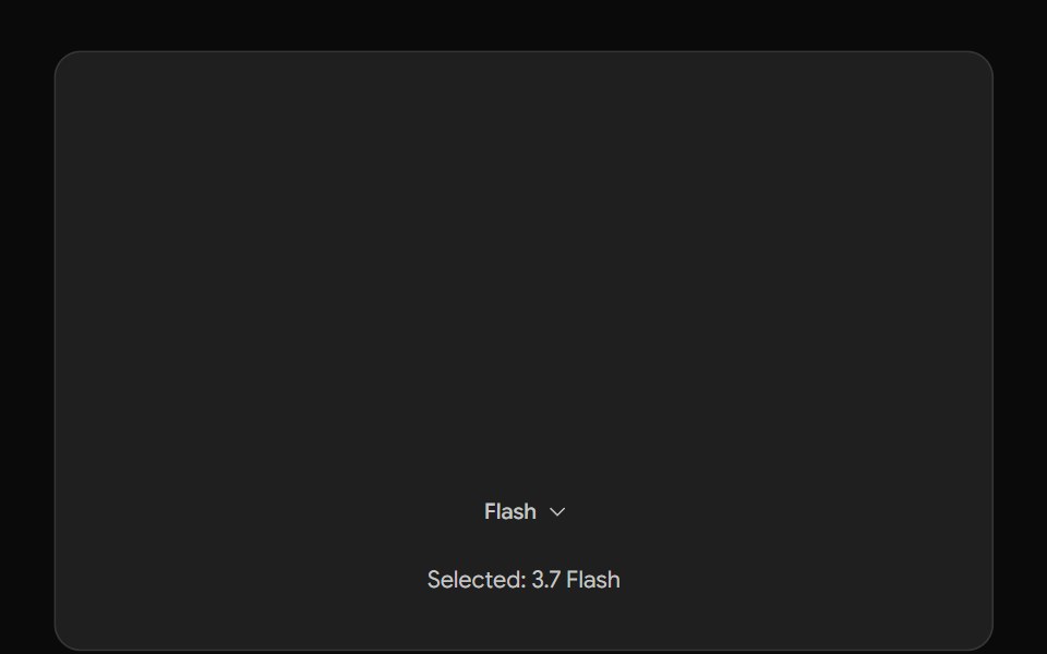 Gemini Model SelectorNotra · ReactThe Gemini model chip and menu built on shadcn DropdownMenu.
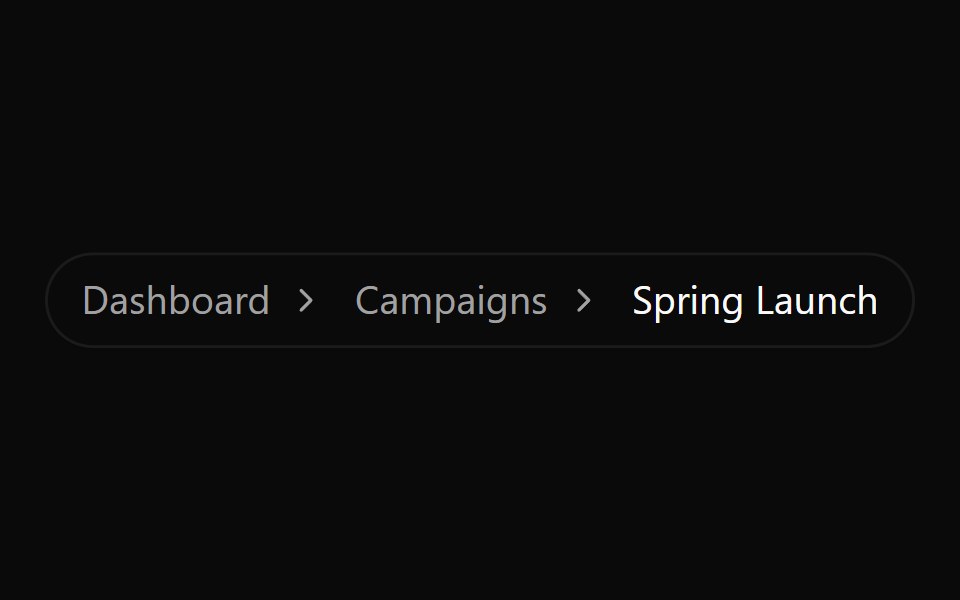 Breadcrumb 1Watermelon UI · React
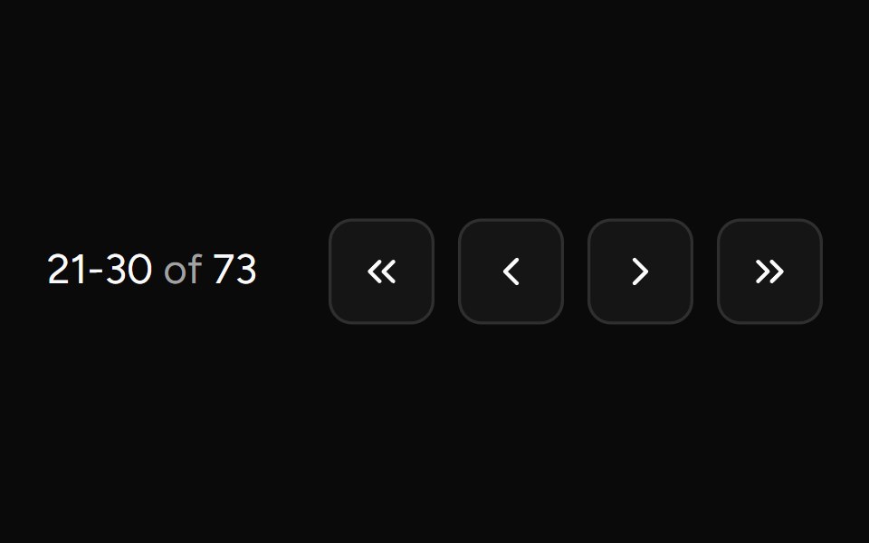 Pagination Arrowsv-table · SvelteCompact arrow pagination for table footers.
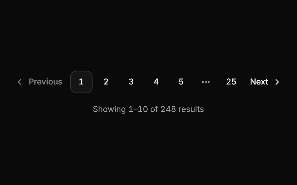 PaginationHextaUI · ReactPage navigation that keeps every button in place, glides to the current page and jumps to any page from the ellipsis.
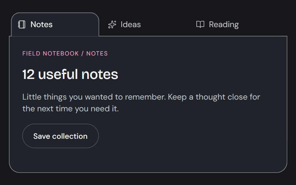 TabsCojeev UI · ReactSwitches between related content panels while keeping the available views visible.
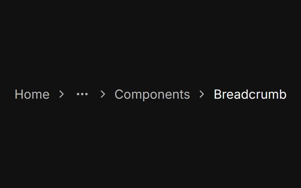 With ellipsisFLX UI · ReactMiddle levels replaced by a static ellipsis icon, showing only the first and last crumbs.
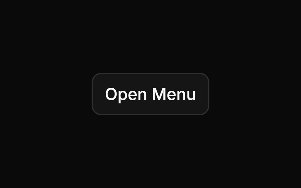 Nested Menusv-particles · Svelte
 navbar-04Intent UI · Reactnavbar-04
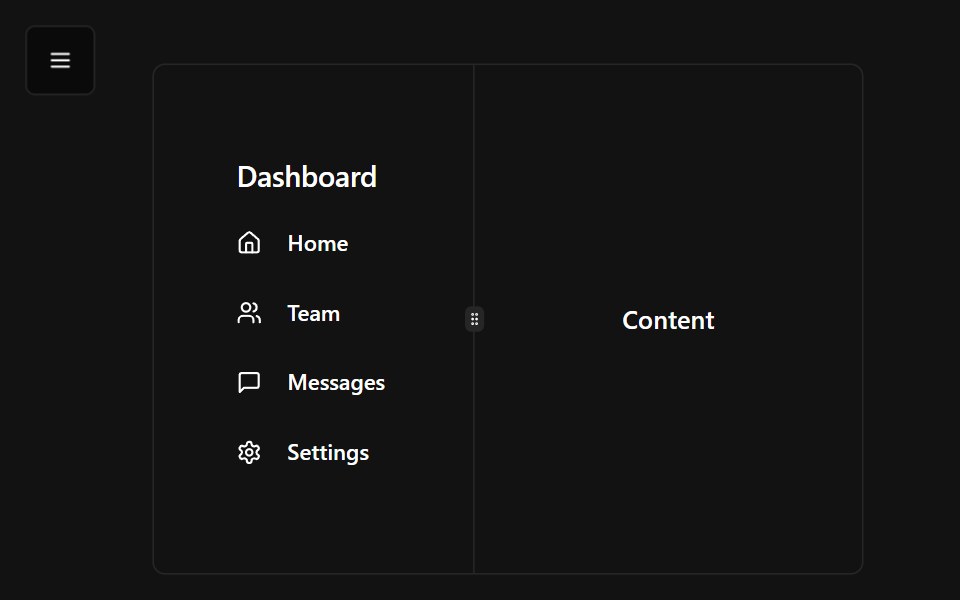 Navbar DemoSpectrum UI · Reactcomponent for the Navbar Demo
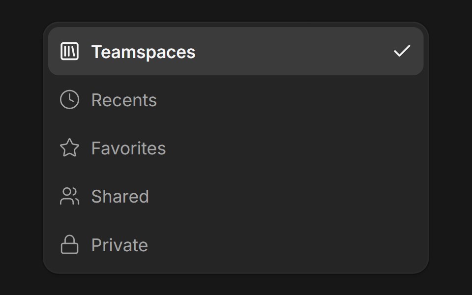 DropdownFluid Functionalism · ReactDropdown menu with fluid hover, animated selection indicator, inline panel or triggered popup with collision-aware…
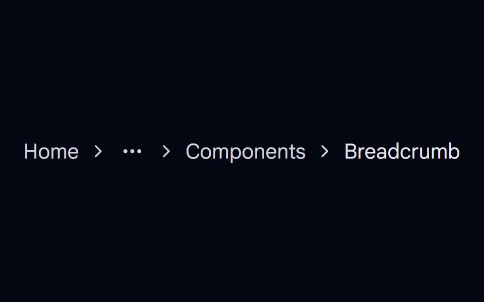 breadcrumb-06 - BreadcrumbShadcn Space · ReactBreadcrumb component
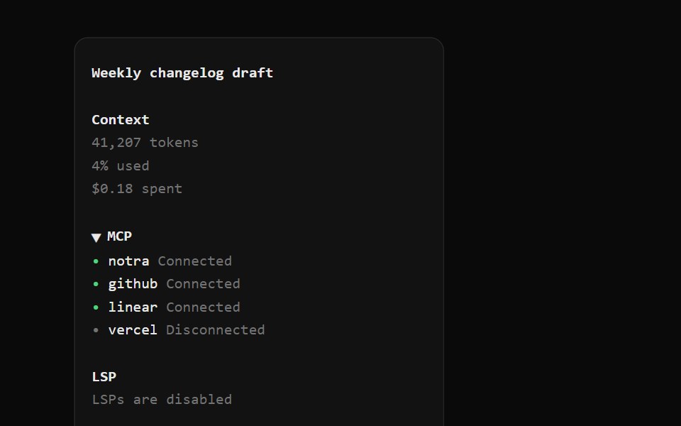 OpenCode SidebarNotra · ReactSession title, context usage, a collapsible MCP list, LSP state, cwd with branch and version.
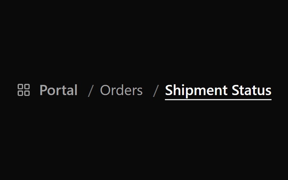 Breadcrumb 2Watermelon UI · React
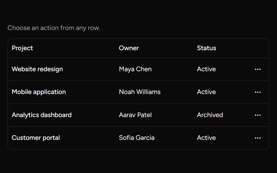 Row Actions Menusv-table · SvelteAn accessible dropdown menu for actions on an individual table row.
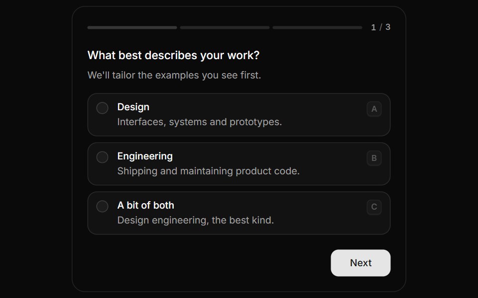 QuestionnaireHextaUI · ReactA step-by-step form that moves between questions with a sense of direction, shows real progress and answers from the…
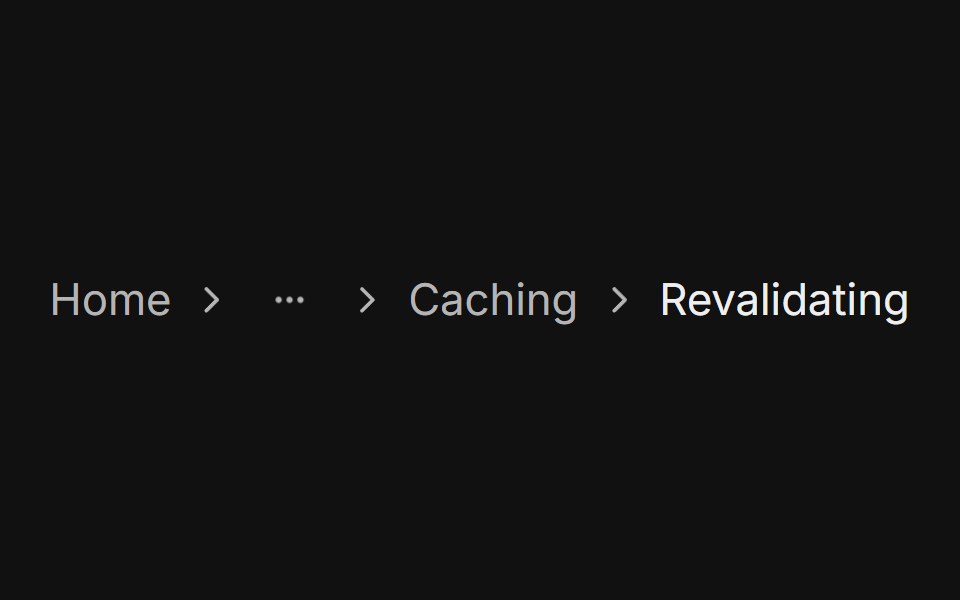 With dropdownFLX UI · ReactGhost icon Button opens a menu of the hidden levels.
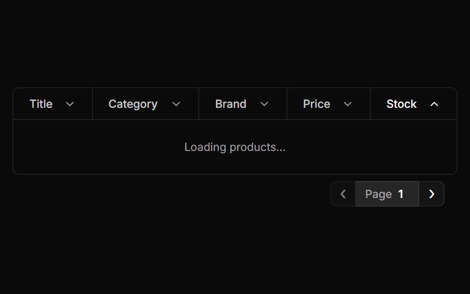 Pagination Tablesv-particles · Svelte
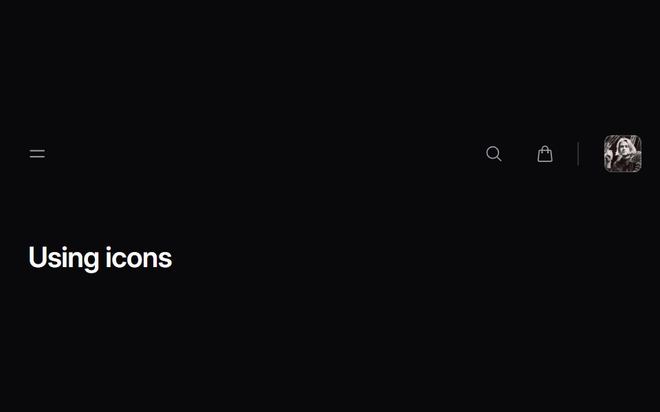 navbar-05Intent UI · Reactnavbar-05
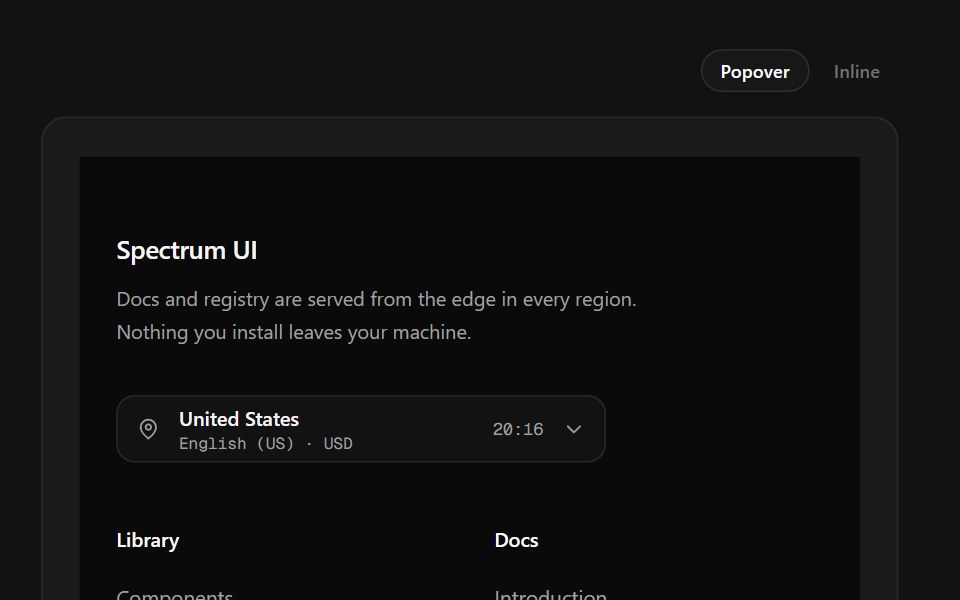 Region Picker FooterSpectrum UI · ReactA region popover with locale, currency, data residency and live local time.
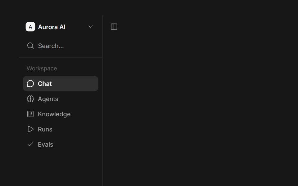 SidebarFluid Functionalism · ReactRefined, composable app sidebar with offcanvas collapse, floating and inset variants, a mobile drawer…
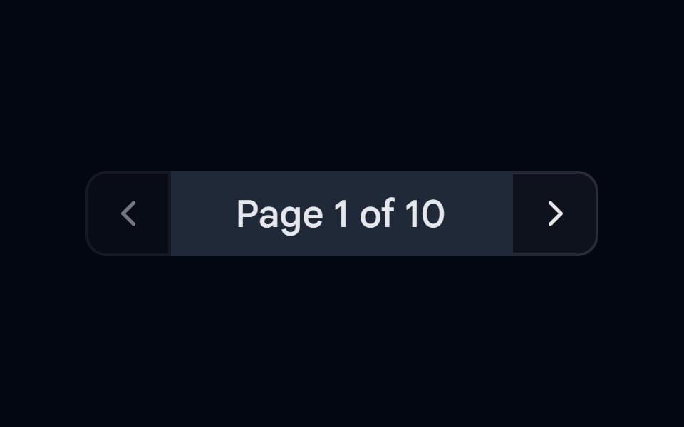 Button Group-03 - PaginationShadcn Space · ReactPagination style button group component
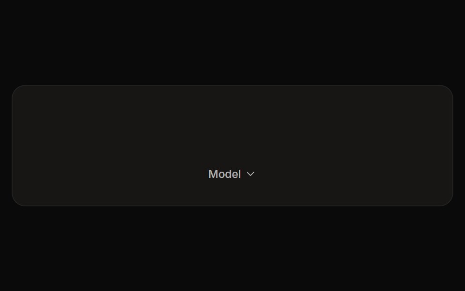 Perplexity Model SelectorNotra · ReactThe Model chip and its provider list with Max/New badges and locks, built on shadcn DropdownMenu.
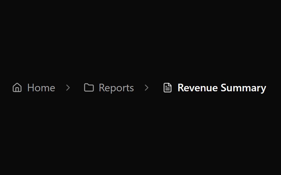 Breadcrumb 3Watermelon UI · React
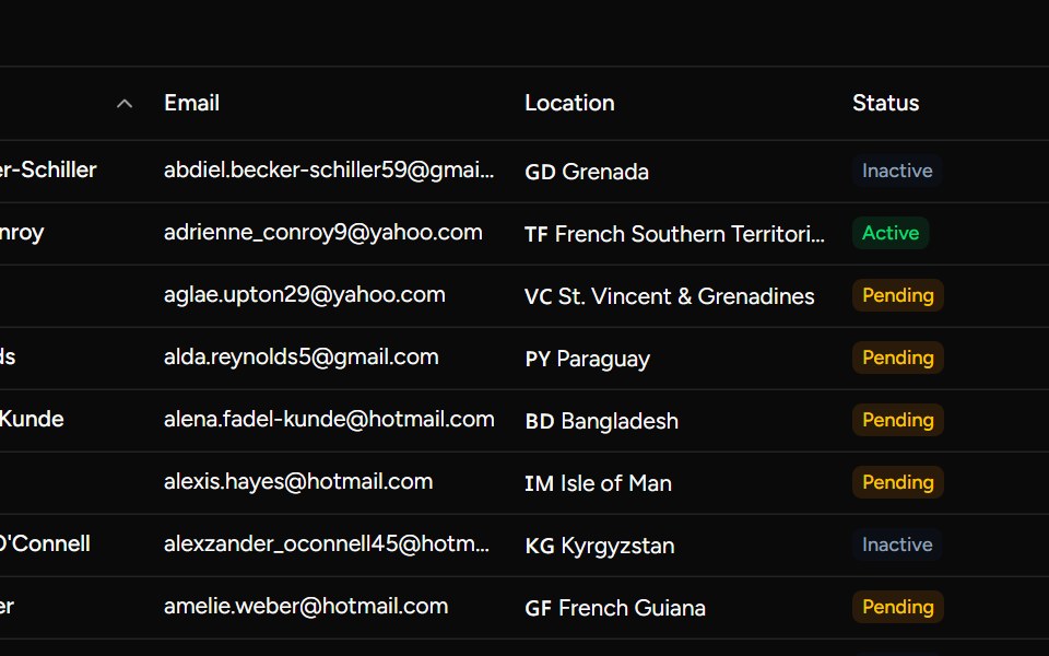 Numeric Pagination Examplesv-table · Svelte
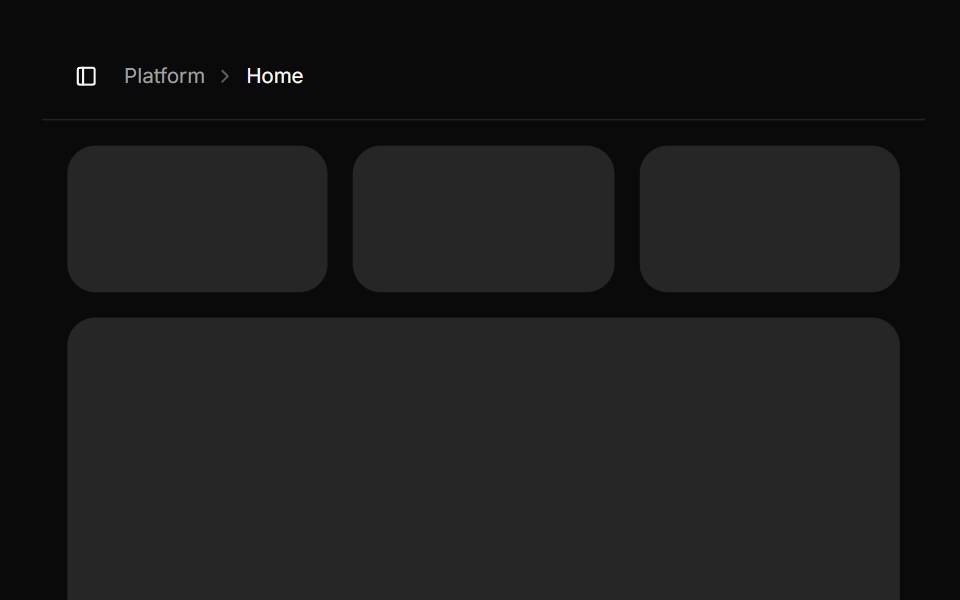 SidebarHextaUI · ReactAn app sidebar that collapses to icons or off canvas, stays pinned under your header, and becomes a swipeable sheet on…
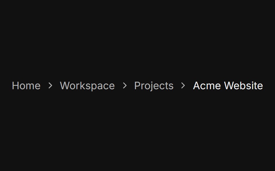 Responsive collapseFLX UI · ReactDropdown on small screens, full inline path from sm up.
 Sticky Column Dropdownsv-particles · Svelte
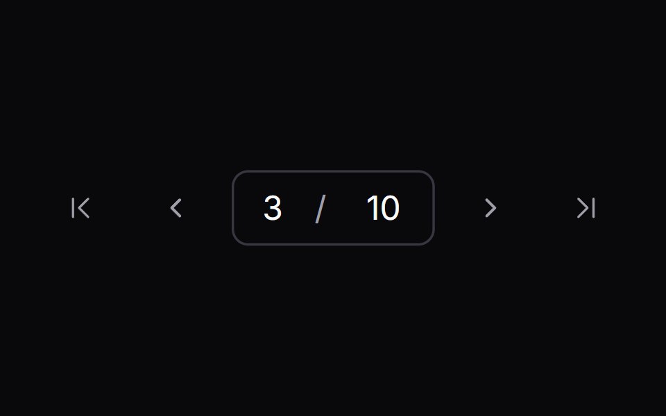 paginationIntent UI · Reactpagination
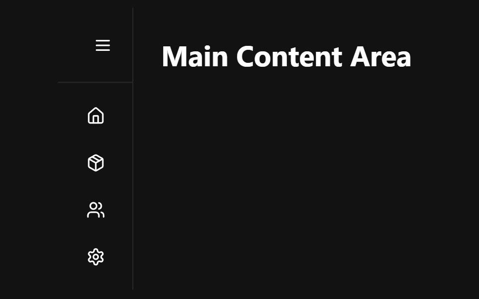 Sidebar NavbarSpectrum UI · Reactcomponent for the Sidebar Navbar
 App SidebarFluid Functionalism · ReactA complete app shell: workspace header with the peek cross-fade, search on the menu rows' rhythm with a hover-revealed…
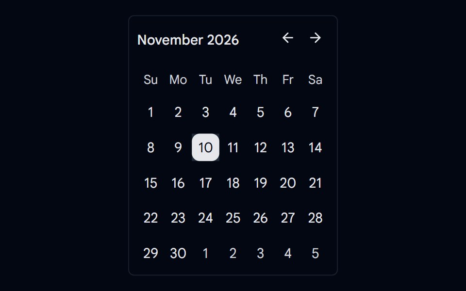 Calendar 10 - Right Side NavigationShadcn Space · ReactCalendar component
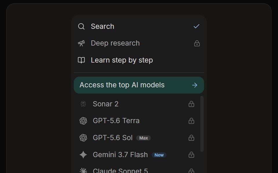 Perplexity Rewrite PanelNotra · ReactThe mode and model list with a Rewrite button.
Libraries with shadcn/ui navigation components
Related categories
- Navigation Components
- React Navigation Components
- Tailwind CSS Navigation Components
- Svelte Navigation Components
- React Native Navigation Components
- Animated Navigation Components
- shadcn/ui Menu Components
- shadcn/ui Tabs Components
- shadcn/ui Pagination Components
- shadcn/ui Sidebar Components
- shadcn/ui Command Palette Components
- shadcn/ui Breadcrumb Components
- shadcn/ui Navbar Components
- shadcn/ui Stepper Components
- shadcn/ui Wizard Components