 Dev Design Library
shadcn/ui Wizard Components
Dev Design Library indexes 7 shadcn/ui wizard components from 7 open-source UI libraries, with the most coming from uselayouts, Spectrum UI, Cojeev UI, FLX UI and Fluid Functionalism. Each one links to its page with the source code, a live preview where available, the library license and the install command. They follow the shadcn/ui conventions, so most install with the shadcn CLI and drop into a Tailwind project. Wizard components belong to the Navigation group.
 Multiple Step Form DemoSpectrum UI · Reactcomponent for the Multiple Step Form Demo
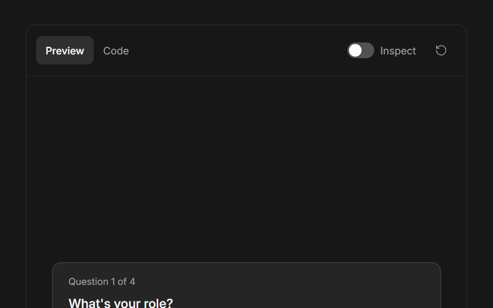 Ask User QuestionsFluid Functionalism · ReactStepped question flow with numbered options, keyboard shortcuts (1–9), single or multi-select, inline 'other' text…
 Stepper 02 - Multi-Step WizardsShadcn Space · ReactMulti-step configuration stepper wizard with distinct tabs for user details, workspace set up, and network options.
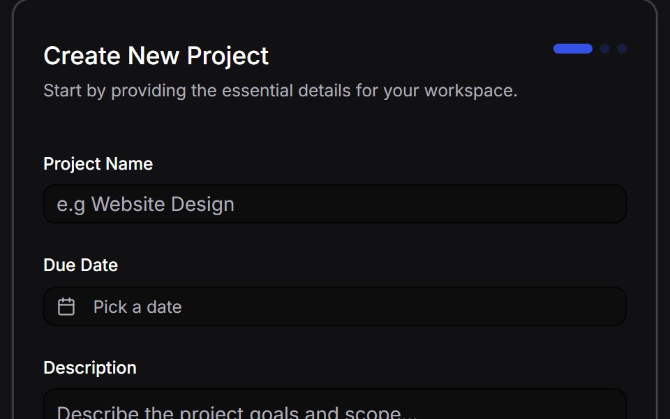 Multi Step Formuselayouts · ReactA dynamic, animated multi-step form with validation.
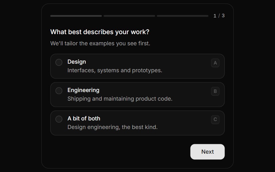 QuestionnaireHextaUI · ReactA step-by-step form that moves between questions with a sense of direction, shows real progress and answers from the…
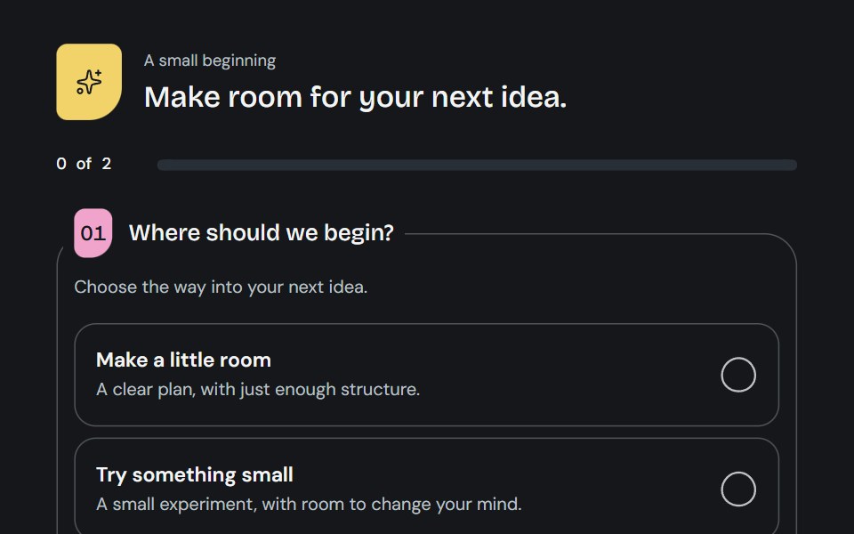 QuestionnaireCojeev UI · ReactA little guided brief: open questions, a focused journey or a two-column worksheet with living choice marks and honest…
 Onboarding welcomeFLX UI · ReactCompact hero image, title, and description; dual CTAs.
Libraries with shadcn/ui wizard components
Related categories
- Wizard Components
- Tailwind CSS Wizard Components
- Animated Wizard Components
- shadcn/ui Navigation Components
- shadcn/ui Menu Components
- shadcn/ui Tabs Components
- shadcn/ui Pagination Components
- shadcn/ui Sidebar Components
- shadcn/ui Command Palette Components
- shadcn/ui Breadcrumb Components
- shadcn/ui Navbar Components
- shadcn/ui Stepper Components