 Dev Design Library
shadcn/ui Command Palette Components
Dev Design Library indexes 30 shadcn/ui command palette components from 13 open-source UI libraries, with the most coming from FLX UI, Shadcn Space, Cult UI, ObsidianUI and sv-table. Each one links to its page with the source code, a live preview where available, the library license and the install command. They follow the shadcn/ui conventions, so most install with the shadcn CLI and drop into a Tailwind project. Command palette components belong to the Navigation group.
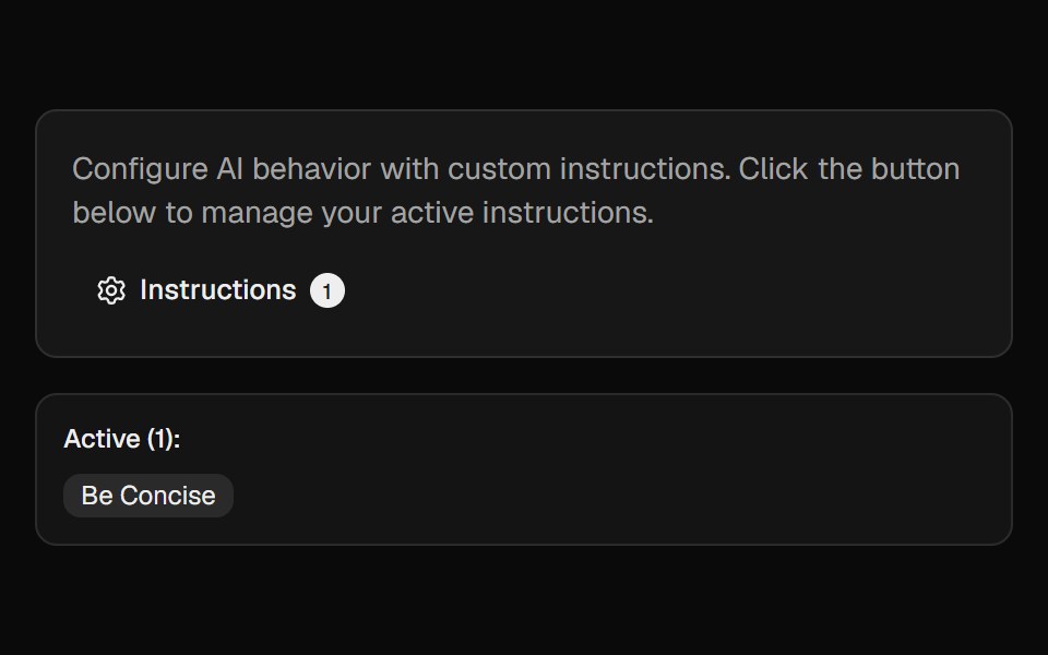 Ai InstructionsCult UI · ReactManage and toggle AI instructions with a popover, search, and create-dialog
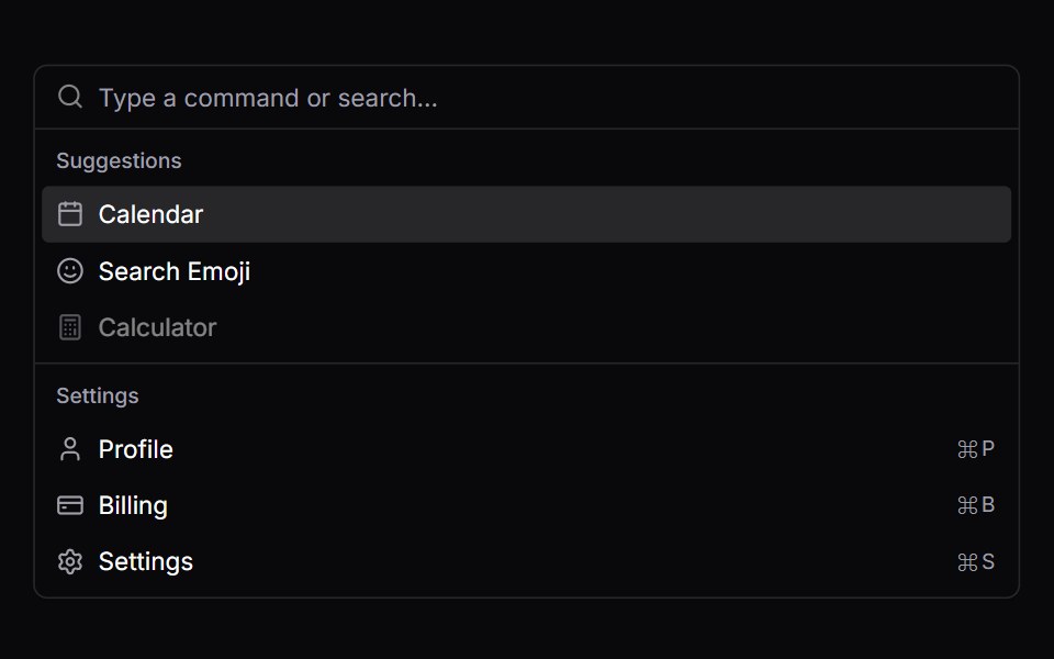 CommandVengeance UI · React
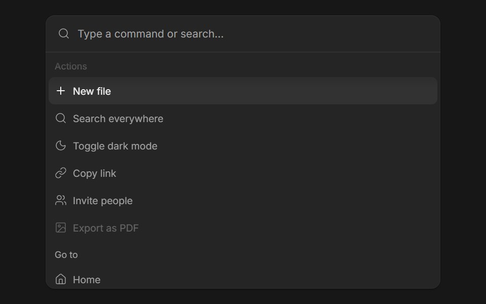 Command MenuFluid Functionalism · ReactSearch field over a list of actions: type to filter, arrows to move the fluid hover highlight, Enter to run. Grouped…
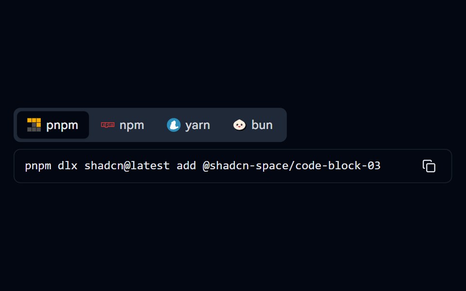 Code Block 07 - Install CommandShadcn Space · ReactPackage manager install command tabs (pnpm, npm, yarn, bun) with copy button
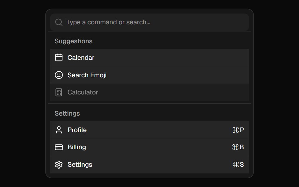 CommandShadcn Dashboard · React
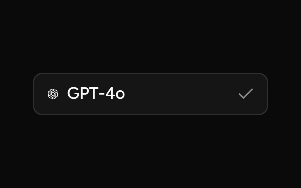 Model SelectorAI Elements (Svelte) · SvelteA searchable model selector dialog built on command and dialog primitives.
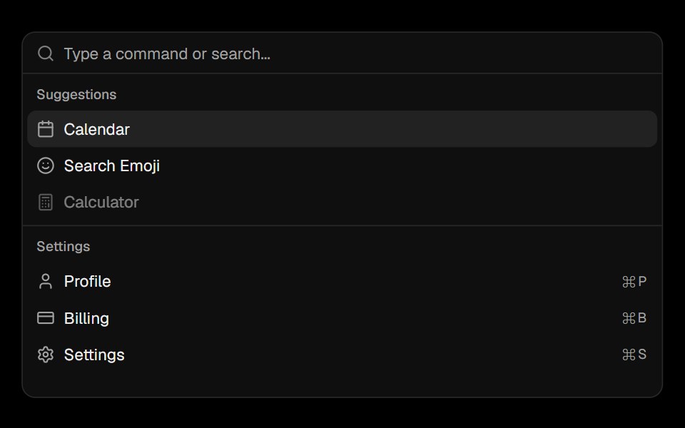 CommandObsidianUI · React
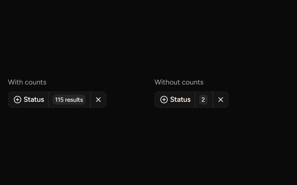 Data Table Faceted Filtersv-table · SvelteA searchable multi-select filter with live counts for categorical table columns.
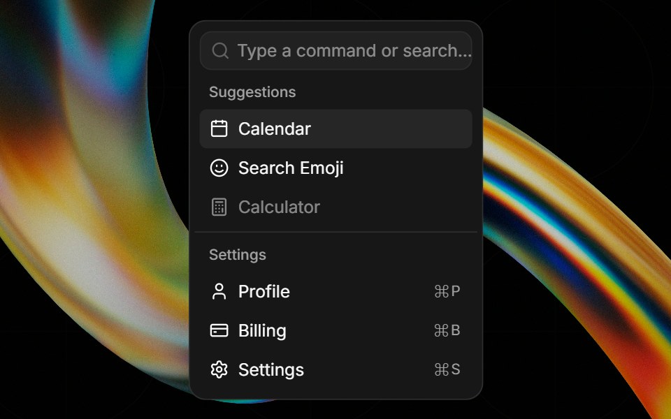 Commandglasscn · React
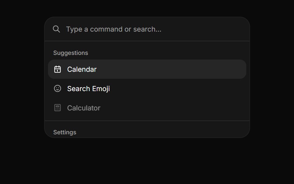 CommandHextaUI · ReactA searchable list of actions, inline or as a ⌘K palette, with pages, shortcuts and highlighted matches.
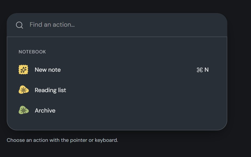 CommandCojeev UI · ReactBuilds a searchable command list that users can navigate and activate from the keyboard.
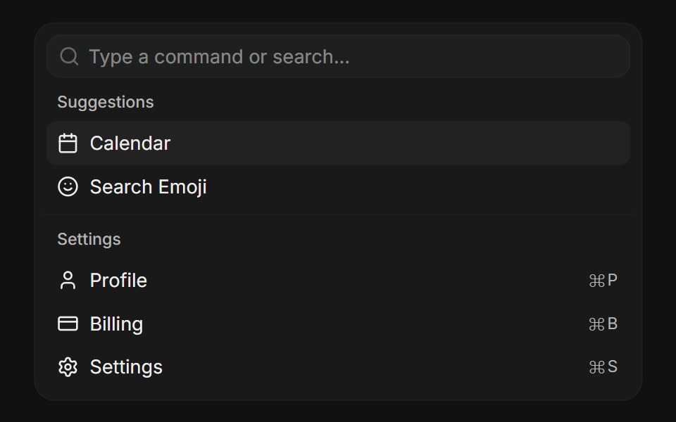 BasicFLX UI · ReactCanonical command menu with grouped items, icons, and shortcuts.
 Commandark-cn · ReactA shadcn-style command component built with Ark UI primitives.
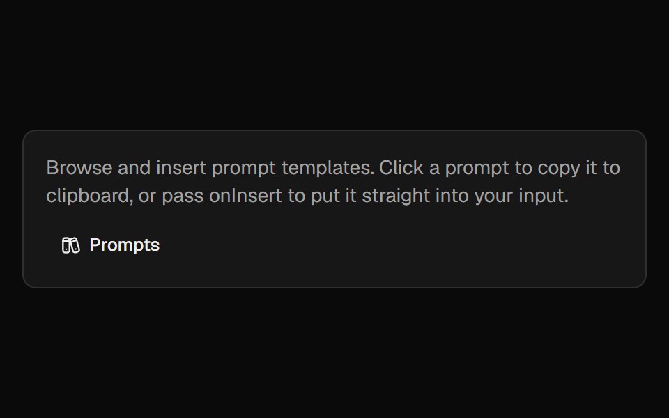 Prompt LibraryCult UI · ReactBrowse, insert, and manage prompt templates with categories and custom prompts
 Command-02 - ScrollableShadcn Space · ReactScrollable command component with groups and separators
 Command dialogFLX UI · ReactSpotlight-style ⌘K palette toggled by a button or keyboard shortcut.
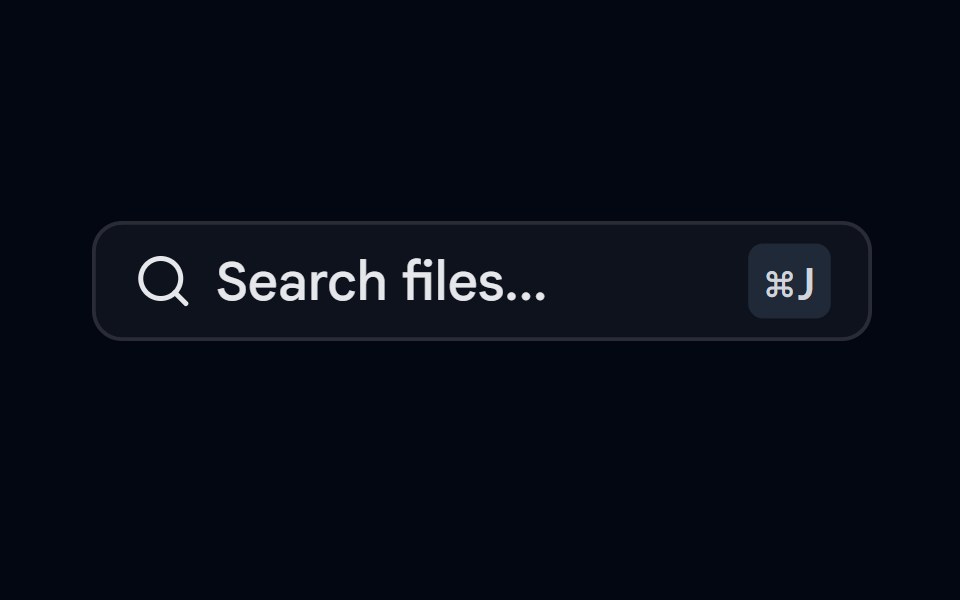 Command-06 - Search FilesShadcn Space · ReactCommand component for searching files
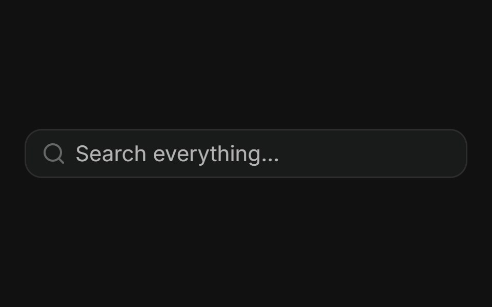 Global searchFLX UI · ReactRich search dialog with recent, pages, and people plus a hint footer.
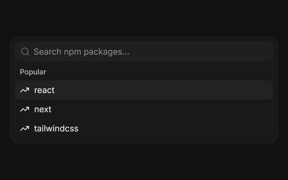 Async loadingFLX UI · ReactDebounced search with skeleton rows while loading, an empty state, and shouldFilter disabled for server-driven results.
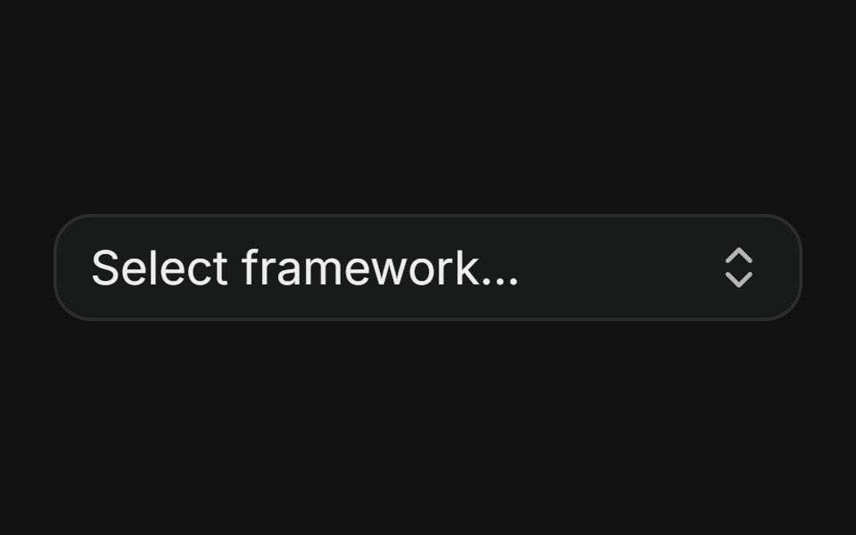 ComboboxFLX UI · ReactPopover + Command framework picker with a check mark.
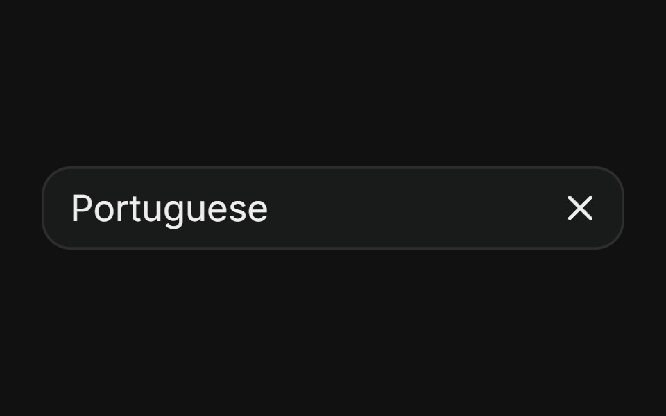 Combobox with clearFLX UI · ReactSelected value shows an inline X that clears without reopening.
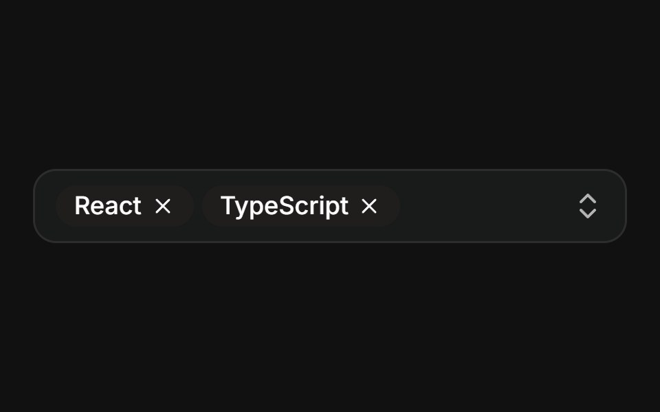 Multiple — chipsFLX UI · ReactMulti-select showing every choice as a removable badge chip in the trigger.
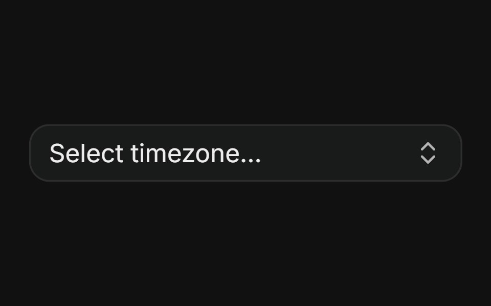 Grouped pickerFLX UI · ReactOptions split into labeled groups with separators, demonstrated with timezones organized by region.
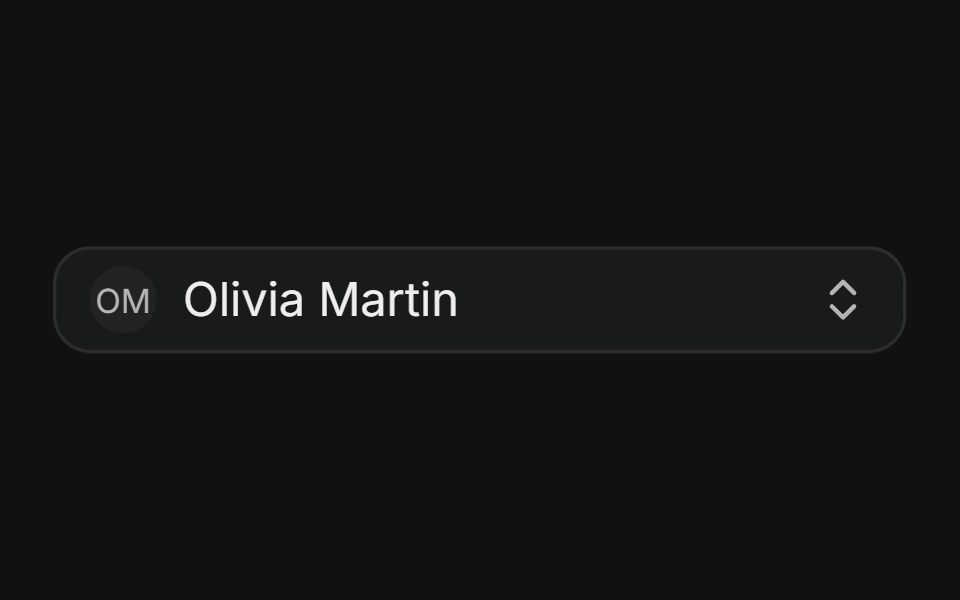 Assignee pickerFLX UI · ReactAvatars with name and email subtext in the trigger and options.
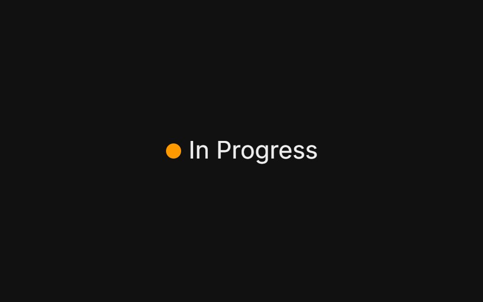 Status pickerFLX UI · ReactGhost trigger with a colored status dot, issue-tracker style.
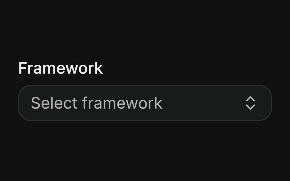 With labelFLX UI · ReactCombobox composed with an accessible field Label.
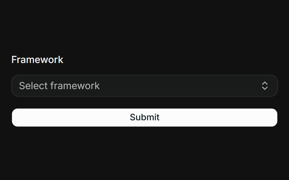 React Hook Form + ZodFLX UI · ReactController binds the combobox to RHF; Zod resolver drives FieldError on submit.
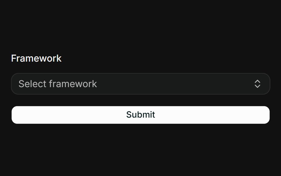 TanStack Form + ZodFLX UI · Reactform.Field wires the combobox; Zod onSubmit validator surfaces FieldError when touched.
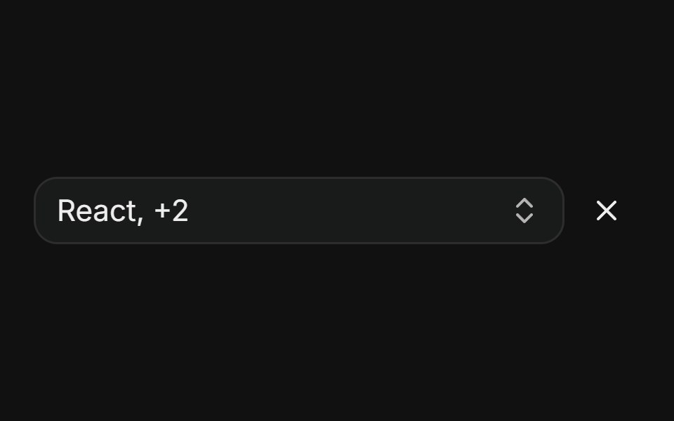 Multiple — count summaryFLX UI · ReactTrigger shows "first, +N" with a separate button to clear all.
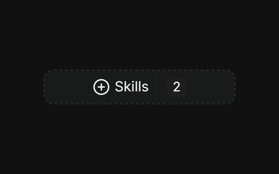 Multiple — faceted filterFLX UI · ReactDashed trigger with count badges, checkbox rows, facet counts, and a clear footer.
Libraries with shadcn/ui command palette components
Related categories
- Command Palette Components
- React Command Palette Components
- Tailwind CSS Command Palette Components
- Animated Command Palette Components
- shadcn/ui Navigation Components
- shadcn/ui Menu Components
- shadcn/ui Tabs Components
- shadcn/ui Pagination Components
- shadcn/ui Sidebar Components
- shadcn/ui Breadcrumb Components
- shadcn/ui Navbar Components
- shadcn/ui Stepper Components
- shadcn/ui Wizard Components