 Dev Design Library
shadcn/ui Tabs Components
Dev Design Library indexes 48 shadcn/ui tabs components from 7 open-source UI libraries, with the most coming from sv-particles, FLX UI, Shadcn Space, Spectrum UI and Cojeev UI. Each one links to its page with the source code, a live preview where available, the library license and the install command. They follow the shadcn/ui conventions, so most install with the shadcn CLI and drop into a Tailwind project. Tabs components belong to the Navigation group.
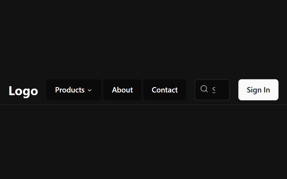 Tab NavbarSpectrum UI · Reactcomponent for the Tab Navbar
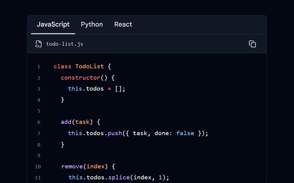 Code Block 06 - Language TabsShadcn Space · ReactCode block with language selector tabs (JavaScript, Python, React) and scrollable content
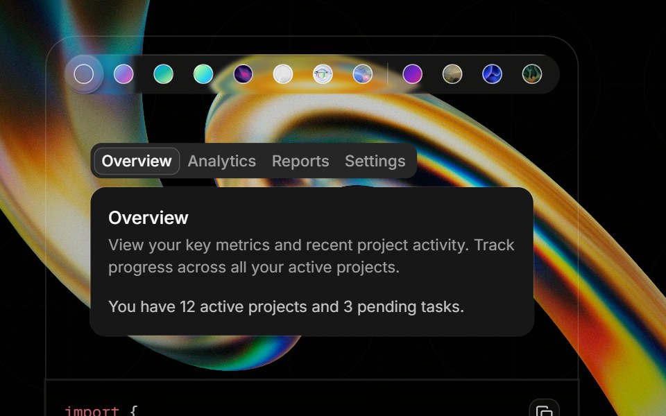 Component Previewglasscn · ReactA preview shell for component demos with switchable default and glass variants.
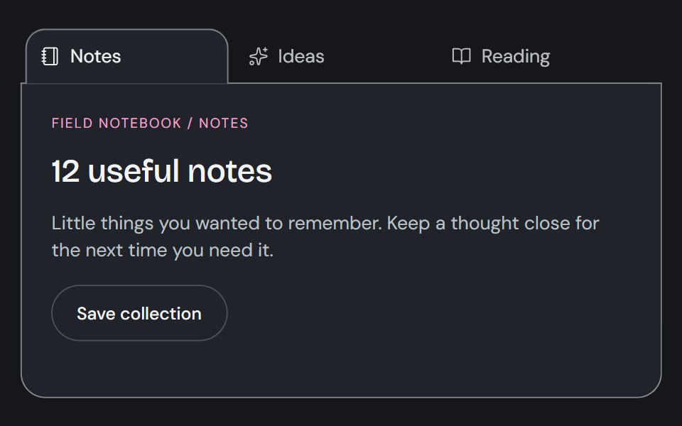 TabsCojeev UI · ReactSwitches between related content panels while keeping the available views visible.
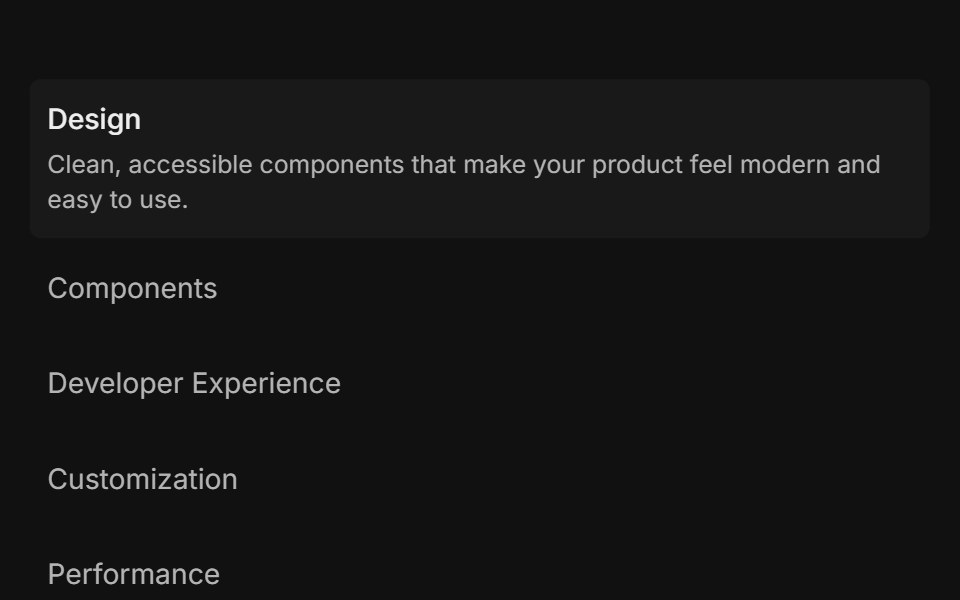 Feature 01FLX UI · ReactList of items: select one to reveal its description and media.
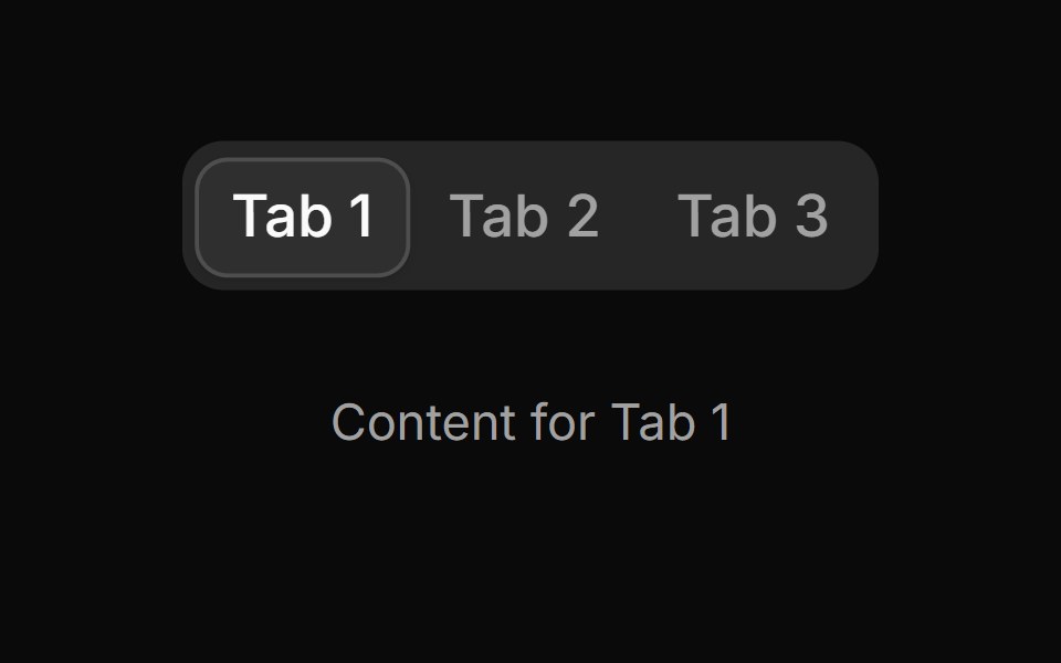 Tab 1sv-particles · Svelte
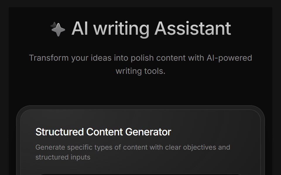 AI Writing AssistantD2Studio UI · ReactAI writing assistant panel with assistant, blog and pro modes and a prompt field.
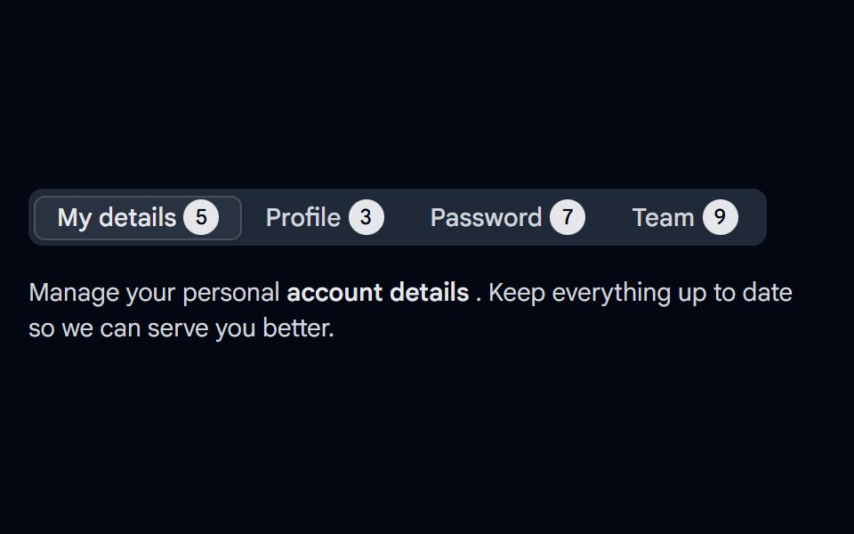 Tabs-04 - With CountShadcn Space · ReactTabs component
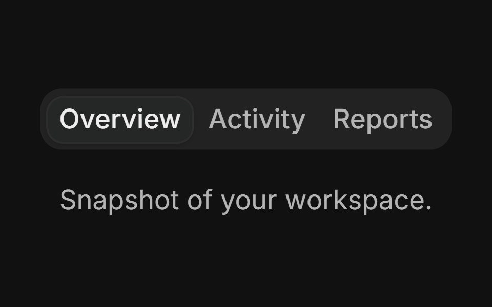 BasicFLX UI · ReactThree tabs with the default filled variant.
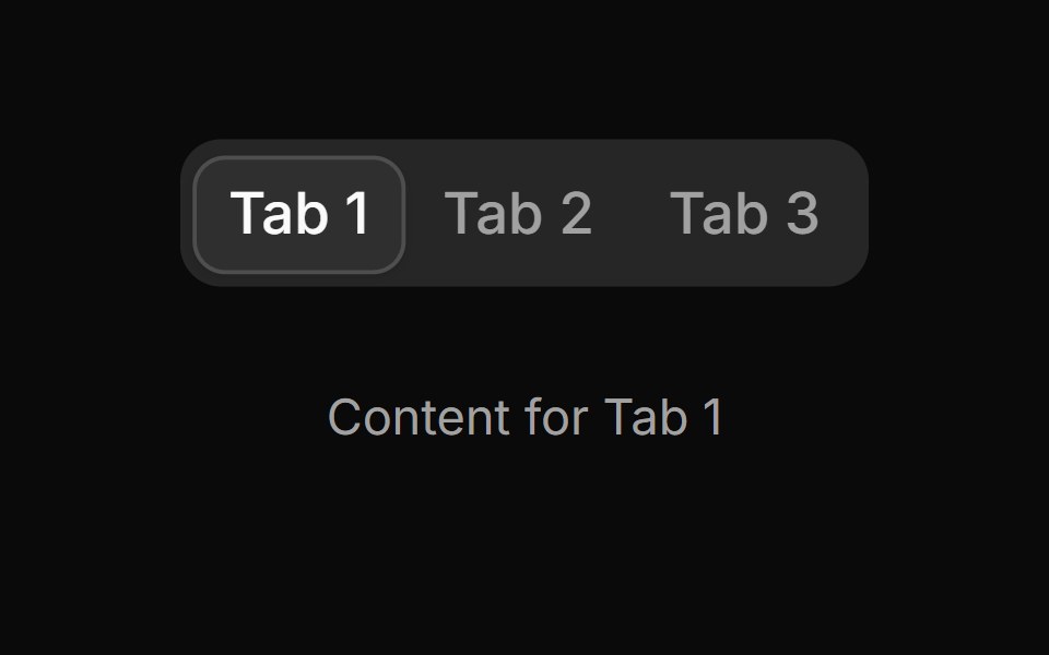 Tab 10sv-particles · Svelte
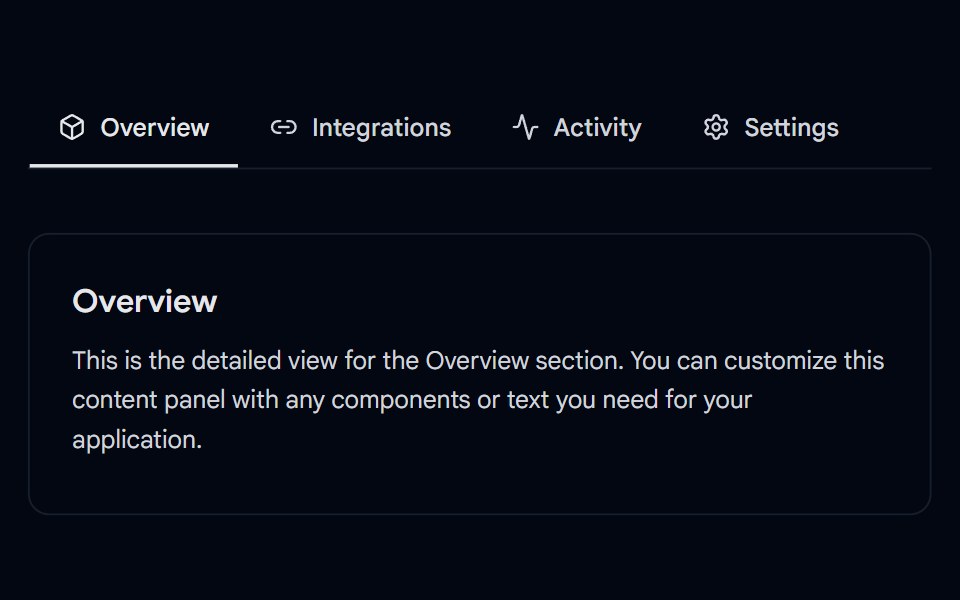 Tabs-05 - UnderlineShadcn Space · ReactAnimated underline tabs component
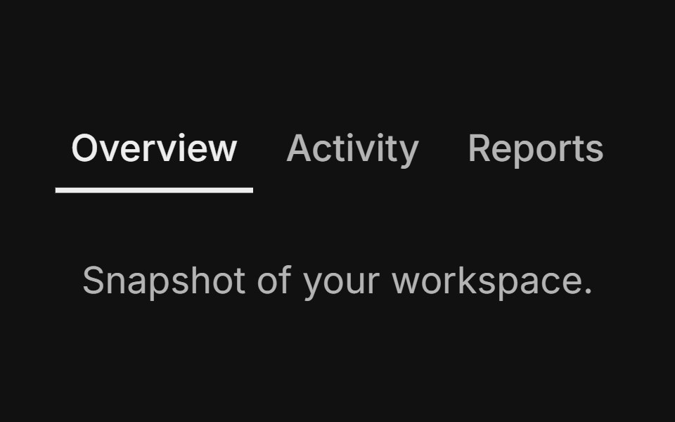 Line variantFLX UI · ReactUnderline indicator instead of filled background.
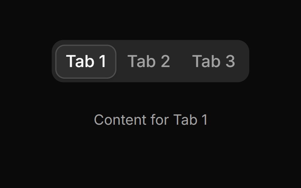 Tab 11sv-particles · Svelte
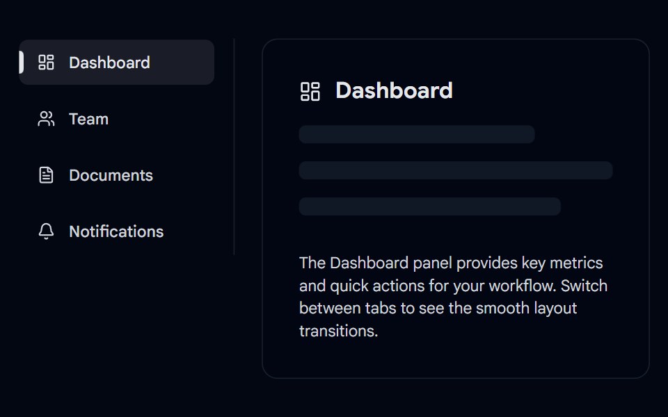 Tabs-06 - VerticalShadcn Space · ReactVertical animated tabs component
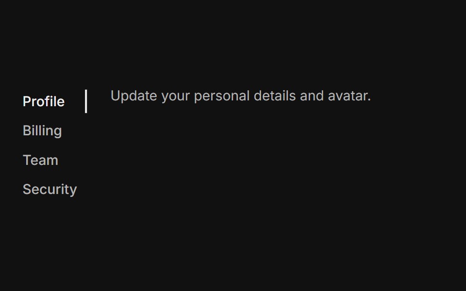 Vertical lineFLX UI · ReactVertical orientation with underline indicators, suited for sidebar navigation.
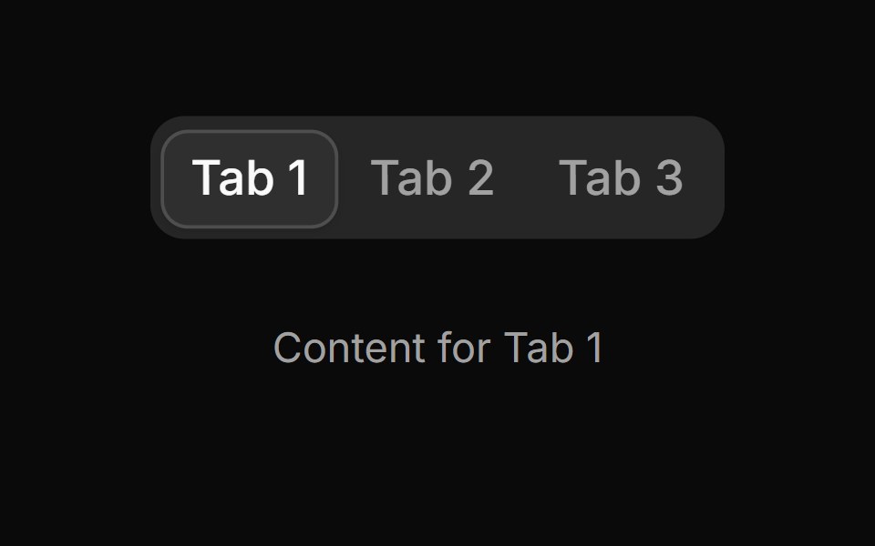 Tab 12sv-particles · Svelte
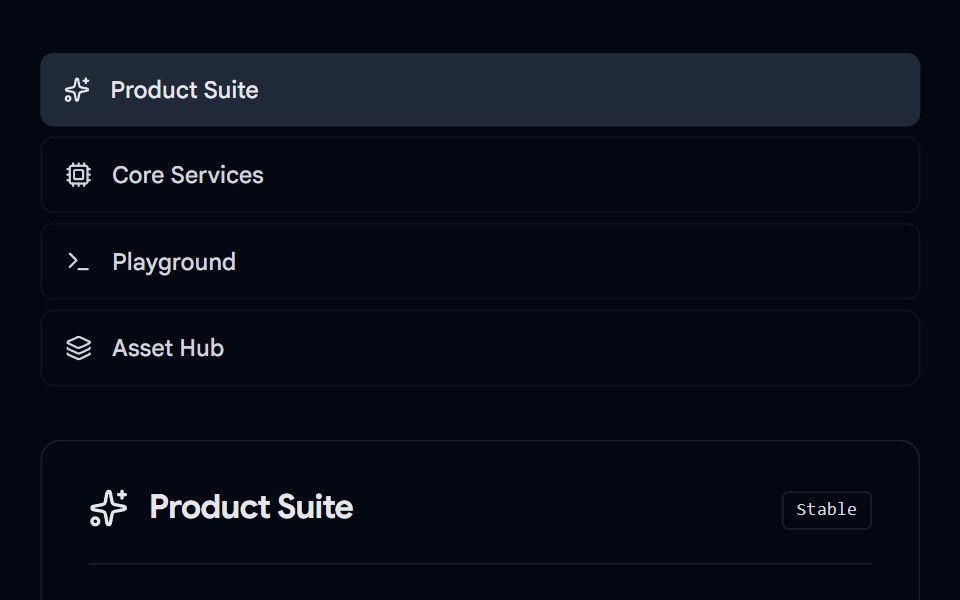 Tabs-07 - Icon & DescriptionShadcn Space · ReactTabs with icon and description component
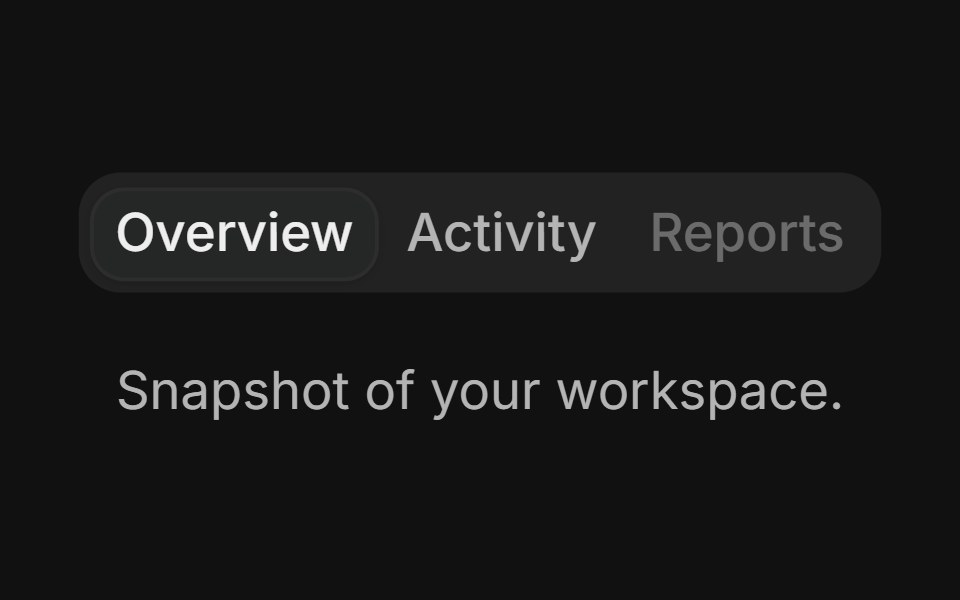 Disabled tabFLX UI · ReactOne trigger disabled while others stay interactive.
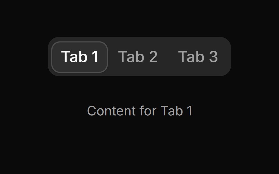 Tab 13sv-particles · Svelte
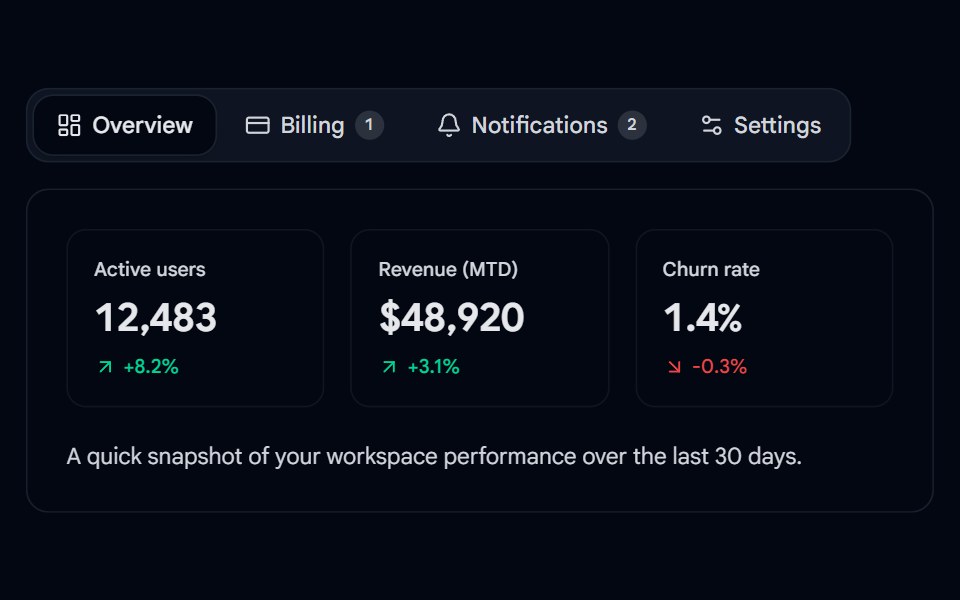 Tabs 08 - Animated Dashboard TabsShadcn Space · ReactA reusable, animated tabs component with a sliding active pill, icons, badges, and direction-aware content…
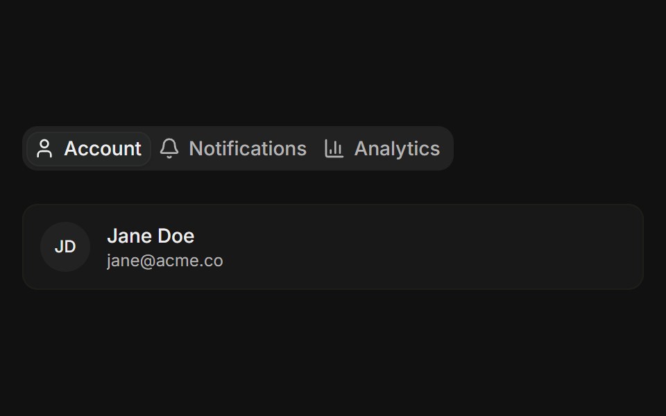 With iconsFLX UI · ReactTabs with a small icon placed before each label in the trigger.
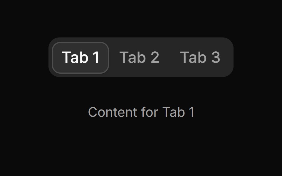 Tab 14sv-particles · Svelte
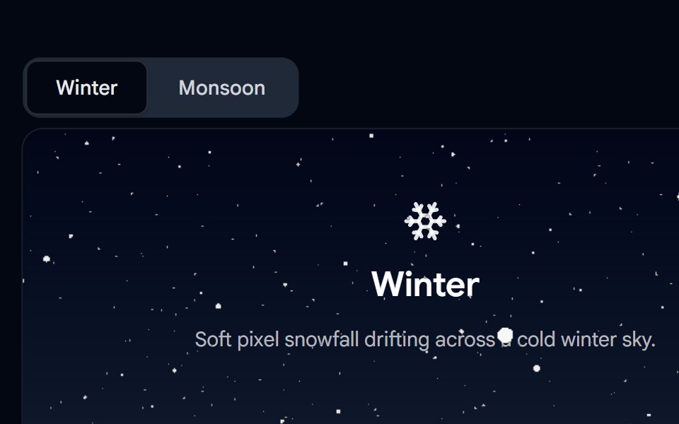 Tabs 09 - Seasonal PixelSnow TabsShadcn Space · ReactA Winter/Monsoon tabs demo where the Winter panel is covered in a live pixel-snow WebGL shader effect and the Monsoon…
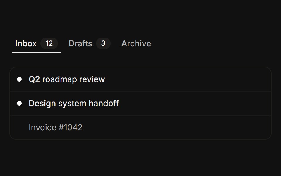 With count badgesFLX UI · ReactTrigger labels paired with secondary count badges.
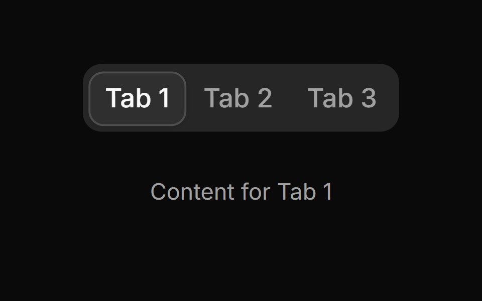 Tab 15sv-particles · Svelte
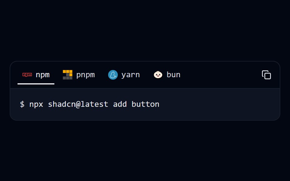 Tabs 10 - Package ManagerShadcn Space · ReactInstall command tabs for npm, pnpm, yarn and bun with a one-click copy button.
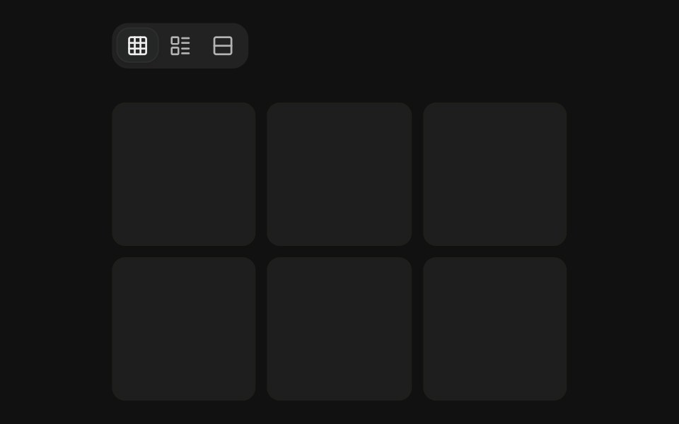 Icon onlyFLX UI · ReactCompact icon-only triggers for view switching.
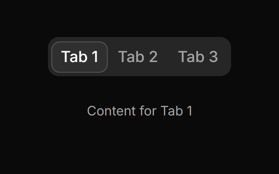 Tab 16sv-particles · Svelte
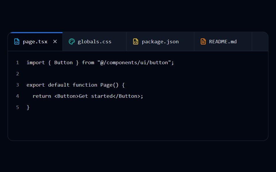 Tabs 11 - Browser TabsShadcn Space · ReactEditor-style closable file tabs with file type icons and line-numbered content.
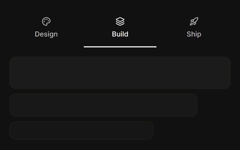 Icon with titleFLX UI · ReactIcon stacked above the title in each trigger, with a visual panel below.
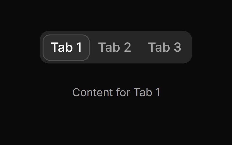 Tab 17sv-particles · Svelte
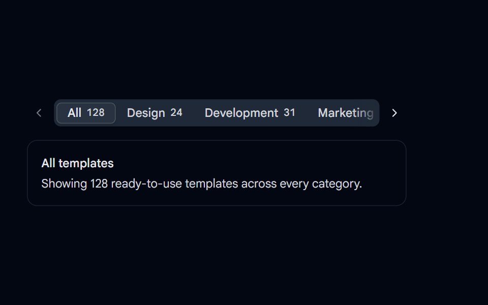 Tabs 12 - Scrollable OverflowShadcn Space · ReactHorizontally scrollable tabs with arrow buttons, edge fades, and auto-scroll to the active tab.
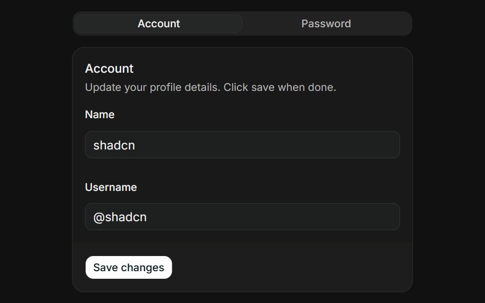 Account and passwordFLX UI · ReactTwo-tab card with a profile edit form on one tab and a password change form on the other.
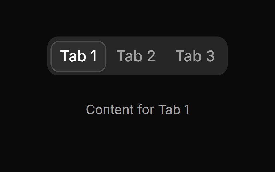 Tab 18sv-particles · Svelte
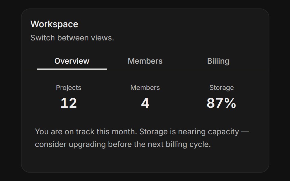 In cardFLX UI · ReactTabs inside a card with stats, member list, and billing summary panels.
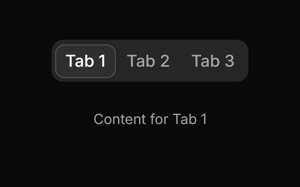 Tab 19sv-particles · Svelte
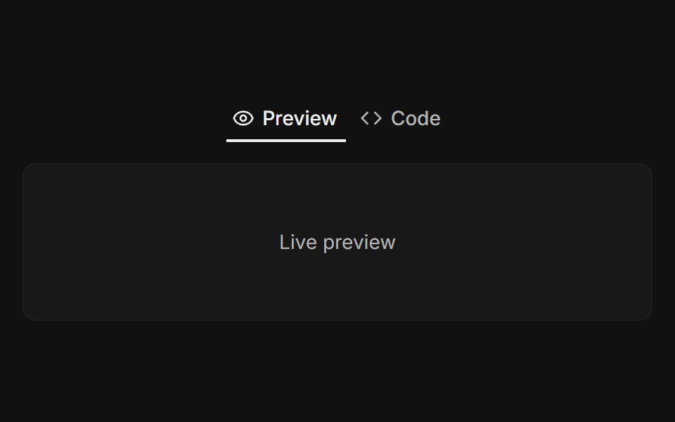 Preview and codeFLX UI · ReactDocs-style switch between live preview and code snippet.
 Tab 2sv-particles · Svelte
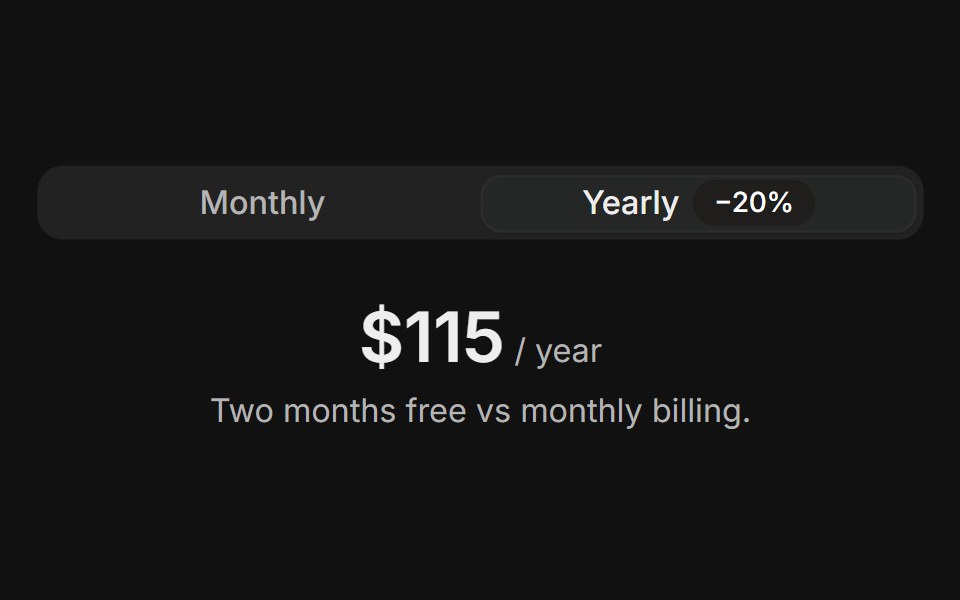 Pricing toggleFLX UI · ReactMonthly versus yearly billing toggle swaps the price.
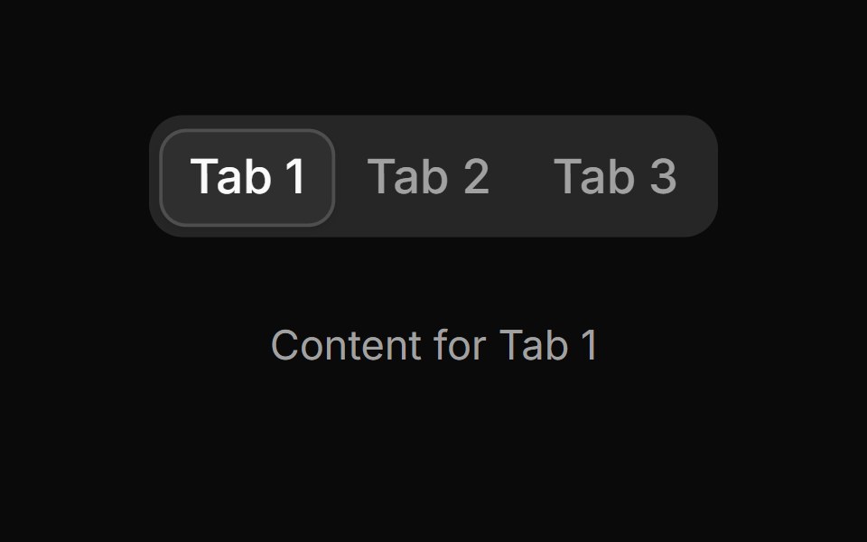 Tab 20sv-particles · Svelte
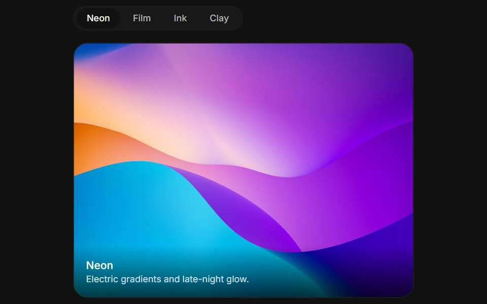 Pill trackFLX UI · ReactRounded pill triggers in a bordered track with cross-fading mood boards.
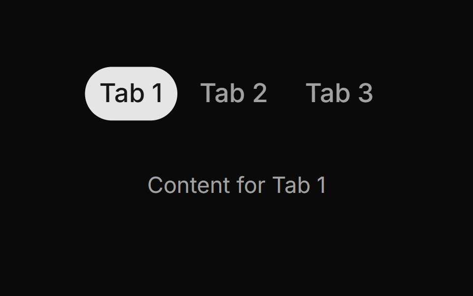 Tab 3sv-particles · Svelte
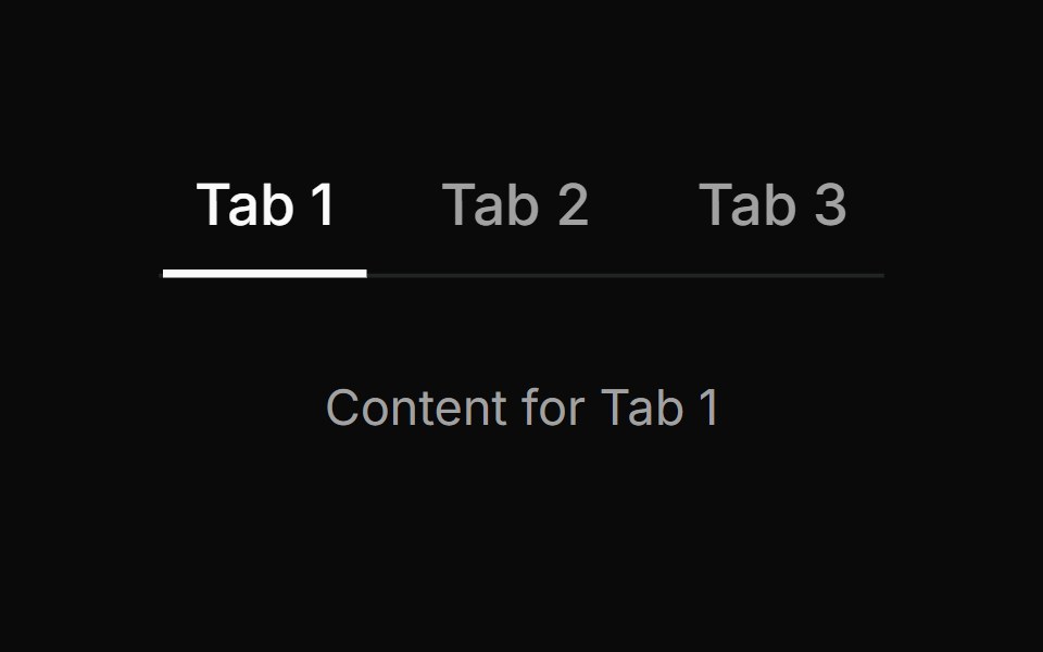 Tab 4sv-particles · Svelte
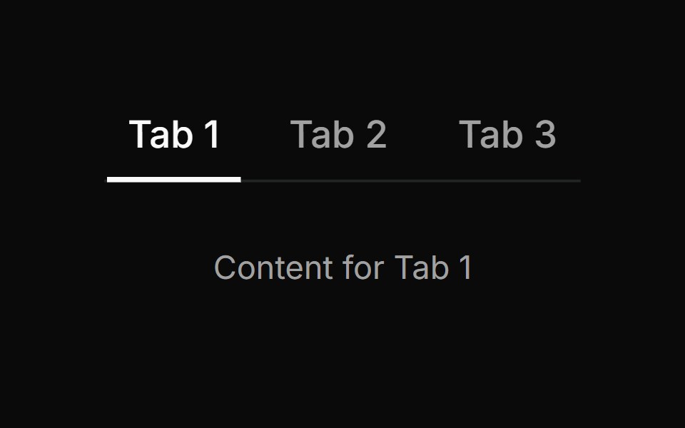 Tab 5sv-particles · Svelte
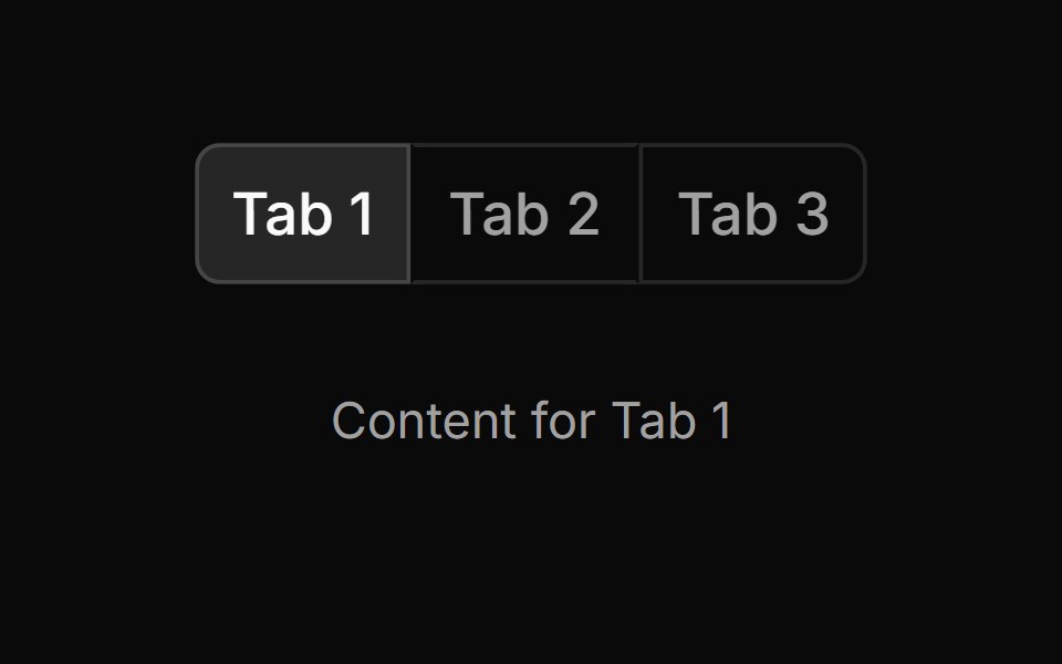 Tab 6sv-particles · Svelte
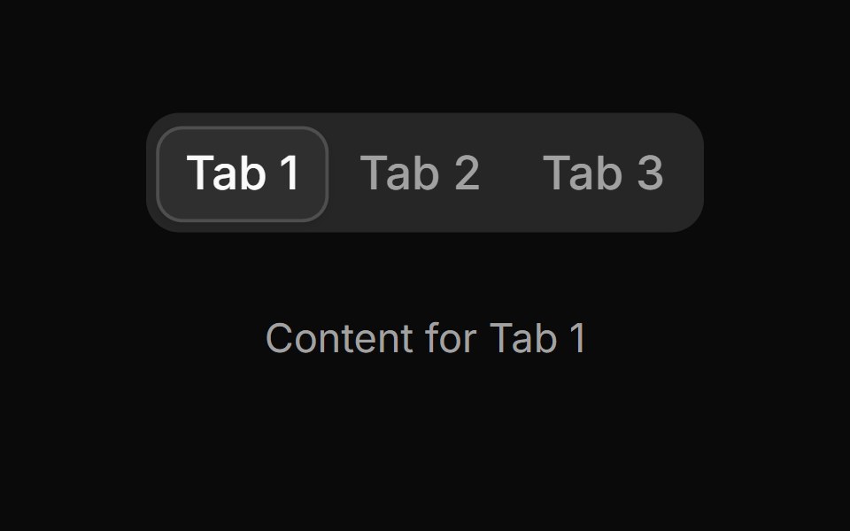 Tab 7sv-particles · Svelte
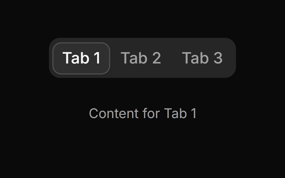 Tab 8sv-particles · Svelte
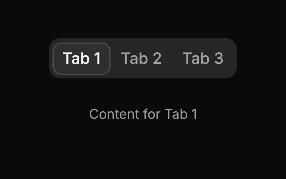 Tab 9sv-particles · Svelte
Libraries with shadcn/ui tabs components
Related categories
- Tabs Components
- React Tabs Components
- Tailwind CSS Tabs Components
- Svelte Tabs Components
- Animated Tabs Components
- shadcn/ui Navigation Components
- shadcn/ui Menu Components
- shadcn/ui Pagination Components
- shadcn/ui Sidebar Components
- shadcn/ui Command Palette Components
- shadcn/ui Breadcrumb Components
- shadcn/ui Navbar Components
- shadcn/ui Stepper Components
- shadcn/ui Wizard Components