 Dev Design Library
shadcn/ui Stepper Components
Dev Design Library indexes 16 shadcn/ui stepper components from 8 open-source UI libraries, with the most coming from Shadcn Space, Cult UI, Spectrum UI, Cojeev UI and uselayouts. Each one links to its page with the source code, a live preview where available, the library license and the install command. They follow the shadcn/ui conventions, so most install with the shadcn CLI and drop into a Tailwind project. Stepper components belong to the Navigation group.
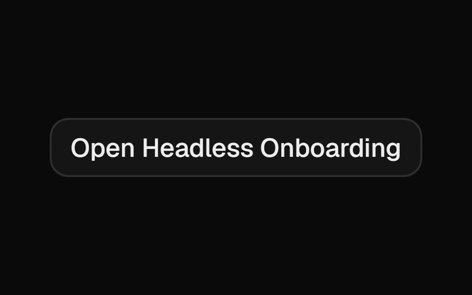 OnboardingCult UI · ReactComposable multi-step onboarding primitives: Onboarding root with step navigation, FeatureCarousel, ChoiceGroup radio…
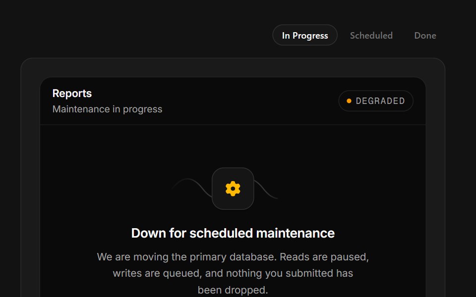 Scheduled MaintenanceSpectrum UI · ReactA maintenance window with a ticking ETA, a stage rail and a notify-me field.
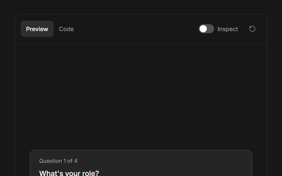 Ask User QuestionsFluid Functionalism · ReactStepped question flow with numbered options, keyboard shortcuts (1–9), single or multi-select, inline 'other' text…
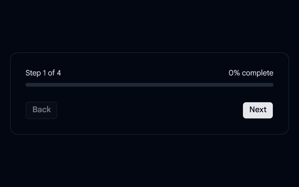 Progress 02 - Onboarding StepperShadcn Space · ReactA clean onboarding progress tracker with step navigation and percentage completion.
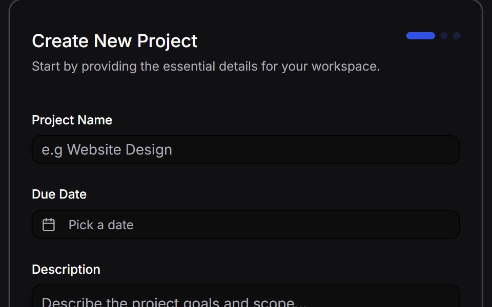 Multi Step Formuselayouts · ReactA dynamic, animated multi-step form with validation.
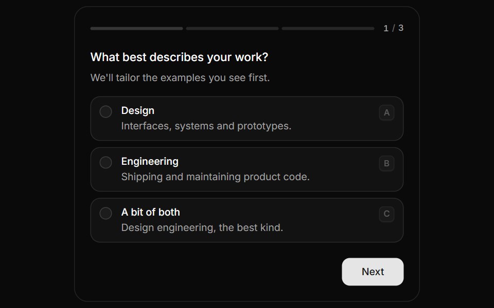 QuestionnaireHextaUI · ReactA step-by-step form that moves between questions with a sense of direction, shows real progress and answers from the…
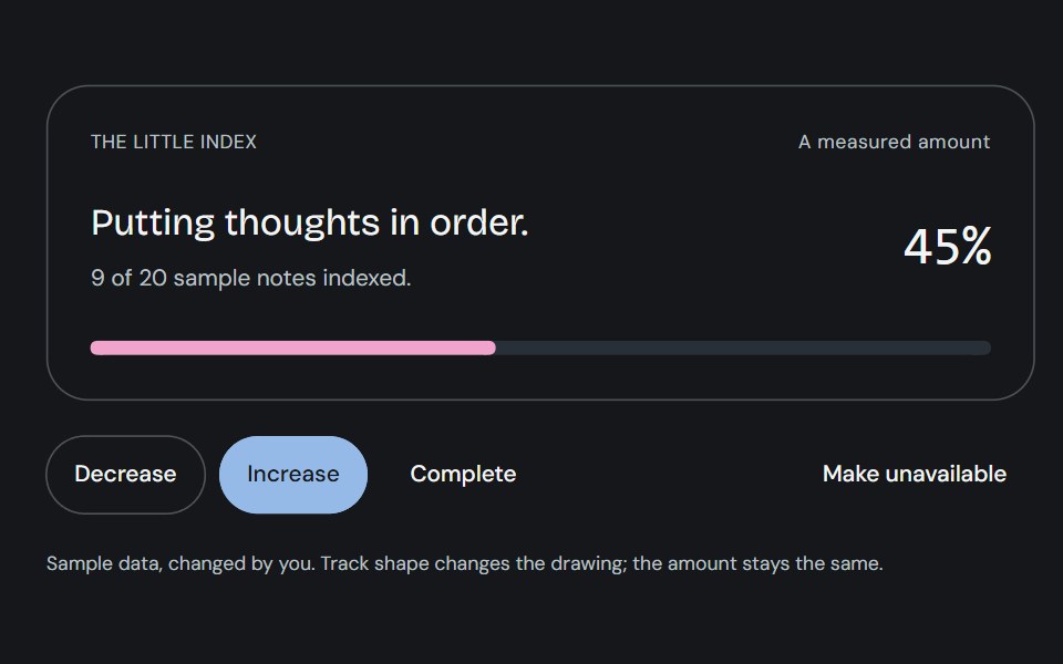 ProgressCojeev UI · ReactOne measured amount, explained as an inline task, a small report or connected milestones—with independent organic…
 Onboarding welcomeFLX UI · ReactCompact hero image, title, and description; dual CTAs.
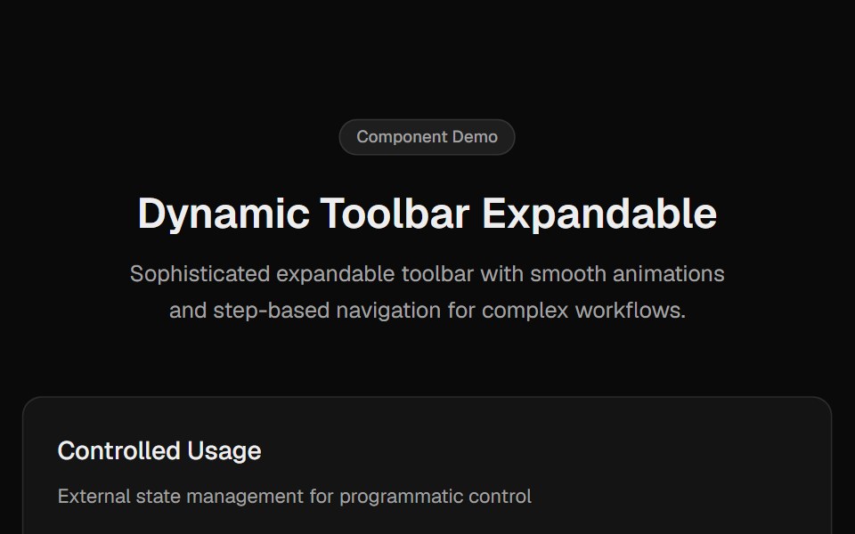 Toolbar ExpandableCult UI · ReactExpandable toolbar component with step-based navigation, smooth animations, and enhanced scrolling
 Multiple Step Form DemoSpectrum UI · Reactcomponent for the Multiple Step Form Demo
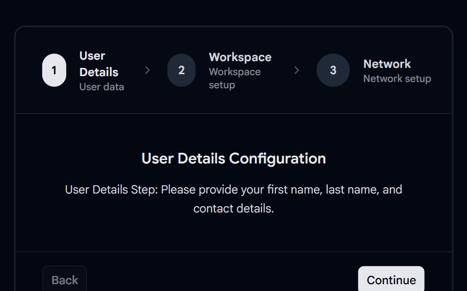 Stepper 02 - Multi-Step WizardsShadcn Space · ReactMulti-step configuration stepper wizard with distinct tabs for user details, workspace set up, and network options.
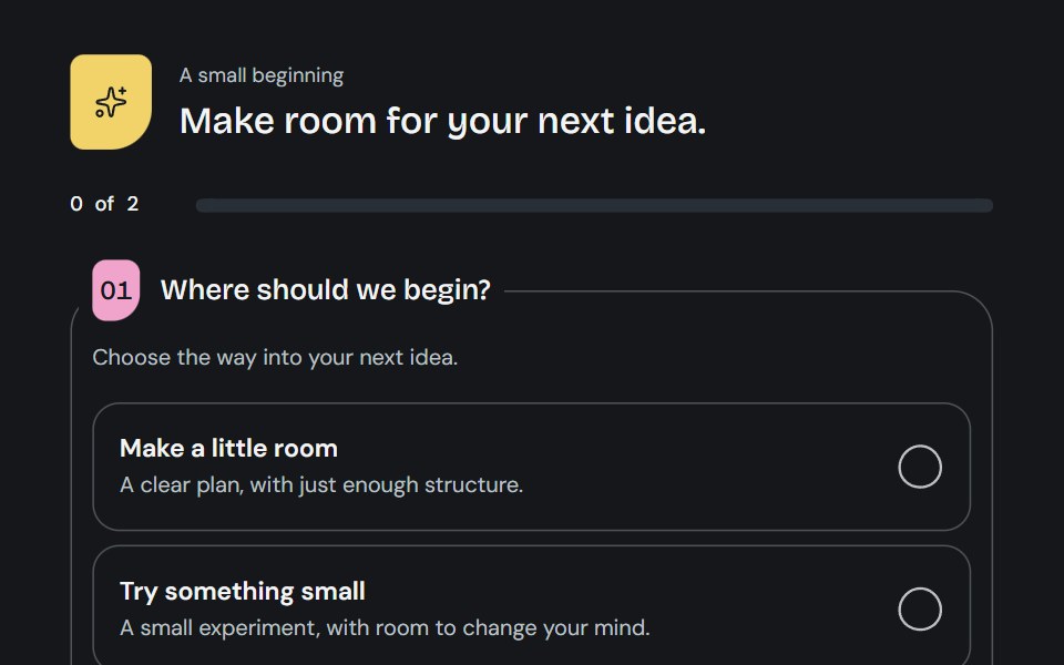 QuestionnaireCojeev UI · ReactA little guided brief: open questions, a focused journey or a two-column worksheet with living choice marks and honest…
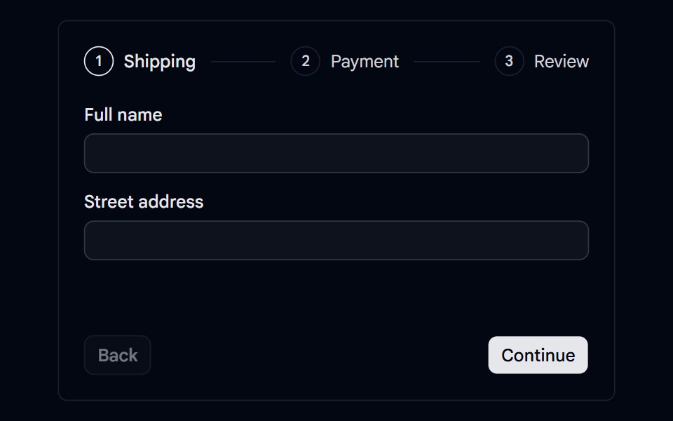 Stepper 05 - Checkout with ValidationShadcn Space · ReactCheckout stepper for shipping, payment, and review with per-step validation, error indicators, card formatting, and an…
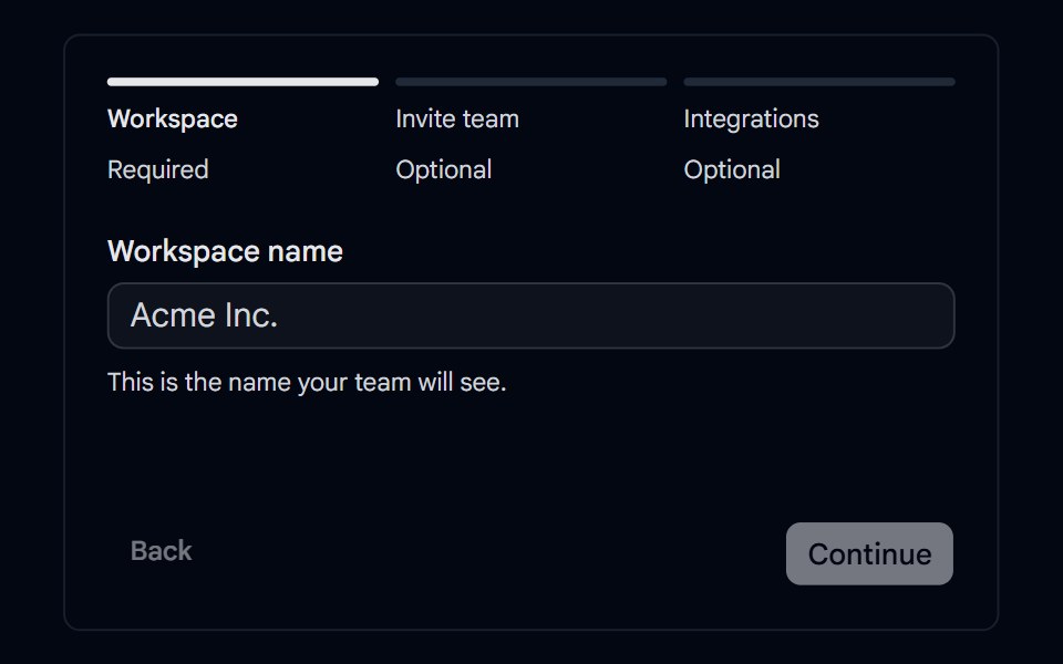 Stepper 07 - Optional & Skipped StepsShadcn Space · ReactWorkspace setup stepper with required and optional steps, a skipped state, and a summary that links back to skipped…
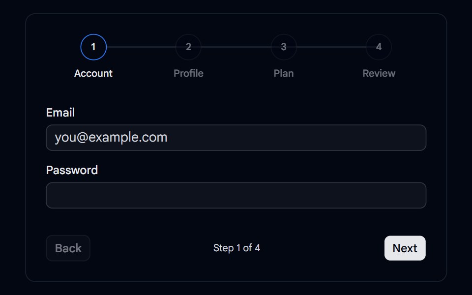 Tabs 15 - Wizard StepsShadcn Space · ReactMulti-step wizard tabs with numbered steps, an animated progress line, and Back and Next navigation.
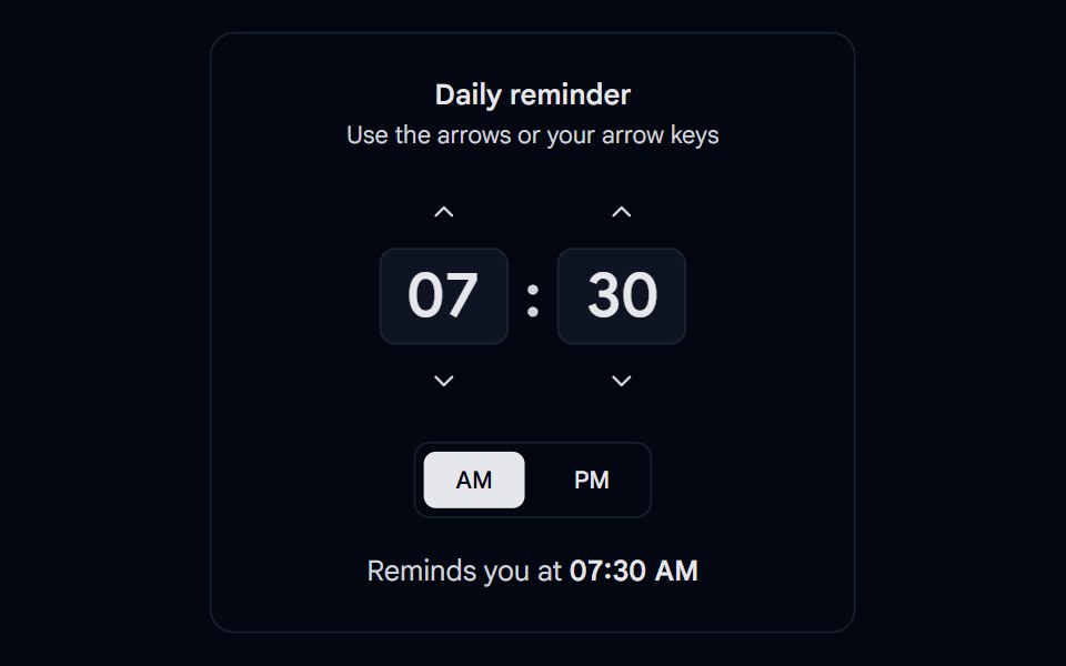 Time Picker 05 - StepperShadcn Space · ReactHour and minute steppers with up and down buttons, arrow key support, 15 minute steps, and an AM or PM toggle
Libraries with shadcn/ui stepper components
Related categories
- Stepper Components
- React Stepper Components
- Tailwind CSS Stepper Components
- Animated Stepper Components
- shadcn/ui Navigation Components
- shadcn/ui Menu Components
- shadcn/ui Tabs Components
- shadcn/ui Pagination Components
- shadcn/ui Sidebar Components
- shadcn/ui Command Palette Components
- shadcn/ui Breadcrumb Components
- shadcn/ui Navbar Components
- shadcn/ui Wizard Components