 Dev Design Library
shadcn/ui Menu Components
Dev Design Library indexes 81 shadcn/ui menu components from 17 open-source UI libraries, with the most coming from FLX UI, Watermelon UI, sv-particles, Notra and Fluid Functionalism. Each one links to its page with the source code, a live preview where available, the library license and the install command. They follow the shadcn/ui conventions, so most install with the shadcn CLI and drop into a Tailwind project. Menu components belong to the Navigation group.
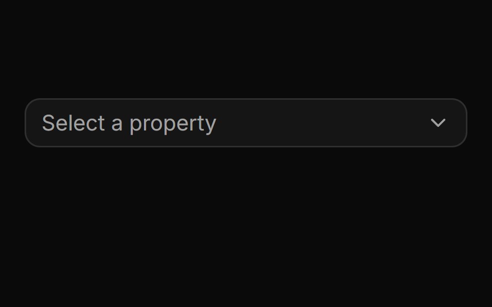 Pinned footer with a side-anchored import flyout.ReUI · ReactPinned footer with a side-anchored import flyout.
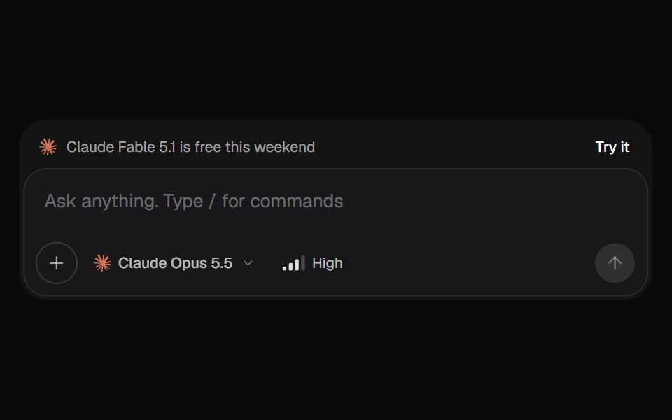 AI Input SelectorKokonut UI · ReactAI chat input with a model menu, a separate Effort control, file chips you can drop or paste, a / command menu, and…
 context-menuIntent UI · Reactcontext-menu
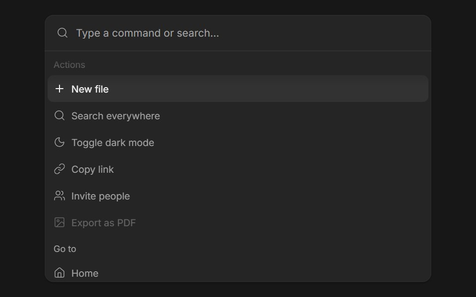 Command MenuFluid Functionalism · ReactSearch field over a list of actions: type to filter, arrows to move the fluid hover highlight, Enter to run. Grouped…
 Command-01 - Shortcut MenuShadcn Space · ReactCommand component with different size variants
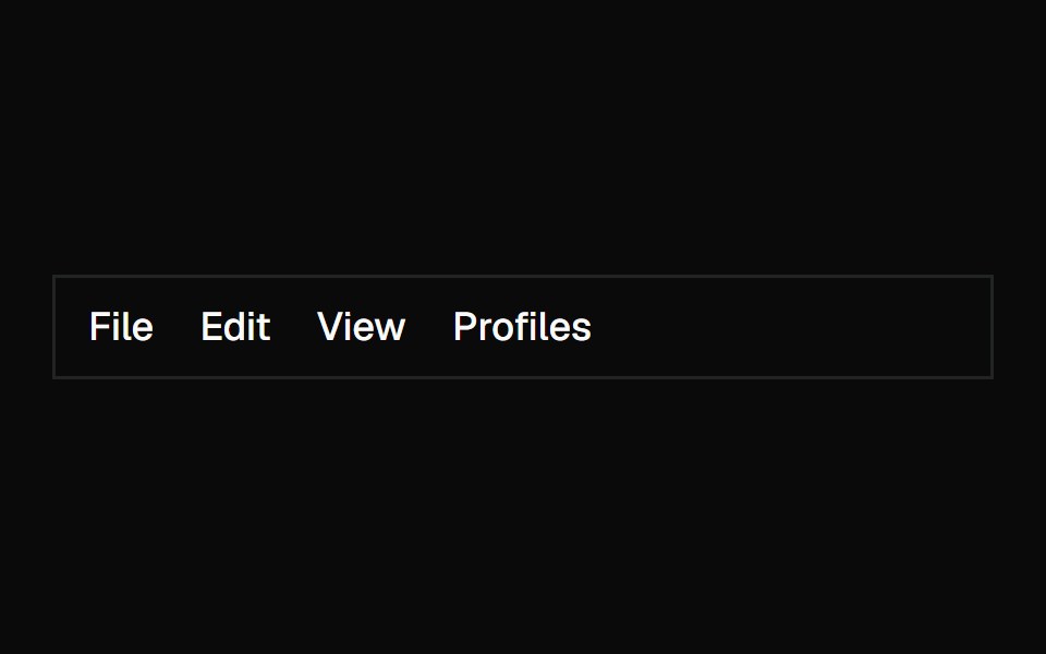 MenubarShadcn Dashboard · React
 Hero Header Eightcnblocks · SvelteNavigation header with dropdown menus
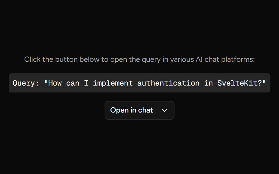 Open In ChatAI Elements (Svelte) · SvelteA provider menu for opening prompts in external chat and AI tools.
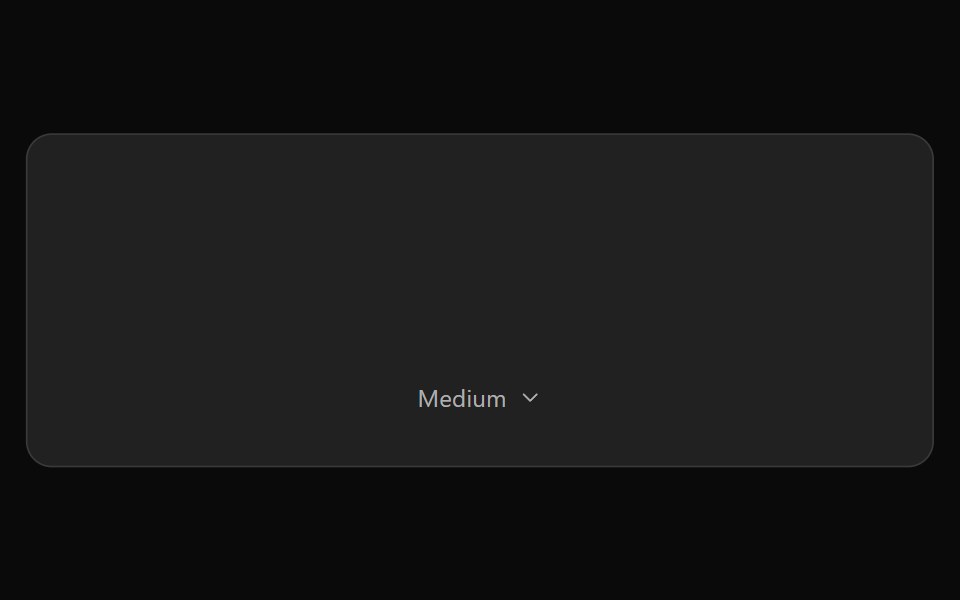 ChatGPT Model SelectorNotra · ReactThe hover-to-open effort chip with Model and Effort submenus, built on shadcn DropdownMenu.
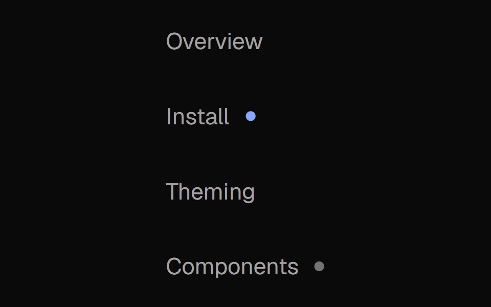 Nav MenuNexvyn UI · ReactA vertical navigation list with two-layer proximity highlight (active route + hover), weight-shift labels, and status…
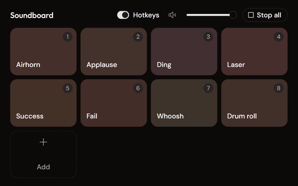 Soundboardaudiocn · ReactA grid of sound pads with global hotkeys, per-pad mode and volume in a context menu, master volume, stop all, and…
 Dropdown Menu 1Watermelon UI · React
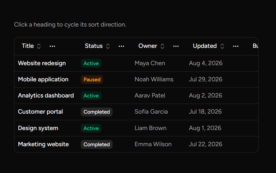 Data Table Column Headersv-table · SvelteA table heading with sorting, pinning, ordering, and visibility actions.
 Dropdown menuHextaUI · ReactA menu of actions and options behind a button, with groups, submenus, checkbox and radio items, and shortcuts.
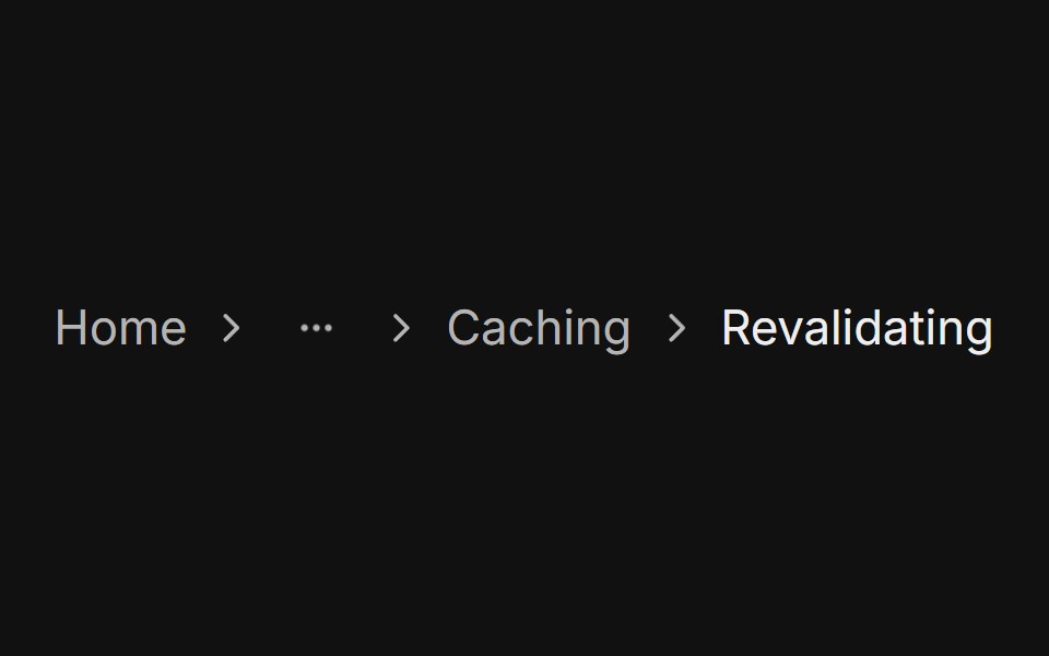 With dropdownFLX UI · ReactGhost icon Button opens a menu of the hidden levels.
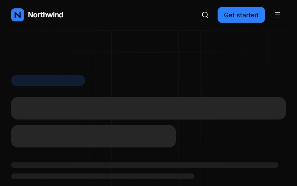 Mega menu navbarVelora UI · ReactTop bar with a keyboard-accessible Product mega menu, search, sign-in and a slide-over mobile menu.
 Basic Menusv-particles · Svelte
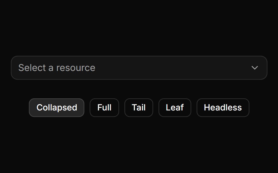 Trigger path formatting and collapsing.ReUI · ReactTrigger path formatting and collapsing.
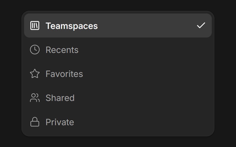 DropdownFluid Functionalism · ReactDropdown menu with fluid hover, animated selection indicator, inline panel or triggered popup with collision-aware…
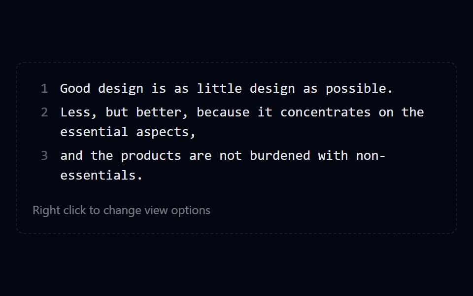 Context Menu 04 - View OptionsShadcn Space · ReactEditor preview with a right click menu of checkbox items for line numbers, wrap, and highlight, and radio groups for…
 Hero Header Ninecnblocks · SvelteHeader with mega menu navigation
 Claude Model SelectorNotra · ReactA hover-open model and effort picker built on shadcn DropdownMenu.
 Dropdown Menu 10Watermelon UI · React
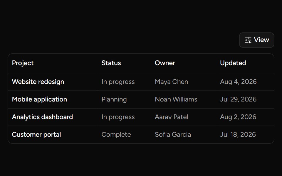 Data Table Viewsv-table · SvelteA checkbox dropdown for toggling table column visibility.
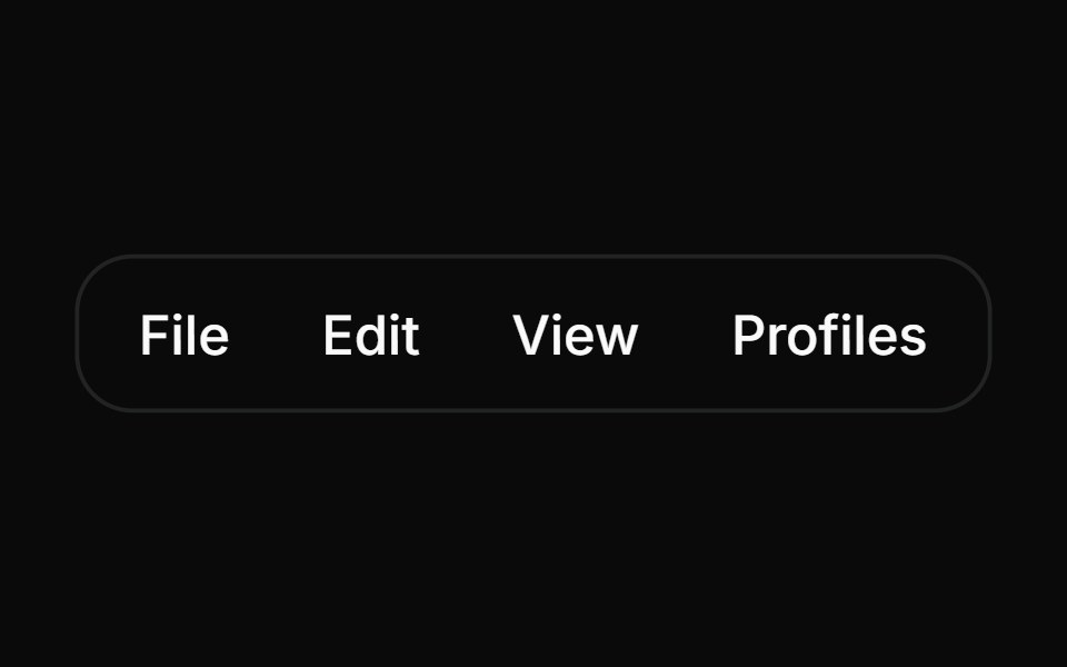 MenubarHextaUI · ReactA desktop-style bar of menus with one highlight that slides between open menus and instant switching as you sweep…
 Split buttonFLX UI · ReactPrimary action button paired with a chevron that opens a dropdown of secondary actions.
 Close On Clicksv-particles · Svelte
 AI model selector with provider iconsReUI · ReactAI model selector with provider icons
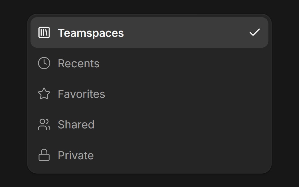 DropdownFluid Functionalism · ReactDropdown menu with fluid hover, animated selection indicator, inline panel or triggered popup with collision-aware…
 Dropdown Menu 07 - ExportShadcn Space · ReactAn export dropdown menu opened from a round button with a circular progress ring, with format items, a more-formats…
 Claude Plus MenuNotra · ReactThe composer's + menu with files, skills, connectors, design system, plugins and research.
 Dropdown Menu 11Watermelon UI · React
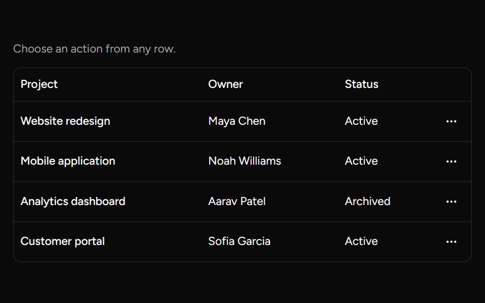 Row Actions Menusv-table · SvelteAn accessible dropdown menu for actions on an individual table row.
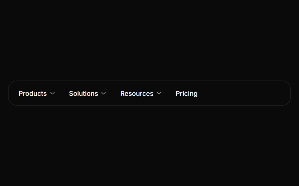 Navigation menuHextaUI · ReactSite navigation with dropdowns, or one full-width panel that stays open while its content slides between menus.
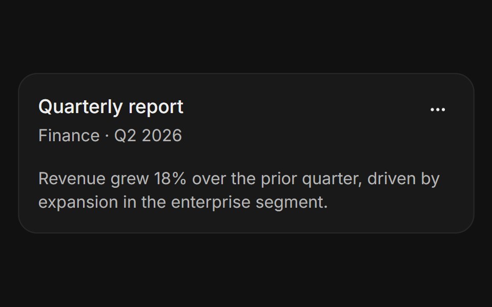 With action menuFLX UI · ReactThree-dot icon button in the header corner opens a dropdown with rename, share, and delete options.
 Froze Column Dropdownsv-particles · Svelte
 Sidebar User FooterFluid Functionalism · ReactFooter identity row: a 20px avatar centred on the rows' leading icon axis, chevron on the trailing action axis, and an…
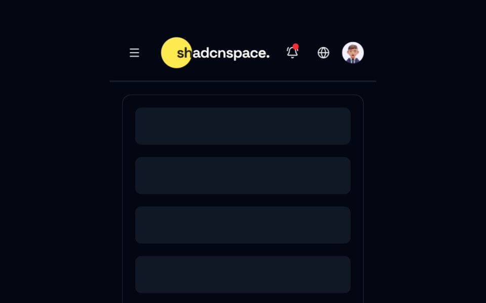 Topbar 02 - Navigation Mega Menu TopbarShadcn Space · ReactMulti level topbar with categorized navigation, quick access links, notifications, and user profile in a clean…
 Gemini Model SelectorNotra · ReactThe Gemini model chip and menu built on shadcn DropdownMenu.
 Dropdown Menu 12Watermelon UI · React
 BasicFLX UI · ReactLabel, separator, and a list of action items.
 Nested Menusv-particles · Svelte
 Sidebar Workspace HeaderFluid Functionalism · ReactWorkspace brand row for a sidebar header: 20px tile on the rows' leading axis, name pinned to the 32px text axis…
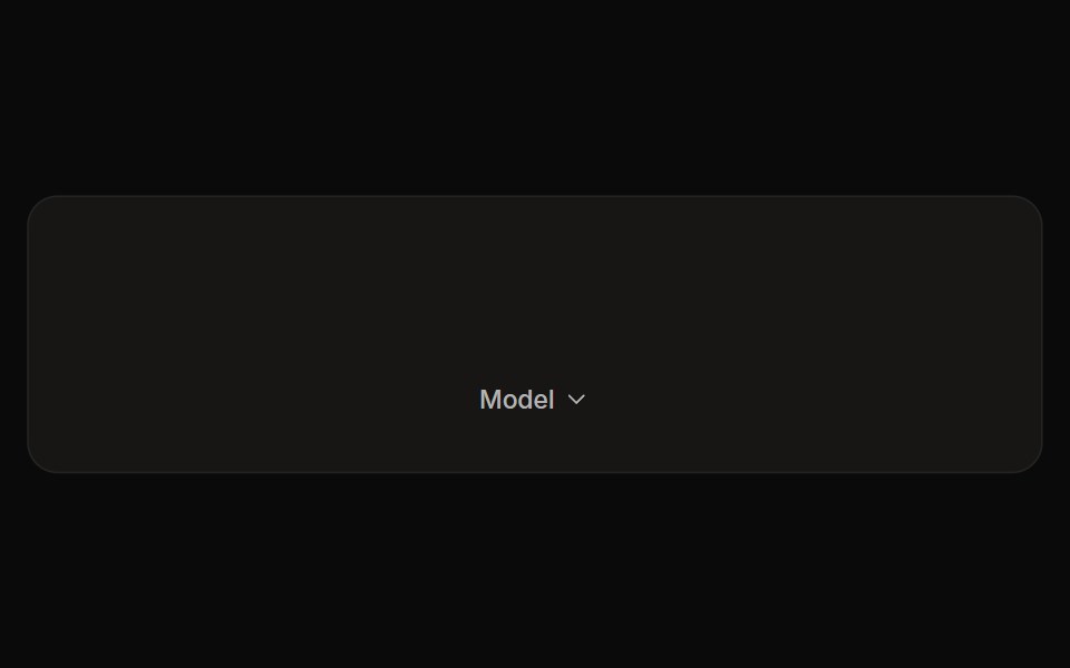 Perplexity Model SelectorNotra · ReactThe Model chip and its provider list with Max/New badges and locks, built on shadcn DropdownMenu.
 Dropdown Menu 13Watermelon UI · React
 With icons and shortcutsFLX UI · ReactLeading icons paired with trailing keyboard shortcuts.
 Sticky Column Dropdownsv-particles · Svelte
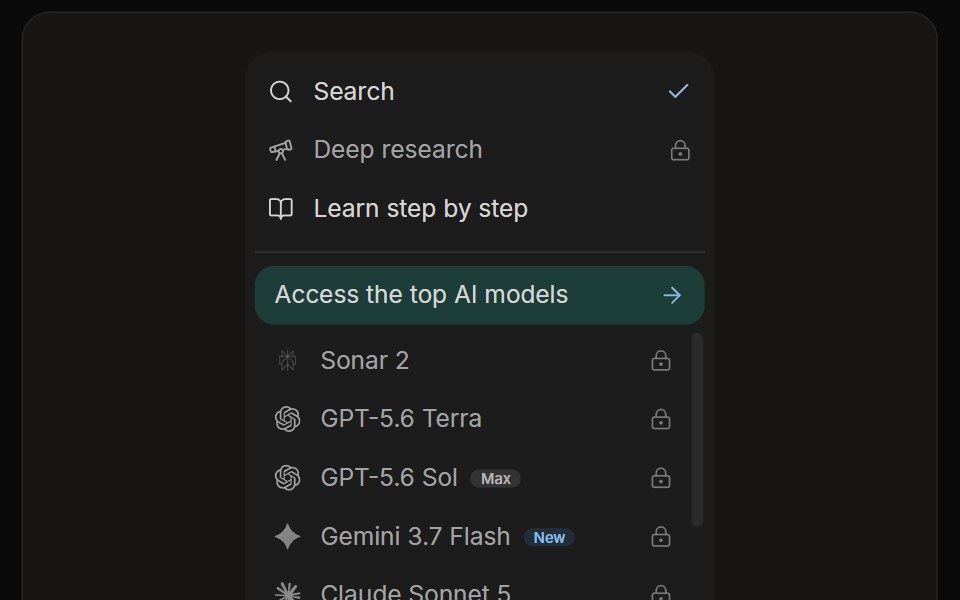 Perplexity Rewrite PanelNotra · ReactThe mode and model list with a Rewrite button.
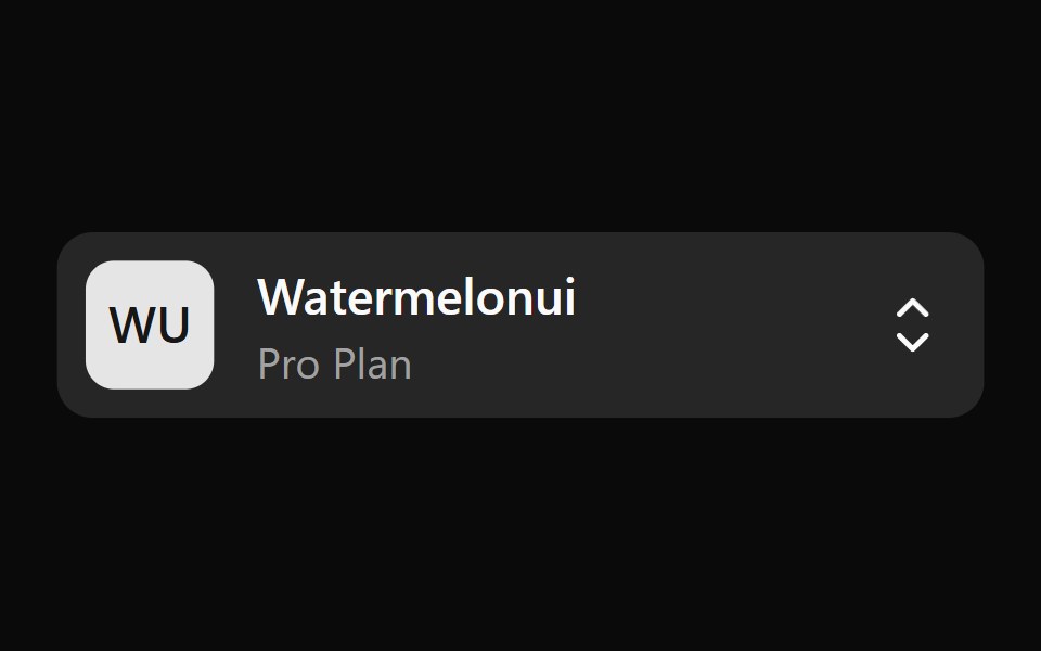 Dropdown Menu 14Watermelon UI · React
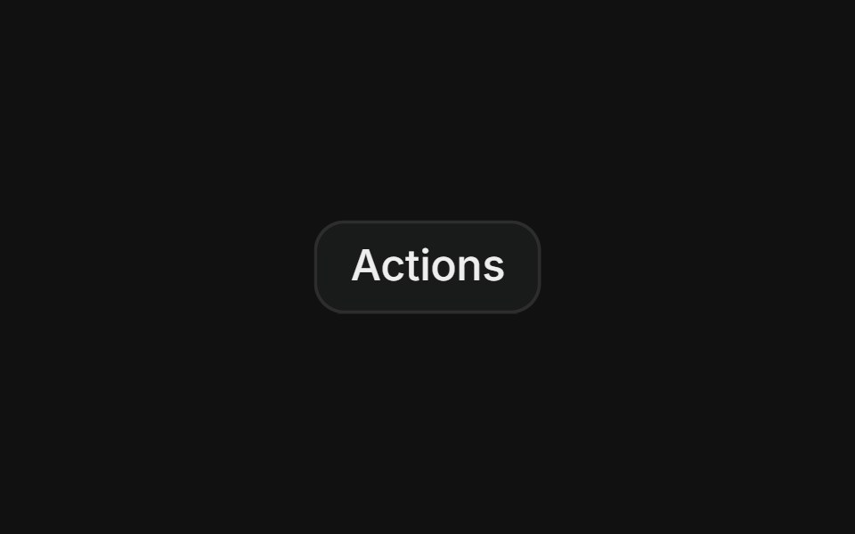 GroupedFLX UI · ReactMultiple labeled groups divided by separators.
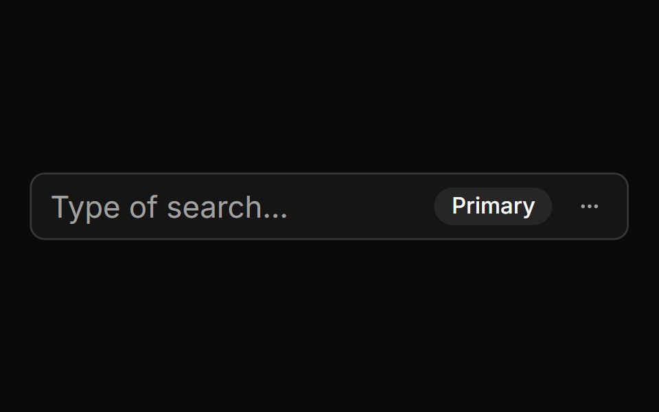 With Badge And Menusv-particles · Svelte
 Dropdown Menu 2Watermelon UI · React
 Destructive itemFLX UI · ReactA red destructive Delete action separated from the regular items.
 With Checkboxsv-particles · Svelte
 Dropdown Menu 3Watermelon UI · React
 Disabled itemsFLX UI · ReactNon-interactive items dimmed with the disabled prop.
 With Checkbox Items As Switchessv-particles · Svelte
 Dropdown Menu 4Watermelon UI · React
 Checkbox itemsFLX UI · ReactToggle multiple view options with checkbox items.
 With Group Labelssv-particles · Svelte
 Dropdown Menu 5Watermelon UI · React
 Radio groupFLX UI · ReactRadio items that keep exactly one option selected at a time.
 With Linksv-particles · Svelte
 Dropdown Menu 6Watermelon UI · React
 SubmenuFLX UI · ReactA menu item that reveals a nested flyout panel with more options.
 With Radio Groupsv-particles · Svelte
 Dropdown Menu 7Watermelon UI · React
 Account menuFLX UI · ReactAvatar trigger with a name and email header block.
 Dropdown Menu 8Watermelon UI · React
 Icon button actionsFLX UI · ReactGhost ellipsis trigger opens a compact actions menu.
 Dropdown Menu 9Watermelon UI · React
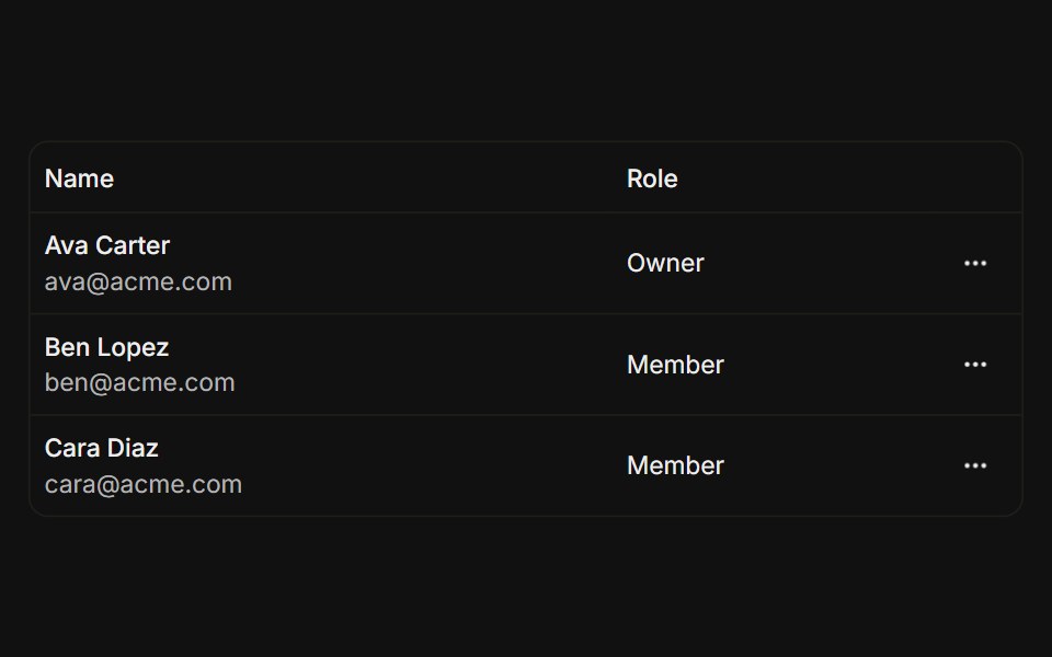 Table row actionsFLX UI · ReactPer-row ellipsis menu with edit, copy, and remove.
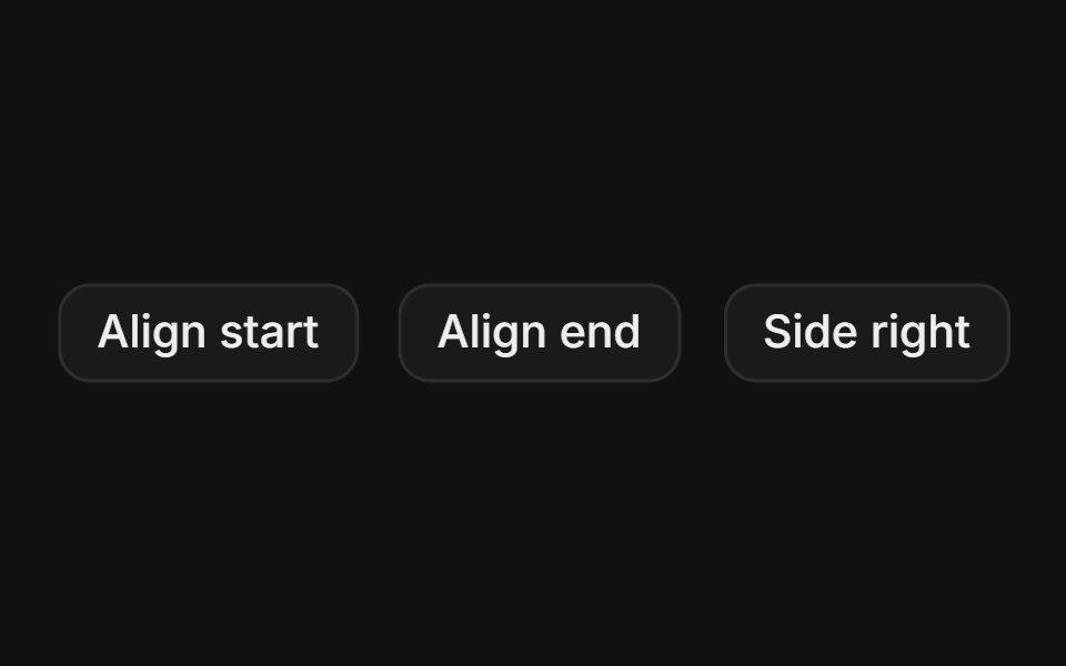 Sides and alignmentFLX UI · ReactAlign start or end and open the menu to the side.
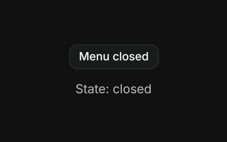 Controlled openFLX UI · ReactMenu whose open/closed state is managed externally and reflected in the trigger label.
 Theme switcherFLX UI · ReactRadio group toggling light, dark, and system themes.
 Multi-select filterFLX UI · ReactCheckbox items with a count badge and a clear action.
 NotificationsFLX UI · ReactBell trigger with an unread badge and an activity list.
 With dialogFLX UI · ReactA menu item opens a controlled confirmation dialog.
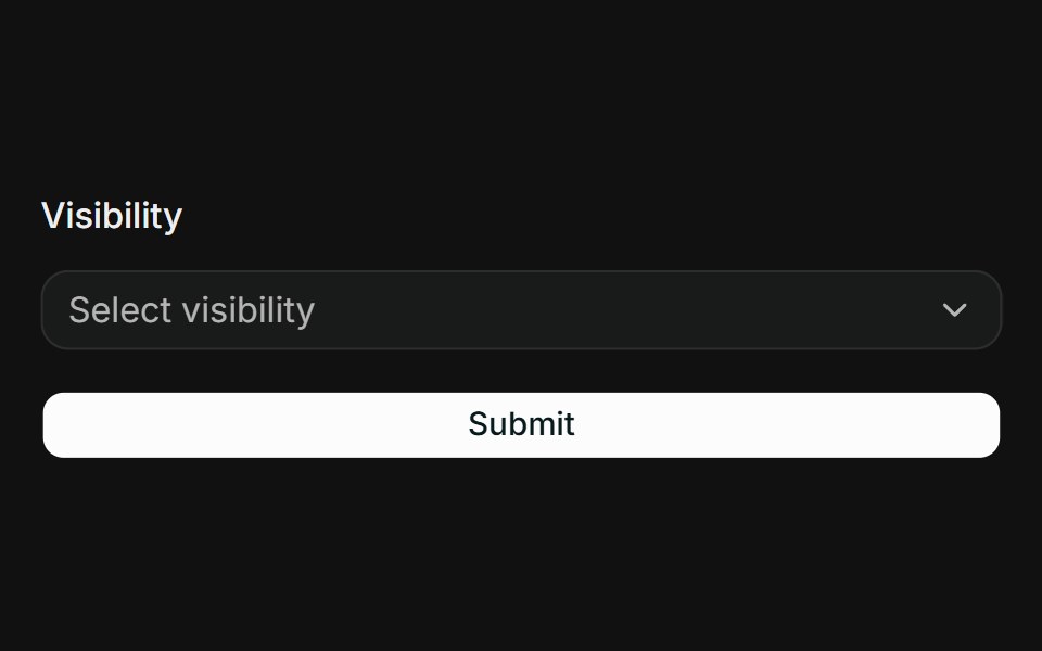 React Hook Form + ZodFLX UI · ReactController binds a radio group to RHF; Zod requires a selection.
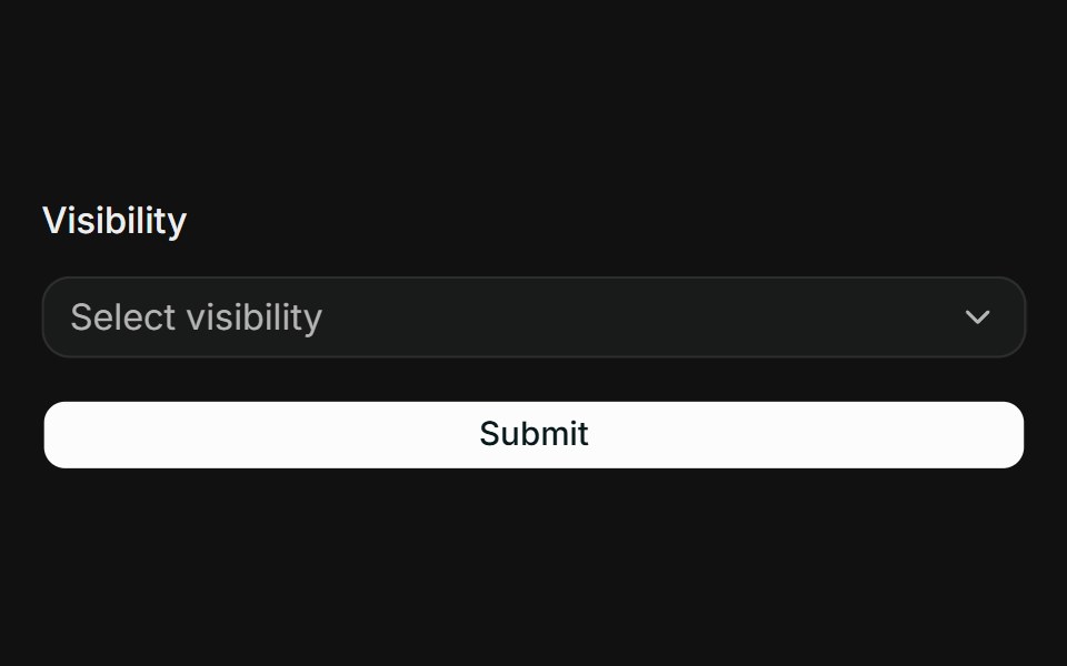 TanStack Form + ZodFLX UI · Reactform.Field wires the radio group; Zod onSubmit surfaces FieldError.
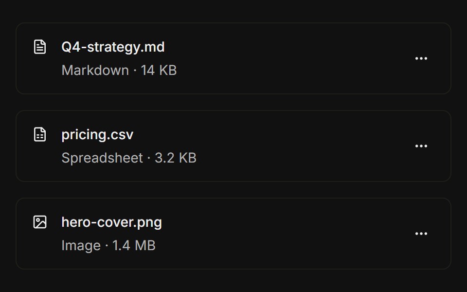 File listFLX UI · ReactFile icon, name, size metadata, and a trailing overflow menu with actions per row.
Libraries with shadcn/ui menu components
Related categories
- Menu Components
- React Menu Components
- Tailwind CSS Menu Components
- Svelte Menu Components
- Animated Menu Components
- shadcn/ui Navigation Components
- shadcn/ui Tabs Components
- shadcn/ui Pagination Components
- shadcn/ui Sidebar Components
- shadcn/ui Command Palette Components
- shadcn/ui Breadcrumb Components
- shadcn/ui Navbar Components
- shadcn/ui Stepper Components
- shadcn/ui Wizard Components