 Dev Design Library
Animated Breadcrumb Components
Dev Design Library indexes 7 Animated breadcrumb components from 7 open-source UI libraries, with the most coming from Arc Library, UI Lab, ReactFrame, Liquefy UI and Fluid Functionalism. Each one links to its page with the source code, a live preview where available, the library license and the install command. These are the breadcrumb components tagged as animated: motion on hover, on scroll or on load, usually built with CSS transitions or Framer Motion. Breadcrumb components belong to the Navigation group.
 BreadcrumbFluid Functionalism · ReactA trail of links to the current page with one fluid hover across every crumb. Steps can lead with an icon, open a…
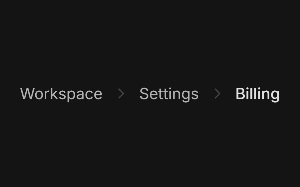 BreadcrumbArc Library · ReactShow where a page sits in a hierarchy.
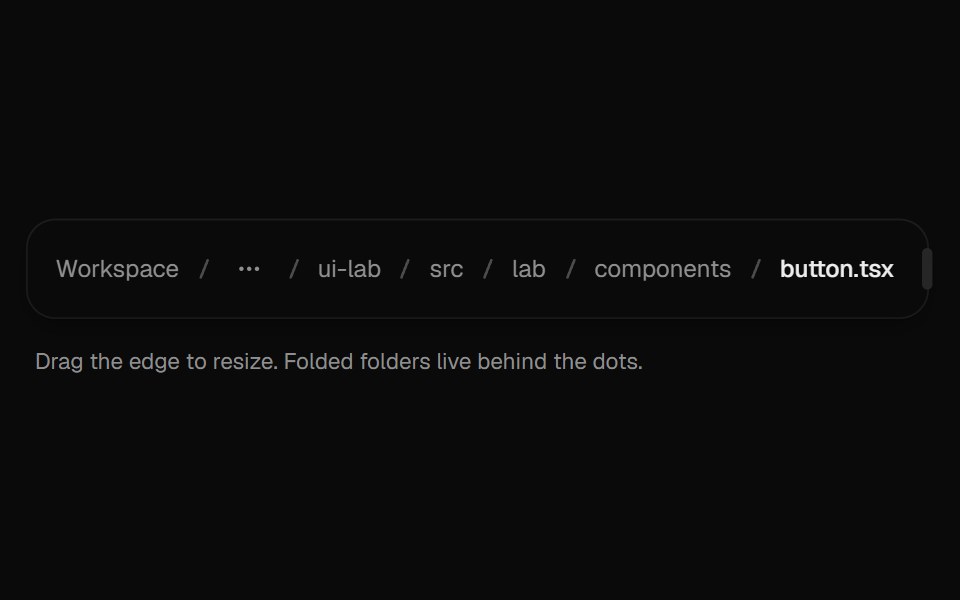 BreadcrumbsUI Lab · ReactFolds the middle of a deep path into a menu when space runs out.
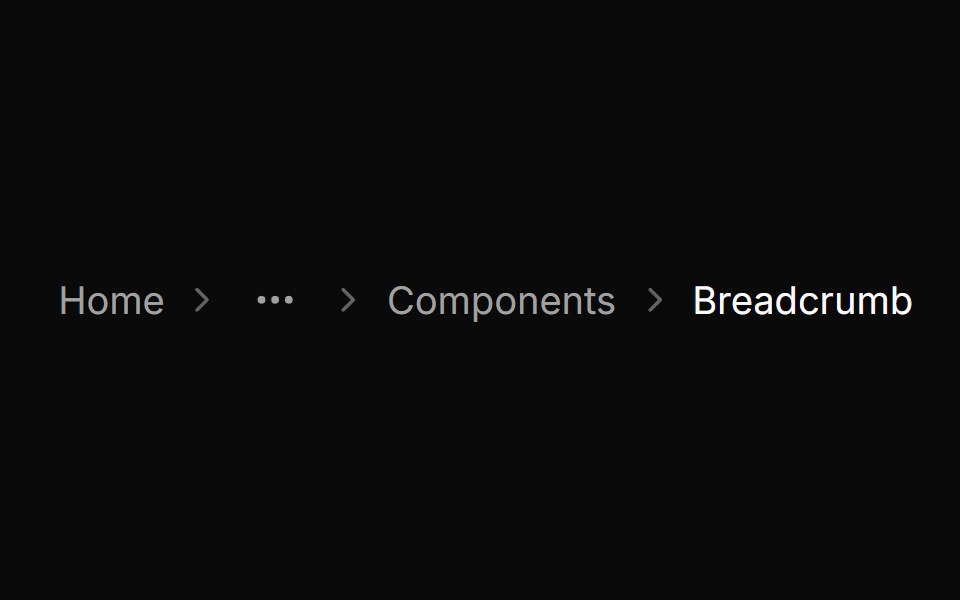 BreadcrumbHextaUI · ReactA trail of links to the current page that wraps safely, mirrors in right-to-left layouts and expands collapsed…
 BreadcrumbsMetal UI · React + SwiftUIWhere you are, as a path you can climb: levels above in ink2, the current in ink, engraved chevrons between; a new…
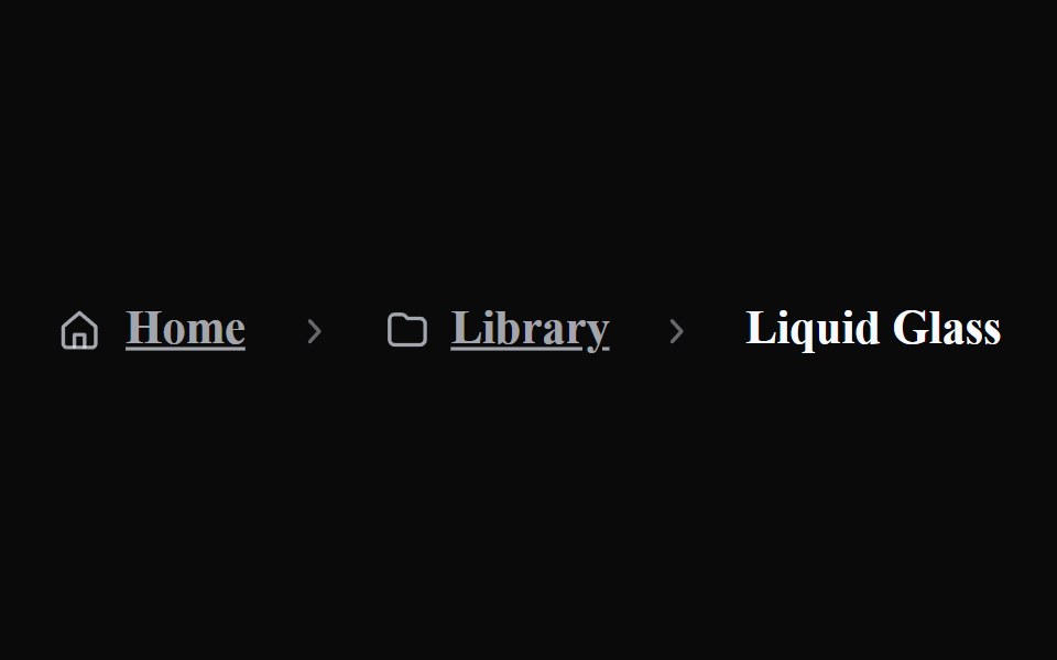 Liquid BreadcrumbsLiquefy UI · ReactBreadcrumb navigation in liquid glass style.
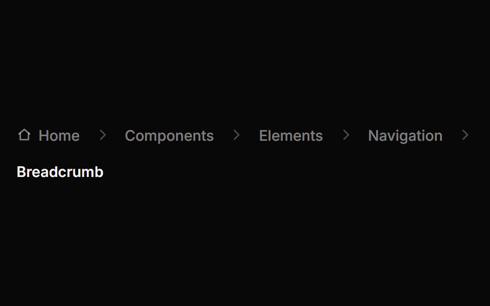 BreadcrumbReactFrame · ReactAn accessible breadcrumb trail with 4 separator styles, an optional home icon, animated collapse of long paths behind…
Libraries with Animated breadcrumb components
Related categories
- Breadcrumb Components
- React Breadcrumb Components
- Tailwind CSS Breadcrumb Components
- shadcn/ui Breadcrumb Components
- Animated Navigation Components
- Animated Menu Components
- Animated Tabs Components
- Animated Navbar Components
- Animated Sidebar Components
- Animated Dock Components
- Animated Stepper Components
- Animated Command Palette Components
- Animated Context Menu Components
- Animated Tab Bar Components
- Animated Pagination Components
- Animated Table Of Contents Components
- Animated Wizard Components
- Animated Hamburger Menu Components
- Animated Floating Navbar Components