 Dev Design Library
React Link Components
Dev Design Library indexes 53 React link components from 32 open-source UI libraries, with the most coming from MicroKit, React Spectrum, SpaceUI, Chakra UI and ReUI. Each one links to its page with the source code, a live preview where available, the library license and the install command. Every library in this list targets React. Link components belong to the Actions group.
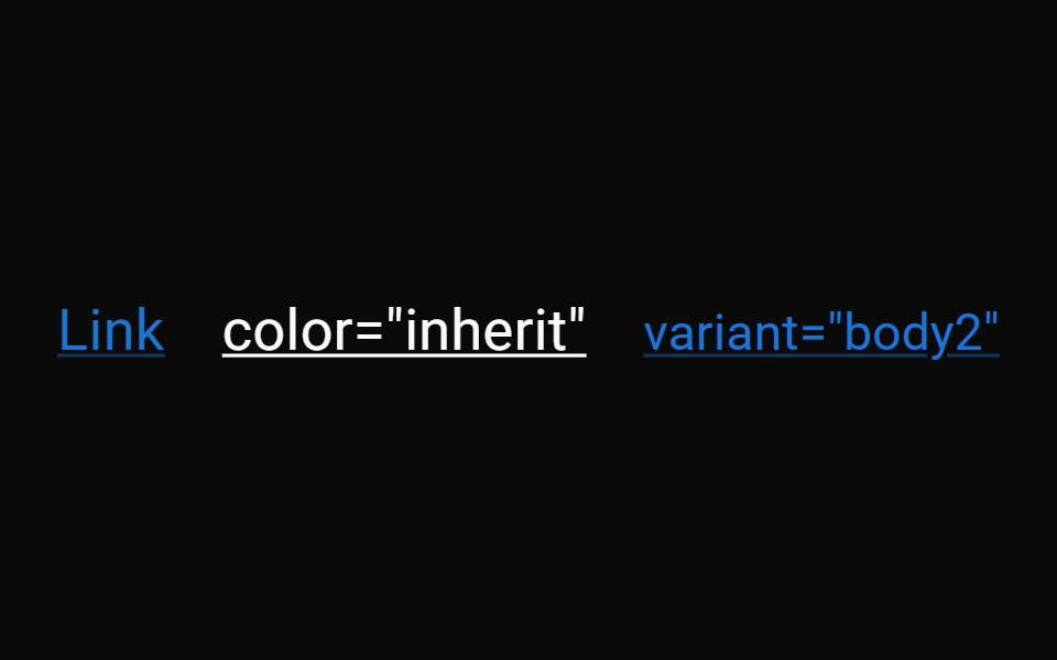 LinkMUI / Material UI · React
 LinkChakra UI · ReactUsed to provide accessible navigation
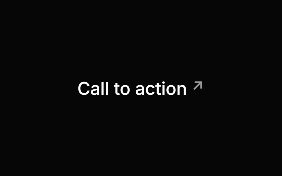 LinkHeroUI · ReactA styled anchor component for navigation with built-in icon support
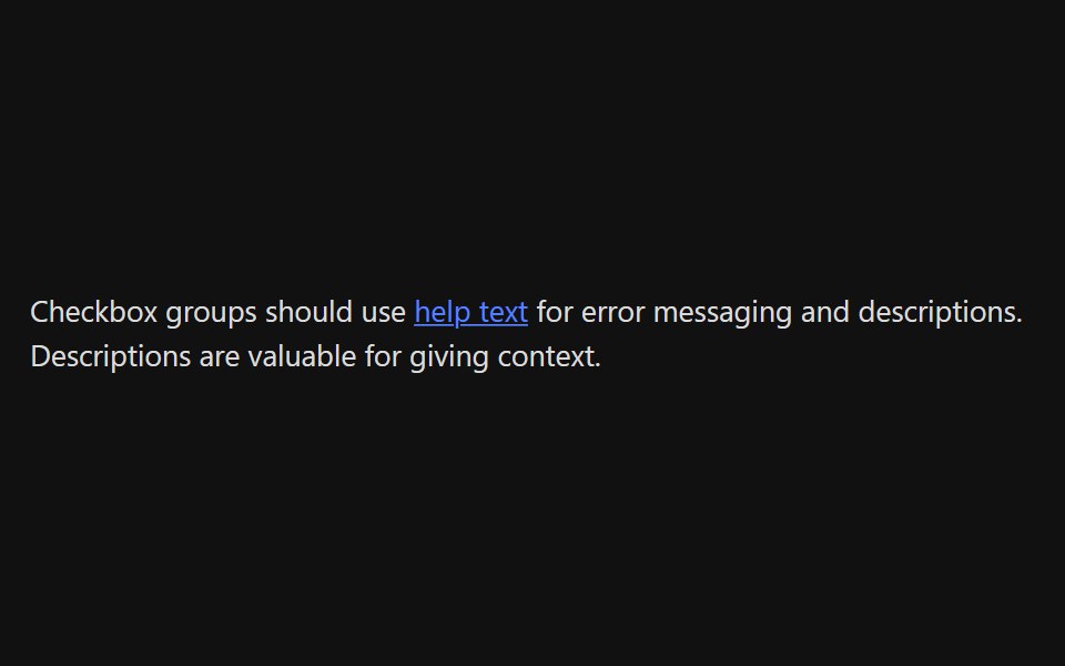 LinkReact Spectrum · ReactLinks allow users to navigate to a different location. They can be presented inline inside a paragraph or as…
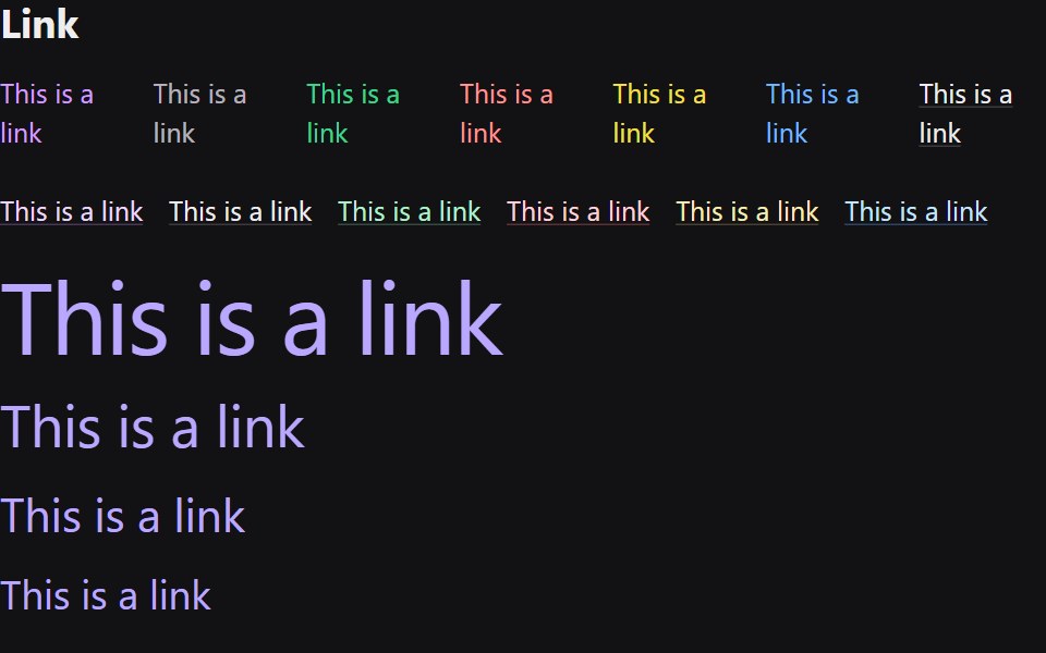 LinkRadix Themes · React
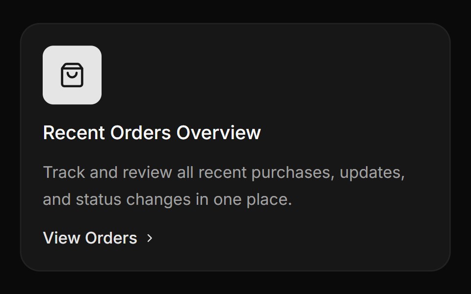 Card with icon, title and linkReUI · ReactCard with icon, title and link
 Linkpdfcn · ReactLink PDF component (forme)
 Hover Link CardAmicro Micro Transitions · ReactRounded pill button labeled "Portfolio" with hover scale-up and floating URL.
 LinkPark UI · ReactA navigation component for creating accessible hyperlinks.
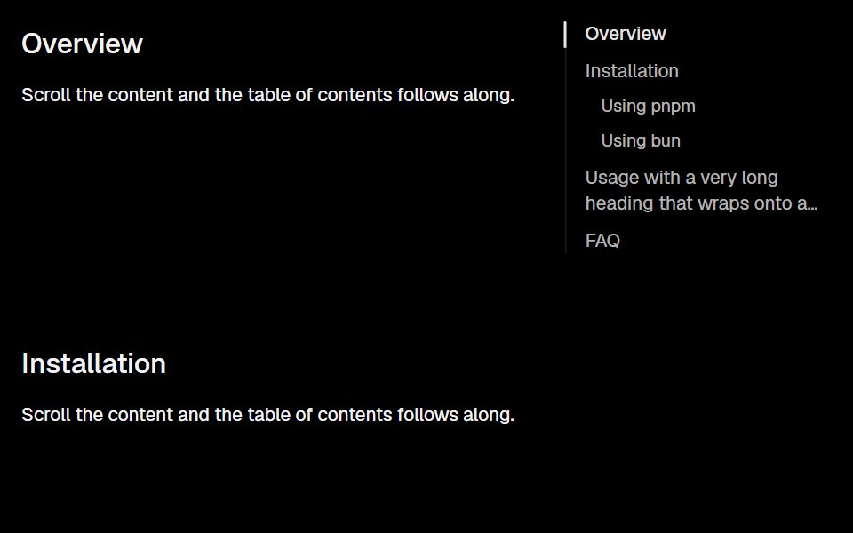 AnchorLobe UI · React
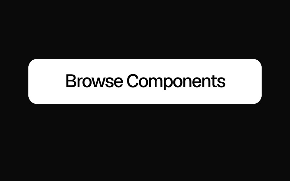 Slide Text ButtonKokonut UI · ReactAnimated link button with a vertical text slide on hover and default and ghost variants, built with React, Next.js…
 linkIntent UI · Reactlink
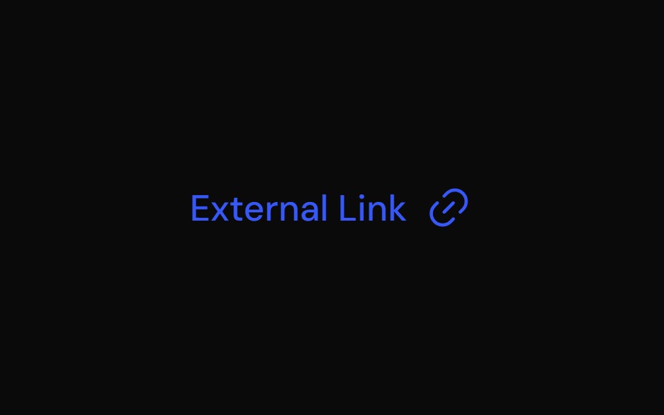 LinkTailGrids · ReactA link component with multiple variants.
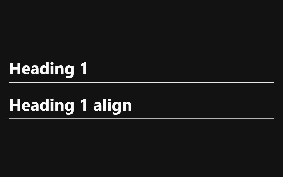 Heading With AnchorSpectrum UI · Reactcomponent for the Heading With Anchor
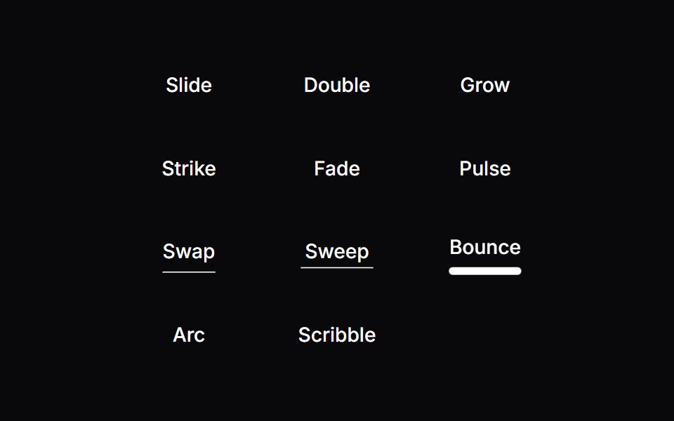 Line Hover LinkVengeance UI · ReactAnimated hover underline styles
 AnchorToolcraft · React
 Link ButtonLaunch UI · React
 Badge-05 - LinkShadcn Space · ReactBadge component
 Copy EmailOpenSourceUI · ReactCopies the maintainer email on click — no mailto / mailbox popup. Hover shows “Click to copy”; after click shows…
 Hover ImgObsidianUI · React
 Animated LinkGreatUI · React
 Link OverlayShark UI · ReactMakes the whole card or article clickable.
 LinkPreviewSona UI · ReactThe `LinkPreview` component is an interactive UI element that displays a preview of a link when hovered over. It…
 Preview Link CardWatermelon UI · React
 Copy EmailUI Lab · ReactClick the address and its letters flip, one by one, into \
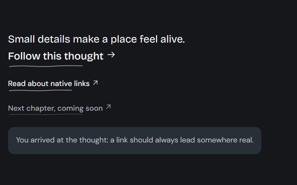 Living linkCojeev UI · ReactA native link with a drawn ink contour, directional underline reveals, or an organic pigment wash.
 Contact Details RevealMicroKit · ReactA compact white contact label that shifts upward to reveal muted contact details with an orange accent.
 Link ButtonHalaska UI · React
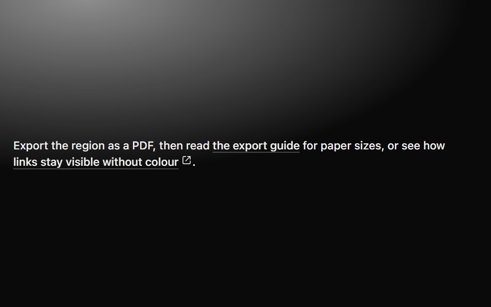 LinkMetal UI · React + SwiftUIAn inline destination with a persistent engraved underline, directional hover emphasis, press travel…
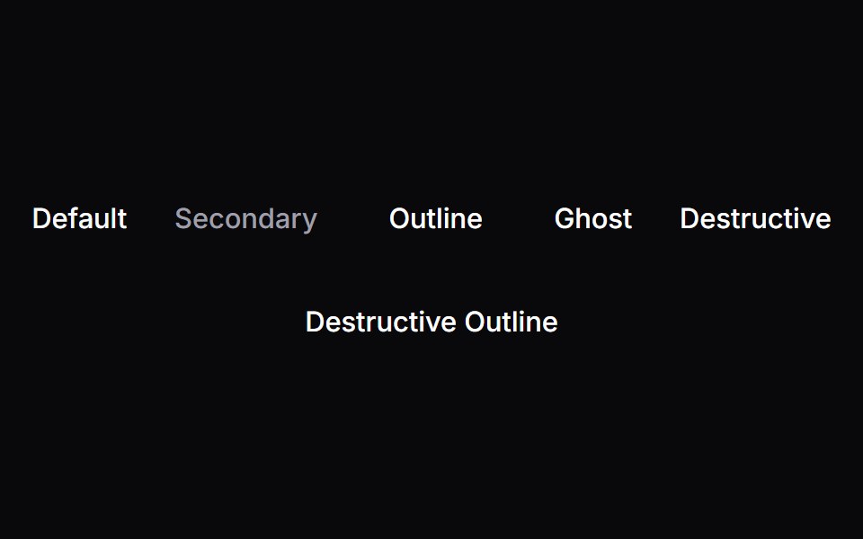 LinkSpaceUI · ReactAllows users to navigate to other pages or external websites with clear hover underlines and accessible link styling.
 Draw Underline LinkSora UI · ReactA link with a hand-drawn SVG underline that animates on hover, powered by Motion.
 LinkOUI · ReactReact aria components Link with shadcn characteristics.
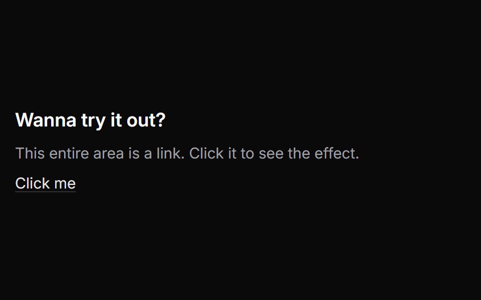 Link OverlayChakra UI · ReactUsed to stretch a link over a container.
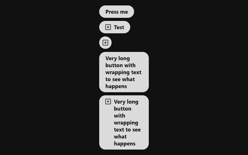 Link ButtonReact Spectrum · ReactA LinkButton combines the functionality of a link with the appearance of a button. Useful for allowing users to…
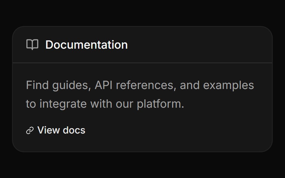 Card with header label and linkReUI · ReactCard with header label and link
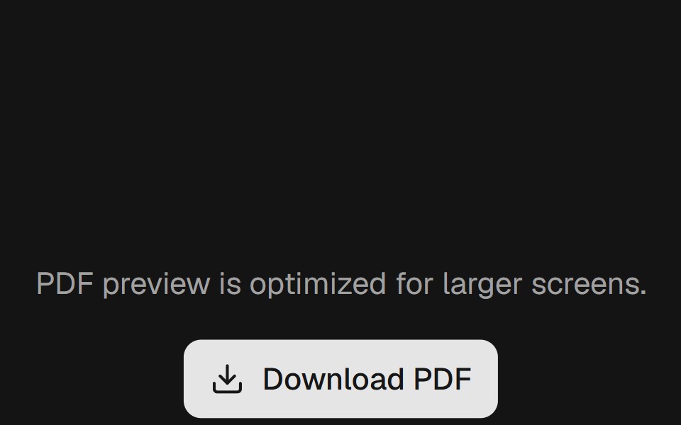 Linkpdfcn · ReactLink PDF component (takumi)
 Button Focus Blur LinksAmicro Micro Transitions · React
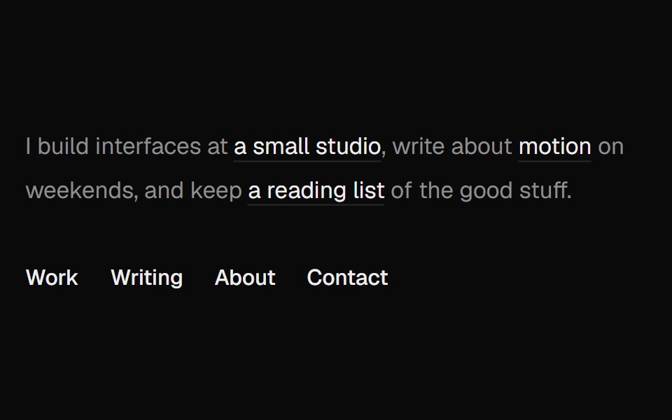 Directional UnderlineUI Lab · ReactThe underline comes in from the side your cursor entered and leaves toward the side it left.
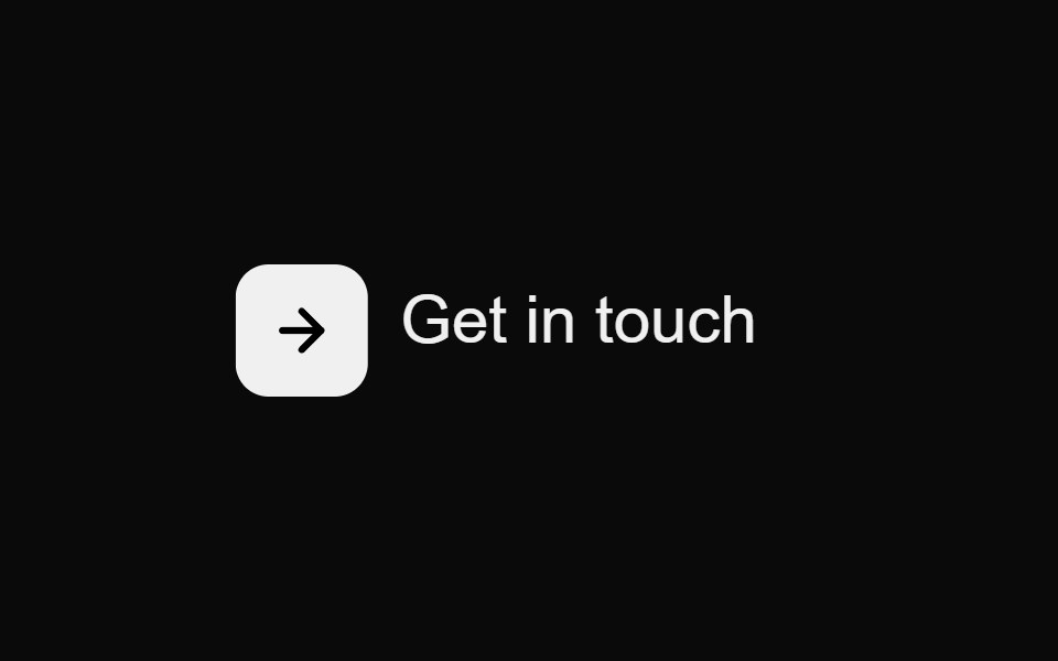 Contact Underline ButtonMicroKit · ReactA compact contact action whose icon turns orange while an underline draws beneath the label.
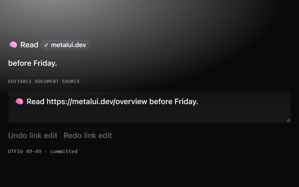 Link cueMetal UI · React + SwiftUIA real URL host-chip link and a separate anchored source field, with an explicit footprint and one confirmed…
 Github LinkSpaceUI · React
 Hover LinkSora UI · ReactFive CSS-only link hover presets — three underline wipes and two block highlights — with an optional sliding arrow.
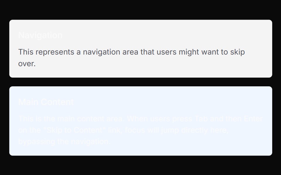 Skip NavChakra UI · ReactSkip Nav Link allows keyboard users to skip to the main content of the page.
 Tailwind LinkReact Spectrum · React
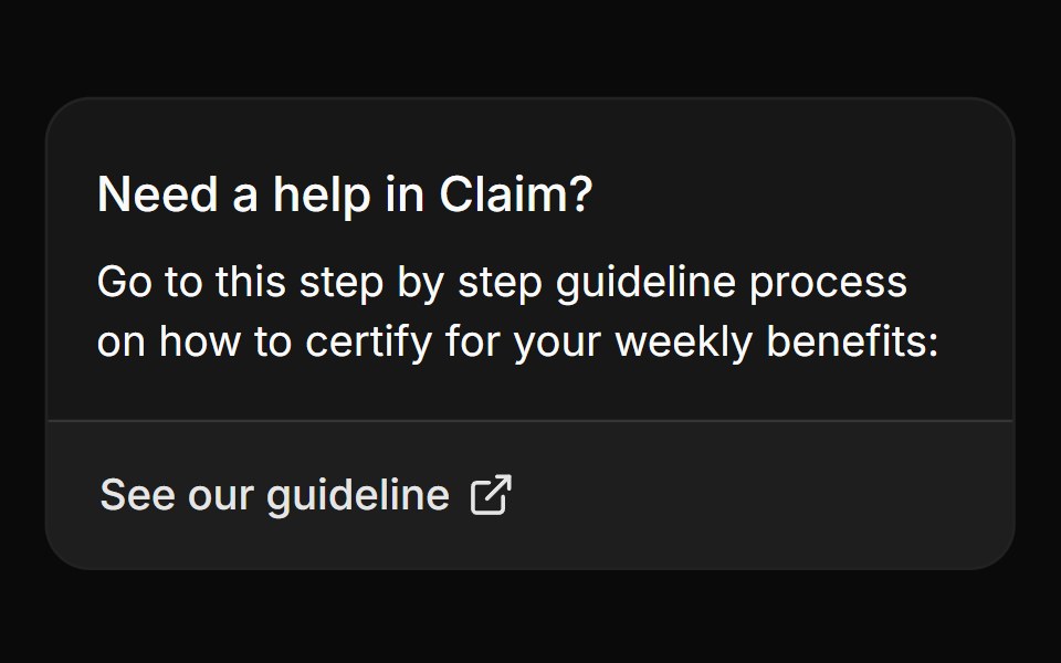 Card with linkReUI · ReactCard with link
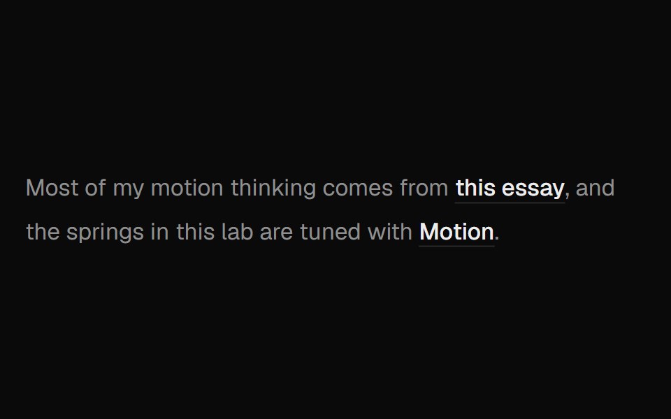 Hover Preview LinkUI Lab · ReactHover a link to get a preview card that trails your cursor and leans as it moves.
 Gradient Underline ButtonMicroKit · ReactA label that scales up as a warm gradient underline grows across it.
 Github Link ClientSpaceUI · React
 Vanilla LinkReact Spectrum · React
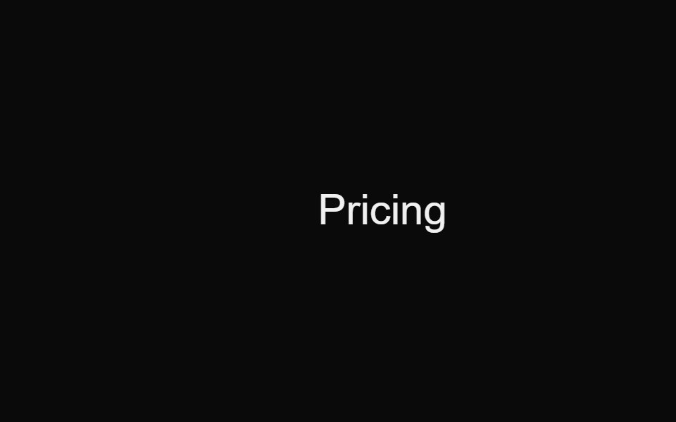 Pricing Slide LinkMicroKit · ReactA text link whose arrow slides in from the left as the label settles into place.
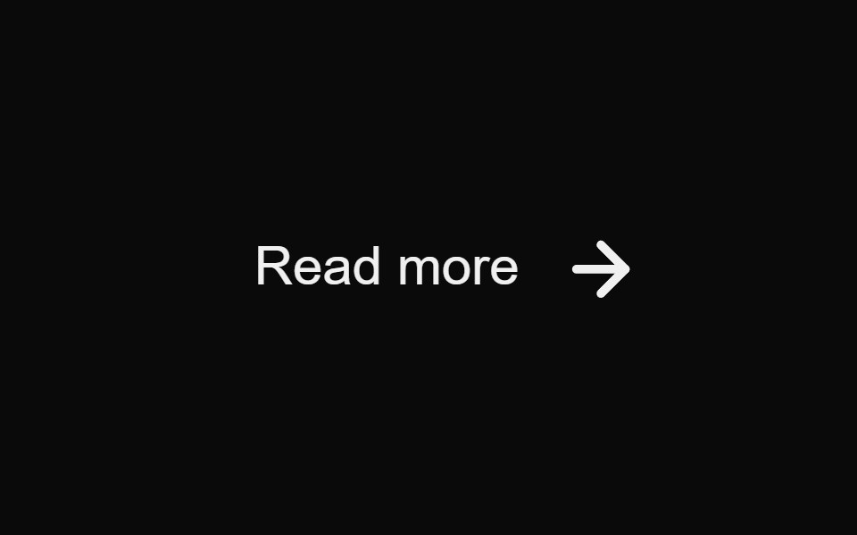 Read More SwapMicroKit · ReactA text link whose arrow swaps from the right side to an orange leading arrow on hover.
 Sliding Arrow LabelMicroKit · ReactA text label that gets a bright surface while an arrow slides in beside it.
 View More Text SwapMicroKit · ReactA borderless View More label that swaps vertically on hover.
Libraries with React link components
Related categories
- Link Components
- Tailwind CSS Link Components
- React Action Components
- React Button Components
- React Button Group Components
- React Toggle Button Components
- React Icon Button Components
- React Theme Toggle Components
- React Copy Button Components
- React CTA Button Components
- React Like Button Components
- React FAB Components
- React Share Button Components
- React Slide To Confirm Components
- React Social Login Button Components
- React Download Button Components
- React Hold Button Components
- React Submit Button Components