 Dev Design Library
Tailwind CSS Link Components
Dev Design Library indexes 49 Tailwind CSS link components from 28 open-source UI libraries, with the most coming from MicroKit, sv-particles, React Spectrum, SpaceUI and ReUI. Each one links to its page with the source code, a live preview where available, the library license and the install command. Every library in this list styles its components with Tailwind CSS utility classes. Link components belong to the Actions group.
 LinkdaisyUI · CSS (Tailwind)
 LinkHeroUI · ReactA styled anchor component for navigation with built-in icon support
 LinkReact Spectrum · ReactLinks allow users to navigate to a different location. They can be presented inline inside a paragraph or as…
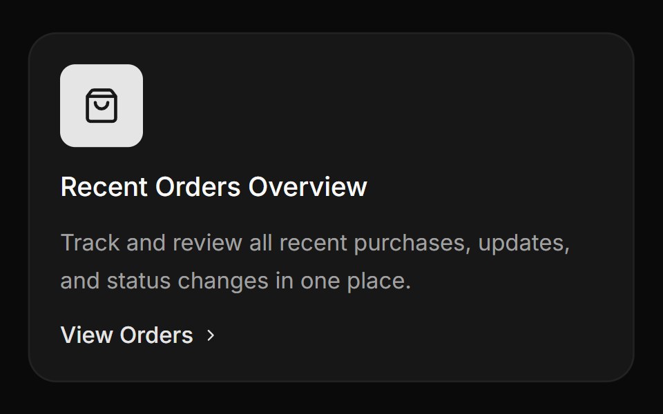 Card with icon, title and linkReUI · ReactCard with icon, title and link
 Hover Link CardAmicro Micro Transitions · ReactRounded pill button labeled "Portfolio" with hover scale-up and floating URL.
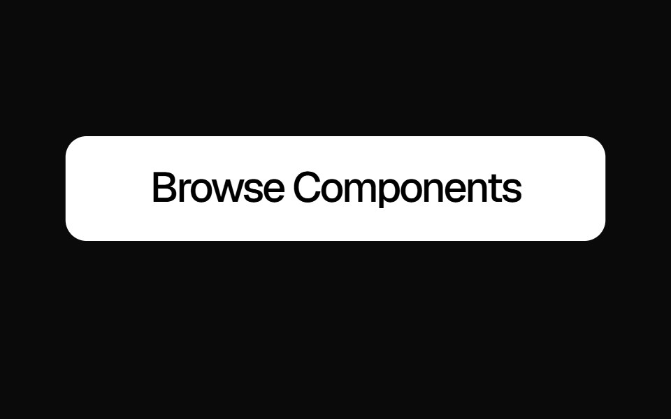 Slide Text ButtonKokonut UI · ReactAnimated link button with a vertical text slide on hover and default and ghost variants, built with React, Next.js…
 linkIntent UI · Reactlink
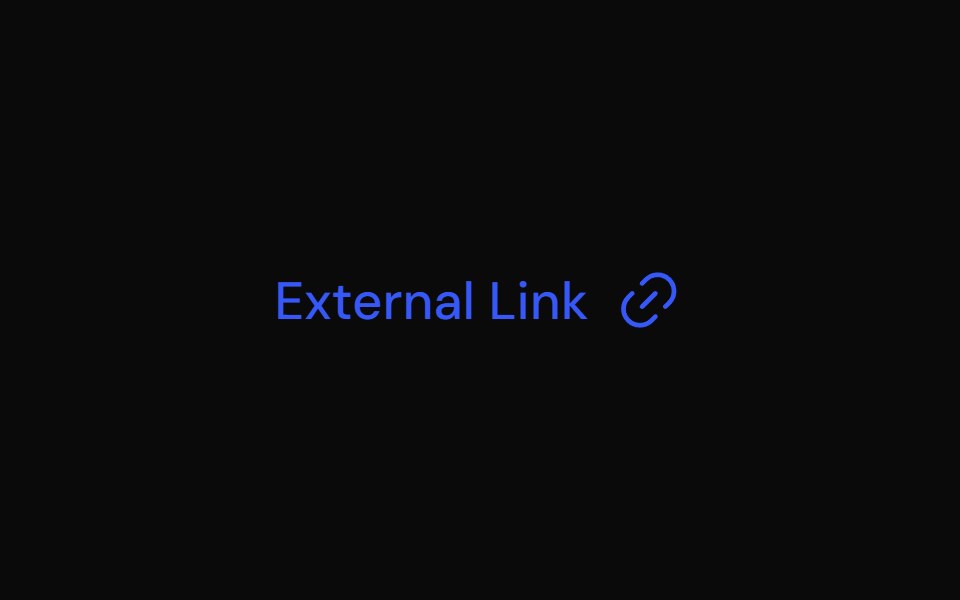 LinkTailGrids · ReactA link component with multiple variants.
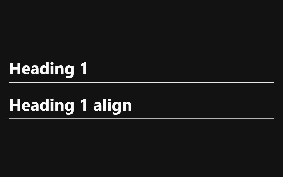 Heading With AnchorSpectrum UI · Reactcomponent for the Heading With Anchor
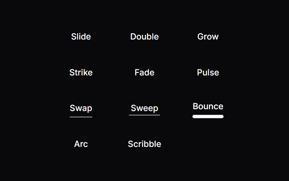 Line Hover LinkVengeance UI · ReactAnimated hover underline styles
 AnchorToolcraft · React
 Link ButtonLaunch UI · React
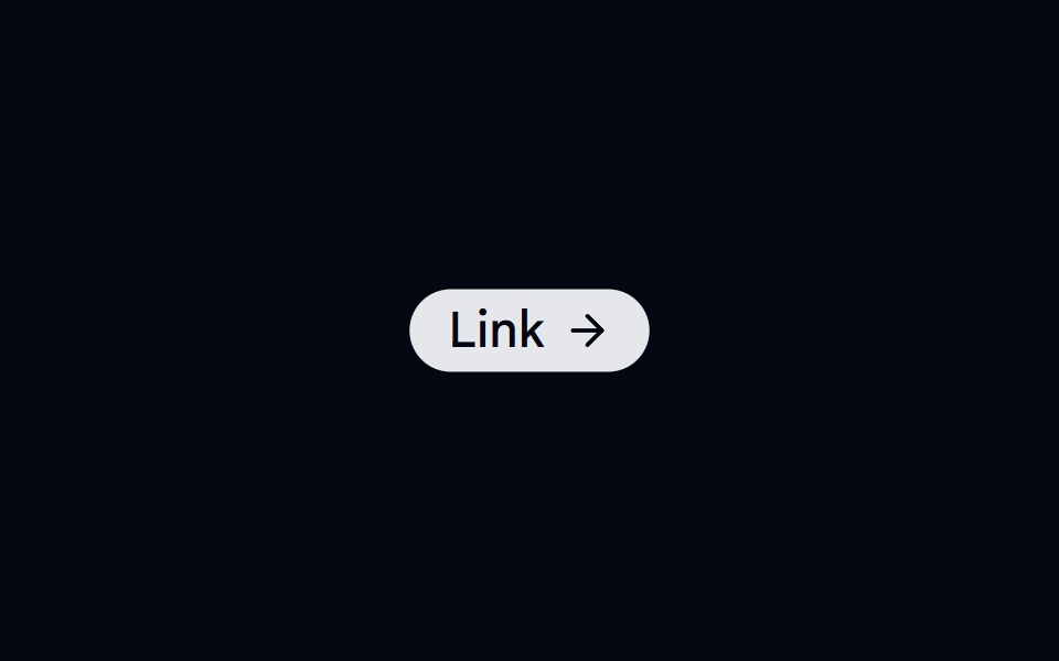 Badge-05 - LinkShadcn Space · ReactBadge component
 Copy EmailOpenSourceUI · ReactCopies the maintainer email on click — no mailto / mailbox popup. Hover shows “Click to copy”; after click shows…
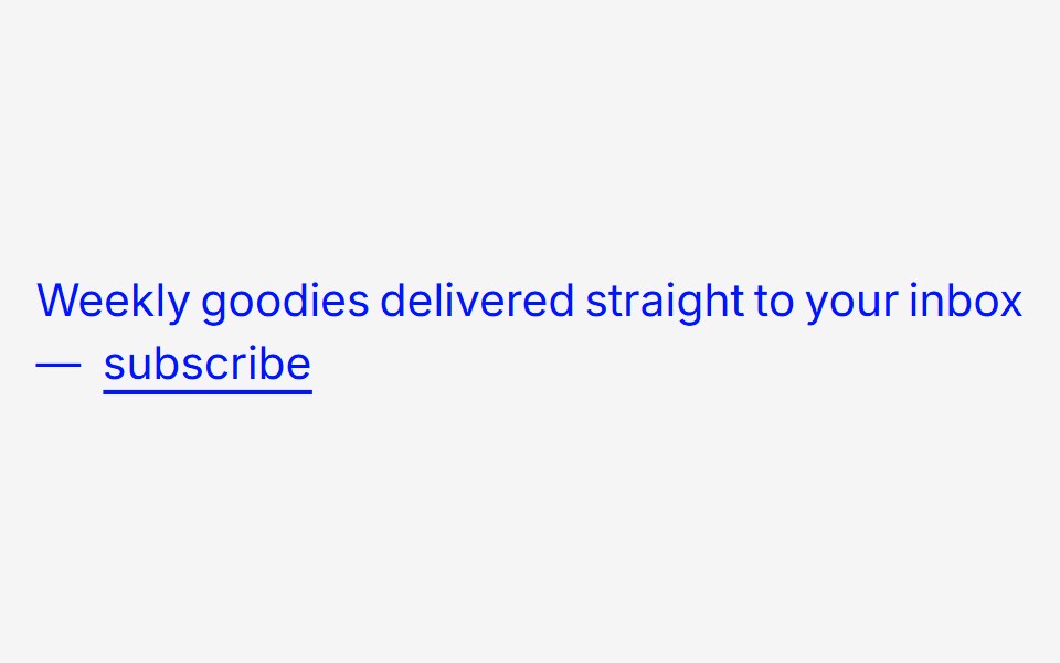 Fancy Underline To BackgroundAnimations (Svelte) · Svelte
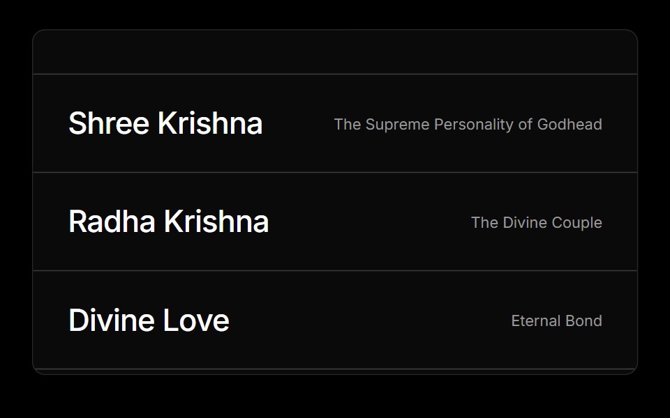 Hover ImgObsidianUI · React
 Animated LinkGreatUI · React
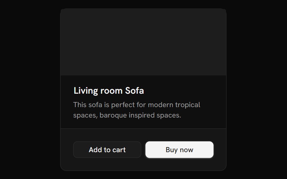 Link OverlayShark UI · ReactMakes the whole card or article clickable.
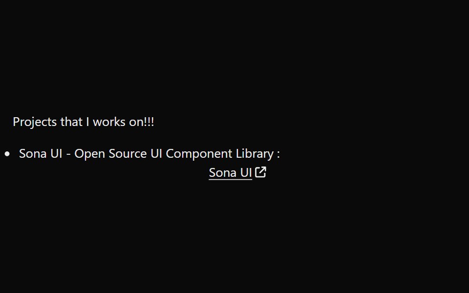 LinkPreviewSona UI · ReactThe `LinkPreview` component is an interactive UI element that displays a preview of a link when hovered over. It…
 Preview Link CardWatermelon UI · React
 Copy EmailUI Lab · ReactClick the address and its letters flip, one by one, into \
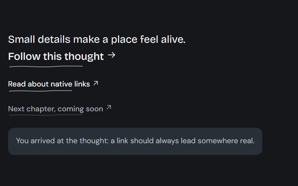 Living linkCojeev UI · ReactA native link with a drawn ink contour, directional underline reveals, or an organic pigment wash.
 Contact Details RevealMicroKit · ReactA compact white contact label that shifts upward to reveal muted contact details with an orange accent.
 Back Link Chevronsv-particles · Svelte
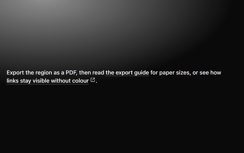 LinkMetal UI · React + SwiftUIAn inline destination with a persistent engraved underline, directional hover emphasis, press travel…
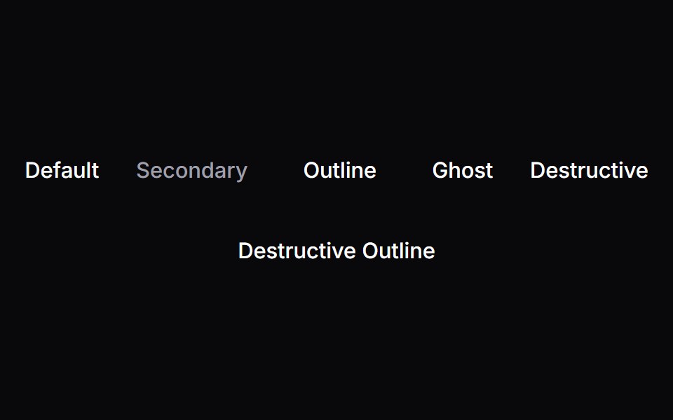 LinkSpaceUI · ReactAllows users to navigate to other pages or external websites with clear hover underlines and accessible link styling.
 Draw Underline LinkSora UI · ReactA link with a hand-drawn SVG underline that animates on hover, powered by Motion.
 LinkOUI · ReactReact aria components Link with shadcn characteristics.
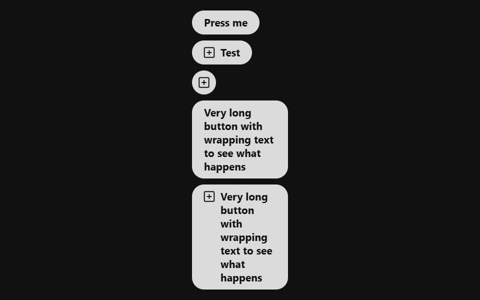 Link ButtonReact Spectrum · ReactA LinkButton combines the functionality of a link with the appearance of a button. Useful for allowing users to…
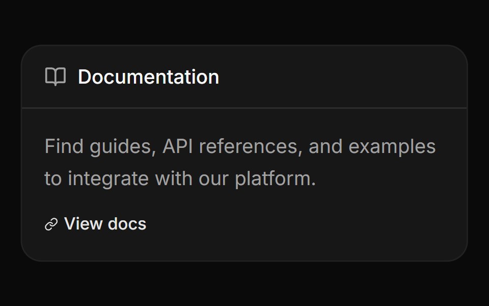 Card with header label and linkReUI · ReactCard with header label and link
 Button Focus Blur LinksAmicro Micro Transitions · React
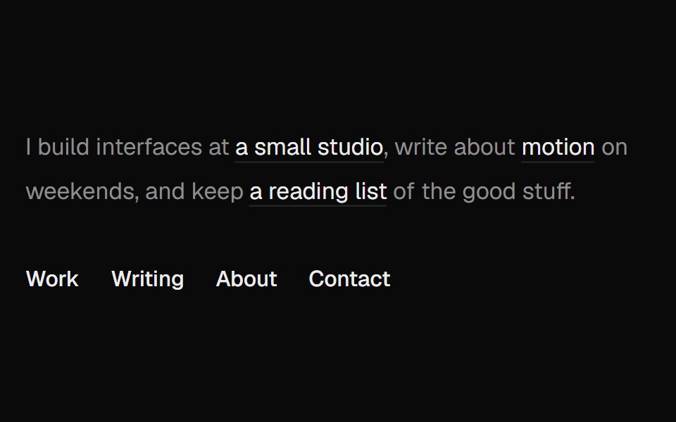 Directional UnderlineUI Lab · ReactThe underline comes in from the side your cursor entered and leaves toward the side it left.
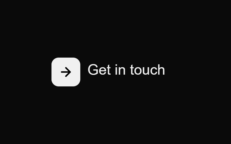 Contact Underline ButtonMicroKit · ReactA compact contact action whose icon turns orange while an underline draws beneath the label.
 Linksv-particles · Svelte
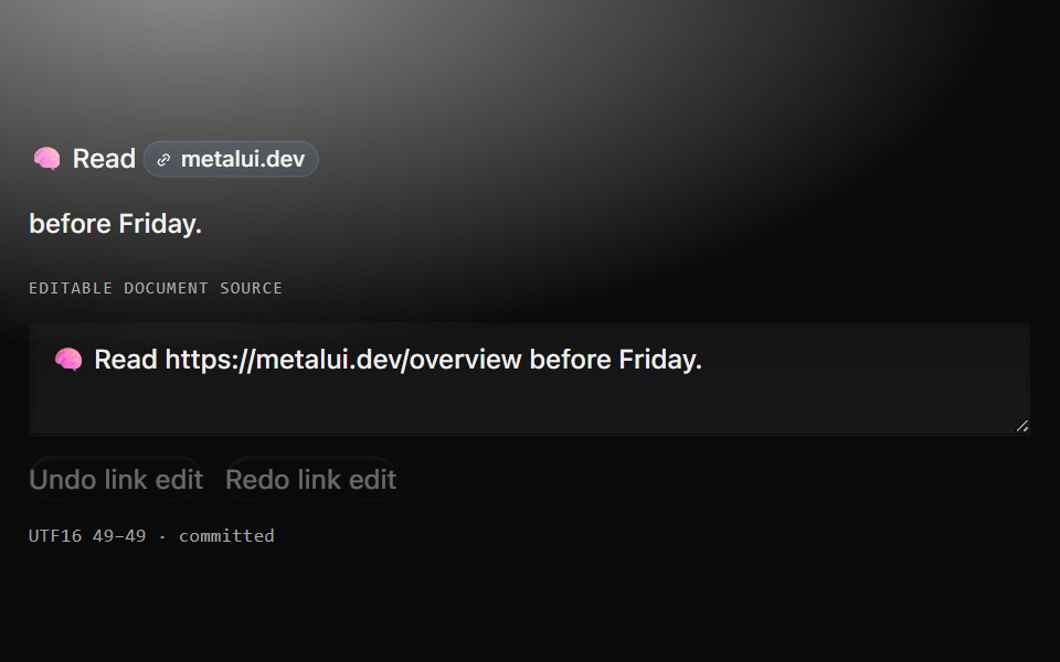 Link cueMetal UI · React + SwiftUIA real URL host-chip link and a separate anchored source field, with an explicit footprint and one confirmed…
 Github LinkSpaceUI · React
 Hover LinkSora UI · ReactFive CSS-only link hover presets — three underline wipes and two block highlights — with an optional sliding arrow.
 Tailwind LinkReact Spectrum · React
 Card with linkReUI · ReactCard with link
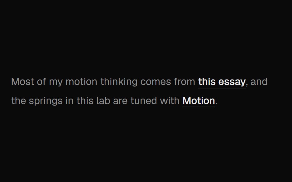 Hover Preview LinkUI Lab · ReactHover a link to get a preview card that trails your cursor and leans as it moves.
 Gradient Underline ButtonMicroKit · ReactA label that scales up as a warm gradient underline grows across it.
 Link Buttonsv-particles · Svelte
 Github Link ClientSpaceUI · React
 Vanilla LinkReact Spectrum · React
 Pricing Slide LinkMicroKit · ReactA text link whose arrow slides in from the left as the label settles into place.
 With Linksv-particles · Svelte
 Read More SwapMicroKit · ReactA text link whose arrow swaps from the right side to an orange leading arrow on hover.
 Sliding Arrow LabelMicroKit · ReactA text label that gets a bright surface while an arrow slides in beside it.
 View More Text SwapMicroKit · ReactA borderless View More label that swaps vertically on hover.
Libraries with Tailwind CSS link components
Related categories
- Link Components
- React Link Components
- Tailwind CSS Action Components
- Tailwind CSS Button Components
- Tailwind CSS Button Group Components
- Tailwind CSS Toggle Button Components
- Tailwind CSS Icon Button Components
- Tailwind CSS CTA Button Components
- Tailwind CSS Copy Button Components
- Tailwind CSS Theme Toggle Components
- Tailwind CSS Like Button Components
- Tailwind CSS Social Login Button Components
- Tailwind CSS FAB Components
- Tailwind CSS Download Button Components
- Tailwind CSS Slide To Confirm Components
- Tailwind CSS Hold Button Components
- Tailwind CSS Submit Button Components
- Tailwind CSS Send Button Components