 Dev Design Library
Tailwind CSS Icon Button Components
Dev Design Library indexes 59 Tailwind CSS icon button components from 22 open-source UI libraries, with the most coming from Amicro Micro Transitions, Oxbow UI, Notra, beUI and OpenSourceUI. Each one links to its page with the source code, a live preview where available, the library license and the install command. Every library in this list styles its components with Tailwind CSS utility classes. Icon button components belong to the Actions group.
 Close ButtonHeroUI · ReactButton component for closing dialogs, modals, or dismissing content.
 Action MenuReact Spectrum · ReactActionMenu combines an ActionButton with a Menu for simple "more actions" use cases.
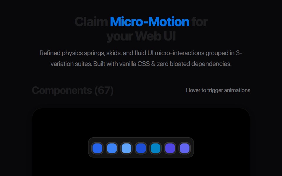 Bookmark Save PillAmicro Micro Transitions · ReactInteractive Save / Saved state pill toggle with icon morph.
 Play Button IconUntitled UI React · ReactRounded play icon with blurred background and a filled triangle in the middle.
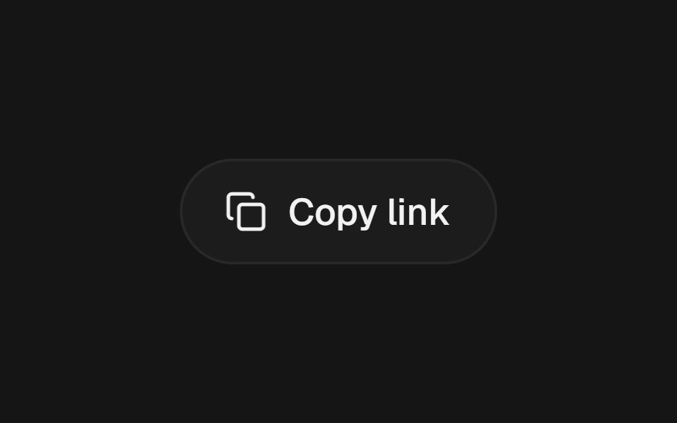 Action SwapbeUI · React
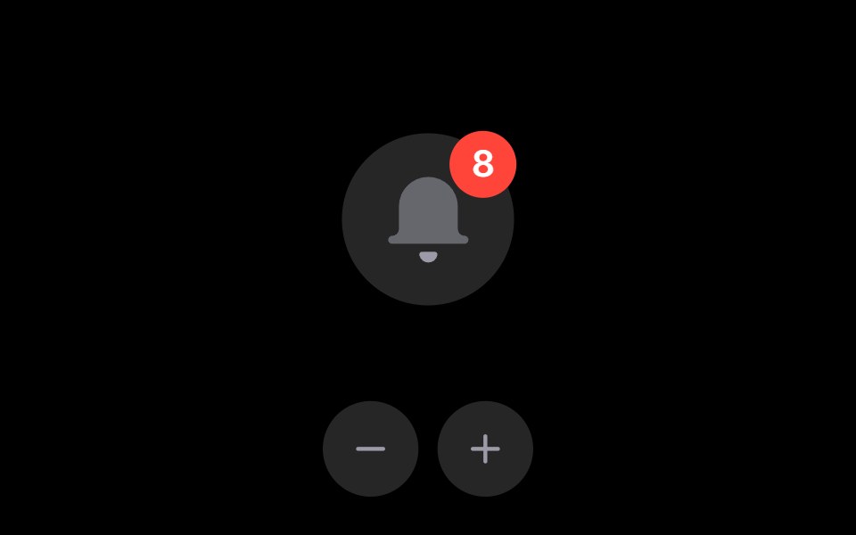 Notification BellRare UI · ReactAn iOS-style notification bell with an unread count badge.
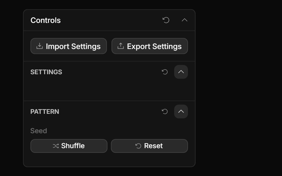 Actions ControlToolcraft · React
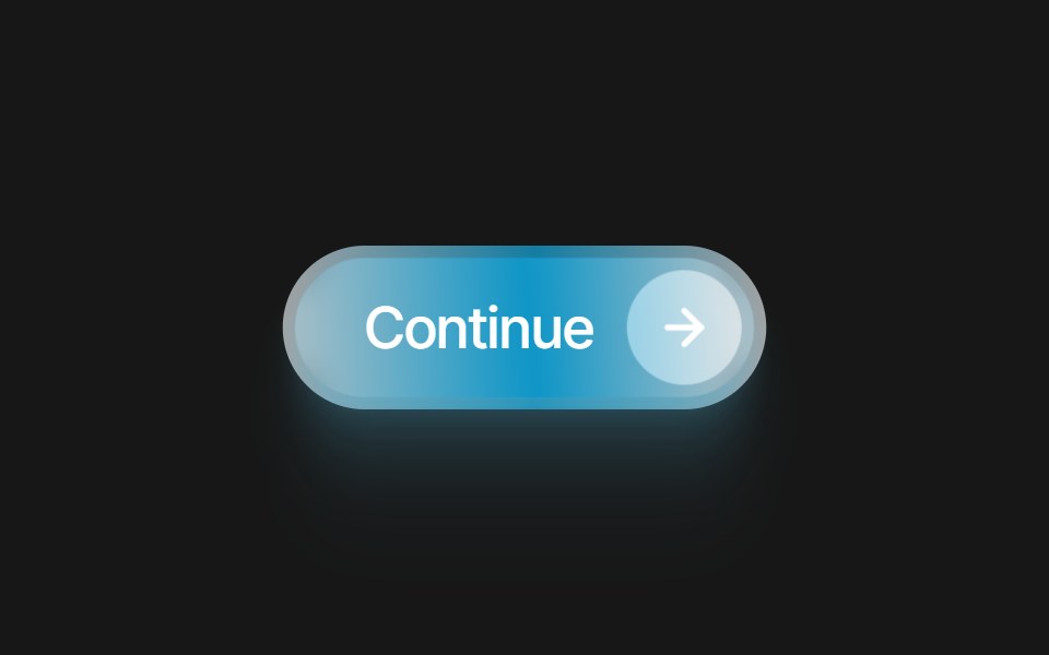 Glass Icon ButtonPixel Perfect · ReactA frosted glass pill button with an embedded icon capsule. 10 color variants and a swappable Lucide icon.
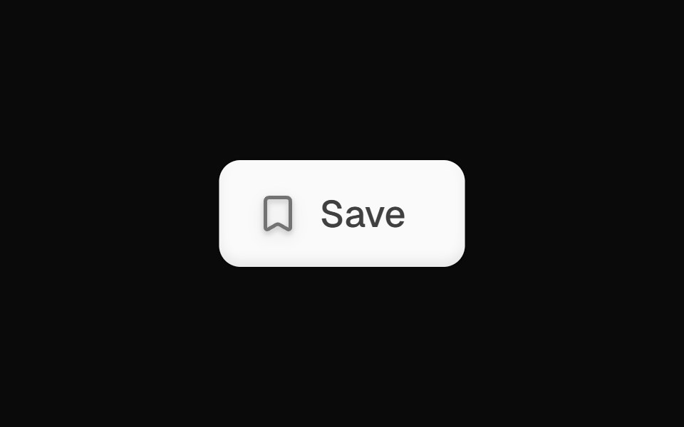 Bookmark Save ButtonOpenSourceUI · React
 ButtonsBoardUI · React
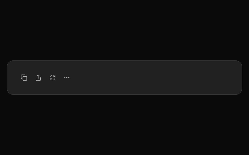 ChatGPT ActionsNotra · ReactCopy, share, redo and more buttons, built on shadcn Button and Tooltip.
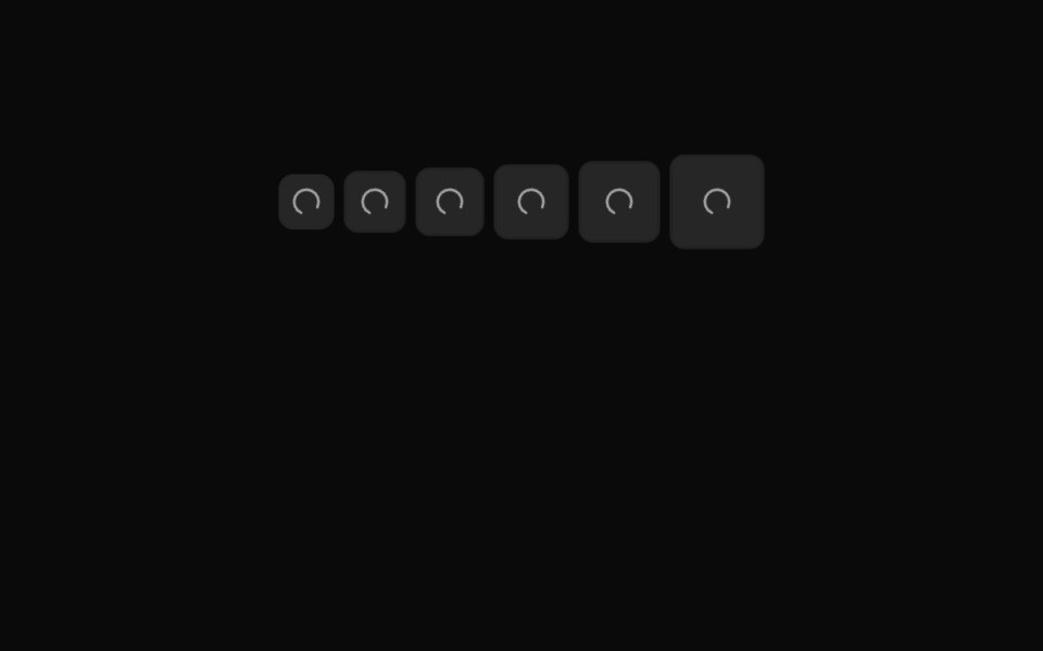 Button Icon 08Oxbow UI · AstroMuted loading icon button
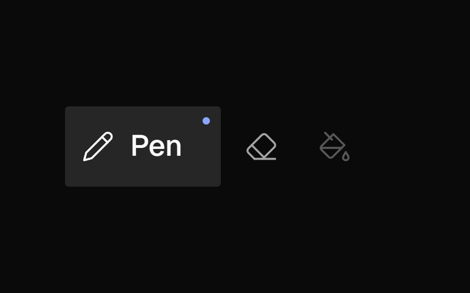 Icon BarNexvyn UI · ReactA horizontal toolbar of icon buttons with bloom-open label reveal on hover/selection, accent dot indicator, and roving…
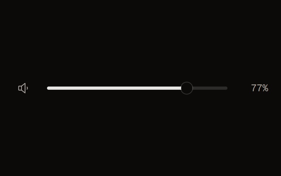 Volume Controlaudiocn · ReactA 0..1 volume slider with a mute button and a perceptual curve, for players.
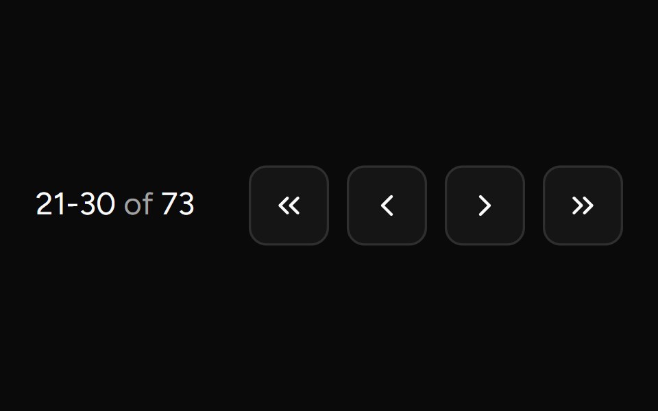 Pagination Arrowsv-table · SvelteCompact arrow pagination for table footers.
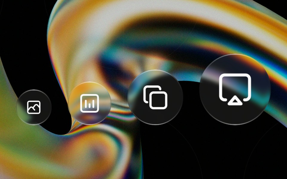 Glass Iconglasscn · ReactA circular glass chip that wraps any icon, iOS-control-center style. Preset sizes scale the circle and icon together…
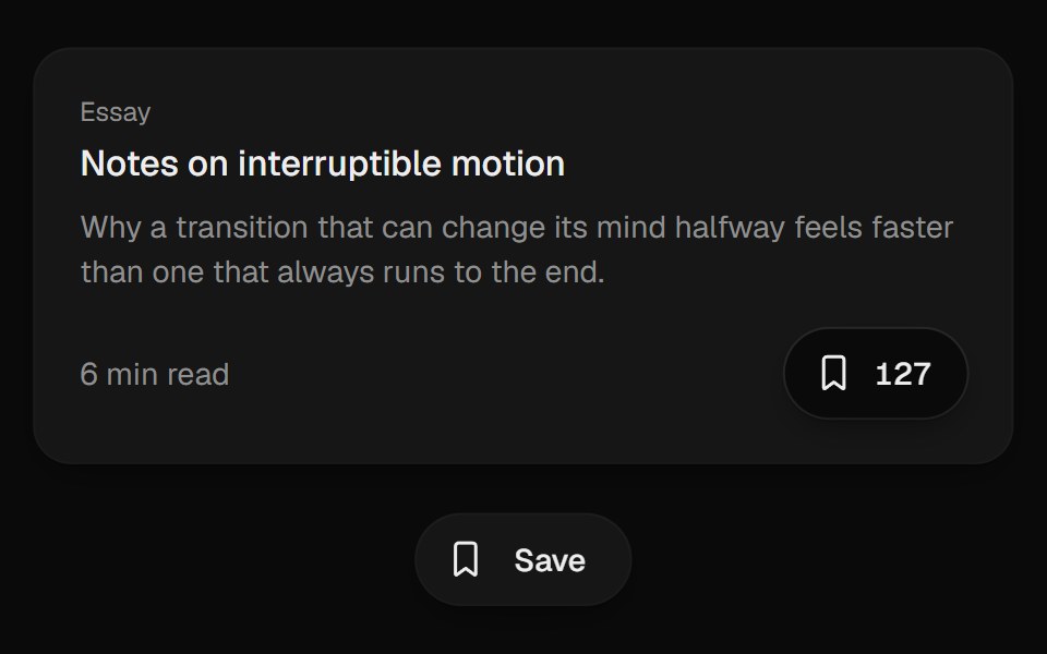 Bookmark ButtonUI Lab · ReactFills from the bottom up and lands with a small squash.
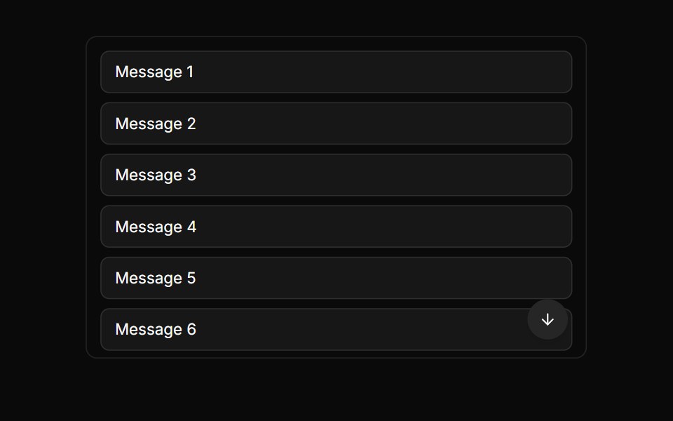 Scroll To Bottom ButtonLocalMode · ReactA floating scroll-to-bottom affordance tied to a chat container's scroll state — appears when the user scrolls up…
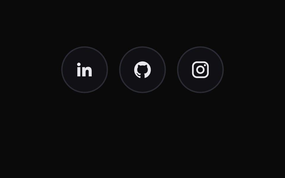 Social Icon ButtonsMicroKit · ReactCircular social links that trade their icon for a brand-colored arrow and glow on hover.
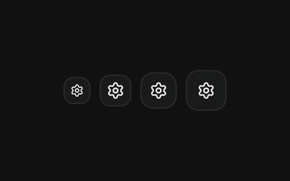 Icon onlyFLX UI · ReactSquare icon-only buttons in every icon size.
 Iconsv-particles · Svelte
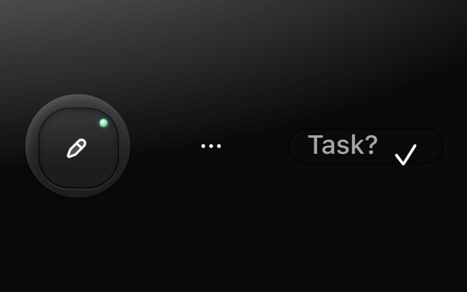 Icon buttonMetal UI · React + SwiftUIA pressable cap with only a glyph: tool (a graphite cap that latches with a green LED), ghost (flat, round) and mini…
 Contextual HelpReact Spectrum · ReactContextual help shows a user extra information about the state of an adjacent component, or a total view.
 Button CameraAmicro Micro Transitions · ReactCamera button whose video icon morphs into the video-off icon.
 ButtonsUntitled UI React · React
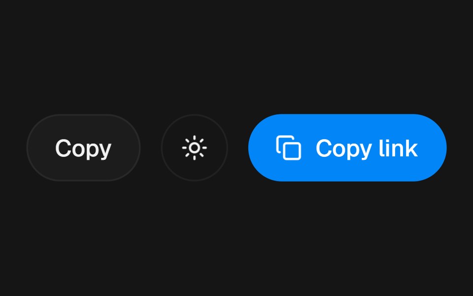 Action Swap BlurbeUI · React
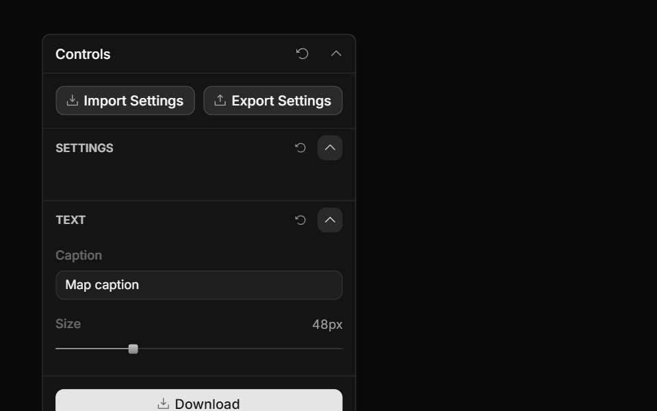 Panel Icon ButtonToolcraft · React
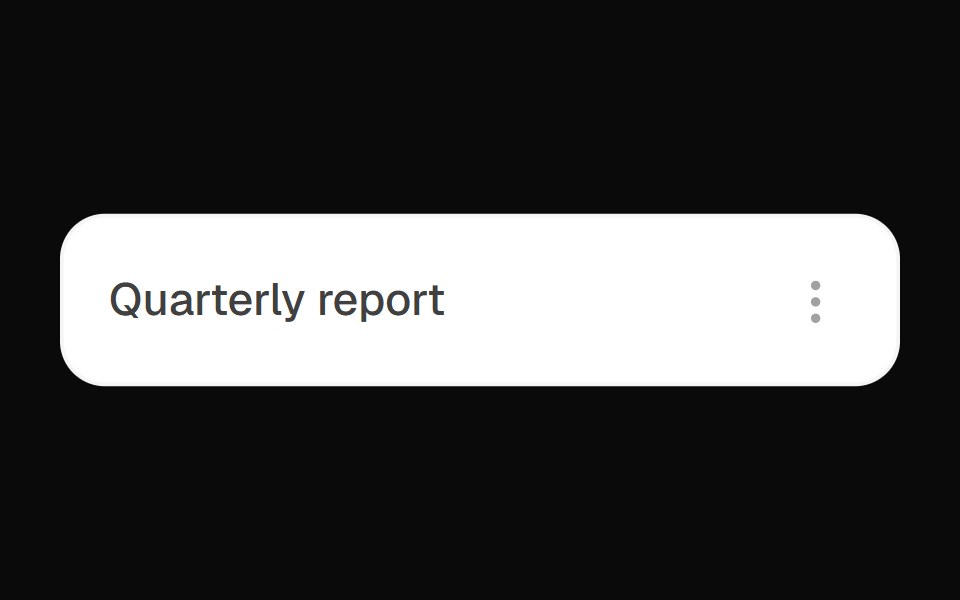 Kebab Actions DropdownOpenSourceUI · React
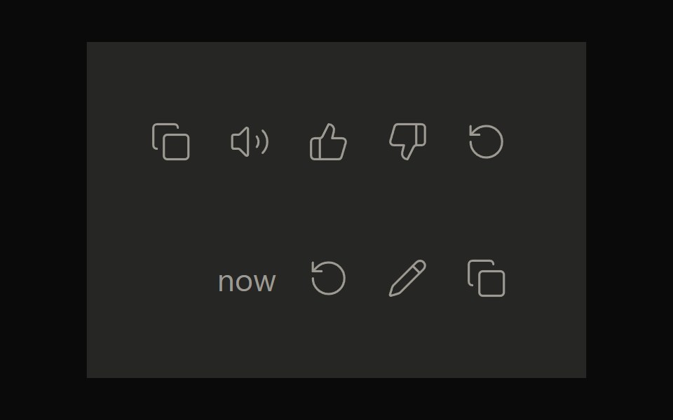 Claude ActionsNotra · ReactCopy, feedback and retry actions built on shadcn Button and Tooltip.
 Button Icon 01Oxbow UI · Astro
 Hover rotate refreshFLX UI · ReactRefresh button whose icon rotates a full 360° on each click.
 Large Iconsv-particles · Svelte
 Plus Minus ToggleAmicro Micro Transitions · ReactDual square toggle buttons with solid color fills and spring micro-bounce.
 Action Swap CascadebeUI · React
 Three D Icon ButtonOpenSourceUI · React
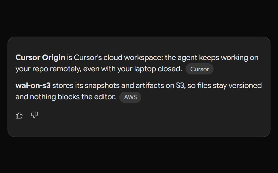 Gemini ActionsNotra · ReactFeedback, share, copy and more buttons built on shadcn Button and Tooltip.
 Button Icon 02Oxbow UI · Astro
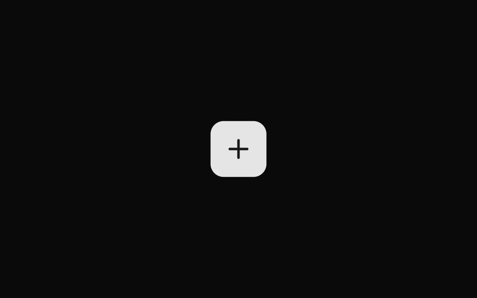 Small Iconsv-particles · Svelte
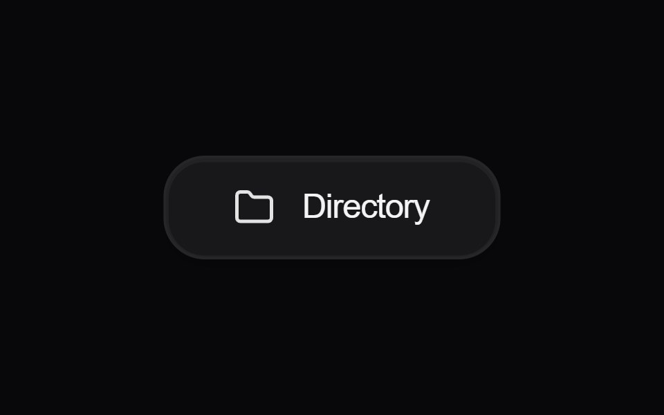 Button DirectoryAmicro Micro Transitions · React
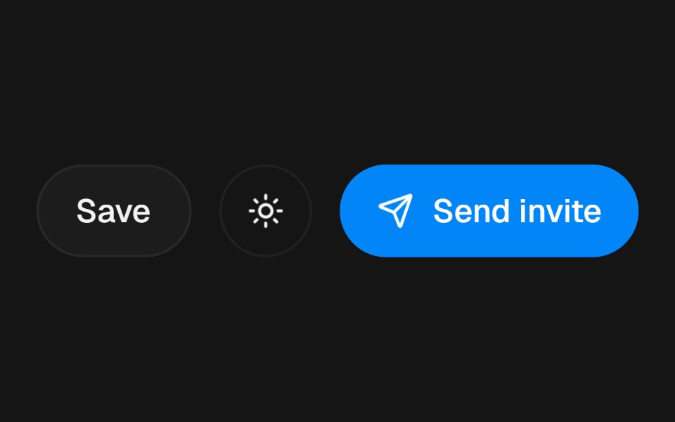 Action Swap RollbeUI · React
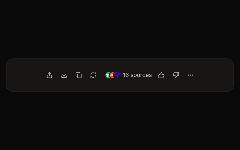 Perplexity ActionsNotra · ReactThe answer action bar with share, copy, rewrite, feedback and a sources button, built on shadcn Button and Tooltip.
 Button Icon 03Oxbow UI · Astro
 Button EditAmicro Micro Transitions · React
 Perplexity User ActionsNotra · ReactThe time, edit and copy controls beside a user message.
 Button Icon 04Oxbow UI · Astro
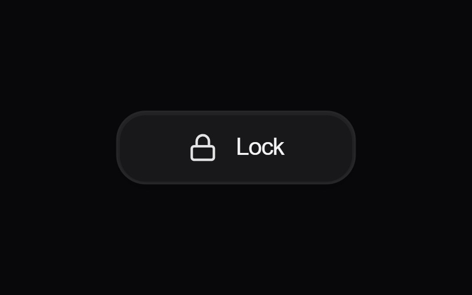 Button LockAmicro Micro Transitions · React
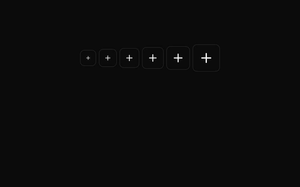 Button Icon 05Oxbow UI · Astro
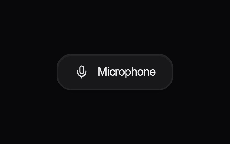 Button MicrophoneAmicro Micro Transitions · React
 Button Icon 06Oxbow UI · Astro
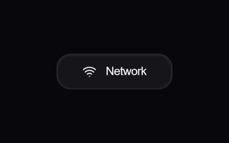 Button NetworkAmicro Micro Transitions · React
 Button Icon 07Oxbow UI · Astro
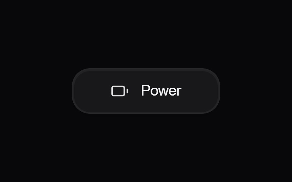 Button PowerAmicro Micro Transitions · React
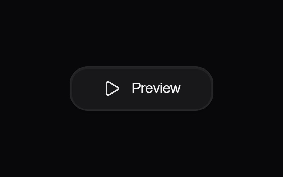 Button PreviewAmicro Micro Transitions · React
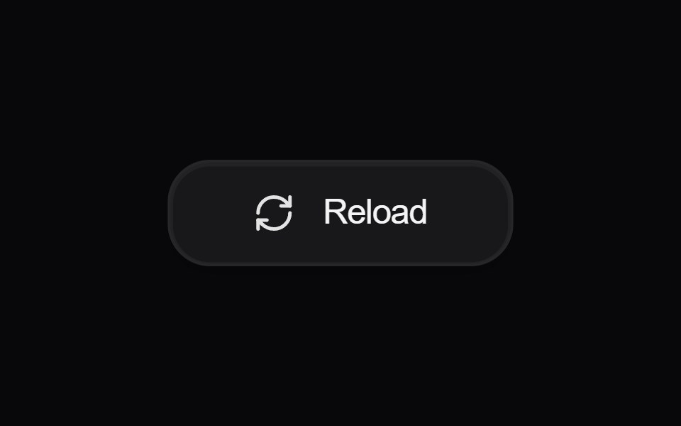 Button ReloadAmicro Micro Transitions · React
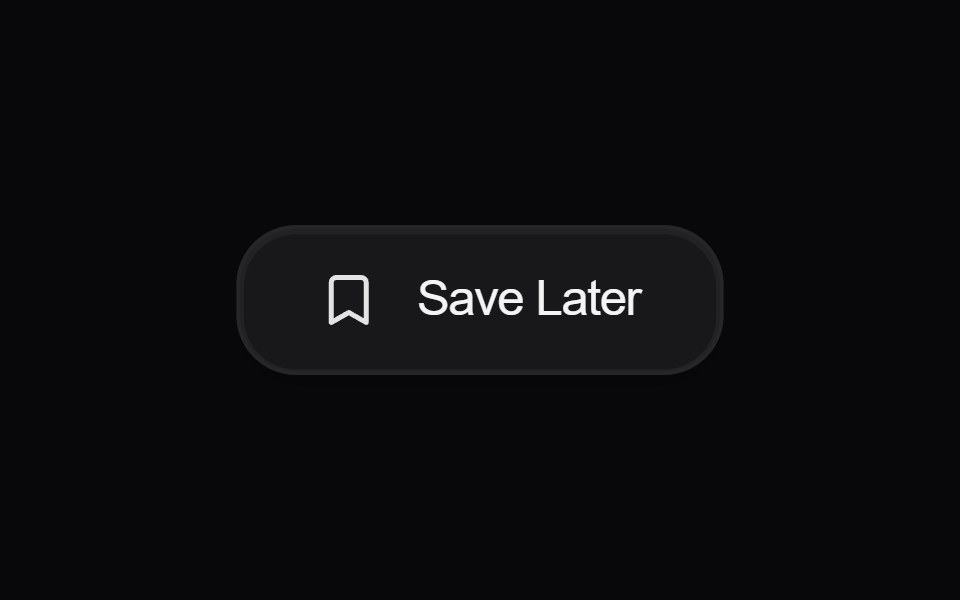 Button Save LaterAmicro Micro Transitions · React
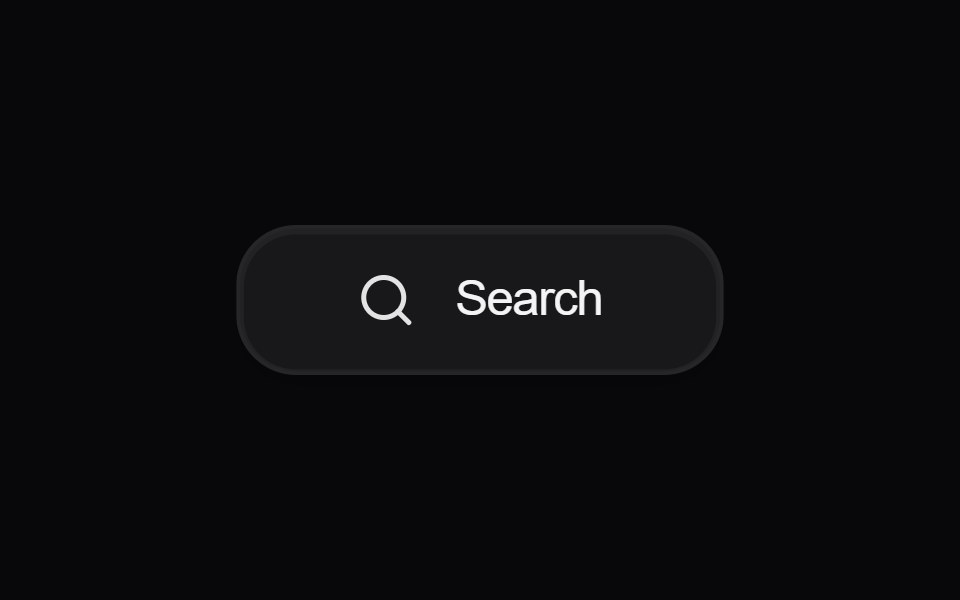 Button SearchAmicro Micro Transitions · React
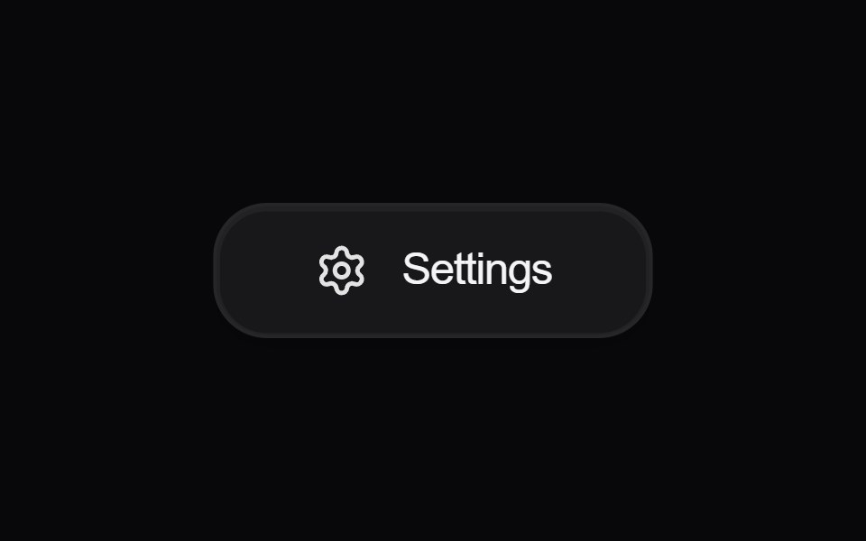 Button SettingsAmicro Micro Transitions · React
 Button VisibilityAmicro Micro Transitions · React
 Button VolumeAmicro Micro Transitions · React
Libraries with Tailwind CSS icon button components
Related categories
- Icon Button Components
- React Icon Button Components
- Animated Icon Button Components
- shadcn/ui Icon Button Components
- Tailwind CSS Action Components
- Tailwind CSS Button Components
- Tailwind CSS Button Group Components
- Tailwind CSS Toggle Button Components
- Tailwind CSS CTA Button Components
- Tailwind CSS Link Components
- Tailwind CSS Copy Button Components
- Tailwind CSS Theme Toggle Components
- Tailwind CSS Like Button Components
- Tailwind CSS Social Login Button Components
- Tailwind CSS FAB Components
- Tailwind CSS Download Button Components
- Tailwind CSS Slide To Confirm Components
- Tailwind CSS Hold Button Components
- Tailwind CSS Submit Button Components
- Tailwind CSS Send Button Components