 Dev Design Library
Tailwind CSS Button Components
Dev Design Library indexes 870 Tailwind CSS button components from 74 open-source UI libraries, with the most coming from Watermelon UI, ReUI, Origin UI, Amicro Micro Transitions and Pixel Perfect. Each one links to its page with the source code, a live preview where available, the library license and the install command. Every library in this list styles its components with Tailwind CSS utility classes. Button components belong to the Actions group.
Showing 120 of 870, a mix from every library. Open a library to see all of its components.
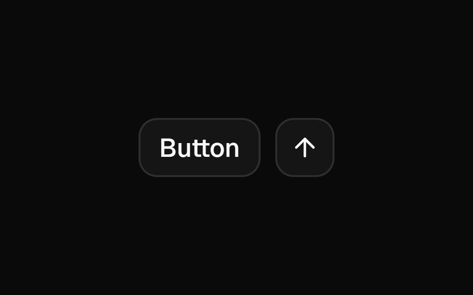 Buttonshadcn/ui · ReactDisplays a button or a component that looks like a button.
 ButtondaisyUI · CSS (Tailwind)
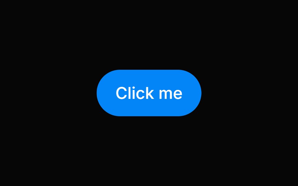 ButtonHeroUI · ReactInteractive component that triggers an action when pressed.
 Theme TogglerMagic UI · ReactTheme toggle with View Transitions and animated clip-path masks (circle, polygons, star), optional viewport-centered…
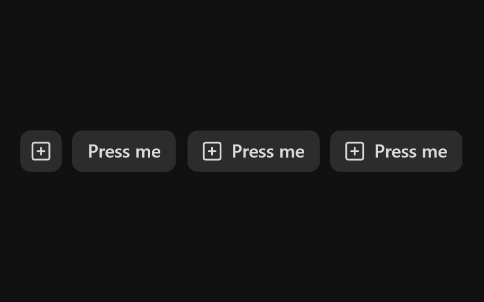 Action ButtonReact Spectrum · ReactActionButtons allow users to perform an action. They’re used for similar, task-based options within a workflow, and…
 Buttoncoss ui · ReactA button or a component that looks like a button.
 ButtonOrigin UI · ReactA button or a component that looks like a button.
 Theme SwitchPreline UI · JavaScript (HTML + Tailwind)
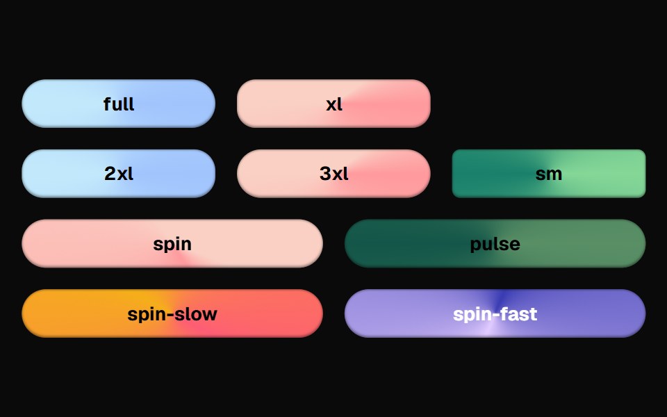 Bg Animate ButtonCult UI · ReactButton component with animated background effects and gradient transitions
 ButtonTremor · React
 Default buttonReUI · ReactDefault button
 Apple Icon MorphAmicro Micro Transitions · ReactApple Icon Morph loading animation.
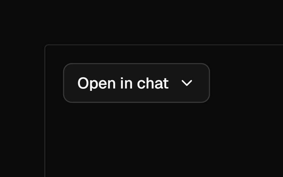 Open In ChatAI Elements · ReactA dropdown menu for opening queries in various AI chat platforms including ChatGPT, Claude, T3, Scira, and v0.
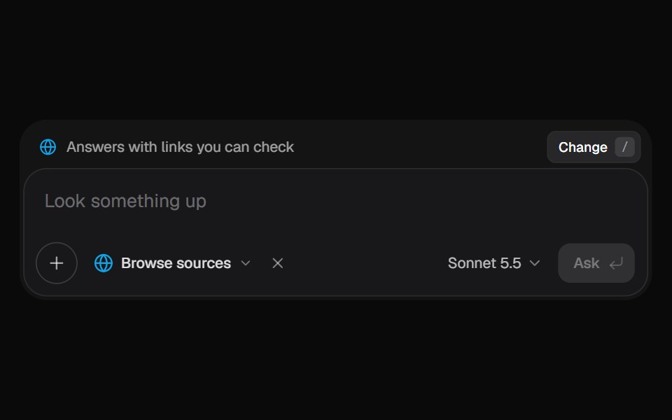 AI Input SearchKokonut UI · ReactAI composer with a Tools menu (browse, investigate, draft, run code, reason), a model picker and a live trace that…
 buttonIntent UI · Reactbutton
 Play Button IconUntitled UI React · ReactRounded play icon with blurred background and a filled triangle in the middle.
 Bloom MenubeUI · ReactA button that morphs open into a menu and blooms iris-out from the center, the grid revealing in every direction with…
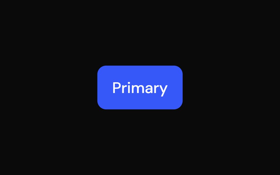 ButtonTailGrids · ReactButton component with multiple variants, sizes, and support for icons.
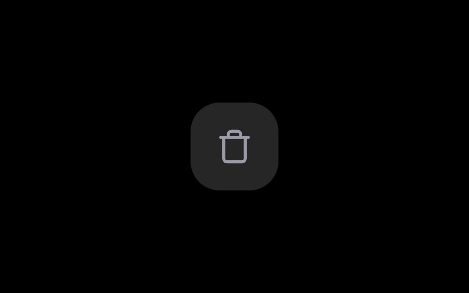 Delete ButtonRare UI · ReactA delete button that asks for confirmation in place, no dialog needed.
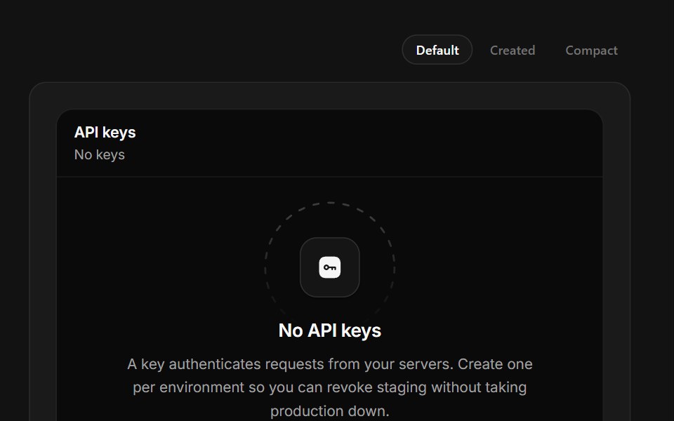 No API KeysSpectrum UI · ReactKey creation that reveals the secret once, masked, with a copy that confirms itself.
 Copy ButtonSpell UI · ReactA copy-to-clipboard button with blur transition effect.
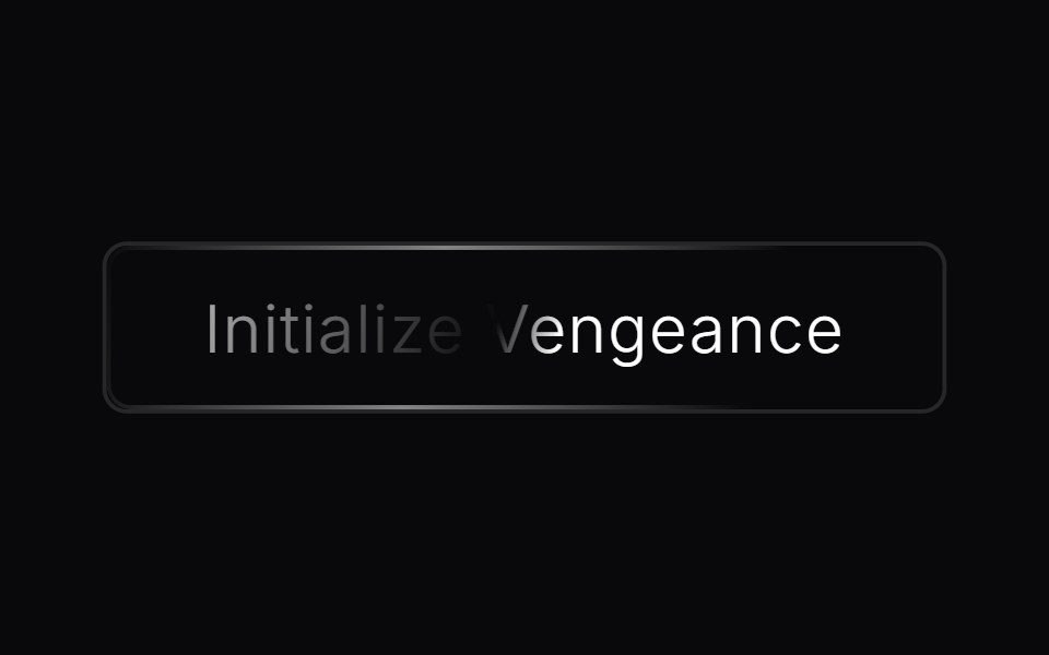 Animated ButtonVengeance UI · ReactAnimated CTA button with shine effect
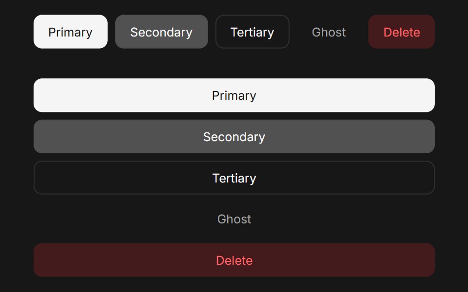 ButtonFluid Functionalism · ReactAnimated button with variants (primary, secondary, tertiary, ghost), icon support, loading spinner, and fluid…
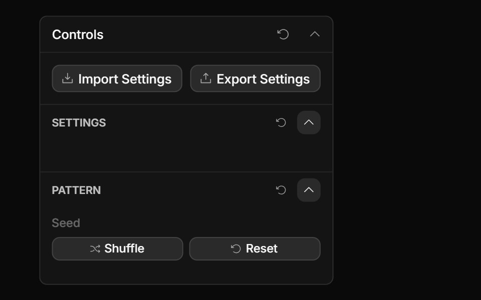 Actions ControlToolcraft · React
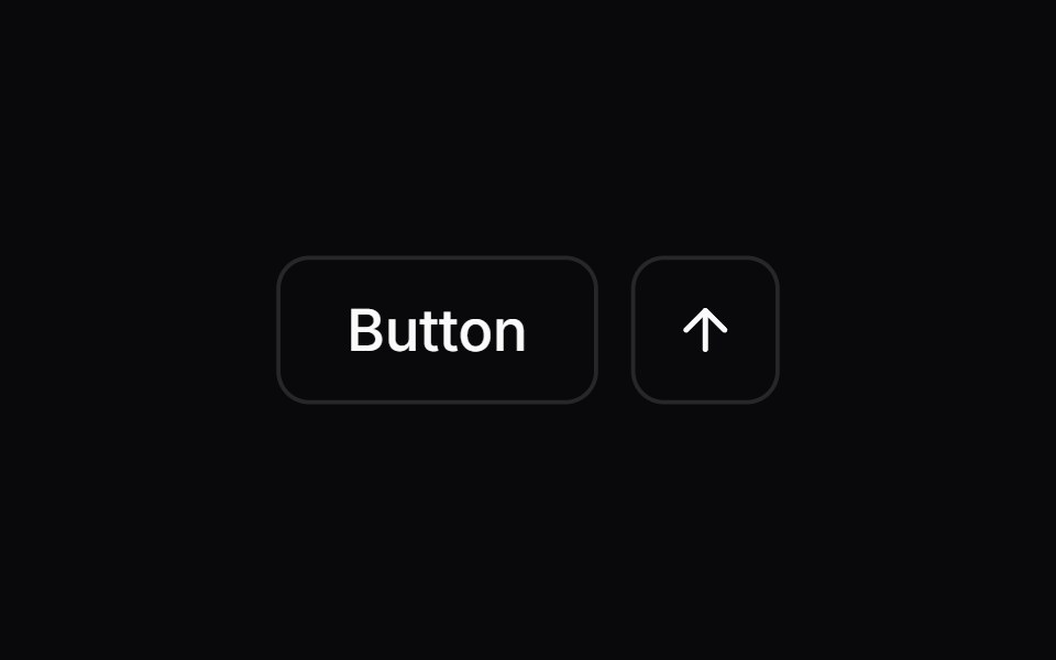 ButtonLaunch UI · React
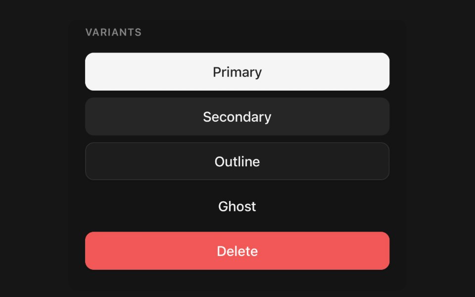 ButtonPanel UI · React NativePressable action with variants, sizes, loading state and icon slots.
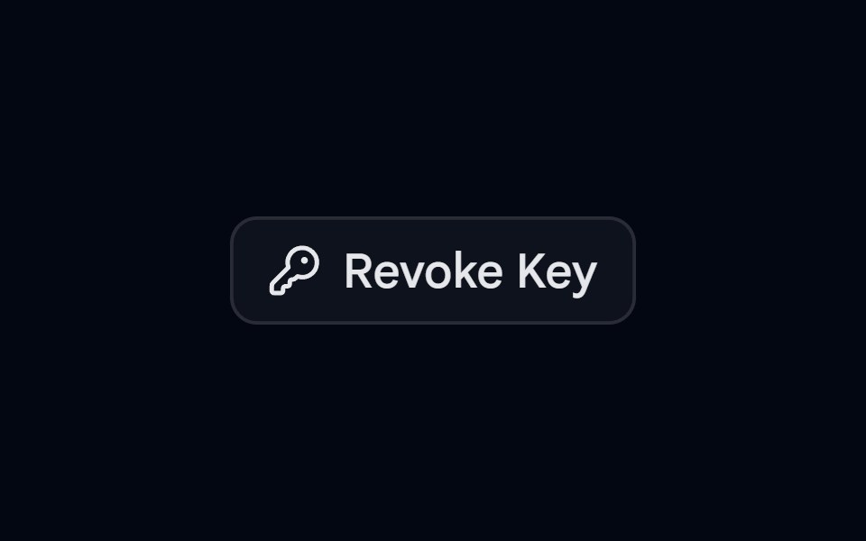 Alert 11 - Hold to ConfirmShadcn Space · ReactCompact alert dialog where the user presses and holds the revoke button until it fills, preventing accidental clicks
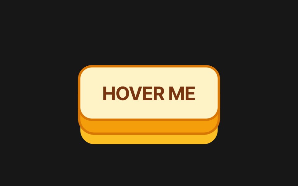 3D ButtonPixel Perfect · React3D push button with press/hover physics and 8 color variants: amber, emerald, rose, sky, violet, slate, coral, mint.
 Copy EmailOpenSourceUI · ReactCopies the maintainer email on click — no mailto / mailbox popup. Hover shows “Click to copy”; after click shows…
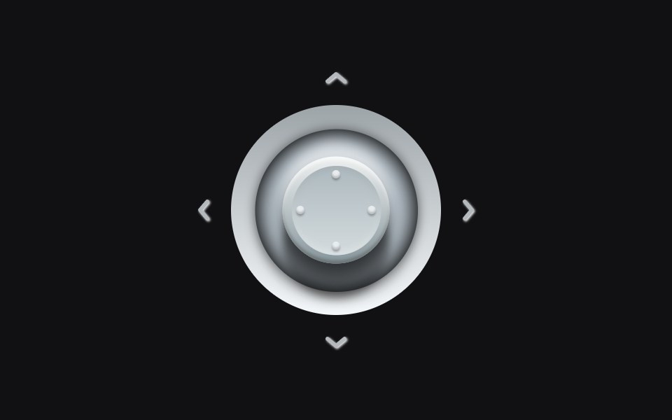 Analog Stickuselayouts · ReactA metallic stick that tilts into the press. Hover a quadrant and the cap leans, the shadow shifts, and the matching…
 ButtonPrebuiltUI · React
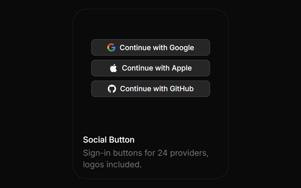 Social ButtonBoardUI · ReactSign-in buttons for 24 providers, logos included.
 Coss ButtonComponentry · React
 ButtonTremor Blocks · React
 ButtonShadcn Dashboard · React
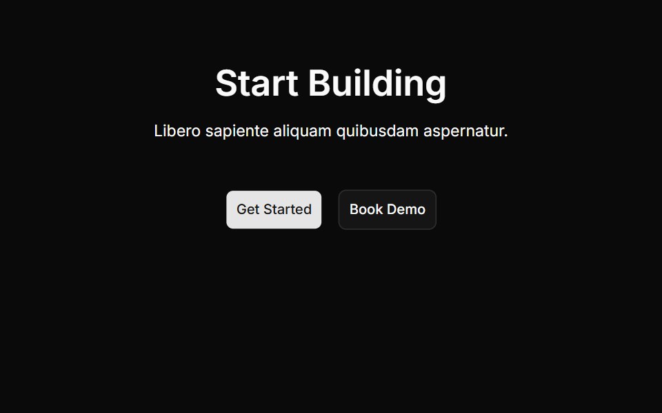 Cta Onecnblocks · SvelteCall-to-action block with centered heading and buttons
 Animated Theme TogglerAnimations (Svelte) · SvelteA smooth animated theme toggler that uses the View Transition API to create a circular reveal effect when switching…
 Copy ButtonAI Elements (Svelte) · SvelteA clipboard-driven button with success and failure states.
 Confetti ButtonBadtz UI · ReactA fun and interactive button that triggers a confetti explosion effect on click.
 ButtonObsidianUI · React
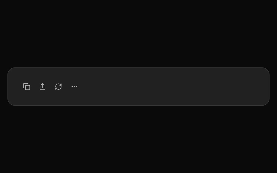 ChatGPT ActionsNotra · ReactCopy, share, redo and more buttons, built on shadcn Button and Tooltip.
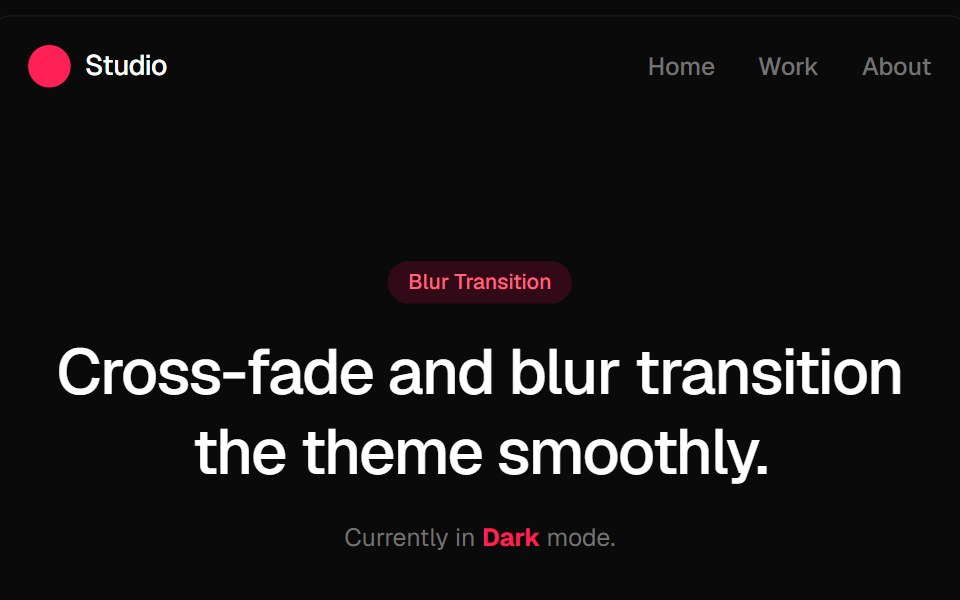 Blur Fade Theme TransitionGreatUI · ReactLight and dark theme toggle that switches the page with a blur and fade transition.
 Button Icon 08Oxbow UI · AstroMuted loading icon button
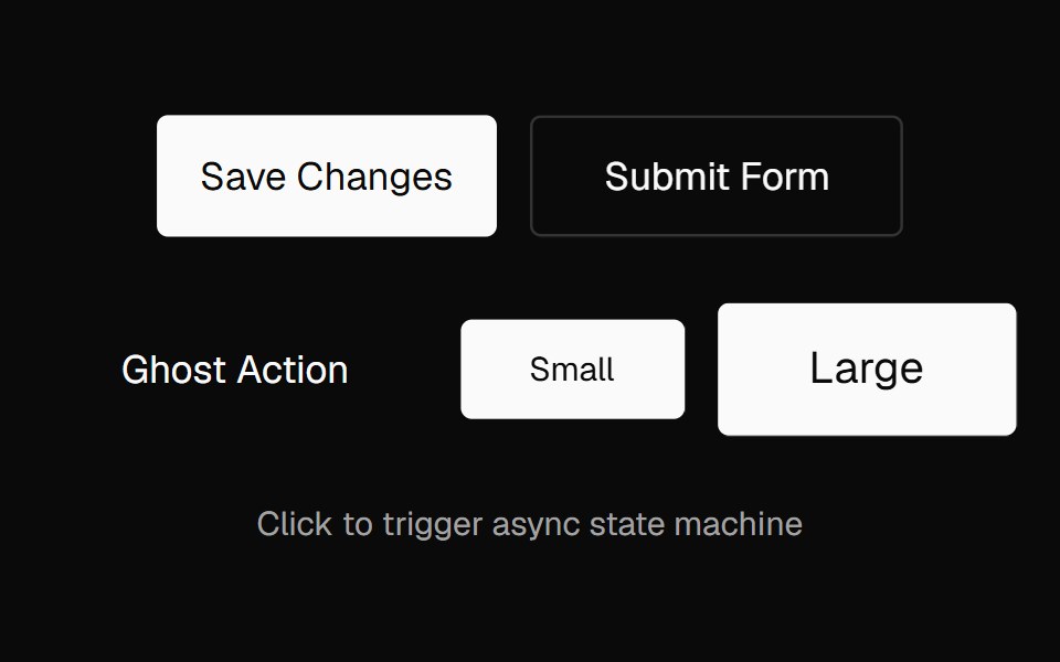 Action ButtonNexvyn UI · ReactAn async-aware button with an idle → pending → success/error state machine, promise tracking, abort support, and live…
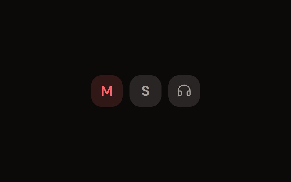 Channel Toggleaudiocn · ReactMute, solo and monitor toggle buttons with their own pressed colours.
 buttonBaseLayer · ReactA button allows a user to perform an action, with mouse, touch, and keyboard interactions.
 ButtonShark UI · ReactA button or an element styled as a button.
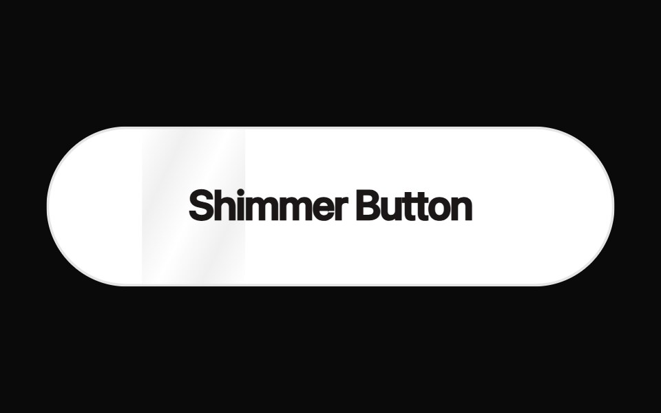 Shimmer ButtonRewamp UI · ReactButton with a strip of light sweeping across it in a loop.
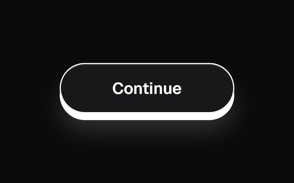 ThreeDButtonEvil Buttons · ReactA minimal 3D button with a clean deck-style press and sliding click sheen.
 BubbleUpButtonSona UI · ReactThe `BubbleUpButton` component provides an interactive button with a fluid "bubble-up" animation effect when hovered…
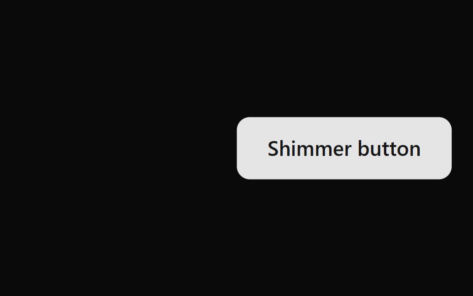 Shimmer ButtonWatermelon UI · ReactButton with a strip of light that sweeps across it on hover.
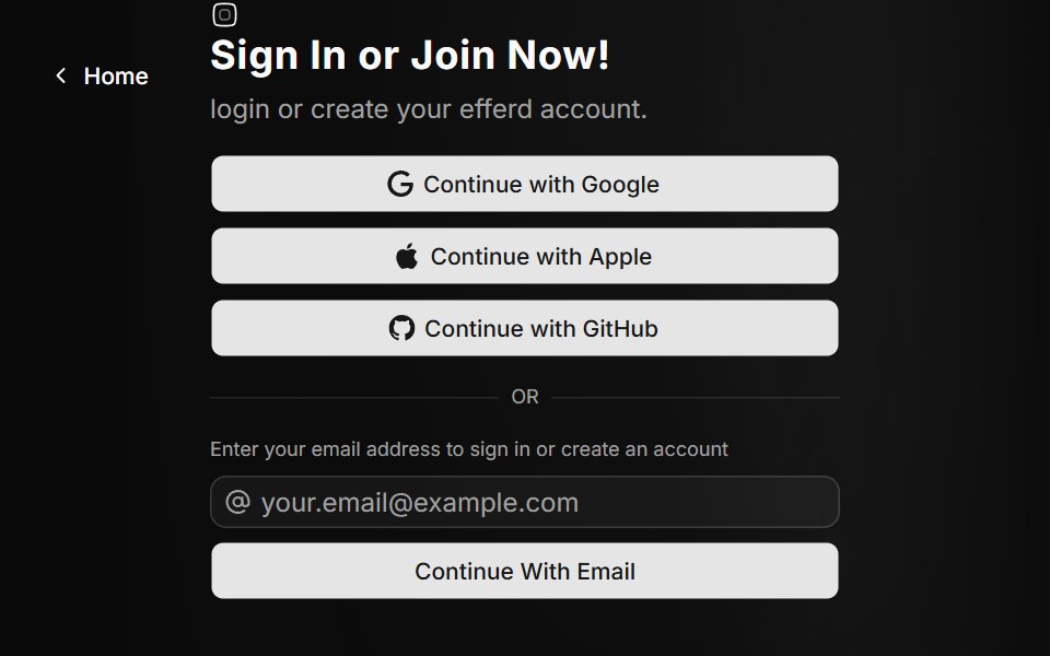 Auth Fivesv-efferd · SvelteA split-screen auth experience with animated background paths and broader provider options.
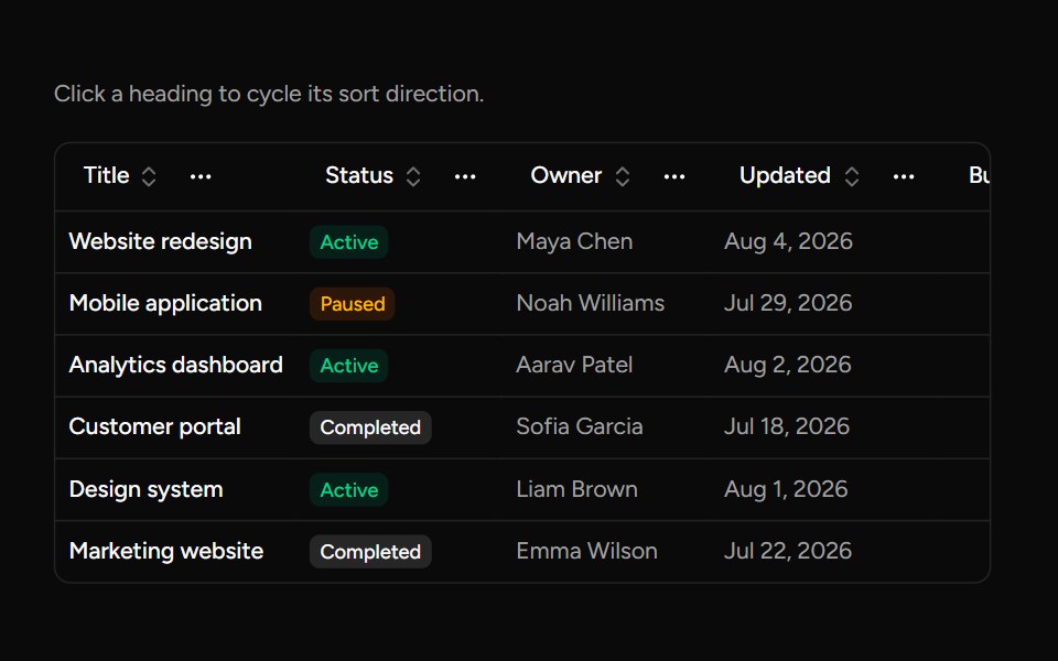 Data Table Column Headersv-table · SvelteA table heading with sorting, pinning, ordering, and visibility actions.
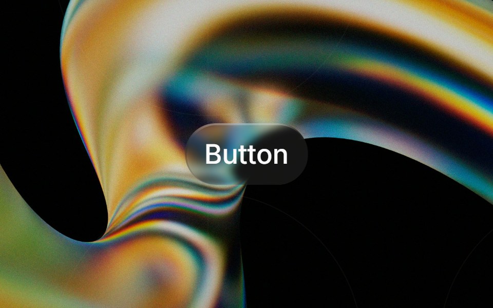 Glass Buttonglasscn · ReactGlass Button with five variants: clear, frosted, subtle, liquid, and liquid-refract
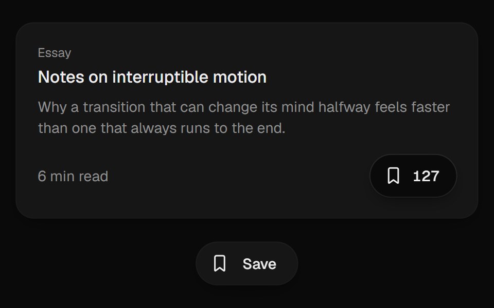 Bookmark ButtonUI Lab · ReactFills from the bottom up and lands with a small squash.
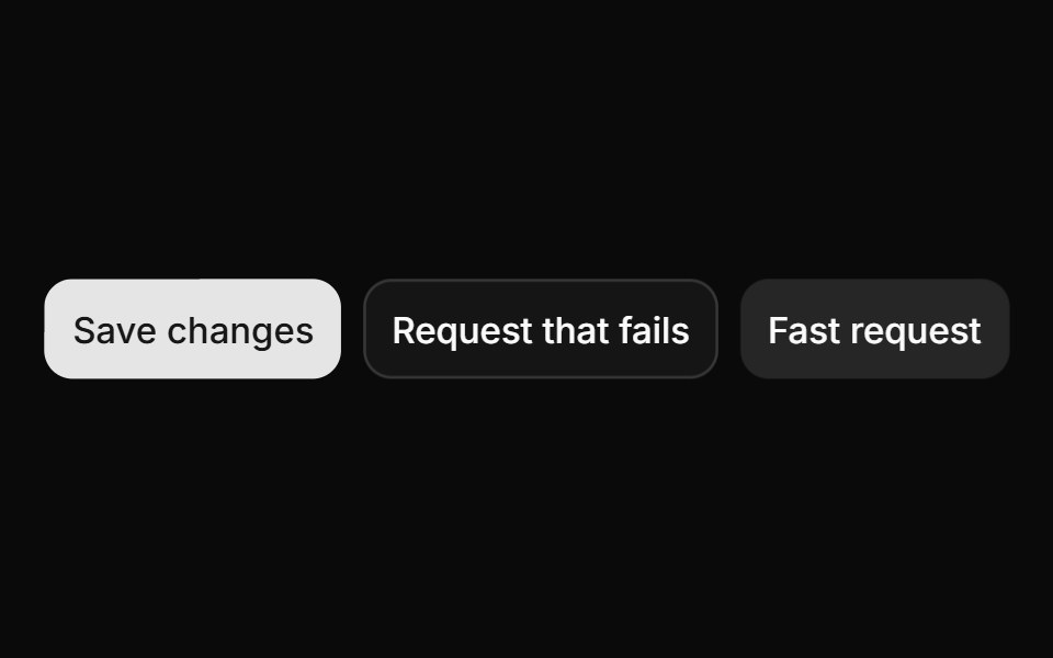 ButtonHextaUI · ReactButtons in every variant and size, with a built-in loading, success and error flow that skips the spinner for fast…
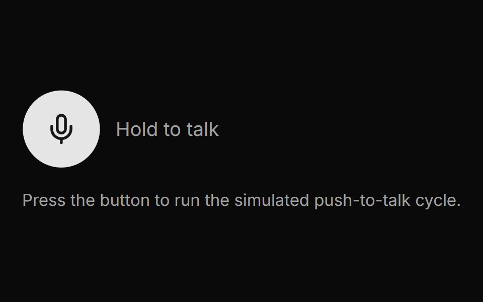 Voice ButtonLocalMode · ReactA press-to-record / release-to-transcribe push-to-talk button with an explicit visual state machine: idle -> recording…
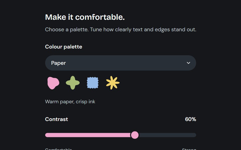 AppearanceCojeev UI · ReactChoose from six coordinated palettes and adjust reading contrast across the application.
 Aurora Download ButtonMicroKit · ReactA layered blue download button with a luminous rim, directional shadow, and blended hover bloom.
 BasicFLX UI · ReactDefault button with text label.
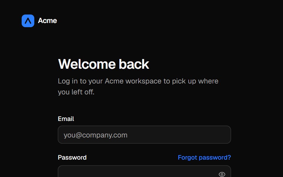 Split login pageVelora UI · ReactLogin form with password reveal, remember-me and social sign-in beside an aurora testimonial panel.
 Outline Like With Countsv-particles · SvelteOutlined like button with a heart and the number of likes next to it.
 ButtonMetal UI · React + SwiftUIA press-in pill button with compact caps, async waiting/result faces and opt-in irreversible hold confirmation. React…
 BloopSpaceUI · ReactCompact assistant orb with listen, think, and speak states, voice palettes, and audio input.
 Morph MenuSkecher UI · ReactA measured action menu that morphs between compact and expanded states with configurable directional movement.
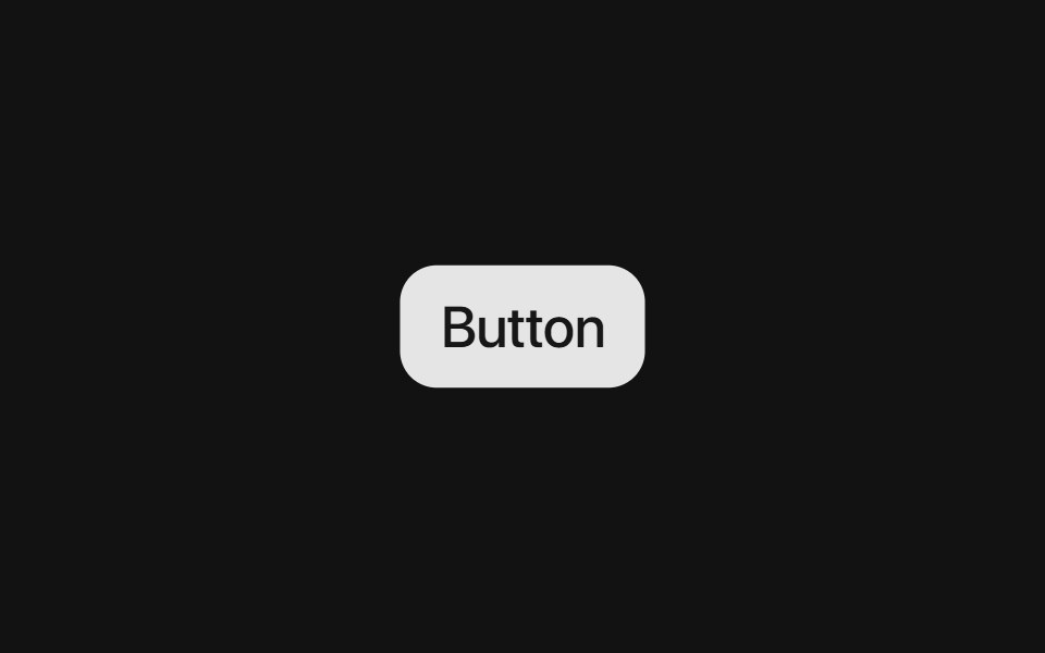 Base ButtonSora UI · ReactAn interactive button component built on Base UI with Motion hover/tap scaling and shadcn/ui variants.
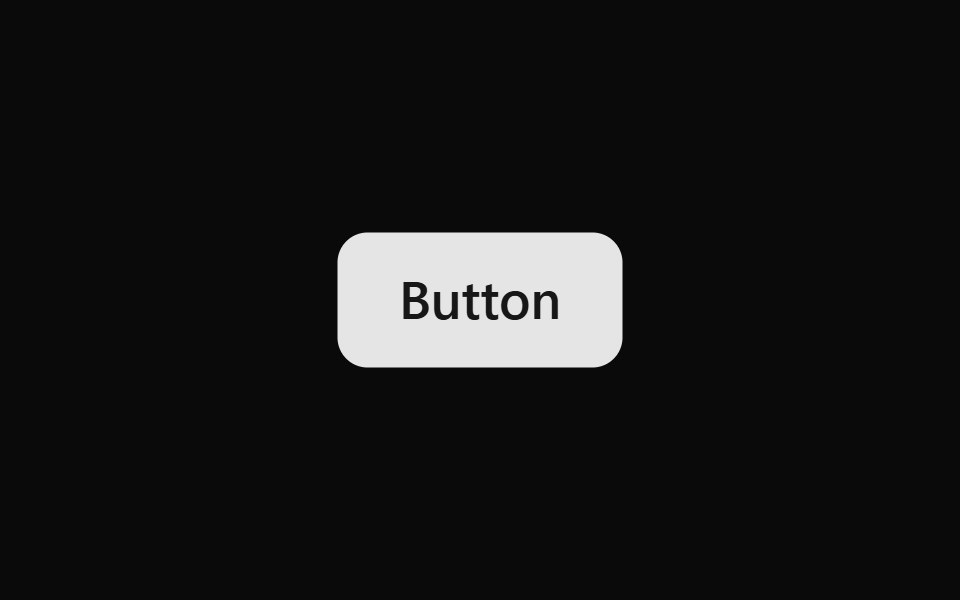 ButtonOUI · ReactReact aria components Button with shadcn characteristics.
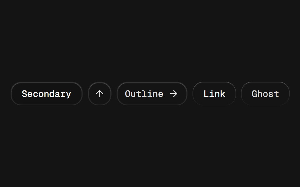 ButtonD2Studio UI · ReactDisplays a button or a component that looks like a button.
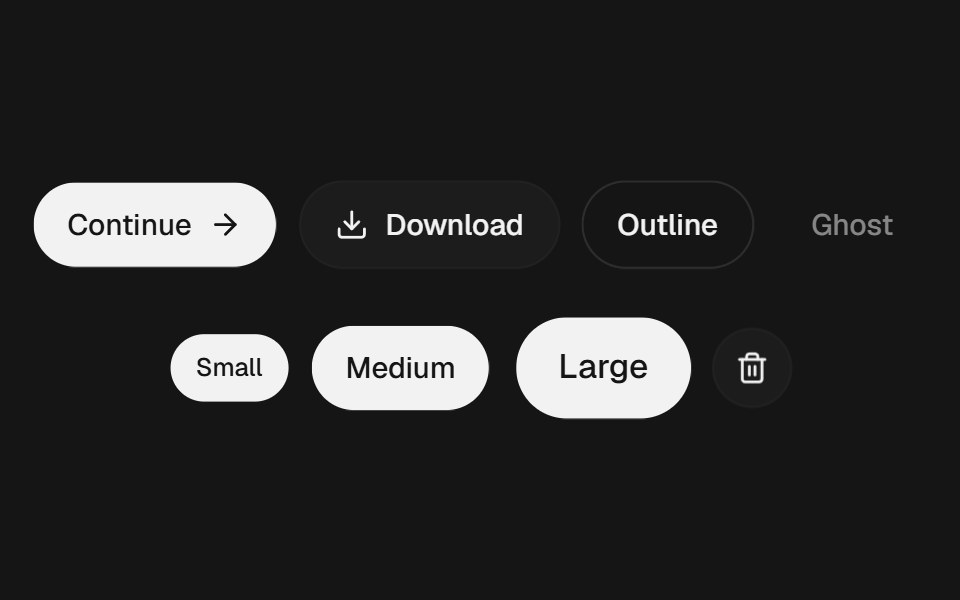 ButtonEaseUI · ReactButton with a quick press, hairline rings instead of borders, four variants, and a 44px tap area even at small sizes.
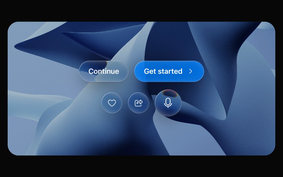 Glass ButtonOpaline · ReactPill button made of liquid glass with a pointer-tracked highlight.
 ButtonFibo · ReactTriggers an action or event with a single click.
 ButtonReactFrame · ReactAn accessible button with primary, secondary, outline, and ghost variants, a spinning loading state, optional icon…
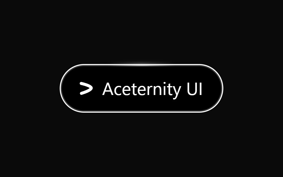 Hover Border GradientAceternity UI · React
 Buttonark-cn · ReactA shadcn-style button component built with Ark UI primitives.
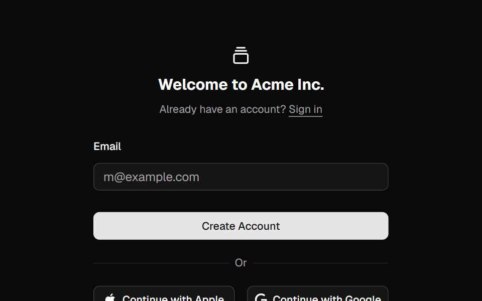 Signup 05shadcn/ui · ReactA simple signup form with social providers.
 FabdaisyUI · CSS (Tailwind)
 Close ButtonHeroUI · ReactButton component for closing dialogs, modals, or dismissing content.
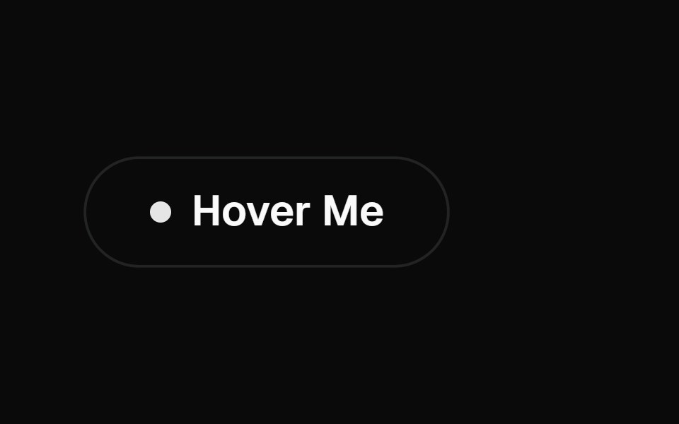 Interactive Hover ButtonMagic UI · ReactA visually engaging button component that responds to hover with dynamic transitions, adapting smoothly between light…
 Action MenuReact Spectrum · ReactActionMenu combines an ActionButton with a Menu for simple "more actions" use cases.
 Togglecoss ui · ReactA two-state button that can be toggled on or off.
 ToggleOrigin UI · ReactA two-state button that can be toggled on or off.
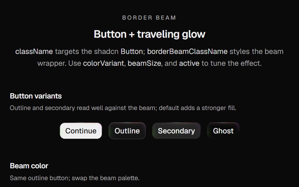 Border Beam ButtonCult UI · ReactShadcn Button wrapped in Border Beam: animated border glow with compact icon and text variants
 Disabled buttonReUI · ReactDisabled button
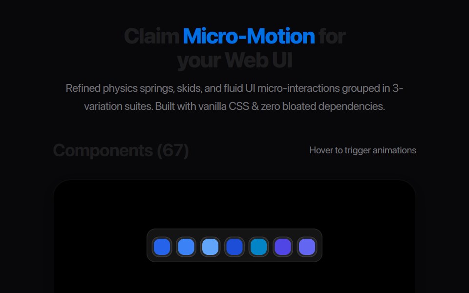 Bookmark Save PillAmicro Micro Transitions · ReactInteractive Save / Saved state pill toggle with icon morph.
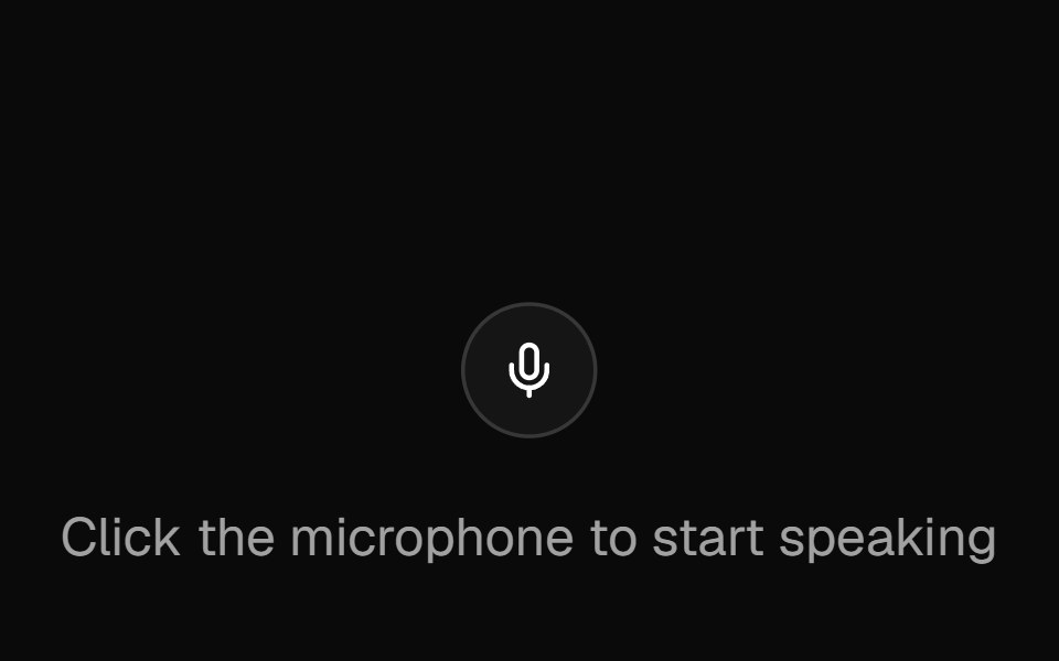 Speech InputAI Elements · ReactA button component that captures voice input and converts it to text, with cross-browser support.
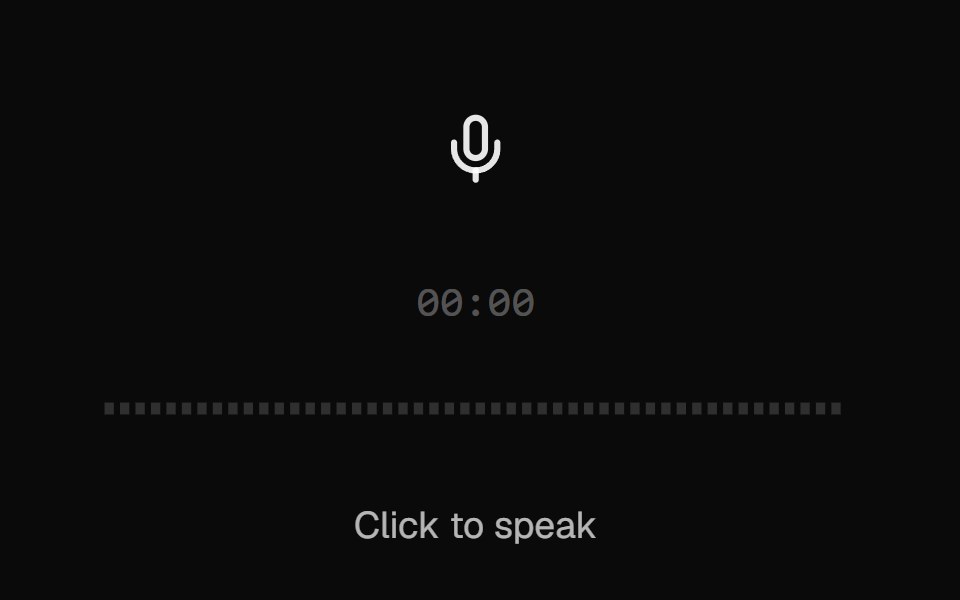 AI VoiceKokonut UI · ReactVoice input with a scrolling waveform, then a take you can play back, discard or send.
 file-triggerIntent UI · Reactfile-trigger
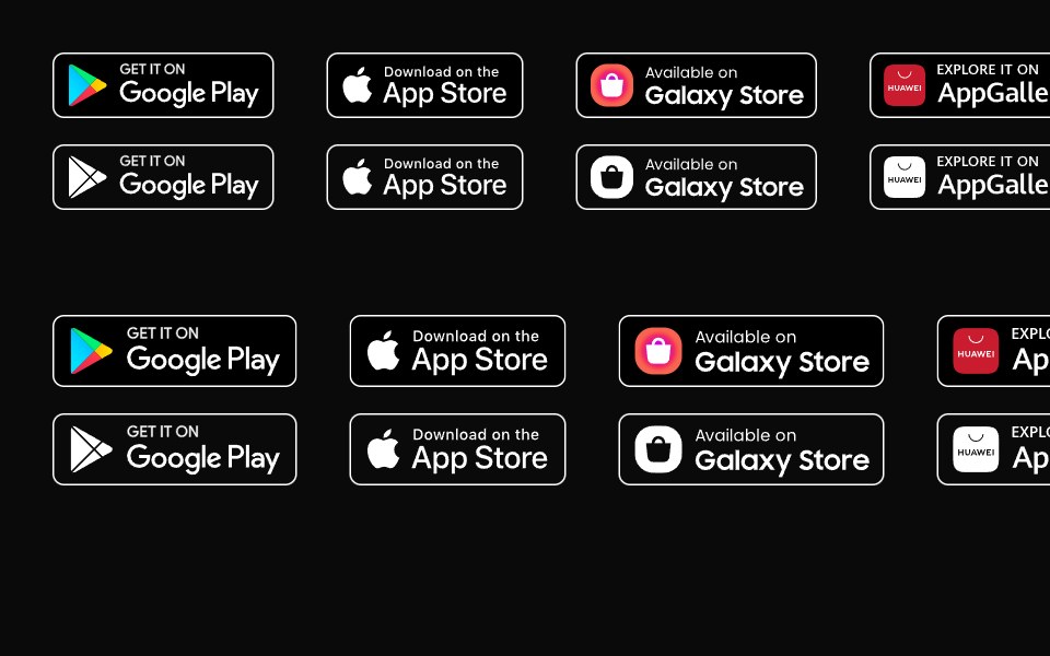 ButtonsUntitled UI React · React
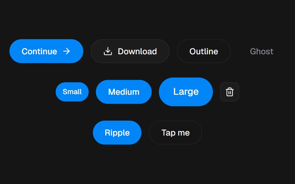 ButtonbeUI · ReactSpring press, ripple, icons and a stateful variant.
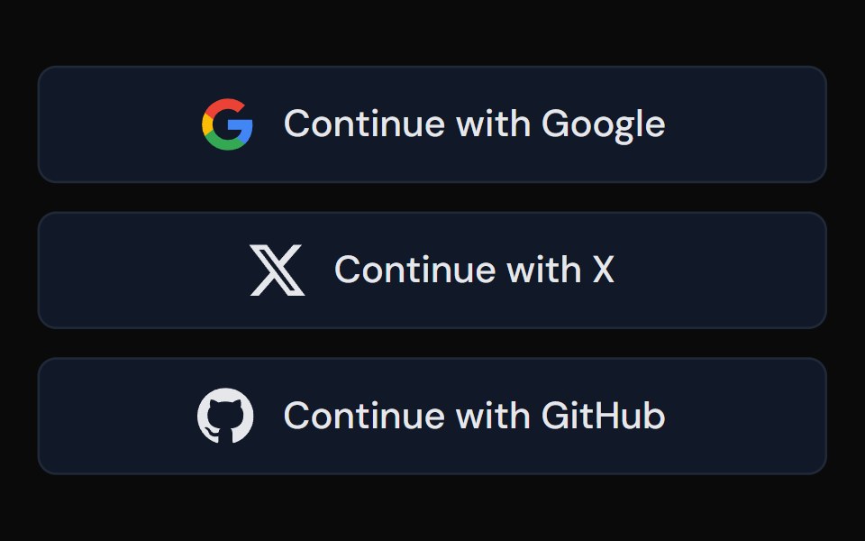 Social ButtonTailGrids · ReactA button component for social media actions.
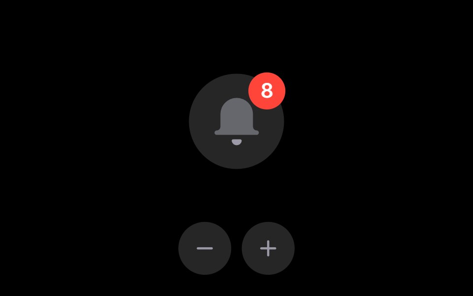 Notification BellRare UI · ReactAn iOS-style notification bell with an unread count badge.
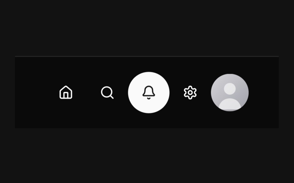 Circular NavbarSpectrum UI · Reactcomponent for the Circular Navbar
 Flow ButtonSpell UI · ReactA button with animated flowing dashed border on hover.
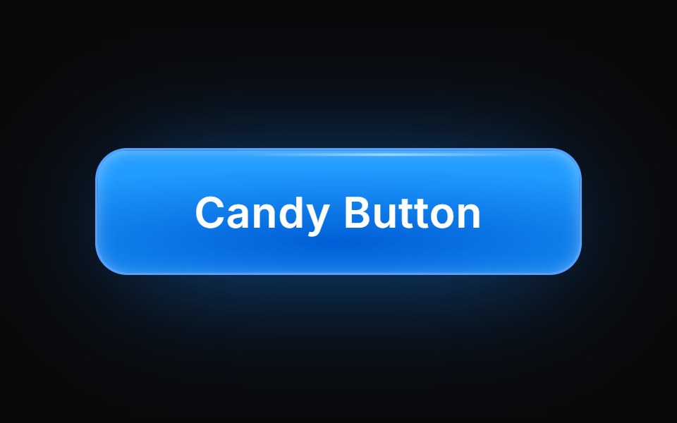 Candy ButtonVengeance UI · ReactGlassy candy-like button with top highlight
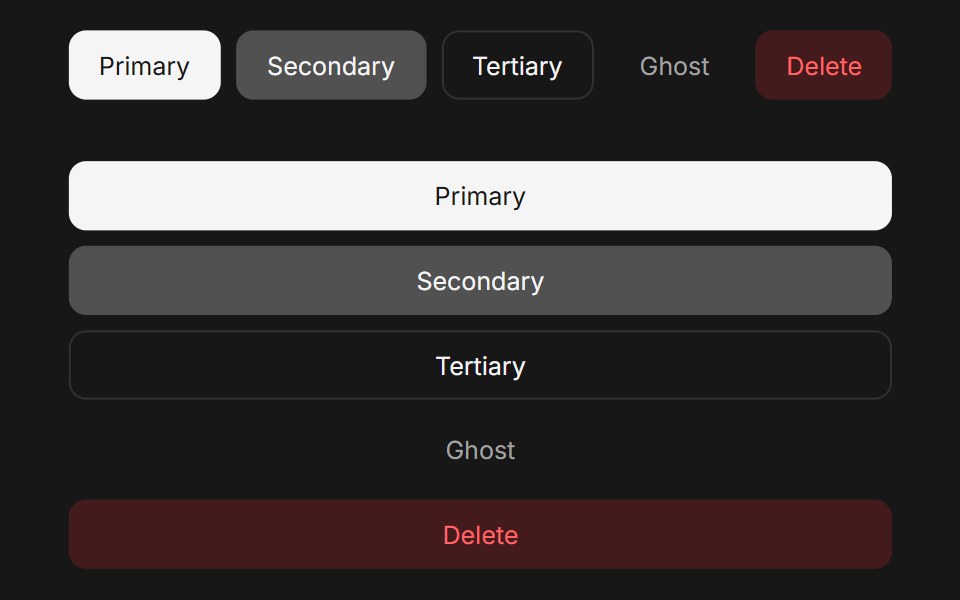 Button (Base UI)Fluid Functionalism · ReactAnimated button with variants (primary, secondary, tertiary, ghost), icon support, loading spinner, and fluid…
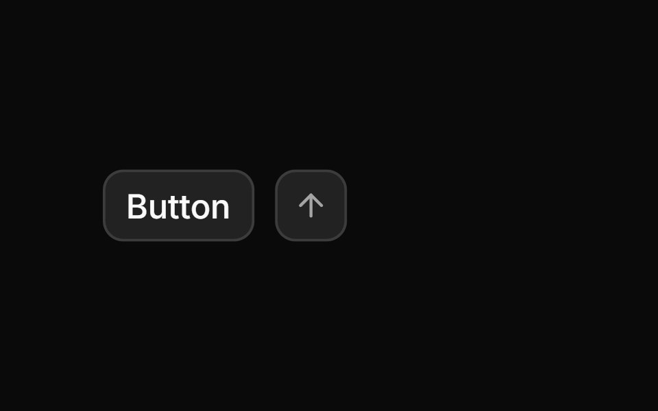 ButtonToolcraft · React
 Link ButtonLaunch UI · React
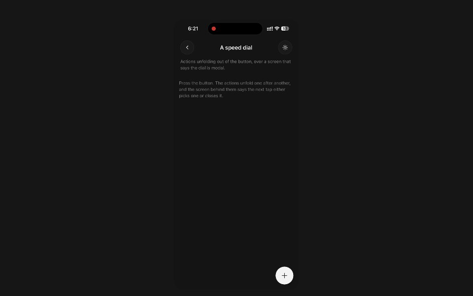 FabPanel UI · React NativeThe floating action button — one action pinned over the content, with an optional dial of others behind it.
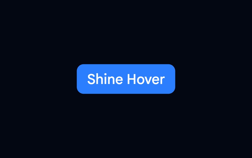 Button 03 - Shine HoverShadcn Space · ReactShine Hover button component
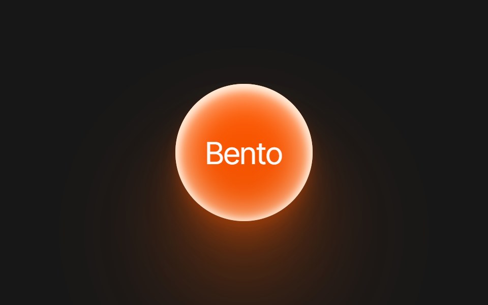 Abhinav Bento ButtonPixel Perfect · ReactA large bento-style button.
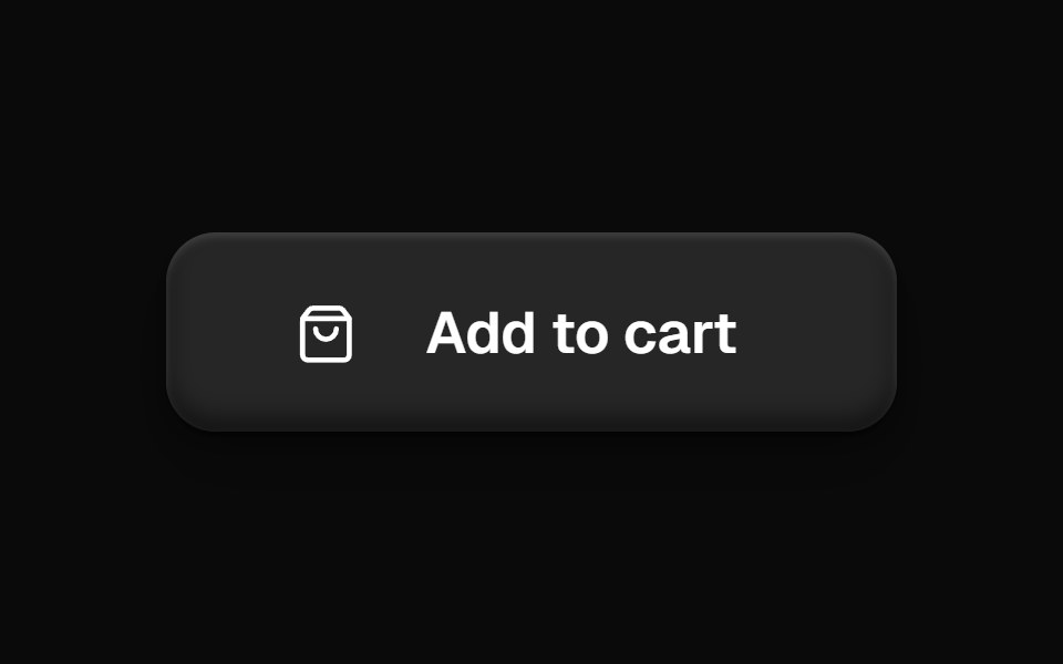 Add To Cart ButtonOpenSourceUI · React
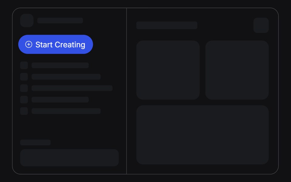 Create Menuuselayouts · ReactA Start Creating pill that springs open into a list of create actions.
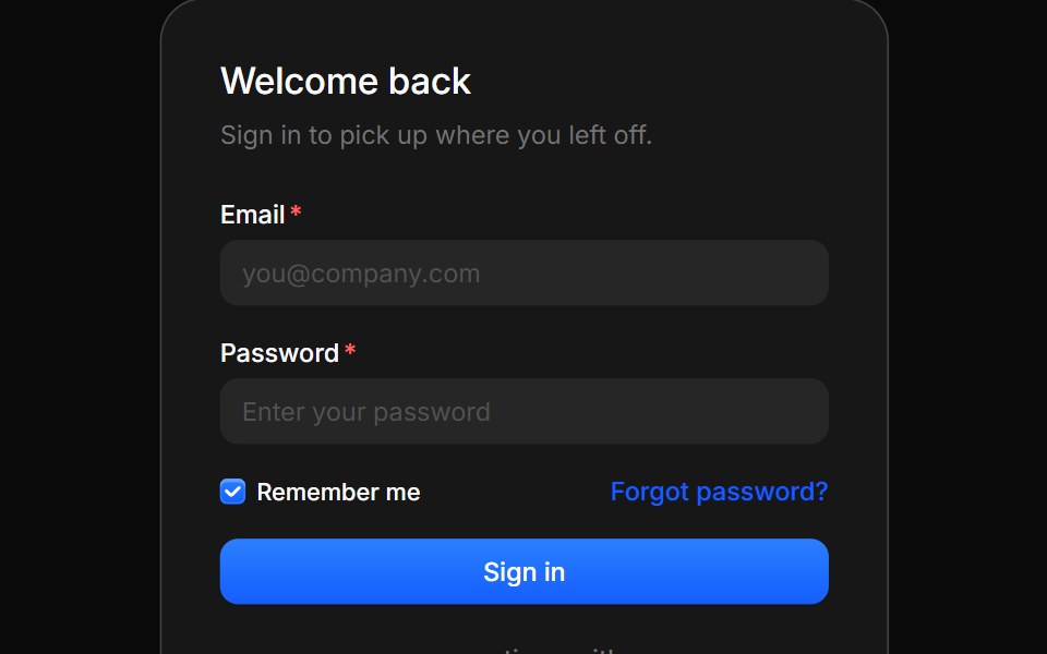 AuthBoardUI · React
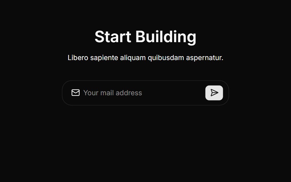 Cta Threecnblocks · SvelteCTA section with background gradient
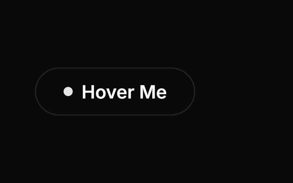 Interactive Hover ButtonAnimations (Svelte) · SvelteA button with an interactive hover effect featuring an expanding dot and sliding text animation with an arrow.
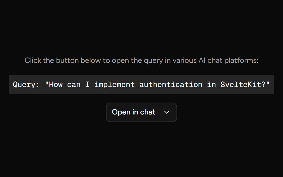 Open In ChatAI Elements (Svelte) · SvelteA provider menu for opening prompts in external chat and AI tools.
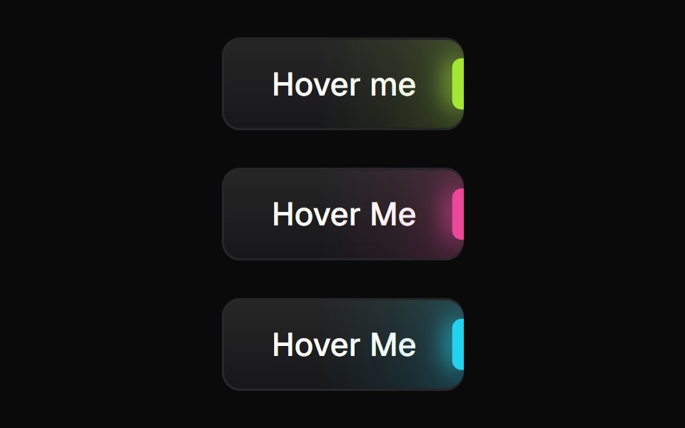 Glowing ButtonBadtz UI · ReactA visually distinct button component featuring a configurable, animated glow effect to highlight calls to action or…
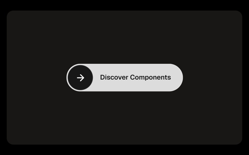 Discover ButtonObsidianUI · React
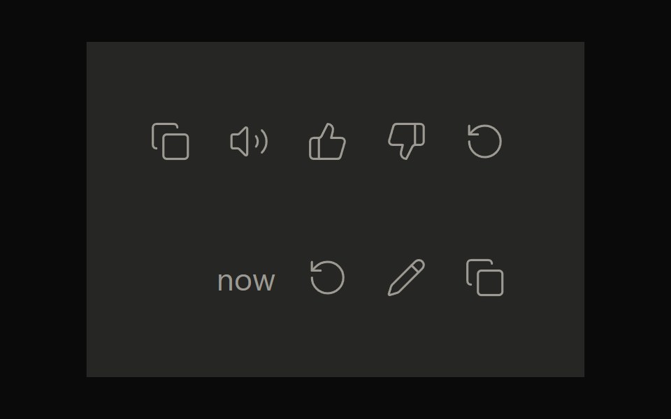 Claude ActionsNotra · ReactCopy, feedback and retry actions built on shadcn Button and Tooltip.
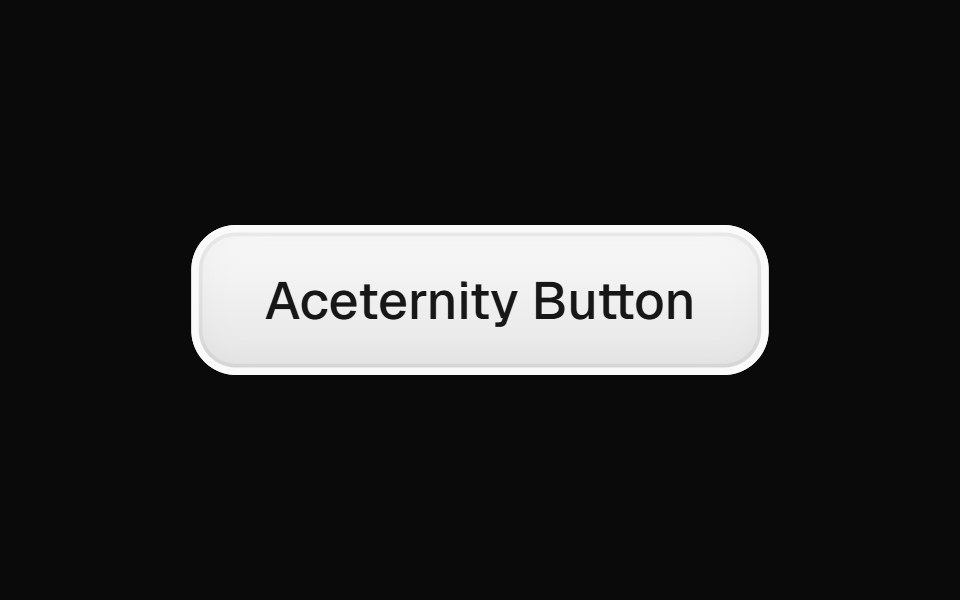 Aceternity ButtonGreatUI · React
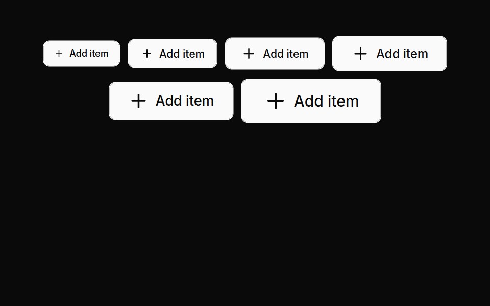 Buttons 07Oxbow UI · AstroButton with left icon
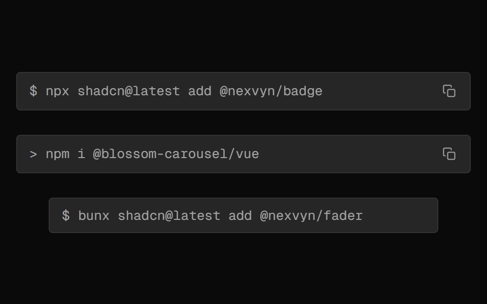 Clipboard FieldNexvyn UI · ReactA one-click install/copy field that morphs between the command and a success label using CSS grid fr tracks. JS only…
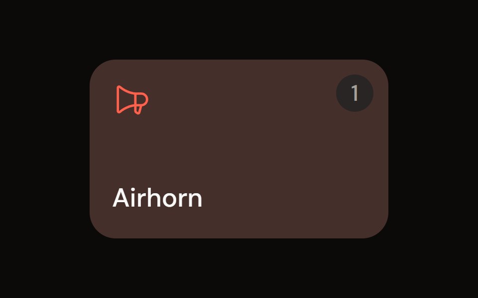 Sound Padaudiocn · ReactA trigger pad with one-shot, toggle, hold and loop modes, a hotkey, playback progress and an accent colour, plus a…
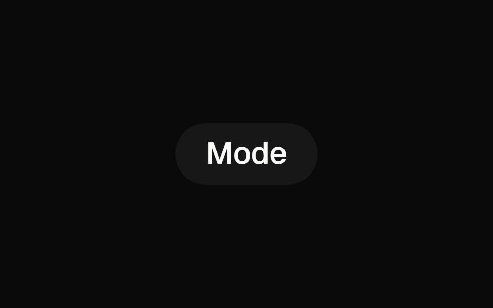 toggleBaseLayer · ReactA toggle button allows a user to toggle a selection on or off, for example switching between two states or modes.
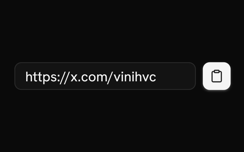 ClipboardShark UI · ReactCopy text to the clipboard.
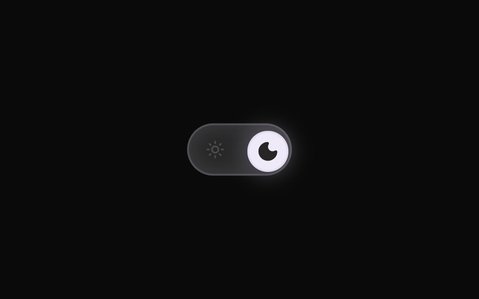 Theme ToggleRewamp UI · ReactRewampUI ThemeToggle Component A smooth, tactile Light / Dark mode toggle switch with layout-interpolated spring…
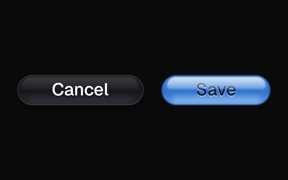 AquaButtonEvil Buttons · ReactA glossy pill button inspired by Apple's Aqua interface, with layered highlights and a soft inner glow.
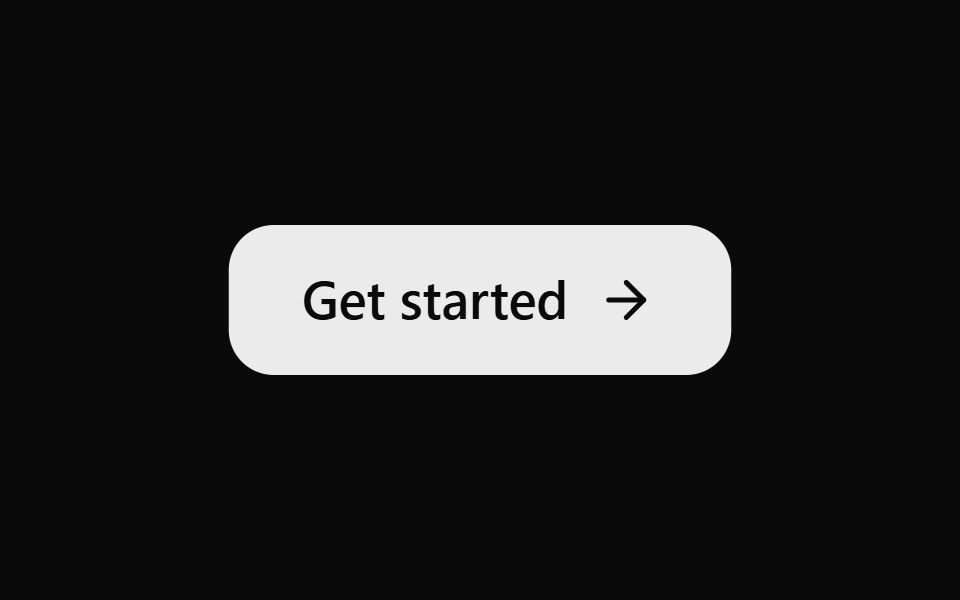 ButtonSona UI · ReactA simple action button with subtle press feedback and reduced-motion support.
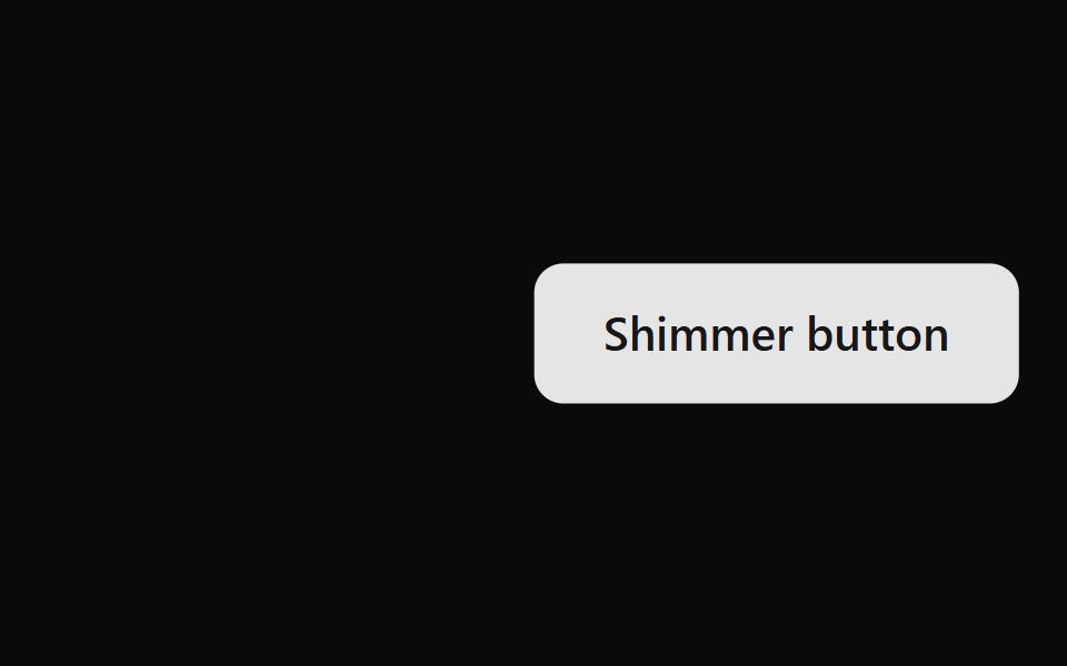 Shimmer Button BaseWatermelon UI · ReactButton with a strip of light that sweeps across it on hover.
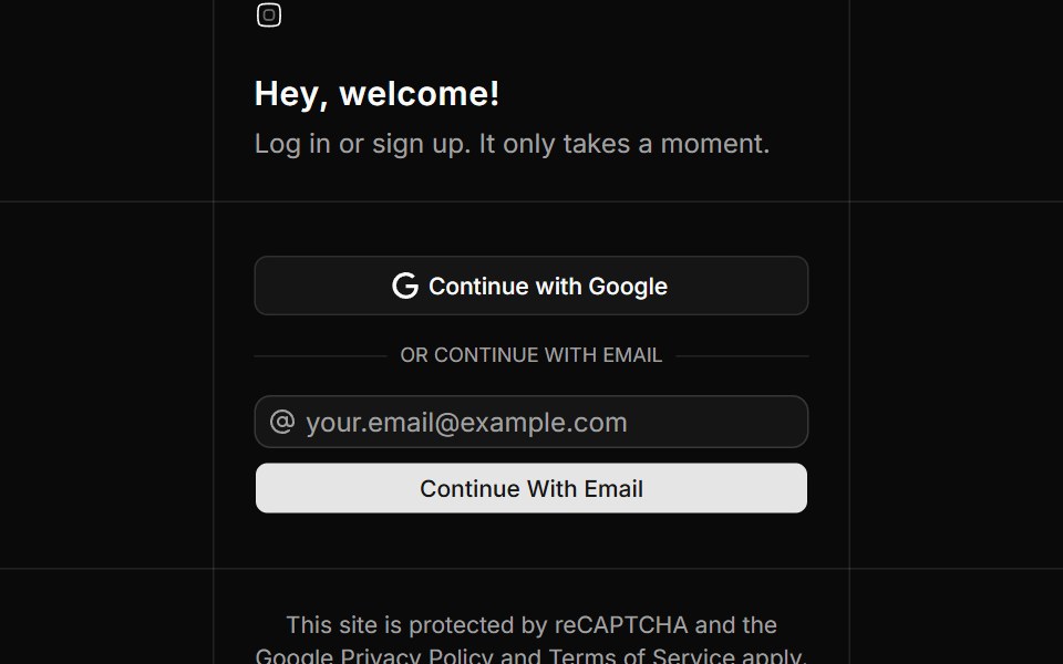 Auth Foursv-efferd · SvelteA bordered auth layout with divider rails and a gentle email-first continuation flow.
Libraries with Tailwind CSS button components
Related categories
- Button Components
- React Button Components
- Svelte Button Components
- React Native Button Components
- Animated Button Components
- shadcn/ui Button Components
- Tailwind CSS Action Components
- Tailwind CSS Button Group Components
- Tailwind CSS Toggle Button Components
- Tailwind CSS Icon Button Components
- Tailwind CSS CTA Button Components
- Tailwind CSS Link Components
- Tailwind CSS Copy Button Components
- Tailwind CSS Theme Toggle Components
- Tailwind CSS Like Button Components
- Tailwind CSS Social Login Button Components
- Tailwind CSS FAB Components
- Tailwind CSS Download Button Components
- Tailwind CSS Slide To Confirm Components
- Tailwind CSS Hold Button Components
- Tailwind CSS Submit Button Components
- Tailwind CSS Send Button Components