Button (Base UI)
Animated button with variants (primary, secondary, tertiary, ghost), icon support, loading spinner, and fluid font-weight transitions on hover. Base UI flavor.
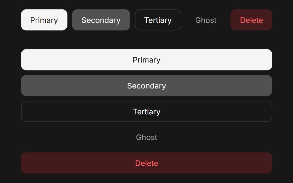
- Library
- Fluid Functionalism
- Framework
- React
- Type
- ui
- License
- MIT
- Dependencies
- @base-ui/react@^1.9.0, class-variance-authority, lucide-react, motion
- Install
npx shadcn@latest add @fluid/button-base- Files
registry/base/button.tsxregistry/default/lib/utils.tsregistry/default/lib/omit.tsregistry/default/lib/font-weight.tsregistry/default/lib/shape-context.tsxregistry/default/lib/icon-context.tsxregistry/default/lib/size-context.tsxregistry/default/lib/type-scale.ts
- Source
- https://github.com/mickadesign/fluid-functionalism
Categories
- Action Components
- React Action Components
- Tailwind CSS Action Components
- Animated Action Components
- Button Components
- React Button Components
- Tailwind CSS Button Components
- Animated Button Components