 Dev Design Library
Action Components
Dev Design Library indexes 1,248 action components from 95 open-source UI libraries, with the most coming from ReUI, Watermelon UI, Origin UI, Shadcn Space and Amicro Micro Transitions. Each one links to its page with the source code, a live preview where available, the library license and the install command.
Showing 120 of 1,248, a mix from every library. Open a library to see all of its components.
 Buttonshadcn/ui · ReactDisplays a button or a component that looks like a button.
 Accordion ActionsMUI / Material UI · React
 Bell ToggleReact Bits · ReactPill toggle that answers a press at three tempos: the bell rings on damped keyframes, the label blur-crossfades, and…
 ButtondaisyUI · CSS (Tailwind)
 Action BarChakra UI · ReactUsed to display a bottom action bar with a set of actions
 ButtonHeroUI · ReactInteractive component that triggers an action when pressed.
 ButtonHeadless UI · React
 Theme TogglerMagic UI · ReactTheme toggle with View Transitions and animated clip-path masks (circle, polygons, star), optional viewport-centered…
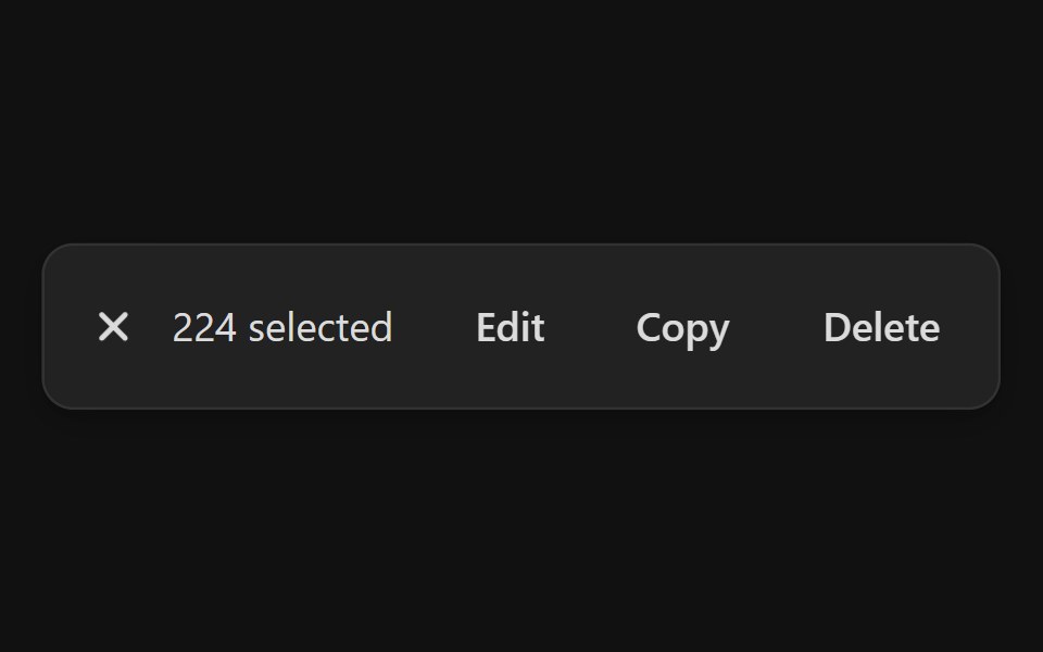 Action BarReact Spectrum · ReactAction bars are used for single and bulk selection patterns when a user needs to perform actions on one or more items…
 Buttoncoss ui · ReactA button or a component that looks like a button.
 ButtonOrigin UI · ReactA button or a component that looks like a button.
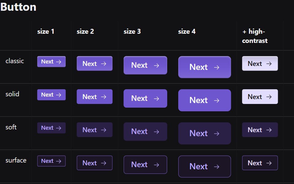 ButtonRadix Themes · React
 Theme SwitchPreline UI · JavaScript (HTML + Tailwind)
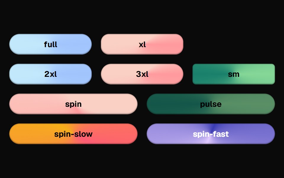 Bg Animate ButtonCult UI · ReactButton component with animated background effects and gradient transitions
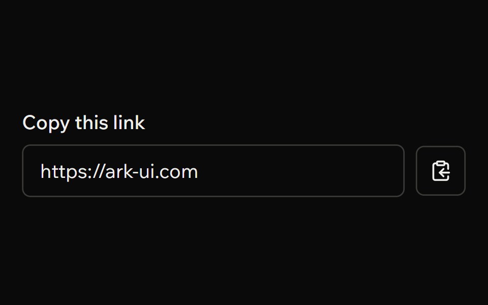 ClipboardArk UI · ReactA component to copy text to the clipboard
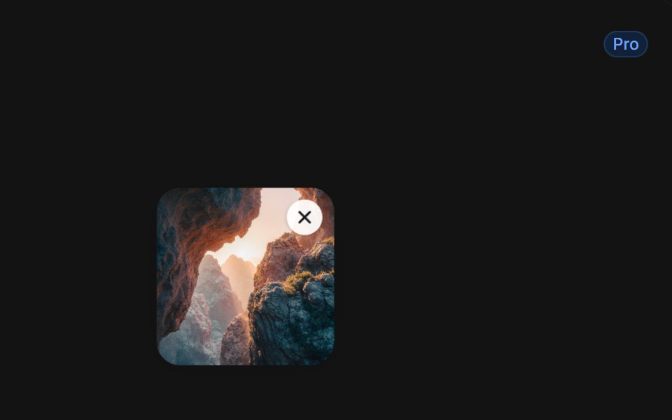 Delete With Smoky Dissolvetransitions.dev · HTML/CSSList item that dissolves into smoke when deleted.
 ButtonTremor · React
 Default buttonReUI · ReactDefault button
 Linkpdfcn · ReactLink PDF component (forme)
 Apple Icon MorphAmicro Micro Transitions · ReactApple Icon Morph loading animation.
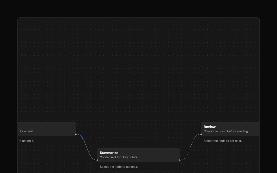 ControlsAI Elements · ReactA styled controls component for React Flow-based canvases with zoom and fit view functionality.
 ButtonPark UI · ReactA clickable component for triggering actions and user interactions.
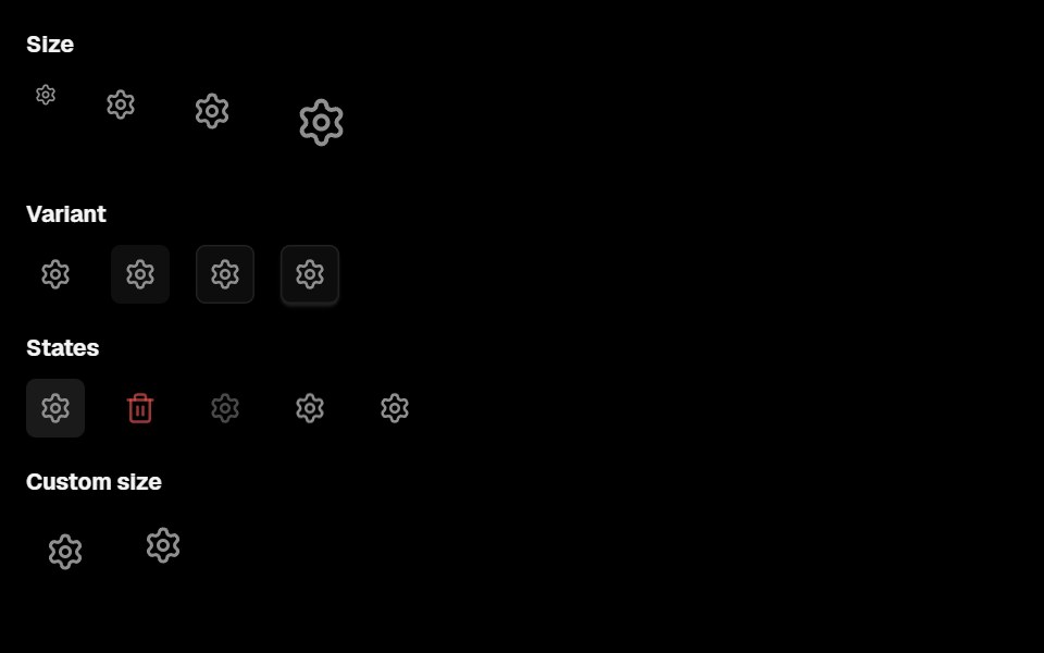 Action IconLobe UI · ReactActionIcon is a component for rendering icon buttons with background, supporting multiple style variants, sizes, and…
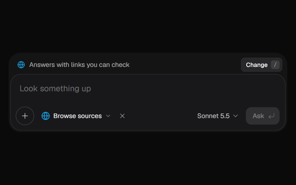 AI Input SearchKokonut UI · ReactAI composer with a Tools menu (browse, investigate, draft, run code, reason), a model picker and a live trace that…
 buttonIntent UI · Reactbutton
 Play Button IconUntitled UI React · ReactRounded play icon with blurred background and a filled triangle in the middle.
 Bloom MenubeUI · ReactA button that morphs open into a menu and blooms iris-out from the center, the grid revealing in every direction with…
 ButtonTailGrids · ReactButton component with multiple variants, sizes, and support for icons.
 Delete ButtonRare UI · ReactA delete button that asks for confirmation in place, no dialog needed.
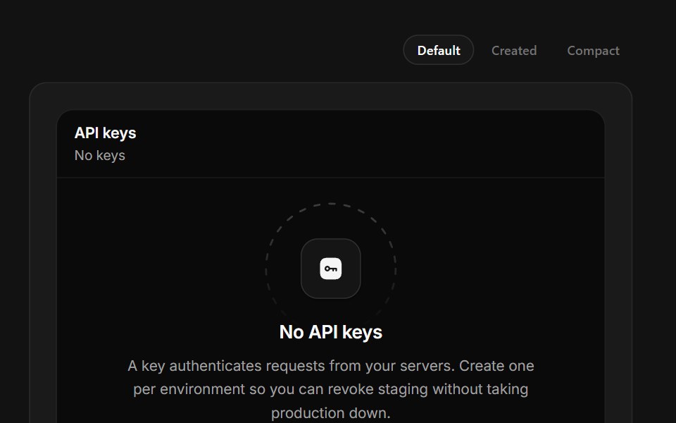 No API KeysSpectrum UI · ReactKey creation that reveals the secret once, masked, with a copy that confirms itself.
 Copy ButtonSpell UI · ReactA copy-to-clipboard button with blur transition effect.
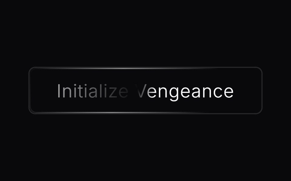 Animated ButtonVengeance UI · ReactAnimated CTA button with shine effect
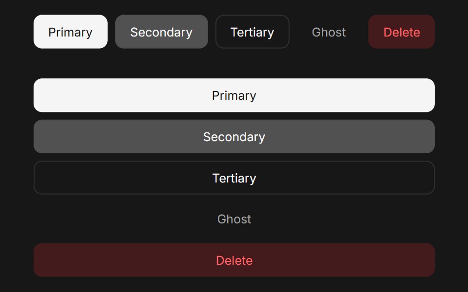 ButtonFluid Functionalism · ReactAnimated button with variants (primary, secondary, tertiary, ghost), icon support, loading spinner, and fluid…
 ButtonUser Interface Wiki · React
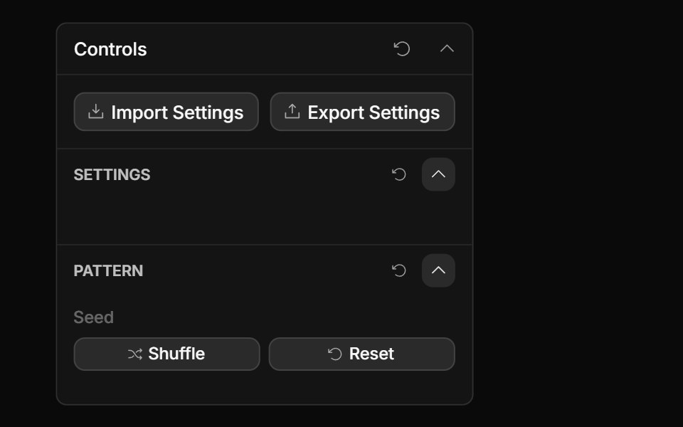 Actions ControlToolcraft · React
 ButtonLaunch UI · React
 Around Theme ToggleTheme Toggles · ReactAn animated sun-and-moon theme toggle with a sweeping transition.
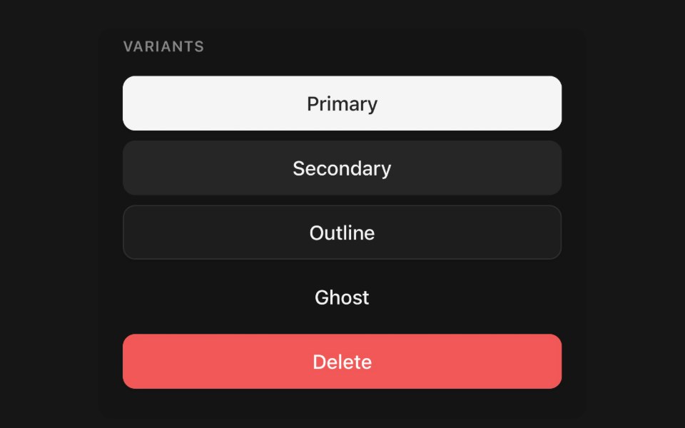 ButtonPanel UI · React NativePressable action with variants, sizes, loading state and icon slots.
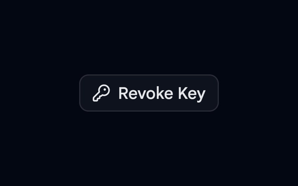 Alert 11 - Hold to ConfirmShadcn Space · ReactCompact alert dialog where the user presses and holds the revoke button until it fills, preventing accidental clicks
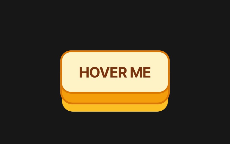 3D ButtonPixel Perfect · React3D push button with press/hover physics and 8 color variants: amber, emerald, rose, sky, violet, slate, coral, mint.
 Copy EmailOpenSourceUI · ReactCopies the maintainer email on click — no mailto / mailbox popup. Hover shows “Click to copy”; after click shows…
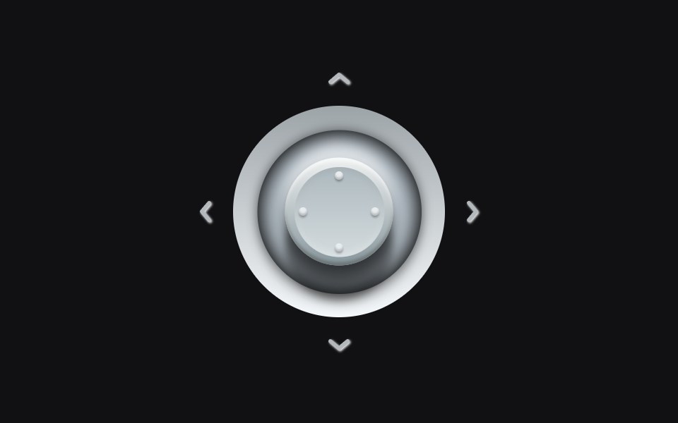 Analog Stickuselayouts · ReactA metallic stick that tilts into the press. Hover a quadrant and the cap leans, the shadow shifts, and the matching…
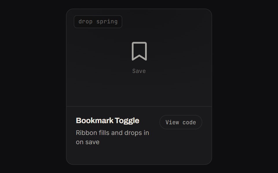 Bookmark ToggleKinetics · HTML/CSSRibbon fills and drops in on save
 ButtonPrebuiltUI · React
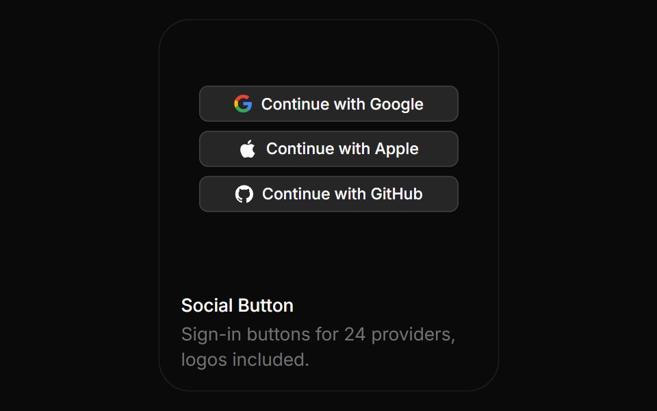 Social ButtonBoardUI · ReactSign-in buttons for 24 providers, logos included.
 Coss ButtonComponentry · React
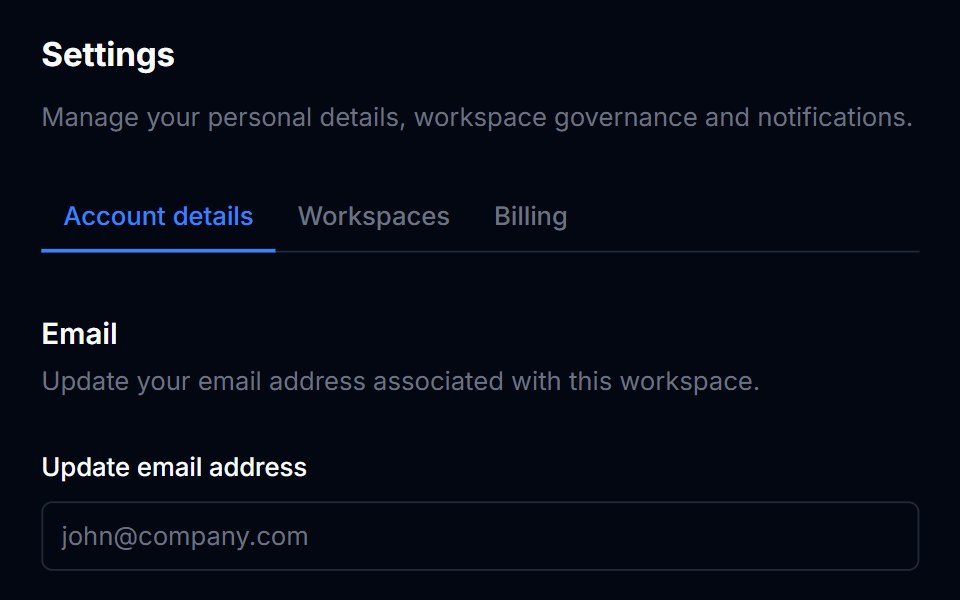 ButtonTremor Blocks · React
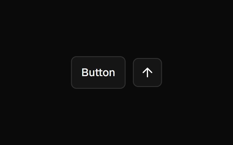 ButtonShadcn Dashboard · React
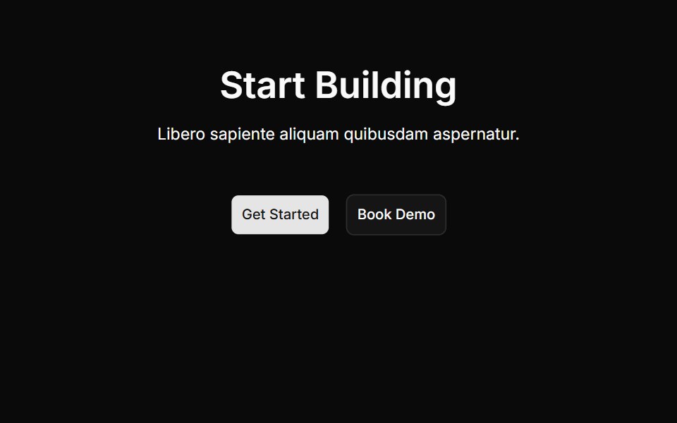 Cta Onecnblocks · SvelteCall-to-action block with centered heading and buttons
 Animated Theme TogglerAnimations (Svelte) · SvelteA smooth animated theme toggler that uses the View Transition API to create a circular reveal effect when switching…
 Copy ButtonAI Elements (Svelte) · SvelteA clipboard-driven button with success and failure states.
 Commit ButtonSwiftPieces · SwiftUIAn async action button in liquid glass that runs through loading, success and error, with a progress bubble budding…
 Confetti ButtonBadtz UI · ReactA fun and interactive button that triggers a confetti explosion effect on click.
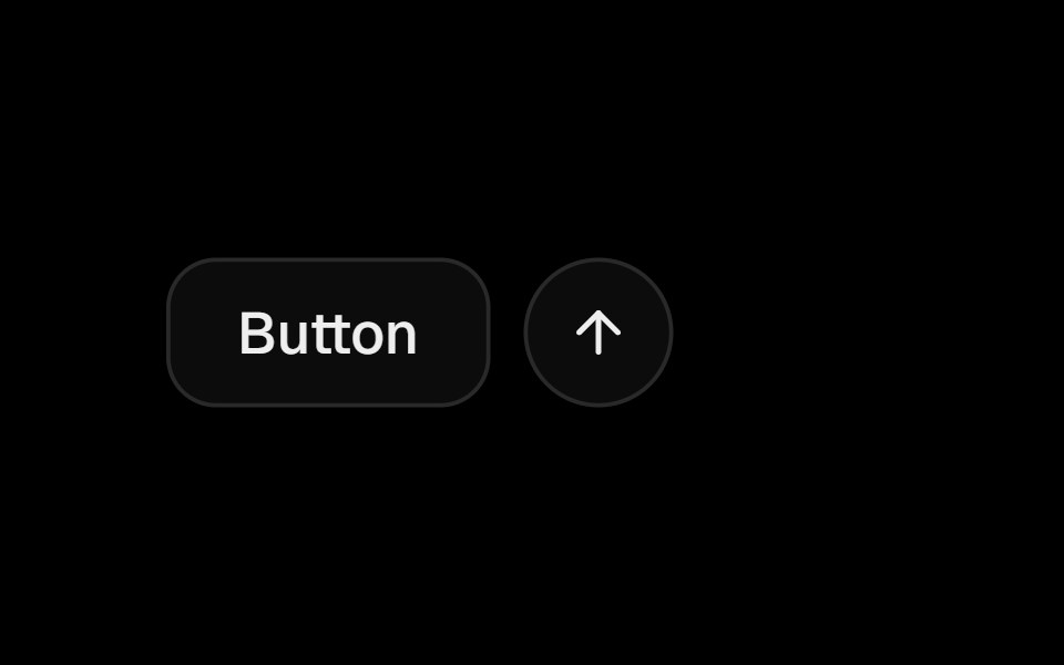 ButtonObsidianUI · React
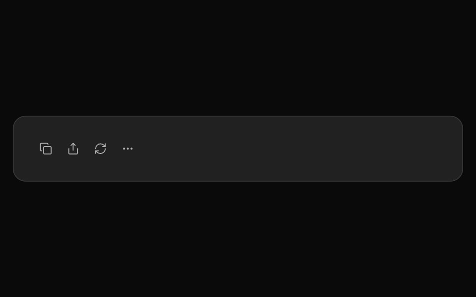 ChatGPT ActionsNotra · ReactCopy, share, redo and more buttons, built on shadcn Button and Tooltip.
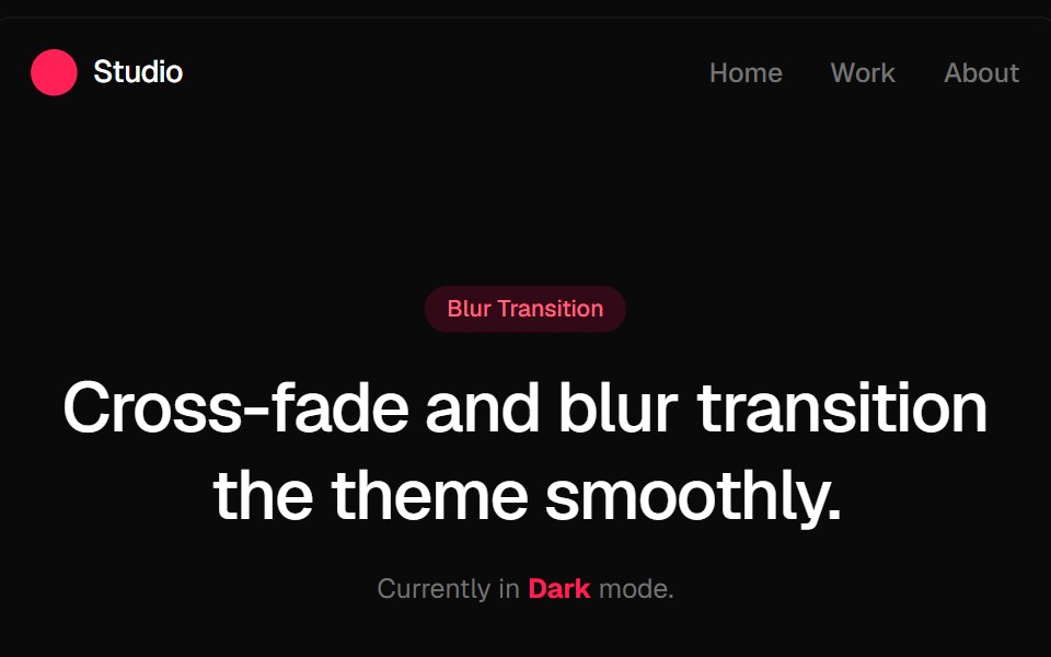 Blur Fade Theme TransitionGreatUI · ReactLight and dark theme toggle that switches the page with a blur and fade transition.
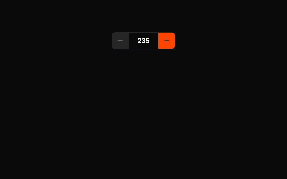 Button Groups 01Oxbow UI · AstroCounter group (− value +)
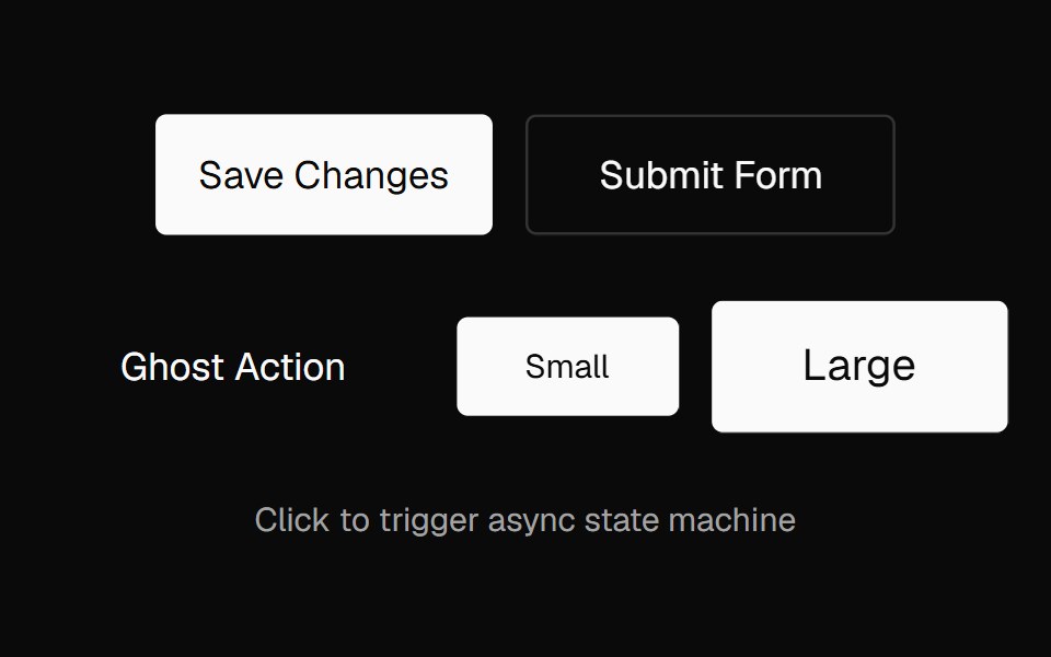 Action ButtonNexvyn UI · ReactAn async-aware button with an idle → pending → success/error state machine, promise tracking, abort support, and live…
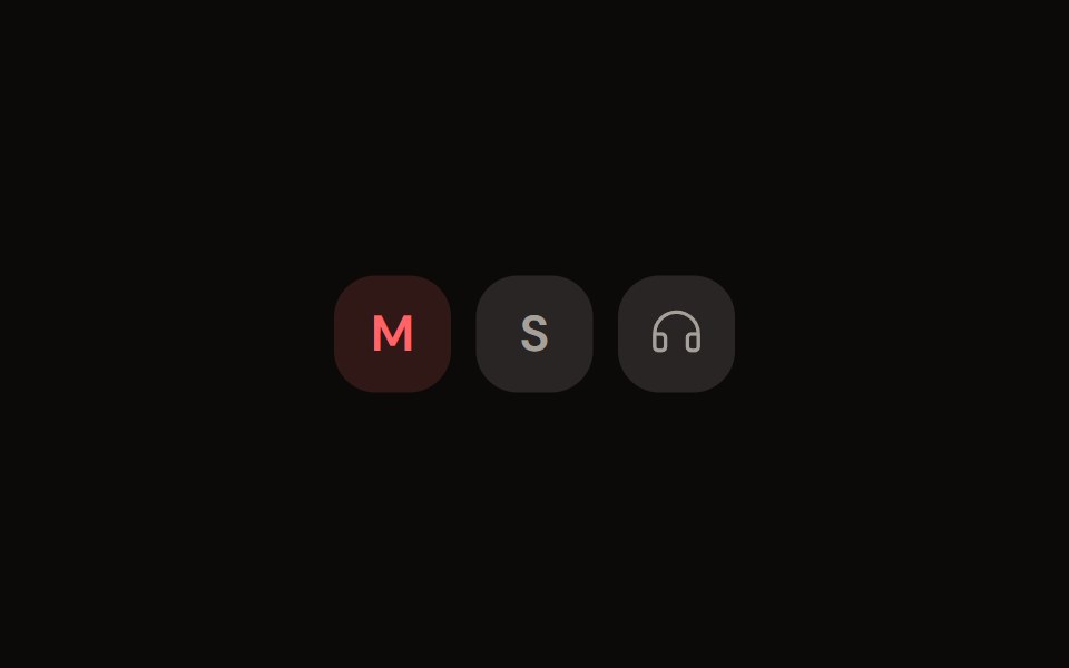 Channel Toggleaudiocn · ReactMute, solo and monitor toggle buttons with their own pressed colours.
 buttonBaseLayer · ReactA button allows a user to perform an action, with mouse, touch, and keyboard interactions.
 Action BarShark UI · ReactDisplay an action bar for selected items.
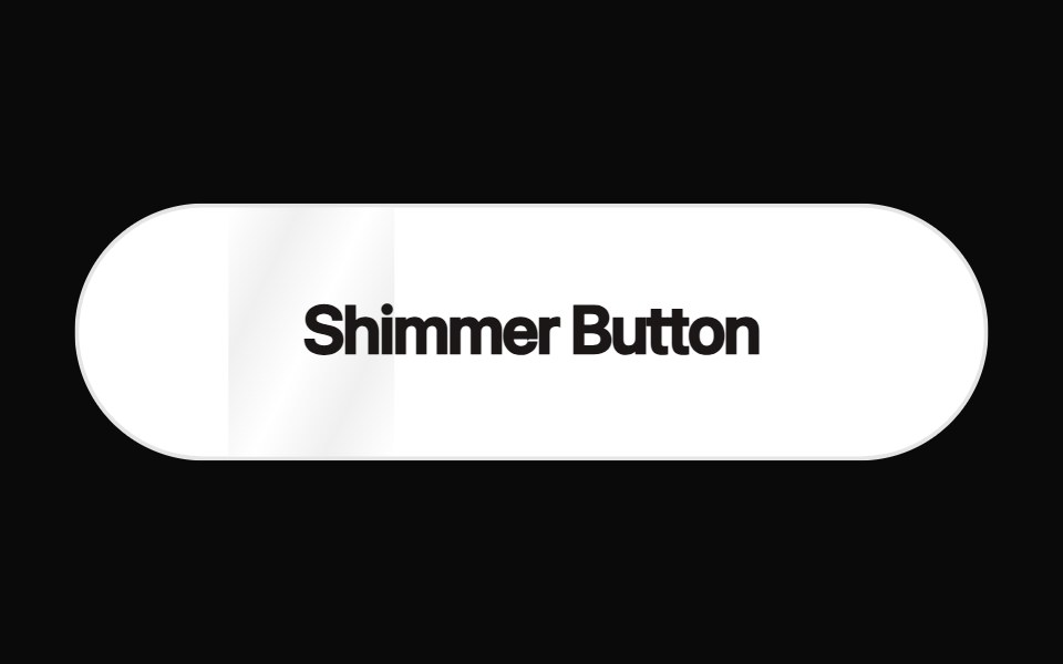 Shimmer ButtonRewamp UI · ReactButton with a strip of light sweeping across it in a loop.
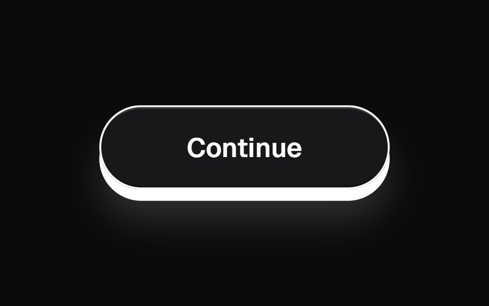 ThreeDButtonEvil Buttons · ReactA minimal 3D button with a clean deck-style press and sliding click sheen.
 BubbleUpButtonSona UI · ReactThe `BubbleUpButton` component provides an interactive button with a fluid "bubble-up" animation effect when hovered…
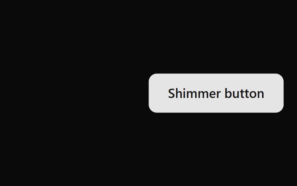 Shimmer ButtonWatermelon UI · ReactButton with a strip of light that sweeps across it on hover.
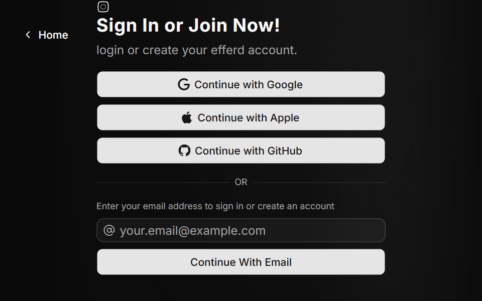 Auth Fivesv-efferd · SvelteA split-screen auth experience with animated background paths and broader provider options.
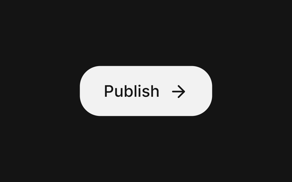 Action buttonArc Library · ReactA compact button for frequent toolbar actions.
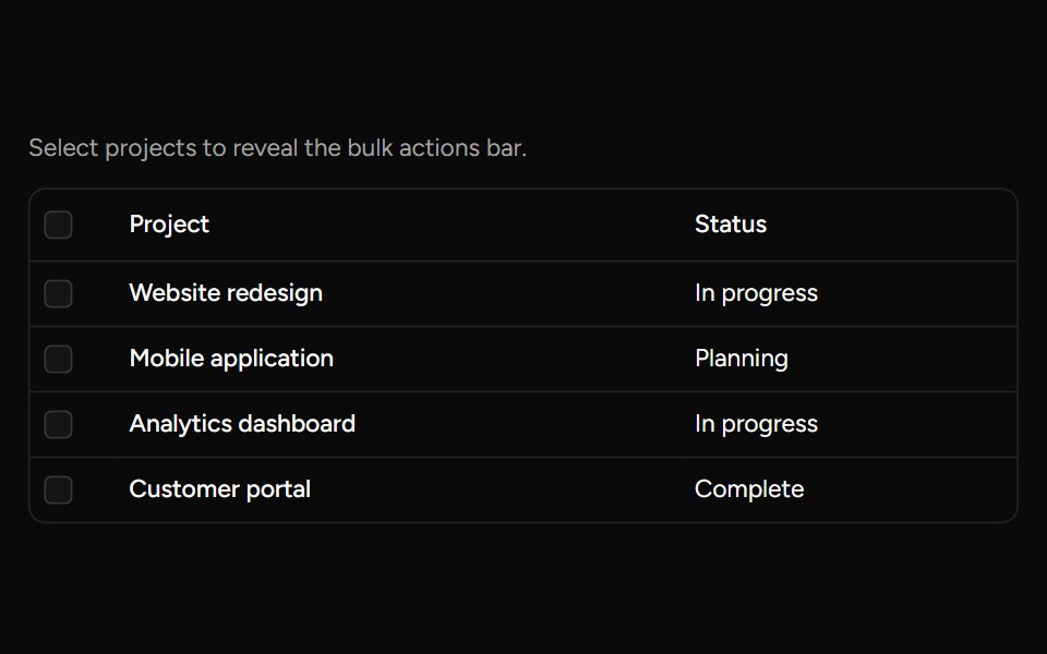 Bulk Actions Barsv-table · SvelteA floating action bar for performing custom actions on selected rows.
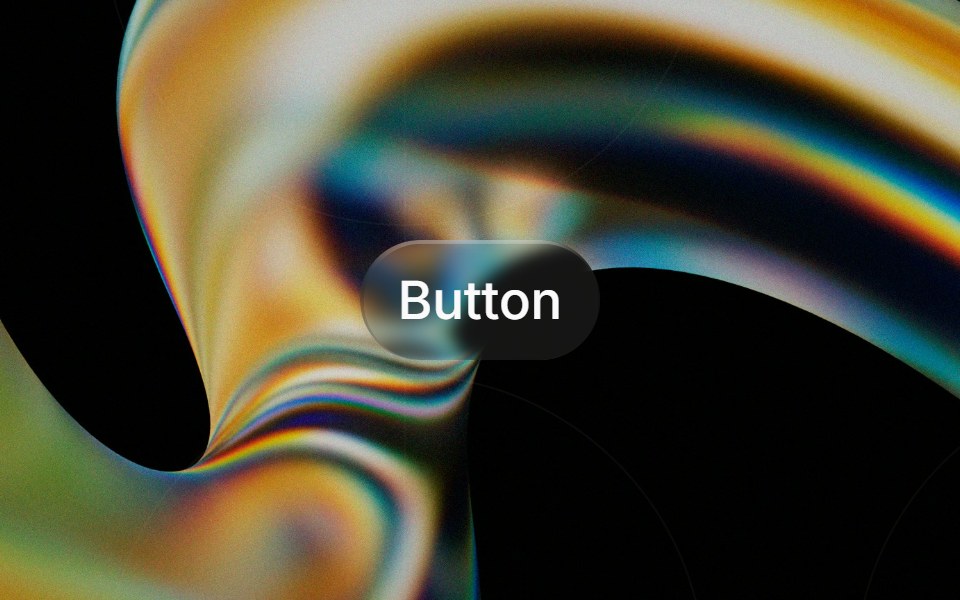 Glass Buttonglasscn · ReactGlass Button with five variants: clear, frosted, subtle, liquid, and liquid-refract
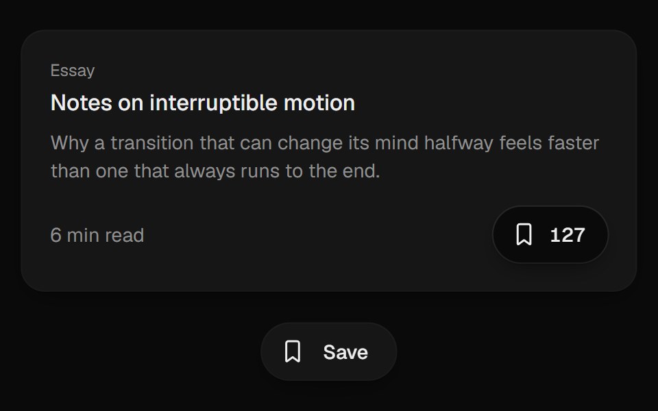 Bookmark ButtonUI Lab · ReactFills from the bottom up and lands with a small squash.
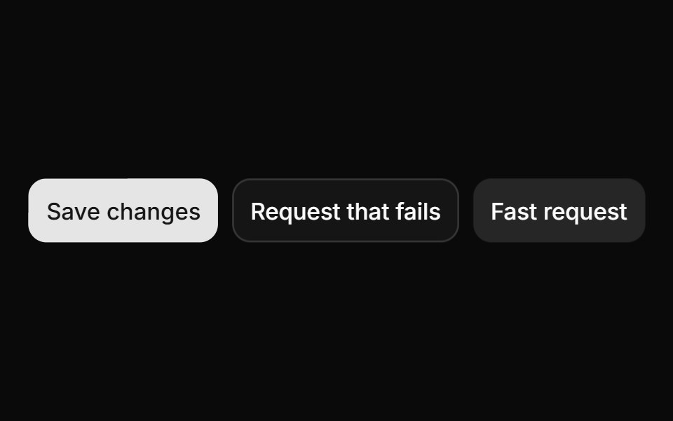 ButtonHextaUI · ReactButtons in every variant and size, with a built-in loading, success and error flow that skips the spinner for fast…
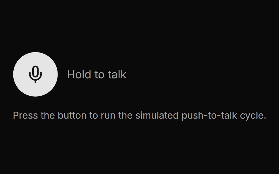 Voice ButtonLocalMode · ReactA press-to-record / release-to-transcribe push-to-talk button with an explicit visual state machine: idle -> recording…
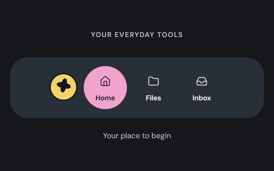 Action dockCojeev UI · ReactA reusable action dock composed from Cojeev base components.
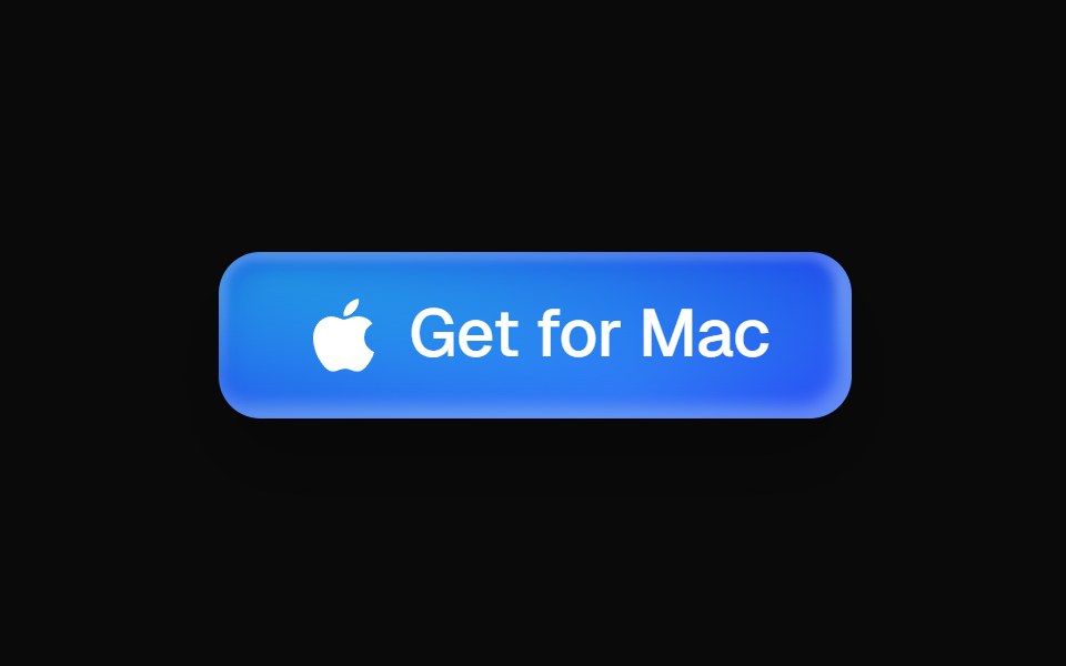 Aurora Download ButtonMicroKit · ReactA layered blue download button with a luminous rim, directional shadow, and blended hover bloom.
 ButtonROI UI · ReactA button component.
 BasicFLX UI · ReactDefault button with text label.
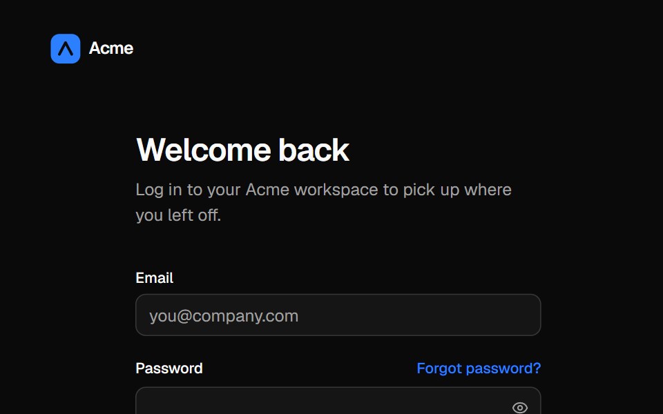 Split login pageVelora UI · ReactLogin form with password reveal, remember-me and social sign-in beside an aurora testimonial panel.
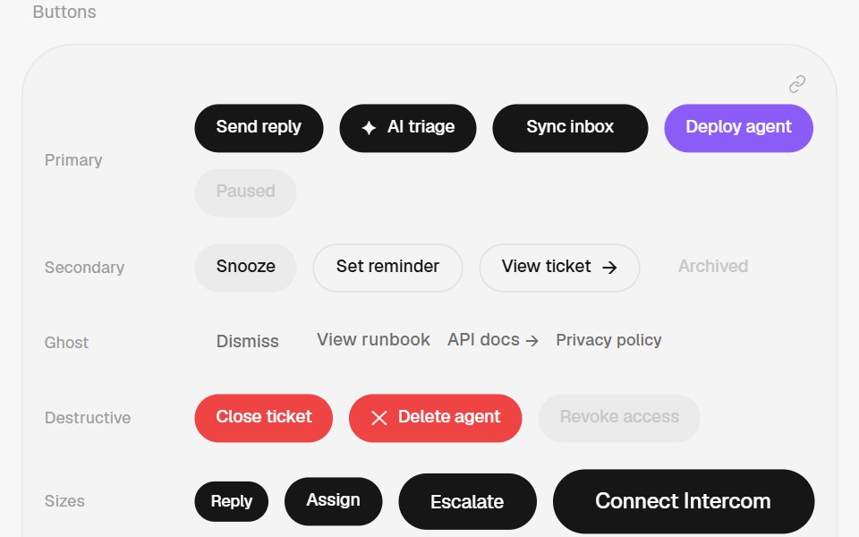 ButtonHalaska UI · React
 Outline Like With Countsv-particles · SvelteOutlined like button with a heart and the number of likes next to it.
 ButtonMetal UI · React + SwiftUIA press-in pill button with compact caps, async waiting/result faces and opt-in irreversible hold confirmation. React…
 BloopSpaceUI · ReactCompact assistant orb with listen, think, and speak states, voice palettes, and audio input.
 Aria ButtonReScript shadcn · ReScript
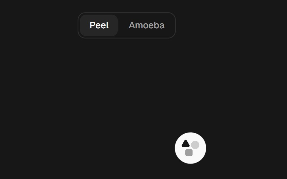 Gooey ToolbarSkecher UI · ReactA compact action toolbar with configurable liquid merging effects and accessible controls.
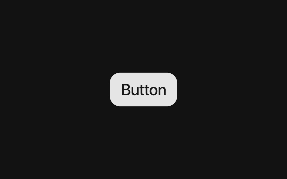 Base ButtonSora UI · ReactAn interactive button component built on Base UI with Motion hover/tap scaling and shadcn/ui variants.
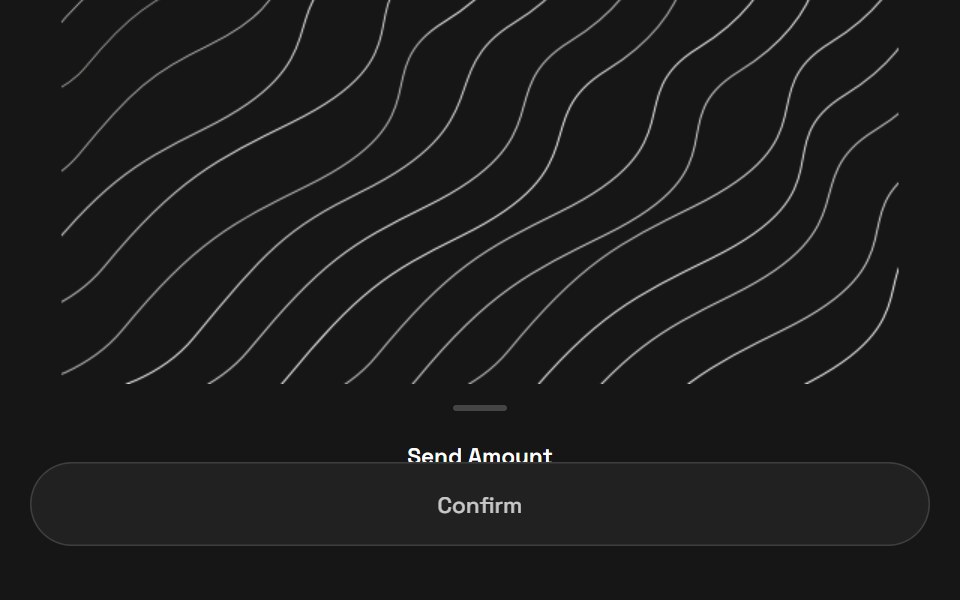 Quick PayZAYX · React Native
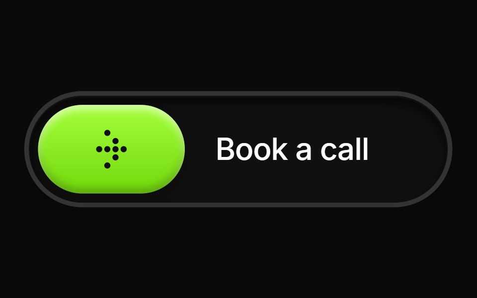 Glossy Slider Call ButtonCue Foundations · React
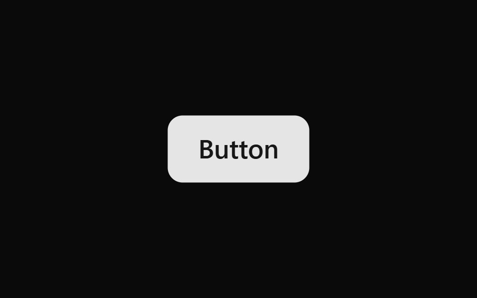 ButtonOUI · ReactReact aria components Button with shadcn characteristics.
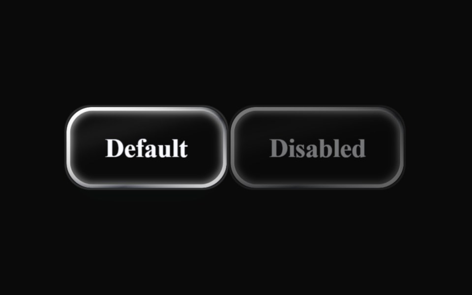 Liquid ButtonLiquefy UI · ReactButton in liquid glass style: translucent, refracting the background.
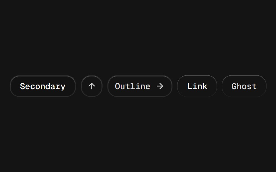 ButtonD2Studio UI · ReactDisplays a button or a component that looks like a button.
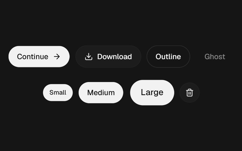 ButtonEaseUI · ReactButton with a quick press, hairline rings instead of borders, four variants, and a 44px tap area even at small sizes.
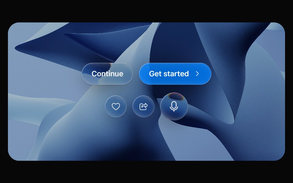 Glass ButtonOpaline · ReactPill button made of liquid glass with a pointer-tracked highlight.
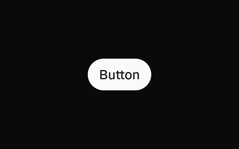 ButtonFibo · ReactTriggers an action or event with a single click.
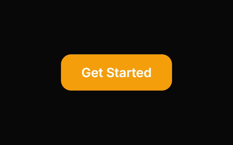 ButtonReactFrame · ReactAn accessible button with primary, secondary, outline, and ghost variants, a spinning loading state, optional icon…
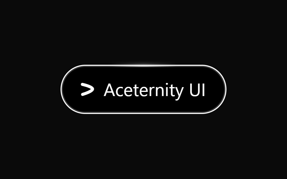 Hover Border GradientAceternity UI · React
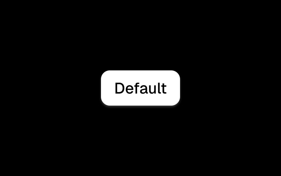 Buttonark-cn · ReactA shadcn-style button component built with Ark UI primitives.
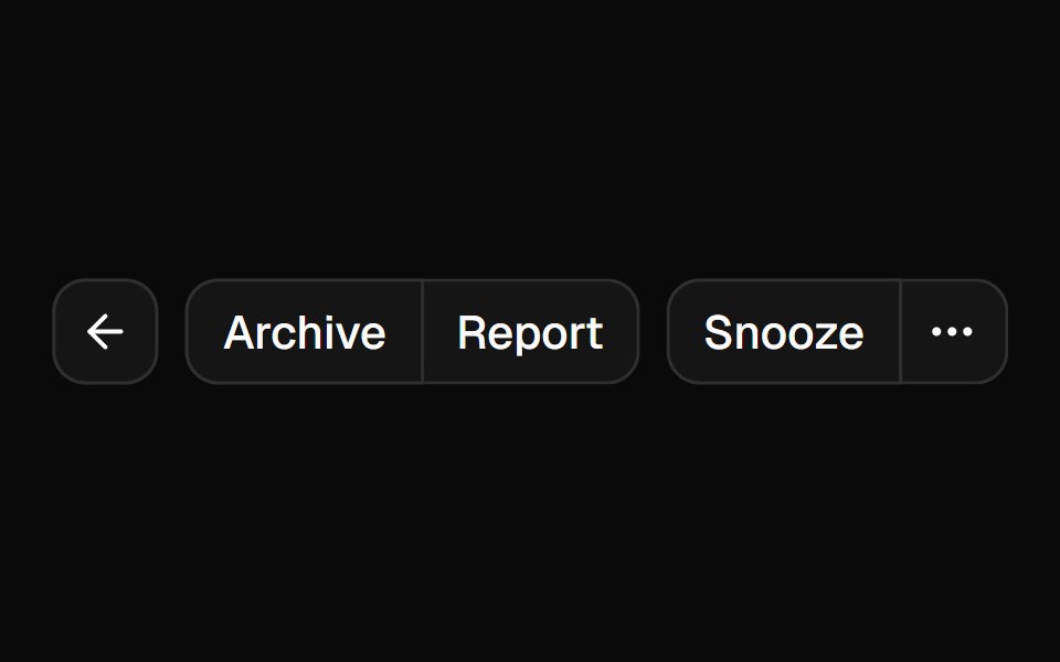 Button Groupshadcn/ui · ReactA container that groups related buttons together with consistent styling.
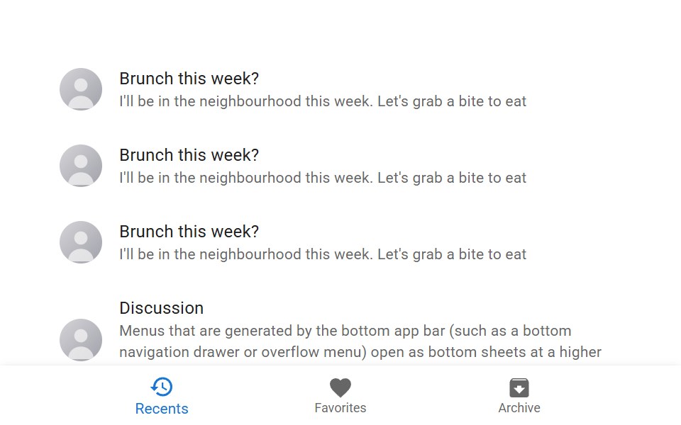 Bottom Navigation ActionMUI / Material UI · React
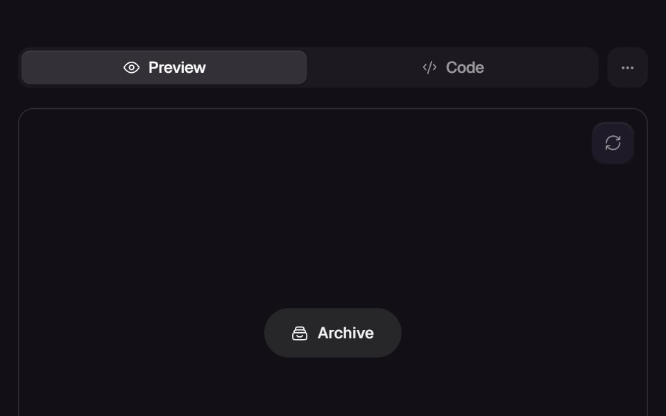 Fuse ButtonReact Bits · ReactAction button whose done state carries its own undo on a burning fuse: press, the label crossfades to Undo, a hairline…
 FabdaisyUI · CSS (Tailwind)
 ButtonChakra UI · ReactUsed to trigger an action or event
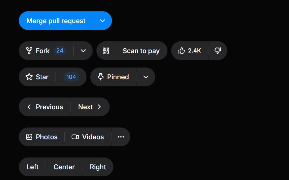 Button GroupHeroUI · ReactGroup related buttons together with consistent styling and spacing
 Close ButtonHeadless UI · React
 Interactive Hover ButtonMagic UI · ReactA visually engaging button component that responds to hover with dynamic transitions, adapting smoothly between light…
 Action ButtonReact Spectrum · ReactActionButtons allow users to perform an action. They’re used for similar, task-based options within a workflow, and…
 Groupcoss ui · ReactA component for visually grouping a series of controls.
 ToggleOrigin UI · ReactA two-state button that can be toggled on or off.
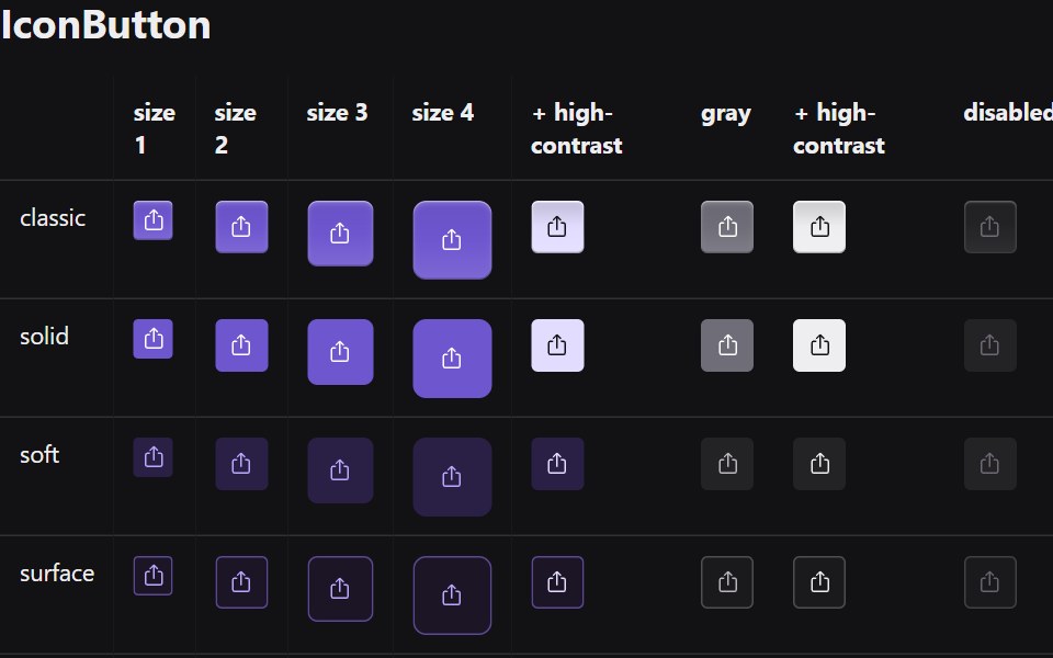 Icon ButtonRadix Themes · React
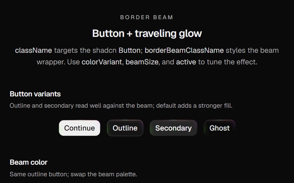 Border Beam ButtonCult UI · ReactShadcn Button wrapped in Border Beam: animated border glow with compact icon and text variants
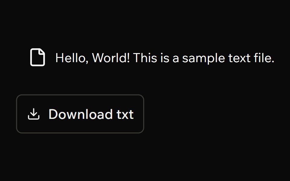 Download TriggerArk UI · ReactTrigger file downloads programmatically.
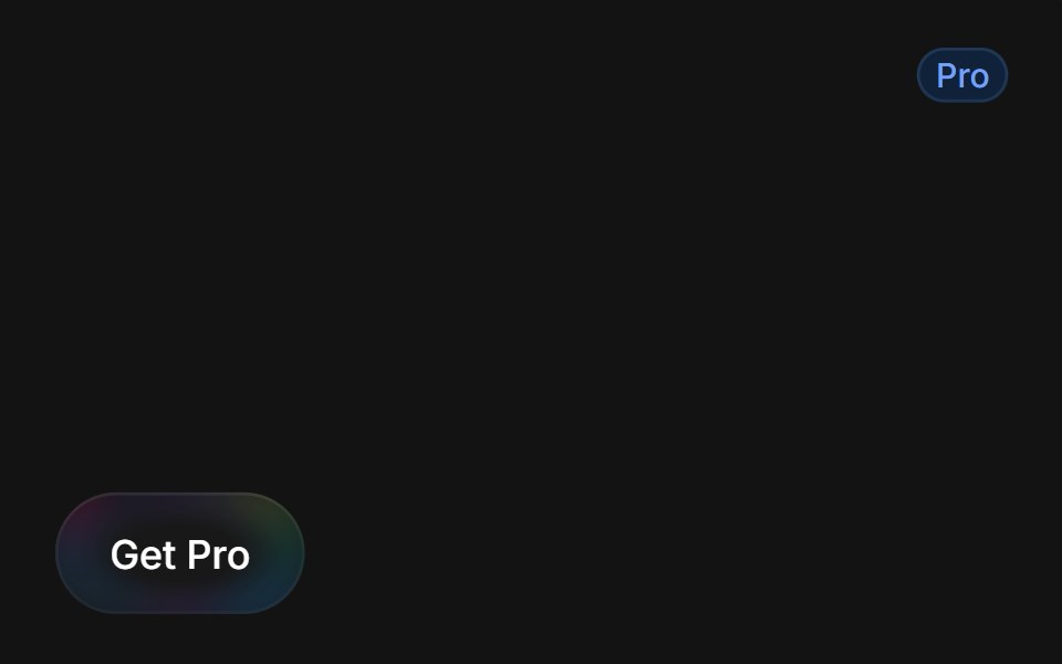 Get Pro Buttontransitions.dev · HTML/CSS
 Disabled buttonReUI · ReactDisabled button
 Linkpdfcn · ReactLink PDF component (takumi)
 Apple UnlockAmicro Micro Transitions · ReactApple Unlock loading animation.
 Open In ChatAI Elements · ReactA dropdown menu for opening queries in various AI chat platforms including ChatGPT, Claude, T3, Scira, and v0.
 ClipboardPark UI · ReactA component for copying text content to the system clipboard.
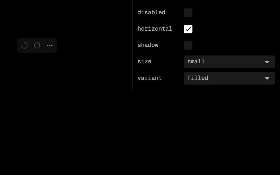 Action Icon GroupLobe UI · ReactActionIconGroup is a component for rendering multiple buttons with unified styling and layout control. It handles…
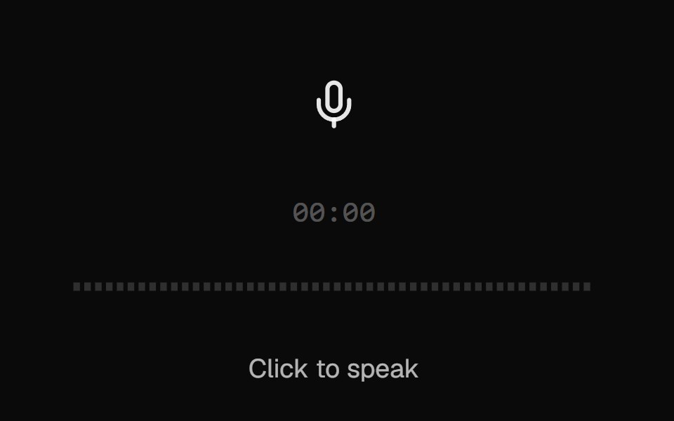 AI VoiceKokonut UI · ReactVoice input with a scrolling waveform, then a take you can play back, discard or send.
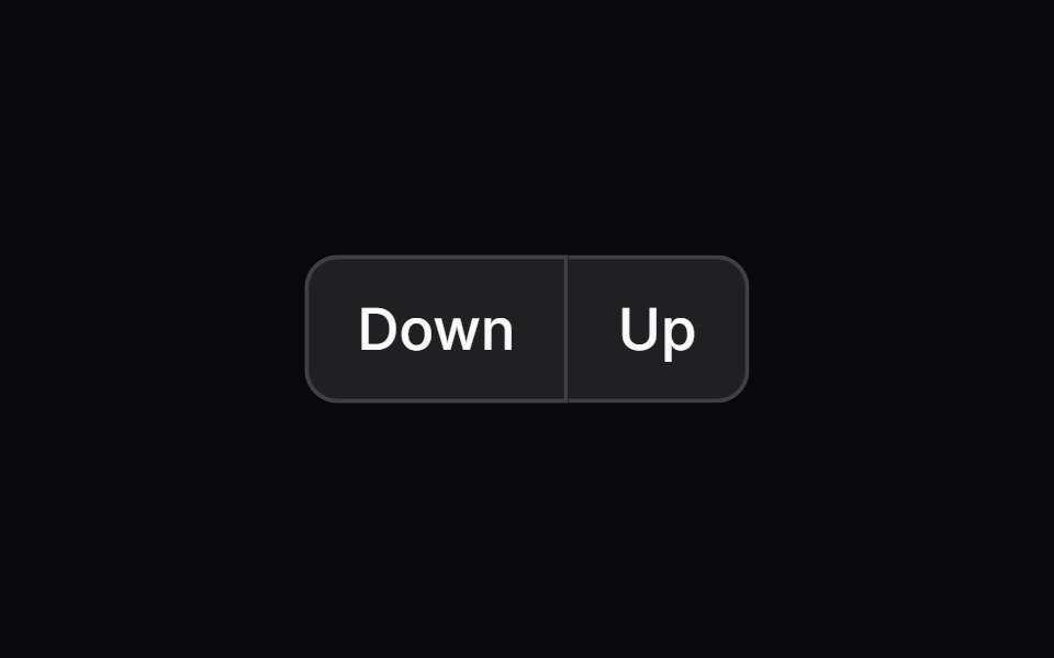 button-groupIntent UI · Reactbutton-group
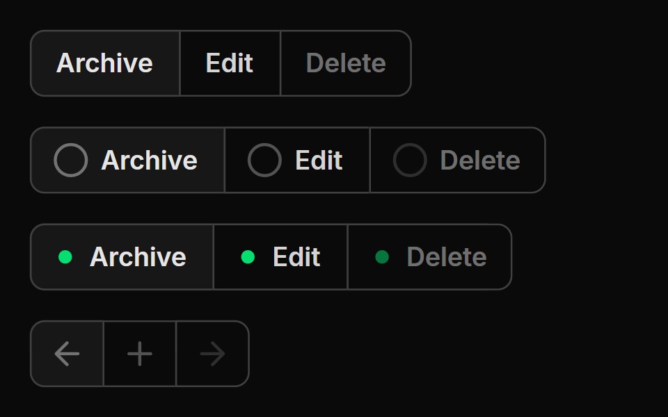 Button GroupUntitled UI React · React
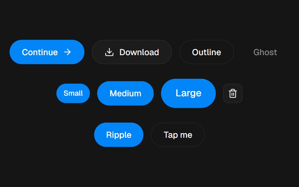 ButtonbeUI · ReactSpring press, ripple, icons and a stateful variant.
Libraries with action components
Related categories
- React Action Components
- Tailwind CSS Action Components
- Svelte Action Components
- React Native Action Components
- Animated Action Components
- shadcn/ui Action Components
- Button Components
- Button Group Components
- Toggle Button Components
- Icon Button Components
- Link Components
- Theme Toggle Components
- CTA Button Components
- Copy Button Components
- Like Button Components
- FAB Components
- Social Login Button Components
- Hold Button Components
- Share Button Components
- Slide To Confirm Components
- Download Button Components
- Submit Button Components