 Dev Design Library
Animated Action Components
Dev Design Library indexes 504 Animated action components from 69 open-source UI libraries, with the most coming from MicroKit, Amicro Micro Transitions, UI Lab, Evil Buttons and Shadcn Space. Each one links to its page with the source code, a live preview where available, the library license and the install command. These are the action components tagged as animated: motion on hover, on scroll or on load, usually built with CSS transitions or Framer Motion.
Showing 120 of 504, a mix from every library. Open a library to see all of its components.
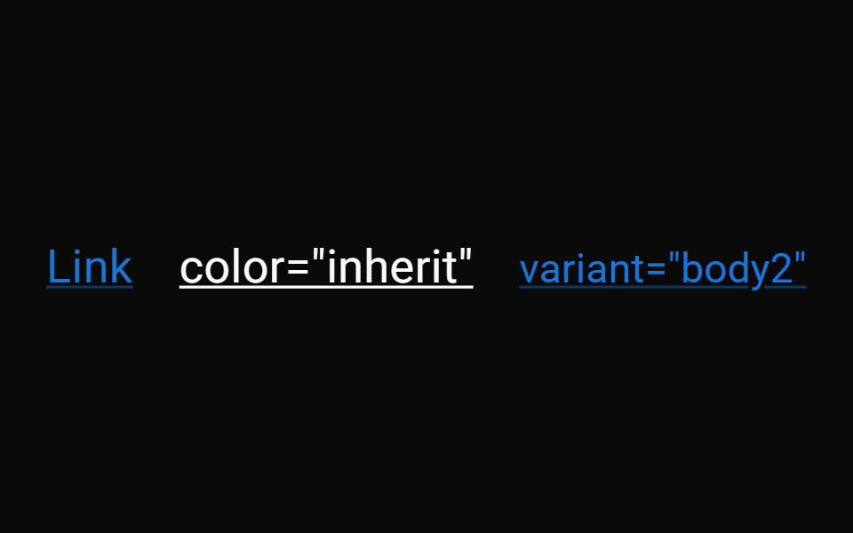 LinkMUI / Material UI · React
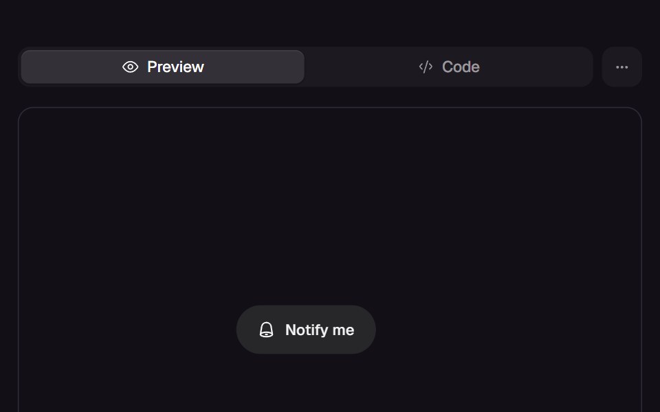 Bell ToggleReact Bits · ReactPill toggle that answers a press at three tempos: the bell rings on damped keyframes, the label blur-crossfades, and…
 LinkdaisyUI · CSS (Tailwind)
 LinkChakra UI · ReactUsed to provide accessible navigation
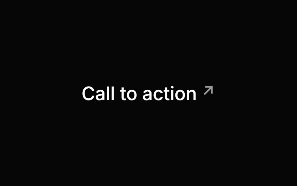 LinkHeroUI · ReactA styled anchor component for navigation with built-in icon support
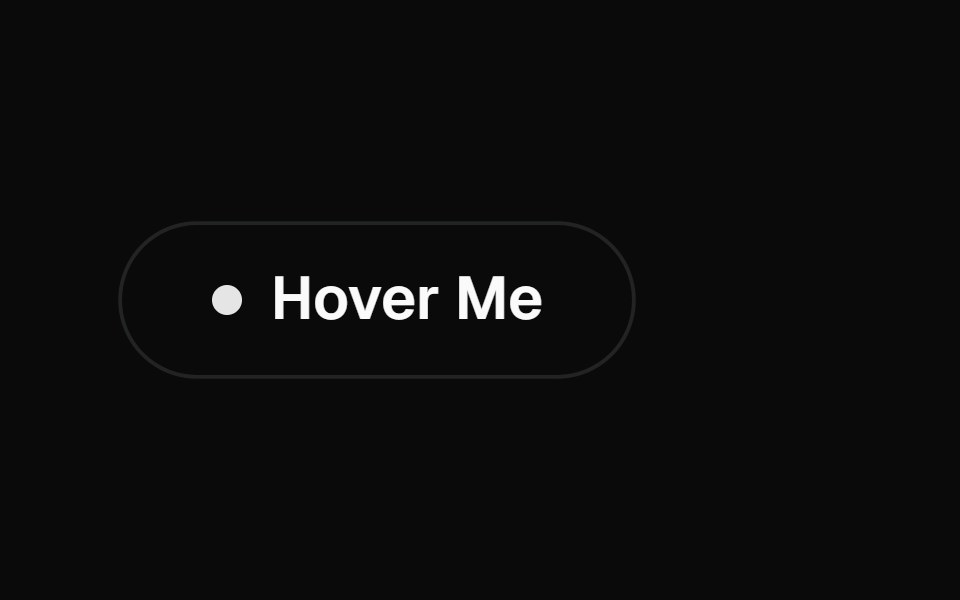 Interactive Hover ButtonMagic UI · ReactA visually engaging button component that responds to hover with dynamic transitions, adapting smoothly between light…
 LinkReact Spectrum · ReactLinks allow users to navigate to a different location. They can be presented inline inside a paragraph or as…
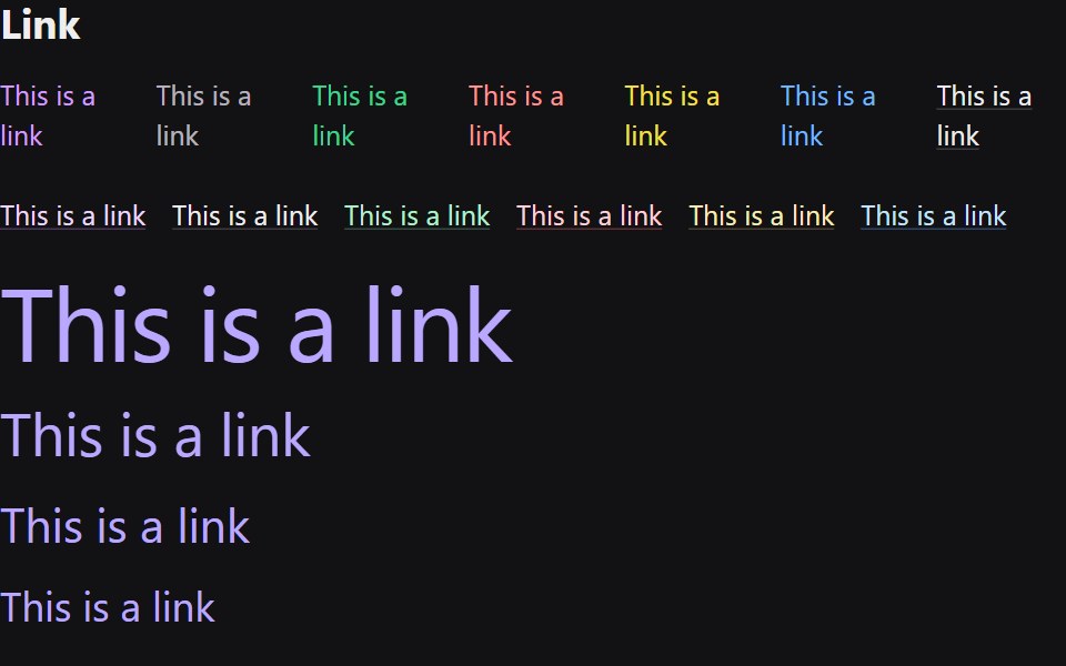 LinkRadix Themes · React
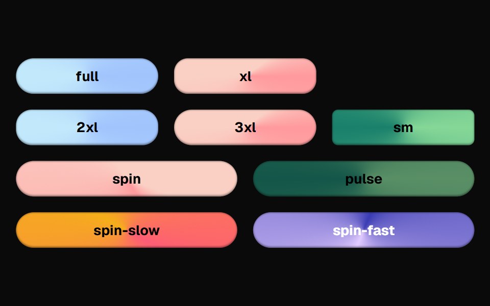 Bg Animate ButtonCult UI · ReactButton component with animated background effects and gradient transitions
 SwapArk UI · ReactAnimate between two visual states with smooth transitions.
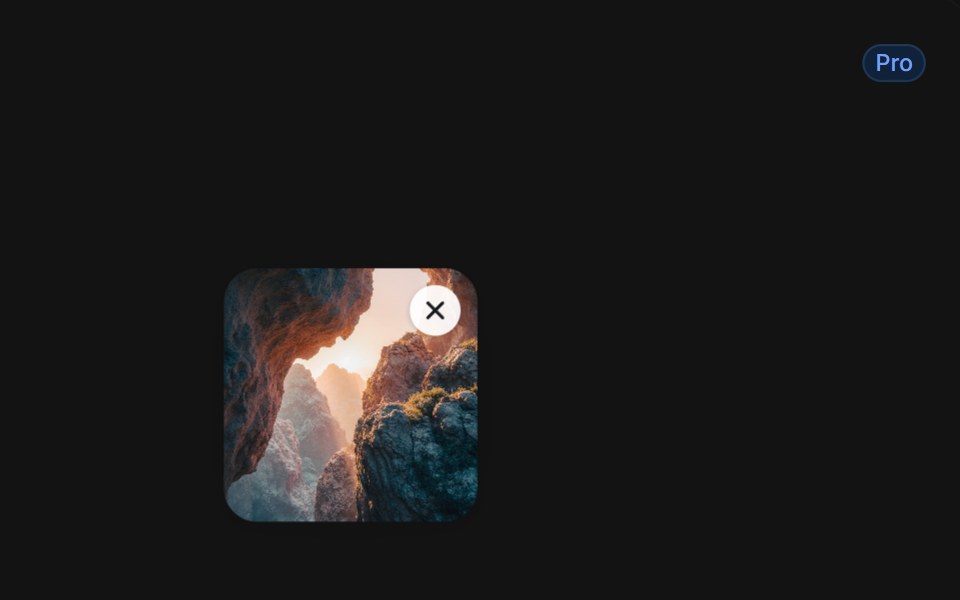 Delete With Smoky Dissolvetransitions.dev · HTML/CSSList item that dissolves into smoke when deleted.
 Animated hamburger / close toggle buttonReUI · ReactAnimated hamburger / close toggle button
 Linkpdfcn · ReactLink PDF component (forme)
 Apple Icon MorphAmicro Micro Transitions · ReactApple Icon Morph loading animation.
 LinkPark UI · ReactA navigation component for creating accessible hyperlinks.
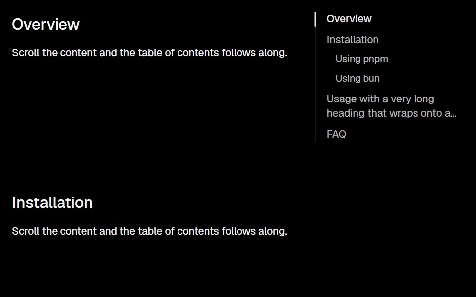 AnchorLobe UI · React
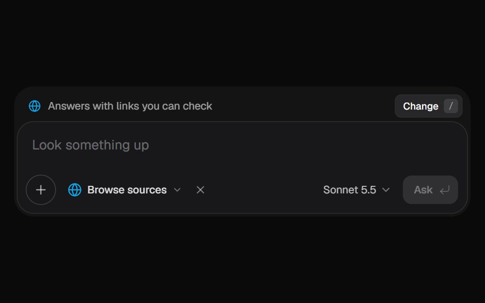 AI Input SearchKokonut UI · ReactAI composer with a Tools menu (browse, investigate, draft, run code, reason), a model picker and a live trace that…
 linkIntent UI · Reactlink
 Bloom MenubeUI · ReactA button that morphs open into a menu and blooms iris-out from the center, the grid revealing in every direction with…
 LinkTailGrids · ReactA link component with multiple variants.
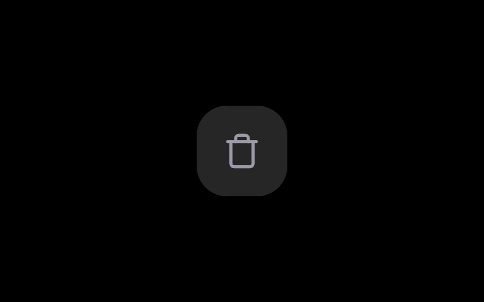 Delete ButtonRare UI · ReactA delete button that asks for confirmation in place, no dialog needed.
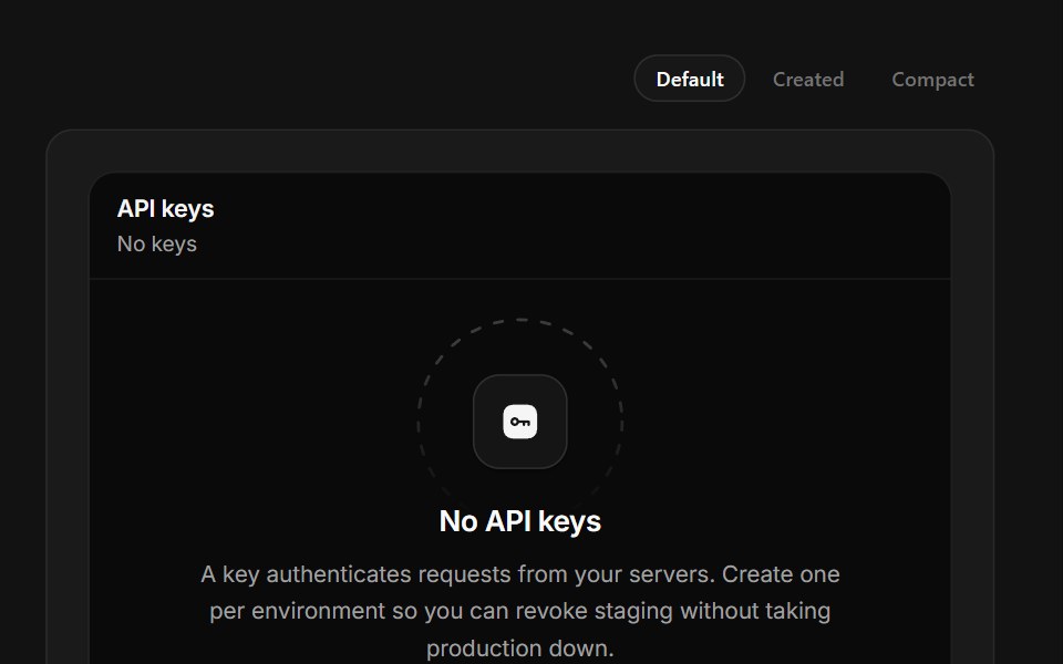 No API KeysSpectrum UI · ReactKey creation that reveals the secret once, masked, with a copy that confirms itself.
 Copy ButtonSpell UI · ReactA copy-to-clipboard button with blur transition effect.
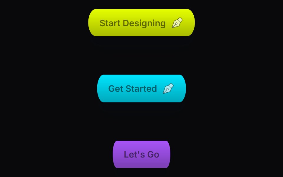 Corner ButtonVengeance UI · ReactAnimated corner dots & lines button
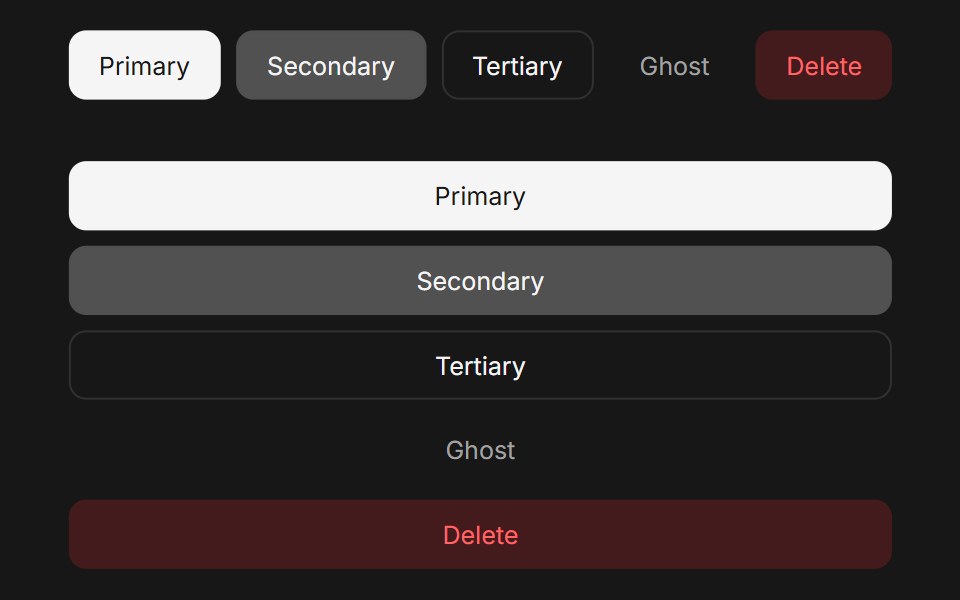 ButtonFluid Functionalism · ReactAnimated button with variants (primary, secondary, tertiary, ghost), icon support, loading spinner, and fluid…
 Theme SwitcherUser Interface Wiki · React
 AnchorToolcraft · React
 Link ButtonLaunch UI · React
 Expand Theme ToggleTheme Toggles · ReactAn animated theme toggle with an expanding sun-and-moon transition.
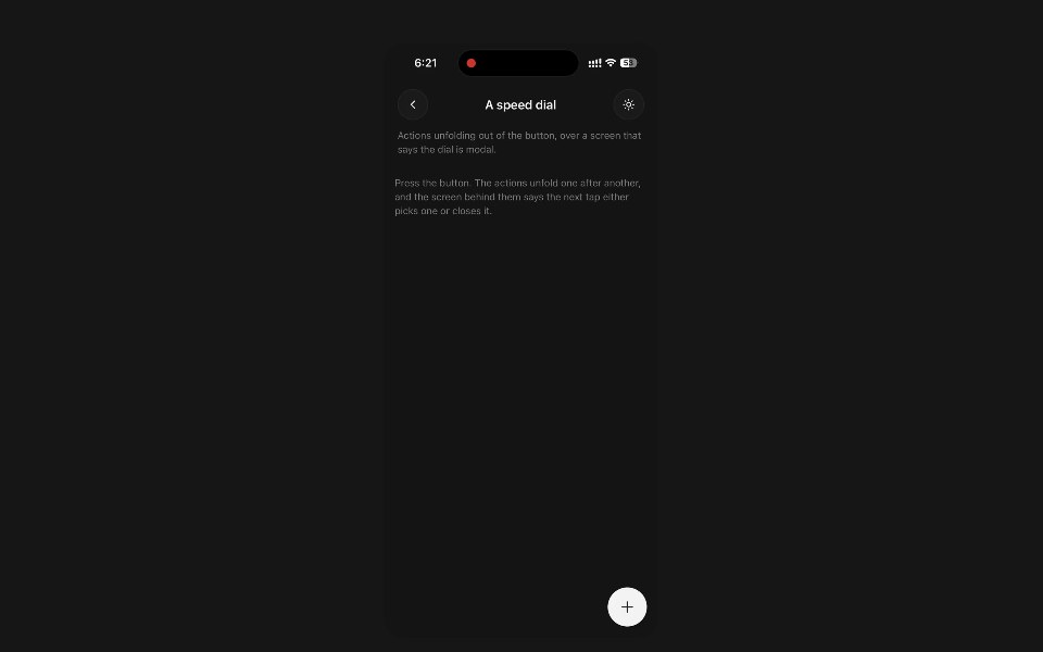 FabPanel UI · React NativeThe floating action button — one action pinned over the content, with an optional dial of others behind it.
 Badge-05 - LinkShadcn Space · ReactBadge component
 Antinomy ButtonPixel Perfect · ReactText label that slides right on hover as two gooey pills bloom and merge behind an action word, in subtle and solid…
 Copy EmailOpenSourceUI · ReactCopies the maintainer email on click — no mailto / mailbox popup. Hover shows “Click to copy”; after click shows…
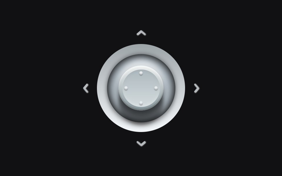 Analog Stickuselayouts · ReactA metallic stick that tilts into the press. Hover a quadrant and the cap leans, the shadow shifts, and the matching…
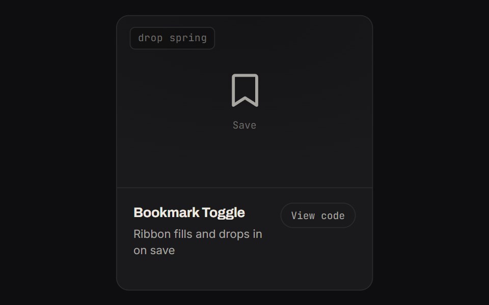 Bookmark ToggleKinetics · HTML/CSSRibbon fills and drops in on save
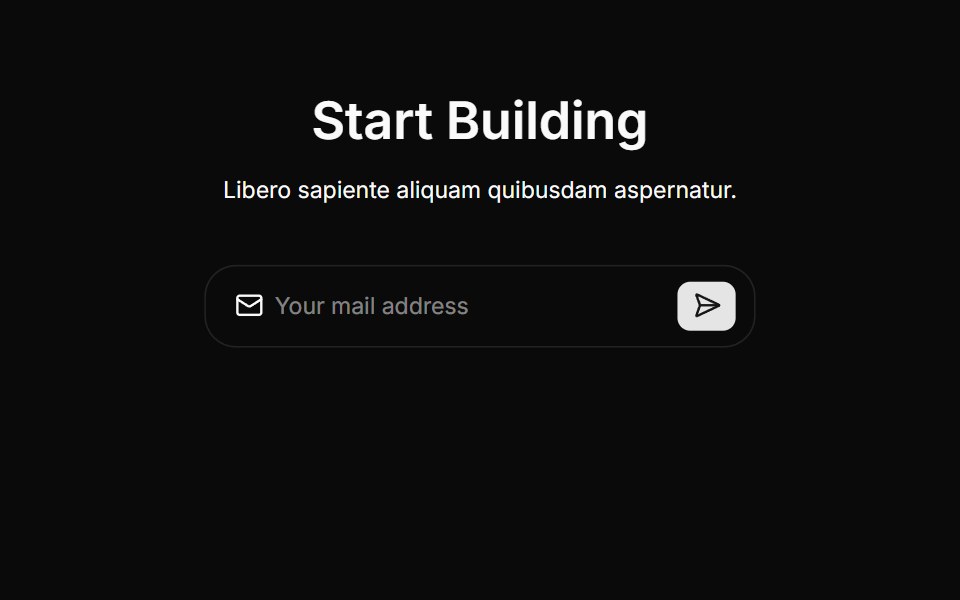 Cta Threecnblocks · SvelteCTA section with background gradient
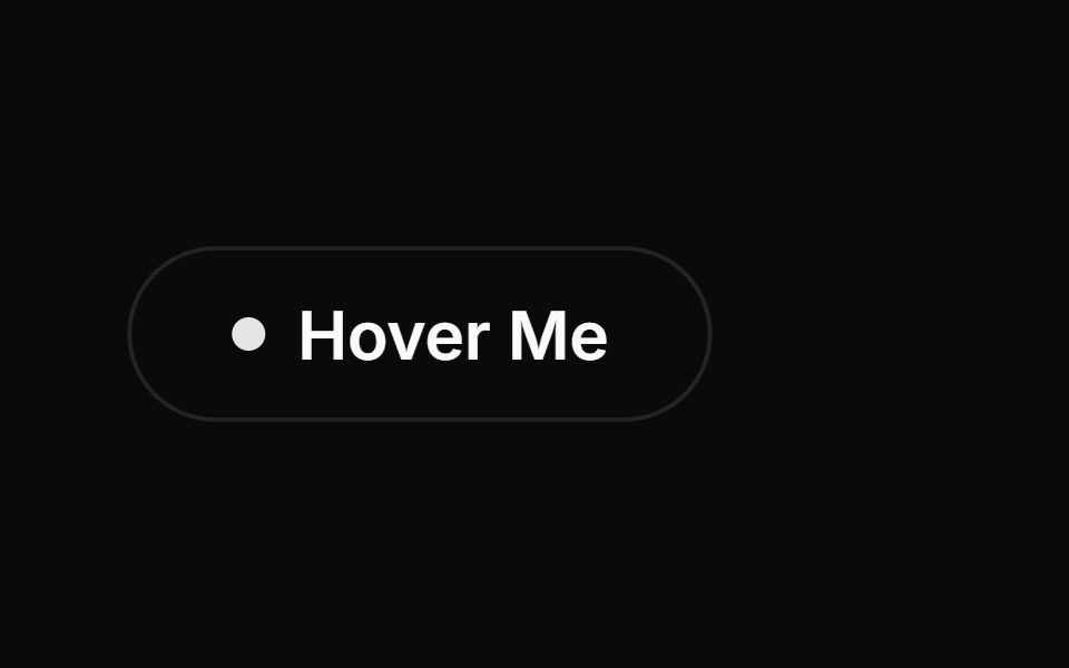 Interactive Hover ButtonAnimations (Svelte) · SvelteA button with an interactive hover effect featuring an expanding dot and sliding text animation with an arrow.
 Confetti ButtonBadtz UI · ReactA fun and interactive button that triggers a confetti explosion effect on click.
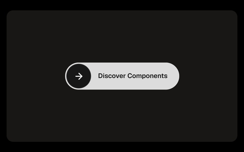 Discover ButtonObsidianUI · React
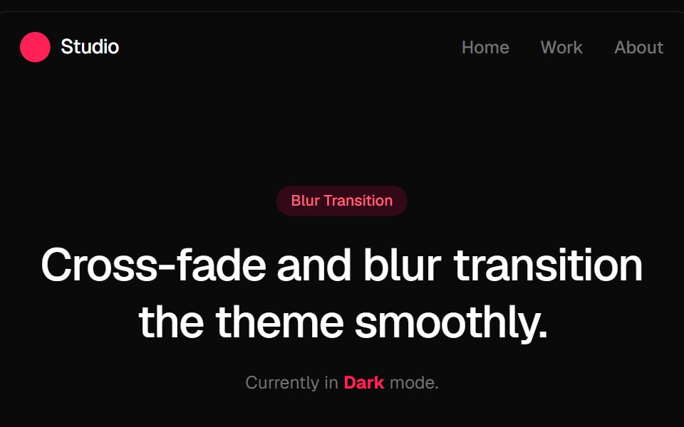 Blur Fade Theme TransitionGreatUI · ReactLight and dark theme toggle that switches the page with a blur and fade transition.
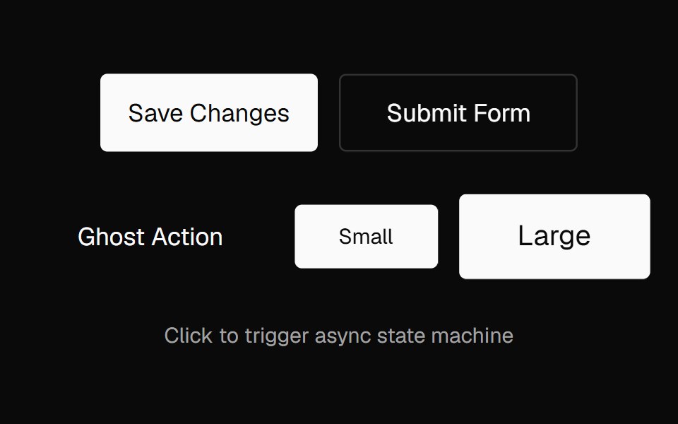 Action ButtonNexvyn UI · ReactAn async-aware button with an idle → pending → success/error state machine, promise tracking, abort support, and live…
 Link OverlayShark UI · ReactMakes the whole card or article clickable.
 Shimmer ButtonRewamp UI · ReactButton with a strip of light sweeping across it in a loop.
 ThreeDButtonEvil Buttons · ReactA minimal 3D button with a clean deck-style press and sliding click sheen.
 BubbleUpButtonSona UI · ReactThe `BubbleUpButton` component provides an interactive button with a fluid "bubble-up" animation effect when hovered…
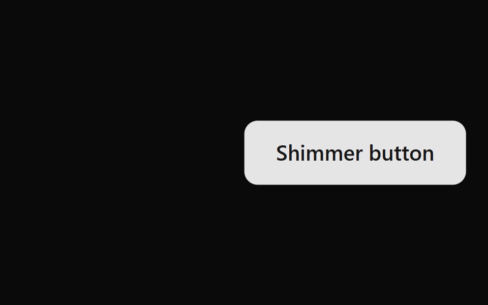 Shimmer ButtonWatermelon UI · ReactButton with a strip of light that sweeps across it on hover.
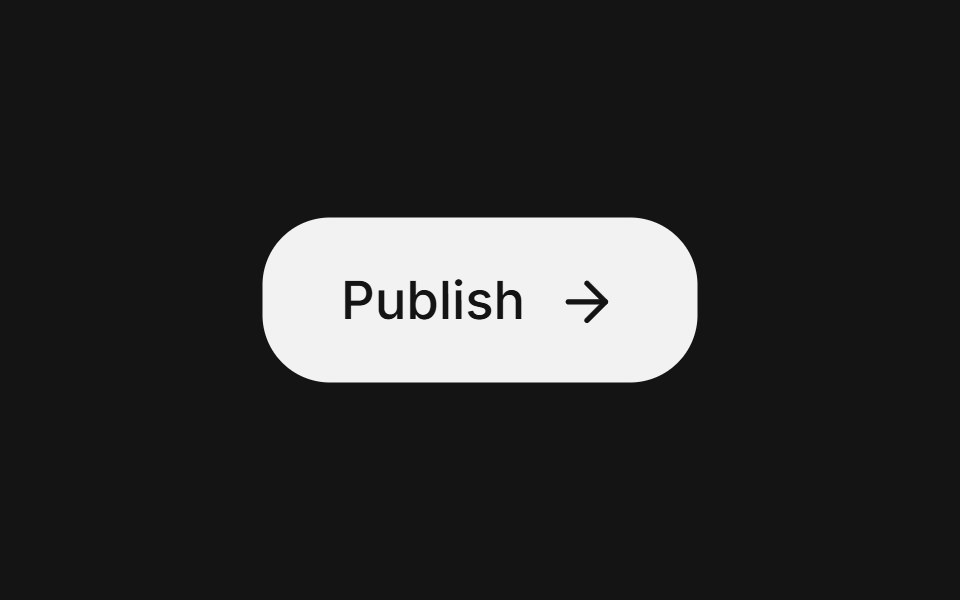 Action buttonArc Library · ReactA compact button for frequent toolbar actions.
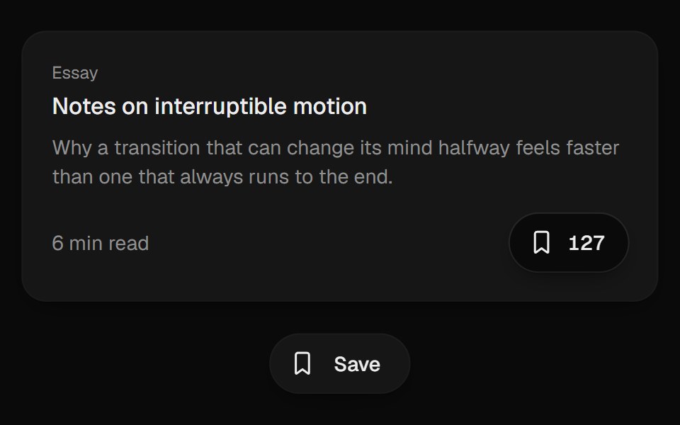 Bookmark ButtonUI Lab · ReactFills from the bottom up and lands with a small squash.
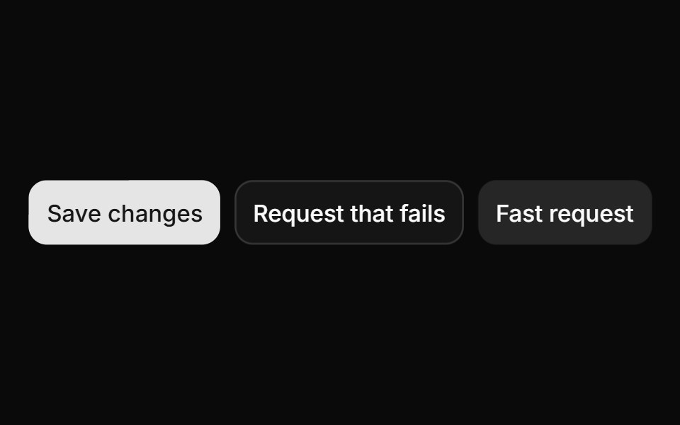 ButtonHextaUI · ReactButtons in every variant and size, with a built-in loading, success and error flow that skips the spinner for fast…
 Voice ButtonLocalMode · ReactA press-to-record / release-to-transcribe push-to-talk button with an explicit visual state machine: idle -> recording…
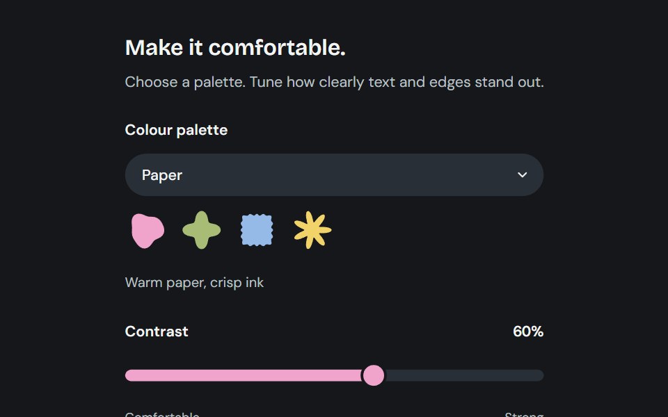 AppearanceCojeev UI · ReactChoose from six coordinated palettes and adjust reading contrast across the application.
 Aurora Download ButtonMicroKit · ReactA layered blue download button with a luminous rim, directional shadow, and blended hover bloom.
 Hover slide arrowFLX UI · ReactCTA arrow nudges right on hover.
 Magnetic ButtonVelora UI · ReactLeans toward the cursor and springs back on leave.
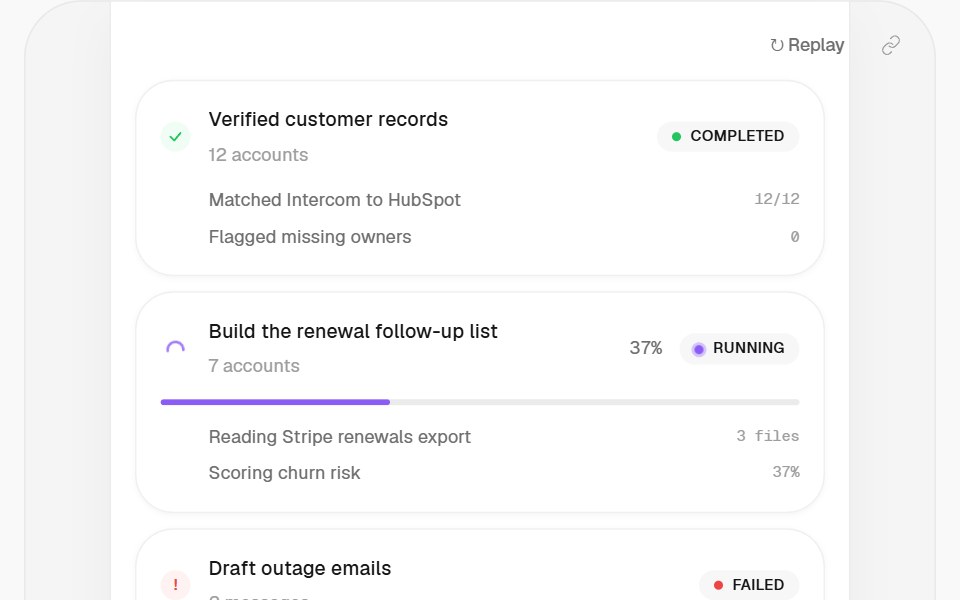 Link ButtonHalaska UI · React
 Back Link Chevronsv-particles · Svelte
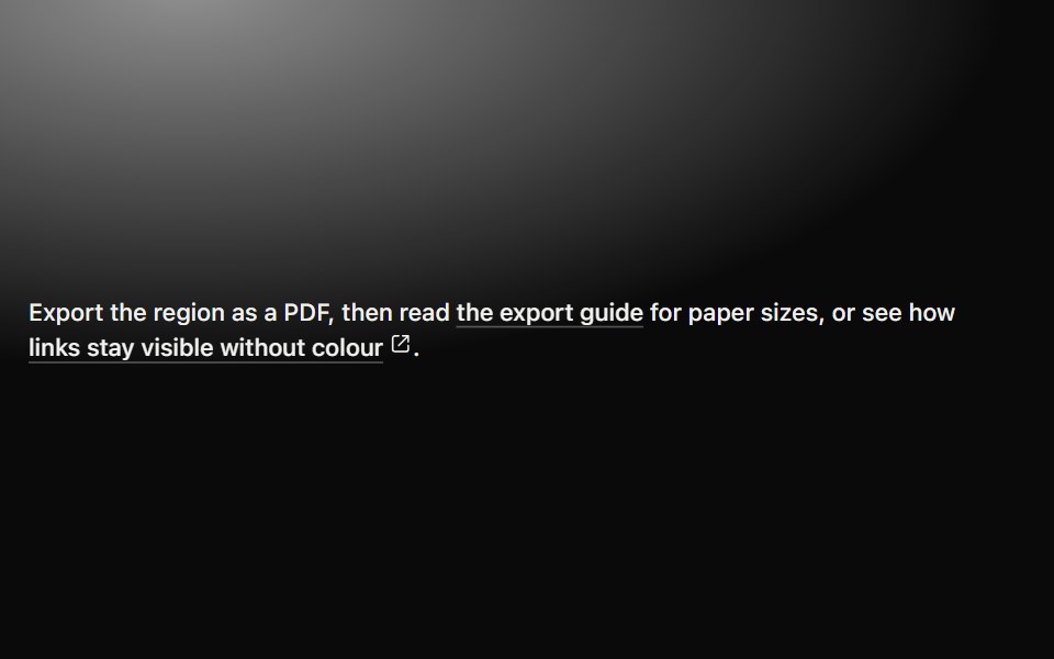 LinkMetal UI · React + SwiftUIAn inline destination with a persistent engraved underline, directional hover emphasis, press travel…
 BloopSpaceUI · ReactCompact assistant orb with listen, think, and speak states, voice palettes, and audio input.
 Gooey ToolbarSkecher UI · ReactA compact action toolbar with configurable liquid merging effects and accessible controls.
 Draw Underline LinkSora UI · ReactA link with a hand-drawn SVG underline that animates on hover, powered by Motion.
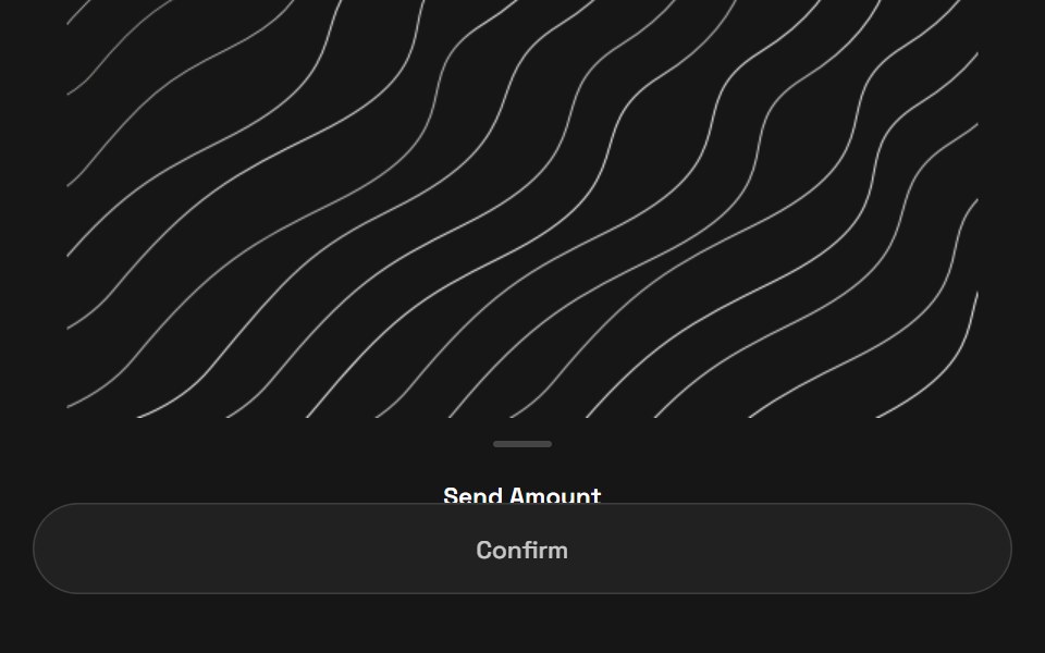 Quick PayZAYX · React Native
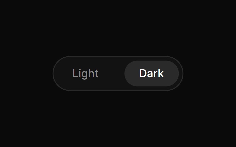 Theme ToggleCue Foundations · React
 LinkOUI · ReactReact aria components Link with shadcn characteristics.
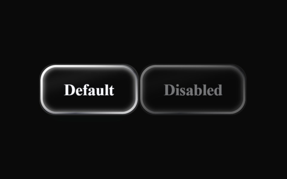 Liquid ButtonLiquefy UI · ReactButton in liquid glass style: translucent, refracting the background.
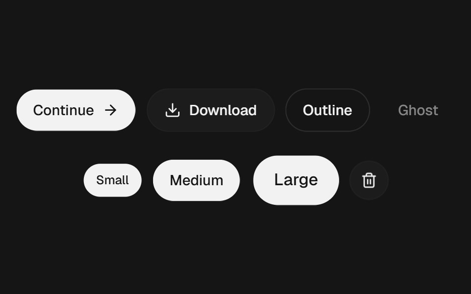 ButtonEaseUI · ReactButton with a quick press, hairline rings instead of borders, four variants, and a 44px tap area even at small sizes.
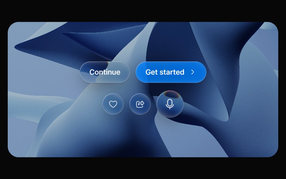 Glass ButtonOpaline · ReactPill button made of liquid glass with a pointer-tracked highlight.
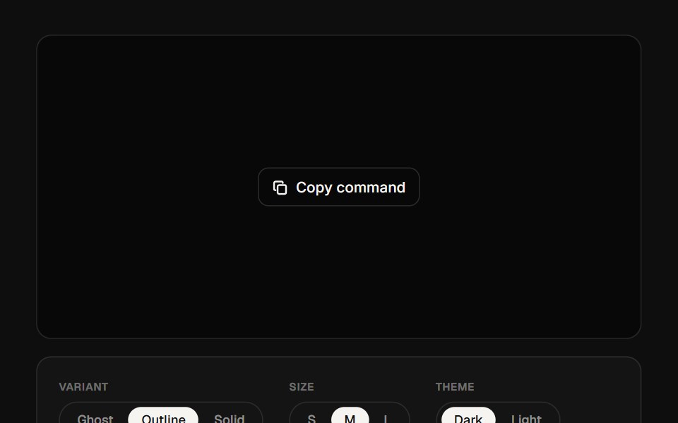 Copy ButtonReactFrame · ReactA standalone copy-to-clipboard button with ghost/outline/solid variants, icon-only or labeled modes, a floating…
 Hover Border GradientAceternity UI · React
 Swapark-cn · ReactA shadcn-style swap component built with Ark UI primitives.
 Fuse ButtonReact Bits · ReactAction button whose done state carries its own undo on a burning fuse: press, the label crossfades to Undo, a hairline…
 Link OverlayChakra UI · ReactUsed to stretch a link over a container.
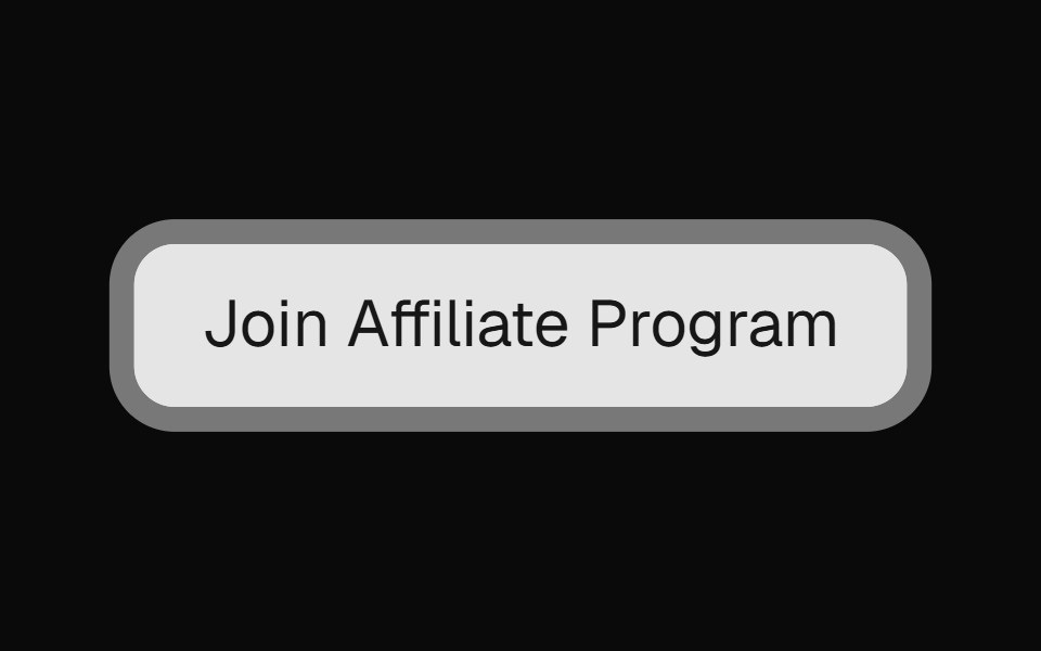 Pulsating ButtonMagic UI · ReactAn animated pulsating button useful for capturing attention of users.
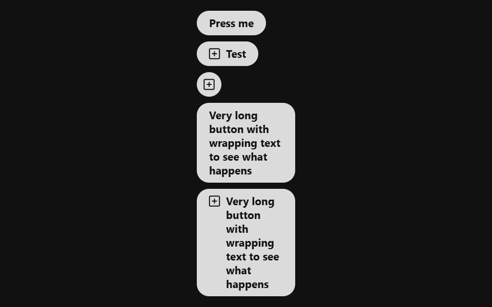 Link ButtonReact Spectrum · ReactA LinkButton combines the functionality of a link with the appearance of a button. Useful for allowing users to…
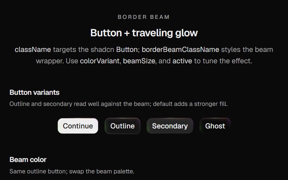 Border Beam ButtonCult UI · ReactShadcn Button wrapped in Border Beam: animated border glow with compact icon and text variants
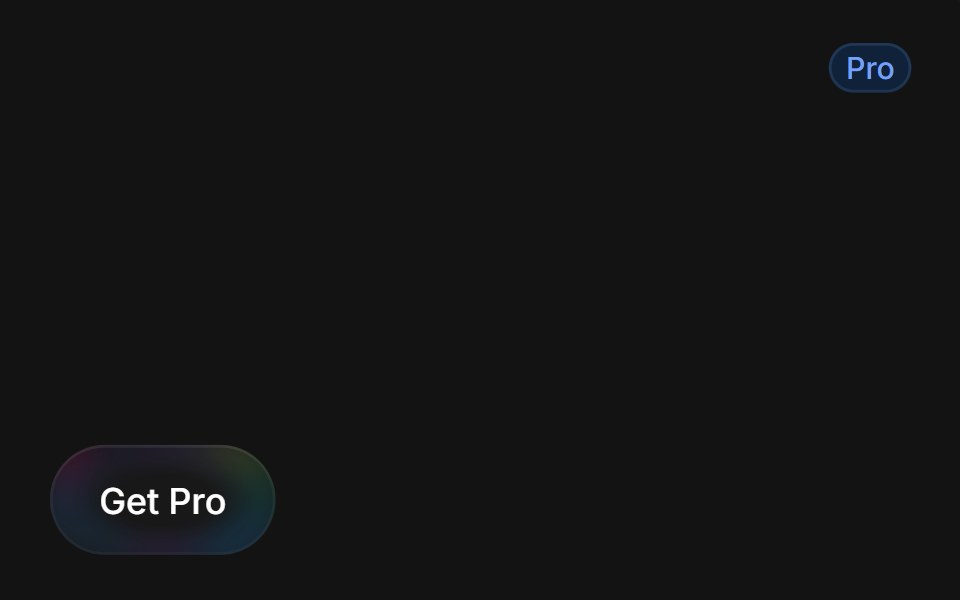 Get Pro Buttontransitions.dev · HTML/CSS
 Go back link button with animationReUI · ReactGo back link button with animation
 Linkpdfcn · ReactLink PDF component (takumi)
 Apple UnlockAmicro Micro Transitions · ReactApple Unlock loading animation.
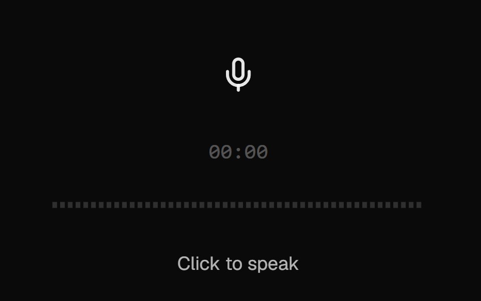 AI VoiceKokonut UI · ReactVoice input with a scrolling waveform, then a take you can play back, discard or send.
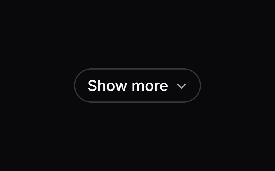 show-moreIntent UI · Reactshow-more
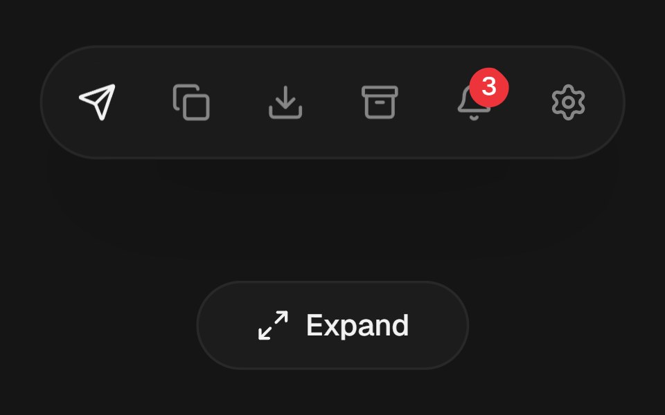 Expandable Action BarbeUI · ReactCompact icon actions that expand into labeled controls on hover or focus with shared layout motion.
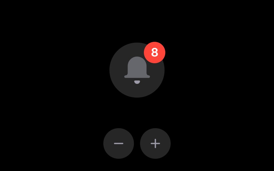 Notification BellRare UI · ReactAn iOS-style notification bell with an unread count badge.
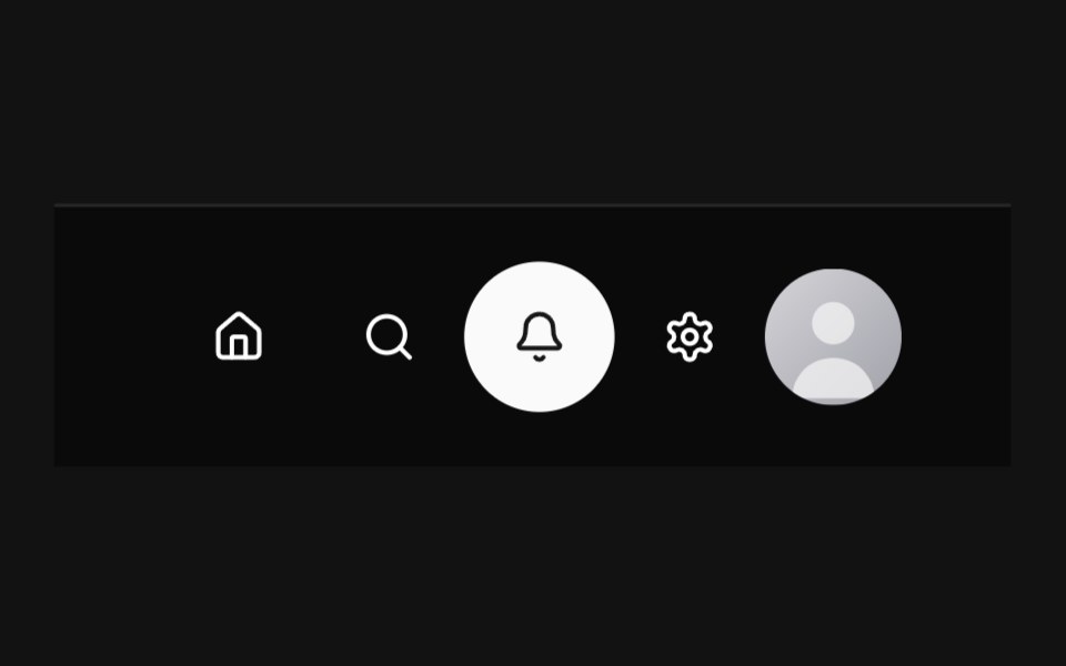 Circular NavbarSpectrum UI · Reactcomponent for the Circular Navbar
 Flow ButtonSpell UI · ReactA button with animated flowing dashed border on hover.
 Creepy ButtonVengeance UI · ReactButton with tracking eyes
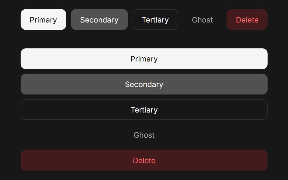 Button (Base UI)Fluid Functionalism · ReactAnimated button with variants (primary, secondary, tertiary, ghost), icon support, loading spinner, and fluid…
 Lightbulb Theme ToggleTheme Toggles · ReactAn animated theme toggle inspired by a lightbulb.
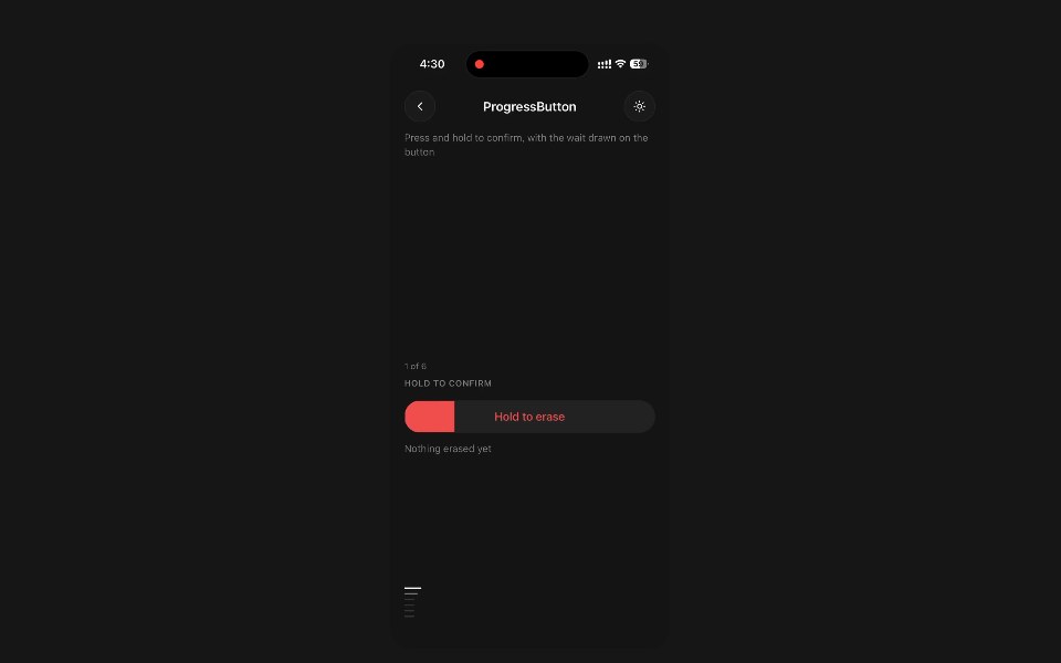 Progress ButtonPanel UI · React NativePress and hold to confirm, with the wait drawn on the button.
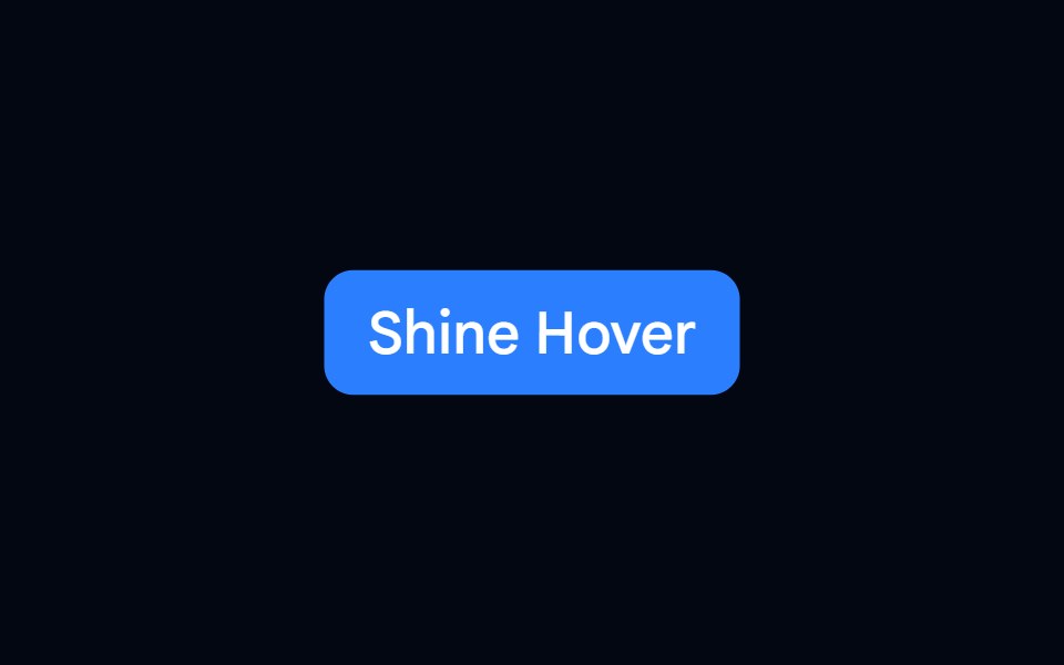 Button 03 - Shine HoverShadcn Space · ReactShine Hover button component
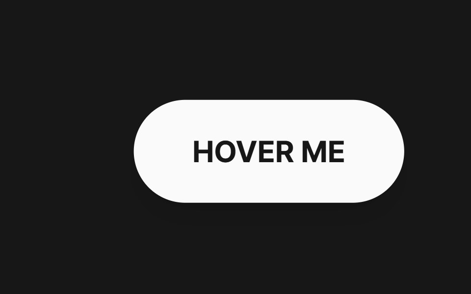 Bend Button FollowerPixel Perfect · ReactA rounded pill button with text that smoothly chases the cursor and warps with an air-friction bend on a WebGL plane.
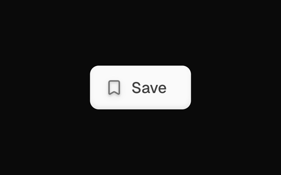 Bookmark Save ButtonOpenSourceUI · React
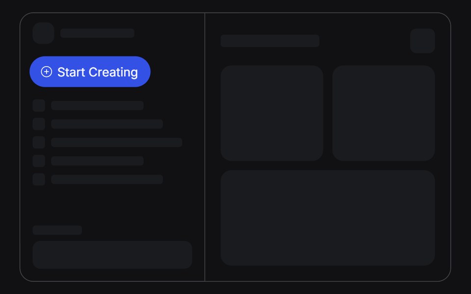 Create Menuuselayouts · ReactA Start Creating pill that springs open into a list of create actions.
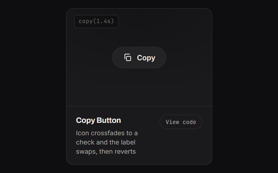 Copy ButtonKinetics · HTML/CSSIcon crossfades to a check and the label swaps, then reverts
 Logocloud Twocnblocks · SvelteInteractive logo cloud with hover call-to-action
 Pulsating ButtonAnimations (Svelte) · SvelteA button component with a pulsating ring effect that expands and fades around the button.
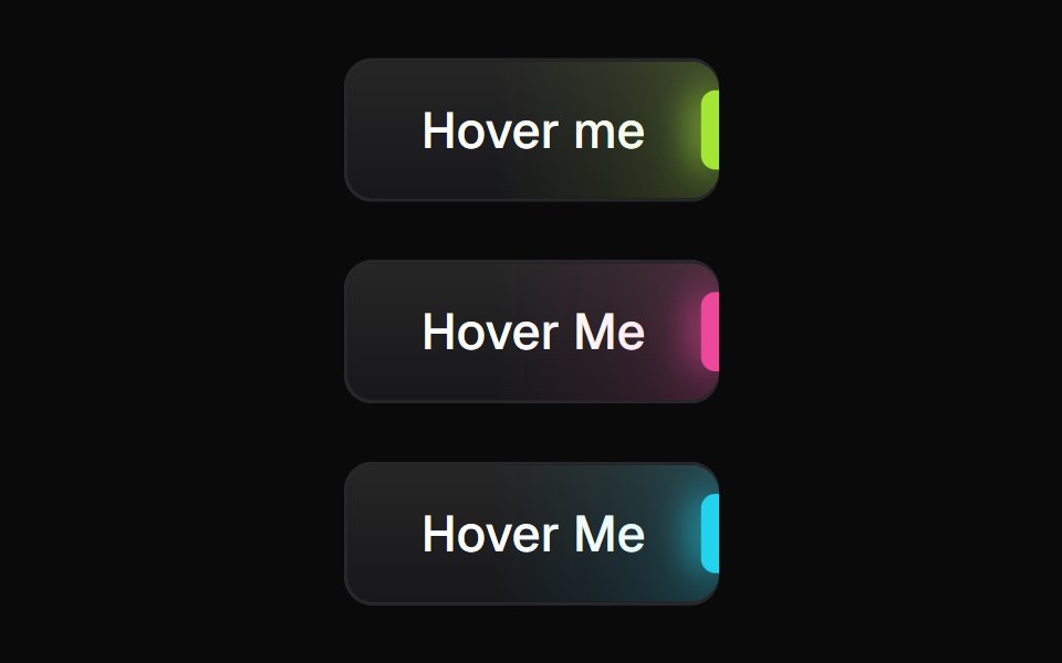 Glowing ButtonBadtz UI · ReactA visually distinct button component featuring a configurable, animated glow effect to highlight calls to action or…
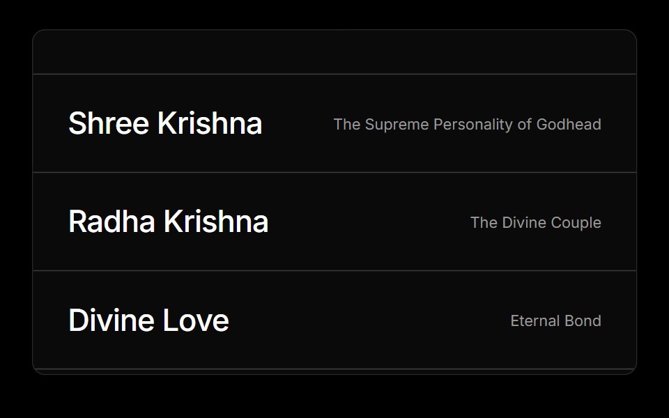 Hover ImgObsidianUI · React
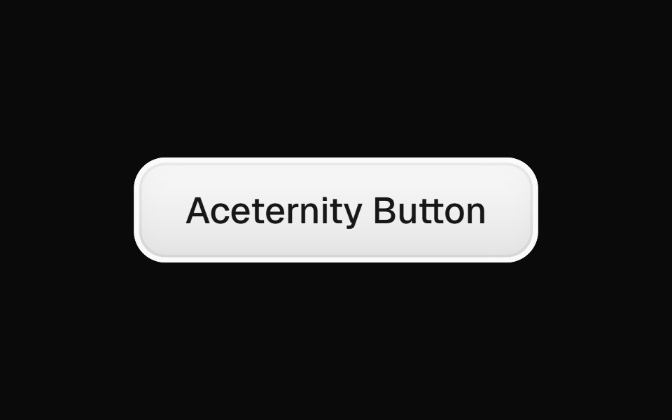 Aceternity ButtonGreatUI · React
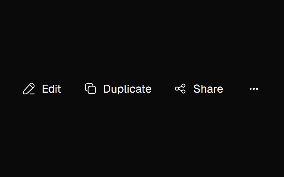 Adaptive ActionsNexvyn UI · ReactA responsive action toolbar that measures its available inline size and moves overflowed items into an accessible…
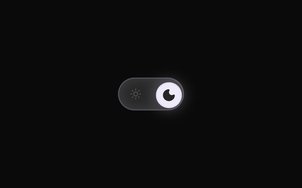 Theme ToggleRewamp UI · ReactRewampUI ThemeToggle Component A smooth, tactile Light / Dark mode toggle switch with layout-interpolated spring…
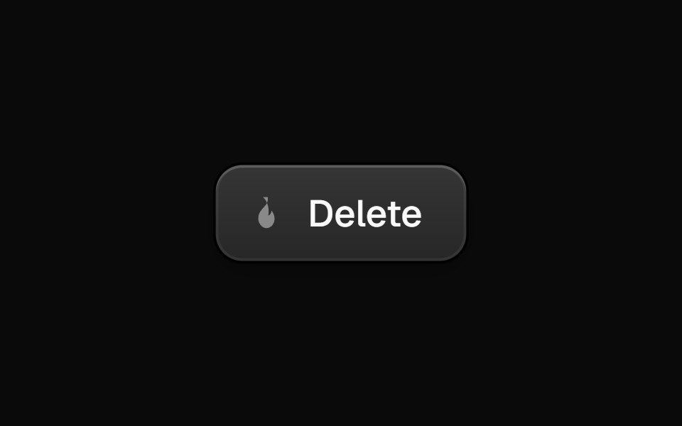 AshBurstButtonEvil Buttons · ReactA ringed dark button that glows like an ember on click and erupts ash that collides with it via Matter.js physics…
 ButtonSona UI · ReactA simple action button with subtle press feedback and reduced-motion support.
 Shimmer Button BaseWatermelon UI · ReactButton with a strip of light that sweeps across it on hover.
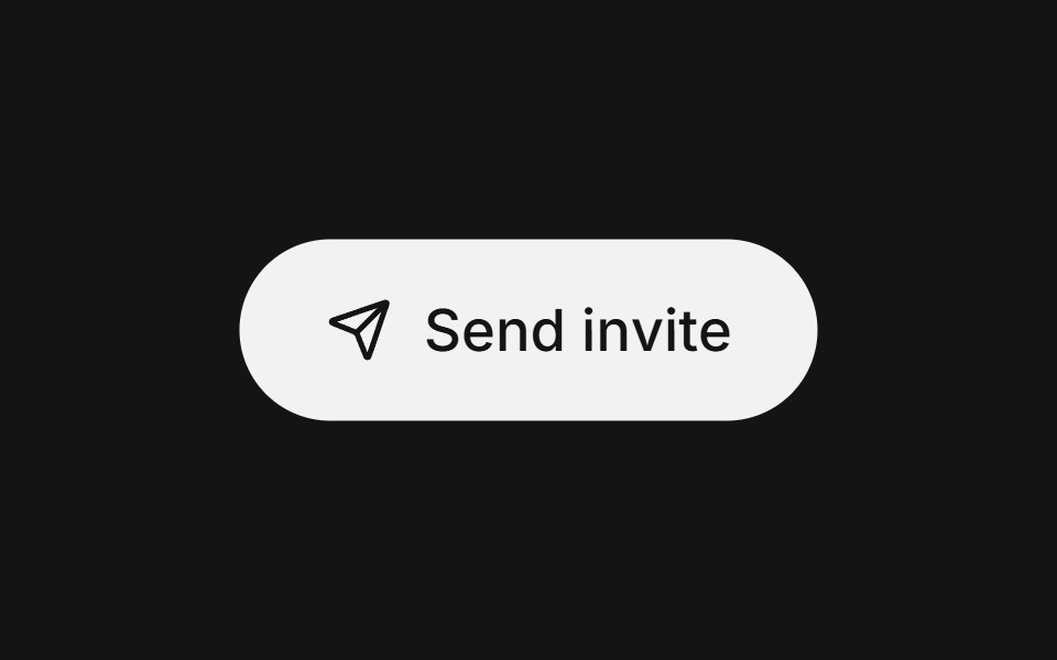 Action swapArc Library · ReactSwap an action label while preserving its place and intent.
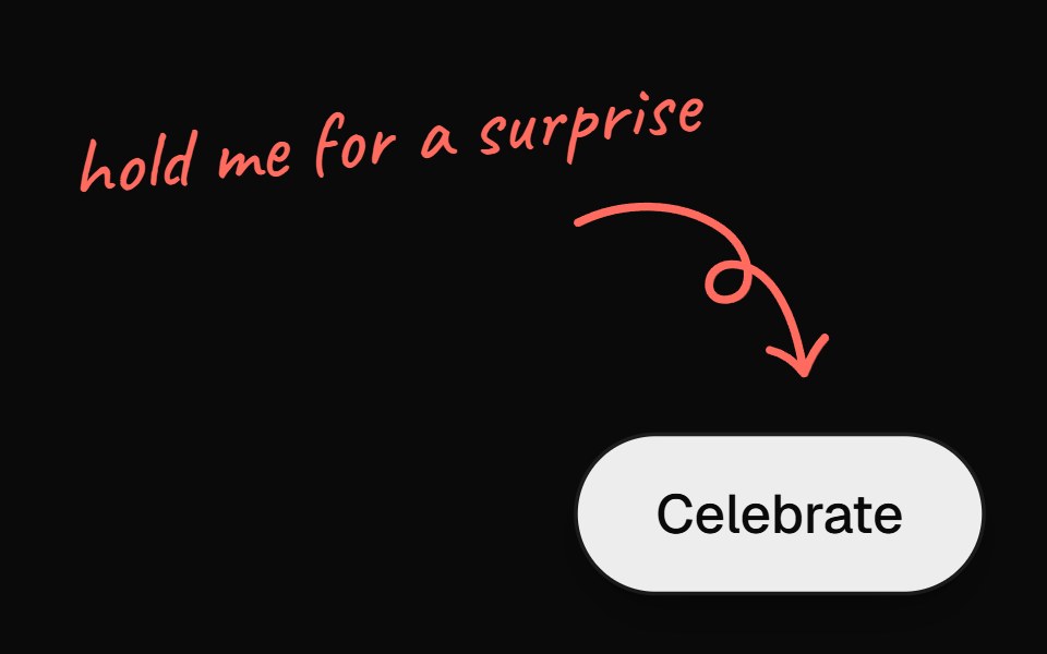 Confetti ButtonUI Lab · ReactA click pops confetti; hold it and the fuse burns until the whole thing blows.
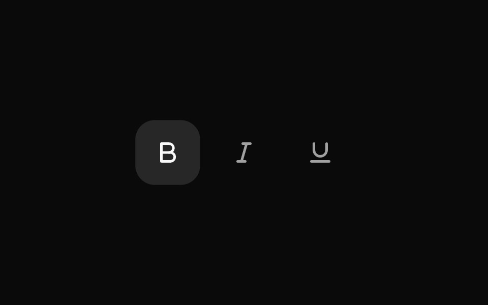 ToggleHextaUI · ReactA button that stays on or off, with a fill that settles in when pressed, a clear hover-to-on step and icons that can…
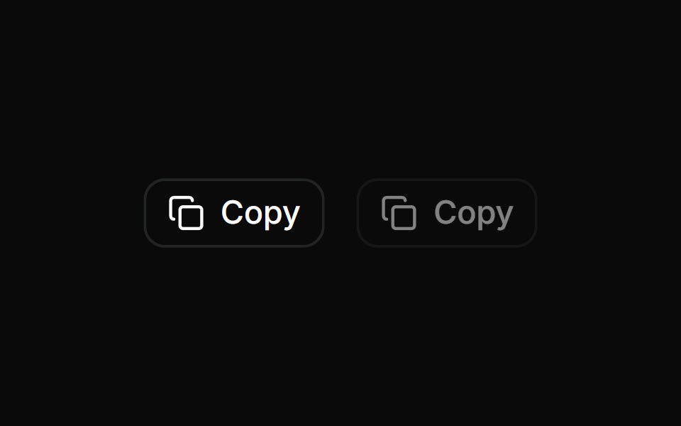 Copy ButtonLocalMode · ReactA copy-to-clipboard button that shows a 2-second Copied confirmation, disables itself when there is nothing to copy…
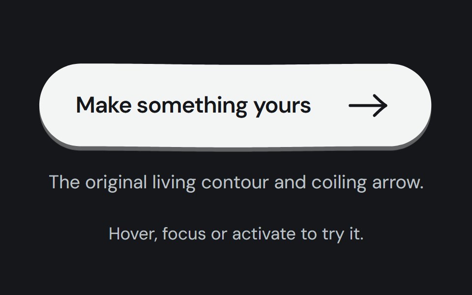 Hero buttonCojeev UI · ReactTwelve tactile calls to action: living ink, paper, keys, tickets and small moments of motion around one native button.
 Circle Surface ButtonMicroKit · ReactA circular CTA whose dark surface expands into an orange fill.
 Copy to clipboardFLX UI · ReactIcon and label swap to a check on copy.
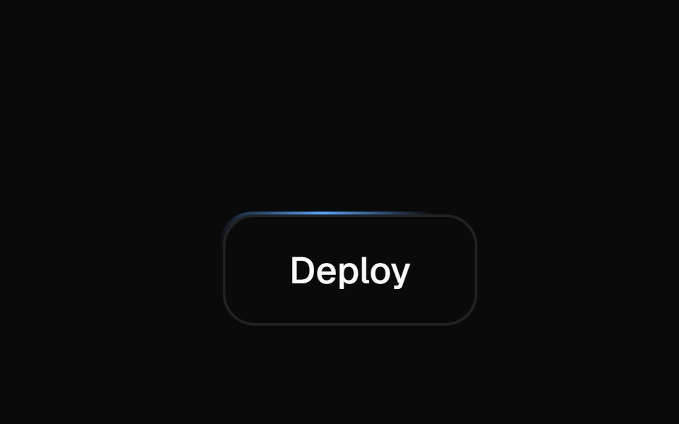 Moving BorderVelora UI · ReactA light laps the button's border via offset-path.
 Copy Buttonsv-particles · Svelte
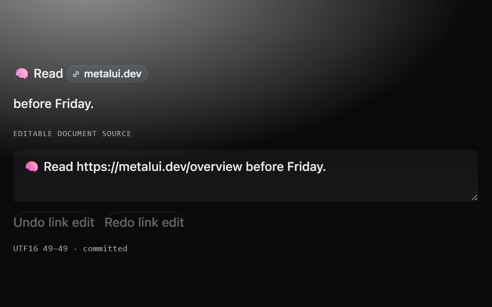 Link cueMetal UI · React + SwiftUIA real URL host-chip link and a separate anchored source field, with an explicit footprint and one confirmed…
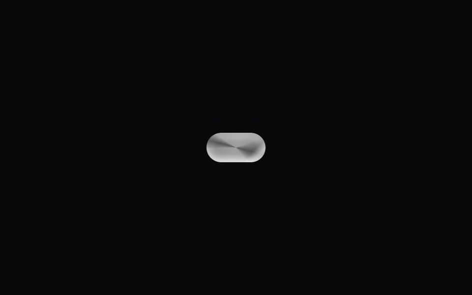 Glass ButtonSpaceUI · ReactA glassmorphic extension of Button Squircle — backdrop blur, layered highlights and a hover shine sweep.
 Liquid Glass SocialSkecher UI · ReactA responsive social-link cluster with focused liquid-glass motion and clear interaction feedback.
 Hover LinkSora UI · ReactFive CSS-only link hover presets — three underline wipes and two block highlights — with an optional sliding arrow.
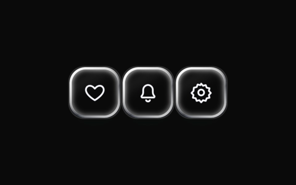 Liquid Icon ButtonLiquefy UI · ReactIcon-only button in liquid glass style.
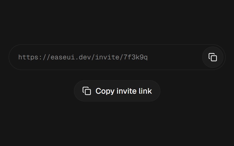 Copy ButtonEaseUI · ReactCopies text to the clipboard and trades its icon for a check for a moment, with a label or as a single icon.
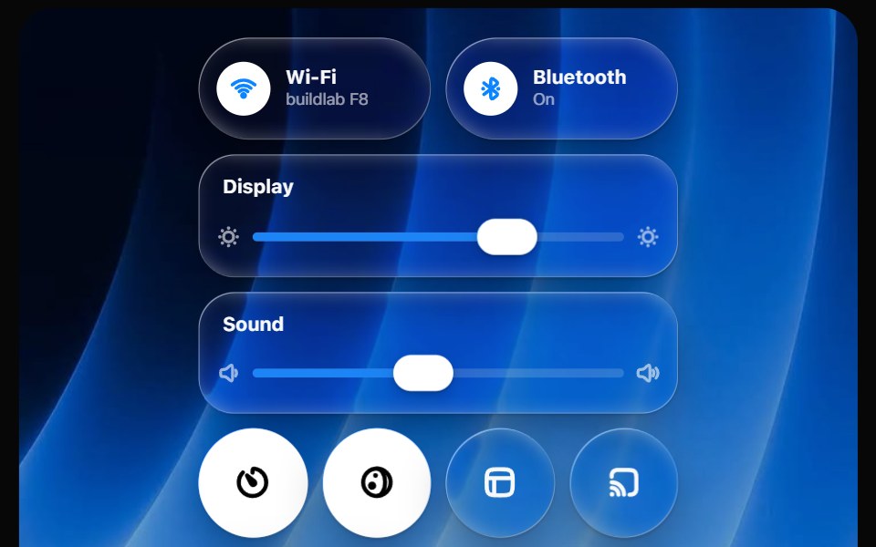 Glass Control CenterOpaline · ReactmacOS-style Control Center kit — glass modules, toggles, light-filled sliders and buttons.
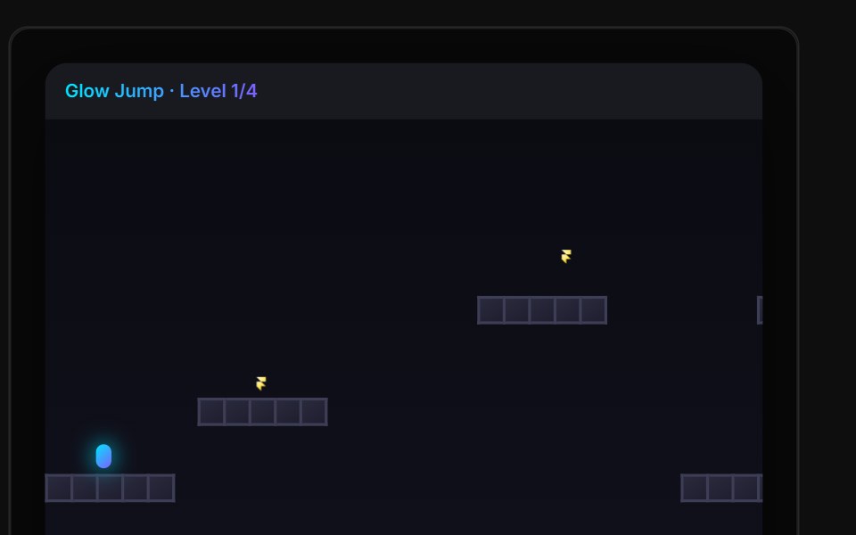 Glow Jump WidgetReactFrame · ReactA floating-action-button popup that opens a glowing 4-level platformer, jump between walls, dodge moving lava, and…
Libraries with Animated action components
Related categories
- Action Components
- React Action Components
- Tailwind CSS Action Components
- Svelte Action Components
- React Native Action Components
- shadcn/ui Action Components
- Animated Button Components
- Animated Toggle Button Components
- Animated Theme Toggle Components
- Animated Copy Button Components
- Animated Icon Button Components
- Animated CTA Button Components
- Animated Button Group Components
- Animated FAB Components
- Animated Like Button Components
- Animated Hold Button Components
- Animated Submit Button Components
- Animated Share Button Components
- Animated Send Button Components