 Dev Design Library
Animated Toggle Button Components
Dev Design Library indexes 68 Animated toggle button components from 30 open-source UI libraries, with the most coming from Amicro Micro Transitions, UI Lab, Rewamp UI, GreatUI and Arc Library. Each one links to its page with the source code, a live preview where available, the library license and the install command. These are the toggle button components tagged as animated: motion on hover, on scroll or on load, usually built with CSS transitions or Framer Motion. Toggle button components belong to the Actions group.
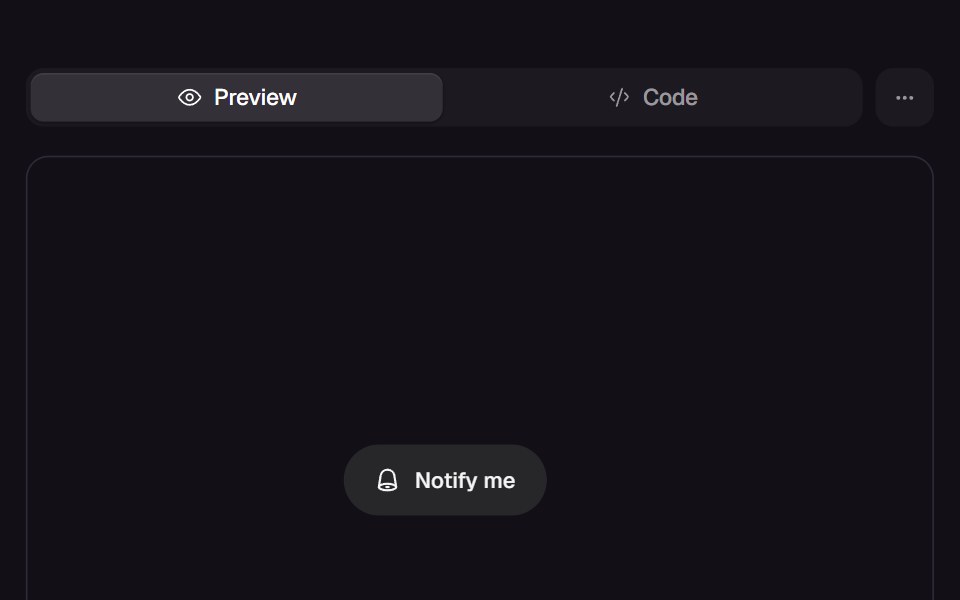 Bell ToggleReact Bits · ReactPill toggle that answers a press at three tempos: the bell rings on damped keyframes, the label blur-crossfades, and…
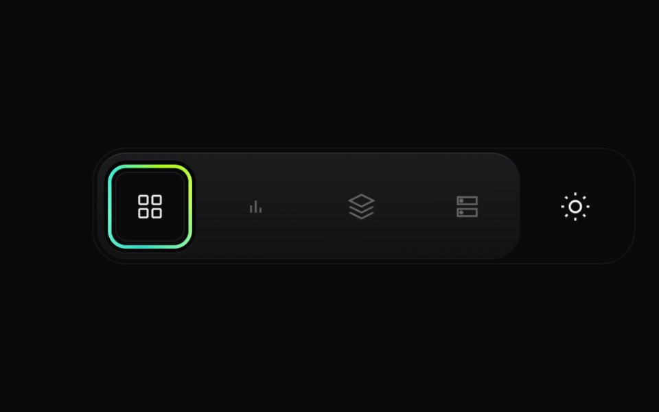 Gradient Button GroupCult UI · ReactPremium layered button group with animated active state, gradient ring accents, and theme toggle underlay
 SwapArk UI · ReactAnimate between two visual states with smooth transitions.
 Like Buttontransitions.dev · HTML/CSS
 Theme toggle button with animated moon and sun iconsReUI · ReactTheme toggle button with animated moon and sun icons
 Apple Icon MorphAmicro Micro Transitions · ReactApple Icon Morph loading animation.
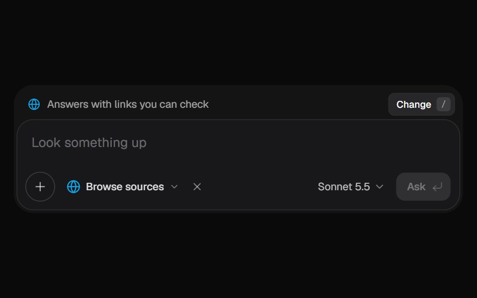 AI Input SearchKokonut UI · ReactAI composer with a Tools menu (browse, investigate, draft, run code, reason), a model picker and a live trace that…
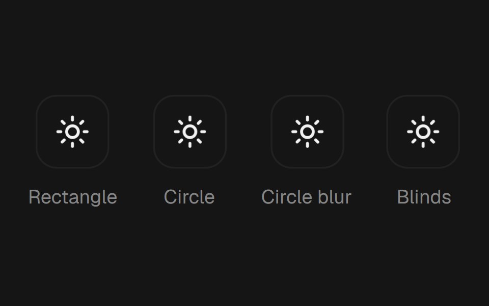 Theme TogglebeUI · ReactTheme toggle button that repaints the whole page through the View Transition API — a rectangle or circle clip-path…
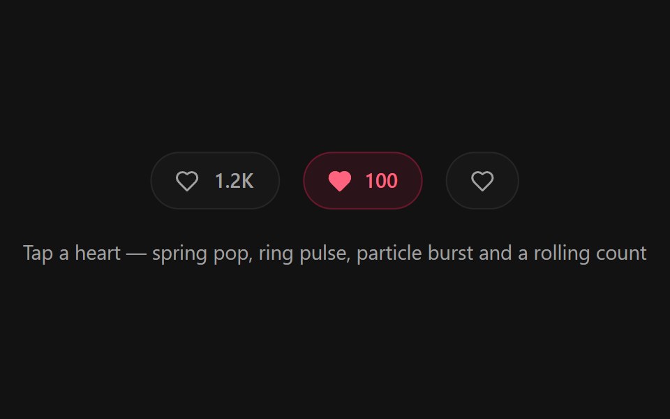 Like ButtonSpectrum UI · ReactA heart like button micro-interaction with a spring pop, ring pulse, radial particle burst, and a rolling odometer count
 Theme SwitcherUser Interface Wiki · React
 Expand Theme ToggleTheme Toggles · ReactAn animated theme toggle with an expanding sun-and-moon transition.
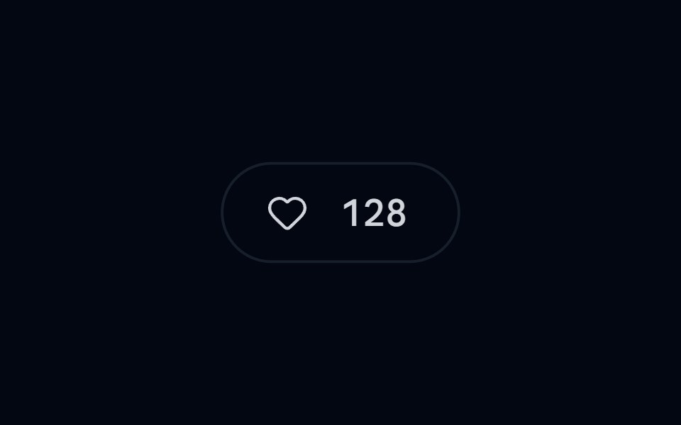 Button 20 - Animated Like ButtonShadcn Space · ReactLike button with burst particle effect and sliding count
 Blur Toggle ButtonPixel Perfect · ReactA button with blur transition effect on toggle using Framer Motion.
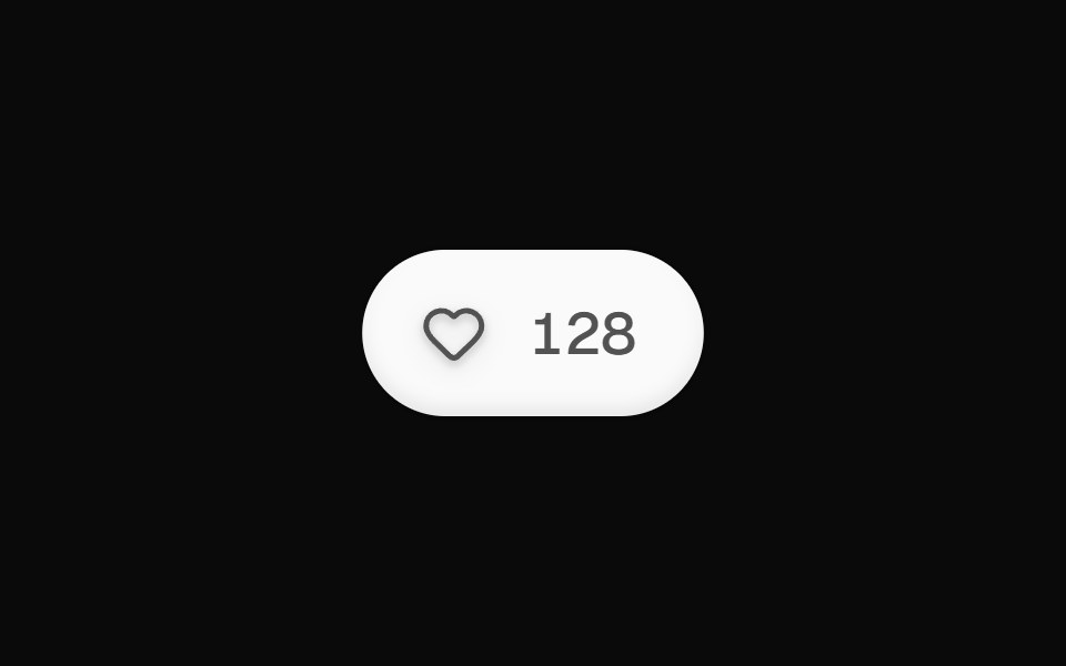 Like ButtonOpenSourceUI · React
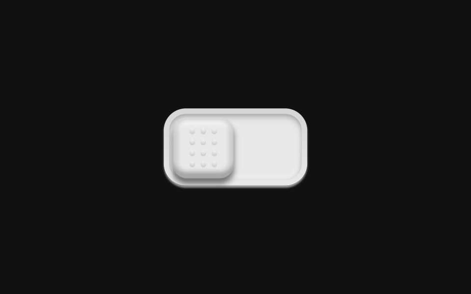 Theme Toggleuselayouts · ReactA physical switch with a dotted grip. Click and the knob slides across a recessed track.
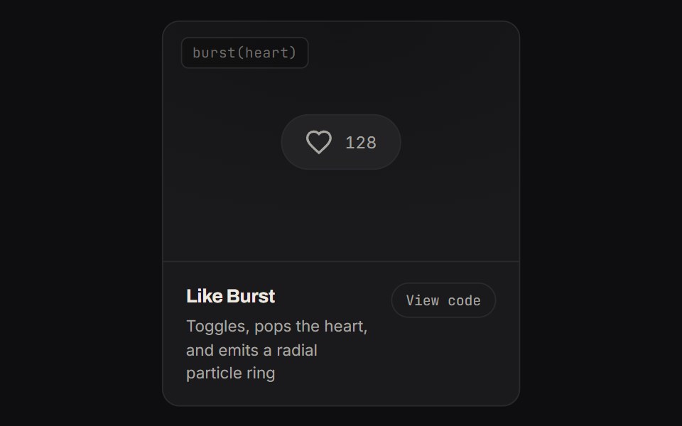 Like BurstKinetics · HTML/CSSToggles, pops the heart, and emits a radial particle ring
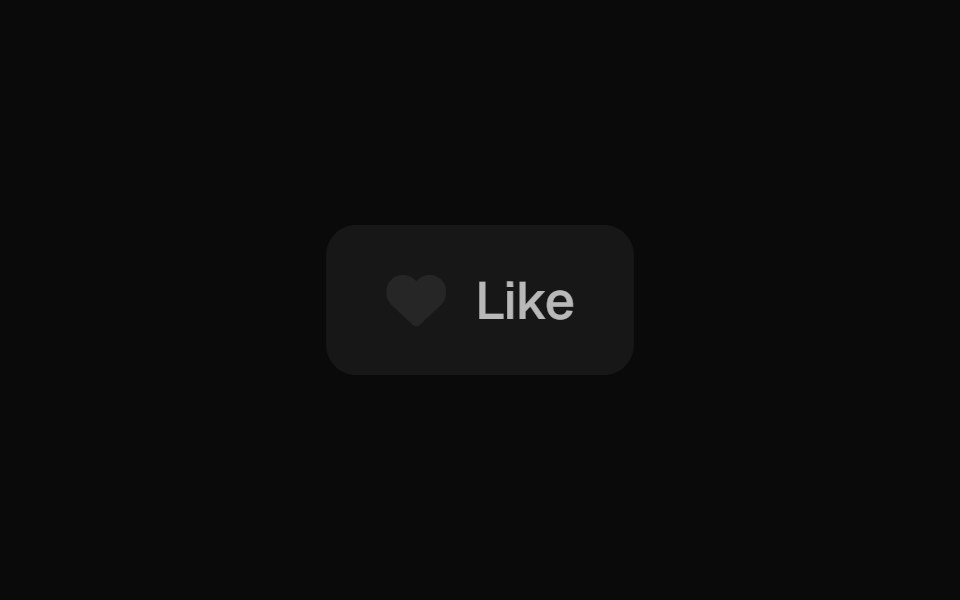 Like ButtonBadtz UI · ReactA dynamic button that animates on click, creating a burst of heart icons that randomly scatter before fading out.
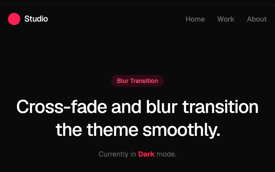 Blur Fade Theme TransitionGreatUI · ReactLight and dark theme toggle that switches the page with a blur and fade transition.
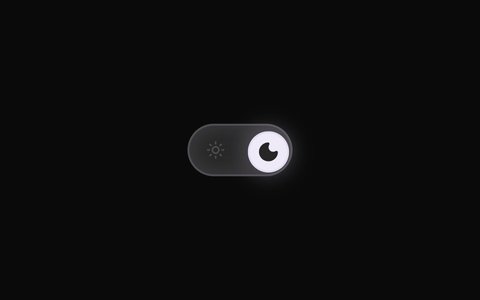 Theme ToggleRewamp UI · ReactRewampUI ThemeToggle Component A smooth, tactile Light / Dark mode toggle switch with layout-interpolated spring…
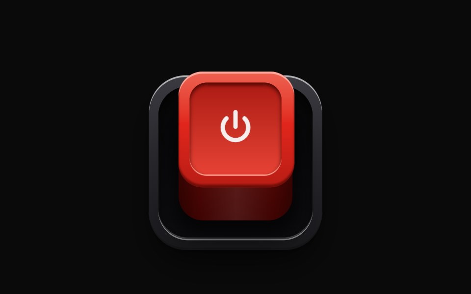 RealisticSwitchEvil Buttons · ReactA latching push switch, a raised box that sinks into its socket when pressed, stays down and glows while on, and…
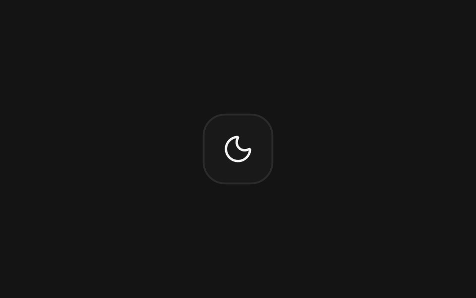 Theme switcherArc Library · ReactFour smooth ways to move between light and dark appearance.
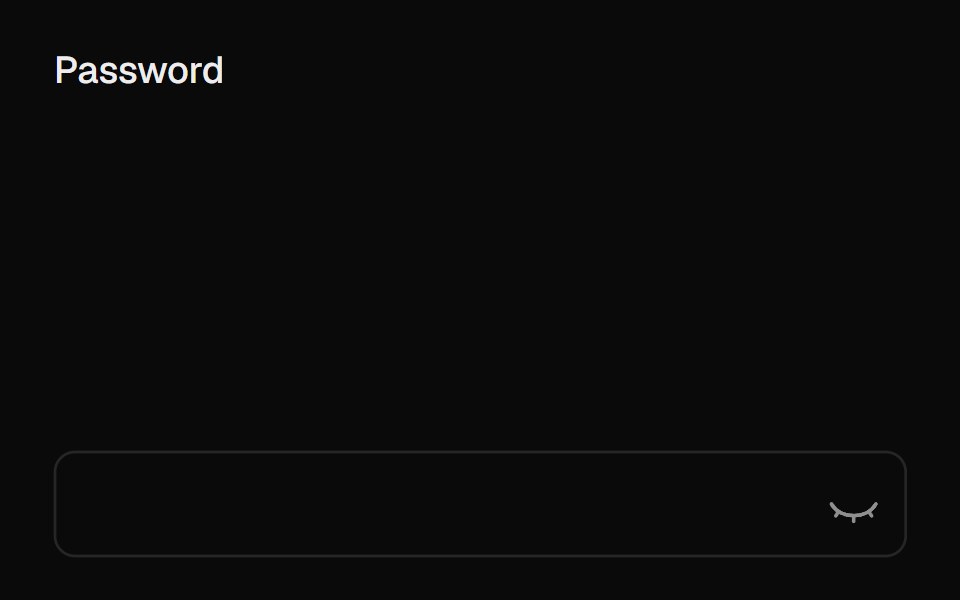 Eye ToggleUI Lab · ReactThe eye shuts when your password is hidden and watches while you type.
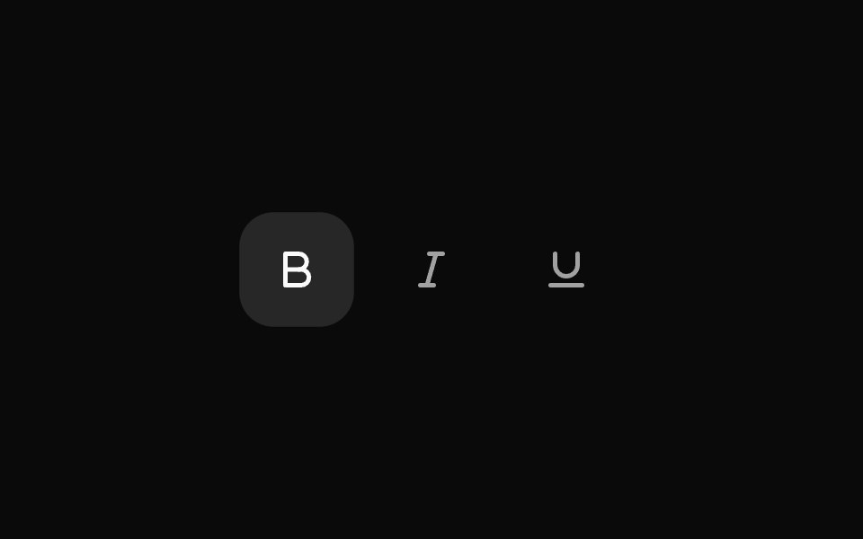 ToggleHextaUI · ReactA button that stays on or off, with a fill that settles in when pressed, a clear hover-to-on step and icons that can…
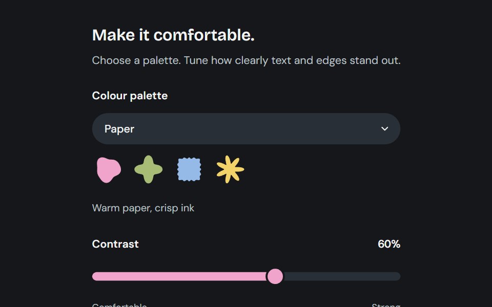 AppearanceCojeev UI · ReactChoose from six coordinated palettes and adjust reading contrast across the application.
 Theme TogglerVelora UI · ReactWipes the new theme in as a circle using View Transitions.
 Rotating Togglesv-particles · Svelte
 Like ButtonSpaceUI · ReactA like button with burst particles, a ripple ring, a spring-animated heart, and a smooth NumberFlow count transition.
 Theme ToggleCue Foundations · React
 Theme ToggleEaseUI · ReactLight and dark switch that reveals the new theme as a circle growing from the center of the screen or from the button…
 Swapark-cn · ReactA shadcn-style swap component built with Ark UI primitives.
 Micro SlatsReact Bits · ReactA wall of tiny slats that becomes a rolling sea in perspective, with glinting crests, four presets, a real fluid the…
 Toggle with icon swap on pressReUI · ReactToggle with icon swap on press
 Haptic RingAmicro Micro Transitions · ReactHaptic Ring loading animation.
 Switch ButtonKokonut UI · ReactLight and dark theme toggle whose sun folds into a moon while the new theme spreads from the button as a circle.
 Lightbulb Theme ToggleTheme Toggles · ReactAn animated theme toggle inspired by a lightbulb.
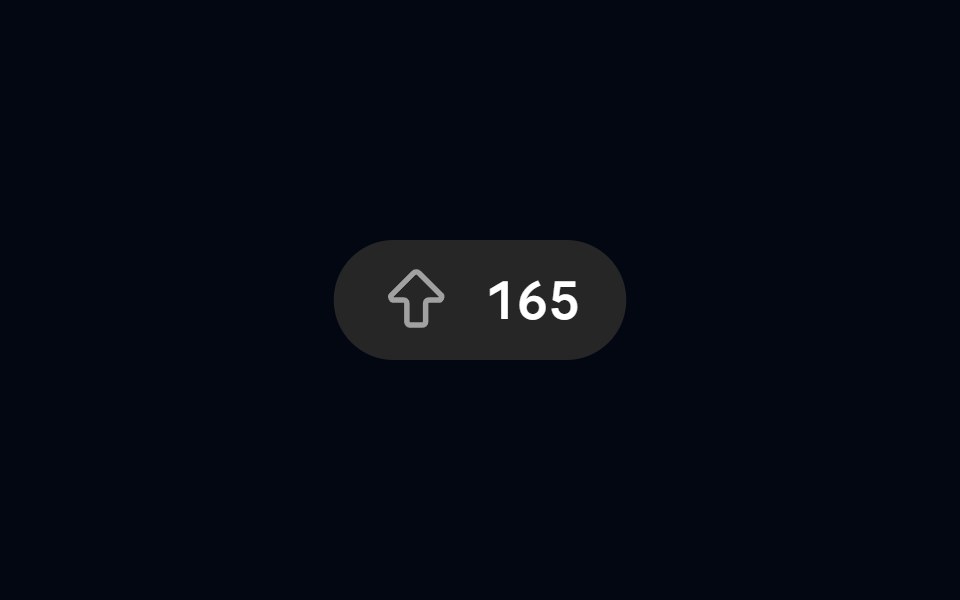 Button 21 - Animated Upvote ButtonShadcn Space · ReactUpvote button with ripple, upward particles, and sliding count
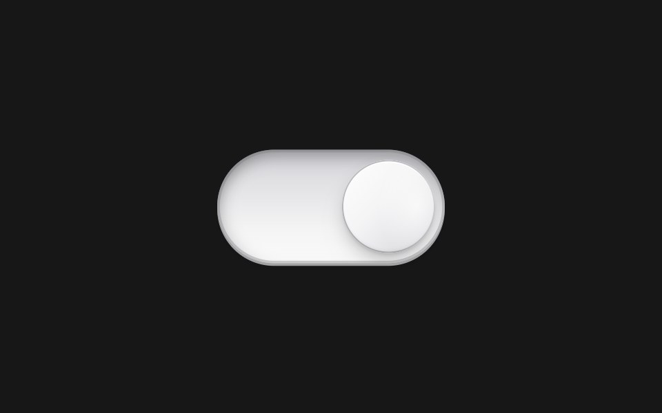 Pearl Toggle ButtonPixel Perfect · ReactPearl Toggle Button component.
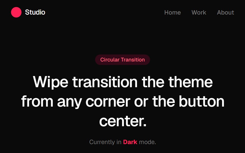 Circular Theme ProviderGreatUI · React
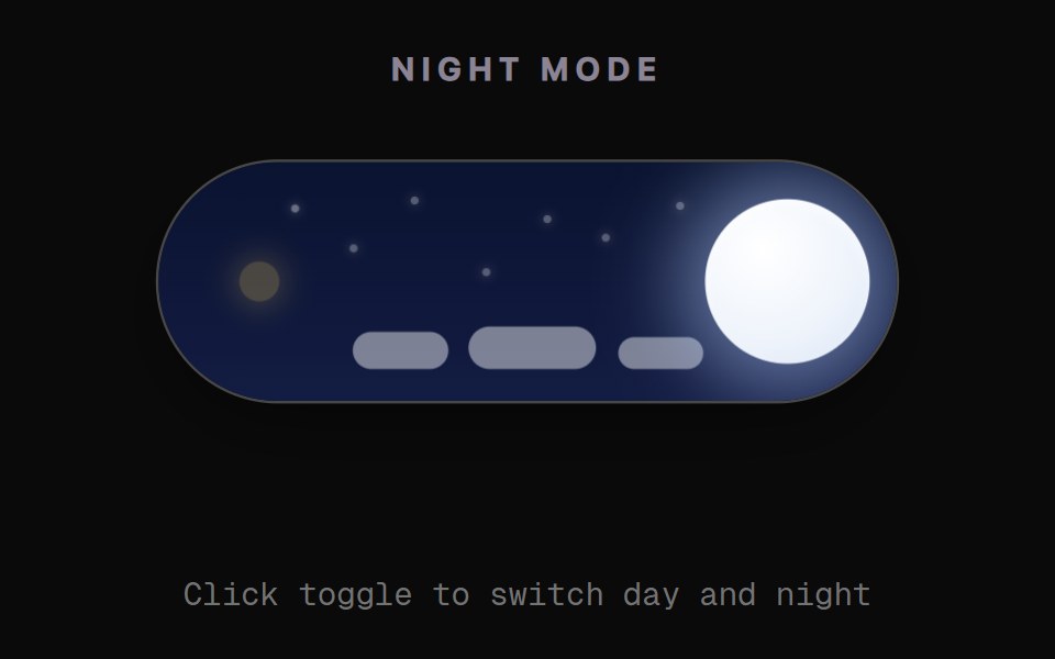 Day Night Sky ToggleRewamp UI · React
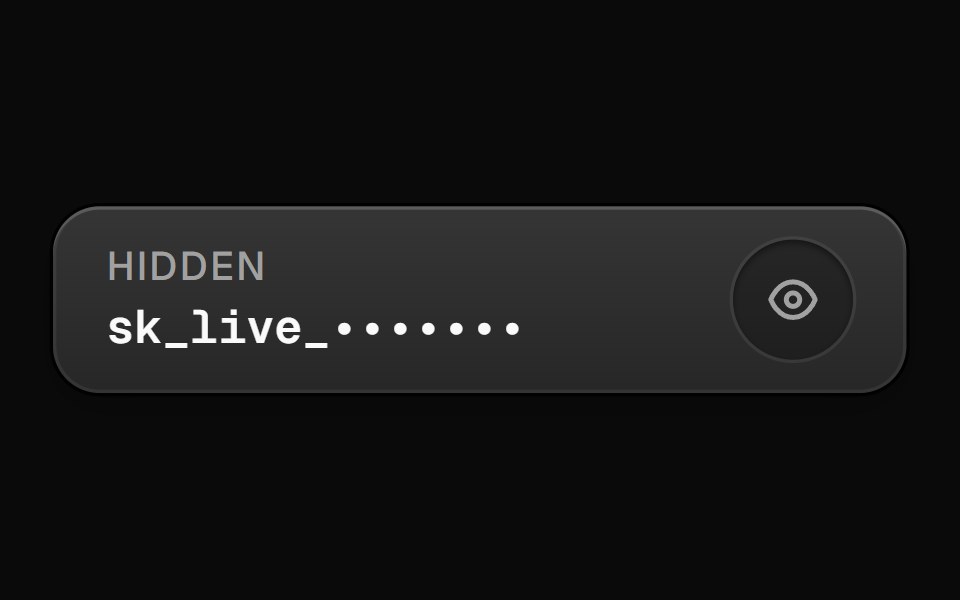 RevealButtonEvil Buttons · ReactA button that reveals a hidden secret value on hold or toggle, with a blur-in animation and an eye icon indicator.
 EclipseArc Library · ReactThe next appearance crosses the page like an eclipse.
 Like ButtonUI Lab · ReactPops, bursts and rolls the count when you like.
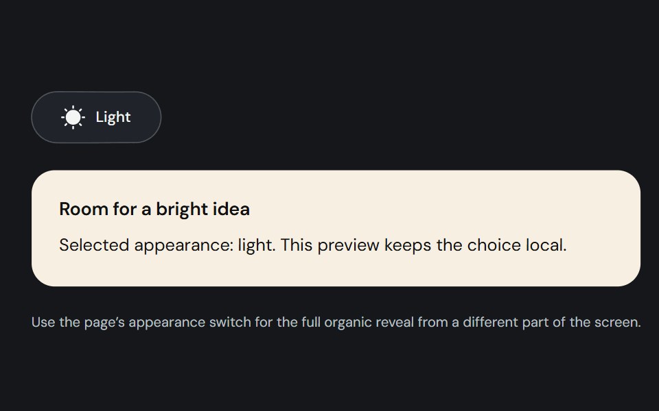 Theme toggleCojeev UI · ReactA controlled light/dark switch with a morphing sun and moon and a smooth organic page reveal.
 Show More Less Togglesv-particles · Svelte
 Theme ToggleSpaceUI · ReactView Transition API theme switch with circle, blur, rectangle, and polygon reveals.
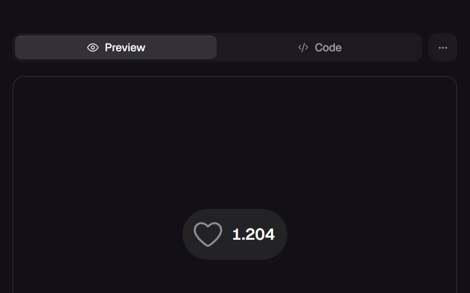 Pulse HeartReact Bits · ReactLike button that contracts to a dot, flips colour at its smallest frame and pulses back while the count swaps one glyph.
 HeartbeatAmicro Micro Transitions · ReactHeartbeat loading animation.
 Spin Theme ToggleTheme Toggles · ReactAn animated theme toggle with a spinning sun-and-moon transition.
 Toggle 02 - Animated Like ButtonShadcn Space · ReactAn animated like (heart) button with active scale pop-up animation and particle radial burst effects.
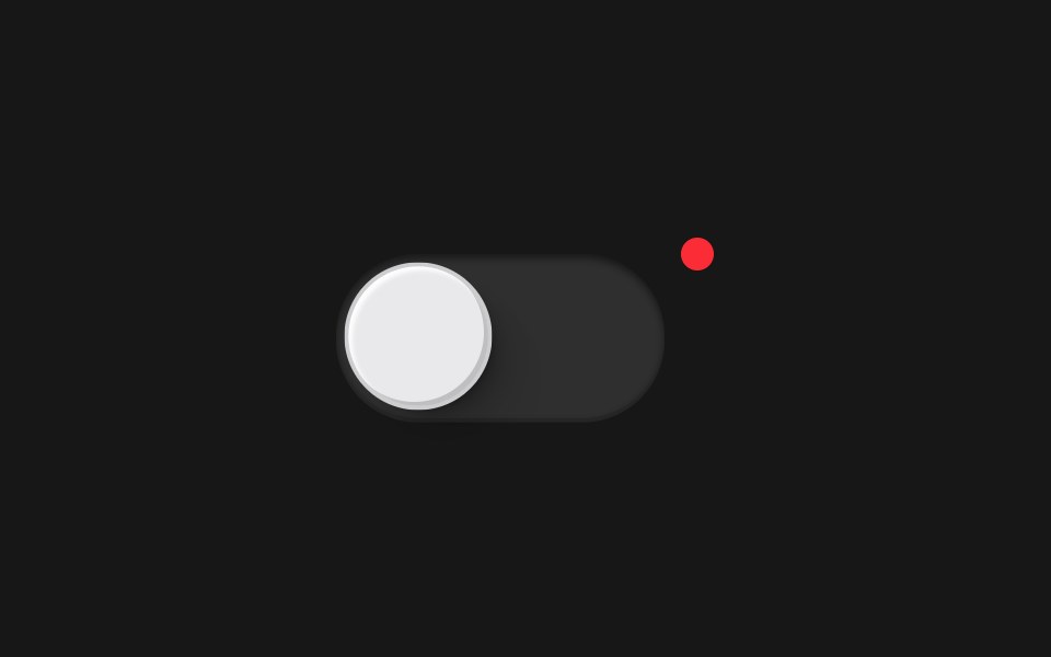 Toggle ButtonPixel Perfect · ReactAn animated toggle switch with spring physics using Framer Motion.
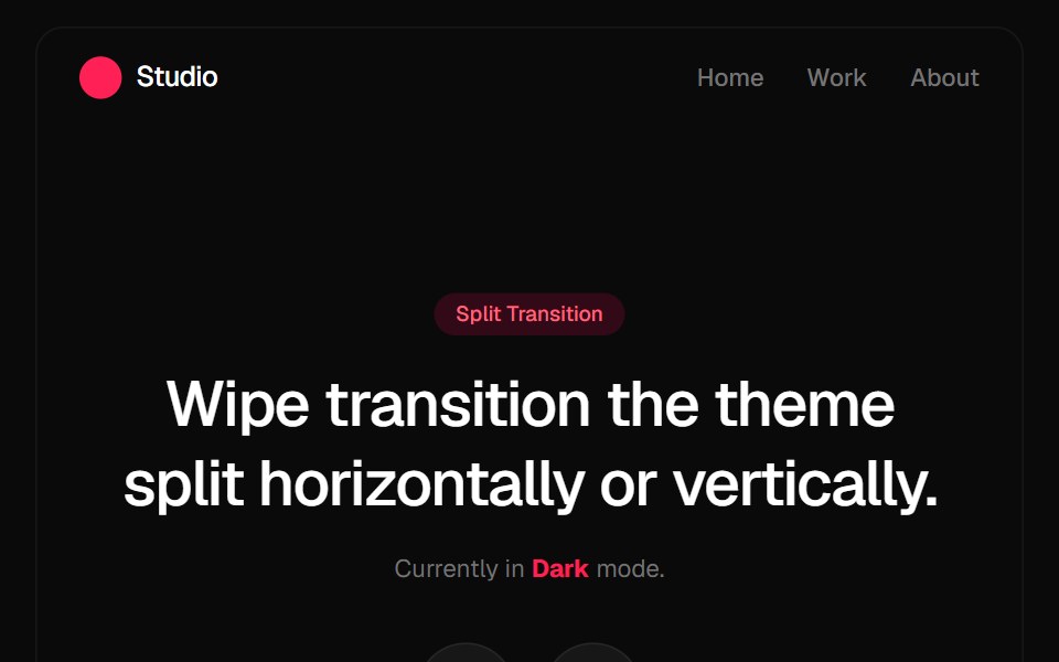 Split Theme ProviderGreatUI · React
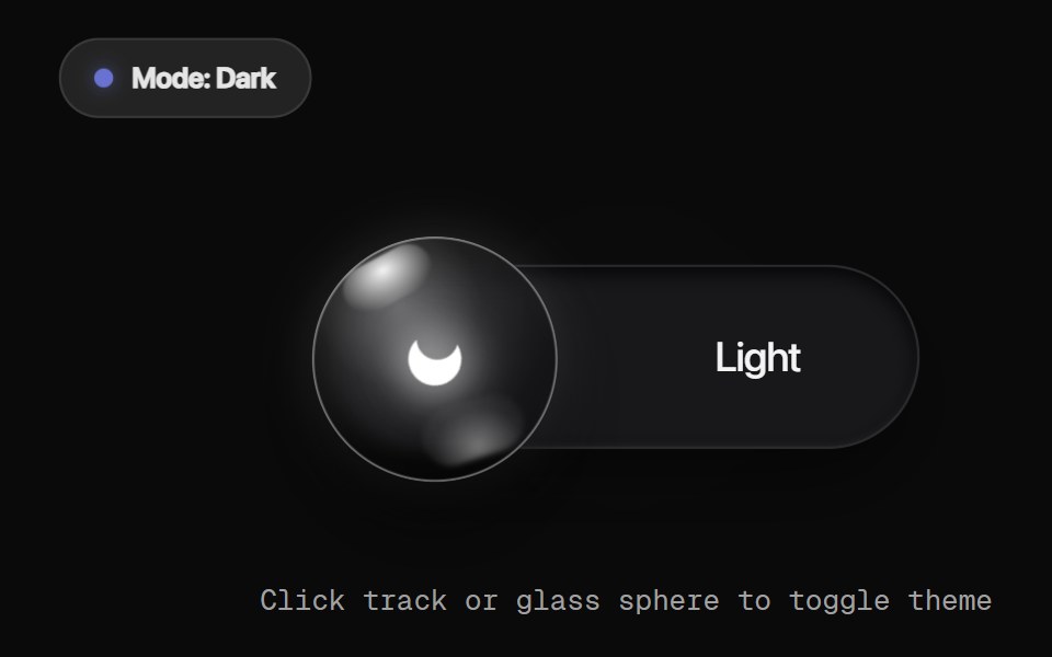 Glass Orb ToggleRewamp UI · React
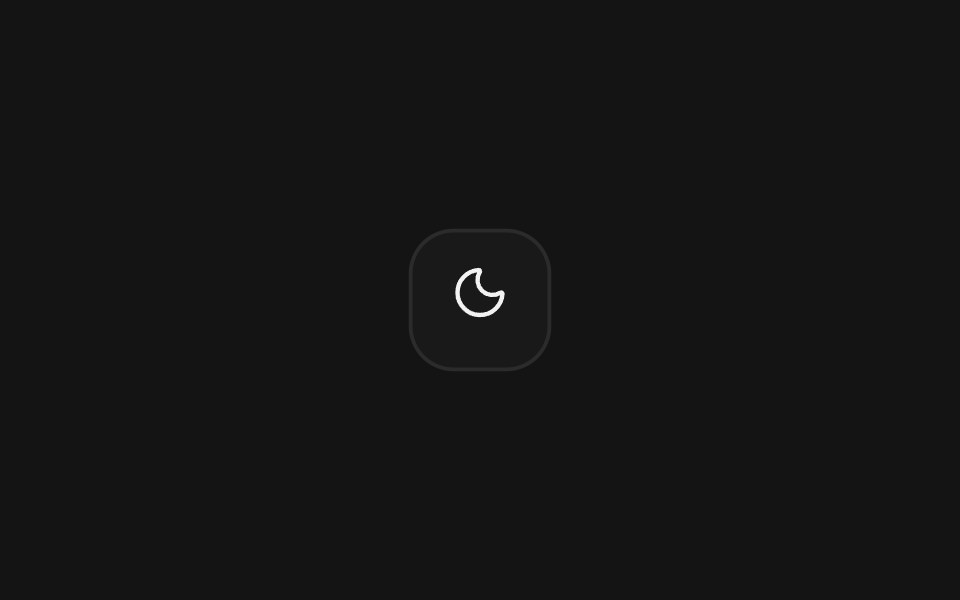 RiseArc Library · ReactThe next appearance rises into place.
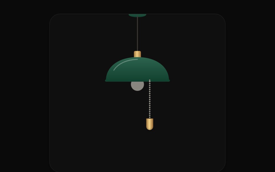 Pull Cord SwitchUI Lab · ReactPull the ball chain to switch the site's lights; light pours from the bulb as a cone.
 Mode SwitcherSpaceUI · React
 Light Dark MorphAmicro Micro Transitions · ReactTheme toggle whose sun icon changes shape into a moon. Alternador de tema cujo ícone de sol se transforma em lua.
 Toggle 03 - Animated Upvote ButtonShadcn Space · ReactAn animated Product Hunt / Reddit style upvote button with bouncing arrow and sliding digit counter.
 Swipe Theme ProviderGreatUI · React
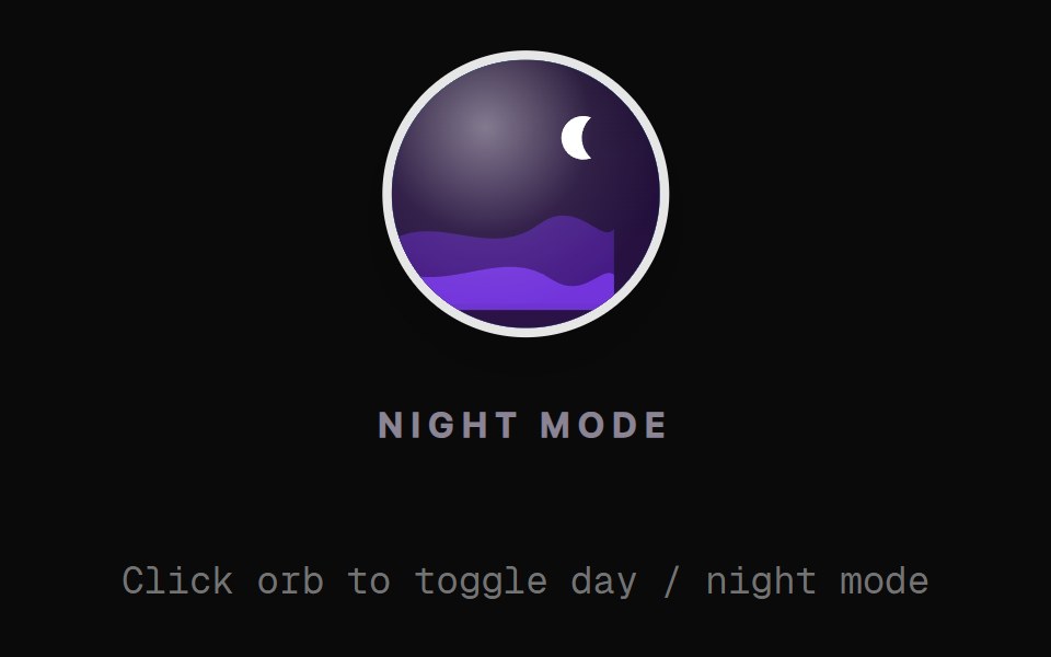 Landscape Orb ToggleRewamp UI · React
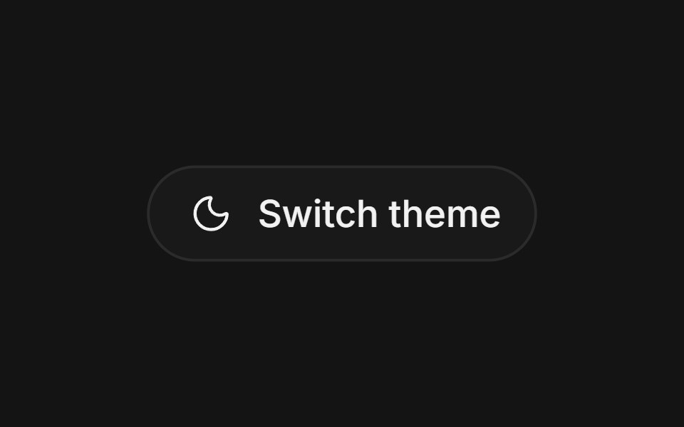 SplitArc Library · ReactThe next appearance opens from a slim center seam.
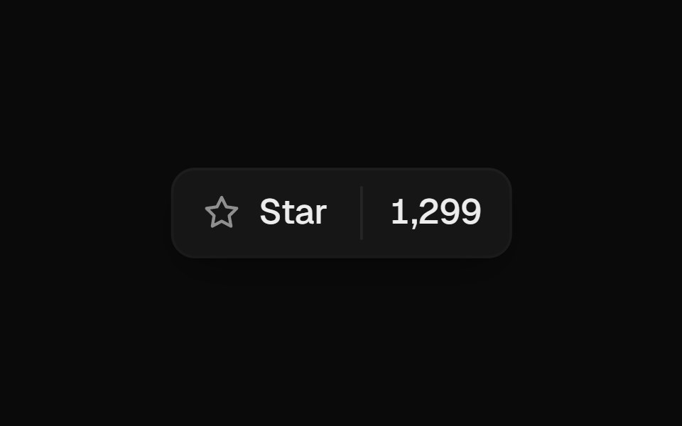 Star ButtonUI Lab · ReactSpins once and throws off tiny sparks when starred, then rolls the count.
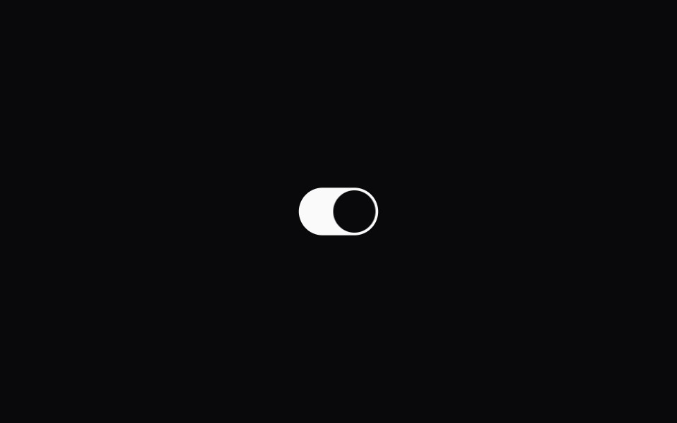 Theme SwitcherSpaceUI · React
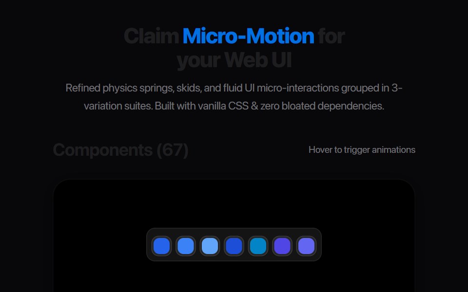 Plus Minus ToggleAmicro Micro Transitions · ReactDual square toggle buttons with solid color fills and spring micro-bounce.
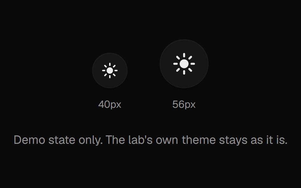 Theme ToggleUI Lab · ReactA sun that folds its rays away and turns into a crescent moon.
 Pumping HeartAmicro Micro Transitions · ReactPumping Heart loading animation.
 Button FavoriteAmicro Micro Transitions · React
 Button LikeAmicro Micro Transitions · React
 Button ThemeAmicro Micro Transitions · React
Libraries with Animated toggle button components
Related categories
- Toggle Button Components
- React Toggle Button Components
- Tailwind CSS Toggle Button Components
- shadcn/ui Toggle Button Components
- Animated Action Components
- Animated Button Components
- Animated Theme Toggle Components
- Animated Copy Button Components
- Animated Icon Button Components
- Animated CTA Button Components
- Animated Button Group Components
- Animated FAB Components
- Animated Like Button Components
- Animated Hold Button Components
- Animated Submit Button Components
- Animated Share Button Components
- Animated Send Button Components