Theme Toggle
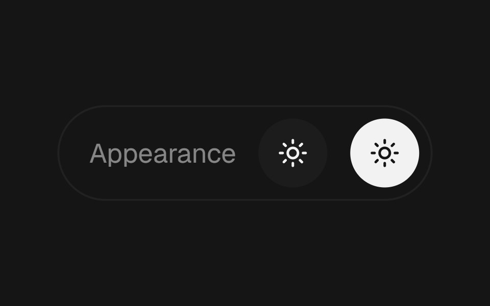
Light and dark switch that reveals the new theme as a circle growing from the center of the screen or from the button itself.
- Library
- EaseUI
- Framework
- React
- Type
- component
- License
- MIT
- Install
npx shadcn@latest add @easeui/theme-toggle- Files
components/motion/theme-toggle.tsxlib/utils.ts
- Source
- https://github.com/rjcuff/easeui
Categories
- Action Components
- React Action Components
- Tailwind CSS Action Components
- Animated Action Components
- Button Components
- React Button Components
- Tailwind CSS Button Components
- Animated Button Components
- Theme Toggle Components
- React Theme Toggle Components
- Tailwind CSS Theme Toggle Components
- Animated Theme Toggle Components