 Dev Design Library
Animated Theme Toggle Components
Dev Design Library indexes 32 Animated theme toggle components from 17 open-source UI libraries, with the most coming from GreatUI, Arc Library, Rewamp UI, SpaceUI and Theme Toggles. Each one links to its page with the source code, a live preview where available, the library license and the install command. These are the theme toggle components tagged as animated: motion on hover, on scroll or on load, usually built with CSS transitions or Framer Motion. Theme toggle components belong to the Actions group.
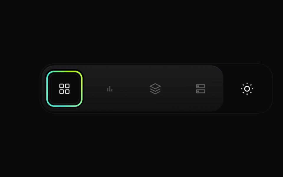 Gradient Button GroupCult UI · ReactPremium layered button group with animated active state, gradient ring accents, and theme toggle underlay
 Theme toggle button with animated moon and sun iconsReUI · ReactTheme toggle button with animated moon and sun icons
 Light Dark MorphAmicro Micro Transitions · ReactTheme toggle whose sun icon changes shape into a moon. Alternador de tema cujo ícone de sol se transforma em lua.
 Switch ButtonKokonut UI · ReactLight and dark theme toggle whose sun folds into a moon while the new theme spreads from the button as a circle.
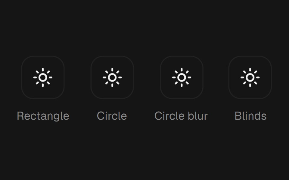 Theme TogglebeUI · ReactTheme toggle button that repaints the whole page through the View Transition API — a rectangle or circle clip-path…
 Theme SwitcherUser Interface Wiki · React
 Expand Theme ToggleTheme Toggles · ReactAn animated theme toggle with an expanding sun-and-moon transition.
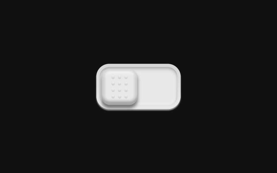 Theme Toggleuselayouts · ReactA physical switch with a dotted grip. Click and the knob slides across a recessed track.
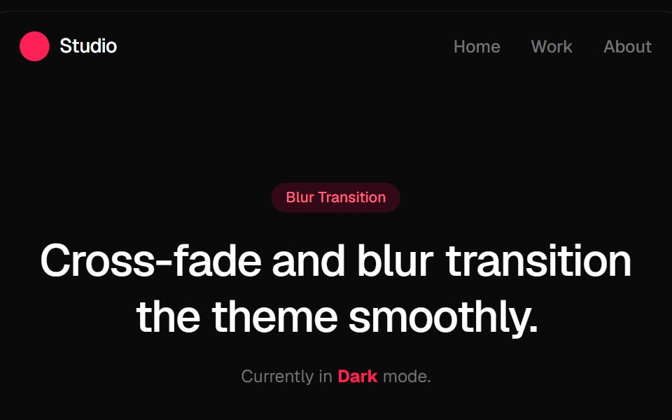 Blur Fade Theme TransitionGreatUI · ReactLight and dark theme toggle that switches the page with a blur and fade transition.
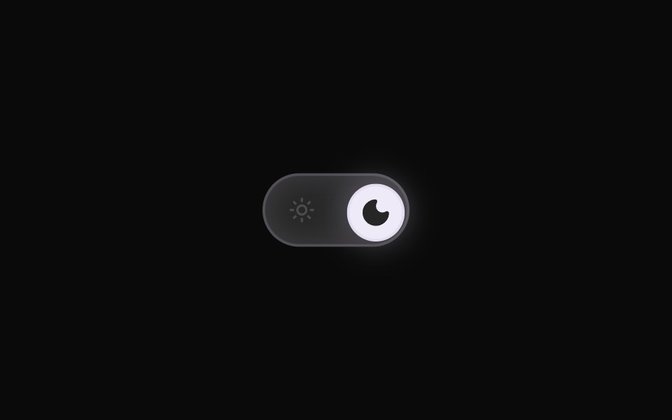 Theme ToggleRewamp UI · ReactRewampUI ThemeToggle Component A smooth, tactile Light / Dark mode toggle switch with layout-interpolated spring…
 Theme switcherArc Library · ReactFour smooth ways to move between light and dark appearance.
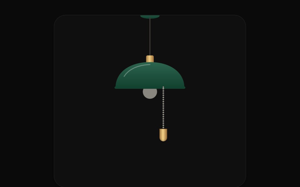 Pull Cord SwitchUI Lab · ReactPull the ball chain to switch the site's lights; light pours from the bulb as a cone.
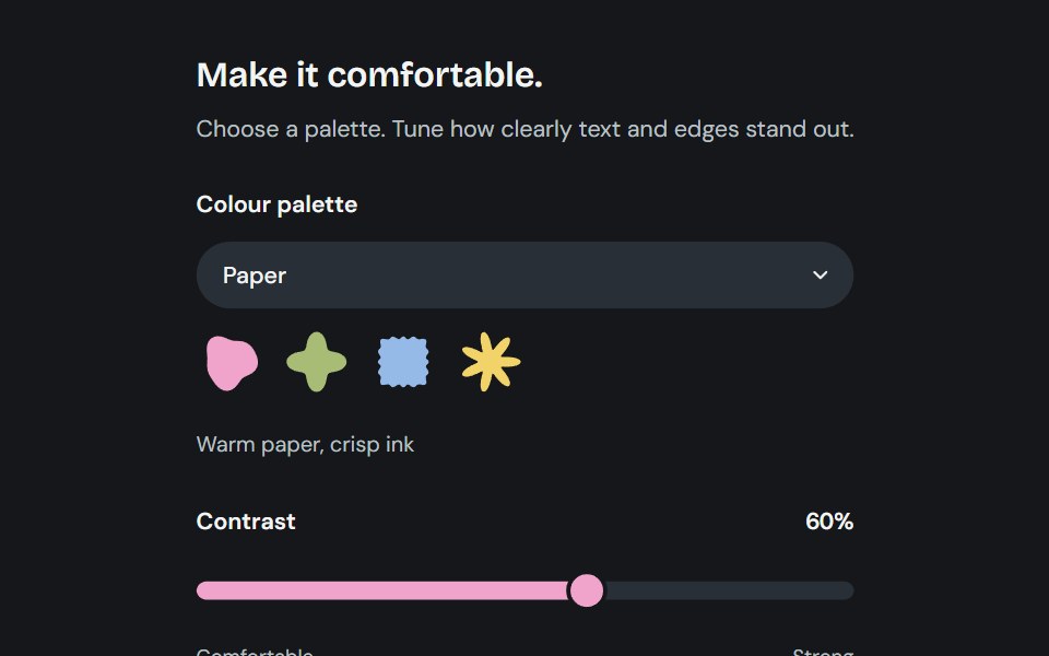 AppearanceCojeev UI · ReactChoose from six coordinated palettes and adjust reading contrast across the application.
 Theme TogglerVelora UI · ReactWipes the new theme in as a circle using View Transitions.
 Theme ToggleSpaceUI · ReactView Transition API theme switch with circle, blur, rectangle, and polygon reveals.
 Theme ToggleCue Foundations · React
 Theme ToggleEaseUI · ReactLight and dark switch that reveals the new theme as a circle growing from the center of the screen or from the button…
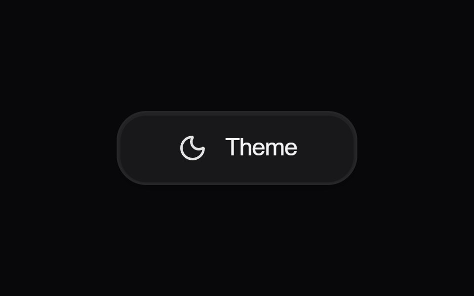 Button ThemeAmicro Micro Transitions · React
 Lightbulb Theme ToggleTheme Toggles · ReactAn animated theme toggle inspired by a lightbulb.
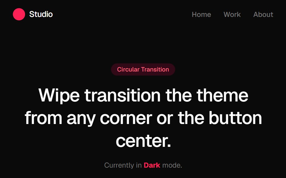 Circular Theme ProviderGreatUI · React
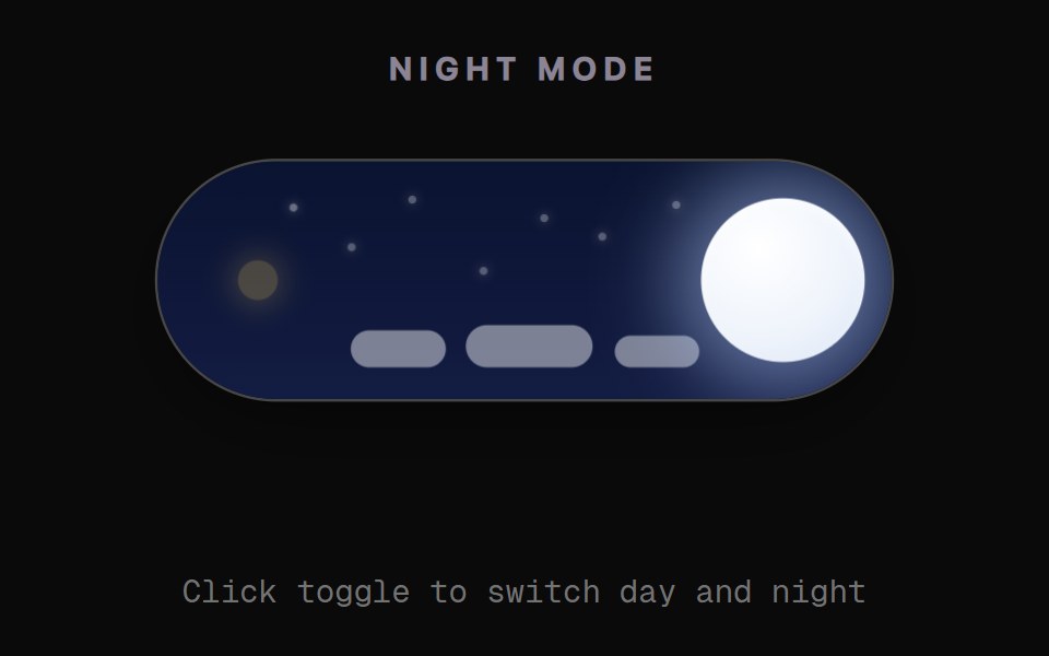 Day Night Sky ToggleRewamp UI · React
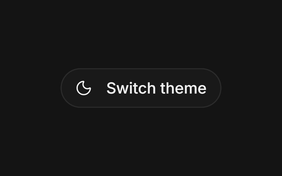 EclipseArc Library · ReactThe next appearance crosses the page like an eclipse.
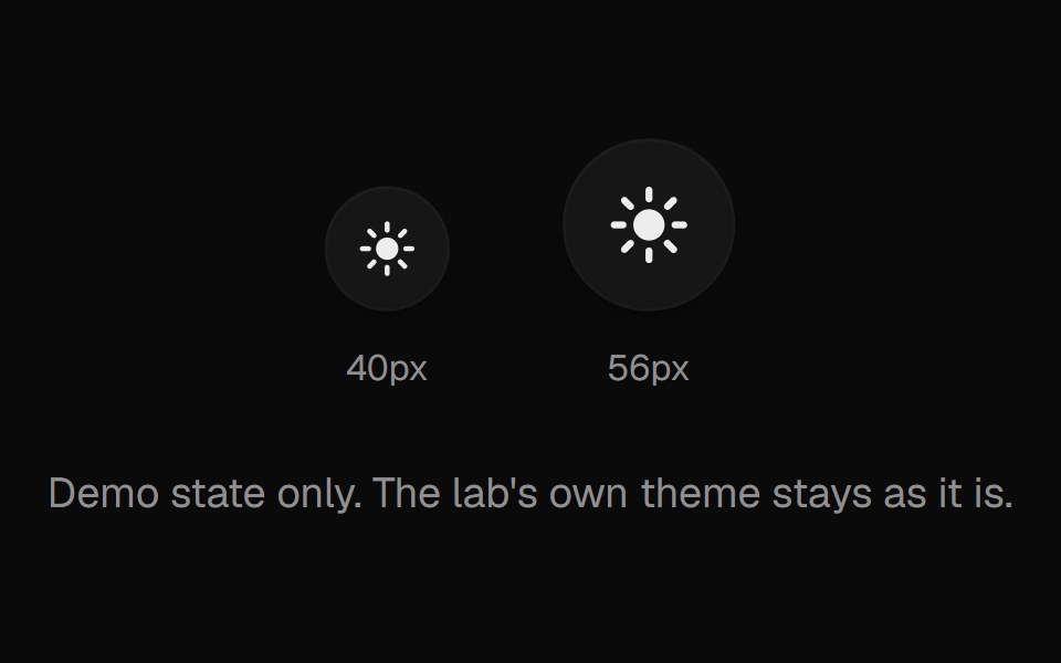 Theme ToggleUI Lab · ReactA sun that folds its rays away and turns into a crescent moon.
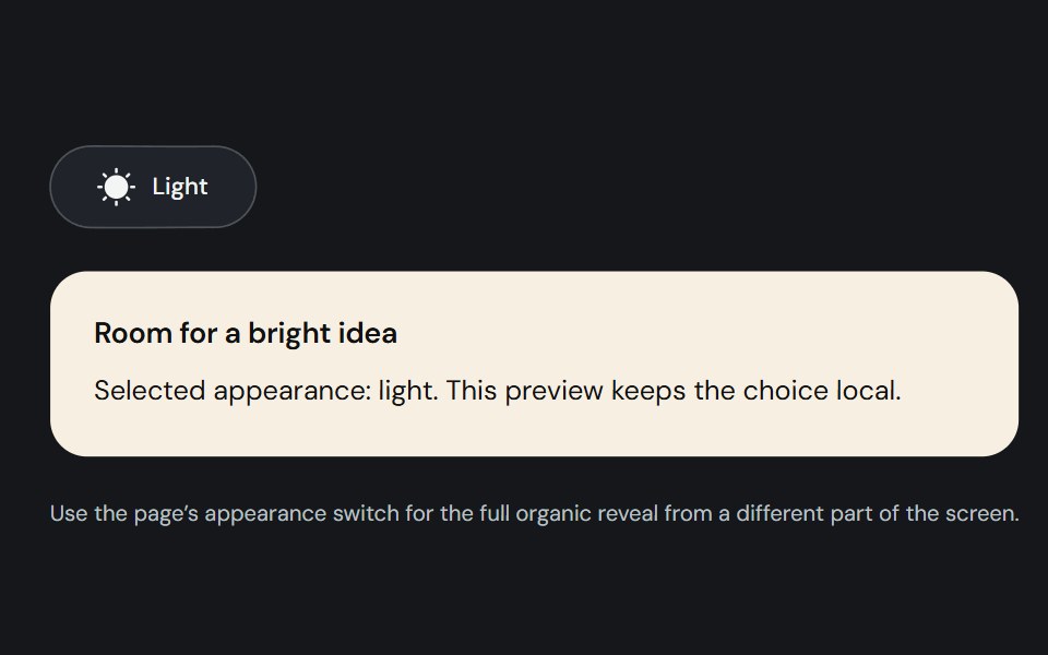 Theme toggleCojeev UI · ReactA controlled light/dark switch with a morphing sun and moon and a smooth organic page reveal.
 Mode SwitcherSpaceUI · React
 Spin Theme ToggleTheme Toggles · ReactAn animated theme toggle with a spinning sun-and-moon transition.
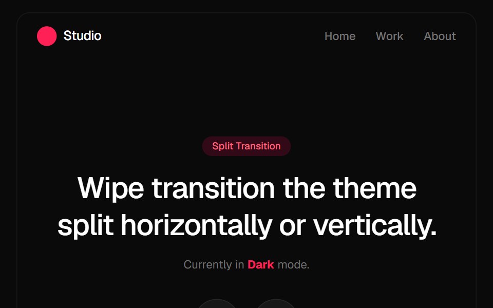 Split Theme ProviderGreatUI · React
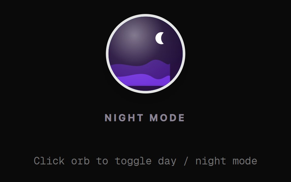 Landscape Orb ToggleRewamp UI · React
 RiseArc Library · ReactThe next appearance rises into place.
 Theme SwitcherSpaceUI · React
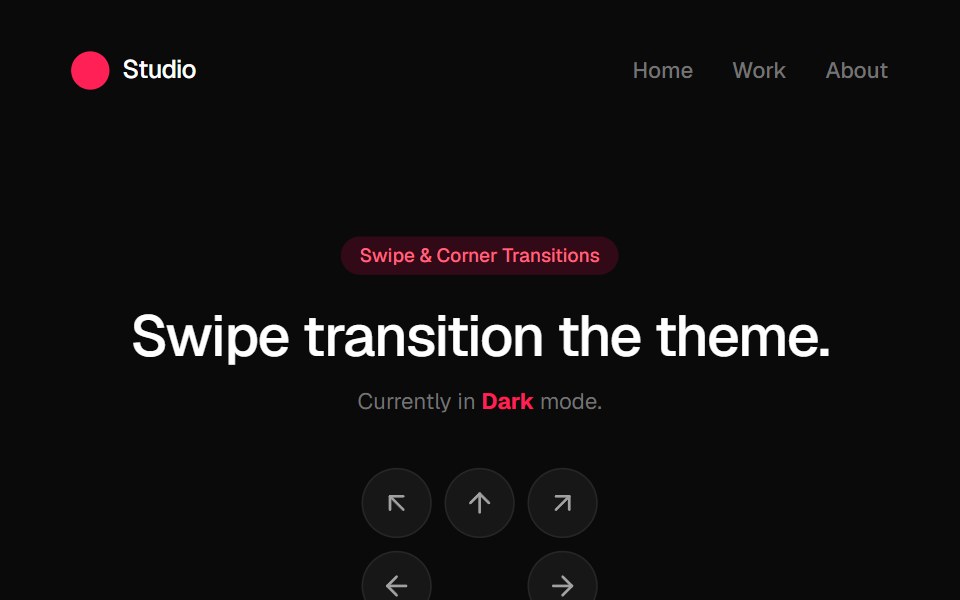 Swipe Theme ProviderGreatUI · React
 SplitArc Library · ReactThe next appearance opens from a slim center seam.
Libraries with Animated theme toggle components
Related categories
- Theme Toggle Components
- React Theme Toggle Components
- Tailwind CSS Theme Toggle Components
- Animated Action Components
- Animated Button Components
- Animated Toggle Button Components
- Animated Copy Button Components
- Animated Icon Button Components
- Animated CTA Button Components
- Animated Button Group Components
- Animated FAB Components
- Animated Like Button Components
- Animated Hold Button Components
- Animated Submit Button Components
- Animated Share Button Components
- Animated Send Button Components