 Dev Design Library
Animated Button Group Components
Dev Design Library indexes 25 Animated button group components from 16 open-source UI libraries, with the most coming from beUI, Arc Library, Sona UI, Kokonut UI and Skecher UI. Each one links to its page with the source code, a live preview where available, the library license and the install command. These are the button group components tagged as animated: motion on hover, on scroll or on load, usually built with CSS transitions or Framer Motion. Button group components belong to the Actions group.
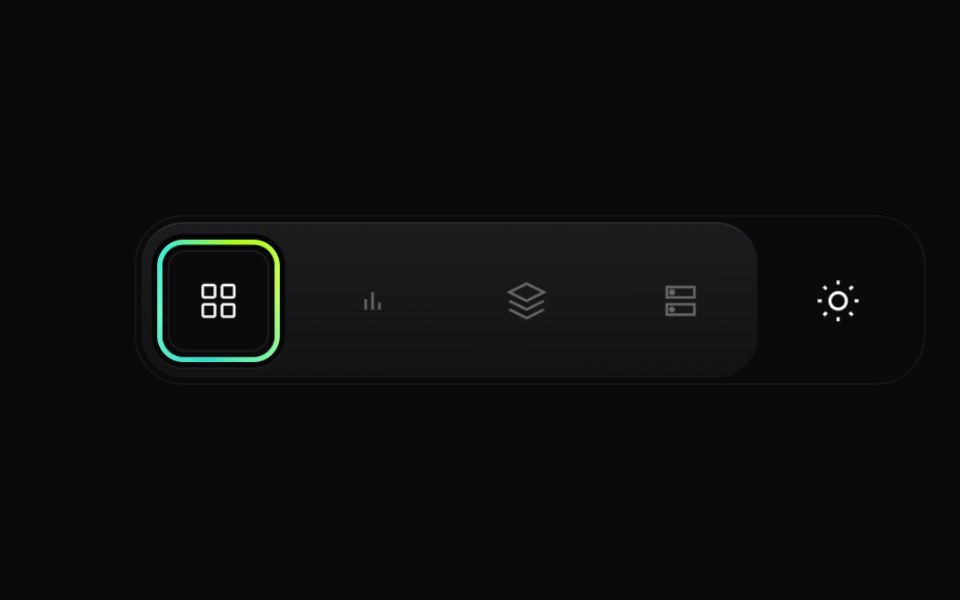 Gradient Button GroupCult UI · ReactPremium layered button group with animated active state, gradient ring accents, and theme toggle underlay
 Morph Action PillAmicro Micro Transitions · ReactPill-shaped action button that changes shape to show a different state or more actions.
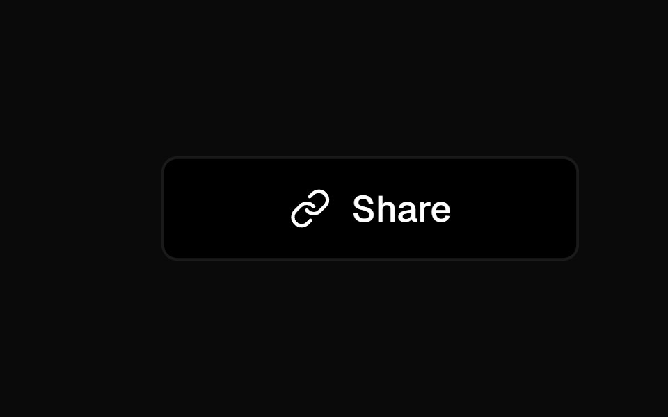 Social ButtonKokonut UI · ReactShare button that expands into a row of social icon buttons with staggered Motion animations on hover, built with…
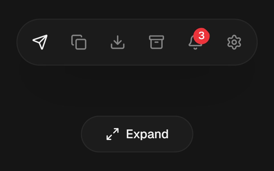 Expandable Action BarbeUI · ReactCompact icon actions that expand into labeled controls on hover or focus with shared layout motion.
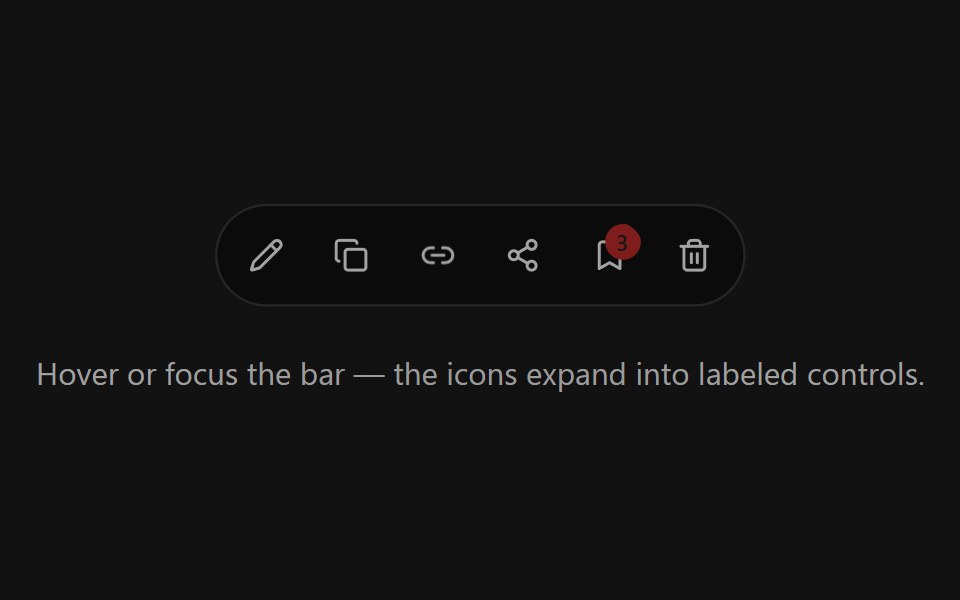 Expandable Action BarSpectrum UI · ReactCompact icon actions that expand into labeled controls on hover or focus with shared layout motion.
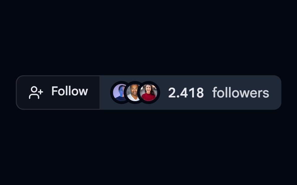 Button Group 09 - FollowShadcn Space · ReactFollow style button group component
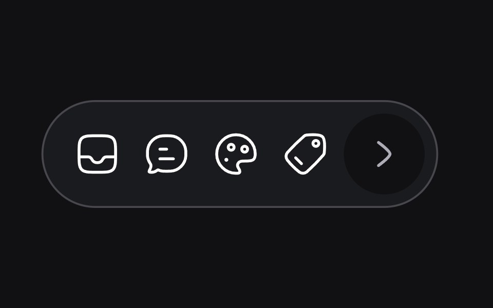 Dynamic Toolbaruselayouts · ReactA toolbar that adapts its size and layout based on content.
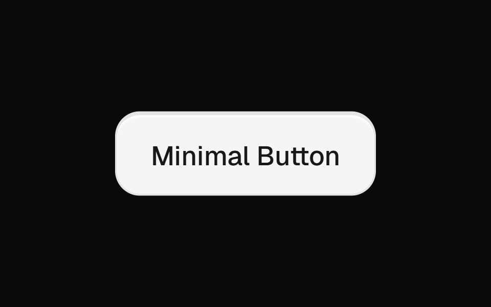 Minimal ButtonsGreatUI · React
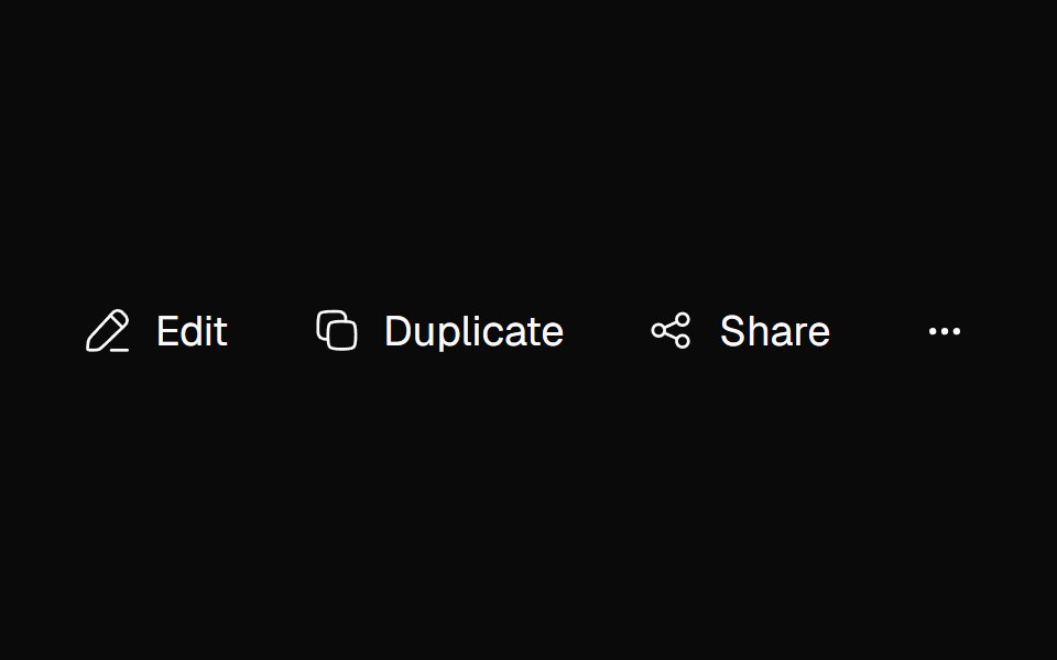 Adaptive ActionsNexvyn UI · ReactA responsive action toolbar that measures its available inline size and moves overflowed items into an accessible…
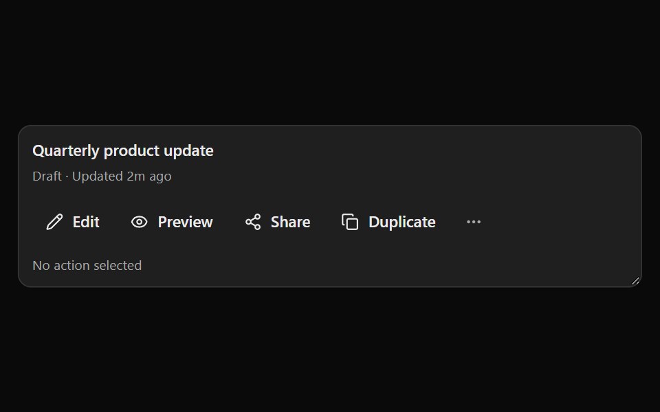 Smart OverflowSona UI · ReactA priority-first responsive action group that moves lower-priority actions into an accessible three-dot menu as…
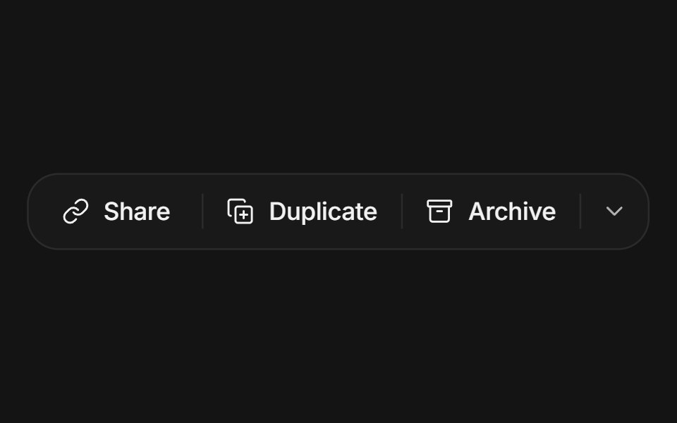 Button groupArc Library · ReactRelated actions joined into one surface with hairline dividers: a hover highlight glides between segments, the pressed…
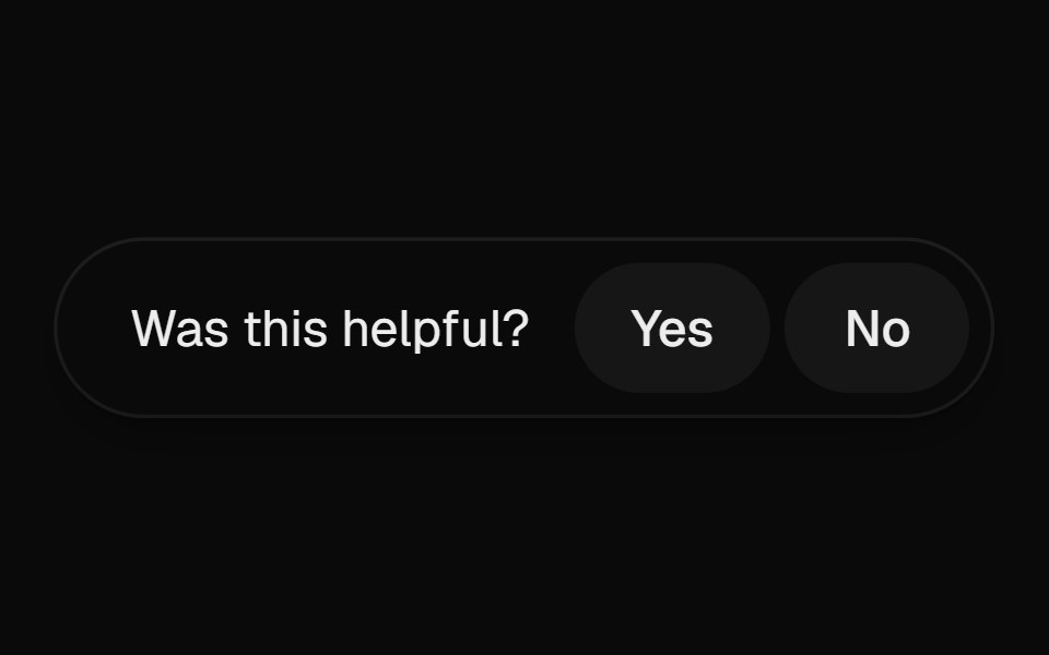 Helpful PromptUI Lab · ReactAsks if the page helped, and on a no opens into a field right where the question was.
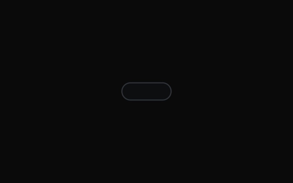 Preview Hover ToolbarMicroKit · ReactA thin empty pill that grows wider and taller off its fixed bottom edge when the surrounding preview is hovered…
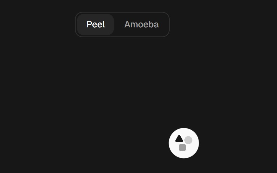 Gooey ToolbarSkecher UI · ReactA compact action toolbar with configurable liquid merging effects and accessible controls.
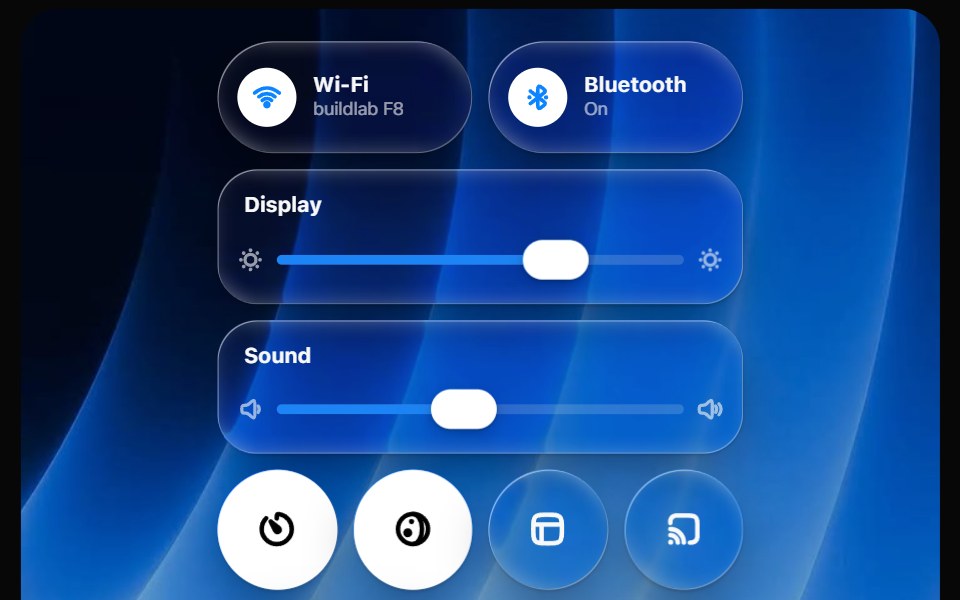 Glass Control CenterOpaline · ReactmacOS-style Control Center kit — glass modules, toggles, light-filled sliders and buttons.
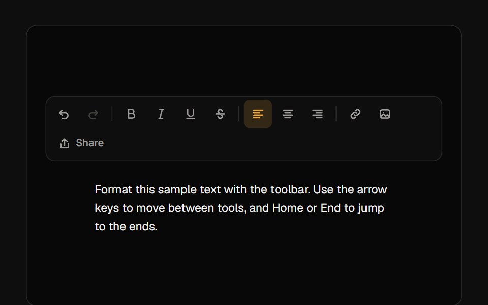 ToolbarReactFrame · ReactAn accessible toolbar of icon buttons, toggles, radio-style toggle groups and separators with roving-focus arrow-key…
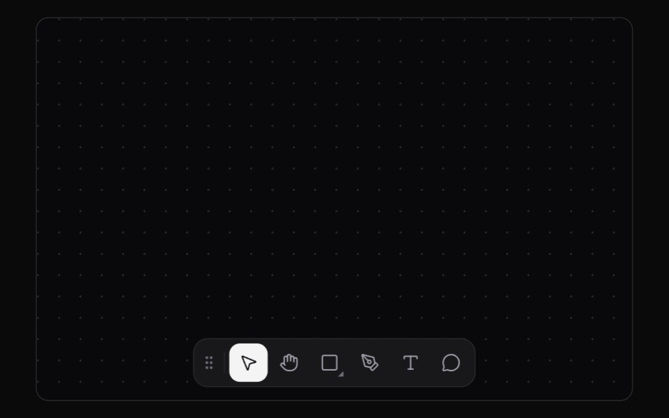 Tool DockKokonut UI · ReactAn editor tool dock with a sliding selection plate, shortcut tooltips and flyouts that you can throw to any edge.
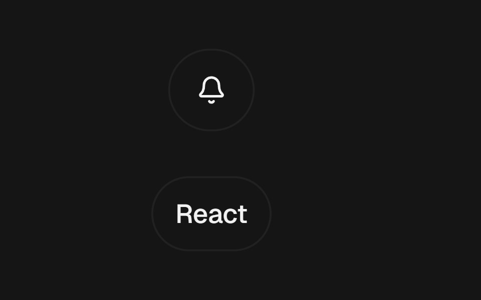 Expandable ControlbeUI · ReactClick-to-expand button and chip controls that reveal a label or trailing action through spring layout continuity.
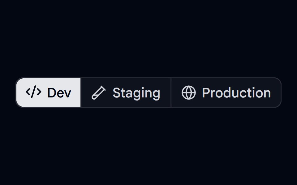 Button Group 11 - Deploy EnvironmentShadcn Space · ReactButton group component used for selecting deploy environment
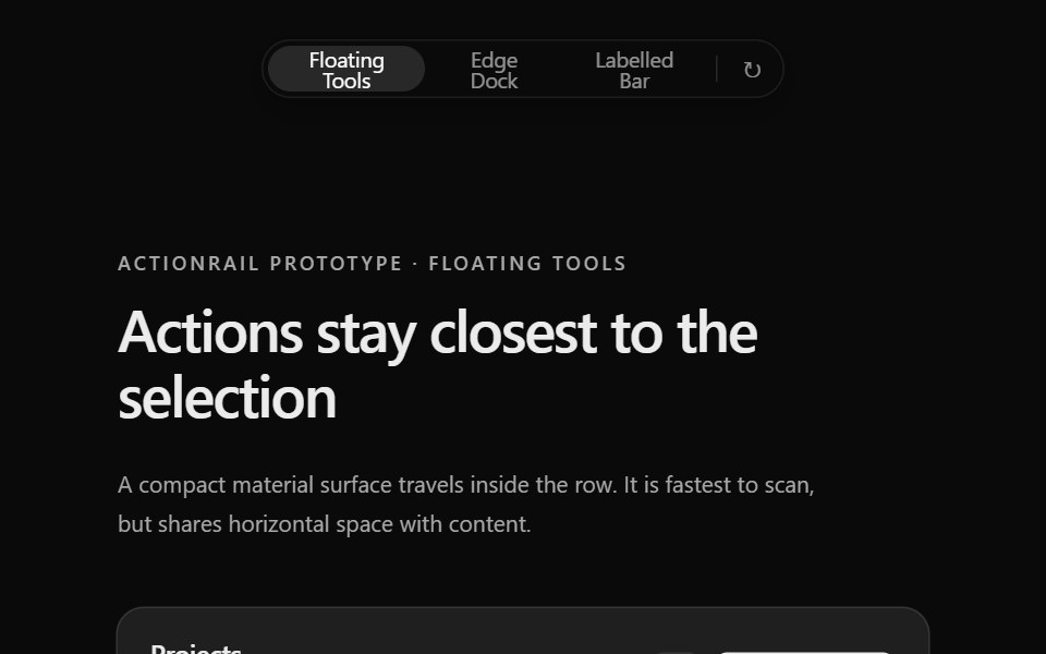 Prototype Action RailSona UI · React
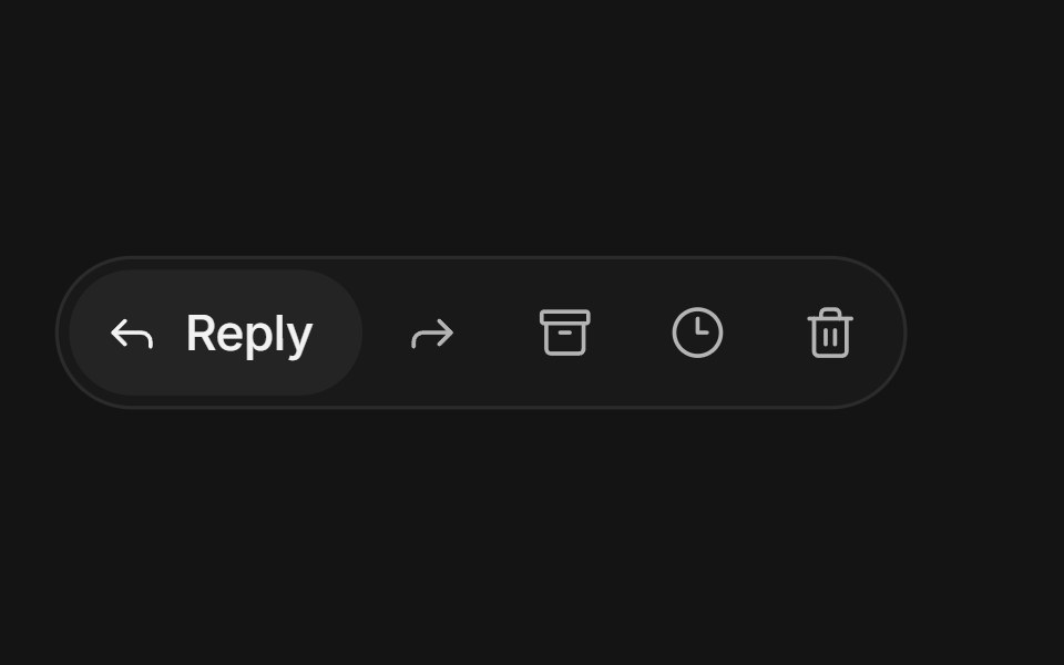 Expanding button groupArc Library · ReactIcon buttons in a compact group: the one you point at or focus grows to reveal its label while its neighbours slide…
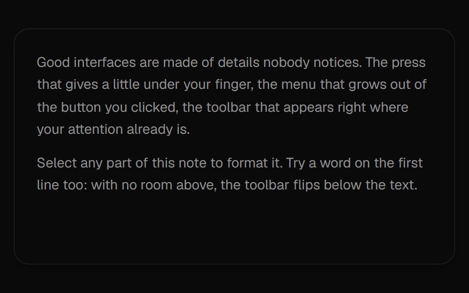 Selection ToolbarUI Lab · ReactA formatting toolbar that grows out of whatever text you select.
 Liquid Glass SocialSkecher UI · ReactA responsive social-link cluster with focused liquid-glass motion and clear interaction feedback.
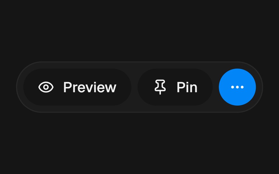 Overflow ActionsbeUI · ReactConnected pill rail for primary actions that springs open to reveal extra controls.
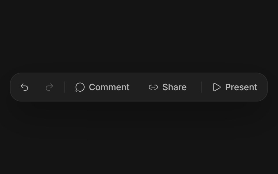 Floating button groupArc Library · ReactSeparate soft buttons in a quiet tray, with one shared highlight that morphs from button to button as you move, and a…
Libraries with Animated button group components
Related categories
- Button Group Components
- React Button Group Components
- Tailwind CSS Button Group Components
- shadcn/ui Button Group Components
- Animated Action Components
- Animated Button Components
- Animated Toggle Button Components
- Animated Theme Toggle Components
- Animated Copy Button Components
- Animated Icon Button Components
- Animated CTA Button Components
- Animated FAB Components
- Animated Like Button Components
- Animated Hold Button Components
- Animated Submit Button Components
- Animated Share Button Components
- Animated Send Button Components