 Dev Design Library
shadcn/ui Button Group Components
Dev Design Library indexes 45 shadcn/ui button group components from 14 open-source UI libraries, with the most coming from Watermelon UI, Shadcn Space, FLX UI, Notra and sv-particles. Each one links to its page with the source code, a live preview where available, the library license and the install command. They follow the shadcn/ui conventions, so most install with the shadcn CLI and drop into a Tailwind project. Button group components belong to the Actions group.
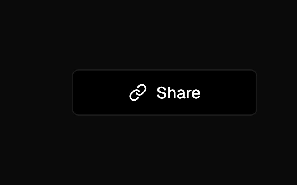 Social ButtonKokonut UI · ReactShare button that expands into a row of social icon buttons with staggered Motion animations on hover, built with…
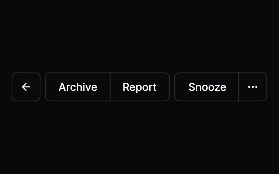 Button GroupVengeance UI · React
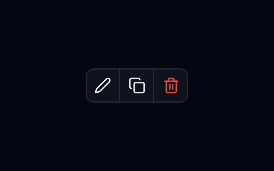 Button Group-01 - BasicShadcn Space · ReactBasic button group component
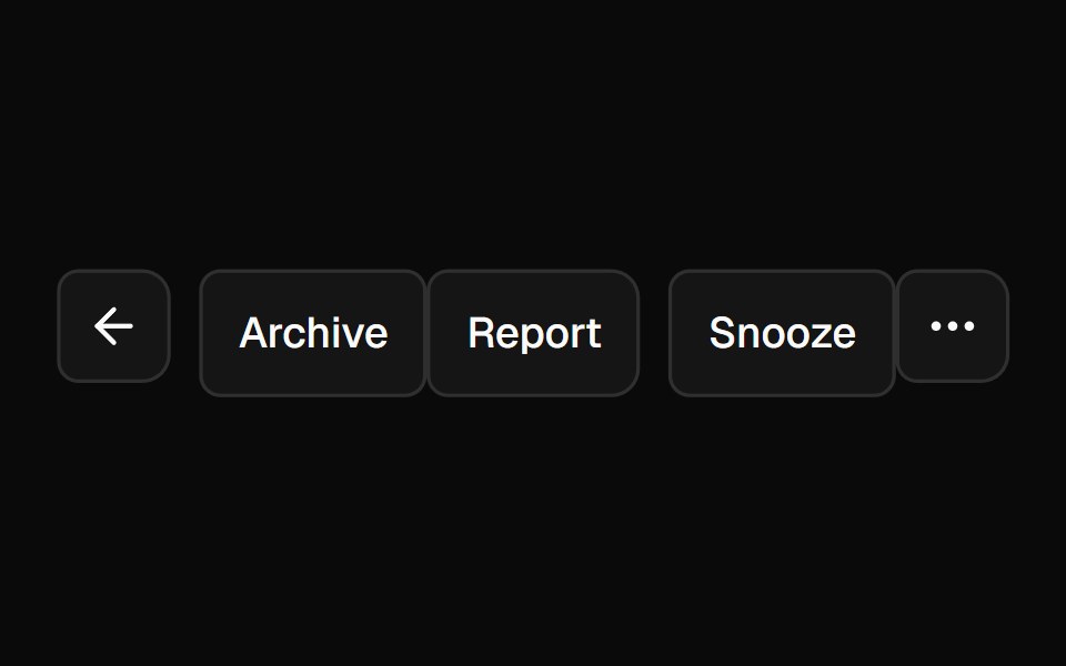 Button GroupShadcn Dashboard · React
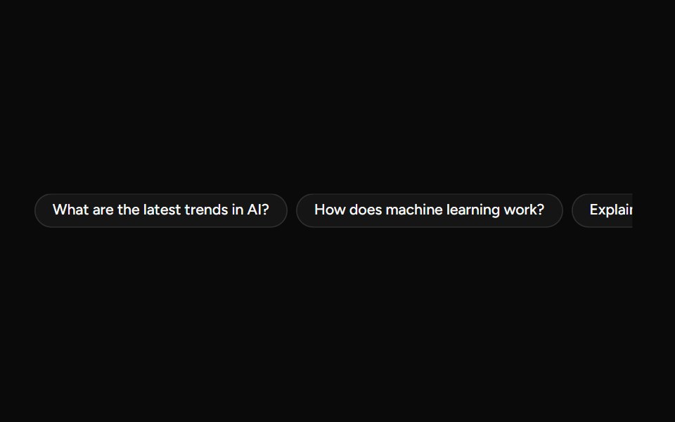 SuggestionAI Elements (Svelte) · SvelteA compact suggestion button set for displaying prompt ideas and quick actions.
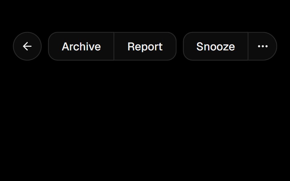 Button GroupObsidianUI · React
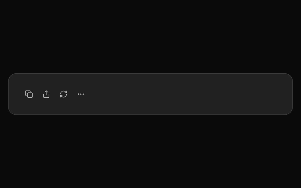 ChatGPT ActionsNotra · ReactCopy, share, redo and more buttons, built on shadcn Button and Tooltip.
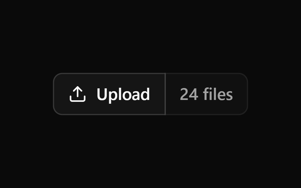 Button Group 1Watermelon UI · React
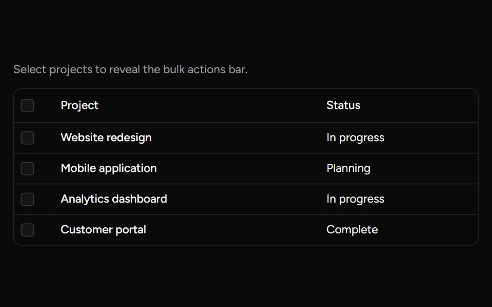 Bulk Actions Barsv-table · SvelteA floating action bar for performing custom actions on selected rows.
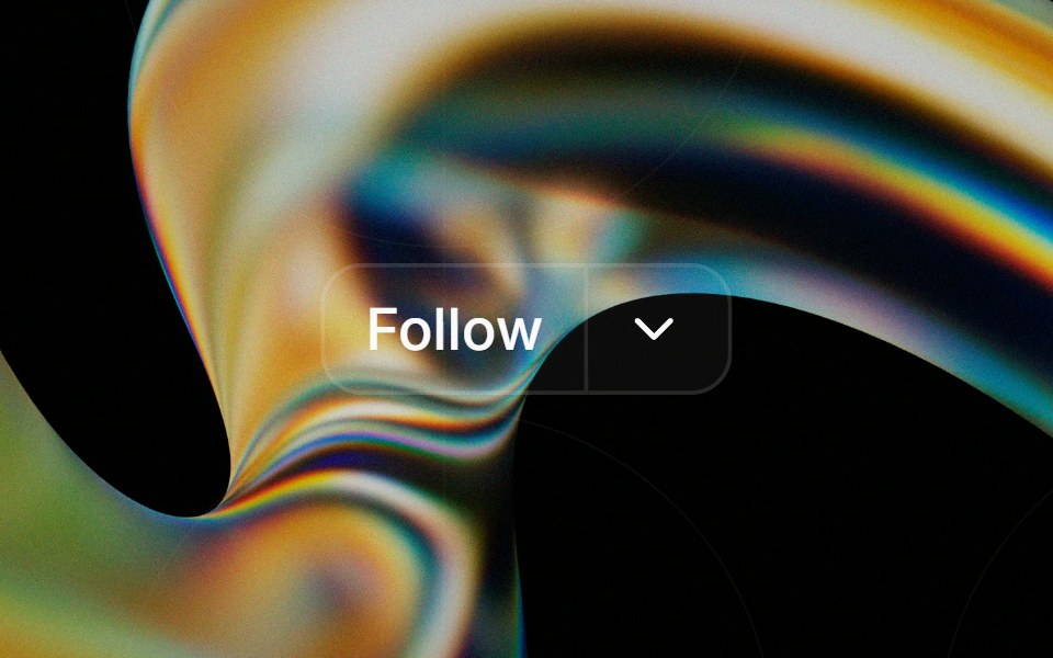 Button Groupglasscn · React
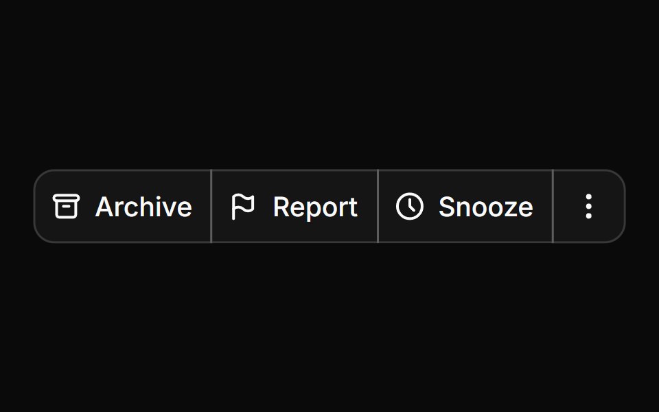 Button groupHextaUI · ReactButtons joined into one control, with shared seams, separators, text addons, nesting and vertical stacks.
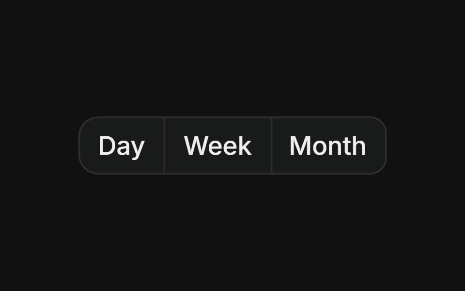 Basic groupFLX UI · ReactHorizontal row of buttons with merged borders, used for segmented controls like date range pickers.
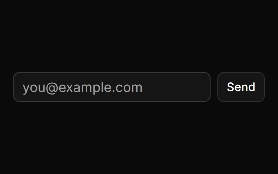 Button Using Groupsv-particles · Svelte
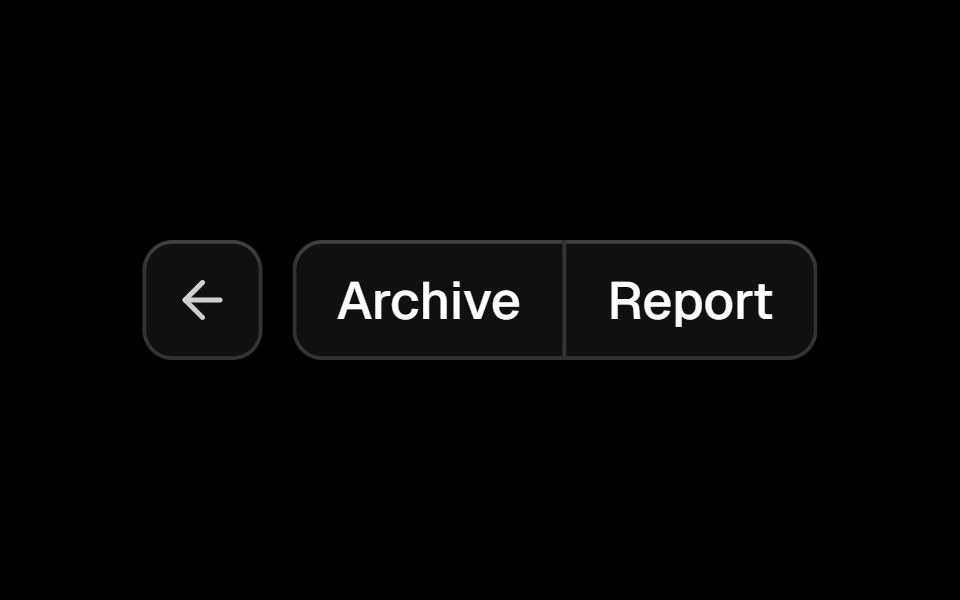 Button Groupark-cn · ReactA shadcn-style button group component built with Ark UI primitives.
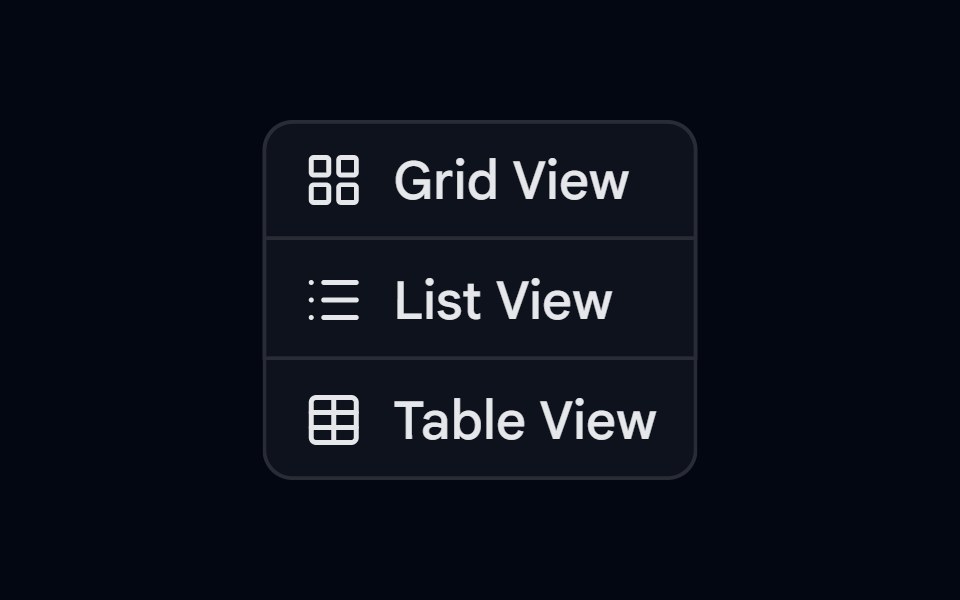 Button Group-02 - VerticalShadcn Space · ReactVertical button group component
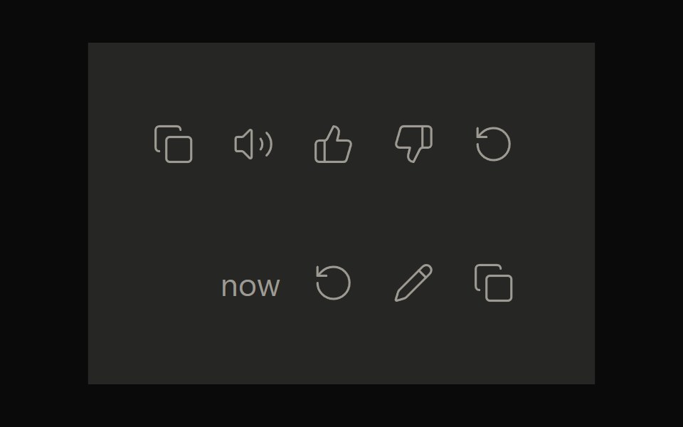 Claude ActionsNotra · ReactCopy, feedback and retry actions built on shadcn Button and Tooltip.
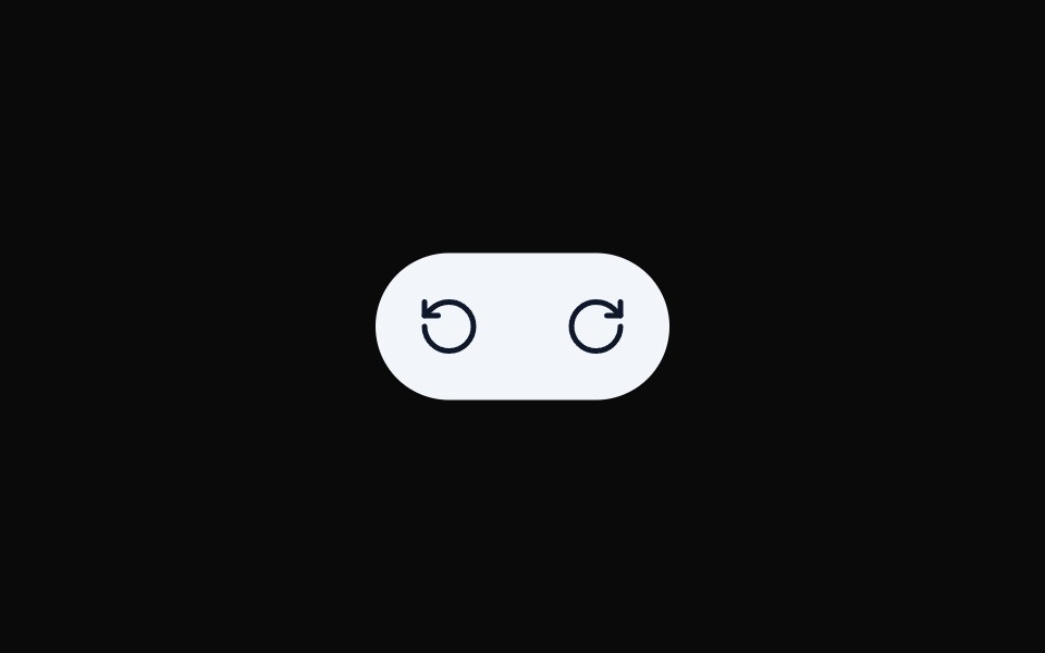 Button Group 10Watermelon UI · React
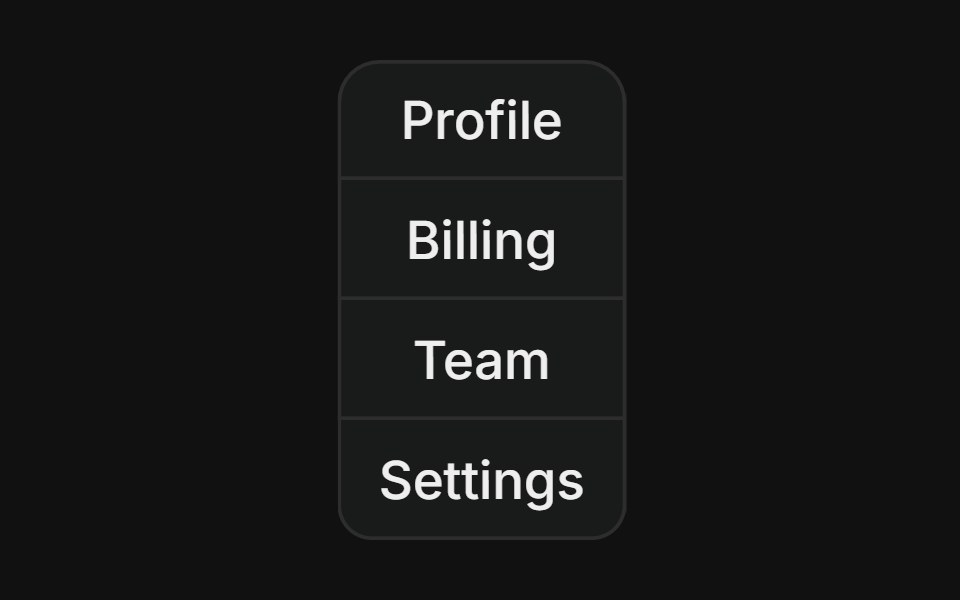 Vertical groupFLX UI · ReactStacked column of buttons with merged borders, used for vertical navigation menus.
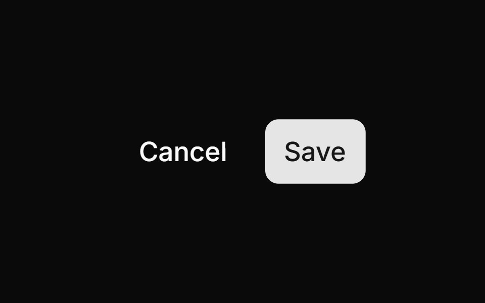 Cancel Savesv-particles · Svelte
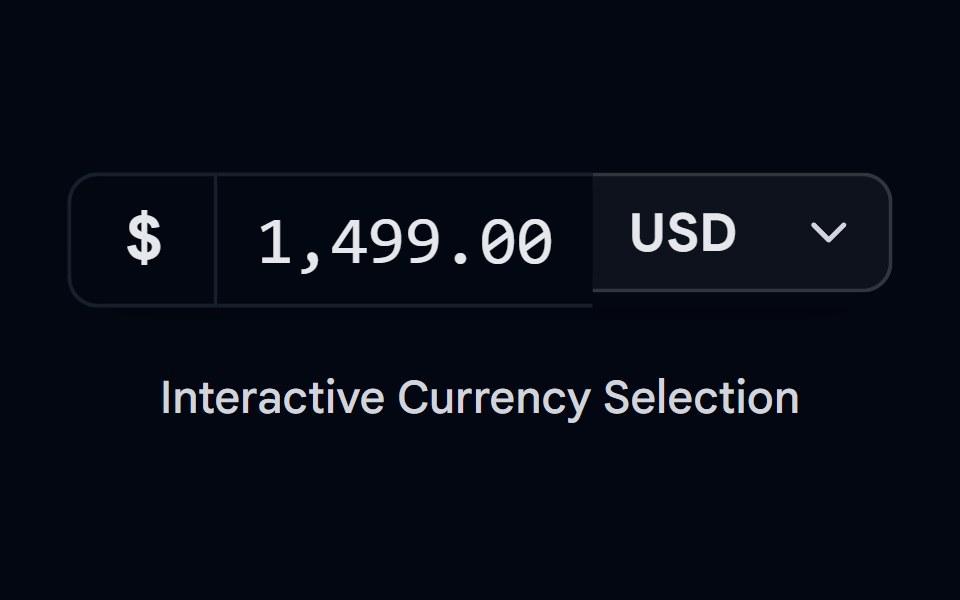 Button Group-05 - CurrencyShadcn Space · ReactCurrency style button group component
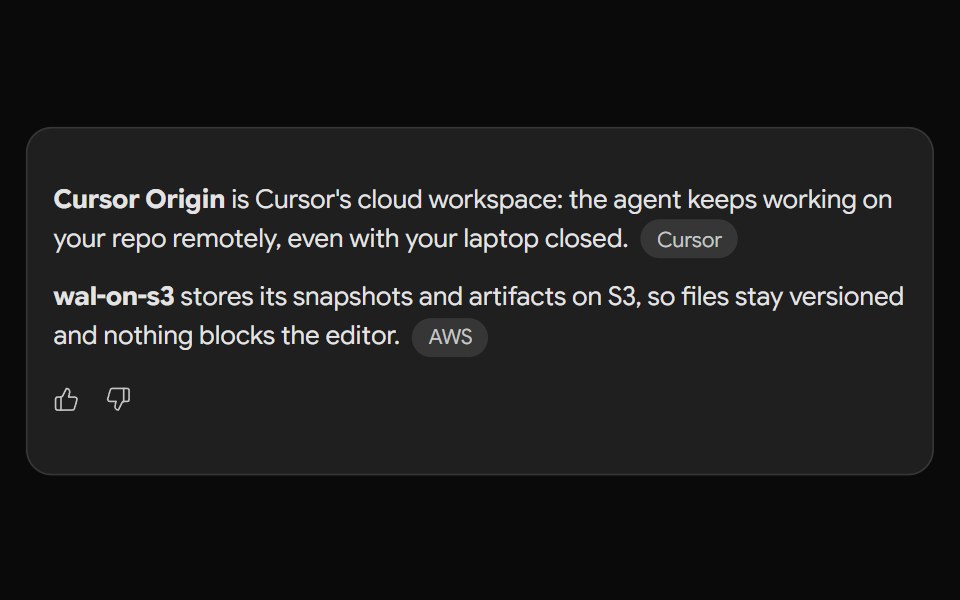 Gemini ActionsNotra · ReactFeedback, share, copy and more buttons built on shadcn Button and Tooltip.
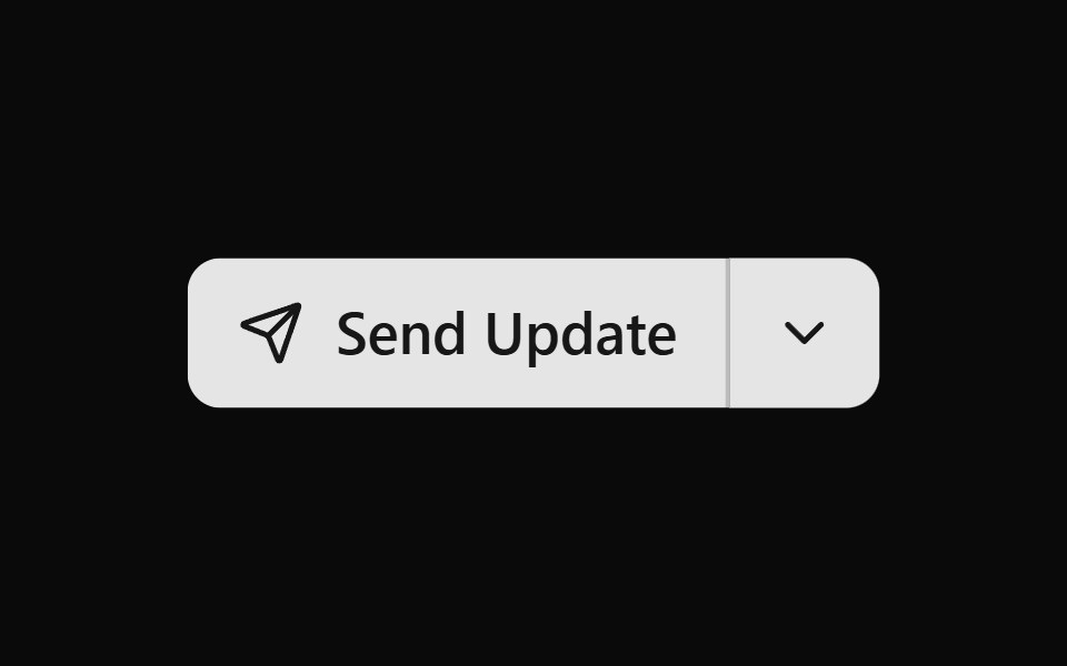 Button Group 11Watermelon UI · React
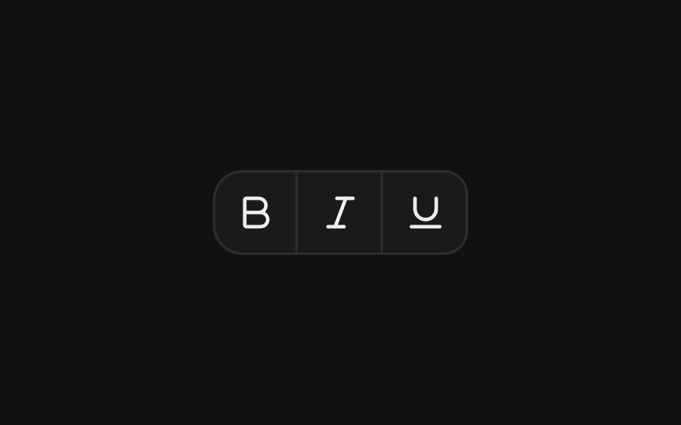 Icon toolbarFLX UI · ReactCompact toolbar of icon-only buttons with merged borders, used for text formatting actions.
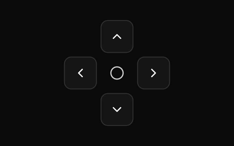 Direction Pad Controlssv-particles · Svelte
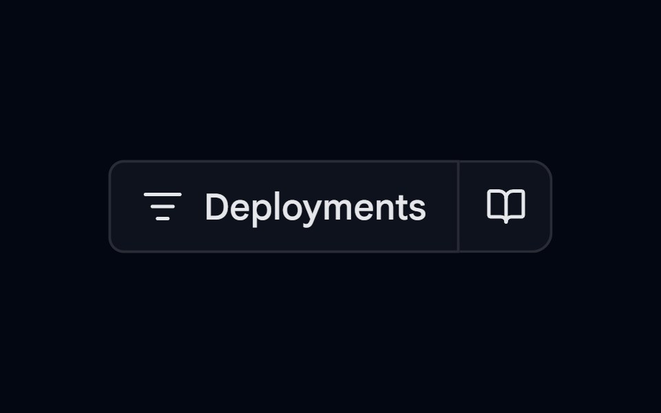 Button Group-06 - VercelShadcn Space · ReactVercel style button group component
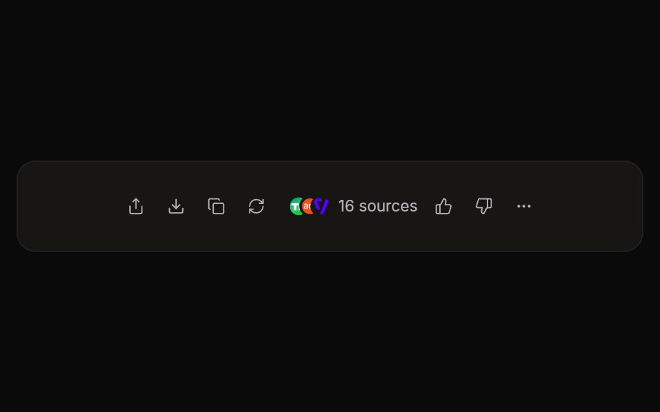 Perplexity ActionsNotra · ReactThe answer action bar with share, copy, rewrite, feedback and a sources button, built on shadcn Button and Tooltip.
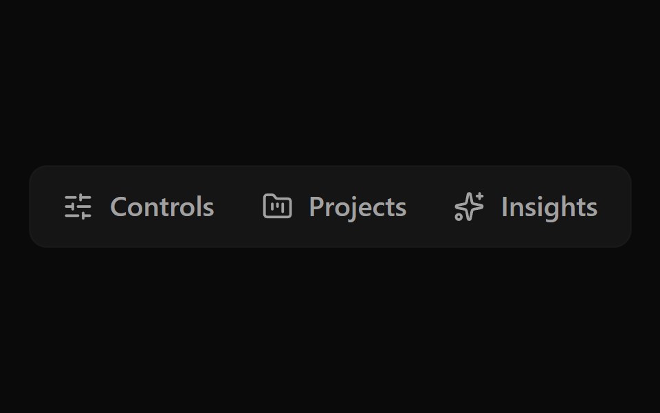 Button Group 12Watermelon UI · React
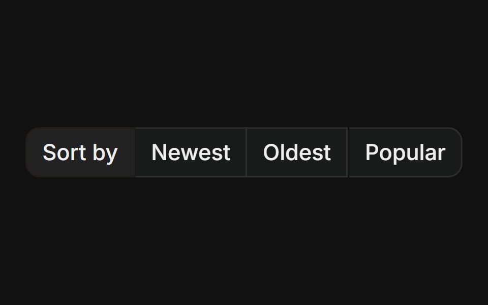 With label prefixFLX UI · ReactStatic text label leading a group of action buttons, useful for labelled sort or filter controls.
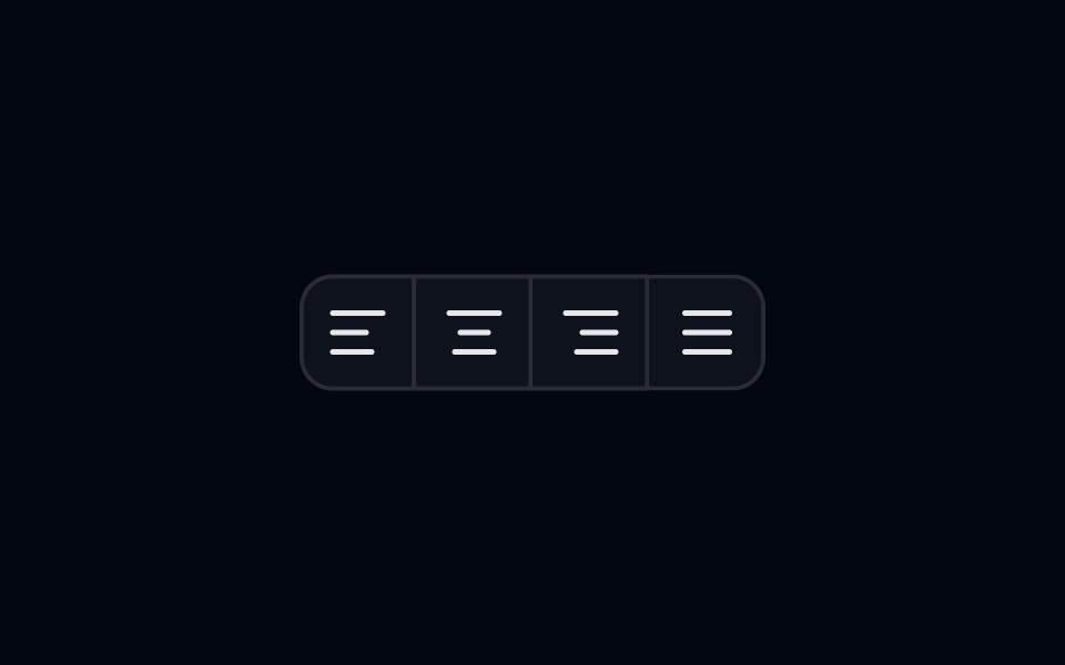 Button Group 07 - AlignmentShadcn Space · ReactAlignment style button group component
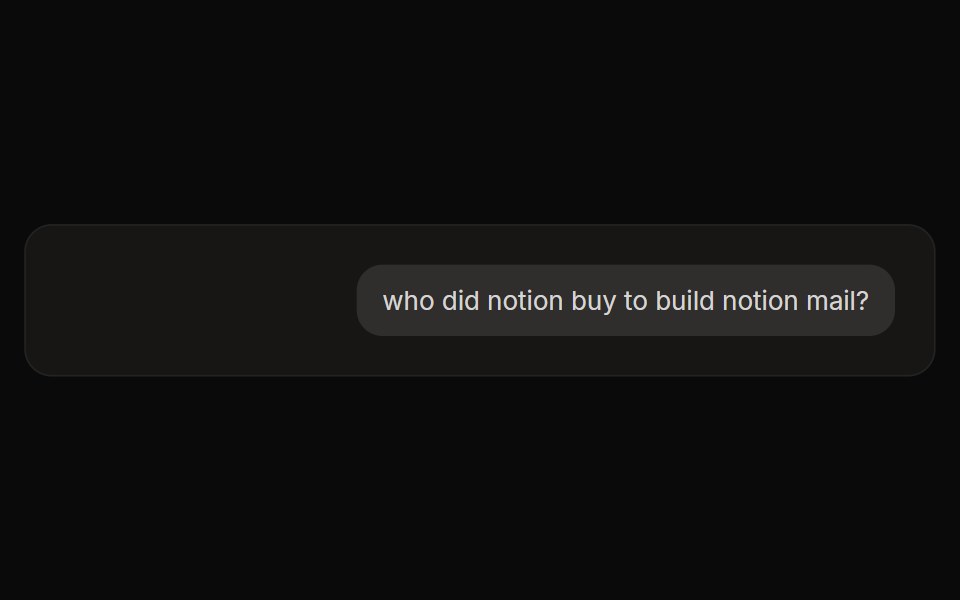 Perplexity User ActionsNotra · ReactThe time, edit and copy controls beside a user message.
 Button Group 2Watermelon UI · React
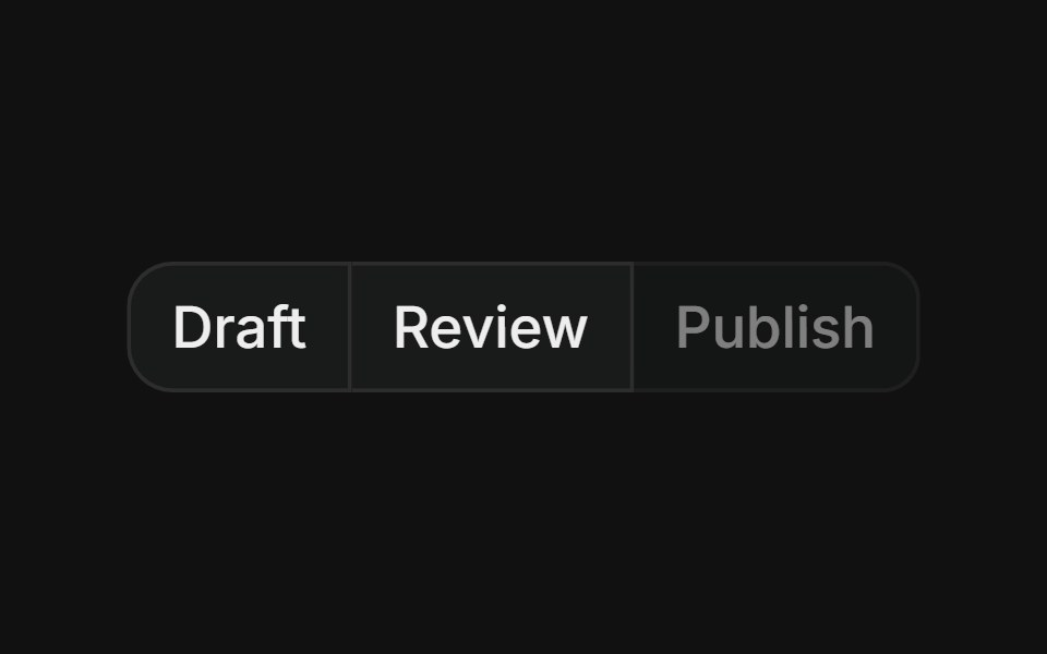 Group with disabledFLX UI · ReactMerged-border button row where one step is visually disabled and non-interactive.
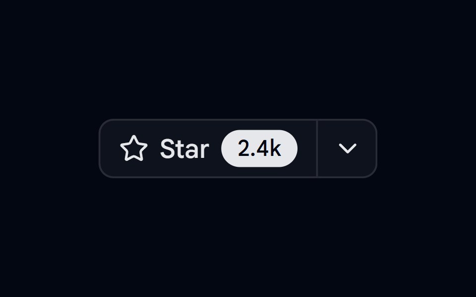 Button Group 08 - Github star barShadcn Space · ReactGithub star bar style button group component
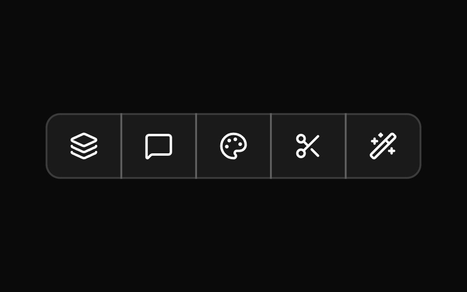 Button Group 3Watermelon UI · React
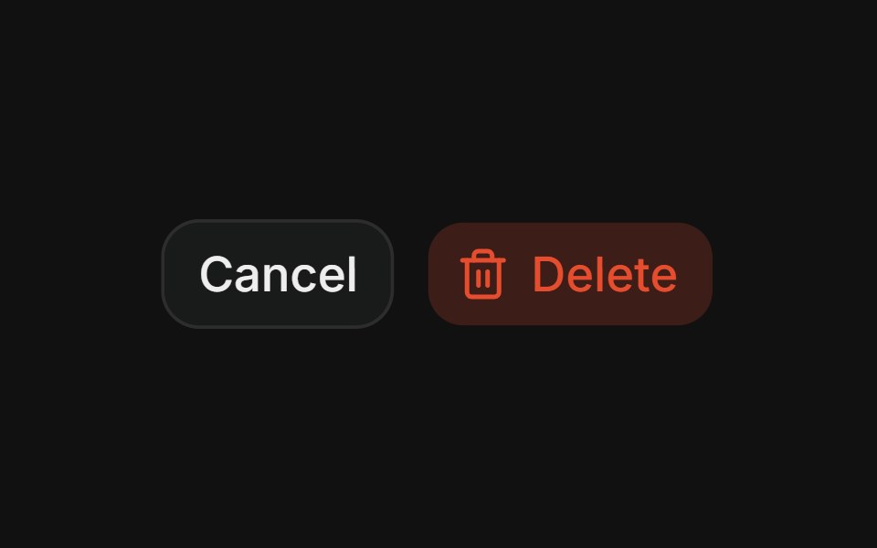 Destructive pairFLX UI · ReactCancel + Delete spaced action pair.
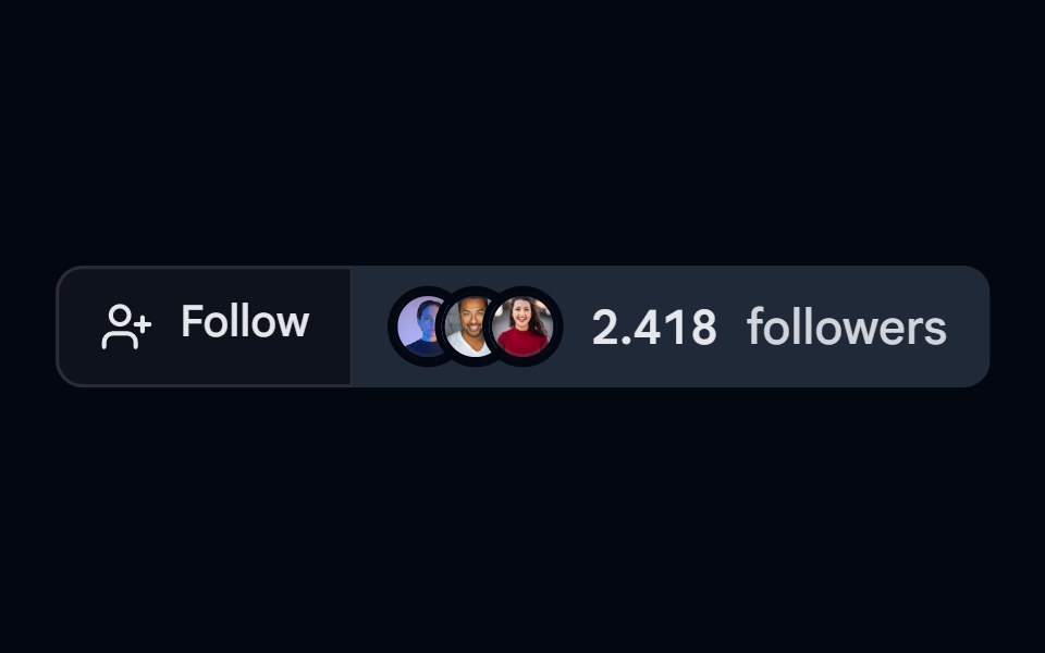 Button Group 09 - FollowShadcn Space · ReactFollow style button group component
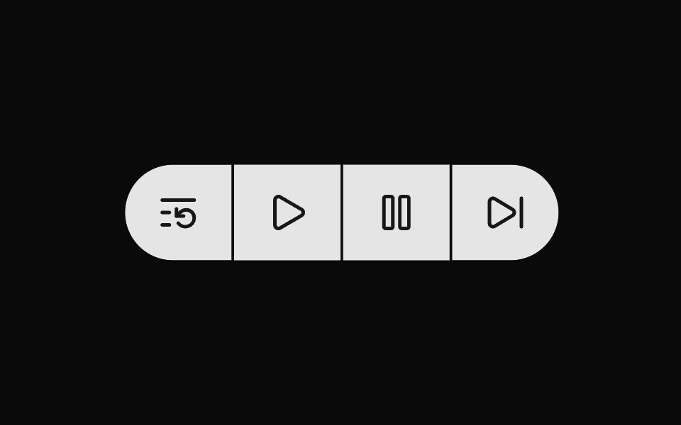 Button Group 4Watermelon UI · React
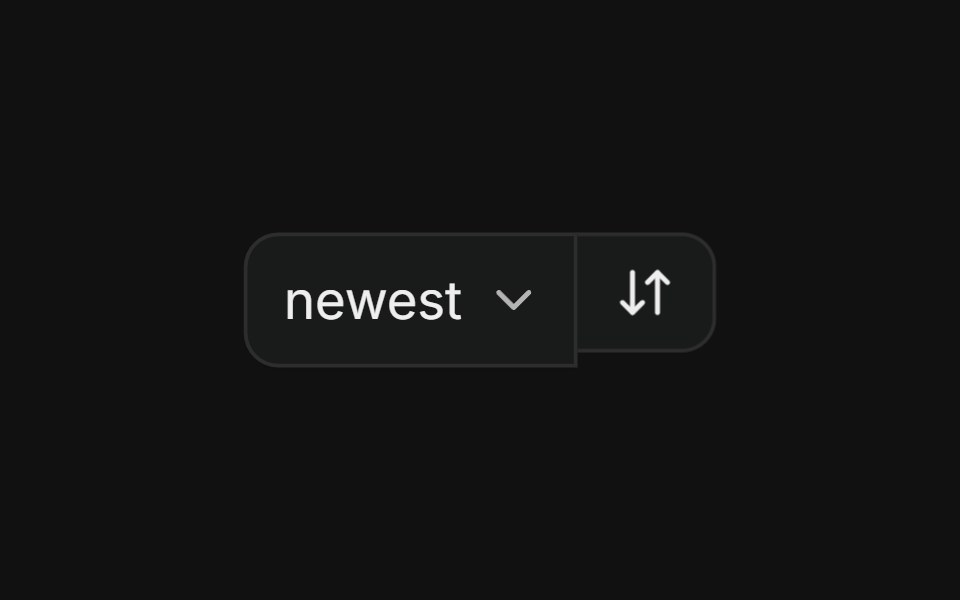 With selectFLX UI · ReactSort dropdown paired with a direction-toggle icon button in a merged-border row.
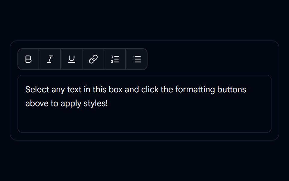 Button Group 10 - Editor ToolbarShadcn Space · ReactRich-text formatting toolbar button group component
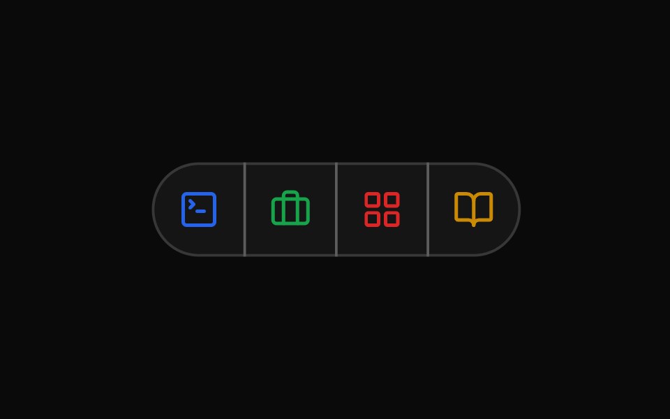 Button Group 5Watermelon UI · React
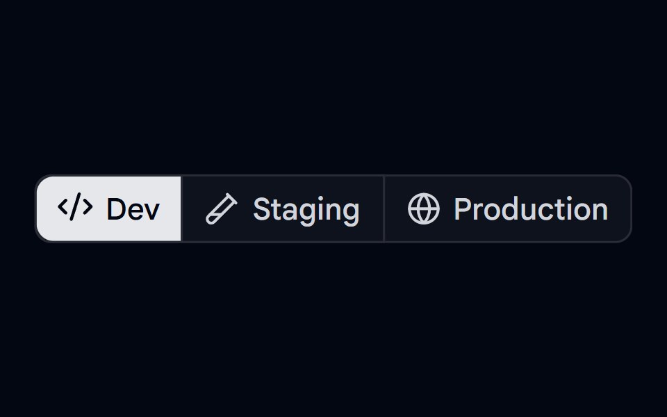 Button Group 11 - Deploy EnvironmentShadcn Space · ReactButton group component used for selecting deploy environment
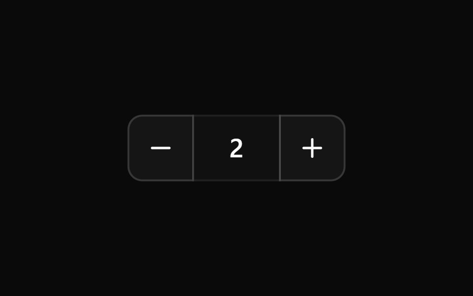 Button Group 6Watermelon UI · React
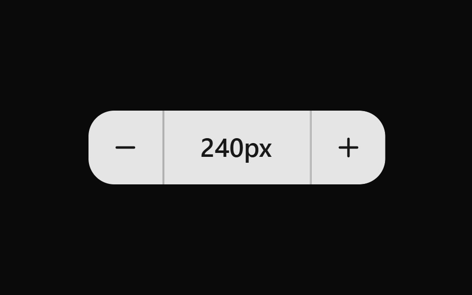 Button Group 7Watermelon UI · React
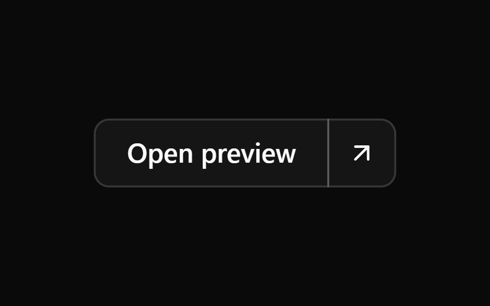 Button Group 8Watermelon UI · React
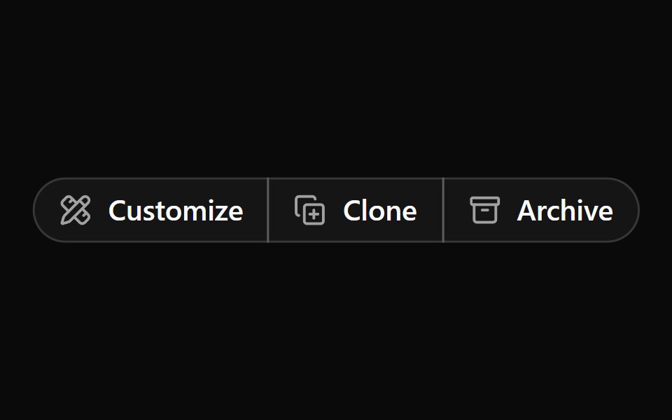 Button Group 9Watermelon UI · React
Libraries with shadcn/ui button group components
Related categories
- Button Group Components
- React Button Group Components
- Tailwind CSS Button Group Components
- Animated Button Group Components
- shadcn/ui Action Components
- shadcn/ui Button Components
- shadcn/ui Icon Button Components
- shadcn/ui CTA Button Components
- shadcn/ui Copy Button Components
- shadcn/ui Toggle Button Components