 Dev Design Library
shadcn/ui Icon Button Components
Dev Design Library indexes 12 shadcn/ui icon button components from 5 open-source UI libraries, with the most coming from Notra, sv-particles, FLX UI, Nexvyn UI and sv-table. Each one links to its page with the source code, a live preview where available, the library license and the install command. They follow the shadcn/ui conventions, so most install with the shadcn CLI and drop into a Tailwind project. Icon button components belong to the Actions group.
 ChatGPT ActionsNotra · ReactCopy, share, redo and more buttons, built on shadcn Button and Tooltip.
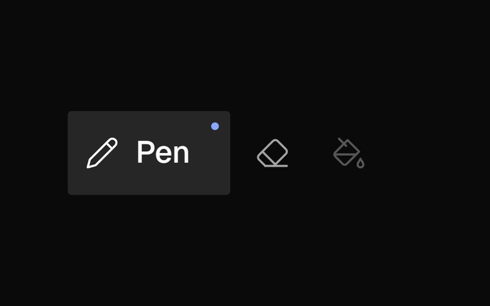 Icon BarNexvyn UI · ReactA horizontal toolbar of icon buttons with bloom-open label reveal on hover/selection, accent dot indicator, and roving…
 Pagination Arrowsv-table · SvelteCompact arrow pagination for table footers.
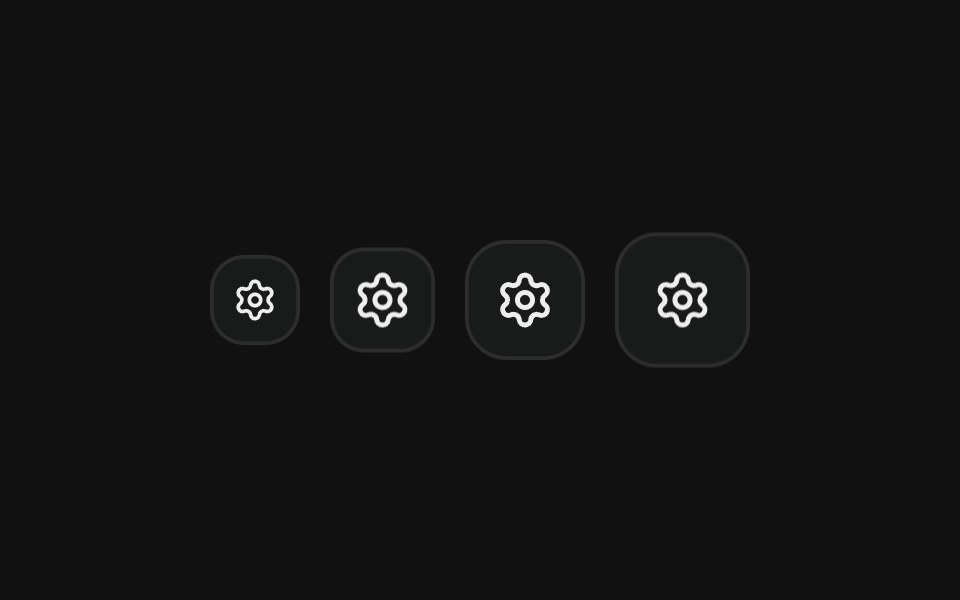 Icon onlyFLX UI · ReactSquare icon-only buttons in every icon size.
 Iconsv-particles · Svelte
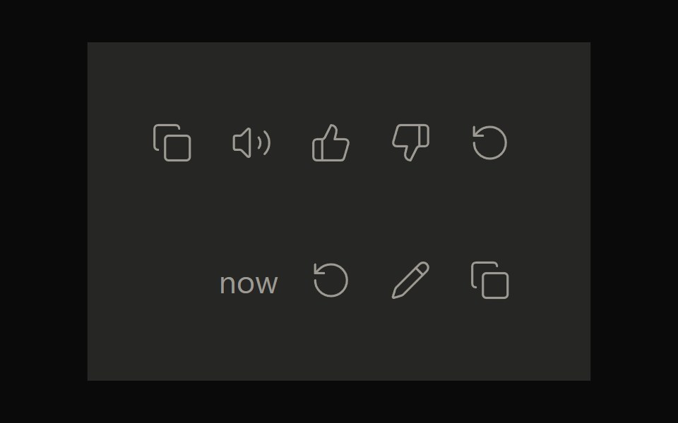 Claude ActionsNotra · ReactCopy, feedback and retry actions built on shadcn Button and Tooltip.
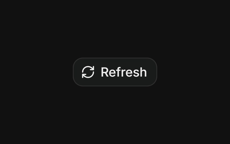 Hover rotate refreshFLX UI · ReactRefresh button whose icon rotates a full 360° on each click.
 Large Iconsv-particles · Svelte
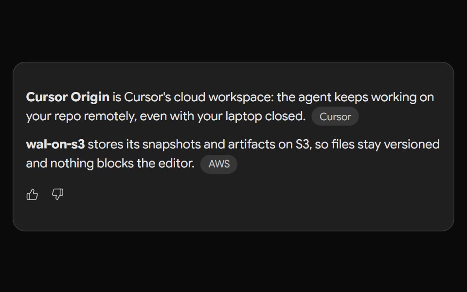 Gemini ActionsNotra · ReactFeedback, share, copy and more buttons built on shadcn Button and Tooltip.
 Small Iconsv-particles · Svelte
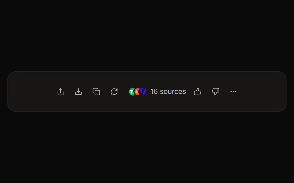 Perplexity ActionsNotra · ReactThe answer action bar with share, copy, rewrite, feedback and a sources button, built on shadcn Button and Tooltip.
 Perplexity User ActionsNotra · ReactThe time, edit and copy controls beside a user message.
Libraries with shadcn/ui icon button components
Related categories
- Icon Button Components
- React Icon Button Components
- Tailwind CSS Icon Button Components
- Animated Icon Button Components
- shadcn/ui Action Components
- shadcn/ui Button Components
- shadcn/ui Button Group Components
- shadcn/ui CTA Button Components
- shadcn/ui Copy Button Components
- shadcn/ui Toggle Button Components