 Dev Design Library
shadcn/ui Action Components
Dev Design Library indexes 230 shadcn/ui action components from 24 open-source UI libraries, with the most coming from Watermelon UI, Shadcn Space, sv-particles, FLX UI and Kokonut UI. Each one links to its page with the source code, a live preview where available, the library license and the install command. They follow the shadcn/ui conventions, so most install with the shadcn CLI and drop into a Tailwind project.
Showing 120 of 230, a mix from every library. Open a library to see all of its components.
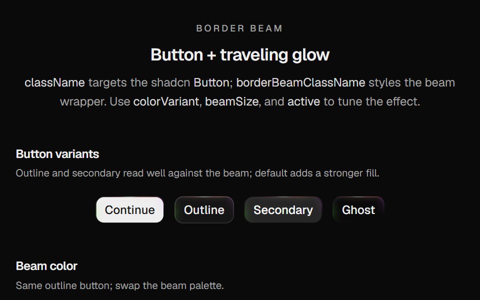 Border Beam ButtonCult UI · ReactShadcn Button wrapped in Border Beam: animated border glow with compact icon and text variants
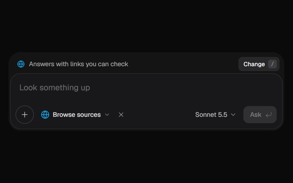 AI Input SearchKokonut UI · ReactAI composer with a Tools menu (browse, investigate, draft, run code, reason), a model picker and a live trace that…
 show-moreIntent UI · Reactshow-more
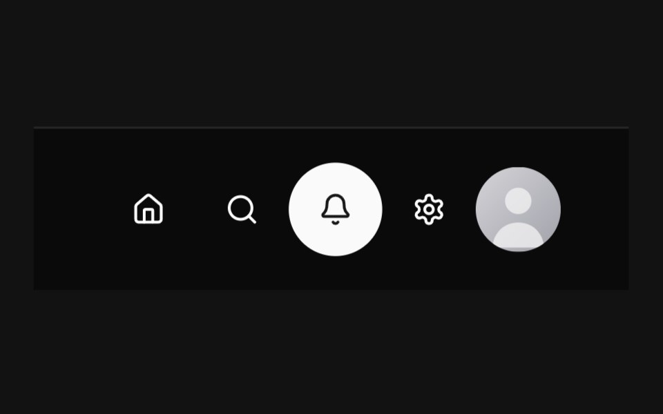 Circular NavbarSpectrum UI · Reactcomponent for the Circular Navbar
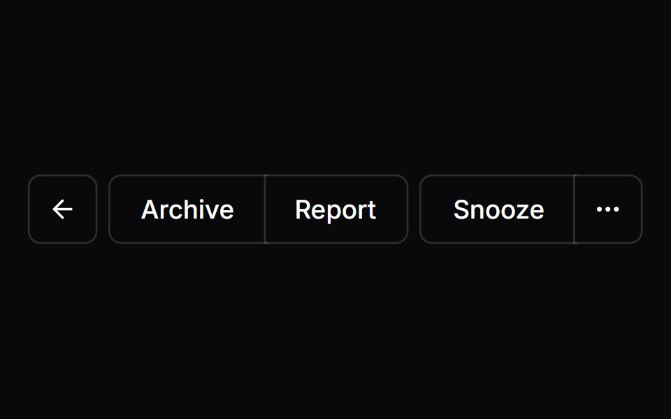 Button GroupVengeance UI · React
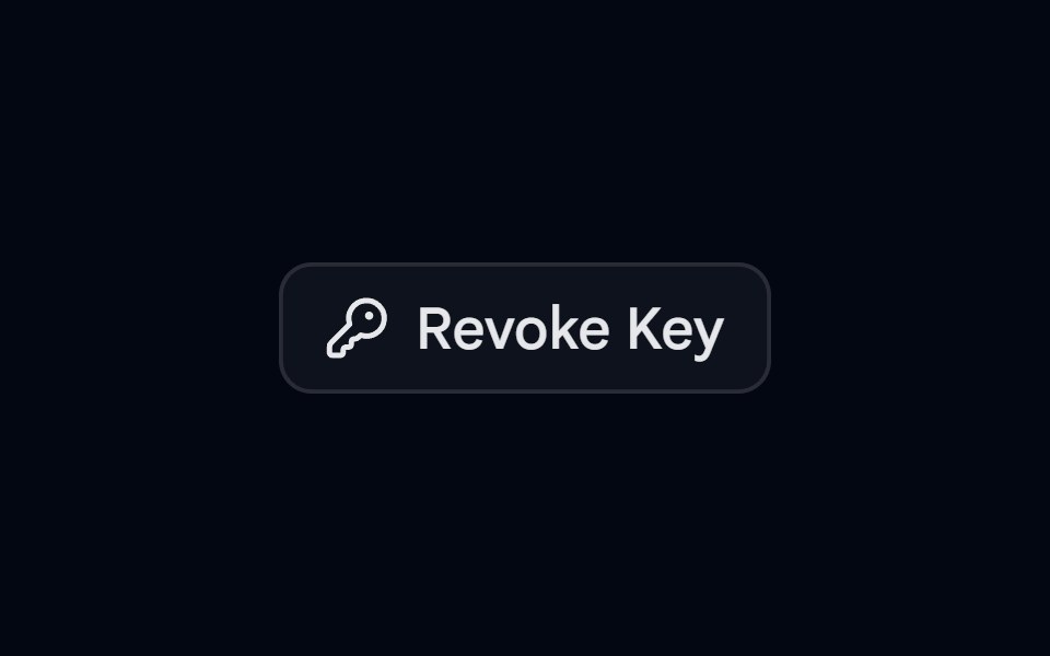 Alert 11 - Hold to ConfirmShadcn Space · ReactCompact alert dialog where the user presses and holds the revoke button until it fills, preventing accidental clicks
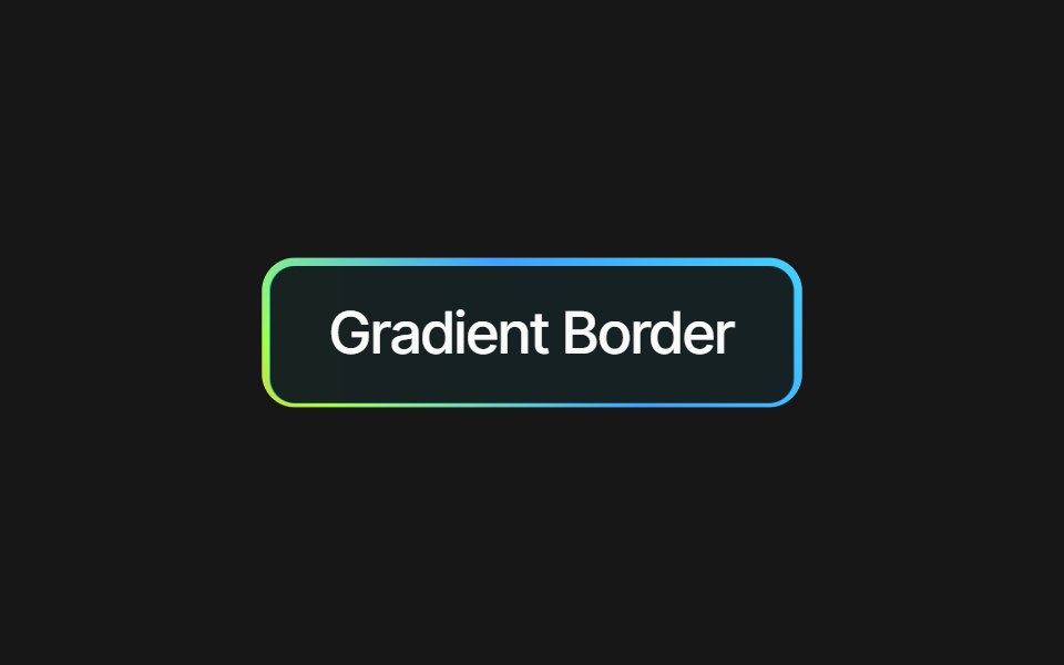 Border Gradient ButtonPixel Perfect · ReactA button with a gradient border effect.
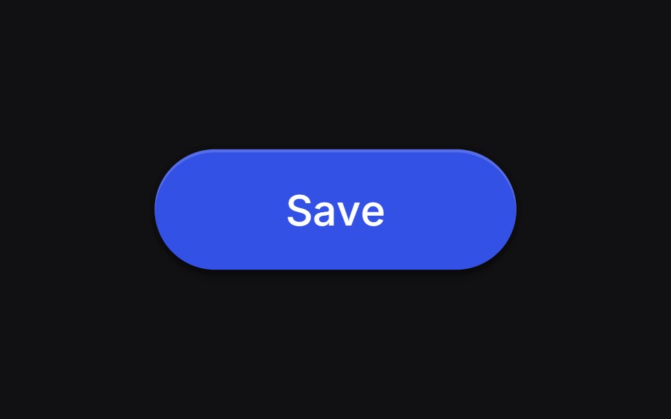 Save Buttonuselayouts · ReactA button with animated states for idle, loading, and success.
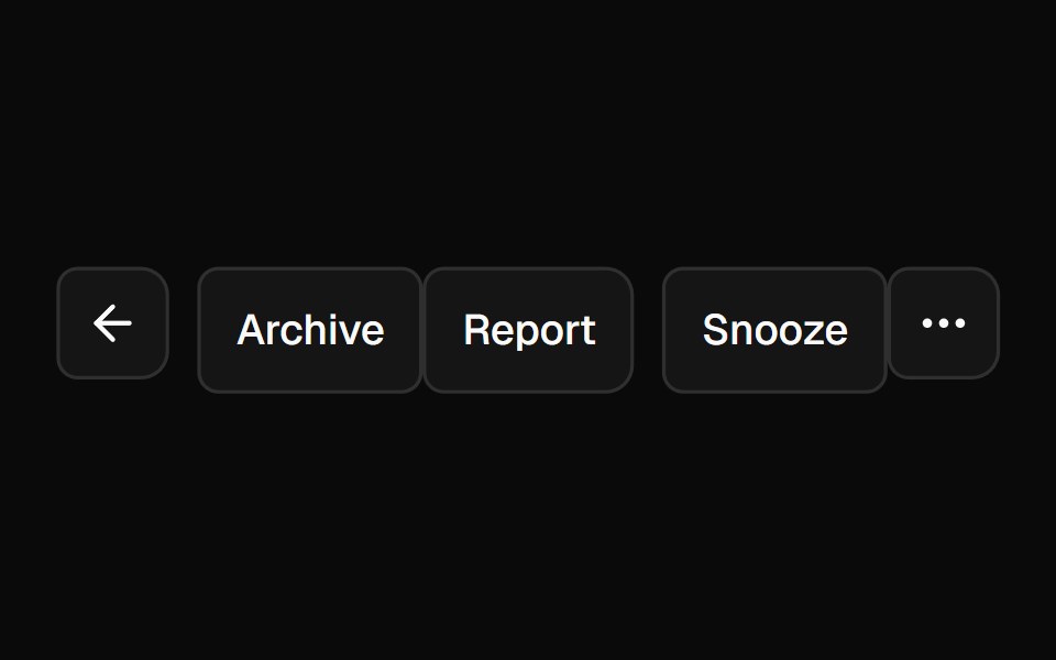 Button GroupShadcn Dashboard · React
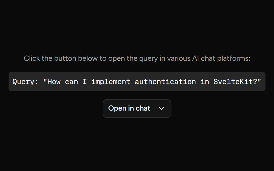 Open In ChatAI Elements (Svelte) · SvelteA provider menu for opening prompts in external chat and AI tools.
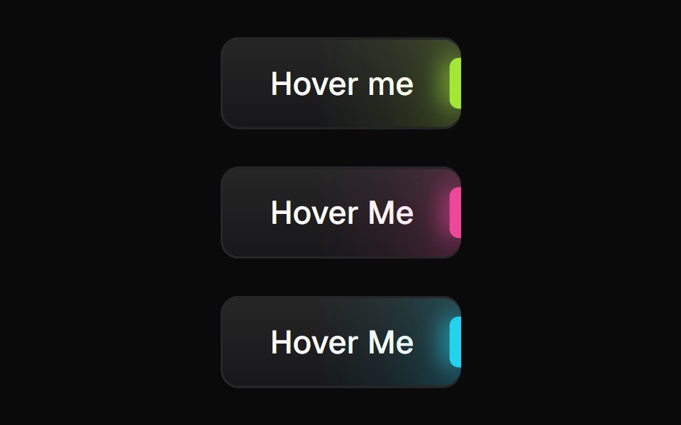 Glowing ButtonBadtz UI · ReactA visually distinct button component featuring a configurable, animated glow effect to highlight calls to action or…
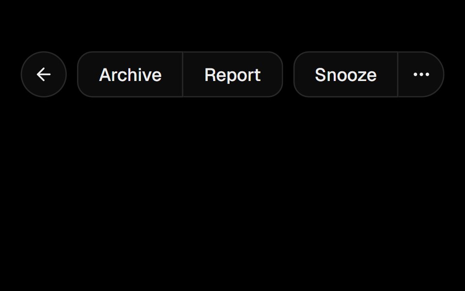 Button GroupObsidianUI · React
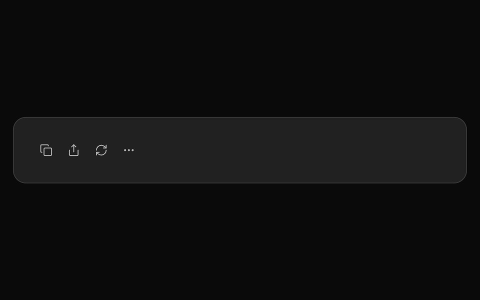 ChatGPT ActionsNotra · ReactCopy, share, redo and more buttons, built on shadcn Button and Tooltip.
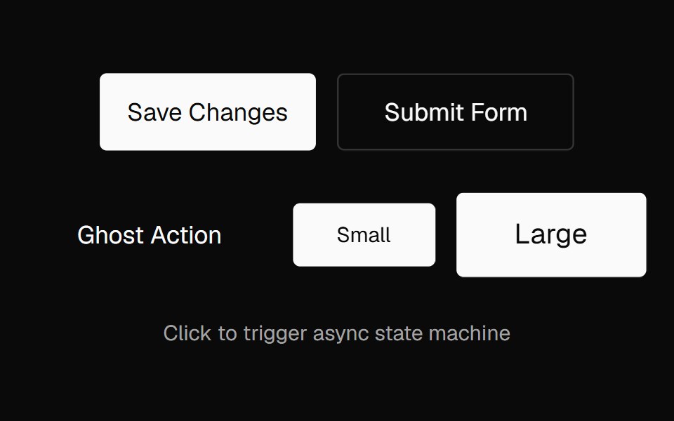 Action ButtonNexvyn UI · ReactAn async-aware button with an idle → pending → success/error state machine, promise tracking, abort support, and live…
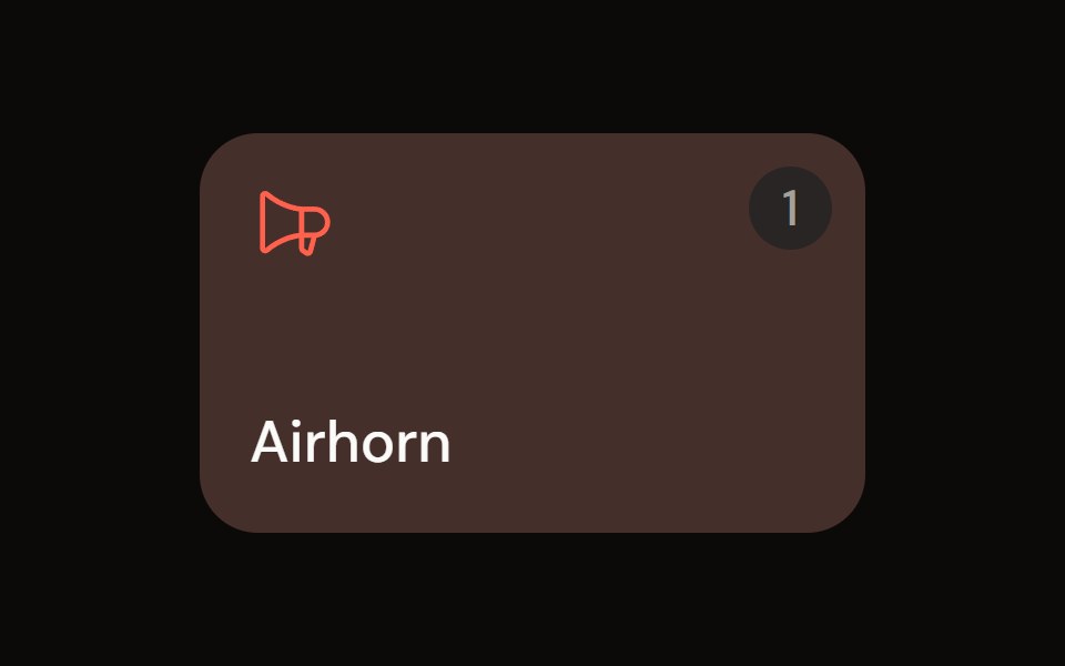 Sound Padaudiocn · ReactA trigger pad with one-shot, toggle, hold and loop modes, a hotkey, playback progress and an accent colour, plus a…
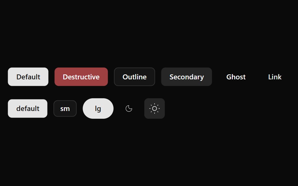 Button 01Watermelon UI · React
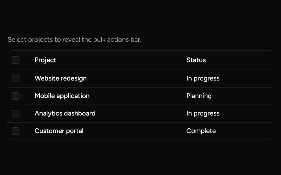 Bulk Actions Barsv-table · SvelteA floating action bar for performing custom actions on selected rows.
 Button Groupglasscn · React
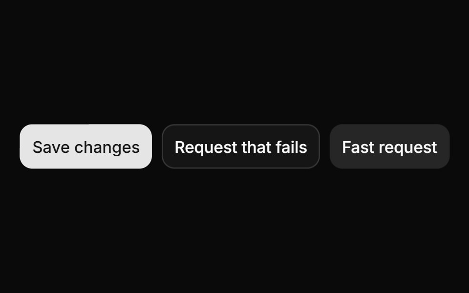 ButtonHextaUI · ReactButtons in every variant and size, with a built-in loading, success and error flow that skips the spinner for fast…
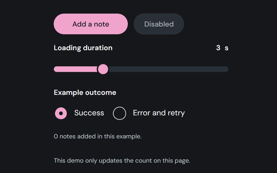 ButtonCojeev UI · ReactTriggers an action with native button behavior and an optional busy indicator.
 BasicFLX UI · ReactDefault button with text label.
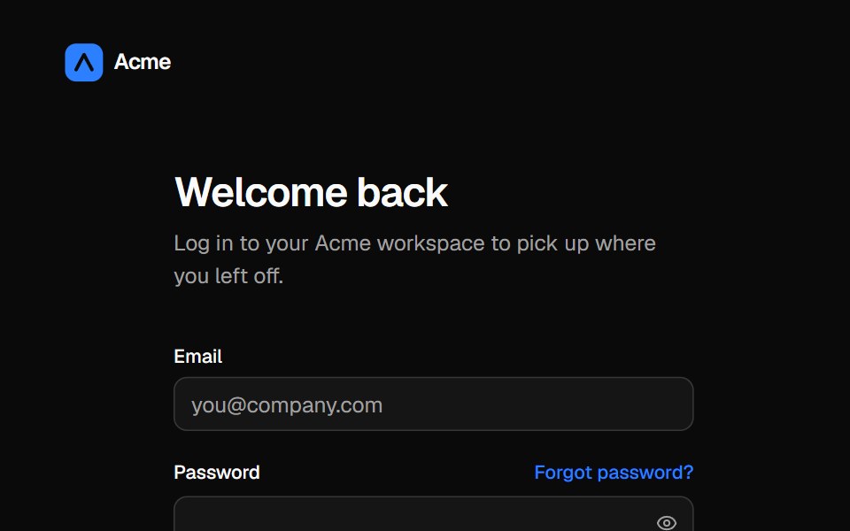 Split login pageVelora UI · ReactLogin form with password reveal, remember-me and social sign-in beside an aurora testimonial panel.
 Outline Like With Countsv-particles · SvelteOutlined like button with a heart and the number of likes next to it.
 Buttonark-cn · ReactA shadcn-style button component built with Ark UI primitives.
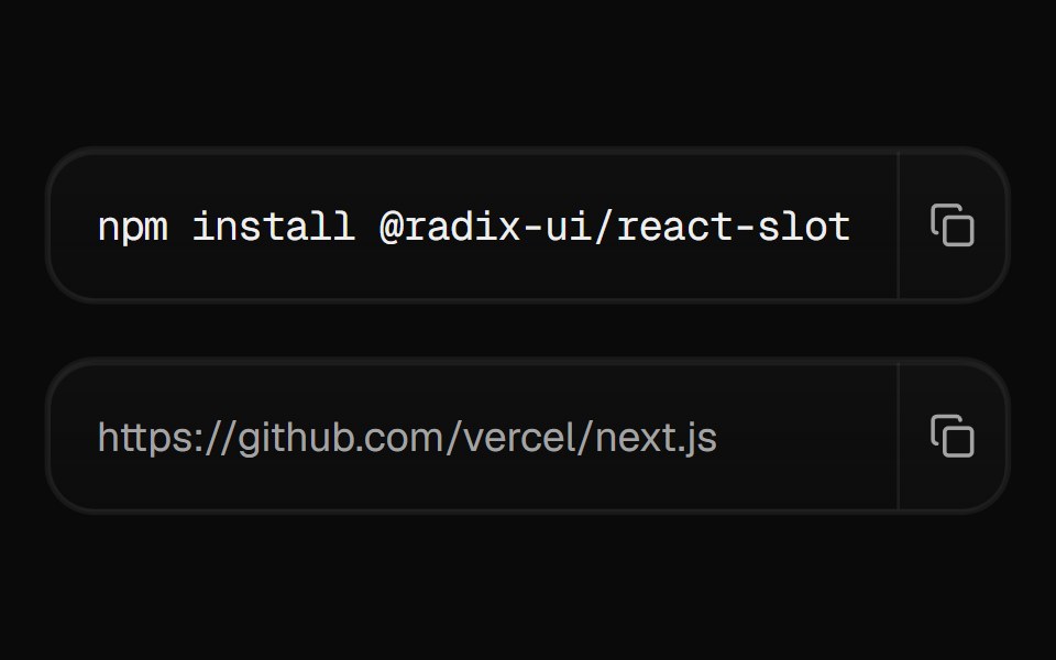 Copy ButtonCult UI · ReactButton that copies content to clipboard with feedback
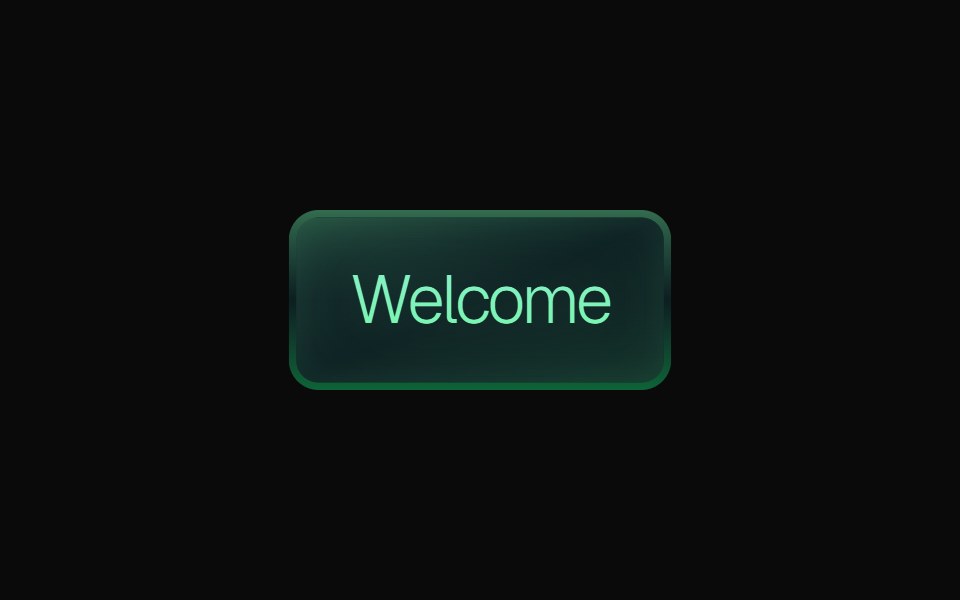 Gradient ButtonKokonut UI · ReactLayered gradient button with emerald, purple and orange variants, a gradient border, a soft inner glow, press feedback…
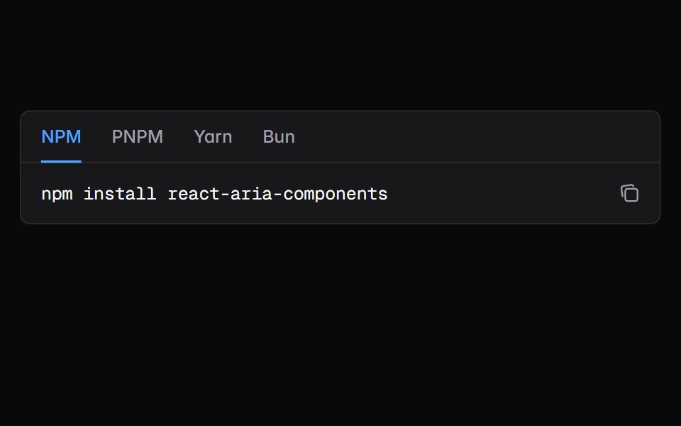 snippetIntent UI · Reactsnippet
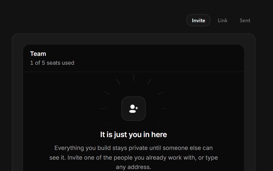 Invite TeammatesSpectrum UI · ReactA one-seat team with an avatar rail, live invite field and copyable join link.
 Badge-05 - LinkShadcn Space · ReactBadge component
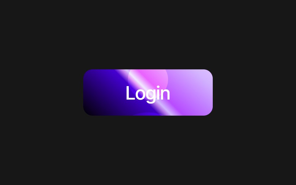 Liquid Gradient ButtonPixel Perfect · ReactPremium gradient button with image overlay, loading animation, and 8 color variants: pink, cyan, emerald, amber…
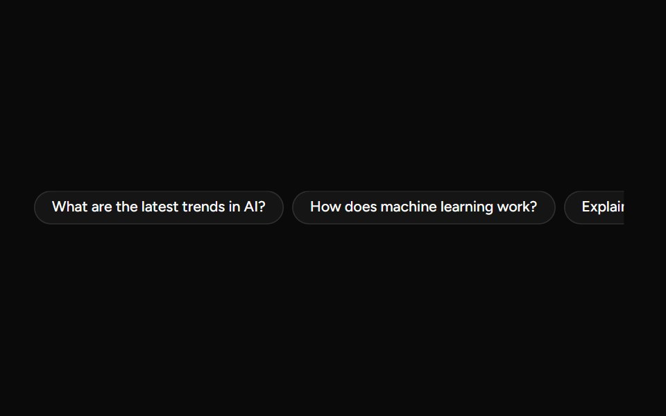 SuggestionAI Elements (Svelte) · SvelteA compact suggestion button set for displaying prompt ideas and quick actions.
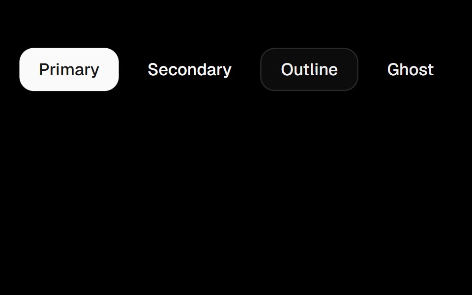 Playground ButtonObsidianUI · React
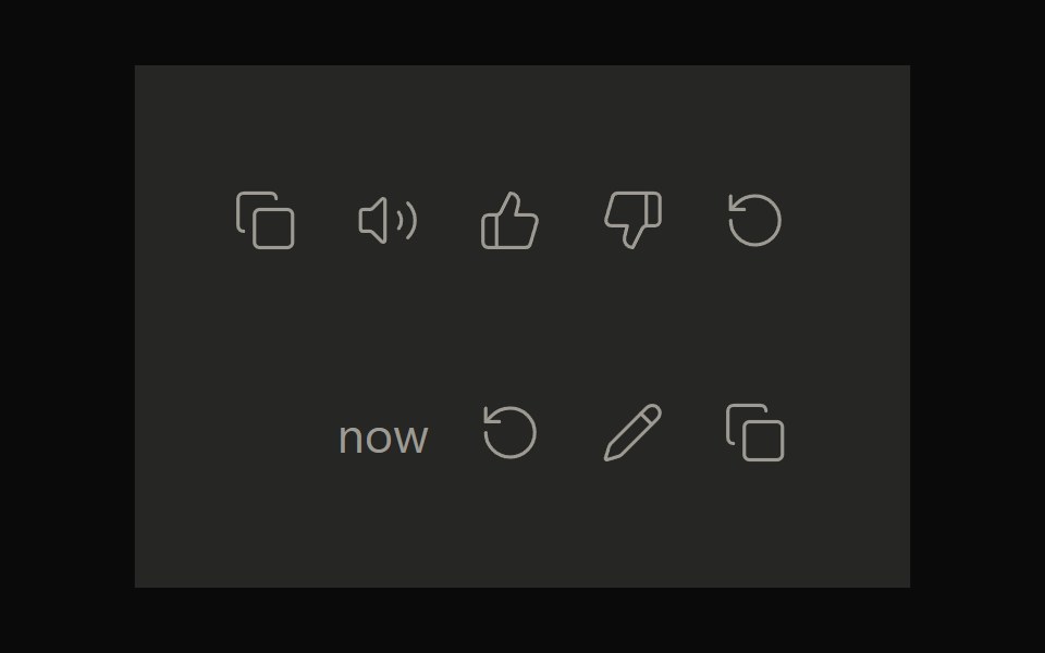 Claude ActionsNotra · ReactCopy, feedback and retry actions built on shadcn Button and Tooltip.
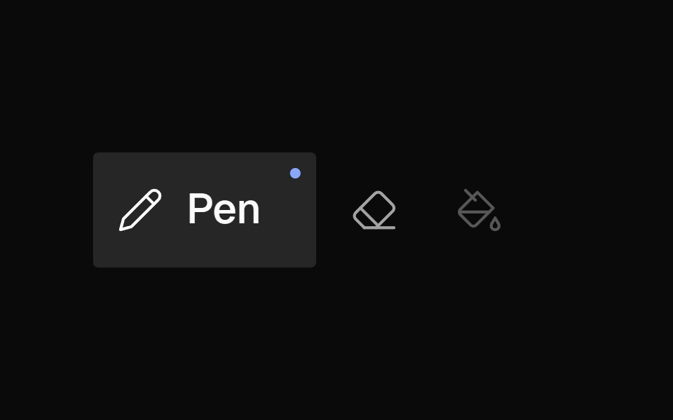 Icon BarNexvyn UI · ReactA horizontal toolbar of icon buttons with bloom-open label reveal on hover/selection, accent dot indicator, and roving…
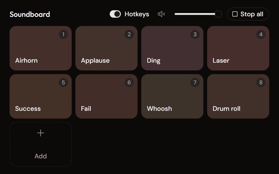 Soundboardaudiocn · ReactA grid of sound pads with global hotkeys, per-pad mode and volume in a context menu, master volume, stop all, and…
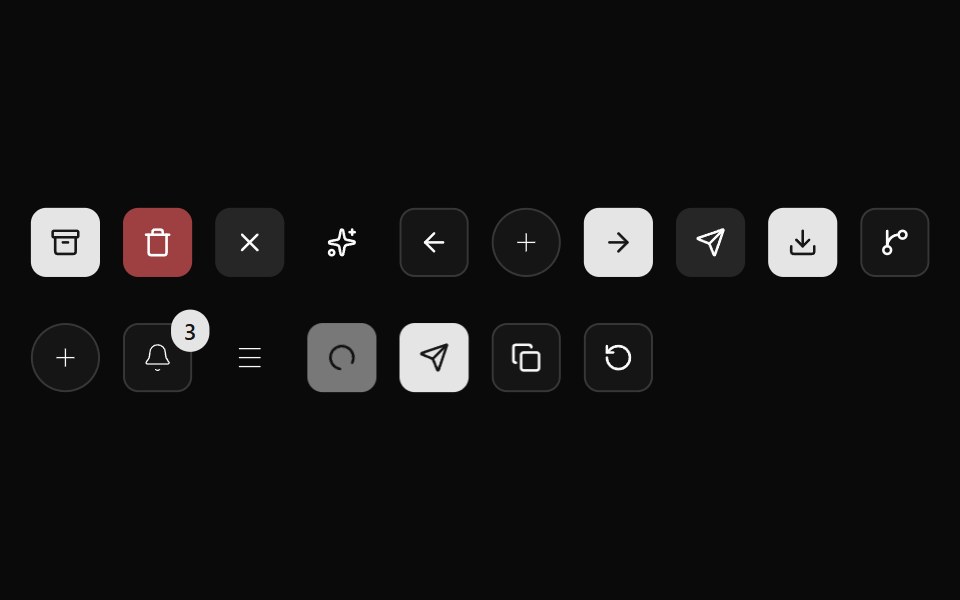 Button 02Watermelon UI · React
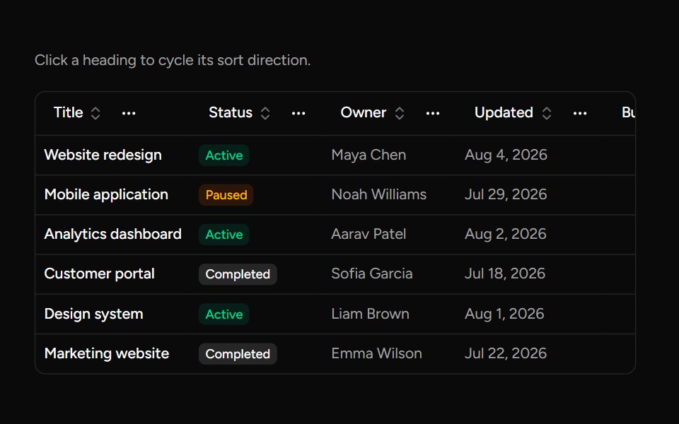 Data Table Column Headersv-table · SvelteA table heading with sorting, pinning, ordering, and visibility actions.
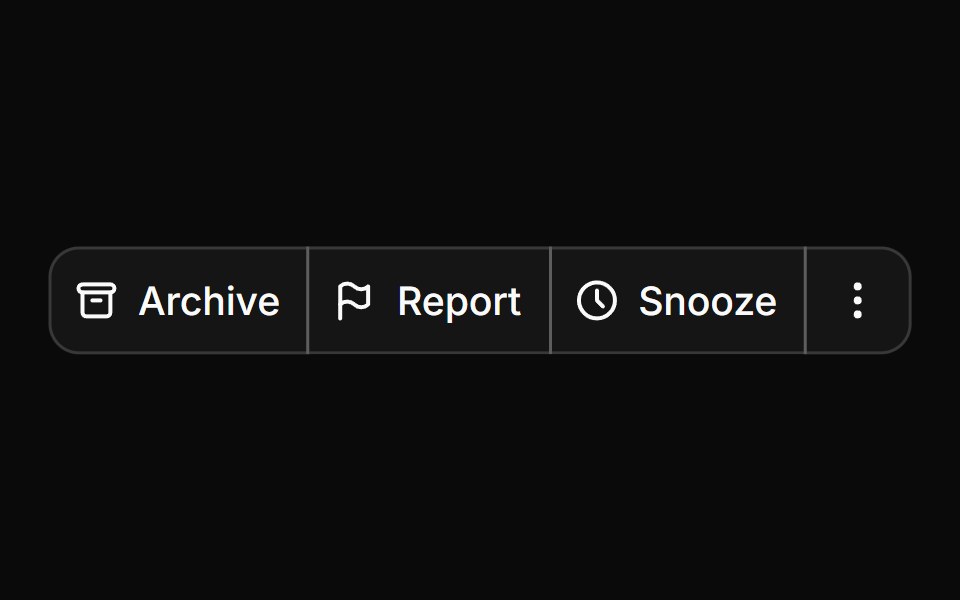 Button groupHextaUI · ReactButtons joined into one control, with shared seams, separators, text addons, nesting and vertical stacks.
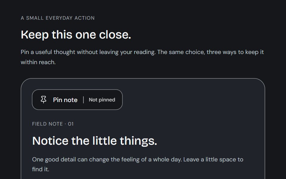 ToggleCojeev UI · ReactA small action with a lasting state: a toolbar tool, a paper bookmark or a descriptive preference. Native targets stay…
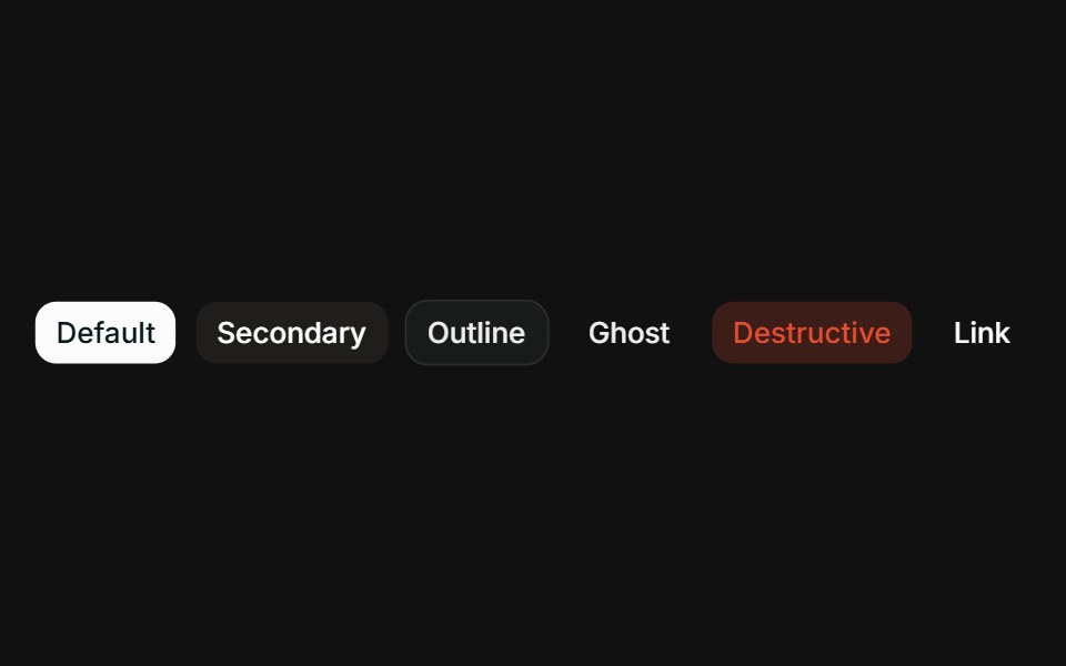 VariantsFLX UI · ReactAll six variants side-by-side: default, secondary, outline, ghost, destructive, link.
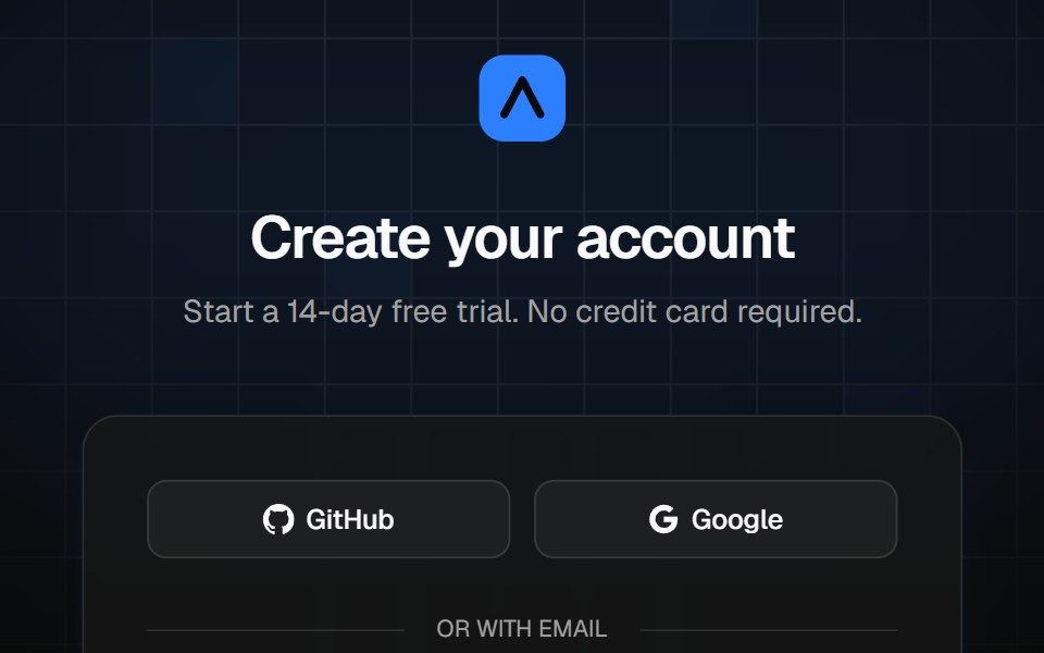 Sign-up cardVelora UI · ReactCentered sign-up card over a grid and light beams, with live password rules, terms and social sign-up.
 Animated Status Dotsv-particles · Svelte
 Button Groupark-cn · ReactA shadcn-style button group component built with Ark UI primitives.
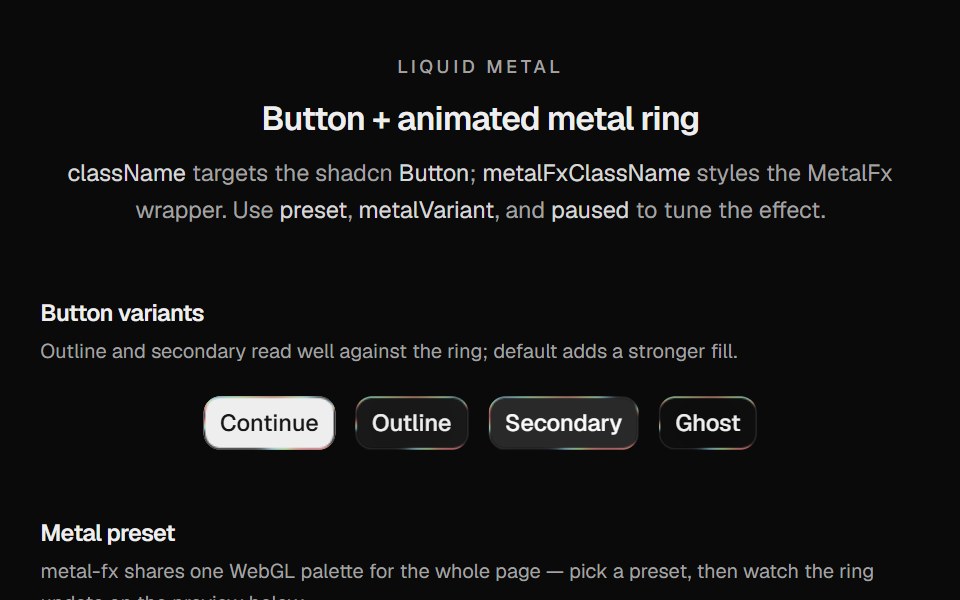 Metal ButtonCult UI · ReactShadcn Button wrapped in MetalFx: animated liquid metal ring with text and icon variants
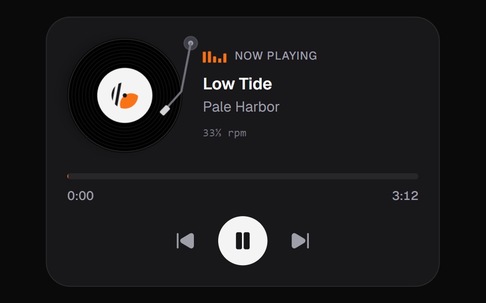 Now PlayingKokonut UI · ReactMusic card with a spinning disc you can grab and turn to scrub, built with React and Tailwind CSS.
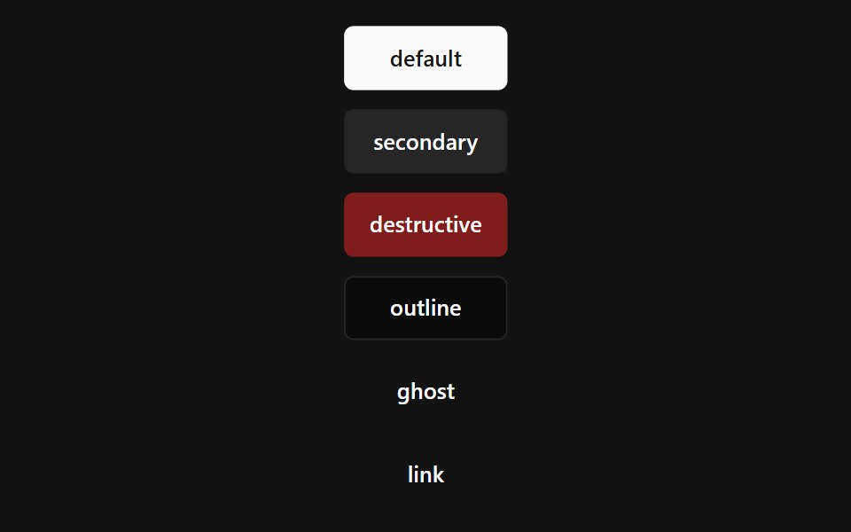 Loading Button UsageSpectrum UI · Reactcomponent for the Loading Button Usage
 Button 03 - Shine HoverShadcn Space · ReactShine Hover button component
 Morph Image ButtonPixel Perfect · ReactA button that morphs an image mask on hover using GSAP.
 Gemini ActionsNotra · ReactFeedback, share, copy and more buttons built on shadcn Button and Tooltip.
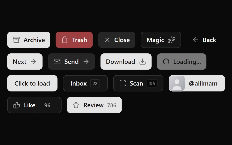 Button 03Watermelon UI · React
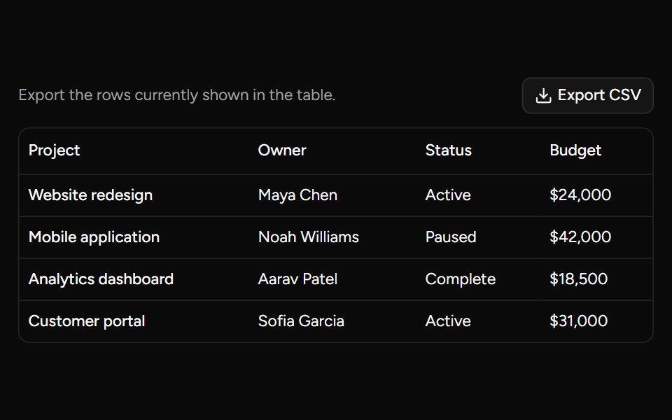 Data Table Exportsv-table · SvelteDownload typed table rows and columns as a safe CSV file.
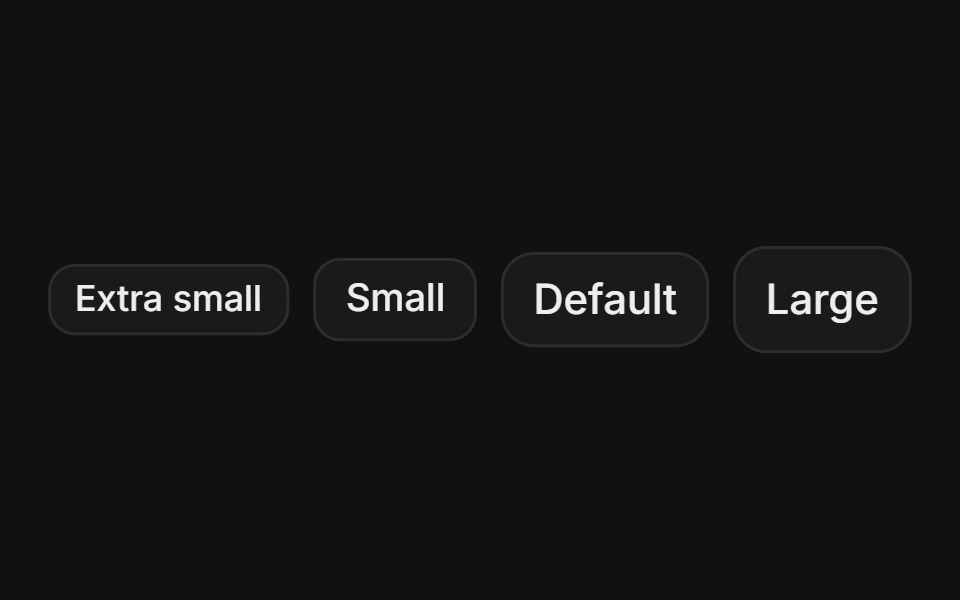 SizesFLX UI · ReactExtra small, small, default, and large sizes.
 Back Link Chevronsv-particles · Svelte
 Download Triggerark-cn · ReactA shadcn-style download trigger utility built with Ark UI primitives.
 Particle ButtonKokonut UI · ReactA status button for async actions, with a spinner, a drawn check and a particle burst on success.
 Button CollectionSpectrum UI · React
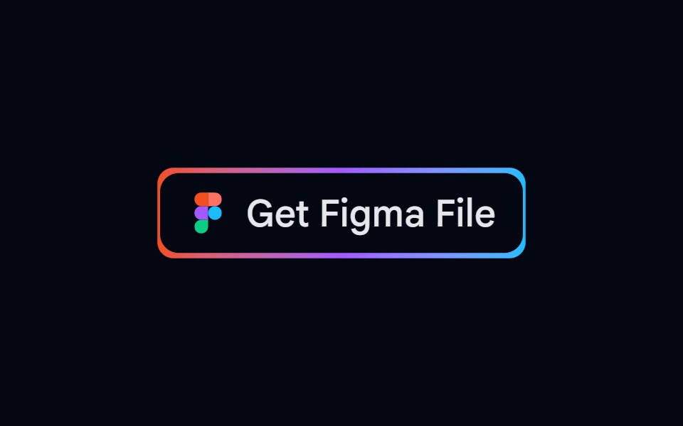 Button 05 - Get Figma FileShadcn Space · ReactGet Figma File button component
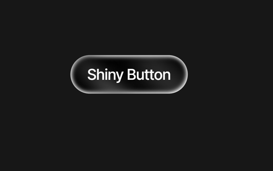 Mouse Follower ButtonPixel Perfect · ReactA button that follows the mouse cursor with hover effects.
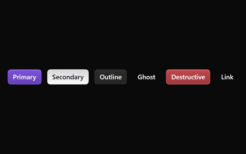 ButtonNotra · ReactA Base UI button with Depth primary, secondary, outline and destructive variants, squircle corners, and loading and…
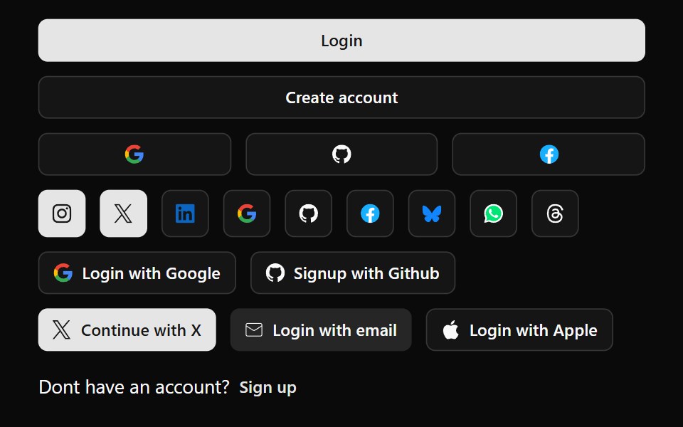 Button 04Watermelon UI · React
 Pagination Arrowsv-table · SvelteCompact arrow pagination for table footers.
 With leading iconFLX UI · ReactButton with an icon placed before the text label.
 Button Using Groupsv-particles · Svelte
 Social ButtonKokonut UI · ReactShare button that expands into a row of social icon buttons with staggered Motion animations on hover, built with…
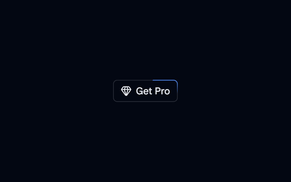 Button 06 - Animated BorderShadcn Space · ReactAnimated Border button component
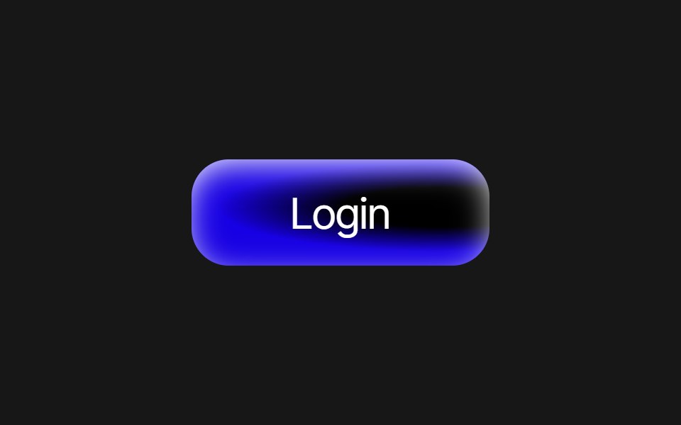 Radial Gradient ButtonPixel Perfect · ReactRadial gradient button with inset glow and 8 color variants: blue, purple, emerald, crimson, amber, cyan, violet, rose.
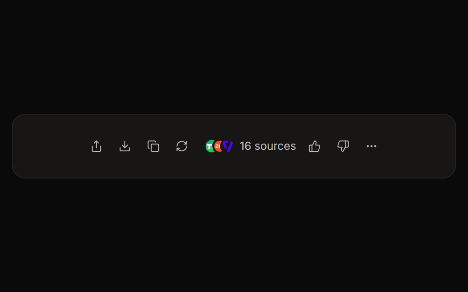 Perplexity ActionsNotra · ReactThe answer action bar with share, copy, rewrite, feedback and a sources button, built on shadcn Button and Tooltip.
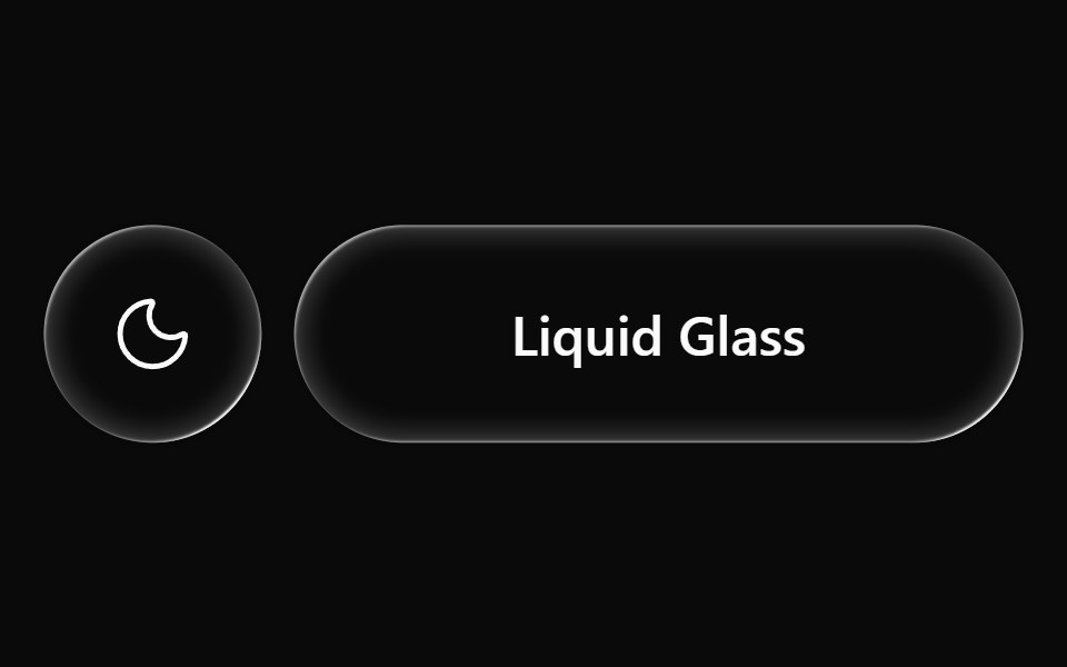 Button 05Watermelon UI · React
 With trailing iconFLX UI · ReactButton with an icon placed after the text label.
 Button With Iconsv-particles · Svelte
 V0 ButtonKokonut UI · ReactOpen in v0 button that sends a component registry JSON to v0.dev for instant editing, built with React, the shadcn…
 Button 10 - SaveShadcn Space · ReactSave button component
 Shiny ButtonPixel Perfect · ReactA shiny button with hover effects.
 Perplexity User ActionsNotra · ReactThe time, edit and copy controls beside a user message.
 Button 06Watermelon UI · React
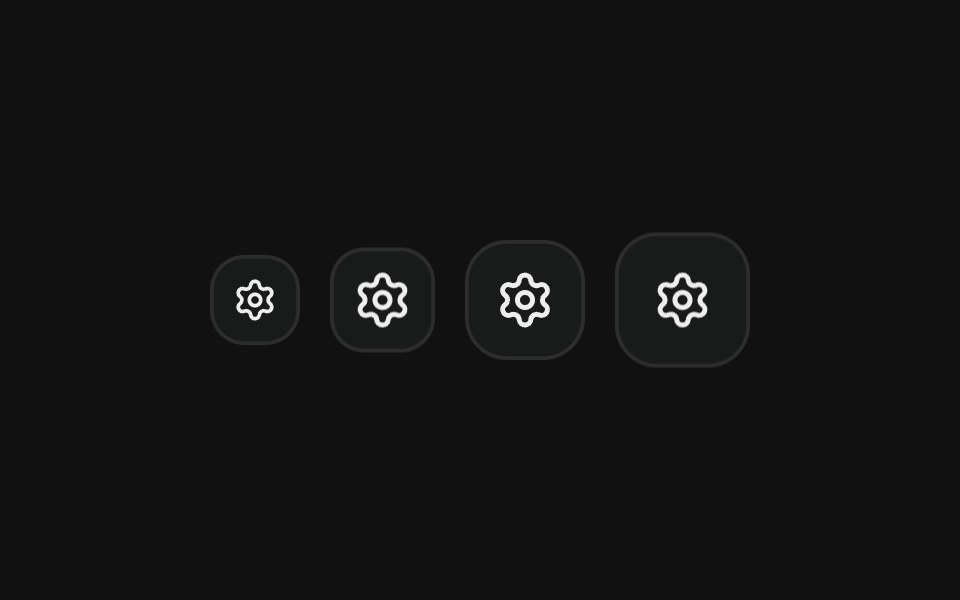 Icon onlyFLX UI · ReactSquare icon-only buttons in every icon size.
 Cancel Savesv-particles · Svelte
 Button 11 - CancelShadcn Space · ReactCancel button component
 Button 07Watermelon UI · React
 DisabledFLX UI · ReactButton in the disabled state, visually dimmed and non-interactive.
 Card Style Buttonsv-particles · Svelte
 Button 12 - DefaultShadcn Space · ReactDefault button component
 Button 08Watermelon UI · React
 LoadingFLX UI · ReactButton with a spinning loader icon and label, indicating an in-progress async action.
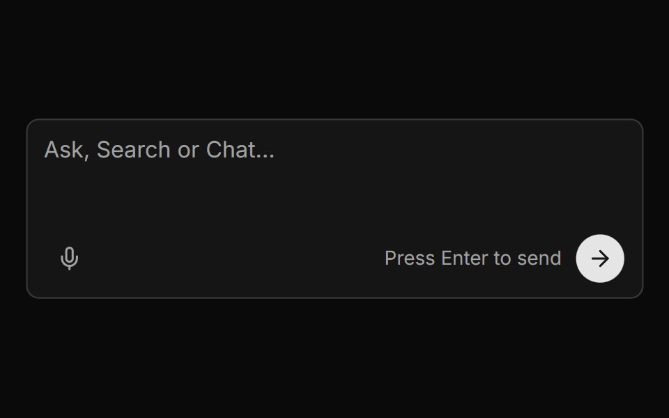 Chat Input With Voice And Send Buttonsv-particles · Svelte
 Button 13 - Size xsShadcn Space · ReactSize xs button component
 Button 1Watermelon UI · React
 As linkFLX UI · ReactLink-styled button that navigates to an external URL, rendered as an anchor with a trailing external-link icon.
 Copy Buttonsv-particles · Svelte
 Button 14 - Size smShadcn Space · ReactSize sm button component
 Button 10Watermelon UI · React
 With avatarFLX UI · ReactUser picker style button with a small avatar image leading the text label.
 Copy With Feedbacksv-particles · Svelte
 Button 15 - Size lgShadcn Space · ReactSize lg button component
 Button 11Watermelon UI · React
 Hover slide arrowFLX UI · ReactCTA arrow nudges right on hover.
 Default Buttonsv-particles · Svelte
 Button 17 - Blob FillShadcn Space · ReactCircle blob expands from bottom center on hover to fill the button
 Button 12Watermelon UI · React
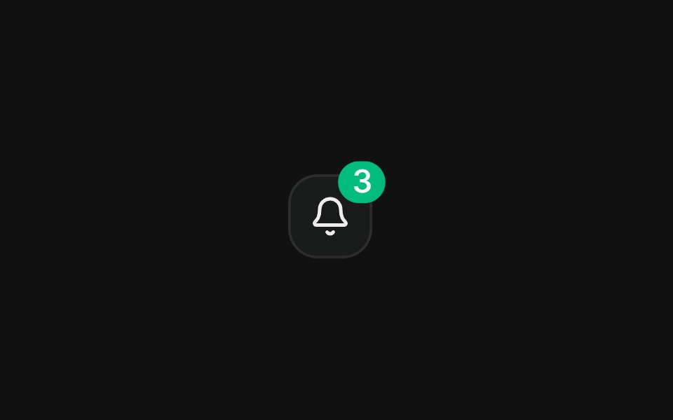 With badgeFLX UI · ReactNotification count badge overlapping an icon button.
 Destructive Buttonsv-particles · Svelte
 Button 19 - Interactive HoverShadcn Space · ReactInteractive Hover button
 Button 13Watermelon UI · React
 Copy to clipboardFLX UI · ReactIcon and label swap to a check on copy.
 Direction Pad Controlssv-particles · Svelte
 Button 22 - Loading ButtonShadcn Space · ReactLoading button component
 Button 14Watermelon UI · React
 Hover rotate refreshFLX UI · ReactRefresh button whose icon rotates a full 360° on each click.
 Disabled Buttonsv-particles · Svelte
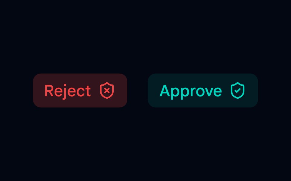 Button 23 - Permissions ButtonShadcn Space · ReactAnimated Permissions button component
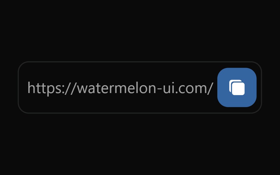 Button 15Watermelon UI · React
 Hamburger toggleFLX UI · ReactThree bars morph into an X on press.
 Extra Smallsv-particles · Svelte
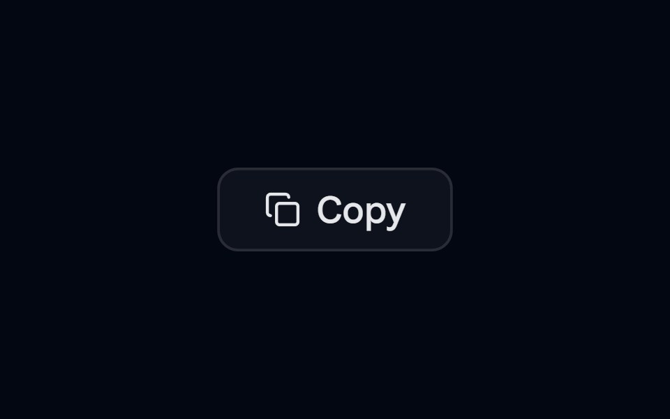 Button 24 - Copy ButtonShadcn Space · ReactAnimated copy button component with spring transitions
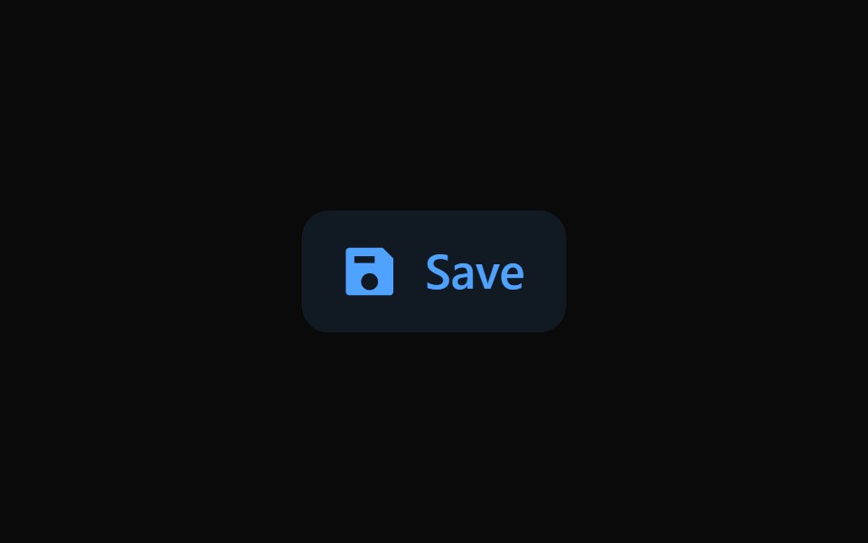 Button 16Watermelon UI · React
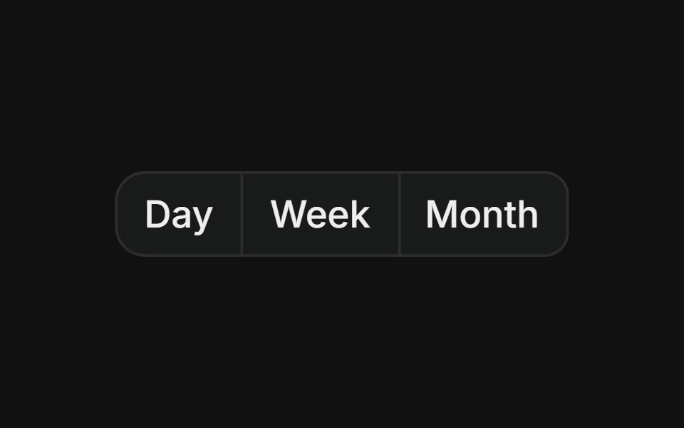 Basic groupFLX UI · ReactHorizontal row of buttons with merged borders, used for segmented controls like date range pickers.
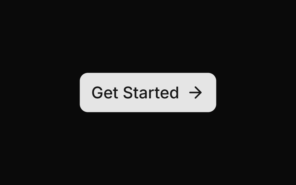 Get Startedsv-particles · Svelte
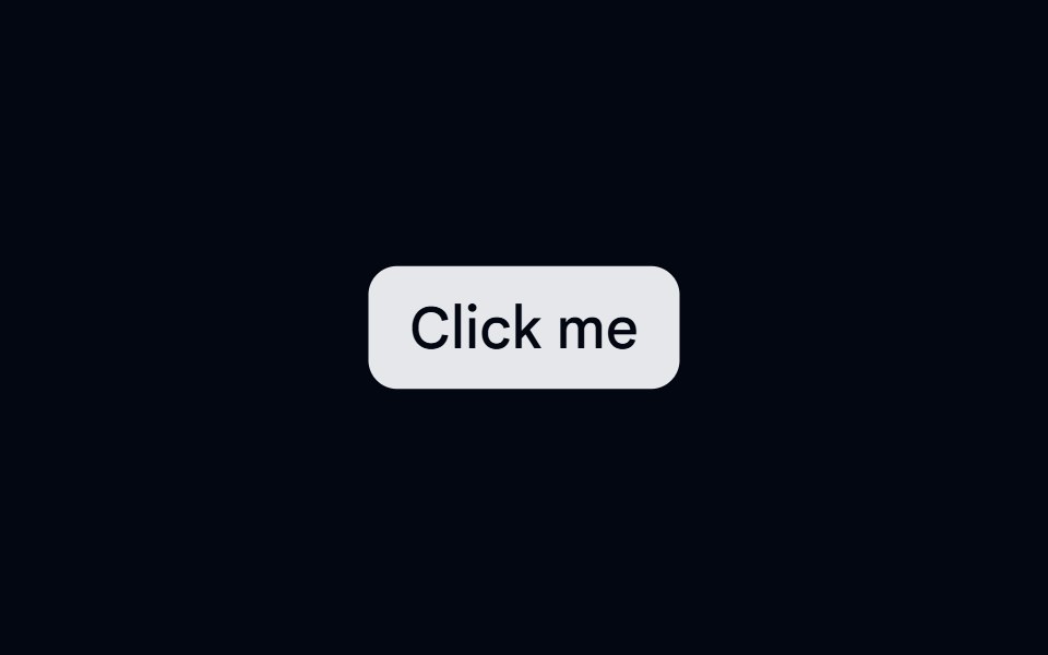 Button 25 - Ripple ButtonShadcn Space · ReactAnimated ripple button component with mouse-click tracking
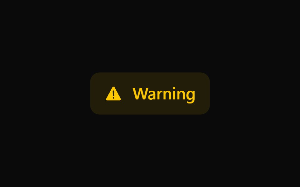 Button 17Watermelon UI · React
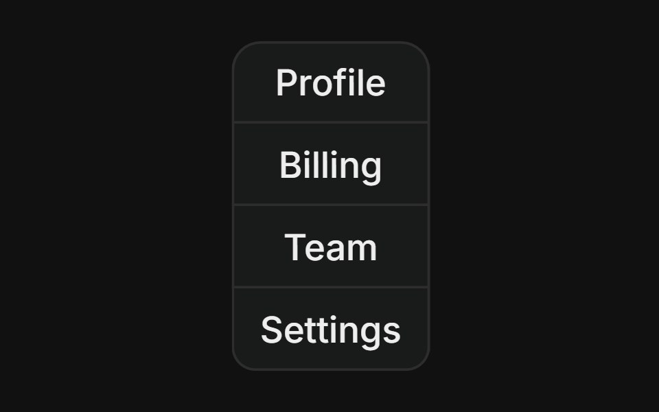 Vertical groupFLX UI · ReactStacked column of buttons with merged borders, used for vertical navigation menus.
Libraries with shadcn/ui action components
Related categories
- Action Components
- React Action Components
- Tailwind CSS Action Components
- Svelte Action Components
- React Native Action Components
- Animated Action Components
- shadcn/ui Button Components
- shadcn/ui Button Group Components
- shadcn/ui Icon Button Components
- shadcn/ui CTA Button Components
- shadcn/ui Copy Button Components
- shadcn/ui Toggle Button Components